
Abstract
In addition to benefiting reproducibility and transparency, one of the advantages of using R is that researchers have a much larger range of fully customizable data visualizations options than are typically available in point-and-click software because of the open-source nature of R. These visualization options not only look attractive but also can increase transparency about the distribution of the underlying data rather than relying on commonly used visualizations of aggregations, such as bar charts of means. In this tutorial, we provide a practical introduction to data visualization using R specifically aimed at researchers who have little to no prior experience of using R. First, we detail the rationale for using R for data visualization and introduce the “grammar of graphics” that underlies data visualization using the ggplot package. The tutorial then walks the reader through how to replicate plots that are commonly available in point-and-click software, such as histograms and box plots, and shows how the code for these “basic” plots can be easily extended to less commonly available options, such as violin box plots. The data set and code used in this tutorial and an interactive version with activity solutions, additional resources, and advanced plotting options are available at https://osf.io/bj83f/.
Use of the programming language R (R Core Team, 2021) for data processing and statistical analysis by researchers is increasingly common; there was an average yearly growth of 87% in the number of citations of the R Core Team between 2006 and 2018 (Barrett, 2019). In addition to benefiting reproducibility and transparency, one of the advantages of using R is that researchers have a much larger range of fully customizable data visualization options than are typically available in point-and-click software because of the open-source nature of R. These visualization options not only look attractive but also can increase transparency about the distribution of the underlying data rather than relying on commonly used visualizations of aggregations, such as bar charts of means (Newman & Scholl, 2012).
Yet the benefits of using R are obscured for many researchers by the perception that coding skills are difficult to learn (Robins et al., 2003). In addition, only a minority of psychology programs currently teach coding skills (Wills, n.d.), and the majority of both undergraduate and postgraduate courses use proprietary point-and-click software, such as SAS, SPSS, or Microsoft Excel. Although the sophisticated use of proprietary software often necessitates the use of computational thinking skills akin to coding (e.g., SPSS scripts or formulas in Excel), we have found that many researchers do not perceive that they already have introductory coding skills. In the following tutorial, we intend to change that perception by showing how experienced researchers can redevelop their existing computational skills to use the powerful data-visualization tools offered by R.
In this tutorial, we provide a practical introduction to data visualization using R specifically aimed at researchers who have little to no prior experience of using R. First, we detail the rationale for using R for data visualization and introduce the “grammar of graphics” that underlies data visualization using the
Why R for Data Visualization?
Data visualization benefits from the same advantages as statistical analysis when writing code rather than using point-and-click software—reproducibility and transparency. The need for psychological researchers to work in reproducible ways has been well documented and discussed in response to the replication crisis (e.g., Munafò et al., 2017), and we will not repeat those arguments here. However, there is an additional benefit to reproducibility that is less frequently acknowledged compared with the loftier goals of improving psychological science: If you write code to produce your plots, you can reuse and adapt that code in the future rather than starting from scratch each time.
In addition to the benefits of reproducibility, using R for data visualization gives the researcher almost total control over each element of the plot. Although this flexibility can seem daunting at first, the ability to write reusable code recipes (and use recipes created by others) is highly advantageous. The level of customization and the professional outputs available using R has, for instance, led news outlets such as the BBC (BBC Visual and Data Journalism, 2019) and The New York Times (Bertini & Stefaner, 2015) to adopt R as their preferred data-visualization tool.
A Layered Grammar of Graphics
There are multiple approaches to data visualization in R; in this article, we use the popular package
1
Figure 1 displays the evolution of a simple scatterplot using this layered approach. First, the plot space is built (Layer 1); the variables are specified (Layer 2); the type of visualization (known as a

Evolution of a layered plot.
Note that each layer is independent and independently customizable. For example, the size, color, and position of each component can be adjusted, or one could, for example, remove the first geom (the data points) to only visualize the line of best fit simply by removing the layer that draws the data points (Fig. 2). The use of layers makes it easy to build up complex plots step-by-step and to adapt or extend plots from existing code.

Plot with scatterplot layer removed.
Tutorial Components
This tutorial contains three components:
A traditional PDF manuscript that can easily be saved, printed, and cited.
An online version of the tutorial published at https://psyteachr.github.io/introdataviz/ that may be easier to copy and paste code from and that also provides the optional activity solutions and additional appendices, including code tutorials for advanced plots beyond the scope of this article and links to additional resources.
An OSF repository published at https://osf.io/bj83f/ that contains the simulated data set (see below), preprint, and R Markdown workbook.
Simulated Data Set
For the purpose of this tutorial, we will use simulated data for a 2 × 2 mixed-design lexical decision task in which 100 participants must decide whether a presented word is a real word or a nonword. There are 100 rows (one for each participant) and seven variables:
• Participant information: – –
• One between-subjects independent variable (IV): –
• Four columns for the two dependent variables (DVs) of reaction time (RT) and accuracy, crossed by the within-subjects IV of condition: – – – –
For newcomers to R, we would suggest working through this tutorial with the simulated data set, then extending the code to your own data sets with a similar structure, and finally, generalizing the code to new structures and problems.
Setting Up R and RStudio
We strongly encourage the use of RStudio (RStudio Team, 2021) to write code in R. R is the programming language, whereas RStudio is an integrated development environment that makes working with R easier. More information on installing both R and RStudio can be found in the additional resources.
Projects are a useful way of keeping all your code, data, and output in one place. To create a new project, open RStudio and click
This tutorial will require you to use the packages in the
# only run in the console, never put this  in a script
package_list <- c(“tidyverse”, “patchwork”)
install.packages(package_list)
R Markdown is a dynamic format that allows you to combine text and code into one reproducible document. The R Markdown workbook available in the online materials contains all the code in this tutorial, and there is more information and links to additional resources for how to use R Markdown for reproducible reports in the additional resources.
The reason that the above code is not included in the workbook is that every time you run the install command code, it will install the latest version of the package. Leaving this code in your script can lead you to unintentionally install a package update you did not want. For this reason, avoid including install code in any script or Markdown document.
For more information on how to use R with RStudio, please see the additional resources in the online appendices.
Preparing Your Data
Before you start visualizing your data, it must be in an appropriate format. These preparatory steps can all be dealt with reproducibly using R, and the additional resources section points to extra tutorials for doing so. However, performing these types of tasks in R can require more sophisticated coding skills, and the solutions and tools are dependent on the idiosyncrasies of each data set. For this reason, in this tutorial, we encourage the reader to complete data-preparation steps using the method they are most comfortable with and to focus on the aim of data visualization.
Data format
The simulated lexical decision data are provided in a
Variable names
Ensuring that your variable names are consistent can make it much easier to work in R. We recommend using short but informative variable names; for example,
It is also helpful to have a consistent naming scheme, particularly for variable names that require more than one word. Two popular options are
When working with your own data, you can rename columns in Excel, but the resources listed in the online appendices point to how to rename columns reproducibly with code.
Data values
A benefit of R is that categorical data can be entered as text. In the tutorial data set, language group is entered as 1 or 2 so that we can show you how to recode numeric values into factors with labels. However, we recommend recording meaningful labels rather than numbers from the beginning of data collection to avoid misinterpreting data because of coding errors. Note that values must match exactly to be considered in the same category and that R is case sensitive, so “mono,” “Mono,” and “monolingual” would be classified as members of three separate categories.
Finally, importing data is more straightforward if cells that represent missing data are left empty rather than containing values like
Getting Started
Loading packages
To load the packages that have the functions we need, use the
library(tidyverse)
library(patchwork)
Loading data
To load the simulated data, we use the function
dat <- read_csv(file = “ldt_data.csv”)
This code has created an object
You should always check after importing data that the resulting table looks like you expect. To view the data set, click
Handling numeric factors
Another useful check is to use the functions
summary(dat)
str(dat)
Because the factor
dat <- mutate(dat, language = factor(
x = language , # column to translate
levels = c(1, 2) , # values of the original data in preferred order
labels = c(“monolingual”, “bilingual”) # labels for display
))
Make sure that you always check the output of any code that you run. If after running this code
A good way to avoid this is never to overwrite data but to always store the output of code in new objects (e.g.,
Argument names
Each function has a list of arguments it can take and a default order for those arguments. You can get more information on each function by entering
dat <- mutate(dat, language = factor(
language ,
c(1, 2) ,
c(“monolingual”, “bilingual”)
))
One of the challenges in learning R is that many of the “helpful” examples and solutions you will find online do not include argument names and so for novice learners are completely opaque. In this tutorial, we will include the argument names the first time a function is used; however, we will remove some argument names from subsequent examples to facilitate knowledge transfer to the help available online.
Summarizing data
You can calculate and plot some basic descriptive information about the demographics of our sample using the imported data set without any additional wrangling (i.e., data processing). The code below uses the
Start with the data set
Group it by the variable
Count the number of observations in each group and then;
Remove the grouping.
dat %>%
 group_by(language) %>%
 count() %>%
 ungroup()
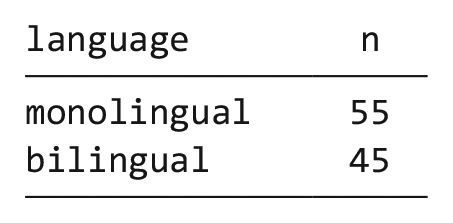
The above code therefore counts the number of observations in each group of the variable
dat %>%
 count()

Likewise, we may wish to calculate the mean age (and standard deviation) of the sample, and we can do so using the function
dat %>%
summarise(mean_age = mean(age) ,
sd_age = sd(age) ,
n_values = n())

This code produces summary data in the form of a column named
Note that the above code will not save the result of this operation; it will simply output the result in the console. If you wish to save it for future use, you can store it in an object by using the
age_stats <- dat %>%
summarise(mean_age = mean(age) ,
sd_age = sd(age) ,
n_values = n())
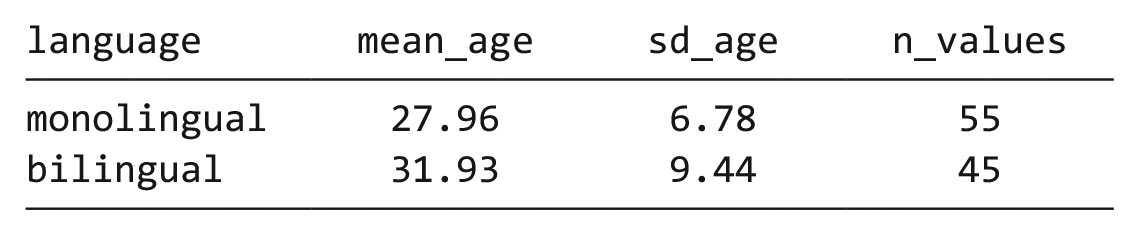
Finally, the
dat %>%
group_by(language) %>%
summarise(mean_age = mean(age) ,
sd_age = sd(age) ,
n_values = n()) %>%
ungroup()
Bar chart of counts
For our first plot, we will make a simple bar chart of counts that shows the number of participants in each
ggplot(data = dat, mapping = aes(x =  language)) +
 geom_bar()
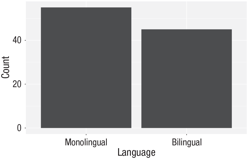
Bar chart of counts.
The first line of code sets up the base of the plot:
The second line of code adds a
The base and geoms layers work in symbiosis, so it is worthwhile checking the mapping rules because these are related to the default statistic for the plot’s geom.
Aggregates and percentages
If your data set already has the counts that you want to plot, you can set
dat_percent <- dat %>% # start with the  data in dat
 count(language) %>%  # count rows per   language (makes a new column called n)
 mutate(percent = (n/sum(n)*100))
             # make a new column             ‘percent’ equal to
             # n divided by the sum              of n times 100

Bar chart of precalculated counts.
Notice that we are now omitting the names of the arguments
ggplot(dat_percent, aes(x = language, y =  percent)) +
 geom_bar(stat=“identity”)
Histogram
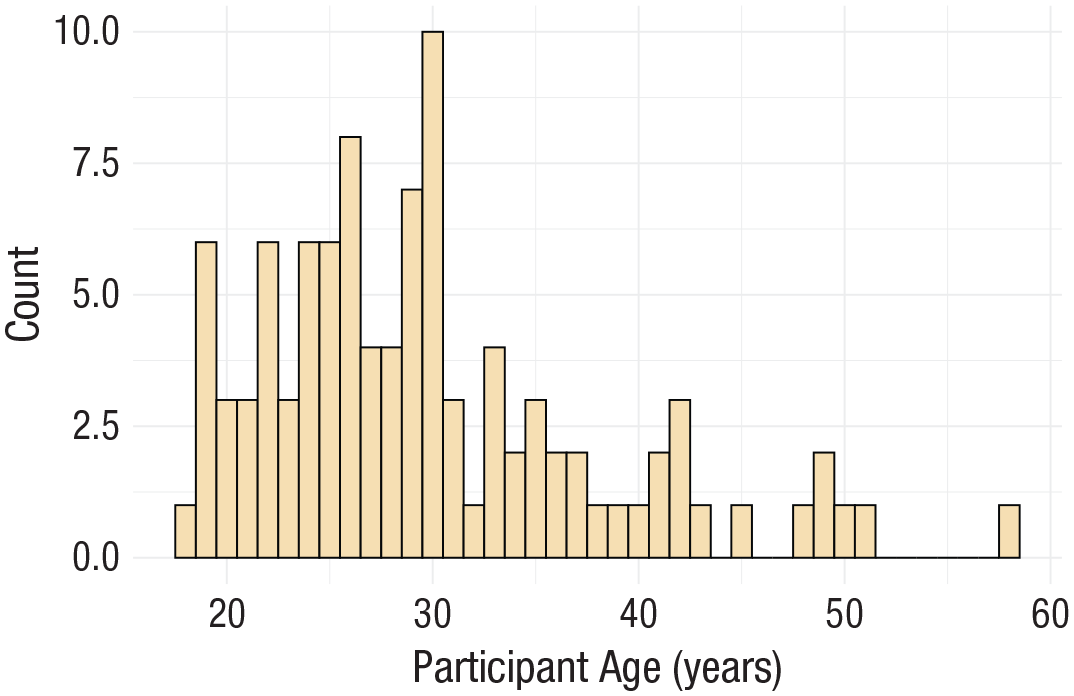
The code to plot a histogram of
ggplot(dat, aes(x = age)) +
 geom_histogram()
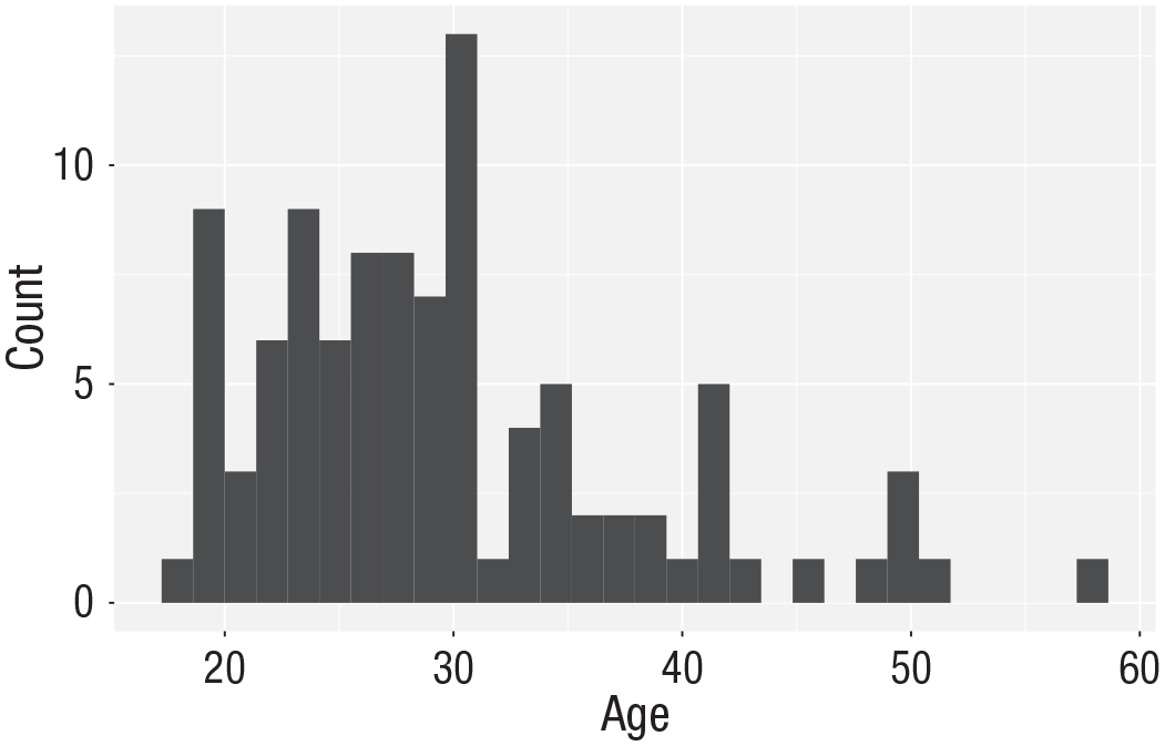
Histogram of ages.
The base statistic for
ggplot(dat, aes(x = age)) +
 geom_histogram(binwidth = 5)

Histogram of ages in which each bin covers 5 years.
Customization 1
So far, we have made basic plots with the default visual appearance. Before we move on to the experimental data, we will introduce some simple visual-customization options. There are many ways in which you can control or customize the visual appearance of figures in R. However, once you understand the logic of one, it becomes easier to understand others that you may see in other examples. The visual appearance of elements can be customized within a geom itself, within the aesthetic mapping, or by connecting additional layers with
Changing colors
For our basic histogram and bar chart, you can control colors used to display the bars by setting
ggplot(dat, aes(age)) +
geom_histogram(binwidth = 1 ,
fill = “white” ,
colour = “black”)

Histogram with custom colors for bar fill and line colors.
Editing axis names and labels
To edit axis names and labels, you can connect
For the bar chart of counts, the x-axis is mapped to a discrete (categorical) variable, whereas the y-axis is continuous. For each of these, there is a relevant scale function with various elements that can be customized. Each axis then has its own function added as a layer to the basic plot (Fig. 8):
ggplot(dat, aes(language)) +
geom_bar() +
scale_x_discrete(name = “Language group” ,
labels = c(“Monolingual”, “Bilingual”)) +
scale_y_continuous(name = “Number of participants” ,
breaks = c(0,10,20,30,40,50))
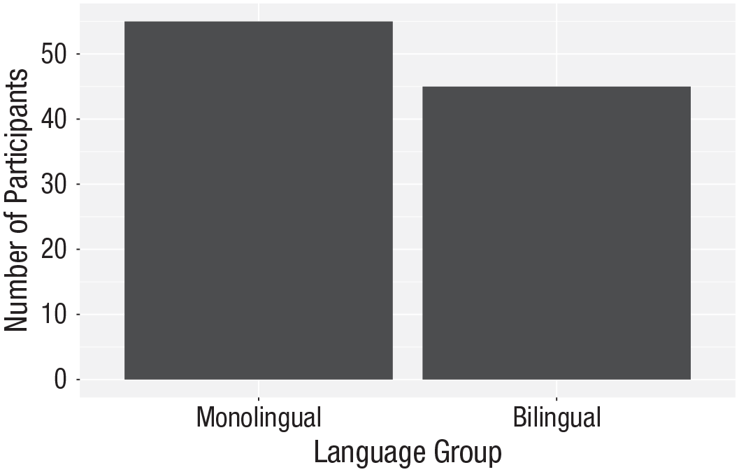
Bar chart with custom axis labels.
A common error is to map the wrong type of
# produces an error
ggplot(dat, aes(language)) +
geom_bar() +
scale_x_continuous(name = “Language group” ,
labels = c(“Monolingual”, “Bilingual”))
This will produce the error
Adding a theme
ggplot(dat, aes(age)) +
 geom_histogram(binwidth = 1, fill =   “wheat”, color = “black”) +
 scale_x_continuous(name = “Participant   age (years)”) +
 theme_minimal()
Histogram with a custom theme.
You can set the theme globally so that all subsequent plots use a theme.
theme_set(theme_minimal())
If you wish to return to the default theme, change the above to specify
Activities 1
Before you move on, try the following:
Add a layer that edits the
Change the color of the bars in the bar chart to red.
Remove
Transforming Data
Data formats
To visualize the experimental RT and accuracy data using
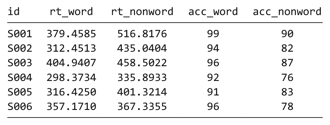
The simulated lexical decision data are currently in wide format (see Table 1), in which each participant’s aggregated 4 RT and accuracy for each level of the within-subjects variable is split across multiple columns for the repeated factor of condition (words vs. nonwords).
Data in Wide Format
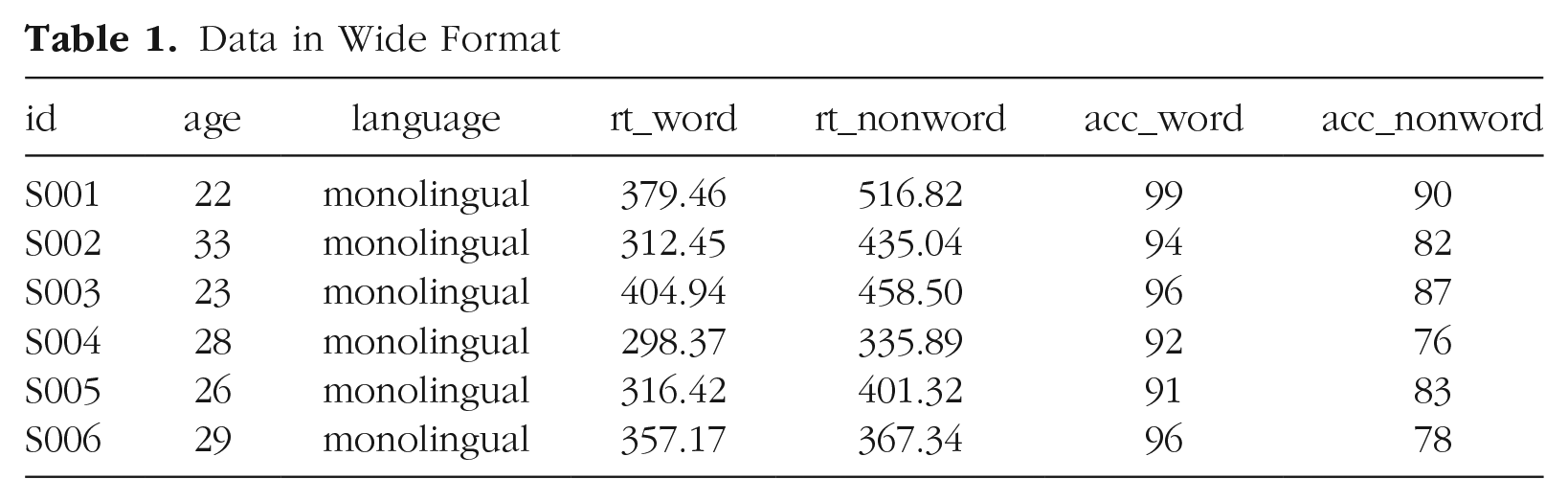
Wide format is popular because it is intuitive to read and easy to enter data into because all the data for one participant is contained within a single row. However, for the purposes of analysis, and particularly for analysis using R, this format is unsuitable. Although it is intuitive to read by a human, the same is not true for a computer. Wide-format data concatenate multiple pieces of information in a single column; for example, in Table 1,
Moving from using wide-format to long-format data sets can require a conceptual shift on the part of the researcher and one that usually comes only with practice and repeated exposure. 5 It may be helpful to make a note that “row = participant” (wide format) and “row = observation” (long format) until you get used to moving between the formats. For our example data set, adhering to these rules for reshaping the data would produce Table 2. Rather than different observations of the same dependent variable being split across columns, there is now a single column for the DV RT and a single column for the DV accuracy. Each participant now has multiple rows of data, one for each observation (i.e., for each participant, there will be as many rows as there are levels of the within-subjects IV). Although there is some repetition of age and language group, each row is unique when looking at the combination of measures.
Data in the Correct Format for Visualization
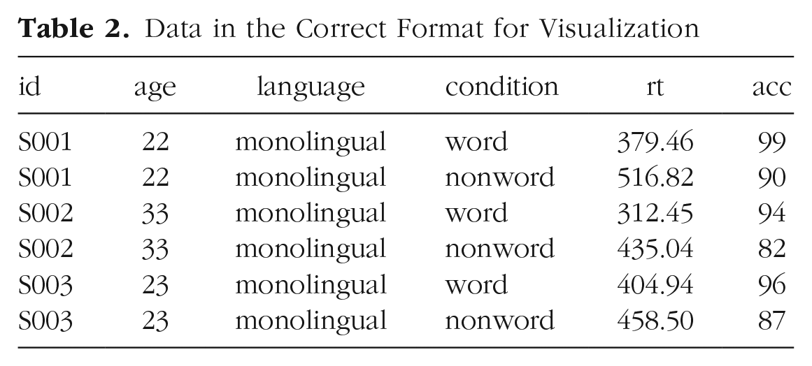
The benefits and flexibility of this format will hopefully become apparent as we progress through the tutorial; however, a useful rule of thumb when working with data in R for visualization is that anything that shares an axis should probably be in the same column. For example, a simple box plot showing RT by condition would display the variable
Wide to long format
We have chosen a 2 × 2 design with two DVs because we anticipate that this is a design many researchers will be familiar with and may also have existing data sets with a similar structure. However, it is worth normalizing that trial and error is part of the process of learning how to apply these functions to new data sets and structures. Data visualization can be a useful way to scaffold learning these data transformations because they can provide a concrete visual check as to whether you have done what you intended to do with your data.
Step 1:
pivot_longer().
The first step is to use the function
This first code ignores that the data set has two DVs, a problem we will fix in Step 2. The pivot functions can be easier to show than tell—you may find it a useful exercise to run the below code and compare the newly created object
long <- pivot_longer(data = dat ,
cols = rt_word: acc_nonword ,
names_to = “dv_condition” ,
values_to = “dv”)
As with the other tidyverse functions, the first argument specifies the data set to use as the base, in this case
Finally,
Data in Long Format With Mixed Dependent Variables
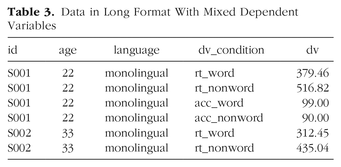
At this point, you may find it helpful to go back and compare
Step 2:
pivot_longer()
adjusted
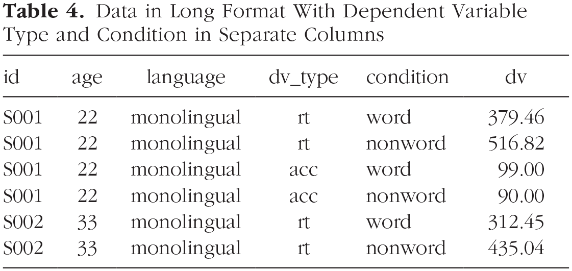
The problem with the above long-format data set is that
Data in Long Format With Dependent Variable Type and Condition in Separate Columns
long2 <- pivot_longer(data = dat ,
cols = rt_word:acc_nonword ,
names_sep = “_” ,
names_to = c(“dv_ type”, “condition”) ,
values_to = “dv”)
Note that when specifying more than one column name, they must be combined using
Step 3:
pivot_wider().
Although we have now split the columns so that there are separate variables for the DV type and level of condition, because the two DVs are different types of data, there is an additional bit of wrangling required to get the data in the right format for plotting.
In the current long-format data set, the column
dat_long <- pivot_wider(long2 ,
names_from = “dv_type” ,
values_from = “dv”)
The first argument is again the data set you wish to work from, in this case,
Again, it can be helpful to compare each data set with the code to see how it aligns. This final long-form data should look like Table 2.
If you are working with a data set with only one DV, note that only Step 1 of this process would be necessary. In addition, be careful not to calculate demographic descriptive statistics from this long-form data set. Because the process of transformation has introduced some repetition for these variables, the wide-format data set in which one row equals one participant should be used for demographic information. Finally, the three-step process noted above is broken down for teaching purposes; in reality, one would likely do this in a single pipeline of code, for example:
dat_long <- pivot_longer(data = dat ,
cols = rt_word:acc_ nonword ,
names_sep = “_” ,
names_to = c(“dv_ type”, “condition”) ,
values_to = “dv”) %>%
pivot_wider(names_from = “dv_type” ,
values_from = “dv”)
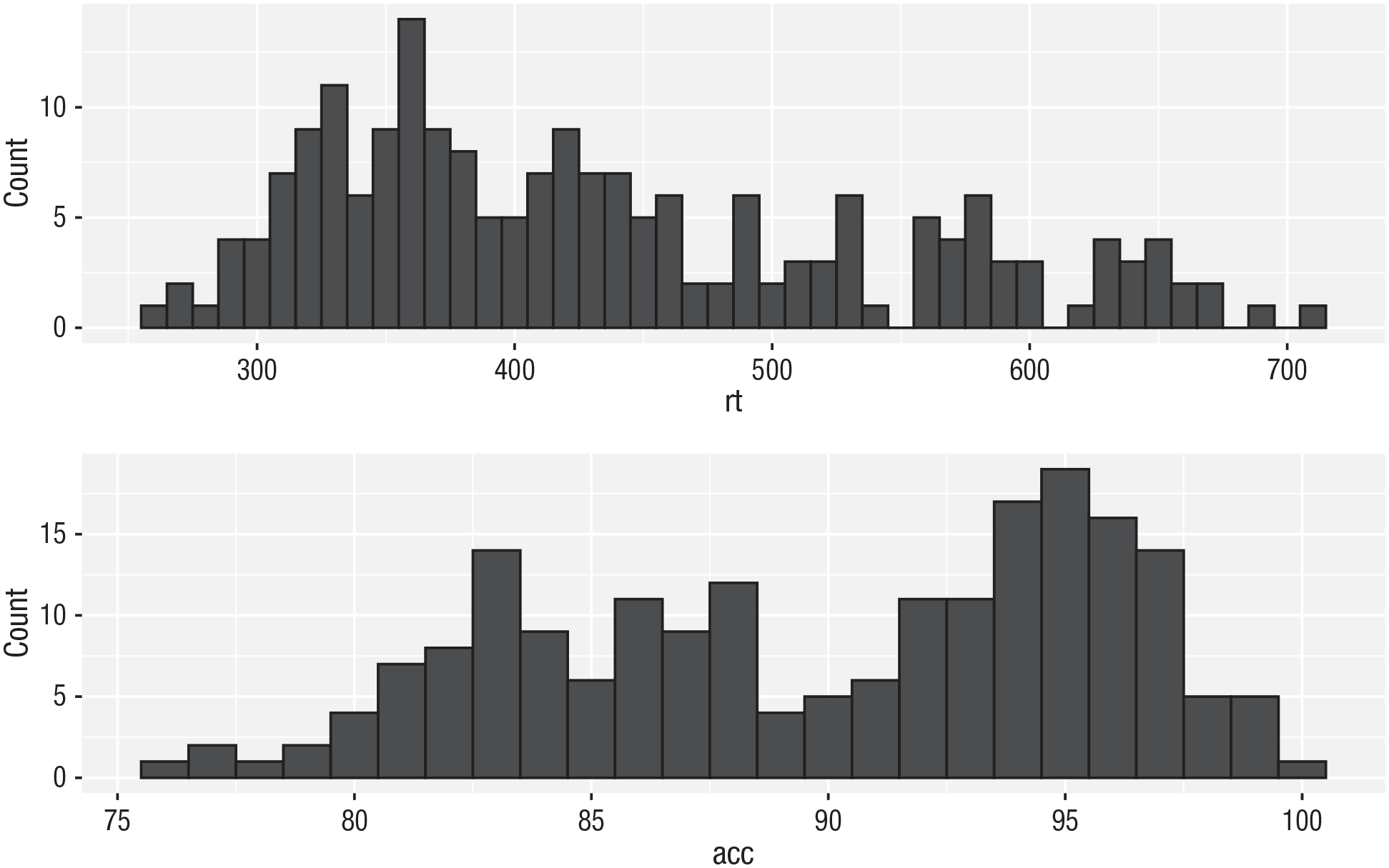
Histogram 2
Now that we have the experimental data in the right form, we can begin to create some useful visualizations. First, to demonstrate how code recipes can be reused and adapted, we will create histograms of RT and accuracy. The below code uses the same template as before but changes the data set (
ggplot(dat_long, aes(x = rt)) +
 geom_histogram(binwidth = 10, fill =   “white”, colour = “black”) +
 scale_x_continuous(name = “Reaction time   (ms)”)
ggplot(dat_long, aes(x = acc)) +
 geom_histogram(binwidth = 1, fill =   “white”, colour = “black”) +
 scale_x_continuous(name = “Accuracy   (0-100)”)
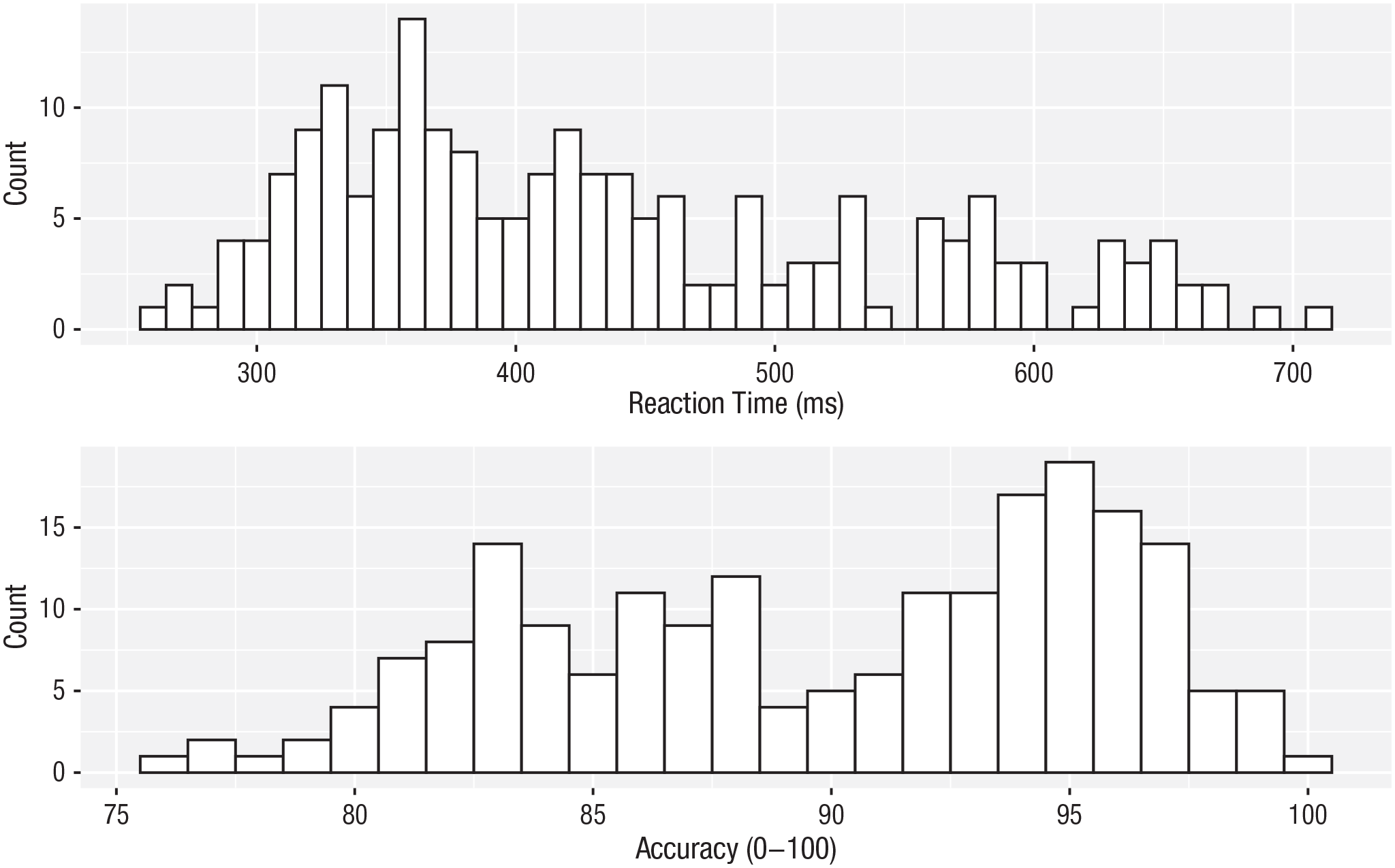
Histograms showing the distribution of reaction time (top) and accuracy (bottom).
Density plots
The layer system makes it easy to create new types of plots by adapting existing recipes. For example, rather than creating a histogram, we can create a smoothed density plot by calling
ggplot(dat_long, aes(x = rt)) +
 geom_density()+
 scale_x_continuous(name = “Reaction time   (ms)”)
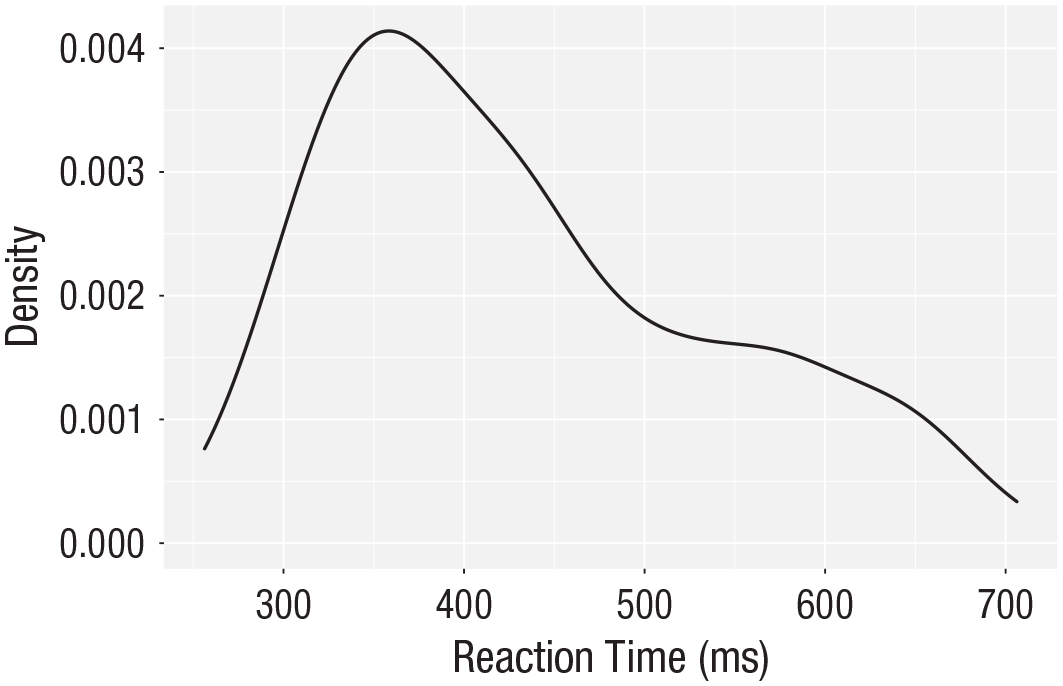
Density plot of reaction time.
Grouped density plots
Density plots are most useful for comparing the distributions of different groups of data (Fig. 12). Because the data set is now in long format, with each variable contained within a single column, we can map
In addition to mapping
Because the density plots are overlapping, we set
As with the x- and y-axis scale functions, we can edit the names and labels of our fill aesthetic by adding on another
Note that the
ggplot(dat_long, aes(x = rt, fill = condition)) +
geom_density(alpha = 0.75)+
scale_x_continuous(name = “Reaction time (ms)”) +
scale_fill_discrete(name = “Condition” ,
labels = c(“Word”, “Non-word”))
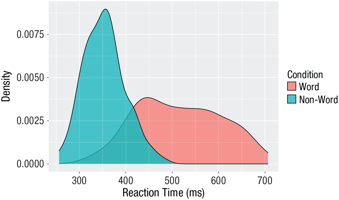
Density plot of reaction times grouped by condition.
Scatterplots
Scatterplots are created by calling
ggplot(dat_long, aes(x = rt, y = age)) +
 geom_point()
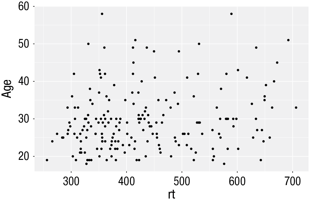
Scatterplot of reaction time versus age.
A line of best fit can be added with an additional layer that calls the function
ggplot(dat_long, aes(x = rt, y = age)) +
 geom_point() +
 geom_smooth(method = “lm”)
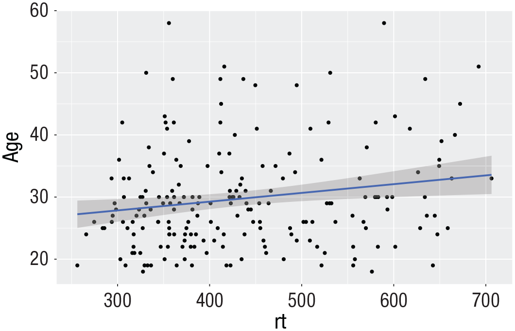
Line of best fit for reaction time versus age.
Grouped scatterplots
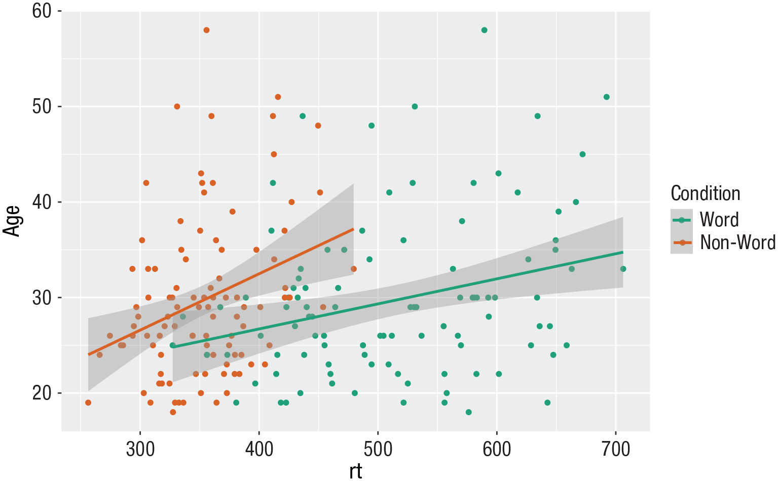
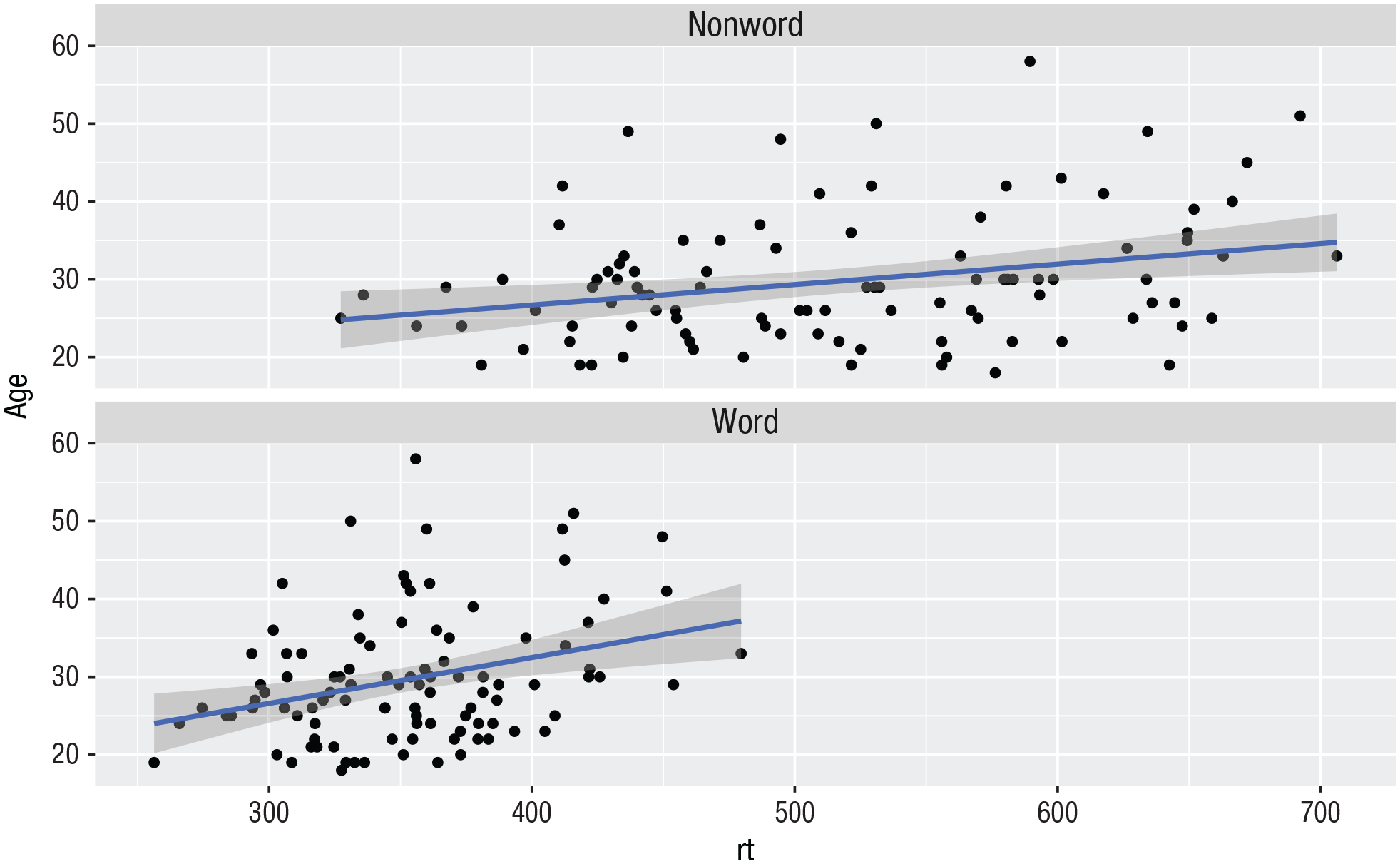
Similar to the density plot, the scatterplot can also be easily adjusted to display grouped data (Fig. 15). For
ggplot(dat_long, aes(x = rt, y = age, colour = condition)) +
geom_point() +
geom_smooth(method = “lm”) +
scale_colour_discrete(name = “Condition” ,
labels = c(“Word”, “Non-word”))

Grouped scatterplot of reaction time versus age by condition.
Long to wide format
Following the rule that anything that shares an axis should probably be in the same column means that we will frequently need our data in long form when using
ggplot(dat, aes(x = rt_word, y = rt_ nonword, colour = language)) +
 geom_point() +
 geom_smooth(method = “lm”)
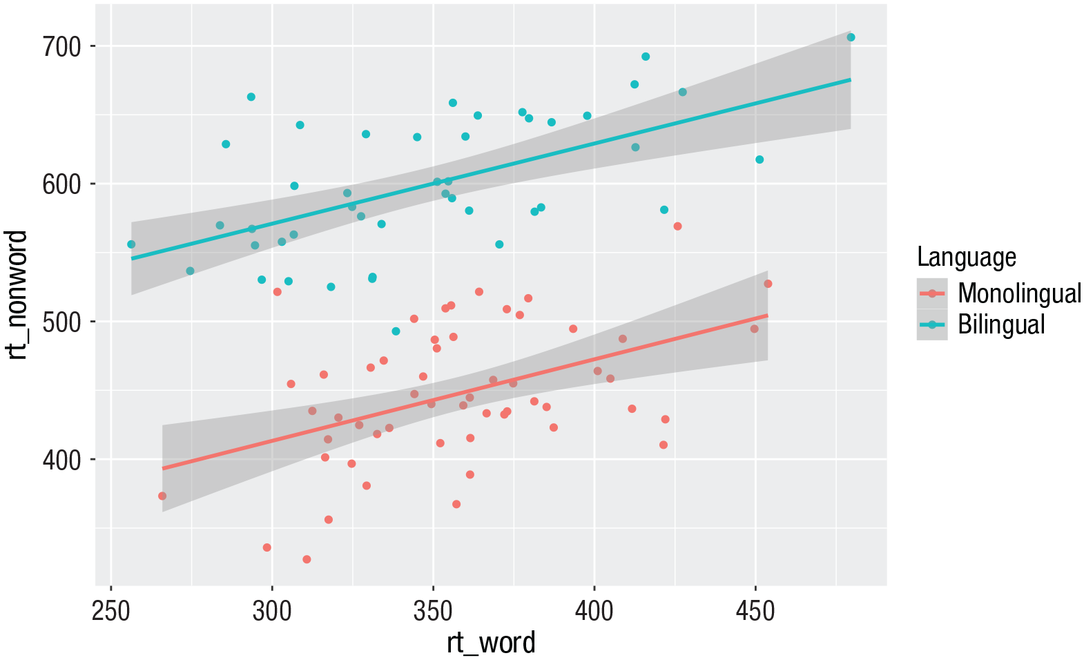
Scatterplot with data grouped by language group.
However, there may also be cases when you do not have an original wide-format version, and you can use the
dat_wide <- dat_long %>%
pivot_wider(id_cols = “id” ,
names_from = “condition” ,
values_from = c(rt,acc))
Customization 2
Accessible color schemes
One of the drawbacks of using
ggplot(dat_long, aes(x = rt, y = age, colour = condition)) +
geom_point() +
geom_smooth(method = “lm”) +
scale_color_brewer(palette = “Dark2” ,
name = “Condition” ,
labels = c(“Word”, “Non-word”))
Use of the Dark2 brewer color scheme for accessibility.
Specifying axis
breaks
with
seq().
Previously, when we have edited the
ggplot(dat_long, aes(x = rt, y = age)) +
 geom_point() +
 scale_y_continuous(breaks =   c(20,25,30,35,40,45,50,55,60))
However, this is somewhat inefficient. Instead, we can use the function
ggplot(dat_long, aes(x = rt, y = age)) +
 geom_point() +
 scale_y_continuous(breaks = seq(20,60,   by = 5))
Activities 2
Before you move, on try the following:
Use
Use
Use
Remove
Replace the default fill on the grouped density plot with a color-blind-friendly version.
Representing Summary Statistics
The layering approach that is used in
Box plots
As with
ggplot(dat_long, aes(x = condition,  y =  acc)) +
 geom_boxplot()
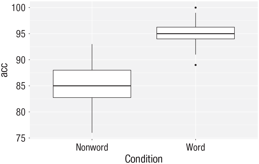
Basic box plot.
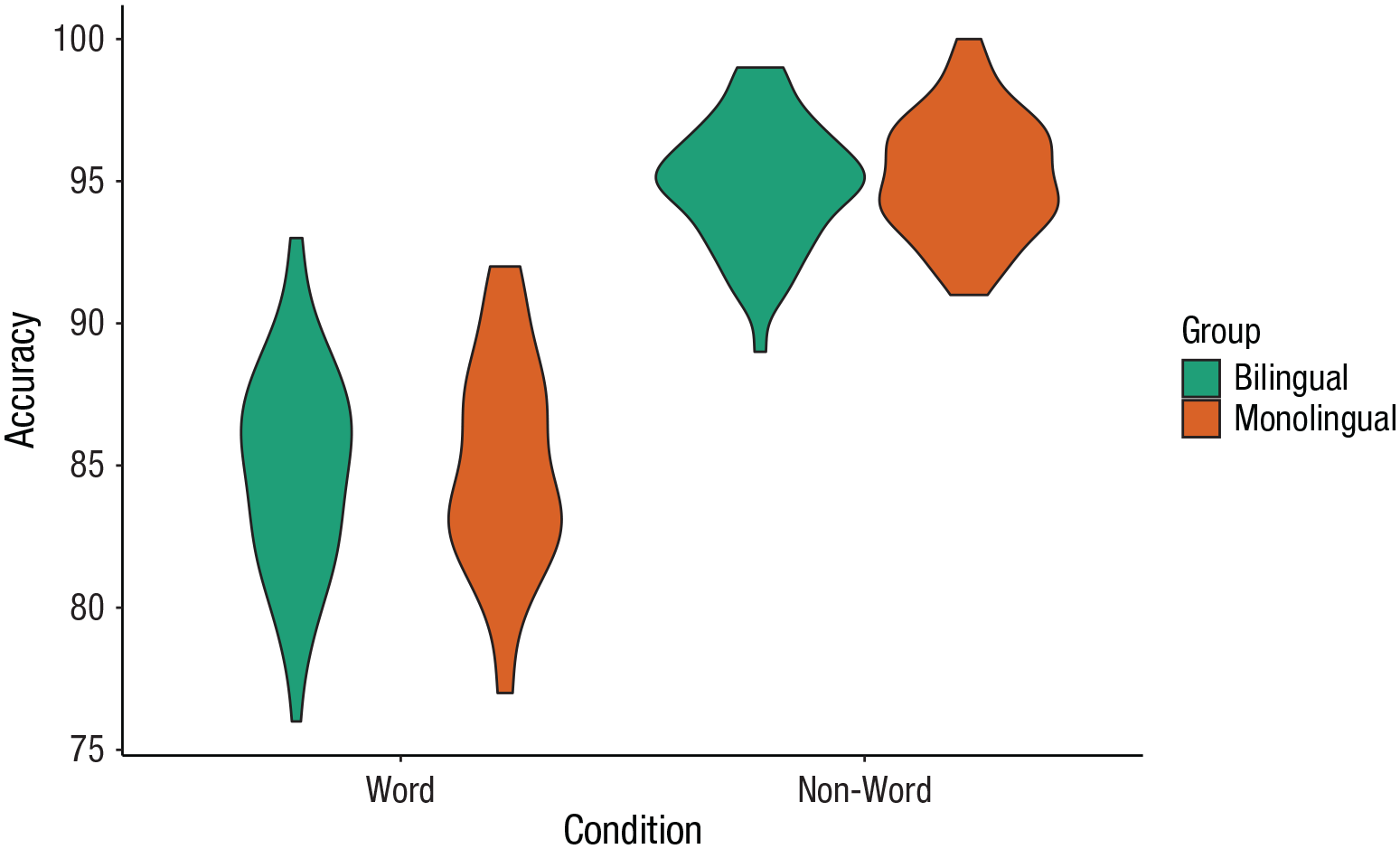
Grouped box plots
As with histograms and density plots,
ggplot(dat_long, aes(x = condition, y = acc, fill = language)) +
geom_boxplot() +
scale_fill_brewer(palette = “Dark2” ,
name = “Group” ,
labels = c(“Bilingual”, “Monolingual”)) +
theme_classic() +
scale_x_discrete(name = “Condition” ,
labels = c(“Word”, “Non-word”)) +
scale_y_continuous(name = “Accuracy”)
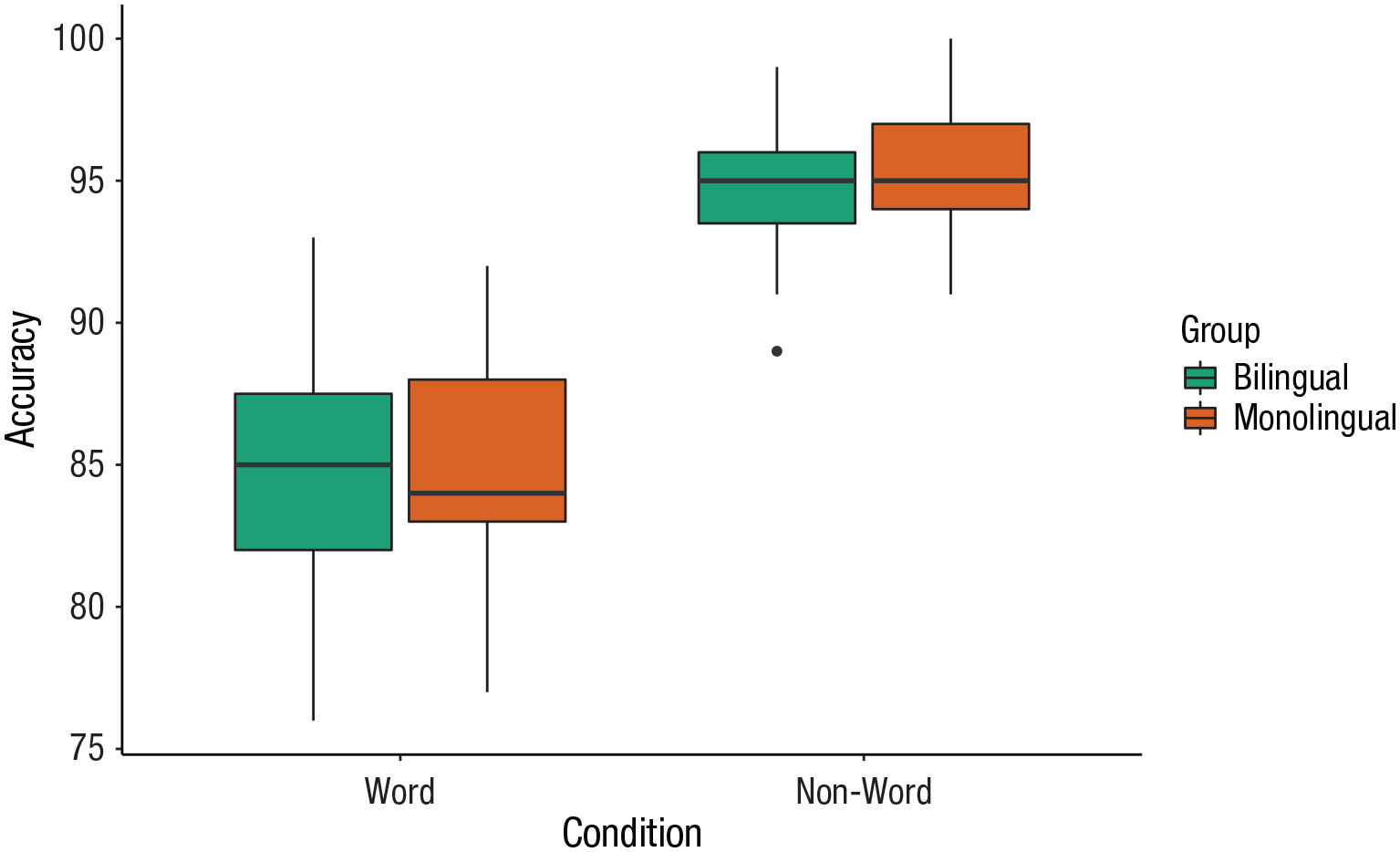
Grouped box plots.
Violin plots
Violin plots display the distribution of a data set and can be created by calling
ggplot(dat_long, aes(x = condition, y = acc, fill = language)) +
geom_violin() +
scale_fill_brewer(palette = “Dark2” ,
name = “Group” ,
labels = c(“Bilingual”, “Monolingual”)) +
theme_classic() +
scale_x_discrete(name = “Condition” ,
labels = c(“Word”, “Non-word”)) +
scale_y_continuous(name = “Accuracy”)
Violin plot.
Bar chart of means
Commonly, rather than visualizing distributions of raw data, researchers will wish to visualize means using a bar chart with error bars. As with SPSS and Excel,
First, we present code for making a bar chart. The code for bar charts is here because it is a common visualization that is familiar to most researchers. However, we would urge you to use a visualization that provides more transparency about the distribution of the raw data, such as the violin box plots we present in the next section.
To summarize the data into means (Fig. 21), we use a new function
ggplot(dat_long, aes(x = condition,  y = rt)) +
 stat_summary(fun = “mean”, geom = “bar”)

Bar plot of means.
To add the error bars (Fig. 22), another layer is added with a second call to
Whereas
ggplot(dat_long, aes(x = condition, y = rt)) +
stat_summary(fun = “mean”, geom = “bar”) +
stat_summary(fun.data = “mean_se” ,
geom = “errorbar” ,
width = .2)
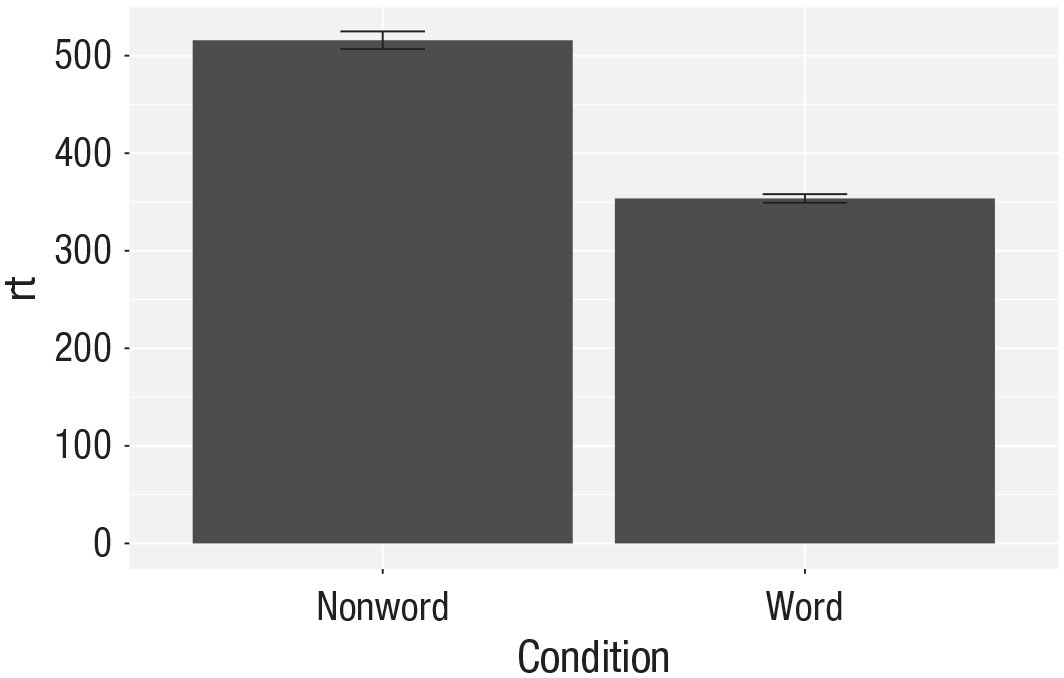
Bar plot of means with error bars representing standard errors.
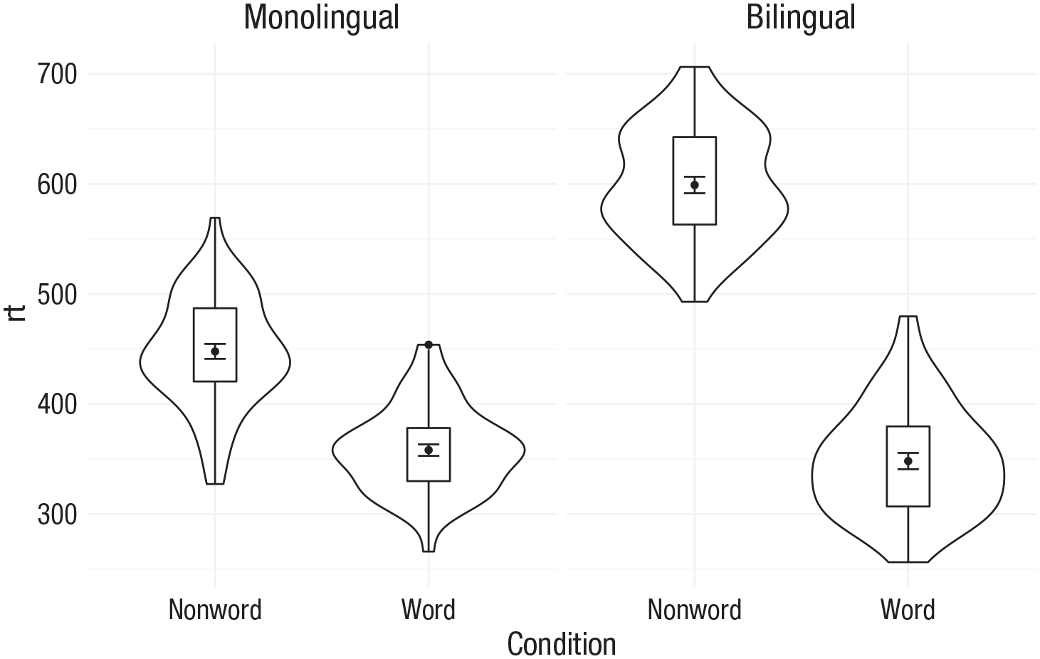
Violin box plot
The power of the layered system for making figures is further highlighted by the ability to combine different types of plots. For example, rather than using a bar chart with error bars, one can easily create a single plot that includes density of the distribution, confidence intervals, means, and standard errors. In the below code, we first draw a violin plot and then layer on a box plot a point for the mean (note
ggplot(dat_long, aes(x = condition, y= rt)) +
geom_violin() +
# remove median line with fatten = NULL
geom_boxplot(width = .2 ,
fatten = NULL) +
stat_summary(fun = “mean”, geom = “point”) +
stat_summary(fun.data = “mean_se” ,
geom = “errorbar” ,
width = .1)
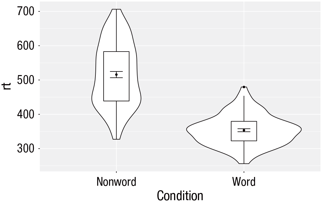
Violin box plot with mean dot and standard error bars.
Note that the order of the layers matters, and it is worth experimenting with the order to see where the order matters. For example, if we call
ggplot(dat_long, aes(x = condition, y= rt)) +
geom_boxplot() +
geom_violin() +
stat_summary(fun = “mean”, geom = “point”) +
stat_summary(fun.data = “mean_se” ,
geom = “errorbar” ,
width = .1)
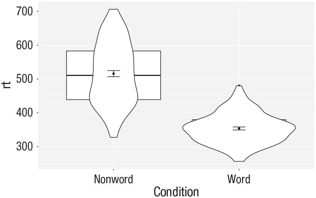
Plot with the geoms in the wrong order.
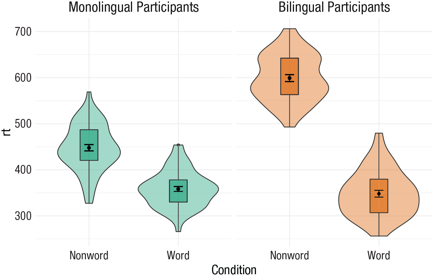
Grouped violin box plots
As with previous plots, another variable can be mapped to
ggplot(dat_long, aes(x = condition, y= rt, fill = language)) +
geom_violin() +
geom_boxplot(width = .2 ,
fatten = NULL) +
stat_summary(fun = “mean”, geom = “point”) +
stat_summary(fun.data = “mean_se” ,
geom = “errorbar” ,
width = .1) +
scale_fill_brewer(palette = “Dark2”)
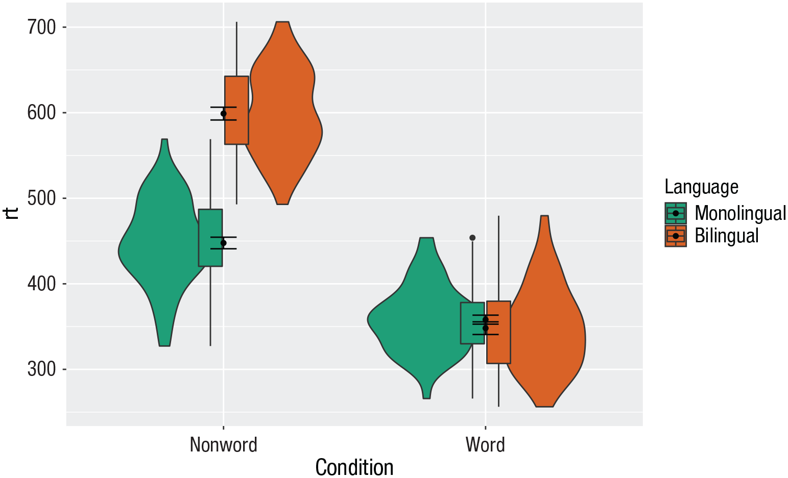
Grouped violin box plots without repositioning.
To rectify this, we need to adjust the argument
# set the offset position of the geoms
pos <- position_dodge(0.9)
ggplot(dat_long, aes(x = condition, y= rt, fill = language)) +
geom_violin(position = pos) +
geom_boxplot(width = .2 ,
fatten = NULL ,
position = pos) +
stat_summary(fun = “mean” ,
geom = “point” ,
position = pos) +
stat_summary(fun.data = “mean_se” ,
geom = “errorbar” ,
width = .1 ,
position = pos) +
scale_fill_brewer(palette = “Dark2”)
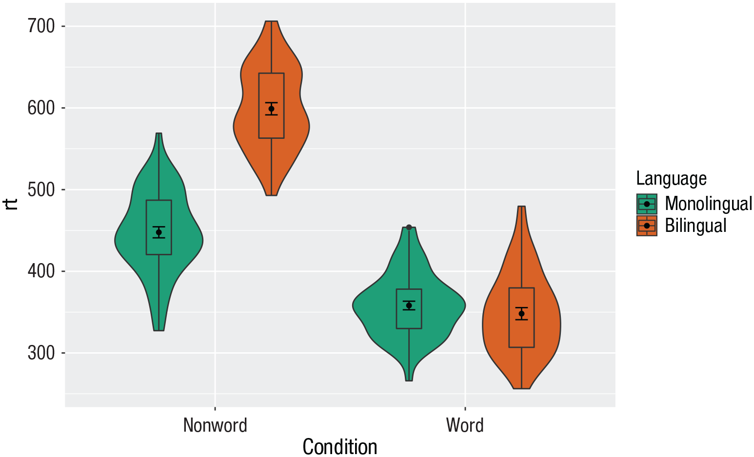
Grouped violin box plots with repositioning.
Customization 3
Combining multiple type of plots can present an issue with the colors, particularly when the fill and line colors are similar. For example, it is hard to make out the box plot against the violin plot above.
There are a number of solutions to this problem. One solution is to adjust the transparency of each layer using alpha (Fig. 27). The exact values needed can take trial and error:
ggplot(dat_long, aes(x = condition, y= rt, fill = language ,
group = paste (condition, language))) +
geom_violin(alpha = 0.25, position = pos) +
geom_boxplot(width = .2 ,
fatten = NULL ,
alpha = 0.75 ,
position = pos) +
stat_summary(fun = “mean” ,
geom = “point” ,
position = pos) +
stat_summary(fun.data = “mean_se” ,
geom = “errorbar” ,
width = .1 ,
position = pos) +
scale_fill_brewer(palette = “Dark2”)
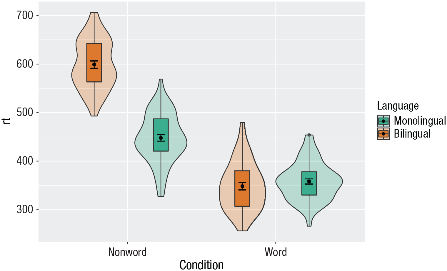
Using transparency on the fill color.
Alternatively, we can change the fill of individual geoms by adding
ggplot(dat_long, aes(x = condition, y= rt, fill = language)) +
geom_violin(position = pos) +
geom_boxplot(width = .2, fatten = NULL ,
mapping = aes(group = interaction(condition, language)) ,
fill = “white” ,
position = pos) +
stat_summary(fun = “mean” ,
geom = “point” ,
position = pos) +
stat_summary(fun.data = “mean_se” ,
geom = “errorbar” ,
width = .1 ,
position = pos) +
scale_fill_brewer(palette = “Dark2”)
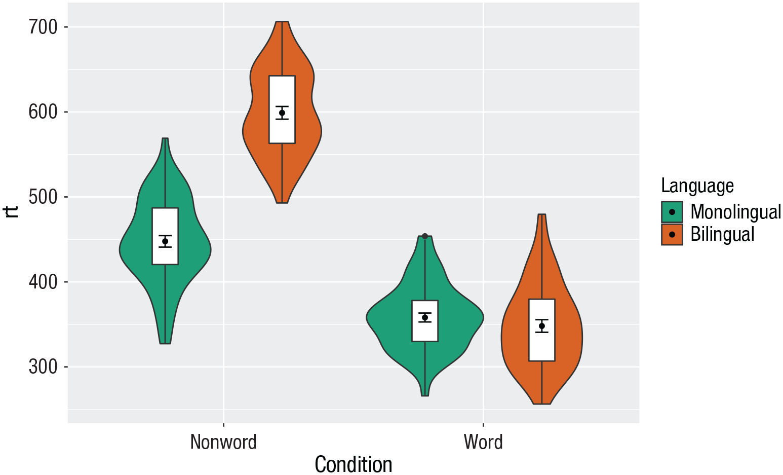
Manually changing the fill color.
Activities 3
Before you go on, do the following:
Review all the code you have run so far. Try to identify the commonalities between each plot’s code and the bits of the code you might change if you were using a different data set.
Take a moment to recognize the complexity of the code you are now able to read.
For the violin box plot, for
For the violin box plot, for
Go back to the grouped density plots and try changing the transparency with
Multipart Plots
Interaction plots
Interaction plots (Fig. 29) are commonly used to help display or interpret a factorial design. Just as with the bar chart of means, interaction plots represent data summaries, and so they are built up with a series of calls to
ggplot(dat_long, aes(x = condition, y = rt ,
shape = language ,
group = language ,
color = language)) +
stat_summary(fun = “mean”, geom = “point”, size = 3) +
stat_summary(fun = “mean”, geom = “line”) +
stat_summary(fun.data = “mean_se”, geom = “errorbar”, width = .2) +
scale_color_manual(values = c(“blue”, “darkorange”)) +
theme_classic()

Interaction plot.
You can use redundant aesthetics, such as indicating the language groups using both color and shape, to increase accessibility for color-blind readers or when images are printed in gray scale.
Combined interaction plots
A more complex interaction plot can be produced that takes advantage of the layers to visualize not only the overall interaction but also the change across conditions for each participant (Fig. 30).

Interaction plot with by-participant data.
This code is more complex than all prior code because it does not use a universal mapping of the plot aesthetics. In our code so far, the aesthetic mapping (
The first call to
Likewise,
Finally, the calls to
ggplot(dat_long, aes(x = condition, y = rt ,
group = language, shape = language)) +
# adds raw data points in each condition
geom_point(aes(colour = language), alpha = .2) +
# add lines to connect each participant’s data points across conditions
geom_line(aes(group = id, colour = language), alpha = .2) +
# add data points representing cell means
stat_summary(fun = “mean”, geom = “point”, size = 2, colour = “black”) +
# add lines connecting cell means by condition
stat_summary(fun = “mean”, geom = “line”, colour = “black”) +
# add errorbars to cell means
stat_summary(fun.data = “mean_se”, geom = “errorbar” ,
width = .2, colour = “black”) +
# change colours and theme
scale_color_brewer(palette = “Dark2”) +
theme_minimal()
Facets
So far, we have produced single plots that display all the desired variables. However, there are situations in which it may be useful to create separate plots for each level of a variable (Fig. 31). This can also help with accessibility when used instead of or in addition to group colors. The below code is an adaptation of the code used to produce the grouped scatterplot (see Fig. 24) in which it may be easier to see how the relationship changes when the data are not overlaid:
Rather than using
Set the number of rows with
ggplot(dat_long, aes(x = rt, y = age)) +
 geom_point() +
 geom_smooth(method = “lm”) +
 facet_wrap(facets = vars(condition),   nrow = 2)
Faceted scatterplot.
As another example, we can use
ggplot(dat_long, aes(x = condition,  y= rt)) +
 geom_violin() +
 geom_boxplot(width = .2, fatten =   NULL) +
 stat_summary(fun = “mean”, geom =   “point”) +
 stat_summary(fun.data = “mean_se”,   geom = “errorbar”, width = .1) +
 facet_wrap(~language) +
 theme_minimal()
Faceted violin box plot.
Finally, note that one way to edit the labels for faceted variables involves converting the
ggplot(dat_long, aes(x = condition, y= rt)) +
geom_violin() +
geom_boxplot(width = .2, fatten = NULL) +
stat_summary(fun = “mean”, geom = point”) +
stat_summary(fun.data = “mean_se”, geom = “errorbar”, width = .1) +
facet_wrap(~factor(language ,
levels = c(“monolingual”, “bilingual”) ,
labels = c(“Monolingual participants” ,
“Bilingual participants”))) +
theme_minimal()

Faceted violin box plot with updated labels.
Storing plots
Just like with data sets, plots can be saved to objects. The below code saves the histograms we produced for RT and accuracy to objects named
p1 <- ggplot(dat_long, aes(x = rt)) +
 geom_histogram(binwidth = 10, color =   “black”)
p2 <- ggplot(dat_long, aes(x = acc)) +
 geom_histogram(binwidth = 1, color =   “black”)
Note that layers can then be added to these saved objects. For example, the below code adds a theme to the plot saved in
p3 <- p1 + theme_minimal()
Saving plots as images
In addition to saving plots to objects for further use in R, the function
ggsave(filename = “my_plot.png”) # save  last displayed plot
ggsave(filename = “my_plot.png”, plot =  p3) # save plot p3
The width, height, and resolution of the image can all be manually adjusted. Fonts will scale with these sizes and may look different to the preview images you see in the Viewer tab. The help documentation is useful here (type
Multiple plots
In addition to creating separate plots for each level of a variable using
Combining two plots
Two plots can be combined side-by-side (Fig. 34) or stacked on top of each other (Fig. 35). These combined plots could also be saved to an object and then passed to
p1 + p2 # side-by-side
p1 / p2 # stacked

Side-by-side plots with patchwork.
Stacked plots with patchwork.
Combining three or more plots
Three or more plots can be combined in a number of ways. The
p1 / p2 / p3
(p1 + p2) / p3
p2 | p2 / p3
Customization 4
Axis labels
Previously when we edited the main axis labels, we used the
p1 + labs(x = “Mean reaction time (ms)” ,
y = “Number of participants” ,
title = “Distribution of reaction times” ,
subtitle = “for 100 participants”)

Plot with edited labels and title.
You can also use
Redundant aesthetics
So far, when we have produced plots with colors, the colors were the only way that different levels of a variable were indicated, but it is sometimes preferable to indicate levels with both color and other means, such as facets or x-axis categories.
The code below adds
ggplot(dat_long, aes(x = condition, y= rt, fill = language)) +
geom_violin(alpha = .4) +
geom_boxplot(width = .2, fatten = NULL, alpha = .6) +
stat_summary(fun = “mean”, geom = “point”) +
stat_summary(fun.data = “mean_se”, geom = “errorbar”, width = .1) +
facet_wrap(~factor(language ,
levels = c(“monolingual”, “bilingual”) ,
labels = c(“Monolingual participants” ,
“Bilingual participants”))) +
theme_minimal() +
scale_fill_brewer(palette = “Dark2”) +
guides(fill = “none”)
Violin box plot with redundant facets and fill.
Activities 4
Before you go on, do the following:
Rather than mapping both variables (
Choose your favorite three plots you have produced so far in this tutorial; tidy them up with axis labels, your preferred color scheme, and any necessary titles; and then combine them using
Advanced Plots
This tutorial has but scratched the surface of the visualization options available using R. In the additional online resources, we provide some further advanced plots and customization options for those readers who are feeling confident with the content covered in this tutorial. However, the below plots give an idea of what is possible and represent the favorite plots of the authorship team.
We will use some custom functions:
# how to install the introdataviz package  to get split and half violin plots
devtools::install_github(“psyteachr/ introdataviz”)
Split-violin plots
Split-violin plots remove the redundancy of mirrored violin plots and make it easier to compare the distributions between multiple conditions (Fig. 38):
ggplot(dat_long, aes(x = condition, y = rt, fill = language)) +
introdataviz::geom_split_violin(alpha = .4, trim = FALSE) +
geom_boxplot(width = .2, alpha = .6, fatten = NULL, show.legend = FALSE) +
stat_summary(fun.data = “mean_se”, geom = “pointrange”, show.legend = F ,
position = position_ dodge(.175)) +
scale_x_discrete(name = “Condition”, labels = c(“Non-word”, “Word”)) +
scale_y_continuous(name = “Reaction time (ms)” ,
breaks = seq(200, 800, 100) ,
limits = c(200, 800)) +
scale_fill_brewer(palette = “Dark2”, name = “Language group”) +
theme_minimal()

Split-violin plot.
Rain-cloud plots
Rain-cloud plots combine a density plot, box plot, raw data points, and any desired summary statistics for a complete visualization of the data (Fig. 39). They are so called because the density plot plus raw data is reminiscent of a rain cloud. The point and line in the center of each cloud represents its mean and 95% confidence intervals. The rain represents individual data points:
rain_height <- .1
ggplot(dat_long, aes(x = “”, y = rt, fill = language)) +
# clouds
introdataviz::geom_flat_ violin(trim=FALSE, alpha = 0.4 ,
position = position_nudge(x = rain_ height+.05)) +
# rain
geom_point(aes(colour = language), size = 2, alpha = .5, show.legend = FALSE ,
position = position_jitter (width = rain_height, height = 0)) +
# boxplots
geom_boxplot(width = rain_height, alpha = 0.4, show.legend = FALSE ,
outlier.shape = NA ,
position = position_nudge (x = -rain_height*2)) +
# mean and SE point in the cloud
stat_summary(fun.data = mean_cl_normal, mapping = aes(color = language), show. legend = FALSE, position = position_ nudge (x = rain_height * 3)) +
# adjust layout
scale_x_discrete(name = “”, expand = c(rain_height*3, 0, 0, 0.7)) +
scale_y_continuous(name = “Reaction time (ms)” ,
breaks = seq(200, 800, 100) ,
limits = c(200, 800)) +
coord_flip() +
facet_wrap(~factor(condition ,
levels = c(“word”, “nonword”) ,
labels = c(“Word”, “Non-Word”)) ,
nrow = 2) +
# custom colours and theme
scale_fill_brewer(palette = “Dark2”, name = “Language group”) +
scale_colour_brewer(palette = “Dark2”) +
theme_minimal() +
theme(panel.grid.major.y = element_blank() ,
legend.position = c(0.8, 0.8) ,
legend.background = element_ rect(fill = “white”, color = “white”))
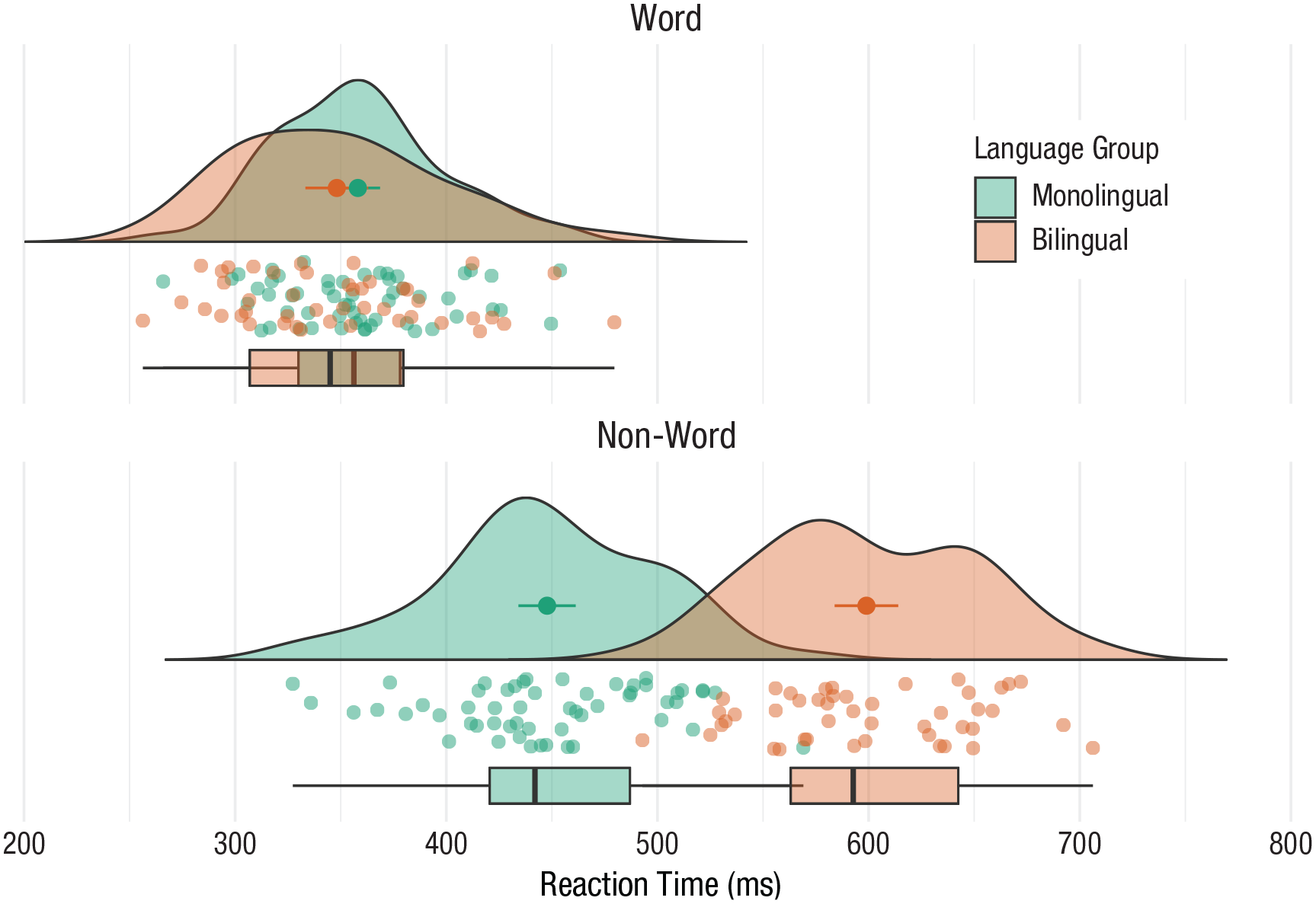
Rain-cloud plot.
Ridge plots
Ridge plots are a series of density plots that show the distribution of values for several groups. Figure 40 shows data from Nation (2017) and demonstrates how effective this type of visualization can be to convey a lot of information very intuitively while being visually attractive:
# read in data from Nation et al. 2017
data <- read_csv(“https://raw.githubusercontent.com/zonination/perceptions/master/probly.csv”, col_types = “d”)
# convert to long format and percents
long <- pivot_longer(data, cols = everything() ,
names_to = “label” ,
values_to = “prob”) %>%
mutate(label = factor(label, names(data), names(data)) ,
prob = prob/100)
# ridge plot
ggplot(long, aes(x = prob, y = label, fill = label)) +
ggridges::geom_density_ridges(scale = 2, show.legend = FALSE) +
scale_x_continuous(name = “Assigned Probability” ,
limits = c(0, 1), labels = scales::percent) +
# control space at top and bottom of plot
scale_y_discrete(name = “”, expand = c(0.02, 0, .08, 0)) +
scale_fill_viridis_d(option = “D”) # colourblind-safe colours
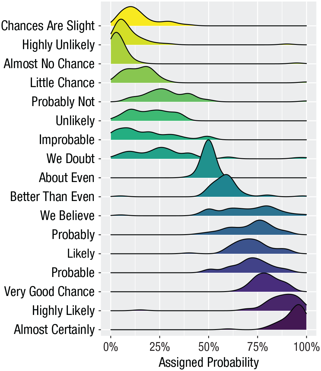
A ridge plot.
Alluvial plots
Alluvial plots visualize multilevel categorical data through flows that can easily be traced in the diagram (Fig. 41):
library(ggalluvial)
# simulate data for 4 years of grades from 500 students
# with a correlation of 0.75 from year to year
# and a slight increase each year
dat <- faux::sim_design(
within = list(year = c(“Y1”, “Y2”, “Y3”, “Y4”)) ,
n = 500 ,
mu = c(Y1 = 0, Y2 = .2, Y3 = .4, Y4 = .6), r = 0.75 ,
dv = “grade”, long = TRUE, plot = FALSE) %>%
# convert numeric grades to letters with a defined probability
mutate(grade = faux::norm2likert(grade, prob = c(“3rd“ = 5, “2.2“ = 10, “2.1“ = 40, “1st“ = 20)) ,
grade = factor(grade, c(“1st”, “2.1”, “2.2”, “3rd”))) %>%
# reformat data and count each combination
tidyr::pivot_wider(names_from = year, values_from = grade) %>%
dplyr::count(Y1, Y2, Y3, Y4)
# plot data with colours by Year1 grades
ggplot(dat, aes(y = n, axis1 = Y1, axis2 = Y2, axis3 = Y3, axis4 = Y4)) +
geom_alluvium(aes(fill = Y4), width = 1/6) +
geom_stratum(fill = “grey”, width = 1/3, color = “black”) +
geom_label(stat = “stratum”, aes(label = after_stat(stratum))) +
scale_fill_viridis_d(name = “Final Classification”) +
theme_minimal() +
theme(legend.position = “top”)

An alluvial plot showing the progression of student grades through the years.
Maps
Working with maps can be tricky. The
library(sf) # for mapping geoms
library(rnaturalearth) # for map data
# get and bind country data
uk_sf <- ne_states(country = “united kingdom”, returnclass = “sf”)
ireland_sf <- ne_states(country = “ireland”, returnclass = “sf”)
islands <- bind_rows(uk_sf, ireland_sf) %>%
filter(!is.na(geonunit))
# set colours
country_colours <- c(“Scotland“ = “#0962BA” ,
“Wales“ = “#00AC48” ,
“England“ = “#FF0000” ,
“Northern Ireland“ = “#FFCD2C” ,
“Ireland“ = “#F77613”)
ggplot() +
geom_sf(data = islands ,
mapping = aes(fill = geonunit) ,
colour = NA ,
alpha = 0.75) +
coord_sf(crs = sf::st_crs(4326) ,
xlim = c(-10.7, 2.1) ,
ylim = c(49.7, 61)) +
scale_fill_manual(name = “Country” ,
values = country_colours)
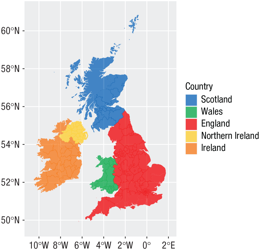
Map colored by country.
Conclusion
In this tutorial, we aimed to provide a practical introduction to common data-visualization techniques using R. Although a number of the plots produced in this tutorial can be created in point-and-click software, the underlying skill set developed by making these visualizations is as powerful as it is extendable.
We hope that this tutorial serves as a jumping-off point to encourage more researchers to adopt reproducible workflows and open-access software in addition to beautiful data visualizations.
Footnotes
Acknowledgements
This tutorial uses the following open-source research software: R Core Team (2021), Wickham et al. (2019), DeBruine (2021), Aust and Barth (2020), Wickham (2016b), Pedersen (2020), Brunson (2020), Wilke (2021), Pebesma (2018), and ![]() .
.
Transparency
Action Editor: Julia Strand
Editor: Daniel J. Simons
Author Contributions
E. Nordmann: conceptualization, visualization, writing—original draft; P. McAleer, W. Toivo, and H. Paterson: visualization, writing—original draft; L. M. DeBruine: software, visualization, writing—review and editing.