
Abstract
Psychologists of many subfields are becoming increasingly interested in the geographical distribution of psychological phenomena. An integral part of this new stream of geo-psychological studies is to visualize spatial distributions of psychological phenomena in maps. However, most psychologists are not trained in visualizing spatial data. As a result, almost all existing geo-psychological studies rely on the most basic mapping technique: color-coding disaggregated data (i.e., grouping individuals into predefined spatial units and then mapping out average scores across these spatial units). Although this basic mapping technique is not wrong, it often leaves unleveraged potential to effectively visualize spatial patterns. The aim of this tutorial is to introduce psychologists to an alternative, easy-to-use mapping technique: distance-based weighting (i.e., calculating area estimates that represent distance-weighted averages of all measurement locations). We outline the basic idea of distance-based weighting and explain how to implement this technique so that it is effective for geo-psychological research. Using large-scale mental-health data from the United States (N = 2,058,249), we empirically demonstrate how distance-based weighting may complement the commonly used basic mapping technique. We provide fully annotated R code and open access to all data used in our analyses.
Keywords
Psychologists have long been interested in the psychological and cultural characteristics of places (Oishi & Graham, 2010; Rentfrow & Jokela, 2016). However, it is only now—spurred by the rapidly expanding availability of large-scale data—that research examining geographical differences in psychological phenomena is really booming (Ebert et al., 2022; Hehman et al., 2020; Rentfrow, 2020). The topics and data studied under this new umbrella are diverse and span multiple psychological subdisciplines. To illustrate, researchers have used large-scale online personality surveys (Chopik & Motyl, 2017; Elleman et al., 2020; Rentfrow et al., 2008, 2013), large-scale experimental bias assessments (Hehman et al., 2019; Ofosu et al., 2019), or massive amounts of geotagged digital footprints (Eichstaedt et al., 2015; Jaidka et al., 2020; Obschonka et al., 2019) to examine spatial variation in psychological phenomena.
One, perhaps the most, compelling way to describe and communicate the spatial organization of psychological phenomena is to visualize it in maps. Indeed, maps are a central element of almost every article that investigates geo-psychological differences (Ebert, Götz et al., 2022). However, mapping techniques are typically not a standard feature of psychologists’ methodological training. As a result, most published geo-psychological studies rely on the most basic mapping technique: color-coding disaggregated data (i.e., grouping individuals into predefined spatial units and then mapping out average scores across these spatial units). To be clear, there is nothing wrong with this mapping technique. However, as we outline in this article, in many research contexts, this basic mapping technique may leave some unleveraged potential to effectively visualize spatial data. Therefore, here we introduce and implement an alternative technique to visualize spatial data: distance-based weighting (i.e., calculating area estimates that represent a distance-weighted average of all measurement locations). We believe that distance-based weighting requires only little incremental effort but may offer large incremental utility in many research contexts. Our aim is to enable readers to readily implement distance-based weighting in their workflow. We provide fully annotated code to reproduce all analytical steps in R.
Demonstration Data: Mental Health in the United States
We demonstrate all empirical steps using real-world data. To do so, we chose (a) a prominent psychological attribute (i.e., mental health) that most readers will likely be familiar with and (b) a data set that mirrors common geo-psychological research in size and spatial-coverage characteristics. The following files are necessary to replicate our analysis and can be downloaded from our OSF project page (https://osf.io/quhcb):
mental_health_counties.csv: contains information on the average mental health (based on a sample of 2,058,249 U.S. residents [observations]) of a county’s population 1 (menthlth: Now thinking about your mental health, which includes stress, depression, and problems with emotions, for how many days during the past 30 days was your mental health not good? [count variable range = 0–30]). These data pool the survey years 2005 to 2010 of the Behavioral Risk Factor Surveillance System (Centers for Disease Control and Prevention [CDC], 2020). 2
county_shape.shp and state_shape.shp with corresponding .prj, .dbf, and .shx files: These so-called shapefiles originate from the U.S. Census Bureau (2020). They contain digital vectors to store polygons representing the spatial location and boundaries of the 3,108 counties and the 48 states of the contiguous United States plus Washington, D.C.
The following code imports, prepares, and merges these data files:
# Import spatial data
county_layer <- read_sf("us_counties.shp")
state_layer <- read_sf("us_states.shp")


# Import county-level variable
my_data <- read_csv("mental_health_counties.csv")


# Select relevant columns
sp_var <- "menthlth"
nobs_var <- "observations"
geo_var <- "fips"
vars <- c(geo_var, sp_var, nobs_var)
my_data <- my_data %>%
 select(all_of(vars))


# Rename columns to make code generic
colnames(my_data) <- c("geo_id", "sp_var", "nobs")


# Join spatial data with county-level data
my_data$geo_id <- as.character(my_data$geo_id)
county <- left_join(county_layer, my_data, by = c("GEOID" = "geo_id"))
Conventional Mapping
First, we briefly present the basic mapping technique that underlies almost all existing geo-psychological studies, that is, color-coding disaggregated data. This means that for each geographical unit, the corresponding average score of the phenomena under study is mapped out. In our case, we would (a) calculate the average number of poor-mental-health days per month for each county and then (b) map out this average county by county. Note that we can map out average scores only for counties whose samples are sufficiently large to derive meaningful estimates. Previous research has used varying minimum inclusion thresholds, such as 50 observations (Götz et al., 2018; Matz & Gladstone, 2020), 100 observations (Ebert et al., 2019; Obschonka et al., 2018; Payne et al., 2019), 150 observations (Hehman et al., 2017), and 200 observations (Bleidorn et al., 2016) per geographical unit. We here sought to choose a cutoff that is sufficient to produce reliable aggregate-level health scores and allows us to retain a large number of counties. To balance these aims, for our data size and structure, a cutoff of 50 observations per county forms a reasonable compromise: Previous research has successfully employed this cutoff, which suggests that 50 observations per county are sufficiently high to inspire confidence in the resulting county-level mental-health scores. At the same time, employing a rather liberal cutoff of 50 observations per county allowed us to retain most counties (N = 2,204). Thus, we could at least partly avoid the problem that setting fixed cutoffs comes at the expense of selectively dropping observations with specific features from the analysis (i.e., usually less populous rural areas).
To map out differences in mental health, we broke up the county-level mental-health scores into equally sized categories and assigned darkening colors from yellow (low values) to red (high values). The following code maps out county-level mental-health scores for each county with at least 50 participants. Thereby, we use a color-coding scheme that groups counties in steps of 0.25 and assigns darkening colors from yellow to red. 3 Figure 1a depicts the resulting map.
# Reduce sample to counties with at least 50 participants
disaggr_layer <- county %>%
 filter(nobs >= 50)


# Define color coding scheme and assign colors
grouping <- seq(2.5, 4.5, by = .25)
colors <- brewer.ylorrd(10)
disaggr_layer$group <- findInterval (disaggr_layer$sp_var, grouping) + 1
disaggr_layer$colors <- colors [disaggr_layer$group]


# Map mental health across counties while depicting state boundaries
ggplot() +
 geom_sf(data = disaggr_layer,
  fill = disaggr_layer$colors,
  color = disaggr_layer$colors) +
 geom_sf(data = county_layer,
  fill = NA,
  color = "#bbbbbb",
  size = .3) +
geom_sf(data = state_layer,
  fill = NA) +
theme_bw()

(a) Conventional mapping of regional differences in mental health across 3,108 U.S. counties. White colored counties did not meet the minimum inclusion threshold. (b) Map of regional differences in mental health across the United States using spatial grids and distance weights.
Most generally, we observe strong regional differences in mental health across the United States. Those differences range from an average of only 0.58 poor-mental-health days per month in Hand County, South Dakota, to 8.09 poor-mental-health days per month in Dickenson County, Virginia. This statement exemplifies the major advantage of the conventional mapping technique: We can directly infer the level of mental health for specific geographical units. For example, we can determine that Fulton County in Atlanta (Georgia’s most populous county, which we frequently return to throughout this tutorial) falls into the category of 2.75 to 3.0 poor-mental-health days per month (exact score = 2.77). However, the current map is also limited in two crucial ways. First, in many (if not most) instances the aim of mapping is to reveal and communicate spatial patterns (in our case, the geographical distribution of mental health across the United States). Reporting scores separately on a county-by-county basis produces a scattered pattern that makes it difficult for readers to identify spatial regularities within the data. Second, the map does not cover the entire United States but contains blank spots for those counties that do not meet our minimum inclusion criteria. Thus, the current map does not provide any estimates on the mental-health levels of these areas.
Figure 1b is based on the same underlying data as the conventional map in Figure 1a. However, it is obvious that in this map, the data are visualized quite differently. In the following, we (a) explain distance-based weighting as the approach underlying this alternative visualization, (b) demonstrate how to design distance-based weighting so it is effective for geo-psychological research, and (c) discuss the advantages and disadvantages of this alternative visualization compared with the conventional mapping approach.
Mapping Based on Distance Weights
We now introduce distance-based weighting as an alternative technique to visualize spatial data. Distance-based weighting is a commonly used technique in geography and the wider social sciences (e.g., Buddemeier et al., 2011; Hough et al., 2004; Mann et al., 2002). Although an emerging set of recent studies highlighted the promise of distance-based weighting for mapping psychological data (Buecker et al., 2021; Calanchini et al., in press; Ebert et al., 2021, 2022), so far, this technique has been used in only a very few studies and by a narrow circle of researchers.
The basic idea of distance-based weighting is to calculate area estimates that represent distance-weighted averages of other measurement locations in the data. Thereby, following Tobler’s (1970) first law of geography (i.e., “Everything is related to everything else. But near things are more related than distant things,” p. 236), proximal locations receive greater weights than distal locations. Note that there is a great flexibility in how to exactly design this distance-based weighting. Below we outline in two steps how to design distance-based weighting so it is effective for geo-psychological research.
Step 1: transforming polygon data into point data on a spatial grid
The map presented in Figure 1 is based on the division of the contiguous United States in 3,108 counties. In our first analytical step, we now dissolve this division into counties and instead divide the surface of the United States into a regular spatial grid (i.e., into a raster of equally sized quadratic squares). Specifically, we use a fine-grained spatial grid dividing the United States into 57,570 squares with a size of 15 × 15 km (see thin dotted points in Fig. 2). 4 The following code creates this spatial raster:
# Define grid size (in meters) and create raster layer
raster_size <- 15000
raster_layer <- raster(ext = extent (county_layer), res = c(raster_size, raster_size))

(a) Transformation of the surface of Georgia into equally sized 15 × 15 km spatial grids with county scores superimposed as point data. Gray dots represent locations with insufficient sample sizes. (b) Spatial grid with measurement locations scaled according to their underlying sample sizes. In both panels, the black circle reflects a 75-km radius around the Fulton County, Georgia, measurement point location.
This spatial grid layer forms the basis for the second analytical step. Specifically, we superimpose the information depicted in Figure 1 (i.e., each county’s average number of poor-mental-health days) onto this spatial grid. 5 Note that when doing so, we no longer treat county scores as polygon data but as point data. That is, we treat each county as a measurement point located in the geographical center of the specific county. Figure 2a displays how we conceptualize the data structure in the next analytical step. For example, we can see that Fulton County, Georgia, now represents one measurement location on a spatial grid. The gray dots represent those county scores that were excluded because their sample size did not meet our inclusion criterion of at least 50 participants.
Step 2: using distance weights to smooth point data
In our second analytical step, we now use distance-based weighting to smooth the data across the entire study area. To do so, we calculate a score for each grid cell, which represents a weighted average of all measurement points. Thereby, each measurement location is weighted according to its distance to that specific grid cell. To that end, we first need to calculate the distance between all grids and measurement points. The following code calculates these distances and stores them in a matrix:
# Create layer for distance-based weighting by removing counties without any observations
db_layer <- county %>%
 filter(!is.na(sp_var)) %>%
 as_Spatial()


# Define function to calculate Euclidean distances
eucl_dist <- function(p, q) {
 a <- outer(p[, 1], q[, 1], "-")^2
 b <- outer(p[, 2], q[, 2], "-")^2
 sqrt(a + b)
}


# Apply function to data points (here the centroids of the grids and the counties)
gdistmat <- eucl_dist(coordinates (raster_layer), coordinates(db_layer))
gdistmat <- gdistmat / 1000 # Transform distances to kilometers
Now that we know the distances between each grid cell and measurement location, we need to define how these distances translate into weights. In the simplest (and commonly used) approach of distance-based weighting, each location receives a weight, w, which represents the inverse of its distance to the target grid cell (also called inverse distance weighting), 6 which is given by:

The solid gray line in Figure 3 depicts the distance-decay function resulting from this weighting scheme, which shows a decline in assigned weights that trend toward zero. We can easily and flexibly adjust this distance-decay function. For example, by exponentiating distance (i.e., distance2), the function would trend toward zero more quickly and therefore increase the relevance of nearby measurement points (see dashed gray line in Fig. 3).

Shapes of different distance-decay functions.
To map out geo-psychological differences, we recommend adjusting this basic weighting scheme in two ways. First, we recommend specifying a distance-decay function that is adequate for the data structure and psychologically meaningful. Regarding adequacy, the used distance-decay function should be appropriate for the underlying data structure. For example, consider a case in which measurement locations are spaced (on average) 50 km apart from each other. In such a case, it would be suboptimal to use a distance-decay function that assigns high weights only to locations in very close distance (e.g., only to those within a 5-km radius). If we did so, single measurement locations will become overly dominant, whereas most others would not be relevant at all. Consequently, there would not be much of a smoothing effect. Thus, when informing a distance-decay function, we should try to ensure that most grids actually have measurement locations in the relevant spatial range. Regarding meaningfulness, the used distance-decay function should ideally be informed by theoretical considerations. For example, we here aim to map out regional differences across the United States. One approach to identify a person’s psychologically relevant region is to define it as the interaction space that is available on a daily basis (Ebert et al., 2022; Götz et al., 2020; Stieger et al., 2022). Studies have shown that commuting or traveling for short-term activities is perceived as cumbersome if it exceeds a physical distance of 60 to 80 km (Ahmed & Stopher, 2014; Phibbs & Luft, 1995). A quick check shows that such a definition of distance should be adequate for our data structure. To illustrate, we can see in Figure 2 (75-km circle in Figs. 1a and 1b) that in most cases, several measurement points fall within the daily interaction space around a grid cell.
Note that there are many possibilities to define distance-decay functions (for an overview of commonly used approaches, see Brenner, 2017). In the following, we depict the daily available interaction space by using a log-logistic distance-decay function, which is given by

where r denotes the distance at which the decay function reaches a value of .5 and s determines the slope of the decay with distance. We use and introduce this distance-decay function here because it has the advantageous property that its general shape (flat – decreasing – flat) aligns neatly with the idea of representing the daily available interaction space. To illustrate, we defined the daily available interaction space to cover a distance of 60 to 80 km. If we chose r = 75 km and s = 7, this results in a distance-decay function in which (a) observations up to a distance of 50 km (i.e., within the core of interaction space) receive a weight of nearly 1, (b) observations between 50 and 100 km (i.e., at the edges of the interaction space) receive decreasing weights, and (c) observations beyond 100 km (i.e., clearly outside the interaction space) receive weights near 0. A further advantage of this log-logistic distance-decay function is that it can flexibly be adjusted to accommodate different research settings (see Fig. 3). For example, if we were interested in more fine-grained differences (e.g., within cities), we could set a lower r to shift the curve to the left and put more emphasis on nearby locations. Likewise, we can adjust the shape of the distance function. For example, if we set s = 4 (instead of 7), the curve’s trend toward 0 is less steep. 7
Second, besides specifying an adequate and meaningful distance-decay function, we also recommend considering the sample sizes of measurement locations (Brenner, 2017). Unlike, for instance, weather data (in which each location represents exactly the same number of measurements), in geo-psychological studies, locations typically represent different numbers of participants (and thus measurements). Consider Figure 2b, which shows that the measurement location of Fulton County represents many more participants than measurement locations from smaller rural communities in Georgia. To account for this, we may expand our weighting scheme by additionally weighting for sample size:

Including sample size in the equation comes with two advantages in our research context. First, we can now use all available data and must no longer exclude measurement locations with small sample sizes. Why is that? If we treat each measurement location equally (i.e., do not account for sample size), small samples with unreliable means could severely bias the estimation (which is why they are excluded). However, this is no longer the case if we additionally weigh for sample size. Specifically, measurement locations with very few people will be less influential because they receive small-sample-size weights (see Fig. 2: gray dots in Fig. 2a are transformed to small colored dots in Fig. 2b). Second, weighting according to sample size allows for an easy and straightforward interpretation of the resulting map: For each grid cell, we now indicate the average score among the people in our data that reside within the daily available interaction space of that grid cell. The following code defines the weighting function and uses the distance matrix (created in the previous step) to calculate a weighted score for each grid cell:
# Define function to calculate spatial weights based on log logistic distance decay function
spatial_weights <- function(d, r, s) {
 (1/(1+((d/r)^s)))
}
r <- 75
s <- 7


# Compute spatial weights based on the computed geographic distances between grid cells and observed counties
gweights <- spatial_weights(gdistmat, r = r, s = s)


# Define function that takes spatial weights (w), the desired variable (v), and the number of participants (n) as input parameters
db_fun <- function(w, v, n) {
 x <- rowSums(t(apply(w, 1, function(x) x * v * n)), na.rm = TRUE)
 x_weight <- rowSums(t(apply(w, 1, function(x) x * n)), na.rm = TRUE)
 x <- x / x_weight
 x
}


# Apply function to compute distance-based weighted scores for every grid cell
db_values <- db_fun(w = gweights, v = db_layer$sp_var, n = db_layer$nobs)


# Assign distance-based weighted scores to grid cells
db_raster_layer <- setValues(raster_layer, db_values)
Mapping differences in mental health using spatial grids and distance weighting
Because of the previous step, we now have a weighted average score for each grid cell and are ready for mapping. The following code prepares the spatial grid and maps out grid-cell scores using the same grouping and color scheme that we used for the conventional map (i.e., groups of 0.25 with darkening colors from yellow to red). Figure 1b depicts the resulting map and juxtaposes it against the conventional mapping approach (Fig. 1a):
# Crop raster layer to the shape of the contiguous US
db_raster_layer <- mask(db_raster_layer, county)


# Transform raster layer to data frame
db_raster_layer <- as.data.frame (db_raster_layer, xy = TRUE)
db_raster_layer <- na.omit (db_raster_layer)


# Group calculated values using the color coding scheme from above
db_raster_layer$group <- findInterval (db_raster_layer$layer, grouping) + 1
db_raster_layer$colors <- colors [db_raster_layer$group]


# Create map
ggplot() +
 geom_raster(data = db_raster_layer, aes(x = x, y = y), fill = db_raster_layer$colors, color = db_raster_layer$colors) +
 geom_sf(data = state_layer,
   fill = NA) +
 labs(x = "",
  y = "") +
 theme_bw()
When comparing distance-based weighting with the conventionally used mapping technique (Fig. 1a vs. Fig. 1b), we first realize that it is no longer possible to infer exact scores for specific geographical units (e.g., What is the average score of the participants residing in Fulton County?). Any prespecified borders of geographical units are dissolved. Furthermore, because of the distance-based weighting, the score for any specific location is now also informed by nearby locations. 8 This smoothing generally leads to less extreme spatial differences. Specifically, whereas scores in Figure 1a range from 0.58 to 8.09 (Δ = 7.51), in Figure 1b, they here range from 1.90 to 6.30 (Δ = 4.4).
Although it is no longer possible to infer exact scores for specific locations, the map in Figure 1b provides clear advantages in communicating general spatial patterns in the data. Specifically, at least three merits stand out. First, distance-based weighting leads to continuous, easy-to-grasp distributional patterns. Thus, distributional patterns that were previously disguised (or only tentatively visible) now become evident at a single glance. To illustrate, the map clearly indicates a belt of poor mental health spanning from Oklahoma through Missouri and Arkansas, into the Deep South, and back up to Kentucky and West Virginia. Second, according to the very fine-grained spatial grid, the depicted distributional patterns are no longer tied to prefixed county boundaries. Rather, the distributional patterns could largely emerge freely from the data using our weighting scheme. This weighting scheme was informed by theoretical considerations. Thus, the distributional patterns should reflect “true” psychological contexts. To illustrate, the map clearly depicts how the extensive belt of poor mental health in the South is broken up by the sphere of influence of agglomerations such as Atlanta. Third, because we calculated scores for each grid cell, we now have estimates for areas in which only sparse data are available (i.e., the areas that were blank in Fig. 1a). To illustrate, consider the extensive areas of Texas that were missing data in Figure 1a and now form a nuanced geographical distribution. 9
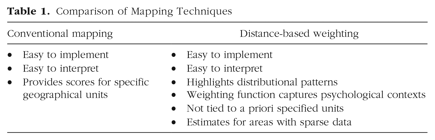
Taken together, we have shown that both mapping techniques (i.e., conventional mapping and distance-based weighting) come with their own unique strengths and limitations. Table 1 summarizes the major strengths of both approaches. In short, if researchers are most interested in communicating precise estimates for specific geographical units, color-coding disaggregated data will serve them well. Conversely, if the aim is to communicate broader patterns, distance-based weighting may be preferred. Likewise, researchers may also complement different techniques by presenting their results side by side. In sum, we neither discourage the use of conventional mapping nor advocate for a universal use of distance-based weighting. Which mapping technique is most appropriate will ultimately depend on the research question at hand.
Comparison of Mapping Techniques
Conclusion
Psychologists of all subfields are becoming increasingly interested in the geographical distribution of psychological phenomena. To visualize such geo-psychological differences, previous studies largely relied on conventional mapping (i.e., color-coding disaggregated data). In this tutorial, we reviewed the strengths and limitations of this basic mapping technique (i.e., exact scores for specific locations but spatial regularities and blank areas that are difficult to identify). We then introduced distance-based weighting as an alternative mapping technique that not many psychologists are aware of yet. In two steps, we demonstrated how to effectively employ this technique in geo-psychological research. First, we transformed polygon data into point data on a spatial grid. This transformation allowed us to produce more continuous maps with distributions that are not tied to prefixed higher spatial entities. Second, we used distance weights to estimate scores for each spatial grid cell. This allowed us to (a) smooth the data (i.e., making it easier to identify spatial regularities) and (b) estimate scores for unmeasured locations (i.e., filling in blank areas in the map).
From our perspective, distance-based weighting can be a useful tool for geo-psychological research for at least three reasons. First, distance-based weighting is very versatile and can be applied regardless of which construct is being studied (e.g., personality, bias, or well-being), how it was assessed (e.g., count variables, binary data, or Likert scales), and at what geographical level it is being examined (e.g., from neighborhood differences in cities to regional differences in countries). Second, as demonstrated by our code, distance-based weighting is relatively easy to implement. Third (and potentially most relevant), distance-based weighting is straightforward to interpret. For example, in our case, we indicate for each place the average score among the people in the data that reside within the daily available interaction space. We consider this straightforward interpretation particularly advantageous when the audience of an article is nonexperts in spatial modeling (which is almost always the case in geo-psychological research). That being said, there naturally exist further approaches to visualize and interpolate spatial data. Box 1 provides an annotated list of five tools that may be useful for researchers studying spatial differences in psychological phenomena. All these tools are implemented in major software packages (e.g., R) and can be applied without additional costs (see e.g., Bivand et al., 2013; Lopez-Martin et al., 2021).
List of Further Useful Tools for Geo-Psychological Research

Footnotes
Transparency
Action Editor: Brent Donnellan
Editor: Daniel J. Simons
Author Contributions
Conceptualization: F. M. Goetz, L. Mewes, T. Ebert; data curation: L. Mewes, T. Ebert; formal analysis: L. Mewes; investigation: L. Mewes, T. Ebert; methodology: L. Mewes, T. Brenner, T. Ebert; project administration: T. Ebert; validation: L. Mewes, T. Brenner, T. Ebert; visualization: L. Mewes, T. Ebert; writing, original draft: F. M. Goetz, T. Ebert; writing, review and editing: F. M. Goetz, L. Mewes, T. Brenner, T. Ebert. All of the authors approved the final manuscript for submission.