
Abstract
Interaction plots are used frequently in psychology research to make inferences about moderation hypotheses. A common method of analyzing and displaying interactions is to create simple-slopes or marginal-effects plots using standard software programs. However, these plots omit features that are essential to both graphic integrity and statistical inference. For example, they often do not display all quantities of interest, omit information about uncertainty, or do not show the observed data underlying an interaction, and failure to include these features undermines the strength of the inferences that may be drawn from such displays. Here, we review the strengths and limitations of present practices in analyzing and visualizing interaction effects in psychology. We provide simulated examples of the conditions under which visual displays may lead to inappropriate inferences and introduce open-source software that provides optimized utilities for analyzing and visualizing interactions.
Keywords
Moderation hypotheses are common in psychological research. For instance, researchers often test whether a given effect differs across groups, such as gender or racial groups, or examine how environmental or individual difference factors such as adversity or biological traits modify risk indicators of psychopathology (e.g., Luthar, Cicchetti, & Becker, 2000). In ordinary least squares (OLS) regression, moderation is tested by including a linear interaction term (e.g., XZ) with its constituent first-order terms (X and Z). The magnitude of the interaction coefficient provides the estimated change in the effect of the focal predictor X on the outcome Y for a 1-unit change in the moderator Z (or, equivalently, the estimated change in Z for a 1-unit change in X). The significance value and confidence interval for the interaction coefficient are then typically used to determine the degree of support for the moderation hypothesis.
To date, considerable work has offered guidelines on statistical improvements for testing and interpreting interactions (e.g., Brambor, Clark, & Golder, 2006). For instance, it is now common practice for researchers to mean-center continuous X and Z variables when testing interactions, in order to facilitate the interpretation of intercepts and conditional effects (Dalal & Zickar, 2012). Researchers also regularly conduct simple-slopes analyses to test the conditional effect of X at multiple levels of Z (Aiken & West, 1991), or use the Johnson-Neyman (J-N) technique (Johnson & Neyman, 1936) to assess the conditional effect of X on Y across a range of values of Z. These approaches have been extended to multiple analytic frameworks, such as hierarchical linear modeling and structural equation modeling (Preacher, Curran, & Bauer, 2006). Researchers have also identified a number of factors that substantially reduce power to detect interaction effects (for reviews, see Aguinis, 1995, and Frazier, Tix, & Barron, 2004). These include poor reliability of and range restriction in the predictor variables (Aguinis, 1995), substantial between-groups disparities in sample size and variance when the potential moderation is a categorical variable (Aguinis, 1995; Stone-Romero, Alliger, & Aguinis, 1994), reduced variability in a continuous moderator as a result of artificially dichotomizing the moderator (e.g., by a median split) prior to analysis (which can also increase risk for detecting spurious effects; Bissonnette, Ickes, Bernstein, & Knowles, 1990; MacCallum, Browne, & Sugawara, 1996), and testing the statistical significance of a categorical-variable interaction by analyzing the focal predictor’s effect on the dependent variable separately for each category (i.e., subgroup analysis; Stone-Romero & Anderson, 1994).
However, considerably less attention has been devoted to providing recommendations for the substantive evaluation of interactions, which may have implications for conclusions regarding competing theoretical claims (see, e.g., Berry, Golder, & Milton, 2012; Roisman et al., 2012). For instance, in developmental psychopathology, some researchers have proposed a diathesis-stress model (Monroe & Simons, 1991). This model posits that individuals with a vulnerability (e.g., difficult temperament) fare worse than those without the vulnerability when exposed to environmental stressors (such as poor parenting), but may look no different from their nonvulnerable peers in low-stress conditions. An alternative theory proposes that these same vulnerabilities can also help children thrive in protective environments (Ellis & Boyce, 2008). These theories imply two different forms of an interaction, and determining whether the data support one theory or the other depends on how researchers evaluate the nature of the interaction. Roisman et al. (2012) highlighted analytic and visual approaches that can help determine which hypothesis is better supported by the data, such as visual inspection of interaction plots, regions-of-significance analyses, and tests of nonlinear (e.g., quadratic) effects, among others. In this article, we aim to provide similar recommendations for social science more generally, to improve scientific inference for evaluating moderated effects.
The goal of this article is to demonstrate how theoretical inference in tests of moderation can be improved by improving visual displays. A major aim in the social sciences is to increase transparency of the scientific process to ensure rigor and replicability (Cumming, 2014). Visual displays can substantially aid in attaining this goal. Displays provide efficient and nuanced information about univariate and multivariate relations in data that may not be readily apparent from tables or text descriptions of results. They also help identify misspecified models and influential data points (e.g., outliers) and facilitate how key analytic findings are communicated between researchers and their audiences (Tay, Parrigon, Huang, & LeBreton, 2016). Optimizing the visual display of interactions can thus improve the scientific rigor of moderation tests.
The Utility of Interaction Displays
Why are visual displays important for evaluating moderated effects? First, interpreting interaction coefficients is not necessarily easy or straightforward (see also Dawson, 2014; Preacher et al., 2006). Consider the following multiple regression equation with a single two-way interaction term: 1

Output from a regression analysis (assuming continuous and standardized predictors) might provide us with the following (Example 1), which shows coefficient estimates in place of the b values:

For applied researchers, the interpretation of 15 or 11 may not be intuitive, largely because each of these effects depends (or is conditional) on the value of the other interacting variable given the inclusion of the interaction term, XZ. For instance, one can interpret the coefficient b1 (in this case, 15) as the effect of a 1-unit change in X on the value of Y when all other predictors are equal to zero. In other words, because an interaction term is specified in this model, b1 is also the effect of X only when Z = 0. Rearranging the formula can show this more explicitly:

When Z is 0, 10Z is also 0, and the slope of
Instead, we suggest that researchers use visual displays to aid themselves and readers in making inferences about moderation hypotheses. Figure 1 illustrates three different forms of interaction, each of which may support different theories about how the interplay between two factors influences an outcome (see also Luthar et al., 2000; Roisman et al., 2012). Figure 1a illustrates a synergistic interaction, in which higher levels of Z enhance the effect of X on Y (as in Example 1). In contrast, Figure 1b illustrates a buffering effect, in which higher levels of Z instead reduce the effect of X on Y. Figure 1c illustrates an antagonistic interaction: The two predictors affect Y in the same direction, though X is associated with Y only at lower levels of Z or in the absence of Z. Such displays are common in psychological research and are typically the basis for making inferences about whether the data support a specific moderation hypothesis.
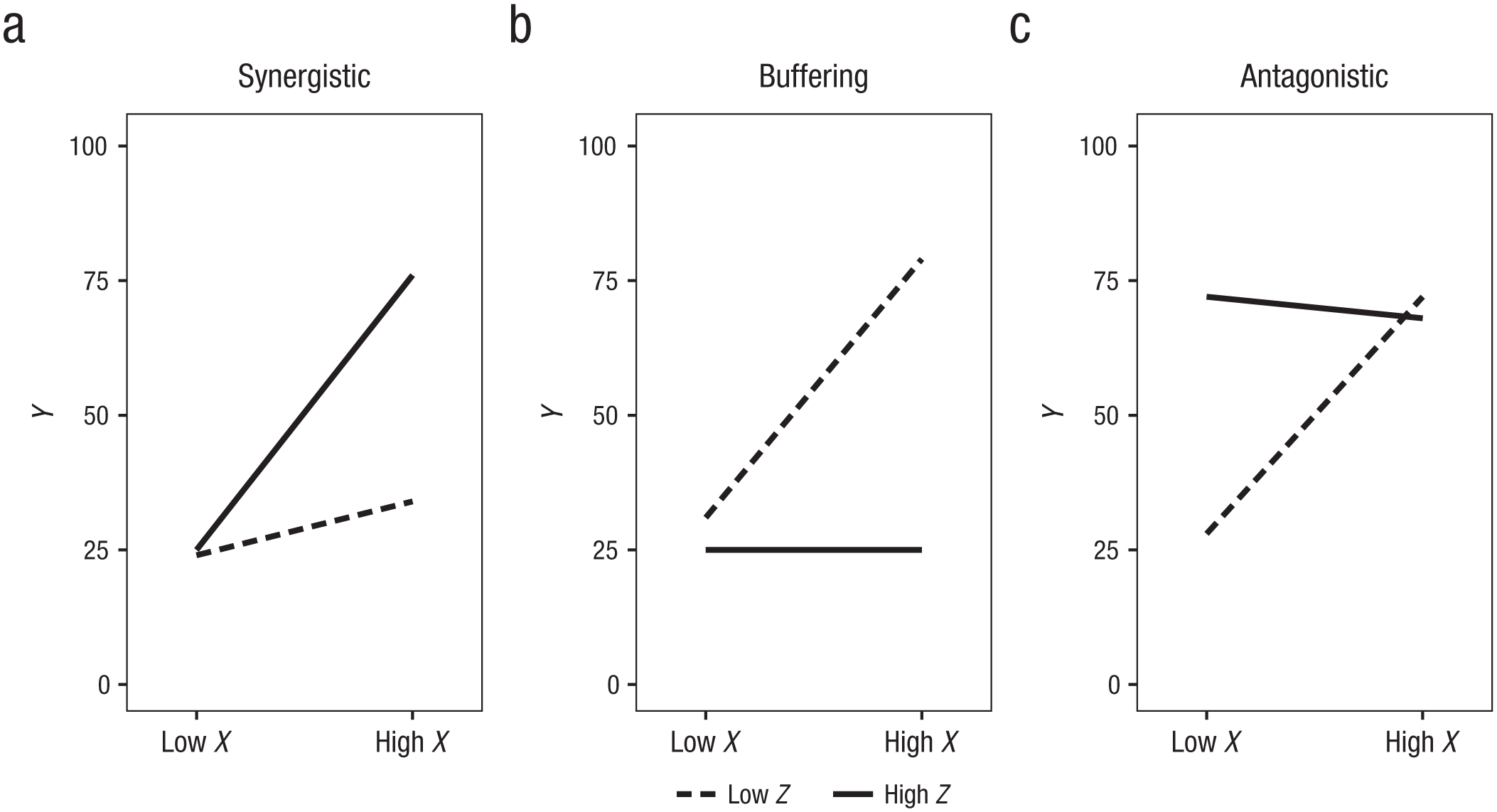
Standard visual displays illustrating (a) synergistic, (b) buffering, and (c) antagonistic interactions.
However, these displays lack a number of core features that are key to both effective communication and statistical integrity (G. King, Tomz, & Wittenberg, 2000; Tufte, 2001). First, these plots limit the number of displayed quantities of substantive interest, in that they communicate only the values of
Here, we first review present practices for the visual display of interactions in psychology and describe the strengths and limitations of these approaches. We then describe an open-source software utility that allows users to apply several graphic solutions that address these limitations.
Disclosures
All simulation code, simulated data, and code for creating the key figures in this article, as well as source code and instructions for using the Web utility described, are available online in a GitHub repository (https://github.com/connorjmccabe/InterActive). Code for generating the simulated examples used in this article and the simulated data can be found at https://github.com/connorjmccabe/InterActive/tree/master/Simulated%20Data. Code for reproducing the key figures can be found at https://github.com/connorjmccabe/InterActive/tree/master/Manuscript%20Figures%20Code. Source code for the Web utility, called interActive, introduced in this manuscript can be found at https://github.com/connorjmccabe/InterActive/blob/master/interActive_OLS.R.
Present Practices
The simple-slopes approach
The most common method for probing interaction effects is simple-slopes analysis, typically conducted using the pick-a-point approach (Aiken & West, 1991). In the pick-a-point approach, researchers select values of interest of the moderator variable (Z) and examine the effect of the focal predictor (X) on the outcome (Y) at each of these values (Cohen et al., 2003). When Z is continuous, the interaction is probed by recentering Z around values of interest. That is, Z is shifted by subtracting a value—typically +1 SD or −1 SD—from each observation, such that the distribution of Z is centered about this value. The model is reestimated with these recentered variables to obtain coefficient estimates, CIs, and p values for the effect of X on Y at these selected values of Z. Table 1 illustrates this process in a simulated example of a synergistic interaction involving continuous variables (the parameterization is based on the model in Example 1). The table suggests that when Z is low (i.e., centered at 1 SD below its mean), a 1-unit increase in X is not significantly associated with change in Y (b = 4.01, 95% CI = [−7.60, 15.61]), β = 0.06). However, when Z is at the mean, a 1-unit increase in X is associated with a 22.17-unit (95% CI = [12.79, 31.54]) increase in Y (β = 0.34), and when Z is high (i.e., centered at 1 SD above its mean), a 1-unit increase in X is associated with a 40.32-unit (95% CI = [27.70, 52.95]) increase in Y (β = 0.62). In the case of binary categorical moderators, analyses can be carried out using identical steps, but instead the moderator is recentered around each dummy-coded category. Testing interactions is more analytically cumbersome with multiple categories because it involves testing a set of interaction terms using multiple dummy-coded variables (e.g., Dawson, 2014). However, a simple-slopes estimate for each dummy-coded category can be derived by reestimating the effect of X on Y separately for each category (Cohen et al., 2003).
Simulated Results of a Synergistic Interaction Probed Using the Pick-a-Point Approach (N = 150)
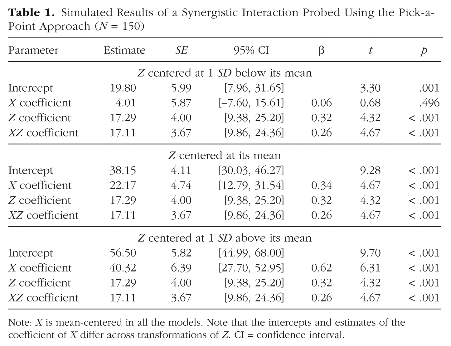
Note: X is mean-centered in all the models. Note that the intercepts and estimates of the coefficient of X differ across transformations of Z. CI = confidence interval.
Figure 2 provides a simple-slopes plot for Example 1, based on the simulated results in Table 1. Plots like this one can be created with software programs such as Excel (e.g., Dawson, 2014), either by using coefficients derived using the pick-a-point approach or by computing simple slopes based on coefficient estimates from the original model. By default, plots are typically constructed displaying the effect at 1 SD above and below the mean of both X and Z.
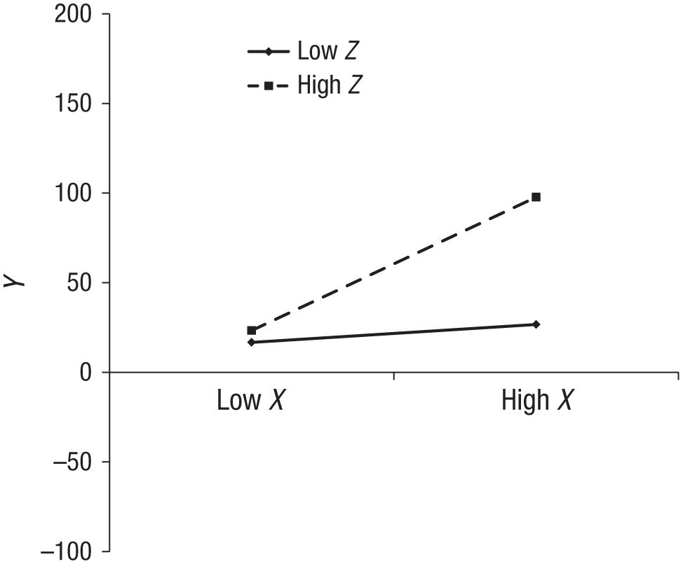
A simple-slopes plot of the simulated XZ interaction corresponding with the results provided in Table 1. Note that low refers to 1 SD below the mean and high refers to 1 SD above the mean for both X and Z.
Simple-slopes plots are limited in several ways. First, they often do not represent the full nature of an interaction effect because they typically display the data only at 1 SD above and below the means of the predictors. For instance, each of the interactions in Figure 1 may also take the form of a disordinal (or crossover) interaction if the depicted lines are within an appropriate range of X. Disordinal interactions suggest that the rank order of Y given Z changes with X (or the rank order of Y given X changes with Z). The value of X at which this change happens (i.e., the crossover point) can be computed as follows (Cohen et al., 2003):

A crossover point may provide evidence that an interaction is disordinal. However, all interactions are disordinal interactions across an infinite range of X, and interactions should not be interpreted as disordinal if the crossover point is outside the observed range of X (Cohen et al., 2003). Thus, on one hand, extending the horizontal axis beyond the observed range of the focal variable may suggest a disordinal interaction that is unsupported by the data (a Type I error), but on the other hand, restricting the range of X (to within 1 SD above and below its mean, e.g.) may obscure evidence of this effect if it truly exists (a Type II error; e.g., Roisman et al., 2012). Providing a depiction of an interaction within a meaningful range of X can substantially aid in evaluating this effect.
Range restriction in moderator variables is also a concern. Displaying an interaction at several levels of a continuous moderator does not necessarily describe the full nature of an interaction across all relevant levels of that moderator. This limitation may be especially important when the significance or direction of the simple-slopes effect changes at more extreme levels of the moderator. For example, if a moderator is skewed or if a sample is particularly large, there may be a substantial number of participants represented at values higher than 1 SD above the mean or lower than 1 SD below the mean, and simple-slopes plots may not accurately represent the nature of the predictors’ effects at those values. Using the J-N technique addresses this concern analytically (Johnson & Fay, 1950; Potthoff, 1964). This approach provides an estimate of the range of the moderator variable at which the focal predictor is significantly associated with the outcome. In effect, this technique is an extension of the pick-a-point approach: Interactions are probed not only at a limited number of levels of a moderator, but rather across the full range of values of the moderator observed in the data. The statistical significance and direction of these simple slopes are then used to better characterize the interaction. Tools for conducting and plotting the results of J-N analyses have been developed for standard statistical software programs (Hayes & Matthes, 2009; Preacher et al., 2006). Simple-slopes plots do not accommodate the analytic strengths of the J-N technique.
Plots of simple slopes typically show only the simple-slopes estimates, with little direct indication of the uncertainty in the estimates or whether the slopes differed significantly from zero. Showing the uncertainty in simple slopes would provide a depiction of how precisely each effect was estimated, which is influenced by factors such as sample size. For instance, Figure 3a displays simple slopes and confidence regions associated with the predicted values of Y for the simulated example in Figure 2 and Table 1 (N = 150), whereas Figure 3b displays simple slopes and confidence regions from an identical parameterization in a larger sample size (N = 500). Although the estimates for the two sample sizes are nearly identical, the confidence regions are notably wider in the smaller sample, which suggests less certainty in the predicted outcome values compared with the larger sample. Moreover, whereas the simple slope at low levels of the moderator (1 SD below the mean) was not significant in the smaller sample (b = 4.01, 95% CI = [−7.60, 15.61], β = 0.06), this effect was statistically different from zero in the larger sample (b = 6.64, 95% CI = [0.64, 12.64], β = 0.12). This is because, holding all else constant, the standard error of the simple slope will be smaller at larger sample sizes, which results in more precise estimation of the regression line and increased power to detect the slope effect.
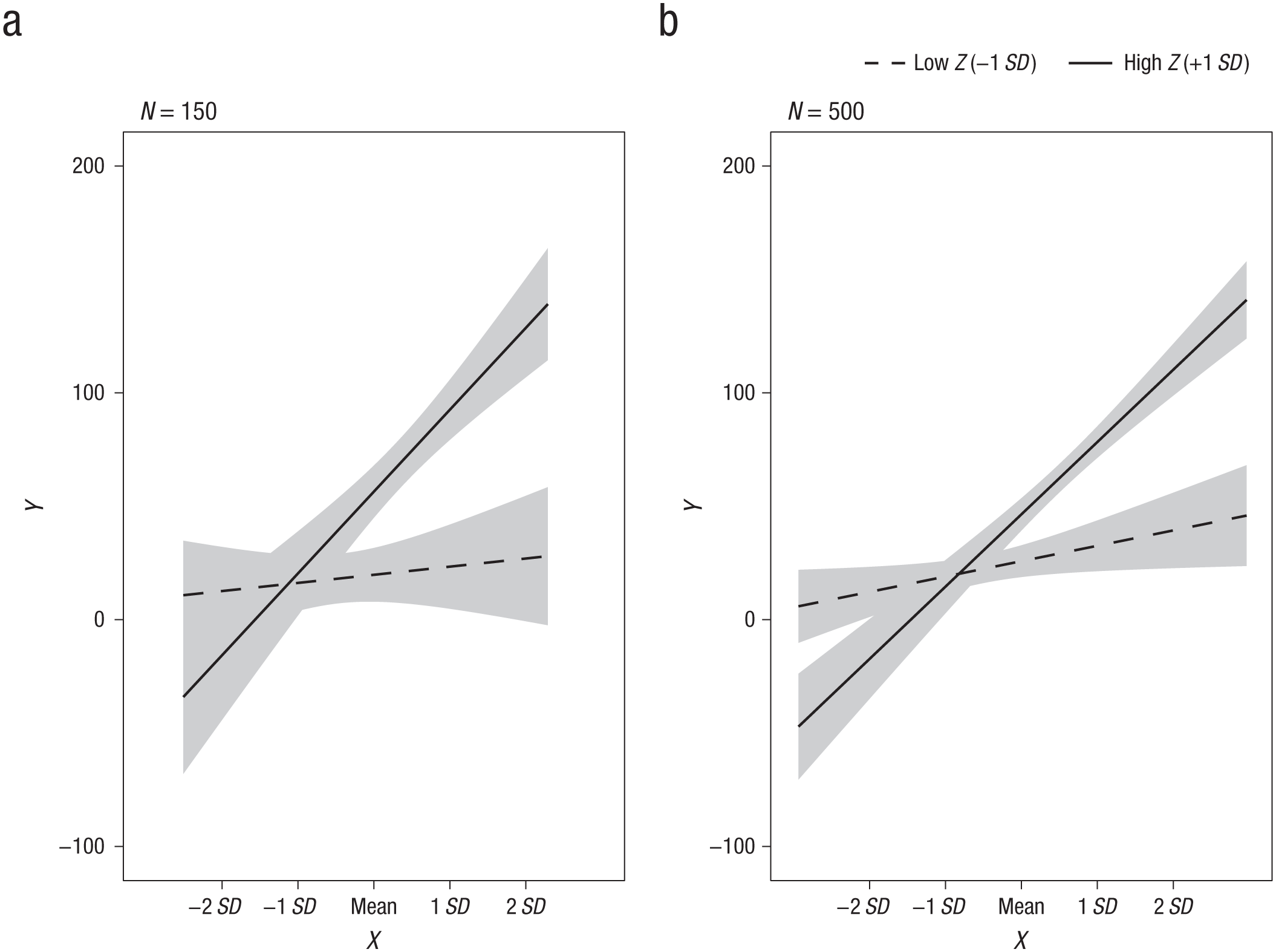
Illustration of the effect of sample size on uncertainty in simple-slopes estimates: simple slopes with 95% confidence regions for (a) the simulated example in Table 1 (N = 150) and (b) the same parameterization with a larger sample size (N = 500). For Z, low refers to 1 SD below the mean, and high refers to 1 SD above the mean.
Finally, most simple-slopes plots do not display the observed data. This omission prevents the use of these plots to diagnose whether the interaction effect is appropriately specified (e.g., Tay et al., 2016) or whether the simple slopes selected represent actual data. For instance, Figure 4 displays three scenarios for Example 1 in which the observed data for the predictor variables were simulated from different population distributions (N = 500). Although the simple slopes are nearly identical in the three scenarios, the observed data provide markedly different information as to how well the estimated simple slopes fit the data. For example, in Figure 4a, both X and Z are multivariate normally distributed predictors, and the simple-slopes estimates capture the data fairly well and provide evidence for a disordinal interaction. However, in Figure 4b, X and Z were simulated from exponential distributions (skew of X = 2.61, skew of Z = 2.35). The positive skew in both variables means that almost no data existed at 1 or 2 SD below the mean of X, and the simple-slopes effect when Z is 1 SD below the mean in fact represents no individuals in the observed data. Finally, Figure 4c shows how simple slopes can suggest an interaction effect that does not exist in the data. The data for this plot were instead generated from a model in which X had a quadratic effect but the interaction coefficient was zero, which is suggested by the parabolic pattern shown in this display. Because X and Z were strongly correlated in this example (r = .52), XZ and X2 were confounded, and a significant interaction was erroneously detected (Cohen et al., 2003; MacCallum & Mar, 1995). It has been strongly recommended that researchers carefully consider their data and plot interactions at meaningful levels of the moderator to ensure that the simple-slopes effects they report appropriately reflect real data (Aiken & West, 1991; Dawson, 2014); plotting observed data may help researchers meet this recom-mendation.
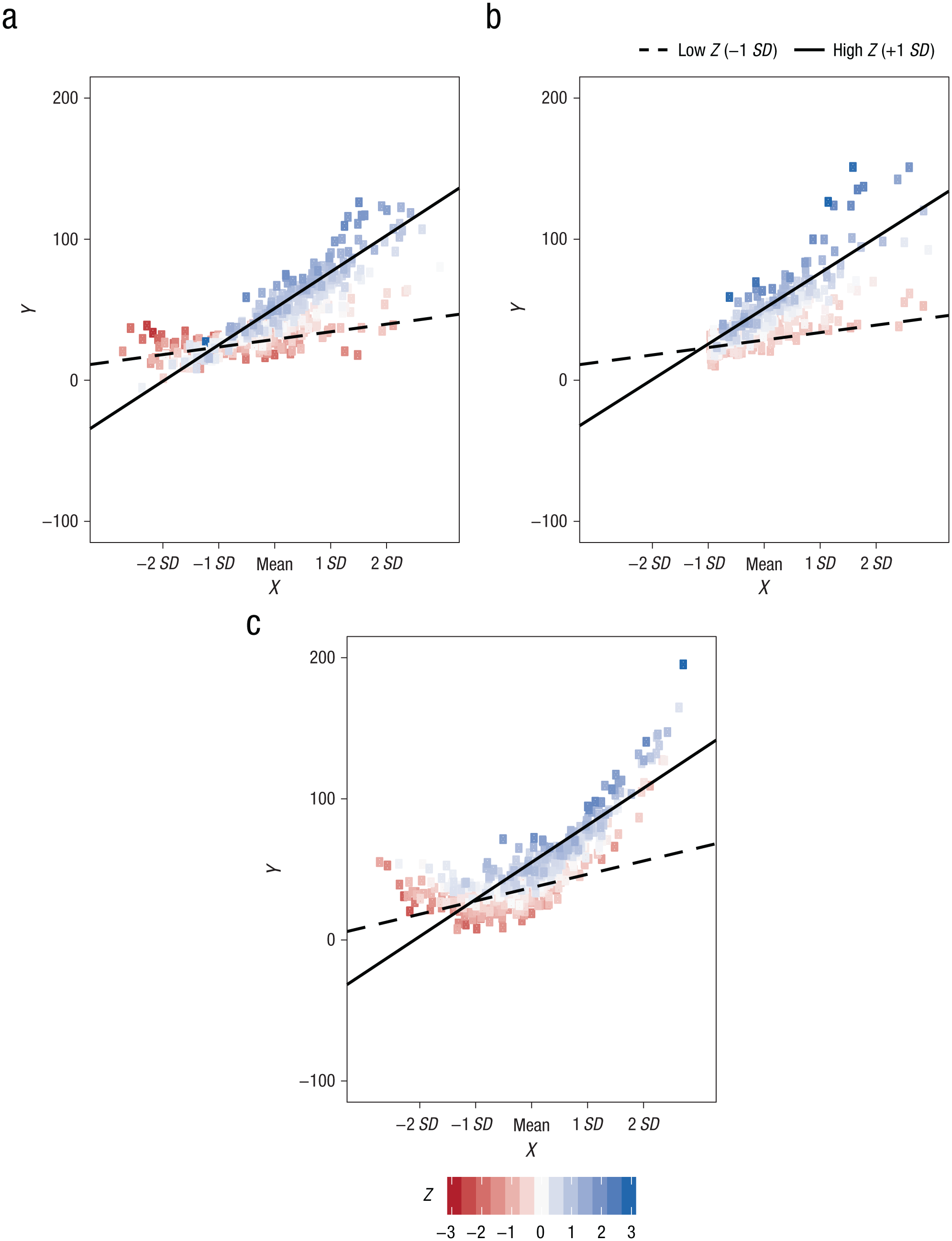
Illustration of the impact of nonnormality on the interpretation of simple slopes. The three scatterplots show regression lines and observed data for the XZ interaction in Example 1, simulated from different predictor distributions. Although the simple slopes are nearly identical in the three graphs, the interaction patterns evident in the observed data differ according to whether the predictors (a) are normally distributed, (b) have skewed distributions, or (c) are strongly correlated (i.e., the interaction is confounded with a quadratic effect of the focal predictor). For Z, low refers to 1 SD below the mean, and high refers to 1 SD above the mean.
The marginal-effects approach
Marginal-effects (or regions-of-significance) plots (e.g., Berry et al., 2012; Preacher et al., 2006) are commonly used in combination with the J-N analytic approach to interactions. These plots depict the simple-slope coefficient of the focal variable and its 95% confidence region against values of the moderator. They indicate the significance, uncertainty, magnitude, and direction of the simple slope across a full hypothetical range of the moderator variable, often a range from 3 SD below to 3 SD above the mean (e.g., Fig. 2 in Preacher et al., 2006). Whereas simple-slopes plots display conditional effects at only select levels, marginal-effects plots ensure that an interaction is fully explored by showing how the simple-slope coefficient of a focal predictor changes across the entire range of the moderator. For instance, Figure 5 is a marginal-effects plot of the interaction in Example 1. When the moderator is 2.30 SD below the mean or lower, or 0.60 SD below the mean or higher, the 95% CI does not contain 0. The plot thus indicates that X is negatively associated with Y when Z is very low (at least 2.30 SD below the mean) and positively associated with Y when Z is −0.60 SD below the mean or greater. Note that, by comparison, Figure 2 fails to provide evidence of the reverse effect in the same data when Z is “low” (1 SD below the mean) because the simple negative slope is significant only when Z is 2.30 SD below the mean or lower.
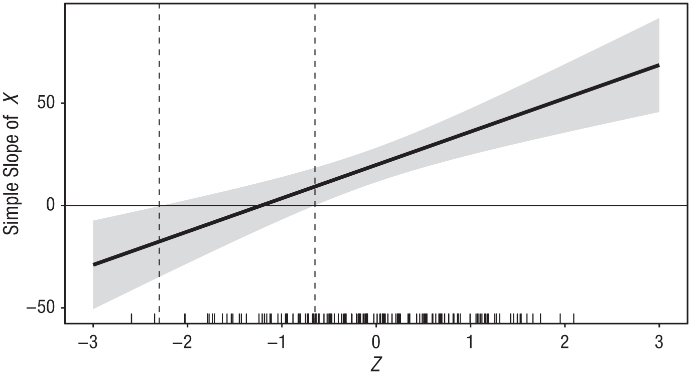
A marginal-effects (or regions-of-significance) plot of Example 1. The plot shows the marginal effect of X on Y (i.e., the simple slope of X) across a range of the moderator variable Z; the shaded area indicates the 95% confidence region for the marginal effect. The marginal rug of Z on the horizontal axis indicates the frequency of observed values of Z across its displayed range.
Although marginal-effects plots aid in detecting and communicating interaction effects that may otherwise be missed, they fail to indicate whether or how much data are represented within the graphed regions and therefore may suggest effects that are not (or are very minimally) supported by the data. For instance, in the data from Example 1, very few data points are observed when Z is lower than 2.30 SD below the mean (see Fig. 5). Only two observations (1.3% of the sample) fall within the region of significance where the slope is negative, and there is no indication of the extent to which these observations are consistent with the estimated model. Indeed, in an often-cited article describing the use of the J-N technique in psychology, the authors provided a figure in which one of the tails of the displayed moderator Z had few to no observations, but this was noted only in the text (Preacher et al., 2006). Restricting the range of the horizontal axis to the observed range of Z and including a marginal rug of the observed data, as in Figure 5, helps address this concern (e.g., Berry et al., 2012). The inclusion of the observed data might lead us to infer that they do not support the conclusion that X has a significant effect on Y when Z is 2.30 SD below the mean or lower.
Moreover, despite their utility, marginal-effects plots have been provided less often than simple-slopes plots in publications reporting tests of moderation. For instance, we randomly sampled 50 of the 253 articles that were published in 2016 and cited the article in which Preacher et al. (2006) described the use of the J-N technique and marginal-effects plots. In brief, of these 50 articles, 38 (76%) provided a simple-slopes plot at two or more levels of the moderator to supplement their analyses. Only 10 (20%) made any mention of conducting a regions-of-significance analysis, and only 4 (8%) provided a marginal-effects plot depicting regions-of-significance results. In other words, among a sample of 50 publications citing a seminal manuscript describing the use of marginal-effects plots, only 8% actually used that kind of display in their article, and 76% used a less descriptive display. These results illustrate a substantial gap between the development of an advanced approach to analysis and its implementation.
We suspect that the unintuitive nature of marginal-effects plots has limited their widespread adoption. Marginal-effects plots are ultimately used to understand the range of a moderator for which a focal predictor is statistically significantly associated with an outcome (as well as the degree of uncertainty in the association); thus, this information is somewhat redundant with information provided by a text description of results obtained using the J-N technique. Moreover, readers are mostly interested in using displays to infer the predicted value of the dependent variable at meaningful values of X and Z. Common visuals for presenting effects (e.g., bar graphs, histograms, bivariate scatterplots, and simple-slope plots) meet this need by assigning the values of greatest interest (i.e., values of the dependent variable) to the vertical axis and the primary predictor variable to the horizontal axis. However, marginal-effects plots allocate a relatively unintuitive value (the simple slope) to the vertical axis and the predictor of lesser importance (the moderator) to the horizontal axis, and omit information about the model-predicted value of the dependent variable entirely. We encourage researchers to use marginal-effects plots to support regions-of-significance analyses and, when doing so, to include overlaid data on these plots. However, given the limitations of such plots, providing additional displays may further aid in communicating an interaction effect.
Summary of present practices
Visual displays of interactions can substantially improve inferences, communication, and transparency, and also can help in diagnosing problems in data analysis. Although simple-slopes and marginal-effects plots strengthen the interpretation of moderation analyses in some ways, they have several limitations. In the next section, we describe an approach to create displays of interactions that utilize the strengths of present practices and address the concerns we have highlighted in our critiques.
Improving the Visual Display of Interactions: interActive
We created an open-source analysis and data-visualization application that builds on simple-slopes and marginal-effects plots to display all quantities of interest, uncertainty in the displayed estimates, and the data underlying an interaction (https://connorjmccabe.shinyapps.io/interactive/). We created this application, called interActive, using the freely available statistical program R (R Development Core Team, 2016) in the Shiny Web application framework (Chang, Cheng, Allaire, Xie, & McPherson, 2017). The graphics were created using the ggplot2 graphics package (Wickham, 2009). The interActive application provides data-upload functionality and allows users to specify and analyze OLS regression models with two-way interaction effects. The present functionality allows for either continuous linear or quadratic focal predictors and either continuous or binary categorical moderator predictors. The application accommodates the specification of covariates (i.e., control variables) and was designed to be usable by researchers at all levels of quantitative expertise. It can be used to conduct regions-of-significance analyses for interactions of continuous variables and creates marginal-effects plots of the results, with marginal rugs indicating observed data (e.g., Fig. 5).
The interActive application is based on the concept of small multiples (Tufte, 2001). An individual plot is created for each of several simple slopes (e.g., Fig. 6). This facilitates the display of a broad range of simple-slope effects, observed data, and measures of uncertainty. Because the design of all plots is identical except for the level of the moderator, a viewer’s attention is directed toward the change in pattern across multiples, which enables the viewer to understand the nature of the interaction depicted. Using small multiples allows indicators of observed data and measurement uncertainty to be included in each plot. Additionally, users can specify the level of the moderator for each multiple. This provides users with flexibility in deciding the number of levels of the moderator and the specific values of the moderator at which they will probe the interaction, so as to best characterize the observed data.
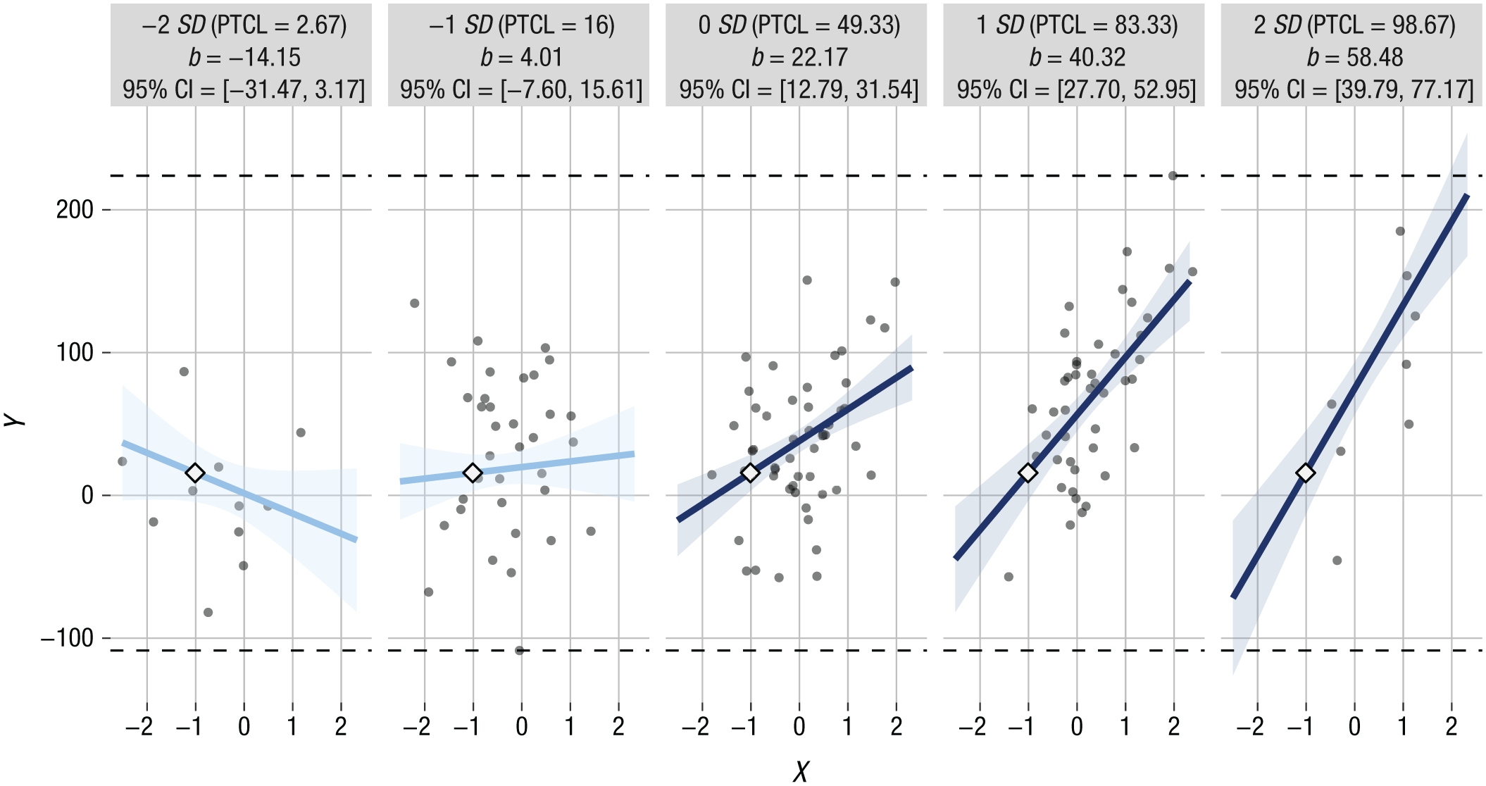
Illustration of small multiples created by interActive for Example 1 using multivariate normal predictors. Simple slopes are provided for levels of the moderator 2 SD and 1 SD below the mean, at the mean, and 1 SD and 2 SD above the mean. Each graphic shows the computed 95% confidence region (shaded area), the observed data (gray circles), the maximum and minimum values of the outcome (dashed horizontal lines), and the crossover point (diamond). The x-axes represent the full range of the focal predictor. CI = confidence interval; PTCL = percentile.
The functionality of interActive is leveraged to display the observed data that are most representative of each simple slope. For each small multiple representing a given moderator value, the displayed data points reflect the bivariate relation between the focal predictor and the dependent variable. This relation is shown within a range of the moderator that begins at half the distance from the value of the moderator at the next lower multiple and ends at half the distance from the value of the moderator at the next higher multiple. For instance, in a series of multiples depicting simple slopes at −1, −0.5, 0, +1, and +2 standardized units from the mean of the moderator, the −1-SD multiple would depict only observations with values of the moderator at −0.75 SD or lower; the −0.5-SD multiple would correspond with observations between −0.25 and −0.75 SD; and so forth. Limiting each multiple to a particular data space makes it possible to evaluate each simple slope on whether it represents real data.
We implemented additional design choices to allow for more nuanced evaluation of the depicted effect. For instance, interActive specifies the limits of the x-axis of each multiple as the minimum and maximum values of the focal variable, in order to display each simple slope across the full range of the focal predictor. Also, interActive computes the crossover point (using Equation 1) and displays it on each small multiple so that viewers can use it in conjunction with the observed data to determine the degree of evidence for a crossover effect. In addition, each multiple displays the coefficient and 95% CI of the simple slope to provide readers with a text description of the displayed slope. Each multiple also displays the percentile corresponding with the specified level of the moderator to aid readers in evaluating whether the depicted simple-slope effect is sensible given the data. Finally, we added horizontal dashed lines at the minimum and maximum observed values of the outcome variable to aid extrapolation of each prediction line.
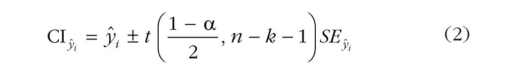
For each simple slope, interActive computes the 95% CI for the predicted value of Y conditional on each observed value of X. If covariates are included, they are held constant at their respective means when these estimates are derived. These CI estimates are used to plot a confidence region, the area in which the true regression line is expected to fall 95% of the time. The CI for
and

where
Appendix A provides an example of the computation of the confidence interval for a predicted value in a bivariate case. Equivalently, and perhaps more intuitively for many researchers, this interval can also be understood as the 95% CI of the intercept in a regression model, and one could center the focal predictor around different values to derive points that follow the edges of the confidence region. Table 2 and Figure 7 illustrate this point in a bivariate case using Example 1. Note that in the standard regression output provided in Table 2, the intercept value when X is centered at zero (i.e., the value of
Simulated Results of a Bivariate Regression With the Predictor Centered at Different Values (N = 150)
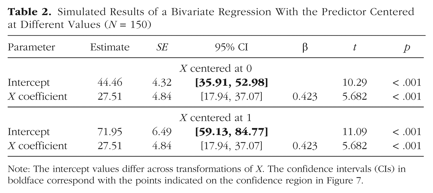
Note: The intercept values differ across transformations of X. The confidence intervals (CIs) in boldface correspond with the points indicated on the confidence region in Figure 7.
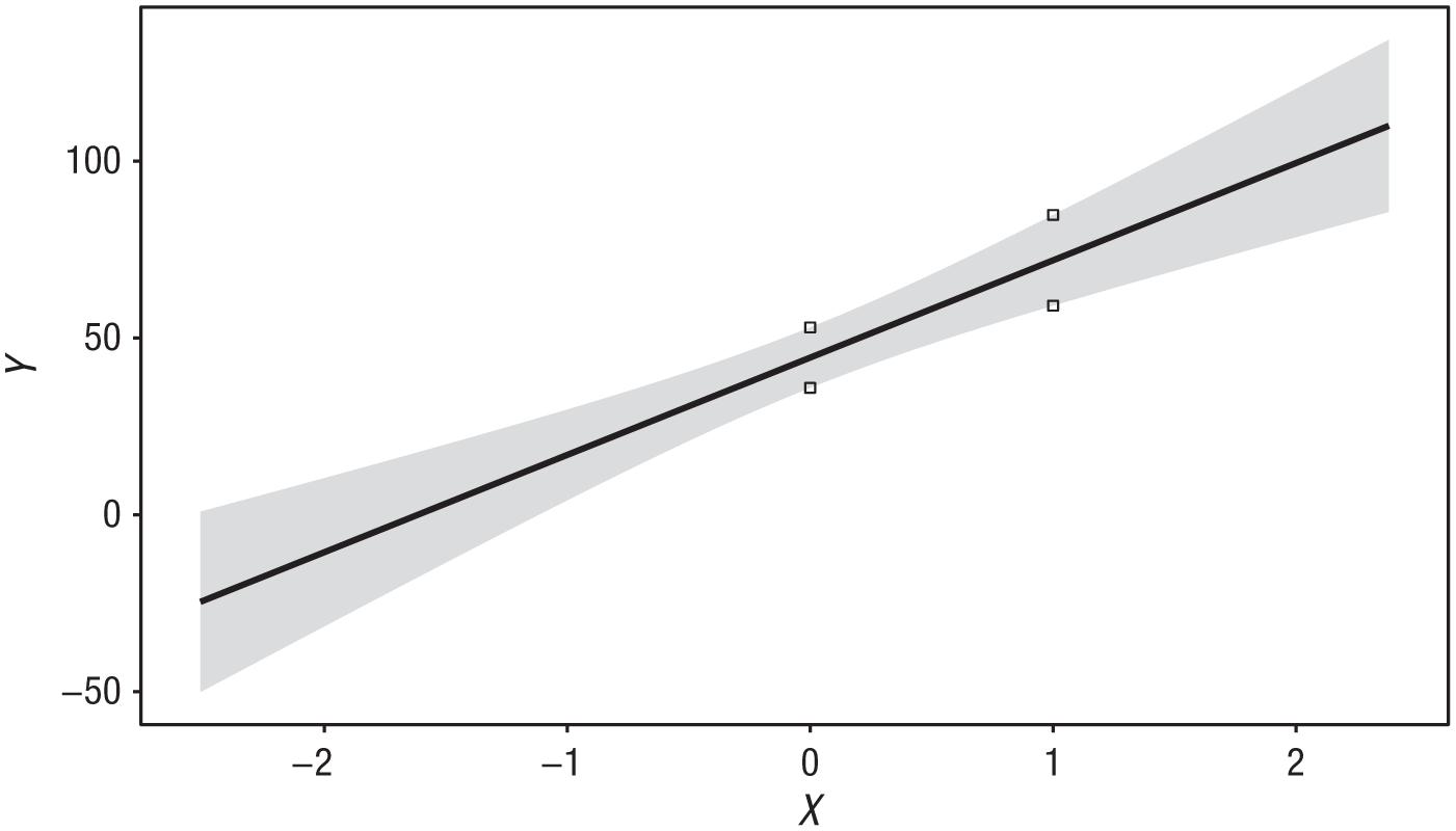
Plot of the bivariate relation between X and Y in Example 1 and the confidence region of the linear estimate. The small squares indicate the lower and upper limits of the 95% confidence interval of
The interActive plot in Figure 6 was simulated from Example 1 using multivariate normal predictors. Note that this display provides much of the same information found in Table 1 (e.g., estimates of slopes, intercepts, and confidence) while also showing more thoroughly how well the model represents the data. Figure 8a displays corresponding estimates simulated from exponentially distributed predictors. Note that the plot elements added by interActive make it readily apparent that the data are not well represented by these graphs; they suggest that the researcher should consider values of the moderator that are more representative of the data (e.g., Fig. 8b). Appendix B provides an example of how interActive can enhance understanding of an interaction effect observed in real data.
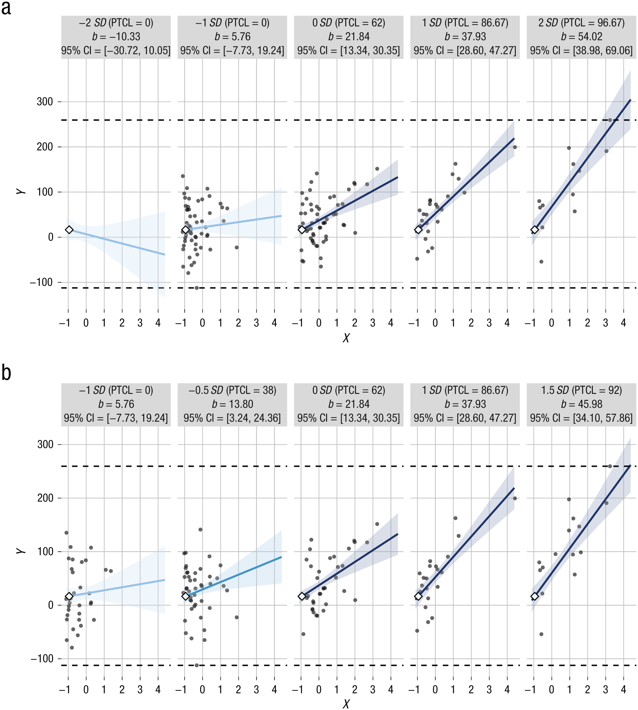
Small multiples created by interActive for Example 1 in a simulation with exponentially distributed predictors. In (a), simple slopes are provided for levels of the moderator 2 SD and 1 SD below the mean, at the mean, and 1 SD and 2 SD above the mean. The observed data are better characterized in (b), which provides simple slopes for a more restricted range of values of the moderator. Each graphic shows the computed 95% confidence region (shaded area), the observed data (gray circles), the maximum and minimum values of the outcome (dashed horizontal lines), and the crossover point (diamond). The x-axes represent the full range of the focal predictor. CI = confidence interval; PTCL = percentile.
Discussion
We have reviewed current practices for graphically displaying interaction effects and provided tools and guidelines for improving displays to affirm and communicate statistical results of moderation analyses. We have included simulated examples showing the conditions under which improper visual displays can affect inference and have shown how the interActive application can be used to address these concerns. To facilitate understanding of the full nature of interaction effects, we recommend the J-N technique and marginal-effects plots as standard analytic strategies for probing interactions of continuous variables across the full range of the moderator (Preacher et al., 2006; Roisman et al., 2012). We also encourage researchers to continue providing displays of simple-slopes effects to communicate the substantive nature of interactions and to construct these displays bearing in mind the principles of graphic integrity we have described here. These practices will support the validity of inferences made while also communicating them with appropriate precision and clarity. When advances in both statistical and graphic approaches are employed, researchers and readers alike can evaluate the nature of an interaction effect with greater understanding and confidence.
We consider the practices we have described to be a first step toward improving visual displays of interactions. For instance, we aim to extend these practices to displaying interactions in nonlinear models given that interpreting simple effects is even less straightforward in nonlinear than in linear cases (Ai & Norton, 2003; Karaca-Mandic, Norton, & Dowd, 2012). Similarly, these principles should also be extended to interactions in structural equation and multilevel modeling (Preacher et al., 2006). We hope that educators, editors, and researchers will use the interActive application and the principles we have detailed to improve understanding and methodological rigor in moderation analyses. We urge researchers to consider data visualization as a crucial (rather than auxiliary) step in the scientific process.
Supplemental Material
McCabeOpenPracticesDisclosure – Supplemental material for Improving Present Practices in the Visual Display of Interactions
Supplemental material, McCabeOpenPracticesDisclosure for Improving Present Practices in the Visual Display of Interactions by Connor J. McCabe, Dale S. Kim and Kevin M. King in Advances in Methods and Practices in Psychological Science
Footnotes
Appendix A: Computing the Confidence Interval of a Predicted Value of a Dependent Variable
In this appendix, we illustrate how to compute an estimate and 95% confidence region for
Assume the following data:
We are regressing Y on X, as follows:
In matrix form, this can be equivalently understood as
where
Suppose we arrange our predictor variable into a 5 × 2 matrix
We can then create a row of hypothetical values of our predictor to obtain the value and 95% confidence interval of
where the first row of this vector is a placeholder value of b0 and the second row represents the hypothetical value of the predictor X. Note that we can multiply
The formula for the standard error of this estimate (Equation 3) is
Obtaining the inverse of the inner product (
Once this matrix is computed, we can apply this quantity to our formula, in concert with the values of
Given
These results suggest that when X = 0.5, we are 95% confident that the predicted value of Y falls between 3.02 and 129.03. Conducting these computations across a range of xi quantities would create points that circumscribe the confidence region of a plotted linear estimate.
The R code for recreating these computations and generating a plot depicting these values is available at https://github.com/connorjmccabe/InterActive/blob/master/Appendix%20A%20code/AppendixA_code.R.
Appendix B: Example of Using interActive With Real Data
Here we illustrate how using interActive to depict a previously reported interaction effect can enhance interpretation of the data. The example is drawn from a study of 491 young adults who were undergraduate students in the Pacific Northwest region of the United States. The study examined whether the effect of sensation seeking on the frequency of alcohol-related problems differed across levels of alcohol use (see K. M. King, Karyadi, Luk, & Patock-Peckham, 2011, for more details). Note that the original authors used semicontinuous regression given that the outcome variable was zero inflated and overdispersed, and violated ordinary least squares (OLS) assumptions. Therefore, in this example, we use parametric bootstrapping to simulate a new conditionally normal alcohol-problems variable that was based on an OLS model from the original data. Moreover, we do not include the covariates included in the original report because these variables were unavailable in the current data set. Nonetheless, the estimate of the interaction effect we obtained (b = 0.082, 95% confidence interval, CI = [0.025, 0.140]) was nearly identical to that of the original report (b = 0.071, 95% CI = [0.016, 0.126]).
Figure B1a is an adaptation of the simple-slopes display from the original article. In this graphic, the slope for the effect of sensation seeking on alcohol-related problems was plotted at low (1 SD below the mean), mean, and high (1 SD above the mean) levels of alcohol use. The reader can infer several effects. First, the fact that the graphed lines are higher on the vertical axis as the level of alcohol use increases suggests a strong main effect of alcohol use on problems. Second, this plot shows that when alcohol use was low, a 1-unit increase in sensation seeking corresponded with about a 1-unit decrease in the level of alcohol-related problems, suggesting that sensation seeking may be protective against alcohol-related problems when alcohol use is low. At mean levels of alcohol use, this effect diminished. Because this simple slope is approximately flat, the graphic suggests that sensation seeking was unrelated to alcohol-related problems at average levels of alcohol use. In contrast, at high levels of drinking, sensation seeking appeared to increase the risk of alcohol-related problems (specifically, a 1-unit increase in sensation seeking at high levels of use corresponded with about a 3-unit increase in problems). Third, this graphic can be used to examine estimates of alcohol-related problems conditional on specific hypothetical values of sensation seeking and alcohol use. For instance, the model predicts that an individual reporting an average level of both drinking and sensation seeking would experience about 18 alcohol problems per year. An individual who has a high level of alcohol use and is 1 SD above the mean in sensation seeking is predicted to experience about 39 alcohol problems per year, and so on.
Using this graphic alone, one might infer that the effect of sensation seeking on alcohol-related problems reverses depending on how much one drinks. That is, sensation seeking appears to be protective when use is low and a risk factor when use is high, and it may or may not be associated with alcohol-related problems when use is at average levels. This effect is ostensibly supported by a regions-of-significance analysis: The slope of the effect of sensation seeking on alcohol-related problems is significant and negative when alcohol use is approximately 2.15 SD below its mean and is significant and positive when use is 0.35 SD higher than its mean (Fig. B1b).
Although the effects presented using interActive’s small multiples (see Fig. B2) are similar to those depicted in Figure B1a, more nuanced information about these effects is available from the small multiples because they include confidence regions and more simple slopes and also display the observed data. For instance, as does Figure B1a, Figure B2 indicates that greater alcohol use is associated with more negative alcohol consequences and that the effect of sensation seeking on alcohol-related problems becomes stronger at higher levels of use. Also, as in the case of Figure B1a, the simple slopes provided can be used to determine the predicted level of alcohol-related problems conditional on specific values of sensation seeking and alcohol use. But in the case of Figure B2, predictions across a greater range of conditional values are possible because the x-axis is extended to include the full observed range of the data.
The added elements in the display also increase the transparency of the data and clarify the inferences that can be made from the results. For instance, though J-N analyses indicated a significant protective effect of sensation seeking when alcohol use was 2.15 SD below the mean (b = −2.93, 95% CI = [−5.84, −0.02]), Figure B2a shows that this effect in fact represents no observations of alcohol use (i.e., there are no data at 2 SD below the mean, which corresponds with the 0th percentile of alcohol use). Similarly, whereas Figure B1 suggests that sensation seeking was protective against alcohol-related problems at 1 SD below the mean of alcohol use, Figure B2a shows that this effect was not significant (b = −0.94, 95% CI = [−2.72, 0.84]). In contrast, the figure shows that when alcohol use was at the mean, sensation seeking had no observed effect on alcohol-related problems (b = 0.80, 95% CI = [−0.52, 2.11]), and when use alcohol use was at 1 SD above the mean, the effect was significant and positive (b = 2.53, 95% CI = [0.72, 4.34]). The graphic also shows that among individuals 2 SD above the mean of alcohol use, a 1-unit increase in sensation seeking was associated with slightly more than 4 additional reported alcohol-related problems per year (b = 4.27, 95% CI = 1.48, 7.05]). Note that although no observed data existed at 2 SD below the mean of alcohol use, real data are represented at 2 SD above the mean. However, the simple slope does not capture the data range in this small multiple particularly well, and a researcher may opt to interpret this slope tentatively.
In summary, Figure B2a suggests a substantively different conclusion compared with the graphics in Figure B1. Whereas the plots in Figure B1 suggest that sensation seeking was protective against alcohol-related problems at low levels of alcohol use, the revised graphic shows that this inference is in fact unsupported. Instead, they suggest that the effect of sensation seeking on alcohol-related problems is not significantly different from zero at mean levels of alcohol use or lower, but is significant and positive at both 1 and 2 SD above the mean level of alcohol use. We can consider revising the interActive graphic to depict this effect across a more representative range of the moderator, as in Figure B2b.
Action Editor
Pamela Davis-Kean served as action editor for this article.
Author Contributions
C. J. McCabe generated the idea for the study. C. J. McCabe programmed the interActive application and created code for all the figures, and D. S. Kim verified the accuracy of the code. C. J. McCabe and K. M. King jointly created simulation code for the manuscript. C. J. McCabe wrote the first draft of the manuscript, and all the authors edited the manuscript. K. M. King and D. S. Kim provided feedback on the functionality and usability of the application. All the authors approved the final version of the submitted manuscript.
Declaration of Conflicting Interests
The author(s) declared that there were no conflicts of interest with respect to the authorship or the publication of this article.
Funding
This research was partially supported by a grant from the National Institute on Drug Abuse (DA040376) to C. J. McCabe. The content of this article is solely the responsibility of the authors and does not necessarily represent the official views of the funding agency.
Open Practices
All data and materials have been made publicly available via GitHub and can be accessed at https://github.com/connorjmccabe/InterActive. The complete Open Practices Disclosure for this article can be found at http://journals.sagepub.com/doi/suppl/10.1177/2515245917746792. This article has received badges for Open Data and Open Materials. More information about the Open Practices badges can be found at ![]() .
.
Notes
References
Supplementary Material
Please find the following supplemental material available below.
For Open Access articles published under a Creative Commons License, all supplemental material carries the same license as the article it is associated with.
For non-Open Access articles published, all supplemental material carries a non-exclusive license, and permission requests for re-use of supplemental material or any part of supplemental material shall be sent directly to the copyright owner as specified in the copyright notice associated with the article.