
Abstract
In recent years, numerous retail conglomerates have adopted self-checkout technologies to enhance accuracy, streamline in-store processes, and mitigate labor expenses, thereby catalyzing the expansion of the self-checkout system market. Nonetheless, due to consumer apprehensions regarding the utilization of self-checkout services, additional personnel are still required on-site, indicating that the usability and user experience of self-checkout systems necessitate further refinement. Consequently, this investigation delves into the usability and user experience of supermarket self-checkout services. Through scenario-based tasks in the preliminary research, which includes usability assessments, cognitive load evaluations, and semi-structured interviews, it was discovered that users, particularly during their initial interaction with the machine and amidst queueing crowds, displayed heightened cognitive strain and error rates. Based on these findings, we optimized the self-checkout interface and operational procedures, proposing designs for 2 × 2 interface styles and guidance cues, which underwent testing in a subsequent experiment. The experimental results indicated: (a) Photo-based guidance cues proved more efficacious compared to illustrated cues. (b) Users primarily rely on visual cues when seeking nearby equipment, with other interface cues serving a secondary function. (c) Clearly distinguishing button menus and frequently used options in the checkout information enabled users to promptly discern key points and seamlessly finalize their transactions. Drawing from the findings of this study, we propose design recommendations. Future machine designs should prioritize swift, accurate operations, and an enhanced interactive experience.
Introduction
The advent of technology has heralded a transformative era characterized by pervasive digitalization, fundamentally reshaping the landscape of commerce and communication. Through the proliferation of telephones, computer networks, the Internet, and mobile phones, technology has facilitated unprecedented connectivity and accessibility across global markets (Köksal, 2024). Alongside broader technological advancements, the integration of Self-Service Technologies (SSTs) in the retail sector has become a pivotal trend, transforming consumer experiences and operational practices. Acknowledging the imperative of enhancing customer satisfaction and operational efficiency, retailers have embraced SSTs as a means of streamlining transaction processes and augmenting service delivery (Demirkan & Spohrer, 2014; Kim & Yang, 2018). Notably, Arnfield (2014) underscores the progressive displacement of traditional manual checkout procedures in favor of diverse self-service technologies, reflecting a strategic pivot toward consumer-centric retail models.
The rise of SSTs marks a significant shift in consumer engagement, granting individuals unprecedented autonomy and flexibility in their shopping experiences. By affording consumers intuitive interfaces for shopping and checkout procedures, SSTs mitigate reliance on personnel intervention, thereby expediting transactional processes and optimizing resource allocation for retailers (Meuter et al., 2005; Oyedele & Simpson, 2007). Moreover, the widespread adoption of SSTs has yielded tangible benefits for both retailers and consumers alike, manifesting in reduced queue waiting times, minimized consumer-staff interactions, and enhanced operational efficiencies across retail environments (Collier & Kimes, 2013; Meuter et al., 2003).
As SSTs continue to advance and spread, they create new opportunities for retail innovation and customer engagement. From self-checkout kiosks to interactive displays and mobile applications, the spectrum of SSTs continues to expand, offering retailers diverse avenues for enhancing service delivery and consumer satisfaction (Orel & Kara, 2014). Through strategic investments in SST deployment and ongoing optimization efforts, retailers can navigate the evolving retail landscape with confidence, harnessing the transformative potential of technology to forge enduring connections with consumers and drive sustainable growth in the digital era (Yang et al., 2012).
Asia, particularly Japan, stands as a pioneer in SST implementation within the retail domain. Digital Times reports that from 2009 to 2013, the Aeon Group installed 3,000 self-checkout terminals across Japanese outlets, reflecting a remarkable growth rate of 139%. This trend has since extended to other Asian nations, including Taiwan (Chen, 2010; Fu, 2018). In Taiwan, Carrefour spearheaded a large-scale deployment of self-checkout stations in 2019, with other major retail chains such as RT-Mart and A.mart swiftly following suit, anticipating enhanced customer shopping experiences through SSTs.
A recent report by P&S Intelligence (2023) illustrates that the growth trajectory of the self-checkout system market closely aligns with improved accuracy, refined in-store procedures, and reduced labor costs. These elements not only propelled the evolution of self-checkout systems but also indirectly promoted sustainable progress within the retail industry. Giordano et al. (2023) further emphasize that advancements in soft robotics technology, particularly the development of autonomous machines powered by renewable energy sources, may play pivotal roles in achieving the United Nations’ Sustainable Development Goals and the Paris Climate Accord. Concurrently, a review by Yahoo Finance (n.d.) suggests that self-checkout systems, known for their accuracy, reduced labor expenses, and in-store optimizations, are poised to facilitate sustainable growth within the retail landscape. Lastly, as reported by PR Newswire (2019), the self-checkout system market demonstrated steady growth between 2013 and 2023, driven by technological advancements and heightened environmental awareness. These dynamics underscore the pivotal role of SSTs in the retail sector, highlighting their potential to enhance consumer shopping experiences and foster sustainable retail evolution. In the research paradigm, gaining insights into the latest developments and future trajectories of SSTs, alongside strategizing solutions for present challenges, remains imperative (Burke, 2002).
As Self-Checkout Technologies (SCTs) become more prevalent in the retail sector, consumer checkout patterns and habits are undergoing a transformation. However, not all consumers have seamlessly adjusted to this novel checkout mode, especially considering the marked disparities in system familiarity across different age demographics (Bulmer et al., 2018; Gupta & Ramachandran, 2021). While SCTs gain traction in the retail sphere, the adoption is hindered by these disparities. As reported by Mull (2023), despite ventures into unmanned stores and self-checkouts in countries like the U.S., China, and Taiwan, significant success stories remain elusive. One significant hurdle lies in the operational challenges of self-checkout systems, compelling retailers to allocate staff to aid consumers, thereby affecting user experience adversely (McWilliams et al., 2016).
While consumers initially welcome the convenience of self-checkouts, subsequent interactions often evoke feelings of stress and frustration due to operational complexities, staff interventions, and spatial constraints (Fernandes & Pedroso, 2017; Jalil & Yeik, 2019). Research by Turner and Szymkowiak (2019) underscores that a substantial number of consumers perceive SCTs as excessively intricate, and ironically, waiting durations for staff assistance might exceed those of traditional checkouts. Consequently, the overall user experience post-usage of self-checkouts often falls short, impacting the likelihood of reuse (Liljander et al., 2006).
Central to the study’s objectives is the meticulous examination and design enhancement of user interface (Cheng, 2013; Maguire, 1999), user experience (Hassenzahl & Tractinsky, 2006; Hu & Jiang, 2018), and usability aspects inherent in self-checkout systems (Chao, 2018). The identification and refinement of guidance cues within these interfaces are crucial endeavors aimed at addressing operational ambiguities and optimizing the overall checkout process. By delving into the nuanced effects of various guidance strategies on consumer behavior and satisfaction, the research strives to bolster consumer confidence and proficiency in utilizing self-checkout systems seamlessly (Dabholkar, 1996). This entails exploring how elements such as visual prompts, instructional messages, and interface layouts influence user interactions and transaction outcomes (Dabholkar & Bagozzi, 2002).
The research gap identified is the lack of comprehensive studies addressing the operational challenges and user experience issues associated with self-checkout systems, particularly the impact of software interface design and hardware functionality on consumer satisfaction and efficiency. While SSTs are widely adopted, there is a need to explore how specific design enhancements, such as guidance cues within the user interface, can improve the overall checkout process and consumer interactions with the technology, thereby addressing current adoption barriers and optimizing user experience.
This research aims to evaluate self-checkout terminals at two major retail outlets in Taiwan, exploring how software interfaces and hardware operational enhancements can enhance consumer checkout efficiency and experience. The study particularly emphasizes the impact of guidance cues on checkout efficiency and resultant consumer experience. By refining these guidance cues, the study aims to mitigate operational ambiguities, bolster consumer confidence and efficiency in self-checkouts, and further substantiate their significance through subsequent assessments and interface design propositions. Ultimately, this research aims to offer valuable insights for the retail industry, advocating advancements in SCTs and service quality, aligning with diverse consumer needs, and fostering sustainable growth within the retail ecosystem.
Method
This research undertakes a detailed examination of the operational functionality, which is based on an empirical standpoint, of self-checkout terminals offered by two prominent retail chains in Taiwan, namely R Store and C Store. To explore the intricacies and challenges associated with the interface utilization of self-checkout terminals, a task-oriented methodology is employed. This approach involves systematic observation of user behaviors, administration of scale questionnaires for evaluation, and conducting semi-structured interviews aimed at capturing user behaviors, time efficiency, usability, and satisfaction levels during the operation of self-checkout services. The gathered data will undergo comprehensive qualitative and quantitative analyses, leading to the proposition of refined self-checkout terminal interface designs optimized for user interaction.
This research involves a total of 90 participants. The experimental instruments vary across different stages of the experiment, which will be detailed in the following paragraphs. The research design is structured around preliminary and core studies (Wang et al., 2023). Grounded in cognitive load theory, this study assumes that an interface’s design directly affects the balance between intrinsic, extraneous, and germane cognitive load experienced during task performance. When self-checkout interfaces present unclear guidance or redundant information, users experience elevated extraneous cognitive load, which hinders comprehension and slows decision-making. Conversely, well-structured visual and procedural guidance can reduce unnecessary mental effort, improving operational efficiency and user satisfaction. Therefore, Cognitive Load Theory provides the theoretical foundation for evaluating how interface guidance cues influence checkout efficiency and perceived usability.
The experimental design comprises two distinct stages. In our preliminary research, functioning as an initial exploration, actively engages participants in executing self-checkout tasks within the premises of R Store and C Store, with meticulous documentation of the entire experimental process for evaluative scrutiny. The findings obtained will elucidate key design considerations and optimization strategies, laying the groundwork for the subsequent phase. The core research focuses on design validation. Building upon the insights garnered from the initial experiment, various iterations of self-checkout terminal interfaces are introduced as experimental samples for further task-based experimentation.
In order to examine participants’ operational approaches to the self-checkout systems, they were tasked with specific scenarios and instructed to perform corresponding tasks. The execution of these tasks was recorded via video, capturing the time required for each task as well as participants’ subjective perceptions. Notably, the examination procedure simulated conditions where participants were left to complete the checkout process independently, with no reminders or assistance provided by the examiners. The tasks were as follows:
Task 1 – Member Verification: Log in as a member using a mobile phone number.
Task 2 – Scanning Products: Scan five recently purchased items (products of varied packaging: bottled water, packaged snacks, stationery, fresh fruit, cleaning supplies), and confirm the item details on the screen.
Task 3 – Invoice Settings: Among six different invoice options, choose the mobile electronic invoice and complete the registration.
Task 4 – Payment: Opt for credit card payment and, among the various hardware devices around the terminal, locate the correct card machine to complete the payment.
Upon completion of tasks, participants were requested to complete the System Usability Scale (SUS) and the NASA-TLX questionnaire. Following this, semi-structured interviews were administered. The objective was to delineate disparities in interface functionality and assessments between the two categories of self-checkout terminals, thereby offering valuable insights for potential design refinements in subsequent iterations. And use post-hoc test to uncover the differences between the four groups (Ruxton & Beauchamp, 2008).
Preliminary Research on Self-Checkout Systems of Two Retailers
The study focuses on the examination of self-checkout terminals implemented by two prominent retail chains in Taiwan, specifically R Store and C Store. Each of these retailers integrates a 24-inch vertical screen into their self-checkout systems, complemented by additional hardware components such as a barcode scanner, a invoice printer, an EasyCard sensor (a local contactless payment system), and versatile credit card machines (see Figure 1).

Comparison of self-checkout terminal setups in R Store and C Store, showing screen layouts and surrounding hardware.
For the preliminary investigation, 30 individuals lacking prior experience in operating self-checkout terminals were recruited as participants and invited to the respective retail establishments. Subsequently, participants were randomly and evenly distributed to engage with the self-checkout systems of both retailers: 15 participants at R Store and 15 at C Store.
Core Research: Verifying Results From the Preliminary Research With a Redesigned Self-Checkout Interface
In this phase of the study, 60 participants were recruited. Drawing upon the outcomes derived from the preliminary research, participants’ performance metrics and interview responses were synthesized to establish design criteria. Notably, enhancements were made to fundamental operational functions, the checkout process flow, and the visual presentation of the interface. Moreover, design recommendations were formulated based on participants’ feedback regarding two pivotal aspects: “Interface Format” and “Location Guidance Indicators.” Employing a 2 × 2 factorial design, four distinct interface design propositions were developed. These designs were showcased on a 60-inch large screen illustrating a prototype of the self-checkout terminal, featuring a 24-inch upright operational interface and surrounding checkout equipment (refer to Figure 2).

Self-checkout terminal prototype of the core research.
Continuing to target participants lacking prior experience with self-checkout systems, two variations of interface designs were deliberated: “Illustration Format A” and “Photographic Format B.” Additionally, two categories of location guidance indicators, namely “Actual Location Indicator a” and “Numbered Location Indicator b,” were integrated. This resulted in the formation of four distinct combinations: Aa (Illustration + Actual Location), Ab (Illustration + Numbered Location), Ba (Photograph + Actual Location), and Bb (Photograph + Numbered Location), constituting four experimental groups. To mitigate potential learning curve effects during interface operation, each participant was exclusively exposed to one design variant throughout the study. Participants were randomly and evenly distributed across the four groups, with 15 participants assigned to each group, resulting in a total of 60 participants. While the core research replicated the operational task sequence from the preliminary research, participants were additionally requested to assess their satisfaction levels with the newly devised samples post-operation. Furthermore, they engaged in semi-structured interviews and completed the System Usability Scale (SUS), NASA-TLX Cognitive Load Questionnaire, and the User Experience Questionnaire (UEQ) to discern disparities between the designs.
In summary, findings from both preliminary and core research were juxtaposed to facilitate a comprehensive comparison, validating the user experience design. Moreover, the study explored the ramifications of the new design proposals on usability, cognitive load, and satisfaction levels, offering insightful recommendations for future research endeavors.
Ethical Considerations
The study was conducted under the oversight of the institutional review board (IRB) of the authors’ affiliated university. All participants were informed of the study’s purpose and procedures, advised that participation was voluntary, and reminded of their right to withdraw at any time without penalty. Informed consent was obtained prior to data collection. The study involved minimal risk, as participants performed simulated checkout tasks using only non-sensitive information in laboratory and store-based settings. No personally identifiable information was collected.
Results
Preliminary Research: Research Findings
In this phase, we analyzed participants’ results from the task-oriented scenarios concerning the self-checkout systems offered by the two prominent retailers. The objective was to compare the interface workflows and hardware equipment performances between the two self-checkout models. Evaluation criteria were derived from task completion times and feedback obtained during user interviews, aimed at identifying deficiencies within the existing self-checkout systems.
Performance Metrics and Interview Insights From Preliminary Research
Regarding task completion time, the results of independent sample t-tests (see Table 1) indicated significant disparities for Task Two, involving the scanning of five items (p = .02 < .05), Task Three concerning invoice settings (p = .04 < .05), and the aggregate task operation duration (p = .02 < .05). However, no statistically significant differences were observed for Task One, pertaining to member identity verification (p = .754 > .05), and Task Four, associated with payment checkout (p = .447 > .05). A comprehensive analysis of each task is presented subsequently.
Results for the Preliminary Research.
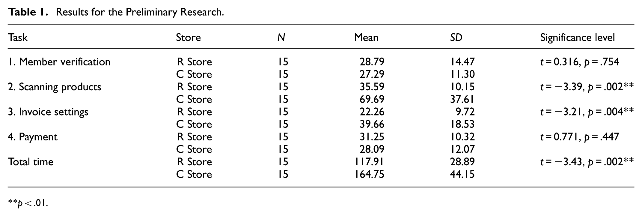
p < .01.
Task One
In the context of Task One, concentrating on member identity verification, no statistically significant difference in operation time emerged between the R store (M = 28.79, SD = 14.47) and the C store (M = 27.29, SD = 11.30), as indicated by a p-value of .754 > .05. Post-experiment interviews elucidated that within the C store’s sample, 33% of participants expressed challenges related to the member login page interface, characterized by visual clutter. This manifestation encompassed the simultaneous display of advertisements, photo-based instructional guides, and operational buttons. Furthermore, the button’s gray background coloration contributed to difficulties in locating it, occasionally resulting in inadvertent clicks elsewhere. In contrast, the R store’s interface demonstrated a higher contrast between background and button colors, coupled with greater white space around text and graphics, contributing to a reduction in errors (see Figure 3).

Interface comparison for the member verification step.
Task Two
Task Two involved the scanning of five items. The performance metrics pertaining to operation time between the R store (M = 35.59, SD = 10.15) and the C store (M = 69.69, SD = 37.61) revealed a statistically significant difference (p = .002 < .05). The operation time for the C store, at 69.69 s, was significantly prolonged compared to the 35.59 s observed at the R store. Through observational analysis, it was observed that the C store’s self-checkout system, in contrast to that of the R store, necessitated items to be placed on a weighing platform for confirmation following each scan. Within the C store’s sample, 47% of participants encountered difficulties with the weighing sensor, impeding seamless scanning. Post-experiment interviews underscored the ambiguity of the system’s error messages, creating uncertainty among participants regarding whether store staff were cognizant of the issues or if they should actively seek assistance. These recurrent errors resulted in elevated cognitive load and a substantial deviation in time performance.
Furthermore, post-experiment interviews divulged that during this experimental phase, participants in both the R and C store samples expressed concerns that the machine screens were excessively elongated. While operating the machines in close proximity during queues, participants found it easy to overlook interface information positioned in the corners of the screens and the physical equipment surrounding the machine.
Task Three
Task Three focused on invoice settings, necessitating participants to log in using the standard mobile carrier barcode issued by the Ministry of Finance. Concerning operational time efficiency, a discernible divergence surfaced between the R store (M = 22.26, SD = 9.72) and the C store (M = 39.66, SD = 18.53), demonstrating statistical significance at p = .004 < .05. Specifically, the operational efficiency at the C store, recorded at 39.66 s, exceeded that of the R store, which stood at 22.26 s, indicating prolonged duration at the C store.
Post-experiment interviews elucidated the underlying reasons for this discrepancy. Within the C store’s sample, 66% of participants highlighted an excess of button options for invoice settings. Furthermore, textual descriptions accompanying the buttons were deemed challenging to comprehend. The interface failed to emphasize commonly used options distinctly, resulting in recurrent selection errors and a consequential disparity in operational efficiency (see Figure 4). Conversely, the user interface in the R store’s sample featured text information that was more comprehensible, coupled with a reduced number of menu options, thereby enhancing browsing efficiency. However, in the R store’s sample, the invoice setting button was situated at the interface’s bottom, prompting 20% of participants to remark that the button was overlooked due to the screen’s elongated layout and close-proximity operations.

Example of the invoice setting interface.
Task Four
Task Four concentrated on credit card payment checkout, necessitating participants to identify the credit card machine amidst the surrounding physical equipment and execute the payment process. Concerning operational time efficiency, no statistically significant difference emerged between the R store (M = 31.25, SD = 10.32) and the C store (M = 28.09, SD = 12.07), yielding a p-value of .447 > .05.
Further scrutiny uncovered notable disparities in the presentation of payment type lists and credit card swiping instructions across the two sample stores. In the R store, the payment type list interface adopted an illustrative format, with two distinct types of credit card machines positioned adjacently for physical transactions. Conversely, the payment type list interface in the C store employed text buttons on a gray background. The physical setup encompassed an all-in-one credit card machine, complemented by a guidance interface featuring three photographic images to elucidate operational procedures (refer to Figure 5).
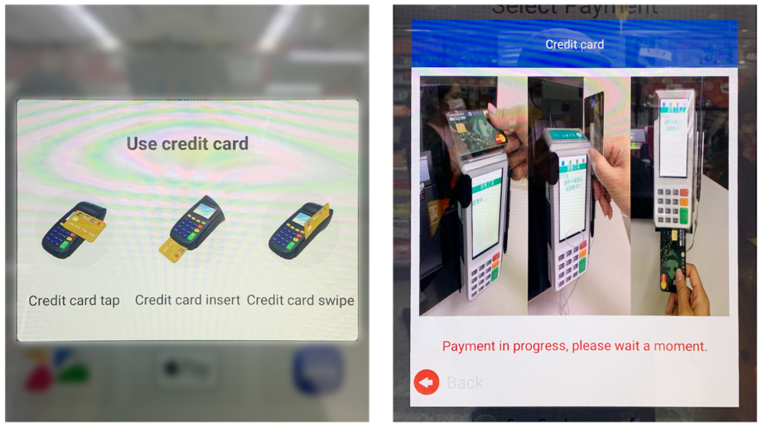
Payment guidance interfaces: R Store (illustrative icons) and C Store (photo-based cues).
Subsequent to the experimental tasks, insights derived from post-experimental interviews indicated that among the R store samples, 73% of participants encountered challenges attributable to the surplus of physical equipment surrounding the terminal. This circumstance impeded their ability to locate the appropriate card swiping position and, in some instances, resulted in inadvertent interaction with incorrect machines. Additionally, the illustrative guidance indicators in the R store samples were frequently misconstrued by participants as interactive buttons.
Conversely, within the C store samples, 60% of participants reported encountering difficulty in locating the correct card swiping position, often requiring multiple trial-and-error attempts. Furthermore, a majority admitted to overlooking the photographic tutorial displayed on the screen. Both store samples revealed that the presentation of interface information and the arrangement of surrounding equipment lacked sufficient intuitiveness for participants, consequently leading to frequent errors and heightened cognitive load during operations.
Usability and Cognitive Loading Analysis
Through the application of an independent samples t-test to statistically evaluate the subjective ratings obtained from the experiment samples of both stores, the subsequent results were acquired and juxtaposed with the corresponding dataset.
SUS Usability Assessment
Upon analyzing the scores derived from the System Usability Scale (SUS), a significant discrepancy was observed in the overall average scores between the R store (M = 74.66, SD = 17.08) and C store (M = 51.83, SD = 21.90), with a significance level of p = .004 < .05 (as delineated in Table 2). Further exploration of usability using the SUS score reveals that the R store, with a score of 74.66, surpasses the usability threshold of 68 points and is categorized as a “C” grade. In contrast, the C store, achieving a score of 51.83, falls short of the usability threshold and is classified as an “F” grade. Hence, in terms of usability ratings, the R store demonstrates superior performance. However, it is noteworthy that neither of the self-checkout interface designs in the two stores fully addressed the operational requirements of the participants, suggesting avenues for enhancement.
SUS Scores and Grades of the Two Stores.

p < .01.
NASA-TLX Cognitive Load Scale
Based on the cognitive load weighted scores, no statistically significant difference was evident between the cognitive load weighted total score of the R store (M = 29.80, SD = 17.04) and that of the C store (M = 44.33, SD = 23.64), yielding a p-value of .065 > .05. Despite the lower weighted total score of 29.8 for the R store in comparison to 44.33 for the C store, it can be inferred that, regarding the overall cognitive load experienced by participants, the self-checkout service encounter in the R store sample demonstrated a superior outcome (Table 3).
Preliminary Research: NASA-TLX Results of the Two Stores.

p < .05.
Analysis of Cognitive Effort Weighted Scores
Concerning the cognitive effort weighted scores, a statistically significant difference was observed between the R store (M = 108.66, SD = 88.12) and the C store (M = 180.33, SD = 99.97), yielding a p-value of .047 < .05. This disparity suggests that the self-checkout system in the C store sample exhibits lower intuitiveness and imposes a greater cognitive burden on users compared to that in the R store. Insights garnered from post-experiment interviews revealed that the majority of participants perceived an overwhelming array of menu options on the interface, coupled with diverse types of physical equipment surrounding the kiosk. Compounded by non-intuitive graphics and text on the interface, these factors contributed to recurrent operational errors, thereby escalating cognitive strain among participants.
Further examination of the average scores derived from the NASA-TLX questionnaire for both stores unveiled that the highest weighted score for both stores pertained to “Time Pressure.” Specifically, the R store registered an average score of 128.33, whereas the C store attained an average score of 202.66 (refer to Figure 6). As per post-experiment interviews, the majority of participants articulated that despite the actual operational time lasting only 2 to 3 min during their initial self-checkout experience, the perceived duration seemed prolonged, particularly amidst queued customers awaiting their turn. Any unforeseen glitch or error encountered during the process exacerbated the sensation of “time pressure,” rendering the perceived duration considerably longer than the actual operational time.

Visualization of NASA-TLX cognitive-load results comparing R Store and C Store across six workload dimensions.
Optimization Recommendations Based on Preliminary Research’s Results
The findings from the initial experiment of this study unveiled operational challenges encountered by self-checkout terminals across both retail chains, including participants’ difficulties in identifying appropriate equipment and locating requisite hardware. The guidance cues integrated into the system interfaces of both stores were deemed inadequate in facilitating smooth operation. Upon a more comprehensive analysis of the preliminary research, it became evident that the interface of the R-store, amalgamating illustrations with functional buttons, elicited confusion among 73% of participants. They encountered challenges in discerning between the two types of information, resulting in operational errors and equipment location difficulties. Conversely, the interface of the C-store, inundated with copious text, images, and advertisements, bewildered users. Moreover, while operating the self-checkout terminals in close proximity amidst queueing scenarios at both retail outlets, participants frequently overlooked interface information positioned in the corners and adjacent physical devices. The design of button interfaces lacked a clear hierarchy, and the utilization of plain text rendered them unintuitive for users.
Subsequently, 54% of participants from the preliminary research conveyed their apprehension toward future utilization of self-checkout systems, expressing a preference for manned checkouts instead.
To address the operational challenges identified in the preliminary research, the core experiment focused on optimizing the interface workflow and visual hierarchy. The checkout procedure was simplified to reduce unnecessary steps and cognitive load, as shown in Figure 7. In this redesign, frequently used options such as member login and payment selection were prioritized and visually distinguished through color contrast and spacing to guide users’ attention. The restructured menu hierarchy (Figure 8) emphasizes task relevance and logical grouping, using consistent graphic elements to improve button recognition and streamline decision-making during checkout.

Comparison of the original and redesigned login procedures. The optimized version simplifies the workflow by removing redundant steps and visually emphasizing key functions such as member verification and payment options.

Redesigned interface menu hierarchy highlighting frequently used options.
Furthermore, to ascertain the enhanced intuitiveness of the interface design and equipment guidance, two stylistic approaches are proposed: “Illustrative Style A” and “Photographic Style B,” in conjunction with two types of location guidance: “Actual Position Indicator a” and “Numbered Position Indicator b.” These configurations will be examined through a 2 × 2 factorial design, resulting in four combinations: Aa (Illustration + Actual Position), Ab (Illustration + Numbered Position), Ba (Photo + Actual Position), and Bb (Photo + Numbered Position), as illustrated in Figure 9, for thorough investigation.
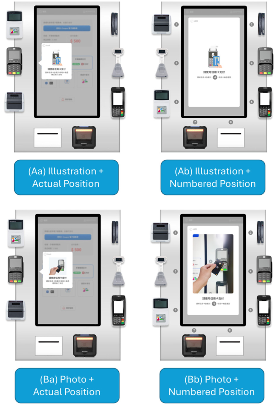
Four 2 × 2 interface prototypes (Aa, Ab, Ba, Bb) combining illustration/photo formats with location guidance types.
Core Research: Results
This phase entailed the examination of the outcomes derived from four distinct self-checkout design interface groups. Given that all four design samples for Task One, pertaining to member identity verification, adhered to an identical interface design, no comparative analysis was conducted for this task. However, for the remaining tasks, a comparative assessment was conducted to discern performance disparities in operation flow and equipment retrieval among the Aa, Ab, Ba, and Bb design samples. Evaluation was predicated on participant operation times, questionnaire scores, and insights gleaned from user interviews. Significant variations among the four sample groups were scrutinized through a one-way analysis of variance (One-Way ANOVA) coupled with the post hoc Scheffe Test.
Participant Performance and Interview Results for the Core Research
The outcomes of the one-way analysis of variance pertaining to operation time performance unveil noteworthy distinctions (refer to Table 4) in Task Two: Scanning Products (p = .00** < .05), Task Three: Invoice Setup (p = .024 < .05), and Overall Task Operation Time (p = .00** < .05). However, Task Four: Payment Checkout (p = .128 > .05) exhibited no statistically significant differences.
Results of the Four Different Interface Designs.
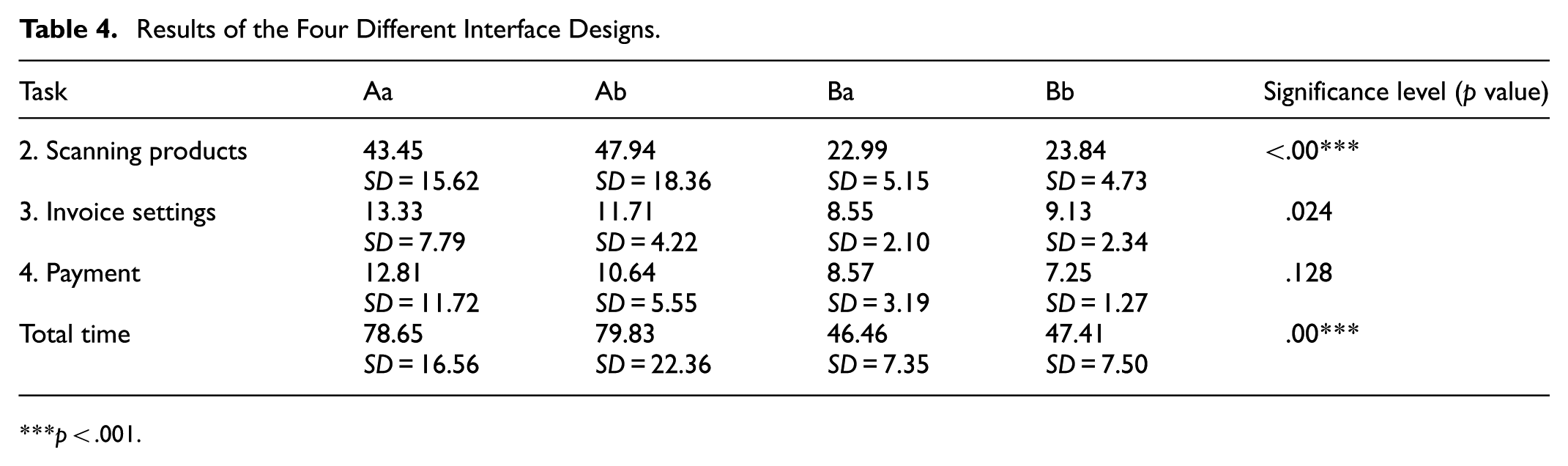
p < .001.
Task Two: Results
Task Two involves the process of product scanning, representing the initial task wherein participants are required to locate physical equipment through the interface information. According to the Scheffe Test post hoc analysis regarding time performance (see Table 5), the average operation time for Ba (photo + actual location) stood at 22.99 s, and for Bb (photo + number location) at 23.84 s, which were notably shorter than those of Aa (illustration + actual location) at 43.45 s and Ab (illustration + number location) at 47.94 s. This suggests that interfaces employing the photo format B exhibit significantly higher efficiency than those utilizing the illustration format A, with significant differences observed at (p = .001 < .05) and (p = .00** < .05), respectively.
Scheffe Test Results of Task 2: Scanning Products Between Different Designs.

p < .01. ***p < .001.
The experiment’s observations indicate that the illustration format A necessitated more time for participants to comprehend the interface information and locate the surrounding physical equipment. Conversely, the photo format B directly depicted the actual appearance and functionality of the equipment, enabling participants to intuitively identify the equipment and execute the operation based on the photographic content. According to participant interviews, 58% indicated that the photo format served as their primary reference for equipment search. They could efficiently correlate the content of the photo with the equipment’s appearance and operate it accurately, while other guiding interface cues served only as secondary confirmation.
Moreover, concerning error counts, it was observed that participants utilizing the illustration format A exhibited a higher frequency of errors in Task Two, particularly during the search for physical equipment. Specifically, four individuals in the Aa group and eight in the Ab group made errors, in contrast to two in the Ba group and one in the Bb group. Based on the interviews, 41% of the participants expressed their disinclination to consult the illustration prompts within the illustration format A. They perceived these illustrations as symbolic representations of operational concepts, offering minimal assistance in locating equipment. This perception was influenced by their prior experiences with various websites and software interfaces where illustrations primarily served aesthetic purposes and lacked practical relevance. Additionally, 25% of participants admitted that their errors stemmed from bypassing the interface’s guiding prompts when transitioning to the product scanning interface in Task Two. Initially, they focused on locating physical equipment and only referred back to the interface prompts when encountering scanning difficulties. Moreover, 20% of participants acknowledged overlooking the actual location indicators in format a due to their placement in the screen’s corners. When operating in close proximity, such details often escaped their attention, especially amid the scanning process.
Observations from the experiment highlighted that samples employing the number indication guide (format b) tended to rely on this indication following several unsuccessful attempts, notably noticeable in the “Ab illustration + number location” group. Subsequent post-experiment interviews unveiled that among those utilizing the number indication (format b), 30% only acknowledged the numbered indications on the equipment subsequent to making operational errors. These participants perceived this design approach as effective in directing them to the correct equipment and serving as a supplementary confirmation tool.
Task Three and Task Four Results
In Task Three, focusing on invoice settings, a comparison of time performance metrics revealed that the average operation times for the designs employing “Ba photo + actual location” (8.55 s) and “Bb photo + numbered location” (9.13 s) were marginally shorter than those of “Aa illustration + actual location” (13.33 s) and “Ab illustration + numbered location” (11.71 s). This discrepancy exhibited statistical significance among the groups (p = .0024 < .05).
Upon further examination of the experiment data, it was revealed that participants using the illustration format during the invoice setting task encountered a higher incidence of operational errors. Specifically, seven participants in the Aa group and four in the Ab group encountered errors, in contrast to zero errors in the Ba group and one error in the Bb group. Post-experiment interviews disclosed that 16% of all participants attributed their operational errors during the invoice registration task to the misconception that the scanner for invoices and products shared identical functionality, which was not the case. Notably, participants employing the guidance indication with numbered designation “b” encountered more challenges.
Participants utilizing the “B photo format” with “a guidance” exhibited fewer errors in the invoice setting task. The primary reason was that 58% of these participants directly referred to the photo to locate the actual equipment, while 56% followed the arrow indications to select the equipment for operation. Consequently, fewer errors occurred with the Ba and Bb design samples.
The post-hoc Scheffe test analysis indicated that, commencing from Task Three, the invoice setting, there existed no significant difference in operation time among the four design samples. This suggests that participants, leveraging experience gained from prior tasks, adjusted their equipment search methods. Thirty-eight percent of all participants acknowledged that with the learning experience from the previous tasks, they realized adhering to the screen interface indications would facilitate successful task completion. Moreover, 70% of participants employing the “a guidance indication” affirmed that the arrow indication of the actual location in Task Three was clearer than that in Task Two. This clarity stemmed from the appearance of a blurred pop-up window after selecting the desired invoice menu, aiding participants in understanding their current operational status.
Further insights from Task Four revealed that the operation time for designs employing photo format B consistently surpassed those employing illustration format A. Seventy-six percent of the participants using illustration format A acknowledged that with the experience gained from Tasks Two and Three, they recognized they could utilize other interface cues such as arrows and numbers to locate the correct physical equipment. Among them, 38% mentioned they could correlate the illustration with the objective of the current task and discern which type of equipment to operate. Nonetheless, in situations where the equipment was ambiguous, they still relied on guidance indications. In contrast, participants using photo format B could directly match the actual equipment appearance through the photos, whereas those using illustration format A had to depend on alternative interface cues, which extended the operation time.
Overall Task Time Experimental Results
The cumulative operation time measured the duration participants of the four design samples took, from their arrival at the self-checkout kiosk to initiate Task One through Task Four, until the interface displayed the final successful checkout feedback. The time performance metrics, analyzed through the post-hoc Scheffe Test (as outlined in Table 6), revealed that the average operation times for “Ba photo + actual location” (46.46 s) and “Bb photo + numbered location” (47.41 s) were notably shorter compared to “Aa illustration + actual location” (78.65 s) and “Ab illustration + numbered location” (79.83 s). This underscores the superiority of the photo format B interface over illustration format A, with a statistically significant difference indicated as (p = .00** < .05) for both comparisons.
Scheffe Test Results Between Different Designs.

p < .001.
Post-experiment interviews unveiled that 58% of participants using photo format B perceived the photo representation as more intuitive. Besides being able to compare the appearance of the equipment, the operational gestures depicted in the photos effectively guided them on how to handle the machinery. Furthermore, 48% of the participants mentioned that the combination of the photo format with arrow guidance provided a secondary confirmation, enabling more precise operation of the self-checkout equipment.
Usability, Cognitive Load, and User Experience Evaluation Analysis
Using One-Way ANOVA and the post-hoc Scheffe test for a statistical comparison of subjective scores from participants across the four design samples, the following results were obtained:
SUS Usability Evaluation
Based on the calculated scores from the System Usability Scale (SUS), the sample “Aa illustration + actual location” averaged a score of (M = 73.83, SD = 19.12), “Ab illustration + numbered location” averaged (M = 74, SD = 13.25), “Ba photo + actual location” averaged (M = 87.66, SD = 9.97), and “Bb photo + numbered location” averaged (M = 88.83, SD = 10.89). There was a significant difference between these groups (p = .002 < .05) as depicted in Table 7. Further integrating the SUS scores with the usability grading revealed that “Aa illustration + actual location” (73.83, Grade C), “Ab illustration + numbered location” (74, Grade C), “Ba photo + actual location” (87.66, Grade B), and “Bb photo + numbered location” (88.83, Grade B) all met the accepted usability standards. Notably, the post-hoc Scheffe test indicated that the SUS score for “Bb photo + numbered location” surpassed that of “Aa illustration + actual location” and “Ab illustration + numbered location” with significant differences, respectively marked as (p = .04 < .05) and (p = .043 < .05). The usability scale results highlighted that “Bb photo + numbered location,” which utilized a photo-based interface prompt combined with numbered guidance for device retrieval, demonstrated superior usability. Participants were able to search and operate the correct equipment precisely, mirroring the actual appearance from the photo, ensuring task completion.
SUS Scores and Grades of the Four Designs.

p < .01.
NASA-TLX Cognitive Load Scale
As per the cognitive load weighted scores (refer to Table 8), the “Aa illustration + actual location” group had a total weighted score of (M = 30.37, SD = 14.07), “Ab illustration + numbered location” group had (M = 37.83, SD = 12.44), “Ba photo + actual location” group had (M = 17.22, SD = 13.22), and “Bb photo + numbered location” group had (M = 23.19, SD = 15.59). There was a significant difference observed within the groups (p = .008 < .05).
Core Research: NASA-TLX Results of the Four Designs.

p < .01.
Analysis based on the total weighted scores indicates that the “Ba photo + actual location” group, with a weighted score of (17.22), imposed the least cognitive load on the participants among the four samples. Feedback from interviews revealed that 48% of all participants noted that during the device search process, they could conveniently cross-reference the location and appearance of the hardware in the photos using the arrow indicators on the “Ba photo + actual location” interface. This facilitated decision-making and judgment processes, enabling participants to operate and complete tasks accurately.
Regarding cognitive load, both “Ba photo + actual location” (M = 30.66, SD = 41.13) and “Bb photo + numbered location” (M = 48.66, SD = 95.15) scored lower than “Aa illustration + actual location” (M = 120, SD = 95.23) and “Ab illustration + numbered location” (M = 126, SD = 80.07). Significant differences were observed within the groups (p = .002 < .05).
The data suggests that in terms of cognitive and temporal load, the design samples employing photos (Ba and Bb) scored lower than those using illustrations (Aa and Ab). This implies that photo-based samples enable participants to identify and operate the correct physical devices with reduced cognitive effort and in less time. Post-interviews revealed that designs using illustrations tended to confuse participants, as they had to interpret the relationship between the illustration and the physical device. A minority mentioned difficulties in understanding the conveyed meaning by certain illustrations, necessitating reliance on other interface cues to locate the correct device, thereby increasing cognitive and temporal load.
UEQ (User Experience Questionnaire) Assessment
Based on empirical data, all four design samples registered scores below −0.8 in “Practical Quality,”“Hedonic Quality,” and “Overall,” reflecting a favorable assessment according to the UEQ criteria (refer to Table 9). Notably, “Practical Quality” scores surpassed those of “Hedonic Quality” across all design samples. Particularly, the two design samples employing “Photo Form B” obtained scores exceeding 1 in both “Practical Quality” and “Overall,” meeting the UEQ’s positive evaluation criteria. This suggests that the photo-based samples garnered higher ratings in terms of practical utility as perceived by the participants. Participants highlighted the utility of photo-based interfaces in locating the correct equipment and executing tasks efficiently. However, there remains room for improvement in hedonic ratings across all design samples.
Core Research: UEQ Scores of the Four Designs.

In a comprehensive evaluation, the average UEQ scores across dimensions for the 60 participants in the new design proposal were analyzed. The aggregate UEQ score for “Practical Quality” stood at 1.508, surpassing the positive assessment threshold of 1. This indicates that the new self-checkout design aligns with the UEQ’s range of 0.8 to 3.0 (very good) for practical quality standards (refer to Figure 10).

User Experience Questionnaire (UEQ) results showing improved pragmatic and overall quality for redesigned photo-based interfaces.
Regarding the overall UEQ score for “Hedonic Quality,” it registered at 0.363, falling between 0 and 0.8, thereby not distinctly indicating a positive or negative evaluation. This suggests that the new self-checkout design requires further refinement concerning design novelty and feedback cues aimed at enhancing user enjoyment and engagement.
Regarding the overall UEQ score, which amounted to 0.935, a score exceeding 0.8 denotes a positive evaluation, indicating that the interface design and operational model of the new self-checkout in Experiment 2 align with the comprehensive impression standards for user experience.
User Interview Results
According to participant rankings and a synthesis of interview data, the four sample groups are ordered from first to fourth as follows: Ba photo + actual location, Bb photo + numbered location, Aa illustration + actual location, Ab illustration + numbered location. The interview rankings reveal a consistent preference for the “Photo Format B” over the “Illustration Format A” within the interface design proposals. Similarly, in the guidance directive proposals, “Actual Location a” consistently demonstrated superior performance compared to “Numbered Location b” (refer to Figure 11).
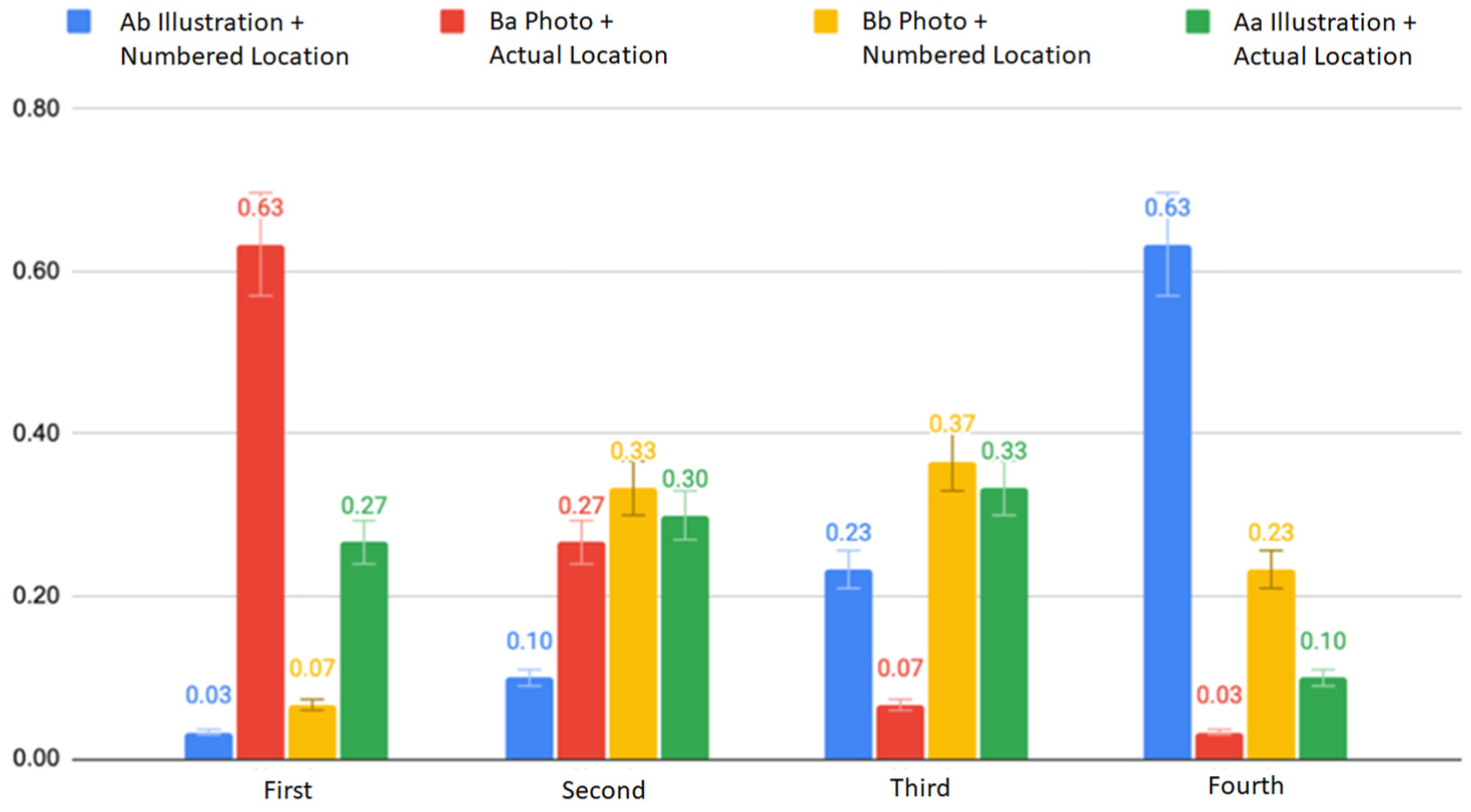
Participant ranking of interface preferences, indicating strongest preference for photo-based guidance with actual-location indicators.
The subsequent section will consolidate collective feedback from participants regarding four distinct design proposals.
Interface Format A: Illustration
46% (28 participants) indicated that the illustration format elucidates operational concepts, informing users of the current task’s objectives; however, it falls short in effectively delineating specific devices and their corresponding operational procedures.
25% (15 participants) expressed ambiguity and uncertainty regarding the illustrative content, with some participants suggesting that illustrations led to misinterpretations, particularly concerning tasks such as credit card checkout, where operational actions like tapping, inserting, or swiping were inadequately conveyed.
36% (22 participants) articulated their ability to establish associations between the illustrations and the intended devices, facilitating device identification.
13% (8 participants) exhibited a preference for the clean and aesthetically pleasing presentation of the illustrative interface, contrasting with the perceived clutter and distraction of the realistic presentation offered by photographs.
38% (23 participants) acknowledged that despite using the illustrative interface, they still relied on supplementary guidance cues to accurately locate devices.
Interface Format B: Photo
58% (35 participants) were able to directly discern devices through photographic content, with operational gestures providing intuitive guidance. Consequently, exclusive reliance on photographic content sufficed for participants to locate the correct device, while other guidance cues served as supplementary confirmations.
36% (22 participants) favored full-screen photographic presentations, citing enhanced attention capture and facilitated direct device operation.
30% (18 participants) found photographic content distracting, as it encompassed background scenery and neighboring self-checkout devices, resulting in visual clutter and diverted attention from the task at hand.
Location Guidance Indicator a: Actual Location
56% (34 participants) preferred arrow guidance cues, deeming direct device indication more intuitive and less cognitively demanding.
48% (29 participants) acknowledged that arrow guidance cues effectively identified device locations and facilitated secondary confirmation after integrating other page information.
20% (12 participants) experienced instances of overlooking arrows during Task Two: Scanning Products, as arrow indicators were located in the corner of the screen, diverting participants’ attention to surrounding physical devices. Participants only looked back at the screen and found arrow indicators when operational errors occurred.
35% (21 participants) found arrow indicators during the invoice setting and payment checkout tasks clearer than during Task Two: Scanning Products, as the previous steps involved selecting button menus, followed by the presentation of gray screens and pop-up arrows, enhancing comprehension of the interface sequence, with attention focused on interface prompts.
Location Guidance Indicator b: Numbered Location
31% (19 participants) preferred numbered cues, as they accurately identified the designated device without the need for additional photographic or illustrative cues, aiding in correct device operation.
30% (18 participants) found numbered cues to be precise decision-making aids during error-prone situations, with subsequent tasks adopting a swift approach to using numbered search methods after initial learning experiences.
Preliminary Research Versus Core Research: Comparative Analysis Results
In order to ascertain the presence of substantial enhancements in usability and user experience by contrasting the novel self-checkout system interface with the prevailing self-checkout systems across the two stores in the preliminary research, a one-way analysis of variance along with a Scheffe post-hoc test was conducted to identify noteworthy differences. This phase juxtaposed the two experimental samples from the preliminary research (Store R and Store C) with the four design samples from the core research for comparative analysis.
Results From Participant Performance and Interviews in Experiments One and Two
A comprehensive comparison between Experiments One and Two was conducted, focusing on the operational times for four distinct tasks and the cumulative performance time (refer to Table 10). Task One, which involved Membership Login Settings, displayed varied operation times across the samples: Aa (9.04 s), Ab (9.53 s), Ba (6.34 s), and Bb (7.18 s), compared with the figures from Store R (28.79 s) and Store C (27.29 s). Statistical analysis revealed a significant difference (p = .00** < .05).
Operational Time From Both Preliminary and Core Research.

Task One (Member Verification), entailed users navigating through a choice between “Member” and “Non-member” statuses and subsequently selecting the login method. This multi-layered process extended operation time and increased error probabilities. The new design proposal streamlined these intricate settings for Task One, prioritizing key functions such as phone number entry and membership barcode scanning directly on the login page, leading to marked improvement in operation time.
Regarding Task Two (Scanning Products), post-hoc Scheffe analysis showed no significant difference between Store R (35.59 s) and its samples Aa (43.45 s), Ab (47.94 s), Ba (22.99 s), and Bb (23.84 s). However, significant differences were observed in other samples compared to Store C. Notably, 47% of participants at Store C (69.69 s) faced challenges scanning products due to weight sensor issues, compounded by unclear system error messages, resulting in significantly prolonged operation times for Store C compared to Store R and the new design samples.
For Task Three (Invoice Settings), post-hoc Scheffe analysis revealed significant differences across all samples except Store R (35.59 s) and its samples Aa (43.45 s) and Ab (47.94 s), indicating considerable improvements over Store C (39.66 s). Interviews from the preliminary research revealed that Store C’s (39.66 s) gray button design and text-heavy interface caused confusion among 66% of participants due to excessive options and unclear descriptions. The new designs mitigated this issue by employing iconographic designs and simplifying the process, resulting in significantly better performance compared to Store C.
In Task Four (Payment and Checkout), post-hoc Scheffe Test analysis indicated significant differences between the new designs and both Store R and Store C. Participants in the core research reported a clearer understanding of the correct payment device after Tasks One to Three, guided by the screen interface, unlike the inconsistency observed in Stores R and C, where interface designs varied across checkout stages.
The results confirmed that the designs in the core research effectively organized operational procedures, standardized the checkout interface style, and provided clear guidance to the correct hardware, significantly outperforming the systems in Store R and Store C from the preliminary research (p = .00** < .05) (p = .00** < .05). This comparative analysis underscores the significance of a user-friendly interface and the advantages of iterative design improvements based on user feedback. The redesigned self-checkout systems in the core research clearly offered a superior user experience and enhanced efficiency compared to those in the preliminary research.
Usability and Cognitive Load Scale Evaluation Analysis
System Usability Scale (SUS) Evaluation
Concerning the SUS usability scale scores obtained from Experiments One and Two, a one-way ANOVA indicated noteworthy distinctions among the six groups (p = .00** < .05). Subsequent Scheffe post-hoc analysis identified significant differences between Store C (51.83, Grade F) and Store R (74.66, Grade C), Aa (73.8, Grade C), Ab (74, Grade C), Ba (87.6, Grade B), and Bb (88.8, Grade B) as delineated in Table 11.
Scheffe Test Results of SUS Scores and Grades From Preliminary and Core Research.
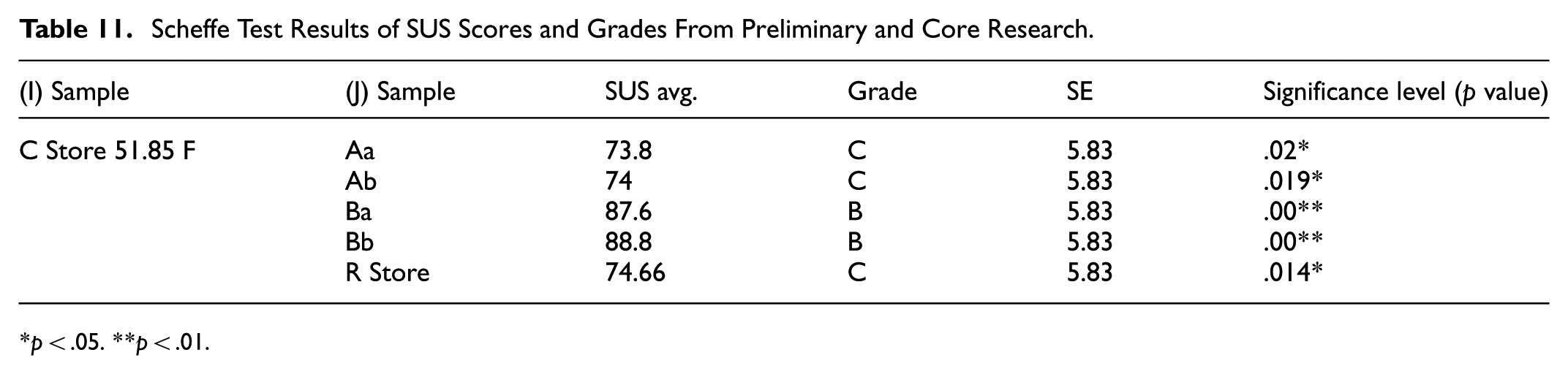
p < .05. **p < .01.
NASA-TLX Cognitive Load Assessment
The NASA-TLX scale findings for Experiments One and Two indicated significant differences among the six experimental samples concerning mental demand, frustration, and overall scores, with respective values of (p = .001 < .05), (p = .009 < .05), and (p = .01 < .05) as elaborated in Table 12. Regarding mental demand, the two design samples utilizing Photo Format B: Ba (30.66) and Bb (48.66) showed notably lower scores compared to Aa (120), Ab (126), Store R (108.66), and Store C (180.33). These outcomes underscored that design samples integrating photo prompts facilitated participants in executing self-checkout tasks with reduced cognitive effort.
One-Way ANOVA of NASA-TLX Results From Preliminary and Core Research.
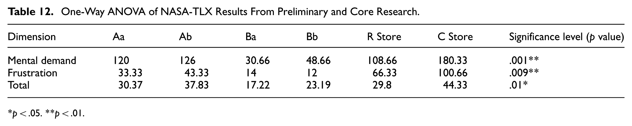
p < .05. **p < .01.
Further Scheffe post-hoc examination revealed a significant discrepancy (p = .025 < .05) in mental demand between “Ba Photo + Actual Position” and Store C. Both experimental samples utilized photo-based interfaces for equipment prompts. “Ba Photo + Actual Position” ranked highest in post-experiment interviews, primarily due to the clear angle of the photo identifying surrounding equipment features and arrows effectively drawing attention, allowing secondary device confirmation. Conversely, 60% of participants overlooked the photos on Store C’s interface during operation, as they were presented at an angle and in groups of three, complicating readability and not aiding in equipment search.
Frustration levels, as depicted in Table 12, were highest for Store C (100.66), followed by Store R (66.33), Ab (43.33), Aa (33.33), Ba (14), and Bb (12). These results indicated that the new design samples addressed operational issues from the preliminary research, simplifying procedures and providing clear guidance, thus diminishing frustration levels compared to Store R and Store C in the preliminary research. Furthermore, the two design samples employing Photo Format B attained the lowest frustration scores. Observations during the experiment noted that the photos provided precise equipment operation guidance, resulting in fewer errors compared to other design samples, leading to lower frustration levels for participants.
A comprehensive examination of the results from Experiments One and Two revealed significant improvements in operation time performance, SUS usability assessment, and NASA-TLX cognitive load evaluation for the four design samples introduced in the core research compared to the self-checkout systems of the two retail stores in the preliminary research. This suggests that the optimized interface prompts and guidance effectively assist users in more accurately and smoothly operating self-checkout systems.
Discussion
The results can be interpreted through the lens of Cognitive Load Theory. The photo-based interface design, by visually depicting real equipment and minimizing the need for symbolic interpretation, effectively reduced extraneous cognitive load. Participants could allocate more cognitive resources to task execution rather than interface comprehension, resulting in faster task completion and higher usability scores. This finding reinforces CLT’s assertion that reducing unnecessary mental effort improves user performance and satisfaction in technology-mediated interactions. The synthesis of research findings has led to the identification of key design principles and recommendations for future improvements in self-checkout systems, with a focus on enhancing usability and user experience:
System-Level Discrimination: It is imperative to demarcate distinct buttons at the system level based on prevalent consumer choices such as invoice selection, payment methods, or other configurations. This practice aims to mitigate user search time and alleviate apprehension arising from encountering an array of button menus. Moreover, interface layouts should meticulously delineate pivotal information pertinent to each operational phase, including but not limited to the total payment amount and discount details. Such delineation empowers users to swiftly confirm transaction particulars and finalize the checkout process.
Visual Representation of Device Operations: Throughout the self-checkout journey, users encounter diverse unfamiliar devices, including credit card terminals, barcode scanners, and receipt printers, as observed in this study. Providing explicit operational instructions for each device on the interface at every checkout juncture effectively aids users in navigating through various operations. Notably, our investigation underscores that instructional presentations employing photographic imagery yield optimal outcomes. It is imperative that such depictions clearly illustrate the frontal aspect of devices, encompassing operational gestures against uncluttered backgrounds.
Supplementary Prompting Mechanisms: In addition to primary visual instructions, self-checkout interface designs should integrate supplementary prompts to facilitate users in locating device positions, particularly in environments featuring an assortment of functional devices. Interface guidance mechanisms must efficiently and accurately steer users toward the correct devices.
Error Resolution and Assistance Mechanisms: Our study discerns that users experience heightened anxiety when grappling with operational errors, prompting dilemmas regarding whether to seek cashier assistance, endeavor self-resolution, or abort the transaction. In crafting self-checkout system designs, graphical and intelligible textual prompts should elucidate the nature of encountered issues and proffer resolution pathways to users. In instances necessitating cashier intervention, the interface should dynamically convey information indicating imminent assistance, thereby assuaging user uncertainties and alleviating the stress associated with waiting.
Integrated Diversification of Checkout Experiences: Presently, the retail landscape offers an array of checkout methodologies, encompassing mobile app-integrated scanning purchases, omnichannel shopping amalgamating online-offline integration and logistics, varied payment conduits, and return services, among others. Self-checkout system designs catering to diverse cross-service guidance and interface presentation requirements must exhibit consistency. By adeptly catering to diverse consumer needs and scenarios, while concurrently augmenting innovation and hedonic quality in user experiences, integrated self-checkout solutions can garner favorable evaluations.
Conclusion
Drawing upon the comprehensive analyses conducted in our two experiments, we have discerned the significant impact of design choices on user efficiency, usability, and cognitive load. Preliminary research served as the bedrock upon which substantial enhancements were built into the design samples of the core research. Through the refinement of operational flows, attention to white spacing, and strategic differentiation between primary and secondary options, notable reductions in operational time and errors were observed, accompanied by an elevation in usability ratings.
Notably, the strategic integration of the photo format, particularly Photo Format B, in the core research underscored its potential in augmenting usability – a facet previously underexplored in the preliminary research. Participant feedback shed further light on the importance of clear photo presentations, capturing equipment from optimal angles, and maintaining clutter-free backgrounds to facilitate user engagement and comprehension. The pronounced superiority of Photo Format B over Illustration Format A became apparent, with a significant majority of users perceiving photo cues as direct, efficient, and less cognitively burdensome. This inclination toward visual elements was particularly evident in the realm of guidance strategies; while both “actual location a” and “numbered location b” strategies demonstrated comparable efficacy, a notable 56% of users favored the intuitive arrow indication for its immediacy and reduced cognitive demands.
This thorough investigation underscores the pivotal role of authentic photos in self-checkout interfaces, accentuated by strategic cues such as arrows to facilitate equipment location. Among the array of designs evaluated, the “Ba photo + actual location” design emerged as exceptional, excelling across multiple evaluation metrics.
In summary, our research delineates a roadmap for the advancement of self-checkout systems. Emphasizing intuitive design, clarity in system differentiation, and leveraging graphical cues can substantially enrich the user experience (Djelassi et al., 2018; Jamal, 2004; Sandnes et al., 2010). As the retail landscape continues to evolve, our guidelines serve as a beacon for crafting seamless, user-friendly checkout experiences that address both the challenges identified in our research and the broader needs of the contemporary consumer. Overall, the study extends Cognitive Load Theory into the domain of self-service retail technologies, demonstrating how visual and procedural guidance design can measurably reduce cognitive effort and enhance user experience.
Limitations and Future Research
In the initial stage of this study, participants engaged with self-checkout kiosks situated in two Taiwanese chain stores, where their performance was subject to the ambient conditions of the respective stores. The subsequent phase, conducted within a controlled laboratory setting, mitigated these real-world challenges. Although this phase utilized interface design prototypes to assess strengths and weaknesses, it did not encompass considerations related to the optimal placement of checkout equipment or simulate potential system failures characteristic of operational kiosks. The central objective of the study was to contrast the effects of illustrative versus photographic interface designs, thereby underscoring the pivotal role of graphical content in guiding user interactions. Given this emphasis, forthcoming research endeavors should delve into more nuanced design elements and integrate physical components to achieve a comprehensive kiosk design aimed at further enhancing user experience.
Footnotes
Ethical Considerations
This study was reviewed by the Institutional Review Board (IRB) of National Taipei University of Technology (NTUT). The requirement for formal approval was waived because the study involved user interface interactions that posed minimal risk, and no personally identifiable information was collected.
Consent to Participate
Informed consent was obtained from all participants involved in the study prior to participation.
Funding
The authors received no financial support for the research, authorship, and/or publication of this article.
Declaration of Conflicting Interests
The authors declared no potential conflicts of interest with respect to the research, authorship, and/or publication of this article.
Data Availability Statement
Data sharing not applicable to this article as no datasets were generated or analyzed during the current study.