
Abstract
Lightbox luminance and colour play an important role in improving the legibility of metro directional signs. However, there are currently no relevant design and technical standards. This study examined the effect of lightbox colour and luminance on wayfinding sign legibility. First, a set of levels for the background luminance of the lightboxes was proposed. Second, based on the perceived brightness magnitude, test points and luminance thresholds were determined under different background luminance levels. Visual acuity tests were then performed using a white Landolt C with different luminance values on different sign backboard colours under varying background luminance levels. The results indicate that both lightbox colour and Landolt C luminance impacted legibility, with the latter exhibiting a greater effect. Wayfinding sign legibility with the same luminance increased significantly with higher background luminance. Moreover, legibility differed substantially between achromatic and coloured lightboxes: the average acuity of coloured lightboxes was lower at low background luminance, whereas the opposite was true at high background luminance. Accordingly, minimum luminance thresholds were proposed according to lightbox colour and background luminance based on an average acuity of 95%. These findings provide an important reference for luminance control of different coloured lightboxes in metro stations.
Plain language summary
Signs in metro stations help passengers find their way, and how easy these signs are to read depends on their brightness (luminance) and colour. Currently, there are no clear standards for designing these signs. This study looked at how the brightness and colour of lightbox signs affect how easily they can be read. The researchers tested signs with different background brightness levels and colours, using a simple visual test called the Landolt C to measure clarity. The results showed that both the brightness of the sign and the contrast with the background affected readability, with brightness having a stronger effect. Signs with higher background brightness were easier to read, and coloured and black-and-white signs performed differently depending on the lighting. Based on these findings, the study proposes minimum brightness levels for different colours and backgrounds to ensure signs are clearly visible. These results can help guide the design of more readable metro station signs.
Introduction
Wayfinding refers to the navigation process of an individual from one location to another, which is particularly important in urban transportation systems (Jamshidi et al., 2020). As key nodes in the urban transportation network, the design of wayfinding signs in subway stations is crucial for passengers’ navigation experience. Since subway stations are typically located underground and lack natural light, passengers cannot rely on natural light for orientation. Therefore, well-designed wayfinding signs not only provide essential navigation information but also support accurate spatial positioning and direction finding (International Standards Organisation, 2019; Ulusoy & Onur, 2023). The design quality of wayfinding signs directly affects visual communication and, consequently, passengers’ navigation efficiency within subway stations (Li et al., 2021; Zhou et al., 2020). With the development of LED lighting technology, the design of lightbox-type wayfinding signs faces new challenges, especially in terms of materials and lighting methods, which differ from traditional road traffic signs (Chongqing Urban and Rural Construction Commission, 2017; Federal Highway Administration (FHWA) of the United States Department of Transportation (USDOT), 2009; National Standardisation Administration of the People’s Republic of China, 2020). At the same time, the scale of subway stations and facilities continues to expand, and the architectural structure becomes more complex, increasing the difficulties passengers encounter in spatial positioning (Y. Zhang et al., 2010). Given that wayfinding signs within subway stations are the primary channel for passengers to obtain directional information, studying the impact of design elements such as sign luminance, sign colour, and background luminance on passengers’ visual performance is particularly important. This study aims to explore how these design elements affect the legibility of wayfinding signs and how to optimise these elements to enhance passengers’ navigation experience within subway stations.
Compared to non-luminous signs illuminated by external light sources, LED lightbox signs offer greater legibility and visual comfort. Among various luminous signs, LED lightboxes are the preferred choice, especially under dim environmental lighting conditions (Chen et al., 2017). Therefore, LED lightboxes are widely used in subway wayfinding signs. However, excessive luminance of LED signs can result in high energy consumption and contribute to light pollution. Studies have shown that the luminance of LED signs often exceeds the recommended threshold, leading to unnecessary energy waste and environmental concerns (Freyssinier et al., 2006). Reasonable luminance design not only helps improve the legibility of subway wayfinding signs but also reduces unnecessary energy consumption. In addition, subway signs often incorporate regional cultural elements to enhance a sense of local identity and community pride. A study of Taiyuan subway stations indicates that specific colour properties (saturation, luminance, and hue) significantly affect visual comfort, suggesting that cultural preferences for certain colours are considered in the design process (L. Zhang et al., 2022). Public art within subway stations, including colour schemes, often embodies regional cultural characteristics. In Shenzhen, the public’s identification with subway art depends on its reflection of local culture, with colour being an important factor. The colour design of wayfinding signs can also influence passenger flow efficiency (Qian & Zhao, 2024). For example, Wuchang Railway Station optimised the colour scheme of wayfinding signs to improve pedestrian passage time, demonstrating that colour selection takes into account both cultural and practical factors (Huo & Xu, 2018). The colour selection for subway wayfinding signs is influenced by both design specifications and cultural factors, and no unified colour system has been established across cities. In some cases, the use of colours with insufficient contrast against the background reduces the legibility of wayfinding signs.
Studies have shown that luminance level is a key factor affecting the visual effect of wayfinding signs (McLean, 1965; Schnell et al., 2009). Legibility varies with changes in background luminance and signs luminance, and when sign luminance is below 100 cd/m2, legibility increases approximately linearly with the logarithmic rise in luminance (Forbes et al., 1976; Zwahlen & Xiong, 2000). As the luminance level increases, the rate of increase in legibility slows down and begins to decline after reaching a certain luminance (He et al., 2021). The luminance requirements for traffic sign legibility are usually expressed as thresholds, with higher luminance enabling longer visibility distances (Schnell et al., 2004; Zwahlen & Xiong, 2000). Researchers have investigated both the optimal and minimum luminance levels for traditional traffic signs and self-luminous information signs at night, and European traffic management departments have established traffic sign luminance standards based on the research findings (European Committee for Standardisation (CEN) (2005). Compared with research on road traffic signs, studies on the impact of indoor wayfinding signs on legibility are still at an early stage. For example, Lasauskaite and Freyssinier suggest that the optimal luminance for train station lightbox wayfinding signs is 100 cd/m2 (Lasauskaite & Reisinger, 2017). Freyssinier et al. also proposed sign luminance standards corresponding to different background luminance levels (Freyssinier et al., 2006). However, luminance standards for indoor wayfinding signs have not yet been established.
Luminance contrast also significantly affects the legibility of wayfinding signs, with high contrast improving legibility and low contrast reducing visual effectiveness (Ko, 2017). The relative luminance and contrast between the sign and its background, as well as between the legend and the sign surface, are crucial for recognisability (Lozano, 1980). The luminance contrast between the sign and the background decreases as the background luminance increases, without changing legibility (He et al., 2021). Signs of different colours require different optimal luminance contrasts; for example, white legends on green or blue signs have optimal legibility at specific luminance ratios (Sivak & Olson, 1985). Shi et al. point out that higher illumination levels in subway stations (such as 273 lx compared to 70 lx) can make signs easier to read and recognise, thus aiding efficient navigation. Achromatic combinations are somewhat easier to recognise than chromatic ones, though the difference is not substantial (Shi et al., 2020).
The impact of signs colour on legibility is more pronounced than that of the legend (text) itself (M. Sun et al., 2020; Zineddin et al., 2005). Sun et al.'s study shows that the location, height, and design colour of guidance signs in underground shopping streets are important factors for their visual prominence (L. Sun et al., 2022). Sign colour is related to luminance, and low luminance can lead to incorrect judgements of colour (Forbes, 1960). Under nighttime luminance levels, changes in sign colour can affect the legibility of white legends (Hills & Freeman, 1970). Moreover, colours that are widely separated in the colour spectrum provide stronger contrast, thereby improving visibility and wayfinding effectiveness. Under the same luminance conditions, human perception of different colours is influenced by various factors, and colours with higher saturation appear brighter than those with lower saturation under the same luminance conditions (Withouck et al., 2013). Background luminance also influences legibility, with readable distance generally increasing as background luminance rises (Johnson & Casson, 1995). When the sign stimulus luminance is low, background luminance has little impact on legibility, and legibility drops sharply when the stimulus luminance is significantly lower than the background luminance (van Norren, 1981). Psychophysical experiments have demonstrated that background luminance levels influence the perceived brightness of highly saturated colours (Nakagawa et al., 2021).
In summary, although previous studies have examined the legibility of subway wayfinding signs under individual factors such as luminance, background luminance, and colour, they have not addressed their combined effects. The colour selection for subway lightbox wayfinding signs has not yet been standardised, especially since the recognisability of different colours at the same luminance varies. To achieve uniform legibility, the luminance of lightboxes for different colours should be controlled separately. Therefore, this study focuses on analysing how key factors—luminance, colour, and background luminance—affect the legibility of subway station wayfinding signs, aiming to provide a scientific basis and practical guidance for improving passengers’ navigation experience.
Field Survey of Wayfinding Signs
Wayfinding Signs Luminance and Colour Characteristics
To investigate the luminance and colour characteristics of existing wayfinding signs on metro platforms, 22 samples representing seven types of coloured wayfinding signs were selected for field measurements (Table 1). The chromatic coordinates of different metro lines were obtained from the local standard (Chongqing Urban and Rural Construction Commission, 2017). Luminance data for the text and pictograms of wayfinding signs were measured within the areas delineated by dashed lines in Figure 1 using a digital luminance and colour metre (CS-150, Konica Minolta Holdings, Inc.). Each measurement area was tested at three different positions, and the results were averaged to obtain the mean luminance. For signs containing both coloured and white regions, the luminance values were further averaged to calculate the combined luminance of colour and white areas.
Wayfinding Sign Luminance and Colour Information.
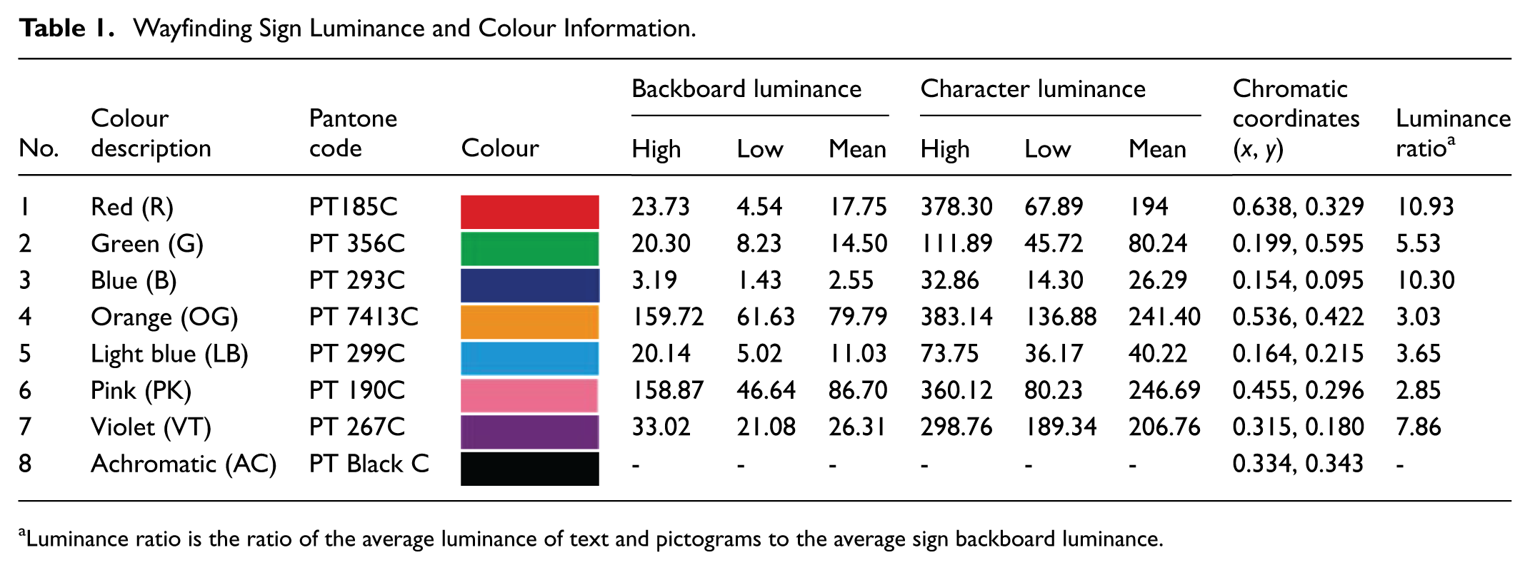

Luminance ratio is the ratio of the average luminance of text and pictograms to the average sign backboard luminance.
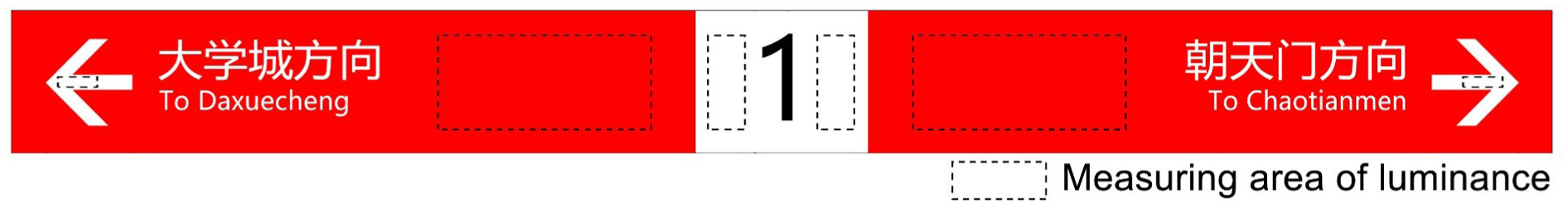
Measurement areas (delineated by dashed lines) used to determine the average luminance of wayfinding signs in metro (self-drawn).
Background Luminance Measurement
Passengers at different metro stations and viewing positions perceive varying backgrounds and corresponding luminance levels when observing wayfinding signs. Moreover, background luminance inevitably influences the legibility of wayfinding signs. Since the backgrounds of wayfinding signs consist of diverse environmental elements with varying luminance levels, their overall background luminance cannot be determined directly.
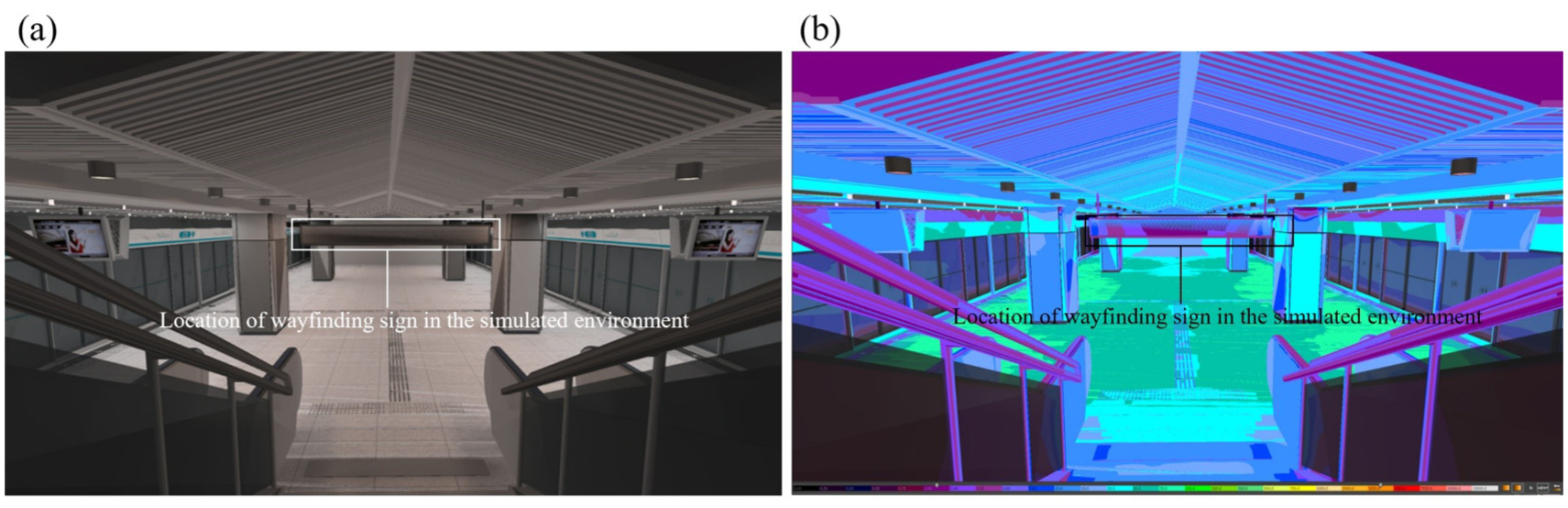
In this study, the background luminance of wayfinding signs at 22 stations was measured using high dynamic range imaging (HDRI; Safranek & Davis, 2021). Photographs were taken from positions where passengers viewed the wayfinding signs while descending the stairs. The horizontal distance between the camera position and the wayfinding signs was approximately 12 m at each station (Figure 2a).

Example background luminance environment: (a) fisheye lens photograph and dynamic field of vision (different speeds correspond to different dynamic fields of vision); (b) 180° field angle range; (c) division of background environment elements (self-drawn).
Given the large variations in background luminance values, average luminance was calculated using the L20 method recommended by the International Commission on Illumination, which has been commonly applied to evaluate tunnel entrance luminance (International Commission on Illumination, 2004). Since the typical passenger walking speed is 3 km/hr, resulting in minimal differences between dynamic and static visual fields, the passenger’s field of view was considered to be 180° (Figure 2a and b). Based on human visual perception, the brightest, darkest, and three intermediate-brightness points were selected for each background element, and their luminance values were averaged to determine the element’s mean luminance. The average background luminance of each of the 22 wayfinding signs was calculated by weighting the luminance values of the environmental elements according to their proportional areas (Figure 2c).
Methodology
Participants
Young people, especially students, are important subway users (Maljaee & Khadem Sameni, 2022; Murata et al., 2017), whereas elderly individuals often avoid travelling during rush hours (Myung-Jin et al., 2018). In this study, 30 students aged 24 to 30 years (14 males and 16 females; mean age = 27) were recruited as participants, providing a sufficient sample size for analysis. All participants had a naked or corrected visual acuity of ≥0.8 and reported no visual impairments or eye diseases.
This study involved only non-invasive visual acuity and luminance perception tests conducted under controlled indoor laboratory conditions, which minimised any risk of harm to participants. The potential benefits of the study, including providing design guidance for improving metro wayfinding sign legibility and thereby enhancing passenger safety and accessibility, outweighed the minimal risks of participation.
The study adhered to the principles of the Declaration of Helsinki and received approval from the Ethics Committee of Chongqing University. All participants were informed of the study’s purpose, procedures, voluntary nature, and their right to withdraw at any time without penalty. Written informed consent was obtained from all participants prior to data collection.
Experimental Design
Compared with coloured lightboxes, the backboard luminance of achromatic (black) lightboxes remains relatively stable and is unaffected by changes in character or pictogram luminance. A comparative acuity test was therefore conducted between achromatic and coloured lightboxes, and among different coloured lightboxes, to examine the influence of colour on legibility under varying background luminance conditions. To eliminate the influence of subjective and objective factors on legibility, Landolt C was used as the acuity test visual target. The maximum luminance and background luminance values of metro wayfinding signs were less than 400 cd/m2. Liquid crystal display (LCD) screens were used to conduct the legibility experiments, as these luminance values fall within the response range of LCDs. In this experiment, three independent variables of lightbox wayfinding signs were analysed: colour, luminance, and background luminance.
Colour
All the lightbox wayfinding signs colours displayed on the LCD were generated from a red-green-blue (RGB) colour model. Seven chromatic and one achromatic colour were selected as lightbox backboard colours in the experiment. The coloured backboards were assigned the colours recommended by current specifications (Chongqing Urban and Rural Construction Commission, 2017), whose chromaticity coordinates are shown in Table 1. To investigate the difference in legibility between coloured and achromatic lightboxes, Pantone black C (0.334, 0.343) was adopted as the backboard colour.
Background Luminance
The background luminance was divided into three levels according to the field survey results: high (21.76–34.38 cd/m2), medium (13.97–18.46 cd/m2), and low (6.72–9.91 cd/m2). In this study, the following standard values were selected for high background luminance (highest value in the high background luminance range), medium background luminance (median value in the medium background luminance range), and low background luminance (lowest value in the low background luminance range): 34, 14, and 7 cd/m2, respectively.
Because the human visual field is wide, an LCD screen cannot cover the entire field of view; therefore, both the luminance of the LCD image and the luminance of the surrounding LCD background must be considered. Therefore, in this study, the background luminance of the wayfinding sign was divided into two parts: the average background luminance of the simulation model and the luminance of the LCD background wall. To determine the average background luminance of the simulation model, the simulation image was first displayed on the LCD, and the proportion of different elements in the field of vision (ceiling, train, column, wall, floor, and step) was measured and calculated. Second, Photoshop software (Adobe Systems Inc., version 11.0) was used to adjust the luminance of the simulated image, and a luminance metre was employed to measure different elements and calculate their average luminance values using the above method. Finally, the average background luminance value was obtained using the L20 method. By continuously adjusting the luminance of the simulation image, scenarios were obtained at high, medium, and low luminance levels. The background luminance of the LCD was adjusted by indoor lighting. To correspond to the average background luminance of the simulation model, the average background luminance of the LCD was adjusted accordingly.
Luminance
Lightbox wayfinding signs comprise a coloured backboard, white character, and inner lighting. Different parts of each coloured lightbox have fixed transmittance values so that the text and backboard have a fixed luminance ratio under uniform internal lighting. The varying luminance ratios of coloured lightboxes produce different surface luminance values; however, because white characters or pictograms have the same transmittance, their surface luminance differences remain small. Therefore, the luminance of a white Landolt C on the lightbox was used as the basis for determining the experimental luminance level. The luminance ratio between the white text and the coloured backboard was obtained by field measurements (Table 1), combined with the luminance ratio, the corresponding luminance value of the coloured backboard can be determined. In addition, because the luminance of the black backboard does not vary with the luminance of white text, the average luminance of the black lightbox wayfinding sign was determined under high, medium, and low background luminance conditions, yielding values of 2.8, 3.2, and 4.5 cd/m2, respectively.
Numerous studies have considered the relationship between physical luminance and subjective brightness as the associated perception (Fechner, 1948; Sekuler et al., 1973; J. C. Stevens & Stevens, 1963). In this study, the relationship between a physical stimulus and sensation was assessed using Stevens’ power law (Bodmann & La Toison, 1994; J. C. Stevens & Stevens, 1963). The magnitude estimation scaling method was applied to determine the relationship between brightness perception and physical stimuli. On this basis, the luminance value and thresholds of different experimental points were determined. According to Stevens’ power law (S. S. Stevens, 1962), the relationship between luminance stimuli and psychophysical magnitude perception was derived under different background luminance conditions. According to the field survey, the character or pictogram luminance in the lightbox did not exceed 400 cd/m2. Therefore, regardless of the influence of lightbox colour, the upper limit of luminance in the experiments was assumed to be greater than 400 cd/m2.
One bril was used as the starting point, and subsequent points were determined by incrementally increasing the psychophysical perceived magnitude. When the corresponding Landolt C luminance value of the psychophysical perceived magnitude exceeded 400 cd/m2, this value or the next value was used as the termination point. A threshold of two bril was also applied to obtain the Landolt C luminance values shown in Table 2. In the metro station environment, ambient light will affect the surface luminance; therefore, if the luminance of the lightbox is less than the background luminance, its surface is often illuminated by ambient light. Therefore, experimental points with luminance values significantly lower than the background luminance were excluded. Finally, 13, 11, and 9 experimental points were obtained at low, medium, and high background luminance, respectively (Table 2).
Target Luminance Values of Experimental Points Under Different BL Conditions (cd/m2).

Ψ is the psychophysical magnitude perceived by the observer from the luminance stimulus provided under given viewing conditions.
Experiment Place Condition and Apparatus
The experiments were conducted in the architectural technology conference room at Chongqing University. The indoor lighting was a dimmable LED light, and a shading curtain was used to control interference due to daylight changes.
The experimental apparatus included a digital camera (Canon EOS 5D2) equipped with a fisheye lens (SIGMA 8 mm F3.5 EX DG), a notebook computer (ThinkPad P52), data cables, an LCD monitor (Hisense H65E3A), and digital luminance and colour metres (CS-150, Konica Minolta Holdings, Inc.). The viewing distance was set to 2.0 m to ensure that the horizontal viewing angle of the LCD screen remained within 30° (Figure 3).

Experimental apparatus; (a) front and (b) side views (self-drawn).
Stimuli
SketchUp software was used to model the metro platform and wayfinding sign. Dialux Evo 9.1 software was used to simulate the light environment of the platform with a lamp layout (Figure 4).
Experimental simulation environment: (a) perspective image; (b) luminance pseudocolour map (self-drawn).
A previous study determined the visual conversion coefficient between Chinese characters and Landolt C required to obtain the same legibility value of 1.79 (He et al., 2021). The typical Chinese character height in wayfinding signs is 280 pt (105.28 mm; Chongqing urban and rural Construction Commission, 2017); therefore, the Landolt C height used to ensure equivalent visual acuity was 58.8 mm.
For a given viewing angle, the viewing distance and corresponding text height should be proportional. In this study, the test point was 12 m from the wayfinding sign; therefore, the Landolt C height on the screen ensuring equivalent legibility was 9.8 mm. Because participants had varying visual acuity, they perceived targets of different sizes differently. To accurately evaluate the impact of lightbox luminance and colour on legibility, it is important to standardise participants’ ability to recognise the Landolt C at a fixed distance. Thus, in accordance with the principle of visual acuity, participants’ acuity was standardised by maintaining a fixed viewing distance and adjusting the visual angles. For example, for visual acuity of 1.0 and 1.2 on the Landolt C acuity chart, the corresponding LCD Landolt C heights were 7.8 and 6.5 mm, respectively.
Adobe Photoshop was used to render the Landolt C (9.8, 7.8, and 6.5 mm) onto lightboxes with various coloured and black backboards, which were then integrated into the test scenario. According to the luminance ratios in Table 1 and the luminance values of experimental points in Table 2, the luminance of the lightboxes and Landolt C in the experimental scenario was adjusted for different background luminance conditions. All parameters were calibrated using instrument tests to meet the size, colour, and luminance requirements. Experiments were then conducted to assess the effects of background luminance, colour, and Landolt C luminance on wayfinding sign legibility, with participants required to identify the Landolt C opening direction under different scenarios. The Landolt C used in the study had eight possible opening directions: up, down, left, right, up-left, up-right, down-left, and down-right (Figure 5). In total, 2,112 test scenarios were conducted for each Landolt C height, encompassing 3 background luminance levels, 8 backboard colours, 33 Landolt C luminance levels, and 8 opening directions.

Example experimental scenarios: (a) metro line test scenarios; (b) coloured wayfinding sign with Landolt C; (c) enlarged partial Landolt C image (self-drawn).
Procedure
A display time of 0.2 s is considered sufficient for accurate recognition of a single Chinese character (B. Zhang, 1993). Therefore, considering differences in visual function, the display time was set to 0.5 s in this study. After each scenario was displayed, participants had 2.0 s to indicate the Landolt C opening direction. Based on the different background luminance levels, lightbox colours, and Landolt C luminance levels, the experiment included 264 test scenarios. Each test scenario maintained the same backboard colour, background luminance level, and Landolt C luminance, but varied in the Landolt C opening direction. To prevent cumulative fatigue from long test sequences, experiments were alternated between two participants, following a Latin square design.
After determining the Landolt C size based on participants’ visual acuity and selecting the corresponding test scenario, the experiment commenced. ACDSee software was used to present each test scenario randomly for 0.5 s. The image then disappeared for 2.0 s before another image appeared. During this period, participants indicated the Landolt C opening direction, and the responses were recorded by the experiment assistant. For each scenario, each participant repeated the test 20 times.
Data Analysis
Legibility (acuity) scores (correct/incorrect) for each participant were recorded, and average acuity scores (percentage of correct responses) were calculated. The Statistical Package for the Social Sciences (SPSS) was used to perform analyses of variance (ANOVA).
Results
The experiment involved three independent variables: colour (8 levels), background luminance (3 levels) and Landolt C luminance (13 + 11 + 9 levels). Each participant completed 264 test scenarios, yielding 5,280 test acuities and 264 average acuity scores. Thirty participants completed the Landolt C acuity test, resulting in a total of 158,400 test acuities and 7,920 average acuity scores (264 × 30). Based on this, the mean acuity across the 30 participants for each test scenario was further averaged to obtain the overall average acuity for all 264 test scenarios.
Colour
The results of colour and Landolt C luminance under different background luminance levels, along with ANOVA summaries, are presented in Table 3. When the background luminance was 7, 14, and 34 cd/m2, the main effects of colour and Landolt C luminance were statistically significant, indicating that both factors influenced the recognition of wayfinding sign lightboxes across the three background luminance levels. The interaction effects between Landolt C luminance and wayfinding sign lightbox colour were not significant (p > .05) under a background luminance level of 7 and 14 cd/m2. At a background luminance of 34 cd/m2, the interaction effect between Landolt C luminance and the colour of the wayfinding sign lightbox was significant.
Within-Subject Effects Analysis of Test Participant Average Acuity Scores Under the Same Background Luminance for Different Lightbox Colours and Landolt C Luminance Values.

Statistical significance at p < .05.
The individual effects of lightbox wayfinding sign colour on legibility were analysed by Student–Newman–Keuls (SNK) pairwise comparison at the same background luminance level (Table 4). For the colour average acuity SNK homogeneous subset at a background luminance of 7 cd/m2 (Table 4), the influence of colour on average acuity can be divided into four homogeneous subsets. There were no significant differences within each subset. Red and pink were in one group; pink, orange, violet, light blue, and blue were in one group; violet, light blue, blue, and green were in one group; and achromatic colours were in one group. At a background luminance of 14 cd/m2, the influence of colour on average acuity can be divided into two homogeneous subsets, with significant differences between achromatic and colour lightboxes. There were no significant differences among the seven colours.
Multiple Comparison Test Results for the Colour Average Acuity (%) SNK Homogeneous Subset.

Under a background luminance of 34 cd/m2, the interaction effect between Landolt C luminance and wayfinding sign lightbox colour is significant. Therefore, a simple effect analysis was performed to further understand the influence of colour on average acuity. A comparison among coloured lightboxes revealed that pink produces the lowest average acuity score and blue produces the highest average acuity score. When the Landolt C luminance was 20.22 cd/m2 (7 bril), a significant difference was observed between all colours except light blue, whereas violet, blue, and orange showed significant differences at a Landolt C luminance of 39.54 cd/m2 (9 bril). At a Landolt C luminance of 105.6 cd/m2 (13 bril), significant differences were observed between pink and red, blue, green, and orange, as well as between blue and light blue, with no significant differences among other colours. However, there was no significant difference in average acuity among different coloured lightboxes at higher Landolt C luminance values.
Background Luminance
Landolt C stimuli with the same perceived brightness values (7–23 bril) under different background luminance levels were selected for comparison (Figure 6). Under the same perceived Landolt C brightness, the average acuity of different colour wayfinding signs generally increased with increasing background luminance, whereas the average acuity of achromatic wayfinding signs increased initially and then decreased. The average acuity for red showed a more pronounced trend of increasing with the enhancement of background luminance. For green, there was not much difference at background luminance levels of 14 and 34 cd/m2. The interaction between background luminance and wayfinding sign colour was not statistically significant (p > .05) according to ANOVA.
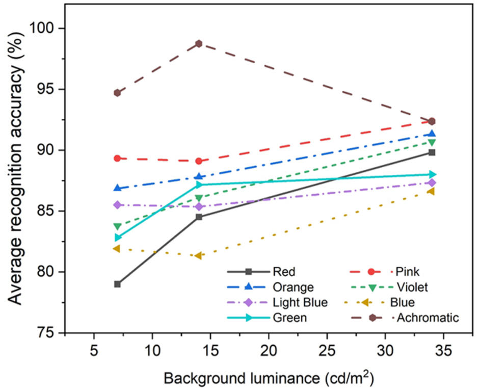
Average acuity (%) of different colours under different background luminance with the same perceived brightness (self-drawn).
Luminance
Similar to the colour independent variable, the main effect of wayfinding sign luminance was statistically significant (Table 3). The interaction effects between Landolt C luminance and wayfinding sign lightbox colour were not significant (p > .05) at background luminance levels of 7 and 14 cd/m2. Therefore, the individual effects of lightbox wayfinding sign Landolt C luminance on legibility were analysed by Student–Newman–Keuls (SNK) pairwise comparison at the same background luminance level (Table 5).
Multiple Comparison Test Results for the Landolt C Luminance Average Acuity (%) SNK Homogeneous Subset.

For the Landolt C luminance average acuity SNK homogeneous subset (Table 5), the influence of Landolt C luminance on average acuity was divided into five homogeneous subsets under a background luminance of 7 cd/m2, and four subsets under a background luminance of 14 cd/m2. Under a background luminance of 34 cd/m2, a simple effect analysis was also performed to further understand the influence of Landolt C luminance and colour on average acuity. Multiple comparison tests at each Landolt C luminance point showed that colour and achromatic lightboxes exhibited significant differences at Landolt C luminance levels of 20.22 cd/m2 (7 bril), 39.54 cd/m2 (9 bril), 67.88 cd/m2 (11 bril), and 105.6 cd/m2 (13 bril). Moreover, coloured lightboxes exhibited lower average acuity than the achromatic lightbox at low Landolt C luminance. With increasing Landolt C luminance, the average acuity of the achromatic lightbox gradually changed from being higher than that of colour lightboxes to lower, although the difference was not statistically significant. Thus, the influence of lightbox colour on average acuity was not pronounced with increasing Landolt C luminance at high background luminance.
Discussion
Under different background luminance levels, the impact of luminance on the legibility of subway wayfinding signs is substantial (Partial eta squared > 0.14), while the impact of colour is moderate (0.06 < Partial eta squared < 0.14) or small (Partial eta squared < 0.06). These results indicate that the influence of luminance on legibility is greater than that of colour. Thus, luminance is a critical determinant of legibility, with a large observed difference between high and low luminance conditions. When luminance values are below 500 cd/m2, average acuity increases with luminance for both colour and achromatic lightboxes, but their response patterns differ: the acuity of colour lightboxes rises steeply at first and then gradually stabilises, whereas that of achromatic lightboxes rises to a peak and then slightly decreases (Figure 7). This suggests that luminance contrast between legend and background is a key mechanism underlying the legibility difference between colour and achromatic lightboxes. In practice, achromatic lightboxes can maintain acceptable legibility by carefully controlling luminance contrast.

Wayfinding sign legibility (given by the average acuity score) according to Landolt C luminance for different coloured lightboxes and an achromatic lightbox under the same background luminance level: (a) 7 cd/m2; (b) 14 cd/m2; (c) 34 cd/m2. Left: complete average acuity trends. Right: average acuity trends above 95% (self-drawn).
The effect of colour is more complex. For example, the green lightbox produced the highest average acuity under all three background luminance levels, even though it did not yield the highest luminance contrast ratio. Conversely, the red lightbox showed the lowest acuity under low background luminance, despite exhibiting the highest luminance contrast ratio. These results demonstrate that colour itself, beyond its luminance contrast, substantially influences legibility. Different colours present distinct legibility patterns under the same background luminance (Figure 7), and although the differences among most colours are not statistically significant, they still show small variations with changes in background luminance. At higher luminance levels, colour lightboxes generally outperform achromatic ones, confirming the enhancing effect of chromaticity on visual performance.
Another important finding is that higher background luminance reduces the luminance requirement for achieving the same acuity. For example, to reach 95% average acuity, a higher Landolt C luminance is required under low background luminance than under medium or high levels. This indicates that increasing background luminance effectively improves legibility for most wayfinding sign colours, with the exception of pink. Interestingly, although an increase in background luminance reduces the perceived brightness of a lightbox at the same luminance level, the actual measured legibility still improves. This unique result suggests that in indoor environments such as metro stations, legibility benefits not only from luminance contrast but also from the combined influence of colour and the constant contrast of lightbox characters. This contrasts with many outdoor wayfinding sign studies, where very high luminance often reduces legibility.
To synthesise, the legibility of metro station lightbox wayfinding signs is jointly influenced by luminance, colour, and background luminance. Our findings highlight several practical implications. First, luminance control standards for wayfinding signs cannot be determined by luminance values alone; they must consider the specific colour of the sign and the background luminance conditions of the station. Second, colour selection can play a role in energy-saving strategies: for instance, green signs achieved 95% acuity at the lowest luminance thresholds across all background luminance levels, whereas violet and pink required the highest thresholds under certain conditions. Therefore, choosing colours with lower luminance thresholds can reduce energy consumption without compromising legibility.
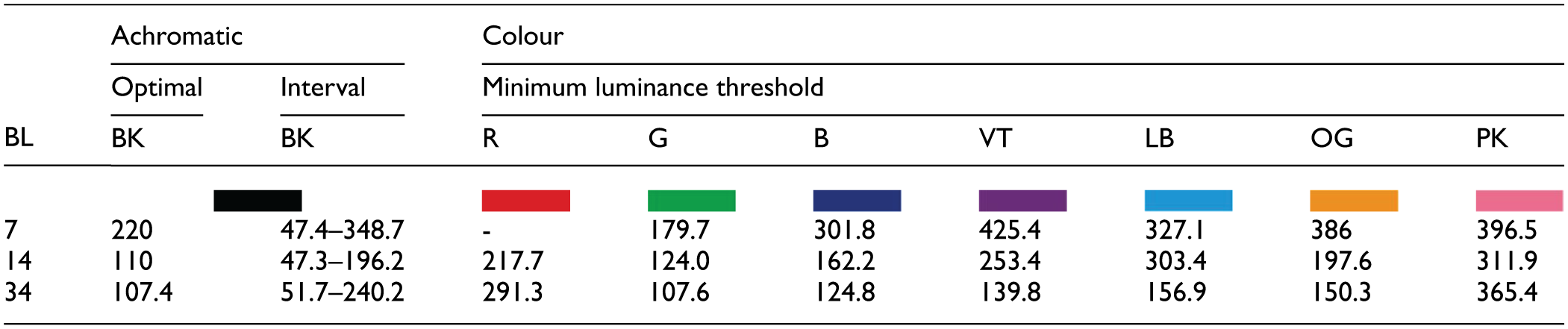
Finally, in this study, young participants with good vision were used as the benchmark group, and 95% average acuity was adopted as the criterion for luminance thresholds. As the Landolt C luminance is less than 500 cd/m2 in the experiment, the coloured lightbox experiments can only reveal the minimum luminance threshold required to meet 95% average acuity and are unable to provide the optimal or maximum luminance threshold (Table 6). This provides a reference baseline for metro station wayfinding sign design but also indicates that actual thresholds for general passengers may need to be higher. Future work should therefore investigate different age groups and visual conditions to establish more inclusive design standards.
Optimal Luminance, White Character Luminance Intervals, and Minimum Luminance Thresholds for Different Coloured and Achromatic Lightboxes Under Different BL Levels (cd/m2).

Conclusion
This study assessed the impact of colour and character luminance on the legibility of subway station lightbox wayfinding signs under different background luminance levels. Luminance was found to have the most significant effect on legibility, followed by colour. A considerable difference was observed between achromatic and coloured lightboxes. When luminance and background luminance were identical, wayfinding signs of different colours exhibited varying legibility. Background luminance also influenced average acuity; under the same luminance, the recognisability of directional signs increased significantly as background luminance rose. At low background luminance levels, the average acuity of coloured lightboxes was lower than that of achromatic lightboxes, while the opposite trend appeared at high background luminance levels. Based on a 95% legibility threshold, luminance thresholds for seven coloured and achromatic lightboxes were determined at three background luminance levels (7, 14, 34 cd/m2). These findings enhance the understanding of how lightbox colour and luminance affect visual function, contributing to the improvement of safety and efficiency in indoor pedestrian traffic.
Despite these contributions, several limitations remain. The legibility thresholds for different background luminance levels and wayfinding sign backboard colours were obtained from participants who were all young students with good visual and reaction abilities. Consequently, the experimental results primarily reflect the visual recognition of younger individuals. Further analyses are needed for middle-aged and elderly groups to account for visual deterioration and reduced responsiveness, ensuring that luminance standards for wayfinding signs meet broader safety and efficiency requirements. In addition, each lightbox colour involved only one luminance contrast ratio; the influence of contrast variations of the same colour on legibility was not examined. Future research should therefore investigate the effects of contrast changes as well as the role of multiple characters in sign legibility, rather than a single character. With the advancement of technology, LED screen guide signs are increasingly likely to replace traditional lightbox signs. Moreover, frontier technologies such as adaptive LED systems, dynamic contrast adjustment, and smart signage integrated with real-time passenger information may provide new possibilities for improving legibility and energy efficiency in metro stations. Future research should therefore not only refine luminance and colour standards for traditional lightboxes, but also explore these emerging solutions to better support the next generation of metro wayfinding systems.
Footnotes
Ethical Considerations
This study was approved by the Ethics Committee of Chongqing University. All procedures were conducted in accordance with the Declaration of Helsinki.
Consent to Participant
Written informed consent was obtained from all participants prior to data collection.
Author Contributions
All authors contributed to the study conception and design. Material preparation, data collection and analysis were performed by (Li Quan, Xinshuo Zhang, Bo Wang, Ying Li). Drafting the article and critical revision of the article (Li Quan, Xinshuo Zhang, Bo Wang, Ying Li, Ying He). Final approval of the version to be published (Li Quan, Xinshuo Zhang, Bo Wang, Ying Li, Ying He). All authors read and approved the final manuscript.
Funding
The authors disclosed receipt of the following financial support for the research, authorship, and/or publication of this article: This work was supported by the State National Natural Science Foundation of China (grant numbers 52478077) and the Natural Science Foundation of Chongqing, China (grant number cstc2020jcyj-msxmX0984).
Declaration of Conflicting Interests
The authors declared no potential conflicts of interest with respect to the research, authorship, and/or publication of this article.
Data Availability Statement
Data available on request from the authors.