
Abstract
Reading is a fundamental process and enhancing legibility is crucial for improving the reading experience. There is a growing interest in improving legibility, with new applications such as bionic reading. To investigate the legibility of texts in the bionic format, we tested two groups of participants, that is, younger readers (students) and older readers (middle-aged). Two widely used typefaces designed for on-screen reading were used to assess legibility, that is, the transitional typeface Georgia and the sans-serif typeface Verdana. The reading was tested with an eye-movement tracking device. Bionic reading was developed for on-screen reading; however, we were interested in whether it could also be used as a print typeface on paper. The results showed that bionic reading affects the reading time, that is, the reading time is longer. In addition, the Verdana typeface is faster to read than the Georgia typeface. Moreover, it was found that there is no advantage to using bionic reading for texts on paper. Older readers read faster on any medium and in both typefaces in the non-bionic and bionic format. It cannot be stated with certainty whether bionic reading is favourable or not, as the results of comprehension and memorisation do not suggest that they are affected in the same way. Further extensive testing is required. We propose extensive testing with different typefaces and type sizes, including people with dyslexia and ADHD, especially with younger readers to refine the bionic reading applications and understand their impact on enhancing the reading experience.
Plain language summary
Improving text legibility enhances the reading experience. One innovative approach is bionic reading, which emphasizes the first few letters of each word (for example) to guide the eyes. However, its effectiveness remains under-researched. We analysed its impact on younger (students) and older (middle-aged) readers using two typefaces. While designed for screens, we also tested its applicability to printed text using eye-tracking. Results showed no benefits for print, but surprisingly, older readers outperformed younger ones across all formats. Further research is needed, especially with different typefaces and groups like dyslexic and ADHD readers, to refine bionic reading and assess its benefits.
Introduction
Reading is a complex process where observers transform typographic, that is, visual, symbols into recognisable meanings (Agrawal et al., 2019; Reynolds, 1988). It is assumed that more than ten percent of the population (with a specific learning disability, e.g., dyslexia or a macular disease) have problems with reading (Chung, 2020; Wagner et al., 2020). Readers should find it easier to recognise the letters in the first part of a word than in the second part (Engbert et al., 2005; Reynolds, 1988; Snell, 2024). The legibility of a text refers to how easily this process can be carried out, that is, the text to be easily understood by a reader (Reynolds, 1988).
Research on Legibility
Academic research on legibility has surged in the past 80 years (Flesch, 1948; Spencer, 1969), though investigations began over 200 years ago. Louis-Laurent Anisson-Duperron, a director of Imprimerie Royale, conducted one of the earliest recorded tests during the 1790s. He tested two typefaces, that is, old-style Garamond and modern Didot (Mosley, 1997; Spencer, 1969). Early legibility research focused on sentence length, word count and average syllables per word (Flesch, 1948; Spencer, 1969). Later, the reading speed became an important measure of legibility (Rayner et al., 2016). Research indicates that texts of the same length are read faster if they are easier to read (Rayner et al., 2016). Eye movement is another insightful metric for understanding legibility (Rayner et al., 2016). Using eye-tracking equipment to check legibility provides information on saccades and fixations (Franken et al., 2015; Vonk et al., 2000). Fixations are the short stops at individual words or groups of words that allow the brain to process information, while saccades are very rapid eye movements that align the object image with the fovea area. From the data on fixations (duration and location), saccades (number per unit time and length) and reading speed, we can draw conclusions about how reading proceeds and how legible the text appears to be (Franken et al., 2015). For example, familiar words require shorter fixation times than less familiar or unknown words (Rayner, 1998; Schother & Rayner, 2012). Saccade movements depend on type size (Rayner et al., 2001; Vonk et al., 2000).
Various variables are measured to test legibility, including the reading speed and comprehension, fixation count, fixation length, the number of returns to re-read and memorisation.
The shape of letters and typographic design with type size strongly influence legibility (Ali et al., 2013; Beier et al., 2017; Choi et al., 2018; Franken et al., 2015; Su et al., 2018). The properties of typographical elements influencing text legibility include character shape, counter size, x-height, ascender and descender extensions, the presence and shape of serifs, stroke weight contrast, letter width, type size, leading (line spacing) and type style (Bix, 2002; Bringhurst, 2002; Možina et al., 2019; Rayner et al., 2001; Tracy, 2003). X-height represents the baseline-to-midline distance of lowercase letters, impacting the reading speed based on its visual angle (Legge & Bigelow, 2011). Sans-serif typefaces, consisting of only thick strokes, have a simpler shape.
When reading on screens, screen resolution also affects legibility, for example, higher resolutions allow better display of letters and their features (Bessemans, 2016; Bigelow, 2019). At lower screen resolutions, larger type sizes are recommended (Banerjee et al., 2011; Franken et al., 2015).
In smaller type sizes and differences in stroke weight, typographic tonal density (TTD) significantly affects text legibility (Rat et al., 2011). TTD denotes the darkness or grayscale of a text on a background and can be quantified by ink concentration per unit area, in square centimetres, picas or inches (Keyes, 1993). Thicker stroke widths imply more ink coverage per area (Bringhurst, 2002; Možina et al., 2019).
Higher legibility promotes a positive attitude towards the text, leading to better comprehension and memorisation (Labroo & Pocheptsova, 2016; Mead & Hardesty, 2018; Medved et al., 2023; Pieger et al., 2016; Song & Schwarz, 2008). In contrast, poorer legibility fosters negative attitudes, longer reading and more time to memorise. This results in poorer information processing, comprehension and memorisation (Bjork & Yue, 2016; Meyer et al., 2015; Oppenheimer & Frank, 2008; Pieger et al., 2016; Rummer et al., 2016; Sanchez & Naylor, 2018; Wu et al., 2020).
Research shows that comprehension in reading depends also on the reader’s age. Children up to the fourth grade of elementary schools have lower letter recognition ability than adults (Woods et al., 2005). Reactions to the same stimuli differ between younger adults (under 35) and older adults (over 60; Johnson et al., 2004; Piqueras-Fiszman et al., 2011).
There is currently a great interest in improving legibility. For example, typefaces like Dyslexie Font and OpenDyslexic aim to help readers with dyslexia, though some researchers dispute their advantages (Galliussi et al., 2020; Joseph & Powell, 2022; Kuster et al., 2018; Wery & Diliberto, 2017). The fragmented typeface Sans Forgetica was designed to aid memorisation, yet studies have shown mixed results regarding its processing or memory benefits (Cushing & Bodner, 2022; Geller et al., 2020; Maxwell et al., 2022; Taylor et al., 2020; Wetzler et al., 2021). However, some research indicates that poorer legibility or desired difficulty in text legibility can improve text processing and memorisation (Bjork et al., 2013; Diemand-Yauman et al., 2011; Halin, 2016; Pieger et al., 2016; Price et al., 2016). New reading applications, such as BeeLine Reader (beelinereader.com), which adds coloured gradients to sentences and Bionic Reading (bionic-reading.com), aim to improve legibility.
Bionic Reading
Bionic reading, developed by the Swiss typographic designer Renato Casutt, highlights the first few letters of each word (e.g., for example) to guide the eyes through the text (Bionic Reading, 2024). It is intended to aid comprehension and assist people with dyslexia and ADHD (Attention-Deficit/Hyperactivity Disorder) in reading faster. However, some researchers (Kieu, 2023; Singer Trakhman, 2022) dispute the developer’s claims, noting that the benefits were marketed based on merely 12 tested participants and that the application was not tested on individuals with dyslexia. Nevertheless, both sources agree that further research is needed. In the pilot research on bionic reading (Doyon, 2022a), participants read two texts, one set in the Garamond typeface and the other in the bionic format. Almost each participant read faster the text that they encountered first, suggesting that the bionic format did not have a significant impact on participants’ performance. Another research (Doyon, 2022b) was conducted with the help of social media platforms, that is, Hacker News, Reddit and Twitter. In this research, the participants, that is, 2,074 users of these platforms, needed to read two 1,000-word texts in the typeface Literata, once in the non-bionic and then in the bionic format. The text set in the latter was read slightly more slowly, while the comprehension results were virtually identical for both typefaces. In the research conducted by Sardido et al. (2024), 490 young students aged between 15 and 16 years participated. One group of students, that is, 245, read the text in the bionic format, and another group of the same number of participants read the text set in a plain typeface. The results showed no significant differences in the reading speed and comprehension between the texts set in the non-bionic and bionic format. Another research on bionic reading (Snell, 2024) included 32 participants who read 100 paragraphs, one-half in the non-bionic and the other in the bionic format. The results showed no significant differences between the two formats.
Present Research
The aim of the present research was to establish the benefits of bionic reading for typical readers who do not have a specific macular disease or diagnosed learning disability. If the bionic reading proves to be effective, it could be used in the design of educational materials as well as everyday popular texts in digital media, such as websites. Previous research in this area is sparse and includes participant groups of different sizes. Tests with larger numbers of participants were not conducted in a controlled environment as they took place on social media platforms (Doyon, 2022a, 2022b). Tests in a controlled environment were conducted with a smaller group of participants from the same age group (Snell, 2024). In our research, we conducted the tests in a controlled environment with a larger number of participants and in two different age groups. We included adult readers, that is, students (young adults; ca. 19–25 years old) – as they are expected to read a lot – and middle-aged readers – as they are expected to be more experienced readers. To evaluate legibility, two widely used typefaces designed for on-screen reading were used, that is, transitional typeface Georgia and sans-serif typeface Verdana. For testing the legibility on a screen, we used an eye-movement tracking device as it provides objective measures of reading (Franken et al., 2015; Medved et al., 2023, 2025; Piqueras-Fiszman et al., 2011; Salicchi et al., 2023). The bionic format was developed for on-screen reading. However, given that no research has explored the comparison between on-screen and print bionic reading so far, we were interested in whether a bionic text adjustment can be used for reading on paper – as the material was improved when reading in print (Haddock et al., 2020). We were interested in whether bionic reading is useful for adult readers who are more experienced readers. At the same time, we also wanted to investigate whether bionic reading can improve legibility on paper.
Methods and Materials
Ethical Consideration
The research was performed in accordance with the Declaration of Helsinki. The Ethics Commission in Slovenia granted ethical approval for this research. The participants provided an informed consent document to participate in this research.
All data are openly accessible on: https://osf.io/xgd79/?view_only=535241693b2d4bf493afe4ec25b5c89a.
Apparatus
To track the eye movement, we used a Tobii Pro Fusion 250 Hz eye tracking device and Tobii Pro Lab 1.232 (x64) software (Tobii AB, Sweden). The device tracks the eye movement by monitoring the reflection of the cornea image. This reflection is produced when the infrared illuminators on the front side of the eye tracker create light patterns that reflect off the cornea. An infrared-sensitive camera tracks each movement and fixation (User’s manual Tobii Pro Lab, 2024).
We used an LCD screen with a resolution of 2560 × 1440 pixels and a refresh rate of 60 Hz.
In the same room, participants read texts printed on a paper in a Judge QC light chamber (X-Rite, MI, USA) under D50 lighting conditions.
Measurements
The measurements were conducted in line with the experimental plan (Figure 1).
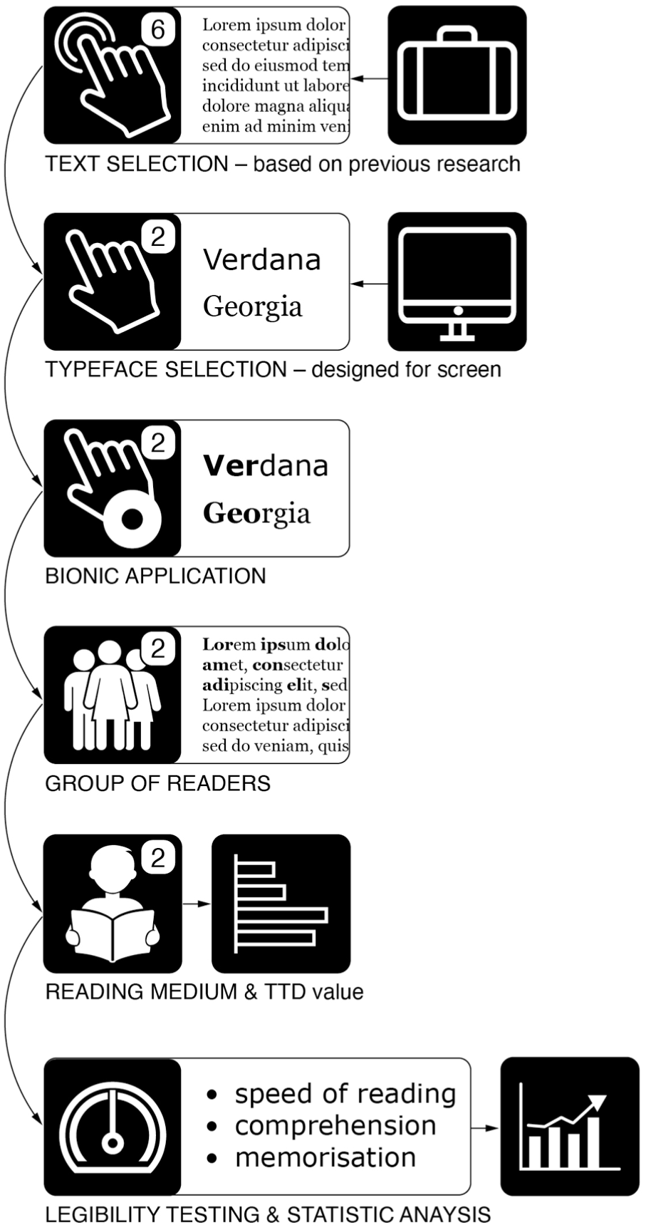
Experimental research plan.
All measurements were performed in a quiet room with walls painted in a neutral matte grey, which is in line with the ISO 3664 standard (ISO 3664, 2009).
The participants were positioned 60 cm ± 1 cm from the screen for on-screen reading, as recommended by the ISO 9241-303 standard (ISO 9241-303, 2011). For the reading on paper, the distance was between 35 and 40 cm from the paper.
To avoid the influence of text content or complexity on legibility during the reading speed assessment, we used the same texts as in previous research (Možina et al., 2020, 2024). Six different texts were sourced from the Slovenian edition of the National Geographic journal. The texts ranged in length from 537 to 603 characters, excluding spaces (M = 561.83, SD = 23.56), with 100 to 114 words (M = 105.17, SD = 5.01) and were set in 10 to 12 lines (M = 10.67, SD = 0.75).
Each typeface, Georgia and Verdana, was tested in plain (non-bionic) and bionic format (Figure 2). The text was presented as dark letters on a light background according to the ISO 12646 standard (ISO 12646, 2015). Four texts were displayed on a screen (both typefaces and in both formats), and two texts in the Verdana typeface (non-bionic and bionic) were printed on paper. The type size was 16 px on the screen and the same size, that is, 12 pt (1 pt = 4.233 mm), printed on paper. The leading was 125% of the typeface size, that is, 20 px or 15 pt. The vertical view angle (Legge & Bigelow, 2011) was 0.21° for Georgia and 0.23° for Verdana.

Example of (A) non-bionic and (B) bionic text in Georgia (top) and Verdana typeface (bottom).
The texts for on-screen reading were set and displayed as HTML documents to ensure a precise text display in the selected size. The texts were displayed in the middle of the screen and advanced by successive mouse clicks.
The texts for reading on paper were printed on commercial office paper with grammage of 80 g/m2. Black prints were made with an HP Officejet Pro X576dw MFP inkjet printer at 1,200 dpi resolution (Hewlett-Packard Development Company Dallas, TX, USA), using the original pigment-based black ink.
The TTD of different typefaces was measured with an image analysis using ImageJ software (National Institutes of Health, 2024). This software provides the opportunity to measure, analyse and provide output values, for example, area, number of particles and percentage of coverage (National Institutes of Health, 2024). All measured samples were the same in size, that is, 800 × 300 pixels.
Procedure
The group of young adult readers, that is, students (young), involved 59 participants with an average age of 21.22 years (SD = 1.37), 67.79% of them being female and 32.21% male. In the group of middle-aged adults (older), there were 55 readers with an average age of 46.02 (SD = 7.72), 70.91% of them being female and 29.09% male. All participants had normal or corrected-to-normal vision. According to the participants’ self-reports, none of them was familiar with bionic reading at the time.
Before the measurement, each participant was given 5 min to adapt to the lighting conditions in the test room and to perform a nine-point screen-based calibration of the device.
Each participant read all six texts. They first read four texts on the screen, followed by two more texts printed on paper. To control the fatigue effect, participants read the texts in a different order, using the Latin square method.
During on-screen reading, we measured the reading speed, number of fixations, fixation duration, and number of saccades for each text across all participants. For the reading on paper, we measured the reading speed across all participants. After reading each text, the participants answered two questions to assess their comprehension and memorisation of the text content. The text comprehension was tested with a multiple-choice question with three possible answers, from which they chose the one they thought was correct. Text memorisation was checked by presenting a sentence and asking if it was included in the text.
To ensure comparable results, we recalculated the reading speed, number of fixations, fixation duration, and number of saccades for each text based on 600 characters. Since the average length of words varies significantly among different languages, the number of characters was used as the measurement unit instead of the number of words (Trauzettel-Klosinski & Dietz, 2012) in order to facilitate the generalisation of our results.
The influence of the typeface, bionic text adjustment and medium (screen vs. paper) on legibility was statistically analysed with SPSS statistics 17 (SPSS, Chicago, IL, USA). Mixed analyses of variance (ANOVA) were conducted. Statistical hypotheses were tested at a 0.05 error rate.
Results
In presenting the results, we focus on the reading speed, number of fixations, fixation duration, number of saccades, results of comprehension and memorisation. Moreover, we report the results on TTD.
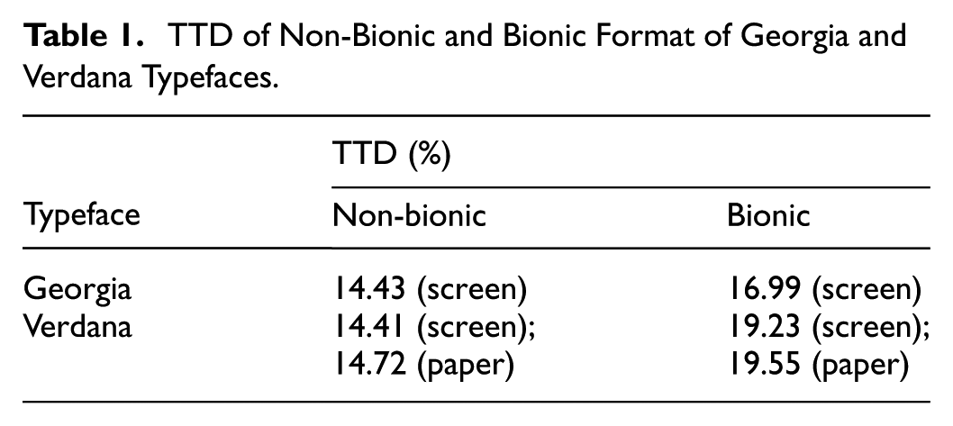
Typographic Tonal Density
The TTD (Table 1) for the non-bionic Georgia typeface was 14.43% and for the bionic Georgia, it was 16.99%. The difference was more pronounced in the Verdana typeface, that is, average 14.66% for the non-bionic versus average 19.39% for the bionic format.
TTD of Non-Bionic and Bionic Format of Georgia and Verdana Typefaces.
Eye-Tracking Measures of Legibility
A mixed ANOVA with age group (young vs. older) as the within-subjects factor, typeface (Georgia vs. Verdana) and bionic format (non-bionic vs. bionic) as the between-subjects factors was performed. The eye-tracking measures (reading time, number of fixations, fixation duration, and number of saccades) were used as dependent variables.
For the reading time, the analysis showed the main effect of the typeface, F(1, 112) = 40.39, p < .001, indicating that the texts in Verdana had shorter reading time (M = 35.38, SE = 1.09) than the texts in Georgia (M = 38.77, SE = 0.94). Furthermore, the main effect of the bionic format was found to be statistically significant, F(1, 112) = 6.20, p < .05, indicating that the bionic format of the texts resulted in longer reading time (M = 37.58, SE = 1.03) than the non-bionic format (M = 36.57, SE = 0.98).
The analysis further indicated that the main effect of the age group was also statistically significant F(1, 112) = 7.63, p < .01. The older participants spent less time reading the on-screen texts (M = 34.37, SE = 1.41) than the younger participants (M = 39.79, SE = 1.36; Table 2).
Descriptive Statistics for Statistically Significant Differences.

For the number of fixations (Table 2), the mixed ANOVA showed that the bionic format was the only factor for which the main effect was statistically significant, F(1, 112) = 38.69, p < .001. The bionic format of the texts resulted in a higher number of fixations (M = 130.97, SE = 2.83) than the non-bionic format (M = 122.88, SE = 2.55). For the average time of fixations, the main effects of the typeface, F(1, 112) = 100.37, p < .001, bionic format F(1, 112) = 27.39, p < .001 and age group F(1, 112) = 8.83, p < .01, were statistically significant. The texts in Verdana had shorter average time of fixations (M = 277.76, SE = 3.94) than the texts in Georgia (M = 304.92, SE = 5.05). Furthermore, the texts in the bionic format had shorter average time of fixations (M = 286.09, SE = 4.36) than the texts in the non-bionic format (M = 296.59, SE = 4.50). Finally, the older participants had shorter average time of fixations (M = 278.51, SE = 6.21) compared to the younger participants (M = 304.18, SE = 5.99). There was a statistically significant interaction between the typeface and bionic format F(1, 112) = 5.39, p < .05, indicating that the difference between the average time of fixations for the non-bionic and bionic format of the texts was different depending on the typeface. The difference in the average time of fixations was more significant in the case of Georgia compared to Verdana (Table 2 and Figure 3).

Interaction effect between typeface and bionic format on average time of fixations in milliseconds.
For the number of saccades, the analysis showed the main effect of the bionic format, F(1, 112) = 46.74, p < .001, indicating that the bionic format of the texts resulted in a higher number of saccades (M = 118.81, SE = 2.64) than the non-bionic format (M = 110.74, SE = 2.42). There was a statistically significant interaction between the typeface and bionic format F(1, 112) = 7.72, p < .01, suggesting that the effect of the bionic format on saccades varied depending on the typeface used. The difference in the number of saccades between the non-bionic and bionic format was more significant in the case of Georgia compared to Verdana (Figure 4).
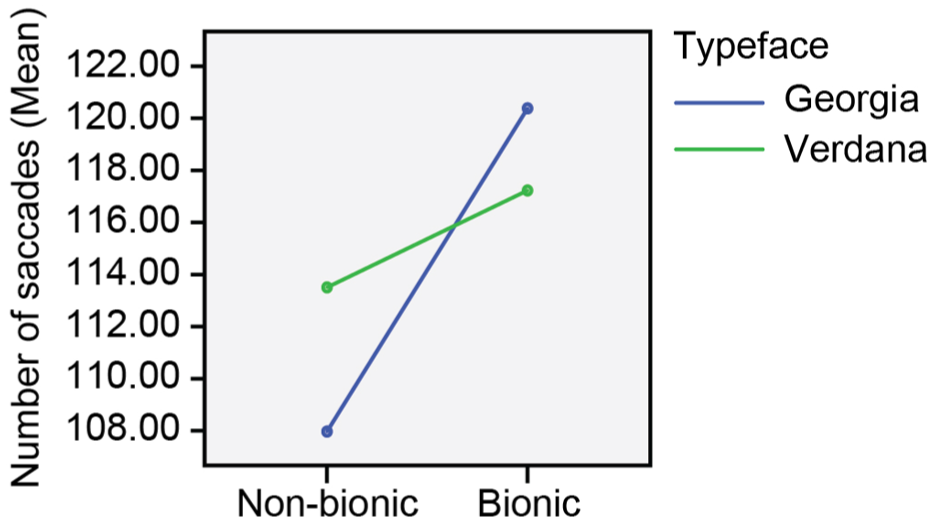
Interaction effect between typeface and bionic format on number of saccades.
The research also unveiled a statistically significant interaction between the bionic format and age group, F(1, 112) = 5.32, p < .05, suggesting that the difference in the number of saccades between the non-bionic and bionic format was more pronounced in the younger group compared to the older group (Figure 5).

Interaction effect between age group and bionic format on number of saccades.
Medium Measures of Legibility
Another mixed ANOVA with the age group (young vs. older) as the within-subjects factor, medium (screen vs. paper) and the bionic format (non-bionic vs. bionic) as the between-subjects factors was performed. The typeface was the same in all conditions (i.e., Verdana). The reading time was used as a dependent variable. The results showed a significant main effect of the medium, F(1, 112) = 69.18, p < .001, indicating that the texts displayed on a screen had shorter reading time (M = 35.38, SE = 0.94) than the texts printed on paper (M = 40.60, SE = 0.85).
A significant main effect of the bionic format was also found F(1, 112) = 39.41, p < .001, suggesting that the texts in the non-bionic format had shorter reading time (M = 36.65, SE = 0.82) than those in the bionic format (M = 39.33, SE = 0.91).
The analysis yielded a significant main effect of the age group F(1, 112) = 8.19, p < .01. The older participants spent less time reading the texts (M = 35.59, SE = 1.21) than the younger participants (M = 40.39, SE = 1.16).
The analysis further indicated a statistically significant interaction between the medium and bionic format, F(1, 112) = 27.76, p < .001. The bionic format prolonged the reading time more when the texts were printed on paper than when the texts were displayed on a screen (Figure 6).
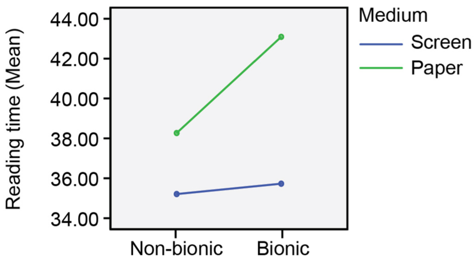
Interaction effect between medium and bionic format on reading time in seconds.
Comprehension and Memorisation
In additional analyses, the effects of the typeface, bionic format, and medium on the participants’ comprehension and memorisation were explored by conducting a binary logistic regression for the conditions in which the participants were reading the texts on a screen. While the bionic format did not yield statistically significant results, the typeface was found to predict the likelihood of correct comprehension (Exp(B) = 6.12, 95% CI [2.69, 13.88], p < .001) and memorisation significantly (Exp(B) = 0.23, 95% CI [0.08, 0.64], p < .005). Especially changing the typeface from Verdana to Georgia substantially increased the likelihood of correct comprehension (Figure 7A) and decreased the likelihood of correct memorisation (Figure 7B).

Mean predicted probability of participants’ correct (A) comprehension and (B) memorisation.
Furthermore, another binary logistic regression was performed for the conditions in which the participants were reading the texts in Verdana. The results showed that the medium and bionic format were significant predictors of correct responses (Figure 8). Changing the medium from paper to screen significantly increased the likelihood of both correct comprehension (Exp(B) = 2.98, 95% CI [1.73, 5.12], p < .001; Figure 8A), and memorisation (Exp(B) = 9.26, 95% CI [3.47, 24.74], p < .001; Figure 8C). Moreover, changing the format from bionic to non-bionic increased the likelihood of both correct comprehension (Exp(B) = 2.27, 95% CI [1.33, 3.86], p < .005; Figure 8B), and memorisation (Exp(B) = 3.04, 95% CI [1.52, 6.04], p < .005; Figure 8D).

Mean predicted probability of participants’ correct responses: (A) correct comprehension when reading texts on different mediums, (B) correct comprehension when reading texts in different formats, (C) correct memorisation when reading texts on different mediums, (D) correct memorisation when reading texts in different formats.
Figure 9 shows the percentage of correct responses across the conditions. Chi-square tests were used to examine for statistically significant differences in participants’ responses between the two age groups. Therefore, further analyses about reading the bionic text should be conducted. Our analysis yielded a significant effect of the age group on comprehension, indicating that the younger participants had fewer correct answers than the older participants when reading the texts on a screen (χ2 = 5.20, df = 1, p < .05; Figure 9A), as well as reading the texts in Verdana (χ2 = 6.83, df = 1, p < .05; Figure 9C). There was also a significant effect of the age group on memorisation, suggesting that the younger participants had a lower performance in memorisation tests than the older participants when reading the texts on a screen (χ2 = 14.47, df = 1, p < .05; Figure 9B). The age did not yield a statistically significant effect on memorisation when reading the texts in Verdana.

Percentage of correct responses by age group: (A and B) when reading texts on screen; (C) when reading texts in Verdana (Only statistically significant comparisons are shown).
Discussion
Typographic Tonal Density
The difference in TTD between the non-bionic and bionic formats (Table 1) was more pronounced for the Verdana typeface. The sans-serif typeface Verdana has no or minimal differences in stroke weight, resulting in a higher TTD value compared to the transitional typeface Georgia, which has differences in stroke weight. This result is consistent with the findings of previous research (Bringhurst, 2002; Gabrijelčič Tomc et al., 2023; Možina et al., 2019). Due to the first few letters in each word being in bold (Bringhurst, 2002), it was expected that the bionic typeface has higher values of TTD than the non-bionic typeface. The higher difference in the Verdana typeface (non-bionic vs. bionic) is a result of minimal differences in stroke weight, which is even more pronounced in the bold version (Bringhurst, 2002; Gabrijelčič Tomc et al., 2023; Možina et al., 2019).
Eye-Tracking Measures of Legibility
In terms of reading time, the analysis showed the main effect of the typeface. The Verdana typeface had a shorter reading time than the Georgia typeface. The sans-serif Verdana has a higher x-height and bigger counter size than the transitional Georgia. At higher TTD, it is more visible than Georgia. The results of higher reading speed in the Verdana typeface compared to the Georgia typeface are consistent with the results of Franken et al. (2015). For decades, it has been recommended to use a sans-serif typeface for screen texts (Rutter, 2017). Therefore, most websites and digital texts are set in sans-serif typefaces. Readers most commonly use (Sanocki & Dyson, 2012) and expect the screen text to be displayed in a sans-serif typeface.
The main effect of the bionic format was found to be statistically significant. The results showed that the texts in the bionic format require a longer reading time than in the non-bionic format. Our results are consistent with those of recent research (Doyon, 2022a, 2022b; Sardido et al., 2024; Snell, 2024), which can be explained by the fact that the bionic format is a relatively new approach in type design, and users are not yet sufficiently familiar with it.
The results showed that the older participants spent less time reading texts and had a shorter average time of fixations. This can be attributed to a growing trend of younger people reading less today, and that they are able to read attentively only shorter texts (Sardido et al., 2024). Hence, it can be assumed that they may be less skilled readers than older people. The differences between less and more skilled adult readers have already been established in the past (Gernsbacher, 1993). In addition, less skilled readers are likely to be limited in their awareness and use of effective reading strategies (McHardy et al., 2021).
The bionic format of the texts led to a higher number of fixations than the non-bionic format. This result was to be expected, as at the beginning of words becomes longer due to the bold letters (which are wider). However, the texts in the bionic format had a shorter average duration of fixations than the texts in the non-bionic format. This could confirm the developer’s claim (bionic-reading.com) that bionic reading enables better reading. Nevertheless, there has not been enough research yet to confirm the developer’s statement. In addition, the texts in Verdana had a shorter average time of fixations than the texts in Georgia. This result is consistent with the findings of previous research (Franken et al., 2015), where it was established that the Verdana typeface has a shorter fixation time than the Georgia typeface, and results from the design attributes of the typeface.
The difference between the average fixation time of the non-bionic and bionic formats of the texts differed depending on the typeface (Figure 3) and was more significant for the Georgia typeface, indicating a more noticeable decrease in this measure. This could suggest that bionic reading is more appropriate for the typefaces with differences in stroke weight. Further research with different typefaces is thus required.
In contrast to the number of fixations, the number of saccades in bionic reading was higher and dependent on the typeface (Figure 4). The higher number of saccades was no surprise. As the words take up more space in bionic reading, the number of saccades increases. This could be a consequence of readers still being unfamiliar with bionic reading. Again, it was shown (Figure 5) that older participants tend to be more skilled readers, as their reading included fewer saccades than the reading of younger readers.
Medium Measures of Legibility
The results showed that the texts displayed on a screen have a shorter reading time than the texts printed on paper (Figure 6). This result is in line with the research findings of Ronconi et al. (2025). It is not surprising, as bionic reading was developed for reading on a screen and is therefore less suitable for reading on paper. This result was expected, as the Verdana typeface, which was tested on both mediums, was designed for reading on a screen. Similarly as before, it was established that the reading in the non-bionic format was faster than in the bionic format in both groups of readers, and that the older readers read faster. This could be due to the fact that readers are not familiar with bionic reading. On the other hand, it could also indicate that older readers are more skilled readers.
Comprehension and Memorisation
The typeface used, its format (non-bionic vs. bionic), and the medium significantly change the probability of correct comprehension (Figures 7A, 8A and C) and the probability of correct memorisation (Figures 7B, 8B and D). This could indicate that typefaces designed for screens also influence comprehension and memorisation. Nevertheless, these data are somewhat surprising and show that further research should be conducted. Comprehension and memorisation are two distinct cognitive processes. The comprehension of a text implies the ability to interpret and extract meaning from it, while memorisation requires the capacity to store and recall information. It is possible that the participants focused more on the meaning of the text, and that this focus on interpretation resulted in them neglecting to memorise the information. We should probably also take into account that all participants stated that they were not familiar with bionic reading.
Our analysis showed that young participants gave fewer correct answers in comprehension (Figure 9A) and memorisation (Figure 9B) than older participants when reading the texts on the screen and when reading the texts in Verdana (Figure 8C). A similar result about the difference between less and more skilled adult readers was also found in the past (Gernsbacher, 1993).
Conclusion
The aim of our research was to establish the usability of bionic reading for typical readers, who do not have significant problems with reading. To compare the legibility of reading in the non-bionic and bionic format, we tested two groups of adult readers, that is, students (young adults) and middle-aged adults. Two widely used typefaces designed for on-screen reading were used, that is, transitional typeface Georgia and sans-serif typeface Verdana. An eye-movement tracking device was used to assess on-screen legibility. We found that bionic reading affects the reading time, that is, it leads to a longer reading time. In addition, the Verdana typeface is faster to read than the Georgia typeface. There is no advantage to using bionic reading for texts on paper. The latter is logical, as bionic reading was not developed for reading on paper, but for reading on a screen. We found that older readers (middle-aged adults) read non-bionic and bionic texts on a screen and on paper faster than younger readers, that is, students. We cannot say with certainty that bionic reading is good or bad, as the results of comprehension and memorisation do not suggest that they are affected by the bionic format in the same way. Further research with diverse measurement methods and sufficiently large participant groups is necessary. The potential effectiveness of bionic reading could be utilised in the design of educational materials as well as everyday popular texts in digital media, such as websites.
Limitations and Future Research
A possible limitation of the study lies in the choice of typefaces. We selected two typefaces that were designed for on-screen use. They differ in various characteristics, such as stroke width, the presence of serifs and overall counter size and shape. The used typefaces do not have the same x-height. To ensure better comparability of the results, it might be worth considering adjusting the type sizes based on x-height. This is particularly important as it is known that typefaces with a higher x-height tend to be more legible at smaller type sizes (Legge & Bigelow, 2011; Možina et al., 2019).
Further research is without a doubt needed, using a larger and more varied number of typefaces and testing individual typefaces at different sizes. The leading should probably also need to be increased, as the first few letters of the words in the bionic format are presented in bold. Most importantly, the tests should be broadened to encompass younger, inexperienced or less skilled readers – for example children in different age groups in primary school. It would also be beneficial for professionals (e.g., psychologists and doctors) working with people with dyslexia and people diagnosed with ADHD to test the usefulness of bionic reading. Although bionic reading was designed with these groups in mind, it has regrettably not yet been validated on a sufficiently large sample.
These steps are crucial for refining bionic reading applications and understanding their potential impact on improving the reading experience.
Footnotes
Acknowledgements
We would like to thank Ana Mendizza for her help in creating an HTML document for the experiments and Matjaž Kragl for his help in editing the reading data.
Ethical Considerations
The research was performed in accordance with the Declaration of Helsinki. Ethical approval for this research was granted by the Ethics Commission of the Faculty of Natural Sciences and Engineering, University of Ljubljana (No. 1-2024). An informed consent document to participate in this research was provided by the participants. Prior to the study, all individuals who took part in the study agreed to participate voluntarily and were not paid for or otherwise rewarded for their participation.
Author Contributions
Conceptualisation and methodology, K.M., D.K. and B.B.; investigation, K.M.; data curation, K.M and B.B.; formal analysis and validation, D.K.; project administration, resources and supervision, K.M.; visualisation, D.K. and B.B.; writing – original draft, K.M.; writing – review and editing, D.K. and B.B.; All authors have read and agreed to the published version of the manuscript.
Funding
The authors disclosed receipt of the following financial support for the research, authorship, and/or publication of this article: The research was founded by the Slovenian Research Agency (No. P2-0450).
Declaration of Conflicting Interests
The authors declared no potential conflicts of interest with respect to the research, authorship, and/or publication of this article.
Generative AI
We do not use generative AI tools when writing this paper.