
Abstract
Gender statistics play an important role in highlighting gender inequalities, but they are often presented in a conventional way by depicting males in blue and females in pink. Using stereotypical colours saves users from having to learn which colour is used for which gender. However, colours can also convey unintended messages of strength vs. weakness, status, and power, confirming the very stereotypes they are intended to address. National statistical institutes have the opportunity to influence public perceptions and could play a leading role in raising awareness about gender issues. In our article, we examine the use of colours to represent gender in the Twitter accounts (rebranded to X accounts on July 23, 2023) of national statistical institutes in 24 European countries. Quantitative analysis of 631 colour pairs from 644 images reveals that the stereotypical use of colours in official statistics is still widespread. We examine the nine patterns discovered and comment on possible solutions.
Introduction
Gender equality is one of the 17 Sustainable Development Goals, and gender statistics play an essential role in uncovering gender inequalities and monitoring progress towards achieving gender equality (Mecatti et al., 2012). These data are usually produced by national statistical systems and are part of official statistics; their production only increased after the 1995 Platform for Action called for gender-disaggregated statistics at the national, regional and international levels (United Nations, 1995). The spread of the Internet and the associated democratic processes at the turn of the century brought free access to official statistics to the public and increased the number and diversity of users of official and gender-disaggregated statistics (Eurostat switched from paid to free access on October 1, 2004 – see Díaz Muñoz, 2008; Snorrason & Gylfadottir, 2001). This larger audience had needs other than the availability of data in databases and tables. As Rosling et al. (2005, p. 525) put it, ‘Most statistics are conveyed as if musicians were standing in front of the audience and showing the notes rather than playing’, and they demanded interactive and entertaining visualisation.
National statistical institutes (NSIs) around the world have responded to this call and are now working to improve communication to bring official statistics closer to users, including data visualisation as a tool. Gender statistics are usually based on the traditional gender division (female and male) and colours can be an effective way to visually distinguish between the categories. The question, however, is which colours to use. For statistics broken down by gender, the ubiquitous colours of blue for men and pink for women seem to be the best combination to effectively convey the two categories. However, the use of conventional colours can also have unintended consequences, such as confirming gender stereotypes (see Kirk, 2015, 2016; Myers et al., 2019; Rost, 2018; Smith, 2018). This reflects decades of sociological research demonstrating the importance of gender portrayal in print and media and the harmful effects of stereotypical gender portrayals such as lower self-esteem, lower ambition, and lower task performance (Collins, 2011; Ellemers, 2018; Peterson & Lach, 1990). The stereotypical use of colour is particularly problematic in the field of official statistics, as this field generally attempts to follow principles of impartiality and objectivity and gendered statistics should be aimed to achieve gender equality. In other words, while awareness of avoiding traditional gender stereotypes, such as using pink for women and blue for men, has been widespread across fields and disciplines, official statistics still resorts to using these traditional gender representations. Greater awareness is needed of the broader implications of the specific choices made in visualising gender. As Schwabish and Feng (2020) argue, there is an urgent need to ‘develop a more diverse, equitable, and inclusive approach to data presentation and visualisation’.
In our paper, we attempt to bridge the gap between the need for efficiency, clarity, and comparability on the one hand, and a broader awareness of gender equality and inclusion on the other. We review previous research on the meaning and impact of gender representation, as well as guidelines for the use of colour in data visualisation. We ask the following research questions: ‘How and why does colour matter in gender representation?’, ‘What are the trade-offs and implications of colour choice?’, and ‘Which colour pairs are most commonly used by European NSIs and are there differences between countries in the use of colour for gender statistics?’. We present the results of our quantitative analysis of 631 colour pairs representing the distinction between men and women in 644 images (available at https://zenodo.org/records/11056657) posted on Twitter (rebranded to X on July 23, 2023) by 24 European NSIs. We show that gender statistics are still visualised with stereotypical colours and that blue, people’s favourite colour, is typically assigned to the male gender. Nonetheless, some of the nine patterns discovered provide a starting point for thinking about other, non-stereotypical approaches to colour selection for gender statistics. We conclude with a discussion of the results and possible solutions to raise awareness for better visualisation of gender statistics.
It should also be noted that by using binary gender, official statistics have largely ignored and marginalised missing groups, not only in representation but also in the production of statistics as a whole, although a growing number of countries in Europe and around the world are taking the third gender into account (Quinan & Hunt, 2023). A recent study showed that approximately 1.2 million Americans identify as non-binary (Wilson & Meyer, 2021) or do not identify with either a male or female identity: they may identify with more than one gender or no gender, have a fluctuating gender identity or identify as a third gender (Bosson et al., 2018; Vivienne et al., 2021). Because non-binary people have higher rates of depression, anxiety and risk of suicide (Matsuno & Budge, 2017), understanding their unique challenges is of importance, and binary-focused gender/sex measurement practices are not adequate for studying their lives (Schudson & Morgenroth, 2022). These studies have encouraged treating gender/sex as multidimensional, including the umbrella terms of ‘non-binary’ and ‘genderqueer’ or alternatively ‘gender diverse’ to allow for the self-identification of identities outside of the binary (Thorne et al., 2020). Despite official statistics’ lag in acknowledging these advancements in practices of data collection and representation, efforts are currently underway to establish gender-related concepts and their operationalisation (see National Academies of Sciences Engineering and Medicine [NASEM], 2022; United Nations Economic Commission for Europe [UNECE], 2019) and to include questions about sex and/or gender identity in recent censuses (e.g., in Argentina, Canada, England and Wales, New Zealand, Scotland, etc.). Although our empirical analysis is limited to traditional sex-disaggregated statistics, the discussion of colour selection can be applied beyond binary gender.
Literature Review
Colour, Gender and Stereotypes
While there is a lack of research on the visualisation of gender in official statistics, previous research on gender representation has examined in depth the visualisation and differences in gender representation in a variety of media. Most of the research has examined stereotypes and gender roles in print media such as textbooks, books, holiday cards and colouring books, although many recent studies have also examined movies, music videos, and sports media coverage. Studies of textbooks have most extensively examined the portrayal of gender roles by analysing the types of roles assigned to men and women in the text and accompanying images (e.g., the occupation of the person depicted). Other studies have analysed the difference in representation by quantifying the percentage of images depicting women or minorities, or the number of minutes and type of discourse used by men and women in television commercials, music videos, sports coverage, etc. These studies have identified several important content areas of gender roles: underrepresentation, sexualisation, subordination and representation in traditional roles (Collins, 2011).
Psychologists have not only documented the existence of stereotypes and traditional gender roles but have also studied the effects and consequences of these stereotypes. Seeing people who resemble oneself in books, magazines and television shows affects cognitive development and self-esteem (Peterson & Lach, 1990), and according to Bandura’s (2002) social cognitive theory, resemblance to those portrayed in the media affects learning from their behaviour. Gender stereotypes go a step further, as they ‘influence the way people perceive, interpret, and remember information about themselves and others’ by reinforcing perceived boundaries between men and women and justifying the resulting differences and inequalities (Ellemers, 2018, p. 275). Stereotype threat (a situation in which people perform worse when they fear conforming to a stereotype) has been shown to contribute significantly to racial inequalities in science and gender inequalities in mathematics (Spencer et al., 2016; Walton & Spencer, 2009).
Research on gender stereotypes has also highlighted the problems with using stereotypical colours (e.g., Harp et al., 2017; Kaygan et al., 2019). Although colour preferences have not been documented in children younger than 2 years, colour preferences are evident in kindergarten-aged children, with boys preferring green in stories and black in drawing, girls using a variety of colours, warmer and more vivid colours and more shades of pink and purple than boys, and children of both sexes using colour as a main argument for classifying toys (for a review of these studies, see Karniol, 2011). Gender-coloured clothing has been found to influence children’s social judgements and perceptions of their peers (Albers, 1998), and in experiments, children chose to punish violators of gender stereotypes (e.g., children who play with toys that do not conform to gender roles) more harshly (Karniol & Aida, 1997). Even more troubling, studies have shown how boys develop an ‘aversion to pink’ at an early age (Eliot, 2010), as stereotyping of one’s gender is usually accompanied by distancing from the other gender group, which in turn reinforces perceived gender differences (Bennett & Sani, 2008). Recent research has demonstrated that gender-stereotypic colours persist in children’s media, with media aimed solely at boys or girls displaying gender-stereotypic colours and more same- than other-gender characters, which importantly affects their gender socialisation (Spinner et al., 2023).
The study of colours is particularly important when it comes to gender stereotypes, as research has shown that colour elicits emotions and influences both mood and behaviour (Bortolotti et al., 2023; Ou et al., 2004; Yildirim et al., 2011). Much of the early research on the emotional responses to colour was in the fields of marketing and neuroscience, where researchers examined emotional and behavioural responses to particular colours. They have shown that simply switching colours of advertisements and packaging can affect shopping intentions, perceptions of price fairness and excitement, and that blue hues are associated with more favourable and pleasant evaluations (Babin et al., 2003); the preference for blue hues has been confirmed in other literature (Schloss & Palmer, 2011). In addition to the emotional response to the physical appearance of colour, simply the word ‘pink’ as a descriptor has been found to evoke meaning: it is perceived as representing groups of low social power and low social status (Ben-Zeev & Dennehy, 2014). More recent studies examining colour using advanced artificial intelligence analysis have confirmed the ‘grammar of colour’ (Kress & Van Leeuwen, 2002): a study of a corpus of 6 billion words found that simply the word ‘pink’ was biased towards femininity and softness (Jonauskaite et al., 2021). As Koller (2008) has argued, colour associations provide a window into mental concepts and are important, as repeated exposure reinforces colour concepts and has an important affective component. In the field of statistics, there are few studies that address the possible consequences of stereotypical gender representation. Recent research has focused mainly on the consequences of excluding groups in surveys and statistics, and has examined the possible effects of gender binaries in survey questions (Medeiros et al., 2020; Westbrook & Saperstein, 2015). A central assumption of this research is that survey categorisations not only reflect beliefs about the world (beliefs that currently essentialise and dichotomise sex and gender), but that the results of survey research in turn shape beliefs about the world, resulting in a repeating cycle (Bowker & Star, 2000) that is inconsistent with contemporary gender theory. In addition, research has shown that collecting adequate data on gender identity, gender expression, and sexual orientation also has critical implications for anti-discrimination enforcement and youth protection (NASEM, 2022). Specific to statistics, the UNECE Guide for Communicating Gender Statistics contains the following explicit recommendation: that NSIs ‘must take extra care when communicating gender statistics to balance the need to remain impartial with the obligation to produce relevant data to inform policy making and answer the needs of those who require the data’ (p. 1) and ‘avoid using of images and colours that reinforce gender stereotypes’ (p. 18) (UNECE, 2020).
Colour, Gender and Visualisation
Colour can be a powerful tool for visualising data. Its functional tasks are clearly defined: distinguishing between categories, grouping (e.g., similar categories in a broader category), highlighting (e.g., countries with the greatest gender inequality), conveying a sequence (e.g., an increasing level of education), divergence (e.g., the degree of (dis)agreement) and warning (Camões, 2016). Since gender statistics usually represent only two categories, the visualisation of gender statistics can be done using a single colour: text annotations can indicate which graphical element represents which gender. When colours are used to distinguish between categories, the colour takes over the task of categorisation.
When colour is used to distinguish between categories, it should serve a specific communication goal and different colours should correspond to differences in meaning in the data (Few, 2008). Previous studies have indicated some general guidelines for appropriate colour differentiation (see, e.g., Ware, 2012). Specifically, the colours chosen should be perceptible to (most) colourblind people, so special attention should be paid to colour combinations that are challenging for colourblind people (e.g. red and green). Moreover, colours should be perceptible regardless of the size of the colour field and should contrast appropriately with the background. The unique hues red, green, yellow, and blue are often a logical solution, as these colours are the most distinct in the opponent process theory and top the list of colours people name around the world (e.g., compared to scarlet or salmon). In addition, the number of colours used should not be too large, otherwise they will be difficult to distinguish, and their selection should not violate conventions (e.g., red for stop).
However, the sheer number of perceptual factors to consider suggests that colour selection is anything but simple. Properly used colours can ‘enhance and clarify’, while poorly used colours can ‘obscure, confuse, and confound’ (Stone, 2006, p. 1). The complexity is also evident in the warnings that often accompany guidance on colour representation in data visualisation. Among the most drastic warnings is Edward Tufte’s ‘Above all, do no harm’, because he believes that poorly chosen colours can harm the entire visualisation, so that his overriding principle in applying colour to data is to ‘avoid disaster’ (Tufte, 1990, p. 81). In a more balanced tone, Colin Ware states that ‘choosing a set of colours for all but the simplest designs is a complex problem that usually requires tradeoffs’ (Ware, 2008, p. 84).
In the visualisation of gender-disaggregated data, the combination of blue for males and pink (also red and purple [Lee & Shin, 2016]) for females has attracted attention among experts because it represents a trade-off between efficiency based on convention and culture on the one hand and unintended consequences and stereotyping on the other (Gieseler, 2018). On the side of efficiency, the use of conventional colours facilitates and accelerates message communication and can help create a visual metaphor (Kirk, 2015), while the non-conventional use of colours runs counter to learnability – the most important consideration in colour code design, along with visual distinctiveness (Ware, 2008). Using non-conventional colour pairs requires users to learn which colour is used for which gender, at the expense of speed and clarity – two qualities that are very important in the information age.
While accessibility and clarity are mandated in codes of conduct and quality assurance frameworks (see, e.g., Eurostat, 2018; United Nations, 2019), the United Nations gender statistics manuals do not help with colour selection. For the past, this is understandable because the printed materials were mainly black and white due to the high cost of colour printing (see, e.g., Hedman et al., 1996; United Nations, 1997), however, even more recent updates that address the presentation of gender-disaggregated statistics do not take colour selection into account (see, e.g., United Nations, 2016).
Some guidance on colour selection comes from Eurostat’s (2016) Graphic Design Guide, which limits the use of colours in Eurostat publications to nine theme colours. This restriction leaves little room for colour selection, although no colour combination is explicitly prescribed for the visualisation of gender statistics. Most gender statistics, including gender equality statistics, currently fall under the ‘Population and Social Conditions’ theme with an orange colour. Thus, all visualisations on this theme would have orange as the first colour, while blue is suggested as the second colour. Alternatively, one could choose between dark orange, light blue and turquoise (Palette 1) or dark orange and two shades of green (Palette 2). In practise, Eurostat often uses orange for the weaker party and blue for the other when visualising (in)equality in terms of gender, age and disability. Although the NSIs of the EU Member States are not obliged to follow Eurostat’s graphical guide, some of them adopt Eurostat’s visualisations and use them to communicate gender statistics in the national context.
Data and Methods
Data Source
Our study included 37 NSIs that were partners in the European Statistical System on February 28, 2019, namely 28 EU Member States, 4 EFTA/EEA countries, and 5 candidate countries. We considered different channels that NSIs use to communicate directly with the public as data sources, in particular the official NSI websites and social media. We chose social media because their posts are typically visual and can reach a larger and more diverse audience than the official websites. Of the various social media platforms, we focused on Twitter (rebranded to X on July 23, 2023) because most studied NSIs were using Twitter (X) at the time. In addition, Twitter (X) allowed data to be downloaded through the application programming interface (API) without user consent because all data presented by NSIs on Twitter (X) were public.
We used Twitter (X) accounts of the studied NSIs in an official language of the country (unless the only account was exclusively or predominantly in English, as in Greece or Cyprus). Six NSIs had no Twitter (X) account at the time (see Table 1). For the remaining 31 NSIs, 24,991 images in original Twitter (X) posts (no retweets, replies, or mentions) published between January 1, 2017, and February 28, 2019, were downloaded through the API. The first download was performed in May 2019 and the last download to properly eliminate retweets was completed in January 2020. Most images were in jpg format, some in png format (videos and gifs were removed after download; they accounted for less than four percent of all downloaded images). The images did not contain personal data, so ethical approval was not required to conduct the study.
Overview of Included National Statistical Institutes (NSIs).

The presence of NSIs on Twitter (X) varied widely, ranging from those who had no account or posted only on specific occasions (e.g., Mother’s Day or the release of key indicators) to those who communicated intensively on Twitter (X) on a daily basis. These differences in behaviour are the main reason for the variation in the number of images downloaded per NSI. Some NSIs posted only text and links and hardly any images. For the final analysis, we selected all 644 images that visualised gender and used colour to distinguish between male and female (see Table 2); these images are available as a Supplemental Material https://zenodo.org/records/11056657. We excluded images that contained only text or tables, and images that referred to one gender without the counterpart referring to the other gender (e.g., images that showed only fathers so that the differences were not apparent). We considered infographics if they graphically visualised statistics beyond textual presentation (e.g., presenting statistics in charts or pictograms, presenting name statistics in ordered lists, on maps, etc.). From 644 images, we cut 1,262 segments for colour coding. The number is less than double because some segments were cut from two images with the same subject and design, but one gender in each (e.g., one image depicting only male names and another depicting only female names published consecutively, with colour clearly used to distinguish between the male and female images). The analysis is based on 631 colour pairs representing gender distinction, collected from 24 countries.
Data Source Per Country.

Determination of Colour
Determining the colour to identify males and females was not easy, as inspecting the images pixel by pixel revealed different variations of what appeared to be a uniform colour – a result of compression when uploading to Twitter (X). In the first step, we used the GNU Image Manipulation Programme (GIMP) version 2.10 (GIMP, 2019) with its default settings to extract relevant coloured segments from the images. These coloured segments typically came from the legend or sex symbol within the image. If more than one colour pair was used in an image, the colour that covered the largest area (e.g., the largest bar) or was most prominent (e.g., yellow among bluish variants) and its counterpart were selected. In the second step, we determined the predominant colour in the extracted segment using Colorsnap v0.03 (Krzywinski, 2019) with its default settings and 139 named colours from CSS Colour Module Level 4 (W3C, 2019). We acknowledge that this approach uses only an approximation of the original colour (e.g., a green colour for women in Irish unemployment cards is approximated by ‘darkcyan’ and ‘seagreen’) and ignores the effects of surrounding colours on a colour’s appearance. Nevertheless, the main purpose of this analysis should not be questioned, as we are (typically) examining distinct colour differences to distinguish between genders.
Colours were first rendered in the RGB (red, green, blue) colour model used in electronic display devices. However, this model does not accurately reflect how humans perceive colour. So RGB colours were then converted using Colorconvert (Krzywinski, 2019) version dated January 5, 2019, with default settings, to one of the most commonly used and uniform colour spaces for perception CIE L*a*b* defined by the International Commission on Illumination (CIE) (Luo, 2015). Equal distances between colours in this space are also perceived as equally different. L*, a* and b* represent brightness, red-green, and yellow-blue, respectively. The value L* corresponds to the brightness of a colour and is defined in the range [0, 100], where 0 represents black or absence of light, 100 represents white, and the values in between range from dark to bright. Positive values of a* represent reddish colours, negative values of a* represent greenish colours. Positive values of b* represent yellowish colours, while negative values of b* represent bluish colours. The distance between two colours (L1, a1, b1) and (L2, a2, b2) in space CIE L*a*b*, which approximately reflects the perceived distances, is called Delta E) and is, according to CIE 1976, calculated as the Euclidean distance between them (Luo, 2015):

A drawback of these colour specifications is the difficulty in identifying the hue, which is central to the interpretation of our analysis. Therefore, for presentation purposes, we have converted the colours from the space CIE L*a*b* to the cylindrical coordinate system CIE L*C*h expressing chroma C*ab and hue hab.
Clustering
Clustering is a statistical multivariate method used to divide similar units into homogeneous groups based on the chosen cluster variables. In our case, clustering is used to find typical patterns of colour pairs for displaying gender statistics. Our unit is a colour pair ((L1, a1, b1) and (L2, a2, b2)) representing the distinction between the genders. The position of a unit is determined by six cluster variables – three variables determine the colour used to represent females and three variables determine the colour used to represent males. The aim of clustering is to identify a smaller number of groups of units that are close to each other, where proximity is measured as the squared Euclidean distance between them. By using a quantitative statistical analysis, our study helps to address the lack of such statistical methods in the field of gender analysis, as for example discussed in Spierings (2012), where concerns have been raised that not enough quantitative methods are used in gender research. The R code with data is available as a Supplemental Material –https://zenodo.org/records/11056657.
The analysis began by calculating the squared Euclidean distances between all combinations of pairs of 631 units and visualising a distance matrix (see Figure 1). This matrix can be used to analyse the tendency of clusters, that is, whether there is a smaller number of homogeneous groups of units. The units are arranged on the y- and x-axes in such a way that two objects that are more similar (i.e., the squared Euclidean distance between them is smaller) are closer together. In our example, white colours represent a small distance which suggests belonging to the same cluster, while red colours represent a large distance. Whitish squares that form along the diagonal show that there is a smaller number of homogeneous groups of units in the data. As an example, one of these homogeneous groups is represented by a black square. Usually, when analysing the distance matrix, the Hopkins statistic (a value between 0 and 1) is calculated, which is an indicator of the clustering ability of the data – the higher the value, the better. In our case, the Hopkins statistic is 0.863, which shows that the data set is significantly clusterable.
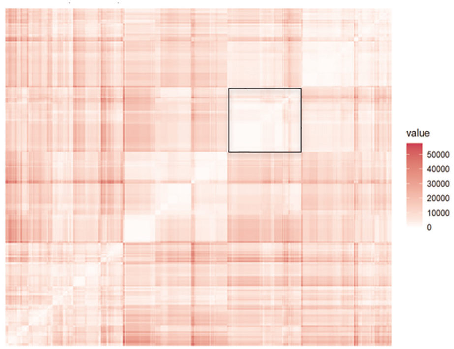
Distance matrix (n = 631).
In the first step, hierarchical clustering was performed using the Ward method and the squared Euclidean distances (R-functions get_dist [library factoextra] and hclust [library stats]). The resulting cluster dendrogram is shown in Figure 2. In addition, the indices for determining the optimal number of groups (R-function NbClust, [library NbClust]) were calculated, suggesting solutions with 4, 8 or 9 groups. Although the 4-group solution is most evident from the dendrogram, we opted for a more fine-grained 9-group solution to be able to describe the colour pairs used to represent the males and females. The final solution was further improved by k-means clustering (R-function hkmeans, [library factoextra]), where the ratio between the sum of squares between groups and the total sum of squares was 72.6%, indicating that relatively homogeneous groups were formed that were simultaneously distinct from each other. The centroids of the groups formed by hierarchical clustering were used as initial cluster seeds in k-means clustering.

Cluster dendrogram (n = 631).
Finally, we wanted to graphically represent the position of 631 analysed units determined by six variables. To do this, we combined the six cluster variables into the first three principal components (R-function PCA, [library FactoMineR]). In doing so, 64% of the information of the original six variables was transferred to PC1, PC2 and PC3. Since the units were defined in three-dimensional space, Figure 3 was used to graphically represent their position, which clearly shows the resulting groups.
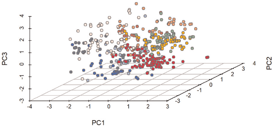
Position of the units in 9-cluster solution, shown in 3-dimensional space (n = 631).
Results
Overview
We begin by comparing the basic colour characteristics of males and females. We perform the analyses based on the CIE L*a*b* coordinates, but represent the colours in the CIE L*C*h colour space, where each colour is expressed by luminance L* (or the lightness from black to white), chroma C*ab (where increasing values indicate higher colour content) and hue hab (what we usually call ‘colour’). Since lightness and hue are central to our analysis, we omit chroma when visualising the results.
In Figure 4, we first plot all the colours used to visualise gender in our analysis, and then run a multivariate ANOVA to compare the two gender groups overall and three ANOVAs to test for differences in specific colour coordinates – in all combinations, statistically significant differences were found at p < .001. The colours representing both males and females are distributed along the y-axis for lightness, from L*= 0 (black) to L*= 100 (white), as shown on the left banner, indicating that light and dark colours are used to represent both genders. Nevertheless, colours for females are lighter on average (L* of 57.58 vs. 53.12 for males). Hue is represented on the x-axis in degrees from −180° through 0° to +180°, as if the colour wheel were spread out in a banner so that both extremes give the same green colour. The hue angle hab ranges from green (−180°), cyan, blue (−90°), violet, magenta-red (0°) to orange, yellow (90°) and back to green (180°). For ease of interpretation, a coloured banner is added using L*= 80 and C*= 100 in GIMP. The naked eye can see that magenta-red hues (around h = 0°) are much more commonly used to represent females than males. In fact, the colours used to represent females are on average redder (a* of 18.11 vs. 2.30 for males) and yellower (b* of 18.38 vs. −15.84 for males).

All 1262 colours used for gender visualisation in our analysis.
Colour Patterns
Clustering yielded nine colour patterns to distinguish the gender. The results are shown in Figure 5 (using the same axes as in Figure 4), while Figure 6 shows a typical example for each group.

Nine groups/colour patterns identified by clustering.
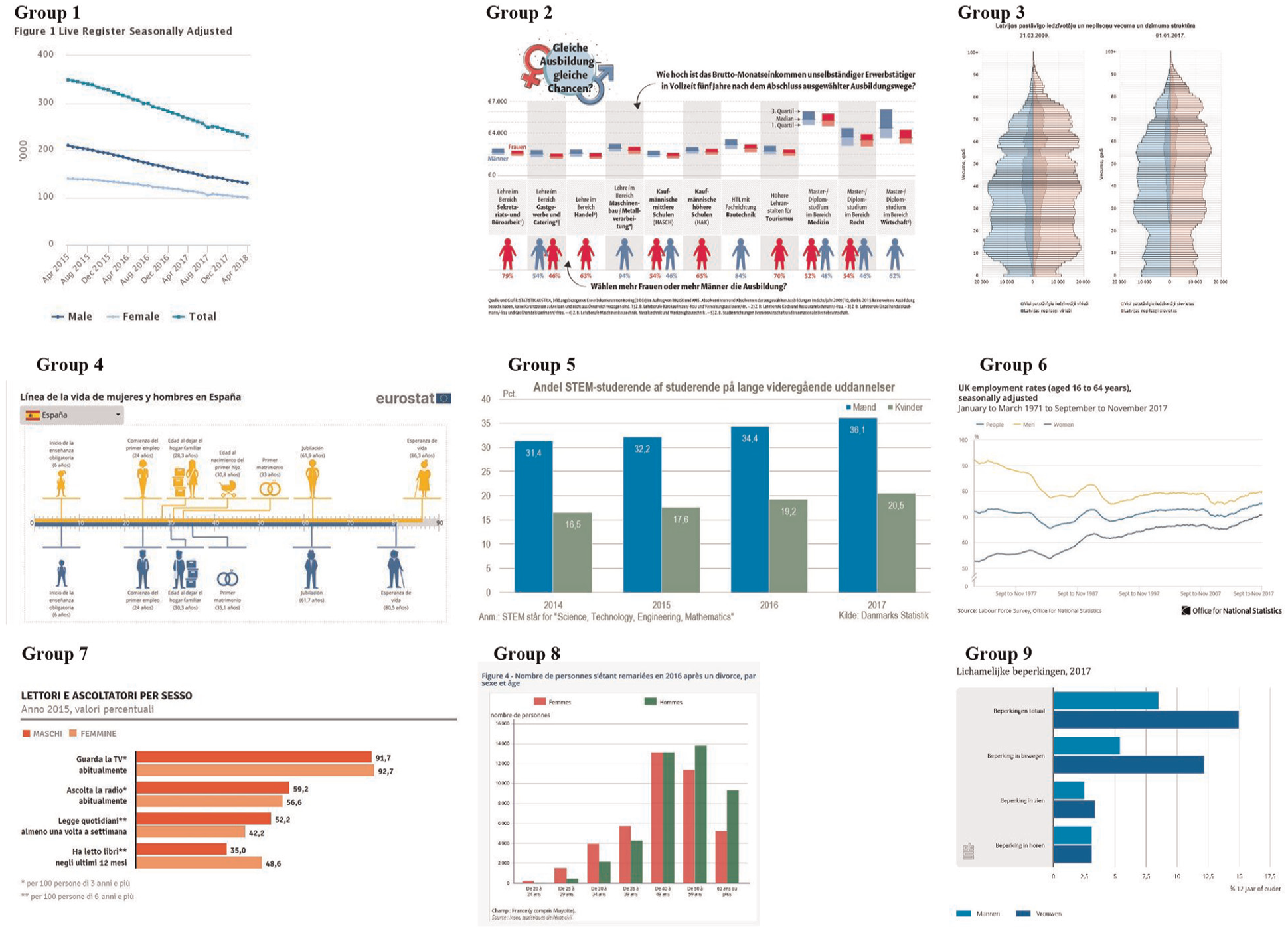
Typical example for each of the 9 groups/colour patterns.
In group 1, the hue for males and females has mainly negative values within the interval (−180°, 0°) (Figure 5). Values around –90° for males indicate bluish colours. Values within the interval (−180°, –90°) for females tend towards green and also have much higher brightness. Most of these images are from the Netherlands and Ireland (Table 3). Figure 6 shows an image from Twitter (X) posted by Central Statistics Office of Ireland on May 3, 2018, titled ‘Live Register Seasonally Adjusted’. The colour for men most closely matches ‘darkslateblue’ and the colour for women most closely matches ‘lightsteelblue’ (see CSS Colour Module Level 4 from W3C, 2019). Other countries that have more than the expected number of colour pairs in this group are Poland and Malta.
Number of Images by Country and Group (n = 644).

Note: Numbers, written in bold, show the combinations in which the country has more than the expected number of colour pairs (p < .05).
In group 2, the hue for males is at about –90°, indicating blue hues. In contrast, the hue for females is about 0°, indicating magenta hues. Most of these images are from Austria and Czech Republic (Table 3). Figure 6 shows an image posted by Statistics Austria on Twitter (X) on June 13, 2018, with the title ‘Gleiche Ausbildung - gleiche Chancen?’ (in English: Same education – same opportunities?). The colour used for males most closely matches ‘steel blue’ and that for females ‘crimson’ (W3C, 2019). Other countries that have more than the expected number of colour pairs in this group are Greece, Estonia and Cyprus.
Most of the group 3 data for both genders appear in the upper part of the graph, indicating lighter colours. The area around 0° with magenta hues is predominantly used for females; other hues can be used for both genders. Most of these images are from the United Kingdom and Latvia (Table 3). Figure 6 shows an image published on Twitter (X) by the Central Statistical Bureau of Latvia on September 26, 2017, titled ‘Latvijas pastāvīgo iedzīvotāju un nepilsoņu vecuma un dzimuma struktūra’ (in English: Age and gender structure of permanent residents and non-citizens in Latvia). The colour used for males is close to ‘light cyan’ and for females to ‘misty rose’ (W3C, 2019). Other countries that have more than the expected number of colour pairs in this group are Slovenia and Turkey.
In group 4, the colours for females are close to each other and represent orange hues, while the colours for males are mostly in the interval (–180, 0) with blue hues of different lightness. The group also contains images developed by Eurostat using the orange-blue colour combination. Most of these images are from Spain (Table 3). Figure 6 shows an image designed by Eurostat and posted on Twitter (X) by the Spanish National Statistics Institute on October 19, 2018, titled ‘Línea de la vida de mujeres y hombres en España’ (in English: Lifeline of women and men in Spain). The colour used for males most closely matches ‘steel blue’ and for females ‘orange’ (W3C, 2019). Other countries that have more than the expected number of colour pairs in this group are Norway and Hungary.
All hues of females in group 5 are within the interval (90°, 180°), indicating green. The hues of the males are around –90°, indicating blue. Most of these images are from Denmark (Table 3). Figure 6 shows an image posted on Twitter (X) by Statistics Denmark on December 13, 2018, titled ‘Andel STEM -studerende af studerende på lange videregående uddannelser’ (in English: Proportion of STEM students of students in long-cycle university education). The colour for males is roughly equivalent to ‘steel blue’ and the colour for females is ‘dark sea green’ (W3C, 2019). Other countries that have more than the expected number of colour pairs in this group are Ireland and Finland.
In group 6, more than one hue is used for each gender: blue and purple for females and green and yellow for males. Most of the images in this small group are from the United Kingdom (Table 3). Figure 6 shows an image from Twitter (X) posted by the UK Office for National Statistics on January 24, 2018, titled ‘UK economic inactivity rates (aged 16 to 64 years), Seasonally adjusted’ The colour used for males most closely matches ‘khaki’ and the colour used for females most closely matches ‘slategrey’ (W3C, 2019). Other countries that have more than the expected number of colour pairs in this group are Norway, Finland and Belgium.
Most of the colours for both genders in group 7 are within the interval of warm colours (0°, 90°). Most of the images are from Spain and Italy (Table 3). Figure 4 shows an image from Twitter (X) posted by the Italian National Institute of Statistics – Istat on January 20, 2017, titled ‘Lettori e ascoltatori per sesso’ (in English: Readers and listeners by gender). The colour used for males is close to the colour ‘tomato’, while that used for females is close to the colour ‘dark salmon’ (W3C, 2019). Another country that has more than the expected number of colour pairs in this group is Germany.
In small group 8, the points for males are mostly in the interval (90°, 180°) with green hues, while the points for females are mostly in the interval (0°, 90°) with red hues. Most of these images are from Spain and France (Table 3). Figure 6 shows an image posted on Twitter (X) by the French National Institute of Statistics and Economic Studies – Insee on March 1, 2018, titled ‘Nombre de personnes s’étant remariées en 2016 après un divorce, par sexe et âge’ (in English: Number of people who remarried in 2016 after divorce, by sex and age). The colour used for males most closely matches ‘forest green’ and the colour used for females most closely matches ‘Indian red’ (W3C, 2019).
In group 9, the hue is within the interval (−180°, 0°) for both genders, with males tending to −180° and females to 0°. Thus, blue hues are used for both genders, lighter (and greener) for males and darker for females, just the opposite of group 1. Most of these images are from the Netherlands (Table 3). Figure 6 shows an image from Twitter (X) posted by Statistics Netherlands on January 16, 2019, titled ‘Lichamelijke beperkingen, 2017’ (in English: Physical Disabilities, 2017). The colour used for males most closely matches ‘deep sky blue’ and the colour used for females most closely matches ‘royal blue’ (W3C, 2019).
Colours for Baby Names
In this section, we focus on 37 out of 644 images with 29 colour pairs that present gender statistics about baby names, mainly top baby names by gender in the country or by region. These images came from eight countries (Ireland, Spain, UK, Belgium, Czechia, Austria, Switzerland, Turkey) and are illustrated with three examples in Figure 7: an image posted by the Czech Statistical Office on Twitter (X) on October 16, 2018, titled ‘Top 20 dětských jmen leden 2018’ (in English: Top 20 Children’s Names, January 2018); an image posted by the Central Statistics Office of Ireland on Twitter (X) on February 28, 2018, titled ‘Irish Babies’ Names 2017’; and an image posted by the Swiss Federal Statistical Office on August 20, 2018, titled ‘Vornamen der Neugeborenen, 2017, Total Schweiz’ (in English: First Names of Newborns, 2017, Total Switzerland). Figure 7 also lists all colours used for 29 boy–girl pairs in the bottom right. More than half of images used a variation of blue for baby boys while the rest used nuances of green. Images for baby girls used variations of red (including purple and pink) with the exceptions of two images with an orange hue.
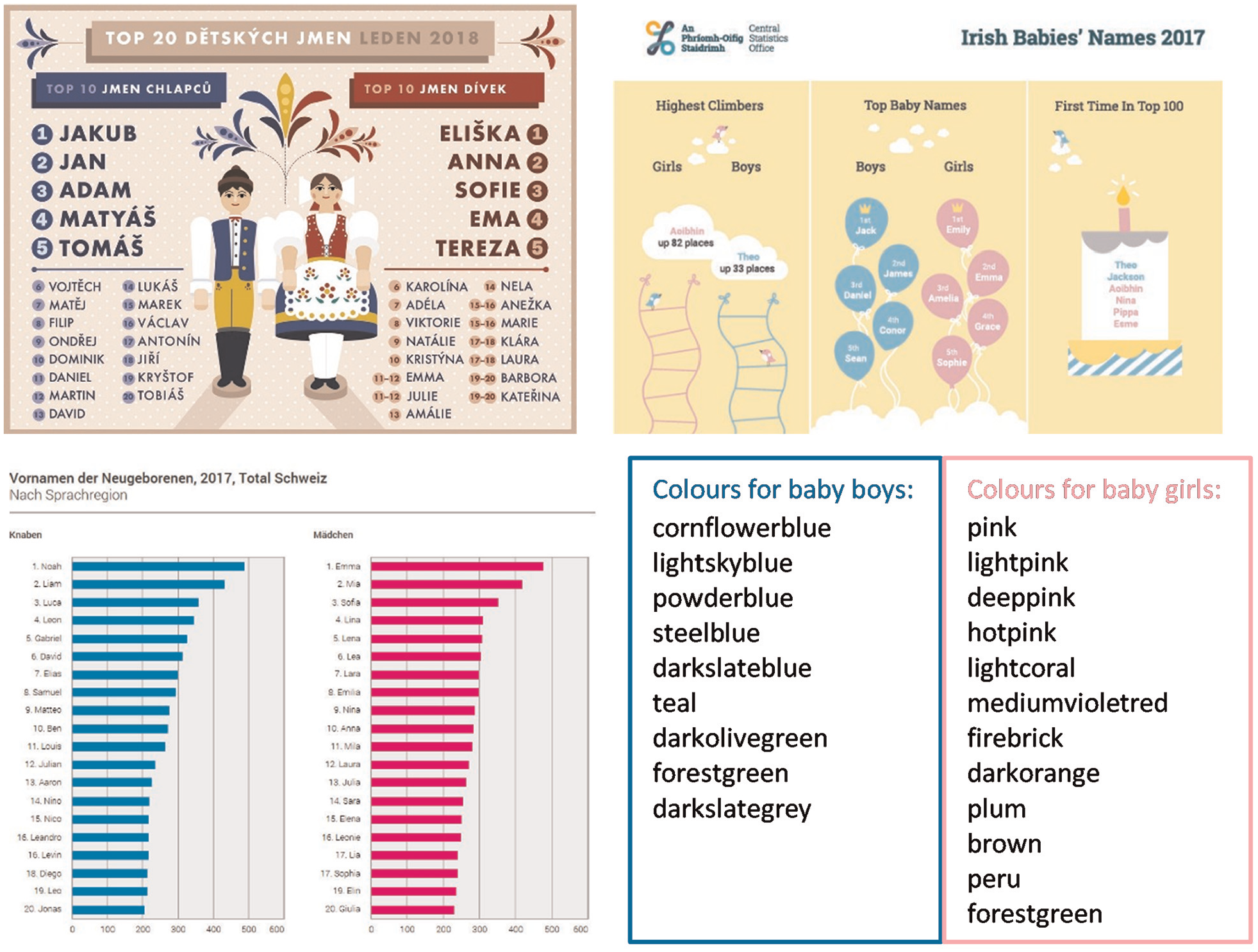
Three examples of baby name images by gender and the list of all colours for baby names (n = 29). Source for images: Czech Statistical Office (top left), Central Statistics Office of Ireland (top right), and Swiss Federal Statistical Office (bottom left).
Discussion and Conclusion
In our paper, we examined the use of colours to represent gender in the Twitter (now X) accounts of NSIs in 24 European countries. Our goal of raising awareness of the broader implications of certain colour decisions in gender visualisation is consistent with other recent attempts to uncover biases or inequalities in data visualisation (Carter, 2022; Schwabish & Feng, 2020) and the problem of missing groups (Medeiros et al., 2020; Westbrook & Saperstein, 2015). Raising awareness of official statistics is particularly important for several reasons. First, official statistics are the most important and reliable source of internationally comparable gender statistics that provide evidence for monitoring national and global progress towards eliminating gender inequalities. Second, official statisticians strive to adhere to the principles of impartiality and objectivity, which are essential for trust in their statistics. Third, because of their data and their position in society, official statistics institutions can influence public perceptions and play a leading role in raising awareness about gender inequalities.
Quantitative analysis of 631 colour pairs from 644 images reveals nine patterns of the use of colour for gender statistics by studied NSIs, among them also the stereotypical colours and colour combinations. Many approaches to colour selection include blue, which is understandable since blue has been shown to be the preferred colour. One approach is to use blue for males and a different colour for females (magenta-red in group 2, orange in group 4, green in group 5). This approach also includes the stereotypical combination of blue for males and magenta-red for females. Another approach is to use blue for both males and females, but distinguish them by lightness (group 1 and group 9). Interestingly, the same country (the Netherlands) has the most images in both groups (both genders get both colours). Some approaches do not use blue. For example, one approach is to use warm colours for both genders (group 7, especially in two Mediterranean countries, Spain and Italy) or light colours for both genders (group 3). Also unconventional are blue and violet for females, and green and yellow for males (group 6). Combinations of red for females and green for males are also found (group 8) even if they are generally to be avoided because colour-blind people may have problems distinguishing them.
When considering the options NSIs have for choosing colours, given the considerations mentioned – the trade-off between clarity and accessibility and gender sensitivity, as well as and practical considerations such as national colours and official logos – our analysis above points to several insights. On the one hand, NSIs can avoid colour choice altogether, by opting for nuances of grey and black/white, depending on the background, or using the same colour for all sexes and genders, which is possible when there are other options for distinguishing the data like labels, symbols, icons, or images. However, an absence of colour detracts from the goal of attracting attention and awareness to gender statistics, while additional symbols, graphics and images introduce a new set of challenges in the proper understanding of data. On the other hand, when choosing from a palette of colours, there are many possible solutions. One is using dark/light or cool/warm colours, which still reflects certain gender associations (dark and cool associated with masculinity, light and warm associated with femininity), but are less pronounced compared to the stereotypical blue/pink-red combination. Another solution is to allow users to choose their own colour preferences, such as in the case of interactive charts, but this does not solve the challenge of NSIs in choosing colours for official publications.
The best solution is obviously to avoid gendered colours in gender statistics, and instead choose a different colour combination. Our analysis provides several insights that could help understand the implications behind each choice. Some colour combinations seem to contain a clear ‘no’ for their use in gender visualisation, based on general guidelines for the use of colours, that is, avoidance of combinations that are likely to be difficult or impossible for the colour blind (red and green, like in Spain and France - group 8) or that challenge our attention by changing colours between genders (such as attributing ‘royal blue’ and ‘deep sky blue’ first to females and males respectively and then switching as in the case of the Netherlands). Other colour combinations, such as blue for males and pink/magenta for females, seem to reinforce gender stereotypes and should be avoided. Reversing the use of colours with gender connotations (e.g., using pink for males, such as in a French image), also runs counter to colour functionality. Using completely unfamiliar colour combinations also comes at a cost as we want viewers to understand that they are viewing a visualisation of gender. Even without these (potentially) problematic colour combinations, the choice of colours is still very wide. Generally, since the visualisations mostly involve only two gender categories, the cognitive load of ‘learning’ what each colour represents should not be too difficult, especially if the other recommendations regarding data visualisation (e.g., appropriate labelling – placing names on visual elements directly instead of in a separate legend) are followed. As we have reviewed above, colour choice also needs to consider the perceptions and feelings of the people represented in gender statistics, the emotional responses evoked by particular colours, and the differences in the meaning of colours across cultures (Adams et al., 1973; Gage, 1999; Wierzbicka, 1990).
We acknowledge that our study includes several limitations. First, the study is limited in its geographic scope, covering primarily European countries. We chose this region because of its generally high scores on gender parity indicators. This allowed us to investigate these issues within a context gender equality awareness and women’s rights and opportunities are relatively strong. By uncovering potential shortcomings in a region known for relatively good gender equality, we can gain valuable insights that might be even more applicable in contexts with weak gender parity. Further research in non-European contexts would provide more insight into practices in other contexts, which we expect vary across levels of technological advancement of NSIs, but also across different cultural understandings of colour and variations in awareness of the importance of gender equality.
The study also only used images from Twitter (X). Ideally, we would have examined a wider range of NSI dissemination channels, but analysing all channels would have been resource-intensive and beyond the scope of this study. There are some indications that colour choices might be consistent across social media platforms, including the NSI website. For example, neither a relevant written source (Smith, 2018) nor Eurostat’s (2016) style guide differentiates colour guidelines by dissemination channel. The use of national or logo colours in some Twitter images also suggests a possible consistency across channels. However, with the ever-evolving social media landscape, this assumption may need revisiting in future studies. On the positive side, a single source of images ensured a clearly defined and manageable dataset for analysis, which would be difficult to achieve with websites that have different information architecture and site hierarchy.
Finally, our analysis does not allow us to understand why and how particular colour choices were made, whether gender sensitivity was a consideration while producing a visualisation, and how decisions regarding colour are ultimately made by NSIs. The choice of these colours could be stereotypical and functional, part of an overall image (e.g., the national colours of flags, NSI logo etc.) or simply pleasing to the designer. Publicly available information on the reasons for colour choices in gender statistics produced as part of official statistics is sparse. In Eurostat visualisations, for example, the colours are the result of design constraints on colour selection. Further research into understanding the internal processes behind colour choice in NSIs, perhaps using interviews or surveys of the offices in charge of producing visualisations, could help us understand how these decisions are made and whether the trade-offs between clarity and gender inclusivity are discussed when producing the visualisations. Recently, UNECE (2019) issued more specific guidance urging that colours that reinforce gender stereotypes be avoided in the communication of gender statistics. This guidance confirms our belief that colour choice for gender statistics is not a trivial matter and should be well considered to avoid unintended subtle messages that can be suggested by the stereotypical use of colours.
Although official statistics are generally perceived as ‘objective’ and devoid of emotions, they can nonetheless contain harmful stereotypes. Using gender-stereotypical colours does not inherently produce adverse results; however, the representation of gender in official statistics can serve as a litmus test of how far a society has acknowledged gender and sex identity diversity and the importance of sensitivity to gender issues. In today’s world, sustainability and inclusivity are no longer an ‘afterthought’, they are an essential consideration; NSIs must be aware of the danger of persisting in the use of two gender categories visualised in gender-stereotypical colours. Having high quality official statistics that are communicated effectively to the public is extremely important for democracy, and signalling gender-sensitivity in visualisation is an important part. At the same time, there is a growing awareness that colour choices have important implications, and the use of colour can evoke emotions even in fields like official statistics. As far as we know, there are no studies that address the use or effects of colour choice in gender statistics. Raising awareness is the first step on the road to more equitable and inclusive colour combinations for gender statistics. Our paper identifies some pitfalls to avoid along the way. However, the paper does not suggest the most optimal colour combinations for visualising gender statistics. To arrive at this answer, one should also explore and consider the perceptions and feelings of the people represented in gender statistics, which should be the topic of future research. Given the universality of this challenge, international guidance and/or pooling of national resources would be beneficial.
Footnotes
Acknowledgements
We thank IT experts and native speakers for their help, anonymous reviewers for constructive comments, as well as visitors to our poster presented at the EU DataViz conference in Luxembourg in 2019, for their comments and encouragement.
Ethical Considerations
No studies have been conducted on animals or humans.
Funding
The author(s) disclosed receipt of the following financial support for the research, authorship, and/or publication of this article: The work was partially funded by the Slovenian Research Agency under the research programme Regenerative economy and business (No. P5-0441), and under the research programme Challenges of inclusive sustainable development in the predominant paradigm of economic and business sciences (No. P5-0128).
Declaration of Conflicting Interests
The author(s) declared no potential conflicts of interest with respect to the research, authorship, and/or publication of this article.