
Abstract
To select the best model for the relationship between the response variable and predictor variables different approaches can be used. In this paper the aim is to find the best model that gives the best forecast of the values for the line of best fit, or to find the model, which is mostly approximated to the real model. This study aims to compare linear and nonlinear models for analyzing electric data, addressing the research gap in identifying the most effective modeling approach. The research methods involved the application of Analysis of Variance (ANOVA), Akaike’s Information Criterion (AIC), and Bayesian Information Criterion (BIC) to evaluate six models, including polynomial regressions of degrees 2, 3, and 4, linear regression, multiple linear regression, and models based on interaction terms. The results revealed that nonlinear models, particularly the polynomial regression with a degree of 4 model, demonstrated superior performance in terms of goodness of fit and predictive accuracy. This model has the lowest AIC and BIC values and an adjusted R-squared of .07619 or 0.76%. The F-statistic for this model is high, at 279, which is greater than 1. The study’s main focus is on data transformation and visualization, which were essential for using the R tool to find patterns and relationships in the data. This study has a lot of potential because it provides useful information for decision-making in the energy sector.
Keywords
Introduction
In order to take the data of electricity in a Power System into consideration, a combination of data mining and the R programing language is a useful mix. Information about electrical load is crucial for electric providers. Data mining can create models from past data that can then be utilized for forecasting, spotting patterns, and other purposes and Machine learning, or modeling, is the process used to create these models (Witten & Frank, 2005).
Electricity is a necessary good for many clients in all areas of life. Electricity consumers are separated or categorized into three groups: commercial, residential, and industrial clients. No matter how the energy is created or generated, it needs to be transferred from the point of generation to the point of consumption. Each nation’s economic growth is largely based on its access to power. It is clear from paper (Prajapati, 2013) that customer demand for specific energy during brief time periods is a factor in the demand for electricity. For businesses that handle the transmission and distribution of electricity, or for businesses operating in the energy market, this knowledge on load demand is crucial in order to supply the necessary capacity.
To compare linear models versus nonlinear models, Load profiles electricity data have been used. These data are the same as the data of papers (Keka & Çiço, 2015a, 2018, 2019). In the previous paper (Keka & Çiço, 2015a, 2015b), the distribution of electricity data is analyzed using histograms and boxplots, and the consumption trend is shown. The multiple linear regression model (MLR) was used in the paper (Keka & Çiço, 2018) to find the best fit line and statistical parameters such as: Adjusted R-squared, t-value, F-statistic, p-value and standard error. The MLR model is applied to three independent variables: time, temperature, and dewpoint, where Multiple R-squared (MRS) value is low and explains 4.5% of the data variability to the fitted line. In the paper (Keka & Çiço, 2019), it has been shown the correlation of the variables, where the load is in linear dependence with calendar data, but between load and temperature there is no pattern. In addition, visualized form show the trend of expenditure and data dissemination during years.
In addition, in this paper we have visualized the data using scatter plots and histograms after writing and executing the R tool scripts as recommended from papers (Keka & Çiço, 2015a, 2016). The programing language R is recognized as one of the greatest tools to analyze data (Maindonald & Braun, 2010) and make decisions in the current Big Data era (Prakash et al., 2018). R can also calculate some statistical metrics including averages, means, medians, and p-values. Additionally, the connection between electrical load and time, temperature and dewpoint is established. However, in this paper, the smoothing line and the line of best fit are shown using the R programing language. Furthermore, the multiple regression model was assessed by computing Cook’s distance and the quantile-quantile graphic.
Linear regression is one of the most used techniques in the field of data analysis. Generally, Multiple Linear Regression is used if there are many factors that affect the dependent variable.
In this work, MLR is applied based on the measured observations where there are values of electric power measured for every SS (Substations) and values of measured temperature and dewpoint. Equation is used to find the relationship between electric loads as a response variable and three predictor variables: time, temperature and dewpoint (Keka & Çiço, 2018).
The authors (Sharma et al., 2011) used multiple regression models and support vector machines (SVM) to forecast solar energy based on weather forecasts and discovered that SVM is a more accurate model than existing forecast models such as past-predicts future model, and cloudy model.
The authors of study (Mahmud et al., 2021) compares models including linear regression, decision trees, and LSTM(Long Short-Term Memory), Support Vector Regression, Random Forest regression with an emphasis on machine learning-based PV (photovoltaic) power forecast in a certain region. Examined is the effect of weather variables, particularly humidity, temperature, and radiation. These parameters have significant impact on power PV prediction. According to the study the Random Forest regression outperformed better than other algorithms. Although there are data constraints, the authors conclude that preprocessing improves accuracy, and the study offers useful information for the planning of renewable energy sources. In the paper (Veeramsetty et al., 2021), to predict active power were used three models: Simple Linear Model, Multiple Linear Regression and Polynomial Regression. In addition, some features are removed to mitigate complexity and overfitting and is concluded that Multiple Linear Regression performs better than other models. The performance measurement of the models were done using Mean Absolute Error (MAE), Mean Square Error (MSE), and Root Mean Square Error (RMSE) metrics. The study of Oprea et al. (2021) proposed a hybrid model to detect and to predict fraud consumers in electricity. Firstly is used unsupervised algorithm to identify anomalies in time-series data, and then is used supervised learning algorithm to predict fraud consumers based on the consumption trends.
Based on nonlinear excess demand specification, the paper (Soytas et al., 2020) proposed a dynamic forecasting model for hourly electricity prices and found that the nonlinear model fits the data better in terms of log-likelihood, AIC, BIC, and pseudo-R2 criteria compared to a linear model. In the paper (Ighravwe, 2020) is proposed a nonlinear model for electricity management during a lockdown time, using Particle swarm optimization (PSO) algorithm. A review of Data Mining techniques used in Load Profiles is presented in Benítez and Díez (2022), with a focus on visualization and dynamic clustering to discover consumer behaviors over time. The authors in Zhao (2022) explores the use of electricity data in personal credit risk assessment for commercial banks. It presents a neural network model with high prediction accuracy rates about 78%, demonstrating its potential in addressing the challenges posed by increasing consumer credit volume.
The paper (Ahmad et al., 2014) discusses the use of artificial intelligence methods like Support Vector Machine (SVM) and Artificial Neural Network (ANN) in building electrical energy forecasting, highlighting the potential for hybridization for more accurate results.
In the paper (Marin et al., 2022) has been presented an analysis and prediction methodology for wind speed based on artificial neural networks modeling. To achieve that have been used wind speed values and GPS coordinates from the Black Sea to identify optimal locations for wind energy converting devices. The study demonstrates that optimal turbine placement in the Black Sea Romanian near shore can improve harvesting efficiency.
It is estimated that data stored in databases doubles every 20 months, so the data mining is focused on analyzing existing data to solve problems (Witten & Frank, 2005). In the paper (Küçükdeniz, 2010) has been calculated the demand for long term electricity using the ANN and SVM methods, which is very important to plan for energy investments in the future. The measurement demonstrates that the SVM algorithm performs better in long-term prediction than the ANN method.
However, in literature there are some gaps such are limited comparison of linear and non-linear models, lack of emphasis on model evaluation metrics. The importance of data visualization and transformation in identifying patterns and relationships within the data is not extensively discussed in the cited literature. The current study contributes by emphasizing the significance of these techniques and their impact on model preparation and accuracy. The use of top-down methodology in the data treatment in this study provides a thorough examination of the ways in which modeling approaches might assist in informing decision-making within the energy sector.
Our Contribution and Research Methodology
Our study makes several significant contributions to the field of electric data analysis.
Firstly, we emphasize the importance of data visualization and transformation in identifying patterns and relationships within the data. By using scatter plots, histograms, and boxplots, we were able to identify trends and patterns in the data that were not immediately apparent. This approach allowed us to prepare the data for modeling effectively, which is crucial for accurate forecasting.
Secondly, we provide a detailed evaluation of multiple models using various statistical metrics, including ANOVA, AIC, and BIC. This approach allowed us to compare the performance of different models and identify the most effective modeling approach for analyzing electric load data. Our study also introduces the application of ANOVA, AIC, and BIC to compare model performance, which is a novel approach to model evaluation in the context of electric data analysis.
Thirdly, our study contributes to the development of more sustainable and reliable energy systems by providing insights into effective modeling techniques for electric load forecasting. By addressing the challenges of accurate load forecasting and understanding the impact of environmental factors on electric load, our study can inform energy providers’ decision-making processes, optimize energy production and distribution, and ultimately contribute to the advancement of the energy sector as a whole. Overall, our study enriches the literature by presenting a thorough analysis of modeling approaches and their implications for energy production and transmission. Our contributions can inform future research in the field of electric data analysis and contribute to the development of more sustainable and reliable power systems.
The research methodology used in this study involved the following key steps:
Data Collection: Electric load data, along with temperature and dewpoint measurements, were collected from a specific electrical company (Z) for analysis. The data were obtained at regular intervals, such as every 15 min for load profiles and every 30 min for weather data.
Data Visualization and Transformation: The collected data were visualized using scatter plots, histograms, and boxplots to identify patterns and trends. Additionally, data transformation techniques were applied to prepare the data for modeling, including merging load profiles and weather data, and removing irrelevant features to mitigate complexity and overfitting.
Model Selection and Comparison: Six models were selected for evaluation, including polynomial regressions of degrees 2, 3, and 4, linear regression, multiple linear regression, and models based on interaction terms. The performance of these models was compared using statistical metrics such as ANOVA, AIC, and BIC to assess their goodness of fit and predictive accuracy.
Statistical Analysis: The models’ performance was evaluated using metrics such as Mean Absolute Error (MAE), Mean Square Error (MSE), and Root Mean Square Error (RMSE) to measure their predictive accuracy.
Interpretation of Results: The results of the model comparisons were interpreted to identify the most effective modeling approach for analyzing electric load data, considering both linear and nonlinear models.
Limitations: The limitations of the study, such as data constraints and the use of data from a single electrical company, were acknowledged to provide a comprehensive understanding of the study’s scope and potential constraints. Overall, the research methodology involved a systematic approach to data collection, visualization, model selection, and statistical analysis to compare linear and nonlinear models for analyzing electric load data.
Thus, the detailed steps of research used in this study such as extracting, data transformation, data processing, and models comparison are presented in the Figure 1, as shown below.

Steps of extracting data, transformation data and models comparison.
Used Data
In this work the data from Load Profiles of the electric grid in W has been used. The Load profile is a comma-separated values (CSV) file that contains electrical data such as maximum power, reactive power, on/off switching or disconnecting, and other information. In our case, we only use the maximum power and date time from the Load Profile from three Sub Stations, as shown in Table 1. This data is accurate and is based on smart metering measurements taken every 15 min. Smart meters are installed on the boundary between TSO and Distribution parts based on the Automatic Meter Reading (AMR) system (Keka & Çiço, 2018).
Load Profile Data for Three Substations.

So, AMR is used as a source of Big Data in electricity which collects, stores and transmits data of Electric Power, Reactive Power, load consumption etc., to the central system. Load profiles contain a population of data of 54 Substations for about 500,000 consumers and measurement for 4 year. In our treatment, we have taken a sample of data, which presents the Power of electricity and the date time of the measurements for three SS in the region of X.
In addition, in our work, we have used quadrennial data of temperature and humidity, or exactly dewpoint presented in Table 2. The dewpoint is in correlation with relative humidity. This data of temperature and humidity have been obtained from W Airport, Department of Meteorology. The Employees of this Department use this data and especially the dewpoint data to predict rainfall. This data is real, because it represents measured data at every 30 min. Based on National Weather Service (n.d.) the dew point (DWPT) is the real measure of the atmospheric moisture. Relative humidity reflects the contents of air temperature and moisture in the air. But, itself, it does not show the moisture of the air. If the DWPT is higher, then the moisture in the air is high, and vice versa.
Temperature and Dewpoint Data.
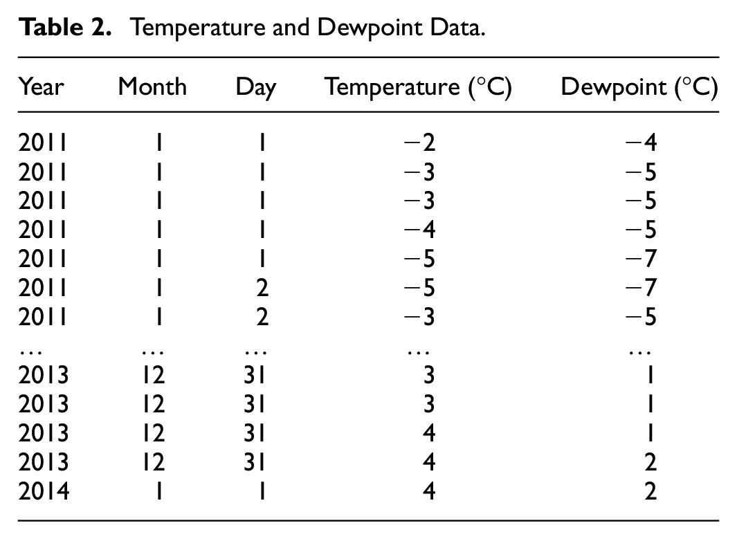
Relative humidity could also be calculated based on the dewpoint temperature. Nevertheless, in our work it is used the dewpoint data.
Data Transformations
The used data is real. The Load Profiles present measurements of the Electric Power in the electric grid SS’s. The data of LP’s is quantitative, because the data come from the measurement of Smart Meters every 15 min. Based on these measurements the Load Profiles are also considered as continuous data. The date and times of the measurements in the LPs are not numbers format, so it could be considered as categorical but continuous. The R tool is a good platform for the script execution and for the data transformation. It’s free of charge, an interpreting language and there is no need for the compiler. The R tool provides a good environment to import data, to manipulate and to apply Data Mining techniques.
To analyze the data, the first step is to import the Load Profiles, temperature and dewpoint data into R. To analyze statistically and to apply Data Mining to this data it is very important to understand the data and its nature. Load Profiles contain data of 54 Substations, nevertheless, our treatment has used data on LP for three Substations from 1 July 2009 to 31 July 2014 (Keka & Çiço, 2015a, 2018, 2019). While measurements are done every 15 min, there are these observations:
1 day = 24 hr = 24 × 4 = 96 measurements
1 month = 31 days = 31 × 96 = 2,976 measurements
1 year = 365 days + 6 hr = 35,064 measurements
4 years = 4 × 35,064 = 140,256 measurements
In the editor of R tool the data is presented as a data frame object, as shown in Figure 2. It can be seen that there are 178,335 observations for seven variables. We have used three variables that in fact are data of the three SS’s. We have treated these three variables:
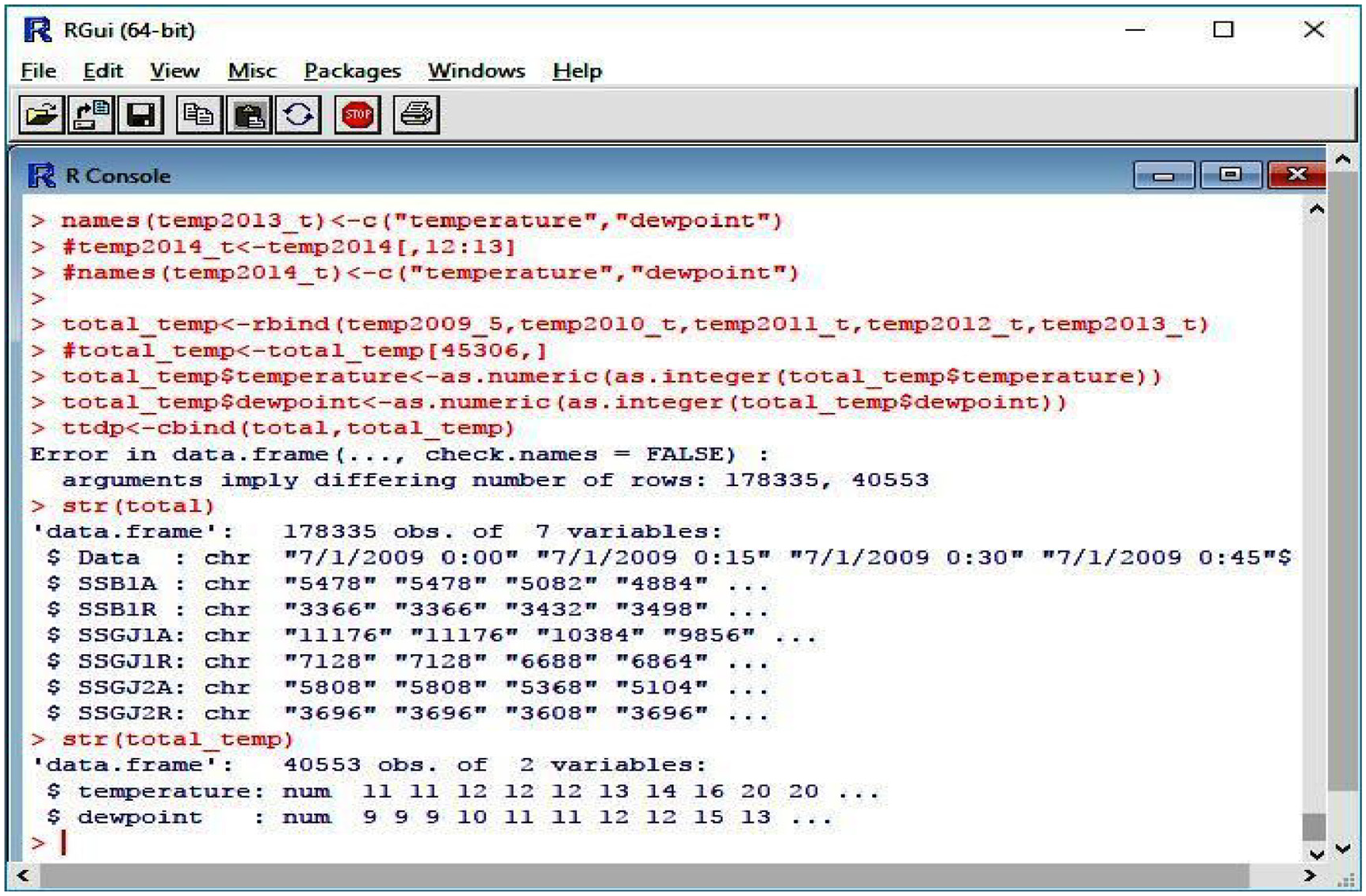
The data imported into R.
Substation of X 1 (SSB1A), Substation of X 2 (SSGJ1A), and Substation of Y (SSGJ2A), which stores the data of Electric Power. Other variables are SSB1R, SSGJ1R, and SSGJ2R, which hold the data of Electric Reactive Power and are not part of our treatment. All data are in character mode, which must be converted in an appropriate mode like numbers.
The R has packages Posixlt() and Posixct() which allow to present date and time in another format. The strptime() function provides conversation from character to Posixlt(). So, the date and time from the form: “01.07.2009 0:15,” after conversation, it will look like: “2009-07-01 00:15:00.” This form provides conditions for the calculation of dates.
In addition, there are the temperatures and humidity (dewpoint) data in the data frame object. There are 40,553 observations and two variables (temperatures and dewpoint). This data is in numeric format. Whilst writing the scripts and running in R, the conversations and combination of data of LP, data of temperature, and dewpoint must be manipulated. All of the data for electricity, time, temperature, and dewpoint have been combined. There are 40,553 rows of all variables in the data, which is aggregated every 30 min.
Data Analysis and Visualizations
Trying to analyze the data of Load Profiles, data of temperature and dewpoint based on the values in the files, it is very difficult to find or conclude a clear view of the trend of the data. Visualization will help to have a better view of data distribution (Keka & Çiço, 2015b, 2016). Data visualization is a critical part of data analysis, helping to see most of the data and at the same time pointing to the unusual (Rickert, 2010). To analyze the data, graphics such as histograms, scatter plot, box plots, density frequency etc., are used.
While the data of the LPs are measured values every 15 min and the data of temperatures are measured values every 30 min, we undertook aggregation of LP’s data for every 30 min.
Writing the script and running in R generates a graph which shows the dissemination of LPs data during 4 years. The scatter plot data for the values of Electric Power of the Substation SSGJ1A is presented in Figure 3.

Data dissemination of SSGJ1A during the years.
The range of data distribution is from 0 kW till 30,712 kW for the time between July 2009 and July 2014. Higher values are in the winter seasons and lower values are in the summer. The reason for higher values in the winter is high consumption of energy due to the use of electricity for the heating. In the winter, most of the data is distributed in a narrow band 5,000 to 25,000 kW and out of this band some data could be considered as outliers points. Even if some null values have been deleted, removing outliers is not part of the treatment of this research; rather, it is advised that future studies manage this and take the context and nature of the data into consideration.
The Figure 4. shows how the observed values are disseminated between the end of 2010 and the beginning of 2014 for the Substation SSGJ2A. The range of Electric Power is between 0 kW till 30,712 kW. Characteristic is that most of the data is disseminated in a narrow band from 2,500 kW till 17,000 kW and the values are higher at every winter season. There are also some values that could be considered as outliers.
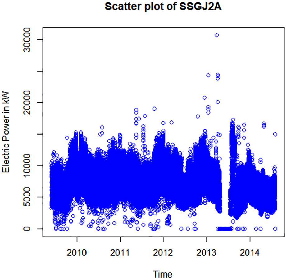
Data dissemination of SSGJ2A during the years.
The Figure 5. shows the Electric Power distribution for the Substation SSB1A during July 2009 to July 2014. The range of Distribution is from 0 to 15,180 kW. Most of the data are disseminated in the narrow band from 2,700 to 12,000 kW. Again, the higher values of Electric Power are in the winter seasons and lower values are in the summer seasons. Some of the data lower than 2,700 kW could be considered as outliers.
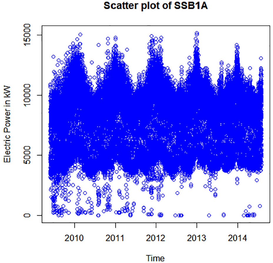
Data dissemination of SSB1A during the years.
The maximal load is 19,800 kW and the minimal load is 6,676 kW. The maximal load for SSB1A is 11,220 kW and minimal load is 1,254 kW. For the Substation SSGJ2A the maximal load is 10,208 kW and minimal load is 3,520 kW.
The maximal consumption happens at 1 p.m. and high values continue until midnight. This happens for almost three SS’s. After midnight until 8 a.m. there is lower consumption. But, after 8 am the consumption begins to increase. And characteristic is that from 10 am to 12 o’clock the consumption begins to decrease.
The Visualization of the Load for Three Substations
The Figure 6 shows the loads of the three Substations (SS), SSB1A, SSGJ1A, and SSGJ2A every hour during a day. The graph shows the dependence of the electric load in the y-axis and calendar time in the x-axis. In the fact, this graph presents the electrical consumption during the time of all customers, which are covered or supplied from SS.

The loads of three SS every hour during a day.
The load is decreased after midnight until morning at 7 a.m. After that it can be seen that the load is increased until 11 a.m., which is very comprehensive, while the electrical consumption is greater. From the 11 a.m. until midday, there is a low load and this is the case for all three Substations. This part of the day is practically the most unused in terms of electricity. After midday the load is increased until midnight. The load of the SSB1A and SSGJ2A are almost the same and goes below 12,000 kW = 12 MW. The load of the SSGJ1A is in the range from 700 to 20,000 kW.
In Figure 6, is shown the electricity consumption for three SS in the region of X of Distribution Network of W. The SSGJ1A has about 4,856 consumers, 10 feeders 10 kV and 60 outputs 10/04 kV. From these feeders or outputs there are 3 industrial consumers (Radiators Factory, Textile Factory I, and Textile Factory II) and 10 commercial customers. The SSGJ2A has 4,877 consumers, 5 feeders 10 kV and 40 outputs 10/04 kV. From these feeders or outputs there are 9 commercial customers. The SSB1A has 10,802 consumers, 10 outputs 10 kV, 220 outputs 10/04 kV. From these outputs there are 21 commercial consumers.
To find the relationship between the response variable and predictor variables based on MLR equation, we have aggregated all the data of Electric Power, time, temperature, and dewpoint. While the data are aggregated every 30 min there are 40,553 rows of all variables.
The Figure 7 shows the data distribution presented by the continuous line in the plot. The plot is done based on the daily expenditure of electricity during 4 years. It is a clear view of the electric load during all the year. It could be seen how the most of the data is concentrated on a range as shown in black. The plot shows a non linear trend of the load. The biggest expenditure happens in the winter season and the lowest happens in the middle of the year, which is in the summer.

Plot of the load for each point.
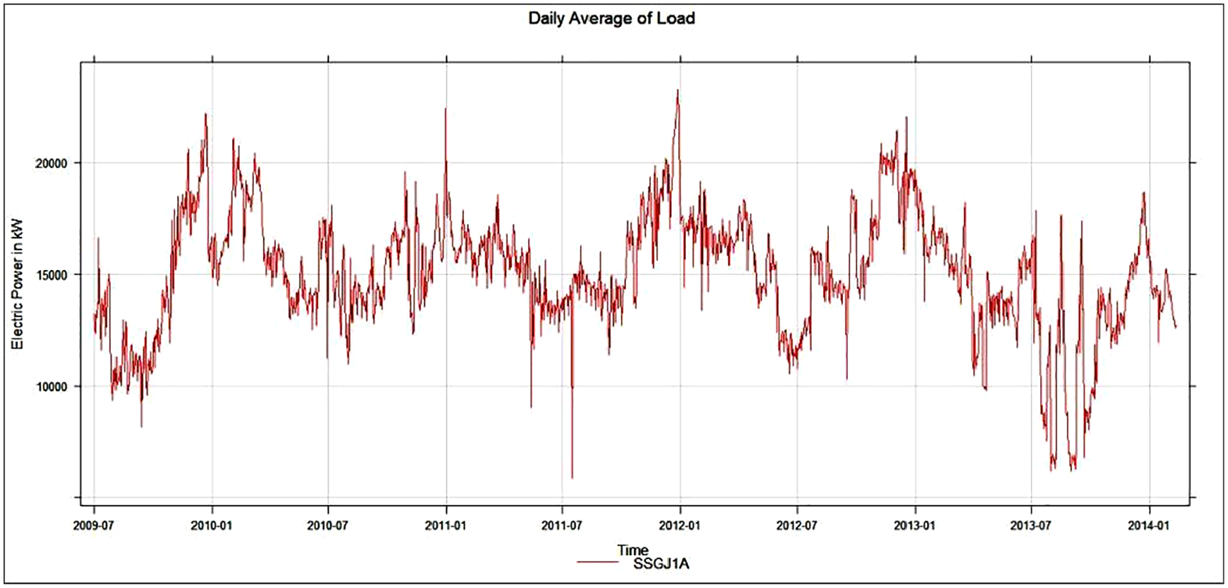
Figure 8 depicts a 4-year graph of the daily average electric load for Substation SSGJ1A. It is easier to see how spending has changed over time in this graph. As a result, from 2010-01 to 2010-07, the load on electricity decreases and there is an increase in expenditure after this date (Keka & Çiço, 2018).
Plot of daily average load (Keka & Çiço, 2018).
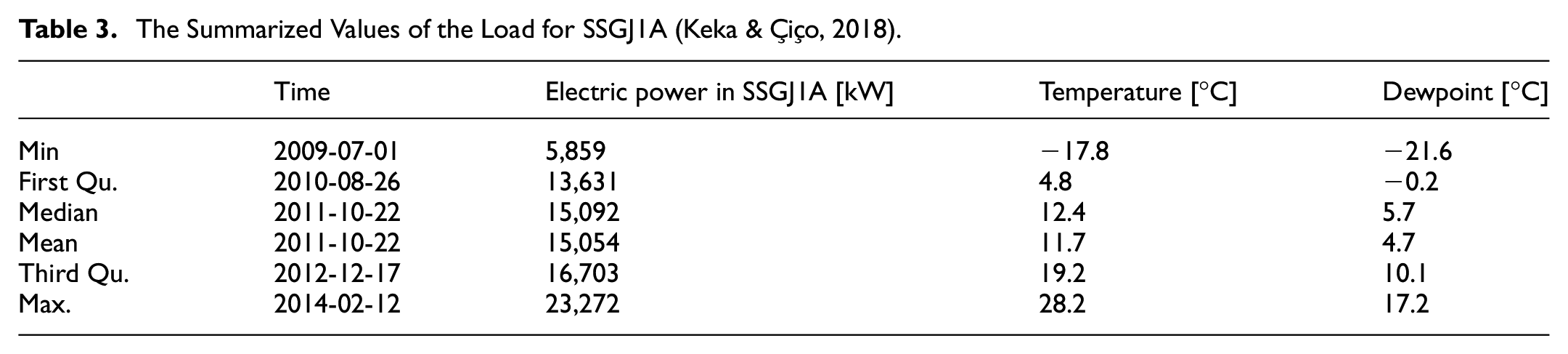
The summarized values of the SSGJ1A data dissemination are presented in Table 3. These values are derived from the three observational data sets, namely electric power, temperature, and dewpoint. On 2009-07-01, the minimum load of 5,859 kW occurred when the temperature was −17°C and the dewpoint was −21.6°C, the average load is 15,054 kW, and on 2014-02-12, the maximum value is 23,272 kW when the maximum temperature 28.2°C (Keka & Çiço, 2018).
The Summarized Values of the Load for SSGJ1A (Keka & Çiço, 2018).
The Figure 9. shows how the load is changing through the years based on the monthly average. It could be seen that there is the same situation with other earlier averages. The summary values of the electric load based on the monthly average of the observed data are presented in Table 4. The minimum load is 9,862 kW, the minimum temperature is −6.7°C, and the dewpoint is −10.3°C. The maximum load is 19,930 kW, and the maximum temperature is 23.9°C. The mean value is 15,043 kW. All other calculated parameters like first Qu., third Qu., and median are shown in the table.

Monthly average of the load.
The Summarized Values of the Load for Monthly Average for SSGJ1A.

The Figure 10., shows the trend load of the three Substations during 4 years based on a week.

Weekly load of the three SS during 4 years (Keka & Çiço, 2019).
The summarized calculation shows that the maximum load for the SSGJ1A is 21,156 kW, while the maximum values for the SSGJ2A and SSB1A are 12356.1 and 10,732 kW, respectively (Keka & Çiço, 2019).
The SSGJ1A (red line) load is so high because there are three industrial customers, whereas the commercial customers used a lot of electricity, despite the fact that the number of customers is the same or less than the other two Substations, SSGJ2A (blues line) and SSB1A (green line).
The Model Based on Multiple Linear Regression-MLR
Linear Regression is the simplest and most used techniques in the Data mining and especially in statistical data analysis.
In cases where there are many dependent variables as in Equation 1 the model is known as Multiple Linear Regression.


Where Y = Power = Load is response variable.
Where

Where
Regardless of the model assumptions, such are normality and correlation, the MLR provides information about relationship of any variables and helps give information about trend significance and how the variables are significant in the model.
Estimated Coefficients of the Multiple Linear Regression
For the data set of about 40,553 rows and 4 variables, the relationship of the one dependent variable and three independent variables based on the estimated coefficients (Keka & Çiço, 2018) is presented by the Equation 4:

This dataset shows aggregated 4-year data based on the mean. Aggregation is performed for each hour of all variables. The temperature variable has the greatest effect on the load, because the model coefficient is the largest.
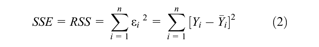
The aim of the fitted line gained through the MLR is to minimize the Sum of Squared Error- SSE, or Least Square. The lm() function of R language is used to provide this relationship model so that all observed points to be as near as possible to fitted line. That’s mean the Least Square to be minimal (Keka & Çiço, 2018).
Figure 11 shows the nature of the correlation between response variable and predictors’ variables. Thus, the relationship of the electric load is in negative trend with the time, temperature and dewpoint (Keka & Çiço, 2018).

Best fit line for the model (Keka & Çiço, 2018).
The Estimated Parameters of MLR
Table 5 shows that p-values for all three variables: time, temperature and dewpoint, are less than .05 (<.05), which means that all three response variables are statistically significant in the MLR model (Keka & Çiço, 2018).
Some Parameters of the MLR Model (Keka & Çiço, 2018).

Note. The symbol * indicates that the p-value < 0.05, which means the coefficient is statistically significant at the 5% level. In addition, the symbol *** indicates that the p-value < 0.001, which means the coefficient is highly statistically significant.
This could be also seen from the star signs on the fifth column of the table. Also, there are values of the standard errors which are not so high based on the dimension of the data.
Table 6 presents the estimated parameters of the Residuals of each observed data of three independent variables: electricity load, temperature and dewpoint.
Residuals of the MLR Model (Keka & Çiço, 2018).

The model could be considered linear because increasing the value of the n-th independent variable by 1 unit increases the value of the response variable by
It is important to explain the implications of statistical metrics in more accessible terms to better understand their significance. Adjusted R-squared is a statistical metric that measures the proportion of the variation in the dependent variable that is explained by the independent variables in the model. A higher Adjusted R-squared value indicates that the model is a better fit for the data, as it explains more of the variation in the dependent variable.
Residual standard error is a statistical metric that measures the average distance between the observed values and the predicted values in the model. A lower Residual standard error value indicates that the model is a better fit for the data, as the predicted values are closer to the observed values.
F-statistic is a statistical metric that measures the overall significance of the model. A higher F-statistic value indicates that the model is a better fit for the data, as it suggests that the independent variables in the model are significantly related to the dependent variable.
Table 7 shows the estimated parameters of the MLR model. The Residual standard error of 4,881 is high, but for this degree of freedom and for this huge size of the data, it could be taken as usual. Adjusted R-squared = .046 is low, F-statistic = 646 is high and p-value is low.
Others Parameters of the MLR Model (Keka & Çiço, 2018).

The Variance, Heteroscedascity and R2 of MLR
Multiple R-squared or Multiple Coefficient of Determination is a parameter, which tells us how close the observational data are fitted to the regression line. It indicates how the MLR model explains the variation of the observational data close to the mean of line based on the Equation 5.

Where
The MLR takes the values from 0 to 1 or from 0% to 100%. The higher the value is better for the model as, it enables the data to the fit line better. Nevertheless, this is not true in all the cases. In our case, the value of R-squared is .04561, or the value of the adjusted R-squared is .04554. That means the value is 0.045 = 4.5%. Therefore, the Multiple R-squared (MRS) is a low value and explains the 4.5% of the variability of the data to the fitted line. Based on the literature, it does not mean that the low value of MRS indicates that it is not a good model.
In most of the cases of the regression model, it is assumed that the variance is constant. The variance is taken into account to determine the range and standard deviation as expressed by the Equation 6.

Where
If the variance is non-constant, then it could be said that we have heteroscedascity in the variation. In addition, when the response data is independent from predictor data and changes are constant with the predictor variable, then it could be said that we have homoscedascity.
Variance is important, because we get an answer as to how different the data is. This means estimating the dispersion of the data. In contrast to the variance, the central tendency gives us an answer as to how similar the data is.
The parameters of the regression model are estimated assuming that the error term is constant in the relationship of the variables. Residual standard error-RSE is to calculate the standard deviation of the error in the MLR model. The values from Table 7 show the standard deviation of each observed variable from the regression line.
Based on the F-statistic, it is possible to test the null hypothesis. The value of the F-statistic for the MLR model based on the table above is 646 on 3 and 40,549 DF. The degree of freedom -DF represent the differences between sample size and number of mean parameters estimated.
Using F-statistic, it is possible to find a linear association of variables and to test the null hypothesis against the alternative hypothesis. So, it should test whether all coefficients of the MLR model are equal to each other and equal to zero:
Null hypothesis, H0:
Alternative hypothesis, HA: at least one of the coefficients is
Or, this can be expressed in this form:
Null hypothesis, H0: There is no relationship between a response variable and predictor variables, versus to the,
alternative hypothesis, HA: There is some relationship between a response variable and predictor variables.
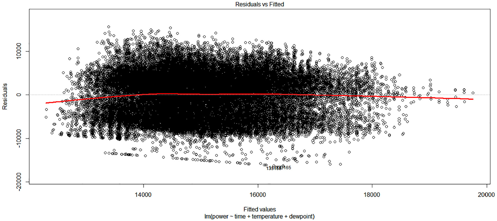
To test the hypothesis the value of the F-statistic should be lesser than 1 or greater than 1. From Table 7, the value of the F-statistic is 646, so 646 is greater than 1 and it could conclude that there is good evidence against the null hypothesis. There is at least one of the variables in the MLR, which must be in the correlation with load variable, or response variable. In addition, it could be said that there is at least one of the coefficients. The p-value from the Table 7 is <2.2e-16 which is lesser than.05 gives us strong evidence that there is an at least one variable that is related to the load response. So, the null hypothesis H0 can be rejected. It is very important to visualize the residuals against the fitted value for the Multiple Linear Regression (MLR) model. Using R language produces Figure 12, which shows how the data is distributed and how the ratio of residuals versus fitted the value.
Residuals versus fitted values.
The distribution of the data is presented by the circle in the graph from which it could be seen that there is a linear trend of the dissemination. In the x-axis are set out the value of the line of best fit in a scale from 10,000 to 20,000. In the y-axis are set out the values of the residuals in the scale from −20,000 to 20,000. The zero line is in the middle of the y-axis or residual axis presented with a line. The key point of this graph is the red line, which show if the residuals are constant in relation to the zero line. At the beginning and at the end of the fitted values there is a bias from the horizontal line, or zero line. These parts allow consideration of the nonlinear of the residuals through the horizontal line. Although, in the middle of the fitted values the residuals are constantly disseminated in relation to zero line and has no significant pattern, so it could be deduced that that the linear relationship at the beginning and end could change this linear relationship.
Figure 13 presents the Normal Q_Q graph the aim of which is to detect if the residuals are normally distributed in order to assess the assumption that the response variable is normally disseminated. The x-axis shows the Theoretical Quantiles with a range of scale from −4 to +4 whilst the y-axis shows Standardized Residuals with a range from −3 to +3. These Quantiles represent the normal distribution. In the range of Theoretical Quantiles −1 to 1, it could be seen that residuals are in the line with the straight line, so there is no deviation. But in the beginning from −4 to −1 of Theoretical Quantiles, is a deviation from the straight line. In addition, from the −1 to 4 of x-axis there is also a deviation. This graph provides a clearer view of the relation of residuals and normal distribution. It could be concluded that the relationship between a response variable and predictor variable is not so normal, although there is not a big violation of the Normal Q_Q criteria.

Normal Q-Q graph.
Figure 14 presents the graph of Scale-Location, which in fact indicates the Spread-Location. The aim of this graph is to check homoscedascity or to check if the variance is equal during the range of the fitted values. Fitted values are set in the x-axis with a range from 10,000 to 20,000 whilst the y-axis shows the square root of the standardized residual with a range from 0 to 1.5. The spread of the residuals looks quasi-constant during the range of the fitted line axis. So, it could not be considered that there is a big violation of homoscedascity. Therefore, the best fit line is quasi linear as shown in the graph.

Scale-Location graph.
Figure 15 shows the Cook’s distance which is used to check if there are any outliers from the data of independent variables and which have any effect in the MLR model. In the x-axis are shown Observation numbers in the range from 0 to 40,000.

Cook’s distance.
Cook’s distance is based on the leverage and outliers of the data in the data set. Leverage is associated with the unusualness of any point in the data distribution. If they are large, then also the Cook’s distance is large. In the case when a point is found, which could be considered as outlier, then the simplest thing to do is to remove this outlier and then to see if the slope has changed in the model and to conclude whether the point is outlier or not. The challenge is to determine which point to remove. In the graph, it can be seen that there are three points that look unusual compared to the other points.
However, the Cook’s distance is too low <0.0012. While the Cook’s distance is smaller than 1, for these three points, then they are not considered as influential in the model.
Boxplots of Data Distribution for a Month
For the same January the boxplot could also be generated to see the data dissemination and to estimate the parameters of central tendency. These parameters are presented in Table 8. The median is 18.04, the average is 16.73 and the standard deviation 3.987. It can be seen that standard deviation is almost equal as the sum of the two standard deviations of the two components.
Parameters of Central Tendencies for Two Components (Keka & Çiço, 2019).

Figure 16 shows the box plot for the dissemination of the electric power for the month of January. In fact, the data presents the hourly averages of electric consumption for January.

Boxplot of January data.
The parameters of the box plot minimum, maximum, median, mean, first Qu., third Qu., Interquartile Range (IQR) for data that represents the electric load or the consumption of electricity calculated through the R tool. From midnight until 6 a.m. the consumption is decreasing, which is comprehensible, since after midnight, there is little use of electricity and from the 6 a.m. to 1 p.m., the consumption is increased. A slow decrease occurs from 1 p. m. until 6 p.m. and after that there is increased consumption. IQR is used to measure the value of variability in the central part of the data set and if the distribution is normal, then 99% of data belong to the whiskers of Box plot (Braun & Murdoch, 2007). The IQR is IQR = 3rd Quartile – 1st Quartile = 1997 − 1293 =7,040.
The data which lie out of the range (µ − 1 × σ) and (µ + 1 × σ) could be considered as Outliers. So, while the standard deviation = 3.987 is greater than one, then that’s means the data are not distributed equally. Or, better to say that the data point which are above Q3 + 1.5 × IQR and the data point which are below Q1 + 1.5 × IQR could be considered as outliers. This data should be reviewed to see what to do with it to remove or to lie. It could be said that the effect of the Outliers is greater on the mean and not on the median, mode and IQR.
For the data of all years, the boxplots are also generated through the R, to give any usable information, as below in Figure 16.
The Figure 17 shows two graphs of boxplots:
(a) First case is the boxplot based on the monthly average, or monthly mean of 4 years data.
(b) The second case is the boxplot based on the hourly average of 4 years data.
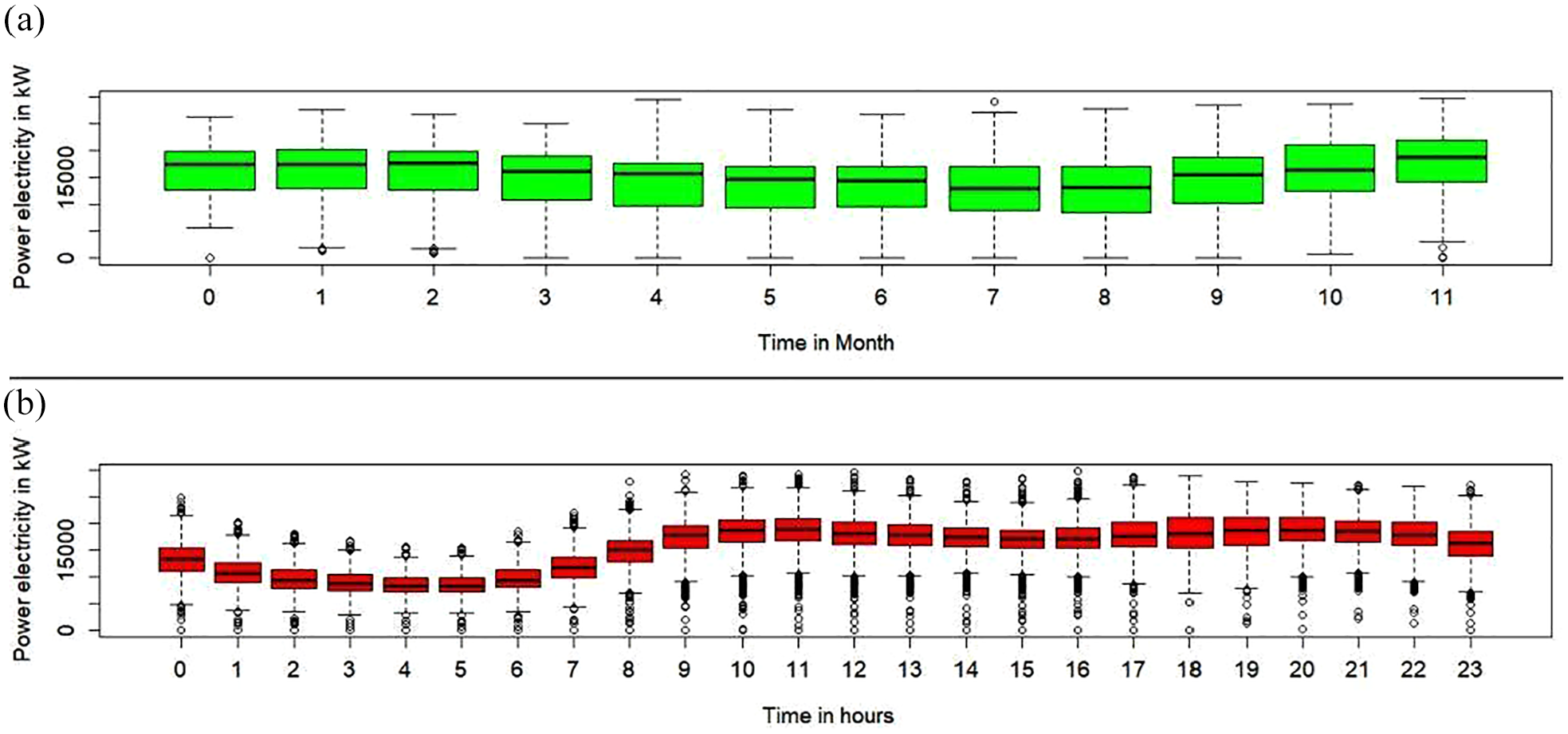
Boxplot visualization for 4 years of data: (a) Boxplot representing the monthly average electricity consumption over four years. (b) Boxplot representing the hourly average electricity consumption over four years.
The first graph shows the boxplot of each monthly average with their estimated characteristics, median, whiskers, first Qu., third Qu. The labeled months in the x-axis are presented from 0 to 11, where 0 presents January, 1 presents February and so 11 presents December. This form of labeling is expressed, since the R tool by default has this standard. In the February and March it could be seen two points which lie in the line with low whisker. These points cannot be considered as outliers. In August there is one point above high whisker and in the December there are two points that lie under low whisker. These points could be reviewed to see the effect of them in the normality of data distribution. From the median of boxplots, it can be concluded that data are not so normally distributed. The second graph shows the boxplot of each hourly average of 4 years data with their estimated and visualized characteristics. There are also some data points which are above and below whiskers. These data points could be considered as suspected outliers. From the median it can be seen that the data distribution is not so normal (Keka & Çiço, 2019). The median is decreased from 12 a.m. to 6 a.m. And then there is an increase of the median in the next average hours.
Another Models Approach, Non Linear Transformations
In this section, for the relationship between the response variable and predictor variables the non-linear models have been used.
Interaction Terms in the Model
In the MLR model the lm() function is used to find the relationship of the variables. In this function there is also applied the interaction of the predictor variables. The interaction of the variables could be expressed as in the Equation 7.

Based on the Statistical Formula Notation in R. the expressed component
The model with interaction term could be expressed by the Equation 8.
Now the coefficients of the predictor terms have different effects of the electric load in the relationship from the MLR model. After execution of the script in R many of the estimated parameters as in Figure 18 are generated.

Parameters of the Interaction term in the model.
Quadratic Regression as Polynomial Regression
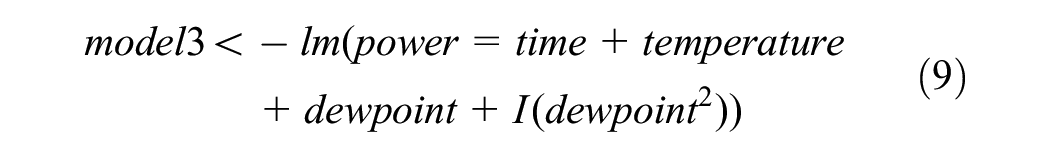
In this part the Non Linear Model (NLM) has also been used for the relationship of load with time, temperature and dewpoint. The linear model is transformed into Non Linear Model as in the Equation 9.
This equation is equivalent of regression of power, time, temperature, dewpoint, and dewpoint2. This new relation could be expressed as in the Equation 10, as below.

The estimated parameters of this NLM model are presented in the Figure 19.

Parameters of the Non Linear model.
Polynomial Regression With Higher Degree
In the observed data, polynomial function could be applied as a non-linear model with different degree of variable X. The polynomial regression should be expressed as in Equation 11.

Where
So the polynomial model with degree 2 for all terms is presented by the Equation 12:

The polynomial model with degree 3 for all terms is presented by the Equation 13

The polynomial model with degree 4 for all terms is presented by the Equation 14

Comparing All of the Models
In Figure 20 are presented 6 models and comparisons based on the analysis of the Variance.

Analysis of the Variance for 6 Models.
All models have low p-values, but the highest degree polynomial regression’s p-value is the most significant. Model 6 is clearly very significant and has a very low p-value (2.2 e-16). Model 6 is a 4-degree polynomial regression. The RSS is the lowest among the other models, and the F value exceeds 1. These model 6 results suggest that there is no linear relationship between the load and time, temperature, or dewpoint.
To determine which of the six models is the best, a different function could be employed. There is a mathematical technique called the Akaike information criterion (AIC) that may be used to assess how well a model fits the available data. To assess various model options and identify the best fit for the data, statisticians utilize AIC, as shown in Figure 21.

Akaike’s Information Criterion (AIC).
The results show that there are not much differences in AIC amongst the six models. However, model 6’s AIC value is the lowest (802,611.7), leading one to believe that it is the best model for load prediction.
The Bayesian Information Criterion (BIC) is a different test used to compare models, and in this case, the model with the lowest BIC value must be taken into consideration as the optimal model. Based on greatest likelihood, the BIC and AIC are calculated. When calculating the model’s coefficients, they demand that the probability be between 0 and 1. However, the likelihood is based on the need that a large number of observed values be present. The model with the lowest value is therefore the best model.
Model 6 in Figure 22 has the lowest BIC value of any of the other models at 802,732.3.

Bayesian Information Criterion.
Figure 23., displays model 6’s calculated coefficients and all statistical characteristics. The number of parameters in each model is also displayed in the

Summarized values of the model 6.
Since the term of time with degree 3 has a p-value of .99061 and is not statistically significant, it should be eliminated from the model. The term for temperature with degree 1 is not significant with a high p-value of .14951, and the term for temperature with degree 4 should be deleted from the polynomial model with a high p-value of .54249. Again, the adjusted R-squared of .07619, or 0.76%, is not very good. The F-statistic is significant (279.7 > 1) at a high level.
The polynomial model of degree 4 could be written as in Equation 15 below:

All the results for the six treated models are presented in the Table 9, as below:
Parameters of Analyses of Variance (ANOVA), AIC and BIC for 6 Models.

Note. The symbol ***indicates that the p-value < 0.001, which means that between models is statistically significant difference.
From the Table 9, it could be seen that RSS-Residual Sum of Squares which presents differences between the observed values and the predicted values, is smaller in model 6, than in other models. In addition, the probability of F-statistic is lower than 0.05 and the F value is high 25.976. The p-value shows that there is a statically significance difference between models means. These significance could be shown also from the stars in the significance column. The minimal values of the AIC (802,311.7) and BIC (802,732.3) for the model 6 give advantages to this model over others. Because the ANOVA test is preferred to calculate the nested models it could be shown that the values for F-statistic and p-value are not estimated for models 1 and 3.
Summary and Future Work
The existing challenges in the field of electric data analysis include the need for more accurate and reliable modeling techniques to forecast electric load and understand the complex relationships between various factors such as time, temperature, and dewpoint.
The study aimed to compare the effectiveness of linear and nonlinear models for analyzing electric load data using ANOVA, AIC, and Bayesian Information. The study primarily focused on comparing linear and nonlinear models, including polynomial regressions of degrees 2, 3, and 4, as well as models based on interaction terms. The emphasis was on using ANOVA, AIC, and BIC to evaluate these models and determine the most promising model for analyzing electric load data. Among the models, the polynomial regression with a degree of 4 has the lowest AIC and BIC values and an adjusted R-squared of .07619 or 0.76%. The F-statistic for this model is high, at 279, which is greater than 1. Thus, the polynomial regression with 4°, or model 6, is the most promising model, as indicated by the models with the lowest AIC or BIC values. The findings indicated that nonlinear models, particularly, the polynomial regression with a degree of 4, demonstrated superior performance in terms of goodness of fit and predictive accuracy. The emphasis on data visualization and transformation proved crucial in identifying patterns and relationships within the data. The study’s focus on nonlinear models and data visualization can inform future research in this field, providing valuable insights for decision-making in the energy industry. Overall, the study provides valuable insights into the use of different modeling techniques for electric load data analysis.
This work developed a Multiple Linear Regression model for electric load based on 4 years of data in the electricity field, following the introduction of the Linear Regression. The model was created to determine the relationship between the data for time, temperature, and dewpoint and the electric load, and was found to have a downward pattern. The MLR model was developed by minimizing the sum of squared error, or SSE, and the estimated parameters were produced. The Adjusted R-squared is low, indicating that the model only accounts for 4.5% of the variability of the data to the fitted line. The Residual standard error is high, but can be accepted as typical for this degree of freedom and for this size of data. The evidence against the null hypothesis is strong, as indicated by the high F-statistic of 646, which is greater than 1. At least one variable in the MLR model must be correlated with the load variable. The p-value of 2.2e-16 is less than 0.05, providing evidence that at least one variable is related to the load. Therefore, the null hypothesis H0 can be disproved. There is no significant violation of hemoscedascity after considering the residuals in comparison to fitted values, the Normal Q-Q graph, and the scale-location plot.
In addition, the scatterplot visualization for the substation SSGJ1A over 4 years shows that the lowest electricity power is 0 kW and the highest is 30,712 kW. The seasonal pattern for the substation was observed, where winter is the season of greatest consumption and summer is the season of least consumption. Electric power is higher in the Substation SSGJ1A than in the other two Substations, as shown by the comparison of the three Substations’ daily data distribution. This is due to the presence of several industrial factories in the Substation SSGJ1A that require a significant amount of electricity.
Furthermore, the correlation between the dependent variables is influenced by collinearity, which implies that there is little to no connection between them. Furthermore, the null hypothesis is tested using the F-statistic. The distribution of the data is visually represented by boxplots of different load types, whether daily or monthly.
Future research in this area should explore the application of advanced nonlinear models, such as the logistic model, to improve the accuracy of electric load forecasting. Additionally, the generalizability of modeling approaches across multiple electrical companies should be investigated to ensure the applicability of findings in diverse contexts. By addressing the challenges of accurate load forecasting and understanding the impact of environmental factors on electric load, future research can contribute to the development of more sustainable and reliable energy systems. Application scenarios for the findings of future research include informing energy providers’ decision-making processes, optimizing energy production and distribution, to ensure load balance and stable frequency, and ultimately contributing to the advancement of the energy sector as a whole. In addition, it may be necessary to experiment with various methods and incorporate other variables, such as wind, that could have a bigger influence on the load.
The paper acknowledges the presence of outliers in the data and suggests that they should be reviewed to determine whether they should be removed or retained. However, the paper does not provide specific details on the steps taken to handle outliers in the model. It is possible that the authors remove outliers from the dataset or use robust regression techniques that are less sensitive to outliers. It is important to note that handling outliers in the data is a complex issue that requires careful consideration and should be based on the specific context and goals of the analysis. Further research that goes into greater detail about how outliers are handled and how they affect the performance of the model would also be beneficial.
Footnotes
Declaration of Conflicting Interests
The author(s) declared no potential conflicts of interest with respect to the research, authorship, and/or publication of this article.
Funding
The author(s) received no financial support for the research, authorship, and/or publication of this article.
Ethical Approval
The author(s) declare(s) an ethics statement for animal and human studies is not applicable at our research
“Data Availability Statement” (DAS)
Please, I want to inform you that the data used in this work are from Electrical Company called Z, so I have restriction about publishing them publicly. I hope that you are considering this declaration. If not, please tell us how to find a solution about that (e.g., to publish just 2–3 files) or to ask again to the company if it is possible to publish.