
Abstract
Perhaps no innovation in history has affected marketing management as pervasively as has the advent of e-commerce. This revolutionary new channel has required businesses to acquire an entirely new set of skills and approaches to promotion, pricing, and distribution. The necessity for e-commerce website operators to more deeply understand consumer behavior when engaged in e-commerce has become a central and crucial factor in website success or failure. As predicted nearly 20 years ago, travel bookings have moved almost entirely to the World Wide Web (WWW). For the past 12 years, data have been collected concerning traveler’s preferences, concerns, and perceptions of airline websites in particular. This research reviews and comments on the evolution of those sites and consumer perceptions of efficiency, ease of use, and usefulness. The results of this study are intended to guide airlines in their pursuit of customer satisfaction and increased profits.
Introduction
With approximately 2,912,460,537 Internet users worldwide as of June 11, 2014 and usage growth of 566.4% worldwide since 2000 (Miniwatts Marketing Group, 2014), there is no question as to the importance of the Internet to retail business. It is estimated that more than three billion users will exist before the end of 2014. In addition, the world wide penetration of 34.3% is more than considerable. Highest penetration occurred in Europe at 89.9% followed by Oceania/Australia at 89.62% and North America at 63.2%.
Within the travel industry, predictions were that online travel sales would double in three years and those revenues did grow from US$38 billion in 2006 to US$80 billion in 2007 (Elkin, 2008). Specifically, Elkin’s (2008) prediction of revenues from online airline reservations of US$32.8 billion in 2007 have been greatly exceeded in an industry where sales volume reached approximately US$700 billion in 2011 (First Research, Inc.) and approximately 87% was conducted online (Mamaghani, 2010). Moreover, online volume is forecast to grow 20% by 2014. In actuality, online purchases of airline travel reached US$85.7 billion in 2014 (International Air Transport Association [IATA], 2014)
In this environment, few scholars would disagree concerning the critical centrality of an airline’s website.
The objectives of this series of longitudinal studies are essentially twofold: first, to allow airlines to evaluate changes made to their customer websites from the perspective of the consumer; second, for airlines to see how their sites are rated by consumers in comparison to other airline websites.
Many research studies including Kettinger and Hackbarth (2004) strongly support the importance of companies’ ability to “alter their activities to adjust to new ways of conducting business.” In these studies of airline websites, the growing importance of online portals for booking travel and the airline’s differing “ability to alter their activities” is strongly indicated by customers changing perceptions of those sites.
Even entire countries are recognizing the importance of online travel sites. Costa Rica designed, built, and operates a national Internet reservation system (Raventos, 2006). As world usage of the Internet increases from the current estimates of approximately US$5.2 trillion, there is little doubt that the travel industry will grow apace. Therefore, it is clear that effective and efficient website design, maintenance, and updates are critical to the success of an airline website.
Several extant studies exist designed to evaluate Internet retailing quality (Francis, 2009); however, none specifically addresses the unique characteristics of the Internet airline retail environment. One case by Buchanan and Clinton (2010) utilized actual airline customer service letters including some concerning online services. In a related study, Manzano and Valpuesta (2010) used a “multi-nominal logit model of 27 socio-economic factors and trip attributes” to develop passenger profiles. Yet, none of these studies attempted to determine the specific characteristics of airline websites, which either attracted or repelled potential customers. Even more important, no research has studied which airline websites attracted repeat customers as a result of their design features and benefits.
In each year since 2007, the IATAs (2013) annual Corporate Air Travel Survey of more than 10,000 active travelers shows that “not only are travelers accepting high-tech travel options, but also they are demanding even more opportunities to take control of their travel experience” (p. 1). That same IATA report showed that 89% of responding travelers preferred e-tickets to paper tickets, and that the first three preferences for more self-service online included online booking, online reservation changes, and online check-in.
Because many scholars agree with Eckrich, McCall, and Wilcox (2005) that long-term customer satisfaction is the core of the marketing concept, the airline industry might be well served by attempting to provide such satisfaction with their online process. Although sites serve many purposes, this study focuses on those sites that allow customers to actually purchase airline travel tickets.
As the site may be the primary point of contact between a potential customer and the airline, it logically follows that that consumer’s perception of that airline will be influenced by the quality of the site (Richard & Chandra, 2005). However, not all of the factors involved in the formation of consumer perception are controllable by the site owner. As an example, navigation systems guiding consumers through ordering scenarios can be controlled. However, the airline exerts only marginal control over page loading speeds and none on the consumer’s computer processor speed, keyboard, or mouse skills.
Then, those aspects of the site that are controllable, semi-controllable, or uncontrollable must be identified and optimized. In this study, comparisons are made among 15 airline websites with particular interest to those aspects within the control of the site owner. More importantly, the changes over the past 12 years are tracked and compared. If the voluminous academic research during that period has had an effect, it should be apparent. To increase the external validity of the study, airlines were chosen to increase sample variance using airlines of several countries and various sizes.
Controllable and Semi-Controllable Attributes
Previously, research has identified several significant factors influencing customer satisfaction and frequency of repeat purchases. Among these, factors identified as controllable include color schemes, font selection, screen layout, and navigation and input systems. The Higgins (1998) research strongly supports these attributes as direct significant influences on user search costs and their influence on purchase behavior.
One semi-controllable factor of considerable impact is perceived security. Although network and site security are largely determined by external forces, such as host computers, network design, and site hackers, site owners still have some control over this aspect. As services retailing of airline reservation systems require detailed personal information, enhanced security measures are essential to perceived and actual security.
There is little doubt that attributes used in this study significantly affect site efficiency and effectiveness. Interestingly, controllable attributes used on e-commerce airline sites appear to more directly and strongly influence consumer satisfaction than the semi-controllable.
Method
Raters in Waves 2001 and 2005 took a 1-hr training session in color wheel usage, font identification, color intensity, text/graphics density, and general site navigation. No airline sites were selected for training. These raters were randomly selected volunteers from the faculty, staff, and students of a major university. In 2006, comparison tests were conducted to determine the value of the 1-hr training versus written instructions. These tests indicated that there was no significant difference in ratings. Therefore, data collection in 2009 and 2013 involved the random selection of individuals from pools of possible respondents produced from a list created by passing out invitations in several major airports, both in the United States and internationally. Raters were provided with written instructions in color and font identification, color intensity, text/graphics density, and general site navigation. Two commercial websites were recommended for training, and individual elements were discussed. Again, no airline sites were selected for this instruction. Each instruction site was a consumer e-commerce site from other industries, which included examples of the variables under study.
As shown in Table 1, font, color, orientation, and other visual variables were individually measured. Factors such as colors, fonts, and test/graphics density were verified by the researchers.
Rater Numbers and Rater Experience.
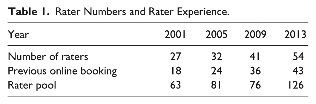
Among others, ease of ordering and quality of help were specifically rated. In the summary shown in Table 1, the most critical results are reported.
Each wave is designated by the year as 01/05/09/13. Individual rater bias was reduced by choosing 27/32/41/54 individuals randomly from pools of 63/81/76/126 volunteers. Within selected raters, 18/24/34/40 had previously used online airline booking services during the past year; the remaining 9/8/5/11 had no experience with online booking.
As e-commerce research has increased in both intensity and rigor, other factors have emerged including challenge, interactivity, and site involvement (Mahmood, Adam, & Ford, 2004) that may play significant roles in site effectiveness (Richard & Chandra, 2005). Unfortunately, it was not possible to include these interesting factors, because such additions would impair the temporal comparisons.
Specific Controllable Attributes
To be consistent and to be able to compare data from various years, the variables remained the same for the entire period. Since prior research found that web page backgrounds and speed of page loading influence user attitudes, these variables were included (Powell & Conca, 2001; Weinberg, 2000) certainly, speed of page loading influences site traffic (Weinberg, 2000). In a similar fashion, page complexity has a significant effect on site traffic (Bucy, Lang, Potter, & Grabe, 1999). Each rater examined the physical layout of the opening page including orientation, background color, font color, font size, secondary color, color density, graphic density, text density, and overall density of information. Numerous studies in cognitive psychology strongly suggest that human response is affected by color, orientation, size, and information density (Lim, Yap, & Lau, 2010). In addition, advertising studies show that density of text or graphics frequently effects reader interest. So our raters counted the number of words on each opening page to estimate information density. Graphics, including differentiation between photographic type material and non-photographic artistic material was noted.
Attention span studies suggest website users lose interest and exit sites if they are unable to accomplish their intended task in a reasonable time frame (Weinberg, 2000). Therefore, the number of screens required to actually place an order was recorded. Ease of data entry was assessed as well as clarity of site instructions. Availability of online help is noted, and the quality of that help function was assessed. Assessments of ease of use; usefulness; clarity of instructions; and speed of response, density, color intensity, and overall evaluations are operationalized using a 10-point scale with 1 being the lowest or negative rating and 10 being the best or positive rating. For instance, a speed of 10 would be the fastest possible site response. Because speed is determined by many factors outside the control of the company, such as the server, user’s computer, and available bandwidth, we correlated this measure with page density and found significant levels of correlation ranging from .65 to .97. It seems that companies do have some control on the response speed of their site.
Results
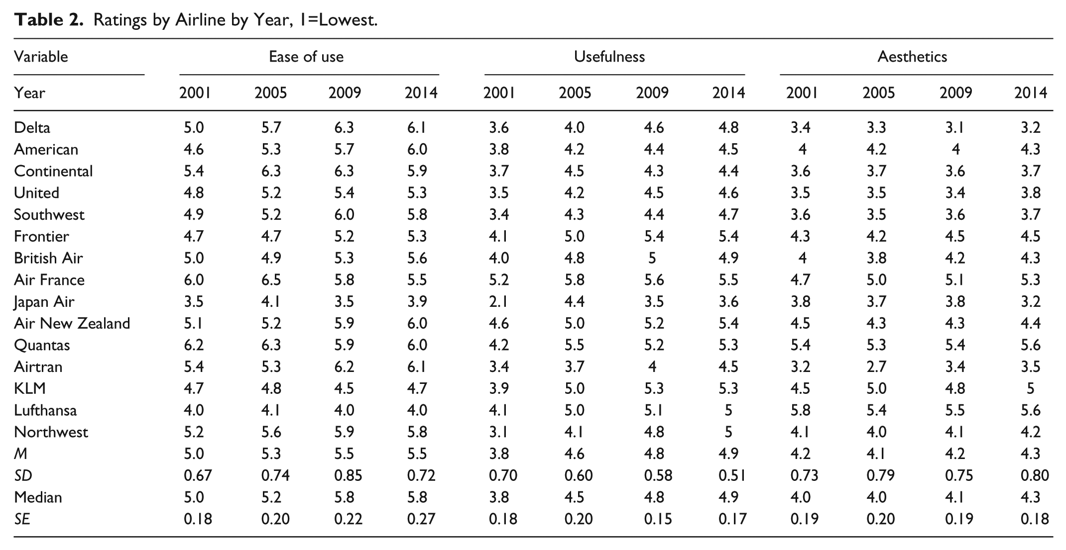
Overall, these studies indicate, as shown in Tables 2, 3, 4, that all of the airlines in the sample have made significant changes in their sites over the 12 years with the important areas of Ease of Use and Usefulness having improved the most. Certainly, these are the areas of most concern for the consumer and deserve this attention. In particular, Delta (+1.2) and American (+1.4) improved the most in Ease of Use. Whereas Northwest (+1.9) and Japan Air (+1.5) improved the most in Usefulness.
Ratings by Airline by Year, 1=Lowest.
Ratings Changes over the Twelve Years by Airline.

Average Ratings on Major Variables over 12 Year Period.

Note. ANZ and Quantas merged. Interestingly, using an additive model wherein the individual attribute rankings are averaged, and the global overall is excluded, the top ranking airlines become Air France and Air New Zealand as indicated by the bold numbering. EOU = ease of use; Ast = aesthetics.
Aesthetics have seen little change in consumer perception although vertical temporal comparisons do indicate considerable change. It would appear that because all have improved, consumers fail to perceive those changes in side by side comparisons.
Following, we review the changes that have occurred over the past 12 years in specific attributes of airline websites. The most important of these, namely, ease of use, usefulness, aesthetics, and overall rankings are summarized in Table 2. Other attributes including color and are discussed in the following paragraphs.
Website designers have considerable flexibility in their choice of screen color schemes (Powell & Conca, 2001). This research focused on three color attributes: primary background color, secondary background color, font color, and the intensity of these colors. In 2001, selected airline sites used one of four colors as primary backgrounds (white, blue, red, and gray). Eleven of the 15 sites (73%) used white, two used blues, one red, and one gray. By 2013, only nine companies used white with five blue and one black. This finding coincides with prior research by Powell and Conca (2001) who found that 75% of 184 general Electronic Commerce (EC) sites examined had white or gray as primary background colors. Color intensity varied from five to 8.3 on a scale of 1 to 10 with 10 indicating 100% intensity. The mean for all background intensities was 6.4 in 2014.
The most common secondary color was blue—eight out of 15—and in the second study, six used blue. Others included three white, two reds, and an orange and a green. Intensities for secondary colors ranged from 5.2 to 7.3 with a mean also of 6.4. Font colors were more varied ranging through seven black; three blue; two gray; and one each green, orange, and white. Although font size varied with each page, the dominant size on all pages visited in both studies was 10. By far, the most common typeface was Ariel at 12 with Helvetica at two, and Veranda one. Yet in 2014, the most common font was Times New Roman (TNR) at 12 with one each of Open Sans, Am Sans, and Ariel. Evidently, the predominance of TNR is a reflection of how frequently this font is used in other media. However, perhaps a more thorough investigation might reveal that the demographics of online airline customers include a larger percentage of older customers than the general population, therefore necessitating a larger font. Only JAl, Lufthansa, and KLM used 6-pt fonts for the main bodies of their pages.
Because contrast plays an important role in perceptions of environmental stimuli, we examined how foreground and background colors were used to provide contrast. The most prevalent combination was black text on a white background (five of 15, or 33%). Blue text on white background was the second most common combination at two sites (11.3%). Other combinations varied widely.
White was the most common background color at 75% then 60%, more than all other colors combined, followed a distant second by blue at 13.3% then 27%. Somewhat surprising, as the web page is in part a commercial message from the organization and most advertising is designed to attract a potential customer’s attention. White does not seem to be a strong attractor. However, if consumers visit EC sites with a particular purpose, perhaps designers already have the user’s attention and do not require strong background colors.
Yet, other methods are used to gain a customer’s attention. Graphics were used in 14 of the 15 (93.3%) with 10 of the 14 (71.4%) of photo quality in all 4 years. However, graphic density on pages increased nearly 50% from 2001 to 2014.
Interestingly, none of the 2001 sites used animation and only one in 2005, and only one again in 2014. Page orientation was almost evenly divided in 2001 with eight sites using landscape and seven using portrait, but in 2005, only two retained the landscape orientation. This propensity continued through 2009 and 2014.
Information density can prove intimidating to a new user, yet the airlines showed wide variations. The 2001 word count on opening pages ranged from 38 to 266 with a mean of 126. Surprisingly, this had significantly increased to 33 to 217, mean 170 in 2005. From 2001 to 2014, combined raters estimates of visual density had a minimum of 4.0 (4.4) and a maximum of 8.0 (6.6). In essence, the range has narrowed with the mean staying the same. An 8.0 indicates that approximately 80% of the page is covered by text or graphics. Results indicate that density beyond approximately 150 words per page or approximately 50% tends to be more than customers can easily assimilate.
Other aspects investigated included usability on four attributes: number of screens necessary to book a flight, help facilities, information presentation clarity, and ease of data entry.
The average site required that six screens be viewed to complete an order (minimum four, maximum 11), and this was unchanged in 2005. However by 2014, the number of screen had diminished to three. Quoting Powell and Conca (2001) regarding general EC websites, “From a usability standpoint, four screens is probably high; in typical business information systems, the general rule is that users should have to click no more than three times before being able to begin working” (p. 290). However, prior research suggests that web users are not quite the same as other computer users (Turban & Gehrke, 2000). In the investigation of usability attributes (Ease of Data Entry, Clarity of Instructions, Speed, and Help) on a scale of 1 (very low or poor) to 10 (excellent), Data Entry Ease was rated at a mean of 4.0 in 2001 and had risen to only 5.4 in 2014.
Ease of data entry in 2001 was rated highest for Air New Zealand at 5.7 and lowest for Japan Air at 2.3. However by 2005, Lufthansa was the best at 4.9 with JAL still lowest at 2.0. By 2014, the margins had narrowed with most, excepting JAL, with a difference of only 0.1. Clarity of instructions with a mean of 2.6 for all sites is far less than adequate. This has not improved in the study of 2014. Ranking highest was Air France at 5.3 and lowest at 0.0 was Continental without instructions at all for 2001. In 2005, Lufthansa had improved from 2.9 to 5.1 to rank first with Northwest now last at 2.3. This has remained the case in the data from 2014. Speed is measured as the time required to display the requested flight quotes ranged from 2.6 (2.5) to 7.3 (5.0) with the average at 4.7 (3.4) where 1.0 is the fastest. So there has been some improvement. As mentioned earlier, this factor is only partially under the control of the airline. Yet, there is some control. Servers are much more capable, and the available bandwidth is far greater than in 2001.
Help facilities were evaluated on availability, ease of use, and usefulness as well as an overall assessment. All airlines had some help facilities; however, the variations in quality were substantial. Ease of use ratings from 2001 to 2014 ranged from 4.1 (2.6) to 6.5 (4.9) with a mean 5.3 (2.9), a significant advance. Usefulness ranged from 2.8 (2.9) to 5.4 (6.6) with a mean of 4.5 (4.5). Overall ratings of the help features were generally poor with a mean of 3.9 (4.4) and a range of 2.3 (2.9) to 5.5 (6.5). Obviously, some airlines, notably United (6.6) and Southwest (6.5), are paying some attention to the help feature.
After completing the above evaluations, each rater was then asked to rank each airline from best to worst, 1 to 15. Delta ranked first with an average rank of 2.3 (3.1) in 2001, 2005, and 2009, then fell to second after American in 2014. Lufthansa made the most remarkable improvement jumping from 14th into second place. In 2001, the four lowest ranked airlines were KLM (11.7); Lufthansa (11.4) with Japan Air and Qantas tied at 11.3. In 2005, the four worst were Southwest at 12th falling from fourth, Northwest improving from 15th to 13th, KLM falling from 13th to 14th, and JAL falling from eighth to 15th. By 2013, the ratings had changed with American first, Delta second, and Southwest third. Table 3 shows the ratings changes over the years.
Interestingly, using an additive model wherein the individual attribute rankings are averaged, and the global overall is excluded, the top ranking airlines become Air France and Air New Zealand. Speculation may lead one to believe that global overalls are influenced by factors other than those included. This artifact, which may be revealed to be quite important in future research, appears in Table 4.
Conclusion
From the consistently low rating on every selected criterion, it is apparent that airlines continually need to reevaluate their EC sites. Because humans are such visually intensive beings, it is obvious that this aspect of web page design requires considerable attention. As evaluated, the visual aspects of the majority of these pages are cluttered, confusing, and not particularly aesthetically pleasing. More importantly, they do not create a feeling of confidence in the use because of poor instructions and difficult, less than useful help features. Some attempts at simplification and improvements in ease of use have occurred, but not enough. Although most reading this article certainly have the ability to use airline websites with little or no difficulty, this may not hold true for the general population. With costs of airline travel within the reach of most consumers, many potential flyers are entering the market with limited computer experience. Unlike the expert web surfer, this segment of the market requires simple, straightforward, and easy to use and understand EC sites. In particular, they need excellent help facilities.
Along those lines, commercial software providers have long understood the importance of help facilities. Consider the Help available in Word, Excel, PowerPoint, and many other applications. None of the airline sites visited had help facilities that would have passed the scrutiny of any competent applications programmer. Perhaps adaptive web designs could be used to continuously upgrade each site as usage patterns emerge (Perkowitz & Etzioni, 1999). Major improvements made by Lufthansa appear to be in the increased information return speed, clarity of instructions, and ease of use. Evidently, these aspects are of particular importance to the user.
These findings explicitly point to a need for airlines to pay increased attention to website design. Specifically, pages should be simplified, advertising limited usability, and ease of use need to be significantly improved. Most importantly, web page design must be controlled by the Marketing Department, not the information technology (IT) department. Consumer behavior and satisfaction are the venues of marketers, not programmers. Unfortunately, many IT programmers see customers through a lens built on their own extensive knowledge and experience. Without this knowledge and experience, many customers feel lost in the maze created by the programmer.
As airlines increase their dependence on websites for bookings, the use of travel agents decreases and the market expands; website design, with the design being under the control of marketing, explicitly consumer satisfaction professionals, will play an increasingly critical role in airline profitability. There is no doubt that airline travel has moved from a luxury to a commodity. Therefore, the marketing mix must adapt to the new demographic. Although many air carriers may long for days past, where corporate travelers were less concerned with fare and more with amenities, the world has changed. Today’s consumers understand that the front of the airplane arrives at the same time as the rear.
Ultimately, the success or failure of any non-monopoly commercial website depends on the consumer’s perception of that site. This research suggests that ease of use, usefulness, and certain aesthetic characteristics of airlines sites are critically important to the user and therefore to the success or failure of the site. The perception of user control augmented by actual user control is foundational to customers’ evaluation of each website.
Research implications include the need for continued annual studies supported by specific financial results tied to website performance. Changes should be tracked and evaluated for not only consumer perception but bookings and site desertion statistics as well. When a consumer fails to complete a booking, it may indicate that the task characteristics are too onerous. Yet, in an environment wherein price is the major factor in most non-business bookings, that effect must be factored into the results. There is no doubt that a flight that is not competitively priced will not be selected on ease of use, usefulness, or the aesthetics of the site. However, in the current highly competitive flight marketplace in which prices are competitive, the characteristics of the site may well be the determining factor in selection and purchase.
In conclusion, each airline must understand the needs and desires of its customers in the e-commerce environment, and create websites that give those customers the ability to easily navigate the site and book a flight. Importantly, the design, constant evaluation of customer feedback, and ongoing modification of the site to meet customer needs must lie in the hands of competent marketing professionals.
Footnotes
Declaration of Conflicting Interests
The author(s) declared no potential conflicts of interest with respect to the research, authorship, and/or publication of this article.
Funding
The author(s) received no financial support for the research and/or authorship of this article.