
Abstract
Existing results regarding the usage of glycemic control in critically ill patients for reduced morbidity and mortality have been based on clinical studies but could not be reproduced in large prospective studies. Current guidelines for glycemic control suggest a target blood glucose of 140–180 mg/dL, with lower targets being appropriate for some patients. The current study aims to provide additional evidence to this area, through the usage of real-world retrospective data of everyday clinical practice. We have used the large, credentialed access database MIMIC-IV to assess the effect of glycemic control to patient mortality. Glycemic control has been characterized by the percentage of time that the glucose measurements fall within pre-specified glucose bands. Results from logistic regression and survival analysis are reported, along with visualizations based on methods from the machine learning literature, which all suggest that increased time in low and high glucose values is related to increased ICU mortality and decreased survival.
Introduction
Several organizations have published recommendations for blood glucose control for critically ill patients, but there is no consensus among physicians about the optimal value ranges, or their specialization in different patient groups. The American College of Physicians, in their 2011 guidelines, suggest avoiding glucose values of 80–110 mg/dL and using as target values of 140–200 mg/dL. 1 The Society of Critical Care Medicine (SSCM), in 2012, developed guidelines with slightly different targets of glucose values (100–150 mg/dL), with a maximum of 180 mg/dL. 2 In 2021, the Surviving Sepsis Campaign recommended values between 144–180 mg/dL, 3 while in 2022, the American Association of Clinical Endocrinologists (AACE) suggested a glucose target of 140 to 180 mg/dL, while avoiding values less than 110 mg/dL. 4 Recently, the American Diabetes Association (ADA) also suggested a target of 140–180 mg/dL, with a lower target of 110–140 mg/dL for some categories of patients in critical condition. 5
The different guidelines reflect the disparity in the literature due to difficulties in the implementation of large Randomized Control Trials (RCTs) in Intensive Care Units (ICU), 6 especially for different patient categories. 7 Several of the experimental interventions affect survival and are thus hard to approve. Moreover, ICU patients are heterogeneous and thus difficult to categorize, even in large multi-center studies.
Recently, clinical researchers are increasingly seeking information on big data/real world data outcomes. 8 Big data is collected by continuously monitoring patients, 9 and can include clinical information, laboratory measurements, images, etc. In a retrospective, big data study with almost 260,000 ICU admissions in the USA, glycemic control was associated with mortality as an independent factor. 10 Similar studies seem capable of clarifying the targets of glycemic control guidelines, but also their specialization to patient sub-categories.11,12
The current study presents a retrospective study with real-world data from the large, credentialed database MIMIC, with the goal to provide additional evidence to the impact of glycemic control to mortality and survival, towards specializing glucose targets and reducing mortality. Preliminary outcomes of this study have been presented in an international medical conference, 13 while the full analysis is presented in this paper, aiming to widen the technical and medical audience.
Materials and methods
Dataset
We have used the Medical Information Mart for Intensive Care IV open access, anonymised database (MIMIC-IV), 1 which contains the data from 76,540 ICU admissions between 2008 and 2019 at the Beth Israel Deaconess Medical Center (BIDMC), USA, in collaboration with the Massachusetts Institute of Technology (MIT). 14 The MIMIC database is fully anonymized and, after approvals from relevant authorities, Institutional Review Boards (IRB) and ethical committees, is publicly available to cooperating certified researchers worldwide. All Protected Health Information (PHI) has been removed and all dates have been changed in accordance to the Standards for Privacy of Individually Identifiable Health Information of the Health Insurance Portability and Accountability Act of 1996 (HIPAA), USA Public Law 104–191, and the General Data Protection Directive (GDPR) of the European Union (EU). This study complies with the principles of the Oviedo Convention and the Declaration of Helsinki. MIMIC-IV contains data from the clinical information system MetaVision.
Statistical analysis
To assess the effect of glucose control during ICU admission, we measure the percentage of time each patient spent in different glucose bands. The glucose bands were defined as in 15 (hypoglycemic: blood glucose level <80 mg/dL, stringent: 80–110 mg/dL, normal: 111–144 mg/dL, intermediate: 145–180 mg/dL, liberal: 181–200 mg/dL, hyperglycemic: ≥ 201 mg/dL). Since the measurements of glucose are not taken continuously or at regular intervals, a linear interpolation between successive measurements has been used in order to have a continuous measurement and compute the amount of time spent at each band.
To assess the effect of glucose control in mortality, we have performed logistic regression, with ICU mortality as the output. Following, 15 we have considered multiple logistic regression models, one for each glucose band, where the percentage of time in each band has been used as a predictor. In each model, additional predictors include patient’s age, sex, as well as SOFA (Sequential Organ Failure Assessment) 16 and OASIS (Oxford Acute Severity of Illness Score) 17 scores, to control for these variables. Although the year of data collection might also affect mortality due to changes in care over time, it could not be included in the analysis, since it has been randomly modified per patient, as part of the de-identification process of MIMIC-IV.
We have performed survival analysis to assess the impact of glycemic control on patient’s survival in the ICU. The length of stay in the ICU has been used as the survival time variable, while death in ICU is the terminal event of interest. ICU admissions that ended with no death are considered as censored records in the survival analysis. We have used a Cox proportional hazards model to assess the impact of the variables of interest on survival in the ICU. The variables of interest are the same as the ones used in the logistic regression analysis, that is the percentage of time in each glucose band, age, sex, SOFA score and OASIS score. Similar to logistic regression, separate models have been considered for each glucose band.
Visualization with t-SNE
In order to provide a deeper insight into the impact of glycemic control in different user sub-categories, we have visualized the available data based on dimensionality reduction methods from the machine learning literature. Specifically, we have considered the t-SNE method (t-distributed Stochastic Neighbor Embedding), 18 which produces two-dimensional representations of high-dimensional data in such a way as to reveal object similarities and differences.
In our case, the input data to the t-SNE method are records corresponding to the ICU admissions. For each record, we have available the following attributes: age, sex (encoded numerically as zero for male and one for female), SOFA score, OASIS score, as well as the six time percentages corresponding to the six glucose bands. After standardizing the age, sex, SOFA and OASIS variables, and concatenating them with the time percentages, we get a 10-dimensional numerical record characterizing each ICU admission.
We use the t-SNE method to transform this 10-dimensional dataset into a two-dimensional one, with only two variables: t-SNE-x and t-SNE-y. The precise interpretation of these two variables is generally difficult, but also irrelevant to the purpose of t-SNE. Indeed, the purpose is focused on showing similarities and differences between points; their absolute position is not so much of interest, but rather their relative position to each other. Points close to each other mean that the corresponding high-dimensional objects are similar, while points away from each other mean that the corresponding high-dimensional objects are different.
Density differences between survivors and non-survivors
The glucose band-based analysis above considers that each ICU admission is characterized by the time percentage at each glucose band. Instead of such a discrete distribution of time, we also consider a continuous distribution across the whole continuous domain of glucose values, without splitting it into bands, which allows us to compute empirical means and standard deviations, that more compactly characterize an ICU admission.
To do so, after linear interpolation, we can consider that each line segment between two successive values occupies a certain continuous range of glucose measurements, with the corresponding time percentage being the ratio of the time duration of the line segment over the whole duration of the ICU admission. Thus each line segment contributes to the whole distribution a uniform part covering the corresponding glucose range, with an area equal to the corresponding time percentage. The accumulation of these uniform parts across all line segments results in the empirical distribution of being at each point across the continuous glucose domain. From this empirical distribution of each ICU admission, we can now extract the mean and standard deviation, which are used as the features to characterize each ICU admission.
Results
Data selection
We applied a number of exclusion criteria that eventually resulted in the final subset used for our analyses. The available ICU admissions in the MIMIC IV database are only of adult users (age Data inclusion process.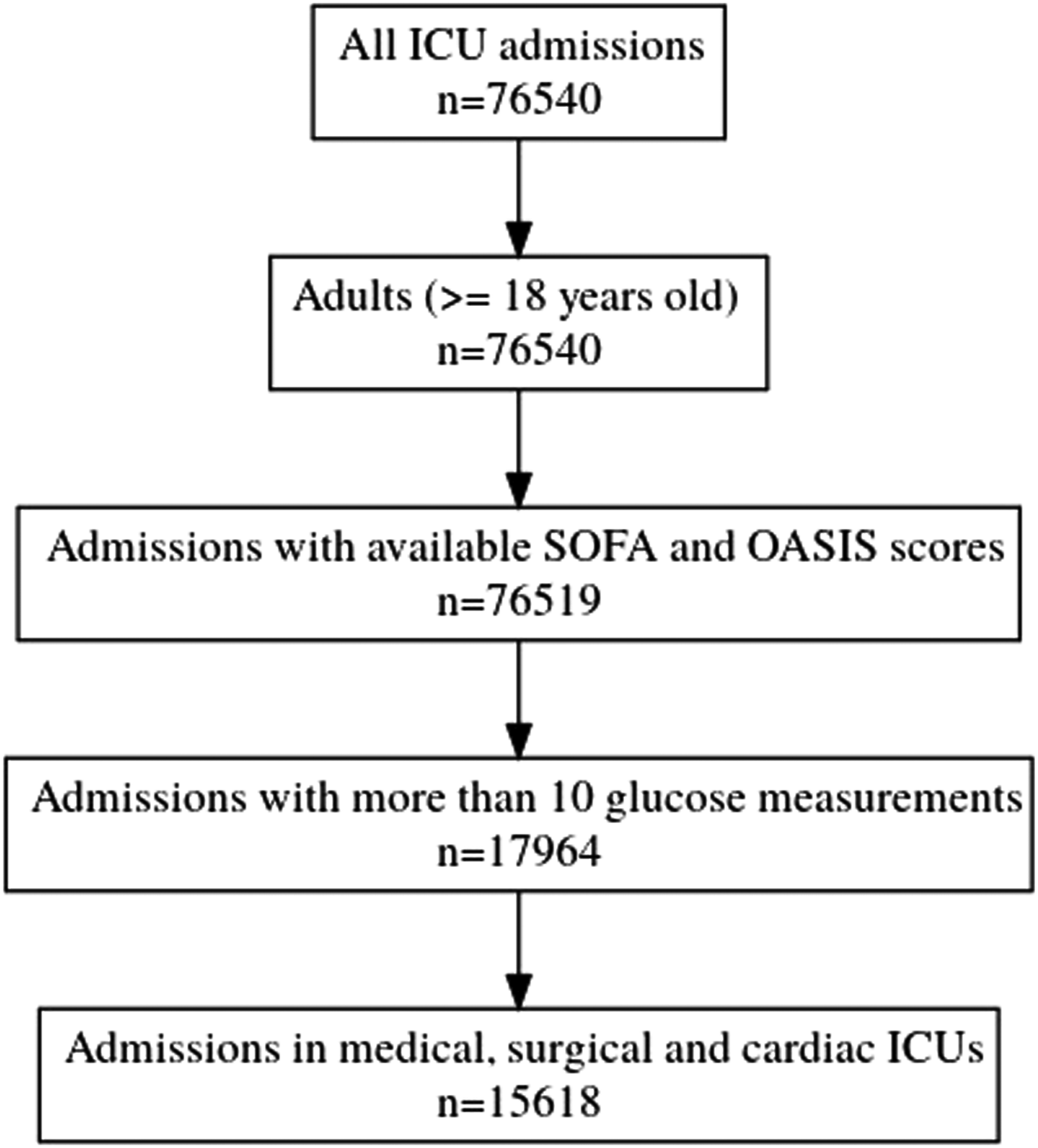
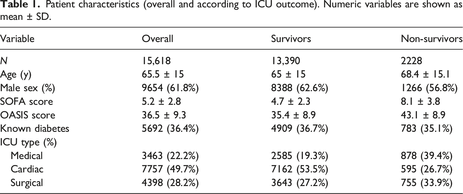
Patient characteristics (overall and according to ICU outcome). Numeric variables are shown as mean
Impact of glycemic control on mortality
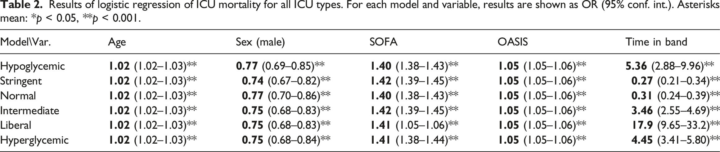
Results of logistic regression of ICU mortality for all ICU types. For each model and variable, results are shown as OR (95% conf. int.). Asterisks mean: *p < 0.05, **p < 0.001.
Results of logistic regression for specific ICU types. Results are shown as OR (95% conf. int.). Asterisks mean: *p < 0.05, **p < 0.001.
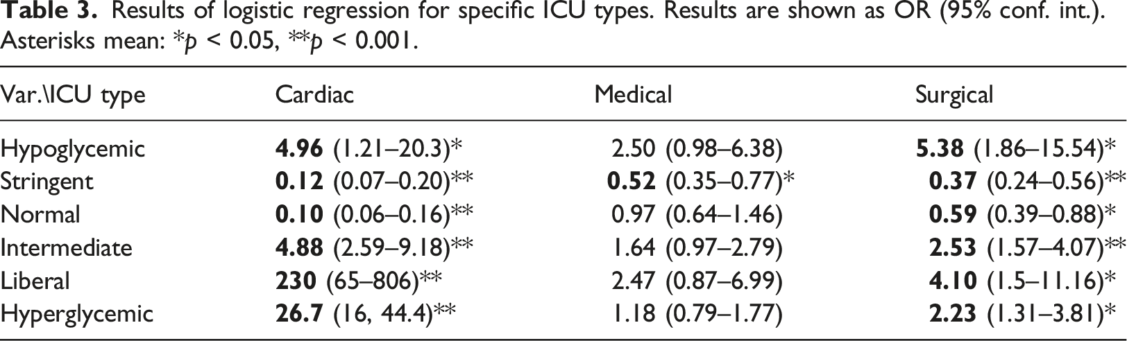
Figures 2 and 3 summarize graphically the Odds Ratios corresponding to the time percentages in each model, for easier comparison. The numbers behind the depicted ORs are the same as those reported in Tables 2 and 3, for the “Hypoglycemic,” “Stringent,” “Normal,” “Intermediate,” “Liberal” and “Hyperglycemic” variables, hence they are already controlled for age, gender, SOFA and OASIS. The horizontal axis is in the log scale, so 0 corresponds to equal odds (OR = 1). Odds ratios for the time percentages in the different bands, for all ICU types. Odds ratios for the time percentages in the different bands, for (a) cardio, (b) medical, and (c) surgical ICU types.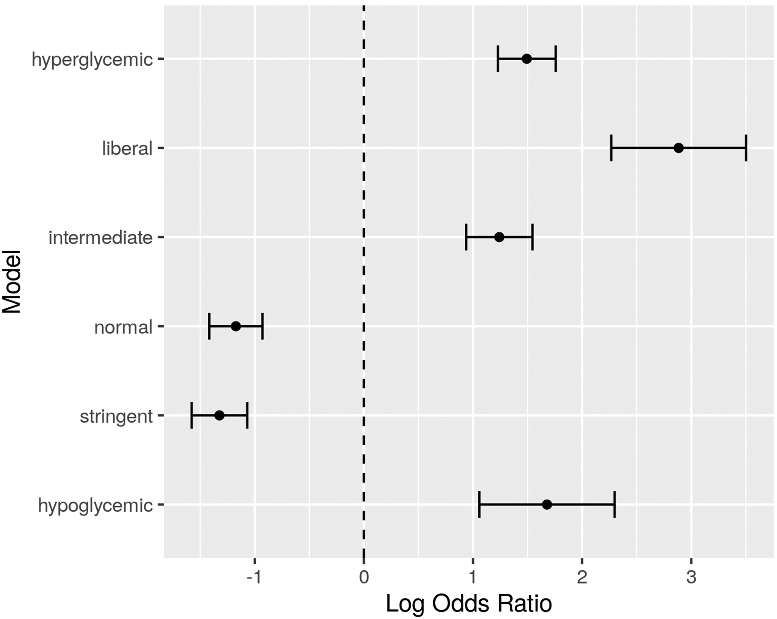
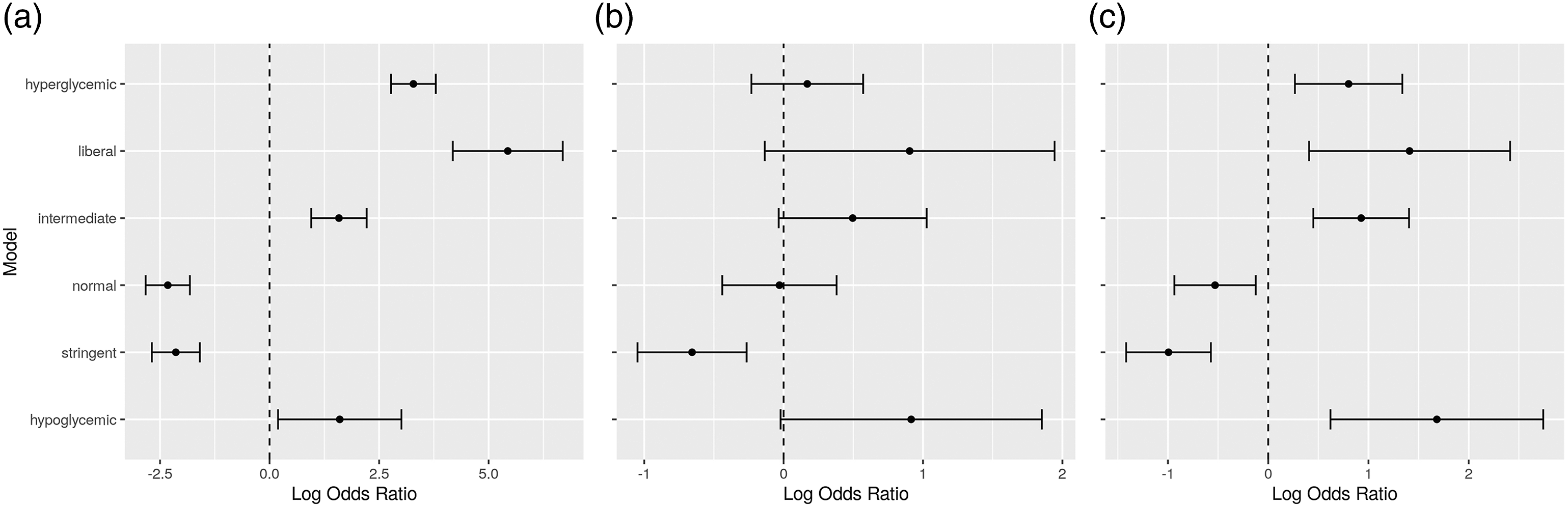
From the tables and diagrams, it can be seen that increased time in the hypoglycemic, intermediate, liberal and hyperglycemic bands is related to increased mortality in the ICU, while increased time in the normal and stringent bands is related to decreased mortality. This pattern holds for all ICU types, and when considering only cardio and surgical ICUs. In medical ICUs, there seems to be a similar pattern emerging, but the result is not conclusive from the data.
The above analysis, considering all ICU types, has also been performed after separating patients based on known diabetic status. The results are shown in Figure 4. Regarding patients with known diabetes, Odds Ratios for the hypoglycemic and intermediate bands are inconclusive as to whether they affect mortality. However, the results for the stringent and normal bands seem to reverse compared to patients with no known diabetes. Higher time in the normal band seems to lead to less mortality rates than higher time in the stringent band, while the opposite holds for patients with no known diabetes. This indicates that glucose control for diabetic ICU patients favors higher glucose values than control for non-diabetic persons. Odds ratios for the time percentages in the different bands, for all ICU types, for (a) patients with known diabetes, and (b) patients with no known diabetes.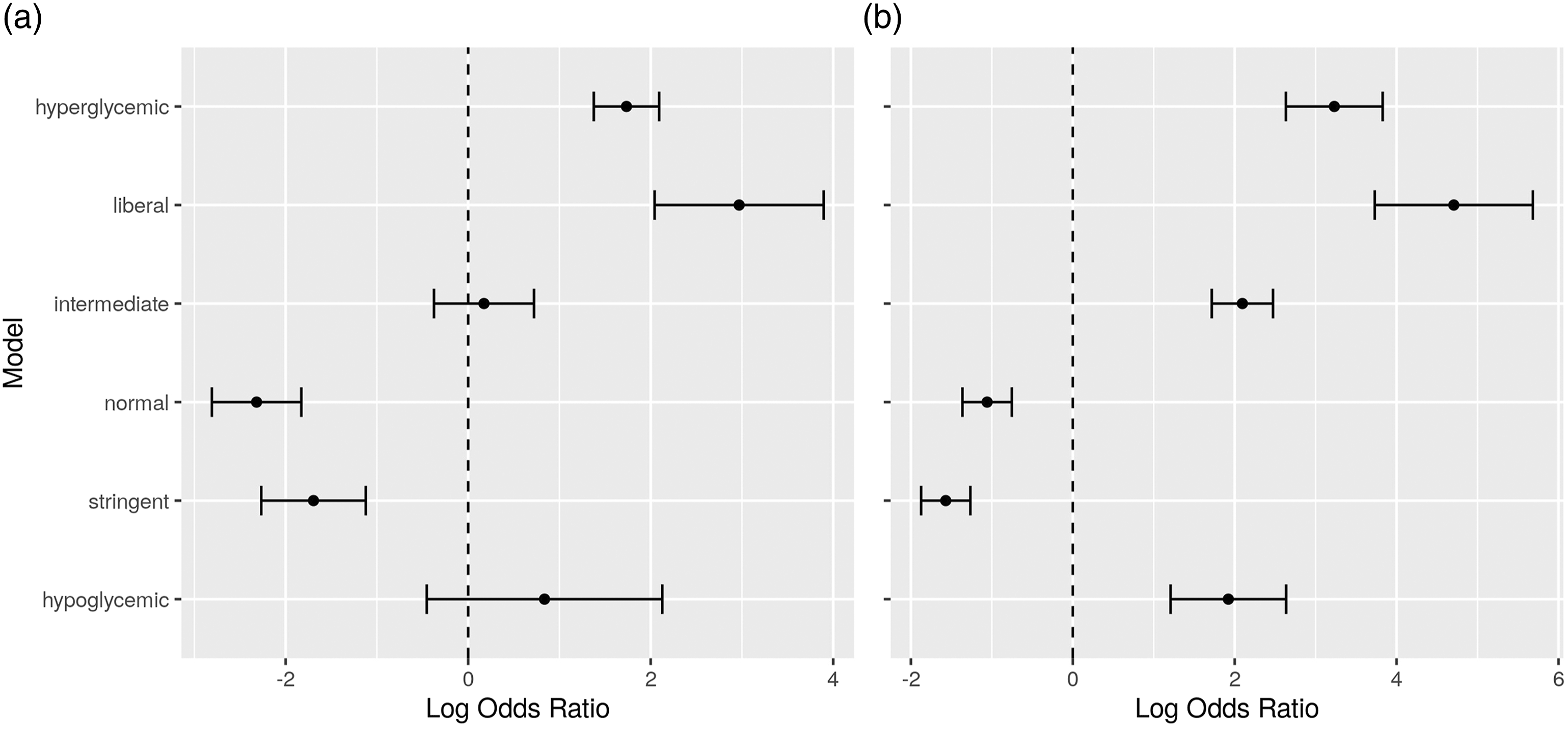
Survival analysis
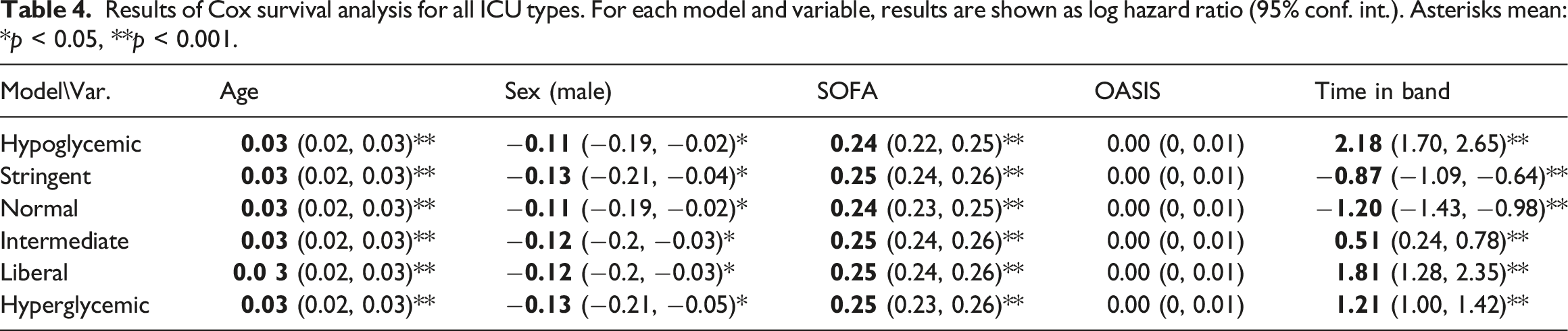
Results of Cox survival analysis for all ICU types. For each model and variable, results are shown as log hazard ratio (95% conf. int.). Asterisks mean: *p < 0.05, **p < 0.001.
Results of Cox survival analysis for specific ICU types. Results are shown as log hazard ratio (95% conf. int.). Asterisks mean: *p < 0.05, **p < 0.001.
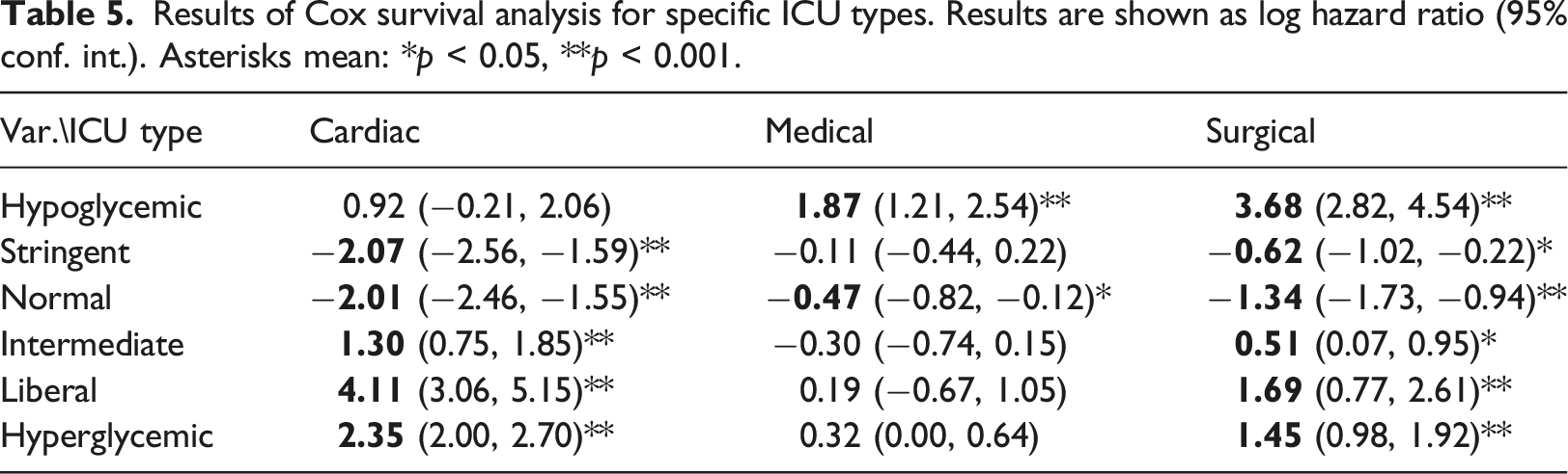
As a summary, Figures 5 and 6 depict graphically the hazard ratio estimates for the percentage of time in each glucose band, as extracted from each of the Cox models, controlled for age, sex, SOFA and OASIS. Hazard ratios for the time percentages in the different bands, for all ICU types. Hazard ratios for the time percentages in the different bands, for (a) cardio, (b) medical, and (c) surgical ICU types.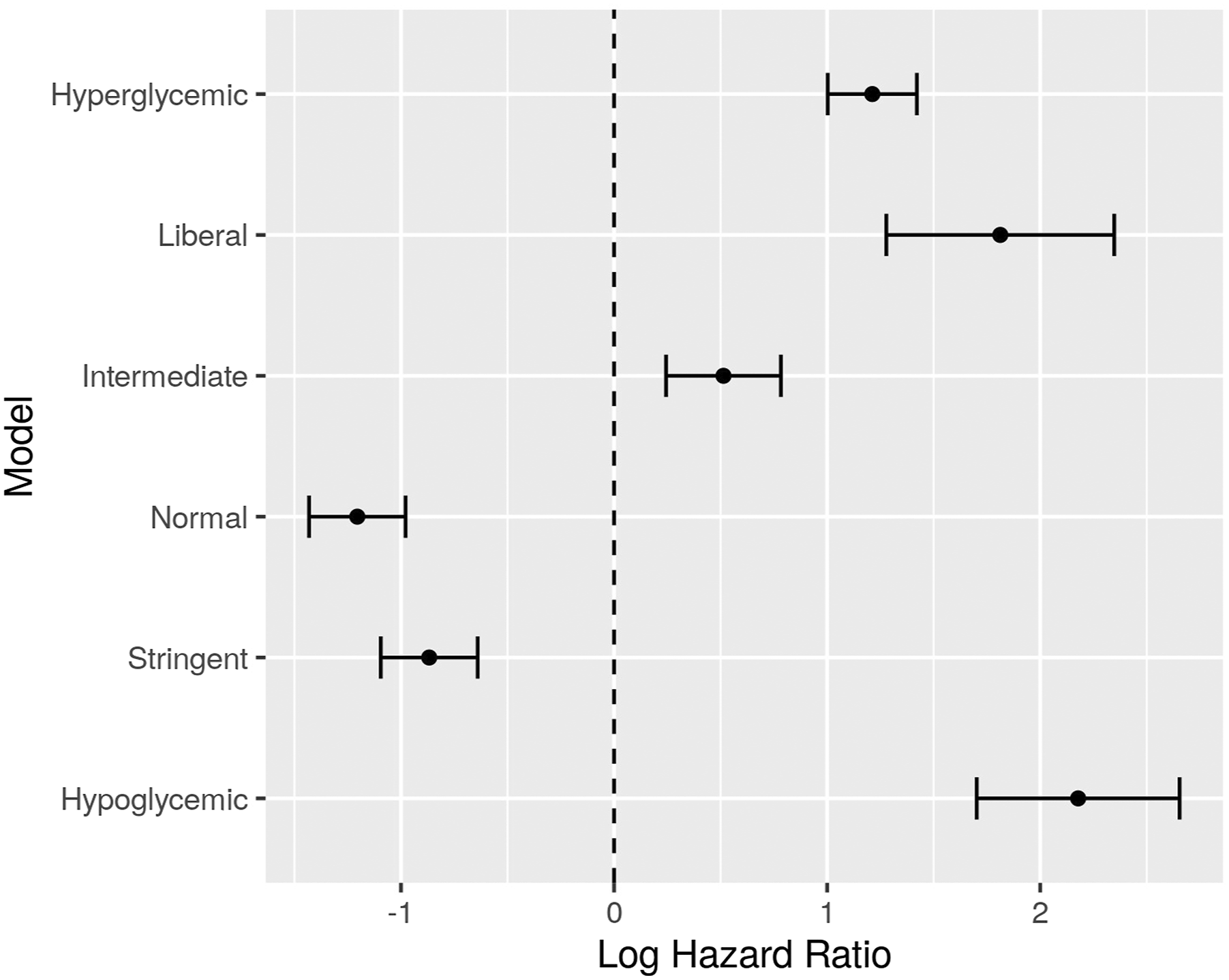
Here we can observe a similar pattern as with mortality results above. Increased time in hypoglycemic, intermediate, liberal and hyperglycemic bands seems to be related to decreased survival time in ICU. Again, the result is not conclusive when considering only medical ICUs.
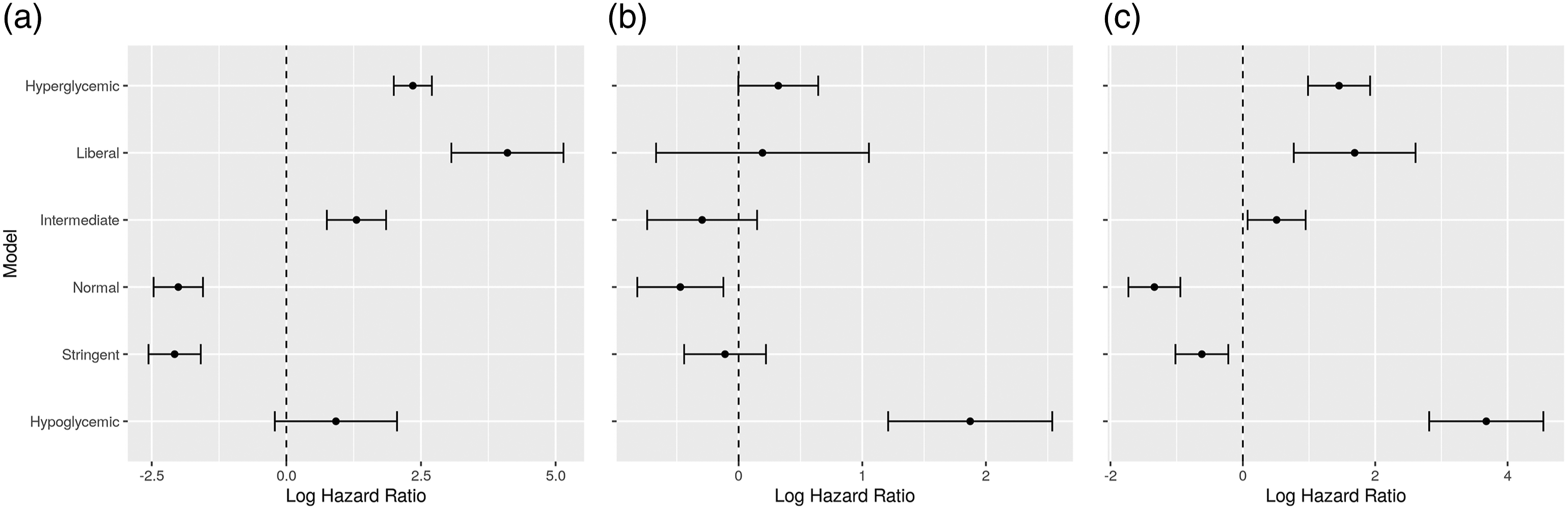
The above analysis, regarding all ICU types, has also been performed to compare between patients with known diabetes and patients with no known diabetes, as shown in Figure 7. There are notable differences between the two patient groups. Increased time in the intermediate band seems to lead to less hazard for people with diabetes, while it leads to more hazard for people with no known diabetes. Also, the difference between the hazard ratios for the normal and stringent bands is more pronounced for people with diabetes, suggesting that higher time in the normal band is even more beneficial for survival. This agrees with the results of logistic regression above (Figure 4), indicating that control towards higher glucose levels is beneficial for diabetic ICU patients. Hazard ratios for the time percentages in the different bands, for all ICU types, for (a) patients with known diabetes, and (b) patients with no known diabetes.
Visualization with t-SNE
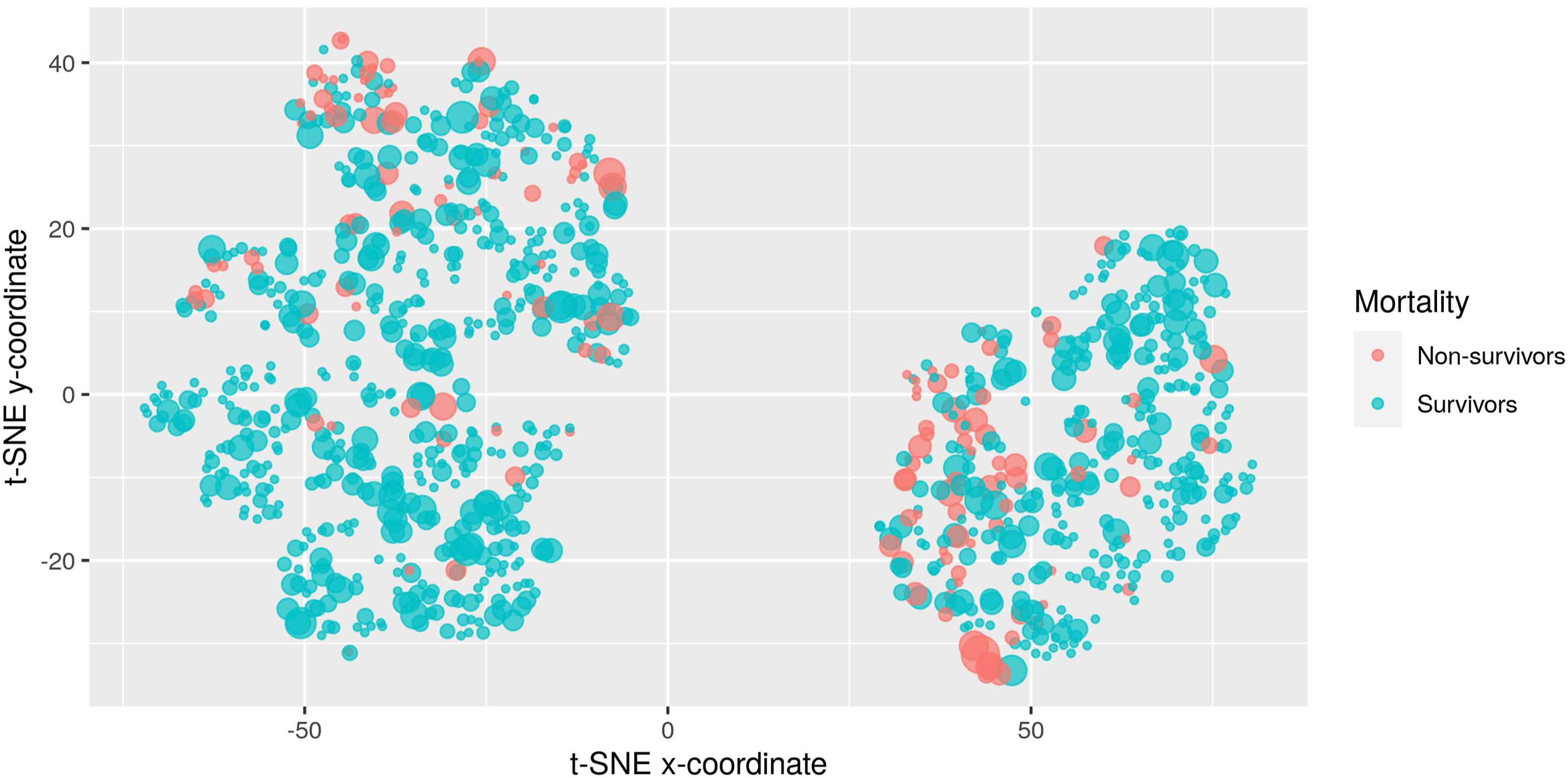
Figures 8 and 9 depict two indicative visualizations using the t-SNE method. A random sample of 1000 ICU admissions has been used, for clearer presentation. Each point corresponds to an admission. The color indicates death in ICU, with blue indicating survivors and red non-survivors. The size of the points indicates extra information on top of the visualization, specifically the percentage of time in the hypoglycemic and the liberal bands, respectively. These two bands were selected for this example, since their corresponding Odds Ratios for mortality are quite different to each other. The placement of the points has been based on their similarity with respect to all 10 features. There are two large groups of points present, corresponding to male (left) and female (right) patients. Visualization of ICU admissions using the t-SNE method. Blue: survivors. Red: non-survivors. The point size corresponds to the percentage of time in the hypoglycemic band. Visualization of ICU admissions using the t-SNE method. Blue: survivors. Red: non-survivors. The point size corresponds to the percentage of time in the liberal band.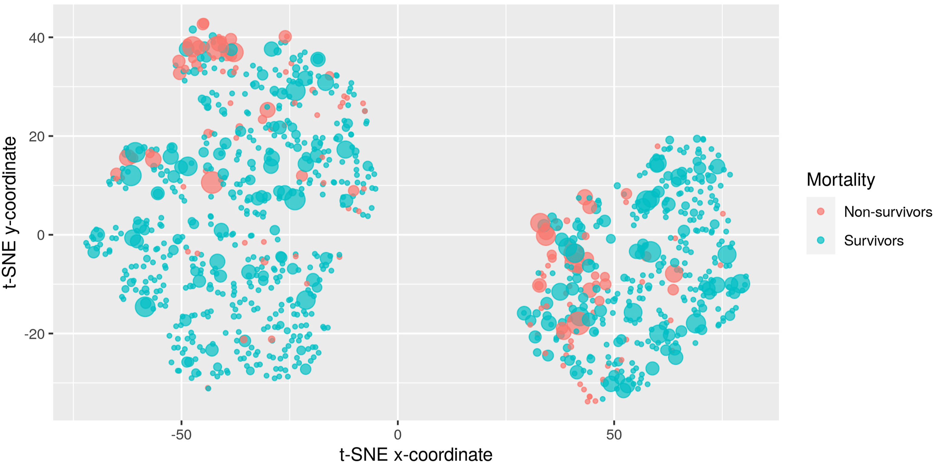
Examining Figure 8, we can see that admissions with frequent hypoglycemic measurements (i.e., large point size) gather at the top of the male cluster, with the most extreme points at the top apparently highly correlated with mortality (most large points are red). The situation is different for women. Here, points with large size are scattered throughout the cluster, indicating that other attributes apart from hypoglycemic measurements dominate the estimation of similarity between entries. Here the correlation between hypoglycemic measurements and mortality is not as pronounced as it is with men.
In contrast, when considering the time percentage at the liberal band for the point size, as seen in Figure 9, the points with high percentages are scattered throughout the men cluster, indicating that measurements in the liberal band are not as much related to mortality as before. Instead, correlation is now more pronounced in the female cluster, as points of large size (i.e., large percentages) are gathered at the bottom of the cluster and are associated with mortality (red color).
Density differences between survivors and non-survivors
We use the mean and standard deviation, extracted as described in the Materials and methods section, from each of the 15,618 ICU admissions and plot them in Figure 10. Plot of the mean and standard deviations of all ICU admissions mathe thet.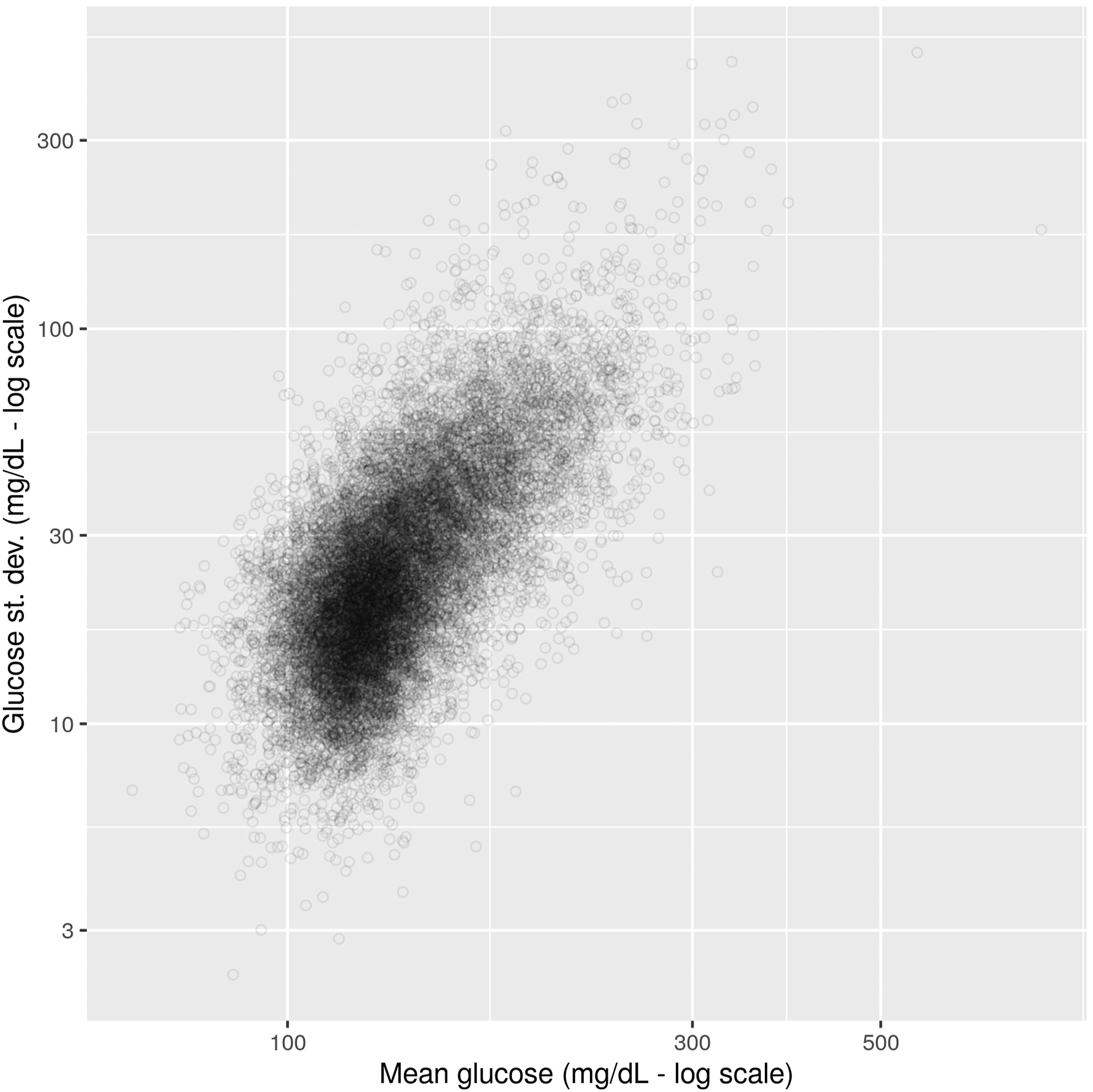
Points to the left correspond to ICU admissions with high percentages towards the hypoglycemic end, while those to the right tend to hyperglycemic. Going from bottom to top, points correspond to admissions with higher deviations, that is scattered across several glucose bands.
Our goal is to see how the characteristics of the ICU admission (mean and standard deviation) affect mortality, when controlled for other parameters. Figure 11 depicts the distribution of mean and standard deviation for male patients, and for different combinations of OASIS and SOFA tertiles. The color of the points corresponds to mortality status: blue for survivors and red for non-survivors. We are interested to see if the distribution of non-survivors differs from survivors across these cases. Distribution of mean and s.d. for male patients, per OASIS and SOFA tertile. Blue: survivors. Red: Non-survivors.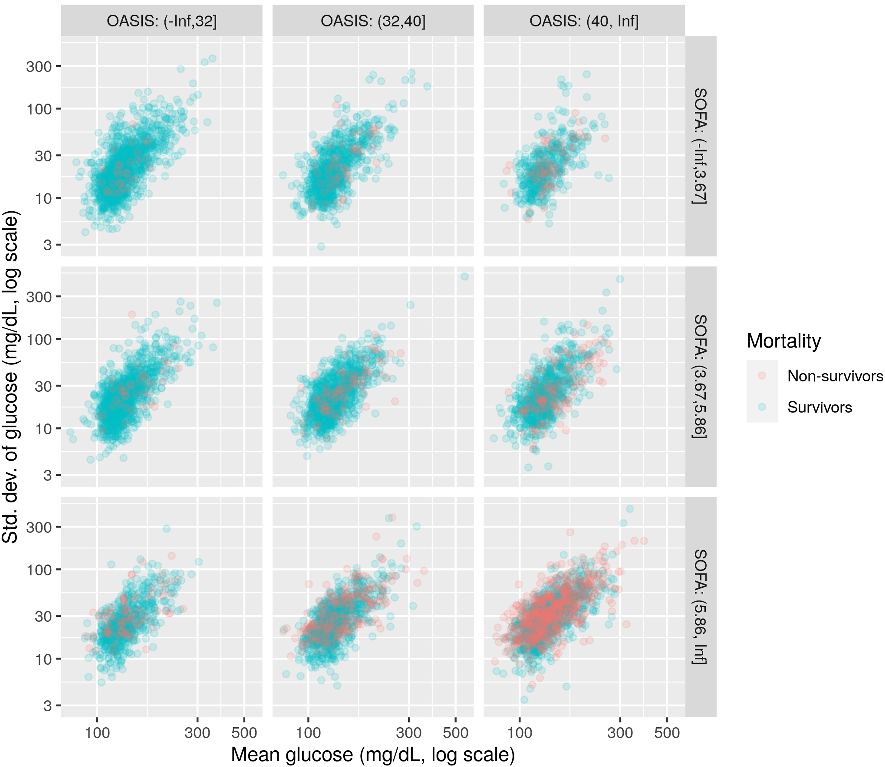
To see this more clearly, we create density plots of the above distributions, using Kernel Density Estimation methods, where the density plotted is the difference between the density of non-survivors and the density of survivors. These differential density plots are shown in Figure 12. Lighter colors (towards yellow) correspond to high positive values, that is, areas where the density of non-survivors is larger than the density of survivors. Density plots for the difference in density between non-survivors and survivors, for male patients.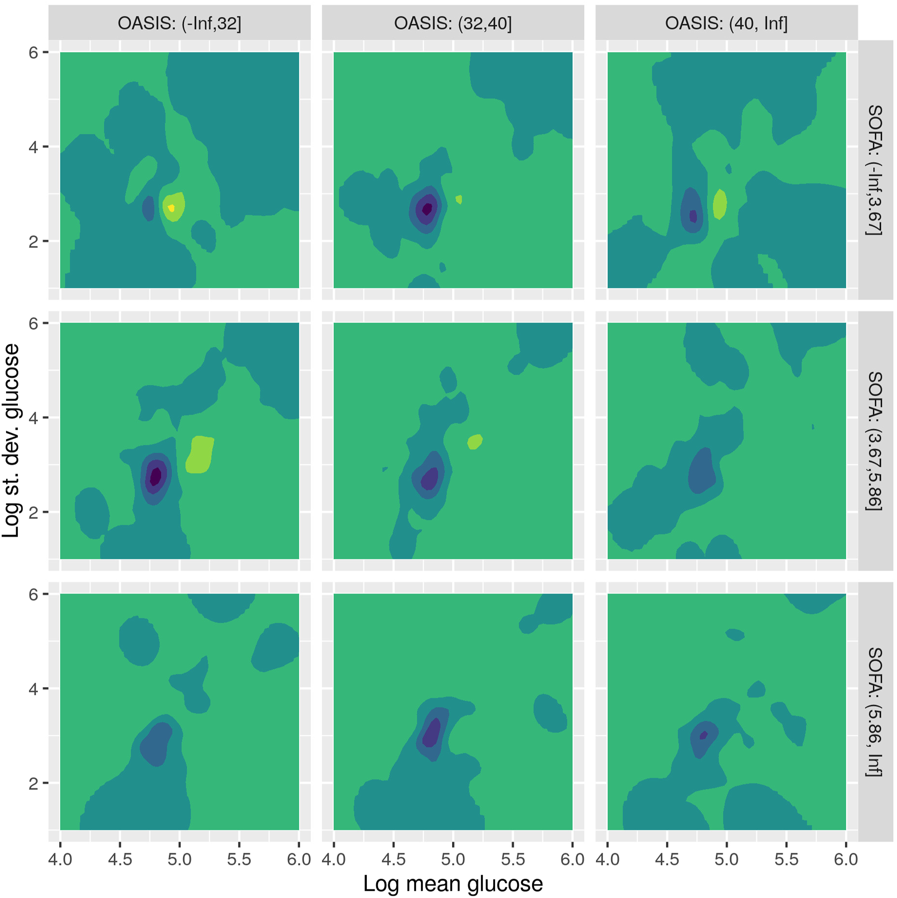
As an example, let us consider the upper left plot, corresponding to low OASIS and SOFA scores. We see that there is a shift to the right of the distribution of non-survivors (yellow area) over the distribution of survivors (blue area). This means that, when OASIS and SOFA are low, there seems to be a correlation between higher glucose values and mortality. As we move towards the bottom and right, at higher OASIS and SOFA scores, the pattern is less pronounced, meaning that when OASIS and SOAF are high, differences in glucose values are not so important for mortality.
This pattern repeats as OASIS and SOFA increase in the first two rows of plots, although less pronounced, because higher OASIS and SOFA values tend to be themselves correlated with mortality. When we reach the bottom row, of high SOFA score, glucose values towards both the hypoglycemic and the hyperglycemic end seem to be correlated to mortality (the yellow area extends both to the left and to the right of the blue area). However, when we reach the bottom right plot, where both OASIS and SOFA are high, the difference in distributions seems much less, denoting that mortality is not less associated with the glucose values.
Figure 13 shows the differential density plots for the female patients. Here, the patterns are more pronounced and slightly different. When OASIS is low (left column), mortality seems to be related to more diverse time series, with high variation across the glucose bands (yellow area is above the blue one, i.e. towards more standard deviations), as well as values both towards the hypoglycemic and the hyperglycemic ends. As we move to the right and higher OASIS scores, the difference in distributions shifts to the right, that is to hyperglycemic values. Finally, when both OASIS and SOFA are large, the difference fades away, similar to the male case. Density plot for the difference in density between non-survivors and survivors, for female patients.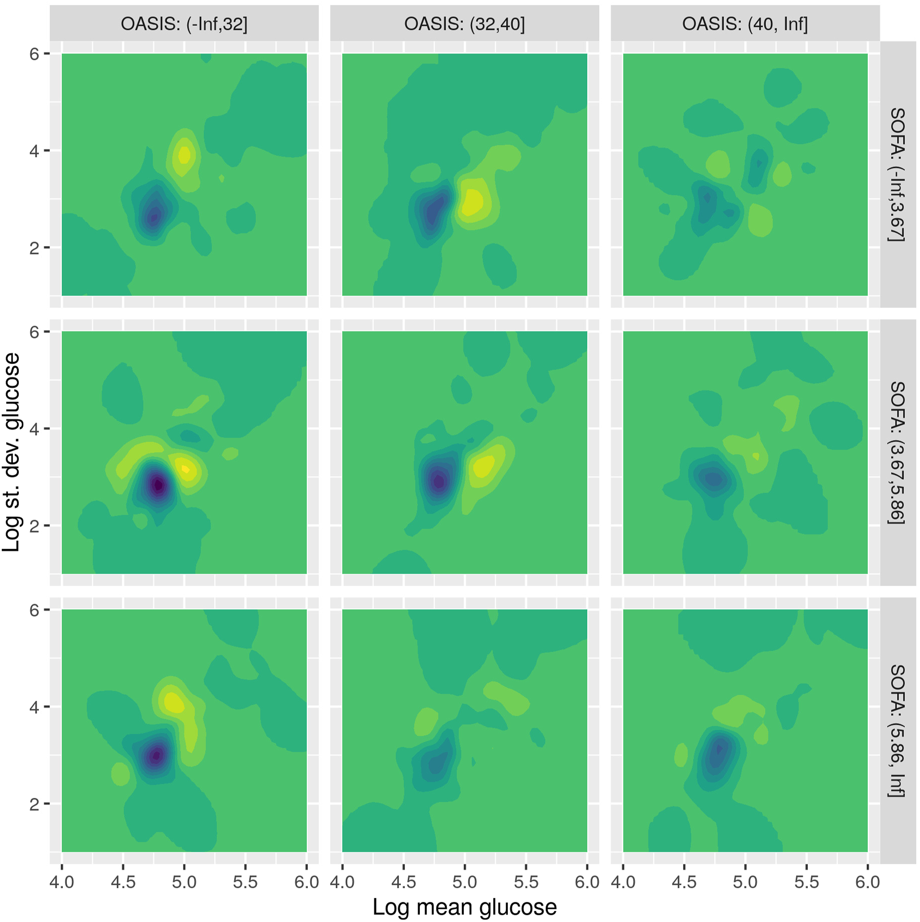
Such diagrams can potentially help the clinical researcher in specializing the goals of glycemic control for different subjects, according to different combinations of the variables hereby considered.
Discussion
This study is an attempt to use real-world clinical data to shed more light into associations between clinical parameters and outcomes, utilizing, apart from statistical methods, tools of exploratory data analysis, such as feature extraction and data visualization. We see the use of real-world data as complementary to the use of data from clinical trials, each with its merits and limitations. Real-world data, collected during everyday practice at clinics, is often of less quality than the data collected after careful planning during a clinical trial: the former may be irregularly collected, biased (e.g., with imbalanced subgroup representation), and may contain many missing values. These limitations make them less suitable for statistical analysis than clinical trial data. On the contrary, real-world data come in abundance. A vast amount of data is continuously being collected in everyday practice, reflected, for example, in the large volume of entries in the MIMIC database, as opposed to the limited data collected in clinical trials, often from only a few subjects. This large volume makes them suitable for different kinds of analysis, leveraging exploratory tools and machine learning, to verify or question statistical results and help extract different kinds of patterns and associations.
A research team has already performed a “Real-world characterization of blood glucose control and insulin use in the intensive care unit” based on the MIMIC database 19 and have highlighted the “tremendous opportunity for EMR data to guide tailored management” and the “highly-detailed data source for future investigation.” However, as all Real-World Data analytics in Medicine, the risk of bias is always present and therefore our study is subjective to such limitations, regarding the generalizability of its outcomes. Still our findings are similar with the similar methodology of Finney et al. 15 We consider that the added value of the present study is a contribution of evidence body and proposed methodology, able to validate current clinical recommendations and provide a better insight to data scientists and medical teams collaborations, on this topic.
Limitations
Apart from the limitations regarding real-world data outlined in the Discussion section, the presented work has also limitations regarding the involved methods. We have investigated the use of visualization methods such as t-SNE and density plots, to discover associations between glucose control and mortality. While these methods can help to provide insights about these associations considering combinations of multiple variables, one limitation is the potential difficulty to interpret them. The displayed charts are not common among the clinical research literature and may be difficult to read. This is especially true for the t-SNE plots, which produce a two-dimensional space where the coordinates are not directly interpretable, for example, straightforward combinations of the involved variables. Only relations between points are easily interpretable in these plots. Future work in this direction could involve using different types of dimensionality reduction methods or using additional visual cues to more clearly explain the presented result.
Conclusion
This study has examined the impact of glycemic control on critically ill patients, using real-world data of clinical practice. We have used the large retrospective database MIMIC-IV to analyze thousands of admissions (15,618). We used time percentages at pre-defined glucose bands as predictors in logistic regression and survival analysis models to assess their relation to mortality and survival time. Both analyses showed that higher percentages in the bands of low or high glucose tend to be correlated with mortality and decreased survival rates, controlling for age, sex, SOFA and OASIS scores. To provide more insight into finer details of this correlation, we have used visualizations of the data, based on methods from the machine learning literature, such as t-SNE and Kernel Density Estimation, which showed how the distributions of survivors and non-survivors differ when considering different sub-populations.
Ethical statement
Ethical approval
MIMIC credentialed access is approved by IRBs of MIT and BIDMC in USA and the IRB of the University Hospital of Larisa, Greece.
Footnotes
Declaration of conflicting interests
The author(s) declared no potential conflicts of interest with respect to the research, authorship, and/or publication of this article.
Funding
The author(s) disclosed receipt of the following financial support for the research, authorship, and/or publication of this article: This research is co-financed by Greece and the European Union (European Social Fund-ESF) through the Operational Programme (Human Resources Development, Education and Lifelong Learning 2014–2020) in the context of the project “A retrospective, real world data based study, on the impact of glycemic control on mortality and morbidity of critically ill patients in ICU” (MIS 5050694).