
Abstract
Visualization analysis plays an important role in metagenomics research. Proper and clear visualization can help researchers get their first insights into data and by selecting different features, also revealing and highlighting hidden relationships and drawing conclusions. To prevent the resulting presentations from becoming chaotic, visualization techniques have to properly tackle the high dimensionality of microbiome data. Although a number of different methods based on dimensionality reduction, correlations, Venn diagrams, and network representations have already been published, there is still room for further improvement, especially in the techniques that allow visual comparison of several environments or developmental stages in one environment. In this article, we represent microbiome data by bipartite graphs, where one partition stands for taxa and the other stands for samples. We demonstrated that community detection is independent of taxonomical level. Moreover, focusing on higher taxonomical levels and the appropriate merging of samples greatly helps improving graph organization and makes our presentations clearer than other graph and network visualizations. Capturing labels in the vertices also brings the possibility of clearly comparing two or more microbial communities by showing their common and unique parts.
Introduction
The rapid progress that DNA sequencing techniques have undergone in the last decade has changed the way in which metagenomics research is carried out.1,2 Sequencing of 16S rRNA gene has become a relatively easy way to study microbial composition and diversity. 3 However, to process the amount of data, associated bioinformatics tools have to handle the resulting high dimensionality that is dependent on the number of operational taxonomic units (OTUs). From the beginning, one of the main goals of metagenomics research has been to describe and compare several samples. Unfortunately, standard metrics for dimensionality reduction techniques do not take into account the phylogenetic information that sequences contained. For this reason, UniFrac 4 metric based on phylogenetic analysis was proposed. Using phylogenic information was a great advantage, because even unidentified sequences, due to a lack of reference database, could be used for the comparison of samples by UniFrac and for visualization by following principal coordinate analysis (PCoA). On the other hand, the method had to tackle the increasing output of sequencing machines. Its array-based implementation, fast UniFrac, 5 provided orders of magnitude improvements, making UniFrac followed by PCoA a standard technique used for visualization in microbiome studies. However, dimensionality reduction causes new a xes, which are principal coordinates, that do not correspond to specific OTUs, but rather to abstract OTUs. This can be disadvantageous in cases where common and unique taxa should be captured and compared for different environments because those particular taxa cannot be connected with the samples or environments directly, but can be done only indirectly using PCoA biplot. Moreover, the nature of UniFrac makes it heavily dependent on the appropriate use of databases and phylogenetic methods.
Although the progress in DNA sequencing brings the possibility to get a deep insight into a metagenome by shotgun sequencing, which is the current trend, cheaper amplicon sequencing-based technique remains the standard approach for investigating the diversity of microbial communities.6,7 Thus, there is still need to develop algorithms for processing amplicon sequencing that can be used for data quantitation by clustering similar sequences together and by assigning taxonomy to the clusters using a reference database. 8 With the growing volume of current databases, it is possible to identify even uncultured microorganisms relatively reliably down to the genus level. 9 A number of various pipelines for processing data and identifying sequences are now available, eg, Megan, 10 mg-RAST, 11 QIIME, 12 etc. An OTU table containing an abundance of OTUs in different samples is presented as the output. Various visualization techniques can be used for the analysis of this table. Among them, one can use direct visualization by a cluster heat map, or a correlation analysis followed by a cluster heat map. 13 Although labels can be added and a range of clustering techniques can be utilized, the rectangular shape of the visualization may hide some small yet important clusters. Venn diagrams also suffer from a similar kind of rigid presentation, which makes them difficult to follow, especially for larger datasets. The abovementioned PCoA can not only be used for dimensionality reduction, but various different techniques can also be applied, for example principal component analysis, nonmetric multidimensional scaling, FastMap, or MetricMap. 14 Last but not least, a range of different network representations can provide visual analysis. Even though these visualizations are able to reveal microbial interactions, are usable for dynamic modeling of bacterial communities, or can process high-dimensional data, 15 there is still a lack of simple workflow that could suitably complement UniFrac PCoA visualization.
Currently, the increasing output of sequencing platforms is causing such a massive increase in the number of nodes in network representations that the resulting representations are becoming uninformative and are not human readable. The significant reduction in the price for sequencing is having another impact. It is cheaper to acquire new data by sequencing than it is to store and process them. 16 Moreover, this huge amount of sequences contains contaminations, so it is not necessary to use every sequence. 17 Rather, an overall view can be more desirable. In an amplicon-based approach, where the reference database is limited to the target gene, even the BLAST 18 identification for larger datasets is possible within a reasonable time, and a reduction of data can be achieved by focusing on the higher taxonomical levels. Herein, we present the bipartite graph visualization that was inspired by the network analysis implemented in QIIME, which, unfortunately, lacks clear description. However, we show that several steps for OTU table preprocessing are required to meet the current needs and provide a clear and informative visualization. We also demonstrate important graph features to be independent of taxonomical level, making community detection also available for highly reduced data. Based on our previous outline of the approach in comparison of microbial samples,19,20 we now provide a deeper analysis showing the patterns that can be revealed by giving different weights to partitions, OTUs, and samples. These can provide additional information to UniFrac-PCoA analysis, making this approach an advantageous complement to the standard technique.
Materials and Methods
Test dataset
For the verification and presentation of our approach, we utilized data regarding the microbiota composition in the cecum of egg-laying hens during their whole lives. The three experiments are described and data are published. 21 Shortly, in the first experiment, long-term on-farm development of cecal microbiota was described. The three chickens or hens were taken from the flock, sacrificed at weeks 1, 2, 3, 4, 8, 12, 16, 19, 22, 26, 34, 38, 45, 51, 55, and 60. In the second experiment, short-term development of cecal microbiota was observed in newly hatched chickens. Three chicks were sacrificed on days 4, 7, 10, 13, 16, and 19. The third experiment verified the long-term experiment. Three chickens or hens were taken from the flock, sacrificed at weeks 3, 7, 16, 28, 40, and 52. Cecal contents were collected from all sacrificed birds and were frozen at −20 °C. The isolated DNA served as a template for the preparation of 16S rDNA library, which was sequenced by 454 Junior (Roche). 21 UniFrac analysis followed by PCoA was used for visual presentation and dimensionality reduction. The data were classified into four clusters by Ward's hierarchical clustering using Mahalanobis distance. Comparing the clusters to area flowcharts representing abundance of different taxa together with biological considerations, four main stages of microbiota development represented by four clusters were determined. This made the dataset an appropriate reference for presenting our workflow.
Overall workflow
Sequence reads were clustered at the 97% similarity level using UCLUST 22 and identified with RDP Seqmatch. 23 The identified clusters of sequences represented OTUs and a number of sequences in the cluster stands for abundance of an OTU in particular samples. Besides the abovementioned techniques, other methods for OTU picking are applicable in this step. Matlab 2014a and R 24 were used for OTU table preprocessing and for the construction of bipartite graphs, but any suitable scripting language can be used. The final graphs were visualized with Gephi 25 using the force-directed layout ForceAtlas2. 26 Different stages of microbiota composition were determined by community detection based on modularity optimization 27 using different resolutions according to the graph size. 28 Also this step can be implemented in any suitable graph visualization software. The overall commented workflow is shown in Figure 1.

Flowchart describing proposed workflow. Every main step is implementable in several scripting languages/software according to the preferences of users.
Data transformation
An OTU table, which is
Summary of parameters describing the reconstructed graphs for reduction of taxa partition.

The preprocessed OTU table was easy to use for graph reconstruction. The values of 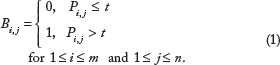
A connection between the 

To distinguish the vertices between both partitions for visual presentation, we decided to present vertices from taxa partition as smaller than vertices from the second partition. Any arbitrary distinction, eg, circles vs. squares, can be used. Both partitions are identifiable from the matrix and their presentation is therefore dependent on software used for visualization (Gephi, Cytoscape, etc.).
Results and Discussion
Original data visualization
The entire dataset consisted of 18,451 OTUs detected in 52 cecal microbiota samples obtained during the whole life of egg-laying hens. For the first analysis, we only transformed the absolute values of OTU table into relative counts. We consider that this is a sufficient and suitable way for OTU table preprocessing, because of following edge weighting and data reduction by sample merging. Due to different sequencing depths and substantially different composition of the microbiota between the different stages of the lives of the hens, rarefaction may transform the data in an inappropriate way by removing the differences between samples; however, this was not tested because the results without using rarefaction satisfied the purpose of the proposed visualization. The resulting graph is shown in Figure 2. Many small clusters of the vertices from the taxa partition are observable in the graph. These clusters were divided into four large communities, according to modularity optimization, that are represented by four different colors. This result agrees with data description containing four main clusters. Unfortunately, vertices with a low average degree repulsed the vertices with high degrees. These were the vertices that represented the samples. Although this repulsion did not affect community detection, the resulting comet shape of the graph together with an enormous number of edges makes visualization unclear and prevents capturing the labels of the vertices. Although the content of particular communities could be analyzed by further inspection using additional graph algorithms, the purpose of the presented workflow is to visualize the data to the naked eye without the need for additional steps. Therefore, the data reduction is needed before community detection and graph presentation.

Bipartite graph reconstructed from the entire OTU table with four detected communities.
Reduction of taxa partition
In the next step, we tried to provide visualization that would on the one hand preserve the correct distribution of communities, but on the other hand, present the distribution in a much clearer way. Such a presentation can be achieved by data reduction. This reduction should not affect the results of the analysis while improving the overall layout. Thus, we decided to observe the overall influence of reducing the taxa partitions. We reconstructed the graphs gradually from the genus to the phylum levels. The results are summarized in Table 1. During the reduction of vertices from taxa partition, division of vertices from sample partition remained satisfactorily consistent when 89.5% vertices remained in cluster 1, 88.3% in cluster 2, 95.4% in cluster 3, and 100% in cluster 4. These four clusters represented the four biological stages defined in Ref. 21, when cluster 1 contained mostly samples from newly hatched chickens, cluster 2 mostly 2–4-week-old chickens, cluster 3 mostly 8–26-week-old chickens, and cluster 4 the rest of samples from hens. Smaller size of cluster 1 and its overlap with cluster 2 caused its lowest consistency.
The most noticeable difference was between the whole OTU graph and the genus graph, which is not surprising, because resolution of V3/V4 16S rRNA is sufficient only to the genus level, and the whole OTU graph consists of many unidentified sequences on the species level. The number of vertices was reduced 66 ×, to 280 identified genera. Because the number of edges was reduced only 7 ×, the average degree of vertices and the graph density increased. Thus, the organization of such a graph is clearer. Although modularity decreased in comparison to the whole OTU graph, four main communities were still detected. Other moves to higher taxonomical levels caused additional reduction of vertices and edges, while modularity and detected communities remained similar. Although the reduction of taxa partitions according to higher taxonomical levels improved the graph layout while the results of community detection remained similar, 407 edges are still too many to provide a clear overview of the data. Moreover, in the phylum graph, 52 of 66 vertices represented samples, so community detection is a matter of sample clustering, and such clusters were already revealed by UniFrac-PCoA. 21 On the other hand, distribution of phyla among these four stages of microbiota development would bring interesting additional information, because even in a PCoA biplot, the connection between samples and phyla was not easy to determine. The combination of UniFrac-PCoA, area charts, and hierarchical clustering was needed to reveal this pattern. 21
Reduction of sample partition
On the contrary, a bipartite graph contains the information about the connections between taxa and samples by definition. In addition, another reduction can be applied to the graph by merging the samples together. By combining the samples according to the cluster they are assigned to, the bipartite graph can provide a very simple yet very powerful visualization, as presented in Figure 3.
Bipartite graph representing four stages of microbiota development.
The partition representing samples was now replaced by a partition standing for the different stages of microbiota development. The size of the vertices from the partition representing stages was used to distinguish both partitions to the naked eye; it did not play any role in the graph layout computation or in community detection. Because all the samples were related to one organism, a hen, and the purpose was to describe the microbiota composition, this kind of graph denoted the situation in a very clear way. The number of vertices and edges was reduced to 15 and 28, respectively, while other parameters such as modularity (0.255), graph density (0.267), and average path length (1.886) remained more or less the same as in the graphs representing all the samples. Moreover, it revealed the same pattern as did the whole OTU graph in Figure 2, because every stage was included in the different community, but in a way that provided information about the main connections among the stages and their most abundant phyla directly to the naked eye. Thus, it presented the correctness of the division of microbiota development as well as the robustness of the bipartite graph representation against the merging of the samples.
Reduction by abundance threshold
Eventually, we decided to examine the impact of the threshold
Summary of parameters describing the reconstructed graphs for reduction by abundance threshold.

A lot of the bacterial families did not reach even 0.5% abundance in particular stages, which led to a massive reduction of the graph, even for very low threshold (

Bipartite graph showing bacterial families exceeding the threshold of 0.5% abundance.
Although the family
The presented workflow is a suitable complement to the current techniques, eg, UniFrac-PCoA, and can provide advantageous and clear visualization. It is applicable to any kind of microbiota studies, but its main use can be found in descriptive studies where more environments, developmental stages of microbiota composition, or microbial communities are being compared. As it is mainly meant as descriptive approach considering the relation between sample and microbiota composition, no relations among taxa can be revealed.
Conclusion
Amplicon-based metagenomics is a standard approach for investigating the diversity of microbial communities. Although several different techniques can be used for a visualization analysis of microbiome data, there is still room for further improvement, especially for processing data with assigned taxonomy by a reference database. In this article, we proposed a novel workflow for the reconstruction of a bipartite graph that can present the common and unique parts of different samples or communities very clearly. As we demonstrated, the overall layout of the graph can be greatly improved by data reduction coupled with moving to higher taxonomical levels without affecting the result of the analysis in an inappropriate way. It also allows additional analysis of the detected communities by merging the samples without affecting the detected patterns. The results of community detection are also robust against any reduction of data by considering only taxa with abundance higher than a selected threshold, because every taxon is given the same priority during graph construction. Our graph's representation revealed the same pattern as the standard UniFrac-PCoA technique for the reference dataset. However, it provided additional information about the unique and the common parts of the microbiota composition during the different stages. On the other hand, information about the overall diversity was lost, especially when a nonzero threshold was used. Thus, our approach can supply the UniFrac-PCoA analysis with different aspects of the data that would otherwise require combination of several additional techniques.
Footnotes
Acknowledgments
The authors thank the MetaCentrum under the program LM2010005 and the CERIT-SC under the program Centre CERIT Scientific Cloud, part of the Operational Program Research and Development for Innovations, Reg. no. CZ.1.05/3.2.00/08.0144 for providing computational resources.
Author Contributions
Conceived and designed the experiments: KS, PV. Analyzed the data: KS. Wrote the first draft of the manuscript: KS. Agreed with manuscript results and conclusions: KS, PV, HS, IR, IP. All the authors reviewed and approved the final manuscript.