
Abstract
Objective
This article summarizes the process of developing and evaluating a series of alcohol educational leaflets with pregnant women.
Methods
Four group interviews were conducted with a total of 33 pregnant women.
Results
The copy, font, and color should be tailored to pregnant women. Scientifically compelling information was preferred; the use of too many colors and objects was considered distracting and reducing the seriousness of the information. The facts presented through a patient's photo of fetal alcohol syndrome and a graph impressed the participants, since they were tired of the illustrations found in many other materials. Pregnant women who are interested and motivated to learn about alcohol consumption valued the quality of the information, rather than visual appeal.
Conclusions
Testing a draft leaflet with the target population before final development and dissemination is a critical component of an educational outreach effort. Incorporating feedback can help enhance the quality of the end product.
Keywords
Introduction
Prenatal exposure to alcohol is one of the leading causes of preventable birth defects and developmental disabilities. 1 During the past 30 years, fetal alcohol spectrum disorders (FASD), including fetal alcohol syndrome (FAS), have gradually begun to attract attention. However, awareness and understanding of the disorders remains low. Pregnant women and women who might become pregnant, including high school and university students, continue to consume alcohol, placing themselves at risk of having a child with the effects of prenatal alcohol exposure. 2 Although prevalence of FASD in Japan is as low as 1 per 10,000 to 20,000 live births, 3 more than 50% of female university students had never heard of FAS. 4
Many educational materials for pregnant women have been developed by the government, organizations, and health care providers. However, those materials are often developed without input or feedback from members of the targeted group. In most cases, tailored health educational materials are more effective than non-tailored ones. 5
This study used group interviews and questionnaires to obtain feedback on a draft educational leaflet developed specifically for this study. The author combined the qualitative and quantitative methods since open-ended comments were useful for redesigning the leaflets and quantitative evaluation helped the author to make a decision objectively. The information obtained will be used to develop a final leaflet for a program on alcohol education intervention for pregnant women who are enrolled in maternity classes held at municipal health centers. The information collected will allow the author an “insider's perspective” that helps the author better tailor the educational material to the specified target population.
Methods
Participants and sampling
To avoid sampling bias, two recruitment methods were used. The National Institute of Public Health Institutional Review Board approved the study procedures (NIPH-IBRA#09032 for convenience sampling and NIPH-IBRA#10006 for recruitment via a research company).
Convenience sampling
In Japan, municipal health centers run maternity classes to provide health education to female residents who are pregnant for the first time. Most maternity classes consist of four sessions with each session being held on the same day of the week over a one-month period. The frequency of the maternity classes depends on the population administered by the center; some small towns, for example, hold only three courses of maternity classes each year, while some health centers in Tokyo's 23 wards run maternity classes once a month.
The author recruited pregnant women participating in maternity classes held at three municipal health centers in Saitama Prefecture (A town and B city) and Tokyo (C ward) in Japan. To recruit participants, fliers were distributed at the first session to advertise that a group interview would be held on the same day as the last session. To call for 10, nine, 10, and nine participants applied at the sites of A town, B city, and C ward, respectively. However, on the day of the group interview, three and two applicants did not appear at the B city and C ward sites, respectively. In return for participation in the group interview, each participant received an honorarium, a receipt for which was collected in lieu of written informed consent.
Recruitment by a research company
Another sample of pregnant women comprised members of a national Internet panel maintained by Yahoo! Value Insight JAPAN (hereafter simply referred to as Yahoo), a custom research company located in Tokyo. At the time of recruitment, the Internet panel consisted of 5,890 pregnant women in Japan. Inclusion criteria were based on residence (ie, living in Tokyo or the neighboring prefectures [Saitama, Kanagawa, or Chiba]), being in months 5–8 of a first pregnancy, and not being engaged in a medical profession. To avoid selection bias, the detailed themes of the intended group discussion were not mentioned at the time of recruitment; rather, participants were simply informed that they would be interviewed about their lifestyles. A group interview was held at the National Institute of Public Health in Saitama Prefecture. In return for participating in the group interview, each participant received monetary compensation from Yahoo. On the author's behalf, Yahoo obtained written informed consent from each participant.
Course of group interviews
The first group interview was conducted with A town participants on February 17, 2010 (Fig. 1). The second, third, and fourth interviews were conducted with Yahoo, B city, and C ward participants, respectively. The participants were told that group interviews were being carried out to obtain their thoughts about educational leaflets. They were informed that all information shared would be strictly confidential and that they would not be identified by name because their seat number was substituted for their name during the interview. The author conducted all interviews, with each interview lasting about 90 min. Notes were taken by two assistants at all interviews. All interviews were audiotaped with the permission of the participants, and the audiotapes were later professionally transcribed.
Course of four group interviews and development of leaflet.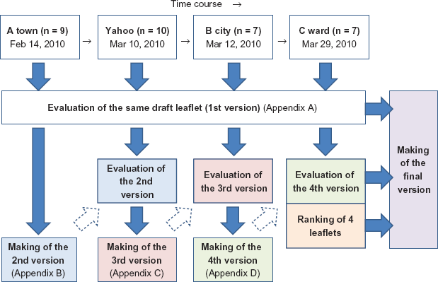
Evaluation of a draft leaflet
Upon arrival, the participants were offered refreshments. After reviewing a draft educational leaflet developed specifically for this study (Appendix A), each participant was asked to rate the material on eight dimensions–-ie, 1) first impression, 2) design, 3) readability, 4) density of words, 5) understandability, 6) information, 7) message, and 8) content–-using a five-point Likert scale and to complete a feedback questionnaire. After providing their ratings, participants were asked comments on each component, like title, photos, text, and a bar chart etc.
There are no foreign language versions since this leaflet was developed for study purpose and all the study participants were Japanese. For publication purpose, English translation was given in the leaflet near each sentence written in Japanese.
Evaluation of revised leaflets
Yahoo, B city, and C ward participants were also asked to evaluate the second, third, and fourth version of leaflets, respectively, by the same questionnaire used for the evaluation of the draft leaflet. After providing their ratings, participants were asked comments on the small components of a revised leaflet. In addition, only C ward participants were asked to rank all the four leaflets at the end of the interview.
Additional pre-interview questionnaire
Qualitative research often involves adding data-collection instruments during the study period, as the investigators themselves gain more understanding about the item under study as the research progresses. 6 Following the interview with the A town participants, an additional questionnaire was distributed to the participants in B city and C ward, prior to their respective interviews. They were asked about alcohol-consumption habits before and after conception, if they had ever heard about the risks related to drinking during pregnancy and, if yes, the information source and their knowledge of FAS. Yahoo participants were asked these questions via the Internet, prior to gathering.
Statistical analyses
Scores gathered from the quantitative evaluation of the leaflets were compared among the four groups by a one-way analysis of variance (ANOVA) with a Bonferroni multiple comparison. Changes in scores among the first, second, third, and fourth versions were examined by paired t tests. The level of statistical significance was set at P < 0.05. All analyses were conducted using the Statistical Package for Social Sciences (SPSS Statistics Base 18 for Windows, 2009; SPSS Japan Inc., Tokyo).
Results
Evaluation of a draft leaflet
Characteristics of participants.
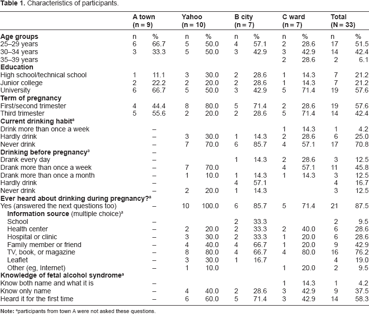
participants from town A were not asked these questions.
Quantitative evaluation of a draft leaflet (first version) by a questionnaire.
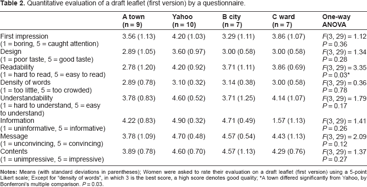
A town differed significantly from Yahoo, by Bonferroni's multiple comparison. P = 0.03.
Title (A)
The copy, “What a mom can do for her baby to be born”, was evaluated as follows:
You'll pick it up at once since the title is impressive (No. 2, A town).
You'll want to know what it is all about (Nos. 3, 6, and 9, A town).
Even a non-drinker will pick it up (No. 9, A town).
You'll wonder what a mom can do (No. 1, Yahoo).
Interesting. You can't see what it is until you open it (No. 10, Yahoo).
It's attractive (No. 6, C ward).
Photo of a baby (B)
Generally, this photo on the front cover gave a good first impression.
You'll pick it up at once since the baby is sweet (No. 1, A town). This large-size photo gives the impression that it's easy to read. It's good (No. 2, C ward).
Babies are sweet in photos than in illustrations, though illustrations are often used in leaflets for pregnant women. Illustrated leaflets are better than those only with messages but photos are more impressive than illustrations (No. 4, Yahoo).
Enough of illustrations (No. 7, C ward).
Q&A
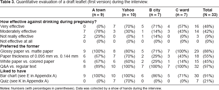
Quantitative evaluation of a draft leaflet (first version) during the interview.
While there're a few technical terms, it's easy to understand in the form of Q&A (Nos. 1 and 3, Yahoo, No. 6, C ward).
It's effective (No. 2, Yahoo).
Bar chart (E)
As shown in Table 3, 91% of them liked the use of a bar chart. Many said; it's scientific, impressive, persuasive, reliable, visually arresting, and effective.
Photo of a FAS child (G)
Many said; it's dissuasive, shocking, impressive, visually arresting, real, and effective. On the other hand, some could not find any anomalies in the photo.
It is not clear that the child has disabilities (Nos. 6 and 7, B city).
It looks a normal child (Nos. 2 and 4, C ward).
Development of the second version
With the help of comments from the A town participants, the draft leaflet was improved in its second version (Appendix B).
Title (A)
The font of the title on the front cover was changed to a rounded pop font, and its color was changed from red to pink because:
The font is too formal. Rounded pop font would be better. Red letters are not good either (No. 8, A town).
Q&A
The headline, “Do you know? Pregnancy and Alcohol”, was added above the first Q of the two-page spread since there should be a headline, not beginning with “Q: …”(Nos. 1 and 9, A town). The underlined text was colored red, the font was downsized from original 14-point, and the text was double-spaced because:
The underlined texts should be in red (No. 3, A town).
The lines too close together are difficult to read. A smaller font size would be better (No. 6, A town).
Word balloons were used for the Q&A, along with illustrations of speakers. Pink, blue, yellow, and yellow-green were used to color the balloons.
There are no differences in the font and its size between questions and answers. It's not easy to read. The presentation could be more impressive, for example, by putting the question in a balloon with the questioner's face and the answer with the answerer's (or doctor's) face (No. 9, A town).
Bar chart (E)
Although all the A town participants liked to have a bar chart (Table 3), some found it difficult to read the mauve bar chart on the draft leaflet. For this reason, it was replaced by another simple bar chart in the second version.
The bars should not be in mauve but in a lighter color (Nos. 2 and 8, A town).
It's not easy to read. How should we read it? (No. 5, A town).
It's completely unreadable (No. 8, A town).
Photo of a FAS child (G)
A photo of a healthy child was added, for comparison to that of a child afflicted with FAS.
Quiz (K)
The quiz was removed, since no one in A town liked it (Table 3).
Maternity mark (L)
All the A town respondents preferred the mark in the leaflet. It was moved from the back cover to the front cover to emphasize that leaflet is intended for pregnant women (Nos. 2 and 8, A town).
“Advice for family and friends” (M)
Five of nine respondents preferred this advice in the leaflet. The bells located on either side of “Advice for family and friends” in the draft leaflet were replaced by an exclamation point in yellow triangle, that is something like a warning mark (No. 4, A town).
“Refrain from drinking during lactation as well” (P)
This was newly added in the second version, as requested since some may think they can drink after childbirth (No. 6, A town).
Evaluation of the second version
Evaluation of revised leaflets, and differences from the first version.
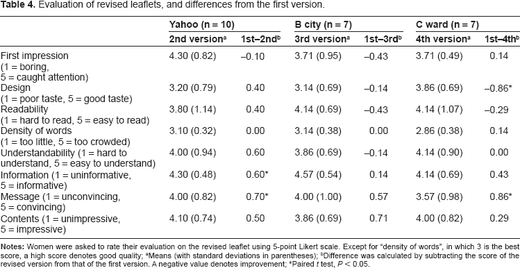
Means (with standard deviations in parentheses)
Difference was calculated by subtracting the score of the revised version from that of the first version. A negative value denotes improvement
Paired t test, P < 0.05.
The new version appears messy and has excessive dialogue balloons (No. 2, Yahoo).
Use of abundant colors makes the new version clear, but on the other hand, less impressive and more superficial (No. 3, Yahoo).
The image is full of colors and beautifully prepared, but the first version was more convincing. Surrounded by the photo of a boy eating ice cream and others, the photo of the child with FAS became less appealing (No. 4, Yahoo).
Development of the third version
With the help of comments from the Yahoo participants, the second version was improved and moved to the third version (Appendix C). The maternity mark reverted to the back cover, since when it was superimposed on the baby's photo, its white background stood out to poor effect. To simplify the leaflet, both the word balloons and the illustrations of speakers were removed. The photo of the healthy boy was removed, and the facial features of the FAS child were detailed, item by item, on the right side of the photo. Since Yahoo participants preferred the old chart to the new one on the back cover in the second version, the former was brought back in the third version. The phrases “it has not been demonstrated” were deleted from C and D in Appendices A and B, since they were less persuasive (No. 10, Yahoo). C and D were shortly rephrased as “Safety of alcohol consumption during pregnancy has not been established.
Author information (O)
This was moved from the back cover to the front cover, to discriminate it at a glance from leaflets prepared for commercial purposes.
I'm not interested in leaflets prepared for commercial purposes. The fact that the author is a decent organization is important (No. 5, Yahoo).
The descriptions will be more reliable when the author information is on the leaflet (Nos. 1 and 2, Yahoo).
Evaluation of the third version
B city participants’ evaluations of the third version were not significantly different from that on the first version (Table 4). Points improved from the first version were; the addition of the headline (“Do you know? Pregnancy and Alcohol”), itemization of facial features, font size, pink color of the title, and brief and clear answers.
Suggestions for further improvement included:
Headings of “Q” and “A” should not be deleted (No. 4, B city). Author information should be the last item on the back cover (No. 6, B city).
No color is necessary for the A(nswer)s (Nos. 6 and 7, B city).
Development of the fourth version
With the help of comments from the B city participants, the third version was improved and became the fourth version. The author information was moved to the back cover (see O in Appendix D). Font size of the phrase,
There should be differences in the letters. The difference between questions and answers should be clearer. (No. 4, B city).
Evaluation of the fourth version
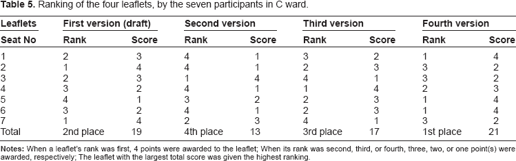
Ranking of the four leaflets, by the seven participants in C ward.
Future development of the final version
Since 55% of all participants preferred colored paper to white paper (Table 3), the final version will be printed on colored paper. The one paper color chosen by the largest number of participants (n = 9) was pink (data not shown in Table). The author also distributed a drawing of a FAS child with an explanation of his facial features, but all the participants preferred the photo to the drawing.
Addition of subtitle
Below the baby's photo on the front cover, the subtitle, “Do you know about fetal alcohol syndrome?” will be added because:
It's better to directly express what the purpose is, for example, with a question beginning with “Do you know…?” Then, you'll have to ask yourself [if you know what the leaflet is talking about] (No. 1, B city).
A subtitle such as “fetal alcohol syndrome” will attract more readers (No. 6, C ward).
“What a mom can do” is good but the title should include “alcohol” (Nos. 3 and 5, C ward).
There should be “about FAS” or something like that. You'll have no idea at first sight, except that it's for pregnant women. There should be “pregnant women and alcohol”, for example, in parentheses or below (No. 2, Yahoo).
If something about alcohol is shown on the margin or blank space, more readers will pick it up (No. 7, C ward).
Discussion
Number of group interviews
The author conducted four group interviews. This number of group interviews was judged to be empirically sufficient, given that the variety of comments from the participants had approached the saturated point by the time the four sessions were over. 7 On the title and baby's photo in the front cover, similar comments were raised by the four groups.
The author found that it should be avoided to redesign a leaflet based on the comments generated during only one group interview. For example, 70% of the Yahoo participants liked the quiz in the leaflet, but no one in any other groups did (Table 3). If the author had done only one group interview with the Yahoo participants, the quiz would have remained in the final leaflet. In addition, word balloons were used in the second version as suggested by a participant in A town. However, it was far from popular with Yahoo participants. According to the ranking of the four leaflets by the C ward participants (Table 5), the second version came in the last place. These examples suggest that development of materials based on only one group interview should be avoided.
Combined usage of qualitative and quantitative data
In the course of leaflet development through four interviews, some components went back and forth. For example, maternity mark was moved to the front cover in the second version but it was back to the back cover since the third version. Also, author information was moved to the front cover in the third version but it was back to the back cover since the fourth version. It seemed that opinions from later group interview have a priority over those from the earlier interview. To confirm this, the author showed all the four leaflets to the C ward participants and asked them to rank the leaflets. It was unexpected that the draft leaflet had better evaluation than second and third versions but the third version was evaluated higher than the second version and the fourth version ranked first. Thus, from the second version at the bottom, the leaflets were improved step by step.
Tailoring for segmented audiences
Audience segmentation divides an audience into segments on the basis of shared characteristics, so that interventions and educational materials can be tailored to address their concerns and needs optimally. 8 Current target population was pregnant women enrolled in maternity classes held at municipal health centers in the Tokyo area. They were pregnant for the first time, and 94% of them were 34 years or younger. In addition, they all lived in the same geographic area. On account of these criteria, they had already been segmented into a small and homogenous group. The tailoring of materials is a good approach to making them effective among such groups.
Effective title
An important contributor to the effectiveness of any leaflet is the extent to which it is read. In the draft leaflet, the front cover did not contain direct words like “alcohol” or “FAS”. Instead, the title bore certain implications, and it was evaluated as impressive, interesting, and attractive. As intended, the participants wanted to know what it is all about and will open the leaflet because you can't see what it is until you open it. In addition, by avoiding words like “alcohol”, even a non-drinker will pick it up. On the other hand, the addition of a subtitle that includes “alcohol” was requested by some participants. In the final version, therefore, a subtitle in a small-sized font will be added to the space below the baby's photo.
Style of the text
It is important to tailor a leaflet for a target population, since needs differ according to the characteristics of that population. Patients with disorders of the hematopoietic system, for example, have found 12-point letters difficult to read. 9 The author initially used a 14-point font size in the Q&A of the draft leaflet, but the participants said the letters were too large. It was not true, it seems, that the larger the letters, the easier it is to read; rather, for young adult women like those in this sample, a smaller font size could be better.
Photo or illustration
Adult women tend to like real photos rather than cartoons or drawings. 10 The pregnant women in this study also preferred photos to illustrations. In designing an educational or informational leaflet, the tendency is to include a large amount of text, since we want to provide a great deal of information. In such cases, large photos that do not provide information are often considered wastes of space. However, the use of large photo, like a baby's one on the front cover, gave the impression that it's easy to read. The most important thing for the front cover would be that it grabs the reader's attention and gets her to open the leaflet, especially in a half-fold leaflet.
Regarding the photo of the child afflicted with FAS, some participants said it is not clear that the child has disabilities. Nevertheless, all of the C ward participants preferred the photo to a medical illustration. Photos, it was suggested, offer a greater dimension of reality than illustrations, and they add deepness to the leaflet.
Elaboration likelihood model
According to the Elaboration Likelihood Model, attitudes can be changed or adopted by two routes: 1) centrally, by a thoughtful consideration and evaluation of the given information, and 2) peripherally, by simply using heuristics or peripheral cues like attractiveness, an expert source, or a number of arguments. When people have little interest, ability, and/or motivation to think about a message, they tend to process it peripherally. 11 My participants were pregnant and almost 80% of them were highly educated (ie, junior college or university graduates). Almost 60% of them drank more than once a week before pregnancy, but they abstained from drinking upon learning they were pregnant. In general, women become more health conscious when they get pregnant. 12 They seemed to have an interest, ability and motivation to think about the message provided by the leaflets. In this case, peripheral cues like attractiveness might be less important for them. In fact, the second version was most highly evaluated as “caught [my] attention” (Table 4) but the final ranking was the lowest (Table 5).
Regarding the problem of dioxin-contaminated breast milk, mothers’ attitudes toward breast feeding were adopted centrally by absorbing a full understanding of the given information, since they were highly motivated to consider the risk to their baby's health. 13 For mothers-to-be and mothers of babies who are conscious of their children's health, it is important to support information-processing via the central route. Since they are already motivated to learn the information, content quality might be more important than peripheral cues.
In addition, prior knowledge may affect one's information processing. 14 Almost 90% of the participants had ever heard about drinking during pregnancy from a variety of information sources (Table 1). It is possible that participants had a great ability to process the message because they had prior knowledge about the topic.
Combination of the rational and the emotional
With regards to disseminating health-related messages, there is a debate as to whether the most effective persuasion is rational or emotional; however, this debate is misleading, since elements of both kinds are required. 15 The draft leaflet's approach on the front cover was emotional; it uses copy and a baby's photo that appeal to a mother's love and pride. On the other hand, the leaflet provided scientific evidence and rationally explained the risks of alcohol consumption during pregnancy within the two-page spread.
Slater and Rouner found that a greater number of message-relevant responses are generally obtained when the message is congruous with the recipients’ own values regarding alcohol use. 16 For recipients for whom the message was value-congruent, the message with statistical evidence was considered more persuasive and more believable than any containing anecdotal evidence. Gaston and Prapavessis also suggest that presenting pregnant women with factual information about the prevention of maternal-fetal disease may serve as an effective motivator. 17
Limitations
There were different types of recruitment used. A part of this study used a convenience sample of pregnant women recruited from maternity classes at municipal health centers. Potential participants who were willing to spend some time discussing “alcohol education leaflets” were recruited. It may have been that those women were naturally curious about this topic and may have been better informed than individuals in the community at large. This is why the author added another recruitment method using a research company. By comparing two samples, potential selection bias was examined.
While Yahoo participants did not know of the topic beforehand, their sociodemographic characteristics and comments on the leaflets were comparable to those of the participants in the maternity classes; thus, overall, the participants seemed to be typical women in the Tokyo area, undergoing their first pregnancies. With regards to generalizability, the findings and recommendations from this study may not be applicable to other areas (for example, the rural areas of the country).
Conclusions
During the current study, the author drew the following conclusions about designing a half-fold leaflet that discusses FAS. To get women to take and open it, the front cover should be visually attractive and eye-catching; further, the copy, font, and color should be tailored to pregnant women. They preferred photos to illustrations. On the other hand, information contained in the two-page spread should be scientifically convincing. Since pregnant women are interested and motivated in learning about the effects of alcohol consumption during pregnancy, the use of too many colors and objects can be distracting and can reduce the seriousness of the information. The educational effect of the final version of the leaflet will be examined in a subsequent study.
Disclosure
This manuscript has been written by a single author. This paper is unique and not under consideration by any other publication and has not been published elsewhere. The author and peer reviewers report no conflicts of interest. The author confirms that she has permission to reproduce any copyrighted material.
Footnotes
Acknowledgements
This study was supported by a grant from the Ministry of Education, Culture, Sports, Science, and Technology, Japan.
Supplementary Data
Top right: front cover. Below: two-page spread. Top left: back cover
Top right: front cover. Below: two-page spread. Top left: back cover.
A–O correspond to the alphabet in Appendix A.
P (“Refrain from drinking during lactation as well”) was newly added since this version.
Top right: front cover. Below: two-page spread. Top left: back cover.
A–P correspond to the alphabet in Appendix B (second version). C and D were shortly rephrased hereafter.
Top right: front cover. Below: two-page spread. Top left: back cover.
A–P correspond to the alphabet in Appendix C (third version).