
Abstract
The use of ecological-momentary-assessment (EMA) data to study individuals in their everyday lives is popular in many areas of social and life sciences. At the same time, EMA data sets are complex, the psychometric properties of EMA items are often not investigated systematically, and scales are often neither standardized nor validated beyond their face validity. Here, we present different descriptive statistics and data-visualization techniques to increase the understanding of the performance of EMA items. We apply these techniques to a wide range of items used in a large EMA data set (599 participants, 360 time points) collected in the WARN-D study to investigate their distributions, contextual influences, change over time, sources of variability, and relationship with classical static measures of psychopathology. We discuss the theoretical and substantive implications of our findings and provide researchers with R code that they can adapt to their own EMA data, as well as literature recommendations for each topic. We hope to inspire more researchers to share in-depth descriptive summaries of their experience-sampling data such that the field can move forward in understanding the performance of EMA measures across contexts.
Keywords
The use of ecological momentary assessment (EMA) to study individuals in their everyday lives has become widespread in many areas of social sciences. “EMA” refers to various methods that include repeated assessments of individuals in their day-to-day lives (Shiffman et al., 2008). EMA data collection, often carried out via smartphone apps, comes with several benefits, such as increased ecological validity, the possibility to investigate contextual influences, and the opportunity to use a within-persons perspective to explore how concepts of interest develop, interact, and change over time (Trull & Ebner-Priemer, 2009). To facilitate such rich insights, EMA data sets tend to be relatively complex. For example, EMA data contain a large number of measurement points nested within individuals, usually with multiple assessments per day (Wrzus & Neubauer, 2023). The data frequently feature many different constructs of interest, commonly using only one item per construct to minimize burden for participants (Dejonckheere et al., 2022). In addition, different sampling schemes are often used for different items, such as asking about sleep quality only in the morning versus measuring current affect multiple times per day.
These and other common features of EMA data, such as attrition and interindividual and intraindividual variation, pose two core challenges for assessment, analysis, and valid inference (Hall et al., 2021). First, common descriptive measures and visualizations, such as sample averages or aggregate histograms of items, fail to convey all relevant information about the highly multivariable and dynamic nature of the data. Given that a thorough description and visualization of EMA data is a crucial requirement for choosing appropriate statistical models and gaining a better theoretical understanding of the constructs under study, there is an urgent need to tackle this challenge. Second, classical psychometric strategies using latent-variable models to assess the quality of measures cannot easily be applied to the many single-item measures common in EMA (M. S. Allen et al., 2022), leaving open the question of how well EMA items perform or function and, as a subsequent step, whether they can be considered valid. To put it differently, the EMA literature is currently in a bit of a free-for-all situation when it comes to assessment because it is largely unclear what “good” items should look like and which psychometric standards this evaluation should be based on.
To tackle these two challenges, in this article, we showcase different descriptive statistics and data-visualization techniques for EMA data to increase the understanding of the performance of individual items. With “item performance,” we loosely refer to item distributions and other relevant properties across individuals, contexts, and time. We consider obtaining a deeper understanding of EMA data a necessary precursor for discussions about the validity of EMA data for two reasons. First, understanding data better is a necessary first step for selecting appropriate statistical models. For example, statistical models often assume normally distributed and unimodal data, and violating these assumptions may have important ramifications for the quality of estimates (Haslbeck et al., 2023; von Klipstein et al., 2023). Second, it is a crucial element for epistemic iteration, that is, for updating theories about constructs based on an improved understanding of measurements and then improving measurements based on updated theories (Chang, 2004). To do so, we stay at the descriptive level of individual items and their bivariate associations and thus do not consider multivariate measurement models, such as reflective latent variables, commonly used in psychometrics.
Our line of reasoning is based on a long tradition of arguing for the importance of data visualization before model fitting (e.g., Anscombe, 1973; Tukey, 1977; Wainer & Thissen, 1981), a call that is arguably even more relevant with increasing complexity of data for which researchers are no longer interested in just sample averages but also dynamic aspects of the data and interindividual and intraindividual variation. We argue that many key features of data may be obscured if researchers focus solely on the results of modeling techniques and neglect the informational content of raw data. While many researchers may already thoroughly explore and visualize their raw data, this information is usually not available in publications. In that sense, the intensive use of (visual) exploratory data analysis can be tied to theory building in psychology (Haig, 2013). Establishing robust, that is, replicable, phenomena, which the field aims to explain with theories, means finding generalizable patterns in data. This can often be achieved via relatively simple methods, such as visualizations or basic correlations, but requires this information to be available to build a cumulative psychological science. This way, insights generated from individual work can then serve as building blocks to generate and refine explanations and analysis techniques.
Below, we provide a tutorial for researchers interested in better understanding their EMA data focused on the following topics: (a) distributions, (b) context, (c) temporal (in)stability, (d) disentangling variability sources, and (e) measuring across different time scales. We provide R code suitable for standard EMA data formats so that researchers can adopt our visualizations and analyses for their data. In contrast to existing visualization frameworks for EMA data (e.g., Bringmann et al., 2020; Rimpler et al., 2024), which were developed to provide feedback to participants or clinicians, our core goal is to provide a tool for the research community. As a supplement to the article, we further provide a “full report,” which contains multiple additional analyses referenced throughout the article, and a “tutorial” file containing the R code to reproduce all figures on synthetic data (available at OSF, https://osf.io/yf3up/). 1
For the tutorial, we use data from the WARN-D project, which aims to build a personalized early warning system for depression. The 3-month EMA data—with around 40 EMA items, around 360 measurement points, and several hundred participants—are representative of the complex nature of EMA data, featuring different sampling frequencies, interindividual and intraindividual variability, state- and trait-like variables, missing data, attrition, and other aspects we discuss below (Fried et al., 2023).
After a brief introduction to data and software, the tutorial is structured into five sections. In the first three sections, we cover insights into individual EMA items based on (a) distributions, (b) context, and (c) time. In the fourth section, we expand on these insights by (d) disentangling different sources of variability in our data. Finally, we move beyond the univariable case to (e) assess the association of EMA items with more static measures, such as a validated depression questionnaire. For each section, we present several analyses to facilitate a better understanding of an EMA data set and highlight their implications from both a theoretical and substantive standpoint. Analyses are accompanied by visualization examples, our theoretical and statistical interpretation of the results in the WARN-D data, and resources for further reading on the respective topic and potential modeling strategies. We finish the tutorial with an outlook on where researchers might go next after having described and visualized their data.
Method
WARN-D
The overarching goal of the WARN-D project is to build a personalized early warning system for depression in higher-education students. To do so, around 2,000 students, split into four cohorts of around 500 students each, are followed over 2 years. Participating students had to be enrolled in a Dutch institution of higher education, and all surveys were available in both English and Dutch. Participants completed a baseline survey and then underwent 3 months of daily data collection by completing questionnaires and wearing a smartwatch to track digital phenotyping parameters, such as activity, sleep, and heart rate. After this period, students complete follow-ups every 3 months for 2 years. In this article, we use data from a subset of participants from the first two cohorts for illustrative purposes. EMA data collection has been completed for all cohorts, but follow-up assessments are ongoing at the time of writing. The project is funded by the European Research Council in the Horizon 2020 research and innovation program (Grant 949059), and data collection was approved by the Leiden University Research Ethics Committee (2021-09-06-E.I.FriedV2-3406). An in-depth description of WARN-D, including an extensive codebook of all measures and information on reimbursement and data-collection procedures, is available in the protocol article by Fried et al. (2023). Because one of the primary aims of the WARN-D project is creating a prediction system, we excluded a subset of the whole sample for cross-validation techniques in future projects (see the associated preregistration at Tutunji et al., 2023), reducing the sample size available at the time of writing this article from 865 to 599.
During the 3 months of daily data collection, participants received prompts four times per day at semirandom times. In addition, participants received an extra survey on Sundays that included questions about the past week. The full list of items used here is provided in the online supplement. Unless stated otherwise, all EMA items were assessed on a Likert scale from 1 (not at all) to 7 (very much). On average, participants missed
Unless stated otherwise, we exclude participants from analyses if they responded to fewer than
Software and visualization
We use the statistical programming language R (Version 4.3.1; R Core Team, 2023) for all visualizations and analyses. Details, such as specific R packages used, are available in the supplementary materials (https://osf.io/yf3up/). Throughout the tutorial, we follow guiding principles for informative visualizations (see e.g., Midway, 2020) when possible, including making heterogeneity across participants, items, and time explicit; using color to highlight differences while remaining colorblind-friendly; and plotting raw data points and/or uncertainty when presenting aggregates or estimates. With these principles in mind and with the overarching goal of gaining a better understanding of our data, the figures and analyses presented below were created and conducted in an iterative process. We recognize that many alternative visualizations of EMA data may be equally or more useful for other research projects. Rather than providing a single set of recommended figures, we aim to showcase our visualization workflow and inspire researchers to adapt and improve on it.
Our commented R code is intended for a long-data format in which each row is a single response of an individual at a certain time point. For a more general introduction to using R and RStudio for data visualization and an explanation for how to restructure data into a long format, see Nordmann et al. (2022). For further resources on data visualization, we refer readers to Hehman and Xie (2021). WARN-D data collection is still ongoing, and we want to avoid having different small parts of the data shared across many different articles. We will make data available on the WARN-D project hub (https://osf.io/frqdv/) when all data are collected, cleaned, and checked (excluding potentially identifiable data). To make this article reproducible in the future, we share the exact participant IDs we used for this article in the supplementary materials. We have also created a mock data set that allows researchers to understand the data structure that we are using, available on OSF (https://osf.io/yf3up/). It has a similar structure as the real data but does not mimic any associations or patterns therein and is used within the tutorial code supplement. We recommend researchers wishing to adopt our analyses start with that document.
Results
In the following sections, we introduce statistical and visualization techniques to summarize information that we believe is critical to a better understanding of the EMA data. We provide an extensive online supplementary document, which we call “full report” and includes code to reproduce all analyses in this article and several additional analyses for each of the sections below. In each of the following five sections, we first explain the importance of the topic, perform example analyses and visualizations in the WARN-D data, and then interpret them. At the end of each section, we provide a “Further reading” section that contains literature relevant to each topic.
Distributions
Summary statistics
We start by displaying a range of summary statistics for specific items to gain a first understanding of individual distributions. Table 1 contains means, medians, standard deviations, skew, and the root mean square of successive differences (RMSSDs; for the original publication on the mean square of successive differences, see von Neumann et al., 1941), which has been suggested as a measure of the (in)stability of psychological constructs, such as affect (Schoevers et al., 2021). We show the RMSSD as an example of a time-series variability measure that has gained popularity in the context of EMA and refer to the further reading section below for more information. Instead of providing a between-subjects average, we calculate each statistic for the whole time series of every item for each participant first. We then calculate the means and standard deviations of the individual statistics across people. For example, suppose we have time series of three individuals A, B, and C, each with 100 time points. We first calculate the individual mean for each person in that person’s time series. If we obtained the means of 1, 4, and 7 for individuals A, B, and C, respectively, we could then calculate the mean across these three mean values as 4. We do the same for all individual summary statistics below—first aggregating within individuals and then across individuals.
Means (SDs) of Different Individual Summary Statistics

Note: We did not exclude participants because of missingness here. All items ranged from 1 (not at all) to 7 (very much). Starting letter “i” refers to individual summary statistics. Skewness was calculated in the default way implemented in the R package e1071 (Meyer et al., 2023). RMSSD = root mean square of successive difference.
We use the starting letter “i” to denote individual summary statistics. For example, the iMedian for cheerful is the mean of all person-specific medians for the item. Table 1 shows, for example, that participants are on average not very irritable, that aggregated means and medians of motivated are around the center of the scale (
Although these statistics provide some first information about our data, the raincloud plots in Figure 1 facilitate a better understanding of the distributions of individual means. These plots include individual observations, density estimates of the distributions, and box plots to show central tendencies and quantiles of the distribution, thus improving over traditional bar or box plot only (M. Allen et al., 2021; Hehman & Xie, 2021).

Raincloud plots for example items. The box plot displays the first and third quartiles of the distribution as upper and lower hinges and the median as a horizontal bar. The whiskers extend to
In this example, we found both large heterogeneity in individual means across all items and marked differences in the distribution of negative affect (floor effects at the aggregate level for some items) compared with positive ones. Some item distributions also seem to exhibit multiple modes instead of having just one clear peak. Although informative about the heterogeneity in average responses, the summary statistics presented in Table 1 may miss crucial distributional features of individual data. For example, two individuals may have the same individual means, but their distributions may look very different because of multimodality, which we explain further in the following paragraph.
Modality
One particular feature of interest is whether individual distributions are unimodal, that is, have one clear peak, or exhibit multimodality. This may be masked when calculating summary statistics: Even if the distribution of an item was strongly bimodal in every person, the aggregate distribution of all person-specific means of that item could look perfectly normal. This is important for two reasons. First, the form of person-specific distributions may contain important information about the individuals and constructs that we are studying. For example, a multimodal distribution of an affect item could point to a specific response process in which an individual does not use certain regions of the response scale because of a tendency to choose extreme or center values only (Van Vaerenbergh & Thomas, 2013). It could also hint at phenomena such as individuals switching between multiple stable states, for example, a state of low negative affect and one with high negative affect, which may correspond to better and worse states of their overall mental health (Haslbeck et al., 2023). Second, typical summary statistics, such as the standard deviation, cease to be meaningful descriptors in the presence of multimodality (Smaldino, 2013), and many statistical models applied to time-series data assume unimodal (and symmetric) distributions; violations of these assumptions may have important ramifications for the quality of estimates (Haslbeck et al., 2023).
One way to investigate modality is the visual inspection of marginal distributions (Haslbeck et al., 2023), achieved by creating histograms for every item and participant (for an example for the item stressed in six individuals, see Fig. 2a). The example of participant E illustrates that the number of modes is often somewhat ambiguous. For larger data sets, the modality estimation technique by Haslbeck et al. (2023) can be used (we present these results in the full report). We show the number of estimated modes for multiple items in Figure 2b. Although we use Likert scales with a limited range of 1 to 7, which makes it more difficult to identify bimodality, we still find considerable multimodality in some items. For example, around 20% of the response distributions for the items stressed and overwhelmed are estimated to be multimodal, which can be seen by comparing the height of the leftmost blue bar with the height of the other bars in Figure 2b.

Modality of ecological-momentary-assessment items. (a) Distributions for unimodal (first row) and bimodal (second row) distributions for the item stressed for six example participants. The x-axis denotes the response options; the height of a chart on the y-axis denotes the count of the respective response. (b) Results for the modality estimation for different items. The x-axis denotes the number of modes; the y-axis denotes the count of participants having a certain number of modes in their individual distribution.
Floor effects
Next to the presence of multimodality, floor and (less commonly) ceiling effects can occur in person-specific distributions in EMA data (Mestdagh & Dejonckheere, 2021). Floor effects occur when the average score is low and the response distribution is skewed and exhibits limited variability. This can violate standard assumptions of linear models and make the interpretation of their results problematic, leading to incorrect conclusions and findings based on statistical artifacts (Terluin et al., 2016; von Klipstein et al., 2023). Floor effects may also help with understanding items and the underlying response processes. For example, one can speculate that floor effects could mean that symptoms or events are not sufficiently relevant or common for many participants in a study. Alternatively, some individuals may not conceptualize the rating of emotions or other constructs on a continuous (e.g., 1–7) scale; instead, they may first evaluate whether the emotion is present and only then rate response options higher than 1. Studying such response processes via cognitive interviews is urgently needed to get a better understanding of why EMA item distributions look like they do (see e.g., Zumbo & Hubley, 2017). We assess floor effects by calculating the proportion of participants that choose the lowest response category more than
Further reading
In general, Revol et al. (2023) provided useful tools for the preprocessing and investigation of EMA data. For a nuanced perspective on calculating time-series summary statistics that aim to capture (in)stability, see Jahng et al. (2008). Haslbeck et al. (2023) investigated modality and skewness in various EMA studies in depth, whereas Haslbeck and Ryan (2022) probed the performance of common time-series models for bimodal response distributions. For some example modeling options for such data, see Cui et al. (2023) and Hamaker et al. (2010). Terluin et al. (2016) and von Klipstein et al. (2023) showed examples of when an ignored floor effect may have affected the conclusions of studies. Alternative time-series models better suited for heavily skewed or zero-inflated distributions have so far been rarely discussed in psychology. They are, for example, covered in Haqiqatkhah et al. (2024) and in Ruf et al. (2021).
Context
One of the key promises of EMA studies is to “captur[e] life as it is lived” (Bolger et al., 2003), which includes variation across different contexts, situations, or activities. Therefore, in this section, we demonstrate ways in which several contextual factors may be associated with response behavior. The question of the extent to which behavior or experiences are stable across different contexts is reminiscent of the well-established person-situation debate in personality psychology (Beck & Jackson, 2022). If EMA data are to advance understanding of such questions, items that measure constructs that likely vary across different contexts should indeed show such variation in empirical data. Which items researchers may expect to vary to which degree across different contexts is necessarily dependent on the population and constructs they are studying. For example, researchers may expect different levels of variability of psychopathological symptoms in a clinical sample compared with a student sample. Here, we aggregate across time and individuals and present two example items that illustrate different levels of stability across contexts.
Item response across activities
In Figure 3, we present the distribution of the answer options for the items cheerful, depressed, motivated, and irritable across different activities that participants reported when answering prompts. The relative frequency (in percentages) of an answer option is displayed on the x-axis. For example, when individuals are in a social activity, they indicate that they are very cheerful (dark red) more often than during other activities. Likewise, participants indicate higher levels of motivation during study/work activities than during leisure. Such pronounced effects do not occur for depressed and irritable, for which responses seem to be more stable across contexts.

Answers across activities. This figure displays the relative frequencies of answer options (x-axis) depending on the concurrent activity (y-axis) for four example items. Activities are ordered by their relative frequencies from top to bottom.
The difference in stability across contexts fits the different nature of the items. Whereas the depressed item was collected in the evening only and inquires about a summary of the whole day, the item cheerful aims to capture momentary affect (“How cheerful are you right now?”) and should be more responsive to different contexts given that it was collected four times a day. From a statistical perspective, we can learn that the inclusion of contextual variables may provide relevant additional information when modeling or predicting certain constructs that fluctuate considerably across contexts. Furthermore, floor effects in items such as irritable impede their informativeness on an aggregate level because they show little insight into interindividual differences, and these items are potentially harder to include in typical statistical models. We take a deeper look comparing the two example activities study/work versus social activities in Figure 4a. We can again see that for some items, such as relaxed and cheerful, responses differ quite strongly across these activities, whereas responses for tired or sad are very similar for these different activities.
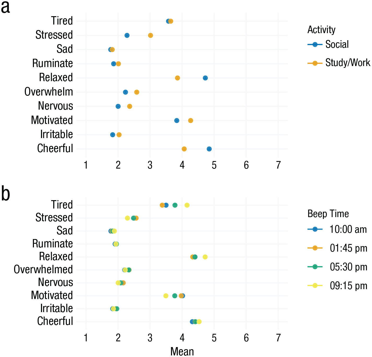
Activity and time-of-day effects. (a) Item means across all participants when participants either indicated that they were in a “social” activity or a “study/work” activity. (b) Item means across the four daily beeps/notifications. The hours of the day indicated in the legend for Fig. 4b are approximate because the exact timing of beeps included some planned randomness (Fried et al., 2023). Horizontal lines around the points would indicate the standard error of the estimated means, but they are barely visible here because of our sample size.
Time-of-day and weekday effects
The time when people answer surveys provides important situational context that may give rise to recurring patterns in EMA data that can be of interest for various research questions (e.g., Helliwell & Wang, 2014; Smith et al., 2018). Time-of-day effects, such as lower motivation in the evenings, can be indicative of natural circadian rhythms or external influences, such as work or university courses, and the daily experiences of participants on a weekday compared with the weekend may be markedly different (Koudela-Hamila et al., 2019). This, in turn, can have implications for how to best measure EMA items because researchers might miss important information by infrequent sampling. Likewise, too-frequent sampling can also lead to a loss of information. In Cohort 1 of WARN-D, we queried participants about daily drug use in the evening prompt around 9:30 p.m., which likely misses some behavior later in the night. In Cohort 2, we adapted a less frequent but more functional sampling schedule and asked the item retrospectively on the weekend for the whole week.
We find the most pronounced time-of-day effects for the item tired, which increases by about 0.77 points on the 7-point Likert scale from around noon compared with the evening. Other items, such as sad or ruminate, stay mostly stable during the day.
Regarding weekend effects, the largest differences between weekdays and weekends are found for the items useful (
Further reading
Mestdagh and Dejonckheere (2021) discussed shortcomings of previous research and ways forward for the investigation of contextual influences in EMA. Beyond self-reported context, the abundance of GPS data has allowed the study of the influence of environmental context on mood measures (de Vries et al., 2021). Langener et al. (2023) reviewed how the social environment, including activity, is captured in experience-sampling and passive-sensing studies. Recent methodological innovations extend dynamical structural equation modeling to be able to include person-situation interactions (Castro-Alvarez et al., 2022). Adolf et al. (2017) showed how context-related changes in parameter estimates can be modeled for time-series analyses. Beck and Jackson (2022) displayed how information about situations can be leveraged for individual prediction of behaviors and experiences and discussed the relevance of situation information for personality research, and Cloos et al. (2022) used the sensitivity to emotionally relevant events as a quality criterion for EMA items. Both weekend effects and time-of-day effects have been studied across a range of constructs (e.g., for suicide and mood, see Freichel and O’Shea, 2023; for positive affect, see Egloff et al., 1995). Gabriel et al. (2019) offered a discussion on time trends and how to model them, and Zhang and Volkow (2023) discussed the role of seasonality and circadian rhythms in psychiatric disorders.
Across time
Changes over time
Change over time is one of the main reasons why collecting longitudinal data is of interest to researchers. This includes, for example, intervention research; research into biological rhythms, such as menstrual cycles (Beddig et al., 2020); and research following participants during periods of stressful events, such as students over a semester with multiple exam periods. But other factors, such as shifting response styles of participants, may also cause observed changes. For example, initial elevation bias has been observed in multiple intensive longitudinal studies, meaning that individuals report higher state values at the beginning of data collection (Shrout et al., 2018). Yet summary statistics, such as those presented in the first two sections of this article, give very limited insight into stability or change over time. Potential changes are also important because time-series models commonly assume no (lasting) changes in means or variances over time (Ryan et al., 2023). In the following, we present tools that help highlight stability and changes over time. We first take a look at aggregate changes of multiple items throughout data collection, followed by the temporal stability of a single item at the group level. We then highlight interindividual differences across people researchers may miss when using group-level approaches.
Investigating item changes at the group level
To visualize how the daily averages of responses change over time, we visualize the average daily EMA responses over time (solid lines) and their overall mean across all time points (dotted line) in Figure 5. For both cohorts, we show that the reports of stressed were above the overall mean at the beginning of data collection and that the reverse was true for happy and relaxed. There are several explanations for this. For example, for Cohort 1, we know that there was an intense exam period until around Day 20. We further observed a clear periodicity in which higher negative affect and lower positive affect were being reported on Mondays or, in other words, at the vertical grid lines. Because WARN-D follows a sample from a general student population and does not include any intervention, overall mean changes over time were generally small. Using such a visualization may bring additional insight when studying distinct groups, for example, diagnostic conditions or treatment groups. In these cases, distinct change patterns between groups can often be expected, which is easy to see in plots.

Group-level changes of daily means of example items. This figure shows daily means for five example items, split by Cohort 1 and 2. Vertical grid lines represent Mondays. Solid lines indicate average daily ecological-momentary-assessment responses across all individuals. Dotted lines indicate the overall items’ means across all time points and individuals.
Investigating item stability at the individual level
Beyond the aggregate change of mean levels of items over time, the stability or fluctuation within individual items over time is of central relevance for most EMA research. One of the most common indicators of temporal dependencies in time series is the autocorrelation. For a lag size of 1, the autocorrelation quantifies the linear dependency between the current and the previous time point. Autocorrelations are often used to infer the optimal lag size in time-series modeling. Beyond modeling decisions, the inspection of autocorrelations can help understand time dependence in data. Broadly, autocorrelations indicate the extent to which states persist over time and are resistant to change (Kuppens et al., 2010). Such effects are often called “inertia” and also play a role in the literature on identifying early warning signals for mental disorders (Helmich et al., 2021). The concept of long-range autocorrelations has also been studied as the “memory” of a time series in complexity science, indicating that the current state of a time series may be dependent on its state a long time ago (Olthof et al., 2020).
In Figure 6, we plot all individual autocorrelations for the item stressed across nine different lags, that is, beeps, while excluding overnight effects. The number 9 was selected here for ease of plotting. Depending on the specific item and context, a smaller or larger range of lags may be of interest. Each point reflects the autocorrelation of one individual. Note that we detrend the data by removing a linear trend of time.

Autocorrelations of the item stressed. The individual data points in this figure represent individual autocorrelation function (ACF) values. A linear trend was detrended before calculation, and overnight effects were not included. The ACF was calculated only for individuals with more than 100 data points.
The plot in Figure 6 indicates substantial heterogeneity across people at every lag size. Still, the association with the previous time point is the strongest overall. In addition, autocorrelations seem to be elevated around Lags 4 and 5, which indicates some stability of the item stressed (measured 4 times a day) across roughly a 24-hr interval. Other items not shown here show slightly different patterns. For example, autocorrelations of the item cheerful are generally slightly lower compared with the item stressed, and they decrease somewhat faster with higher lag size. Theoretically, this informs about the tendency of certain item responses to persist over time and the interindividual differences therein. For modeling, significantly elevated autocorrelations beyond Lag 1 can indicate that for certain purposes and individuals, researchers should consider using models that take into account more than the first lag typical for psychological research.
Investigating item changes at the individual level
Plotting time-series data can inform about the nature and degree of changes over time. However, with many time points, variables, and individuals, such visualizations are often quite messy. This can make it hard to see certain changes over time and features of the individual response distribution. We therefore zoom into six participants for the remainder of this section.
Figure 7a shows the raw time-series data for the item depressed of these six participants. In this figure, it is very hard to distinguish individual lines and to recognize overall trend patterns. Figure 7b depicts the same data using a moving-window technique (Fig. 7a) in which (in this case) 7 days of data are averaged for each time point (e.g., Time Point 40 includes the average of Time Points 37–43; Time Point 41 includes the average of Time Points 38–44). Such visualizations can be flexibly applied in varying window sizes to summarize different statistics, such as the mean or variance, to simplify the visual interpretation of patterns over time. We additionally color the time series based on their variability over time such that time series with a higher fluctuation are shaded in darker colors and time series with less variability are colored in lighter colors. Overall, we show that the responses to depressed fluctuate highly and change abruptly for some participants, while they are more stable or gradually changing for others. This interindividual heterogeneity in change patterns is not directly apparent from the other analyses in this article because they often condense the time-series information into a single summary statistic. This could imply, for example, that the stability of depressive symptoms may vary between individuals and that symptoms may change faster than what is often assumed (Fried et al., 2022). Statistically, it may be relevant to use methods that can account for or explicitly model such changes over time, which we sketch in the “Further reading” section.

Development of the item depressed for six participants. (a) Raw values of item responses. (b) Seven-day rolling means are visualized as an intuitive example of an aggregation window spanning a week. The x-axis denotes the day of the study, and the y-axis denotes the response value. Time series with higher variability (operationalized as standard deviation) are colored in darker colors, and time series with lower variability are in lighter colors.
Figure 8 illustrates how time series for one item (at the individual or group level) can be made more informative by displaying the marginal distribution of the item on the right side of the plot. Here, we show that responses of one individual to the items sad and stressed tend to fall in either the middle or the extreme values of the scale, which is not easily visible from the long time-series visualization alone. 3 Creating individual time-series plots, such as in Figures 7 and 8, can be challenging in large samples. In such cases, we recommend looking into a random subsample of participants to obtain insight into potential patterns that may warrant further investigation.

Raw time series with marginal distribution. The figure shows time series for items sad and stressed for an example participant. The x-axis denotes the day of the study, and the y-axis denotes the response value.
Further reading
The analysis of lagged dependencies is explained in many standard time-series textbooks, such as Box et al. (2008). We chose the simple approach of calculating autocorrelation in a univariate and basic way, but other approaches allow one to handle the possible nonstationarity of the data and the influence of other variables on a given item. Concerning the former, moving-window calculations of autocorrelations can also be used to deal with nonstationarity (see e.g., Olthof et al., 2020). Inertia is also often operationalized as an autoregressive effect in multivariable statistical models, such as multilevel models (Hamaker & Wichers, 2017; Jongerling et al., 2015), in which the influence of other variables and interindividual differences can be modeled. The analysis of autocorrelations, as shown here, can be the first step in understanding the lag structure. Beyond that, for example, Jacobson et al. (2019) developed a tool for exploratory and confirmatory lag diagnostics in typical psychological time-series data. Change-point detection techniques also commonly use moving-window approaches (see e.g., Cabrieto et al., 2018). To explicitly model changes over time in intensive longitudinal data, readers may refer to Boker et al. (2002) for an example of changing associations between two time series or Haslbeck et al. (2021) for more complex multivariate methods.
Disentangling variability sources
Up to this point, we have looked at sources of variability, such as changes over time and contextual factors, mostly separately. Now we can try to synthesize them and try to understand where most of the variance in our data set comes from. This helps us answer questions such as the following: Is there more between-days variability than within-days variability? Are there strong changes in responses over time that are consistent across individuals? And what is the ratio of within-individuals variability to between-individuals variability? This last question occurs regularly in the context of multilevel modeling and is commonly answered by calculating the intraclass correlation (ICC), which quantifies the proportion of variance because of stable between-persons differences (Hamaker, 2024). Expanding on this perspective, generalizability theory (Cranford et al., 2006; Schönbrodt et al., 2022) is concerned with decomposing variance at multiple hierarchical structures, such as beeps, days, individuals, or items in the data set. This can help researchers obtain a first insight into the structure of variation in their data. Here, we investigate the influence of time and interindividual variability for an example item.
First, we estimate the ICC for every Likert-scaled EMA item in the data set. For more details about its calculation, see the full report. The mean of ICCs across items is
We can extend this and decompose the variance of moments/beeps nested in days nested in individuals in our data set. The following description is, in parts, adapted from Schönbrodt et al. (2022). Technically, we estimate an intercept-only multilevel model including a random intercept variance for all factors and allocate the variance of item responses across multiple levels and factors without assuming linear relationships. This is summarized in Figure 9, which shows the proportion of variance components across these factors. The size of a tile represents the relative proportion of total variance that is attributable to a certain factor. “Person” contains between-persons differences, “Person:Day” contains variance between days (in which each day of each person is a unique element), “Person:Prompt” contains time-of-day effects for some individuals, “Prompt” contains general time-of-day effects, “Day” contains general effects of study day, “Day:Prompt” contains effects of certain prompts on certain days, and the residual contains the remaining residual variance left after all other factors have been taken into account. For code for this plot, see Section F7 in the full report.

Variance decomposition for the item stressed. The figure illustrates different variance components. The proportion of variance components is represented by their tile size.
The variance decomposition in Figure 9 shows the large extent of residual variance, which here represents within-persons variation in the item stressed that is not explained by the other factors. A substantial amount of variance can also be attributed to between-persons differences, as indicated by the size of Person in the plot. The interactions of Person with beep and day show between-individuals variability in time-of-day and day-of-study effects, respectively. The latter can be interpreted as different trajectories of stress between different participants. The general effect of the day of the study is small, which is to be expected given that we follow students during their normal lives and do not expect particularly impactful events on any specific day. In addition, our sample comprised two cohorts in which a given day of the study refers to different dates. Note that the decomposition here builds on classical test theory and thereby comes with some strong assumptions, including the absence of autoregressive effects or the independence of different variance components (Schönbrodt et al., 2022). We sketch some potential solutions for these shortcomings in the “Further reading” section below.
Further reading
Various reliability indices could be computed from variance decomposition analyses (Schönbrodt et al., 2022). How to incorporate autocorrelation structures into variance decomposition for EMA is shown in Vansteelandt and Verbeke (2016). A more flexible approach to calculate reliability in longitudinal data with multiple indicators per construct is the use of dynamic-factor models (Fuller-Tyszkiewicz et al., 2017), and Schuurman et al. (2015) showed how to calculate between- and within-persons reliability with single-indicator measures. General recommendations regarding reliability in single and multiitem EMA measures are provided in Vogelsmeier et al. (2023).
Measuring different time scales
One additional source to better understand EMA items is to look at how they are associated with other features in the data, such as EMA items assessed weekly or psychometric scales assessed at baseline before the EMA stage. This allows researchers to better understand the association between dynamic momentary items and slower moving or trait-like measures. In traditional validation work, such analyses may be used to establish predictive (How well does a daily item predict later measures?) or concurrent (How well does a daily item overlap with less frequent assessments of the same construct?) validity (M. S. Allen et al., 2022). Here, we aggregate across time and individuals, calculating between-persons correlations for multiple EMA items and baseline questionnaires.
EMA and baseline items
Figure 10 depicts these correlations, with a focus on questionnaires assessing mental-health-related constructs, shown on the x-axis, including the Altman Self-Rating Mania Scale (ASRM; Altman et al., 1997), assessing manic symptoms; the Generalized Anxiety Disorder (GAD-7; Spitzer et al., 2006) scale, assessing anxiety-disorder symptoms; an adapted form of the Patient Health Questionnaire–9 (PHQ-9; Kroenke et al., 2001), assessing depressive symptoms; and the 10-item version of the Perceived Stress Scale (PSS-10; Cohen & Williamson, 1988), and the SCOFF (acronym explained in Morgan et al., 1999) assessing eating disorder symptoms. We use sum-scoring for these questionnaires to obtain a single score per individual on the x-axis. On the y-axis, we include the mean of multiple EMA items over the whole data-collection period.

Correlation of ecological momentary assessment (EMA) with baseline. This figure shows the correlation of EMA means with baseline items. The y-axis contains the mean of different EMA variables, aggregated to individual means across the whole study duration. The x-axis contains different baseline questionnaires. Emo_reg refers to the item, “Today, it was difficult to cope with my emotions.” For more information about all items and their phrasing, see the supplementary material on OSF.
Correlations between EMA means and the depression (PHQ-9), anxiety (GAD-7), and stress (PSS-10) questionnaires appear fairly similar, indicating that EMA means do not differentiate well between the baseline questionnaires. Most items are only weakly connected to the eating-disorder (SCOFF) and mania (ASRM) questionnaires.
Daily and weekly items
We can also look into the relations of EMA items collected at different frequencies, such as multiple times per day, daily, or weekly. Specifically, here we investigate how validated retrospective reports over a longer period relate to aggregates of daily reports, such as comparing a validated scale for a construct assessed on the weekend (“Last week, I felt . . . ”) with daily scores obtained every evening of the week (“Today, I felt . . . ”). If items with a higher sampling frequency deliver additional information, this points to the added value of intensive daily versus less frequent assessments and can inform the frequency of assessment in future studies. In the WARN-D data, we investigate this question by looking at the association of the weekly means of a daily depression question (“Today, I felt down or depressed”) with various individual depressive symptoms assessed retrospectively once a week with the PHQ-9 (“Last week, I felt . . . ”). We do not visualize these calculations here but rather show more detailed quantitative results in the full report in Section F9.
Overall, the correlations range from
Further reading
Recent work has compared momentary versus recalled affect (Greene et al., 2022; Leertouwer et al., 2022) and daily versus biweekly depressive symptoms (Horwitz et al., 2023). For example ways to study the predictive and concurrent validity for single-item measures, see Song et al. (2023). A spectrum of techniques that, among other advantages, allow modeling using items assessed at different sampling frequencies is subsumed under continuous-time modeling (van Montfort et al., 2018).
Discussion
EMA data are commonly collected across a variety of disciplines, and there are many rich data sets available for psychological researchers to analyze. However, EMA data tend to be quite complex, and in our tutorial, we aim to provide ideas on how researchers can better understand such data. To introduce and demonstrate useful analytic and data-visualization tools, we have presented the properties and performance of various items in the WARN-D study. Most of these insights would not have been gained by applying only typical time-series models that capture multivariate associations between variables. We have emphasized the relevance of the information researchers can gain for both theoretical and statistical considerations. We hope that this tutorial and the associated R code will help researchers explore items in their EMA data in more detail but also share the results of such explorations in their articles or supplementary materials to build a basis for establishing robust phenomena. Making full use of all the information hiding in EMA data sets by employing the full breadth of available data-visualization and modeling tools—and sharing the results (possibly in longer online supplements, such as the full report that we provided)—will not only benefit the quality and transparency of analyses but also improve the understanding of the individuals and constructs under study. We believe that these tools can be helpful in a variety of contexts, from pilot studies with new questionnaires to the description and analysis of large samples with well-known items.
In our application of these techniques for the WARN-D data, we uncovered threats to the integrity of potential modeling strategies because of, for example, floor effects and bimodality. At the same time, we also learned more about the variability and possible contextual influences on the responses of participants. We have gained further insights into the potential added value of EMA above and beyond cross-sectional measures, for example, by investigating the change of item responses over time or assessing the overlap between EMA responses and typical trait-like questionnaires. Finally, we hope that sharing these results of our EMA data in the full report will help other researchers build on our EMA item battery and choose or modify items, for example, to achieve more desirable distributions.
We also note that this tutorial is aimed to provide a first step for researchers to better understand their EMA data. We see our focus on individual items and descriptive statistics as an important precursor to tackling more complex challenges, three of which we highlight below. First, we have not yet discussed multiitem constructs and measurement models, which are the default in psychometrics for cross-sectional data. Such models assume that each item of a scale measuring a purported construct, such as depression, neuroticism, or mathematical ability, is error-prone and that measuring multiple related items and then estimating the construct based on the shared variance of items improves measurement precision. For EMA data, there is a fast-growing literature on measurement models that can capture interindividual differences (McNeish et al., 2021), changes over time (Vogelsmeier et al., 2019), and nonlinear and state-switching properties of measurement models (Kelava & Brandt, 2019). Second, readers may have noticed that we used terms such as item “functioning” and “performance” and refrained from terms such as “validity” or “validation.” Existing validity frameworks, such as the Standards for Educational and Psychological Testing (American Educational Research Association, 2014), do provide crucial opportunities in understanding psychological constructs (see e.g., Fried et al., 2022), but how to apply them to EMA data is not quite established. Furthermore, and related to our first point, validity terminology in psychology is traditionally associated with the evaluation of measurement models in the context of multiple indicators for a construct instead of focusing on individual items. New methods are emerging for marrying EMA data and notions of validity, such as investigating single-item reliability (Dejonckheere et al., 2022; Schuurman et al., 2015) and validity (M. S. Allen et al., 2022) in longitudinal studies. Third, establishing how our items perform in data is helpful to guide questions into an underappreciated aspect of the question of validity: understanding the response processes, that is, the cognitive processes underlying people’s item responses. Choosing the highest answer category in the item sad, for example, may have substantively different meanings across individuals and within individuals over time. What response processes underlie EMA item answers is largely unknown and can be tackled by conducting cognitive interviews in which participants are queried to make explicit how and why they answer items in the way they answer them (Stone et al., 2023). Understanding this process is crucial to understanding if the constructs researchers use actually measure what they intend to measure (Borsboom et al., 2004).
Footnotes
Transparency
Action Editor: Katie Corker
Editor: David A. Sbarra
Author Contributions