
Abstract
This tutorial is aimed at researchers working with repeated measures or longitudinal data who are interested in enhancing their visualizations of model-implied mean-level trajectories plotted over time with confidence bands and raw data. The intended audience is researchers who are already modeling their experimental, observational, or other repeated measures data over time using random-effects regression or latent curve modeling but who lack a comprehensive guide to visualize trajectories over time. This tutorial uses an example plotting trajectories from two groups, as seen in random-effects models that include Time × Group interactions and latent curve models that regress the latent time slope factor onto a grouping variable. This tutorial is also geared toward researchers who are satisfied with their current software environment for modeling repeated measures data but who want to make graphics using R software. Prior knowledge of R is not assumed, and readers can follow along using data and other supporting materials available via OSF at https://osf.io/78bk5/. Readers should come away from this tutorial with the tools needed to begin visualizing mean trajectories over time from their own models and enhancing those plots with graphical estimates of uncertainty and raw data that adhere to transparent practices in research reporting.
Repeated measures research designs and data analyses that leverage longitudinal data are increasingly prevalent in psychology. In Psychological Science, 19.2% of research articles published between 2015 and 2020 included the keyword longitudinal, compared with just 7.0% of research articles published between 1995 and 2000. Advances in the latter part of the 20th century introduced alternatives to repeated measures analysis of variance and the popularization of techniques to fit curves or trajectories to longitudinal data using structural equation models and random-effects (multilevel) regression (e.g., Bryk & Raudenbush, 1987; Meredith & Tisak, 1990). Instead of simple mean differences at varying times of measurement, models with trajectories summarize underlying patterns of change over time, typically using polynomial (e.g., linear, quadratic) or spline functions fitted to repeated measures data. Fitted trajectories are popular in life-course studies tracking age-related changes over years but also frequently appear in experimental research (e.g., impact of a self-reflection manipulation on patterns of change in emotionality; Dorfman et al., 2021), short-term observational studies (e.g., daily diaries tracking change in emotion regulation in the days leading up to and following a major sports competition; Tamminen et al., 2019), and physiological measures (e.g., effects of stress on diurnal cortisol over hours since waking; Young et al., 2019).
Research questions arising in repeated measures designs often focus on evaluating patterns of mean-level change in a behavior over time. On average, does a behavior systematically increase, decrease, or change direction? A common practice to aid in interpreting patterns of change is to derive predicted values or point estimates from the model fixed effects and visualize the trajectories by plotting values at various increments of time. There is often an accompanying hypothesis that change over time differs conditional on a grouping variable or time-invariant factor (e.g., experimental condition, personality trait level, gender), and plots are often constructed to showcase the trajectories of two or more groups at a time. Most software for longitudinal analysis includes built-in functionality to create visual displays of fitted trajectories from the fixed effects, but these are not typically accompanied by displays of raw data or estimates of uncertainty around those trajectories. Psychologists’ appetite for transparent research practices is rapidly increasing, and a key recommendation in data visualization is to include confidence intervals around point estimates (Cumming, 2014). For simple group mean comparisons, these are easily estimated with popular commercial software such as SPSS. Techniques and tools for computing confidence bands—confidence intervals surrounding a continuous range of point estimates—are not as readily available or widely documented online. When user-friendly tools are available, they may not apply to more complex models typically used for repeated measures data, such as random-effects regression (as is currently the case for the
Data Example Used in This Tutorial
Longitudinal or repeated measures data take many forms, appearing in experimental, observational, time-series, and psychophysiology study designs. A common theme anchoring these diverse designs is researchers’ interest in identifying and visualizing trends modeled over time in their data. What differs over studies is the functional form of time in the model: The simplest models include one fixed effect, slope, or vector of factor loadings representing a single linear rate of change, but models commonly include two or more fixed effects capturing polynomial functions of change or linear splines.
The example I chose for this tutorial strikes a balance across the diverse designs of interest in psychological science. Drawing on a model study by Tamminen and colleagues (2019), example data presented here comprise a simulated sample of 60 competitive athletes surveyed once per day over 10 days. Surveys completed on the first 5 days measured interpersonal emotion regulation on practice days leading up to a major competition, which took place on the sixth day. Surveys completed on the sixth through 10th days measured interpersonal emotion regulation after competition. In their original article, Tamminen et al. described research showing that athletes on teams interact with each other in ways that deliberately affect each other’s emotions, cognitions, and motivation for competition. They found that athletes’ attempts to worsen their teammates’ moods—for example, by ignoring them or trying to embarrass them—declined precipitously in the days leading up to competition and leveled off or increased in the days following competition.
The pattern described above implies a question about two-part trajectories for athletes: What are the rates of change in attempts to worsen teammates’ moods in the days before and after a major team competition? The data for this tutorial are available at https://osf.io/78bk5/ and include an ID number for each simulated athlete, a variable indicating whether the athlete’s team won or lost their competition (loss; coded 0 or 1, respectively), an index of time for each athlete (time; range = 1–10), and a score indicating athletes’ attempts to worsen teammates’ moods each day, where higher values reflect greater attempts to worsen mood. I used these data to fit 10-day trajectories for athletes whose teams won versus lost their competitions. All demonstrations presented here generalize to repeated measures studies with any number of time points measured at any intervals and on any time scale (e.g., minutes, hours, weeks, years).
Following Along in R Software
The code and descriptions to follow presume that readers have already installed a copy of R software (freely available at https://cran.r-project.org; also frequently used with the free RStudio IDE interface: https://www.rstudio.com/products/rstudio/download) updated to a recent version (3.6.2 or higher 1 ). No prior experience with R is necessary to follow the demonstrations below, although some prior experience with R may be helpful. Demonstrations presume that readers are familiar with typical tabular results of a growth model that comprises an intercept, slopes, and effects of a time-invariant predictor on those slopes.
Data provided with this tutorial can be used in any software package. If you have downloaded the file
athlete <- read.csv (file = file.choose ())
R software includes a wide range of built-in base functions, but there are also numerous third-party supplemental functions called packages that need to be loaded into the R environment each time the software is restarted before they can be used. Key packages used in this tutorial are: the
install.packages ("dplyr")
install.packages ("ggplot2")
install.packages ("viridis")
To load the packages (do this every time you restart R), call each package with a
library (dplyr)
library (ggplot2)
library (viridis)
Readers working primarily outside of R are encouraged to first run the model from the data provided in their preferred software environments (e.g., SPSS, SAS, STATA, or Mplus). Readers already working in R or interested in doing so can fit these data using the
In R, we can use the
athlete$ before <-
ifelse (athlete$ time <= 5,
athlete$ time - 5, 0)
athlete$ after <-
ifelse (athlete$ time > 5,
athlete$ time - 5, 0)
The parenthetical command creating a new variable
head (athlete, n=10)
id
time
loss
score
before
after
1
1
1
0
3.81
-4
0
2
1
2
0
4.17
-3
0
3
1
3
0
3.33
-2
0
4
1
4
0
3.10
-1
0
5
1
5
0
2.66
0
0
6
1
6
0
2.13
0
1
7
1
7
0
3.55
0
2
8
1
8
0
3.22
0
3
9
1
9
0
3.29
0
4
10
1
10
0
3.06
0
5
Using these data, we can set up a random-effects regression model predicting athlete’s score from group membership (winning team, loss = 0; losing team, loss = 1), the two additive linear functions for change (before and after), and their interactions. The model shown here permits a random intercept and random slopes for both functions of change, but other combinations of random effects are defensible, including random-intercept-only models. After loading the appropriate package libraries for the analysis, we call the
library (lmer)
library (lmerTest)
m <- lmer (score ~ before + after + loss
+ before*loss
+ after*loss
+ (1 + before + after
| id),
data = athlete)
Calling the
summary (m)
Fixed effects:
Estimate
Std. Error
df
t value
Pr(>|t|)
(Intercept)
2.09828
0.07549
57.99666
27.797
< 2e-16 ***
before
-0.38041
0.02377
57.99538
-16.003
< 2e-16 ***
after
0.05067
0.03658
58.00322
1.385
0.17131
loss
0.09834
0.10675
57.99666
0.921
0.36076
before:loss
-0.01522
0.03362
57.99538
-0.453
0.65243
after:loss
0.18600
0.05174
58.00322
3.595
0.00067 ***
Degrees of freedom for this model were calculated using the default Satterthwaite (1941) method, a frequently used and conservative choice, especially in small samples (Li & Redden, 2015; Luke, 2017). Readers estimating the above model in other software should obtain similar fixed effects and standard errors, but degrees of freedom may differ or may not be given if a z ratio is used instead of a t ratio (as in Mplus software). These differences will affect the choice of critical value for forming confidence bands later in this tutorial. Our practical demonstration begins after reviewing the structure of fitted trajectory plots and how uncertainties around points on a line are computed.
Plotting Fitted Trajectories
Table 1 shows the fixed effects from the above model predicting athletes’ attempts to worsen teammates’ moods over 10 days, with separate effects for the time trend in the days before and days after competition. Mean trajectories are also expected to differ for athletes whose teams won versus lost their competitions, and this is captured in the model by interactions between the indicator variable loss and the two different time trends.
Fixed Effects for the Model Predicting Change Over Days in Athletes’ Attempts to Worsen Their Teammates’ Moods Before and After a Competition Day

Creating a plot of the average trajectories across individuals from a random-effects regression or latent curve model—not including the confidence bands around those averages—is straightforward because all the necessary information is contained in the table of coefficients or parameter estimates of the model’s fixed effects. The fixed effects in Table 1 can be rewritten as a linear equation:

For the trajectories of athletes whose teams won (loss = 0) and lost (loss = 1), we can find fitted values for a plot by first writing a reduced equation for each trajectory and simplifying and then gathering terms:
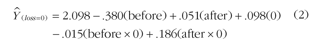


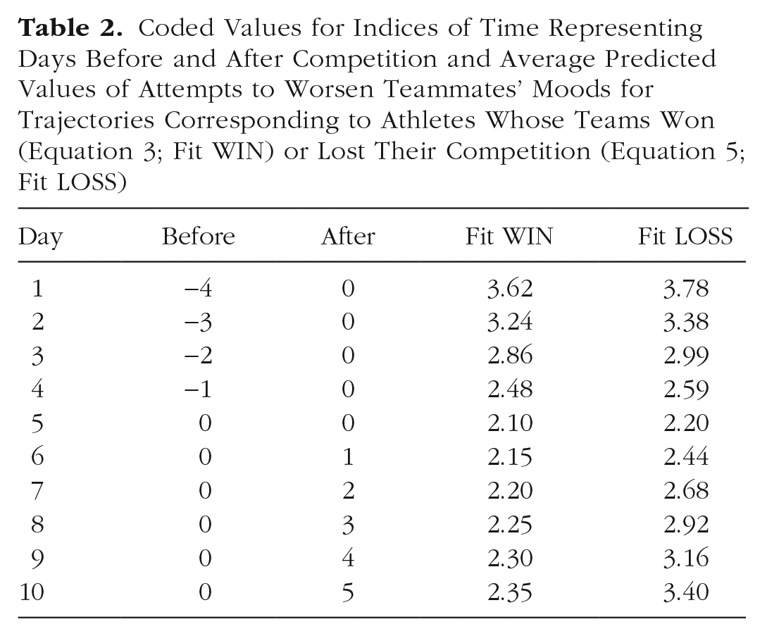
Equations 2 and 4 substitute values of 0 and 1 representing the effect of loss and its role in interaction terms to obtain simple equations for athletes who won (Equation 3) and lost (Equation 5) their competitions. Fitted trajectories can now be computed by substituting into Equations 3 and 5 the values that we used to code days before competition and days after competition in the model. Table 2 shows fitted values for trajectories corresponding to athletes whose teams won and lost their competitions at the midpoint of the study. Plotting the scores for each scenario, Figure 1 shows simple fitted trajectories over 10 days with competition day occurring after the Day 5 assessment and before the Day 6 assessment.
Coded Values for Indices of Time Representing Days Before and After Competition and Average Predicted Values of Attempts to Worsen Teammates’ Moods for Trajectories Corresponding to Athletes Whose Teams Won (Equation 3; Fit WIN) or Lost Their Competition (Equation 5; Fit LOSS)

Simple mean trajectories of attempts to worsen teammates’ moods for athletes who won and lost their games on competition day.
Plots like the one shown in Figure 1 often appear in empirical articles illustrating trajectories of change over time. They are easy to create and require no special software. Fitted values can be computed by hand from the table of fixed effects and plotted in Excel or other spreadsheet software. Notably absent from Figure 1, however, is any index of uncertainty around the lines for each group. The lack of a statistically significant Before × Loss interaction indicates that there is insufficient evidence to conclude that the two types of athletes differ in their rates of change in the days leading up to competition. In Figure 1, all athletes appear to reduce their attempts to worsen teammates’ moods at roughly the same rate. In contrast, the significant After × Loss interaction suggests that attempts to worsen teammates’ moods increase for the athletes whose teams lost their competitions and remain fairly low for athletes whose teams won their competitions. We have some confidence that athletes accelerate their attempts to worsen teammates’ moods more quickly after a loss than after a win, but at what point are athletes from winning and losing teams distinguishable? The point estimates appear notably different on Day 10 but still similar on Day 6. Fitted trajectories alone lack the necessary information to draw these kinds of narrower conclusions, and we require additional information not included in default software output to visualize uncertainty at individual points along each simple slope.
Uncertainty Around Fitted Trajectories
Equations 3 and 5 give the simple intercept and simple slopes of the rates of change over time before and after competition day for athletes whose teams won and lost their competitions. Hypothesis tests of these conditional effects are often of interest but require their own composite standard errors. Formulas for calculating such composite standard errors in the regression context were introduced decades ago (Rogosa, 1980; see also Aiken & West, 1991, pp. 24–26) but popularized more recently with the introduction of web-based software for regression, 2 multilevel regression, and latent curve analysis (Bauer & Curran, 2005; Preacher et al., 2006). Formulas for obtaining standard errors of simple slopes are special cases of a more general matrix algebra expression for obtaining the variance of any predicted value of interest in the model, also known as the delta method (e.g., Ogasawara, 1999, pp. 107–110; Raykov, 2002). This general procedure requires estimates of variances and covariances among the fixed effects in a given model, contained in an asymptotic covariance matrix (ACOV).
The ACOV for the model shown in Table 1 is available in the file
acov <- vcov (m)
For readers performing longitudinal analyses in other software (e.g., SPSS, STATA, Mplus), see the supplemental files (https://osf.io/78bk5/) for instructions on obtaining an ACOV matrix and reading it into R. For the purposes of facilitating the present demonstration, the ACOV matrix for this model is also given in the supplemental files and can be read directly into R as a matrix using the following command:
acov <- as.matrix
read.csv
file = file.choose ()))
Diagonal elements of the ACOV matrix are the variances of the six fixed effects in Table 1. Taking their square roots gives the standard errors shown in Table 1. Off-diagonal elements of the ACOV matrix are the pairwise covariances between fixed effects. Both variances and covariances are needed to approximate the uncertainty around a given point estimate in a model. An exception is the model intercept, which itself is a point estimate of the outcome variable when all values of X in the model equal zero. The overall model intercept in Table 1 is 2.098 (SE = 0.075). This information alone is enough to calculate a confidence interval around the estimate of attempts to worsen teammates’ moods for athletes from winning teams (loss = 0) on Day 5 (in which before = 0 and after = 0). A common regression “hack” for obtaining standard errors of point estimates is to recenter X variables around different, desired values to coerce the intercept to take on a different, specified predicted value with its standard error now reflecting the uncertainty at that new value. With more than a handful of desired point estimates and standard errors, however, it becomes much more efficient to use the ACOV matrix as shown in the demonstration that follows.
Standard errors of fitted values
Returning to Table 2, suppose we are interested in obtaining a standard error on Day 7 for an athlete whose team won their competition. We can first define a row vector of X values that represent this point in the data:
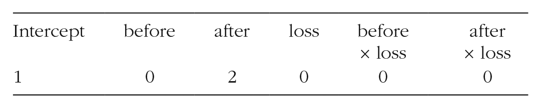
For this test case, values of all variables in the model are represented, including the intercept, which always takes a value of 1. In R, the row vector can be created by hand with the
vec <- cbind (1,0,2,0,0,0)
The six values in this vector will be multiplied using matrix operations
3
with the entire 6 × 6 ACOV matrix. To combine this vector with the ACOV matrix we obtained earlier, we premultiply then postmultiply
vec %*% acov %*% t (vec)
The result of this operation is a single value, 0.013, the variance of the point estimate of attempts to worsen teammates’ mood on Day 7 for an athlete whose team won their competition. The standard error is then the square root of this value, 0.114. A simple confidence interval around the point estimate (Table 2, Day 7, Fit WIN = 2.20) is then
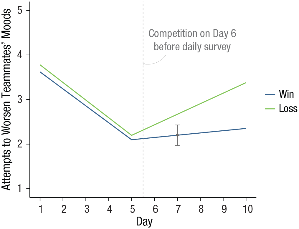
Simple mean trajectories of attempts to worsen teammates’ moods for athletes who won and lost their games on competition day with Day 7 confidence interval highlighted.
Adding the confidence interval for this single point estimate clarifies that on Day 7, athletes whose teams won their competition engage in attempts to worsen teammates’ moods that are less than the average for athletes on Day 7 whose teams lost their competition. This technique is easily extended to calculate standard errors and confidence intervals on all days. Instead of defining a vector of X values for a single point estimate, we define a matrix of X values for a range of point estimates. In the present example, we would like to capture uncertainty at point estimates for athletes whose teams won and lost their competitions at each of the 10 days in the study. To begin, we can build a data frame containing a series of values for time over which the plotted trajectories are desired and two values of a moderator at which to plot different trajectories. In the present example, time is a sequence of 10 equally spaced days, and the moderator is the two coded values for athletes whose teams won (0) and lost (1) their competitions. The code below uses the
pred <- expand.grid (
time = seq (1,10,1),
loss = c (0,1)
)
This basic structure can be customized to capture any range of discrete or continuous time points and values of time that are evenly or unevenly spaced. In the case of trajectories that differ at values of a continuous moderator, we would replace the coded values we used here (0, 1) with selected values representing cases that are relatively low and high on the moderator. We might also add more levels of a moderator if three or more trajectories are desired.
As before in the complete data, coded values representing the passage of time before and after competition day can be coded using
pred$ before <- ifelse (pred$ time <= 5,
pred$ time - 5, 0)
pred$ after <- ifelse (pred$ time > 5,
pred$ time - 5, 0)
Finally, the interactions between loss and the two trajectory components must also be represented in the data, this time using the
pred <- pred %>%
mutate (loss.before = loss* before,
loss.after = loss* after)
We can view the first few rows of the resulting data as follows:
head (pred)
time
loss
before
after
loss.before
loss.after
1
1
0
-4
0
0
0
2
2
0
-3
0
0
0
3
3
0
-2
0
0
0
4
4
0
-1
0
0
0
5
5
0
0
0
0
0
6
6
0
0
1
0
0
All key predictor variables from the analysis are now represented in this data frame. In a short sequence of steps making use of more functions from the
xmat <- pred %>%
mutate (int = 1) %>%
select (int, before, after, loss, loss. before, loss.after) %>%
as.matrix ()
We use
Predicted values are obtained by multiplying the elements of the data matrix
fixed <- rbind (2.098, - 0.380,0.051,
0.098, - 0.015,0.186)
For readers performing longitudinal analyses in R using the
fixed <- summary (m)$ coefficients
[,"Estimate"]
Because the six columns of
pred$fit <- xmat %*% fixed
Standard errors are obtained by premultiplying the ACOV matrix by the data matrix
pred$ SE <- xmat %*% acov %*% t (xmat) %>%
diag () %>%
sqrt ()
Like the example for a single fitted value, we can now compute confidence intervals around each point estimate by multiplying each standard error by a critical value of t (or z, or another critical value as demanded by a given model). Using the critical value of 2.00 as before, the lower and upper limits of all 20 point estimates are obtained as follows:
pred <- pred %>%
mutate (LL = fit - 2* SE,
UL = fit + 2* SE)
The data are now ready to plot.
Plotting Mean Trajectories With Confidence Bands
Organizing a plot to communicate as much information as possible in a transparent way without compromising interpretability is in some ways a matter of personal preference and aesthetic skill, but some key elements are important to keep in mind (for guiding principles, see Healy, 2019; Tufte, 1983). These include scaling the axes to avoid distorting the data or inflating the apparent magnitude of the results, limiting noninformative elements on a plot (“chartjunk”; e.g., background color and prominent gridlines), and using color in a perceptually uniform way that is also visible to people with common forms of color blindness. The task of transparent and reproducible data visualization is especially easy for plots of fitted trajectories that feature a naturally interpretable, left-to-right ordering of the passage of time on the x-axis (Tufte, 1983). We apply these principles to create a plot that combines mean trajectories, uncertainty, and raw data while ensuring that all three elements are visible and easy to interpret.
The
We can first make a plot containing just the mean trajectories for each athlete group overlaid on their confidence bands. After loading the
panelA <- ggplot (pred, aes (y = fit, x =
time, group = as.factor (loss))) +
geom_ribbon (
aes (ymin = LL, ymax = UL, group = loss),
fill = “grey80”,
alpha = .6) +
geom_line (aes (colour = as.factor (loss)), size = 1)
The above commands create the plot object. To render the plot, run a line calling up the completed plot object:
panelA
Your rendered plot should look something like the image in Figure 3a. By default,
panelB <- panelA +
scale_y_continuous (name="Attempts to
Worsen Teammates′ Moods",
limits=c (1,5)) +
scale_x_continuous (name="Day",
breaks=seq (1,10,1))

Interim figures created by adding and editing plot elements step by step. To fit the plots into this multipanel display, the y-axis label runs over two lines. This is accomplished by editing the name option to indicate a new line break (\n) in the middle of the label: name = “Attempts to Worsen\n Teammates’ Moods.”
The rendered plot object appears in Figure 3b. This plot satisfies the goals of accurately displaying the trend lines with uncertainty, but the confidence bands are difficult to see because of the gray background. Plot themes are used to control the noninformative elements of the display, and
panelC <- panelB +
theme_classic ()
Figure 3c shows that this plot is easier to read but could still be improved. The most prominent elements limiting the success of this plot are the font sizes of the axis labels, the lack of informative labels identifying the different trajectories, and the default color selection, which is neither perceptually uniform nor suitable for readers with color blindness. A small tweak with an extra theme command increases the font size and applies bold face to the axis labels, as shown in Figure 3d:
panelD <- panelC +
theme (axis.title = element_text (face =
"bold", size=16))
The line colors and legend labeling can be controlled within a single
panelE <- panelD +
scale_colour_viridis_d (begin = .3,
end = .8,
name = NULL,
labels = c
("Win","Loss"))
Try modifying these values between 0 and 1 to see how the rendered plot changes. Depending on your needs and preferences, you may instead prefer to generate a gray-scale or black-and-white plot. In that case, return to the code used to generate Figure 3a, replace the
## Alternative commands if black-and- white lines are preferred:
geom_line (aes (linetype = as.factor (loss)),
size=1) +
scale_linetype_discrete (name=NULL,
labels=c ("Win",
"Loss"))
Adding Raw Data to Complement Mean Trajectories
An important strategy for enhancing the transparency of the findings and the conditions in the data that led to the fitted trajectories is to plot the raw data alongside the group mean trajectories and confidence bands. Particularly when there are interactions, raw data can help to reveal links between variables, outlier influence, and nonlinearity that may not be apparent from the fitted lines alone (Tay et al., 2016). Raw data in a plot of repeated measures or longitudinal data calls for more than just a scatterplot. Most participants will have contributed multiple observations, and their observations are linked. Such data are well represented graphically as a spaghetti plot, so named for giving the appearance on the figure of a handful of spaghetti noodles tossed onto a flat surface. At the outset of this tutorial, we loaded a data file containing individual participant responses and assigned it to an object named
In prior
panelF <- panelE +
geom_point(data=athlete,
aes (y=score,
colour=as.factor (loss)),
size=.5,
alpha=.3) +
geom_line (data=athlete,
aes (y=score,
group=id,
colour=as.factor (loss)),
size=.2,
alpha=.3)
The layered structure to plots made with
ggplot (pred, aes (y=fit,x=time, group= as.factor (loss))) +
geom_point (data=athlete,
aes (y=score,
colour=as.factor (loss)),
size=.5,
alpha=.3) +
geom_line (data=athlete,
aes (y=score,
group=id,
colour=as.factor (loss)),
size=.2,
alpha=.3) +
geom_ribbon (
aes (ymin = LL, ymax = UL, group=loss),
fill="grey85",
alpha=.6) +
geom_line (aes (colour=as.factor (loss)), size=1) +
scale_y_continuous (name="Attempts to
Worsen Teammates′ Moods",
limits=c (1,5)) +
scale_x_continuous (name="Day",
breaks=seq
(1,10,1)) +
scale_colour_viridis_d (begin = .3,
end = .8,
name = NULL,
labels = c
("Win", "Loss")) +
theme_classic () +
theme (axis.title = element_text (face =
"bold", size=14))
Figure 4 shows the final plot, which includes annotation to mark the location of the athletes’ competition day after their Day 5 assessment but before their Day 6 assessment. Unlike Figure 1, it is clearer from this final plot that athletes from losing teams do not begin to meaningfully differentiate from their peers on winning teams until Day 7, when the trajectory confidence bands no longer overlap. The variability in individual trends evident from the raw data also highlights the degree of departure from the group mean trajectories—for example, some athletes from winning teams report attempts to worsen teammates’ moods that exceed the means of athletes from losing teams.
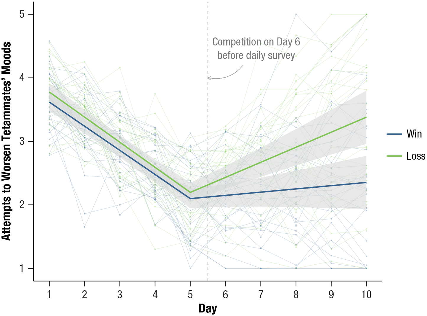
Final annotated plot of mean trajectories for athletes whose teams won and lost their competitions with confidence bands and raw data from individual athletes.
Annotation can be used in addition or as an alternative to a figure legend to highlight important plot elements or outliers or to add brief descriptive content that might otherwise appear in a caption. Strategies for plot annotation are covered nicely in Chapter 5 of Healy (2019).
The following commands can be added to the code for Figure 4 (be sure to terminate any existing plot layers with a “+” symbol before adding new commands). First, a vertical line can be added anywhere on a plot canvas using the
geom_vline (aes (xintercept = 5.5),
colour = “grey65”,
linetype = 2) +
annotate ("text", x = 7, y = 4.3,
size = 4,
colour = “grey45”,
label = “Competition on Day 6
\nbefore daily
survey” +
geom_curve (aes (x = 6.5, y = 4.2, xend = 5.5, yend = 4.0),
arrow = arrow (length =
unit (0.07, “inches”)),
size = 0.2,
colour = “grey65”,
curvature = - .3)
Summary
This tutorial provided a step-by-step guide to visualizing trajectories of mean-level change for studies modeling repeated measures data. This included a general-purpose technique for calculating delta-method composite standard errors of fitted values arising from a model and commands for building a plot using R software that features confidence bands and raw data. A cursory glance through recent issues of Psychological Science suggests that plots featuring all of the above elements are rare (see e.g., Hittner et al., 2020). Plots of mean trajectories with no information about model uncertainty are still common (e.g., Jebb et al., 2020; Padovano et al., 2020), and those that include confidence intervals or bands often leave out raw data (e.g., Aichele et al., 2018). This tutorial resolves an important barrier to generating informative and transparent plots by decoupling data visualization from model development. Researchers performing analyses in any software can bring data and key output to the R programming environment to build accurate, beautiful, and scientifically transparent graphics depicting trajectories of change.
Footnotes
Acknowledgements
I am grateful to Drs. Erin Barker and Megan Lamb, who assisted in testing the data and scripts in this article and for providing helpful comments on an earlier draft.
Transparency
Action Editor: Mijke Rhemtulla
Editor: Daniel J. Simons
Author Contributions
A. L. Howard is the sole author of this manuscript and is responsible for its content. She developed the idea, wrote the article, generated simulated data, wrote accompanying R scripts, and created all figures shown here.