
Abstract
This study aims to determine which signs are cognitively sufficient to convince the viewer to enter a social place, through the integration of semiotics and design. Photographs of 6 social places were obtained through personal photographs. A semiotic model of entrances was created and qualitative data were analyzed. An online survey was used to find out the perceived effectiveness of signs influencing customer decisions. A total of 595 respondents from all over the world responded to the questionnaire. Chi-square analysis was used for statistical analysis for differences between countries and age groups. Results of this study showed that specific colors, lights, transparency, right symbols, large scaled forms and gold lettering on black background raise the visibility of social place entrances and convince customers to enter the place and explore further. According to color preferences of countries, differing from previous literature; black or gray tones followed by red was preferred in Turkey and Cyprus. Red was the most preferred color in the The U.S.A., Middle East and Far East. In order to convince the customers to enter sociable places; this study has pointed out the importance of right signs to be used at sociable place entrances considering the different cultural connotations.
Introduction
Entrance is an element of architecture which has an important role in the design process. An entrance which is an intermediate space and a threshold forming a barrier between interior and exterior spaces allow entry to spaces (Boettger, 2014). While allowing transition, mediation, and passage through boundaries, entrances are associated with specific symbolic meanings, rituals, and socio-cultural behavioral codes (Stevens, 2006).
Signs are elements which raise the recognition level of people. Today signs on entrances act as signals indicating a kind of transition where one is going to transit to and signs have a considerable effect on the attractivity of places. Even in nature; to raise the attractivity of the nest entry; male vocal cop bowerbird in the rainforests of Irian Jaya, creates a colorful entrance; using flowers and natural treasures as eye-catching signs to make it appealing to female birds. Furthermore; the male bowerbird turns over shiny beetle bug wing cases to reflect light from the nest entrance to the female’s eyes (Thompson, 2009).
Oldenburg (1999) suggests that for a healthy life; people must balance the time they are spending in home, office, workplace and sociable places. Nowadays clubs, pubs and bars are some of the sociable places in which customers come together and forget about problems at home and work while socializing with others. Signs also have a considerable effect on the interrelation between people and social places and the first impression is very important for the decision of people in choosing a sociable place.
Some signs are not attractive and people just pass by them without thinking about their meaning and what they denote. Theme based uniquely designed signs may grab attention and make one want to enter the place and want to explore the establishment.
In today’s world; sociable places are in competition to attract customers more than ever before. During the Covid 19 pandemics, many properties were closed. It has been more important for the remaining business owners to transmit a perfect message with entrance signs about what kind of concept the place has; so that the customers may understand from the visual communication whether the place suits their needs or not. To point out the importance of function of the entrance; people are in need to find out the adequate signs to raise recognition.
Although, entrance with its balance, transparency, color and lighting has an important role in the design process, there is no consensus about the characteristics of an effective entrance. Previous studies about sociable places include interview with the customers, perception of the customers about services offered, concepts of bars and change of space/place identity (Bilgenoğlu, 2006; Kim et al., 2022; Moss et al., 2009; Schmidt & Sapsford, 1995; Shi & Lee, 2021; Skinner et al., 2005, 2008; Twigger-Ross & Uzzell, 1996).
Since there is no study on the effect of signs of club, pub and bar entrances; this study will make up for the insufficient current interior design research related with Semiotics.
In order to confirm the previous theoretical observations; three hypotheses were proposed in this study:
H1—There is no difference between a nontransparent closed entry with signs “giving clues about what the place offers” and a translucent see-through entry which shows “what is happening inside” on influencing the possible customers’ decision to enter the place.
H2—Bold and large texts around the entrances attract people more than other font sizes and thicknesses.
H3—Age and country of people have no effect on the perception of colors used around the entrances of sociable places.
By interrelating semiotics to design; this study aims to examine the attractivity of visual signs on sociable place entrances and investigate which signs are recognitive enough in giving clues to convince the viewer to enter the place by using the research questions below:
Question 1: Do the label, sign and logo put around bar-club entrances makes it appealing to attract customers?
Question 2: Do visuals of the entrances give right clues to customers which services are offered behind the doors?
Question 3: Do entries communicate with the customers whether the club suits their taste and budget clearly or not?
Question 4: Are visual signs (lights, neons etc.) more dominant than the building itself?
Literature Review
History of Signs Around Club, Pub, Bar Entrances
The initial use of bar signs dates back to ancient Rome and signs began to be used in Britain with the Roman invasion in 43 A.D. Romans called buildings selling wine as “Tabernae” at those times. In ancient Rome, establishments selling wine hung bunches of vine leaves outside as trading signs to show that they sold wine. As vine leaves were rare in Britain because of the climate; small evergreen bushes were hung up to mark out the pubs (BarSigns, 2023). Bringing recognition to services offered inside; early pubs hung long poles outside their doors to attract customers from a distance. If both wine and beer were sold, then both bush and pole were hung outside.
Signs that can be considered close to today’s modern versions began to be used in the 12th century. As the majority of the population could not read or write at that time, painted pictures were used instead of texts. Local people or travelers could more easily recognize a pictorial sign than a written text (BarSigns, 2023). In 1393 bar signs changed because King Richard II made it compulsory for businesses that sold beer to have a white stag on their entrances. Then the bar signs began to change in the following years. Firstly, religious (Crossed Keys), then royal (The King’s Head) and then names of famous people in history, (like The Duke of Wellington and Shakespeare) were given to pubs (BarSigns, 2023). More recently, industrial change and sports have been reflected in pub names (e.g., The Railway, The Cricketers).
As colorful signs became more common, signs began to take on many different meanings. Today, according to certain themes/ concepts, pub and bar signs are specialized and a lot of drinking establishments in the world hang decorated signs over their entrances giving clues about their function. Recently signs have both a picture and a text to point out the name of the establishment to attract potential customers. Although pub and bar signs have changed a lot throughout the years; the attractiveness of a well-designed sign and its effect to arouse people’s interest are the same as in the old years.
Basic Concepts of Semiotics
Semiotics is a rapidly emerging new research subject and important topic in humanities and social sciences. Recently, semiotics has gradually gained importance in the fields of architecture and interior design. Sign is an important element of semiotics and represents something which becomes an image that occurs in our minds. Semiotics; has an important role for the recognition of the meaning of signs and their relationship between sender and receiver (Schielke, 2019). Signs such as texts, colors, and lights are used as tools in communication studies since they contain meanings (Kim, 2006).
Sign, Signifier, Signified
Ferdinand de Saussure; a linguist from Switzerland, Roland Gérard Barthes; a philosopher from France and Charles Sanders Peirce; a philosopher from The U.S.A. have made important contributions on the development of theory of sign systems. Signs may be linguistic or non-linguistic. The linguistic sign is used as a communication system which examines the function of the language. Nonlinguistic signs refer to metaphor meaning concepts between the sender/receiver (Akbaş, 2019). Signifier is related to the concept and function of the place which is the primary function (Eco, 1980). Signifier directly perceives the external manifestation of design which is expressed as a form of modeling, color, structure and material. In this regard, the primary function could also be defined as “denotation.” Saussure states that a sign is composed of a “signifier” which is the material form of sign and a “signified”; the perceptible part of sign (Chandler, 2007).
Signified, the secondary function, is the expression of abstract information like ideas, concepts, meanings and emotions in interior design and can be defined as “connotation.” Signified can be associated with what is offered in interiors.
Charles Peirce’s theory of signs is based on reasonable and philosophical grounds (Mick, 1986). In contrast to the binary concept of Saussure’s theory; Peirce classifies the basic elements of meaning as; the sign, the interpretant and the object (Caivano, 1998; Peirce, 1998).
The first aspect is in relation with Saussure’s concept termed as “signifier” meaning physical signs. On the contrary, Saussure’s concept of signified, is divided by Peirce into two components, namely object and interpretant.
In Peirce’s symbolic classification; there are iconic, indexical and symbolic signs according to the interrelationship between the signifier and signified (Broadbent et al., 1980; Jie, 2018). Icon has a similar appearance with the signified to express its meaning. Index has evidence of what is being represented with an intrinsic relationship between the signifier and the signified. The connection between the index and its indicator is a real connection. According to Peirce, although the symbol has no similarity with its original, it has a long-lasting and stable relationship between the signifier and the signified (Jie, 2018). People understand and communicate with each other through the symbol system (Jie, 2018), but they must have a certain knowledge background to understand the meaning of symbols. Symbols are used for communication of information to express ideas and emotions of people (Jie, 2018), but they may have different meanings in different cultures.
Denotation and Connotation
Roland Gérard Barthes defined the terms; denotation and connotation and focused on the relationship of signs and photographs with different cultures and ideologies (Akbaş, 2019). Signs have obvious meanings referred to as denotation and also may have metaphoric, multileveled interpretations depending on context, cultural codes, and multiple connotations (Fiske, 1990). Every sign communicates and/or sends a message as long as someone receives and creates a meaning from it (Ferreira, 2007; Leach, 2005; Pane et al., 2018; Peirce, 1998; Schielke, 2019). As a result, communication always involves meanings that are created and exchanged either intentionally or unintentionally (Duncan & Moriarty, 1998). Interior designers create different signs or sign combinations according to certain rules and concepts. Different signs and sign combinations have different meanings and create an endless variety of information in the field of interior design. Over time, as new signs and sign combinations are created the old ones become outdated.
People interpret the interior design signs in terms of abstract information. Since everyone has a different cognitive system, the meaning of signs also differ from one person to another. The differences in the interpretation of signs depend on the development of society, the complexity of information, the globalization of information, the enrichment of imagination and new combinations. For this reason, the shape of the sign also changes with the design and with the creation of new signs.
During the communication process; signs evoke meanings because they are consciously and unconsciously interpreted as connotations (Ares et al., 2011; Fiske, 1990). Both signifier and signified are related with interior design and can be used in communicating messages and convincing customers to enter the attractive atmosphere. Consequently, the transfer of semiotics to entrance design may offer an opportunity to evaluate the attractiveness of texts, colors and lighting in meeting the customers’ expectations.
According to Venturi et al. (1977): “a sign may denote its meaning through its words whereas the character of graphics connotes institutional dignity or commercialism. Size and the position of the sign may connote entering.” For this reason, the sign on the entrance is an important part of the place inviting the customers.
In this study Peirce’s theory of three types of sign relations: icon, index and symbolic sign were employed related with Saussure’s signifier and signified as well as Barthes’ denotation and connotation.
Perception of Sociable Places
People have been interested in sociable places which have been an important part of culture throughout the world. In social life cafes, restaurants, drinking establishments, theaters, football stadiums, tennis clubs and many other places can be counted for people to come together and build social interactions. Focusing on drinking establishments; clubs, pubs and bars play an important role in bringing people together to socialize. In these social places people relax, have fun, meet people, look at people, break up the monotony of life, stay in touch with friends, listen to music, play games, learn from others and be learned by others.
People create close relationships and bonds with numerous places to undergo evolution and to develop themselves. These bonds reflect their thoughts, feelings and lifestyle (Gustafson, 2001; Hay, 1998; Skinner et al., 2008; Twigger-Ross & Uzzell, 1996). Some people prefer to spend time at places having tables outside in summer, some people want to dance in a chic and nice atmosphere, and some people just want to drink and socialize. People of different age groups have different characteristics with various tastes. Elderly people may prefer a comfortable pub in a nice location with comfortable seating to socialize with friends while young people may want to listen to loud music.
From the viewpoint of the club, pub and bar owners; it is not enough to attract the customers for only one visit (Skinner et al., 2005). To keep the customers coming to their places on a regular basis, they organize special supportive activities. It gives way to customers to spend more time in the place. “Karaoke, special drink promotion or live performance” kinds of supporting activities perceptively need to be visualized at the entrance of the place by signifier signs to attract people.
The perception of a place is important for the people to enter a social place. If the customers are satisfied during their experience with the services offered inside both psychologically and economically; they will want to visit that place again (Kim et al., 2022; Shi & Lee, 2021). In the process of seeing; eye forms an image on the retina and sends signals to the brain. Analyzing this information, the brain forms perceptions (Henley, 2019). Thus, a sign on the entrance of a place takes shape as a visual cue; captured in memory becoming a learned info which is useful at least as a mnemonic device, enabling us to think of that place later on recalling the image (Grossman & Wisenblit, 1999; Leach, 2005). Accordingly, successful representation of a place should communicate its message and convince the customer in a short time (Piqueras-Fiszman et al., 2011). If signs, placed at the entrances as visual clues are well designed, then they can guide customers as subconscious (hidden) stimuli about what the space is offering and whether the place suits their needs or not (Clement, 2007; Orth et al., 2010).
Methodology
Study Design
This study was based on mixed method design, composed of qualitative and quantitative analysis.
Qualitative Analysis
The framework of the study is based on analyzing the late-night sociable entertainment place entrances. Photographs of the six cases from Cyprus, Turkey and The U.S.A. have been taken by author 1 at different hours of the day and night in order to demonstrate how the day and night time recognition levels of the entrance signs changed the identity of the establishments focusing on the selected constituents as tools to survey.
The selected cases are interpreted according to the semiotics method; in terms of applied signs on entrances as signifiers and signified through different perceptions in the qualitative analysis part of the study. Signifier and signified signs are classified as icon, index and symbol and their relation with the chosen signs as well as their denotative and connotative meanings are analyzed according to the semiotic model of entrance visuals as seen in Figure 1.

Semiotics model of entrance visuals.
The methodology was based on a semiotics model of the entrances (Figure 1) created in the light of Ferdinand de Saussure, Roland Gérard Barthes and Charles Peirce’s theories.
Results of qualitative data analysis led to quantitative data collection by means of a questionnaire in the research.
Quantitative Analysis
Along with qualitative analysis in order to better interpret the findings; quantitative data was planned by an online survey and circulated to several websites and various online communities.
Inclusion and Exclusion Criteria
People under the age of 18 were not included in the study.
Data Collection
Ethical approval was obtained from the Near East University Scientific Research Ethics Committee (NEU/AS/2021/133). The web link of the survey was prepared on “Google Forms program” and sent to our coworkers, friends, and relatives in The U.S.A., Cyprus and Turkey. To reach more respondents around the world; the survey web link was also shared through surveycircle.com, whatsapp.com and facebook.com. Online survey was used in the study because it is a more effective way to reach out to the respondents, less expensive and less time consuming than the traditional way of gathering information through one-to-one interaction.
Participation was voluntary and the respondents were informed that the collected data would be confidential. The details about the aim of the study were explained and the respondents were asked to fill the informed consent with their own will before answering the questions.
The survey included three sections. The first section included consent. The second section had 13 questions including 6 questions framed suitably in multiple-choice patterns about the selected cases. 7/13 of the questions included open ended answer options along with the multiple-choice answers. In order to minimize the risk of misinterpretation; pictures of some entrances were included in the questionnaire. Demographic details such as age, education level and frequency of visiting social places were asked in the third section of the questionnaire. Respondents were also asked to write/choose the factors that would be most likely to attract them for a visit to sociable places. A total of 595 people responded from all over the world within a time period of 3 months.
Statistical Analysis
The data obtained from 595 respondents were divided into subgroups by age; (20–29, 30–39, 40–49, 50–59, and 60 and above) and countries/regions (Turkey, Cyprus, The U.S.A., countries of Middle East and Far East and other countries mainly from Europe and Australia). The collected data was stored in a database, which was later subjected to statistical analysis by an expert in the field. “R Core Team 2020” was used in the statistical analysis (R: A language and environment for statistical computing, R Foundation for Statistical Computing, Vienna, Austria. URL: https://www.R-project.org/). Pearson Chi-Square and Pearson Exact Chi-Square analyzes were used in the analysis of the created cross tables. Categorical data was given as a percentage (%). A value of p < .05 was accepted as a criterion for statistical significance.
Results
Qualitative Semiotic Analysis Results
The analysis of sign locations has shown that establishments have signs located in the middle or off-center above the entrance or next to the entrance on the facade. On the contrary there was an extreme establishment that did not have written text signs denoting the function of the place on day time; giving no clues to the customers about the place (Figure 2).
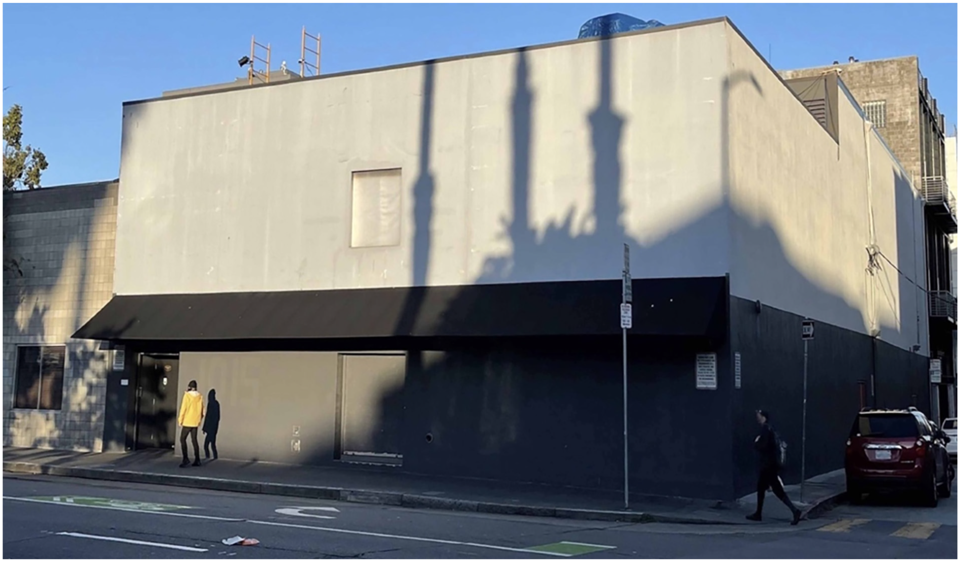
Day time view of 1015 Folsom nightclub, San Francisco, The U.S.A.
This place has a pale gray exterior look with no visible signs on its walls, expressing itself totally different about its function in daytime. Volumetrically, from street view expression, this place also does not denote enough that it is offering a large airy space in the interiors. On the contrary at night-time a cat logo wearing nightclub sunglasses is used as an icon to attract people to the place. At working hours; Figure 3 shows highly usage of lighting; clarifying the event name and logo making it appealing to customer’s eyes. Figure 3 depicts the text and logo lit on the facade which can be clearly seen to make one stop and want to get in. APPBASH text is a symbol referring to an event that invites a charming experience. Waiting line is lit via rope lights from above and rope border usage clearly makes it well defined, referring as a sign, where to stop and wait and where to pass by from the sidewalk. From night time street view analysis, the reservation desk and security waiting in front of the line (Figure 3) at the entrance clearly makes one connote that it is a well-defined and expensive entertainment place. With that right denotation of the place at night, the people who are looking for an inexpensive place will immediately pass by.

Night time view of 1015 Folsom Dance Club, San Francisco, The U.S.A.
Some establishments display their names usually in all uppercase letters in a sans serif typeface, either near their entrance walls or on the facade of their establishment. In this example the name of the place is written with bold and large silver-colored uppercase letters stuck onto the building contrasting with the black facade (Figure 4).

Cheetah Club, Kyrenia, Cyprus.
Backlit large uppercase letters create a three-dimensional illusion at night.
The brand name of the place was also written near the entrance wall with a smaller sized text under the glossy look of a cheetah head which is used as an icon (Figure 5).

Cheetah Club entrance, Kyrenia, Cyprus.
The silver-colored phrase “more than you know” written on a black background, takes one’s attention, denoting this place might have surprising potentials (Figure 5).
Usage of expensive materials at the entrance facade and silver lettering pops up from the polished black entrance wall panels grab attention (Figure 4). Considering the translucent facade on the second floor; the blacks and silvers of the solid entrance are dominating and welcoming features, referring to the elegant interior ambiance (Figures 4 and 5). Contrasting from the dark building facade; considering the effective figure ground relationship; the vivid pink colored male panther standing at the balcony and holding two bottles as icons; explicitly expresses that this place offers drinks and entertainment with right denotation (Figure 4). On the other hand; from the road entrance; a female pink panther lies down on a branch (Figure 6) and another pink female panther climbs on a tree (Figure 5) giving the wrong connotation about the place’s identity.

Cheetah Club, Kyrenia, Cyprus.
Some establishments intend to deliver messages with icons and indexes. Instead of the letter “U” the owners chose to use a wine glass sectional shape on the text, giving it such an unusual and amusing look. This shape is used as an index on windows referring to wine glass (Figure 7). Usage of uppercase letters informing people about what the place is offering is making the functions more recognitive. The name of the sports bar, “Rumors”; is written on a variable baseline in the sans serif font with uppercase letters. “Video Bar” text is written in thick and large old style sans serif fonts whereas “Bar and Grill” text sign is written in small and thin fonts (Figure 7).

Rumors Bar, Fort Lauderdale, The U.S.A.
The analysis of glass doors shows that text symbols are used as informing signs, giving information about open days and hours, age limit and parking rules (Figure 8). These are written with thin and large fonts in uppercase letters, and can be easily seen from the street distance. Olive on a wood stick is an iconic sign whereas “V” like shaped figure is an index sign, denoting “martini glass” (Figure 8).

Village Pub, Fort Lauderdale, The U.S.A.
Olive on a wood stick; strengthens the denotation that it is clearly a martini glass. Usage of “rainbow flag” as a symbol near the door handle, is a learned sign expressing that it is a “LGBT friendly” place. While walking on the modern streets of Fort Lauderdale, the contradictory selected name of the place “Village Pub” is a symbol that connotes rural ambiance as a text sign.
Interior designers choose to use some metaphors as mimesis and imitation using colors, light and icons as signs referring to what is offered inside (Shojaee et al., 2018). Colors are important signs to attract people to a place (Figures 9 and 10). The name of the establishment is written on a black background in the space created in the middle of the brick wall covered with golden lettering. The text is written in modern sans serif font including swirls and calligraphic design elements and can be clearly seen from the street distance (Figure 9). In contrast; the name of the place written in gold color in thin fonts on the red background of vivid red canopies pops up from the gray facade. The name of the place cannot be read from street distance whereas the text informing the people about the menu, written in gold color and thin fonts on black background placed on the space located over the canopy can be easily seen (Figure 10).

The North Shield Pub in Istanbul, Turkey.
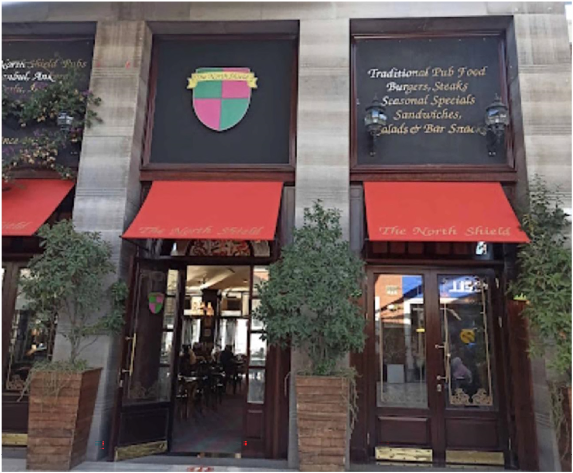
The North Shield Pub in Istanbul, Turkey.
The North Shield logo, located over the entrance door, is an icon. The logo is in the form of a shield and is divided into four portions; two in color green and two in color red. The name of the place is written in black color with thin fonts on a narrow strip with yellow background on top of the logo.
While bringing a contradictory architectural style to an entertainment place in a city with modern architecture; adding country western features that connote rural identity to the place is a head turner tactic as a sign to attract customers in an urban environment. In interior design, the shape of entrance doors express the functional interrelation between interior and exterior spaces. The Old West swinging saloon doors at the upper floor are the visible indexes located just above the entrance. Furthermore; cowboy silhouettes on the windows of ground and upper floors are indexes. In the ground floor; on the right and left side of the entrance there are some silhouettes which are in contrast with the black filmed window. On the right side of the entrance; a horseback riding cowboy silhouette is a visible index sign. On the left side of the entrance; a cactus, a cattle car wheel and a group of cowboy silhouettes sitting on a fence under a text sign as a symbol, “The place to make friends” written with all uppercase letters are all eye-catching signs. Symmetrically located cattle car wheels (Figure 11) and two horse sculptures as icons (Figure 12) welcome customers through the colonial style veranda to the entrance door. These country western traces that develop rural and colonial style appearance are clearly some signs as symbols, indexes and icons that the establishment owners selected (Figures 11 and 12).

Scandals Bar, Fort Lauderdale, The U.S.A.

Scandals Bar Fort Lauderdale, The U.S.A.
Silhouettes of three men wearing cowboy hats are icons placed on the logo of the establishment. “Scandals” text symbol is popping up on the entryway on a lit sign board. It is written in country western font (Figure 12), clearly making it recognitive about the place’s identity to the ones who are interested in this concept.
Quantitative Semiotic Analysis Results
The results of the qualitative semiotic analysis helped us in preparing the survey questions. Information has been gathered from the qualitative analysis results and questions on color preferences, transparent or non-transparent entrances and size of the texts were asked to the survey respondents to find out the quantitative results.
The analysis of the respondents’ answers to the research questions highlighted the role of entrance signs on the interpretation of people (Figure 13).

Frequency distributions of preferences of 595 respondents on colors.
Decreasing order of color preferences for the entrances of clubs, pubs, bars were red > black and gray tones > blue > white > green (Figure 13). When respondents were asked to select the colors that grab their attention around the sociable place entrances; 44% of respondents liked black and gray colors (Figure 13).
Table 1 shows the signified perceptions from the signifier signs used in sociable places.
Semiotic Interpretation of Entrance Visuals and Perceptions.
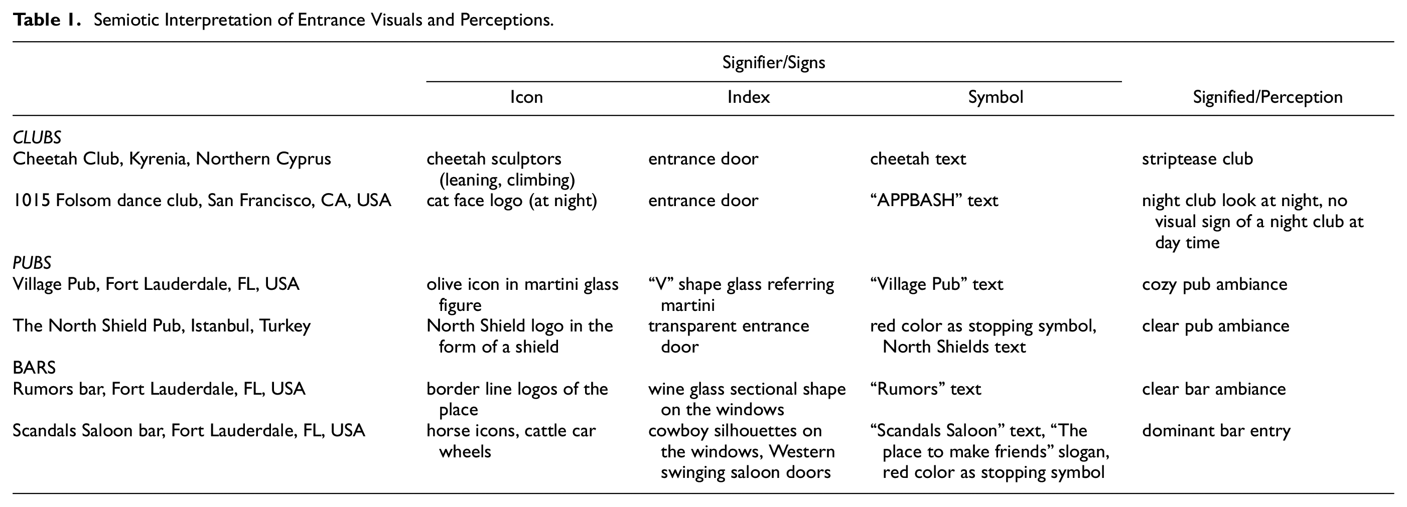
Table 2 shows the qualitative data of sociable places analyzed by the research questions.
Entrance Visuals and Communication of Sociable Places.

Table 3 shows the education level of the survey respondents from different countries.
The Education Level of the Respondents Data Gathered From This Study Survey.
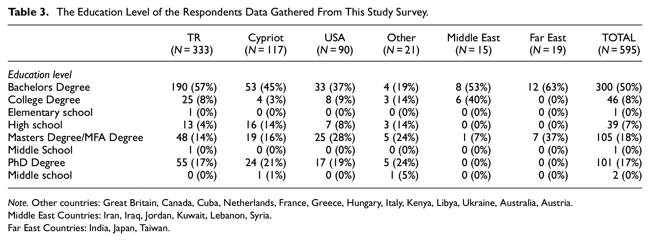
Note. Other countries: Great Britain, Canada, Cuba, Netherlands, France, Greece, Hungary, Italy, Kenya, Libya, Ukraine, Australia, Austria.
Middle East Countries: Iran, Iraq, Jordan, Kuwait, Lebanon, Syria.
Far East Countries: India, Japan, Taiwan.
Seventy-three percent of 595 respondents stated that texts, signs and logos put around club, pub and bar entrances make it appealing to grab their attention to enter the places and no significant difference was found according to the countries. When the image without any signs, texts or logos was asked (Figure 2), respondents from different countries pointed out statistically significant answers about what this place could be (p < .001). Most of the respondents thought that this place could be a depot (60%), some thought it could be a mechanics store (21%), a market (5%) and only 14% thought that this place could be a dance club. However, when the night picture of the same place (Figure 3) was asked; the usage of lighting clarifying the event name and logo lit on the facade (text symbol APPBASH and cat face logo as an icon) made it clear to 75% of the respondents that it is a dance club. This shows the power of signs in giving the right message about the function of the places.
A door or window may create a communication between outside and inside spaces with the transparent or non-transparent closed entries and facades. Transparency allows flow of light through thresholds giving the customers a clue of the services likely to be found inside the place (Figures 4, 7, 9, and 10). On the contrary, a nontransparent entry and facade (Figures 2, 11, and 12) implies curiosity. Fifty-five percent of the respondents preferred translucent entry in order to see what is happening inside but 5% did not find transparency appropriate for customers’ privacy. Fifty-three percent preferred nontransparent closed facades and wanted their curiosity to be aroused by attractive signs at the entrance giving clues about what the place offers. No significant difference was found among the age groups.
Fifty-five percent of the respondents preferred bold and large fonts for text signs because bold and large size of the fonts make it noticeable among the other semiotic resources.
Fifteen percent preferred bold and small lettering whereas 26% preferred thin and large lettering and only 4% of the respondents liked thin and small lettering. Thirty-nine percent preferred lit lettering. There was a significant difference among the respondents for gold lettering on a black background (p < .001); and 78% think that gold lettering on a black background raises the visibility of lettering.
When the text “Village pub” was asked and the index used for letter V (Figure 9) was questioned; a significant difference was observed among 595 respondents (p < .001). Eighty-eight percent agreed that the symbol expressed “Martini glass,” 5% answered as wine glass whereas 6% thought that it was the letter “Y.” The decreasing order of selecting the right answer; “Martini glass” among people of different countries was as follows; Americans (97%) > Cypriots (90%) > people from Far East (89) > Turkish people (87) > people from Middle East (67%).
Figure 14 shows color preferences according to age

Color preferences according to age.
Figure 15 shows color preferences according to countries.

Color preferences according to country/region.
Discussion
Due to the lockdowns, because of the Covid-19 virus pandemic throughout the world since 2020, there are limitations placed on the study which are beyond control. Despite the fact that there are various sociable places that can be semiotically analyzed; in this study; the research is limited to analyzing visual communication of entrance signs around late-night sociable places. Due to copyright problems; we limited the cases to 6 sociable places with effective and ineffective entrance signs from where author 1 took the photos. Although evaluation of the signs may be made by considering many factors; the evaluation of the entrance signs in the study is limited to icons (sculpture, logo), indexes (door, specific shapes), and symbols (text, color).
A well-designed entrance with the right signs may evoke warm feelings and arouse the desire to pass through the entrance to spend time in the interiors. Right signifiers for the entrance designs of target establishments are important to grab customers’ attention at first glance. Regarding the qualitative analysis results; discussing the signifier and signified of a place which had no signs during daytime (Figure 2); with the right denotation of lit signs giving clues about the activities in the interiors at night time (Figure 3), clearly one connotes that it is an entertainment place. In Figure 4, the pink male panther standing at the balcony holding two bottles denotes that this place offers drinks. On the other hand; seductive female pink panther which lies down on a branch (Figure 6) and another pink female panther climbing on a tree denoting pole dance (Figure 5) make people think about the function of the place; if it is a strip club or not. The denotation is confusing and gives a wrong connotation; because this place is a dance club only.
The V like index in the name of “Village Pub” grabs attention in Figure 8. The denotation of martini glass by olive on a wood stick in the letter V connotes that alcoholic drinks are served in this place giving the right denotation.
The cattle car wheels, cowboy and horse silhouettes are right signs (Figure 11) that express rural life ambiance for customers who want to experience a place offering country music in modern city; Fort Lauderdale.
The analysis of the respondents’ answers to the research questions highlighted the role of entrance signs on the preferences of people in the quantitative part of the study. Nearly half of respondents preferred establishments with nontransparent entries however, another big part of customers preferred establishments with translucent doors and windows showing what is happening inside. According to this result it can be stated that there is no statistically significant preference between the non-transparent or see-through translucent entries. As the p-value is more than .05 there is strong evidence in favor of the hypothesis 1; “There is no difference between a nontransparent closed entry with signs giving clues about what the place offers”and a translucent, see-through entry which shows“what is happening inside” on influencing the possible customers’ decision to enter the place is accepted.
Texts are developed by locating pictorial, semantic and structural sign elements (Kim, 2006). The p-value of bold and large font preferences is more than .05 and is not statistically significant. It indicates strong evidence in favor of the null hypothesis, as there is more than a 5% probability the null is correct. Therefore, the hypothesis 2 “Bold and large texts around the entrances attract people more than other font sizes and thicknesses” is fully accepted.
Only 30% of the respondents preferred the color blue. On the contrary, people aged 50 to 59 found blue attractive (56%) and this choice was statistically different from the other age groups (p < .002). As the p-values are less than .05 according to age and colors; these statistically significant results indicate strong evidence against the null hypothesis as there is less than a 5% probability the null is correct. Therefore, the age part of null hypothesis 3 “Age and country of people have no effect on the perception of colors used around the entrances of sociable places” for ages is rejected.
According to the results of the present study it can be stated that the country part of hypothesis 3 related with colors is also rejected as there is less than a 5% probability the null hypothesis to be correct. This result shows that with globalization; color preferences became similar in different cultures.
According to Wassily Kandinsky, an expressionist painter; “Color is a power which directly influences the soul.” In fact, colors are design symbols influencing emotion and psychology of people (Kauppinen-Räisänen & Jauffret, 2018; Madden et al., 2000). Colors have an important role in visual perception of the signs on the property entrances. Furthermore, colors have the ability to attract people and to keep their attention (Schoormans & Robben, 1997). White is a symbol of purity, cleanliness and hope with a positive connotation suggesting safety. Gold is a symbol of illumination, high quality, wealth and evokes the feeling of prestige.
Black can give a chic connotation with the feeling of perspective and depth (Scott-Kemmis, 2022; Stout, 2019). Black is associated with power, authority, strength and elegance. Sixty-four percent of the respondents in this study commented that color black makes entrances stand out, bringing elegance, clearness, sharpness and formality to the place. Differing from previous literature, black or gray tones were found to be the primarily preferred colors for social place entrances in Turkey and Cyprus.
Primarily red then blue is preferred in The U.S.A. In the Middle East, red followed by white is preferred whereas primarily red then black is preferred in the Far East. Red is the most eye-catching and exciting color in the entire spectrum. Color red demands attention and transmits a passionate and energetic feeling psychologically (Scott-Kemmis, 2022; Stout, 2019). It is a stopping symbol associated with energy and power as well as love and desire. Red has very high visibility bringing out text and images to the foreground stimulating people to stop and make quick decisions.
Madden et al. (2000) stated that selection of matching colors changed according to cultures; Canadians paired green with yellow whereas green was paired with blue in Colombia, with white in Austria. Chinese and Taiwanese paired green with yellow or red. In the present study; in terms of figure ground relationship; gold lettering on a black background was found to raise the visibility of lettering. The decreasing order of countries and regions who agreed that gold lettering on a black background raises the visibility of lettering was as follows; Middle East > Cyprus> Turkey > The U.S.A. > Other countries including Europe and Australia > Far East. These colors and their combinations can be useful for interior designers; on selecting the right signs while designing the entrances of target establishments in different countries.
Although color preferences were statistically significant in this study for black and gray tones; there was a significant decrease for this preference with advanced age (p < .001). Young people aged between 20 and 29 liked black and gray colors more than people above 60. For people above 60; black and gray tones produced strong feelings of dislike; the preference for color black and gray tones decreased. This result shows that with advanced age, the preference for black decreases because of remembrance of death (Figure 14).
Jadva et al. (2010) examined the preferences of 120 infants, aged 12, 18, or 24 months for different toys, colors, and shapes. Their findings about shapes showed that infants preferred rounded shapes over angular shapes. The results of the present study were parallel with Jadva et al. (2010) study because 61% of the respondents preferred round form for the social place entrances. This finding shows that extraordinary forms in the design may grab the attention of people.
Silver and Ferrante (1995) found that red was preferred over green among elderly people in Florida, The U.S.A. Dittmar (2001), reported that older people prefer red more because reception of red areas remain stable in elderly. In the present study, red was also the most preferred color among the 595 respondents (Figure 13) and the popularity of red increased with advanced age (Figure 14). According to ages (Figure 14) older people; aged 50 to 59 and above 60 liked red whereas young people aged 20 to 29 liked red less. The findings are in accordance with our study showing that toward the end of life people are attracted to the color red. Among all age groups; the least preferred colors were white and green respectively.
Figure 15 shows that respondents from Turkey and Cyprus primarily prefer black then red whereas respondents from the The U.S.A. primarily prefer red then blue. Middle Eastern respondents primarily prefer red then white whereas Far Eastern respondents primarily prefer red then black. For the people at the age of 60 and above; the preference for blue and black and gray tones decreased (p < .001) whereas the popularity of red increased in this study. Red color grabbed the attention of people from the The U.S.A., Middle East and Far East (Figure 15) and their perception of red color is statistically more significant than the respondents from Turkey and Cyprus is (p < .0283). Elderly people prefer warmer temperatures in interiors and avoid cold due to the decrease in basal metabolic rate. Change of body temperature and yellowing of the lens, resulting in less sensitivity to the blue end of the color spectrum, may explain the decreased preference of cool color blue due to aging (Waldman, 2002).
Simon (1971) asked 490 college students to write down a number between 0 and 9 and the name of any color that came to their mind. The most commonly written number was 7 and the color was blue. The results of this study point out the “Blue Seven Phenomenon” (Wiegersma & Van Der Elst, 1988). Similarly, Paul (2002) reported that Asians, blacks, Hispanics, and white ethnic groups in the The U.S.A. all preferred blue. In contrast, in the present study; respondents from the The U.S.A. preferred “red” as the primary color of choice whereas “blue” was the second preferred color. Similarly, the first color of choice was red among the Middle East and Far East respondents. This change in the preferences can be attributed to the globalization of the world minimizing the intercultural differences.
Choungourian (1968) investigated color preference and cultural variation among 160 university students from The U.S.A., Lebanon, Iran and Kuwait in Beirut. He found that red and blue were highly preferred by the American students, while they were the least preferred colors by students from Kuwait. In the present study, 50% of the respondents from The U.S.A. liked color blue whereas Turkish people, Cypriots people from the Middle East and Far East preferred color blue less (Figure 15).
Respondents from The U.S.A. preferred green better than the people from Far East, Turkey and Cyprus however green was found to be the least preferred color by the respondents from the Middle East (7%) in the present study (Figure 14). In contrast, the results of a study in Germany showed a preference of green over red among elderly people aged between 52 and 90 years (Dittmar, 2001).
The frequency distributions of the percentages of color white also differed according to countries in the present study. People from the Middle East and The U.S.A. preferred white more than people from Far East and Cyprus however, white was preferred less in Turkey than other countries/regions (Figure 14). In contrast, Saito (1994), reported that white was mostly preferred in Japan, because it is an elegant and refreshing color meaning purity, infinity, cleanliness and gentleness. In the same study white color was disliked in Taiwan and China because this color referred to end of life, and loneliness.
These findings show that according to different ages and cultural values, different colors may give rise to different perceptions. White was maybe a less liked color in Chinese, Turkish and Cypriot cultural spheres in the present study because of its association with the image of death reflecting the culture and social customs of these areas.
During the design process, interior designers should keep in mind that; deep meanings of signs may vary in different cultures; for example; color white represents death in some cultures whereas it may represent purity and innocence in others.
Recently; for sociable places; hoping to find a winning sign layout around entrances to attract the right customers and gaining their approval to enter; advertising signs are constantly evolving. In this respect, this study has revealed that Semiotics can be helpful in the design of late-night social place entrances to give the right message with signs by taking the preferences of different cultures into consideration.
Conclusion
Entrance design and signs have an important effect on the attraction of customers making the place distinguishable and welcoming among the other similar drinking establishments. In the competitive world of the late-night market, a sign, a logo, colors, lights or entrance design of a club, pub or bar has only a few seconds to make an impact and catch the customer’s eye to communicate its message and convince the customer. Considering people from various age groups, cultures, education levels; the sign on the entrance has to express the concept of the place appropriately to attract the right audience. Well-designed signs around entrances are visual cues as hidden stimuli to guide customers about what the place offers and whether the place suits their needs or not. If an establishment wishes to be successful as in the nest entrance example of male vocal cop bowerbird in the rainforests of Irian Jaya; it is important for its managers to understand the strength of the psychological attraction of well-designed entrances. For this purpose; owners of the establishments should get help from interior designers for a unique and effective design with a place identity, in order to reach a globally expressive recognition level.
The respondents’ answers to the questionnaire pointed out the importance of specific colors, size and type of texts that would be useful for the selection of signs for an establishment identity. Furthermore; the answers opened up a guiding set of clues about the meanings of signs across cultures that interior designers and designers should consider during their designs.
In order to achieve a successful eye-catching entrance for club, pub and bars; the below conclusions were drawn from the present study and the following strategies can be recommended:
Strategy 1: Signs bring more attraction:
Establishment owners should have a demographic knowledge of potential customers. General preferences of target customers are important and age, race, gender, ethnicity, social status, work-life habits should be taken into consideration for creating the strategy. Most of the respondents in this study agreed that texts, signs and logos around entrances grab attention. A country pub out in the rural area requires a different point of view in design to an urban area bar. Texts, signs and logos should be put around club, pub and bar entrances according to the demographics of target customers to arouse their desire to enter the place and explore further.
Strategy 2: Exaggerated forms focalize the entrance:
The extraordinary forms chosen while designing entrances may make the entrance center of attention. Majority of the respondents in this study preferred round form for the entrance.
Strategy 3: Text font size matters:
Text size is important for legibility from the street distance. More than half of the respondents agreed that bold and large fonts for text signs raised the attraction. Creating clever contrast and choosing the right legible fonts for signage are key factors for grabbing attention. As a finding in the present study; gold and thin lettering on light red background is found illegible (Figure 10) whereas gold or silver lettering on a black background is found successful in terms of readability (Figures 4 and 9).
Strategy 4: Eye catching lit signs:
An entrance with lit signs around, creates a wonderful feeling and undoubtedly an amazing impact on the individual entering the establishment.
Strategy 5: Transparency:
Based on our findings; there was no statistical difference between the people who preferred translucent or nontransparent entry and facades. Although some people prefer see - through entries, some think that nontransparent closed facades are appropriate for customers’ privacy. The choice for a transparent or non-transparent entry may differ according to the demographics of the potential customers.
Strategy 6: Power of colors:
The color of the entrance, building facade and lighting around the entrance should create a focal point that naturally drives the attention. Red, yellow, and orange are known as warm colors which evoke warm feelings; whereas cool colors including blue, green and purple are associated with calmness and sadness. Based on our findings; the colors from the most liked to the least were as follows: red, black & gray, blue, white, and green. Designers must carefully use variations of color because colors carry multiple meanings in different cultures and affects customer decisions.
Strategy 7: Iconic logos and objects:
Adding up an iconic logo brings identity to the place’s recognition. The sign that is chosen matters in order to express what is offered. It is directly proportional in grabbing attention. Carefully chosen objects or statues defining the concept of the place is important whether to pull or push customers.
Strategy 8: The usage of head turner, catchy slogans, amusingly bright and witty taglines:
Thinking about the target audience, considering their limit of cultural moral values balancing the level of sense of humor by choosing the right signs with an eye-catching size will be beneficial in order to not to lose customers. Neons, texts, colors, transparency of an entrance and flow of light through doors, windows and screens may attract people.
In terms of creativity; meaningful slogans play an important role in marketing the brand of entertainment establishments. While choosing conceptual slogans, adding uniqueness, simplicity and intuition will be faster and easier for customers to catch the idea of what the place offers. To reach the maximum effect, matching the slogan referring to the concept of the place and adding a remarkable logo should be considered.
Strategy 9: Connecting the interrelation of signage into a kind of communication with the customer:
Choosing the stopping colors, eye-catching lighting, the usage of amusing text slogans with a witty phrase in an appropriate level, adding text symbol information and a lit menu near the entrance are good ways to express what the place offers to grab customers’ attention. The results of the present study showed that while choosing the right entrance signs; importance should be given to colors, logos, right sized texts, eye-catching phrases and appropriate objects. While creating a legible figure-ground relationship on signs; it is crucial to select the right color combinations and contrasting tints and tones. Although iconic signs can define and acquire cultural meaning beyond their obvious functions; balance, color and lighting are crucial to grab attention. For this purpose; interior designers can use various icons, indexes and symbols to create different combinations in order to develop effective and constantly evolving sign selections. All these strategies interrelated with semiotics will help the entrance design of establishments to step up and be the winner in this competitive market of entertainment business world.
Through the interpretation of entrance signs from the perspective of semiotics; this research enabled us to view the issue from a new perspective; and has also made up for the lack and insufficient current interior designers research on entrance designs.
The findings will help to solidify the framework of this study for applying semiotics to interior design. Our results will be beneficial for interior designers, property owners/managers and customers.
The outcome of this research will assist interior designers in realizing how people perceive entrance signs. In essence, this research is expected to show that semiotics may be helpful in attracting the right customers through the use of cognitive factors that are associated with signs giving the right message. Interior designers can benefit from the recommended strategies of this study in selecting right design solutions for the entrances of sociable places and create more attractive and recognitive designs to establish a positive effect in inviting customers.
The results of this study will be influential to property owners, by raising their awareness to give importance to interior design and get the help of interior designers while choosing the right entrance signs to be designed uniquely for their own place identity. The recognitive entry signs will give right clues about the services inside and will raise the number of customers.
A well-designed entrance will help customers in finding a place that suits their taste without spending too much time and will raise their wellness, making them understand that they are at the right place to relax, forget the stress of work and socialize. Right invitation, right service to the right customer which means happy customer and happy property manager as well.
In this essence; further future semiotic studies are needed in interior design, focusing on signs and their interpretation by people of different cultures and ages.
Footnotes
Declaration of Conflicting Interests
The author(s) declared no potential conflicts of interest with respect to the research, authorship, and/or publication of this article.
Funding
The author(s) received no financial support for the research, authorship, and/or publication of this article.