
Abstract
This study uses occluded text as a visual cue and hypothesizes that a deliberately incomplete advertisement headline or product name enhances visual attention. An experiment on tea packaging and advertisement is applied to investigate whether visual attention and, even viewer preference enhancement, will be affected by occluded text. The experiment contains two parts: first, an eye tracker observes the differences in the participant’s visual attention between samples of incomplete and complete text; second, a questionnaire records the participants’ preferences between the two samples. The result validates our hypothesis that incomplete text elicits a certain level of visual attention as long as viewers can recognize the text; alternatively, if the occlusion causes difficulty in text recognition, the occluded text will fail to attract visual attention and viewer preference. This is particularly true for advertisement headlines. The experiment results of visual attention and viewer preference for the occluded product name on tea packaging are consistent. As for the occluded advertisement headline, however, it attracts only visual attention but is not able to enhance viewer preference. This could be attributed to the fact that participants are affected by different amounts of received information and their complexities when examining experiment samples.
Introduction
Text is a non-verbal communication medium, and complete text may be the optimal form of communication. Designers deliberately create text effects to deliver their design purposes. For example, designers occlude parts of an enlarged word or term on the product packaging, advertisement headline, or graphic work to create incomplete text and to spark viewers’ interest and feel creative (Hagtvedt, 2011). Such incomplete text even enables viewers to automatically complete messages and impress upon them that they can easily recall the text (Zeigarnik, 1999).
Research finds that an appropriate font can communicate specific connoted meanings to consumers (Doyle & Bottomley, 2004, 2006), and one tea packaging design in the Taiwanese market applies this finding. The designer occludes the character strokes on the left side of the Chinese characters of each product name in the whole series of tea packaging designs. Such design symbolizes a better quality of high mountain tea because when tea is grown on high mountains it is often occluded by cloud cover. Using occluded text to link the idea of high mountain tea with cloud cover not only retains the spirit of Gestalt but also applies such symbolism as an encouraging, implication, or associative cue. Generally, a cue is used to instigate the orienting of attention, such as the process of detachment, or attention shifting (Ongchoco & Scholl, 2019; Posner & Petersen, 1990). Thus, visual cues are applied frequently in daily life. For example, color and form are used as an implication for visual communication. Another example is that color is used as a cue associated with taste in food packaging design (Guo et al., 2022). In a third example, a line segment is used as a cue in information searching (R. W. Y. Wang & Tsai, 2003).
Packaging plays an increasingly important role as a strategic tool to attract consumers’ attention (Ahmad et al., 2012). Typefaces exist everywhere in the design of logos, advertising, and product packaging, and have a delicate effect on consumer perception and behavior (L. Wang et al., 2020). For designers, a better understanding of viewers’ emotional responses to designs that include incomplete text in different media may help their designs stand out which, in the marketplace, impacts potential customers’ choices (Ilman, 2019; Irani & Frankel, 2020). The objectives of this study are to understand whether occluded text on product packaging acts a cue which elicits visual attention and to investigate whether such potential impact can alter viewers’ choice preferences. Moreover, by applying the same technique to advertising design, we investigate if we can produce the same or different results.
Visual Effect of Typeface, Occluded Chinese Character, Attention Capture and Measurement, and Preference
(i) Visual effect of typeface: Unlike other visual symbols, such as color, picture, and texture, the text is a visual re-code of verbal symbols (namely, written text). The text is seen as a visual feature. Such a concept is frequently applied to advertising design, such as for packaging or logos, in order to convey explicit or implicit messages to viewers (Ares et al., 2011; Gollety & Guichard, 2011; Toncar & Fetscherin, 2012; van Rompay & Pruyn, 2011). Thus, the appropriate use of the typeface is essential for improving brand recognition (Doyle & Bottomley, 2004). Previous research has confirmed that the shape curvature of typeface is strongly correlated with tastes. (Velasco et al., 2015). A round typeface is usually associated with a sweet taste (Velasco et al., 2014). Studies have proposed that the viewer’s response to a typeface can be regarded as an emotional response, and thus dynamic text can be designed to convey emotions (Malik et al., 2009; H. Wang et al., 2004). Arc typefaces are associated with positive emotions, whereas angular typefaces are associated with negative emotions (Morrison, 1986; Velasco et al., 2014, 2015). Moreover, L. Wang et al. (2020) pointed out that consumers tend to show higher preferences for hedonic products with round typefaces (high curvature) in the packaging or advertisement. For a long time, graphic designers and other types of designers have relied on changing the shape and form of letters of an alphabet and words to enhance the meaning of text (Malik et al., 2009).
(ii) Occluded Chinese characters: Chinese characters contain structural attributes, such as strokes, radicals, characters, and terms (Ding et al., 2004). Chinese ideogram is composed of radicals and components according to a meticulous set of rules and methods (Cheng, 1981). A. B. Wang and Fan (2001) determined that if viewers can successfully extract a Chinese character’s radicals and components (the so-called “pianpang”) before recognizing its logogram, they can acquire important information about that character. Thus, identifying a key component (pianpang) is much easier than recognizing the entire character.
An incomplete text is defined as a Chinese character that is partially occluded, and the missing part is unknown (Luijkx et al., 2006). Chinese characters possess a redundant nature (Tseng et al., 1965) because if a character is partially occluded, wherein the occluded part does not affect the character’s radicals and initial strokes; then, that character can still be recognized. Research studies have found that the key position by which a character is identified is the main radical, followed by the other radicals (Liao, 2018; Tsao & Liao, 2015). In addition, if the right side of a character is occluded, it is easier for such a character to be recognized than if its other parts are occluded.
Hagtvedt (2011) suggested that companies try to deliberately create an innovative image in order to attract consumers’ attention to their advertisements even though the incomplete text used in these advertisements may decrease their consumers’ trust. In addition, Wetzler et al. (2021) introduced the following hypothesis: if the learning experience involves difficulties that induce extra effort, then retention may be improved. With the aim to enhance learning, a new disfluent typeface, Sans Forgetica, was developed and alleged to promote deeper processing and improve learning. Investigating packaging texts also supports this conclusion. Rockler (2019) concludes that logos with incomplete text are considered to be more creative, but nonetheless are not trustworthy compared to normal logos. In the future, it would be worthwhile to compare the concurrent pique of interest and potential of lost trust due to this design technique of occluded text with the same phenomenon when incomplete information is intentionally presented in advertisement copy (Yüksel et al., 2014).
(iii) Attention capture and measurement: Cheng (2010) pointed out that attention itself is selective. It is the first part of the perception process and focuses on what is considered to be important or meaningful (Anderson, 2005; Bang & Wojdynski, 2016; Chun et al., 2011; Mrkva et al., 2021). When we use selective attention, our visual system makes a selection based on previously formed visual representations, such as the target’s space, location, object, and surface (Chang et al., 2009). Pieters and Wedel (2007) then emphasizes that object characteristics should include the target’s shape, color, size, and location.
Block (2020) also mentioned that divided attention occurs when the brain is able to attend to multiple ideas, or stimuli, at the same time. Bottom-up control of attention refers to attentional capture being automatically driven by the stimulus that is considered silent or attention-grabbing (Theeuwes, 1994; Yantis, 1993; Yantis & Hillstrom, 1994). When people track moving stimuli, their brains’ abilities automatically control the location of attentional capture. Such type of attention is a goal-driven control of attention and is possible to quickly detect relevant stimuli. Top-down attention or endogenous control over the locus of attention refers to the voluntary allocation of attention to certain features, objects, or regions in space. Such an attentional capture is an active mode.
Visual signal processing involves the aforementioned two perspectives. The first perspective is “from local to the whole.” An object is first separated into components (or features); then, these component parts and features need to be assembled in order to recognize the object. Such object recognition is bottom-up processing (Biederman, 1987; Marr, 2010; Treisman, 1986). The second perspective is “from the whole to local.” The whole of an object (the object’s main component parts) is recorded by the visual perception system before its properties and components are analyzed, and such recorded whole is larger than the sum of the other components. Such a view is the top-down process in object recognition (Chien et al., 2011). The initial hypothesis of the recognition-by-components theory adopts a bottom-up processing perspective (Marr, 1977; Marr & Nishihara, 1978) because the extraction of an object’s edges does not rely on the previously familiar object, but on its component parts. Such explanation is bottom-up processing. This particularly works for the recognition of less complex objects (Biederman, 1981; Biederman et al., 1982). When we recognize an object, our brains voluntarily interpret outside information using the stored knowledge rather than passively waiting for external stimuli (Cheng, 2010). From the perspective of text recognition, this is a result of both bottom-up and top-down processes.
Moreover, approximately 83% of received information relies on visual perception (Lin et al., 2021). Many studies have suggested that eye-tracking movement can detect the internal change process of visual attention, and thus, eye movement can reveal a person’s focus of attention and the position of getting attention (Bicknell et al., 2020; Cronin et al., 2020; Henderson & Hollingworth, 1998). Eye-tracking thus become a common way of detecting visual attention (Kruikemeier et al., 2018; Y. J. Wang & Minor, 2008; Wojdynski & Bang, 2016; Yan et al., 2018). Through eye-tracking, we can understand the cognitive process and mechanism involved in reading comprehension (Ahn et al., 2020; Rayner et al., 2006) as well as in visual perception (Liversedge & Findlay, 2000; Su et al., 2020).
Lai et al. (2013) suggested that eye movement detected by an eye tracker can be classified into three types: fixation, saccade, and mixed. Among them, fixation and saccade are the two main types of eye movement. The eye-tracking metric can also be categorized into three types of information: spatial, temporal, and count. Time to first fixation, fixation duration, and fixation count are the three most-used variables in studies (Ahn et al., 2020; Hernik & Broesch, 2019; Krejtz et al., 2018; Marchezini et al., 2022). Therefore, we adopt these three variables as observed indicators in this study.
Goldberg and Kotval (1999) proposed that the complexity of an information processing procedure is reflected by the average fixation time and the number of fixations. If the amount of information in the message is relatively large or complex, people need more time to think; thus, the fixation time is relatively long (Mackworth & Morandi, 1967; Salvucci & Anderson, 1998). If the format of the design is not conducive to reading and browsing, the average number of fixations and average fixation time increase with the difficulty of reading or browsing. Thus this research proposes:
Hypothesis 1: Compared to complete text, using incomplete text as a visual cue can prolong fixation duration.
(iv) Preference: Preference can be evaluated in the sense of liking or disliking a stimulus (person or object), or preferring it or not over other objects, or judging the relative stability of a stimulus (Lichtenstein & Slovic, 2006; Scherer, 2005). Scherer (1988, 2005) tried to distinguish emotion and feeling in his research and provides the following definition: stable preferences should generate intrinsic appraisal (inner pleasure check), independently of current needs or goals. Scherer states that preferences, attitudes, affect dispositions, and interpersonal stands may overlap in the definition. To some extent, preference can be seen as a reflection of feeling. He also mentions that many researchers still consider emotion and cognition as two independent yet interactive systems. This leads to the Research Question posed in this study, as well as to a second hypothesis:
Research Question: Depending on the situation, are there different results when applying Scherer’s statement that stable preferences should generate intrinsic appraisal (inner pleasure check), independently of current needs or goals?
Hypothesis 2: Incomplete text can prolong the fixation duration; however, viewers do not necessarily like to view incomplete text.
However, preferences are not stable and can change substantially during the decision-making process (Brehm, 1956; Sharot et al., 2009). And a person’s preferences can be affected by the following factors: geographical location, cultural background, religious beliefs, education (Quispel & Maes, 2014), nurture, the political system (Beblo & Görges, 2018), economic conditions (Cain et al., 2018), value function (Kahneman & Tversky, 1982), and gender (Bonnardel et al., 2018; Hoffmann, 2019).
In the design field, understanding why people dislike certain designs will help designers improve upon their creations (L. Wang et al., 2020). For example, in the study of the role of typeface curvature in consumer preference for hedonic products (L. Wang et al., 2020), one can find that consumers have the potential to link their preferences of typefaces to certain products. The features of typefaces have been found to affect the effect of message delivery. Otterbring et al. (2022) studied whether correspondences between typefaces and food preferences drive congruent choices and found that there is no direct typeface-food choice effect. However, there is an effect of typeface preferences and food choices on the age of consumers (Otterbring et al., 2022).
In their research, Ahn et al. (2020) mentioned that Underwood et al. (1990) is the first article to detect and predict viewers’ cognitive process of reading using the eye movement technique and found the fixation time is a factor used to predict the standard of reading comprehension (high or low). Furthermore, Rayner et al. (2001) use print advertisements as stimulus materials and find that most readers’ visual attention is on the text rather than on the picture; specifically, they look at the big text first, then at the small text, and finally at the picture. The authors conclude that the number of fixations and fixation time may be affected by factors, such as the complexity of information, the difficulty of reading materials, personal interests, and the positions of attractive objects. Personal interests of consumers are closely allied with choice preferences, so this leads to the proposal of
Hypothesis 3: Incomplete text applied in different media affects the focus of attention and choice preferences.
Methods
Experimental Design
The experiment conducted in this study is comprised of two parts. In the experiment, all participants were asked to look at four tea packages in Task 1 and 4 advertisements in Task 2. The independent variable was the occlusion orientation (n = 4, oblique upper left, oblique lower right, right, and no occlusion). The dependent variables were the participants’ visual attention and preferences. The data were analyzed using repeated-measures ANOVA. Four tea packages and four advertisements were shown on one screen and the participant’s eye movements were tracked by an eye tracker as they saw product names on four packages and headlines on four advertisements. The participants’ visual reactions were then categorized into three primary metrics: (1) the participants’ time to the first fixation, which is the time from the beginning of recording to the first fixation in each AOI. (2) Fixation count, which is the total number of fixations, and (3) fixation duration, which is the time when the participants’ eyes rest on each AOI. These three metrics are used to determine the participants’ interest in each AOI. Subsequently, participants filled out a questionnaire which was used to investigate their attentional priority on the headlines, text, and pictures on each package (advertisement) as well as their preferences for the product names and headlines.
Participants
This study recruited a total of 60 participants, 33 females and 27 males. These participants were with normal vision or normal vision after correction. Among them, 42 were aged between 18 and 26 years old, 10 were aged between 27 and 39 years old, and 8 were aged between 40 and 67 years old. The average age was 27.5 years and the standard deviation was 12.8. The participants were divided into four groups (A, B, C, and D), with 15 people in each group.
Stimulus Material
A fictitious tea product named Mountain Countenance (山顏) was used in the experiment. Of the characters in the tea name, 顏 consisted of two component parts, and 山 contained only one component part. According to Tsao and Liao (2015) and Liao (2018), the optimal occlusion proportion (in terms of width or height) is 2/9. The packaging design featured four design types.
We divided each character’s four surrounding sides into nine parts. For T2 with an obliquely occluded lower-right part structure, the occlusion started at 4/9 of the width from bottom to top on the right side of the character and then obliquely occluded at 2/9 of the width from left to right on the lower-right of the same character. For T3 with an obliquely occluded upper-left part structure, the occlusion started at 4/9 of the width from bottom to top on the left side of the character and then obliquely occluded at 2/9 of the width from right to left on the upper-right side of the same character. For T4 with a vertically occluded right part structure, the ratio of occlusion was at 2/9 of the width and vertically occluded from right to left on the top of the character. Lastly, T1 has a complete text structure.
The four packages are depicted in Figure 1 numbered from T1 to T4. The product name, subheading, tea leaves, and illustration of a bowl were each assigned as an AOI. The subheading and illustration each have an AOI that is identical in every variation while the AOI for the product name is adjusted to match the variation in the shape of the text with a 10% expansion.

Four product name/headline presentations on the tea packages and advertisements.
We re-designed the headline of a magazine advertisement: “激情過後還剩下甚麼 (What’s left after passion).” This headline comprises nine Chinese characters, including one character containing three components (激), seven characters containing two components (情, 過, 後, 還, 剩, 甚, and 麼), and character one containing one component (下). Four different advertisement headlines were created: one obliquely occluded in the upper-left, one obliquely occluded in the lower-right, one vertically occluded in the right part with a width in the proportion of 2/9, and one with the complete headline. The samples were numbered from A1 to A4 and displayed in the lower row of Figure 1. The headline, text, illustration of a head, and an illustration of a body were each assigned an AOI.
To prevent the positioning of the four packages and advertisements from influencing the experiment results, we placed them into four differently sequenced groups. The order was as follows: Sequence A (T1, T2, T3, T4), (A1, A2, A3, A4); Sequence B (T2, T1, T4, T3), (A2, A1, A4, A3); Sequence C (T3, T4, T1, T2), (A3, A4, A1, A2); and, Sequence D (T4, T3, T2, T1), (A4, A3, A2, A1). The sequences were presented in random order.
Experimental Apparatuses
The experiment of this study was conducted using a computer (UX550VD:i7-7700) and a 16-inch monitor with a 1,920 pixels × 1,080 pixels resolution. Each participant sat in a height-adjustable chair where the participant’s eyes were positioned 65 cm away from the monitor at which point calibration was completed. A Swedish eye tracker (Tobii Pro X2-30) and software (Tobii Pro Studio 3.4.8) were used to record eye movement trajectories with the sampling rate set at 30 Hz.
Experimental Procedure
(i) Task 1-looking at tea packages: Each participant individually performed the experiment. In the first procedure, after participants filled in their demographic information, the purpose of the experiment and the operating procedure were explained: The experiment would take 26 s to complete, 10 s for viewing the text instructions, 2 s for the start picture (black screen), 12 s for putting the four stimulus sample pictures on one screen, and 2 s for the end picture (black screen). In the second procedure, we made sure that all participants had healthy eyes (visual acuity level ≥5.0, no color vision problems). In the third procedure, the tester set the eye tracker at the bottom of the screen and requested that the participants’ eyes be kept 65 cm away from the monitor. The tester also was required to fix the position of the chair for each participant. In the fourth procedure, participants were reminded to fix their head posture to prevent affecting the eye tracker. In the fifth procedure, the tester used software to perform eyeball calibration and ensured that the accuracy was within 0.4°. After all the procedures were confirmed to be correct, the official experiment started. Each group of 15 participants only saw one sequence of tea packages. Data for a total of 60 participants were collected.
After completing the eye-tracking experiment, each participant was asked to answer five questions. The questions were as follows: (1) Please recall the characteristics of the product name on each tea package; (2) Which design was your favorite? (3) Explain the reason why you liked the design; (4) Regarding your most favorite design, on which part of the design did you maintain the longest fixation time: (a) product name, (b) subheading, or (c) picture; and (5) Explain the reasons for this longer fixation time.
(ii) Task 2-looking at advertisements: Each participant would take a rest and then continue the experiment. The procedure was the same as that for viewing the tea packages in Task 1 with the exception that two additional seconds were allocated for viewing the four stimulus sample pictures on the screen; thus, this procedure in task 2 took a total of 14 s. Each group of 15 participants only saw one sequence of advertisements. After completing the eye-tracking experiment, each participant was asked to answer the same five questions as before, concerning the advertisements viewed in Task 2.
To avoid the learning effect skewing experiment results, the implementation order of Tasks 1 and 2 were alternated. For example, if the implementation order for participant A was Task 1 followed by Task 2, the order for the next participant would be the reverse.
Results
Eye Tracker for Tea Packages
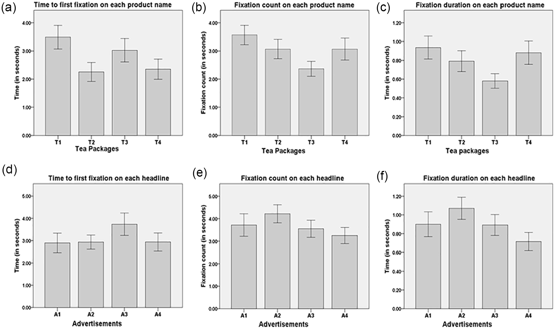
The data of the four tea packages are analyzed using repeated-measures ANOVA. The product name presents the main observed variances; thus, only the data for the product names’ AOI are analyzed. Table 1 presents the results of the participants’ time from the beginning of the Recording to first fixation in each AOI; that is, F(3,177) = 2.41, p > .05, partial
Summary Statistics of Observed Indicators on Each Product Name.

p < .01. *p < .05.
These statistical results indicate that the time to the first fixation on each product name in the four designs yields no significant difference.
The statistical results of fixation count on each product name are as follows: F(3, 177) = 3.89, p = .01, partial
With regard to fixation duration, there is also a significant difference between the four tea packaging designs, with F(3, 177) = 3.2, p = .02, partial
Estimated average values on each product name (a–c) and headline (d–f).
Eye Tracker for Advertisements
The data of the four advertisements are analyzed using repeated-measures ANOVA. Table 2 presents the ANOVA results of the participants’ time to first fixation on each headline, with F(3,177) = 1.02, p > .05, partial
Summary Statistics of Observed Indicators on Each Headline.

p < .05.
The results of fixation count on each headline show that the four advertisements are not significantly different, with F(3, 177) = 1.44, p > .05, partial
Figure 2 shows the ANOVA results of the three observed indicators—time to first fixation, fixation count, and fixation duration—on each headline for the four advertisements. As shown, the participants direct their first fixation on the beginning of the headline, followed by the subheading, and then the picture is rapidly skimmed.
Questionnaire Analysis
(i) Tea package product name preferences and reasoning: Data collected from the questionnaire are analyzed using the Nonparametric Friedman test. The favorite packaging is assigned a value of 1, while those not selected are given a value of 0. The test result, that is X2(3) = 19.842, p < .001, is found to represent the participant’s preferences for the product names on the four tea packages, with one being significantly different in preference. Moreover, the Wilcoxon Signed Ranks Test results are as follows: T2–T1, with Z = −0.302, p > .05; T4–T1, with Z = −2.058, p < .05; T4–T2, with Z = −1.768, p > .05; T3 is significantly different from T1 (Z = −4.2, p < .05), T2 (Z = −3.962, p < .05), and T4 (Z = −2.496, p < .05). These results indicate that T1, T2, >T4 > T3. That is, T1 (complete name) and T2 (lower-right part of name occluded) have no significant difference in the degree of preference, while T3 (upper-left occlusion) is the least preferred one.
We also find that several factors increase participants’ preferences. T1 is consistently being considered clear and comprehensible. T2 received comments favorably mentioning the following aspects: its sense of design, ease of recognition, esthetically pleasing quality, and specialness. Only two participants consider T3 to be recognizable and exhibit attractive esthetic sensibility. Lastly, T4 (occlusion on the right) is viewed as follows: the occlusion does not hamper character recognition and it exhibits a compelling sense of esthetics.
To determine which AOI among the product name, subheading, and picture is viewed the longest, we use the Nonparametric Friedman test to analyze the collected questionnaire data. The test result shows that there is a significant difference in the viewing times of each AOI, with X2(2) = 73.379, p < .001. In addition, the Wilcoxon Signed Ranks Test shows that product name > picture, subheading, signifying that the product name is focused on the longest and the picture the shortest. These results are consistent with eye tracker observations reported by Rayner et al. (2001). Reasons for focusing on the product name the longest include: it is interesting, more unique, beautiful, easier to understand, more liked, want to understand it more, see it clearer, want to see the differences, etc. Among these reasons, “want to understand it more” is stated 15 times, followed by “it’s easier to understand” 14 times, and “it is more unique” nine times. From the mean rank, it can be concluded that the fixation duration on the subheading is shorter than that on the picture. The subheading has a very small font size and is not easy to read, hence it can only serve as a foil.
(ii) Advertisement headline preferences and reasoning: Data collected from the questionnaire are analyzed using the Nonparametric Friedman test. The test results signify that, out of the four advertisement headline preferences, at least one is significantly different (X2(3) = 8.069, p < .05). The Wilcoxon Signed Ranks Test results are as follows: A2–A1, with Z = −1.915, p > .05; A3–A1, with Z = −2.556, p < .05; A4–A1, with Z = −0.801, p > .05; A3–A2, with Z = −0.688, p > .05; A4–A2, with Z = −1.134, p > .05; and A4–A3, with Z = −1.80, p > .05. These results show that there is no difference among A1 (complete headline), A2 (lower-right part of the headline occluded), and A4 (occlusion on the right of the headline) in preferences. Moreover, A3 (upper-left part of the headline occluded) is the least favored one.
The key reason why the participants prefer A1 is that A1 is the most comprehensible one among the samples. The reasons for selecting A2 include the following: it is visually pleasing, comprehensible, has an attractive design, it exhibits diversity but is still recognizable, it has a special quality and is recognizable (the most common response), it has an attractive sense of esthetics and is comprehensible, and it is more comprehensible than A3. As for A4, the participants express that it has an appealing sense of esthetics. As shown, participants consistently report that the headline of A1 is comprehensible.
To determine which AOI among the product name, subheading, and picture is viewed the longest, the data is analyzed using the Nonparametric Friedman test. The test results show that there is a significant difference between the AOIs with X2(2) = 45.895, p < .001. We further perform the Wilcoxon Signed Ranks Test and find that headline > picture, subheading. From the mean rank, subheading rather than picture is viewed for the shortest time. This can infer that a half-naked body with an occluded headline has more probability of attracting fixations than a small font subheading even though the picture is expressed with light-colored lines on black background.
The reasons for the longer fixation duration on the headline include: it is curious, special, beautiful, clear, want to understand it, simply prefer it, want to compare the differences, seem familiar, etc. Among these reasons, “want to understand it” is started 21 times and “it is special” nine times.
Discussion
The results of this study do not conclusively demonstrate that all occluded text on product packaging or advertising designs acts a cue which elicits visual attention and that attention alters viewers’ choice preferences. Specifically, the results for the participants’ time to the first fixation show no significant difference between the four tea packaging designs nor for the four advertisement headlines. An explanation for this is that when four test samples are displayed together, no matter whether one scans from right to left or left to right, visual attention is homogenized among the test samples, which may be a limitation of this research. But as tea packages on store shelves usually sit one next to another, and advertisements may also be posted side by side, this is not an unrealistic situation. In the beginning, the participants’ visual attention was captured by bottom-up stimuli, and then they started to look for the target of interest, that is, scan the objects repeatedly. This should be top-down processing.
Although there is no significant difference in the participants’ time to the first fixation for the four tea packaging designs; it can be observed that the average value of time to the first fixation on T1 (M = 3.49) is longer. This result shows that T1 is the least preferred one to attract fixation. Thus, it may be inferred that as the product name on the tea packaging consists of only two characters, when read quickly, it is easy to overlook, especially when the complete product name is present but there is no adequate information about the text. This finding is also reflected in the prior studies of Altarriba et al. (1996), Rayner and Well (1996), and Schustack et al. (1987). These studies mention that text that is predicted to be read quickly is often read quicker than predicted, but is easily skipped over.
Regarding both fixation count and fixation duration on each product name, when all four tea packages appear simultaneously, T3 has the poorest performance. The fixation count and fixation duration of T3 are significantly less than that of T1, T4, and T2. However, there is no significant difference between T1, T4, and T2. This result indicates that when the occluded text maintains identifiable features, it can be read quickly just like the complete text. This is especially true for a product name that is not complicated. On the other hand, characters occluded on the upper left (T3) are significantly more difficult to recognize since their initial strokes and radicals are occluded. The difficulty in recognizing the occluded text may lead to a decision of discontinuing reading at the instant of recognition.
When all four advertisements appear simultaneously, there is no significant difference between them for fixation count; however, A2’s count is slightly higher than that of A1. For fixation duration, there is a significant difference between the headlines on the four advertisements. The results of LSD Post Hoc Analysis are as follows: A2, A1, A3 > A4. Looking at the averages, eyes do linger longer on A2 than on A1 or A3. According to participants’ feedback, they want to comprehend the meaning of the headlines with occluded characters and compare the differences among occluded characters. In addition, A2 having a longer fixation duration maybe because of the meaning of the headline or a combination of occluded characters and an ambiguous metaphor image, or that it is a long and complex headline with nine Chinese characters.
This finding corresponds to the findings of previous studies: factors such as the amount of received information, the inherent complexity of a text, and comprehension level can affect fixation duration (Ahn et al., 2020; Mackworth & Morandi, 1967; Salvucci & Anderson, 1998). Moreover, participants compare A2 (which is obliquely occluded in its lower-right part) and A3 (which is obliquely occluded in its upper-left part). The occlusion orientation is likely the explanation for fixation duration being longer for A3 than A4. A4, which is vertically occluded in its right side, is much easier to read than A3 which is occluded on the upper left. It can be observed that incomplete text can increase the fixation duration that a particular advertisement receives, which confirms Hypothesis 1 in this study.
The results of preference for the tea packaging are completely aligned with those for fixation count and fixation duration. That is, the incomplete text of the tea packages does not receive a higher degree of fixation nor a higher like or dislike response than that of the complete text. This finding suggests that incomplete text applied to packaging logo design is acceptable to viewers. However, incomplete text that is difficult to comprehend should not be applied to a design. Such a preference is evidenced by responses to the questionnaire conducted in this study.
Among the four advertisements, A2 has the longest fixation duration. In terms of preference, besides the less preferred A3 (which is obliquely occluded on the upper left), both A2 (which is occluded on the lower right) and A4 (which is occluded on the right side) do not receive special preferences compared to complete text. Although Scherer (1988) suggests that preference is independent of current needs or goals, we suspect that participants’ preferences are affected by the purpose of use in the packaging and advertisement designs. This may be due to questionnaires carried out after the eye-tracking movement experiment in this study. Thus, participants have more time to consider the purpose of use in the designs. Thus it is likely that the experimental design impacts the investigation of the research question we posed.
The results of preference for the advertisement headline are not closely aligned to those of fixation duration. This suggests that preference is for the others that are readable even though the occluded portion of the text does attract the eyes. From this, it can be understood that preference and attention are not always aligned. This finding confirms Hypothesis 2 in this study.
Packaging and advertisement are both important tools in marketing. Packaging and advertisement must be able to attract viewers’ attention to their messages before they can further impact consumer behavior. Using occluded text as a visual cue and applying such a text to packaging and advertisement designs. It is for this reason that there is an increased emphasis on being more creative in attracting attention, as proposed by Hagtvedt (2011). Regarding Hypothesis 3: incomplete text applied in different media affects the focus of attention and choice preferences, the research results of this study are inconclusive. Similar responses on preference are found for using occluded text in the packaging and advertisement designs; however, there is some variance in the results of visual attention. Preference may be affected because these headlines have different numbers of Chinese characters or they have different purposes for media usage. These factors are worthy of further exploration.
Conclusion
This study explores whether occluded text can attract attention with its unique visual characteristics. Due to the fact that the experimental design places the four samples of packaging or advertising on the same screen, this likely results in no significant difference in enhanced viewer attention at first glance. Though this study has some research limitations, it does prove that occluded text has an opportunity to attract attention with its unique visual effects. Overall, the main finding of this study is that the eye-tracking experiment and preference questionnaire yielded different results, but both confirm that incomplete text, as long as recognition is not impacted, does attract the eyes to some extent. On the contrary, if occlusion results in the text becoming not easily recognizable, it is more difficult for it to receive attention or to be preferred. From a theoretical perspective, this study illustrated that the experimental design can be further developed to increase differentiation of the factors driving viewer attention and preference. The practical implication of the results from this study is that designers must carefully screen designs making use of occluded text to achieve the desired positive impact. By extension, these principles of occluded text can be applied to logo designs, advertising banners, book covers, and poster designs. Furthermore, the emotions elicited by applications of occluded text are also a topic worthy of follow-up research.
Footnotes
Acknowledgements
The protocol was approved by the Research Ethics Committee of National Taiwan University on June 20, 2017. The committee is organized under, and operates by, Social and Behavioral Research Ethical Principles and Regulations of National Taiwan University and relevant governmental laws and regulations. (NTU-REC No.: 201706ES001).
Declaration of Conflicting Interests
The author declared no potential conflicts of interest with respect to the research, authorship, and/or publication of this article.
Funding
The author disclosed receipt of the following financial support for the research, authorship, and/or publication of this article: This study was funded by the Ministry of Science and Technology of the Republic of China (Taiwan) (grant numbers: MOST 106-2410-H-130-042; MOST 107-2410-H-130-042).