
Abstract
This paper introduces the open-source Urban Belonging (UB) toolkit, designed to study place attachments through a combined digital, visual and participatory methodology that foregrounds lived experience. The core of the toolkit is the photovoice UB App, which prompts participants to document urban experiences as digital data by taking pictures of the city, annotating them, and reacting to others’ photos. The toolkit also includes an API interface and a set of scripts for converting data into visualizations and elicitation devices. The paper first describes how the app’s design specifications were co-created in a process that brought in voices from different research fields, planners from Gehl Architects, six marginalized communities, and citizen engagement professionals. Their inputs shaped decisions about what data collection the app makes possible, and how it mitigates issues of privacy and visual and spatial literacy to make the app as inclusive as possible. We document how design criteria were translated into app features, and we demonstrate how this opens new empirical opportunities for community engagement through examples of its use in the Urban Belonging project in Copenhagen. While the focus on photo capture animates participants to document experiences in a personal and situated way, metadata such as location and sentiment invites for quali-quantitative analysis of both macro trends and local contexts of people’s experiences. Further, the granularity of data makes both a demographic and post-demographic analysis possible, providing empirical ground for exploring what people have in common in what they photograph and where they walk. And, by inviting participants to react to others’ photos, the app offers a heterogeneous empirical ground, showing us how people see the city differently. We end the paper by discussing remaining challenges in the tool and provide a short guide for using it.
Keywords
Introduction: Why engage in digital toolmaking?
When researchers set out to study something empirical they make use of methods and tools that shape their analytical gaze. Thoughts, associations and arguments do not run freely—they are guided by the infrastructures through which we inscribe and visualize the aspects of the world that we intend to make claims about. When Latour (1986) once stated that we are “thinking with eyes and hands” he was exactly calling attention to the fact that the devices we use to inscribe and represent the world simultaneously frame the problems we try to solve. This is not least true when it comes to the creation of knowledge within the field of urban planning. In this context we have historically seen devices such as census tracts (Scott, 2020) and mortgage maps (Kurgan et al., 2019) functioning as vehicles for imagining urban futures and choosing among potential political scenarios. However, the results have often been to the disadvantage of those marginalized in society. This is why it matters who gets to design the empirical tools through which we make the city legible. No tool or method is neutral. They mediate the interests of their designers and the context in which they were built. They act as “epistemology engines” (Ihde, 2000) that enable particular ways of knowing that may benefit some and disadvantage others.
With that in mind, this article presents a digital toolkit developed during the Urban Belonging (UB) project which was carried out in Copenhagen in 2022. 1 Initiated by a collective of researchers from different universities and practitioners from Gehl Architects, the project set out to create more diverse insights about how the city works as a space of belonging for marginalized communities. Two of the central tasks for the project team were to a) design an app that could inscribe feelings of urban attachment among the diverse participants through the collection of visual data and b) invent data representations that could simulate relevant conversations among the participants. Whereas the Urban Belonging toolkit was designed in the context of a project inspired by the tradition of photo-voice, we believe its methodological affordances are of relevance to many empirical disciplines. For instance, it allows the researcher to move between the qualitative and the quantitative in novel ways. The UB App and the scripts in the associated toolkit are thus designed to be used in a myriad of ways, independent of how it was used in the Urban Belonging project. As such, this article focuses on documenting the toolkit as a piece of methodological innovation that hopefully inspires others. It does not aim to report in detail on analytical findings of the Urban Belonging project, which are the topic of other articles with a more empirical focus.
This paper documents at the technical level the key capabilities and affordances of the app, and contributes on a methodological level with discussion of the process of how the app was developed and designed in collaboration between various actors. First, we will introduce concepts from STS and participatory design as the theoretical lens through which we unpack the distinctive features of the UB toolkit. Second, we shall dive into the Urban Belonging project mainly to situate the app in the context in which it was developed and use the project as a case to describe the features of the app and exemplify some of what it can be used for. Third, we discuss its relevance outside the field of urban studies. Fourth, we touch upon challenges in the tool and provide an overview of the components of the open source tool repository that is published as a practical companion to this paper. The “UB App” is currently available for Androids and iPhones, in Danish, English, Dutch and Italian and it is published with the “UB toolkit”- a graphical interface that allows the user to customize the app and export a series of structured, malleable datafiles that each open different analytical opportunities. Also, the toolkit offers different visual outputs such as printed photocards and a datascape for data exploration.
Participatory Tool Design
The design of tools and methods never happens in a vacuum. The motivation to engage in tool making is often spurred by the realization that existing empirical infrastructure seems unfit to answer specific questions. In such a “problematic situation” (Dewey, 1910) it is not unusual that people agree on the deficits of existing tools and methods while having different perspectives on how to move forward. A we will explain in more detail below this was the case in the UB project where researchers, architects, professional urban planners and representatives from marginalized communities agreed on the diagnosis that urban planning currently has an engagement deficit and that there is a need for new (digital) methods for doing public participation. Nonetheless, these different groups formulated quite different design specifications when we had to design an alternative engagement method. This is not surprising because tools and methods are often materialized and stabilized through negotiations between actors with different interests and sometimes even different disciplinary backgrounds. As most other technologies their design bears the traces of the social groups that were invited into their construction (Pinch and Bijker, 1984). More often than not they are also built on an already installed technical base that sets specific constraints on the design (Star and Ruhleder, 1994).
This paper will frame the design as the UB toolkit as the result of such socio-technical processes where distinct interests and historical trajectories came to matter. Taking inspiration from literature such as “participatory design” (Brandt et al., 2012; Simonsen and Robertson, 2013) and “participatory data design” (Jensen et al., 2021), we will describe which actors we invited into formulate design specifications and discuss how this ultimately shaped the technical features of the tool and thus the empirical practices it affords. Drawing on work in “Design Justice” (Costanza-Chock, 2020), “Data Action” (Williams, 2020), and “Data Feminism” (D'Ignazio and Klein, 2020), we will pay specific attention to the involvement of communities that are rarely given a say in the design of digital democratic tools. Because we live in a world where decisions about urban futures are increasingly anchored in the datafication of publics, it is—in the words of D'Ignazio and Klein (2020)—important that we critically interrogate the power dynamics and mechanisms of exclusion built into tools that have implications for who is made (in)visible in cities. As combined frameworks, Design Justice and Data Feminism make clear that we need to involve heterogeneous perspectives in designing tools that are used to datafy urban life and urban problems. Building on such thinking, we designed the process of developing the UB app as a collaborative effort, which centers inputs from local communities, urban planners, as well as policy and citizen engagement experts from the city. In the coming part, we introduce the Urban Belonging Project and pay specific attention to the involvement of various actors in the design process, and unpack how they shaped the UB App and toolkit.
The Urban Belonging Project
The UB project grew out of a collaboration between researchers at Aalborg University and urban planning practitioners at Gehl Architects. Having previously worked together on developing methods for mapping urban political diversity through large volumes of data on Facebook (Madsen, 2022), the team noticed the need to learn more about people’s perception of urban belonging and gain specific insights into the perspectives of social groups that may not be visible in data found on social media. This was coupled with a desire for a more curated form of digital data generation than what is possible when data is harvested from external sources. As mentioned in the literature on digital methods, there is a risk that the use of data from commercial platforms guides the analytical gaze of researchers in distinct ways (Ben-David, 2020; Marres, 2012). Instead, we wanted to build a digital tool that re-locates the agency of data collection in the hands of researchers and the people under study. We wanted to build a tool that could translate the perspectives of marginalized groups into the machinery of urban planning, empowering citizens to show the city from their view (see example of participant in the UB project using the app in Figure 1).
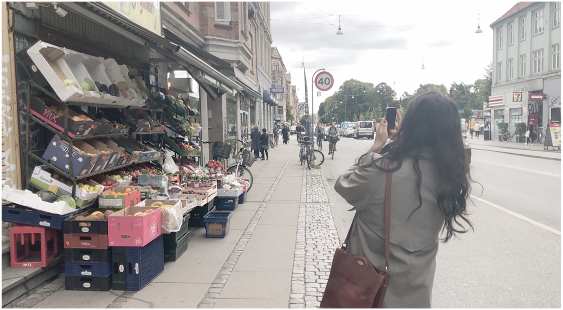
Participant in the project taking a picture with the UB App.
From the outset we took inspiration from a variety of photo-based methods that in one way or another have put the practice of image-taking at the heart of their empirical practice. An example is the decision of Boal (2014) who distributed cameras to residents in a low-income neighborhood in Lima, as an experiment in centering participant-produced images in urban analysis. The choice to hand the representational “means of production” over to community members (Gubrium and Harper, 2016) opened for a type of engagement that we felt could mitigate the identified engagement deficit in urban planning. With this outset we scanned for existing open-source tools that we could develop further. We found “Snappthis!” (Ten Brink et al., 2016), 2 an app which already contained the ability to take photographs and see and react to images by others with a straightforward like or dislike. Snappthis! came to act as our “installed base” as the UB App took inspiration from its code, and similarly offers itself up as open-source on GitHub.
As shown in Figure 2, the translation of Snappthis! into the open source UB toolkit was not done by us in isolation. Drawing on the abovementioned literature on participatory design, we invited distinct social groups to formulate the design specifications that ultimately shaped the toolkit. Besides the already mentioned Copenhagen-based researchers and planning practitioners these groups include the Visual Methodologies Collective in Amsterdam, public engagement professionals and participants from relevant community organizations that represent the marginalized voice that we wanted to learn from. How each set of actors shaped the UB App is summarized in Figure 2 and explained in detail below.
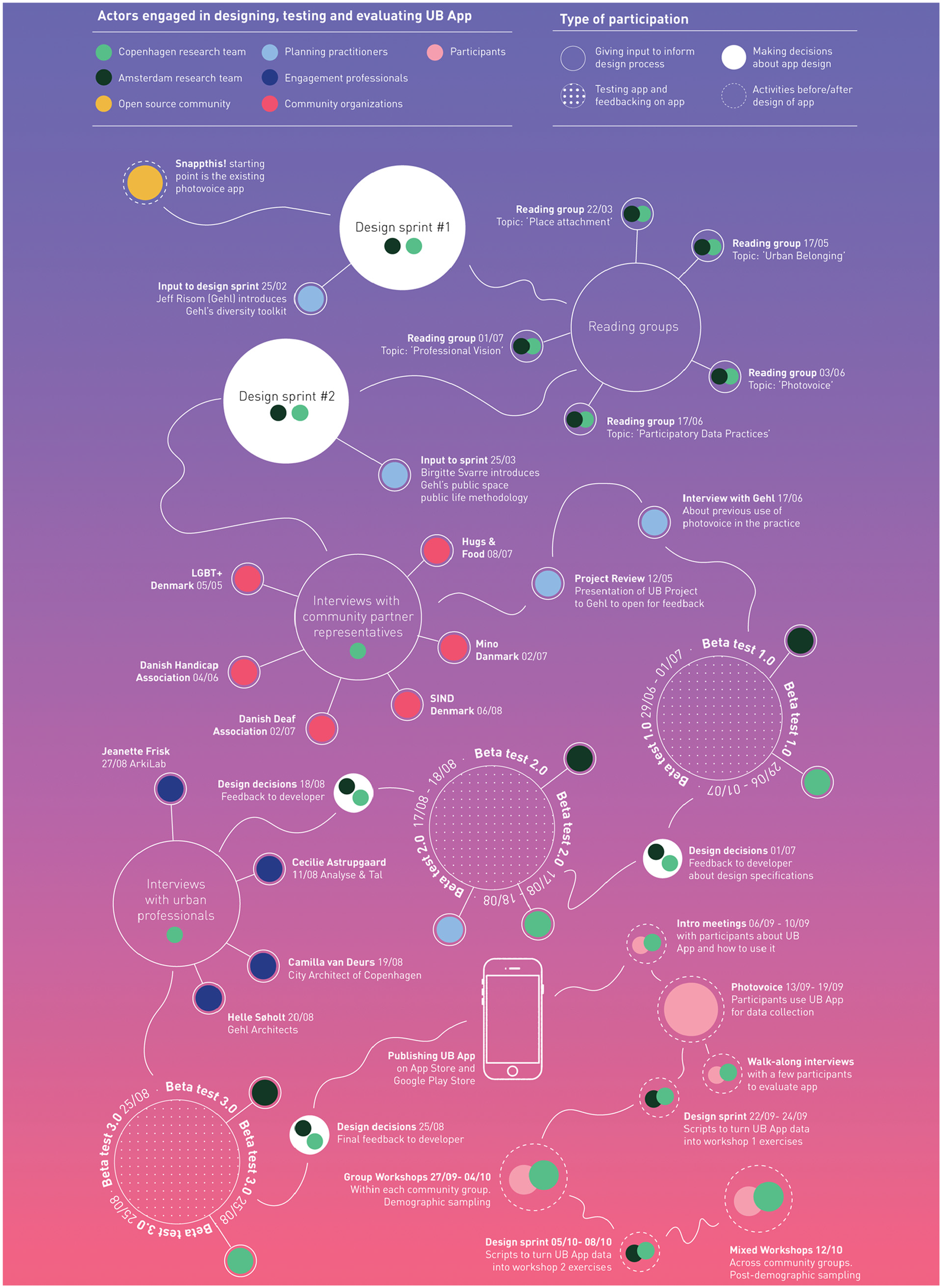
Overview of participatory moments in the UB App design process, indicating who was involved in different stages, as well as what sort of participation the different actors engaged in.
Design specifications form researchers
The Copenhagen-based researchers and members of the Visual Methodologies Collective in Amsterdam—the authors of this paper—assumed a coordinating role in the development of the toolkit. Throughout the process we were doing interviews, collecting feedback, reading relevant literature and translating inputs from the different groups into design decisions. With another concept drawn from STS, one could thus say that we were the “obligatory passage point” (Callon, 1984) that every idea or interest had to go through to influence the design of the app and the accompanying scripts. As is evident from Figure 2, the initial parts of the process were heavy on our involvement (the green and black dots). To begin with, we met virtually for an initial design sprint with the aim to clarify our respective interests in the affordances of the toolkit. Before the sprint we got an introduction to the existing state of Gehl’s tools for studying public space and public life. In the sprint we used this knowledge as a backdrop to identify distinct analytical sensibilities from our own work with digital- and visual methods that would supplement the tools that planning practitioners had already at hand.
From the tradition of digital methods, we took inspiration from the idea that there is no need to reproduce methodological separations between qualitative and quantitative data when working with digital tools. On the contrary, we discussed how separation has prevented urban sociologists from capturing the full complexity of urban issues and we wanted a tool that retained complexity by allowing “quali-quantitative” movements between overviews and contexts in data (Venturini and Latour, 2010). Another inspiration we took from digital methods is the possibility to use the granularity of digital data to look at urban life both through a post-demographic lens (Rogers, 2013). Whereas most urban analyses interpret social groups through demographic traits such as gender, age and income, we wanted to design a tool with methodological flexibility to group participants on such demographics as well as post-demographic traits such as shared urban experiences. Recently, some of us have introduced the concept of “soft city sensing” (Madsen et al., 2022) as a headline for empirical projects that aim to bring some of these methodological insights to the field of urban studies. The UB toolkit can thus be understood as contributing to this methodological agenda.
From the tradition of visual methods we took inspiration from the insistence on putting the practice of photo taking at the center of empirical research. Photo-based methods are known to be productive ways of capturing place attachments from a citizen perspective (Stedman et al., 2014) and opening up phenomenological inquiry into lived experiences beyond what people are able to put in words (Plunkett et al., 2013). More specifically, we decided to design a toolkit that would afford using the captured photos and their associated metadata as elicitation devices to stimulate qualitative conversations. A choice that was also inspired by Pink et al. (2016) who shows how digital ethnography and “learning through the hand” are useful ways of empowering people to document their experiences. Our ambition was to make a sort of participation possible that mimics this. One of the design specifications emerging from the first design sprint was thus the need for procedures for feeding the captured photos back to the participants in order to enable them to interpret the data. The choice also fits with more general findings by scholars like Halegoua (2020) and Manovich (2020) who have both shown that digital and visual media are a ubiquitous part of contemporary urban experience and how we build emotional attachments with(in) urban environments.
Between the first and the second design sprint we held dedicated reading groups on “place attachment” and “urban belonging” in order to translate central concepts from these literatures into the design of the app. One design specification that was later developed with references back to these readings was the need to offer the participants a set of predefined tags that in combination captured the various ways “belonging” and “attachment” have been conceptualized in different strands of theory. From Scannell and Gifford (2010) we took inspiration from the idea that people can be attached to urban places for both physical and social reasons. Accordingly, we ended up offering the participants the possibility to tag their photos with social tags such as “culture” and “people/community” alongside physical tags such as “architecture,” “objects” and “wind/weather.” Reading Bennett’s (2014) thoughts on the role of “memories” in belonging similarly inspired us to dedicate a tag to this specific form of personal experience. However, the final choice on tags was not settled until after we had conducted interviews with the group of urban professionals and the community partners representing the marginalized communities we ultimately wanted to involve and give a voice. Nonetheless, the literature on digital methods, visual methods, place attachment and urban belonging arguably set the scene for the production of the toolkit from the beginning.
Design specifications form urban professionals
We seeked out inputs from planning practitioners at Gehl Architects at several stages in the design process (the blue dots in Figure 2). One motivation for this is that we see a tendency for digital research tools to be developed within a polarized industry/research dichotomy: While many tools within digital humanities—such as TCAT (Borra and Rieder, 2014)—are developed within academia, software like Google Vision AI, Clarifai are developed proprietarily among commercial industry actors. This means that few tools are developed through collaborative efforts in ways that may bridge research with practice. As a partner in the UB project, Gehl gave interviews about past experiences with photo-based methods, through which we learned that a challenge for them relates to how unstructured the data coming out of it can be. Gehl’s planners and anthropologists also took part in beta-testing the app, emphasizing the need for the app to produce geolocated data to inform the types of questions they work with. We had designed the app to geolocate photos, but it was development-intensive—and provided new privacy issues—to also track the routes that people walk when taking photos. Because of that, and in prioritizing between other features, we had first suggested not to include route tracking but ended up prioritizing it higher, because Gehl insisted that the tool would be more useful for practitioners if it also captures how participants move in between photo locations. Having different voices involved thus shifted the design priorities in a productive way, making the app useful to more types of urban research.
The design process also involved interviews with the City Architect of Copenhagen Camilla van Deurs, Gehl Architect’s CEO Helle Søholt, Jeannette Frisk of ArkiLab, and Cecilie Astrupgaard of Analyse & Tal, who all work professionally with community engagement in Copenhagen. Together, they could tell us about how engagements are carried out in Copenhagen, and answer questions about blind spots in those processes. One of blind spots voiced was the tendency for urban professionals to understand urban problems through a limited set of frames. For instance, in Gehl architects there is a tradition of studying public life with observation methods (Gehl, 1987; Gehl and Svarre, 2013), imposing a particular “professional vision” (Goodwin, 2015) on the city. An interview with CEO of Gehl Architects informed us how this gaze misses out on knowing lived experiences:
“We are all limited by our own experience. I cannot see how the city looks from your perspective, and that is why we need new processes and tools that help us step into each others’ lived experience.”
The UB project sought to unsettle this by innovating an empirical toolkit that would better equip the practitioners to see the city through the eyes of citizens. This was the motivation for inviting people to document their urban experiences through photography. From the interview with Jeanette Frisk we got the additional important insight that the documentation of these experiences should not just flow from the participants to the facilitators of the engagement process, but be shared among the participants:
“The important thing is to make people interact. It’s not enough to hear the alcoholic say what he wants, and hear an LGBT+ person say what they need. We must expose people in engagement processes to how others see the city so we create understanding of how we have different needs”– Jeanette Frisk, Arkilab.
The resulting design specification was that the UB toolkit should expose participants to each other’s photos. The interview motivated us to implement a reaction phase in the UB App where participants could also add metadata to each other’s photos. This meant that the user of the app would not exist in his or her own silo but rather have a networked experience with the other participants already within the app. This was something we had already given priority in order to enable the kind of relational and post-demographic analyses suggested in the digital methods literature. The choice to inscribe the relation between participants through these reactions was also a way to materialize a distinction “I-narratives” and “we-narratives” that we encountered in the reading group on place attachment (Duff, 2010) in the beginning of the process. As we will see later, the reaction feature makes it possible for participants to group around shared “we” experiences emerging from their engagement with others’ content.
Design specifications from community organizations and project participants
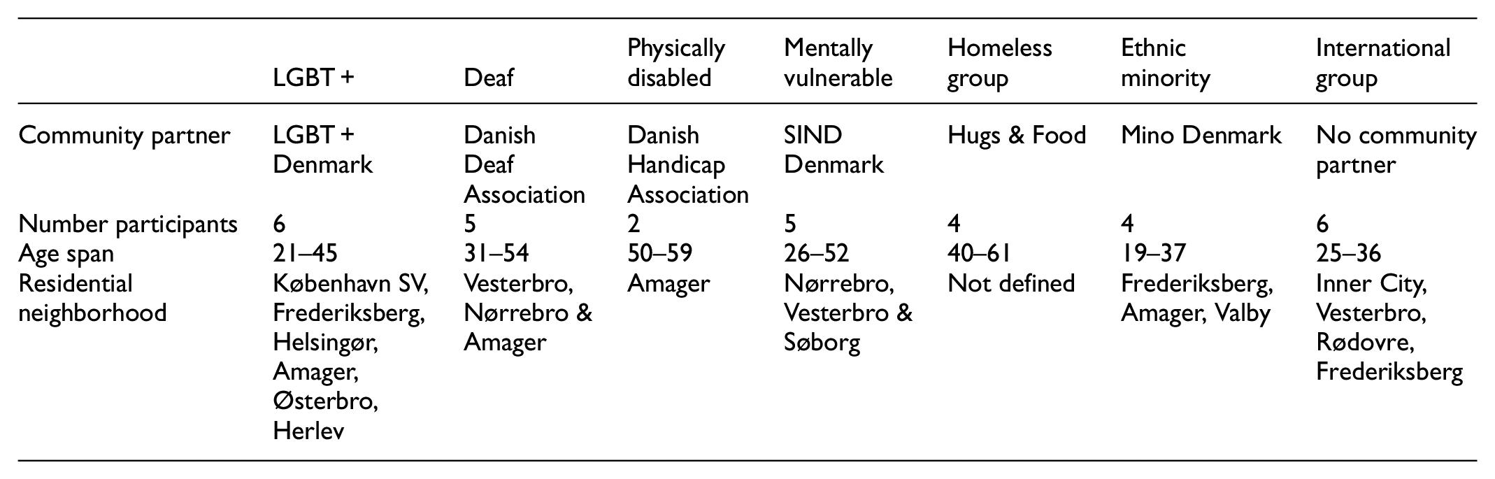
It has recently been suggested that formats like citizen assemblies and hearings are often inaccessible to people at the margins (Kahila-Tani et al., 2016). This issue was also brought up in the interview with Camilla van Deurs who questioned the diversity of the people attending urban engagement exercises. In the Urban Belonging project we tried to mitigate this problem by inviting seven minority groups in Copenhagen to be a part of the study. In choosing those groups we followed a “maximum variation” (Flyvbjerg, 2006) sampling strategy where we searched broadly for groups who had expressed feelings of being marginalized as part of their life in Copenhagen. We ended up including LGBT+, deaf, ethnic minorities, mentally vulnerable, physically disabled, international expats, and or houseless (in our project this group self-describes as “homeless,” which we will refer to them as). To build on existing communities in the city, we decided to approach each group via a local organization that represents the group’s interests. This was important, since our process was designed around the idea of letting local organizations sample participants, building on their existing relationships of trust with the community members, and also having existing knowledge about each group frame the design of the app.
While this ensured that community partners could inform the app design to make it more inclusive it also had the obvious downside that we did not work with marginalized groups who lack organized political representation. Aside from the seven groups who were enrolled in the project, it should also be noted that we additionally asked local organizations representing elderly, refugees, trans people, specific political youth organizations and the Jewish minority to be community partners in the project. While some did not respond at all, others responded that they did not have the resources at the moment to take part in the project. Sampling was thus also guided by an ethos of pragmatism, and the groups that we ended up working with are groups for which a community organization agreed to sign on as a project partner.
We worked together with each organization on sampling two to six participants among their community, coordinating to use their social media channels and newsletters to send out participant invitations. The requirement for signing up as a participant was that people self-identify with one or more of the invited communities and live in Copenhagen, or spend at least 3 days in Copenhagen weekly. To our surprise, however, we had a lot of people signing up, who identified with one of the six marginalized groups, but who did not speak Danish. Since enough people signed up to form their own group, we decided to adjust the initial sampling and create a seventh group in the project with “internationals,” who have in common that they have moved to Copenhagen from another country and speak English, but not Danish. These participants would be the only group in the project that we did not mix with other participants in the project, due to the language barriers that made it impossible to get a sign translator to translate between spoken English, spoken Danish and sign language. In total, we had 32 participants sign up for the project. They range in age from 19 to 59 years. Some have just moved to the city, others have lived there their whole lives. Geographically, they live in different parts of the city with zip-codes ranging from central Copenhagen and the big boroughs to neighborhoods further out from the center. To showcase this, an overview of demographics within groups is seen below:
In the onboarding of organizations as partners, we carried out interviews with one or two front-persons from each group. In these interviews we asked questions like: What are barriers for your community to take part in citizen engagement? When and why does your community feel they have a voice? How do we make photo-based tools accessible? Through interviews, we let local insight about each community give input to the app design process- not on the app itself, but on what it should be able to do. It was, for instance, important to hear how difference in visual literacies was highlighted as an important issue to address, as exemplified below.
“Homeless people are used to using smartphones and taking pictures, but I don’t think they use Instagram and are as trained as other people in making photos look a particular way”—Hugs & Food representative
“The deaf community is a highly visual culture. But if you want people to also document the bad things in the city, you should make sure that people don’t feel pressure to take ‘good’ photos”—Danish Deaf Association representative
An important learning from this was to design the app to “level the playing field” between participants from these communities by leaving esthetic-centric features out of it. It therefore does not contain editing or filtering options that people know from social media like Instagram, where they can edit photos before uploading them. Decisions were also made to standardize photo capture to a square format and prevent upload of images from the library, as we shall get back to. Further, through our interview with the Hugs & Food representative we became aware of potential hardware divides:
“Not all homeless people have phones, or might have old phones. So you might have to lend them phones. Also, most homeless people are scared to even tell us where they sleep out of fear that the police will find out and kick them away. If you want to track people, you need to convince them that it is safe”.
To mitigate the hardware divide it became a priority that the app works on older phones. We also learned from this that trust is key if we expect participants from these communities to submit data. This informed decisions to make the app as transparent as possible, making it clear for each participant how and when data is being collected, and to give participants control over when tracking of their movement starts and ends.
The issue of trust, however, also relates to how visible participants are within the app itself (something we also discuss at the end of this paper). Thinking about this led to the decision to create an option to sign up in the app anonymously with pre-generated user-IDs as an alternative to signing up with email. Further, it affected a decision to make a collective view of all photos available in the app, without it being possible to see who took what photo. Interviews with community representatives also informed us of differences in spatial literacy, which made it important to design the “walking mode” to display a map with a blue dot that helps people locate themselves. Finally, we learned that we should design an app that can capture both negative and positive experiences, as expressed by the Danish Disability Association representative:
“We are used to thinking only in negatives and how the city does not work for people with disabilities. It would be truly new, if we got an invitation to map our positive relationships to the city, and why we like to live in this city. No one shows interest in that.”
This informed decisions to create an open prompt and an annotation that asks people to ascribe sentiment to an image from a range of negative to positive.
The UB toolkit & it’s distinctive features
The participatory process described above resulted in the UB App being designed with the ambition to make participants experts on how they experience the city, while creating a data infrastructure that is visual, quali-quantitative, geo-located, relational, and protects privacy. The chart in Figure 3 shows how the specifications requested by the different actors impacted the design of the concrete features in the app and the toolkit. The figure thus gives an overview of “core functions,” “data infrastructure,” “interface UX/UI” and “conversion scripts” in the UB toolkit and how they relate to the specifications described above. Whereas the previous section outlined the design specification sourced from different actors, the next section illustrates how these were translated into design features and functionalities in the app.
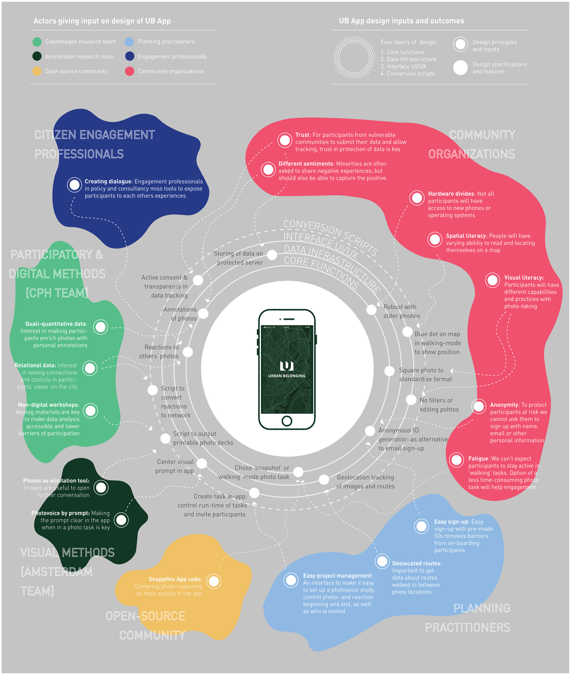
Summary of inputs that have shaped core functions, data infrastructure and interface of the UB App and the conversion scripts accompanying it in the UB toolkit.
Image capturing and annotation
The first and most important feature of the UB app is that it invites participants to take and annotate pictures. The images below exemplify this part of the UB-app interface.
To the left we see the interface for taking pictures (Figure 4). It is quite simply a camera with the prompt “take a picture of a thing/place/situation in the city that you want to share.” We designed the prompt to be broad and open in its formulation to not determine a priori what participants should take photos of, but invite them to capture what matters to them. We also deliberately left the prompt neutral to invite participants to share both positive and negative experiences. At the same time, we learned from beta-testing that the prompt should always be visible in the moment of picture taking to help the participants to remember the context of their photo task. Hence, the prompt is displayed above the photo-capture button in the final version of the app, as visible in Figure 4 above. By adding a zoom function and the possibility to flip the camera, we tried to give participants the flexibility to position themselves in space as they want.
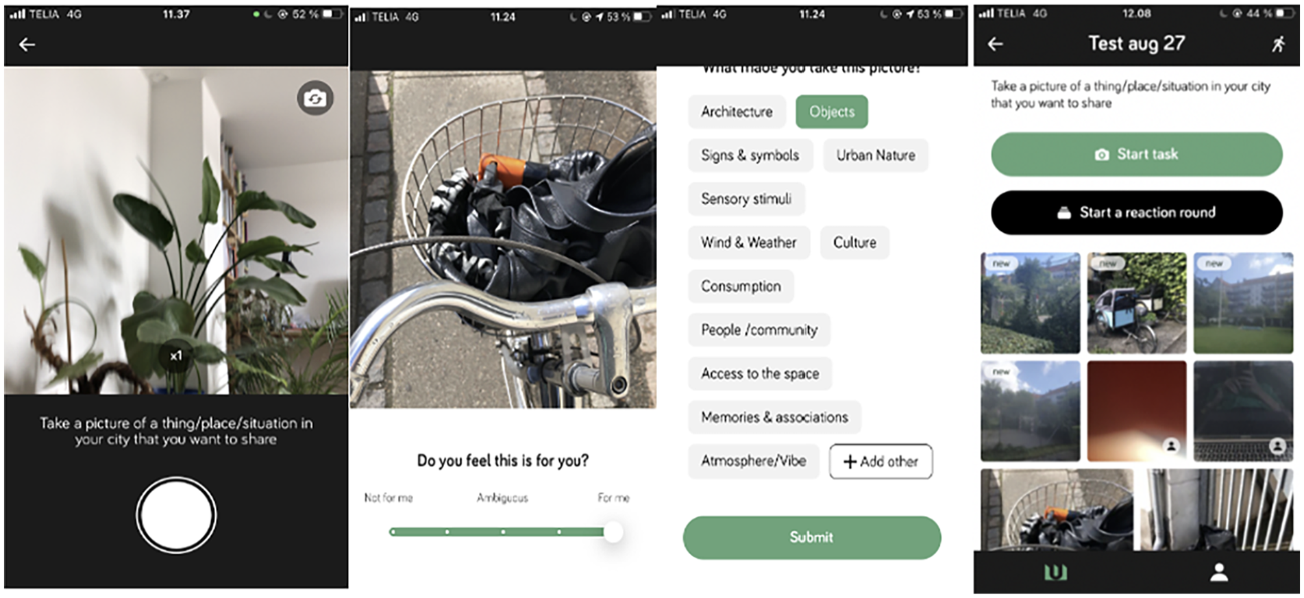
The flow of taking and annotating photos.
To mitigate differences in visual literacy and “level the playing field” among participants, we put constraints on the activity of picture taking. For instance, it is not possible to put filters on the images or post-process them in any way. The reason for this is to avoid visual hierarchies between participants who are more or less skilled at this, as we see on platforms like Instagram, which is known to be saturated by esthetic economies (Manovich, 2020). Also, the participant can only take images in a square format, which produces an evenly sized and standardized set of images where no one stands out (Figure 7). The app also does not allow upload from image library, which ensures that people have taken pictures only within the timeframe of the study, and encourages a more raw in-situ photo that is off the moment and cannot be staged in the same way as when you take a series of pictures and decide later which to upload.
After submitting an image, the participant is taken through two distinct annotation interfaces that each prompt them to enrich the image with relevant metadata. The first annotation comes in the form of a 5-point slider (Figure 5). In our project we used this to gauge the sentiment behind the image, by asking “do you feel this is for you?.” We wanted to give the participants the possibility to portray both positive and negative experiences in the city while also providing the opportunity to be ambivalent about the place, thing or situation captured in an image. This was important because place attachments can just as much be a function of negative experiences as positive ones (Duff, 2010). The second annotation came in the form of a set of pre-defined tags (Figure 6) that the participant can use to answer the question “why did you take this picture?.” In our project we chose a collection of tags that covered different theoretical perspectives on what might generate feelings of belonging and place attachment. Some focus on the physical aspects of cities (Scannell and Gifford, 2010), and we therefore included tags like “objects,” “nature” and “architecture.” Other theories focus on social relations or individual experiences (Di Masso et al., 2014; Relph, 2006), and we thus included tags like “humans,” “symbols” and “memories.” Most importantly we designed a tag named “other” that gives participants agency to define their own tag when the predefined tags are insufficient. This tag ended up being heavily used in the UB project. Extending the project’s participatory ethos, this was an important methodological choice proving that an “other”-category can encourage co-creation between researchers and participants through bottom-up discovery of what annotations make sense to those using the app to document their experiences. The open source version of the app is flexible in the sense that these prompts and tags can be tailored to the specific project one wants to do.
Granular data through geo-tracking and timestamping
Before the photo-capture moment just described, the participant has to choose between two types of photo tasks. One is “to take a picture” in snapshot mode, and the other is “to go for a walk” (Figure 8). A reason for offering both options was that we want participants to decide about the extent to which they are tracked when using the app. When choosing the first option the app will geolocate and timestamp the images captured, whereas the option to go for a walk will start a continued tracking of how the participant moves around the city while taking photos. Guided by the principles of privacy-by-design (Cavoukian, 2009) we decided to make this choice visible as a pop-up dialog (Figure 9) and designed the interface as a recognizable map, where a blue dot tells the participant where they are currently positioned (Figure 10). Finally, before submitting the walk the participant is asked to name their walk and is given the option to see the walk on a map and what pictures have been taken (Figure 11). This dialog ensures transparency and lets the participant understand what data they are submitting.
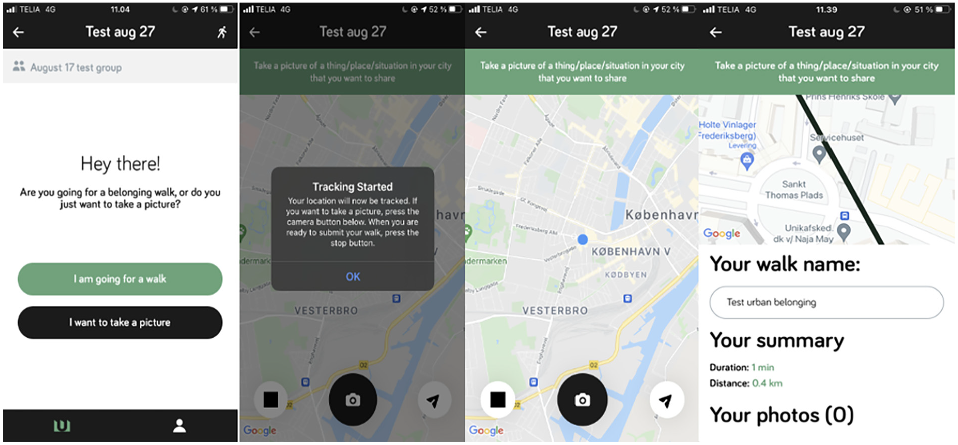
From starting a walk, consenting to tracking, to active photo-task, and submission of walk.
While geo-tracking in walking mode only happens if participants consent to it, it is impossible to completely opt out of any form of tracking. In the snapshot-mode the app automatically collects metadata about the time and place an image was taken, which means it is still necessary to inform and make agreements about consent and data ownership outside of the app. The app simply gives participants control over when to start and stop tracking of movement, and prompts them to actively see and think about what data they submit. After ending a walk and seeing the data overview (Figure 11), participants can choose to submit, or delete the data.
Relational data through reaction rounds
Aside from the geospatial metadata, we also wanted to be able to study relations between the participants. Instead of seeing each participant as an isolated actor, we wanted the app to give them the possibility to interact with each other’s pictures. We call this the reaction round.
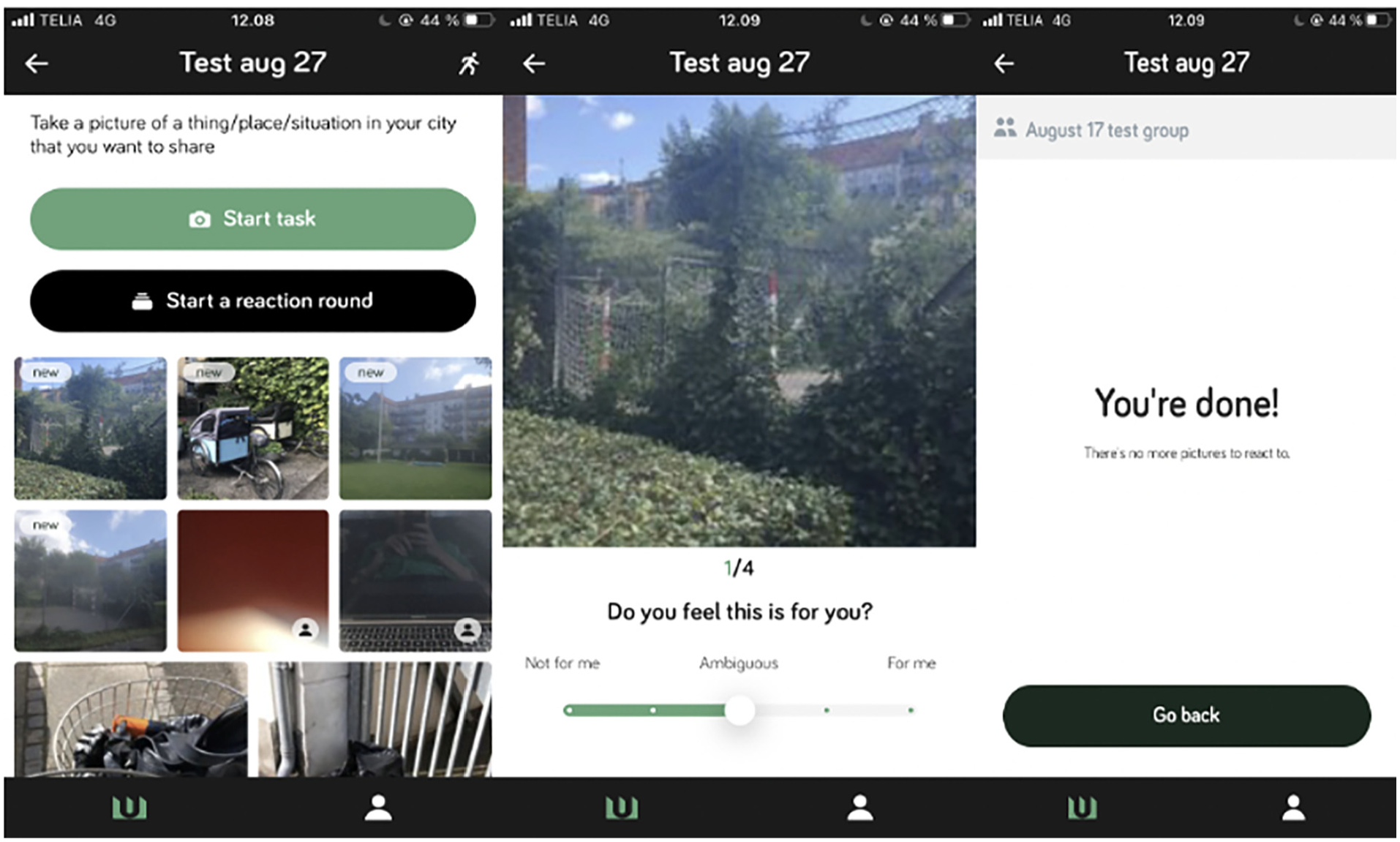
As we will see later the relational traces emerging from this affords studying the participants as a social network, rather than actors in a spatial grid, as it makes possible to study for instance how people who have shared or different sentiments about the same photos. In the app, a participant can “start a reaction round” (Figure 12) which will expose them to 20 randomly selected photos taken by other participants. They are then asked to annotate them with the same two annotations they used on their own photos (Figure 13). In the Urban Belonging project, we exposed participants to 20 pictures in each reaction round in order to make it a manageable task to do in 5 minutes. When participants have reacted to the 20 pictures, the task is done (Figure 14). If there are more pictures, it is possible to request a new batch of 20 images and this can continue until the participant has reacted to all photos.
The reaction round in the UB app.
In feedback on using the app, one participant stated that; “It was actually really fun to go through the photos others had taken,” and another told us that “seeing other people’s pictures made me realize how differently we see the city.” The reaction round is in this way more than just data collection. It also creates a collective, reflective moment. A design feature that was explicitly suggested by Jeanette Frisk of Arkilab, who emphasized that “[…] there can be great community building potentials in facilitating that people are exposed to each others’ experiences.” Using the reaction phase might in itself produce place attachments and feelings of belonging (the thing it sets out to measure), as using the UB App made our participants reflect on their relationship with the city. The integration of the reaction phase in the app comes with an important methodological choice for the researcher about whether one wants the reaction round to run simultaneously with the photo phase, or to open it only after participants are done taking pictures. This brings us to mention how the app affords an “administrator” role, which enables you to set up a study.
Customizing the toolkit via the admin dashboard
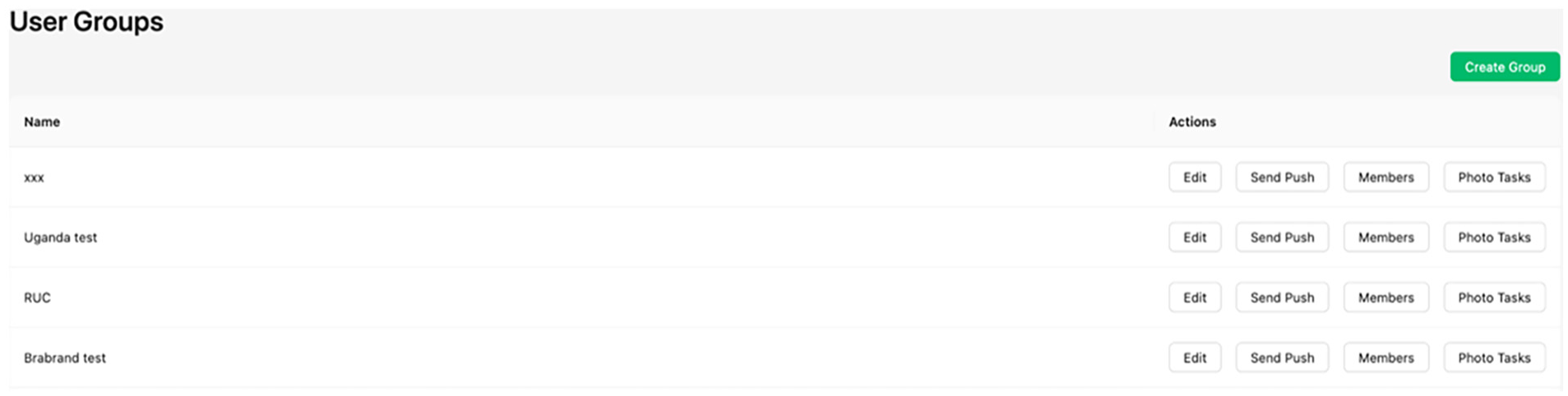
People who are assigned the role of “administrator” of projects in the app will get access to a graphical user interface that we term the “admin dashboard” (Figure 15). This dashboard can be opened in the browser and will list all the projects of which the user has admin rights and offer the option to create new groups. This might be relevant if a study has different groups, and you do not want participants to see each other’s photos across these groups, or if the timeline for photo tasks should look different for different groups in a study. Once a group has been created, administrators can invite members via an email address, or by usernames that can be auto-generated and handed out to keep participants anonymous in the app. For each project the admin can edit the set-up, manage translations, send push-notifications to participants, delete/add members and create new photo tasks. It is also possible to assign specific metadata to each participant if this is relevant for the subsequent analysis.
The opening view of the “admin dashboard” where admins can manage and customize their UB projects.
After creating a group, administrators can add a photo task, which will prompt them to decide the start and end time of the photo phase as well as the reaction phase and the specific questions that the participants will answer (Figure 16). As mentioned, it is important to decide if photo- and reaction-phase should be separate or overlap. In our project we chose to keep them separate because we did not want the participants to be affected by seeing each other’s pictures, while still documenting their own urban experiences. When the participants are not just exposed to their own images they begin to take notice of the content of the other images and this will potentially affect their own picture taking. This can be a methodological potential or a problem depending on the research context.
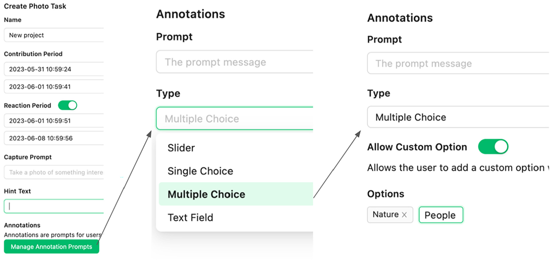
Example of a “photo-task” generation where it is decided that the period for contributing photos is before the reaction phase and that the participants can tag their photos with a multiple choice between “nature,” “people” or a custom user generated tag. This interface makes it possible to customize the tool to various projects.
Data outputs and analytical affordances
Developing the UB App, we wanted to create a tool with flexibility in what research questions and processes it can lead to. We have therefore designed the dashboard to create a variety of empirical outputs that can be used to study urban issues from different angles, such as temporal, spatial, relational, demographic and post-demographic questions. These outputs are also available with one click in the “analytics section” of the admin dashboard, where the admin can also follow the number of photos, reactions and walks from each user in real time (Figure 17).
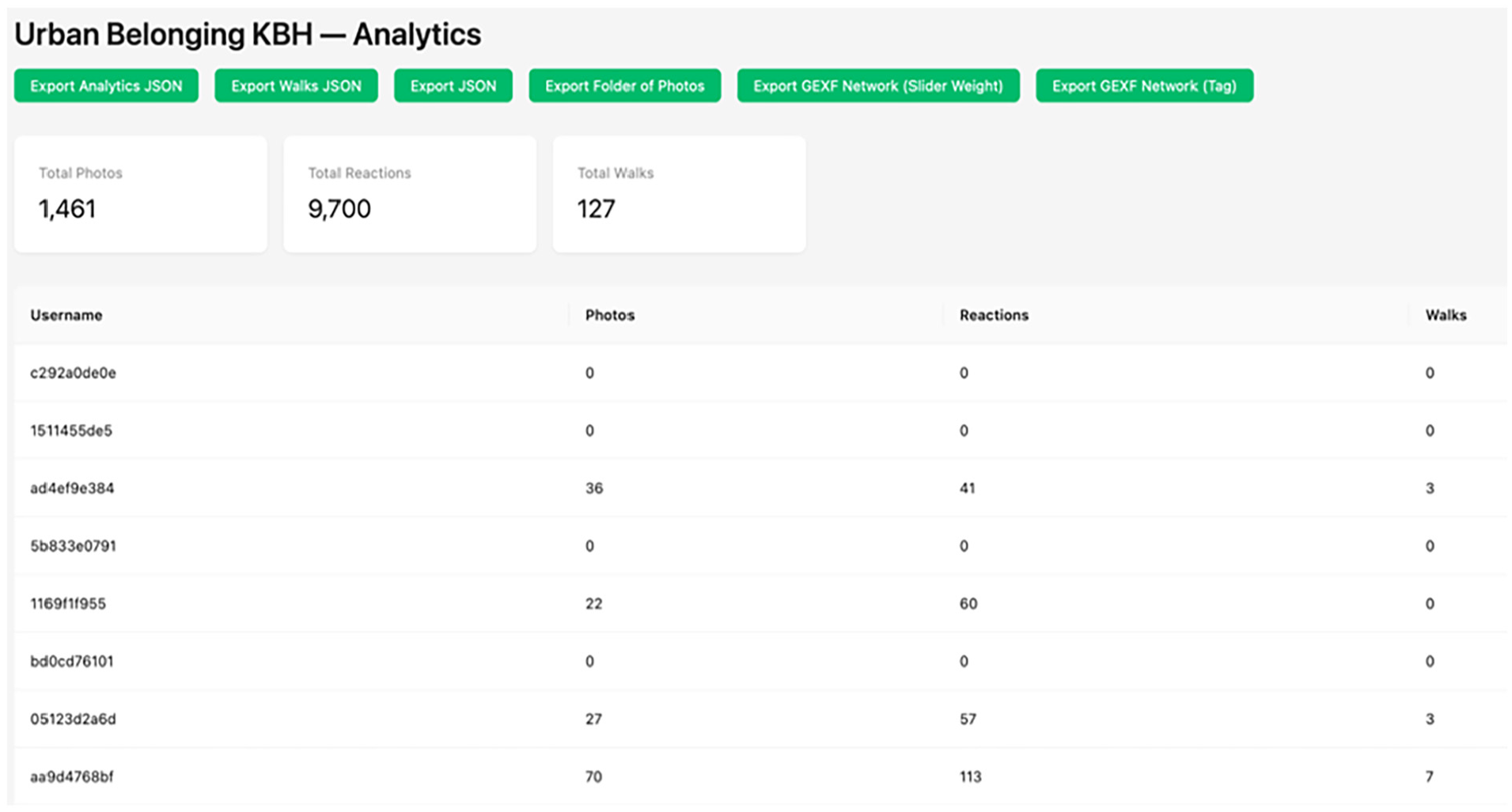
Example of the analytics interface where the admin can follow data collection in real time and export data in different formats.
The raw output of the app can be exported in JSON-files that opens itself up to many different analytical translations. To enable just some of them, we have created the following additional outputs. A folder of photos that organizes the images of each participant in dedicated folders. A csv-file that lists the images as rows and selected metadata as columns. Two outputs in gexf-format that affords doing network analysis of the data. A set of PDF files that makes the images available as “playing cards” with annotations printed next to them. Finally, the admin-dashboard allows the user to customize a datascape that allows participants to explore visually and use the metadata as filters. This datascape is part of the participatory ethos as it delivers data back to participants in interpretable format through public urls that can also be embedded in web-sites for communication purposes.
In this section, we introduce some analytical potentials in these outputs and demonstrate how a combination of the UB toolkit and other open-source software might open for creating outputs that are either analytically informative or—as in our project—can be used in workshops with participants. Note that we only present potentials that can be leveraged with open-source tools, as we intend the UB App and data output to be accessible without proprietary tools or advanced coding abilities.
Visualizing images and annotations
As part of the UB toolkit, we have created scripts that make it possible to put images in the center of the analytical exploration. For instance, this is possible with the csv-output. A tabular file, with a row for every image and metadata describing annotations, location, timestamp and other characteristics of each image. Below we illustrate two ways in which images can be the center of visualization. Figure 18 organizes the images visually based on the annotation category they received by participants in and charts them as montages with ImageMagick, whereas Figure 19 uses machine-learning to order them by color. There are many possibilities for processing images with AI, and plotting them in a two-dimensional space based on similarity in visual content can for instance be done with t-SNE or UMAP models like PixPlot, or Visual Network Analysis (Thorsen and Astrupgaard, 2021).
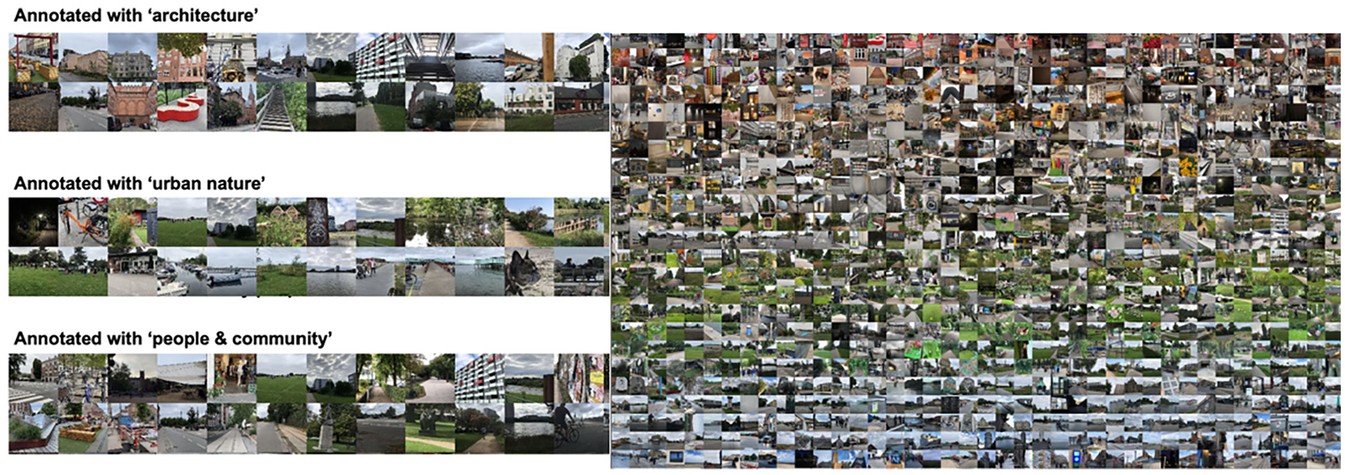
Montages of images from the UB App sorted by annotation category (left) and colors (right).
The UB project, however, was premised on making participants meet in workshops and using images to elicit conversation about individual and collective experiences. To enable this, we designed two outputs that gives participants access to their own images in an analog format. One takes the raw output from the app and produces a digital folder for each participant’s images. The other outputs pdf-files for each participant with a deck of images and annotations (Figure 20) that can be printed.
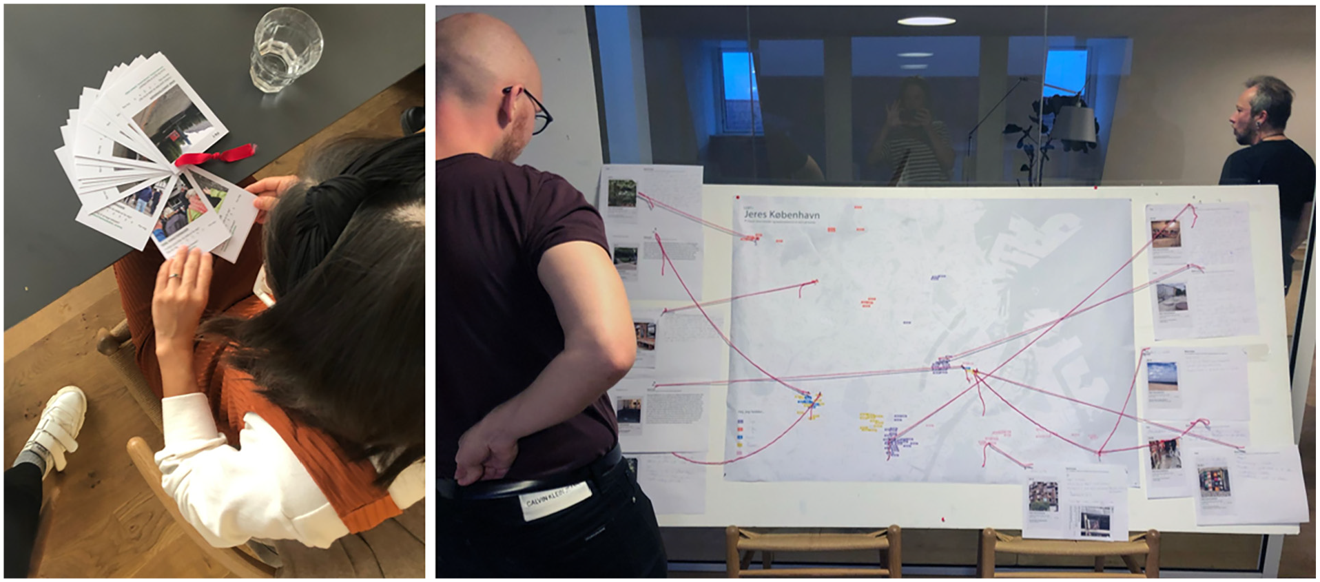
The deck of cards and their use in a participatory process as elicitation tools.
In our project we used this as a physical prompt to help participants remember the images they had taken, and designed a workshop exercise (Figure 21), where they were asked to select two images, give them a title and a story, and place their stories on a collective map. This image analysis could be much more systematically approached by invoking, for instance, the “interpretive engagement” framework (Drew and Guillemin, 2014), or the “SHOWeD” technique (Wang and Burris, 1997), which are precisely formulated to support meaning-making of participant-generated visual images and overcome inclusively challenges in such interpretative practices (Cluley et al., 2021).
Visualizing spatial patterns
As the csv-output provides the latitude and longitude for each image we can also use it to visualize the geolocation of all images in open-source software like QGIS (Figure 22). The metadata in the csv-file further opens such cartographies up to coloring the map in different ways as exemplified in Figure 23, which displays images as a pie chart of annotations ascribed to it in the reaction phase, opening questions about where people take photos of different things.
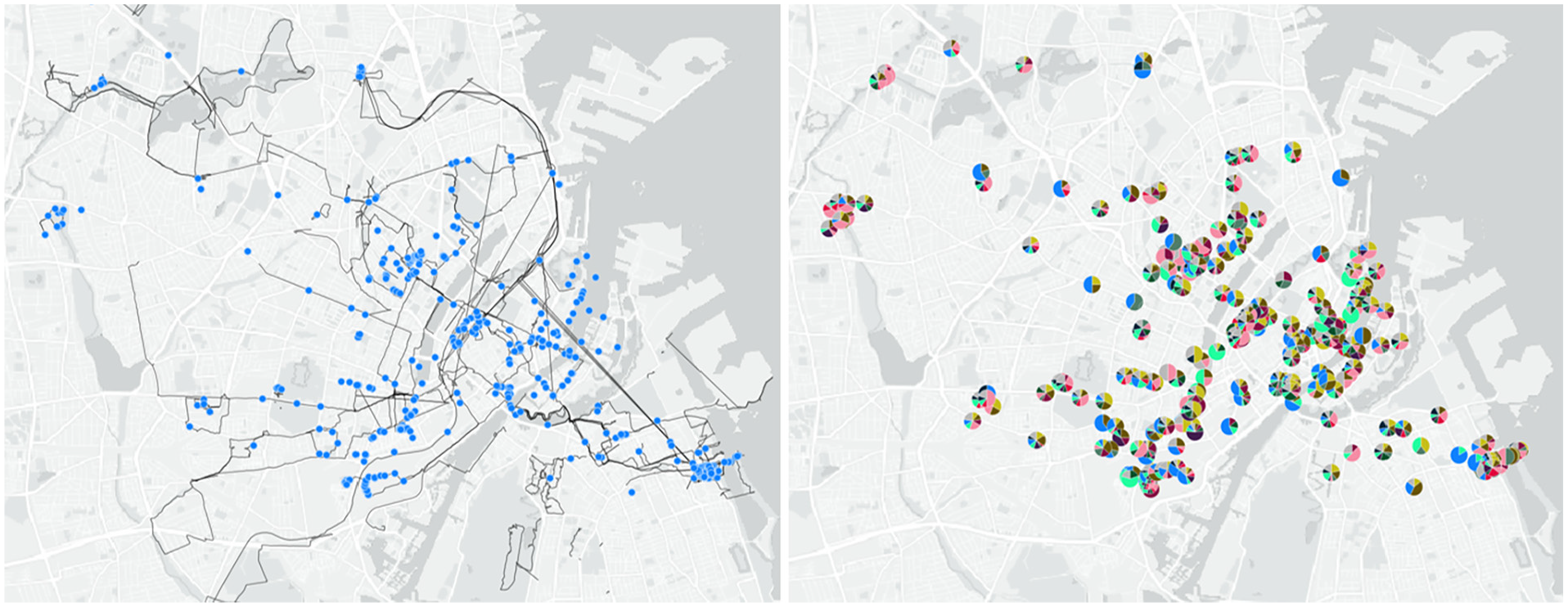
Map of image locations and routes walked with the UB App (left), and map of images shown as pie charts (right) to show distribution of annotations about what people notice in the image.
Mapping the data with QGIS as heatmaps or a Voronoi plot as seen in Figure 24 can also reveal patterns in density between photo locations, revealing more and less photographed areas.
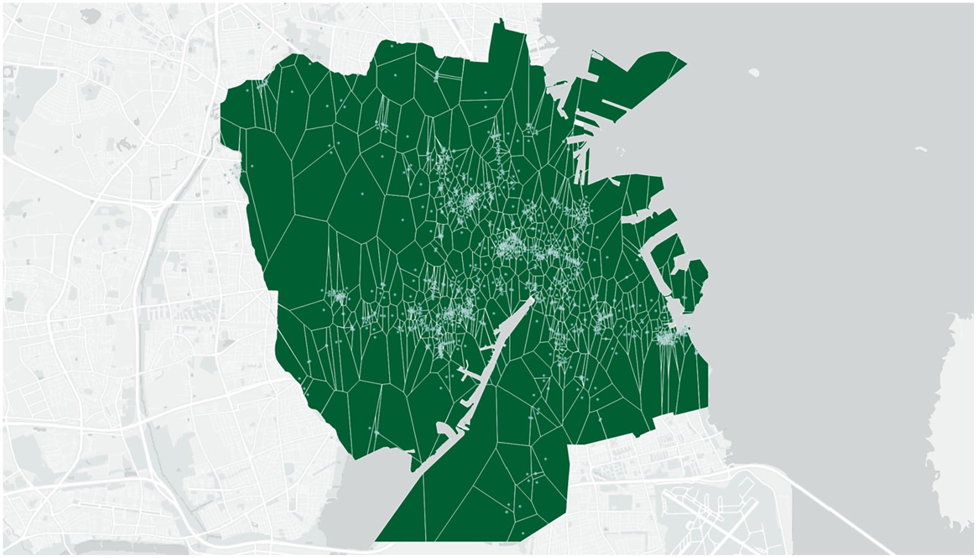
Voronoi plot of images from the UB App made with the “Voronoi polygons” algorithm in QGIS 3.14.
Mapping how participants move between the locations in which they take pictures (Figure 22) can also be used to discover important aspects of their use of the city, and can; give insight into people’s place making practices (de Certau, 2011); be used to open questions around politics and cultures of mobility (Sheller and Urry, 2006); and be used to re-examine how the city’s spaces are connected and networked in the way people move through and experience them (Massey and Massey, 2005). This is made accessible with a dedicated output of the walked routes of all participants together with the location of pictures taken. The images below illustrate how this output can be used in workshops to discuss how not just individual locations, but also the practice of moving through urban spaces create different experiences of belonging, enabling an understanding of places as connected. In our project we used printouts of routes as prompts (Figure 25) to elicit conversations in workshops about positive and negative experiences of moving through Copenhagen (Figure 26), producing individual and collective maps about how belonging is experienced on the move.
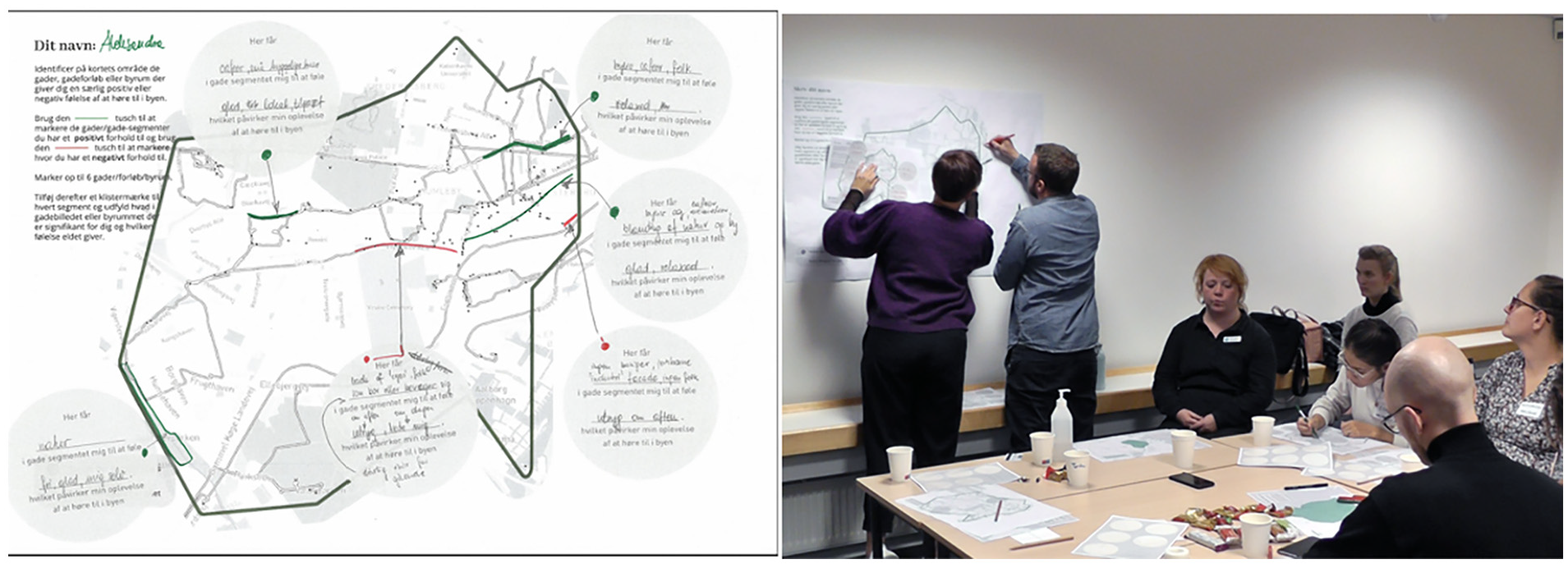
Print-out map of routes as analog prompt (left) and use of it as elicitation tool in workshop (right).
Visualizing reactions
The data emerging from the reaction phase enables us to ask questions about how participants see the photos or “decode” the city in different ways (Hall, 2003). To leverage this possibility the csv-output contains a column showing the annotations made by the image author as well as columns showing how other participants have annotated the image when reacting to it. In our project we used QGIS to construct the “double-dot map” in Figure 27, where each image is represented as a circle and the core is colored by the author’s sentiment, while the rim is colored based on distribution of sentiments from reacting participants. This makes visible how some images—and areas in the city—generate consensus, while others create contested sentiments. How participants decode the city in distinct ways.
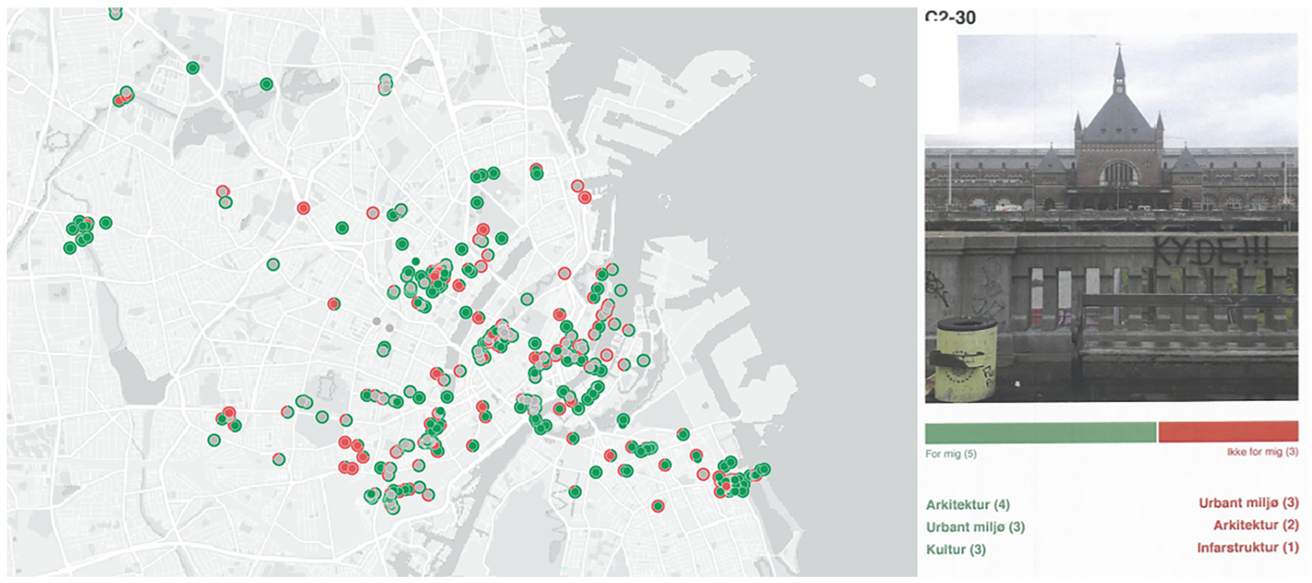
Double dot map (left) showing the sentiment of each image as provided by its author (inner circle) and by others reacting to it (outer rim), and a qualitative example of an annotated image (right).
To investigate this further the dashboard can also output a pdf-file with images that have conflicting sentiments. An example is given in Figure 28 with a picture of the central station that received mixed reactions. In our workshops, we printed the contested photos and hung them on the wall and asked participants to discuss why these images caused such different reactions, opening conversation about aligned or conflicting feelings about the city.
From demographic to post-demographic grouping
As mentioned already, we designed the UB App to open for demographic, as well as post-demographic analysis. First, to make it possible to explore experiences among participants who share demographic characteristics or belong to a specific group, the UB App has the feature that a group-identifier can be assigned to user-IDs to make it easy in the backend to distinguish between the images produced by different groups. This was for instance used in Figure 29 to map the locations of photos captured by participants from different groups, indicated by different colors. Such demographic analysis of UB App data can be used to study patterns in various groups’ relationship to the city.
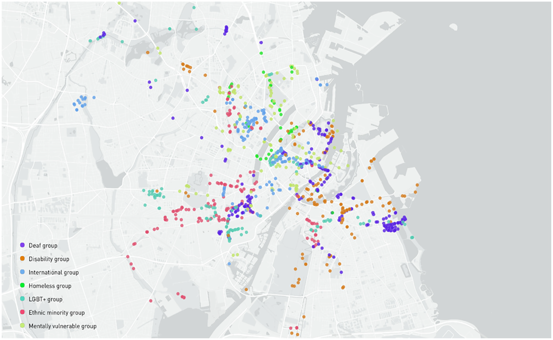
Location of images colored by the organization of their authors.
In the UB project, the first round of workshops were carried out within each of these groups, and we used the group-based user-IDs to filter maps and images so we could present each group with their own data and elicit collective and individual stories within the group. Following this, we however sought to mix people based on a post-demographic logic, and place participants in groups based on shared experiences and perceptions of the city, rather than shared identity. The UB App is designed to encourage such analysis and grouping in more than one way.
First, the granularity of the spatial data can be used to identify overlaps in where in the city people have been taking pictures. This is seen in Figure 30, where we have plotted all image locations with QGIS, and used the k-means algorithm to identify clusters with a high density of images. We used bottom-up cartographies like this to form groups for workshop 2 based on what areas participants had been photographing.
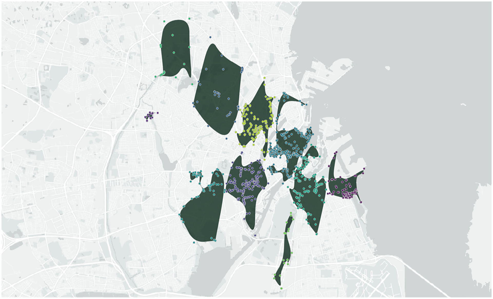
Geographic clustering of images with the “K-means clustering” and “Concave hull (k-nearest neighbor)” algorithms in QGIS 3.14 which divides the images into a number of clusters based on spatial proximity and distance.
A second post-demographic strategy is to analyze the participants as a social network (Venturini et al., 2015), leveraging the reactions in the app as relational data. This is why the dashboard outputs gexf-files that that can be visualized with the network analysis software, Gephi (Bastian et al., 2009). One network produced is a “sentiment network” as seen in Figure 31 below.
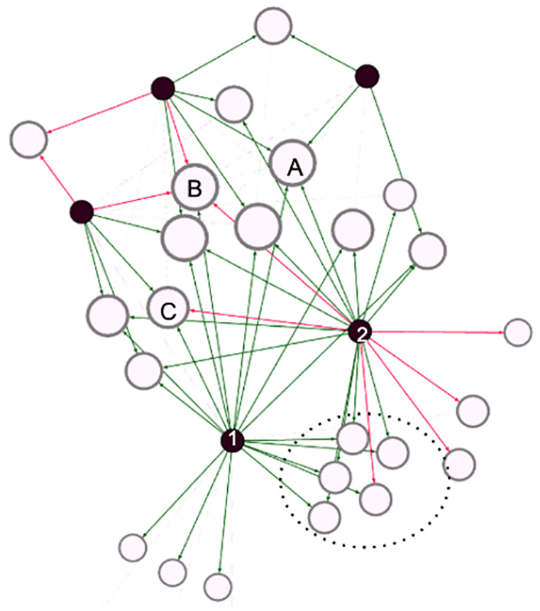
Bipartite sentiment network showing how participants (first nodes) give sentiment to images (second).
Here, black nodes represent participants and white nodes the pictures they took. A line connects the two if the participant has reacted to the image with green indicating a positive, and red indicating a negative sentiment. If people gave a neutral sentiment score, there is no line (a choice that poses the thorny methodological question of how participants interpreted the “middle ground”’ on the slider). Nodes are spatialized with a force vector algorithm that pulls nodes closer if they share connections. The network shows that there is a group of images that only participants 1 and 2 have reacted to (the dotted circle), with a mostly positive sentiment. We can also learn that participant 2 generally has a more troubled relation to the city than participant 1 who only conveys positive sentiments. Leveraging the relational nature of the reaction phase data like this, network analysis allows us to construct a topology alternative to the geographical ones, enabling us to see other patterns in how participants and images are connected. The images taken by participants 1 and 2 may be geographically far apart, but in the network we learn that they give similar sentiments to the same images. Such outputs can be a strategy for deciding who to bring together in a workshop group to unfold conversations about what people react to. The dashboard also outputs a “tag network,” which is based on the second annotation in the app about what people notice in an image.
Further challenges
As demonstrated, our aim was to design a toolkit that puts narrative power in the hands of participants and give the analysts access to data outputs with high empirical flexibility (raw JSON-files) as well as outputs that enable specific types of analyses that we found relevant in our process. Every tool, however, comes with constraints that influence the type of knowledge that can be produced with it. This section focuses on such limitations and challenges.
The digital divide: Hardware and visual literacy
The choice to design an app raises important questions related to people’s opportunity to make themselves visible in such a digital infrastructure. From literature on digital divides, we have learned that such questions concern both people’s access to digital tools as well as their skills for using them to their benefit (Hargittai, 2001). Both are relevant in the context of the urban belonging toolkit. First, even though mobile phones have a high market penetration, it is not everyone who has access to one. For instance, our project involved working with homeless people, several of whom did not own a phone. Also, the UB app requires that the phone can access either Google Play Store or App Store, that it has a relatively new operating system, a functioning camera and a data connection, which might exclude some participants (Garcia et al., 2016). In our project we mitigated this by offering phones and also mobile data to those without. Even so, there were still several barriers to who could be a part of the study. Most obviously of course, we missed the opportunity to work with the vision-impaired for whom photography is not accessible. Second, the choice to center photographs means that visual hierarchies and literacies might influence the data collection. It might constitute a bias, and it can be problematic if differences in visual literacy for instance leads to some participant voices drowning, while others are foregrounded. As mentioned previously, the app is designed to minimize such effects in different ways, but does not eliminate them altogether. When that is said, we might also consider if varying visual capabilities say something empirically interesting. Learning from Cultural Analytics, (Tifentale and Manovich, 2015), we could think of people’s visual styles and esthetics as practices that say a lot about who they are, if we see it as an analytical opportunity, rather than just a bias.
Privacy and paradox of exposure
The use of the UB App also raises questions about privacy. The app lets the project manager create anonymous IDs for participants, which means that within the app itself, no one is able to discern who each participant is. If, as in our project, you want to connect the data collected in the app with personal information about who participants are, you need to collect that information outside the app with the consent of the participants. Even so, anonymization is not always enough to keep data private (Douriez et al., 2016). The possibility to plot route data at the granular level might for instance reveal where people live or work, if we can see that multiple routes start from the same spot. Images might also reveal vulnerable information. For homeless people, it might for instance be risky to document places they sleep, or show what parks they like, if authorities should find out and it could lead to increased policing. Thinking about privacy is thus important when plotting maps or showing images from the UB App. On the other hand the app can also empower such groups by making visible where they actually feel a sense of belonging. The fact that visibility can be both empowering and problematic has been discussed as the visibility paradox (D'Ignazio and Klein, 2020) and it is important to have in mind when designing a project. This was indeed also problematized in one of our community interviews.
“Let’s say an LGBT+ person takes a picture of a kink shop, because it is a part of the culture. Maybe they are not ready to let others know that they took that photo. It could be uncomfortable to put on display in workshops or in the app. You should let people decide the degree of visibility they are ready to have.”
The paradox of exposure also relates to the issue of “data ableism,” described by Charitsis and Lehtiniemi (2023) as a two-fold mechanism that punishes those who deviate from the standard of data normalcy: “Data (in)visibility refers to the ability to produce data that render people visible to the system or conversely the ability to hide from it, while data (un)desirability relates to the ability to produce desired data that are deemed valuable and lead to beneficial outcomes” (Charitsis and Lehtiniemi, 2023: 8). Subverting these tendencies, the app is designed to give those who typically are rendered undesirable or invisible the ability to make themselves seen in beneficial ways by means of data, giving participants as much control as possible over how they are made visible. As it is hard to predict when visibility might be beneficial or harmful to a specific community, we recommend interviewing the involved groups before planning a project, to learn from them as we have done. Also, the newest version of the app includes an option for participants to delete photos they regret submitting. Finally, privacy issues go beyond the participants, since images may include other people who do not know they are being captured. This can be solved by running images through an algorithm like “Face Blur” that blurs all faces.
Data ableism and blind spots
In the introduction we argued that digital tools have technical affordances which set the boundaries of their use and the problems they can help solve (Madsen, 2015). One important affordance in the UB App is that it requires participants to collect data in situ (Carter and Mankoff, 2005). This encourages participants to show what matters to them, rather than just talking about it, which following (Plunkett et al., 2013: 156), allows photo-based research to bring about a phenomenological sort of insight into lived experience, which may be unspoken and not always best understood by words alone. The advantage of images always being anchored in a particular time and space is that it invites a way of knowing that, learning from Haraway (1988), produces tangible insights and a situated, partial perspective on the city. An obvious downside is that people are not always comfortable—or have the opportunity—to be physically present in the places that matter to them. If one has experienced harassment in a specific area, it may be uncomfortable to go back to that place and take a picture, or this may even be an outright dangerous act. The consequence is that the UB App might not be the best method to capture traumatic urban experiences or inaccessible spaces, as also highlighted in our interview with the Danish Disability Association representative: “How do you want me to go to places I cannot go in a wheelchair, and take a picture of it?”. This shows how the app might also re-produce a sense of “data ableism,” as a technology that comes with ability expectations which risk leading to additional marginalization of underprivileged and less able individuals. This is for instance the case, if we assume that all individuals will be cognitively capable of using a digital app, or be physically able to hold a phone. In our study, homeless participants who suffered from cognitive disabilities, for instance, required support to be able to go out and use the app (a companion from Hugs & Food went with them). And participants with physical disabilities who could not hold a smartphone had assistants accompany them, who could help operate their phone. If an assistant is not available, however, researchers might have to go on walk-alongs to offer their own help. This prompts challenges such as ensuring that images are captured from their perspective (i.e. height and angle), or evaluating how it influences the participant that a researcher is present during photo taking. However, if this is planned well, walk-alongs can give researchers a chance to observe how a participant moves through an urban space, as seen in Figure 32, where two of us went on a walk-along with a participant in Copenhagen, feeling how physical obstacles on the sidewalk left no room for a wheelchair and forced us into the street.
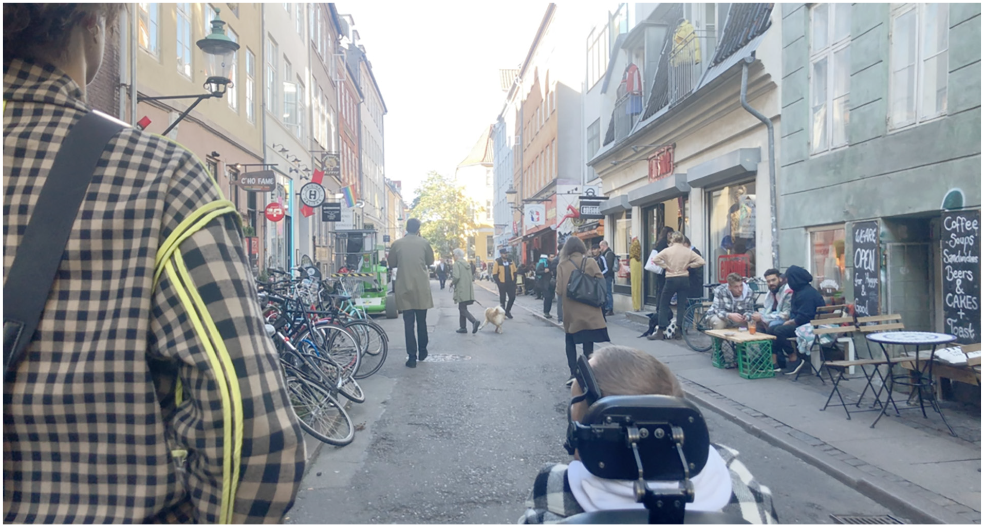
Image of UB participant and researcher on a walk-along in Copenhagen.
Adding to that, the situated nature of the UB toolkit makes it ill-equipped to capture things that existed in the past, as well as really negative settings that could be triggering. To provide an outlet for such stories, our project supplemented photo taking with participatory GIS mappings and workshops. We highly encourage triangulating photo-based methods with other methods, which proved in the UB project to be a fruitful way of capturing different aspects of people’s urban experiences.
Outro: Use it! Tweak it!
In this paper we have described the UB toolkit which consists of three main components. The first is the UB App, available for free on Google Play and AppStore. The second is the “admin-dashboard” that enables users to customize the app to their own purposes, follow the data-production in real-time and export data in various forms. We are currently extending this with a data-scape option that will feed the user real time visualizations of relevant data. The third is the source code for the full app is available on GitHub, inviting others to grab and tweak it.
In this paper, we started by arguing for the need to engage in toolmaking, and why it matters to do so with communities and practitioners. We then described the key features of the UB App and reasons for their design. The UB toolkit is shaped for a process where participants are highly engaged in interpreting their own data. Many of the outputs of the admin-dashboard are made to support this process. However, we have intended the app to be flexible and the data to come out as “malleable matter” (Baerten, 2020) that can be sculptured to answer different questions. While this paper has demonstrated some methodological potentials, we are certain there could be many other applications. In fact it has already been (re)used by urban planners and researchers as an ethnographic device (to take photos in the field, instead of asking citizens to take photos) or to collect citizen photos but without having workshops with participants after. Essentially, the tool is open and can be used for many types of “photo-related research.” This is evident from its recent use where it has been repurposed in a research project on historical heritage in Italy. In Seattle, the app was recently used by environmental justice group DVSA to invite youth groups in South Park, a predominantly Latinx neighborhood, to document how they experience a range of issues in the area. The insights are being used directly to inform policymaking in the city, and has helped shed new light on how social justice issues in the neighborhood are connected to environmental problems such as pollution of the Duwamish River. In these two cases, we helped change prompts and annotations in the app to fit each project by hardcoding them in the app, which arguably is a technical and time-costly task.
Since we built the app, Gehl Architects has set up their own version of the app called Eye Level City and used it in a project at Stanford University, mapping experiences of belonging among minorities on campus. The app thus already has applications across research, NGO work, and professional planning as intended, and we hope to inspire even more to use it. To make the app more accessible, it has recently been developed further by Gehl Architects, who has found funding via client projects to tweak the app, adding features that make in-app customization of prompts and annotations possible. Engaging stakeholders like Gehl in the design of the app within an open paradigm of innovation (Chesbrough and Bogers, 2014) has thus already proven effective in leading to “continuous innovation” (Martini et al., 2013) of it based on situated needs and experiences with using it. We hope to see more of that in the future.
Footnotes
Acknowledgements
The UB project has been possible because various people contributed with their expertise at different stages. We thank the community partners in Copenhagen for their participation as well as practitioners from GEHL and the citizen engagement experts for their time. We also acknowledge that the UB app is with inspiration from SnappThis! created by Marije ten Brink and developed by Iain Kettles.
Declaration of conflicting interests
The author(s) declared no potential conflicts of interest with respect to the research, authorship, and/or publication of this article.
Funding
The author(s) disclosed receipt of the following financial support for the research, authorship, and/or publication of this article: The Urban Belonging project is co-funded by the `Doing Data Together' grant awarded to Anders Koed Madsen at Aalborg University and two industrial PhD stipends from Innovation Fund Denmark awarded to Sofie Burgos-Thorsen and Drude Emilie Ehn, respectively. In addition, it is supported by Gehl, Service Design Lab (Aalborg University), Center for Digital Welfare (IT University Copenhagen), and Centre of Expertise for Creative Innovation in Amsterdam (CoECI). The toolkit is currently being further developed with funding from MASSHINE at Aalborg University and the EU-project DESIRE.