
Abstract
Visualizing music—through music notation, analytical representations, or music videos—might potentially boost the appreciation of music in all its richness. The purpose of this study was to design and test a visualization strategy aimed at explicating to a large audience with diverse backgrounds—especially novices—the multifaceted beauty of the final Contrapunctus in J.S. Bach's The Art of Fugue, performed by the Danish String Quartet. At the surface level of the musical structure, the rich fluctuation of pitch shaped by each musician was depicted in the form of undulating pitch curves. At a deeper structural level, the repetition of pitch curves, distinctive of fugues, was highlighted through vertical alignment—inspired by a technique called paradigmatic analysis, originating from anthropology and music semiology. The visualization was initially prototyped in the form of a real-time technology as part of the MusicLab Copenhagen research concert. The concert audience focused on the performance itself, and did not pay much attention to, nor appreciate, the visualization. To evaluate more thoroughly the potential of the visualization, participants with varied musical expertise and taste were invited to listen to a recorded performance of the piece and watch the visualization on their own computer. A large majority reported that they felt they understood the visualization, around half of them felt that it enhanced their musical understanding, and a small group felt that it helped them to better appreciate the music.
Visualizing Music
Playing, singing, listening, and dancing to music are generally experienced as enjoyable activities, purveying a large range of effects on body, soul, and life in general (Juslin & Västfjäll, 2008; Merriam, 1964). At the same time, music feels somewhat mysterious. It is for a large part invisible: Even if it is often initiated and perpetuated through tangible performances (with musicians, singers, dancers, etc.), the ears generally receive from the music more than what the eyes can see. Every individual perceives, understands, and appreciates the same music experience in their own way.
On the surface, music can be seen as a temporal stream of events, gestures, and notes. This stream is implicitly structured in various ways such as pulsations, phrases, motivic repetitions, the organization of pitch into clusters, chords, scales, or on a higher level a segmentation into larger parts. This can be, to some extent, implicitly understood by musicians and other participants and listeners, in the same way as grammar implicitly structures spoken language (Bigand & Poulin-Charronnat, 2006; Lerdahl & Jackendoff, 1983).
Musicians and music scholars have, for centuries and in various civilizations, attempted to make explicit those implicit rules. This accumulated theoretical knowledge offers a way to study each piece of music, to analyze them to reveal more explicitly their specificity with respect to this conceptual framework. Music analysis enables us to develop further the theoretical investigation; to provide a deeper understanding of those particular pieces. Scholars have long considered music analysis as a method to better appreciate pieces of music. “Analysis sharpens the listener's ear, enhances perception and, in the best of cases, deepens appreciation. Detailed and intensive scrutiny of a work brings one into close contact with the musical material, leaving the analyst permanently transformed by the experience.” (Agawu, 2004).
It has been claimed that music analysis could even guide listeners that are not experts in that particular music. Walter Riezler considers that music analysis “can sharpen the ear of the unperceptive listener” (or, as we would prefer to say: any listener not expert to that specific music culture) “in such a way as to enable [them] to appreciate the music's organic growth; and it can therefore teach [them] to hear better, and so to intensify [their] impressions of what [they] hear, and not to substitute for an adventure of the living spirit a process of conscious thought.” (Riezler, 1938, p.20). Importantly, music analysis does not replace imaginative thinking and daydreaming associated with music listening. Rather, music analysis supported by tools may augment listeners’ appreciation of the musical content.
At the same time, musical expertise (i.e., the capability to grasp and appreciate the music being heard) may also be acquired through passive listening (Bigand & Poulin-Charronnat, 2006; Honing, 2013). Formal training, such as the study of music analyses of particular pieces, may be one method to accelerate acquisition of that expertise. Analytical tools or media designed for the general public, such as Adam Neely's YouTube channel 1 and Song Exploder podcast, 2 could then be considered a blend between passive and formal training.
Describing Music
Talking or writing about music enables comprehension and communication about the salient aspects of the music. In Western classical music concerts, for instance, the audience is often offered program notes, a booklet of short texts offering some explanation of the music to be heard. Recorded music (especially in the form of albums, vinyl or CD in particular) perpetuates this tradition (Simeone, 2001). The popularity of program and album notes indicates that there is a potential interest from the general public in accessing analytical devices or tools too. The limitation of program notes has also been discussed: Practice-led research has shown that the positive effect of program notes can sometimes be rather limited (Bennett & Ginsborg, 2017). For instance, experienced listeners were more likely to reject the program note information in favor of their own interpretation, particularly if they had experiences of music making. More generally, concern has been expressed that a disclosure of the musical structure prior to listening impairs the appreciation of the music, for instance for the appreciation of especially complex, long forms such as symphonies (Chan-Hartley, 2021; Small, 1998).
Textual description can connect aspects related to the structural organization of the music but can hardly convey the inner musical content in detail, in particular with respect to specific musical material such as melodic themes. Beyond words, music notation (such as Western score representation) can describe the actual musical content in detail, but the resulting representation can easily get quite technical and difficult to read without dedicated training. Attempts have been made to represent music content in simpler ways more easily readable for non-experts, for instance using so called “piano-roll” representations (Smith, 1991).
As an alternative or complement to program notes, in the context of Western symphonic orchestra concerts, the Visual Listening Guide offers a simple visualization of the musical structure, integrating piano-roll representation of the beginning of themes (Chan-Hartley, 2021). Audience members who have encountered them at concerts have indicated in feedback that they found them an engaging tool that helped them better appreciate or understand the work from a more analytical perspective. One discussed issue—of interest in the experiment presented in this article—concerned the amount of attention devoted to the Guide during a performance versus watching the orchestra and listening.
Music theory and music analysis have developed ways to depict refined musical configurations in the form of graphical representations, often combined with more traditional musical notations. Making such representations accessible to non-experts is rather challenging. It is also possible to compute graphical representations from audio recordings, such as spectrograms, or, as we will show later, pitch curves. Further analyses can be shown with this as the canvas (Geslin & Lefevre, 2004; Lartillot, 2024).
Animated Representations of Music
Since music necessarily unfolds temporally, a natural way to make any representation of music easily understood is by synchronizing the elements of the visualization with the occurrences of the musical events. A static graphical representation featuring a prominent temporal axis (such as a score, a piano roll, or a spectrogram) can be animated in alignment with the music through a progressive traversal along the temporal axis. In other words, what was initially a static representation now scrolls leftward in front of the virtual camera so that what has just been played is on the left of the display before disappearing, while upcoming elements appear from the right. This can be called the “rolling representation” (Nanayakkara et al., 2007). One famous example using piano-roll representation is the Music Animation Machine. 3 It has drawn a lot of interest from the public and also from teachers. 4 Similar animations have been designed for sound representations (Lartillot, 2024).
Graphic analytical representations designed on top of scores or other temporal representations, as discussed above, can also be shown in such rolling animation (Chan et al., 2010). If the representations, on the static display, require time and effort from the viewer to be understood, its rolling animation becomes even more difficult to follow. In particular, the necessary focus on a narrow temporal region of the analytical display might make it more difficult to understand the complete structure.
In contrast to the rolling animation, “experiential” animation involves the display of elements in time with the music that they represent, and then the elements simply disappear. According to Nanayakkara, “This method of presentation is much more natural and makes the display experiential rather than simply informative” (Nanayakkara et al., 2007). For this type of animation, the mapping strategy between music and visuals is often based on the display of specific simple forms or colors related to elementary musical aspects (Kubelka, 2000; Mitroo et al., 1979; Nanayakkara et al., 2007; Ng et al., 2014; Smith & Williams, 1997). For instance, music can be depicted by free-form pictorial representations, or through gestures, dancing (Goto, 1996; Sauer & Yang, 2009), or colors (Ng et al., 2014), among other modalities. Visualization of multiple musical dimensions has also been attempted (Dixon et al., 2002; Langner & Goebl, 2003), showing their combined contribution to perceived emotion (Lartillot et al., 2013) or the corresponding leitmotiv in a Wagner piece (Goss & Carson, 2016). Visualization of tonal development has been conceived as a travel along tonal space representations (Bergstrom et al., 2007; Khulusi et al., 2020; Mardirossian & Chew, 2007; Toiviainen & Krumhansl, 2003).
Approach & Aims
The experiment presented in this article was inspired by the use of graphic musical analysis as a means to enlighten listeners to the musical structure and facilitate musical understanding and appreciation, regardless of the musical expertise of the listener, and especially focusing on novices. We also shared an analytical approach oriented toward description of the music itself, avoiding textual descriptions and aesthetical “spoilers.” We aimed to design a visual signal that could be easily understood, highly accessible, self-explanatory, and without requiring particular musical or technical expertise. This requires avoiding technical music representations in favor of more intuitive representations that are also more adequate to describe the rich inner variability of live performance.
The structural focus in this study is related to the melodic repetition that is characteristic of fugues. We aimed at designing a representation that enables one to keep track of the evolution of the fugue structure throughout the piece. Our goal was to create a representation that emphasized the essential structural features, rather than allowing all structures to slip away quickly, as in the rolling representation previously discussed. At the same time, echoing Riezler's complaint that the schematic out-of-time description of music analysis might spoil the temporal flow of musical experience, one aim in the proposed approach was to avoid revealing musical structures before they are actually expressed in the music.
Musical Context of the Experiment
While the previous discussion was aimed at addressing music as broadly as possible, the experiment presented in this article needed to focus on one particular piece of music. The development of the technology was initially spurred by the MusicLab concert with the Danish String Quartet (DSQ) (Høffding et al., 2024). In the program they prepared, Contrapunctus 14, the last movement of The Art of Fugue by Johann Sebastian Bach was selected for the visualization experiment, due to the richness and complexity of the piece.
Fugue Principles
It is not possible to provide a complete characterization of fugues in general, however they are defined as contrapuntal, polyphonic compositions built on one or several subjects that recur frequently and are developed through imitation throughout the piece.
Before considering the complexity of the Fuga a 3 Soggetti (“fugue in three subjects”) that is Contrapunctus 14, let's focus simply on the first part of the fugue where only one musical theme, or subject is developed. This is therefore the first subject of the fugue, further denoted The first subject is played solo by the cello first. Then the subject is played by the viola, but because it is a bit transformed (transposed, in particular), it is called an answer instead. At the same time, the first instrument plays a countersubject. The subject is further played by the second violin, this time in its original form. At the same time, the viola now plays the countersubject. The first instrument continues developing its own line as well. The answer is played by the first violin. The second violin plays a countersubject, while the viola continues its own developments, and the cello stops after a few notes. Then the subject is played again by the cello. But from this point there starts to be more variation. Here for instance, this occurrence of the subject is actually an inverted version of the initial subject.
Beginning of Contrapunctus 14. In bars 1 to 6, the first subject
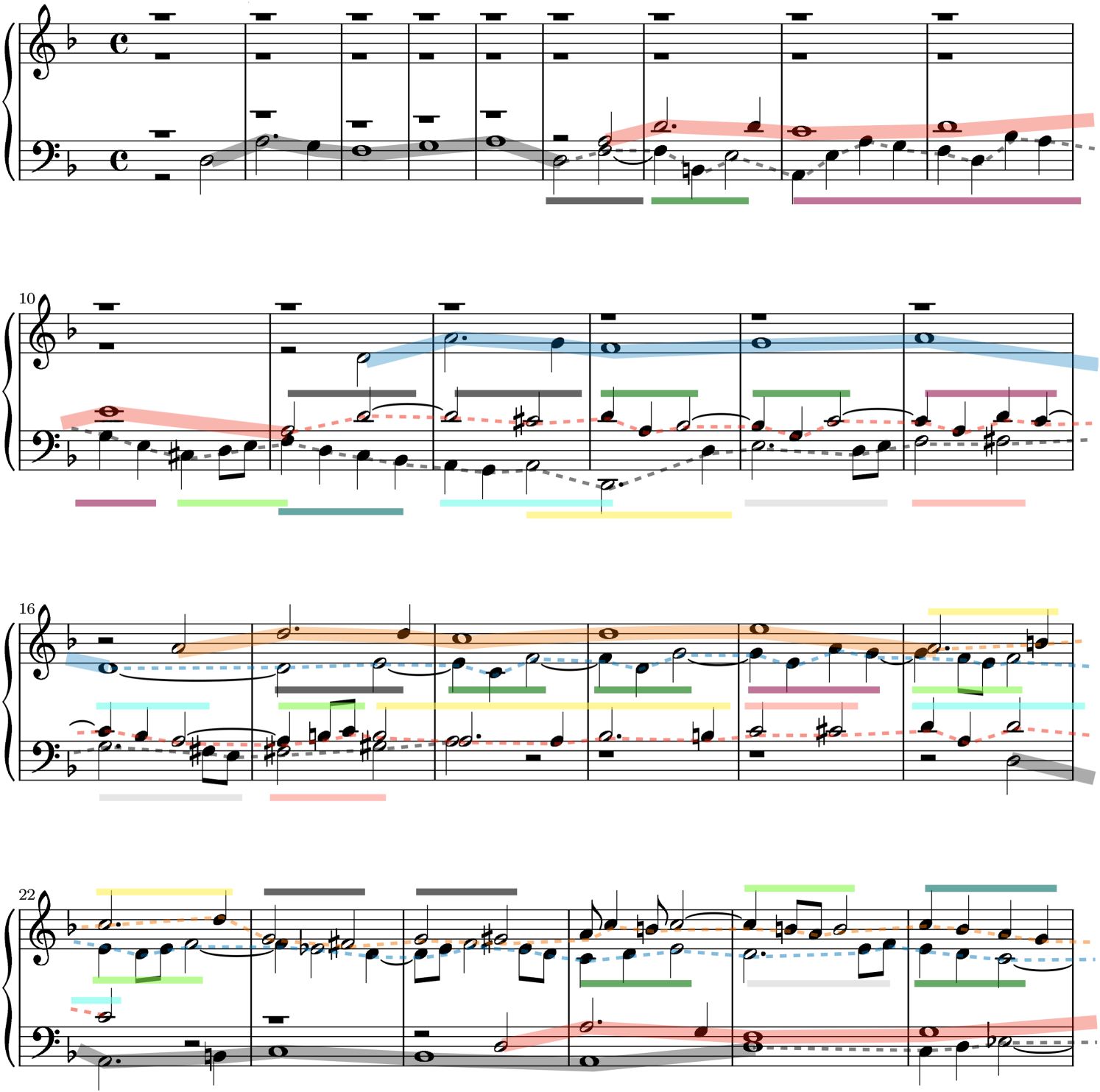
According to fugue theory, a countersubject is defined as a melodico-rhythmic pattern that is supposed to repeat quite similarly in each occurrence. If this is not the case, instead of countersubject, the music superposed to the subject would be rather considered as free counterpoint. We propose to consider Contrapunctus 14 as something in between: Each occurrence of countersubject is quite different from the others, but at the same time they all use a similar reservoir of shorter motivic materials. This is shown in Figure 1 for the beginning of the fugue. The first occurrence of the countersubject 5 played by the cello in bars 6 to 18 is decomposed into short motifs, indicated by the colored lines below the stave. Some internal repetition is highlighted: the repetition of the purple motif in bars 8 and 9, as well as the repetition of the two-bar section in bars 14–15 and in bar 16–17. The second occurrence of the countersubject by the viola in bars 11–22 is based on similar motifs, but in a different order, as shown by the colored lines above the viola line. This motivic repetition within the countersubjects is a structural aspect that will be particularly highlighted in our visualization.
In addition to these structural characteristics, fugues also develop in very creative ways along the rhythmic and harmonic dimensions, however this was not a focus in this study.
Contrapunctus 14 Form
The overall structure (or form) of the triple fugue in Contrapunctus 14 is developed as follows (cf. Figure 2):
The first section of the fugue based on the first subject A second section of the fugue appears at bar 112, based on a new subject From bar 148, the first subject From bar 193, a new section of the fugue is based on a third subject During the development of the fugue based on From bar 233, the three subjects

Overall structure of Contrapunctus 14, with time (based on DSQ's rehearsal performance) spanning from left to right. In the top, middle, and bottom rows, the occurrences of the, respectively, first, second, and third subjects,
The fugue ends abruptly after that superimposition of the three subjects.
String Quartet Music
The visualization needed to be adapted to the particular characteristics of string quartet music, its underlying challenges, and the opportunity of its live performance.
A string quartet is an ensemble constituted of four instruments of the violin family: two violins, one viola, and one cello. The complementarity and, at the same time, consanguinity of this ensemble enables an overall sound to be shaped covering a large frequency spectrum and ambitus, ensuring a large degree of polyphony, while also focusing on the timbral homogeneity of the violin family.
String quartet music often consists of a superposition of voices, played by each different instrument. This is particularly the case in contrapuntal music such as fugues. We previously discussed the enjoyment brought by the ability to understand the underlying structures of the music being heard. David Huron discussed the pleasure of being able to follow the concurrent voices while listening to contrapuntal music such as a fugue (Huron, 2016). He also highlighted, by drawing from the timbral differentiation principle from auditory scene analysis, how the interpretation of a fugue by a string quartet makes this analytical listening even more difficult. Tracking four voices at the same time is particularly challenging (Huron, 2016; Siedenburg et al., 2021).
Design Principles for the Work Under Study
The music visualization strategy is conceived by taking into close consideration the particularities of the piece under study.
Visualizing a Piece for String Quartet
The understanding of the intrinsic logic of the fugue arises from being able to follow each voice separately, which is particularly challenging for a string quartet. The visualization offers a solution to this issue, as a guide to clearly distinguish the superposed voices, so that each of them can be tracked visually at the same time.
Traditional written notation, in the form of scores, would be the expected point of departure for an analytical visualization for experienced music readers. Replacing the score notation with alternative methods could upset some expert members of the public. But, as previously discussed, the main aim was to offer a visualization that would be accessible to a large audience, and in particular to novices. From this perspective, a music score is of limited value, because it requires reading skills from the spectators and because the association from the written note to the perceived sound is not straightforward.
Instead, we chose to depict the temporal evolution of the pitch height played by each instrument in the form of a simple pitch curve, with time flowing continuously from left to right and with the continuous pitch scale from bottom to top. One particular interest of this pitch curve representation is that it draws attention on the performance quality of each musician, for instance with respect to vibrato (shown in the form of an undulation of the horizontal line, as can be seen in Figure 5) or portamento (the shape of the continuous transition between successive notes). This performance characterization plays a very important expressive role in this type of music.
Following previous approaches, one possible simple representation consists of simply representing the pitch curves of the four voices altogether, within a single temporal axis, as illustrated in Figure 3. The four voices are distinguished using four separate colors. This temporal representation can then be scrolled using the same rolling animation as in previous approaches.

First 20 bars of Contrapunctus 14. All four voices are displayed as pitch curves of different colors (black for cello, red for viola, blue for second violin, and orange for first violin), all synchronized to the same timeline. The first subject
The music analysis of the fugue and underlying motivic repetitions, shown in Figure 1, is displayed on a score. It can be also adapted to the pitch curve representation. In Figure 3, the occurrence of the first subject is highlighted with thick lines. As discussed, the motivic structure of the countersubject (shown with colored horizontal lines in Figure 1) is already a bit too difficult to read on the score itself. Adding a rolling animation would make the overall visual even more complex.
Inspiration from Structuralist Anthropology
To address the challenge of displaying the rich motivic analysis, we proposed to use a representation—and its underlying analytical potentials—that has played an important role in the dawn of structuralism. Claude Lévi-Strauss proposed a “logical model” to “study the function of myth,” by dividing it into its “gross constituent units” and “bundle” them “so as to produce a meaning” (Lévi-Strauss, 1955). The sequential data under analysis—here the story of a myth—is written down in the form of a particularly formatted text, progressively aligning the text below the text already written belonging to the same “bundle.” Relations pertaining to the same bundle may appear diachronically at remote intervals, but when we have succeeded in grouping them together, we have reorganized our myth according to a time referent of a new nature corresponding to the prerequisite of the initial hypothesis, namely, a two-dimensional time referent which is simultaneously diachronic and synchronic and which accordingly integrates the characteristics of the langue
6
on the one hand, and those of the parole on the other. (pp. 431–432)
This has been further developed by the linguist Nicolas Ruwet in an attempt to formalize and systematize music analysis and in particular motivic analysis (Ruwet, 1987), and has been used extensively since, under the name “paradigmatic analysis” (Nattiez, 1990).
We carried out a detailed paradigmatic analysis of the Bach fugue. The analysis of the very beginning of the fugue is shown in Figure 4. The particular challenge in adapting this representation to a fugue is that, at each moment in time, what is being played by each different instrument corresponds to a different moment on the synchronic axis. For instance, when the viola starts playing (line 4, bar 1), the cello (line 1) is already at bar 6. For that reason, each voice needs to be analyzed in isolation. The first subject of the fugue is represented along the leftmost five bars (to which can be added the first note of the sixth bar), so we can say that the five leftmost columns form the “synchronic bundle” related to the first subject of the fugue. The rest of the diagram, from the sixth column, corresponds to the countersubject.

Paradigmatic analysis of the beginning of Contrapunctus 14, developing the first four entries of the first subject, one after the other, until bar 27 (corresponding to the end of the score shown in Figure 1). Each voice can be read one after other, separately, from top to bottom, and from left to right. Vertical alignments correspond to motivic repetitions, or “synchronic” “bundles.” The colored horizontal lines at the top repeat the color code used in the motivic analysis in Figure 1. Parts of the violins’ countersubjects that were not related to any motivic content are not shown.
In the countersubject played by the cello, the successive repetition of four notes (with transposition) in bars 8 and 9 (below the purple line) as well as the successive repetition of two whole bars, shown at bars 13 and 14 (under the gray and pink lines), are explicitly represented. The analysis suggests that the countersubject played by the viola is made of various motivic material taken from various parts of the cello countersubject, as shown by the column alignments representing here also synchronic bundles. The same is suggested for violins 2 and 1, although only the beginning is shown in Figure 4.
From Static to Dynamic Paradigmatic Analysis
As observed, the paradigmatic analysis does not seem very suitable for the analysis of fugues, due to the superposition, on a same position in the diachronic axis, of voices related to different moments in the synchronic axis. Hence in the paradigmatic analysis, as shown in Figure 4, the superposition of the voices is not explicitly represented. How can we make this voice superposition visible? The proposed solution is to visualize the analysis progressively, following the progressive evolution of the music through time. For each successive instant along the diachronic time, the corresponding synchronic time positions—one for each currently playing instrument—are highlighted in the score.
Yet another major drawback is that the paradigmatic analysis representation spreads quite extensively in the vertical dimension, as can be seen in Figure 4 for the analysis of only 30 bars of the fugue. Hence the complete fugue is impossible to display in its entirety. Splitting the display vertically into four regions related to the four voices and scrolling within each zone could possibly be a solution, although still rather tedious.
We propose to address this issue, while at the same time making the visualization much more accessible to non-experts, by displaying pitch curves instead of scores, as shown in Figure 5. One particular advantage of pitch curves in this respect is that they can be superimposed, so that the vertical axis is simply used to represent pitch height.

Paradigmatic analysis of the beginning of Contrapunctus 14, where each voice is represented as a pitch curve, extracted from a recording of a DSQ performance. Bar separations are shown with thicker vertical lines and numbered at the bottom, while half-bars and beats are shown with thinner lines. Purple, cyan, and green horizontal grid lines correspond respectively to D, F, and A (all natural). The first voice is played by the cello, in black, and can be read from left to right, with some internal repetition: the second half of bar 8 and first half of bar 9, and bars 13 and 14 (in both cases, first playing the lower curve and then the higher curve). The second voice is played by the viola, in red, first playing the subject and then playing various parts of the countersubject in a non-sequential order, which is not indicated here. Same for the third and fourth voices played by the second and first violins, in blue and orange. The colored horizontal lines at the bottom indicate motivic content that is further detailed in Figures 1 and 4. In this screenshot of the dynamic paradigmatic curve, the curves were drawn up to the middle of bar 21, with the pitch currently being played shown with discs. The thick horizontal golden lines highlight the introduction of the subject and countersubject by the cello, and are progressively drawn when that part of the curve is repeated for the first time, to refer back to the initial pitch curve. The first half of bar 9 and the whole of bar 10 have not been repeated so far.
The progressive accumulation of pitch curves, as illustrated in Figure 5, would quickly make the whole visualization overcharged and unreadable. The proposed solution consists in letting the curves progressively fade away as time goes by, as shown in Figure 6. Only the pitch curve related to the first instance of a given motif (i.e., of a syntagmatic bundle) remains constantly visible. More precisely, once the second occurrence of the motif appears, the first motif is highlighted (in the form of thick golden lines in Figures 5 and 6) to nudge the recall of that previous instance.
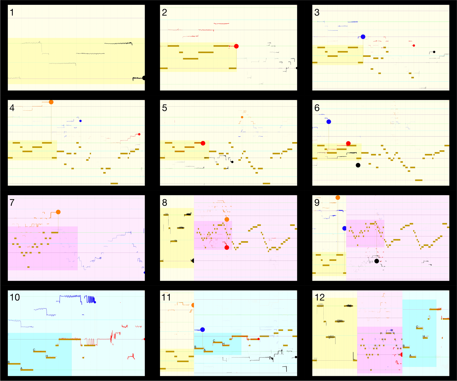
Still images from the complex version of the visualization. From top to bottom, from left to right: 1–6. End of occurrences number 1, 2, 3, 4, 6, and 18 of
We thus obtain an apparently polyphonic representation of pitch curves—except that, here, synchronous pitches (i.e., played at the same time) are not vertically aligned; instead, each pitch currently being played is located at a different “synchronic” position on the X-axis, corresponding to a specific moment in the thematic development, following Lévi-Strauss’ principle previously discussed.
Design Details
To make the visualization as clear as possible, the display initially focused on the temporal and pitch region related to the initial subject
Since the pitch curves are not drawn simply from left to right anymore but may appear at any place in the screen, the part of the curve being extended at a given time should be clearly highlighted. For that purpose, the last drawn point of the pitch curve corresponding to the current instant is highlighted with a clearly visible pointer (large disc), with the color related to the instrument.
Concerning the structural development of Contrapunctus 14, each subject is characterized by a different background color, respectively yellow, purple, and blue for
Similarly, the start of
The final section starts with
The visualization, called ContraPunctor, can be viewed online.
8
A simpler version of the visualization was also conceived,
9
focusing solely on the subject part of each of the three subjects

Still images from the simple version of the visualization, at the same time positions as in Figure 6.
Technical Implementation
To turn these ideas into a functioning visualization interface, a few issues needed to be addressed. First, we needed to detect and track the pitch heights of the different instruments separately and display those pitch curves in an appropriate manner. Another core challenge was the display of the fugue analysis in the form of dynamic paradigmatic analysis. Finally, the music needed to be aligned with the corresponding position in the score.
Drawing Pitch Curves
There are two main ways each instrument's pitch curve could be tracked separately. The first method, which is easy to prepare on the stage but difficult to implement in the software, would be to use regular microphones to capture the sound from the string quartet, and perform computational multi-pitch extraction and tracking. We preferred instead to rely on the alternative method, in which the audio of each individual instrument was captured using a close-up microphone (in our case, DPA 4060 microphone) installed on the instrument near its bridge, and the pitch tracking was performed on each isolated audio channel separately. The audio was digitized and mixed into a single four-channel audio stream using a Behringer UMC404HD audio interface, which was then plugged via USB into a laptop, as schematized in Figure 8. Thanks to this configuration, the pitch curve was tracked on each separate audio track using a simple monophonic pitch tracker. The “leakage” of the sound from the other instruments nearby was not an issue as it was of much lower magnitude. And when the instrument being tracked was not playing, the pitch curve was automatically disabled by the visualizer.

Overall architecture of the proposed solution.
The audio signal was decomposed into successive frames of length 46 ms and with a hop of 10 ms. For each successive audio frame, pitch was estimated by computing the autocorrelation function. To speed up the computation, the autocorrelation function was computed using Fast Fourier Transform (FFT), using the vDSP library of Apple's Accelerate framework. The frequency corresponding to the global maximum of the autocorrelation function, with quadratic interpolation, was selected as the fundamental frequency.
Score Following
Each detected pitch height of the four instruments needed to be added to the pitch curves at the appropriate temporal position in the music score. A computer automation of the process was implemented first, as described in Appendix A. In parallel, we also developed an interface to manually tap the beats while the music was being played. Since Contrapunctus 14 has a clear and steady beat, tapping every beat was not an issue, and in fact this manual score follower led to a visualization that looked much more precise. Therefore, this method was used.
Dynamic Paradigmatic Analysis
The paradigmatic analysis of Contrapunctus 14 was encoded in the form of four CSV files, one for each instrument. Each record in a given CSV file corresponded to one motivic repetition, indicating (1) the start and end position of the repetition in the actual score, corresponding to the diachronic dimension, and (2) the corresponding start and end position in the synchronic dimension, corresponding to the abscissa in the paradigmatic analysis, as shown in Figure 4. There were two versions of the CSV files: one for the simple version of the visualization, restricted to the subjects, and one for the complex version, also indicating the motivic repetitions in the countersubjects.
When the music was being played, the score follower progressively tracked the position along the diachronic dimension. More precisely, the automated score follower indicated when a new note was played, while the manual score follower kept track of every half-beat. Based on this active note and half-beat location information, a more precise determination of the diachronic position—between the onset and offset time of the currently played note(s)—was estimated, allowing continuous drawing of the pitch curves over time (Lartillot et al., 2020).
The visualization module detected the activation of the motivic patterns at the appropriate time, based on the encoded paradigmatic analysis, and computed the synchronic position for the corresponding instrument. The pitch height detected for that voice and the synchronic position defined the current position of the pitch curve in the paradigmatic analysis.
The visualization display was decomposed into three panels, related to the three different subjects, each with its distinct background color. The size and position of the panels changed over time: At the beginning, the first panel occupied the whole screen, while the second and third panels were inactive. Each active panel showed a range of the synchronic and pitch height axes. This 2D range also changed over time, as previously explained, defining zooming in and out movements based on particular events in the dynamic paradigmatic analysis.
The whole software featuring the three components was integrated into a single Macintosh app developed in Swift.
Pilot Experiment in a Concert Condition
The concert experiment took place in the context of the MusicLab Copenhagen concert, during which a series of other independent scientific experiments were carried out (Høffding et al., 2024). During the first part of the concert, the DSQ played two string quartets, by Beethoven and Schnittke, in a standard concert setting. However, some of the audience were equipped with motion capture devices, and all were invited to fill in a questionnaire after each piece (Danielsen et al., 2023). After intermission, the DSQ entered the stage wearing motion capture suits and eye tracking glasses, for the purpose of other independent scientific investigations (Danielsen et al., 2023). The Bach fugue was played first after intermission. The visualization discussed in this article was projected on a screen located at the left of the stage, as can be seen in Figure 9.

The DSQ playing Contrapunctus 14 during the concert, with the visualization projected on a screen. The musicians were wearing motion capture suits and eye tracking glasses, for the purpose of other separate scientific investigations (Danielsen et al., 2023).
Due to the configuration of the concert hall, for most of the audience at the back, neither the stage nor the visualization screen were easily visible, requiring them to raise their head and look between audience members in front of them. Due to the modest size of the screen and its location on the side of the stage, most audience, whether at the front or at the back, could not see both the performers and the visualization at the same time, and had to move their head to watch the visualization. Their motivation to attend the concert was to enjoy the performance itself, not necessarily to participate in a research concert, as they may have been unaware that they were attending a concert experiment when they arrived due to miscommunication between the concert organizers and ticket buyers. Nonetheless, many audience members consented to participate by filling surveys after each piece, though they were not alerted to the visualization component of the experiment until this piece.
The DSQ performed Contrapunctus 14 during the concert in a quite different way than during the rehearsals. This was likely due to the dramatic difference in room acoustics with and without the audience, which, according to the musicians, disturbed their performance during the concert. Compared to the rehearsals, their performance was marked by a rougher sound, incorporating more texture and complexity. It appeared that the automated pitch tracker struggled a bit due to the unforeseen conditions. As a result, there were noticeable artefacts in the display of the pitch curves, with unwanted oscillation of the detected pitch height (and therefore of the animated discs representing each instrument and the resulting pitch curve) between different frequencies. These visualization inconsistencies, which probably disrupted the spectators’ understanding of the visualization, should be taken into consideration when interpreting the questionnaire results.
The concert had a livestreaming audience in addition to the live audience. The livestreaming concert video prioritized the view of the musicians over the visualization; therefore questionnaire responses from the livestreaming audience are not considered informative evaluations of the visualization and thus only results from the live audience are presented.
Questionnaire
Participants filled a questionnaire after the piece was performed, indicating how they perceived, understood, and appreciated the visualization. We acknowledge that such self-report cannot be considered as a reliable measurement of how they actually perceived and understood the visualization. Still a self-report of how they felt they perceived, understood, and appreciated the visualization offers valuable information. To keep the questions as simple as possible, this distinction was omitted. More precisely, the participants reported i) if they perceived how the visualization related to the music, ii) if it helped them follow the different instruments, iii) if it influenced their understanding of the music, iv) if it augmented their appreciation of the melodic themes, v) whether it disturbed/degraded their appreciation of the piece, vi) if it enhanced their experience of the piece, and vii) if it helped them feel emotionally moved by the music. Responses were provided on a five-point Likert scale with response poles 1: Not at all to 5: Totally. They were also asked whether they were familiar with the piece and style and responded on a seven-point Likert scale with response poles 0: I have never heard it before to 6: I am very familiar. See Appendix B for the exact question and answer wording and formatting. Participants also filled questionnaires before and after the concert to report their demographics, such as musical sophistication (Zhang & Schubert, 2019), and their overall concert experience. Other questionnaire results are reported in more detail elsewhere (Swarbrick & Vuoskoski, 2023; Swarbrick et al., 2024).
All participants provided informed consent. The consenting process was conducted visually with information provided to audience members at ticket purchasing and again with signs at the concert hall. Participants who filled questionnaires or had their motion measured additionally filled consent in the MusicLab App (Swarbrick et al., 2022) or they filled paper consent forms.
Analyses were conducted using R statistical software (R Core Team, 2021), and the script used in the analyses can be examined in GitHub. 10
Results of the Pilot Experiment
There were 86 participants in the live audience who responded to the full Bach questionnaire and 3 additional participants who missed one item each in the questionnaire (perceive:
Musical sophistication comparison between the pilot experiment (live audience) and the controlled experiment (online participants).

The distributions of the response to the questionnaire are shown in panels A of Figures 10 and 11. Participants in the live concert were generally familiar with the style of the fugue (“Style”) even though there was greater spread with familiarity of this particular piece (“Familiar”). There was high variability in whether participants reported if they understood how the visualization related to the music (“Perceive”). Participants generally reported that the visualization did not support their understanding of the music (“Understanding”), few reported that it enhanced their experience (“Enhance”), and instead most reported that it disturbed their appreciation of the piece (“Disturb”).

Distribution of the respondents according to their own ratings of their familiarity with Contrapunctus 14 (left column) and to that style of music in general (right column). Panel A shows the participants of the pilot study, attending the live concert, while Panel B shows the participants of the controlled experiment (cf. Section “Controlled experiment”). See the text and Appendix B for further details about the questions and the Likert scale.

Distribution of the respondents according to their answers to the first seven questions, as listed in Appendix B. Panel A shows the participants of the pilot study, while Panels B and C shows the participants of the controlled study (cf. next section) after watching the complex and simple versions of the visualization, respectively. Similarly for panels D and E, concerning the second visualization that they viewed.
Discussion
As previously mentioned, most of the audience expected to attend a normal concert. The unnatural setting of the experiment, with all the tracking devices, the survey, and the visualization, was probably detrimental to the musical appreciation. Most of the audience wanted to focus on the musicians’ performance and were not open to augmenting their experience with a visualization. This is entirely understandable, as focusing on the visualization would detract from fully appreciating the live performance. As previously described, the live visualization contained artefacts due to technical issues, and the experience was suboptimal with respect to the placement of the visualization. This may have reduced their ability to have an enhanced audiovisual understanding of the music.
Controlled Experiment
To address some of the limitations faced while designing and implementing the live concert experiment, we carried out a follow-up study in which the ecologically valid live concert was replaced with a more controlled experiment. We aimed to allow participants to focus on the visualization, to dedicate their full attention to the experiment, and for the visualization to occupy their full visual field.
For this follow-up study, we prepared a visualization of higher quality than the live concert, with a near-optimal pitch tracker. Because the multi-track audio captured during the concert was mainly aimed at the real-time visualization, and since the difficulties encountered during the concert led to significant distortion in the audio recording, the follow-up experiment was based instead on a recording from a rehearsal on October 21st, 2021, in the DSQ studio, at the Royal Danish Academy of Music.
Participants were recruited from email lists and web advertising. Participants could complete the experiment in a quiet and private environment of their choice. Participation was voluntary, and the full experiment lasted 30 min, during which they watched two visualizations related to the same piece of music as before. The two visualizations could either be the same or different. The psychological impacts of listening to the same piece twice in a row (related to exposure effects), and of watching the same or a similar visualization (related to order effects), were accounted for by randomizing the order of presentation for each participant. This also enabled us to study the impact of the first presentation on the second presentation.
The two visualizations were 1. the same visualization as before, this time containing accurately represented subjects and countersubjects, and 2. a simpler version without countersubjects (Figure 7). This simpler visualization only contained the subjects but still used the dynamic paradigmatic analysis approach to facilitate comprehension of the temporal progression of the subjects. 11
Finally, in addition to the conventional questionnaires used in the concert, computer interfaces allowed collection of participants’ continuous ratings of felt understanding. Participants updated their responses in accordance with how well they felt they understood the visualization at any given moment as the audiovisual experience unfolded. In this way, we measured the temporal evolution of their felt understanding.
Methods
The experiment was delivered using an online interface (Qualtrics XM). The experiment could be run on any computer with an internet browser, but we asked participants to avoid using smartphones to ensure that the screen was sufficiently large. Thus, the visualization covered a large part of the participants’ field of view, and the participants could interact with the interface while the video was being played.
They were asked to use headphones or earphones, so that they could listen carefully to the music, in a quiet environment. The recording used for this follow-up experiment was also recorded in four channels with the same four close-up microphones used during the concert. In the stereo mix played to the participants, each instrument is clearly localized in the left-right axis, using the same ordering as in the concert, with the first violin on the extreme left and the cello on the extreme right.
During the experiment, each participant watched two videos. Each video was a random choice between the simple and complex versions. Participants were asked to continuously report how much they (felt they) understood what was happening in the video using a discrete five-point Likert scale with response poles 1: Not at all to 5: Totally. The scale was presented in the form of a series of five radio buttons displayed horizontally below the video. At the beginning of the video, no button was selected. Once a button was selected, it remained selected until another button was selected to update their reported degree of felt understanding from that point forward. The timing of button presses vis-a-vis the music were recorded to the 100th of a second and recomposed for analysis at 10 Hz. After each video playback, the participants were asked to fill in an online version of the same questionnaire as in the concert experiment. At the end of the experiment, they also reported their demographics of age, gender, and musical sophistication. It is unclear whether self-judgement of understanding actually reflects comprehension of the visualization therefore we aimed to measure comprehension with a multiple choice question as follows: “Please select the statement that is most correct. A) The color of the discs corresponded to the emotion in the music, B) Each line corresponded to a different string on the violin, C) Each disc corresponded to a different instrument, D) The color of the lines corresponded to the harmonic color of the music.” The correct statement was C). 46/53 participants responded to the question correctly. Three participants incorrectly reported B) and two participants incorrectly reported D). Two participants did not complete this question. Therefore
Participants were told that they were taking part in a study and that their responses would be anonymous. Consent was implied by their participation in the survey. Analyses were conducted with R (R Core Team, 2021) using the package “psych” for the factor analysis (Revelle, 2022) and “lme4” for the linear mixed effects model (Bates et al., 2015). The code can be examined in GitHub repositories. 12 The code of the online survey interface and the results are also available in the OSF repository. 13
Analysis of the Questionnaire
The distributions of the response to the questionnaire are shown in panel B of Figure 10 and panels B, C, D, and E of Figure 11. Half of the participants in the online experiment were rather familiar with the style of the fugue (“Style”), with
Summary of factor analysis. The first three questions (or “Scale Items”) are found to be related to how much participants grasped the meaning of the visualization (“Grasp” factor). The remaining four questions address their opinion on whether it made them appreciate their experience (“Appreciate” factor). The factor loadings on the right quantifies the extent—as a value from 0 to 1—to which each question related to its factor.

We also used linear mixed effects modeling with lme4 to account for the repeated measures structure of the data (Bates et al., 2015). Despite the non-normality of the data as determined through Shapiro–Wilks tests, the residuals versus fitted plots and QQplots appeared acceptable (see the script in Github). Type (Simple, Complex) and Order (SS, SC, CS, CC) were added separately as fixed effects to models with a random intercept of participant. Model comparisons revealed that neither variable was a significant predictor of Grasp, Type:
Time-Continuous Ratings of Understanding
The time-continuous ratings help identify when the visualizations differed in their influence on participants’ reported felt understanding of the music. Participants usually began reporting some degree of felt understanding within the first minute of the video and changed the rating value a median of nine times as it played (quartiles
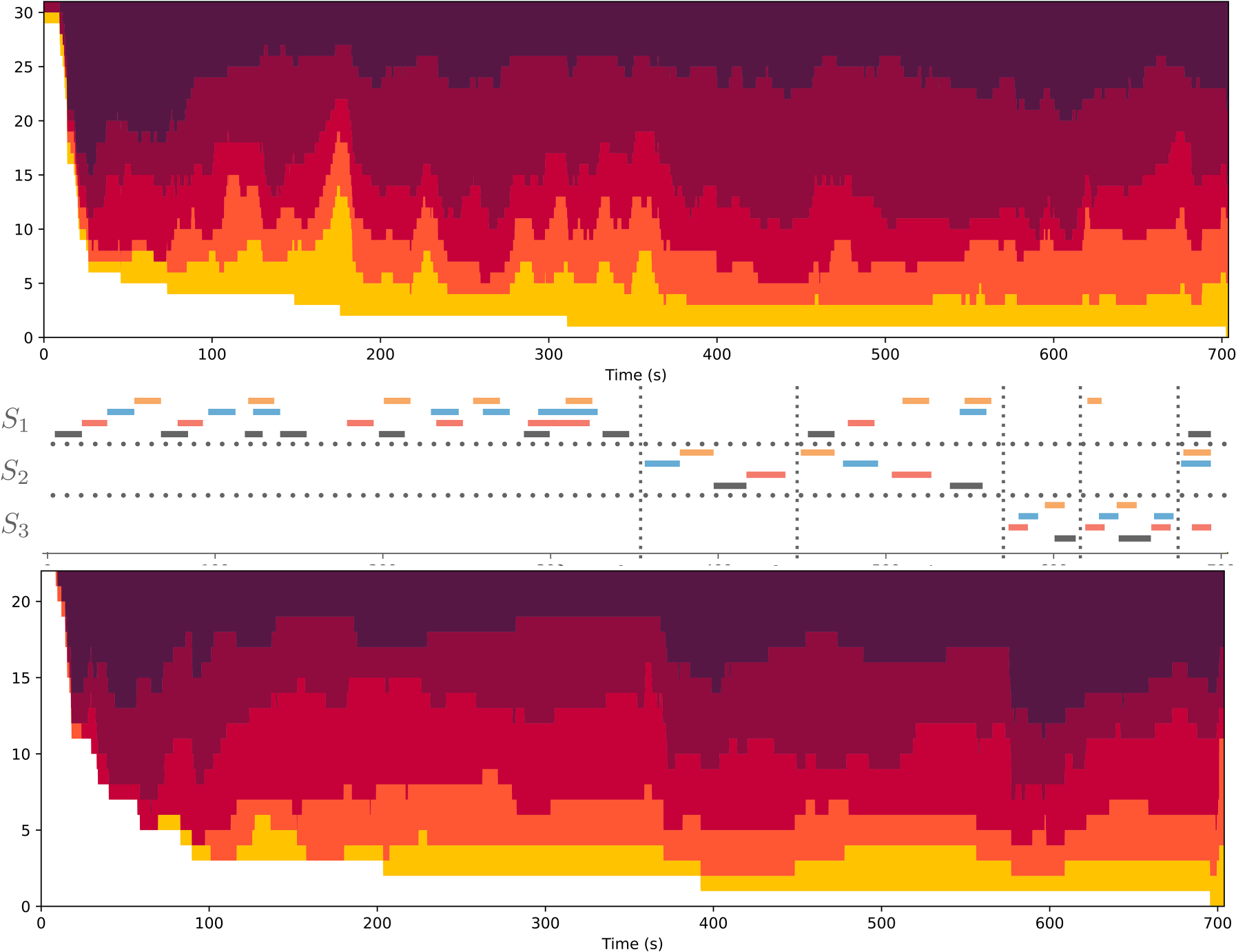
Top and bottom: Distribution of ratings of Understanding across time (spanning from left to right along the x-axis), when watching the simple (top) or complex (bottom) version of the visualization. Colors indicate each discrete rating value, with band width showing the number of participants reporting the same degree of understanding at that moment in the music, from 1 (light yellow indicating no understanding) to 5 (darkest color indicating total understanding). White indicates participants that had not yet given a rating. Middle: For the same temporal axis, analysis of the piece with respect to the fugue subjects as in Figure 2. The different colors represent the different instruments, with cello in black, viola in red, second violin in blue, and first violin in orange.
In both visualizations, the earliest initial ratings of felt understanding tended to be high (5, the darkest shade of red). This is probably because the pitch curve of the first subject played solo by the cello (first black line in the middle panel of Figure 12) is very easy to follow. Once the second occurrence of the subject appears in the viola (first red line), lower rating values start to appear in the simple version, suggesting that the dynamic paradigmatic analysis representation can be disconcerting, especially at first. The subsequent occurrences of the subject in the second violin (blue line) and first violin (orange line) follow the same logic. The subsequent occurrences of the subject in the cello and viola are superimposed and higher ratings give way to lower ratings (75 s) as participants report less felt understanding.
Focusing on the ratings of the simple visualization (top plot of Figure 12), the ratings of felt understanding decrease as the development of the subjects and countersubjects becomes more intricate. The significant drop in ratings around 170 s occurs because the subject is absent, allowing for complex musical developments in the countersubject. Since the simple version omits these countersubjects, nothing happens at that moment, which may confuse viewers. The rest of the development of the fugue around its first subject (
Ratings of felt understanding increased for both versions with the appearance of the second subject (
Contrasting the simple and complex versions, during the first minute, the trend remains similar, except that we notice an even higher rating for the complex version. This might suggest that continuing displaying the pitch curve during the countersubject makes the visualization easier to understand. The further development of the countersubject makes the visualization more and more complicated, with lower rating values appearing quickly from around 100 s; however, this may be preferable to not displaying anything at all as in the simple version (150 to 180 s). In this second half of the section featuring
To understand the impact of a second viewing on participants’ felt understanding of the music, we found it important to consider the versions of the visualization with the order of presentation, since we might hypothesize that the first viewing has a large impact on the second one. The analysis of each of these four configurations is detailed in Appendix D, which also looks at the difference in the ratings between the two sessions for each participant separately.
The fact that half of the participants watched the same version twice (whether simple or complex) enables the impact of mere repetition to be studied. And as could be expected, some (a third of them) indicate a progression in their felt understanding throughout the sessions, while some others (another third) keep a rather consistent rating. The rest (the last third) are slightly more negative the second time, being possibly more critical and scrupulous, or tired of watching the same visualization.
Of particular interest is the study of the contrast between the two versions. Any general improvements in the ratings from the first to the second viewing could be due either to new information from a different version or a consequence of what was learned with the first visualization, whether it be the same or different from the second. According to the trajectories of felt understanding reported by individual participants, the visualizations have distinct implications at different moments in the music. The complex version is particularly appreciated for characteristic episodes in the piece where the countersubject is developed without the subject (from 160 to 180 s, around 220 s, 280 s, and 350 s). At those moments, the absence of visual information in the simple version seems to be disconcerting to participants. Other parts of the music featuring quite complex developments of the countersubjects are better appreciated, for some viewers, in the simpler version of the visualization.
Feedback
At the end of the online experiment, participants were invited to write down any general feedback. A selection of those comments are shown in Appendix E. Some comments were extremely positive, finding for instance the visualization “really eye/ear opening.” For others, focusing on the visualization was distracting them from appreciating the music. Some mentioned that the beginning was a bit confusing, until they understood the basic principles of the paradigmatic analysis. Some participants did not accept the principles of the paradigmatic analysis, finding it “utterly incorrect.” Another participant did not agree with the proposed analysis and expressed concern that the analytical focus could hinder musical appreciation. One participant found it “really hard” to pay attention to the simple version, considered as “oversimplified,” after having watched and seemingly appreciated the complex version. Another participant instead found the complex version “irritating,” with “too much extraneous detail.”
Among the 21 spontaneous feedback items we collected,
six expressed a positive appreciation of the visualization (including one not personally positive, but who “can appreciate that some people would find it interesting”) five expressed a negative appreciation (finding the visualization wrong, distracting, reductive, or “mathematical,” in a negative sense) two said they were uncertain about what they saw.
Additional reactions were further collected from people invited to watch the visualization. Reactions from classical music experts vary significantly: Some were upset by the absence of traditional music notation, some were confused by the paradigmatic analysis; however, others found the visualization highly insightful and enlightening.
Discussion
We aimed to design a visual signal that is easily understood, highly accessible, and self-explanatory, without requiring musical or technical expertise. Our approach focused on describing the music itself, avoiding textual descriptions and aesthetic “spoilers.” Technical music representations were replaced by intuitive pitch curves, which better capture the rich inner variability of live performances. Unlike the rolling approach that lets viewers follow the temporal representation while listening, our goal was to emphasize essential structural features, ensuring that these structures do not slip away quickly. This visualization's structural focus was on the melodic repetition characteristic of fugues. We designed a representation that tracks the evolution of the fugue structure throughout the piece.
Integrating visualizations into live concerts requires careful consideration of audience expectations and experience. In the pilot experiment presented in this study, participants in a live concert generally reported that they were disturbed by the visualization and that it did not enhance their understanding or experience. The presentation of a visualization, which is unnatural to a classical concert audience, was probably detrimental to the musical appreciation, and distracted from the live performance. Compared to the live concert audience, the online audience, who devoted more attention to the visualization, reported better understanding, although this did not positively or negatively affect their experience. Therefore, the method of implementation influenced audience appreciation. Factors other than attentional focus, such as the environmental setting of being in a concert hall with an audience and live performers instead of viewing in a quiet solitary environment, could have also contributed to participants’ experience of the visualization. The primary objective of the study, however, was to design a new music visualization concept. Its application in a live concert setting, while an additional challenge, was secondary and does not undermine the main focus. Given that the aim of the visualization was to promote musical understanding, which may not be the main goal of a concertgoer, the visualization design may be best evaluated within a controlled music listening environment.
The results of the controlled experiment are more encouraging. They demonstrate that the proposed method to visualize the intricacies of a complex Bach fugue can be understood and appreciated by a broad audience. This visualization could enhance their appreciation of the music's richness and potentially increase their engagement with it. Although the experiment was not designed to validate every decision in the visualization's design, it shows that the approach to revealing the fugue's complexity was mainly met with understanding and some appreciation. A large majority of the online participants reported that they understood how the visualization related to the music; a majority also reported that the visualization supported their understanding of the music; about half reported that it augmented their understanding of the melodic themes. Some participants in the experiment didn’t understand the visualization, even in its simpler form. This indicates that the design may not be suitable for everyone. It's important to recognize that visualizations need to be tailored to meet the specific needs of different audience groups.
One fundamental principle of the proposed approach is based on an apparent contradiction: to highlight the richness of the music through dynamic visualization while at the same time keeping it simple and accessible. We developed a visualization that we believed to be optimal in terms of accessibility and aesthetic qualities. One valuable insight gained from the experimentation and testing with different audiences is that there is no single visualization choice that will satisfy all types of listeners. The chosen visualization was considered optimal from the perspective of the designer. Although the online audience reported that the visualization promoted significantly better understanding, some individuals found it either too simplistic or too complex, or even both simultaneously. In future endeavors, users will have the opportunity to select between different strategies, allowing them to evaluate the advantages and disadvantages of each approach. This will provide users with the ability to adjust the balance between simplicity and richness, starting with a minimalist setting and gradually introducing more complexity as their understanding of the visual design progresses.
The specific music piece studied in this project was one of Bach's masterpieces, namely the last Contrapunctus of The Art of Fugue. This piece is of tremendous richness, but its underlying structural principles may be less accessible to non-expert audiences. It could be argued that starting with a simpler piece would have been more prudent in terms of the experimental protocol. However, one of the main goals was to explore the potential of visualization. Using such a sophisticated piece allowed us to delve into its intricacies and examine how they could be made more understandable through visualization for the audience.
Another important aspect of the proposed visualization strategy was to eschew the use of written music scores and instead present temporal pitch curves. While some members of the audience accustomed to reading music scores may find this omission disconcerting, we contend that the pitch curve representation provides additional valuable information, specifically regarding the nuances of stringed instrument performance, such as vibrato and portamento. In future endeavors, users will be given the option to customize the visualization design according to their preferences, allowing for the inclusion of music scores if desired.
Another, and perhaps more daring, major decision was to abstain from using additional graphical annotations to indicate repeated motifs. Instead, we introduced an innovative approach called dynamic paradigmatic analysis to represent these repetitions. This choice can be seen as high-risk, high-reward: Some viewers found the resulting visualization perplexing and difficult to comprehend, while others found it to be remarkably enlightening.
Besides being a pedagogical tool for people with varied musical sophistication, this analytical representation is of interest for musicology in general. The dynamic visualization enables us for the first time to display a “polyphonic paradigmatic analysis”—that is, an analysis where multiple paradigmatic repetitions can appear at the same time—by highlighting the synchronized parts while the music is being played. The visualization focused on pitch curve instead of score notation for simplicity reasons, but also to highlight the performance richness within each single note. A version of the visualization with score notation can be considered for future works, with a comparative evaluation with a simple score following visualization.
The proposed technology remains in the form of a prototype. We plan also to integrate a polyphonic pitch tracker that would not require the use of multi-channel instrument pickups but simply a single mono or stereo pickup. Through further integration of automated transcription systems, the entire process could be conducted without the need for a score or a score follower. In the present form, the motivic analysis had to be performed by hand in advance. Integrating computational methods for motivic analysis will allow automation of the whole process. Besides the display of pitch curves and of the motivic structure of the fugue, other aspects of the music could be depicted as well, related both to the expressivity of the performance—in particular with respect to dynamics and timbre—and to the characteristics of the fugue itself, and notably the harmonic (or tonal) development (Lartillot et al., 2020).
The technology aims to be accessible to the public through software and apps, initially focusing on the fugue repertoire. By fully automating the tracking of each instrument and note, as well as executing a comprehensive analysis of musical scores across various dimensions, the visualization would be tailored to a wide range of fugue compositions and individual performances. The interface also should have the capability to track real-time viewer feedback, adjusting the visualization complexity to meet users’ specific needs. Additionally, the experience should incorporate gamification elements, encouraging users to enjoy music at increasing levels of complexity and guiding them toward a deeper appreciation and understanding of musical nuances. The integrated feedback mechanisms will facilitate large-scale studies of audience appreciation and comprehension, in particular with respect to the proposed visualization.
In future works, we plan to generalize the system to broader music forms, genres, and cultures. The specific music visualization project presented in this article is conceived as part of a more general and long-term endeavor to develop new visualization technologies to facilitate better understanding of music analysis and enhance music listening experiences. This broader endeavor impacts the fields of musicology and music pedagogy, as well as those seeking to expand their knowledge of music (such as scholars, musicians, and the general public) or to make music more accessible to wider audiences. We anticipate that these tools could revitalize the musical ecosystem.
Supplemental Material
sj-pdf-1-mns-10.1177_20592043251352299 - Supplemental material for Video Visualization of a String Quartet Performance of a Bach Fugue: Design and Subjective Evaluation
Supplemental material, sj-pdf-1-mns-10.1177_20592043251352299 for Video Visualization of a String Quartet Performance of a Bach Fugue: Design and Subjective Evaluation by Olivier Lartillot, Dana Swarbrick, Finn Upham and Carlos Eduardo Cancino-Chacón in Music & Science
Footnotes
Acknowledgments
The authors express their gratitude for the fantastic opportunity to test their research in the context of an actual concert of such an outstanding ensemble as the Danish String Quartet.
Action Editor
Simon Høffding, University of Southern Denmark, Department of Sports Science and Clinical Biomechanics.
Peer Review
Oded Ben-Tal, Kingston University, Department of Performing Arts.
Asterios Zacharakis, Aristotle University of Thessaloniki, Faculty of Fine Arts, School of Music.
Author Contributions
OL conceived and implemented the music visualization and carried out the music analysis. CECC provided the automated score following technology. FU, DS, and OL designed and analyzed the questionnaires. OL implemented the online questionnaire interface, while FU conceived the visualization of the online ratings. OL, DS, and FU wrote the sections about the concert and online experiments. CECC and OL wrote the text about score following. OL wrote the rest of the manuscript. DS and FU edited it.
Data Availability Statement
Visualisation videos available on YouTube: complex version: https://youtu.be/zdn9e9R4sAs, simple version: https://youtu.be/00w8O77E1SA. Pilot response data can be collected from the questionnaire responses reported in the MusicLab Copenhagen OSF repository, under Audience Surveys: https://osf.io/89s5w. Discrete rating response dataset and analysis are available on Github at: https://github.com/dana-and-monsters/Bach_Fugue_Visualization_Analysis. The code of the online survey interface and the results are available in the OSF repository: https://osf.io/2b6y8. Continuous ratings dataset and analysis (version 1.0.0) are available at: https://github.com/finn42/Bach_Viz_Responses and ![]() .
.
Declaration of Conflicting Interests
The authors declared no potential conflicts of interest with respect to the research, authorship, and/or publication of this article.
Ethical Approval
This concert experiment was approved by the Norwegian Centre for Research Data (NSD), reference number 915228.
Funding
The authors disclosed receipt of the following financial support for the research, authorship, and/or publication of this article: This work was supported by the Research Council of Norway, grant numbers 262762 (RITMO Centre of Excellence) and 287152 (MIRAGE project).
Supplemental Material
Supplemental material for this article is available online.
Notes
References
Supplementary Material
Please find the following supplemental material available below.
For Open Access articles published under a Creative Commons License, all supplemental material carries the same license as the article it is associated with.
For non-Open Access articles published, all supplemental material carries a non-exclusive license, and permission requests for re-use of supplemental material or any part of supplemental material shall be sent directly to the copyright owner as specified in the copyright notice associated with the article.