
Abstract
Background
Dashboards are tools that support decision-making by leveraging data, delivering precise and prompt information, and significantly aiding organizations in meeting their informational needs while improving data-driven decision-making.
Objective
This study aims to synthesize the evidence on applications, benefits, design features, and challenges of healthcare dashboards through an umbrella review.
Method
Four databases were searched systematically, including PubMed, Web of Science, Embase, and Scopus, within the time frame of 2010 to 2024, with the final article search completed on 30 December 2024. The retrieved reviews were first appraised by applying the JBI Critical Appraisal Checklist and the Risk of Bias in Systematic Reviews (ROBIS) tool. Following quality assessment and data extraction, the content was organized for synthesis into four analytical categories: applications, benefits, design features, and challenges. Data were further organized according to user groups and the two primary dashboard types (Clinical and Quality) in the tables to facilitate interpretation.
Results
A total of 41 studies were included for data synthesis, with 73% rated as high quality. The majority of articles were from the United States and focused on the public health context. Across the included studies, 12 distinct applications, 9 key benefits, 6 design features, and 8 challenges related to healthcare dashboards were identified. Findings were structured to reflect differences and overlaps between clinical and quality dashboards, highlighting their specific roles in patient care versus organizational performance.
Conclusion
Healthcare dashboards serve diverse applications across clinical and public health settings, offering benefits such as enhanced decision-making, improved efficiency, and increased adherence to evidence-based practices. However, the successful implementation of these systems depends on addressing persistent challenges related to data quality, integration, usability, and user engagement. Classifying dashboards into clinical and quality types provides a clearer framework for context-sensitive design, tailored implementation strategies, and improving their impact in healthcare systems.
Introduction
Nowadays, healthcare organizations face significant challenges in utilizing data within managerial and clinical processes due to the large volume of data, data collection from diverse sources, and a lack of structure. 1 A review of the literature highlights that big data challenges span multiple dimensions, including data storage, retrieval, capture, sharing, and analysis. 2 These issues contribute to a state of “information chaos,” characterized by information overload, scarcity, inaccuracy, fragmentation, and misalignment with users’ needs. 3
While data-related challenges may lead to workflow difficulties and delays, they represent only one of several factors associated with suboptimal care.4,5 Traditional static performance reporting systems may further exacerbate these challenges, as their inconsistency, lack of timeliness, limited comparability, and non-interactive formats hinder accurate assessment of organizational performance and impede data-driven decision-making. 6 To address these gaps, healthcare organizations increasingly use dynamic and interactive performance management tools such as dashboards, which can support real-time monitoring, measurement, and evaluation of healthcare processes and may help improve patient care by providing actionable insights to clinicians and managers. 7
Dashboards are data-driven decision support tools that aggregate data from multiple sources and present it visually in a summarized, meaningful, and actionable format based on key performance indicators (KPIs). By transforming complex data into accessible insights, dashboards enable users to monitor, analyze, and manage performance more effectively. These tools can be applied across a range of purposes and contexts within healthcare.8,9
Healthcare dashboards are visual, data-driven tools that integrate and summarize key indicators, enabling both clinical and organizational decision-making and helping organizations manage and interpret large volumes of information across different levels of the healthcare system.7,10,11
These systems are mainly divided into two categories: clinical dashboards and quality dashboards. Clinical dashboards provide timely and relevant information to assist providers in making daily decisions about patients, while quality dashboards provide information at the departmental or organizational level to assist managers in decision-making.12,13 Dashboards are used in various healthcare domains, including public health, 14 nursing care, 15 patient safety improvement, 16 and intensive care.17,18 Given the increasing volume of data and the growing use of dashboards in healthcare, the number of review articles in this area is also rising. 19 To provide healthcare decision-makers with comprehensive evidence, it is important to synthesize these existing systematic reviews. 19 This approach, known as an “umbrella review,” collects and synthesizes evidence from multiple systematic reviews, summarizing findings from various studies in each field. 20 An umbrella review enables a rapid assessment of broad, high-quality evidence, giving an overview of the current state of knowledge without the need to examine each systematic review individually.21,22
This study aims to synthesize the evidence on applications, benefits, design features, and challenges of healthcare dashboards through an umbrella review.
Methods
Study design
This umbrella review was conducted following Preferred Reporting Items for Systematic Reviews and Meta-Analyses (PRISMA), 23 and the methodological framework for umbrella reviews is described by Aromataris et al. 19 (Appendix A: PRISMA 2020 Checklist). This design was selected to provide a comprehensive synthesis of existing systematic reviews, compare conclusions across studies, and highlight potential discrepancies. With the growing volume of reviews in this field, this approach offers an efficient way to consolidate and interpret the overall evidence without duplicating prior work. 24
Identifying research questions
This umbrella review aims to synthesize evidence on the latest applications of dashboards in healthcare. Accordingly, the research questions set are as follows:
For what purposes are dashboards most commonly used in healthcare? What are the key benefits of using dashboards in healthcare? What design features are typically incorporated into healthcare dashboards? What challenges are associated with the adoption of dashboards in healthcare?
Eligibility criteria
At this stage, we used the PICOS strategy (participants, interventions, context/consequence, outcomes, and study design) to develop the inclusion and exclusion criteria for selecting relevant articles. 25 These criteria are presented in Table 1.
Inclusion and exclusion criteria.

Search strategy and study selection
In the first step, the process of defining and formulating the overarching research goals and aims was carried out by three members of the authoring team (SA, RR, and PB), based on the theoretical foundations of the research. A systematic search was carried out in four databases: Embase, PubMed, Scopus, and Web of Science using MeSH terms and related keywords grouped into three categories: dashboard, healthcare, and review articles. The full list of keywords and the detailed search strategies for each database are presented in Appendix B.
The search covered articles published from 2010 to 2024, reflecting the period during which healthcare dashboards became more prominent in the literature,8,13 with the final search completed on 30 December 2024. EndNote version 20.2.1 was used to organize references and manage the screening process. The study selection followed the PRISMA 2020 guideline, as shown in the corresponding flow diagram. The database searches initially yielded 1180 records. After removing 236 duplicates, the remaining 944 records underwent title and abstract screening. During this screening, 835 articles were excluded for the following primary reasons: not related to healthcare dashboards (n = 304), not systematic reviews or scoping reviews (n = 81), focusing on clinical decision support systems (CDSS) rather than dashboards (n = 156), involving medical registries (n = 131), mobile app-assisted self-care interventions (n = 48), usability evaluations (n = 11), visualization-only studies (n = 51), or other topics outside the scope of this review (n = 53). The remaining 109 articles were kept for full-text assessment. During the full-text assessment, 68 studies were excluded for reasons including: not full text (n = 2), not a review (n = 5), medical registries (n = 3), CDSS (n = 5), not related to healthcare dashboards (n = 26), editorial (n = 1), mobile app-assisted self-care (n = 4), usability evaluation (n = 4), visualization-only studies (n = 10), KPIs identification (n = 6), and quality improvement studies (n = 2). In addition, 23 records were identified via Google Scholar and 5 through citation searching, as shown in Figure 1. The screening process was conducted independently by two authors (SA and SZH). This umbrella review includes a broad range of healthcare dashboards, including clinical, quality, and public health applications, to provide a comprehensive overview of the field. To make the results more actionable, the findings are presented and synthesized in structured sub-categories.

Flow diagram of database search, screening, and selection of studies.
Assessment of methodological quality and risk of bias
At this stage, two authors (SA and RR) independently assessed the methodological quality and risk of bias of the included SRs using the JBI critical appraisal tool and the Risk of Bias in Systematic Review (ROBIS), respectively. Any disagreements were resolved through discussion with a third author (PB). The JBI checklist is designed to evaluate the methodological quality of systematic reviews, consisting of 11 items that assess study quality and potential sources of bias, with responses recorded as yes, no, unclear, or not applicable (Appendix C: quality assessment of included reviews). 19 The ROBIS tool assessed the risk of bias across two phases: phase 2 (covering four domains, study eligibility criteria, identification and selection of studies, data collection and study appraisal, and synthesis and findings) and phase 3 (overall judgment). 26 Each domain and the overall assessment can be rated as low risk, high risk, or unclear. A domain is judged as low risk when all items are answered yes or probably yes; potential bias is considered when items are answered no or probably no. The category “no information” is used only when insufficient data is available to make a judgment (Appendix D: risk of bias assessment of the included systematic reviews).
Data extraction
Data extraction was carried out independently by two authors (SA and SZH). After completing their individual extractions, each author cross-checked the other's work. Any disagreements were resolved through discussion with a third author (MG). The extracted data items included: first author's name, year of publication, country, type of review, number of databases searched, number of studies included in each review, publication year range, setting, study objective, dashboard applications, benefits, design features, and challenges. All data were extracted from the systematic reviews and entered into Excel for analysis.
Data analysis
Following data extraction and review of the study objectives and results, the findings were organized into four main outcome categories: applications, benefits, design features, and challenges of using dashboards, through a narrative synthesis (Appendix E: characteristics of the included reviews). To improve clarity and usability, all healthcare dashboards included in this review were categorized into two primary types based on their main application: (1) Clinical dashboards, which support direct patient care and clinical decision-making; and (2) Quality dashboards, which facilitate performance monitoring, resource management, and workflow optimization.12,13 Inductive content analysis was applied within each category to identify, group, and refine concepts (Tables 2 to 5). This method involved reducing and organizing data into structured concepts that directly address the research questions. 27 First, the applications, benefits, design features, and challenges reported in the included articles were identified. Similar concepts were then grouped together within each dashboard category, and overarching themes were generated. The initial content analysis was performed by one author (SA) and subsequently reviewed and confirmed by two other authors (RR and PB).
Applications of healthcare dashboard.

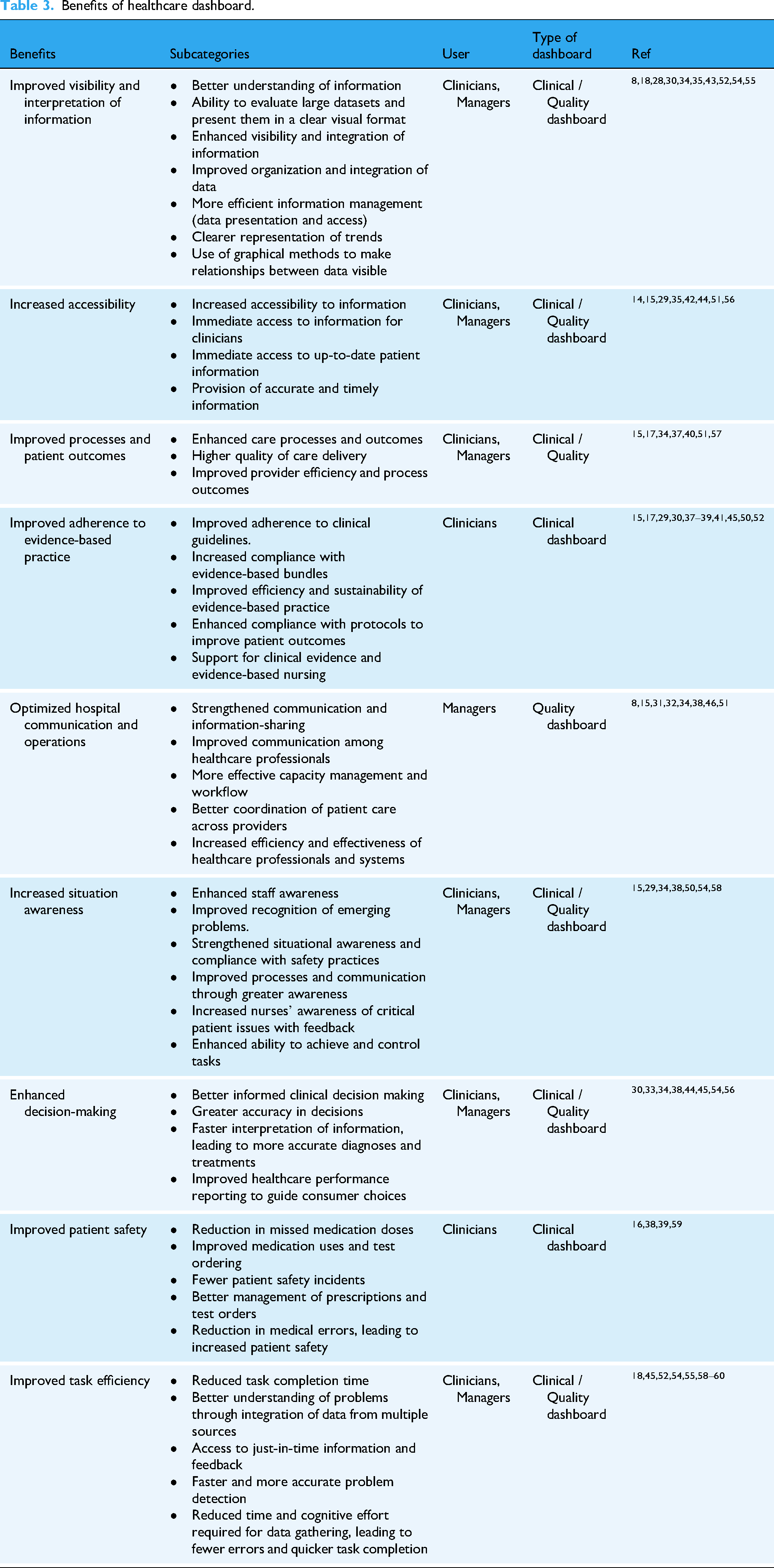
Benefits of healthcare dashboard.
Design feature of healthcare dashboard.

Challenges of healthcare dashboard.

Results
Characteristics of included studies
After screening titles, abstracts, and full texts according to the inclusion and exclusion criteria, a total of 41 articles were ultimately included for analysis. Geographically, the majority of studies (n = 12, 30%) were conducted in the United States, followed by Iran (n = 10, 25%). Publication trends indicated a marked increase in healthcare dashboard studies between 2021 and 2022. With respect to implementation fields, the majority of dashboards were adopted in public health (n = 12, 30%).
Nineteen studies (53%) applied a formal quality assessment tool, most commonly the EPOC (Cochrane Effective Practice and Organization of Care) and the MMAT (Mixed Methods Appraisal Tool), as shown in Figure 2. Based on the JBI methodological quality appraisal, the majority of reviews (n = 30, 73%) were rated as high quality (scores 9–11/11), nine (25%) as moderate quality (scores 6–8/11), and two as low quality (scores <5).

Characteristics of included studies.
The ROBIS tool was used to assess the risk of bias in the included systematic reviews. In domain 1 (study eligibility criteria), 2 SRs were classified as high risk, while others were considered low risk. In domain 2 (identification and selection of studies), 2 SRs were regarded as high risk, and the rest were low risk. In domain 3 (data collection and study appraisal), 8 SRs showed high risk.8,28,32–34,51,54 In domain 4 (synthesis and findings), 16 SRs were classified as high risk, and 20 were considered low risk. For the overall assessment in phase 3, 6 SRs were rated as high risk,28,29,33,35,36,54 while others remainder were considered low risk.
Applications of the healthcare dashboard
A total of 114 applications of healthcare dashboards were initially identified across the included reviews. After removing duplicates and overlapping items, 60 unique applications remained. To provide a clearer and more actionable synthesis, these applications were grouped into 12 main categories (Table 2) and further organized according to the primary focus of the dashboards: Clinical dashboards (supporting direct patient care and clinical decision-making) and quality dashboards (facilitating performance monitoring, workflow optimization, and resource/quality management). The most frequently reported applications were monitoring KPIs (n = 15), resource management (n = 10), and analysis and prediction (n = 10). Other common applications included display of integrated information (n = 6), tracking (n = 5), evidence-based decision-making (n = 5), public health surveillance (n = 5), and patient care management (n = 5).
Benefits of healthcare dashboard
A total of 114 benefits of healthcare dashboards were initially identified across the included reviews. After removing duplicates and overlapping items, 44 unique benefits remained. These were further synthesized into nine overarching categories, as presented in Table 3, and organized according to the primary focus of the dashboards: Clinical dashboards (supporting patient care and clinical decision-making) and quality dashboards (enhancing performance monitoring, workflow optimization, and quality management). The most frequently reported benefits included improved adherence to evidence-based practice (n = 11), enhanced visibility and interpretation of information (n = 10), optimized hospital communication and operations (n = 8), increased accessibility (n = 8), improved task efficiency (n = 8), better processes and patient outcomes (n = 7), increased situational awareness (n = 7), and enhanced decision-making (n = 7). This structured presentation allows readers to readily identify the benefits associated with each dashboard type and understand their relevance to specific users.
Design feature of the healthcare dashboard
Across the included reviews, a total of 90 design features for healthcare dashboards were initially identified. After removing duplicates and overlapping items, 25 unique features remained. These features were further grouped into six main categories, as shown in Table 4, and organized according to the primary type of dashboard: Clinical dashboards (features supporting patient care and clinical decision-making) and quality dashboards (features enhancing performance monitoring, workflow optimization, and quality management). The most frequently reported features were data visualization (n = 18), customizability and flexibility (n = 6), interactivity tools (n = 6), content (n = 3), summary view (n = 3), and trends display (n = 3). This structured categorization allows readers to quickly identify which design features are relevant for each type of dashboard and understand how they can be applied to improve usability, decision support, and actionable insights.
Challenges of healthcare dashboard
Across the included reviews, a total of 56 challenges of healthcare dashboards were initially reported. After removing duplicates and overlapping items, 40 unique challenges remained. These were further grouped into eight main categories, as presented in Table 5, and organized according to the primary type of dashboard: Clinical dashboards (challenges affecting patient care and clinical decision-making) and quality dashboards (challenges related to performance monitoring, workflow, and quality management). The most frequently reported challenges included data quality and integrity (n = 8), user-related factors (n = 7), implementation and training (n = 6), integration of dashboards (n = 5), interface design (n = 5), organizational-related factors (n = 3), and content development (n = 3). Presenting challenges in this structured manner allows readers to quickly identify potential barriers for each type of dashboard and consider strategies to mitigate them in practice.
Discussion
Main findings
This umbrella review was conducted to synthesize existing systematic reviews on healthcare dashboards and provide comprehensive evidence for decision-makers. Umbrella reviews, also known as “overviews of reviews,” collect and summarize findings from multiple systematic reviews to offer a broad and high-quality overview of a topic. 62 By combining evidence from several reviews, umbrella reviews help map the current state of knowledge and identify gaps without focusing extensively on the methodology of each included review. This approach ensures that our study remains focused on the results and practical implications for healthcare dashboards. 63
This umbrella review aimed to synthesize the applications, benefits, design features, and challenges of using dashboards in healthcare settings by reviewing 41 reviews. Dashboards have emerged as valuable tools for policymakers, health system planners, and providers, enabling real-time monitoring of health system performance and supporting data-driven strategies to improve public health. 64 The review also revealed a notable increase in published studies between 2021 and 2022, particularly in public health sector. This surge is likely linked to the COVID-19 pandemic and other recent epidemics, which underscored the critical role of data-driven systems such as dashboards in ensuring timely access to essential public health information for diverse stakeholders and decision-makers.
Prior to the COVID-19 pandemic, dashboard use in healthcare was limited; however, by the end of 2020, nearly all states and many major cities had implemented COVID-19 dashboards.63,65 This rapid and widespread adoption highlights the need to move beyond crisis-driven deployment toward sustainable integration of dashboards within broader health information systems. To achieve this, it is crucial to synthesize evidence not only on their technical features and applications but also on their alignment with health system objectives, governance structures, and decision-making processes. Such integration will help ensure that dashboards evolve from stand-alone tools into embedded infrastructures that consistently support evidence-based healthcare planning and delivery.
Applications
In the present study, the most common applications of dashboards in healthcare were monitoring, resource management, analysis and prediction, decision support, and tracking. Broadly, the literature identifies three core functions of dashboards in healthcare: monitoring, analysis, and performance evaluation, all of which contribute to supporting evidence-based decision-making. 66
To improve clarity and usability, all applications were further grouped into two primary categories based on their main purpose: clinical dashboards, which support direct patient care and clinical decision-making; and quality dashboards, which facilitate performance monitoring, resource management, and workflow optimization.
Beyond these core functions, different studies highlight complementary roles. Yigitbasioglu et al. described dashboards as tools for data collection, processing, communication, planning, performance measurement, and business management, underscoring their value in linking information with organizational processes. 67 Abdul Rahman et al. (2017) categorized dashboard objectives by management level (strategic, tactical, and operational) and found that most were operational, focusing on planning, monitoring, communication, adaptation, and analysis. 68 Pauwels et al. (2009) offered a similar classification, identifying four primary applications: adaptation (reflecting organizational actions and performance), monitoring (tracking outcomes), planning (developing forward-looking strategies), and communication (sharing performance information among stakeholders). 69
Taken together, these findings suggest that dashboards serve not only as analytical tools but also as strategic and communicative infrastructures that enable coordination, transparency, and planning across health systems. Taken together, these findings suggest that dashboards serve not only as analytical tools but also as strategic and communicative infrastructures, with clinical dashboards focused on direct care support and quality dashboards targeting organizational management and performance optimization.
Benefits
Healthcare dashboards offer a range of benefits for providers, managers, and policymakers by enabling more effective use of data in decision-making. These systems can transform healthcare delivery by enhancing efficiency, improving patient outcomes, and fostering evidence-informed planning at multiple levels of the system. Visual elements such as charts, maps, and icons not only facilitate comprehension and reduce information overload but also enhance memory retention, foster motivation, and promote engagement among users. 70 In line with our two-category framework, clinical dashboards predominantly contribute to improved patient care, adherence to evidence-based practice, and support for clinical decision-making, while quality dashboards primarily enhance resource management, workflow optimization, and organizational performance monitoring. However, research indicates that the choice of visualization technique matters: the use of icons, tables, pie charts, or bar charts can directly influence the accuracy and quality of decisions made by healthcare professionals. 71
Beyond supporting interpretation, dashboards contribute to system efficiency by automating data collection, analysis, and reporting. As Few et al. noted, dashboards provide real-time and actionable insights in formats that are understandable to diverse stakeholders, thereby streamlining workflows and freeing up time for higher-value tasks. 72 Similarly, Yigitbasioglu et al. highlighted the role of dashboards in improving organizational processes through integrated reporting and communication. 67 Taken together, these benefits suggest that dashboards are not only technical tools for data display but also strategic enablers of system-wide learning and coordination, with the impact varying according to whether they serve clinical or quality purposes.
Design features
The usability of dashboards and their effectiveness depends heavily on their design, particularly how data is selected and visualized according to users’ needs. In healthcare, these needs vary widely: while managers may prioritize aggregated performance trends over weeks or months, frontline clinicians often require real-time patient-level data to intervene rapidly. 73 This distinction aligns with our two-category classification: clinical dashboards prioritize patient-level detail and real-time alerts, whereas quality dashboards focus on aggregated data, trend analysis, and workflow metrics. 74
Several studies converge on key design principles. Echeverria et al. (2018) emphasized that dashboards are most impactful when their visual capabilities and metrics are explicitly aligned with organizational goals. 74 Janes et al. (2013) similarly identified two central features of effective dashboards: the careful selection of performance indicators and the use of appropriate visualization techniques. 75 Common design elements such as tables, charts, and color coding, particularly traffic-light systems (red/yellow/green) are widely valued for their simplicity and universal recognizability. 76 Expanding on this, Maheshwari et al. (2014) proposed broader principles including customization, linking indicators to organizational processes and policies, integrating multiple dashboards, and providing features that actively support interpretation and performance monitoring. 66
Despite these insights, our review identified gaps in how dashboards are designed to meet diverse user needs. While previous literature notes that many dashboards may not undergo standardized usability assessments, 77 our synthesis focused on features and design elements explicitly reported in the included studies. These findings highlight the importance of aligning dashboard design with user requirements to enhance comprehension, decision-making, and integration into healthcare processes. 67 These findings underscore the need to align design with the primary purpose of the dashboard, whether clinical or quality-focused, to optimize usability and impact.
Challenges
While dashboards offer substantial benefits, their implementation in healthcare is accompanied by significant challenges. Chief among these are concerns about data quality and reliability. Effective and usable dashboards depend on accurate, timely, and consistent data; when analytical tools are applied to incomplete or erroneous information, the outputs can mislead decision-makers and compromise patient care. 78 Key attributes of healthcare data quality include accessibility, accuracy, completeness, consistency, relevance, validity, and timeliness.79,80 Ensuring these as data quality metrics requires robust data governance and integration across multiple information systems and data sources.
Other challenges associated with dashboard use are user-related factors. According to studies, involving different user groups in each stage of dashboard development and implementation is cited as an effective approach to overcome user resistance to new technologies.81,82 Studies also indicate that using a socio-technical approach, which considers the interaction between people, processes, and technologies, in the design, development, implementation, and evaluation of health technologies can reduce user- and organization-related barriers.83,84 Additionally, the successful adoption of dashboards depends on proper training and change management to ensure that healthcare professionals can effectively integrate these technologies into their routine practices. 85
Challenges also differ according to dashboard type: clinical dashboards often face obstacles related to integration into clinical workflow and user engagement, while quality dashboards encounter difficulties in aligning metrics with organizational objectives and training staff for effective performance monitoring. Finally, challenges also emerge in technical and structural integration. Application of data exchange standards to improve dashboards interoperability with other systems, controlling access levels based on user roles, and introducing features incrementally through phased implementation are strategies suggested to improve the effective and efficient use. When combined with ongoing training, these approaches strengthen the alignment between dashboards and user needs.86–88
Implications for policy, practice, and future research
Dashboards play an increasingly important role in shaping health policy and practice. By ongoing monitoring using KPIs, these systems support more efficient resource allocation and management, reveal trends and patterns in healthcare data, and enable early identification of emerging issues. From this perspective, dashboards function as decision-support tools that empower policymakers and health system leaders to set data-driven strategies that improve healthcare delivery and public health. Categorizing dashboards into clinical and quality types allows stakeholders to identify which applications, benefits, and design features are most relevant to their specific goals, thereby enhancing the practical utility of dashboards.
To enhance the practical use of our findings, clear guidance is needed on how dashboards can be implemented effectively across healthcare settings. Our results can inform policymakers, managers, and clinicians on which dashboard applications, benefits, and design features are most likely to improve decision-making and patient care. Future research should evaluate the impact of dashboards on healthcare processes and outcomes, and explore how different applications support adoption in diverse organizational contexts.
Strengths and limitations
To our knowledge, this umbrella review is the first study to bring together evidence on the applications, benefits, design features, and challenges of dashboards in healthcare. A key strength of this work is that it applies a clear two-category classification, distinguishing between clinical dashboards, which focus on direct patient care and clinical decision-making, and quality dashboards, which emphasize organizational performance, resource management, and workflow optimization. This distinction enhances interpretability and practical applicability of the findings for different stakeholder groups. At the same time, several limitations should be acknowledged. Nearly half (47%) of the included reviews did not use a formal quality assessment tool, which may affect the reliability of their findings. Another limitation is the absence of meta-analyses in this area, which restricts the ability to draw stronger quantitative conclusions. Finally, access to the full text of some potentially relevant studies was limited, which may have influenced the comprehensiveness of the review. Additionally, while the two-category framework clarifies dashboard roles, some dashboards may have overlapping functions, which can limit strict classification.
Conclusion
Healthcare dashboards represent an important advancement in the way healthcare organizations manage and use data. By applying a two-category framework, this study highlights how clinical dashboards support direct patient care and evidence-based decision-making, whereas quality dashboards facilitate organizational management, performance monitoring, and workflow optimization. Dashboards have wide-ranging applications, including monitoring, performance evaluation, resource management, and public health surveillance, and offer clear benefits such as strengthening adherence to evidence-based practice, improving communication and hospital operations, increasing accessibility, and enhancing both processes and patient outcomes. At the same time, dashboards present notable challenges, particularly around data integration, adoption, implementation, and organizational readiness. Understanding the different functions of clinical and quality dashboards allows stakeholders to focus on appropriate strategies for design, training, and implementation that suit each type of dashboard. To fully realize their potential, healthcare organizations need to carefully plan implementation, ensure the accuracy and reliability of data, provide adequate user training, and address both individual and organizational factors. When these issues are effectively managed, clinical dashboards can optimize patient care and decision-making, while quality dashboards can improve system-wide efficiency and performance monitoring. Overall, this two-category framework supports a more structured approach to dashboards deployment for optimal impact on healthcare delivery and public health improvement.
Supplemental Material
sj-docx-1-dhj-10.1177_20552076261429609 - Supplemental material for Umbrella review of healthcare dashboards: Applications, benefits, design, and challenges
Supplemental material, sj-docx-1-dhj-10.1177_20552076261429609 for Umbrella review of healthcare dashboards: Applications, benefits, design, and challenges by Sohrab Almasi, Reza Rabiei, Seyedeh Zahra Hamedi, Mustafa Ghaderzadeh and Peivand Bastani in DIGITAL HEALTH
Supplemental Material
sj-docx-2-dhj-10.1177_20552076261429609 - Supplemental material for Umbrella review of healthcare dashboards: Applications, benefits, design, and challenges
Supplemental material, sj-docx-2-dhj-10.1177_20552076261429609 for Umbrella review of healthcare dashboards: Applications, benefits, design, and challenges by Sohrab Almasi, Reza Rabiei, Seyedeh Zahra Hamedi, Mustafa Ghaderzadeh and Peivand Bastani in DIGITAL HEALTH
Footnotes
Author contributions
All authors contributed to the final manuscript.
Funding
The authors received no financial support for the research, authorship, and/or publication of this article.
Declaration of conflicting interests
The authors declared no potential conflicts of interest with respect to the research, authorship, and/or publication of this article.
Data availability
Data is provided within the manuscript or supplementary information files.
Supplemental material
Supplemental material for this article is available online.
References
Supplementary Material
Please find the following supplemental material available below.
For Open Access articles published under a Creative Commons License, all supplemental material carries the same license as the article it is associated with.
For non-Open Access articles published, all supplemental material carries a non-exclusive license, and permission requests for re-use of supplemental material or any part of supplemental material shall be sent directly to the copyright owner as specified in the copyright notice associated with the article.