An added-variable plot is an effective way to show the correlation between an independent variable and a dependent variable conditional on other independent variables. For multivariate estimation, a simple scatterplot showing x versus y is not adequate to show the partial correlation of x with y, because it ignores the impact of the other covariates. Added-variable plots are especially effective for showing the correlation of a dummy x variable with y because the dummy variable conditional on other covariates becomes a continuous variable, making the relationship easier to visualize.
Added-variable plots are also useful for spotting influential outliers in the data that affect the estimated regression parameters. Stata provides added-variable plots after ordinary least-squares regressions with the avplot command. I present a new command, avciplot, that adds a confidence interval and other options to the avplot command.
An added-variable plot is a scatterplot of the transformations of an independent variable (say, x1) and the dependent variable (y) that nets out the influence of all the other independent variables. The fitted regression line through the origin between these transformed variables has the same slope as the coefficient on x1 in the full regression model, which includes all the independent variables.
An added-variable plot is the multivariable analogue of using a simple scatterplot with a regression fit when there are no other covariates to show the relationship between a single x variable and a y variable. An added-variable plot is a visually compelling method for showing the nature of the partial correlation between x1 and y as estimated in a multiple regression.
The plot of the fitted regression line alone does not show whether the slope of the line (the regression coefficient on x1) is statistically significant. Including a confidence interval around the regression line in the plot clarifies this. avciplot includes a confidence interval in the added-variable plot unlike Stata’s built-in avplot command. To add a confidence interval to an avplot would require that almost all the code in avplot be reconstructed manually, so I created the avciplot command.
At a chosen level of statistical significance (typically 95%), if the confidence interval does not include a slope of zero, then the coefficient on x1 is statistically significant. The confidence interval helps the viewer see precisely how the sample data fit the partial correlation of x1 with y.
Outliers in a simple scatterplot of x1 versus y may no longer be outliers when other covariates are included in the model. An added-variable plot is a handy visual diagnostic for spotting influential outliers after conditioning on the other covariates in the model.
A simple scatterplot of x1 versus y can be a misleading representation of the relationship of these variables when controlling for other covariates. Even when it is more or less representative—meaning that the other variables do not much affect the partial correlation of x1 versus y—it is still difficult to grasp the correlation between a dummy variable and the y variable because all the dummy variable observations are clustered at 0 and 1. Because the residual of a dummy variable conditional on the other covariates has continuous rather than discrete values, the added-variable plot can make the partial correlation of a dummy x1 and y easier to visualize (see the last example using avciplots below).
In addition to providing confidence intervals, avciplot has two useful options not available in avplot. The generate() option allows the user to save the values of the residuals of x1 and y conditional on the other covariates for subsequent use in calculations or additional graphs. The xlim() and ylim() options allow the user to exclude extreme observations from the scatterplot (without removing their influence from the regression estimate). These options should be used carefully, but they can make the graph clearer when distant yet inconsequential outliers affect the graph’s scale, which often happens with large datasets.
2 Why do we need added-variable plots, and where do they come from?
The purpose of multivariate regression is to assess the influence of each independent variable on the dependent variable while accounting for the influence of all the other independent variables. The regression coefficient quantifies the partial correlation of an independent variable (x1) on the dependent variable (y) controlling for the other independent variables (x). A simple scatterplot is an effective visual presentation of the unconditional correlation of x1 with y, but an added-variable plot is needed to display the partial correlation of x1 with y conditional on other x variables. The partial correlation typically has a different magnitude and may even have a different sign than the unconditional correlation.
For example, there is a negative correlation between automobile fuel efficiency (mpg) and engine size (displacement) in auto.dta. This is clear from a scatterplot of the data with a regression line:
However, in a multiple regression that includes the car’s weight and displacement, displacement has a small but positive partial correlation with mpg in this sample. Presumably, the problem with large engines is their weight, not their size. How can we display this relationship graphically, that is, the partial correlation of displacement with mpg while controlling for the influence of weight? We do so with avciplot:
The added-variable plot shows that the partial correlation of displacement with mpg when weight is also included in the model dramatically differs from the unconditional correlation of displacement with mpg. The negative unconditional correlation becomes a positive correlation when it is conditioned on the regressor weight.
The slope of the fitted regression line though the origin in the added-variable plot is equal to the estimated coefficient on displacement in the preceding regression. The confidence interval bounded by the dashed lines includes the 0 line on the vertical axis. This indicates that the slope of the regression line is not significantly different from 0 at the 5% level (the default), which is confirmed by the t statistic of 0.54 printed at the bottom of the graph.
The next subsections explain the statistical basis for added-variable plots. If that is not your interest, please skip to section 3.1 (the syntax of avciplot and avciplots) or detailed examples of their use in section 5.
2.1 Partial regression
The statistical basis for an added-variable plot is partial regression. Uncharacteristically, the Stata documentation for avplot does not explain the methods behind addedvariable plots, so they are covered in detail here.
Partial regression is also known as the Frisch–Waugh–Lovell theorem after Frisch and Waugh (1933) and Lovell (1963). Partial regression shows that the partial correlation of x1—one of multiple independent variables—with the dependent variable y can be found by “partialing out” the influence of the other independent variables on both x1 and y first and then regressing the “partialled” x1 on the “partialled” y.
Take the standard linear regression equation relating the dependent variable, y, to K − 1 independent variables x1,…, xK−1, and an intercept term and an error term ε:
The intercept term is placed after the x variables for notational convenience.
If we draw a sample of n observations of data that conform to this relationship, we have n × 1 data vectors of the dependent variable y and the K independent variables (including xK ≡ 1, a vector of ones, for the intercept βK), x1,…,xK. Combining all the independent variables into an n × K matrix X, the data fit the equation
where β is a K × 1 vector of unknown parameters and ε is an n × 1 vector of the unobserved errors.
The ordinary least-squares (OLS) estimator b is derived by minimizing the sum of squared residuals (, where ) and solving the normal equation
We can partition the X matrix into X = [x1X2], where X2 = [x2…xK]; partition b into , where ; and rewrite (1) as
With some manipulation, we can solve for , where . Because M2 is symmetric and idempotent, we can rewrite b1 as
where = M2x1 and ey = M2y.
By inspecting the equation for M2, we can see that ey = M2y is the vector of residuals from the regression of y on X2, and likewise = M2x1 is the vector of residuals from the regression of x1 on X2.
ey and can be interpreted as y and x1 purged of the influence of the X2 variables. , where is the predicted value of y from the regression of y on X2. That is, ey and are, respectively, what is left over when all the variation in y and x1 that can be predicted by X2 has been subtracted out. So the correlation of ey and is the partial correlation y and x conditional on X2.
This decomposition gives rise to the added-variable plot. A scatterplot of the values in versus ey will show the correlation of the x1 variable with the y variable, controlling for the influence of the other independent variables in the multiple regression. From (2), we can see that the OLS estimate of β1, b1, is the result of regressing ey on . Thus, the OLS linear fit of the data in the scatterplot of versus ey is equal to b1, the estimated partial effect of x1 on y.
We were seeking a way of displaying the relationship between x1 and y, controlling for the effect of the other independent variables in the regression. Stata’s built-in command avplot creates a scatterplot of versus ey and displays the linear fit line with a slope of b1. avciplot also creates a scatterplot of versus ey and displays the linear fit line along with confidence interval boundaries above and below the regression line. The formula for the confidence interval around the linear fit line in (, ey) space is derived in section 4 below.
3 The avciplot and avciplots commands
3.1 Syntax
3.2 Description of avciplot and avciplots
avciplot is a postestimation command that creates an added-variable plot (also known as a partial-regression leverage plot, partial-regression plot, or adjusted partial-residual plot) after the regress command. It differs from Stata’s built-in avplot command by adding confidence intervals around the regression line and various options.
avciplots creates a matrix of added-variable plots of all the indepvars.
indepvar is an independent (x) variable (also known as a predictor, carrier, or covariate) that may or may not have been included in the preceding regression. The user would choose an indepvar not already in the regression to evaluate whether to include it.
avciplot shows the partial correlation between one indepvar and the depvar from a multivariate regression.
Besides showing the relationship between the indepvar and the depvar controlling for the other regressors, avciplot is useful for visually identifying which outlier observations have a big effect on the estimated coefficient.
After an OLS regression of x1 and x2 on y, the plotted e(x|X)values are the residuals from the regression of x1 on the other x2 variables in the original regression, and the plotted e(y|X)values are the residuals from the regression of y on the other x2 variables.
The fitted line shown in the graph is the least squares fit between the residuals e(x|X) and e(y|X). The fitted line has the same slope as the estimated coefficient on the indepvar in the preceding regression.
Because of their construction, the residuals e(x|X) and e(y|X) each have a mean of zero, and the regression line fit between them passes exactly through e(x|X) = 0 and e(y|X) = 0. At that point, the confidence interval has zero width, giving it an unfamiliar shape.1
3.3 Options for avciplot and avciplots
marker_options affects the rendition of markers drawn at the plotted points, including their shape, size, color, and outline; see [G-3] marker_options.
marker_label_options specifies if and how markers are to be labeled; see [G-3] marker_label_options.
rlopts(cline_options) affects the rendition of the regression (fitted) line; see [G-3] cline_options.
nocoef turns off display of the values of the coefficient, standard error, and t statistic from the regression line below the graph.
noci turns off the display of the confidence interval on the graph.
ciunder causes the confidence interval to be graphed underneath the scatterplot (that is, the data scatter is visible on top of the confidence interval). This is mainly useful when graphing a solid confidence interval with option ciplot(rarea).
level(#) specifies the confidence level, as a percentage, for confidence intervals around the regression line. The default is level(95) or as set by set level; see [U] 20.8 Specifying the width of confidence intervals.
ciopts(cline_options) affects how the upper and lower confidence interval lines are rendered; see [G-3] cline_options. If you specify ciplot(), then rather than using cline_options, you should specify what options are appropriate for the plottype.
ciplot(plottype) specifies how the confidence interval is to be plotted. The default is ciplot(rline), meaning that the prediction will be plotted by graph twoway rline.
A common alternative is ciplot(rarea), which will draw a shaded confidence interval in place of confidence interval boundary lines around the prediction line. See [G-2] graph twoway for a list of plottype choices. You may choose any plottypes that expect two y variables and one x variable.
twoway_options are any of the options documented in [G-3] twoway_options, excluding by(). These include options for titling the graph (see [G-3] title_options) and saving the graph to disk (see [G-3] saving_option).
3.4 Options only for avciplot
xlim(# #) and ylim(# #) constrain the range of the indepvar and depvar residuals displayed. If only one number is specified, residuals with a value below that number will not be displayed in the scatterplot. If two numbers are specified, residuals below the first number and above the second number will not be displayed.
Excluding observations of the residuals does not affect the slope of the regression line in the graph. The purpose of these options is to avoid a few outlying observations dramatically extending the range of the x or y axis, thus obscuring the display of the relationship between the variables. As usual, make sure that the undisplayed observations are not important to the estimated relationship and are noted in the text.
generate(exvar eyvar) saves the values of the x and y residuals in variables named by the user. The user must specify two variable names for exvar and eyvar. These residuals can be used for subsequent calculations or graphing commands. See section 4 below for how to access the estimate b1 and its standard error and how to calculate the regression fit and confidence intervals.
nodisplay suppresses display of the plot. This is mainly useful for users creating their own plots from variables created with generate().
addplot(plot) provides a way to add other plots to the generated graph; see [G-3] addplot_option.
3.5 Option only for avciplots
combine_options are any of the options documented in [G-2] combine_options for arranging a matrix of plots in a single image.
3.6 Stored results
avciplot stores the following in r():
4 Methods and formulas
Because avciplot is a regress postestimation command, the preceding regress command will have the form
where y is the depvar, x1 is one of the indepvars, and x2 is a vector of the other indepvars. This will be followed by the command
avciplotx1
avciplot allows for x1 not to be included in the preceding regressindepvars. In that case, there is some adjustment to these formulas, principally to fit the full regress model including x1 for the first time as in (3).
avciplot calculates residuals ey and in (2) from
regressyx2
predictey, resid
regressx1x2
predict, resid
using the same weights and sample restrictions as (3).
The coefficient b1 and its standard error (up to a degree-of-freedom adjustment) could be calculated by regressing the residuals on ey, but it is not necessary because they are already available from the regression in (3).2 By default, avciplot displays a confidence interval around the predicted fit from the regression of on ey. The fitted values of ey are . The confidence interval boundaries are , where tα/2[n−K] is the α/2 percentile of the cumulative t distribution with n−K degrees of freedom and α = 1 − level( )/100.
5 Examples of avciplot and avciplots in use
Because avciplot and avciplots are regress postestimation commands, we first load Stata’s auto.dta and then run the regression discussed in the introduction to relate displacement (engine size) and weight of cars to their fuel efficiency (mpg).
Though the simple correlation of displacement and mpg is strongly negative, if we also condition on weight, then displacement and mpg have a positive insignificant partial correlation. This is presented visually in an added-variable plot:
. avciplot displacement
The scatterplot shows the values of the residuals versus ey. The solid line is the regression fit of these values, and the dashed lines are the limits of the 95% confidence interval around the regression fit. The slope of the regression fit in the added-variable plot is equal to the coefficient on displacement in the preceding regression, the value of which is printed at the bottom of the graph.
We can see that the partial correlation of displacement with mpg is not statistically significant (at the 5% level), because the confidence interval includes zero.
The added-variable plot shows the correlation of the x1 variable, displacement, conditional on all the other independent variables in the regression, with the y variable, mpg, also conditional on all the other regressors. That is, it shows the correlation of one x with y, netting out the influence of all the other covariates.
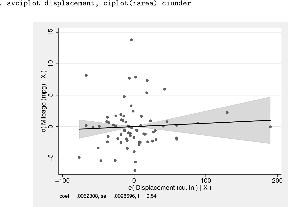
avciplot can display the confidence interval as a solid area (similar to the lfitci graphs) by using the option ciplot(rarea) rather than the default of delineating the interval by two dashed lines. The ciunder option causes the scatterplot to be superimposed on the confidence interval rather than vice versa so that data points within the interval are still visible:
. avciplot displacement, ciplot(rarea) ciunder
Added-variable plots are a good diagnostic for finding outlier observations that influence the partial correlation of a regressor of interest, in this case displacement.
There is a clear outlier in the e(mpg|X) vertical axis with a value of about 14. It is also clear that this outlier has little effect on the slope of the regression line because it has a value e(displacement|X) of about 0. Including this outlier shrinks the rest of the graph vertically, which makes it harder to see the estimated relationship.
We can exclude the display of this observation with the option ylim(-10 10) to magnify the rest of the graph. The lower limit of ylim() has no effect because there are no e(mpg|X) values below −10. The ylim() and xlim() options are not available in avplot, so this could be a reason to use avciplot even if you do not want to display a confidence interval.
Another difference between avplot and avciplot is the ability to save the values of and ey (that is, e(x|X) and e(y|X)) for later use with the generate() option, perhaps to create a more complicated graph after running the avciplot command.
The following command implements the ylim(), generate(), and noci (no confidence interval display) options:
. avciplot displacement, ylim(-10 10) noci generate(ex ey)
The new variables ex and ey, containing the residuals of the x and y variables conditional on all the other regressors, are added to the dataset in memory.
An added-variable plot is an especially effective way of showing the (conditional) relationship of a dummy variable with the dependent variable. A simple scatterplot of a dummy variable like foreign versus mpg displays only two values on the horizontal axis, making it difficult to discern the relationship visually:
In contrast, the added-variable plot of foreign versus mpg graphs the residual of the dummy variable conditional on the other x variables, which is continuous although the dummy variable itself has only two discrete values. avciplot can take an indepvar that has not yet been included in the regression, making it useful for exploring the influence of new variables. To see the partial correlation of the new variable foreign added to the existing regression, use
. avciplot foreign
This controls for all the existing variables in the previous regression, which in our example are displacement, weight, and an intercept. The added-variable plot of foreign could help the user decide whether to add it as a new variable to the regression.
As a final example, the companion command avciplots shows the added-variable plots of all regressors in the preceding regression in a single graph. We include an interaction term between weight and foreign in the regression and then show all the partial correlations:
avciplots provides a quick way of understanding the coefficient estimates after any linear regression. The graph shows the strength and significance of the partial correlations of all the independent variables and helps to highlight outlier observations that affect each correlation.
The examples above show how avciplot and avciplots can be used to present the relationship between independent and dependent variables graphically when there are multiple covariates in a regression. The inclusion of confidence intervals in the avciplot graphs makes it possible to see the precision and statistical significance of the estimated coefficients and their magnitude.
6 Programs and supplemental materials
Supplemental Material, gr0077 - Added-variable plots with confidence intervals
Supplemental Material, gr0077 for Added-variable plots with confidence intervals by John Luke Gallup in The Stata Journal
Footnotes
6 Programs and supplemental materials
To install a snapshot of the corresponding software files as they existed at the time of publication of this article, type
Notes
References
1.
FrischR.WaughF. V.1933. Partial time regressions as compared with individual trends. Econometrica1: 387–401.
2.
LovellM. C.1963. Seasonal adjustment of economic time series and multiple regression analysis. Journal of the American Statistical Association58: 993–1010.
Supplementary Material
Please find the following supplemental material available below.
For Open Access articles published under a Creative Commons License, all supplemental material carries the same license as the article it is associated with.
For non-Open Access articles published, all supplemental material carries a non-exclusive license, and permission requests for re-use of supplemental material or any part of supplemental material shall be sent directly to the copyright owner as specified in the copyright notice associated with the article.