In this article, I extend the theory of added-variable plots to three panel-data estimation methods: fixed effects, between effects, and random effects. An added-variable plot is an effective way to show the correlation between an independent variable and a dependent variable conditional on other independent variables. In a multivariate context, a simple scatterplot showing x versus y is not adequate to show the relationship of x with y, because it ignores the impact of the other covariates. Added-variable plots are also useful for spotting influential outliers in the data that affect the estimated regression parameters. Stata can display added-variable plots with the command avplot, but it can be used only after regress. My new command, xtavplot, is a postestimation command that creates added-variable plots after xtreg estimates. Unlike avplot, xtavplot can display a confidence interval around the fitted regression line.
An added-variable plot displays a scatterplot of a transformation of an independent variable (say, x1) and the dependent variable (y) that nets out the influence of all the other independent variables. The fitted regression line between these transformed variables has the same slope as the coefficient on x1 in the full regression model, which includes all the independent variables.
An added-variable plot is a visually compelling method for showing a partial correlation between x1 and y. A confidence interval shows how precisely the sample data fit that correlation. An added-variable plot is the multivariate analogue of using a simple scatterplot with a regression fit in a univariate context.
The main purpose of the panel-data estimation methods in xtreg is to control for individual effects. If it is important to control for them in regressions, it is also important to control for them in graphs of the relationship of a covariate with the dependent variable. xtavplot controls for the influence of individual effects as well as other covariates on the partial correlation of x1 and y.
Outliers in a simple scatterplot of x1 versus y may no longer be outliers when other covariates are included in the model. An added-variable plot is a handy visual diagnostic for spotting influential outliers after conditioning on the other covariates in the model.
2 Why do we need added-variable plots, and where do they come from?
The purpose of multivariate regression is to assess the influence of each independent variable on the dependent variable while accounting for the influence of all the other independent variables. The regression coefficient quantifies the partial correlation of an independent variable (x1) on the dependent variable (y), controlling for the other independent variables (x). A simple scatterplot is an effective visual presentation of the unconditional correlation of x1 with y, but an added-variable plot is needed to display the partial correlation of x1 with y conditional on other x variables. The partial correlation typically has a different magnitude and may even have a different sign than the unconditional correlation.
For example, there is a positive correlation between the log of wages and worker age in the National Longitudinal Study of Young Women Stata dataset. This is clear to the eye from a scatterplot of the data with a regression line:
However, in a fixed-effects regression that includes age as well as a quadratic in job tenure and total years of labor market experience, age has a negative partial correlation with log wages in this sample. We can graphically display this relationship—the partial correlation of age with log wages controlling for the other independent variables—with xtavplot:
The added-variable plot provides a graphical representation of the relationship between age and wages when other regressors are also included in the model, which is dramatically different from the unconditional relationship of age and wages. The positive unconditional correlation of age with wages becomes a negative correlation when it is conditional on the other included regressors. The slope of the fitted regression line in the added-variable plot is equal to the estimated coefficient on x1 in the fixed-effects regression.1
The next subsections explain the statistical basis for added-variable plots. If that is not your interest, please skip to section 3.1—the syntax of xtavplot—and to detailed examples of its use in section 5.
2.1 Partial regression
The statistical basis for an added-variable plot is partial regression. Partial regression shows that the partial correlation of x1, one of multiple independent variables, with the dependent variable y can be found by “partialing out” the influence of the other independent variables on both x1 and y first and then regressing the partialed x1 on the partialed y.
Take the standard linear regression equation relating the dependent variable, y, to K − 1 independent variables x1,…, xK−1, and an intercept term and an error term ε:
The intercept term is placed after the x variables for notational convenience.
If we draw a sample of N observations of data that conform to this relationship, we have n × 1 data vectors of the dependent variable y and the K independent variables (including xK ≡1, a vector of 1s, for the intercept βK), x1,…,xK. Combining all the independent variables into an n × K matrix X, the data fit the equation
where β is a K × 1 vector of unknown parameters and ε is an n × 1 vector of the unobserved errors.
The ordinary least-squares (OLS) estimator b is derived by minimizing the sum of squared residuals (, where ) and solving the first-order normal equation
We can partition the X matrix into X = [x1X2], where X2 = [x2…xK]; partition b into b = , where ; and rewrite (1) as
With some manipulation, we can solve for , where . Because M2 is symmetric and idempotent, we can rewrite b1 as
where and .
By inspecting the equation for M2, we can see that ey = M2y is the vector of residuals from the regression of y on X2, and likewise, is the vector of residuals from the regression of x1 on X2.
ey and can be interpreted as y and x1 purged of the influence of the X2 variables., where is the predicted value of y from the regression of y on X2. That is, ey is what is left over when all the variation in y that can be predicted by X2 has been subtracted out. The process is similar for . So the correlation of ey and is the partial correlation y and x conditional on X2.
This decomposition gives rise to the added-variable plot. A scatterplot of the values in versus ey will show the correlation of the x1 variable with the y variable, controlling for the influence of the other independent variables in the multiple regression. From (2), we can see that the OLS estimator b1 of β1 is the result of regressing ey on (with no intercept term). Thus, the OLS linear fit of the data in the scatterplot of versus ey is equal to b1, the estimated partial effect of x1 on y.
This is what we were seeking: a way of displaying the relationship between x1 and y, controlling for the effect of the other independent variables in the regression. An added-variable plot creates a scatterplot of versus ey and displays the linear fit line with confidence interval boundaries above and below the regression line. The regression line has a slope of b1.
2.2 Partial regression of transformed variables
The derivation of partial regression above applies only to OLS estimation because it results from the OLS normal equation (1). However, we can derive a partial-regression formula for non-OLS estimation methods if their estimating equations can be transformed so that they meet OLS assumptions.2 The fixed-effects, between-effects, and random-effects panel-estimation methods can each be represented as transformations of the original model, which can then be fit by OLS yielding the β coefficient estimates we are seeking.
If the transformed variables y∗, , and conform to OLS assumptions, the equation
results in the OLS normal equation
As above,
The next three subsections apply the partial-regression formula for a transformed estimating equation to three panel-data estimation methods: fixed effects, between effects, and random effects.
2.3 Fixed-effects estimation
Fixed-effects estimation is just a computationally efficient way of estimating OLS coefficients incorporating a separate intercept for each cross-sectional unit in the panel-data sample. Direct computation using OLS with dummy variables for each unit is straightforward but cumbersome. In the typical situation, where the number of cross-sectional units n is large and the number of time-series observations per unit Ti is small, unit-specific intercepts result in many dummy variables, and their coefficients are usually not of interest in themselves (or consistently estimated). Fixed-effects estimation transforms the estimating equation to eliminate the numerous intercept terms. Estimating the transformed equation via OLS still delivers the same coefficients and standard errors (after a degrees-of-freedom adjustment) as direct computation, making the estimation faster and more convenient.
Given panel data on individuals or units indexed by i ∊ {1,…, n} for multiple time periods t ∊ {1,…, Ti}, consider the linear model
where xit is a 1 × K row vector of independent variables and υi is an individual or unit-specific intercept term that is assumed to be uncorrelated with the error term εit. The advantage of including the individual intercepts is that they control for all characteristics of the individual that do not change over time. Without panel data, one could not control for fixed individual characteristics without gathering data on each of the characteristics. This model can be fit using OLS by including dummy variables for each individual in the sample. Because the individual intercepts are not typically of interest, however, one can save time and effort by subtracting out their effects.
Taking the average of the observations over each individual, (4) becomes
where , , and . Subtracting (5) from (4),
which cancels out all the υi terms, dramatically reducing the dimensionality of the estimation when n is large. This can be rewritten as
where , , and
Fixed-effects estimation applies OLS to (6) to estimate the β coefficients efficiently.3
One could apply the partitioned regression formula in (3) to (6) to derive residuals and . These could be plotted, and the slope of their linear fit would be b1. However, the meaning of the residuals is not intuitive. is a vector of controlling for (where ), not yit controlling for x2it. Similarly, is a vector of controlling for , not controlling for x2it.
It is straightforward, however, to calculate the OLS ey and from the fixed-effects and is the fixed-effects residual from the regression of on y∗, producing the coefficient . An element of is . The fixed-effects coefficient is exactly equal to the OLS coefficient from regressing x2it and υi on yit.4 So, . The second term, , is the OLS estimate of the individual effect. Hence, and , where uy is an (N = ∑i Ti) × 1 vector of u(y|x2)i. Similarly, . That means that one can readily calculate the more intuitive OLS residuals and ey from the fixed-effects estimates.
So, in the case of fixed effects, the estimation of the transformed (6) produces b coefficients identical to those from a direct OLS estimation of (4). The fixed-effects estimates are used to transform the fixed-effects residuals and into the OLS residuals of and ey to create an added-variable plot whose fitted regression line has slope b1.
2.4 Between-effects estimation
Between-effects estimation applies OLS to the n unique individual mean values of (5), taking υi as part of the error term because it is not separately identifiable.
The per-individual averages are transformations of the original y and x variables, so we can apply the partial regression of transformed variables in (3), where
Then, and provide the data points for the added-variable plot. In this case, and are rather intuitive. The plot shows the relationship of the individual means of y versus the means of x1 controlling for the influence of the means of x2.
2.5 Random-effects estimation
Random-effects estimation considers the same model as fixed-effects estimation in (4) but interprets the individual effects υi as belonging to the error term. This means the error terms υi + εit are not independent and identically distributed as required for efficient estimation by OLS. The model, however, reveals the structure of the errors, so it can be estimated by generalized least squares (GLS). GLS is estimated by applying OLS estimation to transformations of the observed variables, which renders the transformed errors independent and identically distributed.
The appropriate transformation of the panel-data model in (4) for feasible GLS estimation is
Where . and are estimates of the variances of υi and εit, respectively.
We can apply the partial regression of transformed variables in (3), where
enabling us to construct and . Regressing on produces the coefficient b1, but unlike fixed-effects estimates, the residuals cannot be converted into OLS residuals ey and and still have a fitted regression slope of b1. Therefore, we make the added-variable plot out of and , which have a somewhat intuitive interpretation as heteroskedasticity-corrected residuals.5
The added-variable plot of and presents the contribution of each data point (x1it, yit) to the estimated coefficient b1, so the plot is a good visual diagnostic for outlier observations having a large influence on the estimated relationship, just as in the OLS, fixed-effects, or between-effects cases.
2.6 Maximum-likelihood random-effects and population-averaged model
The maximum likelihood estimation of neither the random-effects (xtreg, mle) nor the population-averaged model (xtreg, pa) can be represented as a transformed partialregression in the form of (3) in the way OLS and GLS estimators can. xtavplot cannot be used after these estimation methods. This may not be much of a loss in the case of xtreg, mle. The Methods and formulas section of [XT] xtreg notes that it yields “essentially the same results” as xtreg, re except when the sample is small (≤ 200 observations) and unbalanced.
3 The xtavplot and xtavplots commands
3.1 Syntax
3.2 Description of xtavplot and xtavplots
xtavplot creates an added-variable plot (also known as a partial-regression leverage plot, a partial-regression plot, or an adjusted partial-residual plot) after xtreg, fe (fixed-effects estimation), xtreg, re (random-effects estimation), or xtreg, be (between-effects estimation). xtavplot cannot be used after xtreg, mle or xtreg, pa.
xtavplots creates a matrix of added-variable plots of all the indepvars.
indepvar is an independent (x) variable (also known as a predictor, carrier, or covariate) that may or may not have been included in the preceding estimation. The user would choose an indepvar not already in the estimation to evaluate whether to include it.
xtavplot shows the partial correlation between one indepvar and the depvar from a multivariate panel regression.
Besides showing the relationship between the indepvar and the depvar controlling for the other regressors, xtavplot is useful for visually identifying which outlier observations have a big effect on the estimated coefficient.
After fixed-effects estimation, the plotted e(x|X) values are the residuals from the regression of x1 on the other x2 variables in the original regression, and the plotted e(y|X) values are the residuals from the regression of y on the other x2 variables.
After between-effects estimation, e(av.x|av.X) and e(av.y|av.X) are the residuals from the regression of per-unit means and on the per-unit means
of the other independent variables.
After random-effects estimation, e(x*|X*) and e(y*|X*) are the residuals from the regression of heteroskedasticity-corrected and heteroskedasticity-corrected y∗ on the other heteroskedasticity-corrected independent variables.
The fitted line shown in the graph is the least-squares fit between the residuals. For each of the three panel-data estimation methods, the fitted line has the same slope as the estimated coefficient on the indepvar in the preceding regression.
Because of their construction, the residuals each have a mean of zero, and the regression line fit between them passes exactly through e(x|X)=0 and e(y|X)=0. At that point, the confidence interval has zero width, giving it an unfamiliar shape.6
3.3 Options for xtavplot and xtavplots
marker_options affect the rendition of markers drawn at the plotted points, including their shape, size, color, and outline; see [G-3] marker_options.
marker_label_options specify if and how markers are to be labeled; see [G-3] marker_label_options.
rlopts(cline_options) affects the rendition of the regression (fitted) line; see [G-3] cline_options.
nocoef turns off the display below the graph of the values of the regression coefficient, standard error, and t statistic.
ciopts(cline_options) affects how the upper and lower confidence interval lines are rendered; see [G-3] cline_options. If you specify ciplot(), then rather than using cline_options, you should specify what options are appropriate for the plottype.
noci turns off the display of the confidence interval on the graph.
ciunder causes the confidence interval to be graphed underneath the scatterplot (that is, the scatter points are visible on top of the confidence interval). This is mainly useful when graphing a solid confidence interval with the option ciplot(rarea).
level(#) specifies the confidence level, as a percentage, for confidence intervals around the regression line. The default is level(95) or as set by set level; see [U] 20.8 Specifying the width of confidence intervals.
ciplot(plottype) specifies how the confidence interval is to be plotted. The default is ciplot(rline), meaning that the prediction will be plotted by graph twoway rline.
A common alternative is ciplot(rarea), which will substitute shading around the prediction line. See [G-2] graph twoway for a list of plottype choices. You may choose any plottypes that expect two y variables and one x variable.
twoway_options are any of the options documented in [G-3] twoway_options, excluding by(). These include options for titling the graph (see [G-3] title_options) and saving the graph to disk (see [G-3] saving_option).
addmeans rescales the scatterplot values, the regression line, and the confidence intervals to be centered on the mean values of the x and y variables instead of being centered on zero by default. This may make the plot more visually intuitive, but it is important to make clear to viewers that the graph is showing conditioned values rather than the original data.
3.4 Options only for xtavplot
xlim(#[#]) and ylim(#[#]) constrain the range of the indepvar and depvar residuals displayed. If only one number is specified, residuals with a value below that number will not be displayed in the scatterplot. If two numbers are specified, residuals below the first number and above the second number will not be displayed.
Excluding observations of the residuals does not affect the slope of the regression line in the graph. The purpose of these options is to avoid a few outlying observations dramatically extending the range of the x or y axis, thus obscuring the display of the relationship between the variables. Because panel datasets are typically large, it is common to have a few distant outliers that do not significantly affect the estimates. Make sure that the undisplayed observations are not important to the estimated relationship and that their exclusion is noted in the text.
generate(exvar eyvar) saves the values of the x and y residuals in variables named by the user. The user must specify two variable names for exvar and eyvar. These residuals can be used for subsequent calculations or graphing commands. See sections 3.6 and 4 below for how to access the estimate b1 and its standard error and how to calculate the regression fit and confidence intervals.
nodisplay suppresses display of the plot. This is mainly useful for users creating their own plots from variables created with generate().
addplot(plot) provides a way to add other plots to the generated graph; see [G-3] addplot_option.
3.5 Options only for xtavplots
combine_options are any of the options documented in [G-2] graph combine for arranging a matrix of plots in a single image.
3.6 Stored results
xtavplot stores the following in r():
After the addmeans option:
4 Methods and formulas
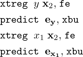
Because xtavplot is an xtreg postestimation command, the preceding xtreg command will have the form
where y is the depvar, x1 is one of the indepvars, x2 is a vector of the other indepvars, and model is a choice of fe, be, or re. This will be followed by the command
xtavplot allows for x1 not to be included in the preceding xtregindepvars. In that case, there is some adjustment to these formulas, principally to fit the full xtreg model including x1.
4.1 After xtreg, fe
xtavplot calculates residuals ey and in (2) from
using the same weights and sample restrictions as (8).
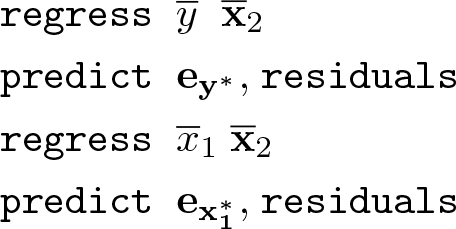
4.2 After xtreg, be
xtavplot forms the n individual means , , and as defined in (5). Residuals and in (3) are calculated from
using the weights and sample of (8).
4.3 After xtreg, re
xtavplot forms the weighted deviations from the mean variables y∗, , and as defined in (7), where . The weights are calculated from and from the preceding xtreg, re command. Define the vector
where each is repeated Ti times.
and are calculated from
using the sample of (8) (weights are not allowed in xtreg, re estimation).
Note that it does not work to use xtregyx2, re and xtregx1x2, re to generate residuals, because they will estimate different values for and , which vary depending on the included indepvars.
4.4 Confidence interval
The preceding subsections explain how to calculate the residuals ey and (or and , as appropriate throughout this section). It is not necessary to regress one residual on the other to calculate the coefficient b1 and its standard error , because they are already available from the preceding xtreg command.7
By default, xtavplot displays a confidence interval around the predicted fit from the regression of on ey. The fitted values of ey are . The confidence interval boundaries are for fixed-effects and between-effects estimates and for random-effects estimates, where tα/2 is the α/2 percentile of the cumulative t distribution, zα/2 is the α/2 percentile of the cumulative standard normal distribution, and α = 1 −level/100.
4.5 The addmeans option
The addmeans option recenters the graph on the mean values of y and x1, instead of the default of zero. The mean of y and of x1 are calculated using the weights and sample restrictions in the preceding xtreg command. is added to the residuals , and is added to ey, the predicted values, and the confidence interval boundaries before the graph is displayed. The means are not added to the values of and ey saved by the generate() option, but and are saved as r(ybar) and r(xbar) in the return values.
5 Examples of xtavplot and xtavplots in use
Because xtavplot and xtavplots are xtreg postestimation commands, we first load an example Stata panel dataset, nlswork.dta. We keep only the first 1,000 observations of the large dataset so that the graphs display more quickly. Use xtreg to fit a fixed-effects model of the correlates of wages. The specification of the model is discussed in help xtreg.
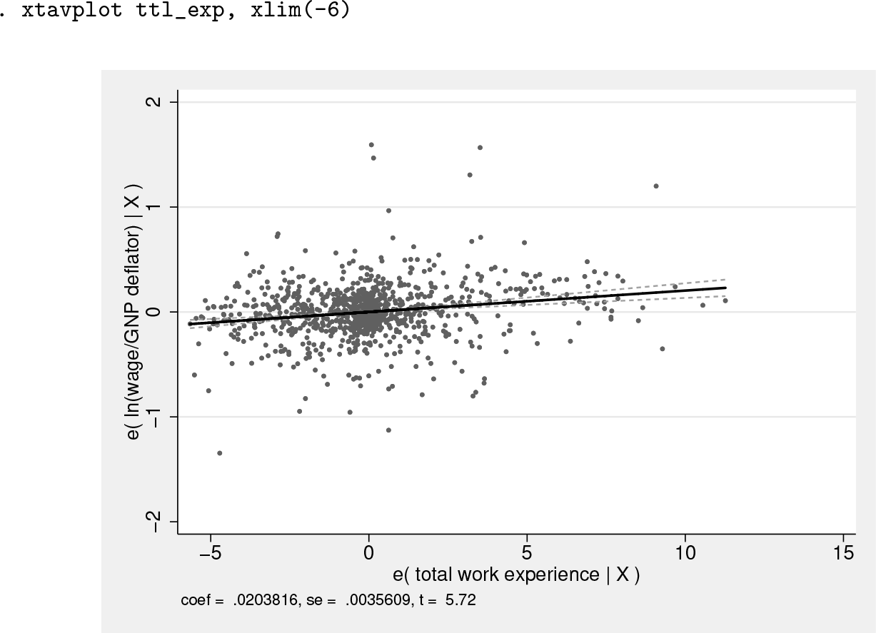
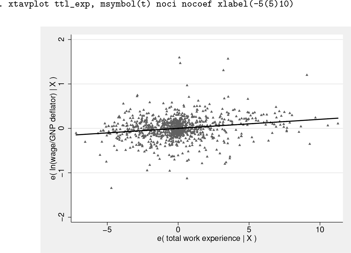
Invoking the command xtavplot ttl_exp will display a graph of the partial correlation between ttl_exp and ln_wage, giving a sense of how closely the individual observations fit this relationship. The slope of the regression of residuals e(ttl_exp|X) on e(ln_wage|X) is shown as a solid line, and the limits of its confidence interval are shown as dashed lines.
The graph has excessive white space to the left of the data because of one observation with a value of e(ttl_exp|X) equal to −6.2. When we add the option xlim(-6), the graph is better situated:
In this particular case, the source of the problem is the label algorithm, which could be better solved with the option xlabel(-5(5)10), causing no observations to be omitted, as in the graph below. However, if the value of this outlier had been −10, the xlim() option would be helpful because the problem could not be solved with an xlabel() option. Omitting the value of −10 would probably warrant a footnote.
The confidence interval can be displayed as an area plot with the ciplot(rarea) option, as displayed in the command lfitci. The ciunder option causes the confidence interval to appear underneath the scatterplot. By default, the confidence interval would be above the scatter, obscuring some of the data points.
The graph below changes the scatterplot marker symbol to triangles, does not display a confidence interval around the fitted line, and removes the value of the ttl_exp coefficient, standard error, and t statistic from the bottom of the graph.
The addmeans option rescales the graph to be centered on the actual means of y and x1 instead of the zero means of the residuals ey and . This may be more intuitive for the reader by conveying the central values of y and x1. Note that the graph shows the conditional values ey and , not the actual values y and x1.
The graph below shows the added-variable plot of south centered on its mean value of 0.02 and the mean ln_wage of 1.83. The mean value of south, close to 0, shows that there are few southerners in the sample.
Note that added-variable plots can be an intuitive way of graphing the relationship of dummy variables like south to the dependent variable because the values of the residuals are continuous even though the unconditional values of south are 0 or 1.
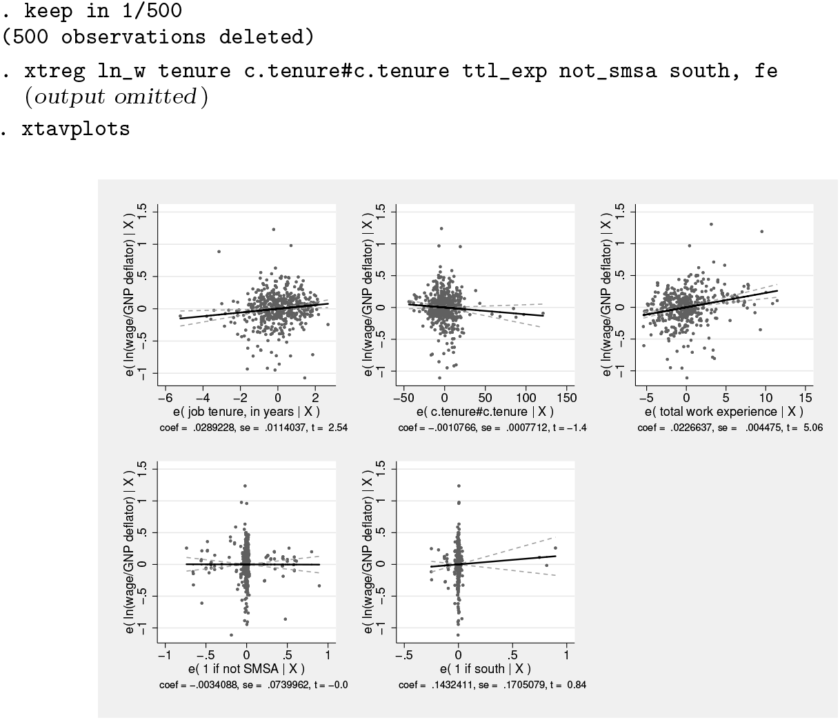
5.1 xtavplots
The command xtavplots with an s on the end creates all possible added-variable plots of the indepvars in a matrix as a single image.
Adding a title and shifting the position of the plots with the holes() option make the image look better.
The examples above have focused on graphing options to change the appearance of the graphs created by xtavplot after fixed-effects estimation. xtavplot can also be employed after between-effects and random-effects estimation. The conceptual issues involved in creating added-variable plots after these other estimation methods are discussed in previous sections, but the visual considerations when creating these graphs are the same as after fixed-effects estimation.
Footnotes
6 Programs and supplemental materials
To install a snapshot of the corresponding software files as they existed at the time of publication of this article, type
Notes
References
1.
WooldridgeJ. M.2010. Econometric Analysis of Cross Section and Panel Data. 2nd ed. Cambridge, MA: MIT Press.