
Abstract
This study explores the interpretations of three data visualisations by individuals of the Albanian diaspora in the United Kingdom. Literature concerning data visual literacy is in its nascency, and has yet to emerge with the nuance provided in this research, particularly concerning its exclusion of non-native English speakers and culturally specific populations. Thus, this research addresses these existing gaps by examining how Albanian participants interpret and engage with three data visualisations of varying complexity: a choropleth map, a line graph, and a radar chart. The findings centre on the responses provided by the participants of the study (n = 18) via recorded and transcribed interviews. The findings reveal a spectrum of potential visual literacy levels influenced by the complexity of the provided visualisation and subjective lived experiences. No clear trends emerged between participants’ backgrounds and their ability to interpret the visualisations. This research foregrounds future research exploring diverse or minority populations and encourages the development of strategies for fostering visual literacy.
Keywords
Introduction
Data visualisation comprises a diverse range of concepts, methodologies, and research, and has only been increasing in popularity since its original “roots in early map-making” 1 (p.19). Its development from cartographic content, taken in conjunction with the rapid advancements of technology, namely the Internet and subsequent globalisation, has encouraged an expansion of the scope of data visualisation and the graphical representation of data. Visual literacy has multiple benefits including the ability to traverse “borders, languages, and dialects” 2 to encourage socio-political change and individual empowerment. In the context of graphical representations of information, visual literacy evolved to encapsulate the term data visualisation literacy (DVL), otherwise a fundamental skill to develop the comprehension, cognition, and demands of an evolving society. 3
As pioneers in the work of DVL, Boy et al. 4 define visual literacy as “the ability to use well-established data visualisations (e. g., line graphs) to handle information in an effective, efficient, and confident manner” (p.1963). Further developments in the field of DVL and subsequent definitions do not stray far from this one. DVL had later been developed and used by data visualisation authors 5 in the field who still use the definition provided by Boy et al. 4 Yet, despite such progressions in both the literature and wider society, DVL is far from an equally distributed attribute or skill, with the level of data visualisation literacy varying not only across individuals at different moments in time, but also across demographics and populations. This disparity is a significant barrier to the democratisation of data and information, as those with lower levels of visualisation literacy are at a distinct disadvantage in both understanding and leveraging visualised data efficiently. 7
One such demographic, marked both anecdotally and in the existing paucity of available literature by technological disadvantage is the Albanian population, whose rich history in language and tradition is marked by “struggles for self-preservation” 8 (p.330) to this day as a result of invading subjugators, “the destruction of cultural assets” 9 (p.1) during Enver Hoxha’s communist regime, a virtually exclusive grasp on oral communication, and negative stereotypes propagated by modern media10,11. The effects of the plurality of events inflicted upon Albanian people have traversed generations and have been inherited by second and third generation immigrants and children of Albanian people that have relocated to the Anglophone West (e.g., the United Kingdom and the United States of America). Continuing in the fashion of their ancestors, first generation immigrants find solace in reinforcing their cultural history through oral tradition, passing down histories and knowledge onto their children and grandchildren in order to preserve their culture while in a new geographical home. Yet, much of the available literature on Albanian history and Albanian people, including, but not limited to, those from surrounding and interconnecting Balkan countries (e.g., Kosova, Macedonia, and Montenegro) is largely speculative, having been written by foreigners or historically ‘rival’ countries’ propagandists. 9 The implications of the above have resulted in a comparatively slow development in information technology education, 12 and particularly in technology literacy. 13 Thus, there emerges a profound need to represent both the enigmatic Albanian history, and to highlight the diversity of its people through academic investigation. Therefore, this paper seeks to make a keen contribution to both the emerging literature on data visualisation literacy and the salient dearth of Albanian representation in academic literature by investigating the visual literacy of Albanians in the United Kingdom.
Literature review
The following section will be broken down into two: the first half of the literature review will focus on developments in data visualisation literacy (DVL) concerning frameworks and underrepresented audiences. The second will focus on the technological and educational context of Albania, identifying relevant barriers and implications for DVL. The scarcity of findings on technologically or digitally oriented Albanian literature, both in English and in Albanian – the first author possesses a native level of Albanian, and therefore has the capacity to read and interpret any academic literature in the language–are emphatic of the issues addressed in the introduction: that the outputs of Albanian formal and academic literature are enigmatic at best, and delving into specialised topics such as DVL results in no direct connections to the research questions or study aims. Thus, a margin of flexibility has been permitted by the first author in order to incorporate some Albanian academic literature, even if of a low relevancy to the study, such that an available work may not strictly address DVL, but instead a related field that is information computer technology (ICT).
The evolution of DVL
Despite the ubiquity of DVL in the midst of emerging technology, artificial intelligence tools, and continually overlapping globalisation initiatives, 14 the academic literature quantifying the rates of literacy are scarce. 3 That said, the most noticeable developments in the literature have been observed in the last decade and have been steadily gaining in traction. 3
As mentioned above, in 2014, Boy et al.
4
pioneered the way for DVL literature, defining visual literacy as “the ability to use well-established data visualisations (e.g., line graphs) to handle information in an effective, efficient, and confident manner” (p.1963). Equipped with a working definition, they sought to describe a means of assessing visual literacy using line graphs, bar charts, and scatterplots in order to “help Information Visualisation (InfoVis) researchers detect low-ability participants when conducting online studies […]” (p.1963). The subsequent years witnessed a series of investigations into DVL and its application to study participants, with Börner et al.′s
5
work being particularly celebrated and referenced in multiple related works since publication.15–17 Defining DVL as “the ability to make meaning from and interpret patterns, trends, and correlations in visual representations of data” (p.200), Börner et al.
5
sought to understand the levels of familiarity that youth and adult visitors had with data visualisations, and any ideas associated with them they specified that they were not interested in the level of accuracy that the participants identified and described the visualisations. They concluded that “a very high proportion of the studied population, both adult and youth, cannot name or interpret data visualizations beyond very basic reference systems, that is, they have rather low performance on key aspects of data visualization literacy” (p.210).
At the time of their writing, data had occupied status as a key component in formal educational environments, particularly within mathematical and scientific disciplines, in order to raise national standards, 5 so a prompt for education practitioners to introduce guidance to understand visualisations was recommended, as members of the general public, or non-expert users, are directed to encounter more data visualisations in environments beyond education.
Grainger et al.′s 18 work also highlighted the necessity of involving non-experts (in the field of DVL) into a scientific perspective, arguing that traditional explanatory graphics have been “designed for audiences that are, to some extent, familiar with the underlying data or graphical form” (p.300). They synthesise the best practices across multiple disciplines that “have the potential to improve visual communication and application of scientific information within a variety of non-scientific, professional contexts” (p.306), specifying a collaborative process and definition of a culturally and functionally appropriate graphical medium (p.307) as fundamental for non-experts to interact with various data.
Frameworks and assessment models
In 2019, Börner et al. 19 presented a comprehensive “typology of core concepts and terminology together with a process model for constructing and interpreting data visualisation” (p.1858). An earlier iteration of the typology was presented at a higher education institution to more than 8500 students. Pertinent to the current study, Börner et al. 19 shared that map visualisations tend to be easier to read and could increase memorability according to “quantitative graphic variables (e.g. size or colour intensity) which can have different ordering directions” (p.1860) highlighting the flexibility of data visualisations, and subsequently DVL, depending on different interfaces and their corresponding controls.
Two years prior, Lee et al. 6 produced a visualisation literacy assessment test (VLAT) for users to take, with a particular focus on non-expert users in data visualisation. They defined visualisation literacy as “the ability and skill to read and interpret visually represented data in and to extract information from data visualisations” (p.552) and used 12 visualisations, free from any suggested context, to compose their assessment, including three forms of bar chart. Lee et al. 6 concluded “that there was a positive correlation between one’s visualisation literacy level and the aptitude for learning and using an unfamiliar visualisation” (p.559), highlighting a further need to explore participants’ understandings of visualisation tools utilised to solve problems. It is also significant that Lee et al. 6 specifically sought out native English speakers for their study, anticipating English as a non-native language as potentially impeding on “thought processes and lead[ing] to poor performance” (p.555).
Inclusion of minority populations
A salient gap in DVL literature is the absence of culturally specific or minority populations in empirical research. Most existing studies are fragmented and existing literature relies on studies being conducted using online tests of Amazon Mechanical Turk, 3 leading to bias in the data. While this allows both scalability and control, it omits participants whose linguistic backgrounds may differ from dominant sampling pools – as was evident in Lee et al.′s 6 study.
In 2022, Firat et al. 3 conducted a comprehensive review of 34 papers and an additional 45 related publications. Their work suggests that there is no overall pattern in developments on data visualisation literature, and regarding this paper’s study objective, the following information stands out: that the greatest age of any participants recorded in the studies reviewed was 69; a choropleth map was used in 8 out of 15 studies highlighted in the review; a line graph was used in 11 out of 15 studies highlighted in the review; studies were conducted using online tests or the Amazon Mechanical Turk; mock data and fictional data were used in three studies20–22; higher education was recorded as a background for participants in 6 out of 10 of the studies reviewed.
Firat et al. 3 note that “visualisation literacy is not a very visible sub-field yet” (p.308) and lacks a clear baseline, with shared elements in the reviewed works highlighting an explicit need for a number of potential research areas to emerge, including new visual designs, new target groups, and new datasets – highlighting the nascence of divisions and targeted studies in the wider field of data visualisation literature as main expectations of future research.
Technological literacy in Albania
A key consideration for this study is the historical and contemporary landscape of technological access and literacy among Albanian populations, albeit living in the UK, to the country’s developing technological and data infrastructures as a result of deterioration post dictator Enver Hoxha’s regime, affecting the economic status of the country in addition to the general education of its inhabitants. 12 Due to the demands for a well-educated workforce and technological developments to support general literacy of the people, electronic learning (e-learning) and information technology (IT) have been subjected to an explosive growth since the 1990s.13,23
E-learning, defined as “the use of Information and Communications Technology to enhance and/or support learning in tertiary education” 13 (p.6) has made notable improvements in higher education domains and disciplines, such as in the Faculty of Natural Sciences at the University of Tirana. These developments largely came as a result of new information and communication technology (ICT) government structures supported by the United Nations to address the digital divide that was present in Albania.13,23 Yet as of 2009, a maximum of only 40% of university and government-funded research libraries offered Internet access to users, and less than 20% of school and public libraries offered the same. 13 Seminal work 13 in Albanian e-learning literature prompted a call for the correct technological infrastructure to be developed in Albania, such as broadband connectivity, mobile phones, and access to personal computers.
Globalisation contributed greatly to the instalment of technological infrastructures, with there also developing accessible new technologies such as iPads, iPods, and other branded devices becoming available in Albania. 23 Yet, there were no reports concerning tangible policy on IT literacy development, with it being contingent through library education and Information Literacy movements called on by the National Library of Albania instead. 23 Recommendations include that IT literacy should be promoted at early stages of education, such as primary schools, in order to develop a wider society of IT literate civilians. 23
The recommendations above are from Domi’s work 23 , published in 2013, over a decade from the time of the authors writing this paper, and developments in technology awareness and usage have become abundant throughout the country. 24 Published at every quarter per annum, AKEP revealed that 2,023,446 people were actively using phones with broadband access. At the time of writing, AKEP’s data suggests that over 70% of the Albanian population were actively accessing the Internet using their mobile phones (the population of Albania being 2,850,639 according to Worldometer 25 live population projections). Therefore, one may consider this the manifestation of Börner et al.′s 19 pursuit of increasing exposure to data and visualisations for the general public.
Research questions
This study is guided by the following research questions:
What themes, ideas, and words are generated by Albanian people when viewing a data visualisation?
What is the length of time it takes for an Albanian person to understand a data visualisation?
Do levels of data visualisation literacy differ among age groups or social backgrounds?
In answering the questions above, this research will endeavour to highlight the differences in data visualisation literacy across the ages and social backgrounds of Albanian participants from the UK. This study has no ethnographic implications for Albanian people as an ethnic group, rather it seeks to provide a nuanced approach to understanding the associations between the two variables (age and social background) and data visualisation literacy through the underrepresented lens of the Albanian demographic. In doing so, the study objective and research questions will seek to address two main gaps highlighted in the available literature:
A notable lack of research involving non-native English speakers as participants in DVL research.
A significant lack of research into DVL studies involving interviews with participants, as opposed to online tests and survey data.
This study addresses these gaps through the involvement of participants of Albanian heritage, both native and heritage speakers, and the provision of primary qualitative interview data to the field of DVL literature.
Methodology
Ethical approval
The study received ethical approval from CIM HSSREC on 28 May 2024 as the basis of the first author’s dissertation project at the University of Warwick. Respondents gave both written and verbal consent for their participation in the interviews and were provided with both a participant information leaflet and a consent form detailing the conditions of their participation. The participants were free to withdraw from the study at any time, and encouraged to contact the first author during any points of the study with any enquiries.
Interviews
The study was conducted through a series of online interviews with Albanian participants. A mixed-methods approach to garnering interview participants was used: a call for participants was disseminated across three social media websites and applications: Instagram, Reddit, and LinkedIn, in addition to information and requests for participants being shared through word of mouth. The wording on the advertisements used to recruit participants was as follows:
“Hello everyone, I am conducting a study for my dissertation titled: Visualising culture: A study on the visual literacy of Albanians in the UK. I would like to understand the different ideas generated when Albanian people view three different data visualisations.
If you are interested in participating, or know anyone else who would be, please send me a message for more information.
Thank you!”
The first author also used convenience sampling to garner study participants. Greater emphasis was placed on the calls for participants shared via social media platforms in order to reduce sampling bias and pursue generalisable results. The interviews were recorded using the Microsoft Teams software and transcribed, and later thematically and linguistically analysed for the purposes of the research. The interviews were unstructured, but were ultimately grounded by an introduction from the first author, an explanation that the participants were to be shown three data visualisations somewhat pertaining to Albania, that the researcher was interested in the ideas generated and the responses of the participants upon viewing the visualisations, and that their responses and response times would be recorded, but that there was no time limit for their responses. The participants were shown Portable Network Graphics (PNG) versions of the visualisations using the ‘Share screen’ option which facilitated the researcher to change images once the interviewees were satisfied and expressed a desire to move onto the next image.
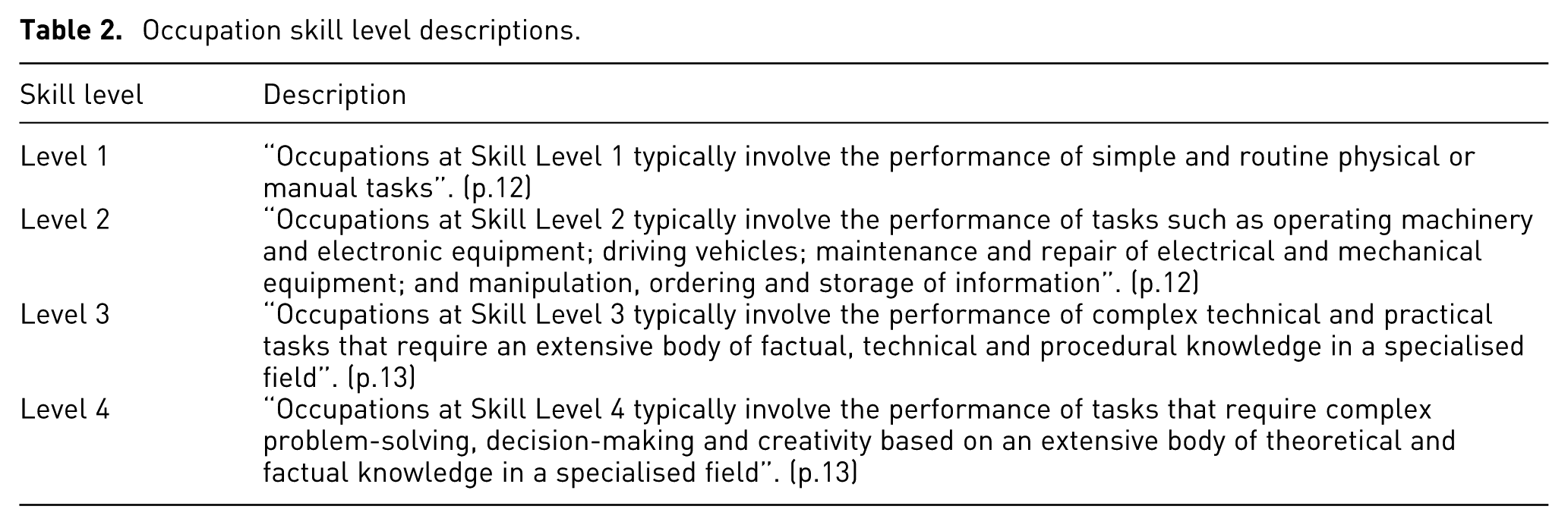
A breakdown of the participants and the medium through which they were invited to participate in the study are detailed in Table 1. The background colour of the cells have been colour-coded for easier viewing, and to facilitate the detection of patterns by most common response (plum, followed by turquoise, followed by green, and finally followed by gold; in this case, gold matched green under the Age range column, and was therefore used as a distinguishing colour). 12 All participants’ names have been pseudonymised to their preferences, and the corresponding occupation skill level attributed to the participants is based on the first author’s interpretation of the definitions provided by the International Labour Office. 26 A brief summary of the skill levels are provided in Table 2.
Participant breakdown.
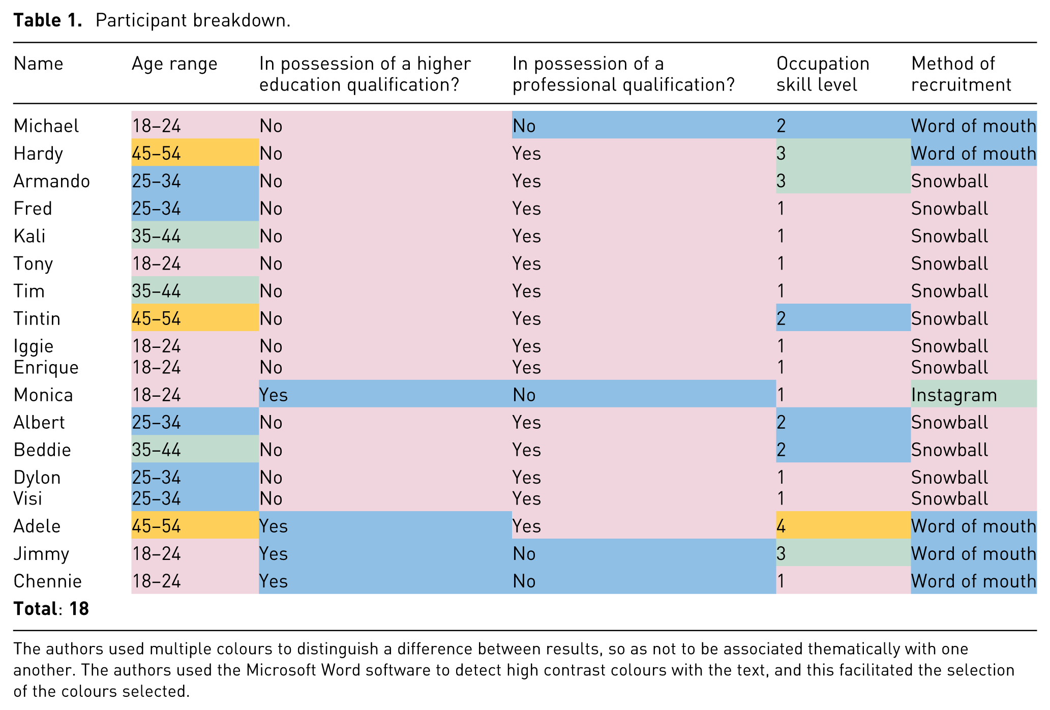
The authors used multiple colours to distinguish a difference between results, so as not to be associated thematically with one another. The authors used the Microsoft Word software to detect high contrast colours with the text, and this facilitated the selection of the colours selected.
Occupation skill level descriptions.
Visualisations
The visualisations shown to the participants were comprised of three different data sets, corresponding to three different visualisations. All visualisations were created using the Flourish 27 visualisation creator website, and all the corresponding titles for the visualisations were removed in order to facilitate and generate unique ideas and responses about the contents of this visualisation.
The first visualisation (Figure 1) was designed to be easily comprehensible, both as per the first author’s discretion and because of the context of the study as being conducted with Albanian participants. This visualisation consisted of a choropleth map of Albania with each municipality divided by the appropriate borders and filled with a colour corresponding to the level of population density per municipality. The spectrum of colours ranged from a dark purple to a neon green, with the darker purple representing the least population density, and the bright green representing a higher population density. The data was retrieved from the 2011 Albanian population and housing census. 28
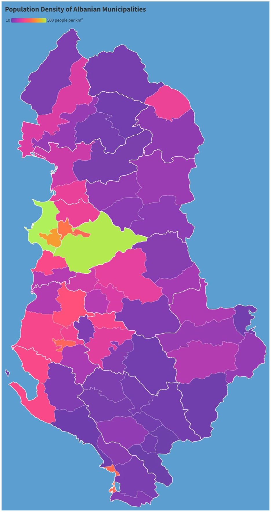
Visualisation 1.
The second visualisation (Figure 2) displayed a line graph representing the past and projected population rates of seven Balkan countries from the years 1930 to 2050. The data was retrieved from the World Health Organisation website 29 . Due to the multiple variables visualised (X axis, Y axis, and population data) this visualisation was designed to be at a ‘medium’ difficulty, where it was deemed more challenging to comprehend than the first visualisation, but not the most challenging. As with the first visualisation, this visualisation used the context of Balkan countries in order to engage the interviewees, as there was an assumption that all participants were aware of the various socio-political connections or interactions among these countries.
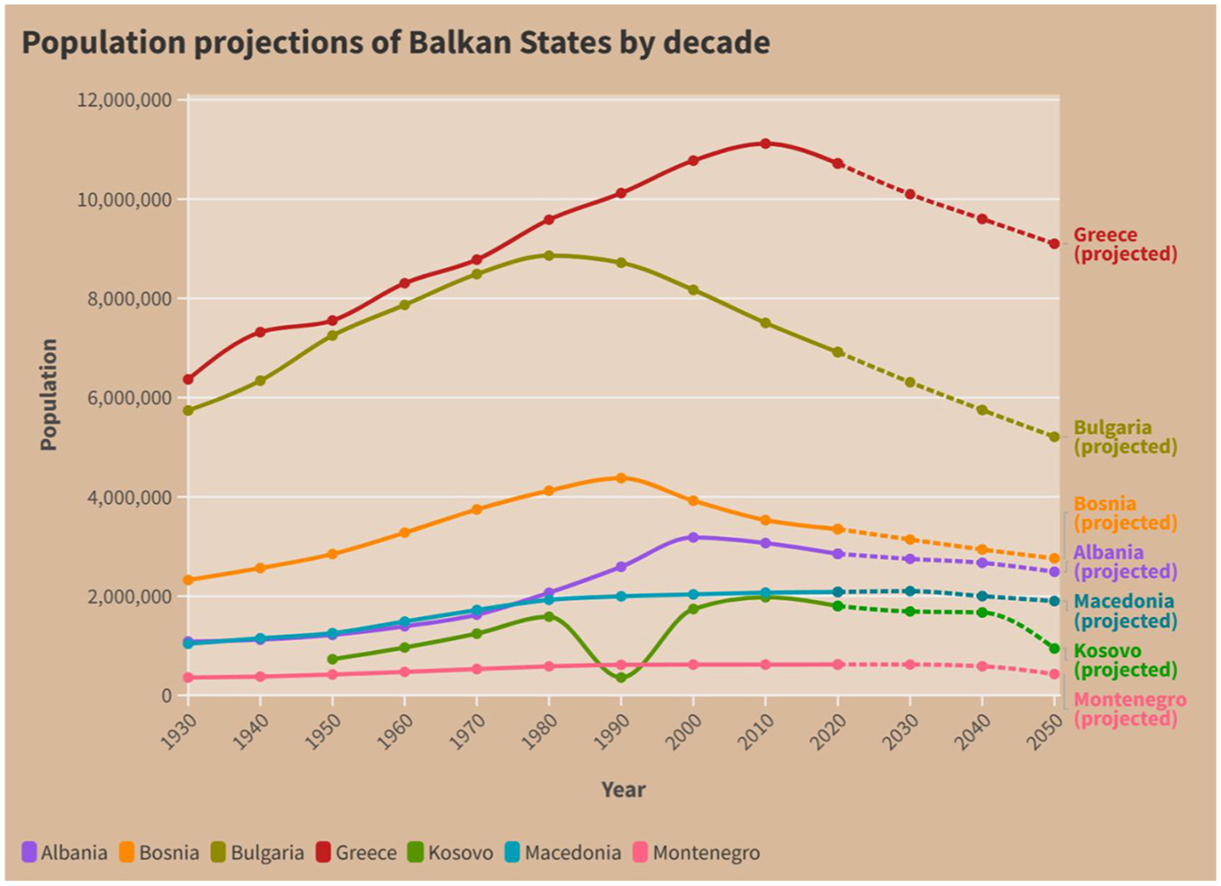
Visualisation 2.
The third visualisation (Figure 3), unlike the former two, is an uncommon radar chart. This chart represented mock data from a Eurovision competition for four different countries, where the detailed data reflected the points provided by judges in the competition. This visualisation was both more vague and the most distantly connected to Albania as a country and as a topic of discussion in order to facilitate greater investigations into its contents by the participants.
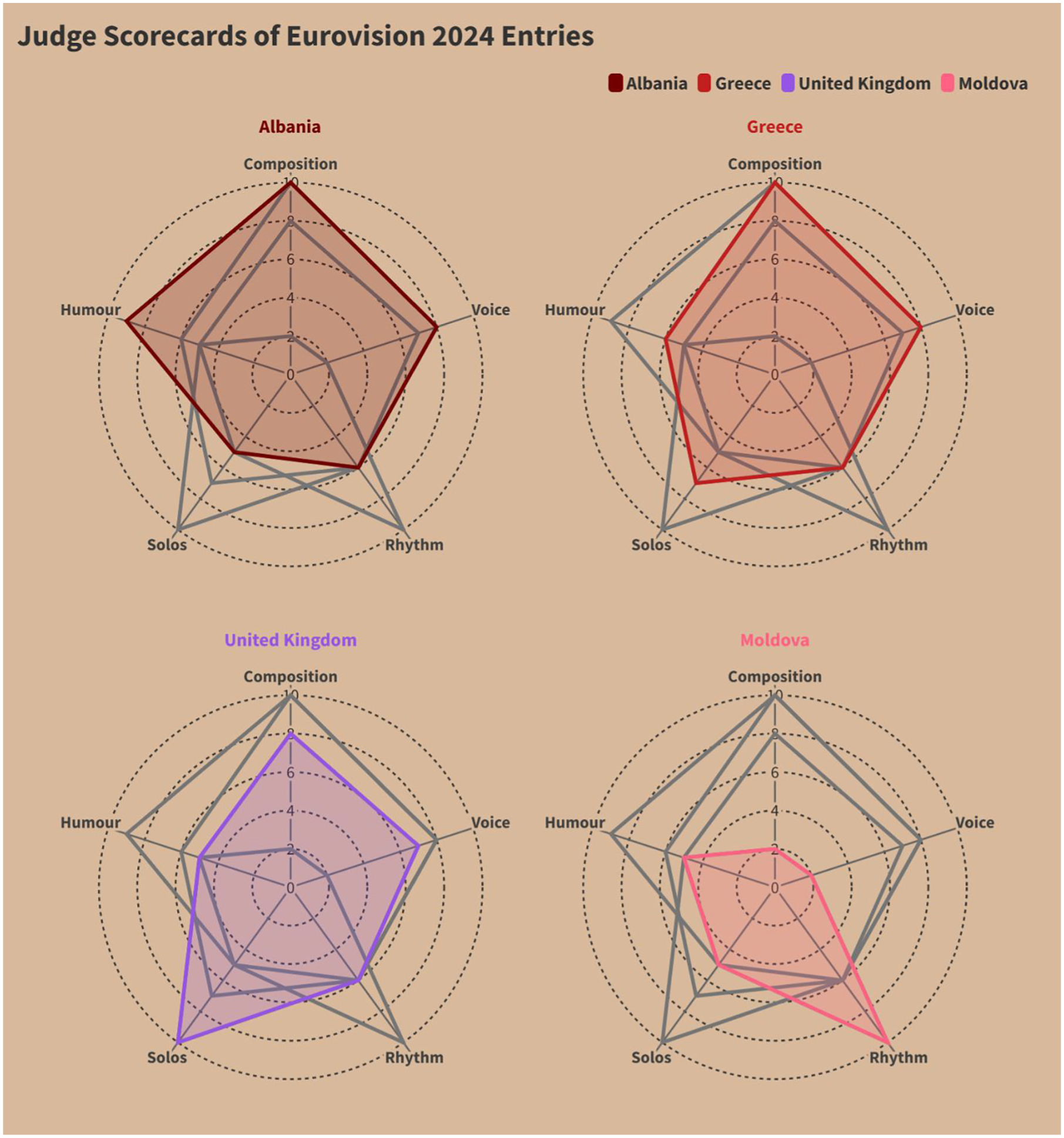
Visualisation 3.
Results
This section will detail the results of the interviews through a combination of tables and visualisations, where the raw data detailed in Table 3 reflects the length of time it took for each participant to review each visualisation before move onto the next. The cells are coloured to represent categories of: up to and including 25 s (plum), more than 25 s and up to and including 50 s (turquoise) more than 50 s and up to and including 75 s (green), more than 75 s and up to and including 100 s (gold), more than 100 s and up to and including 125 s (rose), and anything over 125 s (red). In this case, the lowercase ‘s’ stands for seconds.
Length of time taken (in seconds) to review each visualisation.
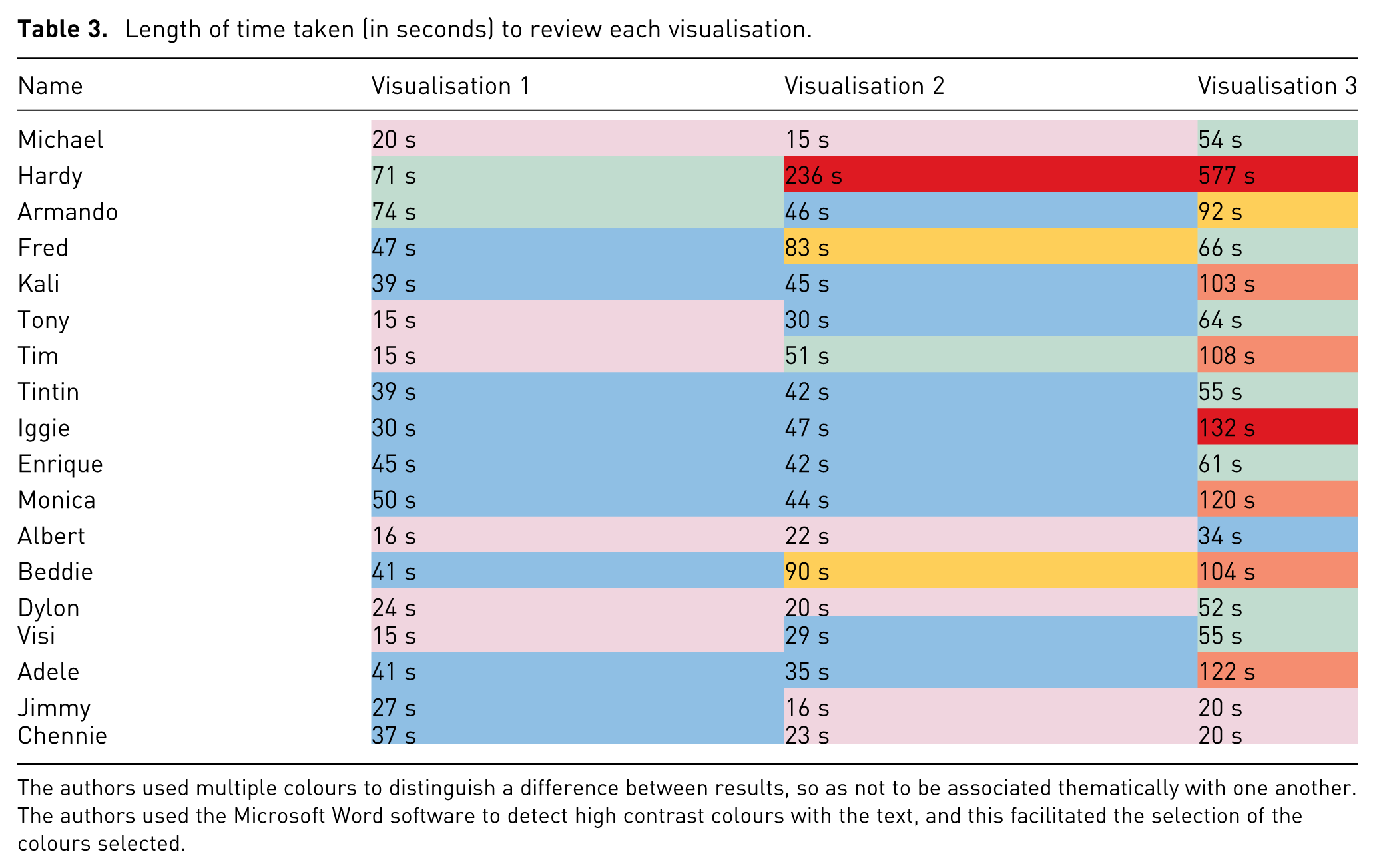
The authors used multiple colours to distinguish a difference between results, so as not to be associated thematically with one another. The authors used the Microsoft Word software to detect high contrast colours with the text, and this facilitated the selection of the colours selected.
Detailed in Tables 4 to 6 is the proportion of participants whose answers were completely accurate or aligned with the title of the three provided visualisations to the extent that the first author understood their words to be a close representation of the data. All words were coded according to the titles of columns listed in Tables 4 to 6, and words that were referenced by more than two individuals constituted a ‘Code’. In this case, ‘Other’ represents words that were referenced by individuals that were not shared by anyone else, and thus could not be grouped into a ‘Code’. The cells in Tables 4 to 6 have their cells coloured in green to represent a positive alignment with the code, otherwise ‘Yes’, compared to the cells coloured in rose to symbolise ‘No’. In the cases of ‘Other’, the theme of the words is included in the cell.
Interview responses for Visualisation 1.
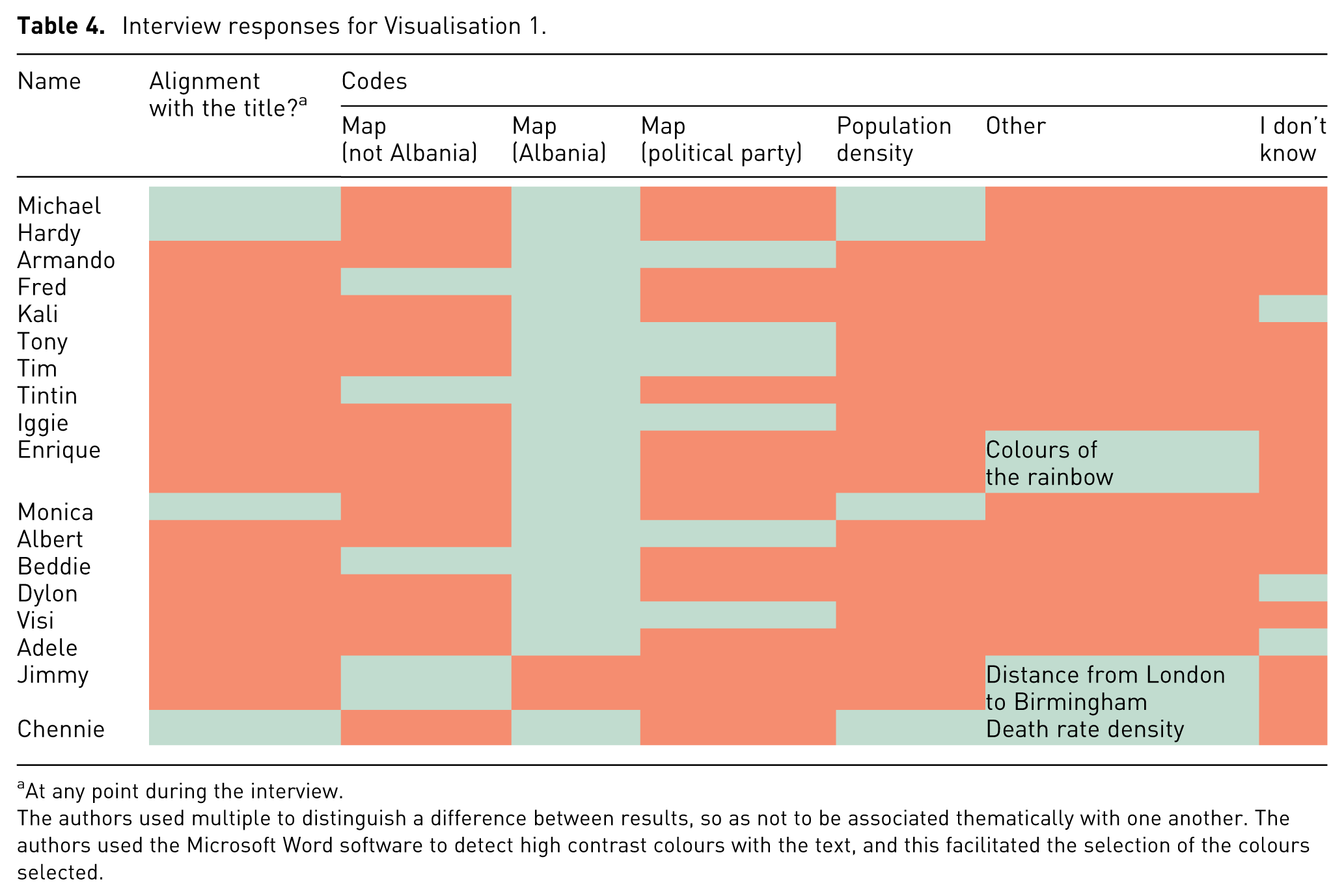
At any point during the interview.
The authors used multiple to distinguish a difference between results, so as not to be associated thematically with one another. The authors used the Microsoft Word software to detect high contrast colours with the text, and this facilitated the selection of the colours selected.
Interview responses for Visualisation 2.
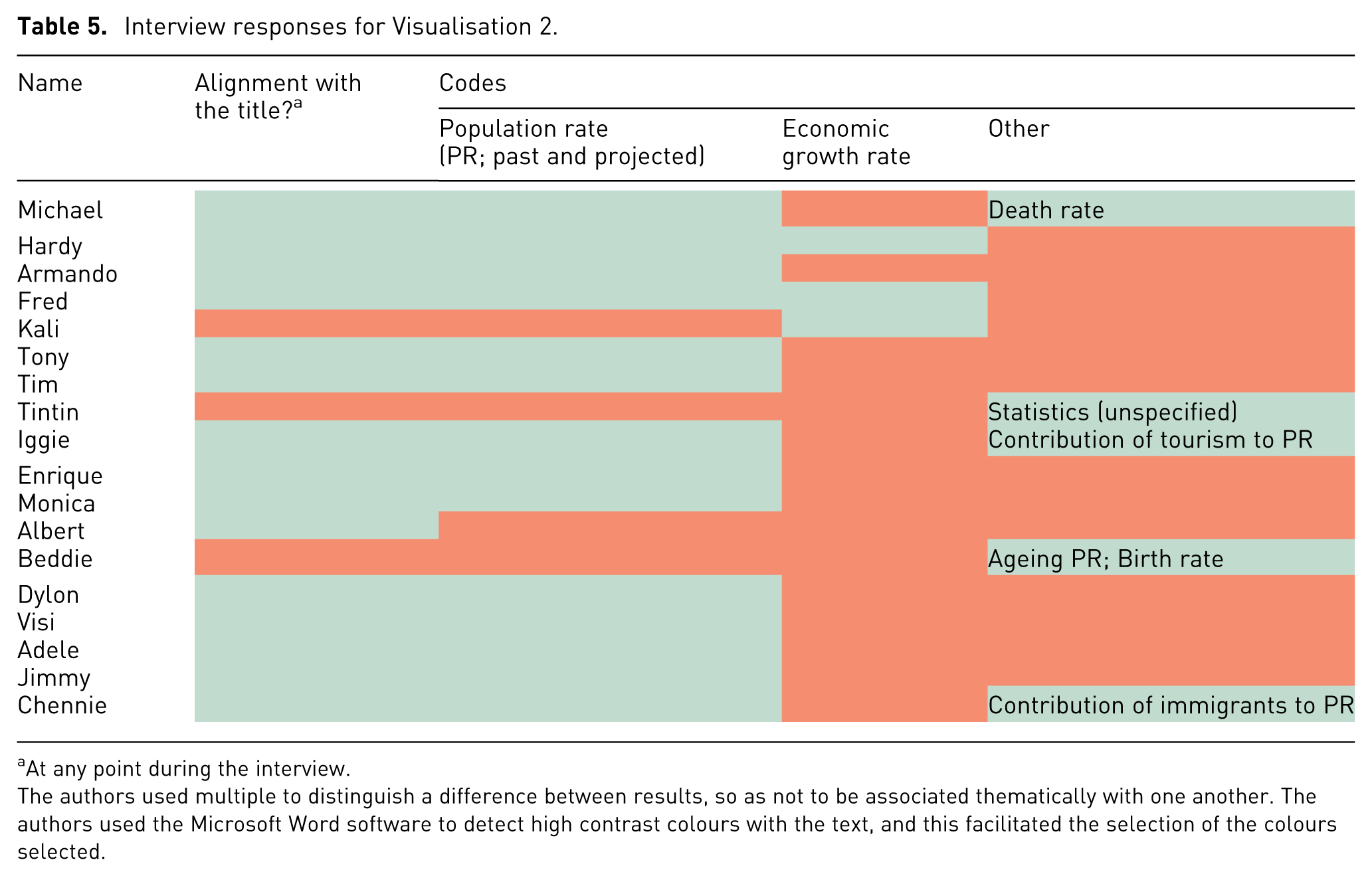
At any point during the interview.
The authors used multiple to distinguish a difference between results, so as not to be associated thematically with one another. The authors used the Microsoft Word software to detect high contrast colours with the text, and this facilitated the selection of the colours selected.
Interview responses for Visualisation 3.
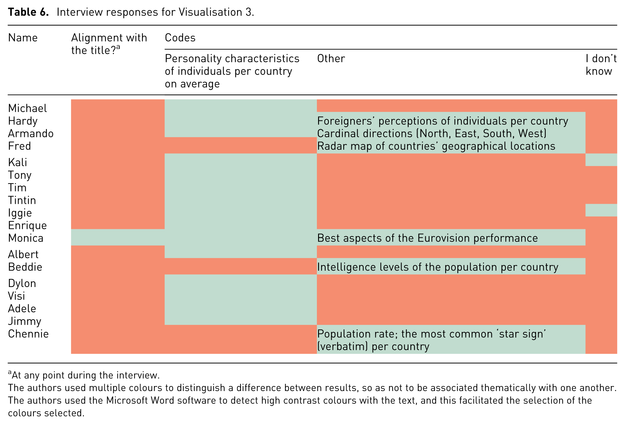
At any point during the interview.
The authors used multiple colours to distinguish a difference between results, so as not to be associated thematically with one another. The authors used the Microsoft Word software to detect high contrast colours with the text, and this facilitated the selection of the colours selected.
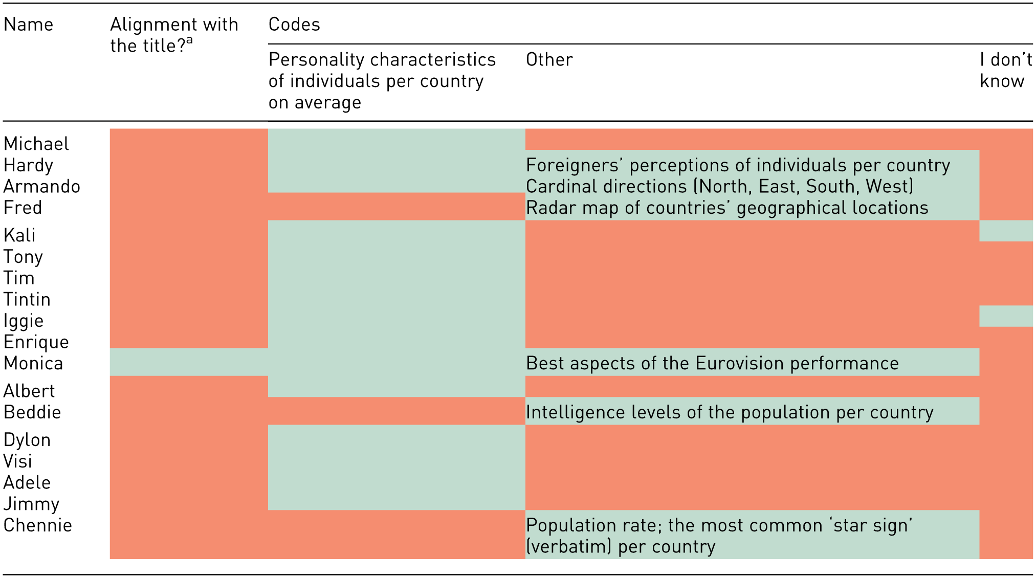
The data in Figure 4, detailed below, reflects the total number of participant responses per visualisation that were aligned with the title. Common themes (Common theme being a theme identified by more than two people) were found for all visualisations, but more so for the first visualisation, which had five common themes (including ‘I don’t know’) compared to two common themes (including ‘I don’t know’) for the second and third visualisation.
Participant responses’ alignment with the visualisation titles.
A review of the answers provided in Tables 4 to 6 reveals that one-third of participants considered Visualisation 1 to be a political party map, identifying states dominated by Prime Minister Edi Rama’s political party as purple. Seventeen participants correctly identified the map in Visualisation 1 as depicting Albania, with one person (Jimmy) believing it to be a map of England. One sixth of participants, at any point during the interview, expressed that they did not know what Visualisation 1 represented, and two participants expressed that they did not know what Visualisation 3 represented. Of these, one participant expressed that they did not know what both Visualisation 1 and Visualisation 2 represented. No participants expressed that they did not know what Visualisation 2 represented.
Figure 4 reflects the number of visualisations that the participants were able to identify, ranging from 0 to 3 (100%).
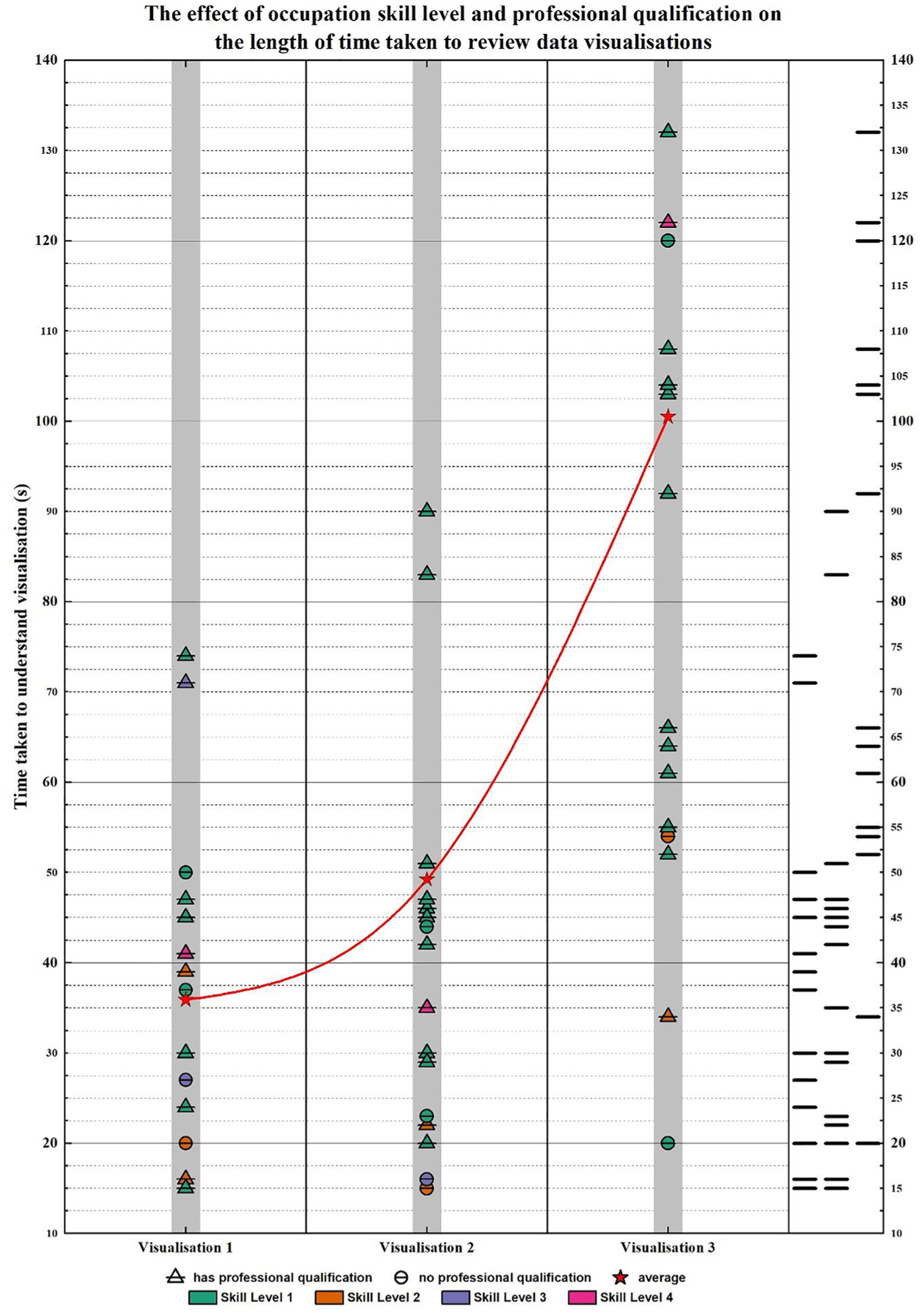
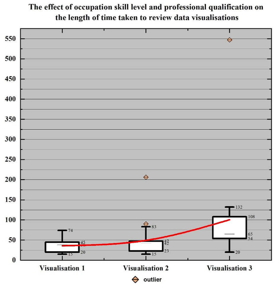
The data visualised in Figures 5 and 7, respectively, highlight the correlations between each participant group and the time taken for the participants to review the data visualisations. In this case, participant group refers to the designated columns listed in Table 1 (age range, in possession of a higher education qualification, in possession of a professional qualification, occupation skill level). Both visualisations are supplemented with further boxplot data (Figures 6 and 8). The inset data in Figure 6 facilitates a closer look at the upper and lower quartiles for comparison purposes, whereas the inset data in Figure 8 reflects the entirety of the dataset, including the anomalous result attributable to Hardy that cannot be seen in Figure 5.
Occupation skill level and professional qualification.
Supplemental box plot data.
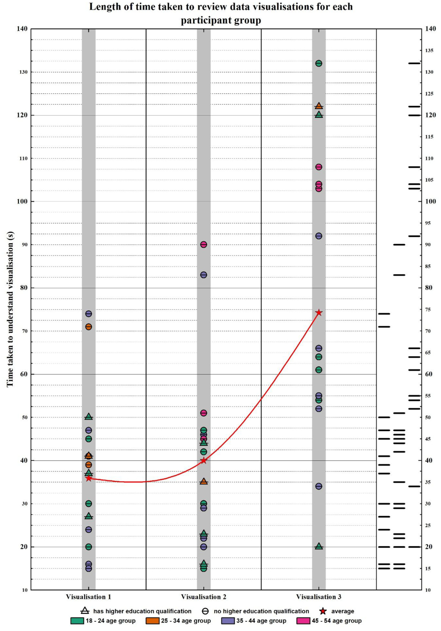
Length of time taken to review data visualisations for each participant group.
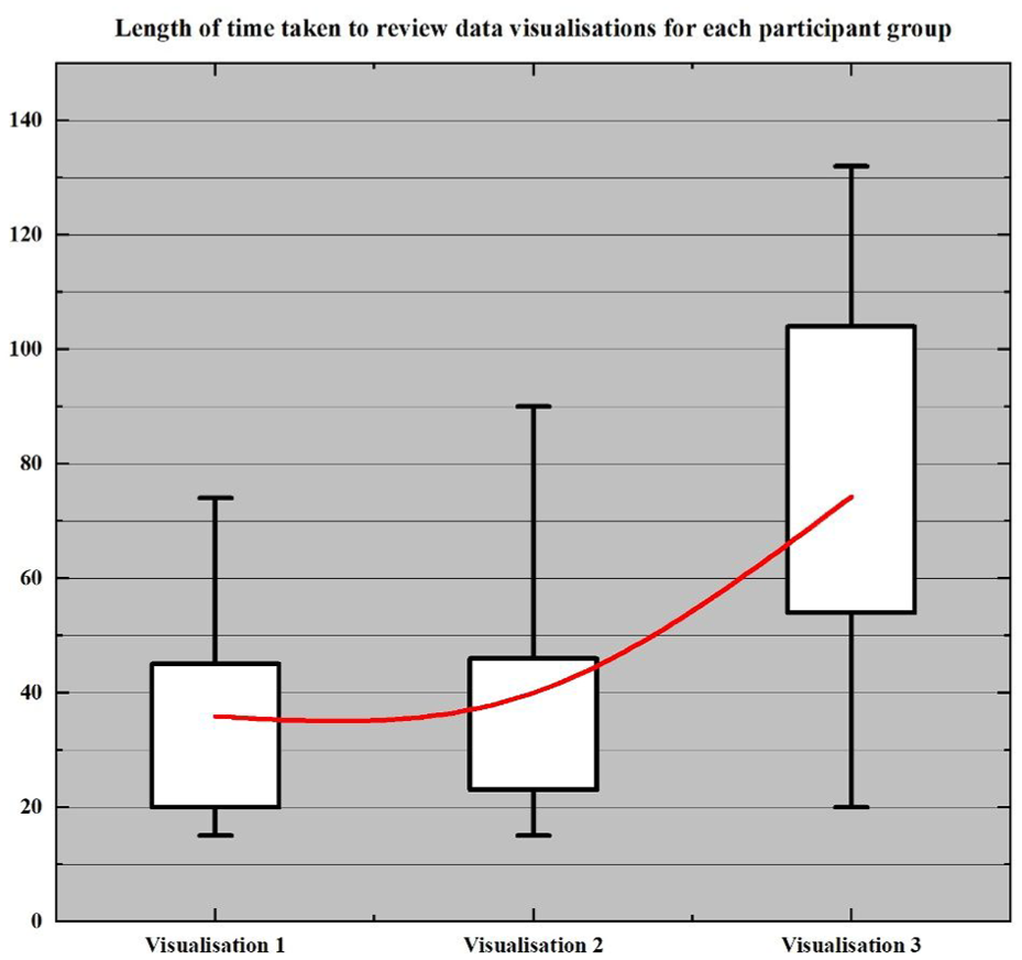
Supplemental box plot data.
Based on the combination of data from the tables and figures provides, three salient – albeit descriptive – results emerge.
The responses to Visualisation 1 and Visualisation 2 were closer in range than the responses for Visualisation 3; the upper quartiles for Visualisation 1 and Visualisation 2 were both less than 50 s (45 s and 47 s, respectively) compared to the upper quartile for Visualisation 3 being 108 s, over double both the former visualisations’ upper quartile and greater than the sum of the two former quartiles combined.
Qualitative trends in theme and title identification were indiscriminate, and did not vary or display any patterns in correlation to any of the participant categories.
There were no real trends identified per participant category however response times naturally increased, on average, with participants in possession of a professional qualification generally having a greater median and mean response time than those who were not.
Discussion
The findings of this study highlight several salient aspects of visual literacy among 18 individuals of the Albanian diaspora in the UK.
Understanding of visual representations
Participants displayed varying levels of understanding across the three visualisations, with responses to the radar chart in Visualisation 3 being indicative of low familiarity and comprehension, compared to the choropleth map in Visualisation 1, as the first author hypothesised when designing the visualisations. While the majority of participants correctly identified Albania as the subject of Visualisation 1, several individuals interpreted the colour-coded data as political party representation rather than population density, despite this information being available in the legend. This could suggest that pre-existing knowledge and subjective lived experiences as a member of the Albanian diaspora influenced the interpretation of the map over inferences using the provided legend.
Responses for Visualisation 2 indicated higher alignment with the title, reflecting a better comprehension of the line graph format. Familiarity with line graphs, in addition to the additional textual information provided in the visualisation likely contributed to this outcome. Participants drew connections between the visualisation content (across all visualisations) and familiar Albanian narratives, such as migration and political history, rather than interpreting the data directly. Finally, the radar chart posed the most significant challenge, as 15 out of the 18 participants misinterpreted it, reflecting a broader gap in visual literacy when faced with (a) less conventional data, and (b) less conventional data representations.
Memorability and DVL
While the number of participants in this study being 18 may not contribute to generalisable findings, an interesting observation can be made when referring back to Börner et al.’s 19 ideas of memorability and improvements in DVL. For Visualisation 2, Chennie accurately aligned her responses with the visualisation and title (population projection rates), and for Visualisation 3, she referred back to her response for Visualisation 2. While the association may be remote, one could potentially hint at an idea of memorability or continuity in DVL – such that her prior knowledge of visualisations in general informed her response to Visualisation 2 which, in turn, informed her response to Visualisation 3 despite it being incorrect. One could also assume that the familiarity of the line graph could have supported her, or served as a safety net in her response to Visualisation 3. This notion of continuity is a point of interest and further research.
Conclusion
This study has examined the visual literacy rates of 18 Albanian individuals in the United Kingdom and the words and themes generated when reviewing three different data visualisations designed with increasing levels of difficulty, at the first author’s discretion. This research, though bound by limitations, would be a fundamental contributor to an entirely new field of data visualisation literature, as it highlights a specific demographic of Albanian people in the UK including non-native speakers, which have been left out of data visualisation conversations and academic research in the past. 6 This research is marked by multiple aspects of further novelty, including a mixed approach to the visualisations by combining real and mock data, contributing to other contemporary work,20–22 in addition to including interview and qualitative data and a radar chart as a form of visualisation to be presented to participants, which have not been discussed in Firat et al.’s 3 extensive state-of-the-art report and data visualisation literature review.
Limitations
Although the first author made active efforts to both avoid any potential bias and recruit a random selection of participants with diverse professional and educational backgrounds, the majority of the recruitment relied upon the snowball sampling method. Although the results varied across individual participants, the snowball sampling method and lack of response from other calls for recruitment (i.e., Reddit and LinkedIn) may hinder the generalisability of the rates of data visualisation literacy from the participants, as they were more closely related to convenience sampling rather than more random sampling methods. Another potential limitation is the number of visualisations produced for the participants to review. With only three visualisations, this study made both a great and novel contribution to addressing data visualisation literacy rates across Albanian people in the United Kingdom, however the sample size of the participants and number of visualisations may limit the scope of the results.
Concerning the data itself is the inclusion of participants who did not understand the visualisations before moving onto the next one. Despite the Results section including 100% of the participants’ answers, this may contribute to the data being non-generalisable as it may lean towards misleading correlations between participant categories and the time taken for the respondents to review the visualisations. As a result, this affects the answers to the research questions 2 and 3 and may shift the subject of the study from an understanding of data visualisations to a more superficial review of data visualisations.
Recommendations and considerations
Due to the nature of this study having been constrained by word count, time, and serving as the final project of the Data Visualisation MASc at the University of Warwick, future research would benefit from a greater diversity in respondents and provided visualisations. Thus, the authors propose that investing the time to develop intricate visualisations in addition to a broader range of them could potentially develop results closer to those seen in the works reported by Firat et al. 3 and create more generalisable results when taken in conjunction with a greater diversity and number of participants (e.g., also identifying the sex of the respondents for any further correlation with their responses). Perhaps most crucially, however, would be (a) the future inclusion of a control group, or even the division of the participants by status (e.g., by generation or by migration status – born and raised in the UK versus migrated to the UK, and/or (b) a replication study with another diasporic group in the UK to see if there are any differences leading back to national or ethnic origin in an ethno-culturally pluralist society. Future research would also benefit from extending beyond descriptive results and into greater explorations of the variables and participant categories.
Ultimately, this research has been a window into the underrepresented, stereotypically misconstrued, and rather enigmatic Albanian demographic via the medium of data visualisation literature, and could serve as a cornerstone for future research involving non-native participants and both qualitative and quantitative approaches to data visualisation literature.
Footnotes
Ethical considerations
This study was approved by CIM HSSREC on 28 May 2024 as the basis of the first author’s dissertation project at the University of Warwick.
Consent to participate
Respondents gave written consent for their participation in the interviews.
Consent for publication
All participants in the study were made aware that their responses would be recorded and disseminated publicly.
Author contributions
Wendy Ramku was responsible for the data collection, data analysis, and manuscript writing. Vas Mehta was responsible for editing and contributing content the final manuscript.
Funding
The authors received no financial support for the research, authorship, and/or publication of this article.
Declaration of conflicting interests
The authors declared no potential conflicts of interest with respect to the research, authorship, and/or publication of this article.
Data availability statement
The data supporting this study are not publicly available due to ethical considerations. Participants provided consent for their data to be used solely within the scope of this research study, with the understanding that their data would be permanently removed following the conclusion of the research project. As such, the data cannot be shared or made available to other researchers.