
Abstract
Financial literacy plays a vital role in everyday life, enabling individuals to manage spending, save for goals, and make sound financial decisions. However, for many people acquiring financial knowledge remains challenging due to the complexity of concepts and a lack of motivation. Data visualization offers a promising approach by helping learners better understand complex ideas and making learning more engaging. Despite its potential, few studies have thoroughly examined its application in financial education. This paper presents an exploratory analysis of the use of data visualization in this field. We analyze commonly used visualization tools and the dimensions of financial visualization education, develop taxonomies for key dimensions, identify their patterns and relationships. We also provide recommendations for future visualization tools in financial education. Furthermore, we propose a visualization-centric pedagogical framework for financial education. Unlike generic instructional design models, this framework is empirically grounded in our review and explicitly specifies where and how visualization techniques and tools should be embedded in the financial education process, thereby addressing the current lack of domain-specific guidance. Our findings aim to support financial educators and visualization professionals in applying effective visualization strategies, while also offering researchers a foundation for further investigation into the role of visualization in financial learning.
Introduction
Financial literacy, defined by Servon and Kaestner 1 as “a person’s ability to understand and make use of financial concepts,” is important in daily life, for example, for budgeting, risk assessment (insurance, loans, investments), and financial planning (buying a house, retirement).2,3 As such, possessing fundamental financial knowledge and basic numeracy skills is essential for everyone, not just financial experts and professional investors. Unfortunately, many individuals struggle with financial literacy, leading to challenges such as poor credit histories, inadequate retirement savings, 4 and heightened anxiety about financial security. 5
Traditional financial education is often not engaging, not easily accessible, or users don’t have the required literacy and numeracy skills. 6 As a result, a significant portion of the population struggles to make informed financial decisions, 7 highlighting a pressing need for new educational strategies. However, in the context of rapidly evolving digital finance, the dual barriers of financial and digital illiteracy continue to significantly affect the financial behaviors of vulnerable populations. Koefer et al. 8 reported that European microfinance institutions and inclusive FinTech organizations are responding to these challenges through just-in-time education, personalized instruction, and blended approaches that combine storytelling with both face-to-face and digital modes.
This trend has also prompted researchers to consider how to design more intuitive, accessible, and adaptable educational tools to bridge the twin gaps of financial and digital literacy. In response to these challenges, researchers have increasingly advocated for the integration of data visualization techniques and tools into financial education.9–11 Visualization enhances comprehension by simplifying complex financial data, making it more accessible and engaging for learners. 3 These tools can help individuals better identify trends and patterns in financial information, 12 facilitating improved decision-making. Moreover, possessing skills in data visualization is becoming essential in the financial sector, with implications for roles such as accounting and financial analysis. 12
However, visualization for financial education poses several challenges that are less salient in many other domains. Learners are typically novices who must reason about data that combine temporal trends, risk and uncertainty, and normative recommendations, often under conditions of low numeracy and limited prior financial knowledge.13,14 At the same time, these visuals are closely tied to high-stakes, emotionally charged decisions about saving, debt, housing, or retirement.15,16 These characteristics create design constraints that are unique to financial education, such as balancing simplification and accuracy for novice audiences, communicating risk without inducing undue anxiety, and supporting trust and transparency in learner-facing financial decision-making tools. From an information visualization perspective, there is a notable lack of integrative reviews that synthesize insights from studies on financial literacy and decision-making,17,18 particularly concerning the needs of non-expert learners. Existing work tends to evaluate individual tools or interventions, but it often (i) addresses these issues in a fragmented manner, (ii) does not systematically examine which visual encoding, interaction techniques, and narrative strategies are used to support financial learning or are most appropriate for different combinations of financial concepts, learner characteristics, and educational objectives, (iii) offers little discussion of the key visualization-related dimensions in financial education and their corresponding taxonomies, and (iv) does not propose a comprehensive framework that links these design choices to educational outcomes under the domain- and audience-specific constraints of financial literacy education.
This study addresses the gap in financial education by exploring the role of visualization tools in improving teaching and learning processes. The research questions we aim to answer are:
From the perspective of information visualization research, we aim to characterize the design space of visualization-based financial education under its unique domain and audience constraints, and to derive design guidance that is specific to this context. Grounded in a systematic review methodology, this study ensures that the literature search, selection, and evaluation follow established protocols. Through an inductive analysis of the 38 selected studies, we first develop a taxonomy of key dimensions that characterize visualization-based financial education. Building on this taxonomy, we conduct an exploratory analysis to investigate the patterns, relationships, and conceptual structures that emerge across these dimensions, shedding light on their interplay and contributions to visualization-driven financial learning. We further discuss potential areas for innovation and propose strategies for advancing visualization techniques to meet future educational needs. Finally, informed by the identified dimensions and analytical insights, we propose a structured framework for financial visualization education that demonstrates how visualization techniques can effectively support key teaching stages.
To our knowledge, this is among the first systematic explorations of visualization tools in financial education. The detailed contributions of this study are: (1) Taxonomies categorizing key dimensions in financial visualization education; (2) An analysis of patterns and relationships among these dimensions that reveals design regularities and under-explored areas in the design space of visualization-based financial education; (3) Practical guidance alongside identified research challenges and future opportunities; and (4) A structured and innovative framework for visualization-based financial education. Our work serves as both a practical and conceptual resource for educators and researchers, aiding in the design and implementation of visualization-driven financial education strategies. Additionally, it supports industry professionals in developing effective visualization tools, ultimately advancing financial literacy across diverse audiences.
Previous work
Visualization in financial education
Some research has analyzed the effectiveness of visualization-based interventions by comparing student outcomes with conventional formats such as text-only reports. Kothakota and Kiss 3 compared a control group, a text-only group, and a group receiving both text and visual explanations. The visual plus text group achieved a significantly higher mean financial knowledge score (3.87) than the text-only group (3.57) and the control group (3.29), with a mean difference of 0.58 compared to the control and 0.29 compared to the text-only group (p < 0.001). However, respondents could only observe visualizations without interacting, revealing intervention limitations. Similarly, Lusardi et al. 19 evaluated four educational programs and found that all effectively increased self-efficacy, with improvements ranging from 14 to 28 percentage points, and several also improving financial literacy. Nonetheless, the lack of accessible interactive tools may have affected these results.
Other studies have explored how individual characteristics, personality, and attitude influence visualization performance and student engagement. Tomasi et al. 20 compared simple and cluttered visualizations in personal finance. They found that simple visualizations increased decision accuracy by 1.38 points (p = 0.02) and reduced cognitive load by 12.1 points (p = 0.01). However, a limitation of their study lies in the lack of diversity within the sample population. Stanca et al. 21 showed that integrating visualization tools can enhance student confidence and skills, though they did not include any visualization figures to illustrate the learning scenario.
Additionally, some studies have focused on developing 3D visualization tools. Helweg-Larsen et al. 22 introduced a dynamic three-dimensional landscape for presenting financial results. They reported improved understanding based on correct responses: 91% among users of the visualization tool versus 56% among users of traditional reports. However, their study lacks empirical validation and does not address practical implementation challenges across industries. Similarly, Jonker et al. 23 developed a 3D prototype for visualizing financial ratios but encountered issues with readability and tracking behavioral trends over time. Lugmayr et al. 24 proposed a 3D immersive design tailored to Australia’s energy sector, though the sector-specific nature of the design may limit the generalizability of their findings.
While prior studies demonstrate that visualization can support the acquisition of financial knowledge and skills, they often remain limited in scope, focusing on individual tools, short-term outcomes, or narrow user groups. Critically, most do not provide a pedagogically grounded rationale for how and why visualizations should be integrated into financial education. Key elements such as learner characteristics, cognitive constraints, feedback design, or long-term knowledge development are rarely addressed in a unified manner.
From an information visualization perspective, these educational gaps in financial literacy programs are compounded by a set of domain-specific design challenges. First, most interventions adopt visual forms that are only loosely aligned with the underlying financial tasks (e.g. reasoning about compounding), suggesting a lack of explicit task and data abstraction. Second, the visual encoding and interaction patterns are rarely calibrated to learner characteristics such as numeracy, prior financial knowledge, or affective responses, even though these factors significantly influence how users interpret and trust financial visuals. Third, evaluations often rely on short-term test scores or self-reported attitudes, with limited attention to visualization-specific performance indicators such as error patterns, uncertainty sensitivity, or decision stability.
These limitations indicate that visualization in financial education is frequently treated as an incidental presentation device rather than as a theory-informed pedagogical instrument. This is partly because there is a lack of comprehensive instructional models that link visualization strategies to educational goals, audience profiles, and assessment practices.
Visualization instructional frameworks
A range of foundational frameworks from the fields of information visualization and educational design inform our understanding of how visual tools can support learning. However, few of these models fully address the instructional demands of financial education, particularly in terms of learner characteristics, feedback mechanisms, and long-term conceptual development. In this section, we review several relevant frameworks and explain how our proposed framework differs from them in addressing the instructional demands of financial education.
Several influential frameworks from the field of information visualization provide foundational insights for visualization design. One of the earliest and most well-known models is the Information Visualization Reference Model by Card et al., 25 which conceptualizes a pipeline that transforms raw data into visual representations through operations such as data transformation, visual mapping, and user interaction. Munzner’s Four-Level Nested Model 26 introduces a structured approach to visualization design, progressing from domain problem abstraction to algorithmic implementation. Kirk’s Practical Design Process 27 outlines four accessible stages: formulating a brief, working with data, establishing editorial thinking, and developing the design solution.
While these models offer valuable guidance for structuring visual workflows and aligning visual design with data and context, they were not developed with educational applications in mind. As a result, they generally do not address key instructional considerations, such as learner diversity, pedagogical scaffolding, formative feedback, or long-term conceptual development, factors that are critical in the design of effective financial education. At the same time, existing visualization-based financial education interventions tend to occupy only parts of this design space: many studies jump directly to visual encoding and interaction decisions without making the domain and task abstractions that Munzner’s model recommends explicit, the pipeline proposed by Card et al. is typically applied to financial data rather than to learner states or pedagogical intent, and the editorial layer emphasized by Kirk remains largely implicit, with limited attention to how narrative and annotation are tuned to novice financial audiences. Our proposed framework builds on these foundations by embedding visualization within an iterative pedagogical process tailored to learner needs and instructional goals.
Additionally, some frameworks from financial and educational research also offer relevant insights. Lusardi et al. 28 developed a stochastic life-cycle model that simulates how different financial education programs influence wealth accumulation, asset participation, and literacy development among diverse consumers. Ainsworth’s DeFT framework 29 focuses on learning with multiple representations—including diagrams and visual forms—by identifying how representational format, function, and cognitive processing affect learning. Mishra and Koehler’s TPCK model, 30 grounded in Shulman’s work on pedagogical content knowledge,31,32 emphasizes the interplay between content, pedagogy, and technology, and highlights the need for integrated teacher knowledge in technology-enhanced instruction.
Although each of these models contributes valuable perspectives, ranging from long-term program evaluation to representational theory and integrative teaching knowledge, they are not tailored to visualization as a primary instructional strategy, nor do they offer procedural guidance for using visual tools across an educational cycle. Specifically, they do not address how visualizations can scaffold learning, how feedback can refine instructional decisions, or how learner characteristics inform visual design. Our framework bridges these gaps by embedding visualization within a pedagogically grounded, feedback-driven instructional design tailored to financial literacy development and by organizing learner characteristics, financial concepts, visual representations, and feedback mechanisms into a domain-specific visualization design space that reflects the unique constraints of financial literacy education and can be systematically explored in future information visualization research.
Methodology
This study adopts a Systematic Literature Review (SLR) approach to identify, analyze, and synthesize existing research on the use of data visualization in financial education. Following established guidelines for conducting SLRs, 33 we systematically retrieved and evaluated relevant peer-reviewed literature to address four research questions. Our methodology consists of five main phases: (1) search and study selection, (2) data extraction and coding, (3) taxonomy construction, (4) pattern analysis, and (5) framework development.
Search strategy and study selection
To achieve comprehensive and high-quality coverage of relevant studies, we conducted a structured search across seven academic databases: Scopus, Web of Science, ACM Digital Library, IEEE Xplore, Taylor & Francis, Wiley Online Library, and Google Scholar. The search strategy was designed to capture studies at the intersection of finance, education, and visualization. We used the following Boolean search string: (“Finance” OR “Financial” OR “Money”) AND (“Literacy” OR “Knowledge” OR “Understand” OR “Understanding” OR “Skill” OR “Skills”) AND (“Visual” OR “Visualize” OR “Visualization” OR “Visual Analysis” OR “Visual Tool” OR “Visual Representation”) AND (“Learn” OR “Learning” OR “Teach” OR “Teaching” OR “Educate” OR “Education”).
Inclusion criteria required that the publication be a peer-reviewed document written in English, report on a study explicitly aimed at improving financial skills or understanding of financial concepts, and employ data visualization as the primary intervention. Exclusion criteria specified that the publication must not be a review paper, an entire conference proceeding (rather than an individual paper), an unpublished study, a book, or any document written in a language other than English. After removing duplicates and screening titles, abstracts, and full texts against these criteria, we retained 38 studies for in-depth review.
Data extraction and coding
To enable systematic comparison across studies, we developed a structured data extraction form. For each included study, we extracted basic bibliographic information (authors, year, venue) and a set of analytical variables capturing the educational use of visualization.
The extracted dimensions include financial concepts (e.g. personal finance, accounting, consumer loans, investment, portfolio diversification, balance sheet, income statement, marketing, pension, insurance); type of financial knowledge (e.g. everyday financial skills, basic professional skills, advanced financial skills); target audience (e.g. school students, university students, general users, lay investors, specialists, professionals); educational objectives (e.g. understanding concepts, developing practical skills, improving decision-making); visualization techniques and tools (e.g. charts, dashboards, interactive visual analytics systems); pedagogical design (e.g. exercises, cases, simulations, games); evaluation design (e.g. type of study, measures of learning, engagement, or performance); and educational feedback (e.g. users’ perceived feedback, peer feedback, or instructional feedback).
The initial coding scheme was informed by prior work on financial literacy, education, and visualization, including earlier work characterizing visualization-based financial education, 34 and was then refined inductively. We first piloted the form on a small subset of studies to identify missing or overlapping categories, iteratively adjusted the definitions of each variable, and then applied the final scheme to all 38 studies. When necessary, we returned to the full text of a study to clarify ambiguous cases and ensure consistent coding.
Taxonomy construction
To address RQ1, we reviewed existing studies on visualization-based financial education and examined the types of visualization techniques and tools used, along with the key educational dimensions involved. Based on this analysis, we developed a set of taxonomies to systematically categorize these components. The taxonomies were derived inductively from the coded data rather than being specified in advance.
For each analytical variable, we first grouped similar codes into preliminary categories (e.g. school students and university students into a “students” class; specialists and professionals under “experts”). We then compared these candidate categories across all studies, merged overlapping categories, and split overly broad ones when the underlying studies served clearly different purposes in financial education. Through several iterations of refining labels and boundaries, we arrived at a set of taxonomies.
Pattern analysis
For RQ2 and RQ3, we first computed the number of studies in each category and then examined how categories co-occur across studies (e.g. which visualization types appear together with which financial topics or target audiences). We visualized these co-occurrences using simple graphical summaries such as histograms, bipartite graphs, and Sankey-style diagrams, which allowed us to qualitatively identify recurring combinations and under-represented areas in the current use of visualization for financial learning, such as which visual forms are commonly chosen for particular financial topics or learner groups and which combinations are rarely explored.
Framework development
Finally, to address RQ4, we synthesized the key dimensions with pedagogical flows and visualization practices to develop a comprehensive framework that supports the design and implementation of visualization-driven financial education.
Building on typical instructional design models, and deliberately going beyond them, we first listed the key dimensions emerging from the taxonomies and mapped them onto canonical phases of instruction (e.g. analyzing learners and goals, designing activities and materials, implementing and evaluating learning). Instead of directly adopting these models, we used them as a scaffold to reorganize the empirically derived dimensions into a domain-specific process for visualization-driven financial education. Drawing on the co-occurrence patterns from the pattern analysis, we then formulated domain-specific decision rules and branches (e.g. how particular types of financial knowledge and target audiences suggest or constrain families of visualization forms and pedagogical activities) and encoded these as explicit design steps. These steps specify concrete decision points (e.g. how particular combinations of financial knowledge type and target audience narrow the range of suitable visualization forms and pedagogical activities), so that designers and educators can directly apply the framework when planning new visualization-based financial learning interventions. We iteratively refined this sequence by checking it against concrete examples from the 38 studies, adding decision paths where under-represented yet pedagogically important combinations emerged, and merging or reordering steps that were not supported by the empirical evidence. The final framework is thus an empirically grounded, domain-specific design approach specifically developed to address the unique instructional demands of visualization-based financial education, offering structured, actionable guidance that existing models have yet to provide.
Taxonomy and structure of key dimensions
In this section, we identified 38 studies that met the inclusion criteria and proposed taxonomies to categorize the key dimensions, including target audience, educational objectives, financial concepts, visualization tools, and feedback mechanisms. We then analyze the characteristics and applications of visualization techniques and tools, highlighting their central role in the pipeline. Finally, we examine each of the remaining dimensions individually to provide a holistic perspective.
Taxonomy of key dimensions
Drawing on the analysis of the 38 studies included in our review, we identified common structural elements and recurring themes. These informed the development of a taxonomy of key dimensions, as illustrated in Figure 1, that captures the main components involved in visualization-based financial education.
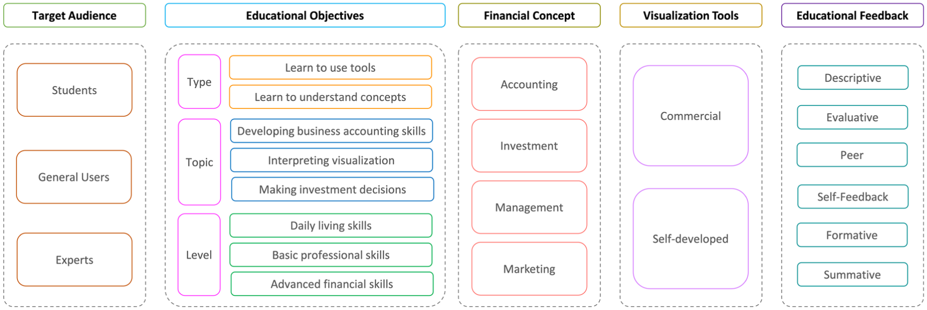
The taxonomy of key dimensions for financial visualization education.
Target audience
The target audience dimension identifies three primary learner groups, students, general users, and experts, each with distinct learning needs and objectives.
Educational objectives
The educational objectives dimension is further categorized into three aspects: types, topics, and levels. The types focus on whether the objective is to learn to use tools or to understand concepts, while the topics emphasize specific areas such as developing business accounting skills, interpreting visualization, or making investment decisions. Levels distinguish between daily living skills, basic professional skills, and advanced financial skills, reflecting varying degrees of complexity in financial knowledge.
Financial concepts
The financial concepts dimension encompasses four central areas: accounting, investment, management, and marketing, highlighting the diverse range of topics addressed through visualization-based learning.
Visualization tools
Visualization tools, which are integral to the pipeline, are categorized into commercial and self-developed tools, reflecting their varying levels of customization and application.
Educational feedback
Finally, educational feedback mechanisms are classified into six types: descriptive, evaluative, peer, self-feedback, formative, and summative. These feedback types underline the critical role of feedback in supporting and enhancing the learning process.
Overall, these dimensions and their categorizations provide a systematic perspective on the core elements of financial visualization education. In the remainder of this section we not only synthesize the reviewed evidence but also examine how particular visual encoding and interaction patterns interact with different audiences, financial concepts, and learning objectives, and where they give rise to perceptual or pedagogical tensions.
Visualization techniques and tools
Beyond classifying visualization tools as part of the taxonomy, we conducted a more detailed analysis of the specific tools employed across the 38 selected studies, as presented in Table 1.
Visualization techniques and tools in financial education.
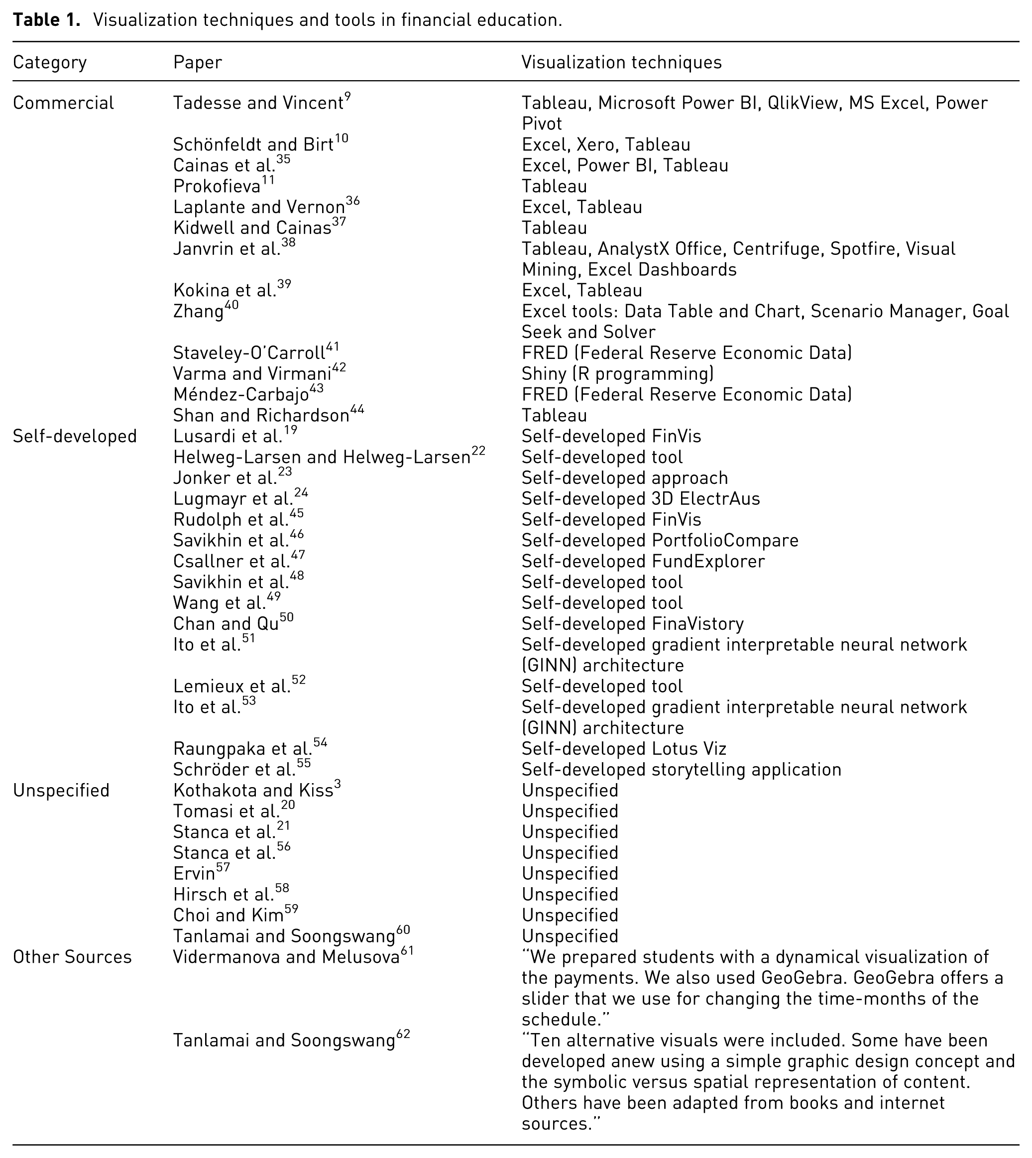
From these studies, 13 papers utilized commercial tools, including Tableau and Excel, as seen in studies such as Refs.9,10,35,44 The reported outcomes indicate that these tools were effectively used to facilitate learning, and provided adequate functionalities to support financial education in various contexts. However, they may lack the flexibility or domain-specific features needed for certain learning scenarios. Accordingly, 15 papers employed self-developed tools, such as Refs.,45–47 reflecting researchers’ awareness of these limitations and the need for more innovative solutions tailored to specific learning outcomes and diverse student profiles.
Additionally, eight papers mentioned the use of visualization tools but did not specify which tools were used, potentially hindering the reproducibility of their findings and limiting insights into the effectiveness of different approaches. A further two studies used alternative sources for visual materials. Vidermanova and Melusova describe dynamic visualizations for student payments using GeoGebra with a slider feature but did not specify the development tool for the user interface. 61 Tanlamai and Soongswang employed newly created graphics and adapted materials from books and online resources. 62
To further illustrate the diversity and innovative use of visualization tools in financial education, we highlight three representative examples from the selected studies: metaphors, 2D dashboards, and 3D visualizations. Raungpaka et al. 54 employed a natural metaphor, the lotus flower, to visualize accounting information, as shown in Figure 2. This creative approach transcends conventional line and bar charts, providing a more engaging and memorable way to represent financial concepts. Similarly, Chan and Qu 50 introduced FinaVistory, a dashboard-based visualization tool depicted in Figure 3, which integrates positive and negative news trends with price fluctuations, highlights key topics, and maps relationships between socio-economic themes. Lastly, Lugmayr et al. 24 utilized immersive 3D visualizations in the “ElectrAus” prototype to interpret complex financial and energy systems, as shown in Figure 4. The 3D scene combines seasonal electricity demand and generation, 3D wind turbine models for renewable energy production ratios, 3D coin objects to depict average daily prices, and line charts for electricity demand, generation, and net imports. From a visualization perspective, the lotus metaphor replaces precise positional encoding with a pictorial scene that can increase engagement and be effective for high-level conceptual understanding, but weakens fine-grained quantitative comparison and relies on low interaction; the FinaVistory dashboard uses conventional 2D positional encoding with moderate interaction (e.g. filtering and highlighting) to link news and prices, yet its dense layout can overload attention and make the reading order hard to control; and the ElectrAus 3D scene encodes multiple variables in spatial depth and object metaphors, inviting exploratory navigation but raising perceptual challenges such as occlusion, ambiguous depth cues, and increased effort for accurate value estimation.
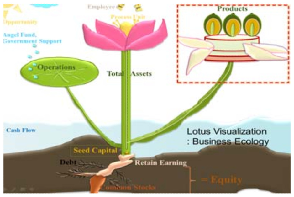
Representative Example 1: Raungpaka et al. 54 visualized accounting information using a lotus flower metaphor to support novice users, including non-accounting students and managers. By drawing on a familiar natural object with cultural and economic significance, the design helps users relate abstract financial concepts to concrete, intuitive structures. This metaphorical visualization was particularly useful for visually-oriented learners, improving their perceived usefulness and intention to use, and offering an accessible alternative to conventional tables and charts. (Reproduced from this work, © 2013, with kind permission of the authors.).
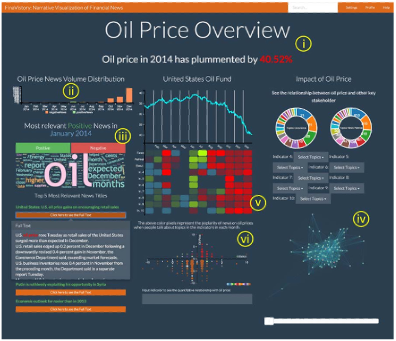
Representative Example 2: Chan and Qu 50 introduced a 2D narrative dashboard (FinaVistory) designed to help non-expert readers interpret complex financial news. The system analyzes large volumes of news articles, extracting sentiment polarity and causal factors related to market indexes, then visually maps their relationships to explain price fluctuations. By synthesizing diverse perspectives into a coherent story, the visualization enables a wide range of users to better understand the socio-economic context behind events such as the 2014 oil price drop. (Reproduced from this work, © 2016, with kind permission of the authors.).
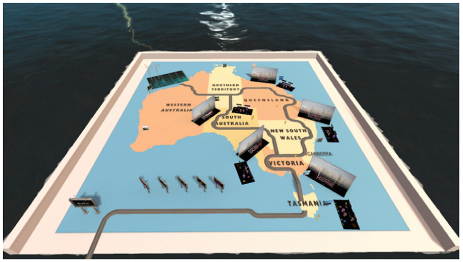
Representative Example 3: Lugmayr et al. 24 developed a 3D visualization prototype within an immersive virtual reality environment to support public users and non-experts in understanding financial data from Australia’s energy sector. The system enables intuitive exploration of complex, multidimensional financial datasets and market events, offering a spatial and interactive representation that goes beyond conventional charts. By leveraging immersive design, the prototype aims to make abstract financial information more accessible and comprehensible to a broader audience. (Reproduced from this work, © 2019, with kind permission of the authors.).
Target audience and financial concept
In this subsection, we examine how the selected studies align different target audiences with specific financial concepts, and how these choices shape the scope and limitations of visualization-based financial education.
The summary of the other key dimensions from the 38 selected studies is presented in Table 2. In terms of target audiences, 18 studies focused on students, primarily at the university level, with a strong emphasis on learners majoring in finance, business, or accounting. These studies typically aimed to support course-based learning by enhancing conceptual understanding and technical skills through visualization. 16 studies targeted general users, such as lay investors or the wider public, reflecting growing interest in using visualization to improve financial literacy in real-world contexts.
Visualization-based financial education.
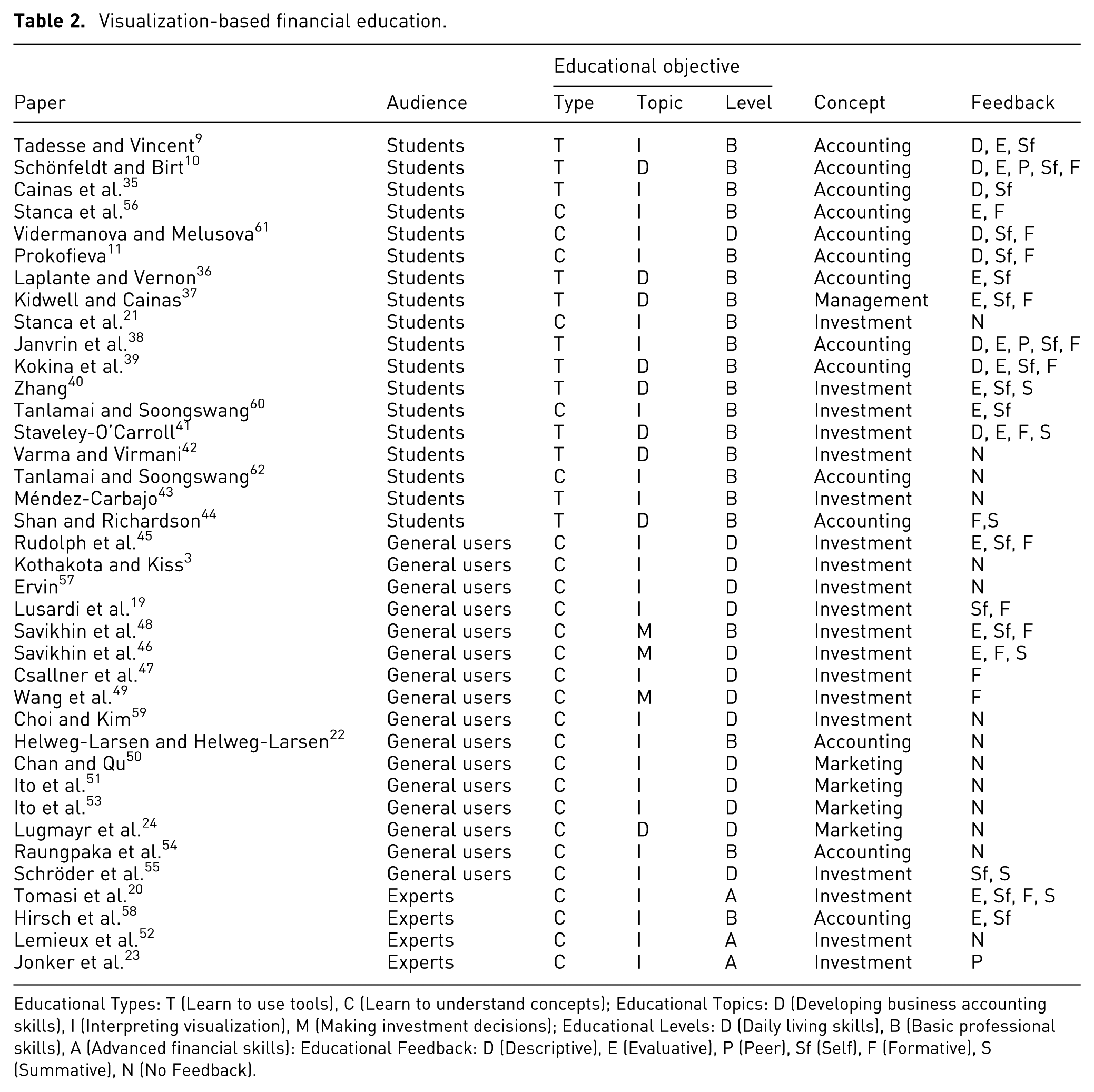
Educational Types: T (Learn to use tools), C (Learn to understand concepts); Educational Topics: D (Developing business accounting skills), I (Interpreting visualization), M (Making investment decisions); Educational Levels: D (Daily living skills), B (Basic professional skills), A (Advanced financial skills): Educational Feedback: D (Descriptive), E (Evaluative), P (Peer), Sf (Self), F (Formative), S (Summative), N (No Feedback).
Only four studies specifically addressed expert users. These studies explored how visualization supports advanced tasks, such as analytical reasoning, modeling, and decision-making in high-stakes professional environments. For instance, Jonker et al. 23 proposed industry-driven visual analytics to support the interpretation of complex financial time series models, while Lemieux et al. 52 used multivariate density estimation techniques to assist systemic risk analysis.
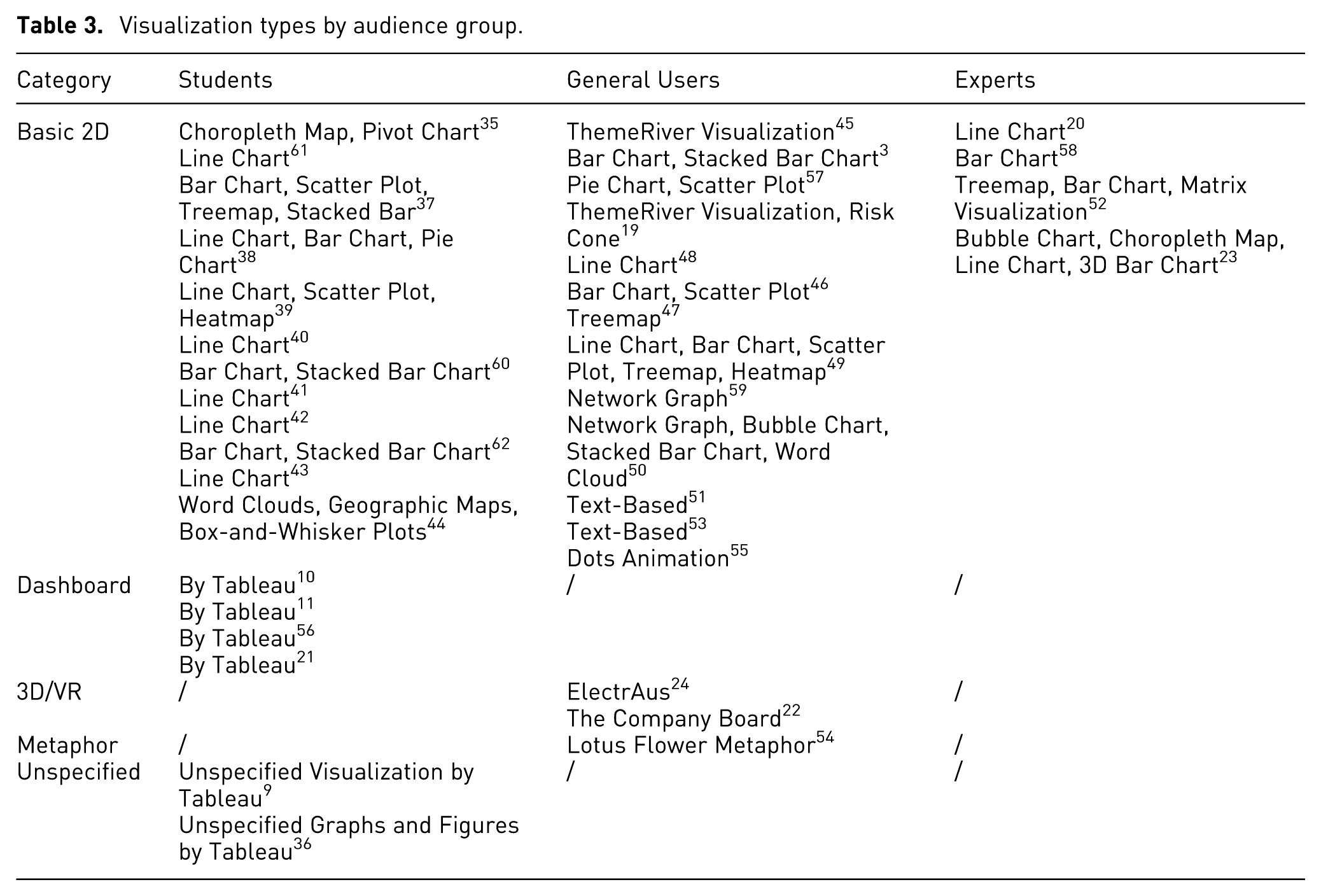
Overall, this distribution prioritizes student and general-user education while largely overlooking expert users. Although several studies do target expert audiences, they are mostly published in the visualization domain and focus on supporting financial professionals in making complex decisions more efficiently, such as interpreting financial models or systemic risks, rather than enhancing their financial understanding or advancing their professional learning. In other words, these tools aim to assist expert workflows rather than foster skill development. From a visualization perspective, this imbalance is mirrored in the choice of encoding and interactions, as shown in Table 3: Student-oriented interventions are dominated by basic 2D charts (especially bar/line charts), with only a small subset using dashboards and a few cases leaving the visualization type unspecified (often implemented in Tableau). Public-facing studies show the broadest representational diversity: alongside standard 2D charts, they uniquely include non-chart formats such as text-based presentations and animated dot displays, and they are the only group featuring metaphor-driven designs and 3D/VR systems. By contrast, expert-oriented studies are the most concentrated, appearing exclusively under the Basic 2D category; within this category, they lean toward more analytic and information-dense encoding (e.g. matrix views, treemaps, choropleth maps, and occasional 3D bar charts) rather than explanatory scaffolding, implicitly assuming high levels of visual and financial literacy.
Visualization types by audience group.
In addition, there is a notable lack of studies focusing on older adults, despite the increasing importance of financial literacy in later life stages, such as retirement planning, fraud prevention, and wealth transfer. Similarly, younger learners, particularly children and adolescents, are rarely addressed, even though early exposure to financial concepts is known to benefit long-term financial behaviors. Very few studies explicitly tailor visual encoding, interaction depth, or perceptual load to the needs of these groups, an omission given well-documented age-related differences in visual acuity, working-memory capacity, and prior digital experience, which are likely to affect the effectiveness and interpretability of specific encoding and interactions across user groups.
These gaps point to valuable directions for future research, particularly in developing age-appropriate and domain-specific visualization strategies that support financial learning across the lifespan, from childhood through professional development to older adulthood.
Among the selected 38 papers, 14 focus on accounting and 19 on investment, underscoring their foundational roles in financial literacy. Additionally, there is only one study on management 37 and four studies on marketing.24,50,51,53
Studies targeting students most frequently address accounting and investment, reflecting a strong focus on foundational professional skills taught in university programs. Studies targeting general users primarily addressed investment-related content. This suggests that public-facing financial education emphasizes practical decision-making and market understanding over formal financial reporting. Expert-oriented studies focused exclusively on investment and accounting, emphasizing analytical reasoning rather than professional skill development. Notably, none of these studies addressed broader management or marketing issues. This conceptual focus is mirrored in a heavy reliance on conventional time-series and tabular encoding and low-complexity dashboards, which offer limited support for representing qualitative management or marketing constructs, and it remains unclear to what extent they alleviate the perceptual burden of dense market data for non-expert audiences.
Educational objectives
In this subsection, we examine how the selected studies define their educational objectives in terms of tool use, conceptual understanding, and levels of financial skill, and how these priorities shape the role of visualization in supporting financial learning.
The reviewed studies reveal a notable imbalance between two educational goals: while 12 papers emphasize practical tool-based training (e.g. learning Tableau or Excel for financial analysis), a much larger proportion (26 papers) focus on conceptual understanding. This suggests that within visualization-based financial education, there is a stronger emphasis on helping learners grasp complex financial ideas rather than simply acquiring operational proficiency. This pattern supports the idea that conceptual understanding is foundational for informed financial decision-making, particularly in dynamic or uncertain environments.48,49 Additionally, the objective of “Learning to use tools” primarily targets students in formal education settings, where acquiring tool-based competencies is often aligned with professional training goals. The emphasis on “learning to understand concepts” dominates studies targeting general users, the goal in these studies is to enhance decision-making and analytical reasoning rather than tool-use skills. However, few studies make this distinction explicit in their visualization design: tool-oriented interventions tend to foreground interface elements and stepwise procedures with limited variation in visual encoding, whereas concept-oriented interventions often reuse the same basic charts and dashboards without systematically exploring alternative encoding or interaction mechanisms that might better expose risk, compounding, or structural relationships.
In terms of educational topics, a clear trend emerges: while nine articles address “Developing Business Accounting Skills” and only three on “Making Investment Decisions,” as many as 26 prioritize “Interpreting Visualization.” Notably, accounting-focused studies typically target university students, supporting formal curricula, whereas investment-related studies are oriented toward lay users, underscoring a more applied, real-world perspective. In contrast, all three studies on investment decision-making are designed for general users, reflecting a practical, real-world orientation aimed at enhancing everyday financial choices. Across all audience groups, this emphasis on interpreting visualization underscores the central role of data comprehension in financial education.
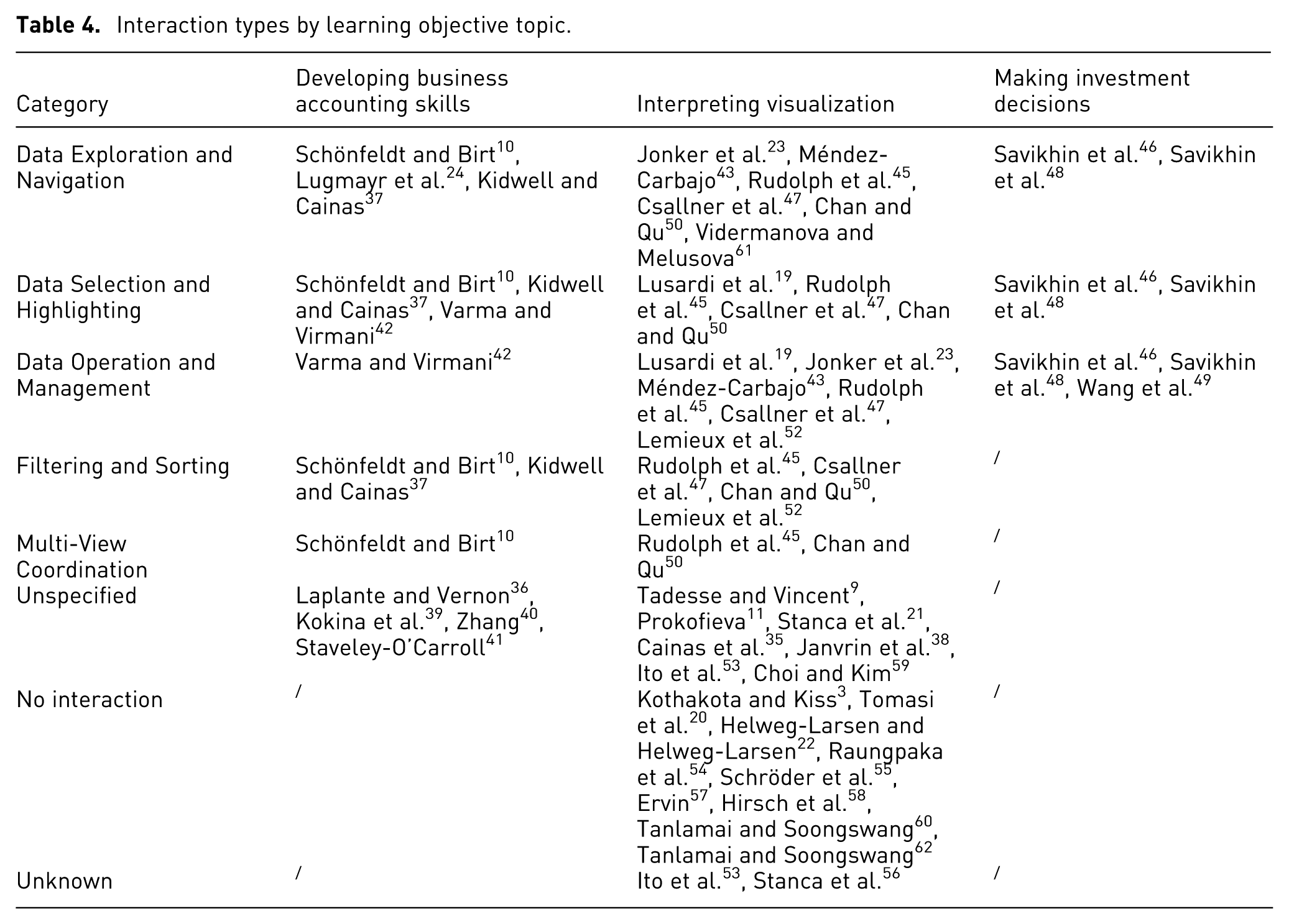
These studies frequently use visualization to support learners in identifying patterns, understanding trends, and strengthening their decision-making abilities.9,35,61 Yet these interpretation tasks rarely employ guided interaction (e.g. progressive disclosure, structured filtering) or perceptual optimization (such as careful color contrast and layout simplification) to manage cognitive load across different audience groups. To better understand how interaction is implemented across different learning topics, we examined the distribution of interaction types in relation to educational topics.
Table 4 reveals distinct interaction patterns across learning objectives. Except unknown (insufficient description), no interaction (usually statistic content) and unspecified (mentioned interaction tools but not specify the types), studies focused on interpreting visualization exhibit the widest range of interaction types, with strong presence in data exploration and navigation, data operation and management, and filtering and sorting. In contrast, studiesaiming to develop business accounting skills show a procedural and task-oriented interaction profile, where selection/highlighting, data exploration, and multi-view coordination appear prominently, likely reflecting stepwise analytical tasks in educational settings. Although fewer in number, studies on making investment decisions consistently employ interactive exploration, selection, and data operation, but do not report any filtering, coordination, or non-interactive designs.
Interaction types by learning objective topic.
Additionally, the results of the educational level analysis reveal that 14 studies emphasize financial skills for daily living, such as budgeting and retirement planning, with nearly all of these targeting general users. It reflects the increasing attention given to improving real-world financial behaviors and promoting financial well-being, especially for populations outside formal financial education. In comparison, 21 studies focus on basic professional skills relevant to finance-related industries. These are predominantly aimed at university students, suggesting that visualization-based instruction is commonly integrated into formal curricula to support vocational training in finance and business. Only three studies explore advanced financial skills,20,23,52 all designed for expert users. This stark contrast reveals a research imbalance: while foundational and vocational competencies are widely supported, advanced skills remain underexplored. Moreover, tools for daily living skills typically employ simple, largely static charts and dashboards that under-represent long-term uncertainty or compounding, whereas professional and expert tools introduce rich interaction with little attention to the perceptual and cognitive demands this places on less experienced users. As a result, the alignment between visual encoding, interaction depth, and learners’ financial skill levels remains more assumed than systematically examined, and the effectiveness of these designs across different user groups is rarely evaluated explicitly.
Feedback on activities
Feedback plays a critical role in financial education by guiding learners, reinforcing understanding, and promoting reflection. The selected studies reveal six main types of feedback used to support learning.
Descriptive feedback provides written, specific information about the learners’ performance. Evaluative feedback involves judgmental responses like grades, scores, or rankings. Peer feedback is offered by fellow learners, encouraging collaborative reflection and knowledge exchange, while self-feedback refers to learners’ own assessment of their understanding or progress. Formative feedback is delivered during the learning process to help learners improve in real time, whereas summative feedback is provided at the end of instruction to evaluate overall achievement. These feedback types reflect varied instructional strategies that shape learner engagement, motivation, and outcomes in visualization-based financial education.
A total of 8 papers provide descriptive feedback, 15 include evaluative feedback, 3 focus on peer feedback,10,23,38 and 17 highlight self-feedback. Additionally, 16 papers offer formative feedback, 6 present summative feedback,20,40,41,44,46,55 and 14 do not include any feedback mechanism, likely because their focus lies more on instructional presentation rather than learning assessment, or on tool demonstration and technical implementation rather than supporting the learning process. Yet in most of the reviewed interventions, feedback remains predominantly textual and loosely coupled to the visual encoding themselves; few studies design feedback as an integral part of the visualization, for example through interactive visual cues (such as progressive highlighting, animated comparisons, or visually salient error indicators) that make performance differences perceptually immediate within the charts and dashboards learners are interpreting.
In particular, self-feedback, evaluative, and formative feedback are the most prominent types, providing essential instructions to learners. For instance, Lusardi et al. 19 reported that students assess their own confidence and effectiveness in understanding and applying financial concepts. Similarly, Prokofieva 11 stated that students self-evaluated that “the project allowed me to see the connection between different accounting topics,” suggesting that self-feedback can promote the recognition of conceptual relationships and support the development of a more integrated and structured understanding of financial knowledge.
A clear example of evaluative feedback is provided by Schönfeldt and Birt, 10 who described an individual assignment for a fully online setting, where evaluative feedback was provided to students based on the quality of their submissions and overall experience. Similarly, Stanca et al. 56 demonstrated how attributes such as attendance and participation were assessed, with feedback aimed at supporting learners in improving their study practices. These examples underscore the role of evaluative feedback in refining teaching methods and fostering deeper learning in visualization-based education.
Formative feedback is effectively demonstrated in the work of Staveley-O’Carroll. 41 In this work, instructor conducted in-class reviews of each assignment after submission, demonstrating how to locate data series and create graphs using the FRED interface. These reviews served as direct feedback, reinforcing students’ understanding and addressing errors in their work.
Although formative and summative feedback are common practices in education, they are seldom designed with visualization-specific considerations in mind. In many studies, formative feedback is delivered as text comments or scores outside the visual interface rather than through adaptive changes in encoding or interaction (e.g. simplifying cluttered views, selectively revealing comparisons, or adjusting color and layout), and summative feedback rarely reflects how perceptual design choices shaped learners’ understanding over time. Self-feedback is integral to the entire learning process, encouraging students to reflect on their progress and adjust their strategies. Descriptive feedback provides students with detailed and specific information about their performance, highlighting strengths, areas for improvement, and steps to enhance their learning. In contrast, peer feedback fosters collaboration among students, allowing them to offer constructive suggestions to each other, refining their understanding of the concepts and enriching their learning experience.
Patterns and implications among key dimensions
The categories of the 38 selected studies for different key dimensions reveal distinct patterns and trends among the key dimensions of visualization-based financial education. By examining the roles of visualization tools, the relationships between target audiences and financial concepts, the alignment of educational objectives, and the variations in feedback mechanisms, this section highlights how these dimensions interact and contribute to the effectiveness of financial education strategies. These patterns provide valuable insights into the design and implementation of visualization techniques, laying the groundwork for future improvements and innovations in this field.
Roles of visualization tools
In this subsection, we contrast commercial and self-developed visualization tools in financial education and examine the different trade-offs they introduce in terms of visual encoding, interaction design, and perceptual complexity.
Commercial tools like Tableau and Excel demonstrate a consistent focus on accessibility and functionality. Tableau’s advanced visualization capabilities and cross-platform compatibility make it a powerful tool for creating interactive dashboards, though its steep learning curve may present challenges for some learners.49,63 Excel, while limited in its data analytics functionalities, 35 equips users with essential financial skills and remains a widely adopted tool for basic professional training. In both cases, visual encodings are largely confined to standard 2D charts and tabular layouts, and interaction is mediated through generic operations such as filtering, sorting, and pivoting. This consistency supports skill transfer and lowers the barrier to entry, but it also restricts the design space for representing uncertainty, non-linear compounding, or multi-factor trade-offs, and the dense, spreadsheet-like presentations can impose substantial perceptual and cognitive load on novice learners when many variables are shown at once. However, these tools effectively foster engagement and comprehension, supporting the development of practical financial skills and essential analytical competencies, as corroborated by several studies.37–40
While commercial tools are often constrained by general-purpose design, self-developed systems are typically built from the ground up to meet specific educational needs and cognitive challenges and address the limitations of commercial platforms. Some self-designed tools offer innovative solutions for conveying complex financial concepts, such as Lotus metaphor 54 and 3D visualization.22,24 Rather than relying solely on a single dashboard or chart type, these systems often orchestrate multiple visual encodings over time. For example, combining narrative scenes with analytic views, or coupling parameter changes to staged visual transitions. But the underlying strategies for sequencing these views and managing learners’ attention and perceptual load are rarely made explicit. The flexibility allows educators to align visualization techniques with targeted learning objectives and diverse learner profiles. In particular, many of these tools embed educational scaffolding directly into the interface, allowing learners to explore financial dynamics at their own pace and level of understanding.
This contrast between tool types reflects deeper differences in how visualization tools interact with core educational dimensions. Commercial tools tend to emphasize accessibility, reproducibility, and skill transferability, making them ideal for foundational financial training, especially in formal curricula or vocational settings. Self-developed tools, on the other hand, are more likely to support exploratory learning, domain-specific reasoning, and interactive experimentation. These tools are often embedded within research-driven interventions, allowing for precise alignment between visualization techniques and learning objectives, such as developing risk awareness, understanding systemic patterns, or interpreting multi-dimensional datasets. The complementarity of these two tool types illustrates the spectrum of visual learning support, from generalizable proficiency-building to deep conceptual engagement. At the same time, it exposes a classic interaction design trade-off: commercial tools favor stable, easily readable encoding and relatively simple interaction at the cost of expressive power, whereas self-developed systems push richer interaction and more complex visual encoding but heighten perceptual complexity and demand higher levels of visual literacy.
To advance the field, future work should explore hybrid approaches that bridge the accessibility of commercial tools with the pedagogical precision of self-developed systems. For instance, AI-enhanced visualization frameworks could dynamically adapt complexity levels based on user profiles, offering guided exploration for novices and deeper control for advanced users. Moreover, open-source extensibility in commercial platforms may offer a middle ground, enabling educators to customize interfaces while retaining core usability features. Such integrative solutions could foster inclusive, personalized, and pedagogically rich financial education environments.
Connections between target audience and financial concepts
The matching pattern between target audiences and financial concepts underscores the importance of customization in visualization tools. For academic settings, tools should align with the depth and complexity of concepts taught, while for public education, simplicity and relevance to everyday financial decisions are paramount.
Studies targeting university-level students predominantly focus on accounting and investment. It reflects the structure of formal academic curricula, especially in business, finance, and economics programs. In these contexts, visualization tools are commonly used to improve conceptual clarity and develop technical skills related to financial reporting, investment strategies, and data interpretation. These tools also help students build competencies in data analysis that are essential for professional practice and future careers.9–11,35,56 Yet the underlying visual designs largely rely on standard time-series plots, bar charts, and table-like dashboards with relatively simple interaction (e.g. parameter changes, basic filtering), offering limited opportunity to explore alternative encoding or interaction sequences that might better surface uncertainty, risk trade-offs, or multi-step accounting structures for learners at different levels of expertise.
In contrast, studies targeting general users, such as lay investors and members of the public, primarily focus on investment-related topics. These studies emphasize the development of practical knowledge for everyday financial decision-making and reflect the increasing demand for accessible tools that empower individuals to make informed decisions without requiring advanced technical knowledge.19,47,48 Visualization tools in this group are designed to simplify information and enhance interpretability, bridging the gap between abstract financial data and real-world actions. However, simplification is typically achieved by compressing information into a small set of highly aggregated charts, with limited interactive scaffolding or perceptual optimization (such as progressive disclosure, focus+context, or careful color and layout choices), so it remains unclear whether these designs genuinely reduce cognitive load for novices or simply hide important nuances in risk and cost.
Notably, marketing-related concepts appear almost exclusively in studies targeting general users, especially in the form of news analysis, behavioral interpretation, and market sentiment visualization.24,50 This may suggest that public-facing tools are being used to help users navigate the broader socio-economic environment, potentially reinforcing the link between visualization, media consumption, and financial awareness.
Expert-oriented studies focus narrowly on investment and accounting and are generally found in the domains of financial analytics and visualization research. However, they often prioritize the enhancement of task efficiency rather than the development of professional knowledge or financial skill development. Furthermore, none of the expert-oriented studies address management or marketing concepts. This may be due to the framing of these studies within the information visualization field, where the primary objective is to optimize data interaction and system performance for domain experts. Consequently, these systems frequently employ dense multivariate encoding and rich interaction controls that assume high visual literacy and tolerance for perceptual complexity, but they rarely consider how the same interfaces might be adapted to support progressive skill development or reflective learning for less experienced professionals.
Additionally, there is a conspicuous lack of studies focusing on older adults and younger learners. One study addresses high school students using a simple visual tool, 61 which has proven effective in building foundational financial literacy. Surprisingly, we did not find other papers about visualization-based financial education for children, despite financial education being important and taught in many countries in schools. 64 We hypothesize that the lack of research in this area may stem from an implicit assumption that existing visualization formats require a level of visual literacy that young learners may not yet possess. While visualizations are generally effective for children, current designs may not be sufficiently adapted to their cognitive and developmental needs, highlighting the need for more intuitive and age-appropriate visual metaphors in financial education. In particular, there is almost no work on tuning visual encoding, interaction depth, or perceptual load to shorter attention spans, concrete thinking styles, and limited prior experience with charts that characterize many younger learners.
Similarly, no studies provide visualization-based interventions for older adults, despite their growing need for support in retirement planning, fraud prevention, and long-term financial decision-making, and there is evidence that older adults require more financial education.55,65 The near-complete exclusion of these age groups suggests a developmental gap in the visualization literature and highlights an urgent need to extend the reach of educational design across the lifespan. Age-related changes in vision, working memory, and processing speed would require explicit attention to perceptual clarity (e.g. font size, contrast, clutter reduction) and to interaction designs that minimize unnecessary navigation and manipulation, yet these considerations are absent from the existing studies.
In summary, the current patterns show a strong alignment between target audiences and financial concepts, driven largely by existing educational structures (in the case of students) and usability considerations (in the case of general users). However, the focus on a limited set of concepts, mainly accounting and investment, indicates a narrow thematic scope that risks overlooking the broader landscape of financial literacy. Across these patterns, visual encoding and interaction mechanisms are seldom differentiated in a principled way for different audiences and topics, and perceptual demands are more often an accidental by-product of design choices than a consciously managed aspect of financial learning.
Future research should aim to diversify both the audience groups and financial topics addressed. For younger learners, age-appropriate, gamified, and storytelling-based visualization tools could facilitate early engagement. For older adults, clear, accessible interfaces tailored to cognitive and perceptual needs are crucial. For expert users, research may shift from task-specific tool design toward supporting continuous professional learning, incorporating AI-powered visualization to complex decision-making, and integrating interdisciplinary financial domains such as management and marketing. Across all these directions, a central challenge is to keep visual encoding, interaction patterns, and perceptual complexity human-centered while still allowing them to adapt to different learners. Rather than asking users to manually configure interfaces, future work could leverage AI-based models of financial and visual literacy, interaction history, and expressed preferences to recommend or automatically instantiate visualization designs whose encoding, interaction depth, and perceptual load are tuned to users’ needs for simplicity, explanation, or analytical control. Such developments would enable visualization to play a more inclusive and transformative role in financial education across all stages of life.
Relationships among educational objectives
In this section, we discuss the cross-analysis of educational objective types, topics, and levels across different target audiences. This analysis revealed three coherent and interdependent triads that reflect tailored instructional strategies.
For students, the most common combination is “Learn to Use Tools”–“Developing Business Accounting Skills”–“Basic Professional Skills,” that is T–D–B. This pattern aligns with the instructional goals of business and finance programs, where tool proficiency is emphasized as a key vocational competency. Visualization tools such as Excel and Tableau are frequently used in these studies to support the development of industry-relevant technical skills,9,35,40,44 typically through standard spreadsheet- and dashboard-style encoding with stepwise, menu-driven interaction that privileges procedural fluency but leaves limited room to experiment with alternative visual mappings or systematically manage perceptual load for less experienced learners.
In contrast, studies targeting general users are mainly concept-focused, with a prevailing combination such as “Learn to Understand Concepts”–“Interpreting Visualization”–“Daily Living Skills” (C–I–D). Another common combination is sometimes “Learn to Understand Concepts”–“Making Investment Decisions”–“Daily Living Skills” (C–M–D) along with other modes. These patterns reflect the practical goal of enabling everyday financial reasoning among the public, such as understanding interest, risk, or news-driven market changes. Here, visualization tools serve to simplify complexity and support intuitive interpretation, often through narrative-driven or metaphor-based visual approaches.19,47 In principle, these designs are expected to “make concepts intuitive,” yet in many cases the visual encoding stops at showing simple trends or categories while leaving the critical conceptual mapping to accompanying text or the learner’s own inference. Interaction is often restricted to choosing scenarios or toggling options, which helps users see that outcomes change but offers little structured visual support for articulating why they change or for comparing alternative explanations, so the perceptual work of connecting visual patterns to underlying financial mechanisms is only partially offloaded to the visualization.
For expert users, the dominant educational profile is “Learn to understand Concepts”–“Interpreting Visualization”–“Advanced Financial Skills” (C–I–A). These studies emphasize the role of visual analytics in enabling high-level decision-making tasks.23,52 Compared with student- or public-oriented tools, these systems tend to encode several layers of financial reasoning, such as raw inputs, derived indicators, and model outputs, into tightly coupled views, with interaction centered on rapidly steering models through parameter adjustments, filtering, and drill-down. This design can be highly efficient for experts executing familiar analytic workflows, but may offer limited affordances for reflective learning, explanation, or the transfer of advanced skills to less experienced professionals.
These patterns suggest that visualization is not applied uniformly, but rather adapted to specific learning goals, content complexity, and expected learner outcomes, it must also align with the cognitive demands of the learner, the instructional intent, and the real-world complexity of the concepts involved. Students benefit from structured tool-based training, general users require accessible and explanatory visuals, and experts need cognitively sophisticated tools that support analytical depth, but in practice these needs are only partially reflected in differentiated choices of visual encoding, interaction mechanisms, and perceptual design. Recognizing and designing for these triads can help educators and developers align visualization strategies with pedagogical intent, thereby improving learning relevance, engagement, and impact.
Future research should go beyond matching visualization tools to surface-level audience categories and instead investigate how different cognitive demands—such as abstraction, comparison, or uncertainty evaluation—emerge across objective–topic–level combinations and how they are mediated by particular encoding, interaction patterns, and perceptual constraints. For example, while the C–I–D pattern supports intuitive understanding for general users, little is known about how such designs affect long-term retention or transfer to real-life decisions. Similarly, the near absence of T–I–A or C–M–A patterns suggests that concept-driven or decision-based visualizations for advanced users remain underdeveloped. Addressing these gaps may require not only expanding design targets but also integrating cognitive assessment into evaluation frameworks and explicitly testing how different visual encoding and interaction depths influence perceptual load and reasoning quality. Additionally, more sophisticated visualization tools tailored for finance professionals are needed to facilitate the interpretation of complex financial data, for example, by adapting interaction affordances and visual detail to users’ evolving financial and visual literacy rather than treating all expert users as having homogeneous perceptual and analytical capacities.
Variations in feedback mechanisms
In this subsection, we examine how different feedback mechanisms are coupled, or fail to be coupled, to visual encoding and interactions across target audiences, and what these patterns reveal about the role of feedback in visualization-based financial education.
The distribution of feedback types across different target audiences reveals distinct pedagogical assumptions embedded in the design of visualization-based financial education. For students, feedback is highly structured and diverse. Most studies incorporate self-, evaluative-, and formative feedback,10,37–39 reflecting a traditional instructional model where learners are guided through the learning process with continuous input and correction. This pattern aligns with formal education settings, where visualization tools are used not only to illustrate content but also to scaffold reflective learning, reinforce accountability, and track progress toward predefined learning outcomes. However, in many student-focused systems these feedback signals are delivered as grades, comments, or rubrics outside the visual interface, rather than being encoded directly in the charts and dashboards (e.g. through visual highlighting of errors, overlaid solution paths, or interactive comparison views), so the interaction with the visualization itself only weakly communicates where and how learners’ interpretations diverge from intended financial concepts.
In contrast, studies targeting general users19,46,48,55 tend to emphasize self-feedback while frequently omitting other types of feedback. This suggests a design orientation that favors autonomy and intuitive exploration with minimal instructional scaffolding, users can manipulate scenarios or parameters, but the visual encoding usually remains agnostic to the quality of their decisions. A number of studies targeting general users do not include any explicit feedback mechanism. Without external or structured feedback, general users may struggle to assess their understanding, identify misconceptions, or translate insight into action, especially in complex financial domains such as investment or retirement planning, where dense time-series and aggregate graphics already impose substantial perceptual and cognitive demands.
For expert users, the range of feedback types is limited. This may happen because experts possess sufficient meta-cognitive and domain-specific skills to interpret visualizations without external guidance. However, sometimes even experts may benefit from embedded feedback that surfaces blind spots, highlights outliers, or prompts reflection on model assumptions. From a visualization perspective, this could include encodings that make residuals, model disagreement, or scenario coverage immediately visible (e.g. uncertainty bands, anomaly markers, saturation cues), as well as interaction techniques that draw attention to regions of the data where experts’ actions systematically diverge from model recommendations, thereby turning perceptual discrepancies into opportunities for reflective learning.
These specific patterns suggest that feedback is often underutilized or inconsistently applied, especially outside of formal educational contexts. Across user groups, feedback channels are frequently decoupled from the visual representations themselves, so interaction with charts and dashboards is not systematically leveraged as a medium for conveying performance, uncertainty, or common interpretive pitfalls. Future research should explore how different types of feedback interact with user expertise and learning goals in visualization-based financial education. In particular, studies are needed to assess whether embedding structured feedback, such as real-time formative cues or delayed reflective prompts, can enhance engagement, accuracy, and long-term retention for non-expert users. Moreover, interactive visualization tools that provide immediate, actionable feedback can effectively connect theoretical understanding with practical application. Overall, it is important to develop adaptive feedback strategies that are aligned with cognitive load, task complexity, and user confidence, including attention to perceptual clarity (e.g. contrast, aggregation level, and clutter) and to interaction patterns that pace information exposure in line with users’ processing capacity, as these could significantly enhance the educational impact of financial visualizations across diverse populations.
Pedagogical design framework for visualization-driven financial learning
Most existing studies focus on developing and evaluating visualization tools, rather than proposing a pedagogically grounded process centered on visualization. Discussion is also limited regarding how visualization can be systematically embedded, supported, and refined as part of an iterative instructional design. To address this gap, we propose a comprehensive design framework for the financial education process, shown in Figure 5, which is organized into three color-coded phases: Preparation Phase ( ), Design and Implementation Phase (
 ), and Evaluation and Iteration Phase (
 ). Across these phases, the framework makes explicit where decisions about visual encoding, interaction patterns, and perceptual complexity are taken, and how they are constrained by, and in turn shape, pedagogical choices. Importantly, not all steps in the framework are compulsory. The design allows for flexibility based on learner needs and educational context, and distinguishes between components that are well supported in the reviewed literature and those that are more forward-looking, normative design recommendations.
A three-phase visualization-driven design framework for improving financial education, consisting of 13 steps. The framework is organized into three phases: Preparation Phase (), Design and Implementation (), and Evaluation and Iteration (). Solid circles indicate essential steps that should not be skipped, while dashed light circles denote optional steps. Solid arrows represent the primary instructional flow, and dashed arrows indicate feedback loops, showing how evaluation and reflection continuously refine earlier stages to support adaptive learning.
This framework synthesizes five key dimensions that were explicitly addressed in nearly all of the 38 reviewed articles in the previous sections, forming the backbone of visualization-based financial education. These five dimensions, along with other frequently mentioned components such as learning barriers (15 articles), visualization interface and interaction strategies (22 articles), and learning outcomes (22 articles), are represented as solid circles, indicating essential steps that are not recommended to be skipped. In contrast, a few steps received limited attention in the literature. Specifically, cognitive and perceptual abilities (three articles), visual literacy or capacity to interpret visualizations (five articles), visual feedback mechanisms (three articles), reflection and iterative improvement (seven articles), and building long-term financial knowledge (two articles) were each discussed by only a small subset of studies. These are visualized as dashed light circles, denoting optional steps. We present them as recommended extensions that extrapolate from, rather than directly summarize, the existing evidence and can be read as normative design guidance. The framework remains both comprehensive and flexible, offering practical guidance that can be adapted to different learner needs and cognitive characteristics. In what follows, the first two subsections focus on synthesizing elements that are consistently supported in the reviewed literature, while the final subsection provides forward-looking, normative design guidance and illustrative use scenarios.
Phase structure and pedagogical flow
This subsection describes the three-phase structure of the framework and explains how pedagogical decisions and visualization design choices are coordinated across stages, primarily synthesizing elements that are consistently supported in the reviewed literature.
In the Preparation Phase (Steps 1–6), educators first analyze and deeply understand learners’ characteristics, including their backgrounds, existing financial knowledge, motivations, and specific learning contexts. Subsequently, this phase systematically identifies barriers learners may encounter, such as abstract financial concepts or information overload, and evaluates learners’ cognitive and perceptual abilities, explicitly assessing their visualization literacy, including familiarity with common chart types and symbolic representations. These diagnostics inform subsequent choices of visual encoding, interaction complexity, and visual density, so that the perceptual demands of the materials are matched to learners’ profiles. The ultimate goal is to precisely define clear educational objectives and carefully select the financial concepts to be taught (e.g. budgeting, investing, saving), ensuring visualization strategies align effectively with learners’ capabilities and educational goals. Only a minority of the reviewed studies explicitly undertook such cognitive or visual-literacy assessments; here we therefore include them as forward-looking recommendations motivated by broader learning-science principles, rather than as a widely adopted practice in current financial visualization interventions.
The Design and Implementation Phase (Steps 7–10) translates insights into tangible visualization-enhanced learning experiences. Educators collaboratively craft intuitive visual interfaces and interactions, selecting or developing appropriate visualization tools and platforms tailored to the predefined objectives. This includes making concrete decisions about which financial relationships are assigned to which visual encoding (e.g. temporal trends vs categorical comparisons), what interaction mechanisms are available (e.g. sliders, drill-down, scenario switching), and how color, layout, and animation are used to manage perceptual load and avoid visual clutter. This phase emphasizes providing learners with targeted visual feedback, reinforcing correct understanding, and complementing visuals with verbal instructions and explicit educational feedback such as formative cues, evaluative commentary, and self-reflection prompts. Such combined modalities ensure learners remain engaged, cognitively stimulated, and supported throughout the learning process.
The Evaluation and Iteration Phase (Steps 11–13) emphasizes assessing and refining educational effectiveness, enabling learners to internalize and apply financial knowledge and skills. Learners’ outcomes are evaluated to verify their knowledge acquisition, practical application, and ability to interpret financial visualizations, including whether the chosen encoding and interaction mechanisms can be used accurately and efficiently without inducing excessive perceptual or cognitive strain. Subsequent optimization of teaching methods, informed by feedback and performance data, allows continuous enhancement of instructional strategies and visualization effectiveness. Ultimately, this phase supports the development of enduring financial knowledge, embedding long-term skills beyond immediate learning objectives and promoting lifelong financial literacy. While only a few of the reviewed interventions were able to observe such long-term effects directly, we treat this emphasis on longitudinal skill development as an aspirational design goal that extends beyond the immediate empirical evidence.
Pedagogical feedback and iterative design
While the framework is structured as a linear instructional sequence, it is inherently iterative and pedagogically responsive. Building on the evidence-based phase structure outlined in the previous subsection, this subsection synthesizes how later-stage insights feed back into earlier steps through designed feedback mechanisms and evaluation loops, enabling continuous refinement of learning goals, visualization tools, and instructional strategies.
Iterative reinforcement from later stages to earlier ones
Step 6 Identify Knowledge to Teach loops back to Step 1 Analyze Learner Characteristics (6 → 1), acknowledging that the selection of financial content should be informed not only by curriculum standards but also by learners’ profiles, such as age, prior exposure, and learning context.
Similarly, Step 12 Optimize Teaching Methods connects back to multiple components: learner characteristics (1), educational objectives (5), financial concepts (6), visualization design (8), and educational feedback (10). The optimization occurs through updating learner profiles with behavioral and performance insights; refining educational objectives in response to observed difficulties; adjusting content selection to address misunderstood or poorly retained concepts; modifying visualization tools or formats that proved ineffective; and improving verbal and instructional support where scaffolding was either insufficient or unnecessarily complex.
These backward flows illustrate how performance data, feedback, and reflection work together to reshape multiple aspects of the educational process. Rather than functioning as a rigid sequence, the framework encourages iterative refinement and pedagogical responsiveness grounded in learner needs and instructional outcomes.
Interconnections within the Design and Implementation Phase Within the design phase, Step 8 Select Visualization Tools and Implement Activities functions as a central hub. It feeds back into both Step 5 Define Educational Objectives and Step 6 Identify Knowledge to Teach (8 → 5, 8 → 6 ), indicating that the selection of visualization tools is not merely determined by predefined goals and content, but can also retroactively influence how these goals are framed and which financial concepts are prioritized. Different visualization types and approaches afford different expressive capabilities and interaction modes, determining which financial variables can be foregrounded in particular visual channels, which comparisons are perceptually easy or hard, and how deeply learners can interact with the data before overload occurs, which shape what can be effectively taught and assessed. For example, tools with dynamic filtering and multivariate views may encourage more exploratory or decision-oriented objectives, while tools with limited interactivity may constrain instructional focus to simpler or more static concepts. Thus, visualization tools play a dynamic constitutive role in instructional planning, not just a supportive one.
Step 10 Deliver Verbal and Instructional Support also connects back to Step 8 Visualization Tools and Activities (10 → 8). This means that the way educators explain content, whether through spoken instructions or written materials, should match the specific visualization tools being used. Different tools present information in different ways, so the guidance must be adapted accordingly. For example, when using interactive dashboards or complex visual simulations, learners may need detailed, step-by-step instructions or scaffolded cues to help them navigate the interface, interpret the data accurately, and avoid cognitive overload. Therefore, instructional support should be designed together with the visualization tools to ensure clarity, reduce confusion, and enhance learning.
Evaluation-Informed Instructional Refinement The Evaluation Phase demonstrates the framework’s most intensive feedback structure. Step 11 Evaluate Learning Outcomes connects back to Steps 5, 6, 7, 8, and 10 (11 → 5/6/7/8/10), enabling educators to refine learning objectives, adjust content emphasis, reconfigure interaction design, and enhance instructional support based on observed learner performance. This dense network of backward flows highlights that evaluation is not a terminal step but a central driver of pedagogical refinement. Through systematic assessment, such as concept mastery, task performance, or visualization comprehension, educators can identify which instructional strategies are effective or ineffective, for example, where particular encodings are consistently misread, interaction sequences are too complex to follow, or visual displays become perceptually overwhelming, and recalibrate the educational process accordingly.
Additionally, Step 13 Build Long-Term Financial Knowledge feeds back into Step 1 Analyze Learner Characteristics (13 → 1), closing the instructional loop. This feedback signifies that learners’ accumulated knowledge, behavioral patterns, and skill development over time can inform the characterization of future cohorts, shaping learner profiles, instructional assumptions, and content starting points in subsequent educational cycles. For instance, if previous cohorts have developed strong budgeting skills or an understanding of core investment principles, future learners with similar backgrounds may arrive with greater confidence, clearer financial goals, or more advanced questions. These differences can inform a more accurate analysis of learner characteristics and allow educators to adjust content difficulty, instructional pacing, or tool complexity to better meet their needs.
Pedagogical utility and use scenarios
This subsection provides forward-looking, normative design guidance and concrete use scenarios. To illustrate the potential practical applications of the proposed framework, we first explore its relevance across different user roles and educational settings, followed by a conceptual example showing how it might be implemented in a real instructional context.
User Roles and Educational Contexts This framework offers practical guidance for a range of users, including educators, curriculum designers, and visualization developers. For educators, it provides a clear, step-by-step process to design visualization-supported instruction, from analyzing learner characteristics and identifying learning barriers to selecting appropriate tools and embedding feedback. For curriculum designers, the framework helps ensure coherence and completeness in instructional planning, addressing common issues such as unclear learning objectives or lack of formative feedback. Visualization developers can use the framework to identify when and how visual tools should be introduced, ensuring alignment with both pedagogical needs and user profiles.
Additionally, the framework is also adaptable across a variety of educational contexts, including formal instruction, informal learning environments, and online platforms. In formal classroom settings, such as university or secondary education, the structured sequence of steps can guide semester-long course design, while in informal settings, such as workshops or community programs, users may focus on a subset of steps (e.g. visualization design and feedback), depending on time or learner background. For example, users can begin at various entry points depending on their needs: some may start by analyzing learner characteristics (Step 1), while others may define learning goals first (Step 5). Online platforms can particularly benefit from the framework’s feedback loops and interface-related steps, as these elements support learner autonomy and sustained engagement.
Application Example: A Visualization-Based Learning Module As an illustrative case, we propose a hypothetical design of a secondary school module on compound interest to exemplify how the 13-step framework can be applied in practice.
The teacher would first analyze learner characteristics (Step 1), identifying that most students have minimal exposure to formal finance, rely on parents for money decisions, and prefer visual over textual content. Next, the teacher would identify learning barriers (Step 2), such as difficulty understanding exponential growth, delayed rewards, and abstract numerical change. They would then assess students’ cognitive and perceptual abilities (Step 3), noting limited attention spans and low spatial reasoning, which influence the choice to simplify interactions and avoid cluttered visuals. To prepare students for visual learning, the teacher would evaluate their capacity to interpret visualizations (Step 4) and introduce a warm-up activity on reading line charts and interest graphs. Based on this analysis, the teacher then defines specific educational objectives (Step 5), such as enabling students to understand how savings grow with compound interest and how time affects outcomes. They identify key financial concepts (Step 6), including principal, interest rate, time, and compounding frequency.
The design of visual interfaces and interactions (Step 7) focuses on allowing learners to manipulate interest rates and durations on an animated savings timeline. Here, line-based encodings and smooth animation are chosen to make growth over time perceptually salient, while limiting the number of simultaneously displayed scenarios to avoid visual clutter. Visualization tools and activities (Step 8) are selected accordingly, such as an interactive compound interest simulator with sliders and graphical projections, integrated into group exercises and discussions. During class, the teacher would provide real-time visual feedback and instructions (Step 9), using color-coded graphs to show whether learners’ input settings lead to optimal savings outcomes. Verbal and instructional support (Step 10) would be provided alongside, offering metaphor-based explanations (e.g. “snowballing effect”) to enhance comprehension, especially when students struggle with abstract accumulation.
At the end of the module, the teacher could evaluate learning outcomes (Step 11), including whether students can interpret compound growth curves and apply insights to real-life decisions like choosing between saving plans. These outcomes feed back to multiple steps: for instance, if students misunderstand the impact of compounding frequency, this may trigger a revision of the learning objectives (Step 5), content emphasis (Step 6), or interaction design (Step 7–8). Misinterpretation of visuals may also indicate a need for clearer guidance or feedback strategies (Step 9–10). Reflection and improvement (Step 12) thus involve refining both tools and teaching methods. Over time, long-term financial knowledge (Step 13) is built, as students retain a visual intuition for interest over time. If successful, this cumulative learning could inform a new cycle: future cohorts can be profiled more accurately (feeding into Step 1), and instruction can be adapted to match their improved starting points.
Conclusion and future work
In this work, we proposed taxonomies for key dimensions in visualization-based financial education, including target audiences, educational objectives, financial concepts, visualization tools, and feedback mechanisms, offering a structured perspective on financial visualization education and its associated visualization design space. By analyzing patterns among these dimensions, we demonstrated how visualization tools interact with educational objectives, audiences, and feedback to facilitate understanding, support decision-making, and enhance financial literacy. Additionally, we provided recommendations for future research, including reaching underserved audiences, diversifying financial topics, and developing adaptive, cognitively aligned visualization tools and feedback strategies. Lastly, we proposed a design framework for visualization-based financial education, outlining its phases and emphasizing its iterative nature to improve learning outcomes.
This work offers guidance for integrating visualization techniques into financial education, helping to promote more effective, inclusive, and cognitively aligned financial literacy initiatives. Beyond the specific application domain, it also has implications for the information visualization research community. By mapping visualization-based financial education onto explicit dimensions such as audience profiles, financial concepts, learning objectives, visual forms, and feedback mechanisms, it consolidates a scattered set of case studies into a coherent, domain-specific design space that can be systematically explored. The patterns and gaps we identify (e.g. the predominance of simple charts for student audiences, the relative absence of advanced visual analytics for complex financial decisions, and the limited use of adaptive or feedback-rich designs) point to concrete opportunities for developing new visualization techniques and interaction strategies under the domain-specific constraints of low numeracy, high stakes, and emotionally charged financial decisions in financial education settings. In this sense, the proposed taxonomies and framework provide a bridge between visualization design and educational theory, offering a structured basis for future work on learning-oriented visualization in finance and potentially other domains.
Future work will involve applying the proposed framework in real-world educational settings, particularly through the design and evaluation of visualization tools tailored to specific learner groups such as children or older adults. Empirical studies will be conducted to examine how specific design elements influence engagement, comprehension, and long-term knowledge retention. These efforts aim to refine the framework and contribute actionable insights for visualization-supported financial education across diverse contexts.
Footnotes
Acknowledgements
We sincerely acknowledge the scholars and practitioners in financial visualization education whose foundational work has significantly contributed to this study. We are especially grateful to those authors who generously granted permission to reproduce their visual materials. Their collegial support has been instrumental in facilitating cross-study knowledge integration and disseminating these valuable resources to a wider academic community.
Funding
The authors received no financial support for the research, authorship, and/or publication of this article.
Declaration of conflicting interests
The authors declared no potential conflicts of interest with respect to the research, authorship, and/or publication of this article.