
Abstract
With the advent of novel visualization techniques to convey complex information, data visualization literacy is growing in importance. Two facets of literacy are user understanding and the discovery of visual patterns with the help of graphical representations. The research literature on visualization literacy provides useful guidance and important opportunities for further studies in this field. This survey examines and classifies prior research on visualization literacy that analyzes how well users understand novel data representations. To our knowledge, this is the first comprehensive survey paper with a focus on interactive visualization literacy. We categorize existing relevant research into unique subject groups that facilitate and inform comparisons of related literature and provide an overview of the same. Additionally, the survey/classification also provides an overview of the various evaluation techniques used in this field of research due to their challenging nature. Our novel classification enables researchers to find both mature and unexplored directions that may lead to future work. This survey serves as a valuable resource for both beginners and experienced researchers interested in the topic of visualization literacy.
Introduction and motivation
Visualization literacy is an essential skill required for comprehension and interpretation of complex imagery conveyed by interactive visual designs. Developing visualization literacy is essential to support cognition and evolve toward a more informed society. 1 Gaining a deeper understanding of the visualization literacy of a cohort of participants or domain experts has become a prominent theme in the information visualization community. Visualization literacy was described as an essential skill in the IEEE VIS 2019 keynote talk by Börner. 2 Few studies were published in the previous 20 years; however, in the last 6 years, there have been many more papers published in this field as shown by the graph in Figure 1. If we look at different categories, there is no obvious trend yet it due to immaturity in the field. In recent years, more studies feature classroom-based evaluation and literature reviews.
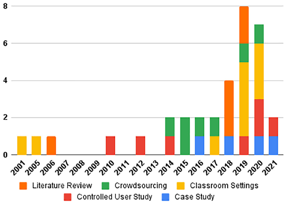
Number of papers by publication year and evaluation method used. There are 34 papers in total. We stopped searching for literature in the middle of 2021.
The Merriam-Webster dictionary defines the term literacy as “the ability to read and write.” 3 Literacy is described as the ability to comprehend and use something with an emphasis on the consumption aspect when the term is combined with other subjects like information literacy, health literacy, etc. More specifically, visualization literacy is defined by Boy et al. 4 as “a concept generally understood as the ability to confidently create and interpret visual representations of data.” Börner et al. 5 explain, “the ability to make meaning from and interpret patterns, trends, and correlations in visual representations of data,” while Lee et al. 6 refer to it as “the ability and skill to read and interpret visually represented data in and to extract information from data visualizations.” There are also related concepts such as visual literacy which is defined by Bristor and Drake 7 as the, “ability to understand, interpret, and evaluate visual messages.” Ametller and Pintó 8 state that visual literacy “encompasses the ability to read (understand or make sense of) as well as write (draw) visual representations” while Bradent and Hortinf 9 identify it as “the ability to think, learn, and express oneself in terms of images.”
In this paper, we present a literature review of visualization literacy to inform both mature and unsolved problems and to convey trends emerging from visualization literacy to readers who are interested in this topic as a research direction. The study also provides an overview of the evaluation methods used in visualization literacy studies. To investigate the state-of-the-art systems implemented for advancing literacy skills, we survey and classify a variety of literacy research. The contributions of this state-of-the-art report (STAR) are as follows:
The first survey of its kind on the topic of visualization literacy with a special focus on evaluation with a total of 34 main papers with an additional 45 related publications.
A novel literature classification of research papers in this area
Beneficial meta-analysis to facilitate comparison of the literature
Indicators in the field of both mature themes and unsolved problems
We collect literature referenced in this survey in an online resource using an interactive literature browser called SurVis. 10 This can be found at the following URL: https://bit.ly/3vljG4t
The rest of the survey is organized as follows. We first present an overview of the related work that contains previous relevant papers that examine visualization literacy. The subsequent section provides a review of visualization subjects and technologies used to enhance users’ ability to understand and interpreting visual representations in different research fields. We later present a discussion of future work and open directions for research in this field.
STAR scope
In this state-of-the-art report, we provide an overview of visualization papers that examine/test/study users’ visualization literacy skills and improve the literacy skills of understanding and creating advanced visual designs. Studies that concentrate on data visualization literacy using interactive visualization techniques are within the scope of this survey. The STAR includes papers to investigate the ability of reading, understanding, interpreting, and constructing visual designs. The main criterion is to examine how the work advances user’s basic comprehension and interpreting visual representations of data.
The research topics and papers presented here introduce methods or software that include advanced and interactive graphical representations developed and used for improving visualization literacy skills. A major challenge is to gauge the effectiveness of the target methodologies and technologies for increasing users’ understanding with the support of interactive visualization systems. Evaluating the effectiveness of an interactive visualization technique to advance visualization literacy is a non-trivial endeavor. As such this survey pays particular attention to the type of evaluation used when examining the literature.
Literature search methodology
Our methodology uses a systematic search of the existent literature in the field of visualization literature with an emphasis on papers published at the annual IEEE VIS Conference. 11 We specifically focused on the keywords “Visualization,”“Literacy,”“Teaching,”“Learning,”“Understanding,”“Interpretation,” and “Construction” in our search for literature. We also included the following resources for our literature search:
IEEE Xplore 12
Google Scholar 13
Vispubdata 14
Eurographics education papers 15
Eurographics Digital Library 16
ACM Digital Library 17
IEEE Pacific Visualization Conference 18
To further expand our collection of resources, we examine all the papers that were cited by the papers in our collection. The related work section of each paper was also examined for additional sources of visualization literacy research. A Survey of Surveys (SoS) 19 indicated that there was an absence of surveys on visualization literacy. A survey of interactive visualization for education 20 does not include any study on visualization literacy either. This is also relatively little material provided on this topic in information visualization books. 21 We checked all the literature cited in the related work section of our previous study on treemap literacy. 22 As a result of our search for the keyword “Visualization Literacy” on Google Scholars, we found approximately 90,000 matches. But after reviewing the 70 articles in the first seven pages, the studies began to lose relevance. We checked the references of each and used Google Scholar’s “cited by” feature to discover more research. The literature has to concentrate on visualization and literacy, and includes an evaluation unless it is a literature review. The tasks involved in the screening process were: (1) Keyword search, (2) Reading paper titles, (3) Reading paper keywords, (4) Reading the abstract, and finally (5) Reading each paper in full if it made it through the prior steps of the screening process. The number of studies in our collection was finally reduced to 34. The Figure 2 shows the general sampling procedure.
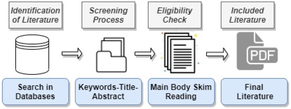
Sampling process of the literature.
Literature overview
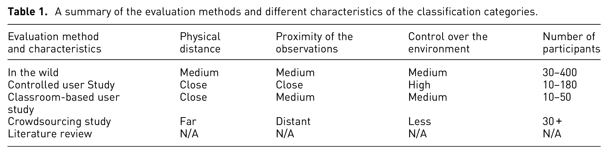
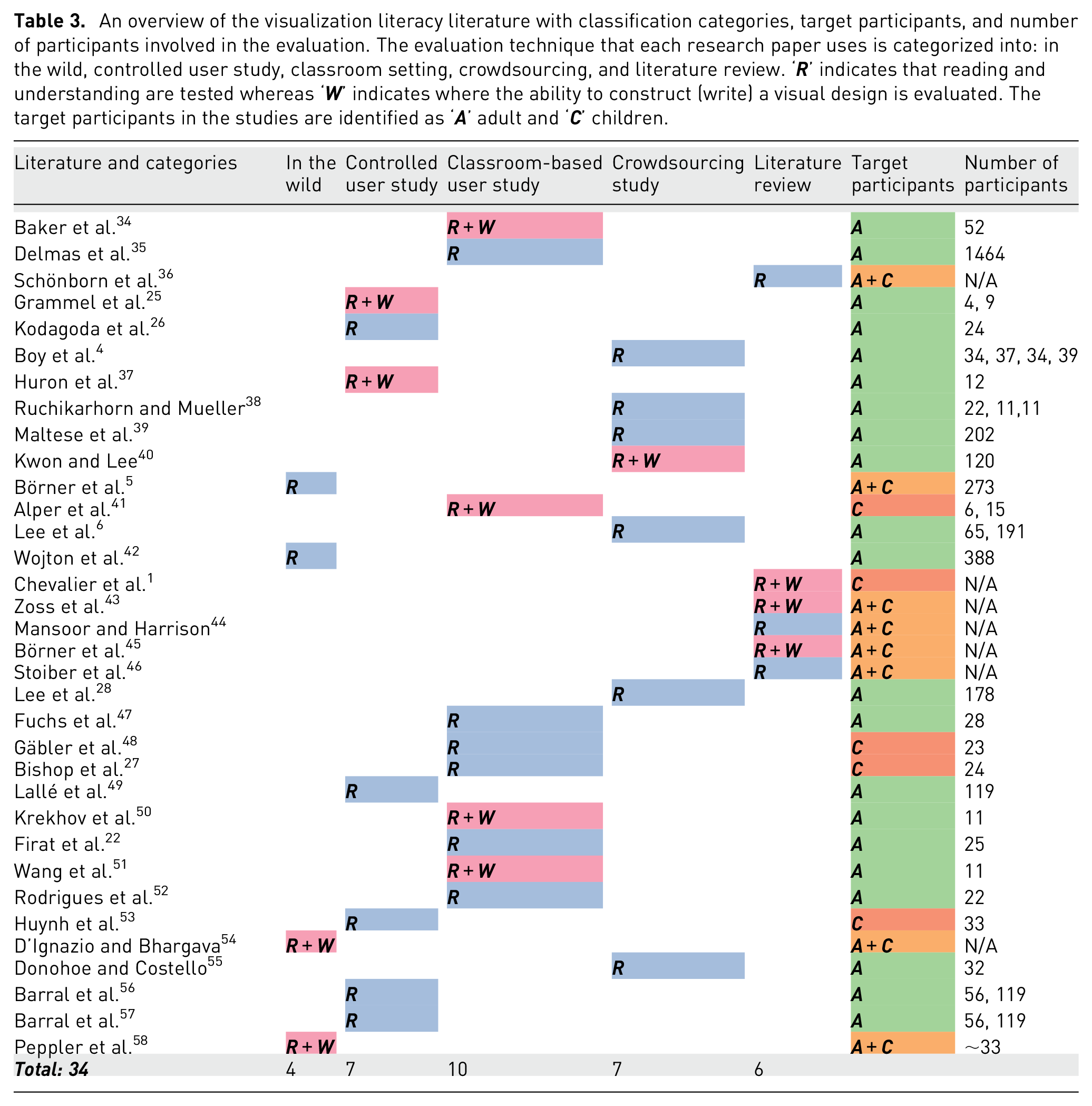
To categorize the papers and projects we examined, we developed a novel classification. Table 3 summarizes how each research paper is classified. We carefully examine the evaluation methods in each paper and further categorize the evaluation method used in the paper as well as providing the number of participants involved in the evaluation. For evaluation methods, we identify five categories: in the wild, controlled user study, classroom-based evaluation, crowd-sourced evaluation, and a meta-review of related literature. The categories are presented in ascending order according to the approximate number of participants involved in the evaluation process. The category called “review of literature” includes papers based-on literature surveys rather than providing an explicit evaluation. Using this approach above, we define a matrix for the literature classification (the columns in Table 3).
For each category we describe, there is a physical distance involved between the participants and the researcher. For example, classroom-based and controlled user studies involve very close distances meaning that experiments are generally conducted in the same room. At the same time, crowdsourcing evaluation involves participation across the globe. Another characteristic is the level-of-detail of the observations that can be recorded based on the distance between experimental participants and observers. The level of observational detail for each participant differs for each type of evaluation. For instance, observations are made with the studies in the wild by paying attention to an uncontrolled cohort of individuals. User-studies support the highest level of detail for making observations, usually measuring every individual task sometimes with supplementary video. The focus of the observation is a cohort in a classroom style evaluation while it is a distant larger group of people in a crowdsourcing study. We also have different levels of control over the environment. We have strict control over the environment for user-studies. There is a higher level of control over the environment with a lab-based user-study than a classroom-based study. The number of participants also changes depending on your evaluation method. It is usually around 10–50 people in a classroom-based study, while it’s more in a crowdsourcing study, for example, 30–200. These characteristics are summarized in the Table 1.
A summary of the evaluation methods and different characteristics of the classification categories.
We can see from Table 3 that classroom-based evaluation is the most popular followed by crowdsourced evaluation. Also, some papers did not provide the number of participants involved in their evaluation. This is indicated with a “N/A” in the table.
Related work
In this section we describe related surveys that systematically review papers with visualization user studies. A survey provided by Fuchs et al. 29 reviews 64 research papers with quantitative controlled studies focused on data glyphs to help researchers and practitioners gain understanding, to find the most relevant papers, and obtain an overview of the use, design, and future research directions involving glyphs.
Johansson and Forsell 30 provide a comprehensive literature review that examines user-centric assessments and explores usability challenges with parallel coordinates. They present 23 papers in four categories: analysis of axis configurations, comparison of clutter reduction approaches, practical application of different parallel coordinates, and comparison of parallel coordinates with other analytical techniques. The survey identifies challenges within the field and provides guidelines for possible future studies.
ACRL Knowledge Literacy Standard 31 requires students to assess and integrate sources into their knowledge base. There are sufficient studies, in both the evaluation and critique of data visualization resources, supported by considering these elements separately. Evaluation corresponds to the basic questions asked in order to determine the quality, accuracy, and reliability of a particular visual design. Critique is an analysis raised to the next level and seeks to answer the question of whether, for a particular application, a particular data visualization is among the best in its field.
Firat and Laramee 32 present a historical overview of studies on gender diversity and spatial cognition and share gender bias research findings in data visualization classrooms for university students studying computer science. The paper offers concise recommendations on how to make the visualization classroom more inclusive in order to encourage diversity.
The state-of-the-art on interactive visualization literacy
This section presents a collection of important re-occurring themes related to visualization literacy and associated research papers. Each research paper is summarized in a systematic way to guide the literature review. 33 Each paper is placed in its respective category (in the wild, controlled study, classroom study, crowdsourced evaluation, or literature reviews) to facilitate comparison.
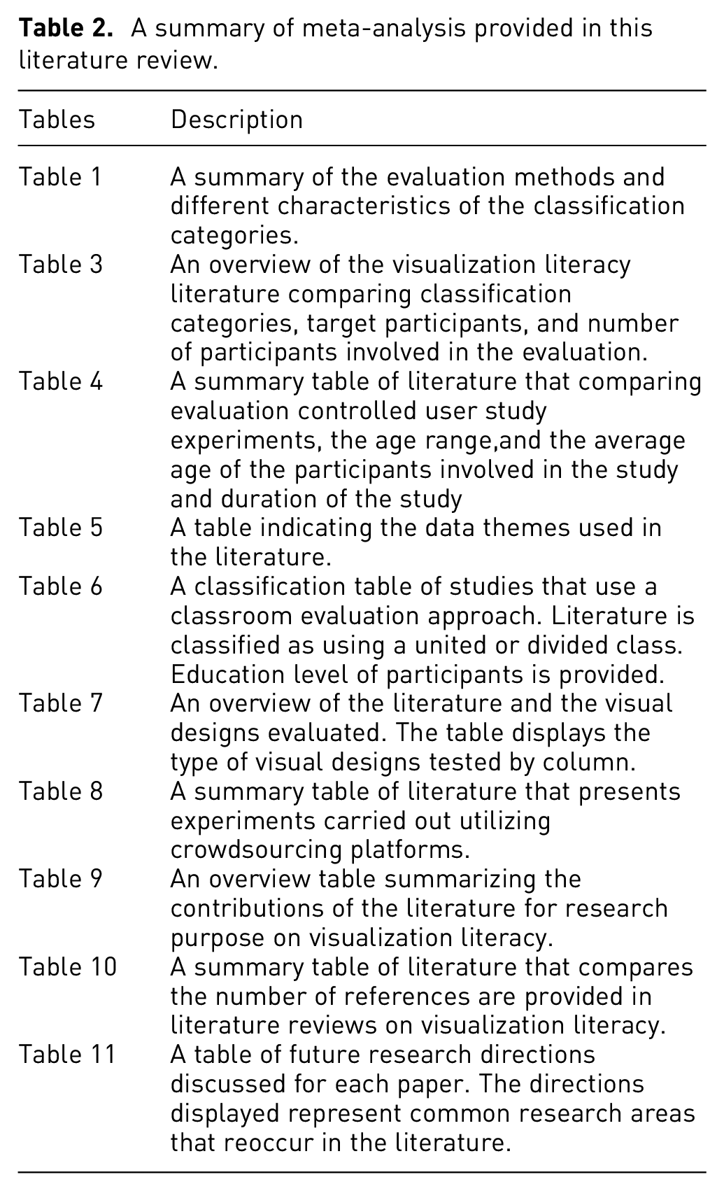
A summary of meta-analysis provided in this literature review.
An overview of the visualization literacy literature with classification categories, target participants, and number of participants involved in the evaluation. The evaluation technique that each research paper uses is categorized into: in the wild, controlled user study, classroom setting, crowdsourcing, and literature review. ‘
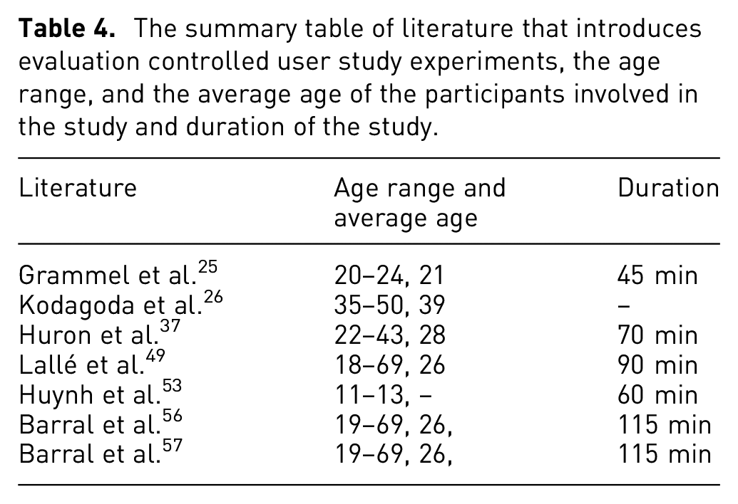
The summary table of literature that introduces evaluation controlled user study experiments, the age range, and the average age of the participants involved in the study and duration of the study.
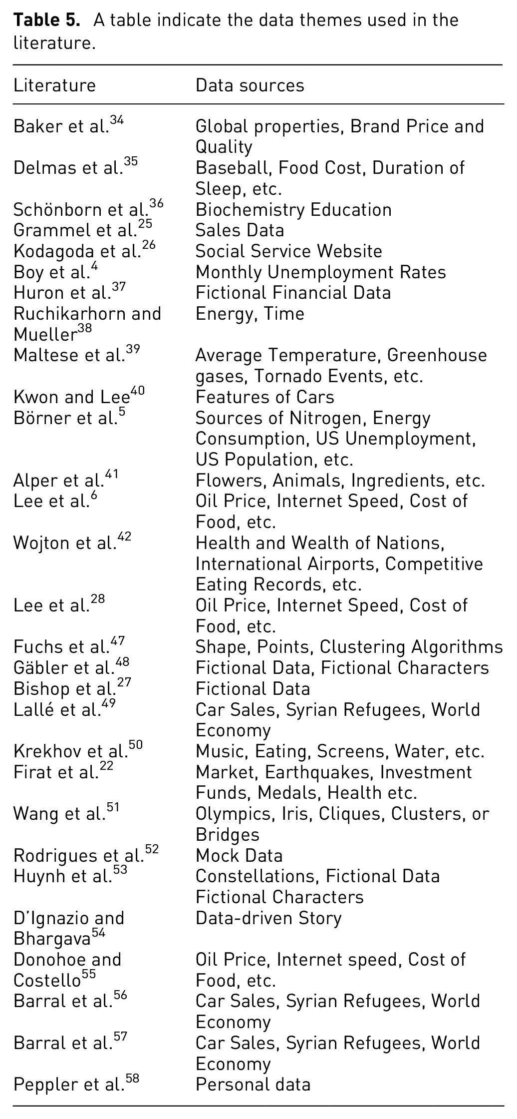
A table indicate the data themes used in the literature.
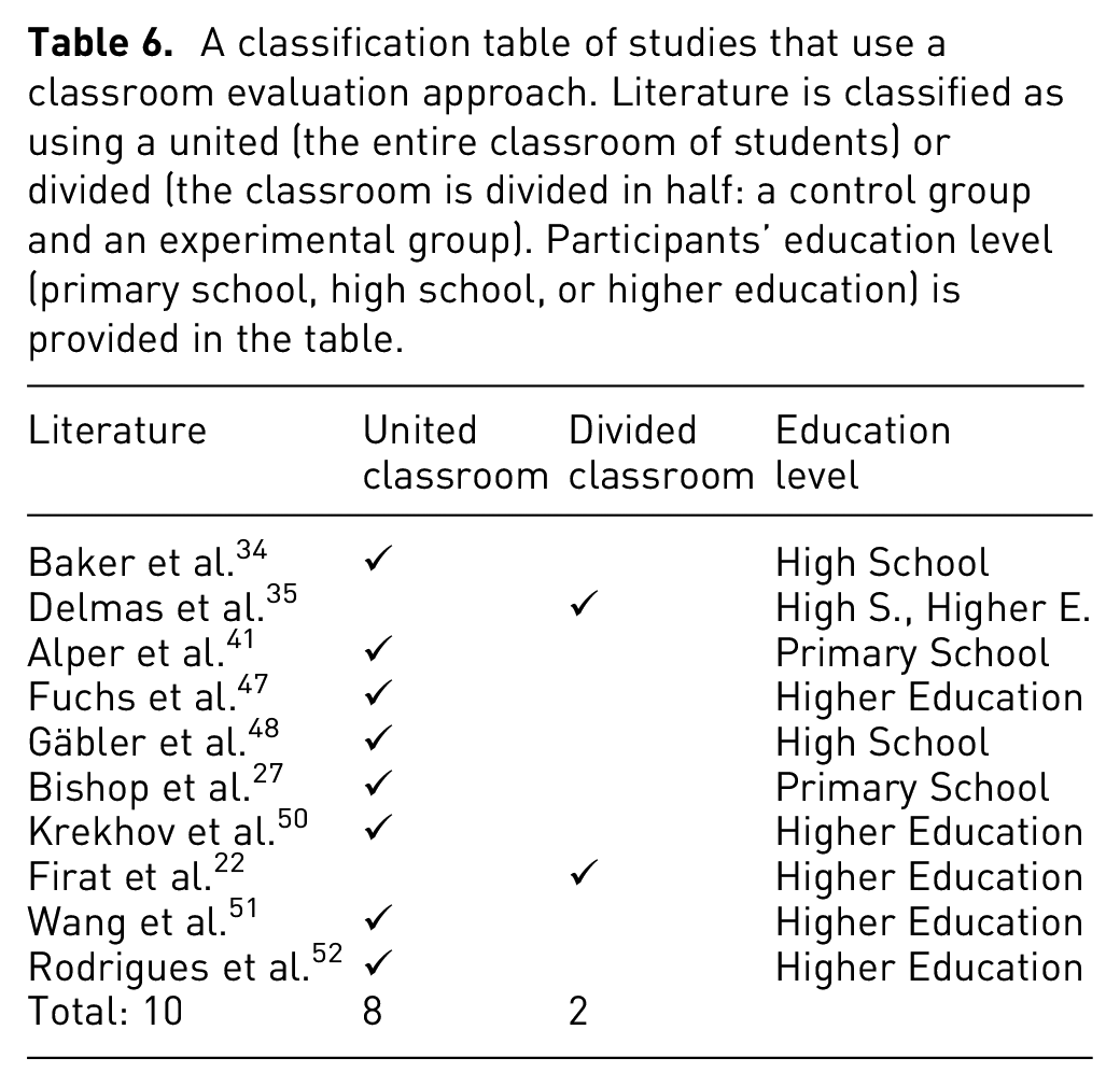
A classification table of studies that use a classroom evaluation approach. Literature is classified as using a united (the entire classroom of students) or divided (the classroom is divided in half: a control group and an experimental group). Participants’ education level (primary school, high school, or higher education) is provided in the table.
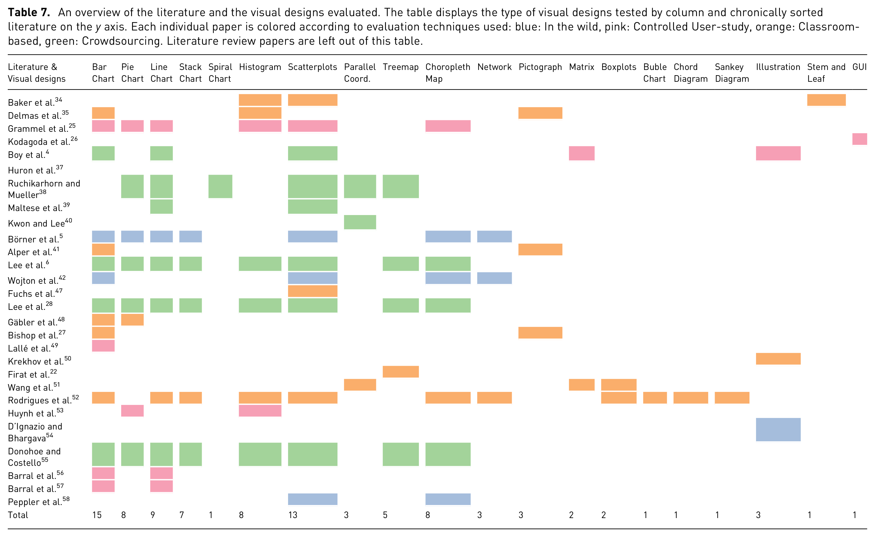
An overview of the literature and the visual designs evaluated. The table displays the type of visual designs tested by column and chronically sorted literature on the y axis. Each individual paper is colored according to evaluation techniques used: blue: In the wild, pink: Controlled User-study, orange: Classroom-based, green: Crowdsourcing. Literature review papers are left out of this table.
A summary table of literature that presents experiments carried out utilizing crowdsourcing platforms. The table indicates studies which experiments use the most popular platform, Amazon Mechanical Turk, or an online test designed by authors for gathering responses.
An overview table summarizing the contributions of the literature for research purpose on visualization literacy (VL). Contributions in the papers are classified based on common themes: 1) creating a VL test to evaluate user’s VL level, 2) developing a visualization software or game to support VL 3) or other. The rest of contributions are briefly explained in the other column. Literature reviews papers are left out of this table.
The summary table of literature that introduces the number of references are provided in literature reviews on visualization literacy.
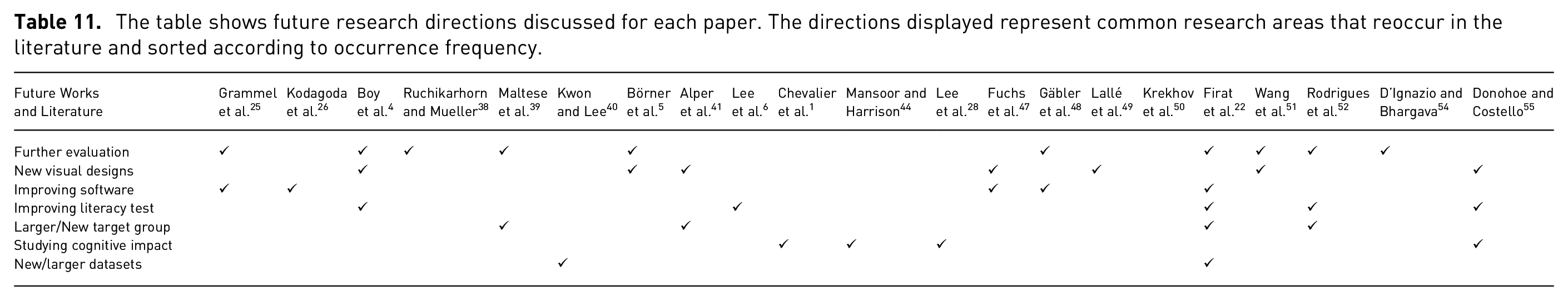
The table shows future research directions discussed for each paper. The directions displayed represent common research areas that reoccur in the literature and sorted according to occurrence frequency.
Visualization literacy in the wild
This subsection introduces papers in which a study is conducted a public setting in order to demonstrate the idea presented in the research. Study participants in this category are members of the public. They are not confined to a specific classroom or university. The exact number of participants is not controlled, neither is the selection process of participants. Each study provides a use-case scenario for the given software and testing it in an uncontrolled open environment. This evaluation method is one of the methods used to evaluate visualization systems.
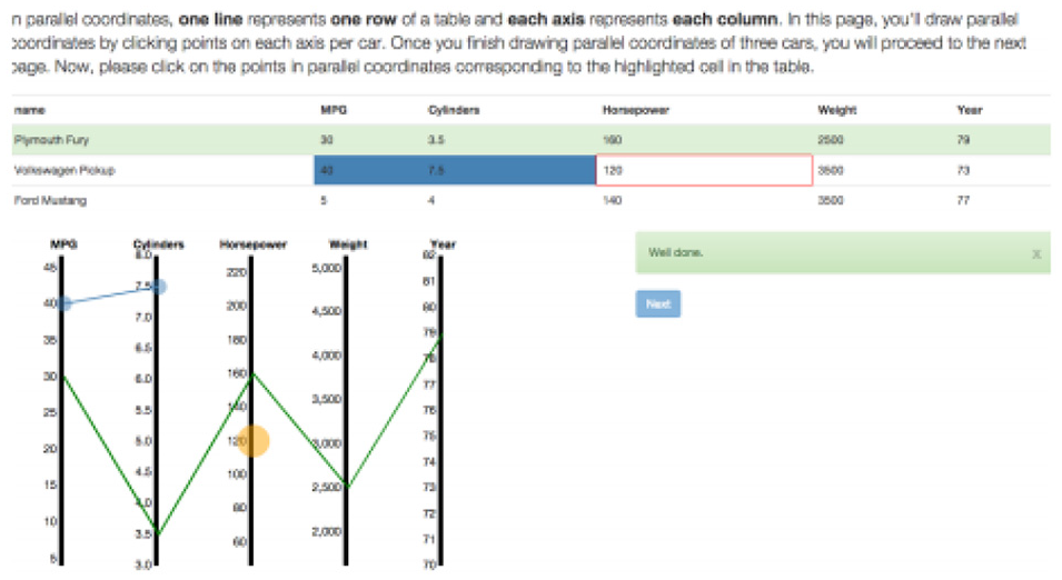
Börner et al. 5 study the familiarity of young and adult museum visitors with a selection of visual designs. A study is conducted in three US science museums, considered informal learning environments. Börner et al. 5 chose 20 visualizations from textbooks and widely used online visualization libraries such as the D3.js library. 59 These visual designs consist of two charts, five maps, eight graphs, and five network layouts (see Figure 3). Five of the 20 visual designs were displayed to visitors of the science museums. Museum visitors are asked to state their familiarity with the visual designs and to identify the name of the design.
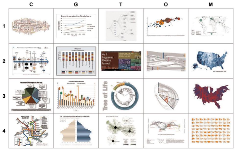
Four sets of five visualizations each row represents one set. All four rows make up the complete set of all 20 visualizations used in the study. Image courtesy of Börner et al. 5
Some 127 youths aged between 8 and 12 years old and 143 adults participate in a pre-test experiment. Visitors with a known perceived gender comprise 110 youth and 117 adults. Before exploring the set of five visualizations, participants were asked to report their interest in science, math, and art on a scale of 1-10. During the test, visitors are asked questions about data and data presentations. During a post-test, a total of 53 subjects sorted the five visual designs in order from easiest to most difficult to read. The results indicate strong experimental evidence that a very high proportion of the studied population, both adult and youth cannot name or interpret visual representations beyond very basic charts. They show low performance on the main aspects of data visualization literacy. The results indicate charts are easiest to read, followed by maps, and then graphs. Network layouts were identified as the most difficult to read.
A study by Wojton et al. 42 proposes a Simplicity-Familiarity Matrix, a study-driven model for integrating advanced data visualizations into an exhibition design to ensure all museum visitors can understand the visualizations and participate. This model derives from a data literacy study. The method of creating a data visualization was used to examine those aspects of data visualization are simpler or difficult for visitors to comprehend quickly and correctly. The study was performed in four museums and one aquarium to collected data that was driven by the question, “How do people engage with/ understand reference systems?.” A total of 250 adults and 138 youth participate. Four visualization booklets consist of a base and layers required to create a visualization. During the design construction, the participants were shown the base and asked to identify what it was communicating. The finding addresses key concerns and problems related to data visualization across two spectrums: simplicity and familiarity. The results also indicate that that visual designs with more than average complexity are difficult to comprehend. The use of the Simplicity-Familiarity Matrix can be used to increase visitors understanding.
D’Ignazio and Bhargava 54 propose teaching methods focused on feminist theory, procedure, and design to address inequalities. Via three case studies, they explore what feminism can offer visualization literacy, with the intention of improving self-efficacy for women and less-represented groups. They demonstrate creative ways to to work with data and develop learning spaces.
The first in the wild concentrates on the process of collaborating with community groups, Groundwork Somerville, and local youth design to paint a data-driven story as a community mural. This example of a “data mural” documents an action-oriented, community-based project that builds data literacy. In the second one, an exercise called “Asking questions” from the DataBasic.io suite of resources and activities is described. DataBasic.io includes web-based tools for beginners that incorporate principles for working with data varying from quantitative text analysis to network analysis. For the purposes of this case they focus on the WTFcsv tool and its accompanying learning activity “Asking questions.” The third in the wild is an activity designed to allow people to exercise the ability to argue with data in order to persuade people to take action, called “ConvinceMe.” Moreover, they provide six conceptual principles for feminist data visualization, drawing from work in feminist science and technology studies, feminist human-computer interaction, feminist digital humanities, and critical cartography & GIS.
The study by Peppler et al. 58 investigates what design features can assist data visualization literacy in science museums. They conduct a study and collect video data from 11 visitor groups that participated in visualization reading and writing in a science museum exhibition. Visitors are encouraged to interact with and interpret data, which consists of personal information records. Furthermore, tasks related to the data visualization framework are displayed around a screen. Participants are shown images and given tasks like finding themselves in the data, comparing with others, or changing their data. Responses collected from participants are analyzed thematically. Results indicate how the exhibit’s design features resulted in the identification of single data records, data patterns, incorrect measurements, and distribution rate. The findings address design practices to aid data visualization literacy in museums.
Visualization literacy and controlled user study-based evaluation
A controlled user study is an investigation carried out in a controlled laboratory environment. Participants are required to undertake given tasks interacting with visual interfaces. The success rate and completion times for each individual task are recorded. Generally, the experiment is performed one participant at a time. Grammel et al. 25 and Kodagoda et al. 26 chose a controlled user study method for the evaluation. Table 4 presents literature that incorporates controlled user study experiments for evaluation and provides participants’ age range and the average age. We can see from the table that a wide age range of participants are involved in the user studies and the duration of the studies which averages 60–70 min.
Grammel et al. 25 investigate the barriers novices face in interpreting and expressing visual designs when developing tools that enable users to create good graphical representations. The study examines how novices create a visual representation. They present abstract models to identify obstacles to understanding data and tool implications from their findings to reduce uncovered obstacles. In a series of a pilot studies, four participants were asked to define the visualizations they want to see while a mediator generates designs using Tableau and shows the participants the resulting visual layouts. After a few pilot studies, nine students from the business school participate in an experiment. Students are observed for 45 min while constructing visual layouts. They are requested to analyze their visual designs verbally. The study ends with an interview questionnaire to explore the resulting visual layouts and problems encountered while students were constructing visual designs. This study reports three visual mapping process barriers: (i) selecting the parameters to map to the visual variables, (ii) selecting the visual marks to be used, and (iii) decoding and interpreting the visual result.
The research offers implications for tool design based on empirical evidence. Some suggestions for developing tools include providing search facilities for retrieving data, offering visual design suggestions, supporting iterative specification and providing explanations, and support for learning of the design.
A study by Kodagoda et al. 26 describes the challenges low literacy (LL) users face while searching for information online. They derive a set of design principles for visual interfaces suitable for LL users. This research identifies two difficulties: understanding LL users in a way that facilitates new designs and understanding the problem that needs addressing. Based on the differences in LL users’ reading skills and perceived mental models, recommendations on designing a user interface for LL users are suggested.
Invisque (INteractive VIsual Search and Query Environment) 60 was developed for creating queries and searching for information in an interactive and visual approach. Invisque focuses on a set of design principles advantageous for LL users. Invesque decreases the cognitive load of word-for-word reading by providing information in boxes on white space and showing the amount of data visible that can be modified through the use of a slider.
The effectiveness of Invisque is evaluated by comparing LL users’ performance with the performance of HL (High Literacy) users by using a traditional website for search and retrieval tasks. Some 12 HL and 12 LL participants from a local Citizens Advice Bureau (CAB) with computer and internet literacy are recruited for the study (12 female, 12 male) with a mean age of 39. The study is conducted in a lab. Each participant performs six tasks in total, three with Invisque and three with the Adviceguide website which starts from a general overview and then requires a deep search to access more specific topics. For each interface, participants perform one easy, one medium, and one difficult task. Cognitive Task Analysis (CTA) techniques are used to understand the users’ decision process during their tasks. Techniques such as think-aloud, user observation, semi-structured interviews, and questionnaires focusing on the systems were used as methods for data collection. Results indicate that Invisque enhances LL users’ performance and changed their behavior strategies.
Huron et al. 37 explore how users build their visualizations and what kinds of visualizations they create. They introduce a visual mapping model to explain how users utilize tokens to form a visual arrangement that conveys their data as well as providing implications for designing tools.
The study’s goals are to understand more about the visual mapping process, determine what makes the process easy or difficult for users, and investigate the suitability of constructive authoring of infovis as a method to construct images. Some 12 participants are assigned three tasks (create, update and annotate a visualization) based on a given financial scenario to represent using tokens. The video of the whole user study process and the photos of visual designs are captured. Also, participants are interviewed on how they created designs to collect more information about construction process. By examining the collected data, the visual mapping process was analyzed as three activities: construction, computation, and storytelling. They provide details of the logical tasks and actions of visual mapping (e.g. build data, build and combine, construct etc.).
Lallé et al. 49 investigate gaze-built adaptations as a way of promoting the production of visualizations in narrative text, known as the Magazine-Style Narrative Visualization (MSNV) and focus on the MSNVs with bar charts and one of the most widely used visualizations found in MSNV documents: newspapers, blogs and textbooks (see Figure 4). They also explore the possible value of long-term user characteristics in order to further customize the delivery of gaze-driven adaptation in MSNVs.
An example of an MSNV document with multiple references, with the first two underlined for easier identification. Image courtesy of Lallé et al. 49
In order to assess the gaze-driven adaptive highlights for MNSVs, they compare the output of the group of users who read MNSV (see Figure 4) with the highlights of the intervention (adaptive group) and the control group that reads the same MSNV without highlights. They used a group of 14 bar chart-based MSNVs, extracted by Toker et al. 61 from the existing 40 MSNV datasets, for example, Pew Research, The Guardian or The Economist. In total, 119 individuals were recruited through advertisements on campus and on the Craigslist (63 for adaptive study, 56 for control study). The 90 min session begins with participants receiving an eye-tracker calibration. Next, participants are provided the assignment of reading the MSNV document on the computer screen and signaling when they are finished by pressing ’next’. Participants see a monitor with a collection of questions that reveal their view of the document and test their understanding.
Five user characteristics are specified in order to test participants. The first characteristic, visual literacy relates to how well users can process visualization. The other three verbal WM, reading abilities, and verbal IQ relate to the ability to process textual elements. The last one, for need cognition is a personality trait that determines how much users like cognitive activities. The results indicate that the interventions enhanced the performance of users with low visualization literacy, while the interventions did not affect high literacy users. Barral et al. 56 expand this research by identifying the particular visual behaviors that adaptive guidance produces in users, based on their level of visualization literacy. Barral et al. 57 extend their previous user study 49 by examining the speed with which users process newly triggered intervention in order to understand how effective interventions are to direct the attention of the user in the visualization and how this adaptive mechanism influences the users according to their visual literacy levels.
Huynh et al. 53 introduce a novel story-based role-playing game to facilitate visualization literacy education for children aged between 11-13 that features a series of exercises, overarching narratives, and mechanics to reinforce narrative elements. The game contains educational activities that focus on pie charts and histograms presented as multiple-choice questions, consisting of a chart question followed by an interpretation. The game consists of three key views: the Action View showing the puzzles, the Dialog View and the Exploration View to support the narrative component of the game (see Figure 5). In order to provide a narrative component to the tasks, players are engaged in a game world where they can discover and find characters to communicate with them by dialogs.
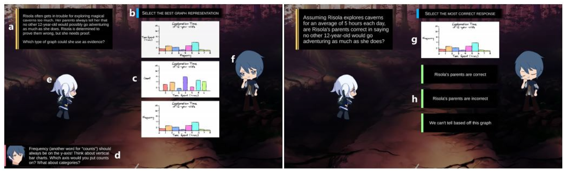
Activity view. This view consists of a question display box (a), instructions (b), choices to select from (c), a feedback box (d), and character sprites (e, f). Follow-up “interpret the chart” questions include a picture of the previously-chosen chart (g), and choices of written answers (h). Image courtesy of Huynh et al. 53
To evaluate the effect of narrative elements in games based on visualization literacy, a study is designed to evaluate two game variations: one with and one without narrative elements. A total of 33 children aged 11–13 participate in the study. Participants are tested in independent sessions conducted in a lab with only the participant and investigator. The study is designed with four phases: pre-test, play time, post-test, and interview. The participants were asked about their experience with pie charts and histograms in the pre-test phase. In play time, participants were all provided with the same activities and randomly allocated to either the non-narrative (i.e. activities only) presented in sequence without additional context) or with-narrative (i.e. activities, exploration and dialog) context. In the post-test, participants are provided a paper-based test to evaluate changes in their understanding of the subject. Then, participants are asked to express their thoughts on the different aspects of the game in the interview phase. The findings indicate that the narrative elements provide a substantial positive effect on childrens’ interaction and enjoyment although it requires players to spend much more time engaging with elements. Interviews reveal that children in the-narrative condition setting are usually satisfied with the story and related interactions.
Classroom-based evaluation
In a classroom setting, researchers design tests for pre- and post-experiments and investigate the visualization literacy skills of users based on participants’ answers to questions. In this category, a cohort of participants carry out an experiment as a group simultaneously, usually in a classroom. Preparing questionnaires to ask in pre- and post-experiments in a classroom environment is the most popular evaluation method among all categories. Papers by Alper et al. 41 and Fuchs et al. 47 present examples of a classroom-based assessment.
Table 6 displays a summary of studies that use a classroom evaluation approach. Evaluation categories are further sub-divided according to the classroom evaluation method. In some cases, the entire class experiences the same education: pre-test, a new educational technology, and a post-test. We call this a united evaluation. In other evaluations, the classes are split in half. The whole class takes the same pre- and post-tests. However one half of the class is taught the traditional way, while the other half uses new visualization technology. We call this a divided classroom evaluation. Table 6 indicates that researches mainly prefer the united classroom approach for the experimental setting. We also provide the education level of the participants (primary school, high school, or higher education) involved in the study.
Baker et al. 34 investigate middle school students’ reasoning abilities with three graphical representations: histograms, scatterplots, and stem-and-leaf plots. They run an experiment to see how novices perform when it comes to interpreting, generating, and selecting visual representations. In the study, 52 students from grades 8 and 9 completed 3–4 exercises in which they were asked to draw a histogram, scatterplot, or stem-and-leaf plot, in response to a set of interpretation questions for each visual design or to select the most appropriate representation for a particular question.
Overall, students performed moderately well on graph interpretation, with an average of 56% correct answers. Student performance on graph selection and generation is quite poor. In graph selection, students performed no better than 25% correctness. They were also unsuccessful in producing histograms and scatterplots. The performance of the 15 students to generate stem-and-leaf plots was relatively poor, with only 20% of them scoring completely correct. This result, however, was significantly better than the performance of the 12 students who generate histograms and the 12 students who generate scatterplots (0%).
Delmas et al. 35 define graph comprehension as the ability to translate a graph or a table and being able to interpret connections or major elements in a graph. The focus is to evaluate learning results in a first statistics course through the Assessment Resource Tools for Improving Statistical Thinking (ARTIST) 62 project over 3 years. The project is designed to address the challenge of evaluation difficulty in statistics education. In addition, the project team develops an overall Comprehensive Assessment of Outcomes in Statistics (CAOS) that includes a group of multiple-choice items to assess student’s comprehension and reasoning on the topic of variability when interpreting distributions, and making comparisons.
The evaluation data is collected by testing high school and college students. A group of 909 students take the CAOS test (97 students from high schools and 812 students from universities), and 555 students take one or more of the ARTIST topic scales (205 students from 4 high schools and 350 students from universities). All questions are multiple choice. Results indicate that students do not have difficulty understanding simple histograms and matching different graphs of the same data, as long as they have clear features to guide them. When students are asked to coordinate more information, the matching is more challenging. Students perform well when matching graphs to the definition of variables. Participants also show difficulty in many aspects of reasoning about images of distributions. They mainly have difficulty reading the data when the bars contain intervals of values rather than single values of a variant.
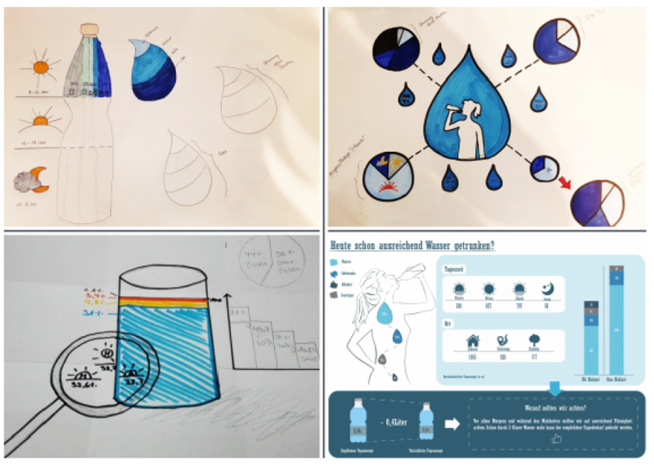
Alper et al. 41 investigate visualization literacy teaching methods for elementary school children and present an online platform C’est La Vis, that enables students to create and interact with visual data representations. It is used by instructors in the classroom by creating exercises for children (see Figure 6). Alper et al. 41 provide the results of an investigation of visualization types taught in grades K-4, in a formative study. They analyze visuals designs included in elementary textbooks and study textbooks that follow the US common core standards. These include five math eTextBooks from the Go Maths collection, six French by Éditions Hatier and eight Turkish elementary math textbooks provided by the Turkish Ministry of Education. 41
Deployment in grade 2 showing the setup in the classroom, discussions between students and written activity. Image courtesy of Alper et al. 41
Students interacting with the tool are evaluated in a field study that aims to understand their interest and understanding of the exercise and to collect feedback from the teachers on how the tool enhances current teaching in the classroom. Some 15 students, split into small groups, from two classrooms (grades K and 2) have their activities observed. An observer takes notes during the sessions with C’est La Vis, occasionally asking or answering questions from students. The main goals are to understand touch interactivity, verbal activity and class dynamics. Observers reported 13 students interacting with the app as playing a game rather than learning. A selection of six students also verbalize visualization literacy concepts (how to read an axis), and they are generally willing to use the app. Also, 16 teachers are surveyed to identify educational strategies for teaching simple visual designs. As a result, a set of design goals are provided to enhance visualization literacy in early grades.
Fuchs et al. 47 develop EduClust, an online application that assists both learning and teaching of clustering algorithms. This application combines visual designs, interaction, and intermediate clustering results to facilitate the comprehension and teaching of clustering algorithms. A web-based tool is developed that enhances the teaching and learning of clustering algorithms for both lecturers and students (see Figure 7). The tool facilitates rapid exploration for quick understanding of clustering algorithms with interactive data sets. EduClust is evaluated in a classroom environment where participant feedback is collected.
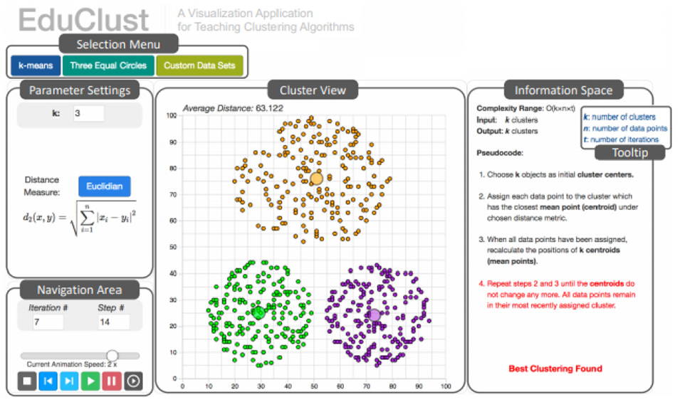
The five main components of EduClust visualization application. Image courtesy of Fuchs et al. 47
Students are shown different clustering algorithms in the classroom to answer a questionnaire based on their experience of the application. The results of the feedback indicate that 50% of the class strongly agreed that EduClust helps them comprehend the clustering algorithms. Also, 47% of students strongly agree that they would benefit from the tool for exam preparation. Moreover, students are asked to share their thoughts on the current implementation of the different algorithms and whether it would advance their comprehension of the algorithmic behavior. Some 22 students (77%) agreed or strongly agreed with this statement while five students (18%) were neutral in their decision and one student (4%) disagreed.
Gäbler et al. 48 developed Diagram Safari, an interactive mobile game for teaching diagrams and charts to children aged 9–11. The game is about learning how to construct bar charts, how to read and interpret them and how to match them to pie charts. In the game, the player navigates a ball across a bar chart by adjusting the bar height. The game includes numerous challenges in the form of quizzes, interactions between drag and drop, and it is designed in a visually appealing format for children (see Figure 8).
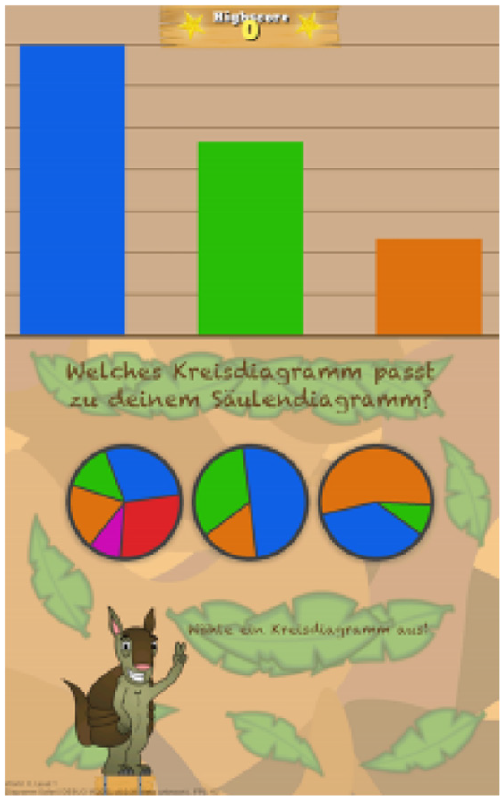
An example of a quiz asking about which of the three pie charts corresponds to the bar chart. Image courtesy of Gäbler et al. 48
The game is tested with 23 children in the fourth grade of primary school to obtain initial input from the target group evaluating the game design and playability. First, the children complete a questionnaire about their diagram literacy. Then, four tasks are given that require the bar chart to be assigned to the appropriate pie chart (see Figure 8). This is used to assess the ability of bar charts to correlate with pie charts. The kids play the game for about 15 min. In the last step, they are asked to complete a second questionnaire that examines their perspectives on the game. This questionnaire includes “Do you like the game,”“Would you like to play the game at home?.” The result indicates that children assigned on average 3.76 of 4 (%94) bar charts correctly to the corresponding pie chart in the first step. After playing the game, they assigned 5.76 out of 6 (%96) bar charts correctly. The study also indicates the children’s interest in the subject of diagrams and that they are motivated to continue playing.
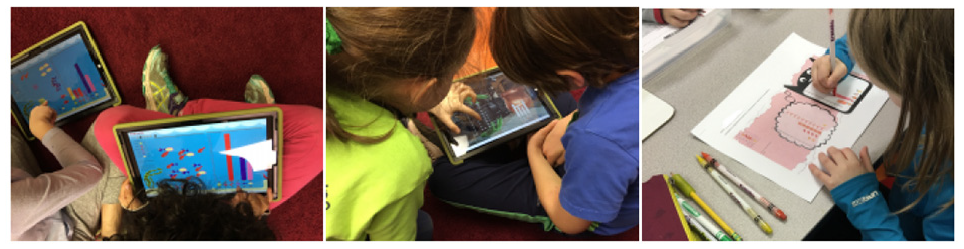
Bishop et al. 27 investigate the visual reasoning processes of children while they participate in free-form visualization (not regular visual designs) practices with Construct-A-Vis, a tablet-based, free-form visualization application. The tool is designed to (1) help the development of free-form visualization, (2) make data-to-visual mappings clear, (3) offer visual input for scaffolding, (4) provide functionality for various ability levels and (5) facilitate shared activities. A qualitative study including three tasks increasing in complexity is conducted to test the Construct-A-Vis tool with 24 elementary school students aged 5–12. The students are asked to visualize a fictional data set about school subjects (maths, music, sports, science, arts, represented as icons) using the tool. The study focuses on examining whether children construct meaningful visualizations with Construct-A-Vis without formal instructions or models, the types of processes that children adopt while making individual and group visualizations, and how the tool encourages active participation in children’s data visualization.
In Task 1, children are provided icons, color, and the shape for their visual designs. The task is designed to promote specific mappings between data points and symbols by providing icons that correlate directly to school subjects. Task 2 requires children to use size and color for their representations. The aim is to lead children toward abstract mappings using size for coding values. In Task 3, the children are provided with an additional shared tablet and told to jointly create a single representation showing an overview of their combined data sets (see Figure 9). The purpose is to support the communication to children. The results indicate that children are engaged in the visualization process and that processes lead to effective discussions and behaviors.
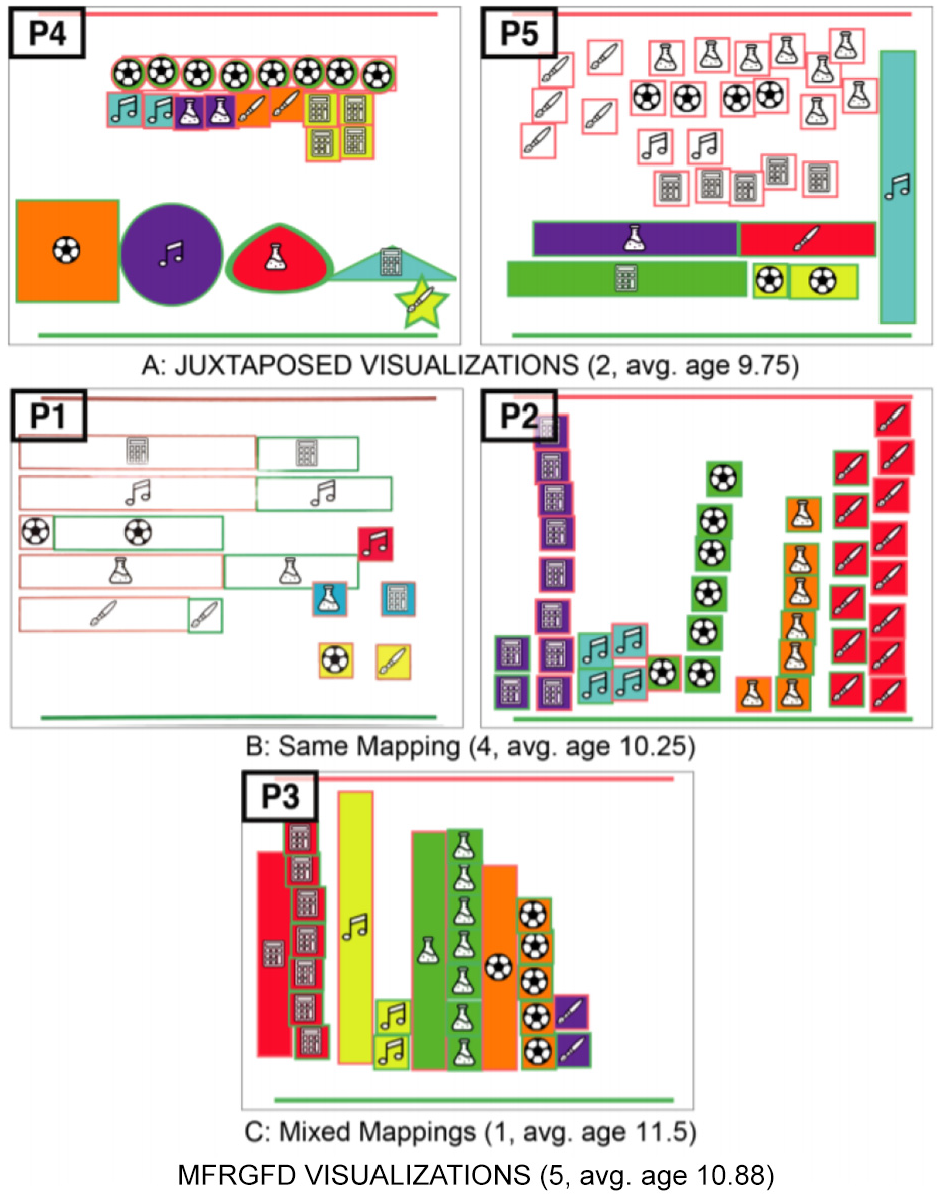
Linked visual representations created by pairs in Task 3. Image courtesy of Bishop et al. 27
The paper by Krekhov et al. 50 seeks for an opportunity to develop computer graphics and visualization courses in a way that would allow students to create visualizations that are easy to understand, engage the students, and memorable. The design of the course is especially inspired by the book Dear Data, 63 in which visualization was generated by the composing of visualization information and creativity. The purpose of the research is to enable participants to focus on design thinking and hands-on exploration of the visualization without being compelled to proceed in a linear manner that is often prescribed by existing tools.
The paper presents a 12-week teaching experiment and designs a course curriculum. The purpose of the course how to transform various datasets into useful and engaging visualizations for a wider audience. The course is divided into the following components: understanding data, visualizing data, and design thinking. For each session, students are assigned the task of creating an appealing, detailed visualization based on the data they are given. Topics include such as water, music, eating (see Figure 10). After the submission of the design, students present their outcomes at weekly meetings. They learn more from feedback received from the lecturers and from the other outcomes.
An example design of the student’s early and intermediate prototypes. Image courtesy of Krekhov et al. 50
Some 11 students participated in the study who identified themselves as being beginners in the field of visualization. During the first 6 weeks, subjects worked on their own, while in the second half, they are divided into groups of 2–4 participants and asked to construct a single collective visualization. During the course, participants were surveyed and an online questionnaire was presented at the end of the experiment. The qualitative results reveal that the concept of thinking motivates novices to experiment with a wider variety of visualization methods. Ten students state that they formulated the main message or purpose of their visualization during or before data collection and mention that the most important factors to a good visualization are the appeal, metaphor, and comprehension.
Research by Firat et al. 22 identifies the barriers and challenges of understanding and creating treemaps by examining the results of 2 years of an information visualization assignment. In order to assess the barriers, a treemap visualization literacy test is developed. In addition, a pedagogical tool that advances treemap visualization literacy is introduced (see Figure 11). Firat et al. 22 conducted a classroom-based experiment with 25 computer science students from undergraduate and postgraduate levels to evaluate the participants’ treemap literacy and the effectiveness of the treemap tool. Participants are assigned into one of two groups and both groups answer the pre-test treemap questionnaire. In the first session, one group experiences traditional treemap teaching using slides. Another group is introduced to the interactive treemap tool. On completion of teaching, all participants answer the post-tutorial and interview questionnaires. The results show that students who attended the slide session answered on average 79% of the post-intervention test questions correctly, while the students who attended the software session answered 89% correctly. Also, participants’ feedback indicates that the treemap software offered them an effective learning experience.
Instructional treemap tool interface with traditional tree structure (left) and linked treemap visualization (right). Image courtesy of Firat et al. 22 The tutorial video can be found at https://bit.ly/31EnXDh.
Wang et al. 51 present the notion of “cheat sheets” to support data visualization education. Cheat sheets are a collection of graphic descriptions and text annotations, like data comics. Cheat sheets enable a broad audience to understand the data visualization techniques and support two scenarios (i) first-time learning assisted by slides, posters, books, or activities; and (ii) as testing material during the actual data discovery process.
Six forms of cheat sheets are introduced: Anatomy, Construction (see Figure 12), Well-Known Relatives, Visual Patterns, Pitfalls, and False-Friends. Cheat sheets are a combination of six forms and describe individual aspects of visualization techniques. Cheat sheets types are organized for a specific presentation purpose: by type and by technique.
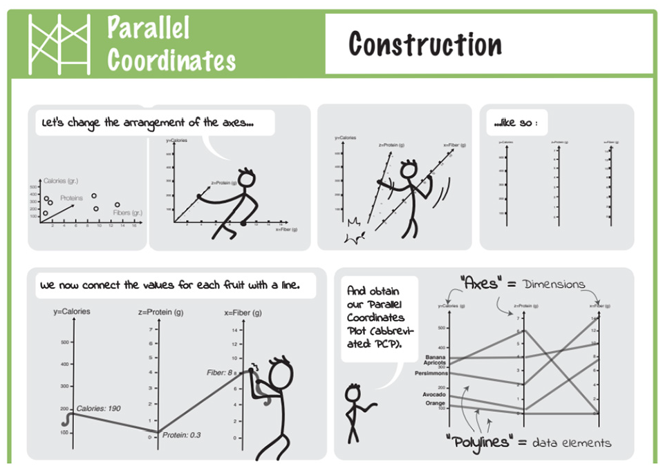
Part of Construction for PCP, showing its “creation” from three-dimensional scatterplot in a comic-strip. Image courtesy of Wang et al. 51
Wang et al. 51 conduct a user study with participants from a local university. Answers from 11 participants who reported that they are novice with visualization are analyzed. For each of the three techniques (boxplots, PCP, matrix), a cheat sheet is produced. Participants are provided a visualization example of a given technique and asked to respond to a small quiz to evaluate their understanding. During the quiz, participants receive printouts of anatomy, visual patterns, and pitfalls. Next, participants are asked to think a loud and write down the content that was unclear. Finally, participants receive a questionnaire asking them to rate comprehensibility, aesthetics, usefulness, etc. The results indicate that novice participants liked and considered the cheat sheets useful for improving comprehension of complex visualizations and that the development of cheat sheets facilities understanding of novel techniques.
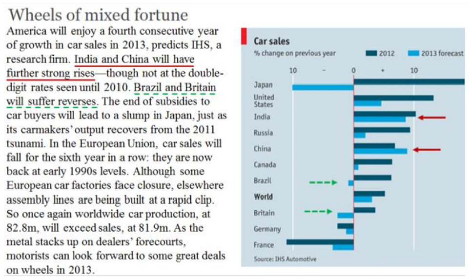
Rodrigues et al. 52 analyze individuals’ initial questions to ask when they first experience a visualization. In this way, they understand the common mistakes individuals make when asking data related questions in an attempt to interpret the data. They designed a study to gauge the quality of data-related questions generated by individuals with low visualization literacy skills when they are shown different types of visual design. A group of 22 participants from graduate and undergraduate studies who self-assessed their prior (no or limited) experience of data visualizations are involved in the study. The research is performed through an online questionnaire, which displays visualizations in random order. Each participant is asked to generate up to five questions about the underlying data that could be answered by analyzing the images. For each question, they are asked to indicate the amount of effort needed to produce the question.
For the study, 20 visualizations (bar chart, heatmap, chord, Sankey, network, histogram, scatterplots, etc.) are created with a dataset made of variables given meaningless names (e.g. klon, neji) (see Figure 13). The questionnaire collected a total of 1058 responses. The responses are examined by three researchers to created standardized versions of the questions as an attempt to reduce the number of unique questions. The 8000 clear questions are classified as ‘OK’ and 250 problematic questions are classified as “problem.” The clear questions are reviewed to describe the different types of questions people can answer through each visualization. The problematic questions are examined and classified to understand which kinds of problems in the questions occurred more often for each type of image. The findings of the study can be an important source for teaching visual designs as they reveal and identify common errors that individuals make when thinking about visually presented data.
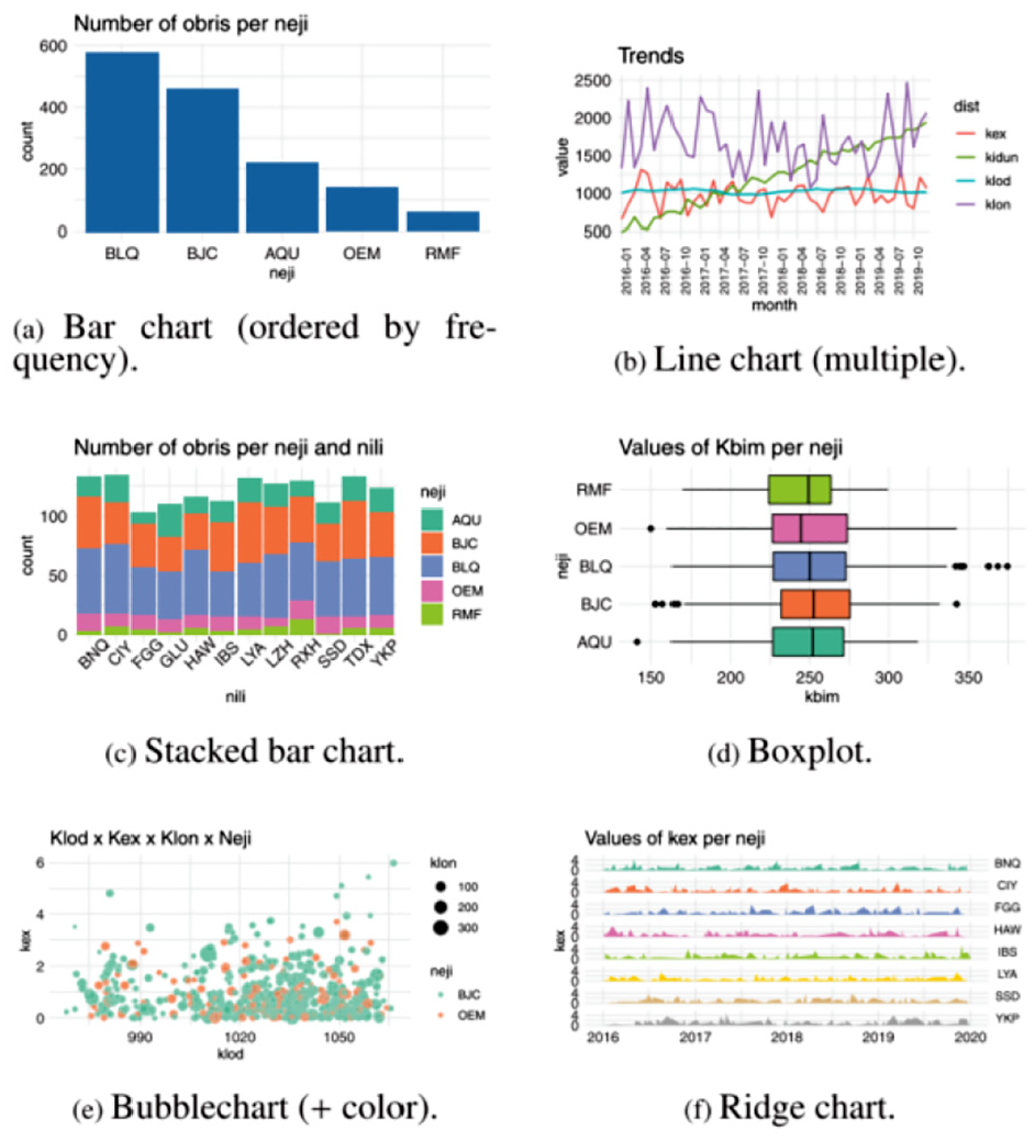
A sample of the visual designs used in the study. Image courtesy of Rodrigues et al. 52
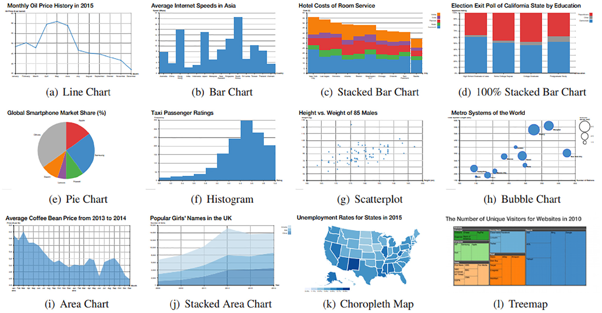
Table 7 provides an overview of which visual designs are included in the evaluation in previous visualization literacy studies, as well as expressing the evaluation methods in the studies using color according to our main classification (see Table 3). The table indicates that the most evaluated designs in literacy are bar charts and scatterplots. In contrast, images such as bubble charts, spiral charts, sankey diagrams, and chord diagrams have only been evaluated in one study.
Visualization literacy and crowdsourced-based evaluation
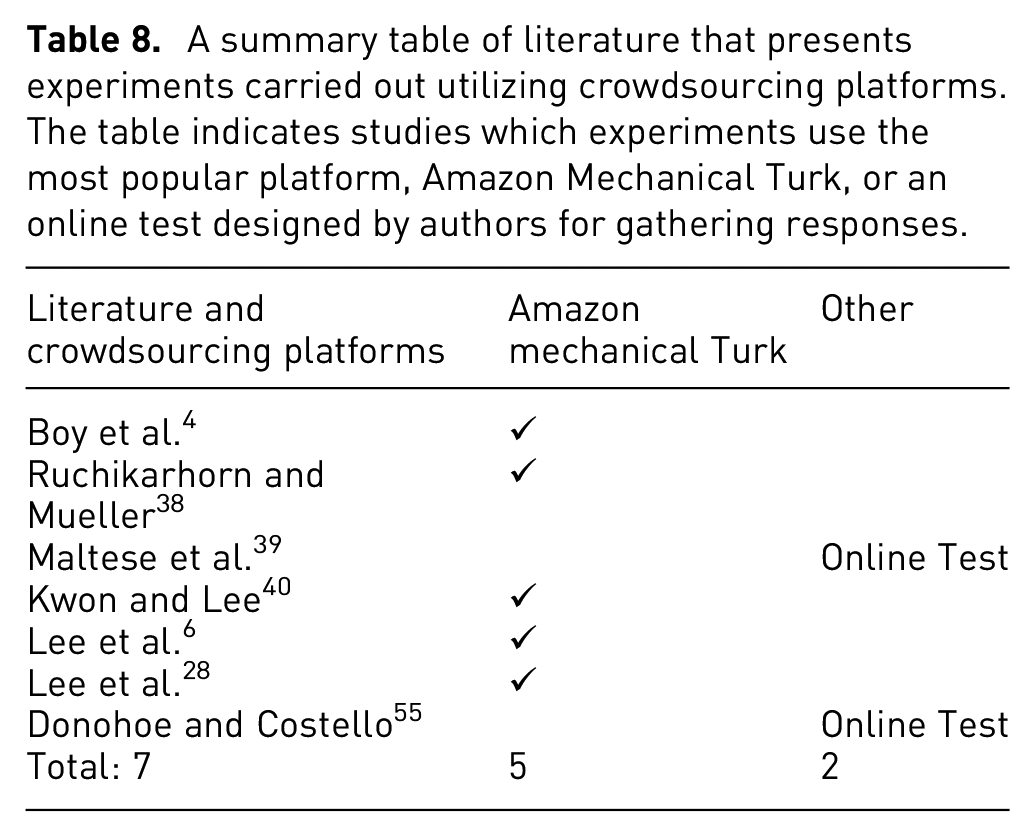
Some studies prefer to conduct experiments using an online platform to recruit a large number of participants from a geographically diverse pool of participants. Crowdsourcing using Amazon’s Mechanical Turk (MTurk) offers access to a great number of participants at affordable prices for collecting data in a relatively short period of time. For example, Kwon and Lee 40 and Boy et al. 4 chose to engage participants and designed online experiments using MTurk. Table 8 summarizes visualization literacy literature that designs experiments carried out utilizing crowdsourcing platforms or create online tests for sharing with crowd. The studies are grouped according to the type of platform used for collecting participants’ responses. We can see that Amazon Mechanical Turk is a popular platform for crowdsourced studies.
Boy et al. 4 aim to develop a method for visualization literacy evaluation. They use the Item Response Theory (IRT) 64 to separate the impacts of item difficulty and examinee ability. The main purpose is to create fast, efficient, and reliable tests that researchers can use to identify test takers with lower visualization literacy ability. The tests are developed based on a three-part structure. These are a stimulus, a task, and a question. The stimuli are the selected visual designs being studied. Tasks are defined based on the visual operations and mental projections that a participant performs when answering a given question. Tasks and questions are linked. This distinction is emphasized because different orientations of a question could influence participants’ performance.
They focus on tasks that require only basic intelligence, such as identifying minimum, maximum, variation, intersection, average, and comparison. They test the user’s ability to find these characteristics on line graphs using Amazon Mechanical Turk with 40 participants. They also perform experiments using bar charts and scatterplots. The results indicate that IRT modeling is useful for differentiating and assessing visualization literacy, especially for examinees with lower ability.
The aim of the research paper by Maltese et al. 39 is to examine differences in data visualization ability along a spectrum of expertise from novice undergraduate students to STEM practitioners to gain a better understanding of how users interpret graphical representations of data. The study reports on the design of the data visualization and evaluation results. In order to collect data, participants respond to questions while viewing given graphs and tables to test their ability to read and interpret them. Task performance data is collected from teaching staff and doctoral students with a range of science expertise in science education. Some 19 of 20 core test items were visualizations from widely published textbooks, government websites, or published reports.
Maltese et al. 39 conducted an analysis to better understand the psychometric features of the items (internal consistency for dichotomous items, item difficulty, item discrimination) used in the study evaluation. Some 202 participants, mainly university and college graduates (68%) and graduate students (9%) participate the study and report the average number of STEM classes that they completed. Their scores from an online assessment of the 20 test items range between 6-18 correct answers. A reasonable correlation was found between the number of STEM coursework participants completed and their performance, but overall this relationship is not strongly positive. The findings indicated that even participants that completed advanced science and mathematics coursework found it difficult to interpret basic data representations.
Ruchikachorn and Mueller 38 present a learning-by-analogy technique that explains an unfamiliar visualization method by showing a step-by-step conversion between two visual designs. The research shows the concept using four visualization pair examples such as a data table and parallel coordinates, a scatterplot matrix and hyper box, a linear chart and spiral chart (see Figure 14), and a hierarchical pie chart and Treemap. The participants understand the uncommon visual designs more quickly after they interact with the transitions.
A pie chart–treemap pair example: (a) target visualization, (b) series of the intermediate images from the source visualization, (c) animation, and (d) interactive visualization. Image courtesy of Ruchikachorn and Mueller 38 .
In the first stage of evaluation, a short task and questionnaire are prepared to test 22 participants via Amazon Mechanical Turk. The pair of linear and spiral charts are chosen. Eleven participants are shown the spiral chart and 11 are shown the linear chart. Results indicate that only half of the spiral chart answers are correct, while all answers on the linear chart are correct.
For the first main study, six male and five female participants are asked about their background and are given the source visualization descriptions. Four visualizations and morphings are displayed and ordered as (a) the target visualization, (b) a series of the intermediate from the source visualization, (c) an animation, and (d) an interactive visualization (see Figure 14). This order is chosen to demonstrate the interaction cost from the smallest to highest. The order also indicates how much help participants need to comprehend and learn the unfamiliar visual designs. All participants describe the morphing as an effective tutoring way to understand new visual designs. A further 11 participants are chosen to test if they can read the underlying data and view the trend on the target visualization. Participants were shown the target visualizations with different data sets before being asked open-ended questions about their comprehension of the data. Results indicate 7 out of 10 participants could read and provide observations from the target visualizations. The other participants had already seen similar visual representations prior to the experiment.
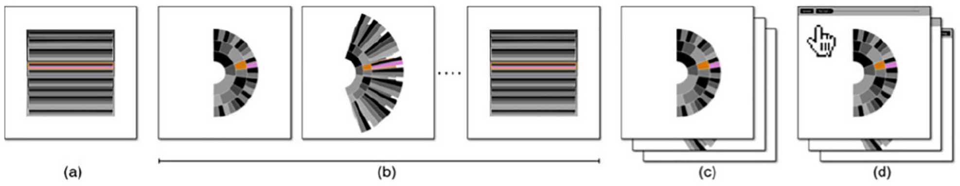
Kwon and Lee 40 focus on Parallel Coordinates, an efficient method to display multidimensional data, to study the impacts of multimedia learning environments for teaching data visualization to non-expert users. The inspiration behind this research is to examine active learning theory. Four experimental conditions are created: baseline, interactive, static, and video. The baseline condition contains a single-page description of how data is presented in parallel coordinates. In the interactive condition, the user can draw parallel coordinates by entering values and creating edges. The static condition displays instructions with screenshots taken from the interactive condition without providing feedback. The video provides screen activities of a walk-through of the activities in the Interactive mode, so it includes the same feedback. The other three conditions provide a description and a tutorial using different media (see Figure 15).
The Build tutorial page: as people click on points in parallel coordinates, lines are drawn connecting them. Image courtesy of Kwon and Lee. 40
An experiment was conducted on Amazon Mechanical Turk with 75 male and 45 female participants (30 people per condition). After the tutorial session, participants are asked 18 questions based-on tasks such as mapping between data points and visual elements, data distribution, comparison and similarities. They are also given six interview questions related to the tutorial. Results indicate that participants with the interactive condition perform better than the static and baseline conditions, and stated that they had a better experience than those with the static condition.
Lee et al. 6 develop a test to assess ordinary users’ visualization literacy skills, especially users who are not experts in data visualization. Three different sources are examined: K-12 curriculum, data visualization authoring tools, and news articles in order to determine the content of the test. They organize a pilot study before generating the test items to analyze the usage of vocabulary and phrases when test takers read and interpreted the data visualizations, which may influence test participants’ performance. After developing a group of test items, domain experts review them to ensure the test contains appropriate contents and tasks (see Figure 16).
The 12 data visualizations that compose the VLAT. Image courtesy of Lee et al. 6
A total of 191 participants (MTurk) consisting of 105 females and 86 males with an age range of 19–72 take the visualization literacy test. The test includes 54 test questions composed of 34 four-option multiple choices, 3 three-option multiple-choice, and 17 true-false questions. Based on the results, all the items are reviewed in order to eliminate inappropriate items and finalize test items for the Visualization Literacy Assessment Test (VLAT). A final experiment is preformed with finalized VLAT test item choices. A total of 37 people (MTurk) 14 females and 23 males in the age range of 22–58 participated in the study. The experiment is designed to measure visualization literacy and the ability to learn an unfamiliar visualization. Participants completed 53 questions and were redirected to a Parallel Coordinates Plot (PCP) test with an online learning tutorial developed by Kwon and Lee. 40 After the tutorial material, participants are asked to answer 13 test items related to PCPs. The result shows that visualization literacy is positively linked with the users’ ability to learn an unfamiliar visualization.
The research by Lee et al. 28 aims to find the connection between visual literacy and the following three cognitive characteristics: numeracy as cognitive ability, cognitive motivation and cognitive style. An experiment with 178 participants using MTurk is conducted. Participants are evaluated against four categories: visualization literacy, numeracy, need for cognition, and visualizer/verbalizer. Participants are asked to complete four assessments: a Visualization Literacy Assessment Test (VLAT), 6 Decision Research Numeracy Test (DRNT), 65 Need for Cognition Scale (NCS), 66 and Verbalizer-Visualizer Questionnaire (VVQ) 67 (see Figure 17). For example, VLAT asks the participants to choose, within a time limit, the best response for each item. The DRNT asks participants to respond quickly and accurately rather than with a time limit. The NCS and the VVQ ask participants to show in what manner each object represents its cognitive features on a 7-point scale ranging from a strong disagree to a strong agree. At the end of the experiment, the participants are required to complete a demographic questionnaire. Results indicated that an individual’s numeracy and need for cognition are positively correlated to individual’s visualization literacy. However, the visualizer-verbalizer cognitive style did not indicate a correlation with visualization literacy.
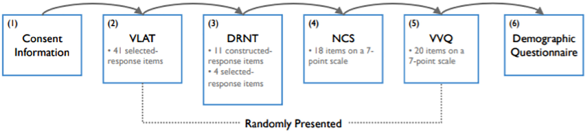
The experiment procedure that consists of six stages. Stages 2, 3, 4, and 5 were randomly presented to the participants. Image courtesy of Lee et al. 28
Research by Donohoe and Costello 55 evaluates participant’s perceived utility and confidence in understanding visual designs by modifying current research tools used in other studies.
A questionnaire is designed that consists of two questions on perceived usefulness 68 and two modified skills questions to test participant’s perception of their peer’s literacy level and evaluate their perceived skill. These questions are followed by 24 multi-choice test items from VLAT 6 covering six data visualizations based on eight tasks. The study is sent to 157 prospective participants and responses are returned by 32 participants (20.4%). The results reveal that visual designs are useful, but the goal of some data visualizations is not always understood. Findings also indicate that participants consider their data visualization literacy to be higher than their peers’ assumption. In contrast to their high confidence, their literacy level was sometimes lower.
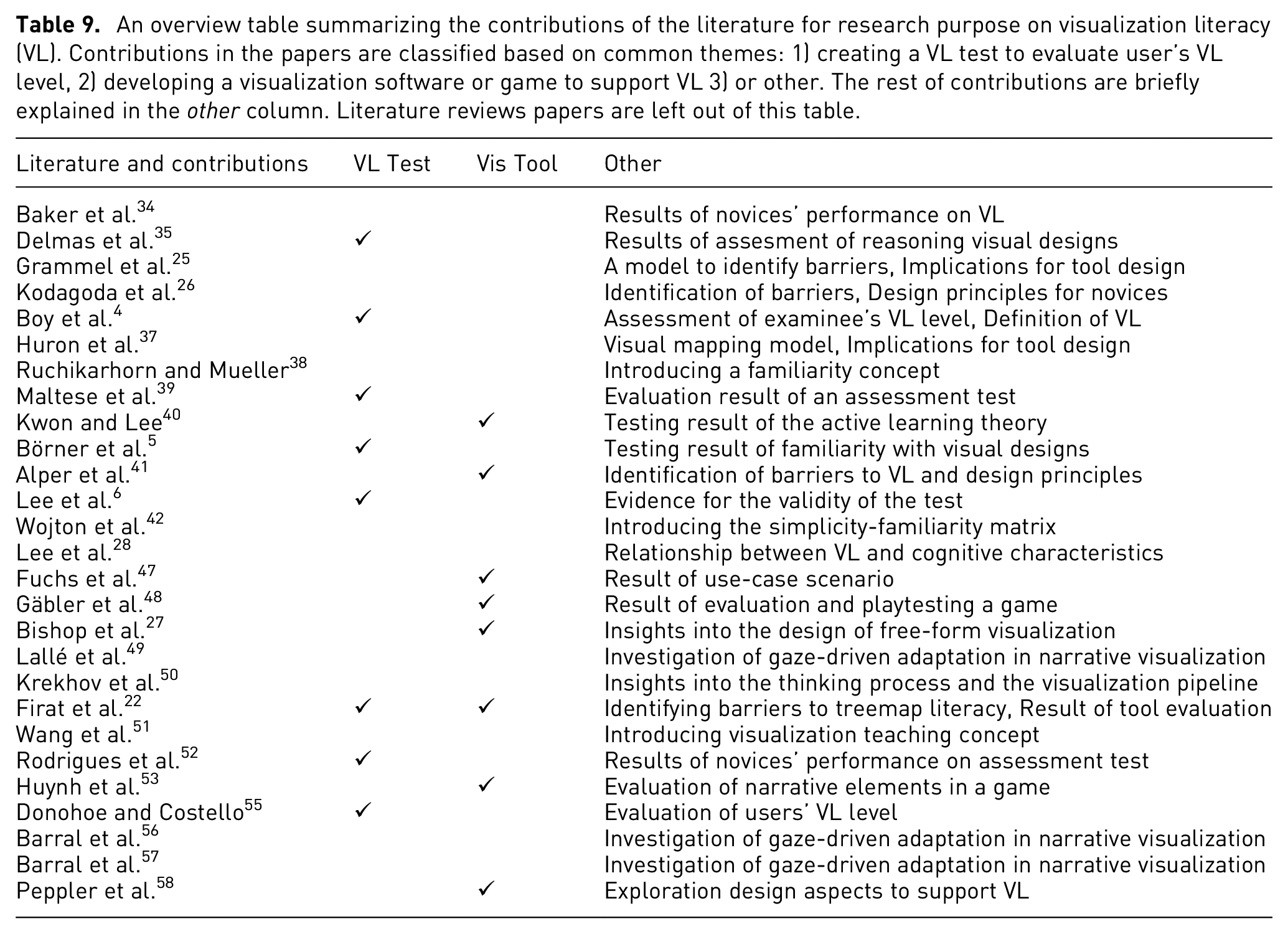
Table 9 summarizes the contributions provided in the literature and shows common research direction in the field. The main themes in visualization literacy literature are grouped: (1) tests that are created to assess users’ visualization literacy level, (2) developed tools or games aimed at advancing user’s visualization literacy level or support learning visual designs, (3) other. While the studies generally focus on examining the users’ visualization literacy skills using a test and assessing the test results, on the other hand, the impact of the developed tools on the users is evaluated. The rest of the contributions are provided in the other column. The novelty in the literature includes the effects of tool designs, the results of the evaluation of users’ visualization skills, and the identification of barriers to visualization literacy, etc. Kwon and Lee 40 introduce a parallel coordinates tool and a tool demo was used in an experiment. The paper discusses the test results of active learning theory.
Literature reviews on visualization literacy
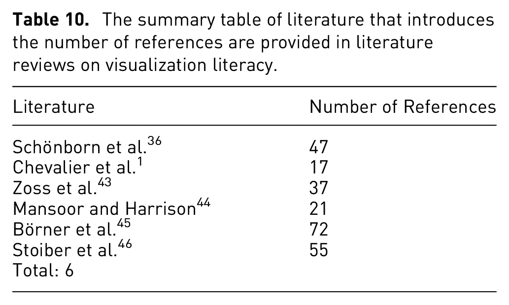
This category is intended to collect literature and does not feature any specific assessment methodology. The literature is summarized in the (see Table 10) with number of references provided. This provides a type of meta-assessment. A study by Chevalier et al. 1 is an example of a literature review.
Schönborn et al. 36 describe the value of visualization in biochemistry education and support the idea of teaching visual literacy and skills using visualization tools as key components of all education programs in biochemistry. A selection of 10 guidelines are introduced to encourage visualization and visual literacy in biochemistry education. At the molecular organizational level, students may need to translate a more practical electron micrograph of the binding complex from various representations of antibodyantigen binding ranging from a molecular representation to a stylized two-dimensional diagram or computer image (see Figure 18). This implies, among other things, that students may need to make sense of an abstract representation of a molecular phenomenon alongside stylized and concrete representations of the same phenomenon, something that students find very challenging. Therefore, students are required not only to translate between the macro, micro, and molecular levels of organization, but also between external representations (ERs) presenting phenomena at each level of abstraction, which becomes extremely cognitively challenging for students in combination. However, it would not be possible to interpret ERs without visualization and the associated processes and abilities of human imagination, studying, teaching, and analysis of molecular structure.
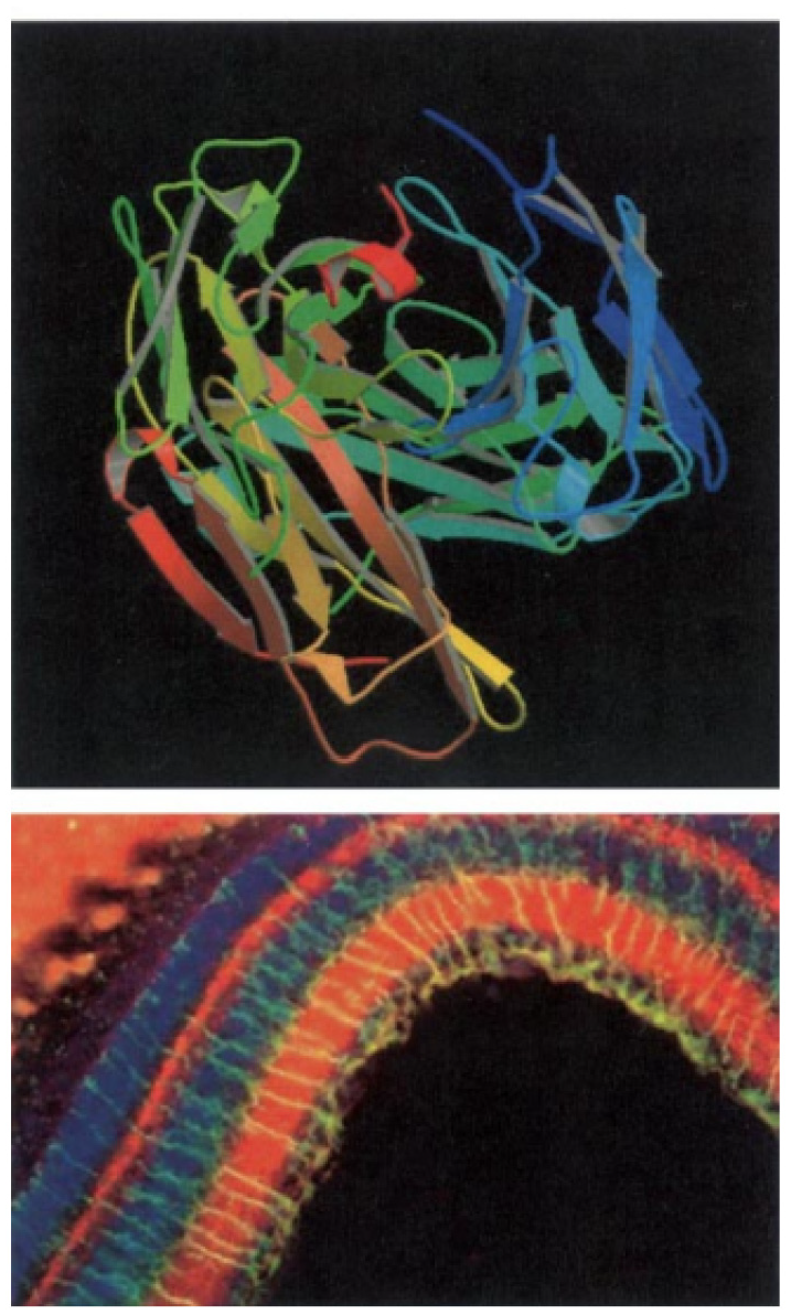
Multiple ERs of antibody-antigen binding on a continuum from abstract to stylized (top) and to realistic (bottom). Image courtesy of Schönborn et al. 36
Another study by Chevalier et al. 1 presents an evidence-based discussion of visualization literacy and how it can be improved in early education and provides future research directions on visualization literacy. Chevalier et al. 1 investigate how children study visual designs and how their visualization literacy skills are improved at elementary school. They collected data from teachers on how much they use visual materials in class. Moreover, C’est la Vis, a tool that supports teaching and learning of pictographs and bar charts, is used to acquire data about child learning activities and interaction with the tool.
Three thought-provoking learning paradoxes arising from empirical information collected and observations in the field are described.
Visuals are omnipresent in grades K–4.
Teachers believe visual images are intuitive.
Elementary students learn to read and create visual designs in early grades.
Moreover, three specific insights are derived and help inform the design of future visualization teaching materials for early education.
Technology could curtail learning: Children interact with technology, especially when it features visuals and animations. Children may focus on solving exercises rather than concentrate on learning on underlying concepts.
Technology could curtail social interactions: Teachers believe social interactions and verbal formulation, or reformulation, of knowledge acquired is necessary to the learning process.
Technology can be too helpful, preventing beginners from practicing other abilities they need to obtain, and the advantages were sometimes skeptical.
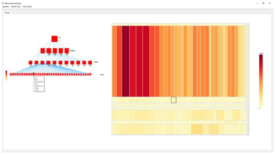
Zoss et al. 43 define network visualization literacy (NVL) as the ability to read, interpret, and visualize different types of networks. In this paper, they provide on a series of topics that attempt to develop a more objective understanding for NVL including how to evaluate NVL, the role of NVL in teaching and learning, and suggestions based on understanding of the effective ways to enhance NVL. Challenges to interpret visualizations arise due to a lack of clarification about the limitations of network visualizations in the understanding of very complicated structures and the characteristics network components (see Figure 19). Zoss et al. 43 study some three aspects of NVL: Representational Literacy, Metaphoric Literacy, and Topological Literacy.
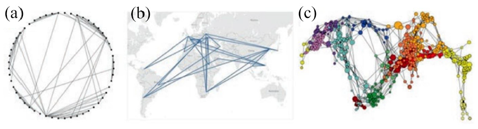
Sample network visualizations, using a circular layout algorithm (a), a geographic layout (b), and a science map (c). Image courtesy of Zoss et al. 43
Zoss et al. 43 state that research is mainly based on experimental studies of the understanding of network visualization, restricted to particular tasks by design. For a better understanding of network visualization literacy, the visualization community must also take into account both how individuals interpret network images in their everyday lives and how they acquire the skills required to create their own network representations. Thus, a mix of formal and informal education is necessary to enable more users to read and visualize network data. The paper presents three current approaches: Connections: The Nature of Networks (a public science museum exhibition at the New York Hall of Science), NetSci High (a research program for high school students), and the Information Visualization MOOC course at Indiana University. The paper also provides recommendations for improving network visualization literacy based on the review of relevant research and experiences with teaching and learning with network visualization.
Mansoor and Harrison 44 provide a case for combining parallel threads of data visualization literacy and visualization bias. The study address research in cognitive biases which claims that cognitive ability and experience can have an effect in how responsive a person is to a particular type of bias. 69 Mansoor and Harrison 44 review previous work on visualization biases to demonstrate how visualization literacy and biases may relate. For example, they cover research on attraction bias and availability bias by Dimara et al.70,71 and address how data literacy interventions potentially affect their analyses and resulting discussions. The paper also includes studies proposing the use of visualizations to mitigate bias, such as Dragicevic et al., 72 and demonstrates how results in visualization literacy 6 can facilitate their efficacy. These examples indicate that, as data visualization research continues to identify biases that occur in visualizations, the influence of individuals’ abilities can be an significant factor for analysis and design.
Research by Börner et al. 45 provides a framework for data visualization literacy (DVL-FW) that has been specifically developed to describe, teach and analyse DVL. The DVL-FW facilitates both reading and construction of visual designs, a pairing similar to that of both reading and writing in textual literacy as well as comprehension and application in computational literacy. Although DVL requires textual, mathematical and visual literacy skills, DVL-FW relies on key DVL concepts and procedural knowledge. The main process for the construction and interpretation of data visualization is defined and the process is interconnected with the typology of DVL-FW that contains seven core types. These were derived from a broad literature review and collected from feedback gained from projects in the Information Visualization massive open online course. 73 Börner et al. 45 address the important role of stakeholders and describe the five steps (acquire, analyze, visualize, deploy, and interpret) (see Figure 20) of the system and their relationship to typology.
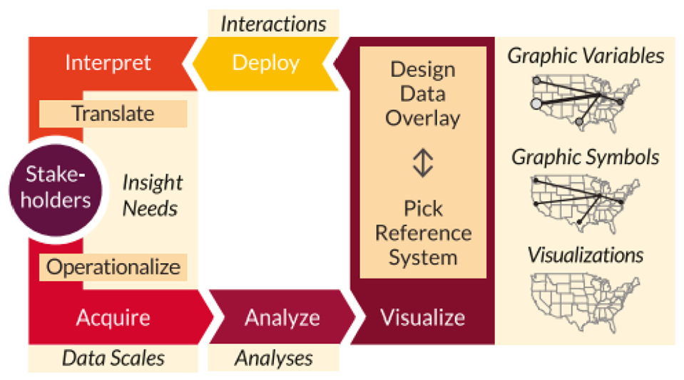
Process of data visualization construction and interpretation with major steps. Image courtesy of Börner et al. 45
Börner et al. 45 introduce selected activities that support learning and evaluation of data visualization literacy (DVL) such as assessment of graphic symbols/variables knowledge, naming and classifying of visualizations, assessing students’ ability to interpret visualizations and assessing students’ ability to create and evaluate visualizations with practical assignments. Additional theoretical lectures and practical exercises are accessible online via the IVMOOC. 73 DVL-FW typology, activities and evaluations outlined in the paper have been applied in the Information Visualization course at Indiana University, supplying initial evidence that the framework can be used to instruct and test DVL. Information on student outcomes, success and feedback have directed the improvement of DVL-FW.
Another study by Stoiber et al. 46 introduces the design space of visualization onboarding and structures it along with the Five W’s and How tool (see Figure 21). The process of assisting users in reading, interpreting, and extracting information from visual representations of data is defined as visualization onboarding (WHAT). This supports observers in dealing with large and complex information structures, to make visualizations more comprehensible (WHY). Another aspect is to determine the knowledge gap that the user has. The users’ prior knowledge considered for developing onboarding concepts is presented such as domain knowledge, data knowledge, knowledge of visual encoding & interaction concepts, and analytical knowledge (WHO). Other relevant aspects of how visualization onboarding is implemented are defined as onboarding type, context sensitivity, and interaction (HOW). The visualization onboarding system can be integrated internally in the visualization or external source (WHERE). Visualization onboarding concepts can be connected before or during the use of visualization tools (WHEN).
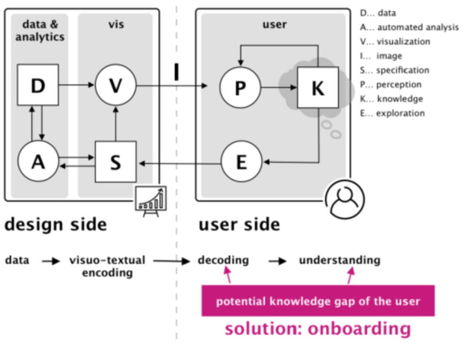
Visualization onboarding in visual analytic system. Image courtesy of Stoiber et al. 46
Future work
We examined each paper to identify common research areas that are discussed in each individual paper presented in Table 3 and summarize the common future research directions in Table 11. The summary facilities identifying a number of potential research areas in the scope of visualization literacy.
Discussion and conclusion
In addition to the most frequent future work presented in the literature in Table 11, we note that visualization literacy is not a very visible sub-field yet. Even though data visualization is growing in prominence, the significance of visualization literacy does not yet stand out in research communities. The amount of literature we presented in the survey also supports this idea. Gaining visibility and momentum is necessary in order to improve literacy skills which enable effective use of visualization in various research areas.
Some basic subjects have a standard assessment test, for example, mathematics, languages, and analytic reasoning. Although some studies4,6 have taken the first steps in this direction by providing visualization literacy tests, we suggest developing a series of a standardized assessment tests for visualization literacy that can vary according to the complexity of visual designs and data sets for students with different backgrounds.
This paper contributes a literature review of visualization literacy papers published from 2001-to the present. We provide a novel classification of literacy research that enables readers to explore published literature. This classification emphasizes the evaluation method chosen to test individuals’ visualization literacy skills, presents guidelines for improving literacy skills, and indicates factors that affect individuals’ understanding of various visual designs. This STAR offers overview tables guided by the evaluation method-based classification (see Table 3). The tables present meta-data that facilitate literature comparisons including visual designs, the number of participants involved in the study, target groups (e.g. age), chosen study platforms anymore. The survey offers valuable information identifying experimental settings required to assess individuals in uncovering problems in the area as well as having a more complete understanding of advancing visualization literacy skills. Moreover, we share an overview of future work from the literature that enables readers to identify areas of open research subjects in this scope. We believe our survey is beneficial for both new or experienced researchers interested in visualization literacy.
Footnotes
Acknowledgements
We would also like to thank the Ministry of Education of the Turkish Republic for their support.
Funding
The author(s) disclosed receipt of the following financial support for the research, authorship, and/or publication of this article: This research was funded in part by EPSRC Grant EPSRC EP/S010238/1.