
Abstract
Fraud detection is related to the suppression of possible financial losses for institutions and their clients. It is a task of high responsibility and, therefore, an important phase of the decision-making chain. Nowadays, experts in charge base their analysis on tabular data, usually presented in spreadsheets and seldom supplemented with simple visualisations. However, this type of inspection is laborious, time-consuming, and may be of little use for the analysis and overview of complex transactional data. To aid in the inspection of fraudulent activities, we develop ATOVis – a visualisation tool that enables a fast analysis and detection of suspicious behaviours. We aim to ease and accelerate fraud detection by providing an overview of specific patterns within the data, and enabling details on demand. ATOVis focuses on applying visualisation techniques to the Finance domain, specifically e-commerce, contributing to the state-of-the-art as the first visualisation tool primarily specialised in Account Takeover (ATO) patterns. In particular, the present paper incorporates: a task abstraction for detecting a specific financial fraud pattern – ATO; two models for the visualisation of ATO; and a multiscale timeline to enable an overview of the data. We also validate our tool through user testing, with experts in fraud detection and experts from other fields of data science. Based on the feedback provided by the analysts, we could conclude that ATOVis is an efficient and effective tool in detecting specific patterns of fraud which can improve the analysts’ work.
Introduction
Fraud can be defined as ‘an uncommon, well-considered, time-evolving, carefully organised, and imperceptibly concealed crime’ that can affect singular people and large institutions from different domains.1–4 In the present article, we focus on Account Takeover (ATO) – a specific fraud pattern in the financial domain, more specifically in e-commerce. It is one of the major e-commerce fraud patterns and can be defined as the unauthorised use of another person’s profile and corresponding credit card details. 2 In most cases, fraudsters exploit stolen cards as much as possible before being detected. 5 Hence, detecting this or any other kind of financial fraud can prevent significant losses for companies and individuals, and for this reason, it is an increasingly relevant problem to tackle.2,4
Currently, many fraud detection companies rely on Machine Learning (ML) approaches to capture fraudulent activities. However, as technology evolves and the techniques applied in fraud detection become publicly available, fraudsters adapt and modify their ways of acting. 2 These changes may prevent ML models from classifying all fraudulent transactions correctly. To tackle this, and to make the detection of fraud more reliable, effective, and efficient, Information Visualisation can be applied and aid in the manual analysis and identification of fraudulent actions that may have passed undetected or were labelled with low confidence by ML algorithms.2,6
We present a design study of ATOVis, a visualisation tool composed of several visualisation models that aims to aid in the detection of ATO patterns through the representation of e-commerce transactions (Figure 1). ATOVis was developed in collaboration with a world leading company specialised in fraud detection and prevention. Fraud prevention companies usually focus on three main pillars: detection, prevention, and response. 7 For this project, we focus on the first pillar defined as the continuous monitoring venture that measures and evaluates possible fraudulent activities. 7
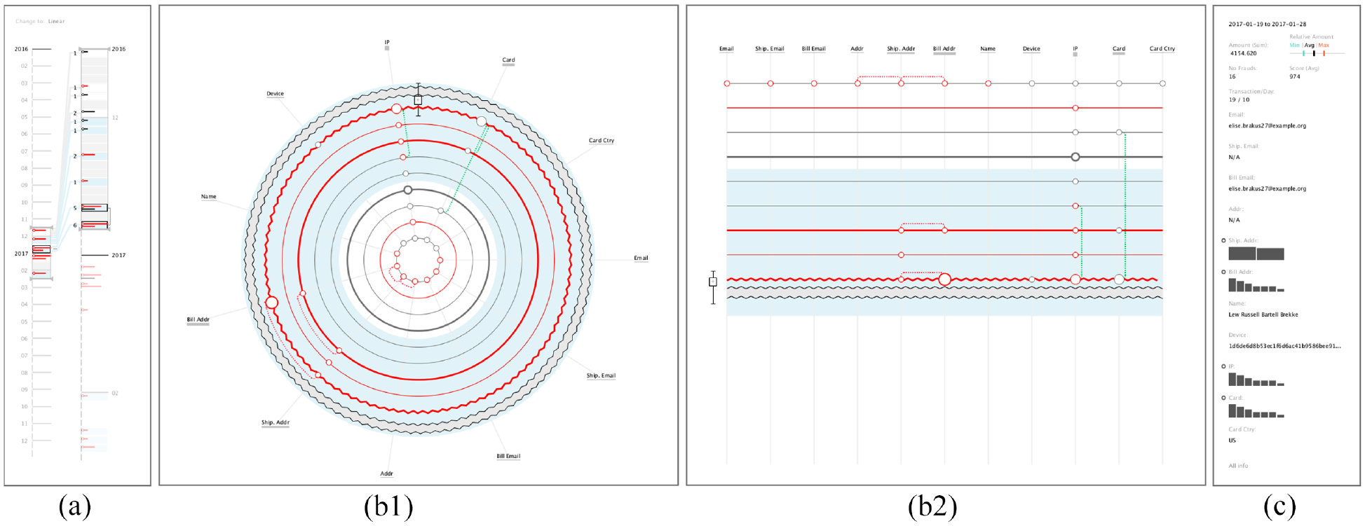
ATOVis is composed of three different areas: a Timeline Area (a), which enables simultaneous analysis of details of primary attention, while providing an overview of the transactions over time; an area for the ATO visualisation (b), in which the representation of changes in transactions is made through a radial layout (b1) or a linear layout (b2); and a Details Area (c), to present the values used in each transaction’s attribute.
In the company’s line of work, different groups of analysts are given different fraud patterns to analyse, making them experts in fraud detection. ATOVis is aimed to speed up, ease, and improve their manual analysis and search for fraudulent transactions. The transactions with which the analysts work are previously selected according to their low confidence score, previously given by the company’s ML system. One of the major challenges of detecting ATO is understanding the user’s typical transaction history and detecting uncommon behaviours or patterns related to fraud. With the aid of experienced fraud analysts, we address these challenges by developing visual representations that effectively depict fraudulent patterns and provide contextual information through an overview of all transactions.
We contribute to the state-of-the-art in Finance Visualisation by developing a visualisation tool focussed on detecting ATO cases. More specifically, our contributions are: (i) a detailed task abstraction on ATO patterns derived from the interaction with experienced fraud analysts; (ii) the description of the design process and design decisions for the development of ATOVis; (iii) the description of a multiscale timeline which enables an overview of the data and simultaneously a detailed view of its distribution over time; and (iv) the findings and insights derived from the validation of our tool with experts and non-experts in fraud detection. Ultimately, our tests indicate that visualisations explicitly designed for particular patterns of fraud, and those that provide overview capabilities, significantly improve current fraud detection manual approaches.
Related work
In this section, we present the state of the art of fraud visualisation in the financial domain and the use of timeline techniques to represent time-series data.
Financial fraud visualisation
With the growth of ground knowledge about existent approaches of fraud detection, fraudsters are evolving and adapting their fraud mechanisms to overcome nowadays security systems and perpetuate fraud. For this reason, fraud detection and prevention companies employ two methods for the detection of fraud (i) Machine Learning (ML) mechanisms2,3,5,8 and (ii) fraud analysts that work in collaboration with ML systems, complementing their flaws by manually analysing suspicious activities and validating the classifications attributed by the system. The collaboration between fraud experts and Artificial intelligence systems raises many questions that go beyond the traditional Human Machine Interaction paradigm. In this sense, we highlight the need to design systems that take advantage of the complementarity between humans and machines, resulting in ‘humanised technologies’ that surpass the current limitations of humans and machines, while being provably beneficial.9,10
Due to the size and heterogeneity of financial data, manual analysis can be difficult and time-consuming. 11 Currently, to evaluate transactions most analysts use spreadsheets and tabular forms which support various operations to extract more detailed information. Nevertheless, they are not effective at providing a clear representation of patterns, trends and correlations hidden in data. 12 Fraud analysts have recognised the relevance of Information Visualisation, as it enables them to get more insights, draw conclusions more rapidly, and improve decision-making. 6
The use of visual techniques to aid in the detection of fraud has already been explored in multiple domains and multiple surveys can be found in the literature. For example, in the work of Leite et al., 4 which does not focus solely on financial fraud, it is possible to perceive that the most used visualisation techniques for fraud detection are: line plots, bar charts, and node-link diagrams. These techniques are used to represent changes over time, facilitate the comparison of categorical values, and to represent networks and relationships, respectively. Focussing only on the financial domain, two surveys present a smaller set of projects, which apply techniques, such as parallel coordinate plots, scatterplots and bar and line graphs.11,13 The most used visualisation techniques of the surveyed techniques in this paper are summarised in Figure 2. The works4,11 give a more detailed description of the techniques used.
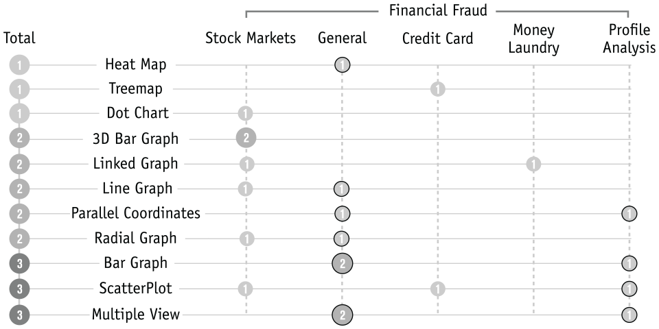
Distribution of the visualisation techniques used for the detection of fraud. The outlined circles represent visualisation models applied in multiple-views.
For the representation of specific financial fraud patterns, six works can be found concerning the visualisation of: (i) stock market fraud, which focus on the analysis of abnormal changes in stock market values along time14,15; (ii) Profile Analysis, which focus on the analysis of personal banking transactions 16 ; (iii) Credit Card Fraud, which focus on the analysis of improper use of credit cards 17 ; and (iv) Money Laundering, which focus on the analysis of the network of transactions.18,19 From these, four projects16–19 focus only on the improvement of the respective automatic evaluation systems, not being applied for the manual analysis of fraud cases as ATOVis. Also, in the work of Sakoda et al., 17 they visualise directly the fraud labels given by the system, not giving further details of each transaction to enhance its analysis. Finally, from this subset, most tools use more than one visualisation technique in separate or multiple views.
With this research, we could conclude that the analysis of fraudulent activities through visualisation is gaining popularity, but its use to detect specific types of fraud is uncommon. We argue that by focussing on the representation of a fraud pattern, it is possible to ease and reduce the time needed to detect fraud. Additionally, there is no visualisation tool specific for the detection of ATO or Bot Attack fraud patterns, which is the focus of this research. The majority of the analysed visualisation tools are intended to be highly interactive, consuming a high amount of time to analyse the data, or are being only applied to improve fraud detection rules of automatic systems.16,17 We consider that visualisation can be used for more time consuming detailed analysis, as well as, for the quick identification of fraud. In the last, by diminishing the time of analysis, it is also possible to diminish the time needed to take action and stop the transactions from being approved. Nonetheless, in both cases the ability to further explore the details should not be completely discarded.
Timelines
Most financial data are time-series with multiple attributes, being time a variable of utmost importance. 11 Although several techniques can be applied for the visualisation of time-oriented data, 20 these are out of scope of this article. Instead, we focus our research in a sub-field of time-oriented visualisations: the visualisation of timelines to overview temporal patterns. A timeline can be defined as the graphical or textual display of events in chronological order, 21 and it is one of the most commonly used techniques to interact with temporal data. 22 Interaction techniques, such as highlight, zoom and filter 22 can be applied, making timelines an important tool to explore complex datasets, especially when used together with multiple views. Its application can be seen in works from diverse domains of application.23–28
From the literature, the timeline representation can be subdivided into two different approaches: faceted and multiscale. 21 The faceted method can be defined as multiple timelines aligned spatially, each one representing the same time interval.29–31 To represent data variables in faceted timelines, different approaches can be used: bars24,27,32–34; lines23,26; heatmaps 35 ; glyphs28,36; and image and/or text.15,29,37,38 The multiscale technique can be defined as multiple timelines with different time granularities. 39 This type of timelines can take the form of lines 40 or bars.39,41,42
In the financial domain, timelines are usually represented with line and/or bar graphs.12,43–46 In the majority of the cases, timelines apply minimal to no interaction and focus on the representation of uni-variate data. In the present project, we intend to proceed in a twofold approach: first, we provide an overview of the transaction distribution over time, and, second, we provide a more detailed overview of their distribution. For this reason, we will focus on the application of a multiscale timeline, with a linear representation of time and a chronological order. 21 Additionally, we propose a multi-variate timeline, to represent over time quantity, type of transaction, and fraud annotated transactions.
Background
In this section, we discuss in more detail what is an ATO pattern, how the fraud detection company deals with fraud detection, and describe the used dataset.
Account takeover
In general, financial fraud can be subdivided into different types of fraudulent patterns. From our collaboration with the fraud detection company we could conclude that ATO and Bot Attacks (BA), which have similar acting patterns, are the most common patterns in e-commerce. An ATO is the illegal acquisition of legitimate users’ details to take over online accounts and use the stolen data (e.g. credit card details) to purchase products. 47 In general, it can be detected by the constant changes of a user’s details, the abnormal purchase rate, or an increase in monetary values. A BA uses one or more bots, that is, software programmes, to execute multiple attacks. In e-commerce, bots use stolen personal accounts of e-commerce websites to buy the company’s goods illegally. 48 Most BAs can be detected by analysing the constant changes in the transaction’s attributes (e.g. IP Address, Country) or detecting high amounts of repetitive and periodic purchases. For this reason, this type of fraud is often connected to ATO, and by visualising specific patterns of ATO, BA cases can also arise.
It is of utmost importance to quickly detect user accounts that have been compromised to prevent large losses for the e-commerce company and the counterfeiting and selling their products in black markets. The fraud detection company already employs several of its analysts in the manual analysis of transactions with low confidence scores. We argue that the use of visualisation can ease the detection of fraud, and speed up the process of accepting/rejecting transactions. Through visualisation, the analysts can have a broader overview of the transactions – which they cannot achieve with their current tools (i.e. spreadsheets). Additionally, it can support decision-making and enable the detection of new patterns, that the ML algorithm could not detect. More specifically, with ATOVis we intend to: (i) emphasise consecutive changes in the transaction details; (ii) improve the understanding of the transactions’ patterns; and (iii) enable the detection of similar fraud patterns (e.g. BA).
Fraud detection workflow
To better understand the applicability of our visualisation tool, we further describe the company’s workflow. The fraud detection company gives to its clients (e.g. an e-commerce company) a solution to detect and stop fraudulent transactions, which encompasses the following phases: (i) the automatic detection of fraudulent cases through an ML algorithm; (ii) the manual detection of fraud through human analysis of low confidence transactions; and (iii) the analysis of older transactions, that may reveal new patterns of fraud. Phases two and three are independent of each other, and commonly occur after phase one.
In phase one, the ML algorithm runs through all transactions made in the e-commerce company and assigns them a score. This score describes the confidence in the transaction’s labelling (as fraud or not). 1 Although the ML algorithm is efficient in detecting fraudulent cases, fraudsters are constantly changing their acting methods. Hence, the company needs to manually analyse the transactions that fall within a specific threshold range (low confidence) to identify false negatives or false positives.
In phase two, low confidence transactions are manually analysed. The analysts must determine whether the transaction is fraudulent or not in a short time (no more than 10 min), so actions can be taken to stop fraud. In this phase, our tool can aid the analysts by giving a temporal overview of all transactions from the same user and highlighting consecutive changes, shortening the analysis time. In phase three, a group of analysts have more time to study uncommon scenarios and search for undetected fraudulent actions. With these new cases, they can take further actions (e.g. improve the knowledge on fraud patterns, extend the blacklist of users). In this phase, our visualisation model can also be helpful, as it enables the analysts to explore the data and drill down on the transaction details to detect suspicious attributes.
In both phases, the visualisation model highlights the transactions labelled as fraudulent by the ML algorithm by colouring them in red. Additionally, the tool gives to the analysts access to the confidence score through the Details Area. However, to prevent analysts from bias and enable a more thorough analysis of the transactions, in phases two and three, the analysts have no more information on what the ML algorithm used to score the transactions as fraudulent or not.
The current method used by the company in phases two and three relies mainly on spreadsheets, which are complex to analyse and hardly give an overview of the temporal patterns. They also have access to a simple interface in which they can see the details of each individual transaction in a textual form and do queries to find related transactions. They usually switch between spreadsheets and visual interface, which is a laborious task. The goal of ATOVis is to facilitate this process, by providing to the analysts all transactions grouped by user and enabling the understanding of the user’s behaviours in a single tool.
Data
We had access to a dataset containing more than 4 million e-commerce transactions, made between November 2016 and February 2017. All transactions were previously processed by an ML algorithm for fraud detection, and are characterised by: (i) a set of attributes specific to online purchases (e.g. ID, timestamp, amount, billing and shipping addresses); and (ii) a set of attributes assigned by the ML algorithm (e.g. fraud label and confidence score). The dataset was properly anonymised, retaining the fraud patterns of the real dataset and enabling us to visually explore the data in real case scenarios without compromising the users’ anonymity.
Each transaction of the dataset has 32 attributes: 8 binary, 3 quantitative, and 21 nominal. In this paper, we focus on a subset of attributes highlighted by the analysts as the most affected attributes by ATO cases and which can reveal behavioural changes with more accuracy. Those attributes are related to: (i) geographic locations---shipping/billing/account address and IP address; (ii) personal details---shipping/billing/account email and name; and (iii) transactional attributes---card ID, card Country, and device. Note that the amount spent on each transaction is not represented, as it is not representative of an ATO case (i.e., the change in amount is not a fraudulent pattern by itself). When buying in online shops, the amount is usually different at every shop. If we represented the changes in this attribute it would be always visible in the visualization, highlighting changes that were not that relevant. Additionally, this aspect was also pointed out in the workshops with the fraud analysts, and for this reason, we omitted this attribute in the visualization. However it is still visible in the details area. Notwithstanding, the attributes used in the visualization can be altered at any given time, having no impact on the visualization model. Finally, as ATO patterns are intrinsically connected to the consecutive changes in each user’s purchase behaviour and/or account details, we parsed the dataset by individual user, enabling the overview and detailed analysis of the user’s transaction history.
Task analysis and design requirements
Contrary to most visualisations in financial fraud detection, our project focuses on a specific fraud pattern: ATO. We interacted with fraud analysts to understand how they work with such sensitive data and which are their main requirements for the visualisation. Before and during the design and implementation phases, four workshops were organised with three of the company’s analysts. These workshops enabled us to understand the workflow used to detect ATO cases, contributing to a guided and user-centred development of the visualisation models. Also, in the first workshop, the analysts shared their insights about the specificities of ATO patterns and showed us how they work to detect ATO and BA cases (see Section Fraud Detection Workflow).
For the detection of ATO patterns, the analysts look for changes in the user’s shopping behaviour and profile details. However, to detect such changes, the analyst has to search and compare the most important attributes thoroughly using spreadsheets (see Section Data) and create a mental image of the user’s behaviour. This is a laborious, complex, and time consuming process. As ATO can be described as the constant change in transactional attributes and behaviours, the visual emphasis on changed attributes between transactions is an important requirement for its representation. It is this highlight of changes that is the basis of our work.
Task analysis
From the workshops, we derived and validated a set of tasks to which our tool must comply to ease the detection of ATO:
T1 Detect fraudulent transactions
The analyst needs to instantly understand which transactions were identified as fraudulent by the ML model;
T2 Detect consecutive changes in attributes
It is important to detect when the users change their details and which ones. By highlighting transactions in which an attribute changed, the analyst will easily detect suspicious behaviours. However, only attributes that are relevant in ATO detection should be emphasised (see Section Data);
T3 Analyse transactional patterns
The analyst needs to overview the transaction history to differentiate typical from atypical transaction patterns and perceive whether some change occurred;
T4 Detect the reuse of attributes
The analyst needs to compare the values between and within transactions. For example, it is important to highlight if the user used different values for attributes of the same domain (e.g. account email, billing email and shipping email), as it can be a sign of ATO.
To improve the analysis of the transactions, in ATOVis, details about the transactions must also be provided, enabling well-informed decision-making. Therefore, a set of secondary tasks was defined:
T5 Inspect the values of the attributes
The analyst should be able to visualise the sequence of values used in each field and determine if they can be considered dangerous;
T6 See the transaction’s details
The analyst should be able to see all information about the transactions and detect values of risk.
Additionally, we present the visual encodings of our visualization tool, organised according to the visual task taxonomy of Zhou and Feiner. 49 This taxonomy was selected due to its alignment with our tool main tasks it is based on exploratory tasks which, in turn are based on search and verification tasks:
•
•
•
•
•
•
Design requirements
We defined most of our design requirements based on our interactions with the fraud analysts. However, from the related work on fraud visualisation, we could retrieve one important requirement: the ability to compare different transactions. Although most fraud visualisations focus their requirements on interaction, we aim to propose a visualisation that can represent the user’s behaviour at a glance, requiring reduced to no interaction. Hence, we focus our requirements on the direct representation of the data. We identified three main design requirements for ATOVis:
DR1 Represent the transactional behaviour
Due to the specificities of ATO, analysts must overview the sequence of changes in the transaction history. Hence, a design that sorts and emphasises all transactions in which changes occurred, assigning less visual emphasis to the ones with no change of attributes, may ease the detection of ATO patterns [
DR2 Summarise the temporal distribution of transactions
The analysts need to understand the distribution of transactions over time, so that they can comprehend and detect differences in periodicity, trends, and quantity of transactions. Thus, the visualisation should represent chronologically the transactions and their characteristics, emphasising transactions annotated as fraud and with changes in attributes [
DR3 Summarise statistics and transaction details
The visualisation should support the analysts to further analyse the specific values used in each attribute, allowing them to detect attributes of risk (e.g. IP, email domain) [
ATOVis design
In this section, we describe the design of ATOVis (Figure 3). In summary, the visualisation model is defined by knowing that, when dealing with ATO, the analysts focus their attention on the changes in the transaction’s attributes. Consequently, we focus our visualisation model on the representation of such changes and their periodicity. ATOVis is a functional application implemented in Java and using Processing, an open-source graphical library, to render the visualisation. A video was recorded to exemplify the interaction with the application: https://cdv.dei.uc.pt/cmacas/ATOVis-video/ATOVis.mp4 . 2
Screenshot of the ATOVis, capturing a non-fraudulent case. The analysts have access to the temporal arrangement of all transactions in a Timeline Area, where they can specify a desired period of time for further analysis (a). In the Main View, the analysts can visualise all transactions from the selected time interval (b). By hovering the transaction(s), they can further drill-down and get more details about their selection (c).
We defined three different areas in response to the design requirements: the Timeline Area, the Main View and the Details Area (Figure 3). Through our workshops with the analysts, and following Dilla and Raschke, 6 we can refer that the process of discovering fraud usually involves detecting unusual patterns, drilling-down into the data and selecting individual items for further analysis. A similar guideline was proposed by Shneiderman. 50 For this reason, after selecting the time period of interest from the Timeline Area, the analyst can visualise the filtered data and analyse with more detail the user behaviours in the Main View. If any transaction(s) arouse suspicion, the analyst can further drill-down and visualise, in the Details Area: (i) some statistics on the selected transaction(s); and (ii) their attributes placed in a tabular fashion.
All components of ATOVis have design requirements in common. For example, in both Timeline Area and Main View, the transactions must use similar representations, so the visualisation is coherent. Additionally, to better highlight important attributes, the use of colour to encode data must be as reduced as possible.
51
As the detection of fraud is the primary goal, we apply the red colour to highlight the transactions annotated as fraudulent [
Main View
The Main View is the principal focus of our project. It is centred on the interface area and occupies the most significant part of the canvas. The main goal for this visualisation is to give an overview of the transactional behaviours of a specific user, and enable the detection of transactions with changes and atypical transactions [
Transaction representation
To plot the transactional data, we employed two spatial arrangements: radial and linear (Figures 1(b1) and (b2)). The goal of the linear arrangement is to implement a visual system closest to the analysts work base (i.e. spreadsheets), facilitating the understanding and readability of the visualisation. All transactions are represented by a horizontal line and are ordered vertically, from top to bottom, being the most recent at the bottom. The attributes are horizontally arranged, from left to right, and spaced equally. For the radial arrangement, we aimed at understanding whether the representation of the transactions as a radial print of behaviours would enable a faster understanding of the transactions. According to Draper et al. 52 and Diehl et al., 53 radial representations of data make more efficient use of space which facilitate the comprehension of the visualisation model and the user interaction. To focus the analysts attention on the sequence of attribute changes, we encode the attributes in the radial sectors, spaced equally. 53 The transactions are represented through concentric circles, where the most recent is in the exterior.
Both approaches can be seen as a sequential timeline, in which all transactions are ordered chronologically but where the space between them does not represent time. We implemented all the visualisation methods for both spatial arrangements to compare their efficiency and effectiveness in terms of: (i) detecting transactions and attributes with more changes; (ii) understanding the relationship of attributes between and within transactions; and (iii) understanding the transactional behaviour of each user. The results can be consulted in Section Discussion.
To represent every transaction individually would lead to an overplotted visualisation. For example, in BA cases, it is common to see hundreds of transactions in a fraction of time. To avoid visual clutter and highlight days with higher amounts of transactions (i.e. suspicious behaviours), we aggregate all transactions with changes by day and represent this aggregation through line thickness. The higher the number of transactions in 1 day, the thicker the line.
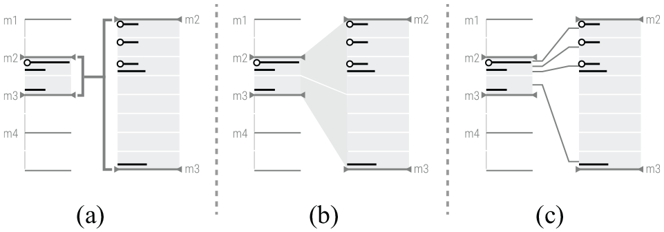
The lines representing transactions with change also represent which attributes changed [
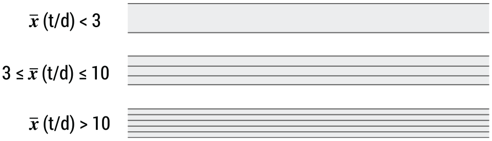
To detect differences in the transactional periodicity and behaviour, the transactions without changes in attributes must also be represented. However, as they are not the main focus of our visualisation, they must have a reduced visual impact. To this extent, we aggregate all transactions with no change that occurred between transactions with change, regardless of the days on which they occurred. To represent these aggregations, we visually distinguish groups with low, medium, and high transaction rates. We compute the average number of transactions by day, and represent three types of rates: (i) average of transactions by day lower than three; (ii) average between three and ten, inclusive; and (iii) higher than ten. Although the ranges were defined in collaboration with the analysts, they can be altered at any time. To represent the transactions with no changes we draw a rectangle with fixed height and length equal to the visualisation space (linear arrangement), or a doughnut shape (radial arrangement). Finally, we draw consecutive parallel lines inside the previous shape according to the transaction rates (see Figure 4).
Three levels of detail to represent transactions without change, according to the average number (
Finally, to emphasise fraudulent transactions, we colour the respective lines in red. To direct the analyst’s attention to problematic groups of transactions, we apply red to the aggregated transactions if at least one transaction in that day is marked as fraud.
Clustering transactional behaviours
During our workshops with the fraud analysts, it was pointed out that the visualisation could be further simplified by clustering transactional patterns [
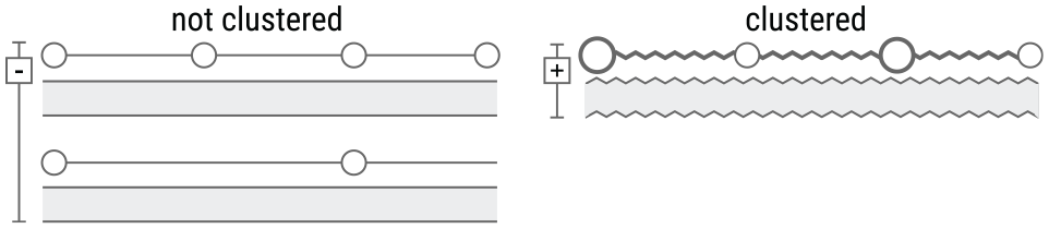
Difference between the representation of aggregated (left) and clustered (right) transaction patterns. On the left of each representation it is a button to condense or expand the clusters.
Relating attributes
We visually connect attribute values that: (i) are reused in different transactions; or (ii) are distinct but belong to the same attribute’s domain (e.g. user email, shipping email and billing email) in the same transaction [
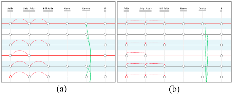
Comparison of the two approaches for connecting attributes: by using arcs (a) and straight dashed lines (b).
Interaction
We implemented a set of interaction techniques: details-on-demand, to obtain more information about the transactions and sequence of changes of a particular attribute [
Regarding the details-on-demand, we proceeded by providing the analyst with details about each transaction and its attributes [
The analyst can also interact with the transaction lines. Through mouseover or click, the analyst can access the details and statistical information about the selected transaction (Figure 3(c)). The attribute fields shown in the Details Area are the same, regardless of the number of transactions. If an attribute changes more than once in a set of transactions, a histogram is shown (Figure 3(c)). The histogram depicts the number of different attributes used and the number of occurrences. In this area, we also show the amount spent or average amount per transaction and the score or average score, depending on if more than one transaction occurred. Additionally, we present the number of fraudulent transactions, and the average number of transactions by day. To contextualise the spent amount of the selected transaction(s), we added a graph that plots the average amount from the selected transactions, and the minimum and maximum computed from all user transactions (Figure 3, top right corner). Finally, the analysts can visualise every attribute in a tabular form through a button at the bottom of this area [
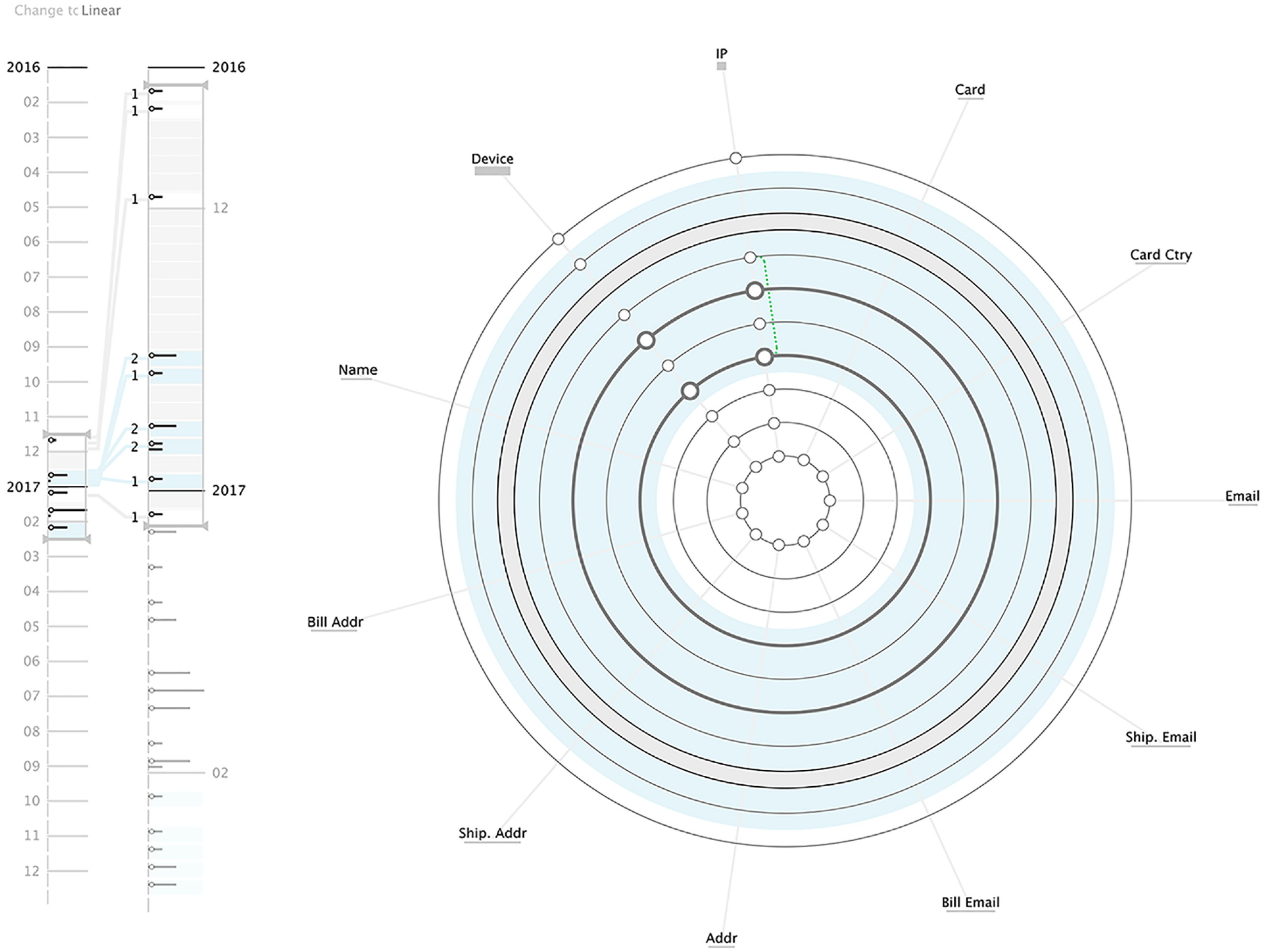
Timeline area
To enable the analysts to navigate through all transactions, we implemented an adaptive multiscale timeline. It aims to give an overview of the transactions periodicity and represent their distribution [
The multiscale timeline consists of two vertical timelines with different time scales: the overview and the detailed view. In the first, an overview of all transactions is presented. In the second, a temporal closeup is shown so the analyst can get a more detailed time distribution of the transactions. Both timelines are implemented using an adaptive algorithm. Depending on the time range, the algorithm adapts the timeline granularity to fit into the allocated space. Depending on the granularity, each month is subdivided into temporal blocks, ranging from one (i.e. all transactions of the month are aggregated into one block) to 31 (i.e. the transactions are aggregated by day).
The numbers of transactions with change and transactions with no change are represented separately in each temporal block. Both transactions’ types are represented with a line. However, lines representing transactions with changes are complemented with a circle at the beginning. To represent quantity, we use the length of the line. Also, we always draw the line representing transactions with change in the first half of the block and below, we draw the line representing transactions without change. All lines are coloured in black unless one or more transactions of the same type in the corresponding block are considered fraudulent, being coloured in red.
To connect the overview and the detailed timelines visually, we tested three different approaches empirically (see Figure 7). From the tests, the analysts referred that the latter approach was more perceptible and easier to understand how a block from the overview timeline was subdivided into the blocks of the details timeline. Also, with the tests, we could attest the need to show near each block the number of transactions (independently of the type), so the analysts could easily relate different blocks (Figure 3(a)).
Comparison of the three different approaches for the visual connection between both timelines: (a) connecting the ranges, (b) using shades and (c) connecting with lines.
The Main View’s clusters are represented in the Timeline Area with a line that connects every block in which the clustered transactions occur. Also, we highlight the blocks within the cluster with a black outlined rectangle (Figure 1(a)).
Finally, we aimed to distinguish visually the months and ease the connection between the Timeline Area and their representation in the Main View. To accomplish this, we alternate between a shade of light blue and white under the transactions from different months (Figure 3).
Interaction
In both timelines, the analyst can select the time range to visualise. By defining the time range in the first timeline, the time granularity and range in the second timeline are adjusted accordingly. By defining the time range in the second timeline, the analyst directly defines the time period for the Main View. We implemented three mechanisms to manipulate the time range: (i) through an upper marker; (ii) through a lower marker; and (iii) by dragging both markers. To avoid clutter in the Main View, we restricted the total number of transactions that can be visualised. By doing so, the time range in the second timeline is conditioned by the number of transactions that can be visualised in the Main View. To see the remaining transactions, the analyst must drag the time range to the intended time block. Additionally, all blocks which are not represented in the Main View have their saturation diminished in the Timeline Area.
To see more details concerning a specific temporal block, the analyst can mouseover a block and get additional details, such as the period of time for the corresponding block, the total and average amount spent, and the rate between fraudulent transactions and total number of transactions.
Usage scenario
In this section, we aim to understand how ATOVis can aid in the analysis of fraudulent transactions and the detection of suspicious behaviours. Also, we aim to describe how ATOVis can be used and how effective it can be in providing the analysts with an informative look at the data patterns. We choose three different cases so it is possible to perceive how the visualisation model can represent different behaviours. In the first case, the ML algorithm identified no fraudulent transaction, and in the second and third cases, fraudulent transactions are highlighted by the ML algorithm. However, the third case differs from the second in terms of fraud pattern. Hereafter, we discuss our findings.
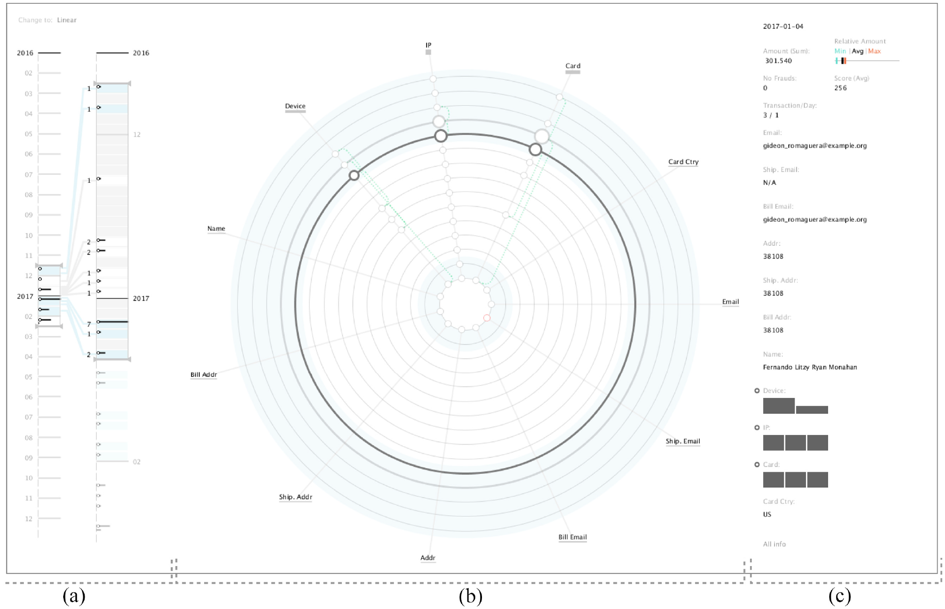
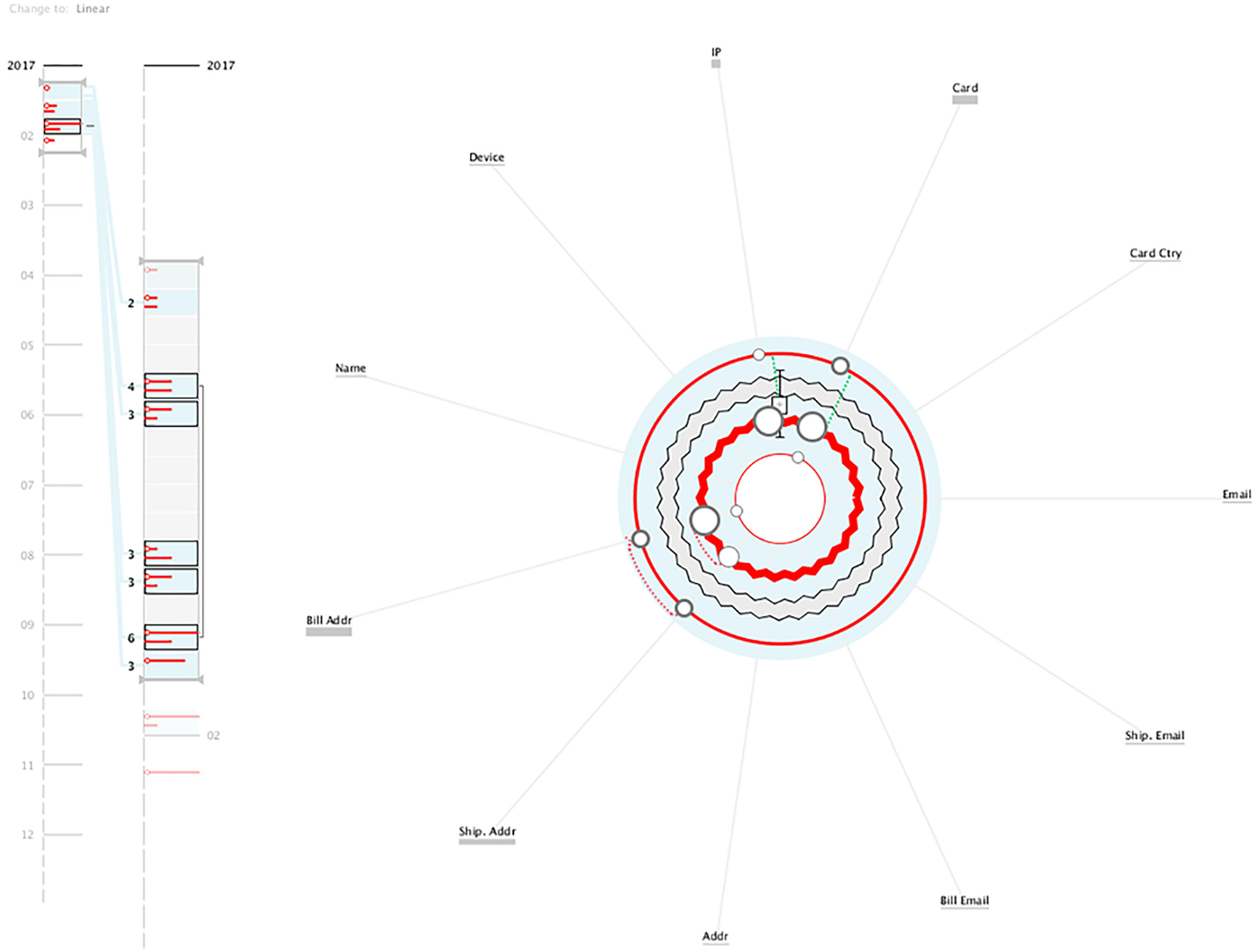
When analysing the first transactions (Figure 8), we can see that the majority of the attributes do not change between transactions, being the device and IP the exceptions – as can be seen by the circles positioned on those attributes’ angles. These changes can be seen as a normal behaviour as users tend to shop on either the smartphone, computer, or other device. We can also see that there is a repetition of the IP number, perceived by the green dotted line connecting the two circles in the IP axis. This is also an expected behaviour as users can shop in multiple places (e.g. their homes or workplaces). We can also detect a group of transactions with no attribute changes, represented by the thick grey circle. By analysing its interior pattern, we can determine that there was a small number of transactions.
Visualisation of client A data. It is possible to perceive that this client’s transactions were not considered fraud. Also, in the majority of transactions, the IP and Device are the only attributes changing.
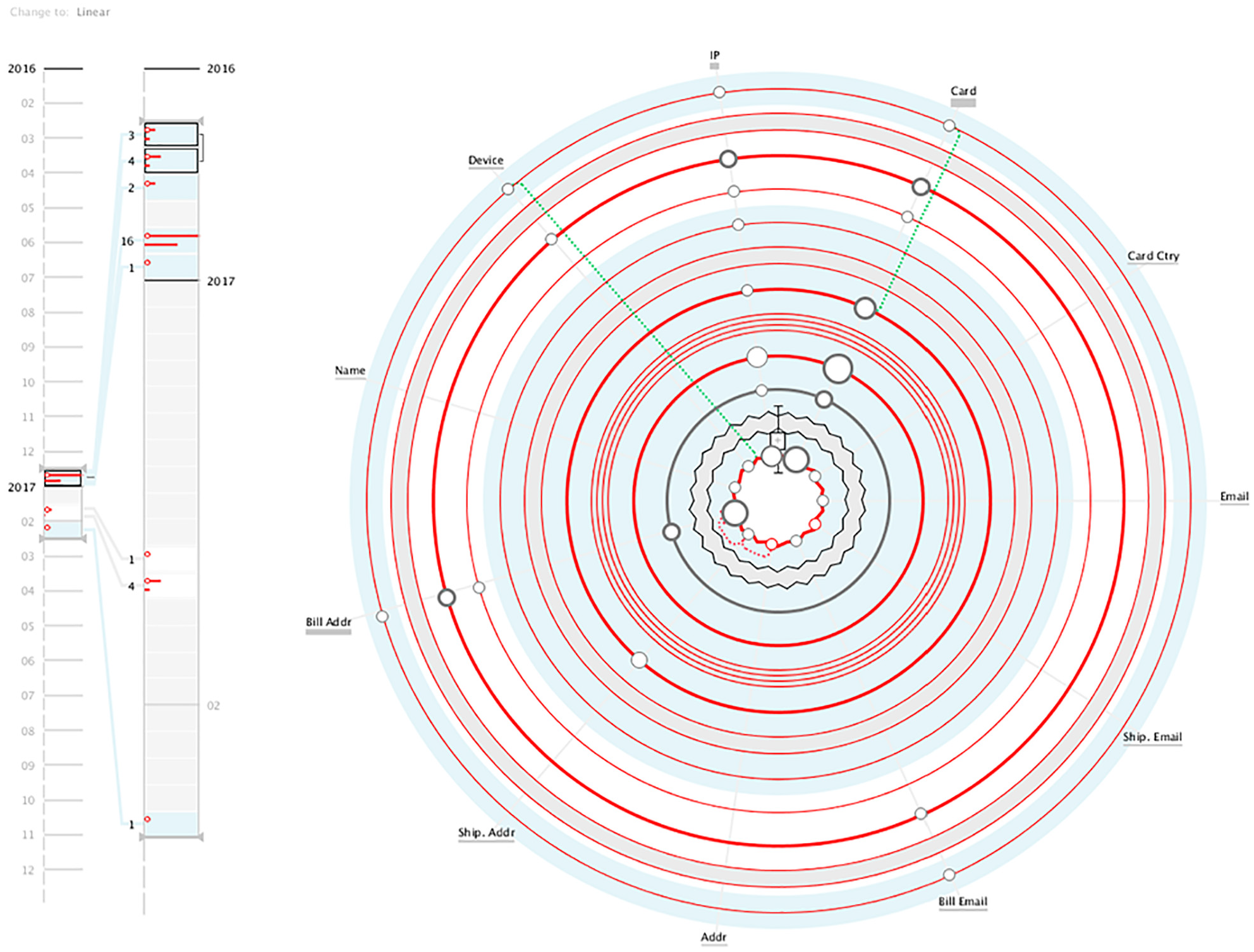
Given that most transactions occur in December, this type of behaviour is expected, as users tend to shop more in this month. Also, this user reveals a small number of transactions. However, we can see through the Timeline Area that there is a growth in products bought in January, probably due to returns. However, in general, there was no suspicious behaviour in this user’s transactions.
Visualisation of client B data. It is possible to understand instantly that the client performs fraud in the majority of his/her transactions.
When clicking on the Details Area, it was possible to see that the values of those transactions were around the same amount (€200) and their fraud scores were high. Also, all the transactions were declined, either automatically or manually. This is likely a case of ATO, in which the hacker maintained the shipping address but used several billing addresses and card numbers. This type of pattern may also indicate the testing of a bot that tries consecutively to buy products around the same price range with a legitimate user’s account. Finally, with this usage scenario, we could perceive how the visual clustering of patterns of transactions can generate a compact visualisation that summarises efficiently the transactions.
Visualisation of client C data. This client performs a set of fraudulent transactions that occur mainly during December.
In the Main View, we can see that the user makes a reduced number of attribute changes, being the card and IP the attributes that change the most. By hovering the day with more changes in the card attribute (i.e. with a bigger circle), we can see in the Details Area that, on the same day, the user used three distinct cards. By analysing that day, in which there are transactions with and without changes, we can see a total of 10 transactions, all considered as fraud (Figure 11). When accessing the table through the Details Area, the transactions have three different amounts, indicating the attempt to buy three different objects. Also, each object was bought at least three times, with different cards. This may represent a more manual attempt to improperly use one user’s account to test different cards and determine which one could be used to commit fraud.
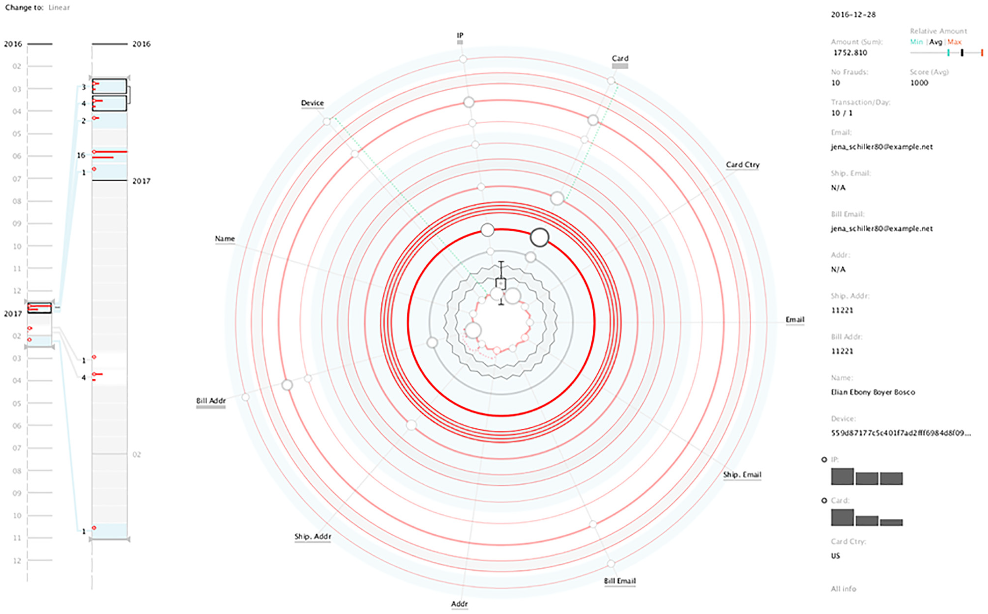
By analysing the details of the clustered transactions, it is possible to see 10 fraudulent transactions in the same day.
Validation
We performed a series of user testings to assess the effectiveness and efficiency of the visualisation models and gather feedback on how to improve them. To validate our tool more thoroughly, we performed two different user testings. In the first, we gave a set of tasks to be completed using screenshots of ATOVis. The tasks were defined to validate the model and not the interface, and were designed to determine the usefulness of the design, identifying the effectiveness of the visual encodings, and proving its suitability for the second phase of analysis (described in Section Fraud Detection Workflow). In the second user testing, we designed a qualitative study in which the participants interacted with the tool. The qualitative study aims to assess the complete functionality of ATOVis. In short, we aim to analyse whether the analysts can make correct decisions and which insights can be acquired through ATOVis, proving its suitability in the third phase of analysis (see Section Fraud Detection Workflow). Both tests were initialised with a scripted walk-through of ATOVis and finished with open-ended questions about ATOVis.
Participants
Two groups of participants were involved in the tests: experts in fraud analysis; and experts from other fields of data science, recruited from the University of Coimbra, Portugal. Due to the reduced number of fraud analysts provided by the company, conducting the user tests in such conditions would limit our assessment of the models. With the participants with no background in fraud detection we can still study the self-explanatory aspects of the proposed models, and whether someone with no expertise could still identify fraudulent cases. This is particularly important as in the fraud company, beginners at fraud detection have less knowledge on fraud patterns, and by testing the system with non-experts we also address the ATOVis effectiveness in highlighting ATO patterns for beginner annalists. No participant had previous knowledge of the tool or visualisation.
The group of experts consisted of 5 analysts recruited from the company. These experts were not involved during our collaboration with the fraud detection company, hence have no conflict of interests or bias towards our tool. Their average working experience in fraud analysis is 5 years, and on average, the analysts had no to little interaction with visualisation on a daily basis. The second group consisted of 11 participants from diverse data science fields, such as Machine Learning, Information visualisation and Design, with no background in fraud analysis. On average, these participants have more interaction with Information visualisation, two of whom work and interact with visualisation everyday.
The first user testing, in which the participants have to complete a set of tasks, was performed with both groups, as we aimed to perceive if the visualisation models could be interpreted both by experts and non-experts in fraud detection. The second user testing, in which the participants have to interact with the tool, was performed only with the analysts, as this is more focussed in understanding the analyst rationale while searching for fraudulent patterns.
Visualisation models validation
At the beginning of each user testing, a small workshop, introducing the visual variables and visualisation models, was held. It had a duration of approximately 15 min. Afterwards, they were given a set of tasks to complete. These tasks, defined according to the tasks T1-4 (see Section Task Analysis and Design Requirements), worked around the comprehension of the models and were grouped depending on what they aimed to validate:
After completing the tasks, the participants were asked to give feedback on the tool, with special emphasis on the efficiency of ATOVis, its learning curve, and the differences between the radial and linear models. Finally, the non-analysts group was asked to rate the visualisation tool as a whole, whereas the expert analysts were asked to rate the three components individually (i.e. timeline, radial and linear models). We recorded the audio from each test to analyse each session afterwards. The user tests had an average duration of 37 min.
We created two different tests to compare the linear and radial models effectiveness. In test A, we started with the linear model, and in test B, we started with the radial. Then, we alternated between the two models for the following tasks. Both tests have the same tasks and order.
Results
Hereafter, we describe the results of the tests, detailing the accuracy and time values for each group of tasks, the differences regarding the linear and radial models, and the feedback retrieved.
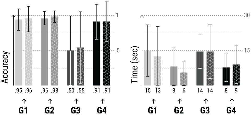
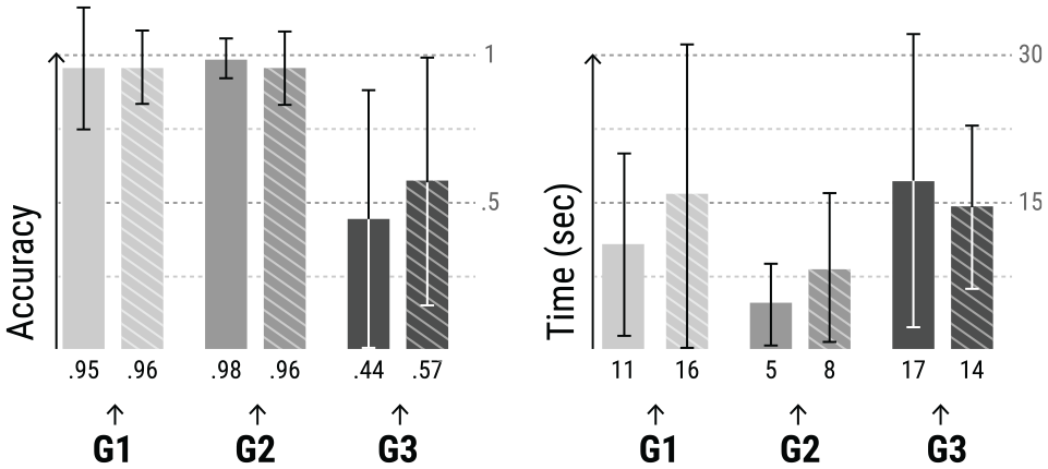
Accuracy, duration and respective standard deviation values for all groups of tasks: transactions (
The group of tasks with the lowest accuracy refers to the cluster’s group (
For the other three groups of tasks (
Concerning the connections between attributes (
Differences in accuracy, duration, and respective standard deviation values for the tasks related to: transactions (
ATOVis tool validation
We conducted the second user testing concerning the validation of ATOVis as a tool in a similar way as the first user testings. First, a small workshop, introducing the visual variables and visualisation models, was held. It had a duration of approximately 15 min. Then, the participants were invited to analyse four different sets of transactions from four users, and categorise them as fraudulent, non-fraudulent or suspicious.
The four users were selected according to their transactional data. Each had different types of complexity and different patterns: (i) no fraud (User 1); (ii) with fraud (User 2); and (iii) with fraud, but with few or none transactions coloured in red (User 3 and 4, respectively). Only the expert analysts performed this test. The analysts were asked to explore and analyse the visualisation, explain out loud what they saw at each moment of their exploration, and refer to the user behaviours as fraudulent, non-fraudulent, or suspicious. The participants took, on average, 3.2 min to conclude each analysis. In the end, they were asked to rate the analysis’ difficulty and certainty of their answers.
Results
Hereafter, we describe the results of the tests, detailing the difficulty, certainty and time values for each interaction with ATOVis, and the feedback retrieved.
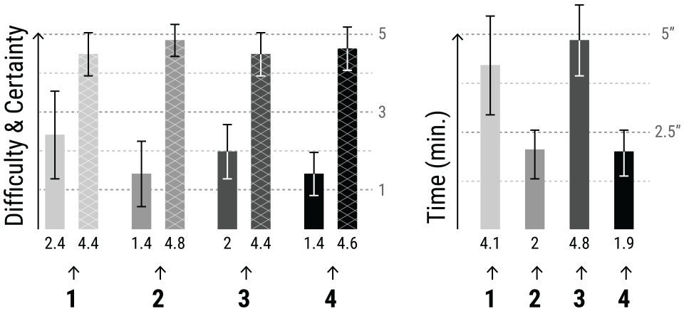
Ratings on difficulty, certainty, and duration (averages and standard deviations). Difficulty (bars with no pattern) and Certainty (bars with cross pattern) are rated from 1 to 5, 0% to 100%, respectively. Time is mapped between 0 and 5 min.
From the selected users, User 1 and 3 were the ones who took more time to analyse, as analysts tended to explore in more detail their transactions in search of suspicious behaviours. As User 1 had no fraud patterns, the analysts were less confident of their answers and found it more challenging to analyse. The bias caused by the test can explain this difficulty, as the analysts were expecting to see fraudulent activities. Notwithstanding, all analysts correctly classified the case as non-fraudulent. In the case of User 3, the suspicious behaviours were not visible in the beginning. The analysts used the Timeline Area to explore the rest of the dataset. They found suspicious activities, such as the consecutive change of attributes within a single day, followed by a high rate of transactions with no changes. For User 2, the analysts could see fraud instantly, as most transactions were coloured in red. However, after some interaction with the tool, the analysts could be more precise about the fraud pattern. It was obvious the consecutive changes in the card details, which most analysts referred to as a carding pattern (constant test of stolen cards). The case of User 4 was also rapidly classified as a BA pattern as it showed a high amount of transactions in only 1 day (through line thickness).
Through the analyst’s interaction with ATOVis, it was possible to detect similar usages of the tool functionalities. Most analysts started their analysis by looking directly at the main model, discarding the timeline. When they finished their first analysis, they had a mental image of the initial behaviour of the user. They searched the timeline for periods of time with: more transactions and/or fraud. If no period of time stood out in the timeline, they started to think of the case as non-fraudulent. However, they still looked for the main model while sliding the timeline. When confronted with fraudulent transactions, the analysts searched for attributes that had changed and analysed their values, especially the country of the card and the differences in attributes of the same domain (e.g. shipping/billing/account email). From the attributes shown in the visualisation, the less analysed was the IP, as it can have a high rate of changes in non-fraudulent cases. The analysts pointed out that a more relevant field would be the IP country. Also, to show the hours of each transaction would enhance the analysis, as it eases the distinction between a BA and a manual attack.
In summary, all fraud analysts could use the tool efficiently and describe the users’ patterns correctly, explaining their transactional behaviours. Through these results, we can argue that the models are capable of representing ATO patterns and other hidden fraud patterns, also represented by the consecutive change of attributes (e.g. BA, carding).
Discussion
Through the collaboration with fraud analysts, were able to do the task abstraction for ATO patterns and define the design requirements which led to the definition of what data to use and which visual encodings to apply in ATOVis. We also could derive the main pattern to look for in ATO, which is the consecutive change in the transactions’ attributes. By focussing on the visual highlight of such behaviours, we could emphasise ATO patterns and ease their detection. This decision was well received by the analysts and even referred to as an important aid for their line of work and decision making. Such visual distinction was seen as an improvement to their current tools, spreadsheets, as it enables the overview of all related transactions in a single place.
Based on the user tests with two distinct groups (experts and non-experts in fraud detection), we can argue that, with ATOVis, both less and more knowledgeable participants can be equally accurate while performing judgement tasks, which contradicts studies such as Cardinaels. 54 The most experienced could drill down faster in specific scenarios (e.g. discovering fraudulent patterns), while the less experienced reasoned more slowly about the transactions but could arrive at similar conclusions. Independently of the expertise, most participants referred to multiple changes in the IP attribute as a user shopping in various places, discarding fraud. In contrast, when seeing various changes in the card attribute followed by a high rate of transactions with no change, the participants referred to this as fraudulent testing of multiple cards. In general, all participants understood the visual mappings of the transactions and could translate them into different behaviours. Hence, we can state that all participants could analyse the visualisation properly, reason about the client’s behaviours, and quickly detect suspicious transaction patterns.
The tasks defined for the first user tests enabled us to assess the interpretability of the visualisation design. We could attest how easily the participants understood the model and the transactional behaviours in a short time. As such, we can confirm the usefulness of ATOVis in the rapid perception of data, allowing the quick identification of fraud. The interaction in the second user tests allowed us to confirm the usefulness and intuitiveness of the tool’s components. The analysts had no difficulty interacting with the tool and used all functionalities during their exploration to drill down suspicious transactions and detect fraudulent activities. They also could define their conclusions in a short period of time (3.2 min on average). Although we could not test the timings concerning the company’s current system, 3 the analysts referred to their timings with ATOVis as a good improvement on their existing tools (i.e. spreadsheets and web database), which commonly take more time to perform similar tasks. Also, the variety of behaviours within the different cases and the accuracy of the analysts’ answers allow us to conclude that the tool can detect various suspicious cases.
Concerning the comparison between the linear and radial models, the analysts saw the linear model as more intuitive (due to the familiarity with tabular information), and the radial promoted more interest during the analysis. One analyst stated that the radial model was better suited to read the attributes changing over time, and after some interaction, it also got easier to read the overall behaviours. The radial model was also characterised as more informative as it condenses more information. Relating to the points referred to in Section Transaction Representation, we could assess that, in terms of efficiency and effectiveness, the radial model was better for ‘understanding the relationship of attributes between and within transactions’ and both models were equally suitable for ‘detecting transactions and attributes with more changes’ and ‘understanding the transactional behaviour of each user’. From this, we can conclude that the radial model is more suitable as an overview tool for phase two of analysis (see Section Fraud Detection Workflow), and the linear model more ideal as an exploratory tool for phase three.
Functionalities, such as the visual distinction between different months through interspersed blue shades, the use of red to highlight fraud, and the aggregation of transactions by day and type, were well-received and understood. In general, the visualisation models were seen as visually appealing, which enticed the participants to explore the visualisation. On the other hand, the clusters of transactions and their representation fell short in reading and comprehension. However, most participants stated that, with more time to assimilate all information, it got easier to distinguish the representations. Also, the clusters were referenced as a good feature to reduce the visualisation space and, at the same time, to represent clearly similar behaviours.
The majority of the fraud analysts referred to the usefulness of ATOVis as an important aid in their daily work. They stated that the tool could give a complete picture of the transactional history, which does not happen with the tools they usually use. Additionally, the multiscale timeline was considered easy to use and a mechanism that presents a clear overview of the transactions’ distribution over time. This overview can better assist the analysts to synthesise the user’s behaviour, highlighting the changes in behavioural patterns. Also, the analysts stated that, compared to their current framework, it was much easier and faster to perceive the transaction behaviours and detect if a fraudulent transaction was an isolated event or a user’s typical behaviour. These facts corroborate our hypothesis that ATOVis can improve the analysts’ workflow by reducing the time needed to analyse the data and by facilitating the tasks required by the analysts, especially when multiple transactions need to be revised.
In future work, some visual encodings can be improved, such as highlighting fraudulent attributes through the red filling of the circles, and the representation of clusters. The functionality to select different months and visualise them side by side should also be covered. A future validation of the detection accuracy in ATOVis (to be conducted after the full implementation of ATOVis in the company’s workflow) is to analyse the number of positive and negative cases detected through ATOVis in contrast to the outcomes of the analysis of the same cases through spreadsheets – their current method.
From a visual analytics point of view, concerning the need to visualise and facilitate the comprehension of the output of machine learning models, we see this work as the first step in a more humanised approach to the analysis of ML results. Our visualization model was implemented to be integrated into two specific phases of analysis of fraud, within the fraud detection company. These phases occur after the ML algorithm classifies and scores the transactions as fraudulent or not fraudulent (Section Fraud Detection Workflow gives more details about the specificities of each phase). Hence, the main goals of our visualization model are: (i) to facilitate the rapid detection of fraudulent transactions that the ML algorithm classified with low confidence; and (ii) to improve the analysis of transactional behaviours that may reveal new patterns of fraud.
The visualization model emphasises, through colour, the fraud label given by the ML algorithm. Although the fraud analysts can have more details about the confidence scores in the details area, this is the only visual cue to the ML result. Due to these specificities, ATOVis can also be seen as a complementing mechanism to ML, as it enables parallel manual analysis of suspicious activities and the validation of the classifications attributed by the system. ATOVis’s main goal is not the improvement of the company’s ML algorithm but the improvement of the manual analysis of transactions, which enables a human validation of the ML’s classifications. Also, with the new insights that may be acquired from ATOVis, the company can improve their algorithms.
We argue that this approach may benefit and improve the confidence in ML algorithms, as humans can detect and confirm the patterns behind suspicious transactions or malicious behaviours. In cases where high confidence in the ML scores is the priority, the visualization should express as little bias as possible, but also increase the perception of patterns. We believe that visualization tools that incorporate these characteristics would benefit fraud detection and prevention. The visualization can be employed as a way to understand the ML outputs, while at the same time be a mechanism to improve the ML rules, which consequently will lead to an increase of confidence in obtained scores.
In this sense, we highlight the need to design systems that take advantage of the complementarity between humans and machines that overcome their limitations and enhance the confidence of the resulting outcomes.
The next step of this project would be to represent which attributes the ML algorithm used to define the confidence score. Although such representation was not possible at this stage due to intellectual property concerns, we argue that this integration would benefit the ML algorithm, as the analysts could detect possible false positives or false negatives and insert new fraud patterns.
Through the present work, we can conclude that ATOVis is effective and efficient in detecting fraudulent patterns and can build the confidence of fraud analysts in their decision-making tasks.
Conclusion
We presented a visualisation design study of ATOVis, a user-centred visualisation tool composed of several models to aid in the rapid detection of Account Takeover (ATO). Through the collaboration with one of the leading fraud detection and prevention companies, we were able to define the task abstraction for the detection of ATO cases. This collaboration led us to define the main design requirements for implementing a visualisation focussed on consecutive changes in transaction attributes. We implemented two visual arrangements to visualise ATO and a multiscale timeline to enable the overview of all data in a temporal context. We validated our tool through user testings, both with experts and non-experts in fraud detection.
We contribute to financial fraud visualisation with a tool that addresses the rapid analysis of a particular fraud pattern – ATO. Through ATOVis, we were able to fasten the analysis of a set of online transactions, augment the confidence of the fraud analysts in characterising the transactions patterns, and, therefore, increasing the analysts’ confidence in making decisions based on their knowledge about the transactional behaviours. The user tests showed that focussing primarily on the changes among transactions eased the tasks of ATO behaviour search. Also, we could attest that to analyse transactional data, visualisation models that overview fraudulent behaviours and emphasise their relations enhance the detection of fraud. Such models can detect single fraud patterns and be a basis for improving ML algorithms with new types of fraud patterns.
Supplemental Material
sj-pdf-1-ivi-10.1177_14738716221098074 – Supplemental material for ATOVis – A visualisation tool for the detection of financial fraud
Supplemental material, sj-pdf-1-ivi-10.1177_14738716221098074 for ATOVis – A visualisation tool for the detection of financial fraud by Catarina Maçãs, Evgheni Polisciuc and Penousal Machado in Information Visualization
Supplemental Material
sj-pdf-2-ivi-10.1177_14738716221098074 – Supplemental material for ATOVis – A visualisation tool for the detection of financial fraud
Supplemental material, sj-pdf-2-ivi-10.1177_14738716221098074 for ATOVis – A visualisation tool for the detection of financial fraud by Catarina Maçãs, Evgheni Polisciuc and Penousal Machado in Information Visualization
Supplemental Material
sj-pdf-3-ivi-10.1177_14738716221098074 – Supplemental material for ATOVis – A visualisation tool for the detection of financial fraud
Supplemental material, sj-pdf-3-ivi-10.1177_14738716221098074 for ATOVis – A visualisation tool for the detection of financial fraud by Catarina Maçãs, Evgheni Polisciuc and Penousal Machado in Information Visualization
Footnotes
Funding
This work is funded by national funds through the FCT---Foundation for Science and Technology, I.P., within the scope of the project CISUC---UID/CEC/00326/2020 and by European Social Fund, through the Regional Operational Program Centro 2020.
Supplemental material
Supplemental material for this article is available online.
Notes
References
Supplementary Material
Please find the following supplemental material available below.
For Open Access articles published under a Creative Commons License, all supplemental material carries the same license as the article it is associated with.
For non-Open Access articles published, all supplemental material carries a non-exclusive license, and permission requests for re-use of supplemental material or any part of supplemental material shall be sent directly to the copyright owner as specified in the copyright notice associated with the article.