
Abstract
Counterfactuals – expressing what might have been true under different circumstances – have been widely applied in statistics and machine learning to help understand causal relationships. More recently, counterfactuals have begun to emerge as a technique being applied within visualization research. However, it remains unclear to what extent counterfactuals can aid with visual data communication. In this paper, we primarily focus on assessing the quality of users’ understanding of data when provided with counterfactual visualizations. We propose a preliminary model of causality comprehension by connecting theories from causal inference and visual data communication. Leveraging this model, we conducted an empirical study to explore how counterfactuals can improve users’ understanding of data in static visualizations. Our results indicate that visualizing counterfactuals had a positive impact on participants’ interpretations of causal relations within datasets. These results motivate a discussion of how to more effectively incorporate counterfactuals into data visualizations.
Introduction
Visualization has become an indispensable tool to help gain insights into increasingly large and complex multi-dimensional datasets. However, effectively communicating meaningful causal relationships in such datasets remains challenging.1–3 To help address this issue, researchers have explored the use of causal analysis theory to inform visualization design.4,5 One approach that has gained popularity is the use of counterfactual reasoning,6,7 a fundamental tool in statistical causal inference that uses hypothetical scenarios to investigate causal relationships. For example, an investigation of the effect of hunger on student test scores may involve considering the counterfactual where students ate lunch before sitting for an exam. Counterfactuals have been applied in a number of visual analytics systems for machine learning explanation8,9 and exploratory visual analysis. 10
While some effective use cases have been reported in previous work, it remains unclear how and to what extent counterfactuals can help users gain a deeper understanding of visualized data. Prior empirical studies in visual causal inference and counterfactual visualization focused on assessing spurious causal correlations, 11 modeling treatment effects and confounding factors, 12 and exploring users’ confidence in feature-to-outcome relations. 10 However, this existing body of work has mainly evaluated self-reported confidences and preferences in specific contexts. As a result, there remains a lack of general understanding of how applying counterfactuals to data visualization can benefit users’ causal inferences.
In this paper, we explore whether and how counterfactuals in general-purpose visualizations can help users gain a deeper understanding of causal relationships within their data. Drawing inspiration from research on the cognitive process behind visual data communication,13–15 we first propose a novel visual causality comprehension model – capturing how we expect people to read and comprehend causal information from visualizations – that includes four progressive levels: recognizing, understanding, analyzing, and recalling.
Based on this preliminary model we conducted an empirical study employing four tasks derived from the corresponding comprehension levels. Motivated by prior work that examined how people can draw causal inferences from simple visualizations10–12,16, three common visualization types – line charts, bar charts, and scatterplots – were used as stimuli to present various datasets. For each dataset, a corresponding set of counterfactual-based visualizations was constructed based on the methodology used in prior work. 10 In each phase of our study, participants were randomly shown different combinations of chart sets displaying different levels of counterfactual information. They were then asked to answer questions related to three design objectives: recognizing correlations, making predictions, and identifying causal relationships. Additionally, participants were asked to report how much they could recall about the datasets 10 min after completing the study.
The study found that using counterfactuals in visualization design significantly improved participants’ ability to understand and draw inferences from datasets, while also improving recall. Moreover, participants reported that counterfactuals helped them reason about hypothetical scenarios and identify causal relationships that were not immediately apparent. The study results also suggest that counterfactual designs do not impair users’ ability to read charts. However, counterfactuals did require longer response times for answering questions. Based on these findings, we propose a set of design heuristics to guide the integration of counterfactuals into data visualizations. These guidelines can assist researchers and designers in creating effective counterfactual visualizations to aid in enhancing users’ comprehension of complex data.
In summary, the contributions of this paper include:
Related work
This section introduces key definitions and provides an overview of relevant previous work, including prior research on visual data communication, the use of counterfactuals in visual analytics, and human visual perception of causality.
Definitions for counterfactual visualization
As briefly described in the introduction of this paper, counterfactual reasoning6,7 is a fundamental concept in statistical causal inference. This methodology involves analyzing what might happen under alternative scenarios in which only a specific condition is different with the aim of understanding the causal effect of that specific condition. Many visual analytics workflows involve the creation of data subsets for focused analysis, as exemplified by the Zoom and Filter step of Shneiderman’s Mantra. 17 The counterfactual approach integrates well with such analyses, and can be operationalized through the creation of four different subsets: the included (IN) subset, the excluded (EX) subset, the counterfactual (CF) subset and the remainder (REM) subset. 10 These are defined as follows:
These subsets are illustrated in Figure 1(a), (c) and (e), and the method for selecting them for the purposes of the user study presented in this paper is described in Stimuli.
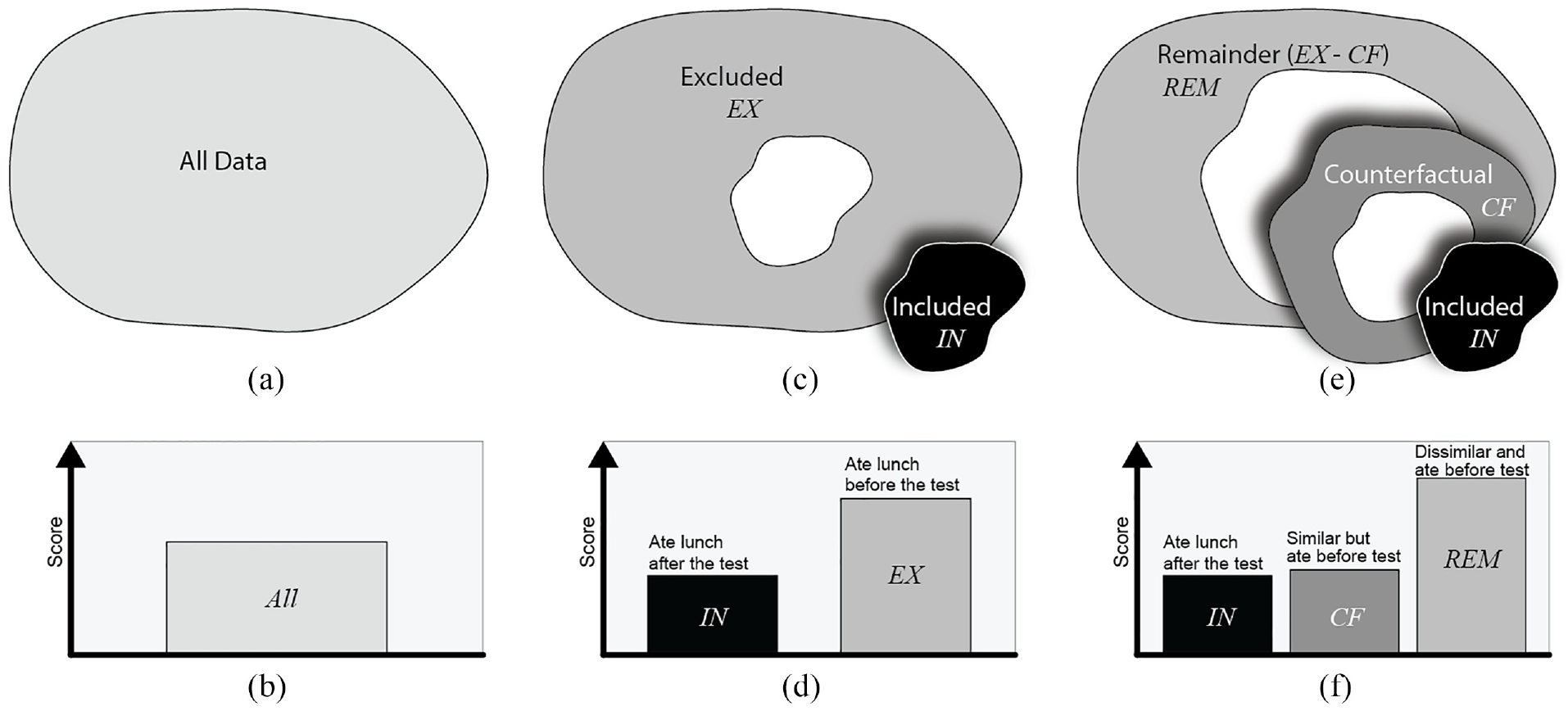
The four types of data subsets used in our study, illustrated with the student test scores example from the introduction. (a and b) are all data points in the dataset and corresponding traditional bar chart visualization of the average test score for all students. When the students who ate launch after the test are selected as IN, (c and d) shows the subset relations and visualizations between the IN and EX subsets, and (e and f) shows the relations and visualizations between the IN, CF, and REM subsets.
Counterfactual visualization aims to provide comparisons of useful combinations of data subsets that can provide additional information to improve reasoning about causal relationships in the data. Following Kaul et al., 10 we refer to a counterfactual visualization as a combination of three charts showing the IN, CF, and REM subsets (Figure 1(f)). A traditional visualization of a chart showing just the IN subset is treated as a control group in our study (e.g. a scatter plot showing positions of only data points in IN).
However, since counterfactual visualizations include a comparison across multiple charts (IN+CF+REM), a second control group with two charts showing the IN and EX subsets (e.g. Figure 1(d)) is also included in the study design reported in this paper. The charts for this second control group display all data points as is the case with counterfactual visualization designs, but they only show the EX subset rather than the similarity-driven subsets CF and REM.
The purpose of visualizing CF is to show the user data points that are similar to IN across all dimensions in the data other than the inclusion criteria for IN, thus helping them confirm or deny any causal relationships they may assume from looking at IN alone, based on the inclusion criteria for IN. For example, in the student test scores example from the introduction, if IN contains students who ate lunch after taking a test, and a visualization shows that they have low test scores, users might assume a causal relationship between hunger and test scores (see Figure 1(d)). In this case, CF would contain students who ate lunch before taking the test, but who are similar to IN in all other respects. If the students in CF also have low test scores, that would weaken the evidence for a causal link between hunger and test scores (see Figure 1(f)). On the other hand, if the students in CF have high test scores, that strengthens the evidence of a causal relationship. The EX and REM subsets contain individuals dissimilar to IN across all dimensions of the data, providing further context to help with causal inference. Figure 1(b), (d) and (f) show visualizations for the student test scores example.
Human cognitive processes and visual data communication
One stated advantage of visualization is that it “forces us to notice what we never expected to see”18,19 within datasets quickly and easily.20,21 Designers aim to present information to users in the most effective way. However, achieving these goals is not always easy, as the efficiency of visualizations can be influenced by various factors such as visual encodings, data type, and even designers’ own biases.2,15
Existing research has examined various factors impacting the comprehension and communication of data in visualizations. Task-based analyses are a common approach, in which researchers explore and summarize how to design visualizations to aid understanding for specific tasks, such as low-level graphical perception22,23 and color design.24,25 In addition to task-based studies, researchers have also investigated how to assess and model users’ understanding and ability to communicate visualizations through evaluating study strategy design,26,27 and visual quality measures.28,29 Interdisciplinary insights have also been proposed, such as Bae et al.’s assessment of how curiosity and play in physicalizations improve data visualization literacy in children’s education. 30
Moreover, Adar and Lee13,15 built on previous studies to develop an affective learning objective framework that aligns with Bloom and Krathwohl’s affective taxonomy. 31 They conceptualized the visual data communication problem between designers and users as a learning problem in a teacher-student relationship. By doing so, they summarized insights in human cognition objectives that enable designers to describe their visualizations’ goals and compare their communication ability with users to those goals in a formalized way.
In this paper, we gain insights from prior insights on human cognition objectives in visual data communication to counterfactual visualization. We aim to explore how people comprehend counterfactuals in visualizations, taking into account the specific demands of counterfactual reasoning.
Counterfactuals in visual analytics
Counterfactual reasoning is a fundamental concept in statistical causal inference.6,7 It involves constructing hypothetical scenarios that deviate from reality and making inferences about what would happen under those counterfactual conditions. For example, we might ask, “What would the sales figures have been if we had lowered our prices by 10% last year?” to assess the causal relations between price and sales figures. Counterfactual reasoning has been widely recognized for its importance and has recently gained traction in the deep learning community, where it has been applied for tasks like model testing 32 and narrative reasoning. 33 While most of these studies are non-visual and result in natural language output, we focus here on the application of counterfactual reasoning in the context of visual analytics. 34
The vast majority of existing work on counterfactual visualizations has focused on improving explanations for and the interpretability of machine learning models. For instance, the What-If Tool 35 provides a basic visualization of the nearest counterfactual point to the target data point, ViCE 9 uses counterfactuals to illustrate minimal edits required to modify the output of the visualized model, DECE 8 enables the visualization of counterfactual examples from different data subsets for decision-making, and INTERACT 36 allows what-if analysis to improve model explainability and prototyping under industrial contexts. Although these studies present effective use cases for their systems, they focus primarily on machine learning model explanations rather than providing insights for general-purpose visualizations.
The potential uses of counterfactuals are not limited to the problem of explaining machine learning models. 34 In recent work, Kaul et al. 10 presented CoFact, the first counterfactual-based interactive visualization system designed for general datasets. CoFact enables users to explore high-dimensional datasets via pairwise visualization of features, prioritized based on association with an outcome variable. Counterfactual visualizations of selected data subsets provide additional information about feature-to-outcome relationships. Although this work provided initial findings on the usefulness of counterfactual visualization in the context of an interactive visual analytics tool, there remains a gap in understanding the impact of counterfactuals for more general data visualization and communication.
Kaul et al. 10 further assessed how the CoFact system helped users learn feature-to-outcome relationships from datasets. Their results provided preliminary evidence that, with counterfactual visualization enabled, users showed greater confidence in strong outcome relationships and lower confidence in weak outcome relationships. The post hoc analysis of interviews found that CoFact could be useful for data exploration and decision-making. However, their study mainly focused on the proposed visual analytic system and lacked insights for more general visualizations. Furthermore, they did not assess the quality of causal inferences generated by users with the help of counterfactuals. The study in this paper aims to address both of these issues.
Human visual perception of causality
Properly designed visualizations can help users avoid making spurious assumptions about causal relationships, leading to improved decision-making. 37 Thus, understanding how human perceptions of causal inference are processed and impacted by visualizations is important for visualization research.
Xiong et al. 11 explored how various graphs can create an illusion of causality, that is, how they can lead to incorrect interpretations of data. They introduced some preliminary insights for visualization design, such as causal inference results for text descriptions and bar graphs being better than those for scatterplots. Another crucial finding from their work is that the data aggregation level of visualizations might be positively associated with users’ self-reported confidence in causal inferences. However, their study focused on assessing users’ self-reported ratings of pre-designed causality statements, thus lacking insights of users’ actual causal inference results.
Further, Kale et al. 12 introduced an empirical study for evaluating causal inferences via the causal support model from mathematical psychology. 38 Their results indicate that user capability for causal inferences is insensitive to sample size. They also reported that using different visual encodings would not be significantly better than tables for causal inference. However, their second finding is inconsistent with most existing visual causal analytics systems all of which indicate that visualization would benefit causal inference.8–10,39–41 This difference may be related to different design strategies between the empirical study and interactive visual analytics systems, but still needs to be further studied.
Network visualizations such as Bayesian Belief Networks 42 are often employed for causal inference tasks. However, a number of prior studies10–12,16 have shown that users also draw causal inferences from common visualizations including scatterplots, line charts, and bar charts, even if they were not intended to show causal relationships. Moreover, starting from simplified and easy-to-understand tasks is a common and important approach to exploring complex concepts in empirical studies.43,44 For these reasons, our study primarily focused on these three common visualization types.
In this study, we aim to systematically evaluate and model the impact and effectiveness of counterfactuals in helping users understand data at different data communication levels 13 for general-purpose charts, building upon the previous definition of counterfactual visualization. 10 Compared to existing studies, we primarily focus on evaluating the quality of users’ causal inference results instead of just assessing self-reported confidence or preference levels, and discuss the design space of how to use and understand counterfactuals in visualization. By doing so, we intend to provide empirical evidence supporting the use of counterfactuals in visual analytics.
Modeling causality comprehension
Existing empirical studies on causality in visualization11,12 have not explored the perceptual data communication process underlying visual causal inference. To advance our understanding of how counterfactuals can enhance users’ comprehension of data, we propose a preliminary causality comprehension model for visualization scenarios. The proposed model aims to decompose this process and shed light on the potential benefits of using counterfactuals in data communication.
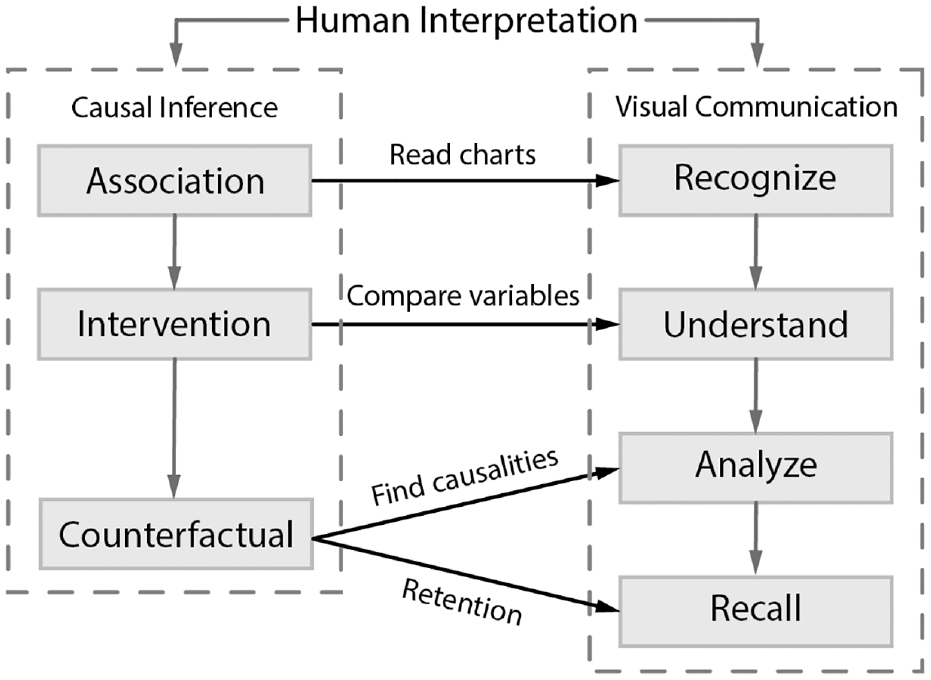
According to statistical causal inference theory,6,7 causalities can be classified into three levels: association, intervention, and counterfactual. In this paper, we propose a model of users’ progressive understanding of causalities in visualization by connecting these three causal inference levels with four important cognitive objectives that occur when users communicate with visualizations13,15,23,45–Recognize, Understand, Analyze, and Recall– resulting in four comprehension levels:
In summary, we define a preliminary model of the visual causality comprehension process of human perception as a progression from recognizing, to understanding, to analyzing, and finally recalling, connecting the theory of causal inference and users’ cognitive processes of visual data communication. Figure 2 illustrates an overall picture of our model.
Methodology
To assess how counterfactual visualizations impact people’s ability to reason about and comprehend causality in real-world datasets, we ran a user study that was approved by the UNC Institutional Review Board. This study enabled us to characterize the effect of counterfactuals in different types of static visualizations, including to what extent they help users infer causal relationships. The datasets and example infrastructure applied in our study are available in the Supplemental Material.
Participants
We recruited 32 participants (19 male and 13 female, based on a power analysis 47 of pilot studies) via recruitment flyers, department mailing lists, and contacts within professional networks. All participants were at least 18 years old, reported normal or corrected to normal vision, and were either pursuing or had earned a university degree. Participants were from a broad spectrum of academic and professional domains. Our experiment took 45 min on average, and each of the participants was compensated $10 for their time.
Hypotheses
Based on the proposed causality comprehension model, we hypothesized that:
As the most basic level of communication, the recognizing process always appears in low-level visual tasks. 48 Visual complexities and design choices within a chart could impact its performance.49,50 However, previous work suggests that counterfactual visualizations can be integrated into a visual analytics system without decreasing system usability. 10 In addition, we chose a juxtaposition visual comparison model that has been employed by many existing studies51–53 to maintain a low visual complexity for visualizations of each data subset (Figure 3(b) and (c)).
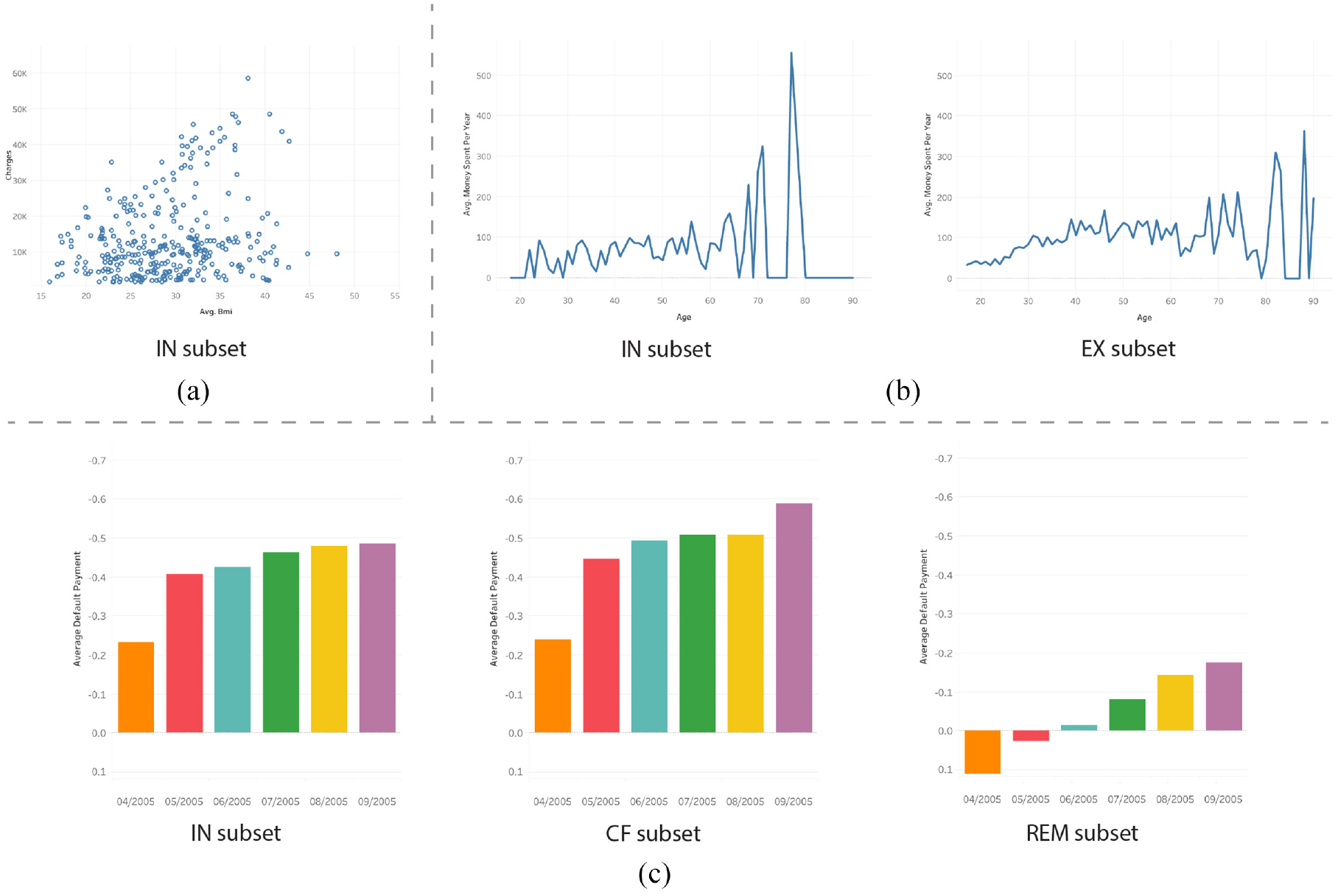
Three examples of data subset visualizations seen by participants in the user study: (a) IN subset scatterplot visualization of the Health Insurance dataset, showing only data in the IN subset. (b) EX subset line charts visualization of the Census Income dataset, showing data in both the IN and EX subsets. (c) CF subset bar charts visualization of the UCI Credit Card dataset, showing data in the IN, CF, and REM subsets.
In existing visual analytic systems,8–10 counterfactuals are shown to be effective in understanding complex algorithms and judging feature-to-outcome relationships. We expect that counterfactuals will also be beneficial to help understand data using general-purpose charts.
An obvious advantage of counterfactuals is to make apparent underlying causalities in data.7,12 We expect their impact to be similar to that of insight explorations which also aim at finding hidden relations in data. Insight exploration methods have been demonstrated to be useful in deeper data analysis.54–56 Such findings indicate that we may see similar advances with counterfactuals, that is, improved analyses and causal inferences.
Perceptual studies demonstrate that additional information and encodings can help people better communicate and recall data. 45 Counterfactual visualizations provide extra information to users, and we anticipate that such counterfactual information will help people remember and recall findings from data more easily.
Stimuli
Our stimuli were created from commonly used real-world multi-dimensional datasets found in prior studies, such as the UCI Credit Card dataset (https://archive.ics.uci.edu/ml/datasets/default+of+credit+card+clients) 57 and the Census Income dataset (https://archive.ics.uci.edu/ml/datasets/adult). 58 We followed the process of the CoFact system 10 for generating the data subsets for visualization, as it is currently the only counterfactual-based system for exploratory visual analysis.
We generated the data subsets as follows:
Picking an included (IN) data subset based on the variables of top-recommended insights computed by a dataset insight exploration algorithm, 54 for example, all individuals with one child from a family-income dataset. This selection also results in an excluded (EX) data subset (individuals that do not have one child).
Creating the counterfactual (CF) data subset from EX following previous work
10
by (i) computing the Euclidean distance from each point in EX to each point in IN, and (ii) selecting the
Denoting the remaining data (neither in IN nor CF) as the remainder (REM) data subset, resulting in four subsets (IN, EX, CF, and REM) for each dataset (See Figure 1).
The stimuli were separated into three groups containing different subsets to be visualized:
IN group – IN subset only (e.g. Figure 3(a)),
EX group – IN+EX subsets (e.g. Figure 3(b)), and
CF group – IN+CF+REM subsets (e.g. Figure 3(c)).
We chose three common visualization types to display the data subsets: line charts (for time-series data), bar charts (for categorical data), and scatterplots (for continuous data). In total, we generated 27 groups of visualizations and employed them in a within-subject study. Figure 3 shows examples of the three groups of data subset visualizations with different chart types.
Tasks
We derived four tasks based on our causality comprehension model:
Participants were required to answer three questions for each task from T1 to T3, and were shown each subset combination group (as introduced in Stimuli) once for each task. For questions asked in T2, we hid the last 5% of the dataset to serve as the ground truth, following the approximate percentage for the validation set in the Microsoft COCO dataset, 59 to use as validation for users’ answers. Table 1 shows examples of specific questions asked for the different tasks.
Examples of questions per task.
Procedure
Our experiment consisted of five phases: (1) informed consent, (2) term introduction and task description, (3) formal study for T1-T3, (4) post-study feedback and preference questionnaire, and (5) answering the recall question for T4.
Participants were shown and agreed to the informed consent with our IRB protocol at the beginning of the study. We then explained any unfamiliar terms and provided examples appropriate for a general audience – we explained the definition of different subsets, provided examples of counterfactuals with narrative explanation (similar to examples in Counterfactuals in Visual Analytics), and encouraged users to imagine hypothetical assumptions during the study – before introducing the required tasks in the study.
After completing the study introduction, each participant was required to view visualizations and answer questions for tasks T1-T3 in a random order, while avoiding back-to-back questions for the same task, to account for learning effects. Participants provided their answers in a textbox. In addition, they provided their confidence for each answer via a 5-point Likert scale. During the study, each participant completed three questions for each task – 1×IN group, 1×EX group, and 1×CF group – and was shown a particular data set+visualization group combination once.
After completing T1-T3, each participant completed a questionnaire reporting their experience including usefulness, confidence, preference, and any additional feedback. We extended the feedback session by 10 min by chatting with participants and finally asked them to report their recall of any information remembered from the viewed visualizations. The recall list was ranked from the most memorable to the least memorable by each user.
Result encoding
We collected participants’ thinking and completion time, verbal and textual responses, and reported confidence in each question. For natural language input, we encoded them as quantities using axial coding 60 (see Table 2 for details about the evaluation metrics). We received 320 responses in total, with 288 for tasks T1 to T3, and 32 responses for task T4. The responses were encoded into four different types following our proposed tasks and the model defined in Modeling Causality Comprehension.
Evaluation metrics for each task.
For task T1, we extracted the statistical descriptions and findings from reported responses, computed the number of findings in each response, and verified the correctness of the findings. Note that since T1 was focused on the ability to recognize, users were requested to describe findings without inferring any correlations between variables. For T2, we collected the prediction results and validated their correctness based on the remaining 5% of the dataset, as described in Tasks. For T3, we collected findings and predictions from users’ responses and computed the average correctness. Meanwhile, for both T2 and T3, we also collected the evidence or reason to support the answer to each question if it was reported. Finally, we recorded the number of recalled datasets per visualized subset type from each response for T4. Table 2 describes the selected evaluation metrics for each task.
Results
We present our analysis methodologies, statistical analysis, and significant results based on the independent factors considered in this paper
Analysis
The overall goals of our analysis were to test the proposed hypotheses and to validate related findings from previous studies. To achieve these goals, we analyzed performance using the following quantitative evaluation metrics: completion time, reported confidence, number of reported findings or variables, correctness rate, and recall rate. For each task, we assessed the resulting data using a 3 (visualized subset groups: IN, EX, and CF) factors ANOVA, where the chart types, inter-participant differences, and trial order are treated as random covariates, with Tukey’s honestly significant difference test (Tukey’s HSD) with
Recognizing association
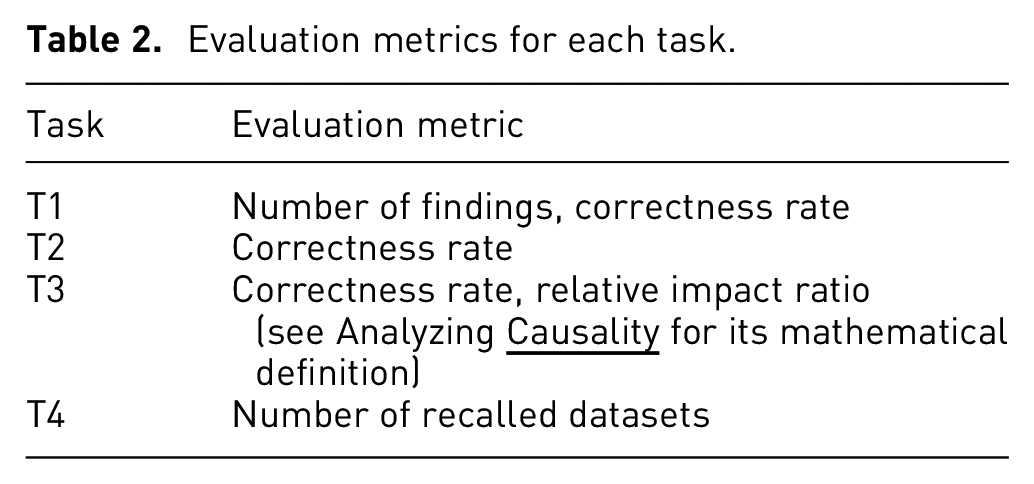
Our results for task T1 support H1: we found that additional visualized subsets do not have an obvious negative impact on users’ recognition ability.
During this task, users were asked to focus on findings from the data shown in the IN subset chart. Our analysis shows that there is no significant impact between the visualized subsets and users’ recognition results for the number of findings and correctness rate. We found users always responded to similar findings for the same dataset. For example, in the
The box plots show correctness rates for each visualized subset group for tasks T1 (a) and T2 (b).
Understanding intervention
Our results for T2 may also support H2: counterfactual visualizations could improve users’ interpretation of interventions behind data variables.
No overall significant difference was found between visualized subsets for users’ correctness rate when predicting changes to a variable after manipulating another variable. Figure 4(b) shows the correctness rate of users’ predictions based on subset visualization type. Although the overall statistical significance was not found at the 0.05 level, a higher average correctness rate for the CF group (IN+CF+REM) was observed visually, as was a larger variance for the EX group.
We therefore further explored the statistical significance at a more fine-grained level. We found a significant difference
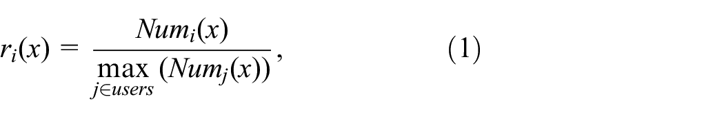
Analyzing causality
Our results for T3 support H3: we found that counterfactual visualizations significantly improved users’ analysis of causalities.
Our analysis reveals a significant impact between visualized subsets and users’ overall correctness rate of causality results
where
Figure 5 shows the results for correctness rate and relative impact ratio per visualized subset group. Counterfactual visualizations achieved the highest average correctness (Figure 5(a)) and relative impact ratio (Figure 5(b)). The distribution of the CF group’s results is also more compact compared to the EX group, implying that counterfactuals may be able to improve user’s causal inference, whereas the EX group may in fact be a hindrance (similar to the results of T2 in Figure 4). Although we do not specifically test these hypotheses in our study, our results could provide guidance on which combinations of data subsets to present to users.
The box plots show correctness rates (a) and relative impact ratios (b) of each visualized subset group for task T3.
Recall
Our results for task T4 support H4: we found that counterfactual visualizations led to better recall rates for users.
We recognized all responses linked to a specific dataset as a successful recall; descriptions that could not be associated with a specific dataset were not recognized as a recall. For example, one user said “I remember poor countries with life expectancy vs money,” which was recognized as a recall because it could be directly linked to the life expectancy dataset, 63 while another user said “I remember the scatterplots which are easiest to use when visualizing data,” which we did not recognize as a recall because it could not be associated with a specific dataset.
We found a significant impact between visualized subsets and users’ recall of datasets
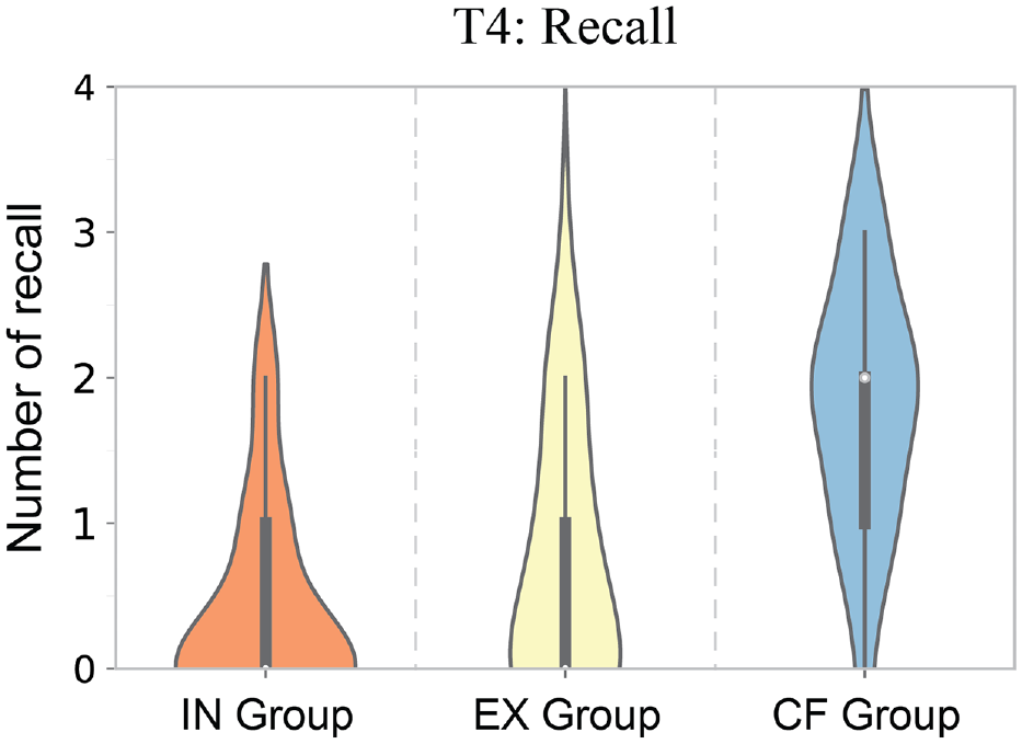
The violin plots show the numbers of recalls per visualized subset group type.
As shown in Figure 6, the CF (avg. 1.78 per user) group had a higher average number of recalls, followed by EX (avg. 0.69 per user) and IN (avg. 0.38 per user). This finding could be due to counterfactuals causing users to perform a more careful causal analysis of data. 10 The effect could also be due to the additional information (for both EX and CF groups), which is in line with findings from Borkin et al. 45
Exploratory analysis
To better analyze other potential impacts in our study, we conducted an exploratory analysis using Tukeys HSD with Bonferroni correction of the other evaluation metrics and random covariates. Here we report significant results from this analysis.
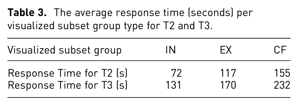
First, we report that counterfactuals led to an impact on the response time for users. Our results reveal significant impacts on tasks T2
The average response time (seconds) per visualized subset group type for T2 and T3.
In addition, we found most of the users’ reported confidences are at a moderate level, but they varied for both visualized subsets and chart types. The results in Figure 7(a) and (b) show users’ average confidence per visualized subset group when answering T2 and T3 and reveal that the CF group got the highest average confidence compared to the other two groups for both tasks. This finding is consistent with the above analysis of these tasks where we found counterfactual visualizations would lead to better performance in T2 and T3. It also indicates users’ average confidence for T2 is higher than T3 which is consistent with the proposed causality comprehension model, implying that T3 requires a higher level of comprehension than T2 (Modeling
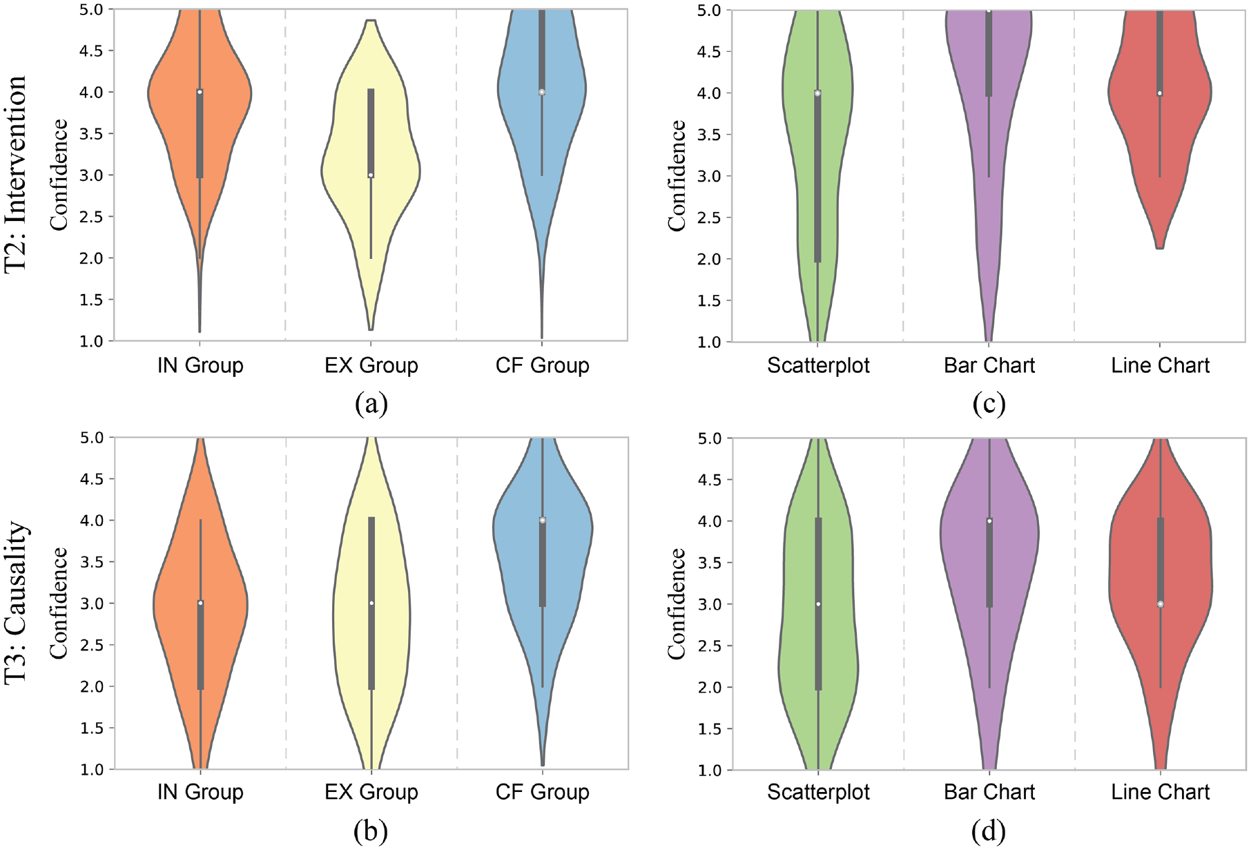
The violin plots show the confidence (reported on a 5-point Likert scale) per visualized subset group for T2 (a) and T3 (b) and per chart type for T2 (c) and T3 (d).
Figure 7(c) and (d) indicate that users’ confidence for both T2 and T3 is lower for scatterplots compared to bar and line charts. This finding is consistent with previous work investigating causality illusions, which found that users provided weaker causality ratings for scatterplots than bar charts. 11 However, this finding shows that high user confidence did not necessarily indicate improved performance and this phenomenon needs to be studied in more detail.
To better explore the inverse relationship between users’ confidence and performance, we further computed and evaluated correct-confidence and incorrect-confidence to measure how users’ confidence aligns with their correct and incorrect responses. The correct-confidence is users’ confidence in correct responses while incorrect-confidence refers to confidence in incorrect responses, as shown in Figure 8. The results indicate that the differences in correct-confidence in the three chart types do not vary much (see Figure 8(a) and (b)). However, the incorrect-confidence of scatterplots is noticeably lower than the other two chart types (see Figure 8(c) and (d)). This finding reveals that the relatively low confidence of scatterplots might be explained by correctly having low confidence in incorrect causal inferences. Thus scatterplots may be positively correlated to the strength of causal evidence behind data, that is, users would have higher confidence for more significant causal evidence and lower confidence for less significant causal evidence. These impacts may also be related to the aggregation level of visual design 11 which was not considered in our study. Future work should explore these differences in more detail.
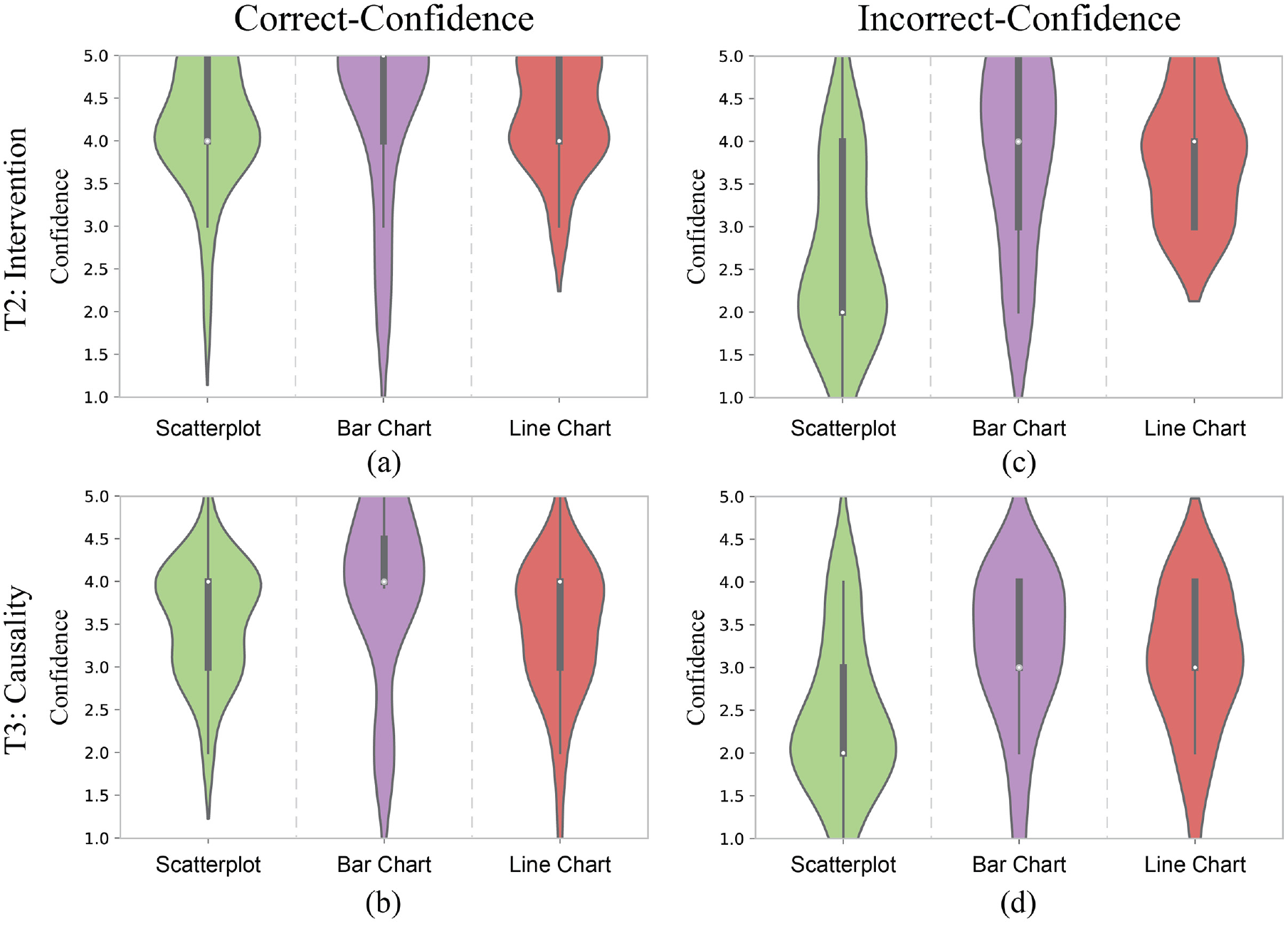
The violin plots show the correct-confidence per chart type for T2 (a) and T3 (b) and the incorrect-confidence per chart type for T2 (c) and T3 (d).
User feedback
In addition, we reported a crucial insight into decision-making uncertainty from participants’ feedback. By summarizing participant feedback regarding chart-reading strategies, most users reported that counterfactuals were helpful in finding implicit causal relationships and reasoning about hypothetical scenarios. However, we also found potential limitations to counterfactuals.
Figure 9 shows a conceptual model illustrating how a number of participants described their decision-making strategy and process. During the study, participants might generate multiple original inferences when looking at the IN chart, where they cannot verify which is correct, but may make an assumption or have a preference among these inferences. In most cases, when looking at the CF chart, they are then able to confirm or reject the original assumptions. However, users felt that sometimes the CF chart might “muddy the waters,” adding additional information that could be difficult to reconcile with their previous assumptions, and potentially leading to confusion and lack of confidence. Additionally, users also mentioned that the current study lacks explorations of the whole dataset, due to visualizing sets of static charts, which made their decision-making more difficult.
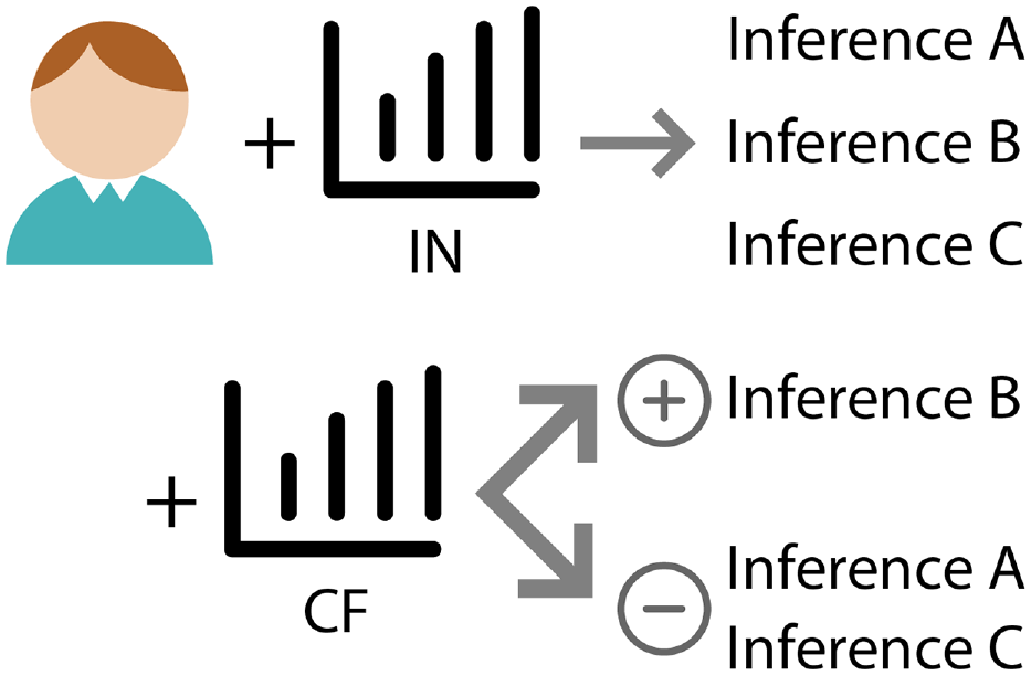
Proposed uncertainty-aware decision-making flow based on participants’ reports. The top arrow shows that users may make three inferences A, B, and C when looking at the IN chart, but may not immediately determine which one is the most likely. The bottom arrow indicates that after looking at the CF charts, it could be possible that the strength of users’ inference B is increased while inferences A and C are decreased.
This situation is similar to the impact of users’ decision-making uncertainty found in previous research,64–66 while an ideal causal inference process should be able to convey the most correct possible decision and reduce users’ uncertainty. The proposed conceptual model could also be helpful to explain how counterfactuals can counter Simpson’s paradox in one-dimensional datasets, 67 in which case users may have only one inference initially, and visualizing counterfactuals can counter the inference that a paradox exists. However, since the evidence for causality is uncertain, increasing uncertainty may also be desirable. Thus, further analysis is necessary to understand the cognitive processes involved in decision-making in the context of uncertainty and causal inference.
In summary, our study results offer evidence largely confirming our proposed hypotheses, and provide preliminary findings of the impact of visualizing counterfactuals, thus providing insights to support the proposed causality comprehension model in Modeling Causality Comprehension.
Discussion
Our study primarily evaluated the impact of counterfactual visualizations in helping people understand data at different communication levels. Our results offer a new perspective on findings from prior studies and provide preliminary design guidance and actionable insights for future research.
Critical reflection within the context of prior studies
Our study demonstrates that integrating counterfactual information with visualization can significantly improve users’ interpretation of complex datasets, enabling them to operate at a higher data communication and causal inference level. Next, we discuss the connections between our reported results and insights from prior studies.
Our first major finding reported that counterfactuals do no harm with respect to users’ ability to recognize relevant features in visualizations. This is consistent with Kaul et al.’s study 10 where they showed that counterfactuals neither decreased the performance of a visual analytic system nor did they negatively impact user experience. Similarly, Kale et al. 12 did not find obvious differences in performance when conducting causal inferences with different charts.
Further, our results demonstrate that counterfactuals can significantly help people understand associations and analyze causalities within data. This finding can be connected with some related insights. Kaul et al. 10 found that counterfactual visualizations significantly impact users’ inferences drawn from charts. Our results confirm such beneficial impacts. Xiong et al. 11 found that for the same dataset, different visualization choices could result in differences in users’ causal inferences, and that some visualizations could trigger stronger causal relations. Our results confirm that cognitive reasoning affordances vary for both visualized subsets and chart types, and visualizing counterfactuals can improve users’ causal reasoning.
Additionally, our findings indicate that visualizing counterfactuals can help with dataset recall. By treating counterfactual information as additions to the original visualization, this finding could be consistent with the guidelines from Borkin et al., 45 in which they found that additional encodings can improve the effectiveness of visual data communication.
We also reported specific insights about task completion time, chart types, and users’ confidence. Our finding about completion time confirmed the previous assumption that counterfactual visualizations could be more complex for users to understand. 10 This finding also fits with traditional graphical perception problems,19,22,68 where users spend more time understanding as chart complexity increases. However, this may not necessarily be a negative if taking a longer time leads to more correct inferences, as indicated by existing work on cognitive load and memorability. 69
Finally, our results also suggest that there may be performance differences among chart types. Overall, scatterplots may afford improved causal inferences versus bar or line charts. This finding fits with previous studies showing that scatterplots may better convey causal relationships in datasets, 16 and can more effectively communicate correlations. 70 Combined with the results of both performance and confidence, our results additionally show that compared to bar and line charts, users’ confidence with scatterplots was more closely aligned with the strength of causal evidence (i.e. positively correlated to their causal inference performance).
Some existing studies, however, also show that scatterplots might convey more uncertainty and be sensitive to different visual encodings,71,72 and uncertainty may lead to poor decision-making performances.65,73 Similarly, users’ feedback reported in User Feedback provided some possibilities about how CF could impact uncertainty in their decision-making. Our study was not designed to investigate the impact of uncertainties in decision-making, however, so this relationship needs to be further explored.
Design implications for counterfactual visualizations
Compared to previous work, 10 our results go farther in providing preliminary insights about how visualizing counterfactuals effectively can help with data interpretation. Additionally, we extended previous work on visual causal inference,11,12 connecting causal inference to multiple data communication levels. In this way, our results indicate preliminary guidelines for how to use counterfactuals:
Visualize counterfactual subsets to convey causalities in datasets.
Our study indicates that people can infer causal relations using counterfactual subset visualization, achieving better performance than showing the IN chart only, as described in Results. In real-world applications, however, counterfactuals have mostly been conveyed via natural language. 74 We therefore recommend that designers consider showing counterfactual subsets of data simultaneously with the originally designed chart, if their design objectives include helping their audience find important causalities in the data.
Use less scalable visualization types to help convey causality.
As shown in Exploratory Analysis, our exploratory analysis on chart types suggests that there may be evidence that the scalability of charts might impact causal inference. Combined with prior similar findings about the impact of aggregation levels 11 and rankings, 70 we anticipate that users might be able to find more causalities in less scalable chart types. Thus, we would recommend designers consider using charts with less scalability if they’re unsure about the visualization choices for datasets containing complex causalities. Specifically, our results in Exploratory Analysis indicate that scatterplots can be positively correlated to the strength of causal evidence within datasets.
Study limitations
Our study was able to evaluate the impact of visualizing counterfactuals for visual data communication using static charts. Some limitations of the study are discussed below.
First, the hypotheses and task designs of our study are primarily based on the proposed causality comprehension model. The study results provide some support for this model, but further research is required to explore how broadly the preliminary model can be applied across a wider range of scenarios. For example, although we have connected important insights from causal inference and human cognition in visual data communication, other possible impact factors also exist, such as how the potential uncertainty within visualizing counterfactuals will impact users’ decision-making.75,76
Second, we focused primarily on analyzing whether counterfactuals can help, but do not address what constitutes a “good” counterfactual subset. Different aggregations and selections of data subsets may significantly impact the performance77,78 and introduce potential bias79–82 in exploratory analysis. We adopted the basic counterfactual generation method from previous work, 10 and did not explore any parameter adjustments for creating the counterfactual subset, thus limiting our findings with respect to the impact of visualizing different counterfactual subsets.
Meanwhile, our study employed the IN chart as a typical visualization, along with counterfactual (IN+ CF+REM) and control (IN+EX) groups as comprehensive views of the whole dataset. However, these visualizations show different numbers of charts which may also impact users’ perception results. Additionally, we studied only three basic static visualization types: bar, line, and scatterplot charts. We did not evaluate user understanding of more complex visual designs, such as interactive dashboards and graph representations such as Bayesian Belief Networks 42 that aim to capture multidimensional probabilistic causal relations. Such interfaces and data representations can be challenging to evaluate,83,84 and can include different chart aggregation levels and multidimensional relations, which might complicate the analysis of perceived causality. 11
Additionally, our evaluation employs measures like correctness rate and a number of findings that are usually applied in low-level task evaluation. However, a limitation common to our work and most existing studies is the lack of a ground truth of human perception of causal relations among variables within datasets, which makes it unclear whether users really judge correlation or causation. Unlike most traditional visualization tasks such as identifying the number of classes, a user’s causal inference is subjective, which means even for the same pair of variables, different people may have different inference criteria. In addition, user performance for causal inference could also be evaluated by higher-level measures. For example, the designers’ objectives would significantly impact users’ comprehension, such as information esthetics and clarity. 85 Further, many other aspects such as individual cognitive factors and personality psychology would have a crucial influence on high-level visual understanding. 86 In addition, our participant recruitment was biased toward users attending university, who may be more familiar with statistics and visualizations than a more general population.
Moreover, Kale et al. 12 reported users’ causal inferences with common visualizations do not perform significantly better than those visualizing textual contingency tables. However, our work and several existing visual analytics systems8–10,39–41 show that visualization of counterfactual and causal relations would benefit users’ interpretation and analyses of data. We anticipate that this finding could be impacted by the types of chosen charts and the representation of causal information. It might also be related to the scalability of charts, where scatterplots usually are less scalable and can represent lower variance.70,87,88 However, this difference definitely needs to be further studied to get a more concrete answer.
Future opportunities
Based on the aforementioned limitations, it is necessary to assess counterfactual visualizations with more evaluation. This includes understanding metrics such as decision-making uncertainty (as shown in User Feedback), a wider variety of, and control over, counterfactual subset selection criteria, and more complex visual encodings and chart designs such as network-based representations. We plan to conduct further experiments to understand how different parameters for specifying counterfactual subsets would impact users’ interpretations. We hope to design different counterfactual visualization techniques that can the show same amount of data samples but with different numbers of charts to further explore the impact of the number of charts on users’ perceptions in the future. We also would like to design more reliable evaluation measures, considering designers’ objectives, and extend our study to include a broader population.
In addition, to provide clearer justifications for participants’ interpretations of causal relations within datasets, we further plan to conduct a large-scale study judging common inference results across diverse populations for causal inference questions. Results from such studies could potentially provide a ground truth corpus of causal relations of data variables that would not only benefit counterfactual studies, but also work as baselines for more diverse causality-related empirical experiments.
Further, according to our current results, it would be reasonable to assume that visualizing counterfactuals can significantly benefit people’s ability to conduct exploratory data analysis. As a consequence, we hope to explore how users will use and interpret counterfactuals and whether they fit our causality comprehension model for exploratory tasks in interactive visualization systems. Additionally, our study focused on how users can find causalities, but lacked an understanding of how counterfactuals can guard against making false assumptions of causality, although this is hinted at by the incorrect-confidence result for scatterplots in Exploratory Analysis. Future work should explore this area of counterfactual visualization more thoroughly.
Our results suggest that low-level data communication is not obviously impacted by counterfactuals, as all subset visualization groups achieved an overall high accuracy rate in T1. However, existing findings indicate that demographics can influence the accuracy of understanding associations, such as in climate change visual analytics. 89 Future work could further investigate the impact of users’ demographics in understanding counterfactuals for more complicated tasks with lower overall correctness rates.
In addition, visualization recommendation and insight characterization methods90–92 have already been a fruitful and insightful research topic. However, unlike with NLP models, it remains difficult to apply those methods in real-world applications.93,94 In the future, we would like to extend counterfactuals into more complex application scenarios, distil empirically supported counterfactual generation methods, and explore the possibilities for applying counterfactuals in visualization recommendations to provide causality-enhanced insights.
Conclusion
In this paper, we proposed a method to model the comprehension of causalities from visualizations by combining causal inference theory and cognitive processes of the visual data communication framework. We explored how counterfactuals impacted people’s ability to understand data at different levels for static visualizations via a user study. Our results indicate that people can interpret and infer relations with counterfactuals. We provide preliminary evidence that visualizing counterfactuals can improve performance in understanding interventions, analyzing causalities, and recalling features of datasets. Based on the results evaluation, we discussed the connections and reflections between our results and prior findings to explore more insights. We further derived design implications for using counterfactuals in visualizations. We believe our findings could benefit a broad range of visual comprehension demands and tasks, and we hope our work will inform further studies to explore further detailed guidance on how to use and interpret counterfactuals.
Supplemental Material
sj-7z-1-ivi-10.1177_14738716241229437 – Supplemental material for An empirical study of counterfactual visualization to support visual causal inference
Supplemental material, sj-7z-1-ivi-10.1177_14738716241229437 for An empirical study of counterfactual visualization to support visual causal inference by Arran Zeyu Wang, David Borland and David Gotz in Information Visualization
Footnotes
Funding
The author(s) disclosed receipt of the following financial support for the research, authorship, and/or publication of this article: This work is supported in part by Award #2211845 from the National Science Foundation.
Supplemental material
Supplemental material for this article is available online.
References
Supplementary Material
Please find the following supplemental material available below.
For Open Access articles published under a Creative Commons License, all supplemental material carries the same license as the article it is associated with.
For non-Open Access articles published, all supplemental material carries a non-exclusive license, and permission requests for re-use of supplemental material or any part of supplemental material shall be sent directly to the copyright owner as specified in the copyright notice associated with the article.