
Abstract
Many data visualization experts recommend the use of bar charts over pie charts because they consider comparing the area or angle of segments to be less accurate than comparing bars on a bar chart. However, many studies show that when the pie chart is used to estimate proportions (arguably its main function) it is as accurate as the bar chart. A major issue is that most previous studies have only looked at one method of extracting information from pie charts, for example either by comparing the segment to the circle (the part-whole relationship) or one segment to another (relative magnitude estimation). Therefore, in this study I test multiple metrics to provide a more holistic assessment of the pie and donut chart against the bar chart. I also measured cognitive load through pupillometry. In summary, bar charts were more precise than pie and donut charts for ranking elements, but all charts were equally accurate for extracting the part-whole relationship. There was little difference in cognitive load between chart types, although bar charts were consistently faster to use on average. Overall, the bar chart was more flexible, but where there were statistically significant differences between charts, the effect sizes were often small, and unlikely to prevent effective extraction of quantitative information. That is, as long as they were used appropriately, all chart types were arguably acceptable for displaying simple, categorical data.
Introduction
The case against pie charts
For over 100 years, the bar-circle controversy has stirred up fierce debate over the value of the pie chart, and many authors have been strenuous in their dismissal of it.1–6
For example, in 1923 Karsten wrote “The disadvantages of the pie chart are many. It is worthless for study and research purposes…In a sense, it might be construed as an insult to a man’s intelligence to show him a pie chart..” 7 The skepticism continued into the late 20th Century, with Tufte’s simple appeal in his seminal book The Visual Display of Quantitative Data - “Don’t use pie charts.” 5 And it remains into the present day, with Knaflic stating that “Pie charts are evil.” 6
This negative view seems to stem from the assumption that the perceptual task by which we extract information from a pie chart is either area or angle.6,8 The main perceptual tasks for graph and chart comprehension were proposed by Cleveland and McGill,8,9 and are shown in Figure 1.
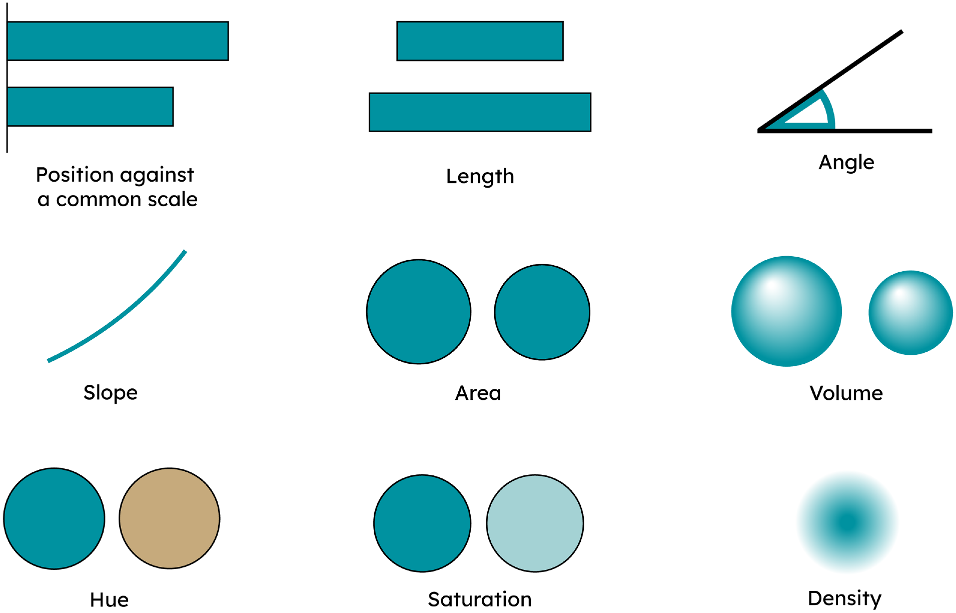
Summary of perceptual tasks as proposed by Cleveland and McGill. 10 The first six tasks are presented in order of accuracy as tested by Cleveland and McGill. Hue, saturation, and density were not tested and assumed to be much less accurate than the others.
Cleveland and McGill concluded that position against a common scale was the most accurate perceptual task, followed by length, angle, and area. 10 However, the differences in average accuracy were often very small (one or two parts in a hundred). Cleveland and McGill were upfront in stressing the infancy of such research, but the perceptual task hierarchy is often presented as authoritative by many authors, especially in practitioner books.
Thus, if one subscribes to Tufte’s call for the accurate representation of data in graphs and charts above all else, 5 and one also assumes that the pie chart perceptual task is the less accurate area or angle, then it is logical to avoid pie charts. This logic is nicely summarized by MacDonald-Ross: “the eye makes comparisons of length more easily and surely than comparisons of area .…” 4 In this case, pie charts are simply less accurate than charts that can make use of position against a common scale, such as bar charts (or even scatterplots, dot plots, and barbell charts).
The typical stance in previous graphical perception studies, mostly designed and interpreted by quantitative scientists, is that the more accuracy there is the better. Therefore, the natural conclusion is that, whenever the bar chart is found to be more accurate than the pie chart, the bar chart should be preferred.5,6,11–14 This view is now common in many quantitative fields, but in my own field of Business Analytics it now seems ubiquitous.
The case for pie charts
The logic presented above suggests that if position against a common scale is the most accurate perceptual task, then virtually every chart of simple categorical data must be a single or grouped bar chart. Even a segmented bar chart would not do as this employs length, which is (slightly) less accurate than position against a common scale.
This is surely a problematic stance. Several authors have outlined the relevant issues with focusing on perceptual task as the only criterion for chart selection, as we need to consider other factors such as ease of use and physical analogy.15–17
In addition, recent papers have cast doubt on the canonical ranking of perceptual tasks, that is position against a common scale > length > angle > area. For example a recent study by Davis et al. 18 suggests this ranking is only the most common, and by no means universal.
Given the limitations of the perceptual task hierarchy (which Cleveland and McGill were the first to identify), it seems hasty to discount chart types that have been used and understood for centuries. 19
Accuracy is important, but only up to the point where the viewer is able to correctly extract the insight. This stance is supported by a wealth of research in cognitive psychology, which finds that people do not make decisions solely on the basis of specific numbers, but rather on the “gist” of them (or at least a combination of both).20–23
The question to ask is therefore more nuanced than “is the bar chart more accurate than the pie chart?,” and is rather “how much accuracy is needed in a simple chart to reliably communicate the insight at hand?.” The latter is obviously a harder and more subjective question to answer, but asking this question is more likely to mean that we accommodate other important factors in the success of a chart.
Speed of comprehension and ease of understanding are also important determinants of successful comprehension of a graph or chart.16,24,25 In particular, physical analogs can help us process abstract information and ease understanding.26,27
Given data is the quintessential abstraction, it is likely that the correct physical analog to demonstrate a graphical insight makes a big difference to the ease in which we can extract out the relevant information. An obvious example is the bar chart, which allow us to comprehend data by using the physical analog of stacking: the taller the stack, the bigger the number. But what the singular or grouped bar chart is less good at is representing proportion. There is no natural representation of the part-whole relationship in these charts; you can always add more bars and thus there is no natural boundary of 100%.
However, segmented bar charts and pie charts implicitly encode the whole within them, through either the length of the entire bar or the circle. Segmented bar charts and pie charts are thus great physical analogs for proportions, employing the same visual cues as if cutting a cake or pie.
Radial visualizations (e.g. pie charts, radial dendograms, sunburst charts) are also much more compact than their linear alternatives (bar charts, linear dendograms, grouped bar charts), utilizing two dimensions rather than one to wrap categories up into a smaller space. 28 This makes them especially useful in this era of data dashboards, mobile phones and smartwatches.
Indeed, one point that is missing from much of the academic debate is that pie and donut charts are ubiquitous. There is barely a data dashboard,29,30 business annual report for investors,31–33 or mobile phone fitness app that does not have multiple examples of pie and donut charts. Of course, popularity is not a good indicator of which chart is best to use, but it does indicate that pie and donut charts are considered useful by the average person.
Also, it seems that the layperson often finds these circular charts more visually appealing. 28 In particular, Siirtola et al. 14 found that while pie charts were less accurate than bar charts for the purposes of ranking categories, participants preferred the pie chart over the bar chart. While many quantitative scientists may frown upon such whimsy, data visualizations are graphic designs, and graphic designs need to be visually appealing in order to attract and engage users.
There is also a more serious angle to visual appeal. Esthetics and design are often closely intertwined with function. 34 Many design principles (gestalt principles, color theory, hierarchy) help us navigate the object we are looking at, and this is no different for data visualizations.6,13 Specifically, we use gestalt principles (proximity, shape) and color theory to distinguish and highlight areas of a chart or graph that contain the insight of interest.
Accuracy is an important criterion for chart selection, but it is not the only one. Once sufficient accuracy has been reached to allow the viewer to extract the correct insight, other factors must also come into play. What is the insight to be extracted? Who is the audience? Are you dealing with absolute values or proportions? What is the best physical analog? How much space do you have? And so on and so forth.
Data visualization is a mix of both science and (graphic) design, where the science has many gaps, and the design elements are inevitably driven by subjective choices around what works best on a case-by-case basis. The call not to use pie charts seems unnecessarily restrictive when viewed in this context.
Review of relevant graphical perception studies
The method for assessing the accuracy of graphical perception hasn’t changed much since the first studies in the 1920s; a number of charts or graphs are constructed and then participants are asked questions of the data. Accuracy is then judged by comparing the average bias of participants’ answers when estimating magnitudes. A much smaller number of studies also measure response time and provide some detail on the variance in bias, not just the central tendency.
In these studies, authors have generally tested the ability of participants to infer the size of one element from another. For the single, grouped or segmented bar chart this is an obvious task, where the encoding is in the relative difference in the heights or lengths of the bars. However, a viewer of a pie chart may use several strategies to extract information (see Figure 2).
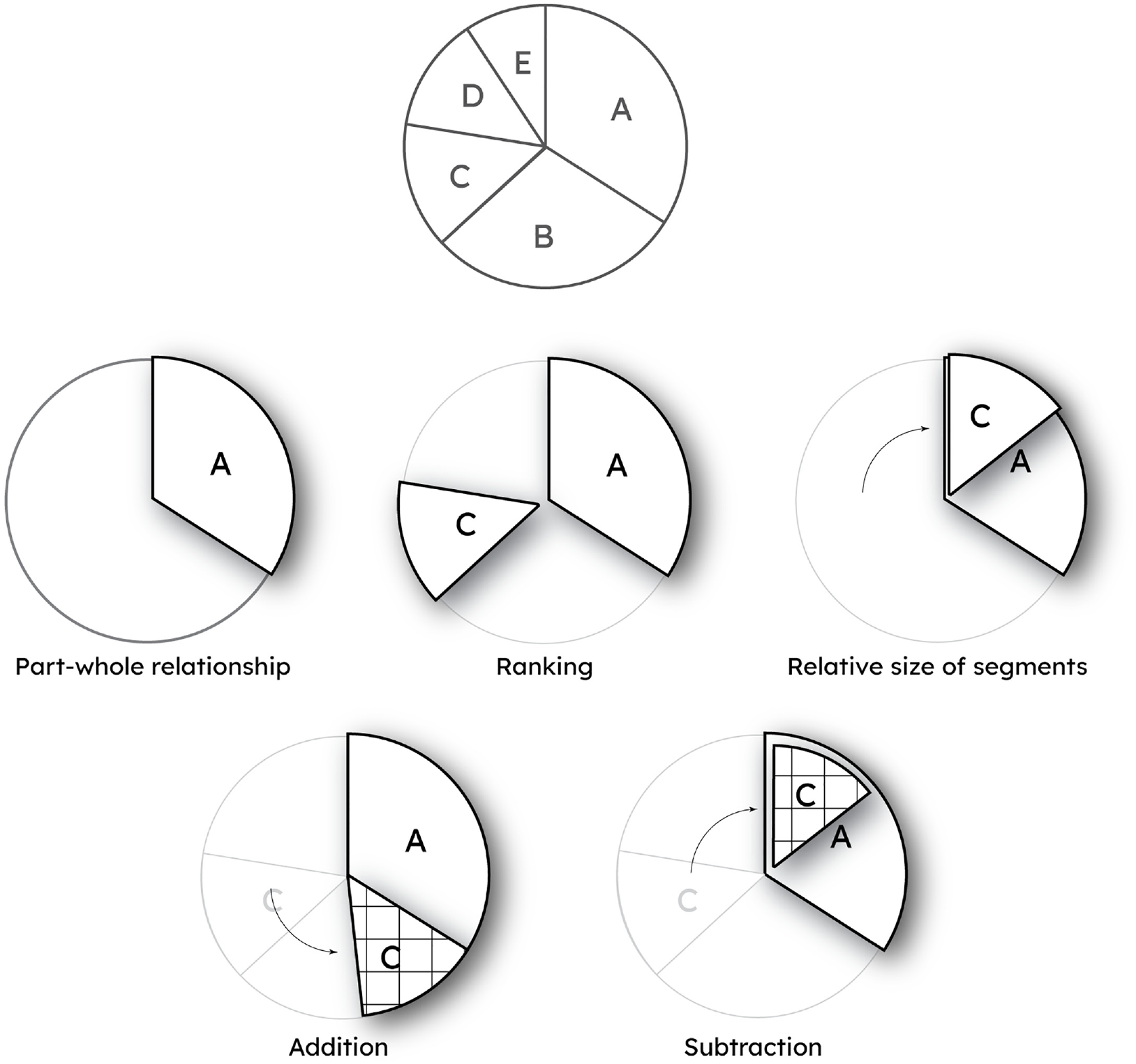
An example pie chart and the quantitative metrics that can be extracted from it. For a single element (e.g. segment A) these are the part-whole relationship (in combination with the circle), ranking against another element (in this case C), and estimating the relative size of a segment against another. In addition, the assessment of multiple segments (A and C) through addition and subtraction are also possible, although some virtual shifting of the segments is likely required depending on the relative location of the segments.
They can either compare a segment to the whole, half or quarter circle, thus extracting the part-whole relationship. But they may also directly compare segments, either to assess ordinal rank of one or more segments, or to extract a quantitative estimate of segment size. As Spence 35 has noted, addition and subtraction are also valid and important tasks for extracting information (but this was beyond the scope of this preliminary study).
Instinctively, comparing segments seems a less accurate strategy, as the viewer must deal with two (or more) segments of unknown size, whereas comparing the size of a segment against the circle at least means there is only one unknown to estimate. There is substantial disagreement in the literature comparing bar and pie charts as to what the “appropriate” strategy is for using pie charts, but this seems too reductionist, as there is no reason why multiple strategies and metrics cannot be employed to extract information from any graph.
Suffice to say, exactly how participants in these studies are prompted to extract information from a pie chart makes a substantial difference to the accuracy recorded. Figure 3 provides a summary of the accuracy of bar and pie charts as observed in previous graphical perception studies.
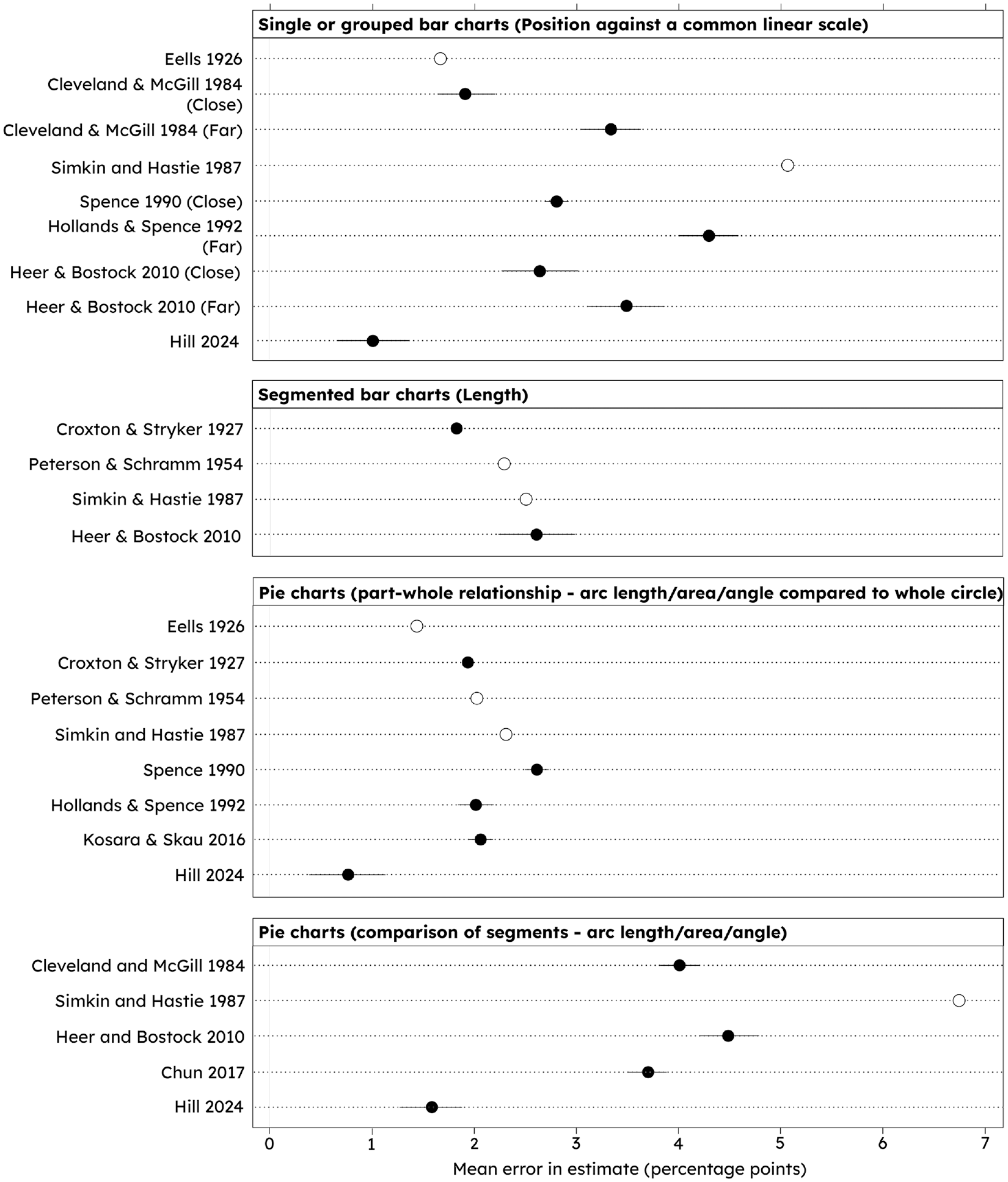
Summary of the accuracy of bar charts and pie charts from graphical perception studies. The relevant perceptual task is noted in parentheses. Close = compared bars are adjacent to each other, Far = compared bars are separated by one or more bars. Error bars represent standard error of the mean; white dots represent studies where no standard error was given. Note this study (Hill 2024), finds a higher accuracy for all chart types.
Summarizing Figure 3, the question asked of the participant is often a crucial distinction in the accuracy of a pie chart. If participants are asked to judge the relative change in size of one segment against another then the bar chart is often more accurate than the pie chart.8,36–38 This pattern seems to remain in the few studies where participants have been asked to rank several segments in descending order.14,39 However, if participants are asked to judge the proportion of the circle taken up by the segment (i.e. the part-whole relationship), the pie chart is on a par, if not better, than the bar chart.2,11,12,35,36,40,41
I therefore suggest two main observations from this review. First, a clear issue is that many studies focus on only one of the two main metrics that can usefully be extracted from a pie chart (ranking/relative segment comparison, or the part-whole relationship). As discussed, many authors go farther than this, and argue the metric they have measured is the only relevant way to use a pie chart.
This variation in the strategy tested leads to results and conclusions that are often incomplete, and not comparable with other studies. Indeed, this crucial aspect of conflicting context is apparent in the very first correspondence during the bar-circle controversy with Eells 2 testing the part-whole relationship, while von Huhn and Croxton tested the relative size of segments. 42 Both studies produced valid results in the context of the reference frame with which they viewed the problem, but they are essentially comparing apples and oranges.
Second, note that regardless of the question or chart type, the mean errors identified in all of the studies represented in Figure 3 are relatively small, typically one or two percentage points. That is, we seem to be pretty good at estimating approximate magnitudes from bar and pie charts. Again, this points to the need to answer the question of “how good is good enough?” when it comes to accuracy.
The assumption that the pie chart perceptual task is either area or angle is over-simplistic, as shown numerous times in studies by Kosara and others.43–45 An interesting study by Siirtola et al. 14 investigated where people’s gaze lies when extracting information from pie charts, which indicated that people distribute their gaze across the pie chart, rather than at the edges, but that variation in individual strategy was high. This suggests that there are multiple visual strategies, be it area, angle, arc length, or a mixture of all.
My own technique for interpreting pie charts is to quarter the circle and baseline my segment estimates from there. This seems to work well, and speaking to others many use a similar technique. There is perhaps some evidence for this strategy in the literature, given participants are more accurate when identifying segments that represent 25%, 50%, and 75%.11,46,47
This would provide a logical reason why the pie chart is as, or even more accurate, than the bar chart when used to extract the part-whole relationship, but is less accurate than the bar chart when estimating segment against segment, as the circle can no longer be used as a known anchor.
I suspect using the circle as a baseline from which to estimate the size of a segment improves the accuracy (or at least precision) of part-whole estimates, which seems to be supported by the comparison of results shown in Figure 3. That is, perhaps a task is missing from the perceptual task hierarchy: proportion of a common radial scale. So far as I can see, this has never been explicitly considered before; other studies mention arc length as a potential perceptual task, but never that the circle represents a known anchor point that might improve accuracy.
Objectives of study
Many previous studies focus only on one metric that they think compares best to the main perceptual task in the bar chart. However, a fairer test would be to test the bar and pie chart against multiple metrics for estimating the rank or magnitude of a single segment.
In addition, many studies report only the average bias. As recent studies have shown,18,48 between-participant variation in bias can be as large or larger than the average between-chart bias. Thus, understanding the distribution of response bias is just as important as understanding the average bias in responses.
Accuracy and response time are easy to measure and so naturally make up the majority of the data available to assess graphical perception. However, it is now becoming much easier to quantify other important factors such as ease of use by measuring cognitive load, and visual strategies can also be tested using gaze tracking.
Therefore, in this study I have quantified four main aspects to give a more rounded picture of graphical comprehension: bias, precision (as measured by the standard deviation of the error), response time, and cognitive load.
Cognitive load was assessed through pupillometry (assessing change in pupil dilation), which has been shown to be a reliable indicator of cognitive effort.49–51 As far as I am aware this is one of only very few data visualization studies to measure cognitive load through pupillometry 52 or other methods such as electroencephalogram (EEG).53,54
Given the rise in popularity of donut charts (a pie chart with a hole cut out of the middle), especially in Business Analytics and data dashboards, I also included this chart type.
In summary, this study’s objectives were to:
Quantify the accuracy, response time and cognitive load required to rank two elements of bar, pie and donut charts.
Quantify the accuracy, precision, response time and cognitive load required to estimate the part-whole relationship through bar, pie and donut charts.
Quantify the accuracy, precision, response time and cognitive load required to estimate the relative size of two elements (bars and segments).
Assess the evidence for the use of a common radial scale in the comprehension of pie and donut charts.
Materials and methods
Chart design and generation
The motivation for the study is to compare the pie chart holistically against the gold standard of perceptual tasks for extracting categorical information: position against a common scale.
As others have reasonably argued, 55 a segmented bar chart is the most appropriate chart to compare with the pie chart, as it is also designed to represent the part-whole relationship. However, as the primary segmented bar chart perceptual task is length, comparing the pie chart against it would not address the main criticism of pie charts, which is that area and angle are not as accurate as position against a common scale. Also, using a segmented bar chart doesn’t seem to be the specific recommendation of those suggesting to avoid pie charts, rather that any bar chart will be better.5,6,13
I therefore chose a single, two-element bar chart (see Figures 4 and 5), because this clearly represents a part-whole relationship with the first element representing the anchor of 100%, while still invoking the position against a common scale perceptual task. In order to be able to judge responses on a like-for-like basis between all charts, magnitude questions were designed to elicit responses between 0% and 100%.
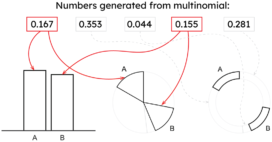
To generate the 50 graphs for each chart type, five numbers were first randomly generated from a Multinomial distribution. The relative size of these numbers produced the proportions to be used in the pie and donut charts. Two of the five numbers were then randomly selected to be A and B. These two numbers were then used to generate the bars for the bar chart, and the highlighted segments for the pie and donut charts (arrows).
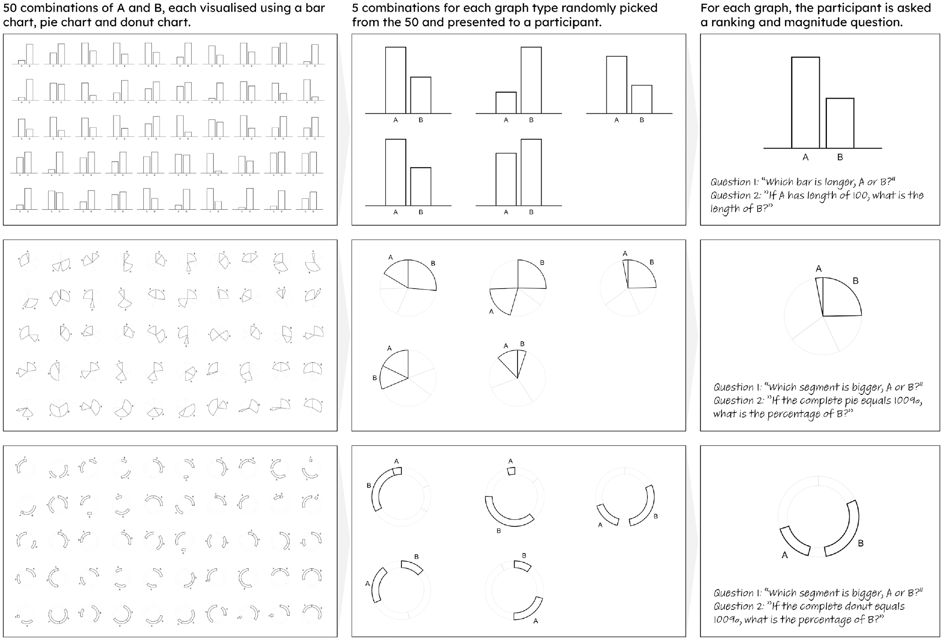
Experiment 1 methodology. Fifty combinations of A and B were randomly generated and visualized using bar, pie, and donut charts. The 150 charts were uploaded into Qualtrics. Of these, 10 bar, 5 pie, and 5 donut charts were randomly presented to a participant. The participant was then asked a ranking and magnitude estimation question for each chart presented.
The standard form for all chart types were designed as simply as possible, so that only the important graphical encoding elements could be used to extract information.
To create the charts I generated 50 random variables from a Multinomial distribution, each with five elements. Two of these numbers were then used to create the elements A and B (see Figure 4) that would be used to extract relevant metrics from the charts.
These chart designs allow for all metrics to be fairly tested across a wide range of part-whole magnitudes (from around 0% to 70% for bar charts, and 0% to 45% for pie and donut charts).
For the ranking metric, participants were asked: “Which bar is longer, A or B?” or “Which segment is bigger, A or B?.” For the relative magnitude question, participants were asked: “If A has a length of 100, what is the length of B?” or “If segment A is 100, what is B?.” The relative magnitude question for the bar chart also tests the part-whole relationship. However, for the pie and donut charts the part-whole relationship is extracted through the question: “If the entire pie/donut equals 100%, what is the percentage of B?.”
One concern in the design of the charts was that the numbers contributing to the part-whole relationship are different between bar and pie/donut charts. For bar charts, the part-whole relationship is defined by the ratio of A and B, whereas for the pie and donut charts it is the relative size of B compared to the circle. This could have the potential to bias the part-whole estimates between the chart types, because of response power laws such as Weber’s or Stevens’ Law.4,47,56,57
However, pilot trials suggested that the bias in participant’s part-whole estimates were independent of the true estimate, for example the bias was no different whether the proportion estimated was 5% or 85%. Therefore, the results of bar and pie/donut charts should be comparable.
The final results showed a strong proportional relationship between true proportion and estimated proportion for each chart type (see Supplemental Figure 3), and so I am confident this difference in the part-whole derivation did not unduly affect the results.
Experimental setup and design
Experiment 1
The 50 examples of each chart type were uploaded onto the online survey software Qualtrics. Each participant was randomly presented 10 bar charts, 5 pie, and 5 donut charts. Extra bar charts were presented to maintain equal weighting between “bars” and “pies.” Examples of the randomized charts are given in Figure 5. A full depiction of the 150 charts is in the Supplemental material (Figure 1).
Participants were asked the ranking and part-whole estimation questions as described in the section above. After participants completed this experiment, they were given a 5 min break before being asked to continue with the remaining experiments.
Experiment 2
When elements A and B are of very different sizes it should be easy for anyone to accurately rank elements, regardless of the chart type used. Thus, a more interesting insight was at what point the accuracy of ranking dropped. In Experiment 2, I used a similar protocol as for Experiment 1, but this time with a smaller, curated selection of charts, where the sizes of elements A and B were similar (±5 percentage points). Ten charts from each chart type were randomly presented (see the Supplemental material Figure 2). This allowed a much more detailed picture of accuracy and precision when the elements of a chart are similar in size.
Experiment 3
The first two experiments collected data on all chart/question permutations except for estimating relative sizes of segments for pie and donut charts. Therefore, in this final experiment participants were asked to directly compare segments on a pie or donut chart, using the question “If segment A is 100, what is B?.”
Participants were presented a block of 10 random pie charts and then 10 random donut charts, from the same list as in Experiment 1 (Supplemental Figure 1).
Participants
Sample size calculations from online pilot trials of the experiment suggested that 30–40 participants, shown five examples of each chart type, would have sufficient statistical power to detect a 1 percentage point difference (
Forty-two participants were recruited from the Business Analytics MSc at the University of Surrey. Experimentation started in February 2021 and, due to COVID restrictions, completed in September 2022.
The study was performed under the guidelines of the University of Surrey’s Research Integrity and Governance Office (RIGO). The study was self-assessed using the University of Surrey’s SAGE-HDR (Self Assessment for Governance and Ethics - Human and Data Research) form. Given the low-risk nature of the study, it was not necessary under the university’s protocol to obtain further approval from RIGO itself.
Participants were given a Participant Information Sheet to read, and were required to give written consent for data collection before the experiment started. All data was anonymized during the collection process by giving each participant a unique reference number that was not identifiable during analysis.
Analysis
Tools
For eye-tracking I used a Tobii Pro Fusion eye tracker, which recorded gaze data every 8–9 ms. Data was collected through iMotions v9.0, taking advantage of the Qualtrics online survey integration. All statistical analysis was conducted in R (v4.2.0) accessed through the IDE RStudio (v2022.07.1). The code and summarized data used to run the analysis is available through the Supplemental Information.
To assess statistical significance, a two-proportion z-test was used to assess the ranking metric for each combination of chart type (bar, pie, donut), using the prop.test function in R.
For the part-whole estimates, relative magnitude estimates and peak pupil dilations, statistical significance was assessed using a combination of ANOVA and, where significant differences were found, multiple t-tests to determine significance between individual chart types. This was done by extracting the p-values generated for chart type from the general linear model function in R.
Response times were heavily skewed, and so the non-parametric Wilcox test was used to test for statistical significance in response times between chart types.
Error removal
A number of participants made systematic errors. For example, on the part-whole estimation question during Experiment 1, some participants estimated the size of element A, rather than B, or gave impossible answers (numbers above 100, which may have been participants answering in degrees rather than percentage points). Where it was clear a participant had made systematic errors, all of their responses were removed. Thus, out of 42 participants, 36 were eventually included in the analysis.
This was a relatively high exclusion rate (14%), which occurred due to issues in following the correct format, mainly for the pie and donut chart questions, but also sometimes on the bar chart questions. Due to the design of the charts, it is easier to mix up answers for A and B on the pie and donut charts leading to exclusion, but I cannot rule out that some participants lacked a familiarity or understanding of pie and donut charts.
Pupil dilation and cognitive load
Peak pupil dilation was calculated by the difference between a participant’s pupil dilation at the beginning of a question and the maximum pupil dilation recorded during that same question.
An example of the gaze and pupil dilation time series data for one participant is given in Figure 6, for Chart 22 when answering the magnitude estimation question of Experiment 1. The eye tracker captured cognitive load changes consistently and accurately for all participants, with increases in pupil dilation occurring at the points where participants were grappling with the substance of the question.
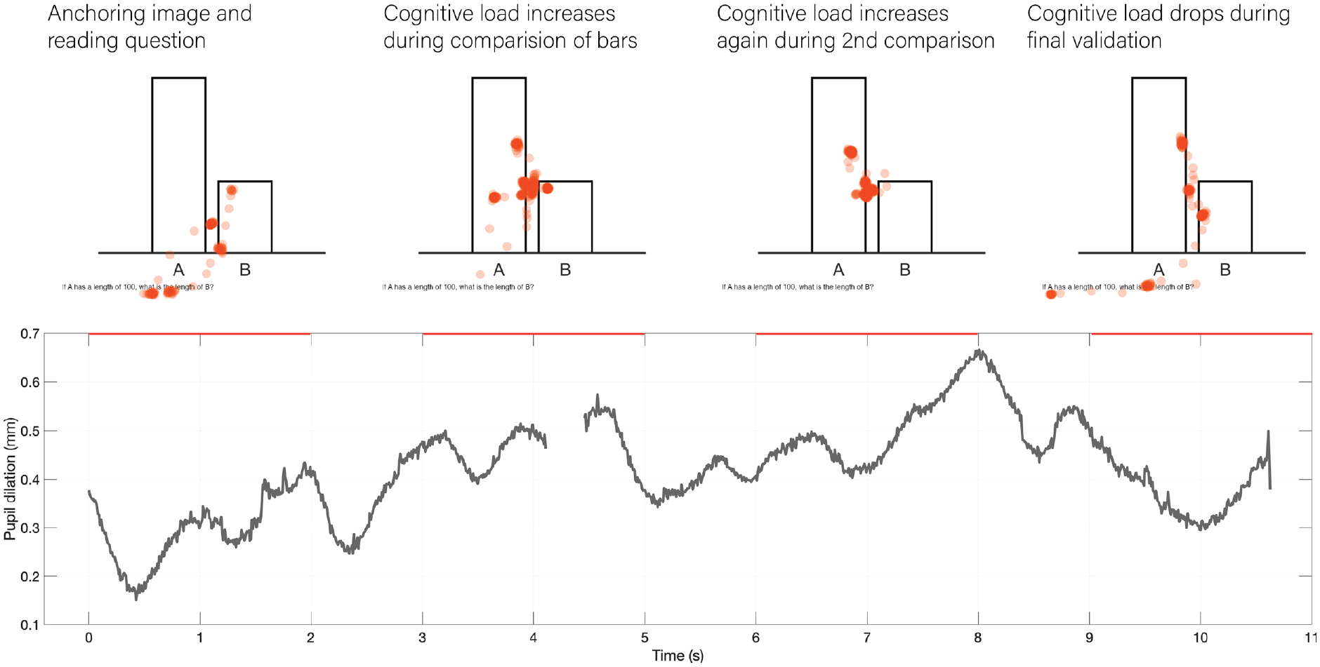
Example of gaze and pupil dilation time series for the presented stimuli. Dots on each graph represent gaze positions during selected two-second periods.
Results
Accuracy and response times of ranking task
For the question “which is [longer/bigger], A or B?,” the mean accuracy is given below in Table 1. For Experiment 1 (no control over difference in element size) there was no statistically significant difference between any chart type. However during Experiment 2, which constrained the charts presented to only those with small differences between A and B, there was a big drop in accuracy for pie and donut charts (see Table 1 and Figure 7a).
Accuracy of correctly identifying the biggest element.
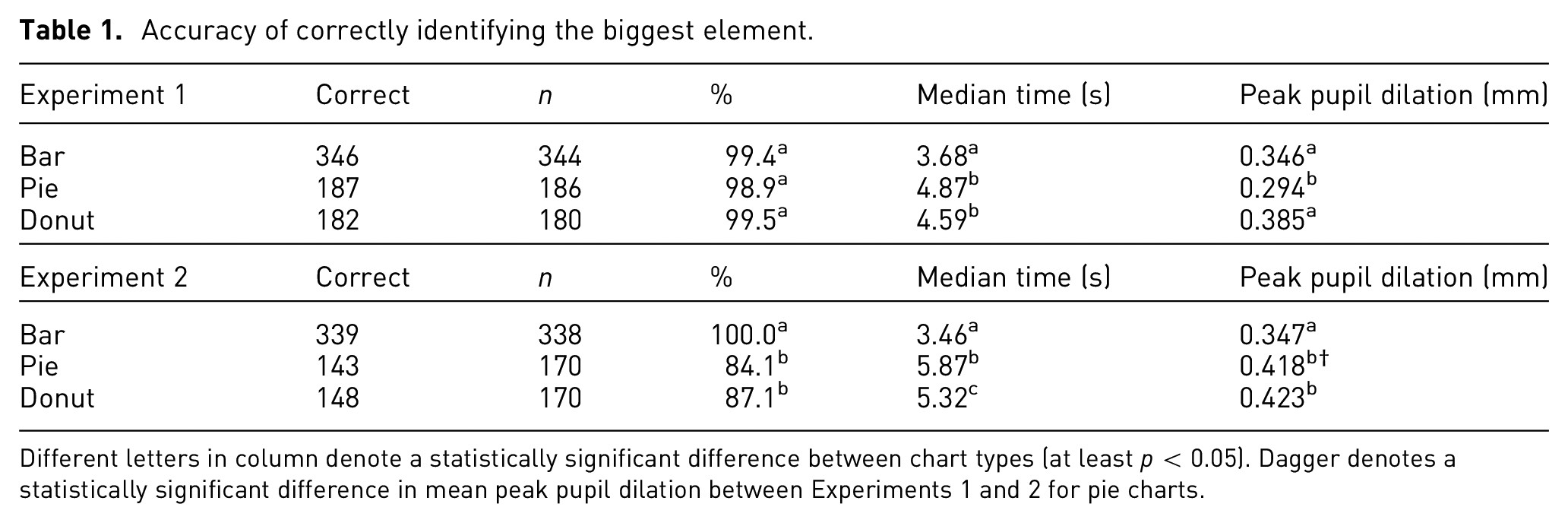
Different letters in column denote a statistically significant difference between chart types (at least p < 0.05). Dagger denotes a statistically significant difference in mean peak pupil dilation between Experiments 1 and 2 for pie charts.
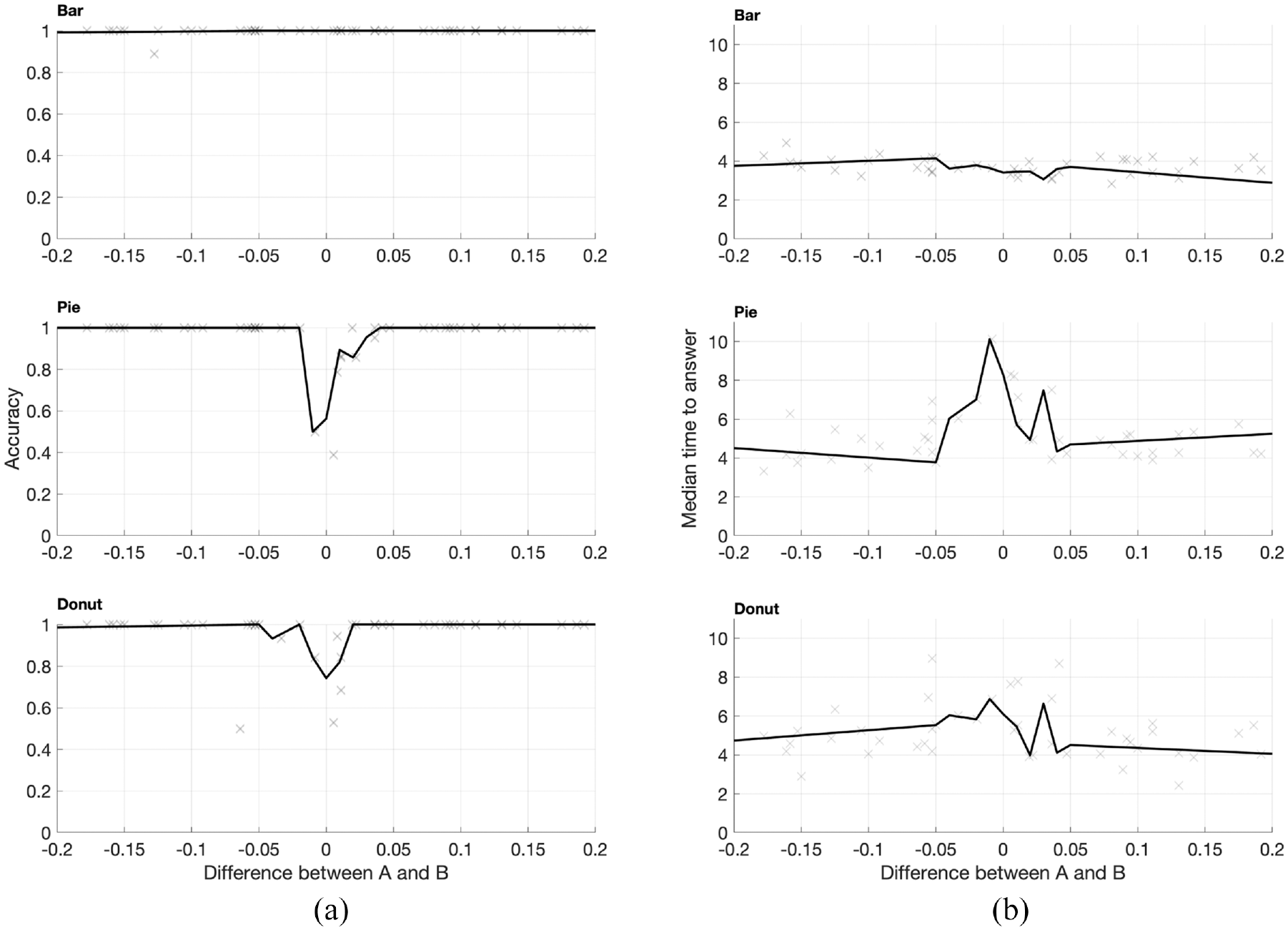
Mean accuracy (panel (a)) and median response times (panel (b)) for ranking question. Crosses represent the mean accuracy/median response times of each chart type, the black line represents the average over steps of 0.01. Pie and donut charts suffered a large drop in accuracy if the difference between A and B was less than approximately three percentage points.
There was a significant difference in the response times between bar and pie/donut charts in Experiment 1 (Figure 7b), with participants taking, on average, around a second longer for pie/donut charts. This difference was more pronounced in Experiment 2, where the median response times were around 2 s longer for pie and donut charts.
Cognitive load varied according to chart and task. During Experiment 1, peak pupil dilation was significantly lower for pie charts than either bar or donut charts. However, this switched during Experiment 2 (when differences were small), with the bar chart generating significantly lower pupil dilations. However, for all charts, the peak pupil dilations recorded (between 0.3 and 0.4 mm) were equivalent to the cognitive effort required to memorize a three digit number 49 ; that is, ranking elements on simple chart types such as bar and pie charts is a simple task for virtually everyone.
In summary, there is little difference in accuracy between chart types in ranking when elements are appreciably different in size. However, when elements are similarly-sized (less than a three percentage point difference in A and B), the bar chart is clearly the superior, more precise encoding mechanism. This broadly agrees with results from similar previous studies.14,39,55 Bar charts tend to be quicker to use in all cases, but especially so when differences in A and B were small.
Accuracy of estimating part-whole relationship
In this task participants answered the questions “If A is 100, what is the length of B?” or “If the entire [pie/donut] represents 100%, what is the percentage of B?.”
One complication was that the bar chart perceptual task was different depending on whether A or B was the tallest element. Participants were reasonably accurate when element A was bigger (a part-whole estimate), but much less so when B was bigger (a one-to-many estimate). Thus, below I only use data for bar charts where A was the biggest element.
Errors in magnitude estimation for the part-whole task were approximately normally distributed for all chart types (see Figure 8a). Mean error rates are shown in Table 2. Errors were small and there was no statistically significant difference between chart types.
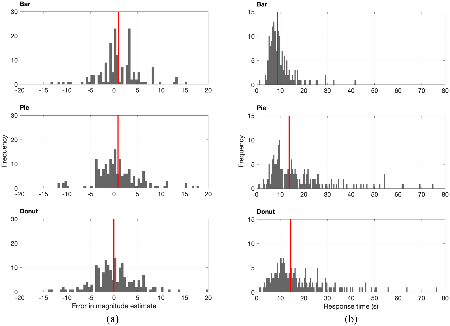
Mean accuracy (panel (a)) and median response times (panel (b)) for magnitude estimation question. (a) Error in estimating magnitude of bars/segments; vertical line represents mean error. (b) Response time in seconds; vertical line represents median time.
Accuracy, precision and response time for assessing the size of element B.
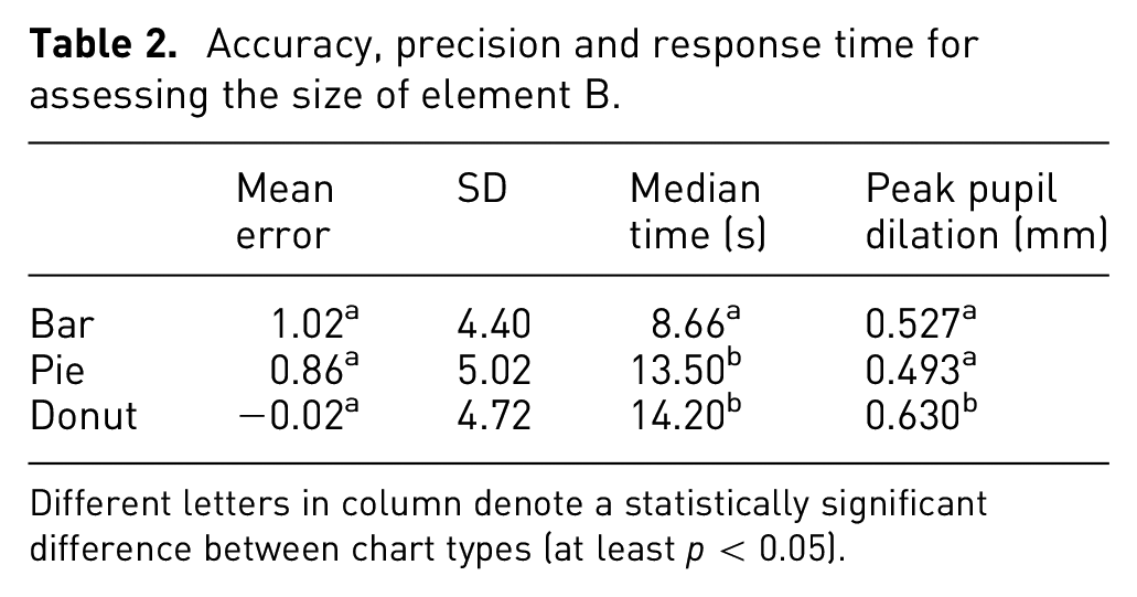
Different letters in column denote a statistically significant difference between chart types (at least p < 0.05).
The response times were, on average, longer for both pie and donut charts (see Table 2). Despite instructions to use their instinctive judgment, a number of participants took a very long time (up to 80 s) to provide a response to pie and donut charts (see Figure 8b).
The higher median response times for pie and donut charts reflects a greater variance in performance between participants: many participants were equally fast as using pie charts as bar charts, but there was a substantial minority who took much longer with pie and donut charts. Interestingly, participants who took a very long time to respond were, on average, just as accurate as their faster peers.
Cognitive loads were generally higher than for the ranking question, but this time there was no statistically significant difference in mean cognitive load between bar and pie charts. Peak pupil dilations for this task were higher, around 0.5–0.6 mm, which are equivalent to dilations seen during relatively difficult multiplication tasks. 49
While chart type did have an effect on cognitive load, the main driver was speed of response (see statistical analysis in Supplemental Information). Participants who took longer to respond, and therefore probably were less confident/experienced, required more cognitive effort to extract out the relevant information.
Accuracy of estimating relative size of elements
For bar charts, the part-whole and relative size estimation tasks are the same. However, for the pie and donut charts, the relative size estimate is different, requiring two segments to be compared with one another, rather than a segment and the circle. As noted for bar charts and the part-whole estimation task, if the element B was bigger than A the task became a much more difficult one-to-many estimate, rather than a part-whole estimate, resulting in catastrophic drops in accuracy. Therefore, those charts where B is bigger than A have been excluded.
The results for this task are shown in Table 3.
Accuracy, precision and response time for assessing the relative size of B against A (where A is the bigger element).
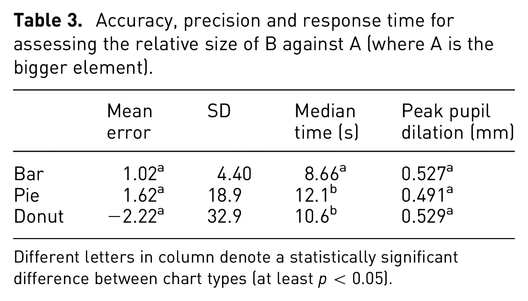
Different letters in column denote a statistically significant difference between chart types (at least p < 0.05).
Surprisingly I did not observe the same magnitude of drop in accuracy as other studies have done (see Figure 3),8,36,38 with mean error being only slightly higher in pie and donut charts compared to bar charts (but which was not statistically significant).
However, what was substantially different was the variance in responses, with large increases in standard deviations for pie and donut charts. This seems logical: the removal of the circle as a baseline does not affect accuracy so much, but it does mean participants cannot be so precise, as now there is no known anchor to baseline their estimate against.
Median response times were again longer for pie and donut charts compared to bar charts. However, there was little difference in peak pupil dilation between chart types.
Perceptual task of pie and donut charts
The last main research objective was to assess the perceptual task used for pie and donut charts, be it area, angle and/or arc length. An additional test was of my theory of a common radial scale. The results given above support this theory, as prompting participants to extract the part-whole relationship was a much more precise task than comparing the relative size of segments, however conclusive proof could only come from gaze tracking.
The animated fixation maps (see Supplemental Information) clearly showed that, when extracting information from bar charts, most people followed the same strategy of essentially bisecting the larger element with the smaller element (see Figure 9 for an example).
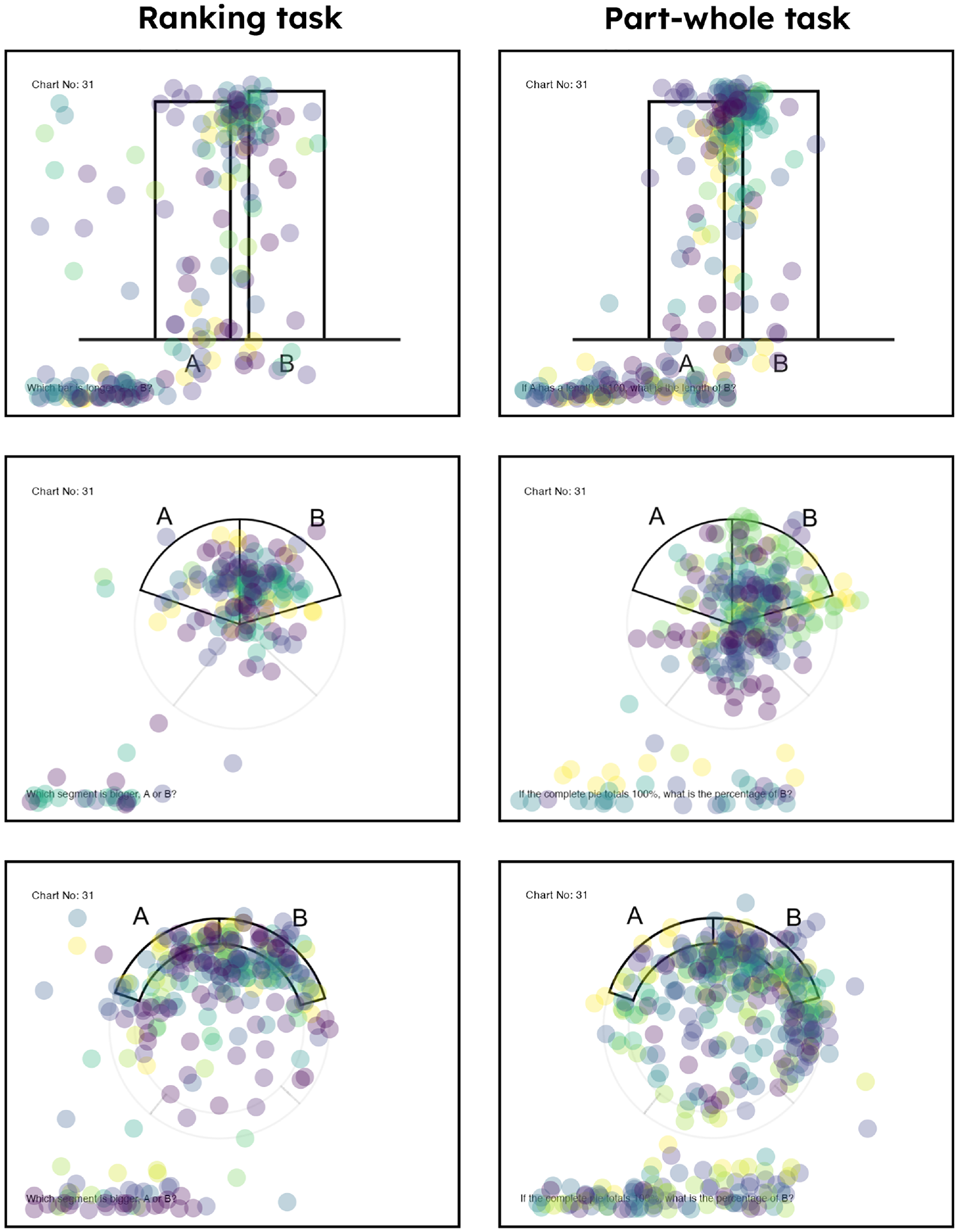
Examples of fixation data from eye tracker (see Supplemental Information for more detail). Each dot represents a fixation, each color represents an individual participant. The bar chart strategy is quite clear: all participants focused on the space between the tops of the bars. The pie chart strategy was less clear, and probably reflected at least some variation between participants in the exact strategy used.
However, the strategy used for pie and donut charts was less clear: there was no conclusive evidence for any perceptual task, be it angle, area, arc length or proportion of a common radial scale (see Figure 9 for an example, or refer to the Supplemental Information for more detail). The evidence seems to agree with the results of Siirtola et al., 14 who found that gaze was distributed across the segment, with no consistent strategy of exactly where participants looked.
The results of the eye tracking do seem to suggest that at least some people are using area and angle to extract information out of the pie chart. However, perhaps this is combined with the instinctive knowledge that the circle is 100%, which allows participants to be more accurate than might otherwise be expected. There was some suggestion at least a couple of participants were using a quartering strategy (i.e. comparing the segment against the 25% mark) that would suggest the use of the common radial scale, but this was far from conclusive.
I had hoped using gaze tracking would shed some light on the exact perceptual task/s that participants used to decipher pie and donut charts, so it was disappointing that there was no obvious strategy. Further analysis/research is required to establish the exact perceptual task, although as others have found it is increasingly likely that the assumption of simple area/angle comparison is an over-simplistic one.41,44,45
Visualizing the accuracy of pie charts
As discussed in the introduction, a pertinent question is just how much accuracy is required to successfully extract an insight? This depends on a case-by-case basis, but I would argue graphs and charts are not intended to communicate decimal-place accuracy, but rather the gist of an insight quickly and easily. This is especially true for bar, pie and donut charts, as they can only effectively display relatively simple data (5–7 categories).
While it is not possible to describe all the contexts in which someone may want to extract information and insight from a bar or pie chart, one illuminating visualization is to simply display data that changes by the rough order of magnitude observed in this and other previous studies. In this study I found that most people could identify the magnitude of a pie segment within ±3 percentage points, with the average bias being around one percentage point.
In Figure 10, I have taken values that were displayed in a donut chart from an investor annual report, 31 and then varied those segment values by one, two, and three percentage points. It’s easy to see just what impact these errors have. For one percentage point the effect is minimal, and it’s difficult to see much change; for two percentage points the errors become more apparent; and at three percentage points there is a clear discrepancy in the magnitudes of the segments.
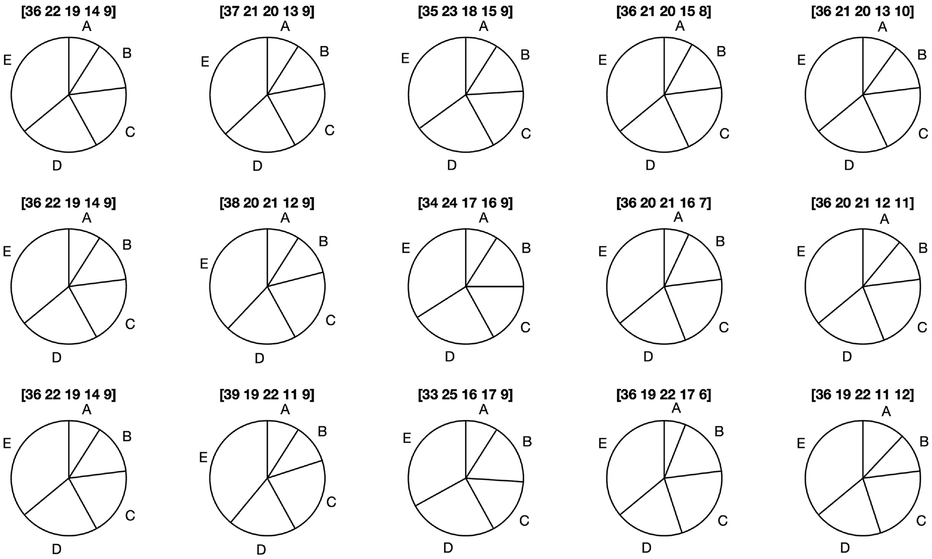
Visualizing one, two, and three percentage point errors for a pie chart of sales data 31 (leftmost panel). The exact values of the segments are given in the square brackets above the chart. Only at three percentage points do the errors become readily apparent.
The bottom row of this visualization is a fairly worst-case scenario, as we would not expect a person to consistently make three-percentage point errors in magnitude estimation; rather any observations will be infused with many small errors, with perhaps one or two bigger ones. Nevertheless, it sets in context the influence of bias on insight extraction, which only really become visible and problematic when errors are of three or more percentage points.
While this is a relatively abstract test, it does support the thrust of my argument: that even if the accuracy of a pie chart is lower than an equivalent bar chart, it will be rare that that bias will materially affect the extraction of the insight, or change a decision. The average magnitude estimation bias for all charts in this study was around one percentage point; I cannot think of an example where such differences would materially affect the successful extraction of relevant information (e.g. E is the biggest, D is roughly the same size as C, A is around 10% of the total).
Discussion
The distaste for pie charts is clear in the scientific literature. In the practitioner community, the outcome of the “bar-circle controversy” has clearly come down in favor of those against pie charts. However, as Figure 3 shows, there is little quantitative evidence to support this view.
The prioritization of accuracy has to be tempered by the objective of charts and graphs, and that a more pertinent question to “which chart is more accurate?” is “how accurate is accurate enough to understand the insight?.” I therefore frame this discussion around two questions: “are pie and donut charts less effective than bar charts, and if so in what context?;” and “Can the pie and donut chart be effective?.” These are necessarily more difficult to answer conclusively than “which chart is more accurate?”, and must also invoke a subjective, case-by-case response. However, I believe they should shed better light on the debate over whether to use pie charts or not.
“Are pie and donut charts less effective than bar charts, and if so in what context?”
There was similar accuracy and precision in part-whole estimation tasks (arguably the main use for pie and donut charts) (see Table 2), with the mean bias around 1 percentage point for all chart types. These accuracy measurements agree with similar studies35,44,58 (see Figure 3). Given graphs and charts are designed to quickly communicate a trend or pattern in data, I think a one percentage point error margin is adequate in most plausible circumstances for extracting insights from a simple bar, pie or donut chart. Figure 10 demonstrates that such a conclusion is reasonable.
The only major difference in accuracy was during the ranking exercise when the relative difference between A and B was very small (less than three percentage points); in this case bar charts were clearly the more precise chart type. This broadly agrees with previous ranking studies.14,39,55 This is perhaps the only clear-cut case where the accuracy of bar charts is unquestionable; if chart users must be able to rank elements at a percentage point accuracy, then a bar chart is a better choice than a pie or donut chart.
Historically, when participants are asked to assess the relative size of segments on a pie chart, this leads to a poor performance compared to bar charts. However, the mean errors I observed for this task (Table 3) showed no statistically significant difference between chart types, but the responses given for the pie and donut charts were much more variable than for the bar chart.
With regards to ease of use I looked at two metrics. The median response times were consistently quicker for the bar chart compared to the pie and donut charts. However, there was little to choose between cognitive loads for each chart, with all being relatively easy for most people to engage with, and statistically significant differences swapping depending on task.
The longer response times for pie and donut charts are largely due to a minority of participants taking a very long time with these chart types. However, the best performers in terms of speed and cognitive load were equally as quick with pie charts as bar charts. So there did seem to be an important between-participant variation in ease of use.
Broadly speaking, the more confident, practiced participants found all three chart types equally easy to use, but less confident people did struggle relatively more with pie and donut charts.
In summary, all charts were useful displays of simple, categorical data. As suspected, the pie and donut chart were as accurate as the bar chart for the part-whole metric. In addition, they are as easy to use for most people as the bar chart. However, the bar chart does seem to be quicker to use, and has an advantage in certain situations, for example when ranking similarly sized elements.
That is, a reasonable conclusion from this study is that the bar chart is more flexible than the pie or donut chart, which depending on circumstances could make it more effective in certain situations. The encoding mechanism of aligned bars is good for both ranking and estimation tasks. Thus, if a chart designer is unsure about what information needs to be extracted from a display of simple, categorical data, the bar chart may represent a safer option if accuracy and precision are vital.
“Can the pie chart be effective?”
Depending on your perspective the results of this study can be interpreted in two ways. If the common decision criterion applied in other papers is used - “what chart is more accurate?” - then the bigger differences in time and accuracy are in favor of the bar chart.
However, while accuracy might be the over-riding decision criterion for quantitative analysts and scientists, there are many use cases outside of scientific journals, and indeed the most popular use of pie and donut charts is likely to be found in business reports and data dashboards.
There is strong evidence from cognitive psychology (in particular fuzzy trace theory and ecological rationality) that people do not make decisions on precise numbers, but rather the “gist” of them.20,21,23 For example, being able to recall numbers precisely makes little difference to understanding the gist of an numerical insight (A was bigger than B, trend was up etc). 59
Thus, as long as there is sufficient accuracy for a viewer to extract the correct insight, this should be enough, as viewers will often either not use, or not need, decimal place accuracy to act upon the simple quantitative information provided by a bar or pie chart.
Indeed, it seems a neglected context is that in scientific fields we will attempt to generate and record data precisely, but this luxury is not available in many analytical disciplines. In my experience, outside of financial data, most business data will be messy and noisy, driven by interacting random processes and often poor data collection/management. Analysts using this data would be lucky to achieve results that are not surrounded by substantial error margins, which would make a one or two percentage point drop in accuracy seem irrelevant.
Figure 10 visualizes the impact of this extraction bias. These percentage point errors are equivalent to rounding up the exact numbers of 98,325, or 99,124, to 100,000. This type of rounding up is done all the time by analysts and decision-makers alike, as it’s much easier to deal with round numbers.
I would therefore argue that an average error of one or two percentage points in a chart is acceptable for the intended purpose of communicating insights quickly and effectively. Certainly for the errors associated with extracting the part-whole relationship, I struggle to envisage the context in which these minor variations lead to materially different conclusions on the possible insights that could be extracted from these charts.
Another pertinent point is to understand a chart or graph’s reason for being. All guides to producing good data visualizations start with understanding the context in which the data was generated, and to define the insight to be communicated.5,6,13 While the bar chart may be more flexible in situations where it is not known which insights are to be extracted, I would suggest that this is not an optimal state of affairs anyway, and that the analyst must take some responsibility to determine what that insight is before designing the chart.
In these circumstances, where we can at least anticipate which metrics will be important to communicate insight, I would argue that there are many situations where a pie or donut chart is a better choice than a bar chart. Where the part-whole relationship contributes to the insight, I think the physical analog of slicing up a pie or cake can help users interpret the data better. It is no less accurate than the bar chart, and it has the advantage of a ready physical analog to aid understanding.
A valid alternative in this situation could be a segmented bar chart, but the pie and donut chart are often more compact and can be more visually striking. You need look only at your smartphone to see how often simple pie and donut charts are used to represent battery life, activity completion etc. They communicate part-whole information very efficiently and compactly.
The ultimate question of which chart to use comes down to the designer, who in best practice will have a good idea of context, insights and audience before starting to produce the chart in question. Accuracy is of course vital, but we must also ask “how good is good enough?.” I suggest that all chart types - bar, pie and donut - are useful and effective when used appropriately in the context of communicating insights quickly and efficiently.
Caveats and interesting notes
Insights from struggling participants
While most people extracted information from pie and donut charts just as well as they did from bar charts, a small but notable minority did struggle with them. The median response times for pie and donut charts were longer mostly because of a small number of participants taking a very long time to respond (up to 80 s).
This struggle is also reflected in the animated fixation maps (Supplemental Information). Those participants taking longer had many more fixations, and seemed to check and recheck the question/chart numerous times. This points to at least some participants struggling with all charts, but the effect was magnified with the pie and donut charts.
I suspect this is an issue with a lack of confidence or familiarity rather than innate understanding, as these slower participants did eventually respond just as accurately as their faster peers.
Perhaps of more significance was that a number of participants were excluded for systematic errors. For example, a common error was to provide an estimate of element A rather than B, or what seemed to be using degrees rather than percentage points. Participants were excluded for incorrectly interpreting all chart types, but there were more that seemed to have an issue with pie and donut charts.
If any result from this study or previous studies would persuade me against the use of pie and donut charts it would be this one. The supposed drop in accuracy of the pie chart relative to the bar chart is likely inconsequential in terms of decision-making, but a significant proportion of people taking a very long time to extract the correct information from a pie or donut chart would be concerning.
However, I suspect that training and familiarization would resolve most of these problems, if only because greater confidence would likely reduce the amount of checking and rechecking these participants did. It is certainly worth investigating further, as it should be easy enough to test whether some simple training could reduce the response times, cognitive loads and systematic errors of these participants.
Pupil dilation as a proxy for cognitive load
A novel addition over other studies was the use of pupil dilation to measure cognitive load. Overall, the results from the eye tracker made sense and it appears that pupillometry is a robust, quick, non-invasive way to measure cognitive load during graph comprehension. For example, pupil dilation was highly correlated with the interaction of a participant with a chart (see Figure 6).
The only other attempts I could find to quantify cognitive effort during graph comprehension was by Anderson et al. and Peck et al.,53,54 who used EEG and functional near-infrared spectroscopy (fNIRS) respectively. Peck et al. found similar results to this study, in that they could find no consistent or large differences in effort in comprehending bar and pie charts.
These methods are probably more accurate than pupillometry, but measuring and analyzing pupil dilation is much easier and quicker, requiring little setup other than attaching and calibrating the eye tracker, and controlling the luminance of the lab environment. Once again I would argue the question is not “what is more accurate?,” but “how accurate is accurate enough?.” In these circumstances, where the differences in cognitive load are likely imperceptible to the participants, pupillometry seems a satisfactory methodology that can give us a useful steer on the cognitive effort involved.
Issues with graphical perception studies
The myriad ways in which a data visualization can be designed, displayed and interpreted make it very difficult to produce a decisive result for any graph or chart, as no one study can ever hope to capture every variation in design and extraction strategy. There are always trade-offs to be made; for example, the design of this study arguably has allowed good coverage of all segment sizes up to around 45% of the circle, but in order to do so, other, bigger, segment proportions are missed.
While I have attempted to assess the accuracy of multiple strategies as well as ease of use, this is still far from the holistic study that would conclusively prove the usefulness of pie charts one way or the other. For example, most studies only look at the ability of participants to extract information from one or two bars or segments, when in real life users will often be attempting to add and subtract elements. It seems only Spence 35 has investigated this, and found that pie charts were better for adding.
There are many other contexts that haven’t really been tested (or considered) in great depth. From Figure 3 we can see that the accuracy of bar charts seems to decrease when participants are asked to compare elements that are not directly next to each other, however this is rarely noted in the discussion around the comparative accuracy of bar and pie charts.
In addition, recent studies18,48 have identified that the between-participant variation in bias can often be just as large, if not larger, than the mean between-chart bias. This agrees with the results of this study, where I found many participants were equally as good with pie or bar charts, and much of the difference found between charts was concentrated in a minority of slower, less confident participants.
Suffice to say, graphical perception studies are useful empirical tests, but they have significant limitations. What is missing is a better understanding of graph comprehension and what cognitive models are being used when extracting information from charts and graphs. Pinker’s graphical comprehension model 60 was a good start, but most of the studies that propose a working cognitive model are fairly theoretical and generic.61–64
However, what both theoretical and empirical studies suggest is that the perceptual task hierarchy is useful, but far too simple. For the pie chart, it is highly likely that some people use one or other perceptual task, some use multiple tasks, and yet more people use strategies that just don’t fit into what we expect (e.g. my proposed position against a common radial scale).
Currently, there seems to be no proposed cognitive model detailed enough to make or test general predictions on pie chart accuracy. However, there are some interesting, specific hypotheses that could be tested with the right study. For example, several studies11,46,47 highlight the fact that participants are very accurate when estimating part-whole relationships of 25%, 50%, and 75%, given that we can take advantage of the known right angles.
There are some proposed models for this phenomenon, for example the cyclical power model, 47 however the driving force behind these empirical models has yet to be established. Regardless, we clearly seem to intuitively understand that a right angle drawn on a circle must represent a quarter, and a straight line through the origin, a half.
It therefore seems sensible that practiced pie or donut chart users do use this knowledge, as it should allow them to make better estimates of the part-whole relationship. While the gaze data from this study was not sufficient, the proposed perceptual task of position against a common radial scale could be a good candidate to test theories of visual cognition, as it is specific enough that it should be testable given a carefully designed study.
All this is to say that while there is surely much to be gained from further theoretical and empirical study, we are a long way from being able to conclusively answer the question of how accurate any chart is, and the only realistic current answer is: it depends.
That is not to say that graphical perception studies are not useful, but it is worth noting just how limited these studies can be, and to therefore be proportionate in the recommendations we make from them.
Practical implementation
As stated above, the bar chart is likely more flexible than the pie or donut chart. It is a jack of all trades, which in one of its many forms (single, grouped, segmented) will represent most simple categorical data acceptably. By its flexibility and thus ubiquity, it is likely more familiar to many non-quantitative users in business and other fields.
But this is all relative. Pie and donut charts, when used appropriately, can also effectively display simple categorical data, and this study and many previous studies show that people are more than capable of extracting information from these chart types.
Bar, pie and donut charts are really only appropriate for relatively simple datasets of no more than about five or so categories. If there are lots of groups/categories, then even a bar chart is probably not optimal, with dot charts, slopecharts, barbell charts and others being more efficient at communicating trends and patterns in this context.
Data visualization is a subjective art as much as an objective science. Even with the simple examples above, there are numerous caveats to both the science and the art. On the science side there is still much that is uncertain outside of the most simple interactions. Beyond the choice of perceptual task are the design considerations. Most analysts are not trained in design principles, and so make many mistakes this way.
Simple concepts like color theory, aspect ratio and gestalt principles will drive whether a chart or graph is easy to use and “looks” right. While the quantitative analyst may minimize the value of these concepts compared to accuracy, users will intuitively feel if something is off, contributing to whether that person can extract the insight they need to, but also whether they feel the data visualization is professionally-produced and hence trustworthy.
Further research
It is reasonable to assume that with such simple charts we have an intuitive feel for how to extract information out of them, but the results of this study suggests that some participants may benefit from some formal training. It would therefore be valuable to run a study where a short training protocol is given before the study to boost confidence and familiarity.
Cleveland and McGill’s 8 seminal work theorized (and partially proved) a hierarchy of perpetual tasks, however they were at pains to point out their work was preliminary and incomplete. So far as I can see, no-one has yet mentioned that the circle of the pie and donut chart acts as a known anchor that explicitly represents the whole in the part-whole relationship, and there are also many other gaps in the knowledge of the perceptual task hierarchy (e.g. accuracy of addition/subtraction).
All of this evidence suggests that defining position against a common scale as the most accurate perceptual task is over-simplistic, and basing the choice of chart type solely on perceptual task hierarchy is a tenuous strategy. Proponents of the perceptual task hierarchy are not necessarily wrong, but the list is incomplete and I think a revision and expansion of perceptual tasks would move the field of Data Visualization forward.
Conclusion
To answer the question in the title, is the pie chart evil? I think not. When used correctly, pie and donut charts are accurate and easy to use. They are not as flexible as bar charts, but this just emphasizes the importance of understanding the context, and knowing what insights need to be communicated, before developing a visualization.
The choice of data visualization is a free marketplace; no-one has to use a pie or donut chart. However, despite their supposed flaws, these charts remain popular and in common usage. I think this says something important about the value and effectiveness of these charts, and what priority lay users put on the values of accuracy and ease of use. The critics of pie charts make some valid points, but arguably this is often in the context of over-valuing accuracy, and downplaying ease of use and relevant design considerations.
Research Data
sj-csv-4-ivi-10.1177_14738716241259432 – Research Data for Are pie charts evil? An assessment of the value of pie and donut charts compared to bar charts
Research Data, sj-csv-4-ivi-10.1177_14738716241259432 for Are pie charts evil? An assessment of the value of pie and donut charts compared to bar charts by Andrew Hill in Information Visualization
Research Data
sj-csv-5-ivi-10.1177_14738716241259432 – Research Data for Are pie charts evil? An assessment of the value of pie and donut charts compared to bar charts
Research Data, sj-csv-5-ivi-10.1177_14738716241259432 for Are pie charts evil? An assessment of the value of pie and donut charts compared to bar charts by Andrew Hill in Information Visualization
Research Data
sj-csv-6-ivi-10.1177_14738716241259432 – Research Data for Are pie charts evil? An assessment of the value of pie and donut charts compared to bar charts
Research Data, sj-csv-6-ivi-10.1177_14738716241259432 for Are pie charts evil? An assessment of the value of pie and donut charts compared to bar charts by Andrew Hill in Information Visualization
Research Data
sj-csv-7-ivi-10.1177_14738716241259432 – Research Data for Are pie charts evil? An assessment of the value of pie and donut charts compared to bar charts
Research Data, sj-csv-7-ivi-10.1177_14738716241259432 for Are pie charts evil? An assessment of the value of pie and donut charts compared to bar charts by Andrew Hill in Information Visualization
Supplemental Material
sj-pdf-1-ivi-10.1177_14738716241259432 – Supplemental material for Are pie charts evil? An assessment of the value of pie and donut charts compared to bar charts
Supplemental material, sj-pdf-1-ivi-10.1177_14738716241259432 for Are pie charts evil? An assessment of the value of pie and donut charts compared to bar charts by Andrew Hill in Information Visualization
Supplemental Material
sj-pdf-2-ivi-10.1177_14738716241259432 – Supplemental material for Are pie charts evil? An assessment of the value of pie and donut charts compared to bar charts
Supplemental material, sj-pdf-2-ivi-10.1177_14738716241259432 for Are pie charts evil? An assessment of the value of pie and donut charts compared to bar charts by Andrew Hill in Information Visualization
Supplemental Material
sj-pdf-3-ivi-10.1177_14738716241259432 – Supplemental material for Are pie charts evil? An assessment of the value of pie and donut charts compared to bar charts
Supplemental material, sj-pdf-3-ivi-10.1177_14738716241259432 for Are pie charts evil? An assessment of the value of pie and donut charts compared to bar charts by Andrew Hill in Information Visualization
Research Data
sj-R-8-ivi-10.1177_14738716241259432 – Research Data for Are pie charts evil? An assessment of the value of pie and donut charts compared to bar charts
Research Data, sj-R-8-ivi-10.1177_14738716241259432 for Are pie charts evil? An assessment of the value of pie and donut charts compared to bar charts by Andrew Hill in Information Visualization
Research Data
sj-xlsx-9-ivi-10.1177_14738716241259432 – Research Data for Are pie charts evil? An assessment of the value of pie and donut charts compared to bar charts
Research Data, sj-xlsx-9-ivi-10.1177_14738716241259432 for Are pie charts evil? An assessment of the value of pie and donut charts compared to bar charts by Andrew Hill in Information Visualization
Footnotes
Acknowledgements
I thank Dr Pablo Pereira-Doel (University of Surrey) and Oscar Haven (iMotions) for their support in developing the eye-tracking study, Mehdi Tavalaei (Surrey Business School) for his help with the statistical analysis, and Alan Stitt (large FTSE 100 company) for his thoughtful review and comments of the manuscript from a practitioner’s perspective.
Funding
The author disclosed receipt of the following financial support for the research, authorship, and/or publication of this article: This study was supported by an internal grant from Surrey Business School.
Supplemental material
Supplemental material for this article is available online.