
Abstract
The connection between climate change and its consequences is often implicit for the general public. Moreover, the public often perceives climate change as a phenomenon affecting distant regions and future generations, rather than recognising its immediate repercussions. Media play a pivotal role in informing the public on climate change and its consequences, including increased frequency and intensity of natural disasters. This research examines the visual frames employed by British news outlets during periods of natural disasters transpiring in the UK, or globally. The aim of the research is to reveal the most common visual frames used, whether nature is framed as a threat and whether psychologically distant visuals are used at times of natural disasters. The authors analyse 2413 images extracted from 907 climate change-related news articles from UK publications and media, namely the The Guardian, BBC and Daily Mail, published during periods marked by natural disasters. They find that the natural environment is not visually framed as threatening, despite the experience of natural disasters. Second, they observe that the news stories mostly reduced psychological distance by using the person frames using a camera angle that creates empathy. However, they also undermine this effect by not providing geographical details regarding origins of persons and location of the scenes depicted in the visuals. Furthermore, significant differences exist in the frames utilised by different outlets that they analysed. This study demonstrates that the visuals used in news stories also tell a story about climate change and this story has a potential to reduce the perceived distance of climate change effects on the viewer, offering ways to improve visual framing of climate change.
1. Introduction
Images depicting climate change are used in various contexts, including the media, scientific reports, NGOs and government campaigns. Climate change is a pressing challenge that demands immediate attention and action. Some of the notable impacts of climate change include more frequent and severe heatwaves, droughts, floods and storms (Seneviratne et al., 2021). These impacts can have severe consequences for human health, food and water security, and the economy, among other aspects. Given its urgency and the threats it poses to humans and the planet, scholarly research focuses on the media’s role in shaping public discourse on climate change (Arıkan et al., 2022; Günay et al., 2018).
Visuals have the ability to evoke emotional responses and strongly influence people’s emotional states (see Brantner et al., 2011; Gordillo-Rodriguez and Bellido-Perez, 2021). Therefore, visual framing can significantly impact how people perceive and understand climate change, shaping their thoughts and responses to the issue (Leviston et al., 2014; O’Neill, 2013; Rebich-Hespanha and Rice, 2016). Images can elicit both positive and negative emotions, contingent upon the content of the visual, and can appear to influence behaviours associated with climate change or, at the very least, individuals’ willingness to take action (Metag, 2020). Due to this potential, the use of visuals can help to reduce the perceived distance of climate change for the viewer. Hutchinson et al. (2014) posit that visual representations serve as catalysts for eliciting empathetic responses and engendering affective engagement among viewers in relation to instances of suffering occurring in geographically remote locations. Thus, it is crucial and necessary to investigate the use of visuals in the analysis of news about climate change (Smith and Joffe, 2009). In our study, we address this issue by analysing the visual frames employed in climate change-related news articles published during times of natural disasters.
It remains underexplored whether and how the opportunity created by natural disasters is used or misused by journalists to increase their coverage of climate change and bring the issue to the public agenda. This question is crucial because the agenda-setting literature indicates that the media successfully transfers not only the salience of objects (McCombs and Shaw, 1972) but also their attributes (McCombs et al., 1997). Furthermore, these objects and attributes are interconnected in a network of bundles (Guo and McCombs, 2011). During disasters, when journalists highlight climate change-related stories and bring them to the public agenda, the use of visuals can influence the public to believe that climate change affects not only people abroad but also UK citizens. Therefore, it is important to pay attention to and explore the use and framing of climate change visuals in this context. Our contribution to the literature lies in focusing on visual frames rather than textual frames that are more commonly studied in analyses of news coverage on climate change (e.g. Schmidt et al., 2013; Günay et al., 2018).
This article is structured as follows: first, we provide a definition of visual framing and conduct a literature review on visual frames in the context of climate change-related news. Based on this literature review, we outline our research questions. Next, we describe our methodological approach to analysing visual framing and the data used in our study. Finally, we present our findings and discuss them in relation to our research questions.
2. Literature Review and Research Questions
The analysis of visuals has been a significant line of investigation in the literature on the visual communication of climate change. Research indicates that images related to climate change often depict recognisable individuals, such as politicians (Anne DiFrancesco and Young, 2011; O’Neill, 2013), scientists, citizens, business leaders and celebrities, along with iconic images associated with climate change (e.g. smokestacks), natural environment (Anne DiFrancesco and Young, 2011), domestic and international climate impacts, and graphic or scientific representations of climate change (O’Neill and Smith, 2014). Studies conducted on British media have also revealed that UK newspapers use visuals-themed climate change impacts, affected public, global politicians and celebrities and graphical representations of climate change (Smith and Joffe, 2009). The UK also exhibits a notable proportion of visual coverage focusing on polar or ice imagery (O’Neill, 2013). Unexpectedly, efforts related to climate change mitigation or adaptation were rarely present in the visuals analysed.
The analysis of climate change visuals identifies dominant themes or recurrent images and the visual frames used. Concepts such as theme, frame and image in climate change visuals research are interconnected. The themes are presented in various frames, influencing how the reader interprets a particular issue or event. Framing, within the context of communication, refers to the media’s selection and emphasis of certain aspects of perceived reality to make them more prominent in a communicating text and promote specific ideas (Entman, 1993). Scholars from various disciplines have utilised the concept of framing to examine how the media and the public establish, shape and reinforce specific interpretations of news events (Fahmy, 2010). Visual framing is the process of highlighting elements of perceived reality in visual materials that promote a specific understanding of an issue (Coleman, 2010; Entman, 1993; Melek and Raza, 2023; Steffan, 2020; Uluçay and Melek, 2024).
Visual framing in relation to climate change encompasses photojournalists’ choices in framing the content within the camera frame, news editors’ selections from vast global image collections and algorithmic decisions that shape online image search results. While initial studies on framing climate change predominantly focused on textual content (e.g. Boykoff, 2007; Brossard et al., 2004; Olausson, 2009; Shehata and Hopmann, 2012), there is a growing trend among scholars to investigate visual framing (Wardekker and Lorenz, 2019). Existing studies examining visual framing in climate change stories have mainly concentrated on newspapers in the US, UK and Canada (e.g. Anne DiFrancesco and Young, 2010; Rebich-Hespanha and Rice, 2016; Smith and Joffe, 2009;).
Rebich-Hespanha and Rice (2016) identified dominant visual frames in climate change articles such as government, science and future impacts. In the visual framing of climate change news, personalisation is the most prominent frame. Research shows that the visual framing of climate change in the print press primarily features politicians in personalisation frames. Boykoff and Goodman (2009) argue that, with the growing public awareness of climate change, celebrities have also assumed a significant role as non-state actors, exerting influence over discourse and action. However, research findings indicate that the utilisation of scientific and celebrity images in visual frames is significantly lower compared to that of politicians (Culloty et al., 2019).
While there are only a few studies analysing the connection between climate change and natural disasters in media coverage (Comfort, 2019; Dixon et al., 2020; Lahsen et al., 2020), research exists on the visual framing of natural disasters by the news media. Borah (2009) found that the most frequently used visual frames in the first week’s coverage of the Indian Ocean tsunami and Hurricane Katrina in The New York Times and The Washington Post were lives saved (36.2%) and pragmatic frame (35.8%) which depicts the physical reality of the disaster. Another study by Fahmy et al. (2007) analysed how wire services influenced the selection of photos in newspapers. This research looked at front-page photos in US newspapers and those distributed by two wire services, finding that images of flood victims were the most prevalent.
In light of these existing studies, our first research question can be formulated as follows:
RQ1: What are the most common climate change visual frames used in news stories covering climate change during periods of climate change-related natural disasters?
The literature on camera angles highlights their impact on the meaning conveyed by visuals. Depiction of subjects from a high angle is commonly associated with vulnerability or powerlessness for the subject (Koga-Browes, 2015). Low-angle shots emphasise the threatening, grand and awe-inspiring nature of events. Low camera angles create representations of strength, dynamism and a sense of dominance (Baranowski and Hecht, 2018) while regular-angle shots provide a more personal and empathetic viewpoint. Therefore, our second research question is:
RQ2: Is the natural environment visually depicted as threatening in the climate change-related news stories through the use of camera angles?
Psychological distance of climate change has been cited as an important barrier to meaningful public engagement with the issue (Arıkan and Günay, 2021; Duan and Bombara, 2022). Psychological distance of climate change involves four dimensions: spatial, temporal, social and hypotheticality. Spatial distance refers to the belief that climate change will affect faraway places. Temporal distance refers to the belief that climate change will affect us only in the future. Social distance refers to the belief that climate change will affect people other than ourselves. Hypotheticality refers to the belief that climate change effects are possible rather than certain (Duan and Bombara, 2022). Duan and Bombara found evidence that concrete images lead viewers to perceive less psychological distance from climate change, increasing their willingness to act. The difference between abstract and concrete images was that concrete images were colour photographs, depicting human victims located in the country where viewers were based and contained information on the urgency of the situation while also depicting consequences such as natural disasters.
Some studies incorporate psychological and geographical distance as frames in their analysis. O’Neill’s (2013) study comparing newspapers in the US, UK and Australia identified two visual framing approaches, one of which was ‘distancing’ visual framing. O’Neill argues that visual news predominantly portrays climate change as a controversial and politicised issue through images of politicians or protests, which account for nearly half of the visual coverage in Australia and approximately one-third in the US and UK. The other dominant visual type depicts climate change as distant in terms of both causes and effects, comprising about one-third of all images in the UK and US, and one-fifth in Australia. Similar to other studies, O’Neill found that images related to species, polar and ice landscapes, agriculture, sea level rise, drought and forest fires depict the impacts of climate change. However, she suggests that many of these images portray nature without humans, framing climate change as geographically and psychologically distant from everyday life.
We add camera shot size as another factor that contributes to psychological distance in this context. Wide/long shot is a filming technique that captures a wide area of the film space, highlighting its expansive dimensions such as width, length and depth. By employing this technique, filmmakers can effectively establish the setting, time and atmosphere, thereby influencing the audience’s perception (Bowen, 2018). From this seemingly distant viewpoint, the physical relationships and interactions between subjects, objects and their actions become discernible. The emphasis is placed on the environment or setting, while individuals or objects may appear smaller in comparison. As a result, climate change visuals shot using a wide/long shot distance depict climate change as distant from everyday life, portraying it as someone else’s problem.
The literature indicates that psychological distance influences people’s perception of climate change, and geographical distance is a component of psychological distance (Spence et al., 2012: 958). When climate change impacts are perceived as close, individuals tend to be more concerned. Therefore, we question whether the geographical distance of natural disasters affects patterns in how they are reported and framed in the media.
This leads us to investigate our third research question:
RQ3: What is the relationship between geographical and psychological distance and the visual climate change frames used in news stories?
3. Methods
To investigate the visual framing of natural disasters related to climate change in UK media, we conducted a quantitative content analysis with individual images as the unit of analysis. For the analysis of visual frames, Rodriguez and Dimitrova (2011) presented a four-tiered model: visuals as (1) denotative systems, (2) stylistic–semiotic systems, (3) connotative systems, and (4) ideological representations. The denotative system focuses on the individuals, entities and distinctive elements that are depicted in the image. The stylistic–semiotic system includes stylistic choices like camera angle, camera distance and colour as well as pictorial criteria like social distance. The connotative system examines figurative symbols and metaphorical pictures. The ideological representations consider the underlying messages of the visual frames. Some researchers propose incorporating structural elements in investigations of visual framing from a stylistic–semiotic approach (e.g. Coleman, 2010; Dan, 2018). Earlier studies have applied visual framing methods in political communication (e.g. Brantner et al., 2011; Farkas and Bene, 2021; Gordillo-Rodriguez and Bellido-Perez, 2021; Melek and Raza, 2023; Steffan, 2020; Uluçay and Melek, 2024) and multimodal methods to examine visual framing for a variety of themes, including migration and climate change (e.g. Hellmueller and Zhang, 2019; Wozniak et al., 2015). For instance, Hellmueller and Zhang (2019) merged the denotative system, the stylistic–semiotic system, the connotative system and ideological representations using Rodriguez and Dimitrova’s (2011) four-tiered model. In another work, to prevent potentially biased interpretations based on single-mode techniques, Wozniak et al. (2015) proposed a multimodal approach to coding climate change coverage incorporating denotative system variables along with stylistic–semiotic and narrative elements. Our research aim is to analyse both the content and symbolic effects of distance on the visual frames in news stories related to climate change and natural disasters. Therefore, following Wozniak et al. (2015), we opt for a combination of denotative and stylistic–semiotic systems in line with our research questions.
Through the application of descriptive statistics, we analysed the frequency of individual components within our dataset, encompassing visual frames at the denotative system, as well as stylistic–semiotic elements such as camera angles and distances. These components are detailed in our codebook, provided in Appendix Table 1A. Additionally, we conducted cross-tabulation analyses to explore the relationships between different elements from our codebook, adopted from Wozniak et al. (2015). For RQ1, we used cross-tabulations of disaster depiction and all the frames in the codebook. For RQ2, we analysed cross-tabulations of camera angle and natural environment frames. For RQ3, we considered distance size, location elements and their cross-tabulation with all frames in the codebook.
3.1. Sampling
British newspapers are among the most likely to frame climate change effects on the UK and the ‘rest of the world’ in different ways. The legacy of colonialism shapes contemporary coverage of migrants in the British media by portraying foreign populations as disorderly and threatening (Połońska-Kimunguyi, 2022). Therefore, it is worth investigating if a similar difference exists in their coverage of climate change impacts. We selected a sample that reflects the ideological spectrum among outlets, as climate change coverage is known to be a highly ideological subject (Chinn and Hart, 2021; Devine et al., 2015; Smith and Mayer, 2019). Therefore, we chose the Daily Mail, Guardian and BBC (online editions) as our outlets. Research conducted by YouGov with a nationally representative sample of participants has characterised The Guardian as predominantly left-leaning and the Daily Mail as predominantly right-leaning (Smith, 2017). These newspapers are also positioned similarly on the AllSides Media Bias Chart (2023). The public broadcaster BBC, on the other hand, is primarily considered centrist by the AllSides Media Bias Chart. We collected data over an 82-week period, starting from 28 December 2015 and ending on 6 December 2020, when we began our data analysis. We identified weeks with at least one disaster in the UK or the rest of the world using the EM-DAT database. Data were collected for these weeks. We specifically gathered news stories that contained phrases ‘climate change’ or ‘global warming’. Tangential mentions of each issue shorter than one sentence in the news were excluded from the sample. We also removed non-photographic visuals, and the final dataset included 2413 images from 907 news stories. The selection of weeks when disasters occurred in the UK and other parts of the world 1 aimed to ensure coverage of natural disasters both close to and far from the UK, creating opportunities for UK outlets cover these natural disasters. We collected news stories starting from the Paris Agreement (2015), a very high-profile climate summit where states pledged to limit global warming and reduce their emissions. Since international climate summits have been found to have strong impacts on issue attention, we expected this time period to produce more news stories on climate change than other periods (Schäfer et al., 2014). The selected weeks were intentionally chosen to maximise the likelihood of capturing the relationship between climate change, natural disasters and occurrences in the UK and the rest of the world in the news stories published during those periods.
3.2. Coding
Our research aims to analyse the content and symbolic impact of distance on visuals in news stories related to climate change and natural disasters. To ensure systematic and consistent coding, we developed a codebook based on previous studies, specifically adopting Wozniak et al. (2015)’s codebook for our analysis (see Appendix Table 1A). The codebook comprises variables representing elements from both denotative and stylistic–semiotic systems. Denotative system variables include objects, depicted individuals, their origins, 2 activities, locations and settings within the image. Stylistic–semiotic system variables cover camera angles, distances and field sizes. These elements constitute the variables documented within the codebook, which are also considered visual frames, with each image coded for multiple frames when applicable. Most variables were coded as a dummy variable, with some variables allowing for open-ended responses and others having certain categories with numerical values.
To ensure reliable coding, two undergraduate students were recruited as coders, 3 and a training period of several weeks was conducted. We used Gwet’s AC1 to assess intercoder reliability as it provides an improvement on Krippendorf and Kappa (see also Duan et al., 2017). We obtained coefficients resulting in levels ranging from 0.6 to 1. Variables that fell below the acceptable threshold of 0.7 were omitted from the analysis. 4 In cases where there were more than 10 visuals in a news story, the coders only coded the first 10 images.
Findings and Discussion
In this section, we present our findings in relation to our research questions, building on existing literature for context.
RQ1: What are the most common climate change visual frames used in news stories covering climate change at times of natural disasters?
The most common frame used in the sample we analysed is the ‘person’ frame. Out of the 4,118 total coded sub-frames, 40.6 percent (n = 1,670) contained this frame (Table 1). Among its sub-frames, ‘person (other)’ sub-frame that includes ordinary citizens was the most highly coded, representing 44.3 percent of all ‘person’ frames (n = 739). Despite the sample coming from periods of natural disasters, ‘climate victim’ sub-frame was coded only 172 times accounting for 10.3 percent of all ‘person’ frames. Our analysis revealed that disasters were depicted in 24.8 percent (n = 599) of the visuals in our sample. Among these disaster visuals, 25.2 percent (n = 151) featured the ‘climate victim’ sub-frame (Table 2). This indicates that the ‘person’ frame is commonly used when disasters are portrayed visually. Images featuring humans and animals are likely to convey the importance of the subject, encouraging action or eliciting an emotional response (Nicholson-Cole, 2005).
Total urban, nature, object and person frames coded.

Cross-tabulation of sub-frames and disaster depiction.
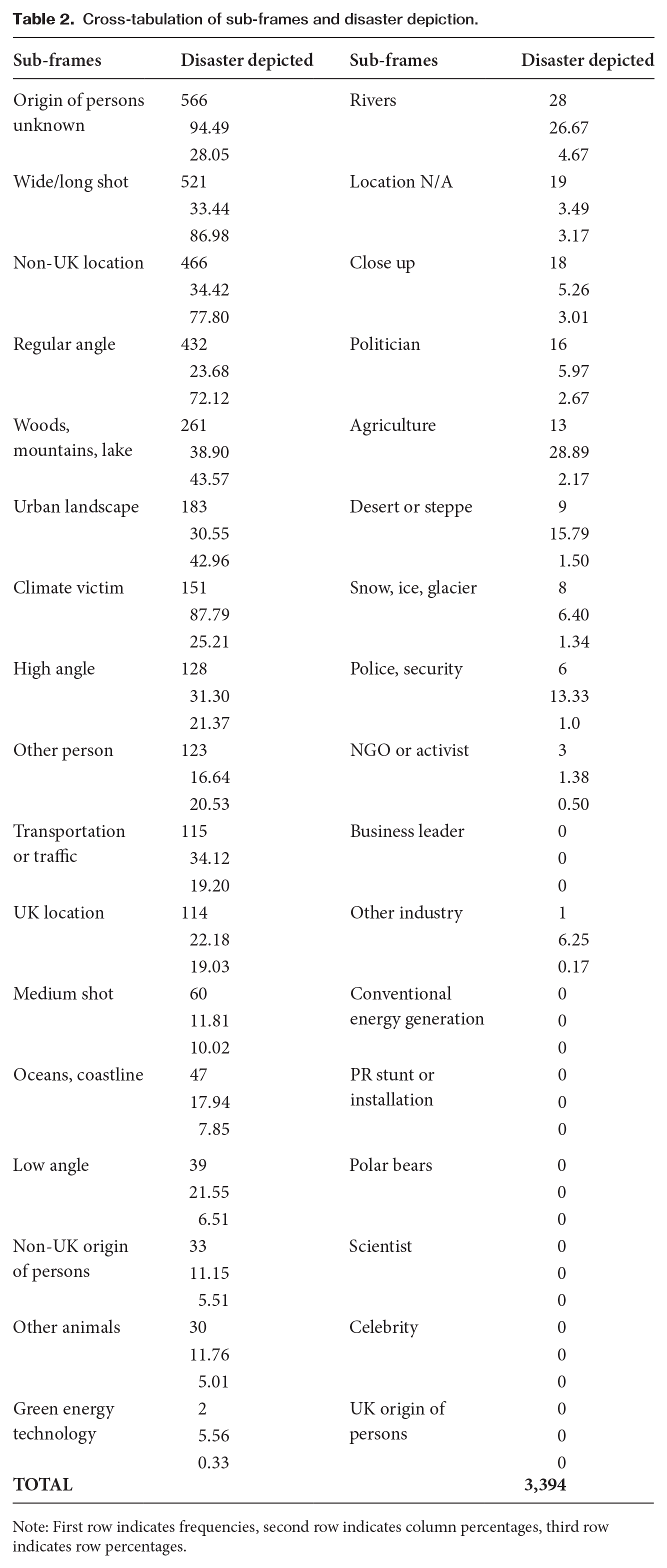
Note: First row indicates frequencies, second row indicates column percentages, third row indicates row percentages.
The ‘celebrity’ sub-frame was used in 9.7 percent of the total ‘person’ frames (n = 162) and no visual portraying disasters employed this sub-frame. The ‘celebrity’ sub-frame was the fifth most frequently coded ‘person’ sub-frame, which contributes to previous research on disaster coverage. Moeller (2006) noted that celebrity visits contribute to making natural disasters newsworthy in the media.
The ‘NGO or activist’ sub-frame (n = 217, 12.9% of total ‘person’ sub-frames) was another relatively common frame in our sample. However, among the visuals depicting disasters, only 0.5 percent featured the ‘NGO or activist’ sub-frame (n = 3). The ‘scientist’ sub-frame (n = 45, 2.7% of total ‘person’ sub-frames) was relatively underrepresented in the visuals. Considering that science is a dominant visual frame in news coverage of climate change (Rebich-Hespanha and Rice, 2016), the underrepresentation of the ‘scientist’ sub-frame in our sample suggests that science was not frequently connected visually with either disasters or climate change. While using images of scientists supports the conveyance of scientific consensus messages to the reader (Chapman et al., 2016), it may, however, create a perception that climate change or climate change-related natural disasters are remote and unrelated to individuals’ daily experiences (Batziou, 2022).
The ‘natural environment’ frame featured prominently in the visuals analysed, 35.9 percent of total sub-frames coded (n = 1480). The most common sub-frame in this frame was ‘woods, mountains, lake’ sub-frame with 45.3 percent of all ‘natural environment’ frames (n = 671). The least frequently coded sub-frame in this frame was the ‘polar bear’ sub-frame, which accounted for 0.3 percent of those visuals with a ‘natural environment’ frame (n = 5).
The third most frequently coded frame was the ‘industry/technology’ frame (n = 494), accounting for 12 percent of total sub-frames coded. Within this frame, the most common sub-frame was the ‘transportation or traffic’ sub-frame with 68.2 percent of the visuals coded as containing the ‘industry/technology’ frame including this sub-frame (n = 337). Previous research indicates that the objects most commonly depicted in climate change visuals are related to energy production, industrial production, agricultural production (Kangas, 2019; Kristiansen et al., 2021) and green energy. These objects are significant because conventional energy, industrial production and agricultural production are major contributors to climate change, while green energy represents a popular solution (Guenther et al., 2022). In the news stories that mention climate change at times of natural disasters, we observed a limited use of these sub-frames. The ‘agriculture’ sub-frame appeared 45 times (1.1% of total frames coded), the ‘conventional energy’ sub-frame was found 60 times (1.5%), the ‘green technology’ sub-frame was recorded 36 times (0.9%) and the ‘other industry’ sub-frame was recorded 16 times (0.4%). As our sample consists of news stories collected during weeks of natural disasters, it is not surprising that the agenda is dominated by natural disasters, as consequences of climate change, while causes and solutions of climate change are relegated to the background.
Likewise, polar-related visuals that were commonly found in previous studies on media coverage of climate change were not encountered in the news outlets covered by this study. Similarly, we also found limited use of the ‘staged/symbolic environment’ frame in our sample (1.2%, n = 48). PR stunts and installations used by climate activists to attract public attention (Wozniak et al., 2017) are among the most frequently used climate change frames as reported by the existing literature. Yet, at times of natural disasters, this frame is used less frequently by the media in news related to climate change as our sample shows.
The analysis of those visuals in which a disaster is depicted reveals that the ‘urban landscape’ and the related ‘traffic and transportation’ frames are frequently used (n = 183, 30.6% and n = 115, 34.1% respectively). This shows that disasters taking place in the cities such as urban floods are covered visually in the news stories. Indeed, a supplementary textual quantitative analysis of the news stories reveals that flood is the most commonly reported disaster with 48.6 percent of all disasters coded (see Appendix Table 2A).
Other than the ‘urban environment’ frame, the ‘woods, mountains, lake’ sub-frame is used frequently (n = 261), which can be explained by the coverage of wildfires in the news stories (Table 2). The ‘oceans, coastline’ and ‘snow, ice, glacier’ sub-frames on the other hand appeared significantly less frequently than expected (n = 47 and n = 8). The ‘climate victim’ sub-frame was used frequently in the visuals in which disaster is depicted as expected (87.8%, n = 151). Conversely, non-human victims of disasters are not as frequently covered in the visuals we analysed. The ‘other animal’ frame was not used very frequently, with 11.8 percent of disaster visuals containing the ‘other animals’ frame (n = 30), which shows animals suffering as a result of wildfires and other disasters was not very much highlighted.
The frequencies of visuals used according to different outlets we examined also yields interesting findings. Table 3 contains the number of related news stories that each outlet had in our sample.
Total number of news stories according to outlet.

In the use of the ‘river’ frame, the Daily Mail diverges slightly from the other two outlets. The Guardian applies the ‘river’ frame in 5.9 percent of its sampled visuals (n = 54), while the BBC uses it in 5.2 percent (n = 32). In contrast, the Daily Mail employs the ‘river’ frame in only 2.2 percent of its sampled visuals (n = 19). The relative presence of the ‘river’ frame is lowest in the Daily Mail (18.1%, n = 19) and highest in The Guardian (51.4%, n = 54). Considering the frequent flooding that took place in 2019–2020 in the UK (AA Floods, n/a), one would expect to find the ‘river’ frame to be frequently used by all media outlets. Yet, the Daily Mail used this frame less frequently than the other outlets, which may reflect the political parallelism between the Daily Mail and the then ruling Conservative Party (Artero, 2015; Melek, 2020). Rivers increasingly became an issue of political contestation due to the sewage dumps, which can be why The Guardian has the highest percentage of river frames and the Daily Mail the lowest. This finding calls for further investigation in the future.
The relative presence of the ‘snow, ice, glacier’ frame was the highest in the Daily Mail (53.6% of all ‘snow’ frames, n = 67) compared to the BBC (21.6%, n = 27) and The Guardian (24.8%, n = 31). The Daily Mail was also the outlet that published the highest number of ‘snow, ice, glacier’ framed visuals relative to its contribution to our sample (The Guardian –3.4%; BBC –4.4%; Daily Mail –7.6%). Such frequent use of the ‘snow, ice, glacier’ frame by the Daily Mail also contributes to the perceived distance of climate change since the victims are non-human and the images depict faraway places (Leviston et al., 2014). The relative presence of the ‘desert’ frame was lowest in the Daily Mail (15.8%, n = 9), which is interesting as the ‘desert’ frame could also create the perception of a distance to climate change effects among UK readers (see Table 4). The Guardian used the majority of the ‘desert or steppe’ frames in our sample (57.9%, n = 33). This could be attributed to The Guardian’s emphasis on the reality of climate change and its consequences such as desertification in different parts of the world as opposed to the Daily Mail’s misleading climate change coverage and its climate change denialism, which is also documented by the independent regulator for the UK news in a ruling (IPSO, 2017). In fact, a 2000 article entitled ‘Whatever happened to desert Britain?’ published by the Daily Mail illustrates how desertification in the UK was at the heart of climate denial in the Daily Mail (Champkin, 2000).
Frequencies of the frames across The Guardian, BBC and Daily Mail.
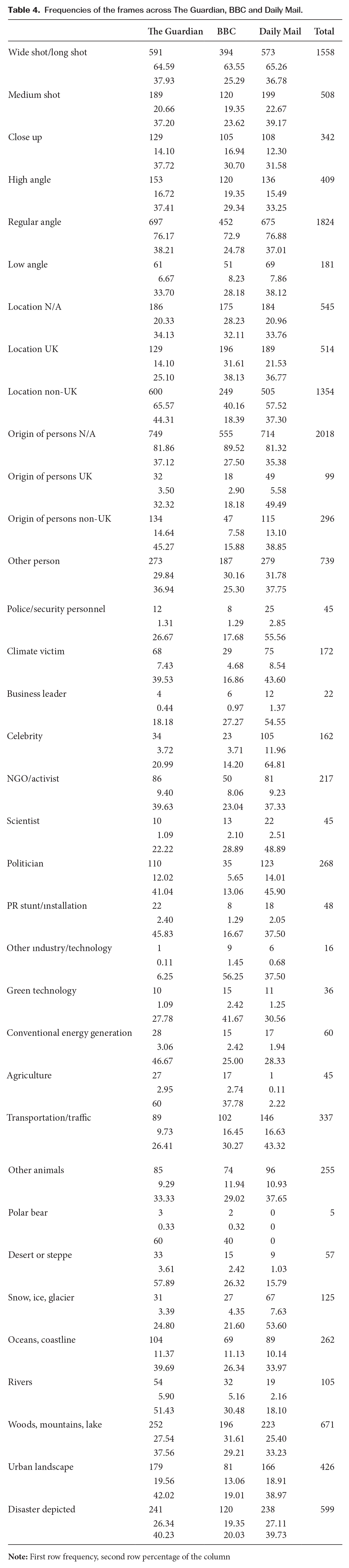
Regarding those photographs containing the ‘agriculture’ frame, there is a difference across the outlets: 60 percent (n = 27) of the ‘agriculture’ frames are used by The Guardian, 37.8 percent (n = 17) by the BBC and only 2.2 percent (n = 1) are used by the Daily Mail. This can be explained by the Daily Mail’s political parallelism with the Conservative Party (Artero, 2015; Melek, 2020), of which an important constituency is farmers (Whale, 2023). The Daily Mail could have refrained from establishing a link between climate change and farming as this would have implied an additional mitigation burden for the agricultural sector.
Left-wing orientation of The Guardian, the right-wing orientation of the Daily Mail and the politically neutral position of the BBC are most evident in their use of the ‘politician’ frame. While The Guardian and the Daily Mail both use this frame frequently – 41 percent (n = 110) and 45.9 percent (n = 123), respectively – the BBC used the ‘politician’ frame less frequently compared to the two other outlets: 13.1 percent (n = 35). Therefore, The Guardian and the Daily Mail visually politicise climate change more frequently compared to the BBC. The Daily Mail is also the outlet with the highest use of the ‘police, security personnel’ frame, with 55.6 percent (n = 25). While 2.9 percent of all images published by the Daily Mail in our sample contain this frame, this percentage is 1.3 percent for both The Guardian and the BBC. This can be explained by the right-wing ideology of the Daily Mail, which tends to legitimise policing (see Bhatia, 2018). The Daily Mail also has the highest share of the ‘celebrity’ frame, with 64.8 percent (n = 105) as opposed to 21 percent (n = 34) in The Guardian and 14.2 percent (n = 23) in the BBC. A total of 12 percent of all images published by the Daily Mail in our sample contains the ‘celebrity’ frame, whereas this percentage is 3.7 percent for both The Guardian and the BBC. Tabloids historically cover celebrities, therefore this finding is aligned with the existing patterns of the Daily Mail coverage (Boykoff, 2008).
Differences in the use of the ‘climate victim’, ‘origin of persons’ and ‘location’ frames are evident between the BBC and the other two outlets. Among photographs with the ‘climate victim’ frame, 16.9 percent (n = 29) were published by the BBC, compared to 39.5 percent (n = 68) by The Guardian and 43.6 percent (n = 75) by the Daily Mail. In our sample, 4.7 percent of all images published by the BBC contained the ‘climate victim’ frame, compared to 7.4 percent for The Guardian and 8.5 percent for the Daily Mail. Similarly, the BBC published 15.9 percent (n = 47) of the visuals with a person of non-UK origin, while The Guardian and the Daily Mail published this frame more frequently: 45.8 percent (n = 134) for The Guardian and 38.9 percent (n = 115) for the Daily Mail. While 7.9 percent of all images published by the BBC in our sample contained this frame, this percentage was 14.6 percent for The Guardian and 13.1 percent for the Daily Mail. The Daily Mail is the outlet that published the most people of UK origin in its news (n = 49), compared to The Guardian (n = 32) and the BBC (n = 18). Almost half of all people of UK origin were published by the Daily Mail (49.5%) amounting to 5.6 percent of all images published by the Daily Mail in our sample, which is also a higher percentage compared to the other outlets (3.5% for The Guardian, 2.9% for the BBC). By showing everyday people in the UK more frequently, the Daily Mail has the potential to bring climate change closer to home among the readers in the UK.
The BBC also differed from the other two in the ‘location’ frame. Among all photos with a non-UK location, the BBC had a share of 18.3 percent (n = 249) whereas The Guardian had 44.3 percent (n = 600) and the Daily Mail had 37.3 percent (n = 505). Therefore, the BBC published non-UK people, non-UK locations and climate victims less frequently than the other two outlets, while the BBC and the Daily Mail are quite similar in their use of the ‘UK location’ frames in their news (n = 189, 36.8 percent for the Daily Mail; N = 196, 38.1% for the BBC). The relatively less frequent use of the ‘climate victim’ frame by the BBC suggests that British people depicted in the BBC visuals are not shown as suffering the impacts of climate change. On the other hand, The Guardian and the Daily Mail converge in their more frequent visualisation of climate impacts in other places and on other people. This finding warrants future research as to explore the causes of such divergence.
RQ2: Is the natural environment visually depicted as threatening in the climate change-related news stories through the use of camera angles?
While regular angle is the most frequently used angle across our sample (Table 5), the second most predominant camera angle used in visuals depicting disasters is high angle, which can convey a submissive portrayal of people and objects, with a total of 31.3 percent of all disaster-depicted visuals (n = 128). Wide/long shot is the most frequently used style with 33.4 percent of disaster-depicted visuals (n = 521) (see Table 2). As discussed above, this common pictorial convention and stylistic choice could reflect the photographer’s need to cover a natural disaster safely.
Stylistic choices and pictorial conventions.

The fear of nature after a natural disaster is a common experience in post-disaster societies (Kumar, 2007) and the news media may tend to represent the disaster as the ‘wrath of nature’, thereby leaving out the human causes of disaster (Ploughman, 1995). However, our sample does not consist of an all-encompassing use of low angle shots of natural environments that could create a feeling of helplessness in the face of nature’s power (see Table 6). When we look up to someone or something in an image, it can imply that we recognise their authority or superiority in a particular aspect of our lives. On the contrary, natural environment frames are dominated by regular angle and, to some extent, by high-angle shots (see Table 6).
Cross-tabulations of camera angles and natural environment sub-frames.

The regular angle was used in 75.9 percent of the ‘woods, mountains, lake’ sub-frame (n = 509); 69.1 percent of the ‘oceans and coastline’ sub-frame (n = 181); 64.8 percent of the ‘snow, ice, glacier’ sub-frame (n = 81); 71.9 percent of the ‘desert or steppe’ sub-frames and 59.1 percent of the ‘rivers’ sub-frame (n = 62) (Table 6). The most frequent camera angle in the ‘other animals’ sub-frame was also the regular angle (82.4%, n = 210). High angle shots in the ‘woods, mountains, lake’ (n = 129), ‘rivers’ (n = 40), ‘snow, ice, glacier,’ (n = 40) and ‘oceans, coastline,’ (n = 73) ‘desert or steppe’ (n =12) and ‘other animals’ (n =33) sub-frames were the second most frequently used camera angle. This can be explained by photographers’ efforts to capture a larger surface area of the river, ocean, glacier or snowy landscape, which is done by taking photos from a high vantage point. In short, the regular angle and the high angle are the most frequently used stylistic choices in the ‘natural environment’ frames. Therefore, the ‘fear of nature’ at times of natural disasters in news on climate change was not visually dominant.
RQ3: What is the relationship between distance (geographical and psychological) and the visual climate change frames used in the news stories?
The use of camera angles in climate change visuals can play a crucial role in influencing viewers’ perceptions and emotional responses. By employing regular camera angles that convey vulnerability and empathy, news stories can effectively illustrate the seriousness of the crisis and motivate viewers to take action. For neutral scenes and realistic programmes, a regular angle – eye level – shot is recommended. This leads to a natural perspective perception, with the observer and subject being at the same level. A regular camera angle is unparalleled in attempting to evoke a sense of trust. Eye-level shots elicit the highest degree of trust. The most likely explanation for this phenomenon is that participants perceive communication at eye level as the most balanced in terms of power distribution (Baranowski and Hecht, 2018). This approach helps bring climate change and its impacts closer to people, fostering a sense of connection and reducing psychological distance of climate change (Swim and Bloodhart, 2014). In our sample, we discovered a frequent association between the depiction of all person sub-frames, except the ‘business leader’ sub-frame, and the use of regular camera angles. A respective breakdown of visual content within distinct sub-frames indicates that 80.1 percent of the ‘person (other)’ sub-frame (n = 593), 78.7 percent of the ‘climate victim’ frame (n = 137), 88 percent of the ‘celebrity’ frame (n = 146), 75.6 percent of the ‘NGO or activist’ frame (n = 164), 89.1 percent of the ‘scientist’ frame (n = 41), and 89 percent of the ‘politician’ frame (n = 242) featured regular angles. This indicates that the majority of visuals portraying persons adopt an empathetic perspective towards them, evoking a sense of empathy and understanding in the viewers by using the regular camera angle.
Wide/long shot is the most common distance size: 64.6 percent of the visuals contain it (n = 1,558; see Table 7). The predominant usage of wide/long shot camera angles in the visuals in our sample, regardless of whether they occurred in the UK or non-UK locations, is an interesting finding. A notable 72 percent of visuals featuring a UK location were captured using a wide/long shot distance size, while a corresponding 74.7 percent of visuals depicting non-UK locations exhibited the same wide/long shot distance size, as illustrated in Table 8. Therefore, for both UK and non-UK locations the majority distance size is wide/long shot. This might be due to the need for photographers to distance themselves from the disaster zone when capturing the scale of the disaster and to remain safe; 87 percent of wide/long shot photos depict a disaster, which confirms this interpretation (Table 2).
Distance field size in the visuals.

Cross-tabulations of distance size and the visual frames.
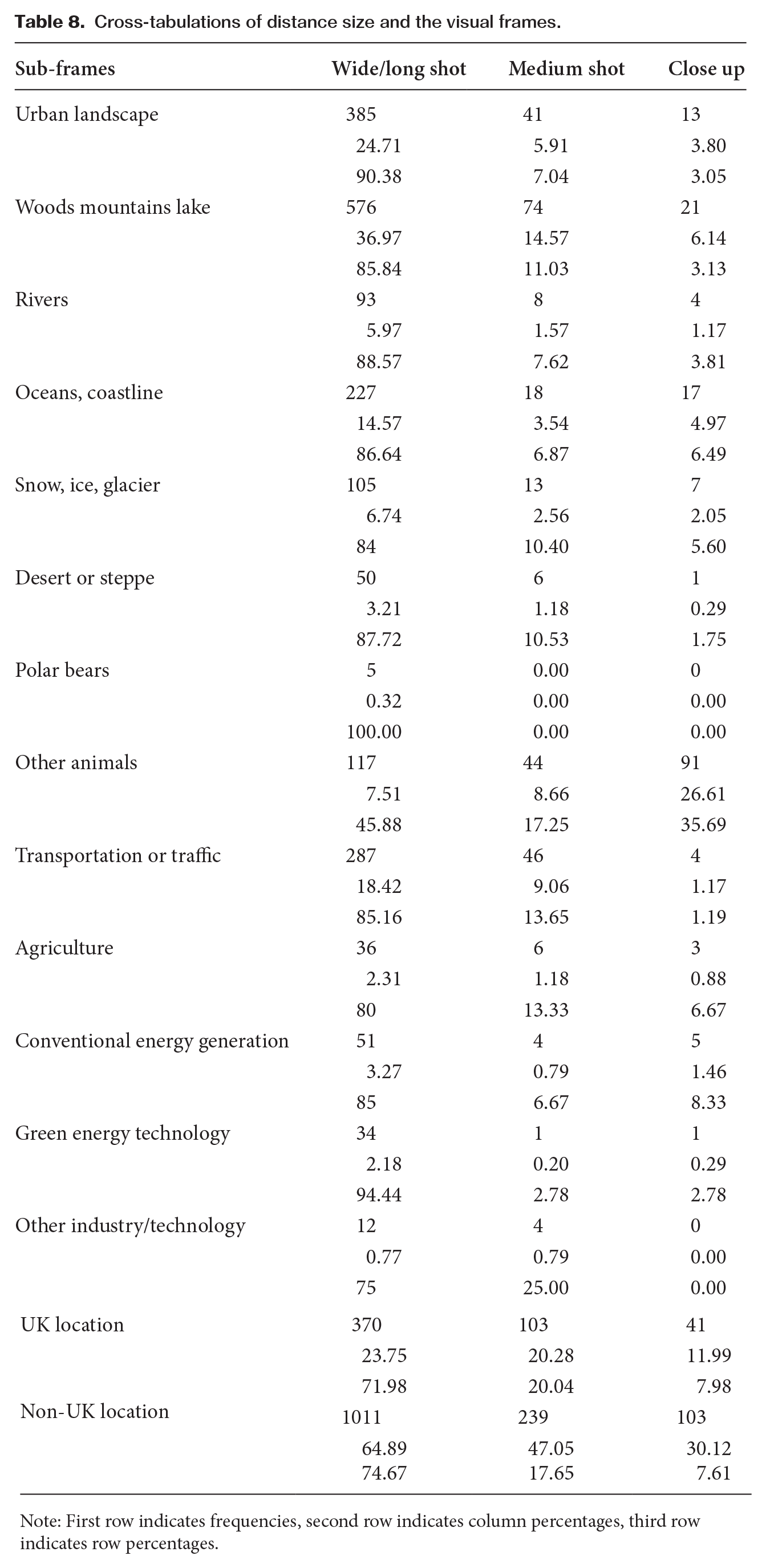
Note: First row indicates frequencies, second row indicates column percentages, third row indicates row percentages.
The ‘natural environment’ and ‘agriculture’ frames are also closely associated with wide/long shot distance size: 85.8 percent of the ‘woods, mountains, lake’ frame (n = 576), 88.6 percent of the ‘river’ frame (n = 93), 86.6 percent of the ‘oceans, coastlines’ (n = 227), 84 percent of the ‘snow, ice, glacier’ (n = 105), 87.7 percent of the ‘desert or steppe’ (n = 57), 80 percent of the ‘agriculture’ frame (n = 36) contain wide/long shot distance sizes. This might be a result of wide/long shots being considered ideal for landscapes and action or activity shots (Pan et. al, 2014). The ‘urban environment’ and ‘technology’ frames are also associated with wide/long shot distance size: 90.4 percent of the ‘urban environment’ frames (n = 385) and 85.2 percent of the ‘transportation and traffic’ frames (n =287), 85 percent of the ‘conventional energy generation’ (n = 51), 94.4 percent of the ‘green energy technology’ frames (n = 34) was associated with wide/long shot. As expected, the ‘person’ frames are the least associated with wide/long shot distance sizes, with the notable exceptions of the ‘climate victim’ and the ‘NGO or activist’ frames (Table 8): 32.1 percent of the ‘politician’ frames (n = 86), 33.3 percent of the ‘scientist’ frames (n = 15), 25.9 percent of the ‘celebrity’ frames (n = 42), 18.2 percent of business leader frames (n = 4) contained wide/long shot distance size; 54.8 percent of the ‘NGO or activist’ frames (n = 119) was associated with wide/long shot distance sizes, which is distinct from other ‘person’ sub-frames. In many cases this is due to the need to cover a group of people and their stunts in the photos; 83.1 percent of the ‘climate victim’ framed photos contained wide/long shot distance size (n = 143), which is again distinct from the other ‘person’ sub-frames. This can be explained by the depiction of ‘climate victims’ in a disaster setting, which calls for wide/long shot distance sizes to reveal the magnitude of the disaster while ensuring safety of the photographer.
A categorisation of the visuals reveals that 1,354 instances pertain to non-UK locations, 514 are associated with the UK and 545 lack any discernible information regarding location (Table 4). A notable 77.9 percent of images depicting disasters with identifiable locations were ascribed to non-UK locations (n = 466), while images featuring the UK locations constituted 18.9 percent (n = 114) of the depicted disasters (Table 2). It is important to note that the selected time period for collecting news stories coincided with a higher occurrence of natural disasters in non-UK locations. Therefore, it can be expected that news outlets reported more frequently on disasters occurring outside the UK, resulting in a higher visual coverage of such events.
As Table 9 shows, the majority of visuals where a ‘climate victim’ is depicted are those from non-UK locations (77.3%, n = 133). The ‘climate victim’ frame has the potential to reduce the psychological distance of climate change (Chapman et al., 2016; Duan and Bombara, 2022; Shields, 2019). In fact, climate change images that have been rated as the most engaging by viewers are those that contain human or animal suffering (Nicholson-Cole, 2005). Likewise, the ‘person (other)’ sub-frame, which includes ordinary citizens, is also used in the majority of visuals (63.7%, n = 471) from non-UK locations. This may contribute to reducing the psychological distance of climate change by depicting ordinary persons in the visual.
Cross-tabulation of location by persons depicted.

Note: First row indicates frequencies, second row indicates row percentages, third row indicates column percentages.
People of UK origin are not framed in the visuals depicting a disaster (n = 0), while the overwhelming majority of disaster-depicted visuals frame individuals whose origin is unspecified (94.5%, n = 566) (Table 2). Specifying the origins of people depicted in the photographs and adding more detail to their story would reduce the perceived distance of climate change-related disasters in the eyes of the reader. Visuals with no identification of location in the photographs where a disaster is depicted are very few (n = 19, 3.4%), which is a positive development, as more detail can help a news story to relate to the reader. In those visuals where location was specified, non-UK locations dominate, with 34.4 percent of disaster-depicted visuals from a non-UK location (n = 466), whereas 22.2 percent of the visuals where a disaster is depicted are from a UK location (n = 114) (Table 2).
However, the absence of location information in 545 visuals out of 2413 (22.5%) as well as the lack of information on the origin of persons depicted in 2018 visuals (83.6%) in our sample is concerning. Such visuals contribute to the psychological distance of climate change-related imagery. Abstract images of climate change that contribute to the perceived psychological distance of the issue are those that do not contain humans but also those that do not contain specific geographic, social or temporal information (Leiserowitz, 2006; Leviston et al., 2014; Wang et al., 2018).
4. Conclusion
Although the impacts of climate change, such as intensified natural disasters, are already evident, the majority of individuals tend to perceive these impacts as affecting others, in distant locations, or future generations. The use of visual frames in media stories that connect climate change with natural disasters has the potential to personalise climate change impacts and bring them closer to home for many people.
Our study analysed the visuals used by UK news outlets in news stories on climate change published in periods of climate change-related natural disasters. The most common visual frame used in our sample was the ‘person’ frame (n = 1,682), within which the ‘person (other)’ sub-frame that covers ordinary people (n = 739) was the most frequent. The presence of the ‘person’ frame in the news could contribute to reducing the psychological distance of climate change. While regular-angle images of persons depicted in these visuals create a sense of empathy in the viewer, they also bring climate change closer to home for the viewer, since empathy is found to reduce the psychological distance of climate change (Swim and Bloodhart, 2014). However, information on the geographical location of the visuals is not provided in 545 visuals (22.5%). Such lack of details increases the psychological distance of the viewer to climate change. The lack of high-angle shots in the ‘natural environment’ frame indicates the lack of perspectives that represent powerlessness in the face of nature at times of natural disasters. Instead, the dominance of regular angle shots tends to create empathy and psychological proximity for the viewer. To bring climate change closer to home and engage the viewer, journalists should use photos of real people experiencing the local impacts of climate change on their lives to underline that no society is immune from the impacts of climate change (see Wang et al., 2018). In order to do this effectively without creating a sense of helplessness, regular angle shots that are better at creating empathy in the viewer should be used.
Visuals used in the three outlets demonstrate differences. The Daily Mail frequently uses the ‘snow, ice, glacier’ frame more frequently than the other two outlets, which contributes to the perceived distance of climate change. All the outlets we analysed use relatable images from UK locations, while the Daily Mail is the outlet that used the highest frequency of people of UK origin in its news. The Guardian dominates the ‘agriculture’ frame (60%), while the Daily Mail’s minimal use of this sub-frame (2.2%) may reflect its political alignment with the Conservative Party. This requires further research, alongside the finding that the Daily Mail used the ‘river’ sub-frame less frequently than the other two outlets. Both The Guardian and the Daily Mail frequently use the ‘politician’ frame (40.4% and 46.7%, respectively), whereas the BBC uses it less frequently (12.9%). The Daily Mail leads in the ‘police, security personnel’ (55.6%) and the ‘celebrity’ frames (65.7%), consistent with its right-wing and tabloid nature.
Our research has several theoretical and practical implications. Firstly, the study adds evidence to the literature on political parallelism between media and political parties by demonstrating differences between the coverage of a right-wing, left-wing and centrist news outlet. Regarding the visual analysis of psychological distance, our study added distance field size and camera angle as indicators of images that may contribute to the perceived distance of climate change for viewers. Practically, the study highlights the need to link natural disasters with climate change through the use of impactful visuals, such as images of humans and animals suffering the consequences of climate change in geographic proximity to viewers, preferably from a regular angle. Equally important is to provide information on who the suffering person is and where the disaster and suffering occurred, thereby making the images more concrete for the viewers.
This study is subject to several limitations that should be acknowledged. Firstly, the sample was restricted to three news outlets, chosen to encompass a range of political perspectives. However, these outlets may not fully represent the entirety of the UK media landscape, introducing a potential limitation in terms of generalisability. Secondly, the temporal scope of the study focused on a specific period during which a majority of the disasters occurred in non-UK locations. Future research studies should consider expanding the sample size and incorporating a wider range of media sources to enhance the representativeness of the findings. In addition, it would be valuable to investigate the impact of visual frames on public discourse and perception, providing a deeper understanding of the ongoing debate surrounding the relationship between climate change and natural disasters.
Supplemental Material
sj-docx-1-vcj-10.1177_14703572251320304 – Supplemental material for Visual framing of climate change during natural disasters at home and abroad: an analysis of British news
Supplemental material, sj-docx-1-vcj-10.1177_14703572251320304 for Visual framing of climate change during natural disasters at home and abroad: an analysis of British news by Defne Günay, Öykü Yenen Aytekin and Gizem Melek in Visual Communication
Footnotes
Funding
This work was supported by the Project Evaluation Commission of Yaşar University under project (BAP088), ‘The Role of Emotions in Climate Policy Support: The Case of the United Kingdom’.
Data Availability Statement
Our data are available upon request.
Supplemental Material
Supplemental material for this article is available online.
Notes
Biographical Notes
DEFNE GÜNAY is Associate Professor at the Department of International Relations and Vice Dean of the Faculty of Human and Social Sciences at Yaşar University. Her research interests cover climate politics, climate communication and EU external climate change policy. Her publications have appeared in journals such as Environmental Communication, Communications: European Journal of Communication Research and Environment and Planning
ÖYKÜ YENEN AYTEKİN is an Independent Researcher. Her research focuses on corporate communication, Turkish cinema and TV. She previously worked for eight years as a Research Assistant in the Department of Radio, Television and Cinema at Yaşar University.
GIZEM MELEK is a Senior Lecturer in Media and Broadcast at Queen’s University Belfast. Her research concentrates on the interplay between media and politics, specifically delving into media effects, journalism, and political and climate change communication. Dr Melek’s research contributions are featured in reputable international journals such as Journalism & Mass Communication Quarterly, Visual Studies, Communications: The European Journal of Communication Research and Visual Communication. Drawing from a journalistic career spanning six years in Turkey and the UK, Dr Melek enriches her academic pursuits with valuable practical experience
Address: Queen’s University Belfast, School of Arts, English & Languages, SARC: Centre for Interdisciplinary Research in Sound and Music, 4 Cloreen Park, Belfast, BT9 5HN, United Kingdom. [ email:
References
Supplementary Material
Please find the following supplemental material available below.
For Open Access articles published under a Creative Commons License, all supplemental material carries the same license as the article it is associated with.
For non-Open Access articles published, all supplemental material carries a non-exclusive license, and permission requests for re-use of supplemental material or any part of supplemental material shall be sent directly to the copyright owner as specified in the copyright notice associated with the article.