
Abstract
This paper examines the visual culture of mediating migration as a “crisis,” arguing that responses to the movement of peoples (especially into the Global North) is animated by two frames: the forensic and the humanitarian. While these appear to be contradictory image regimes—one relying on data, maps and metrics, the other on iconic portraits of human suffering—the paper argues that it is the vacillation between these two poles that creates the dynamic force of the surge of images of “migrant crises.” Using the image of the thaumatrope – a visual tool for tricking the eye into seeing two images at once – this paper explores how processes of mediation train viewers to see images as data and data as images, and thus to be caught within an ideological framework of crisis. It seeks also to provide examples for intervening in the vacillation between humanitarianism and forensics through activist appropriations of migration data.
Keywords
The surge of images of perilous desert crossings, border spectacles of barbed wire and biometric monitoring, “caravans” of refugees fleeing violence, and overcrowded Zodiac boats abandoned at sea has shaped the visual contours of the “migrant crises” of the 21st century. 1 The number of images, their scale and the velocity of their movement through social networks, news sites, arts circles and activist communities has been striking. The very surge of media—the affective force of so many images—lends urgency to political and social events, and echoes the sense that the movement across borders constitutes a “crisis.” How to characterize these highly mediated historical events—the shape of their iconicity and the horizons of their eventfulness? While the mediation of migration is vast and variegated, there are patterns and resonances that inform what one can say about the contested and highly political social framing of migratory movement. In thinking about the so-called European migrant crisis for the anthology Moving Images, my co-editors and I were struck not only by the scale and velocity of images of “crisis,” but by the affective alternation between, on the one hand, alarm at the violation of refugee rights and, on the other, panic at the failures of biopolitical regulation by state and para-state agencies. (Lynes et al., 2020) We began to see these patterns of mediation as delimited on one end by a forensic lens (data regarding points of entry, drownings at sea, migrant demographics, asylum claims, maps of movement) and on the other by a humanitarian one (constituted rather by singular, iconic stories of human drama or personal narratives). On one end, then, we saw massification and abstraction; on the other, singularity and response-ability. In the midst of the sea of images, data, figures, and networks, these poles helped shape the representational possibilities for migrant recognition, and the frameworks through which an adequate response to the bordering regimes at play might be imagined.
To be clear, when we saw this patterning, we didn’t intend for the “forensic—humanitarian” schema to be a classifying tool for sorting images (humanitarian here, forensic there) but rather an opposition whose terms delimited the very structures of ideological closure at play in visualizing migration as a crisis. What could a response be but rights-based or biopolitical? How to think outside the terms of “crisis” even as border closures, deportations and detentions put into crisis so many lives? Based on the nature of the images themselves, and the broader structures of mediation in formal and informal channels, this opposition between forensic and humanitarian responses served to clarify questions such as: How is migration depicted in media as a demographic crisis? As a labour crisis? As a human rights crisis? As a bureaucratic crisis? As a national crisis? In other words, the opposition itself helped to flesh out the mechanisms through which migration-as-crisis appears at once as a problem of regulation, demographics, securitization and as inviolable (but violated) human rights. It thus exposes how migration is constituted as a crisis tout court in and through media.
One might be tempted to see the forensic angle through a state and para-state “visual governance” lens and, conversely, to see the humanitarian lens as more fully mobilized by NGOs in calling for a rights-based approach. As Massari argues, however, visual governance entails not only communicating, regulating, or legitimizing power structures, policies and practices, but also challenging them. As images and data visualization circulate in and across various publics, their political effects are often unstable, and often the very movement between forensic and humanitarian lenses become an instrument of governance. Governance for Massari is iterative, and thus images and processes of mediation more broadly are both an input and an output of governance, in a dynamic interplay with policies, programs, public sentiments, and protests.
In analyzing the vacillation between forensic and humanitarian angles, it is clear that the poles of the forensic and the humanitarian persistently turn into one another such that, for instance, questions of rights are framed by the biopolitical concerns of border control, just as migrant flows can be humanized through photographic portraits. Media platforms, visual rhetorics, institutions, and operations of power alternately draw from and resist these twin logics, and this becomes the very dynamic quality of mediating migration itself as a political process. Crisis affects are produced by the very contradiction between concern and control, and thus the mediation of migration—whether one proclaims “refugees welcome!” or (in their most xenophobic instances) stokes the fears of migrant influxes—is constituted as a “crisis event” by the interplay of the forensic-humanitarian structure itself.
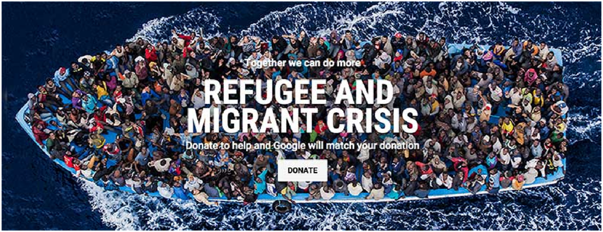
The image that comes to my mind to describe the force of this vacillation between humanitarian and forensic lenses in the mediation of migration as a crisis is of a thaumatrope, a 19th century optical toy in which a disk with pictures on each side is attached to two pieces of string. When twirled quickly, the two images blend into one in one’s mind so that one image appears nestled in the other. The thaumatrope (literally, a “marvellous turning”) frequently allows for things to return to their place—the general to find his uniform, the bird its cage—or for causal relations to be explained (the woman meets death). In doing so, the thaumatrope engages in a marvellous optical trick, one which puts objects in their place, and re-confirms a series of social fantasies (frequently marked by gender, race, class in both the case of the thaumatrope’s imagery and in the mediation of migration) (Figure 1). Thaumatrope. Special collections, firestone library, princeton University. https://graphicarts.princeton.edu/2013/10/28/thaumatrope/. “Closing the back door to Europe”. New York Times. October 16, 2015. https://www.nytimes.com/interactive/2015/09/15/world/europe/migrant-borders-europe.html#:∼:text=A/dangerous/trail/through/the,paths/that/are/more/dangerous. Dorothea Lange, “Migrant mother, Nipomo, California” (1936). Library of Congress; Nick Ut, “Child fleeing an American napalm strike” (1972). Library of Congress; Kevin Carter, “The vulture and the little girl” (1993). New York Times. Massimo Sestini, “Italian navy rescues asylum seekers traveling by boat off the coast of Africa on the Mediterranean, June 7, 2014.” © Massimo Sestini. Google campaign to help refugees and migrants in urgent need. Tweet. September 15, 2015. https://x.com/Google/status/643894201374130176?prefetchTimestamp=1732143480205. “Six graphs to understand the migration phenomenon”. Swissinfo.ch. September 14, 2015. https://www.swissinfo.ch/eng/society/refugee-crisis_making-sense-of-migration-facts-and-figures/41560118. Lucify, “The flow towards Europe”. https://www.lucify.com/the-flow-towards-europe/.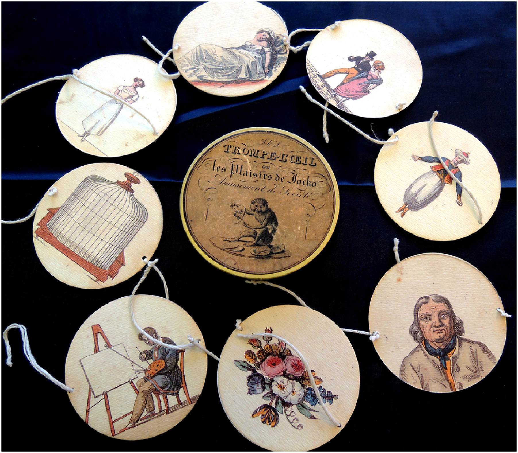
The thaumatrope provides an image of the turnstile through which the humanitarian and the forensic pass in and through each other, alternating between migrant data and migrant lives, between bureaucratic apparatuses and populations on the move. Viewers are invited to register at once the two sides of migrant crisis: a crisis of governmentality and bordering, on the one hand, and a crisis of human rights protection, on the other. The data propels the user through the geographical terrain of the border, while the images position them either on one side of the border or above the fray in what Donna Haraway calls a “god trick,” taken over by the architectures of helicopters and drone technology or firmly implanted behind police controls (Haraway, 1988: 581). Such a device trains viewers to see double – to see data when looking at images, and see images when looking at data – and thus to remain within the ideological framework of “crisis” when thinking about migration. This is because, even while humanitarian images compell a rights-based response, that response is put into crisis by the biopolitical concerns of the larger flow of populations. The question of security, regulation, triage etc. are in turn problematized by the human face of migrant suffering, but that problematization turns back into the concern with maps and borders, with populations and nation-state formations. The very movement of people then becomes a “crisis”, and this encourages social panics that always, in some way, shore up the salience of the state, if not the “nation.” The turnstile of meaning produced here acts, then, as an operation of visual governance more broadly.
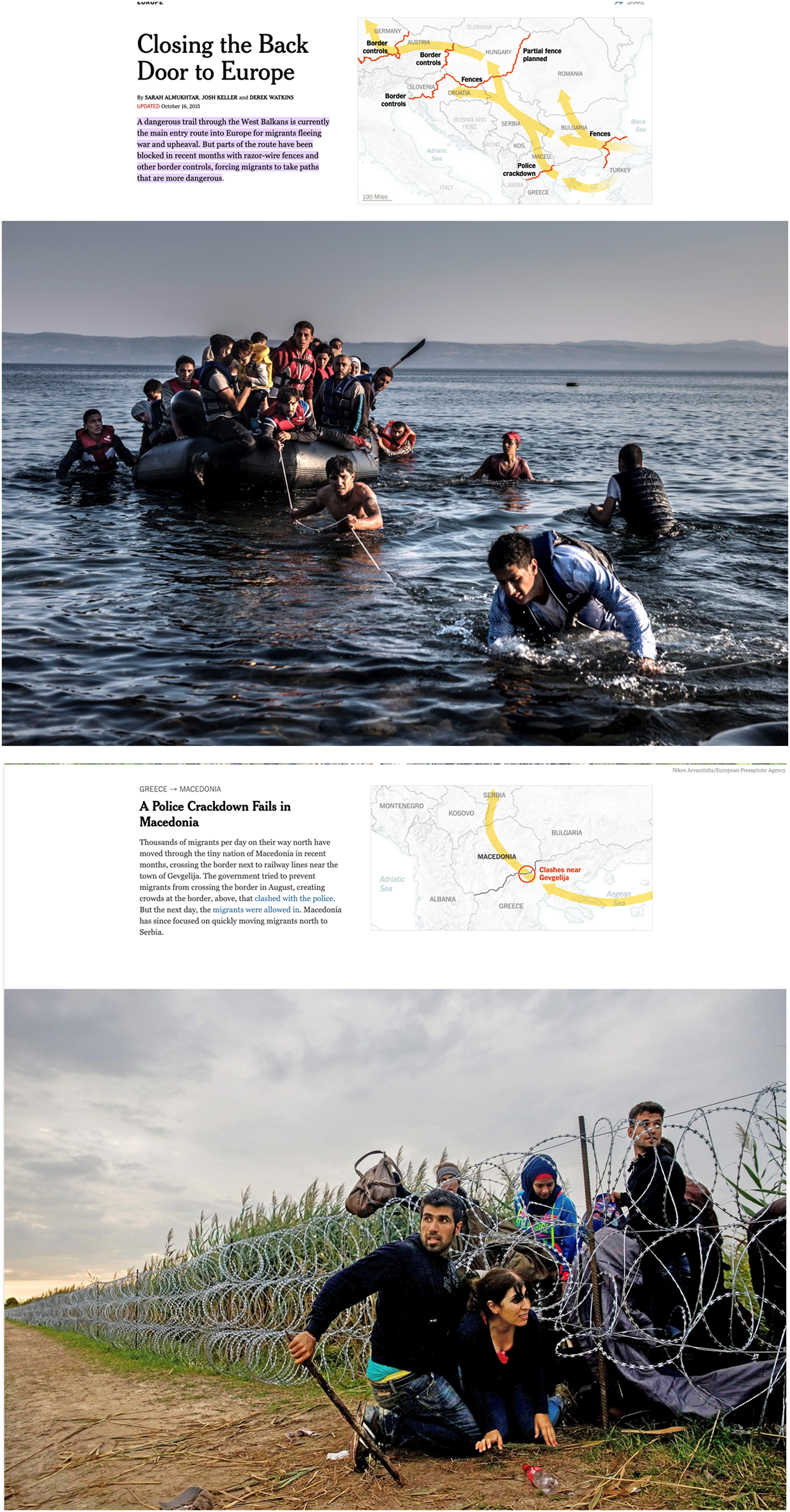
A New York Times article, “Closing the Back Door to Europe,” demonstrates the turnstile between forensic and humanitarian lenses I seek to bring into view: the website’s front page includes both a map and a photograph (Figure 2). (Almukhtar et al., 2015). The map represents Eastern Europe: Germany on the far left of the image, Turkey on the far right. Across the map of the Balkans and Eastern Europe, large yellow arrows indicate the trajectory of Syrian refugees. Certain borders are highlighted in red with tags such as “police crackdown,” “fences,” “border controls,” and “partial fence planned.” Below this map is a photograph of an overcrowded Zodiac boat landing on a (presumably European) shore. Some men have jumped into the water to pull the boat in, as the photographer, Sergey Ponomarev, watches from the shore. The photograph is intensely pictorial, framing the scene through a deep Renaissance perspective that juxtaposes the man pulling the boat to shore with the crowded vessel in the background. As one scrolls through the story, one alternates between maps and photographs: the movement of yellow arrows through the sea due to the obstruction of Greece’s razor-wire fence on its border with Turkey, an image of the border fence stretching into the distance; Bulgaria’s fence and border control efforts that interrupt the yellow arrows, a bird’s eye view of a mass of people (little dots of colour in the space between two clusters of trees) seeking to cross over railroad tracks; a map of a hot spot on the Macedonian border, a family seeking to cross under the razor wire of a long and extensive border fence.
We are presented with an alternation of data visualizations and visions of migrant lives. The viewer’s position is mobile and privileged. We see from a global cartographic perspective, a bird’s eye view, the ‘right’ side of the border (behind the wall, behind the police), and the ‘wrong’ side of it, faced with miles of razor wire but unaffected by its threat. At one and the same time our humanitarian impulses are tempered by the problem of governance produced by the Syrian war. Conversely, even as the yellow arrows summon the iconography of influx, we are asked to remember that the people on the move are refugees, demanding a humanitarian response.
The New York Times essay is pedagogical: as the reader scrolls down the page, they are trained to read the images in the light of the data, and the data in the light of the images. What this means is that the iconic images of overturned boats or families stepping through a barbed wire fence are immediately tied to a larger population flow. Conversely, the maps with yellow areas are rendered concrete by the images of migrant crossings, affectively charged with a documentary iconography. While each pole might point to different “crises” — Is the crisis the barbed wire or the influx of people? Is the crisis the overcrowded boat or the fact of the boat’s crossing? — the narrative strategy the New York Times employs overcomes these potential contradictions. The barbed wire is thus an obstacle, but potentially a necessary one given the influx of migrants across the map of Europe, rendered as a solid directional arrow toward Germany or France.
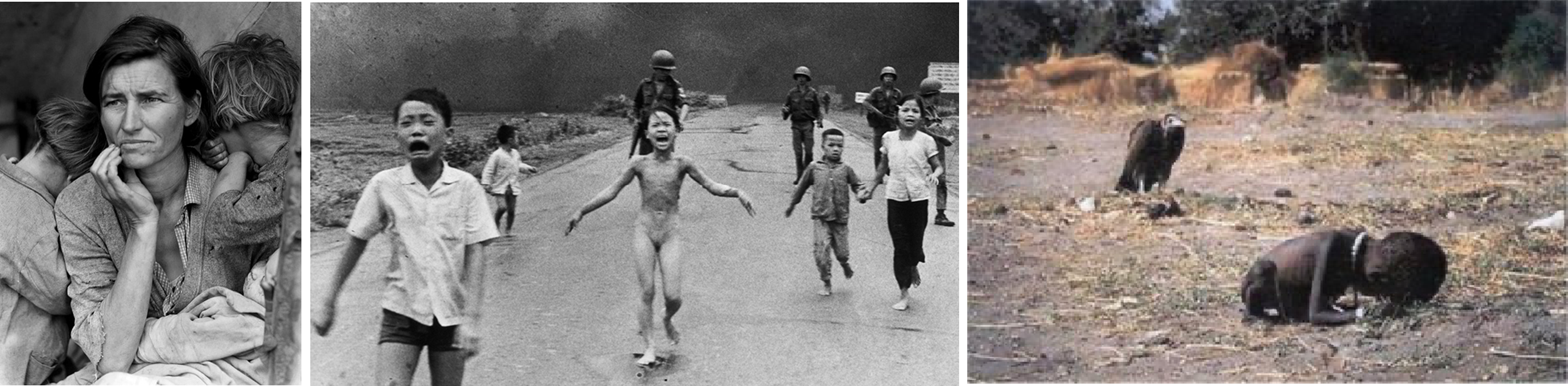
Such operations are not only at play within the narrative structure of formal news media, but also appear in the movement of content across social media platforms. For instance, the humanitarian lens is canonically represented by the image of the young Aylan Kurdi, washed ashore on a Turkish beach in a striking (but shockingly commonplace) act of abandonment. The image lent a figural shape to the migrant, if not a face, soliciting outrage, demands for ethical regard, and identificatory responses (“We refugees”, for instance). A transformative and iconic documentary image, an index of the tragedy unfolding, compared almost immediately to the transformative documentary images of the 20th century — Dorothea Lange’s ‘migrant mother’, Nick Ut’s ‘napalm girl’, Kevin Carter’s ‘starving child’ in South Sudan. (Lynes et al., 2020) (Figure 3).
It indexed not only the violent abandonment of the migrant crisis, but also its own iconicity. The image is not only a documentary image, or a figure for humanitarian discourse, but also an index of scientific and legal regimes, databases, social networks, and the quantification of the image’s effect. The image’s significance is not only humanitarian and documentary, but also always already forensic. This is not only because it is the image of a corpse, but also because the image’s significance lies not only in its visual impact (recalling the Christian iconography of the Piéta, for instance), but also in its circuits of distribution and exchange—thus in its velocity, its multiplicity, its networked status. The British research group Visual Social Media Lab devised a research project to trace the very path and effect of the image’s distribution through social media networks. What they found is that the photograph of Aylan Kurdi circulated initially through countries in West Asia (Lebanon, Gaza, Syria) until the Emergency Director at Human Rights Watch, Peter Bouckaert, shared it via Twitter, at which point the story went viral, being retweeted by Liz Sly, the Washington Post’s Beirut Bureau Chief, and shared across West Asia, Europe, and North America.
Measuring the image’s impact relied also on Google data sources, which gathers collections of search terms across different languages. The Visual Social Media Lab could locate the sites from which people were searching for the term “Aylan Kurdi” (the top cities, in order, were Paris, Buenos Aires, London, Istanbul, Bogotá, Santiago, New York, New Delhi, Mexico City, and Ankara). They located the top questions posed about Aylan Kurdi: (1) What happened to Aylan Kurdi? (2) What is causing the migrant crisis? (3) Why do Syrians leave Turkey? (4) What photographer took the picture of Aylan Kurdi? (5) What is Germany’s stance on refugees?
Through the collection of data regarding Google search terms, alongside terms used in news reporting as well as by state leaders, they concluded that the images triggered strong personal responses, mobilized civil society into organizing networks of support and lobbying for refugees, including various Refugees Welcome campaigns, but that the lasting effect of this emotional engagement was varied. Search data thus became the structuring function for the image, the manner of joining users in a database and network.
The image’s impact, then, was only partially wedded to the formal qualities within the frame. The image accrued value as it was clicked, liked, shared, tweeted. It built affective communities in the path of its distribution. As these graphs make clear, the image was both an image and a network, a figure and a graph. While the memes that emerged atop this image were frequently shockingly unaffected by the trauma of the image’s content, they likely responded to the very ubiquity of the image, to its proliferation rather than to its content. 2 The political feelings the image of Aylan Kurdi evoked were channeled by the movement of the image through digital networks. Adi Kuntsman calls this movement of feelings in and out of digital domains “reverberations” (Kuntsman, 2020: 70). They trace how movement might intensify, transform or muffle feelings towards visual artefacts, as the image of Kurdi’s corpse certainly did. At the same time, Kuntsman notes how the digital manifestation of emotions has become standardized and quantified such that it has become a currency of social media and big data corporations, something to be mined, sold and bought, and militarized (Kuntsman, 70).
It is interesting in this respect—perhaps paradoxically—that it is precisely in the volume and velocity of the images of migrant crossing that the “event” of the crisis took shape as a crisis. Across the media landscape, digital images coalesced into a rhetoric of “surging” of a “sea of images” which also constituted the “eventfulness” of the crisis, pulling it out of the larger historical arc of perilous migrant crossings. What is surging here? Migrants themselves or the images of their crossing? In what way does the data about the image render the affective force of the “migrant crisis” by the sheer number of images circulating? Rather than simply the capacity of an image to elicit a humanitarian response (the sympathetic “We Refugees” slogan that emerged alongside the circulation of Aylan Kurdi), what the vacillation between the humanitarian and forensic point to is the movement of feelings into a “crisis” mode. In this mode, the quantity and movement of images themselves creates the sense of a surge of movement (of images) that stand in for the affective charge of the surge of movement of peoples in 2015-16.
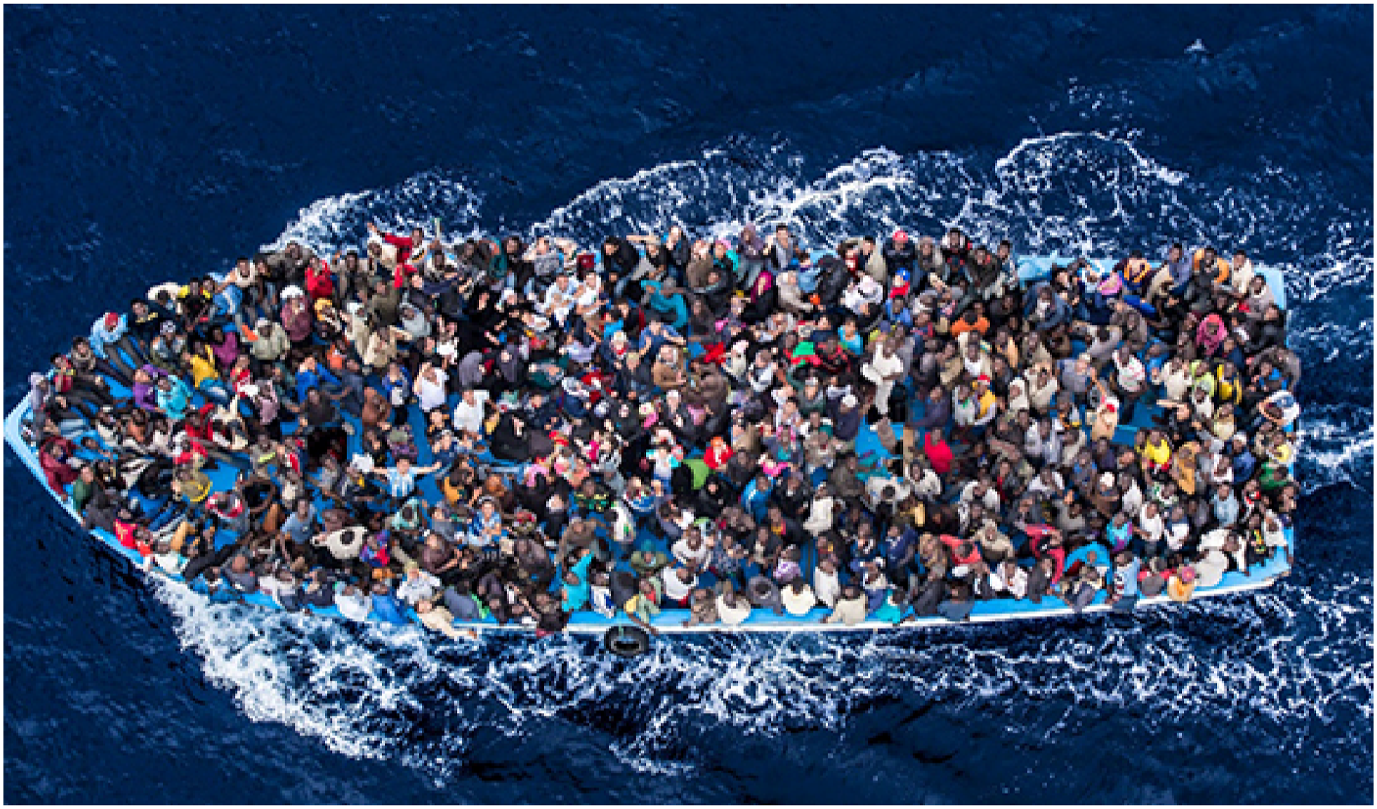
Take another example of the movement and replication of an image: Massimo Sestini’s photograph, taken from an Italian navy helicopter in the waters between Libya and Italy in 2014 (prior to the so-called “migrant crisis”) (Figure 4). 3 The photograph tightly frames an overcrowded boat, capturing only the boat’s short wake as it glides across the surface of the sea. The photograph has almost no depth of field, and appears almost painterly and abstract in the splashes of colour from the refugees’ clothing. Sestina said “I thought if I could get the right angle straightaway, directly above 500 people who have spent 5 days and nights on a boat, they would probably all look up, ask for help, wave—so this year I thought I’d try again and it worked”. The photograph won a World Press Photo award in 2015.
The significance of this image lies not only within the frame—in its poignant but spectacularizing display of the dangers of crossing—but outside it also, in its conditions of production, circulation, reception; and in its translation across contexs as it comes to frame and perform the event of the crisis (even as it ‘predates’ it by a year). Images represent or pictorialize experience, but they do more than this. They are a mediating interface, an interstice, in the complex social relations of the world. They act; they have material weight; they circulate, accrue value, bind communities together through common sentiment; they operationalize various other technologies (military, economic, medical). The importance of the visual (as a particular form of mediation) is its sensual immediacy or affective charge. Nicholas Mirzoeff says that it is “the surplus of experience” the image produces in the viewer that brings the elements of the image into relation with one another. (Mirzoeff 1998: 9). This movement in the image is replicated in the movement between images and information in reporting on migration to mediate migration as a crisis between humanitarian and forensic responses. If you were to perform a Google Image search today on the terms “migrant crisis”, this image would still appear in the top 10 images on your screen. You might notice how many images replicate the rhetorics of overcrowded boats, and more generally of overcrowding. The networked quality of each of these images – the manner in which they refer to each other – constitutes the same training in negotiating the forensic and the humanitarian as the New York Times story does.
Even as Sestini’s image was celebrated prior to the so-called migrant crisis in 2014 for distilling the conditions of migrant crossing, it also has a significant afterlife in the theatre of the 2015-16 ‘migrant crisis.’ In 2015-16, a near infinite repetition of this image can be found across media and platforms, making it homologous with the iconography of that crisis and forming a dense and ossified form for symbolizing the terms and grounds of the crisis. As a convincing image condensing the iconography of crisis, the image then circulated as emblematic of it. On September 15, 2015, almost 2 weeks after the death of the drowned Syrian boy Alan Kurdi, Google announced a new donation matching program, donating at a 1:1 rate for every dollar given up to $10 million dollars. The donations received through Google were shared between Doctors Without Borders, International Rescue Committee, Save the Children, and UN High Commissioner for Refugees. The website’s landing page used Sestini’s image (Figure 5).
Time Magazine reported in October 2015 that at a World Press Photo exhibition in Switzerland, a group of migrants (now living in Switzerland) were lingering in front of the photo, and asked the organizers if they could have a copy of the image as they recognized themselves and others on board. It’s a striking story, not the least because the photograph’s formal qualities all but preclude the possibility that the migrants on the boat would be the viewers of the image. For Sestini, it became a catalyst for an online campaign Where are You?, a website encouraging people to contact him if they recognized anyone on the boat. (Sestini, n.d) He hoped to find at least 10 people and tell their stories of integration: “This would allow me to show the migrants in their normal lives, families from Syria able to find an arrangement. They are doctors, engineers who in order to escape war and death in their own country, have risked their own life, but they might end up becoming respected professionals in some other parts of the world. Maybe there is a happy family living now in Geneva, working as gardeners in a public park. It would be nice to place the two photographs side by side: the photograph of them on the rescue ship, and the photograph of them in that garden in Geneva.”
On the updated website, the individual image is supplemented with several others. Each image has a “zoom” function, allowing viewers to examine the image close up, to focus on the individuals on the boat, to see each individual as a particular engine for another story. The impact of the image of massification and precarity is broken down into portraits, pixel by pixel.
I bring up this image not only to think about how the humanitarian lens cedes to the forensic gaze, and alternately how the forensic analysis cedes to humanitarian stories, but also to highlight the methods of visual analysis in the era of new media – how the image acts and moves beyond its frame, how it circulates and becomes not only an iconic representation but a story in itself, how it is rich with fantasies of who the migrants are and what the crisis consists of, how it confines the social world of the migrant to the act of crossing.
My interest is in how vision articulates and constitutes the contentious aspects of political and social life—sites of social struggle—and how it works to bind communities in different forms of affective belonging and/or solidarity. Visual culture becomes a method for fleshing out the particular significance of those moments where the visual is “contested, debated and transformed as a constantly challenging place of social interaction and definition in terms of class, gender, sexual and racialized identities” (Mirzoeff, 1998: 6) I think about the movement of this image—its poignant joining of humanitarian and forensic lenses—through both Adi Kuntsman’s notion of “reverberations” and Jay David Bolter and Richard Grusin’s notion of “remediation,” a concept that points to the manner in which new media refashion older media, and older media refashion themselves in the context of new media. “Remediation” also emphasizes that any medium must be understood in relation to other media and their histories. (Bolter and Grusin 2000: 9) The so-called ‘hypermediation’ of events (the Arab Spring, the global credit crunch, the migrant crisis) all reveal a complex relation between the event and its mediation, foregrounding, in Sarah Kember & Joanna Zylinska’s view, “the significance of technological, social, economic, geographical, and other influences or forces well beyond those controlled by the human.” (Kember & Zylinska: 9).
The enfolding of the documentary within the forensic points to the danger of focusing one’s attention on singular media objects, or even on media platforms or infrastructures, at the expense of the larger processes of mediation themselves. Kember and Zylinska argue, via Heidegger, that technology is a “world-forming process”, a way of ‘being-with’ and ‘emerging-with’ technology beyond the instrumental dimensions of it. When we look at a media artefact, what we miss is the dynamic system of relations, the lively process, out of which it is cut. This process includes not only the emergence of images, narratives, communications which give shape to worldy events, but the larger social and material forces (Donna Haraway would call them naturecultures) that are responsible for the emergence of phenomena in the world. Mediation is thus not simply medium, platform, genre, or technology, but more broadly “an intrinsic condition of being-in, and becoming-with, the technological world.” (Kember and Zylinska 2014: 1) The singular image—its potency for humanitarian sentiment and action—reveals a multiplicity (“the migrant crisis”), and thus a problem of populations, and thus a problem of governmentality (forensic biopolitics).
For Kuntsman, the question “how do we encounter the political online?” leads towards those digital and material artefacts that act, in their terms, as “affective anchors” to hold, contain and archive feelings (Kuntsman, 70). Rather than notions such as “attitudes” or “opinions” (which are popular ways of measuring feelings towards political issues) Kuntsman’s concept of reverberations traces the movement of emotions through time, either as accelerated, looped over-and-over, intensified or dissolved as they move through different digital terrains (Kuntsman, 71). As images move, they can become weaponized; they can stick to particular (racialized) bodies, or get “stuck” in a particular context of frame. As the mediation of migration circulates online, it fixes on specific images (overcrowded boats, piles of life vests on an empty beach, a long line of families approaching a barbed wire fence), but in the movement and replication of those images, the iconicity of the image gives way to its proliferation. And while this proliferation increases the visibility of human suffering, it also creates an affect of “proliferation” that has biopolitical affects – ones governed by (racialized) fear, social concern over the regulation of movement, worries over national “capacities”, etc.
Thus, the circulation of images online might lead us to conclude that visuality has ceded ground to the more fundamental fact of facticity, of data broadly constituted, in organizing the world. Surveillance frequently no longer operates optically, along panoptic lines, but algorithmically. The verifiable is located far more frequently in statistical probability and risk calculations than in the indexical media (principally film and photography, but also the microscope, telescope and other imaging machines). But the forensic is indispensably rendered in visual form. Just as the flip side of the photograph of Aylan Kurdi is the network of tweets; the flip side of data collection is data visualization. Thus, to see the ‘migrant crisis’ as primarily pictorial is to ignore the flood of visualizations—maps of flows, countries of origin and arrival, demographic breakdowns of men, women and children, comparisons to previous years’ data, concentric circles of migrant arrivals, times to process asylum claims, border walls and border passages, that populate our contemporary imaginary of ‘migration,’ and shape the contours of the ‘crisis’ as a contemporary political event. The image’s iconicity is mirrored in the general iconography of the European migrant crisis, and that iconography requires the visuality of data itself.
Data images
How, then, is data visual? Frontex (the European border and coast guard agency), the UNHRC, IOM, Eurostat, various national interior ministries, and the European Data News Hub all provide much of the data that forms the basis (or database) for understanding migration. These agencies all do data visualization to render their findings for annual reports and website communications. This is perhaps the most explicit form of “visual governance” in para-state migration politics insofar as governance structures and policies are “actively guiding the production and dissemination of visuals” (Massari, this issue). These agencies’ data also forms the basis for reporting by major newspapers online, as well as a variety of data visualization projects by NGOs and other research groups, demonstrating the profound link between the visual strategies of different state and public actors in mediating migration.
Maps provide a key anchor for data visualization, which appears to make sense, given that migration involves spatial movement. It would be interesting to think, however, how the commonplace of the geographical imaginary organizes the aesthetic and ideological force of ‘migrant data’, what it normalizes, makes clear and invisibilizes at the same time. While the map provides the ground on which the movement of populations unfolds, it also naturalizes certain cartographic configurations. What we forget when we look at data visualization maps is that they are not indexical media (like a photograph or film) but rather render data visual (in much the same way that PET scans do, or NASA images of far constellations). Trajectories are not routes travelled; they are statistical averages. They conform more fully to node-and-link network topologies, even though the map papers over this insight by tying such links to geographical trajectories.
Anna Munster argues that data visualizations “awaken us to the topological nature of networks, and emphasize that relational space is now definitely the habitus of information.” (2013: 2) She notes that networks begin to mirror networks (one network will be recognizable insofar as it resembles another, even if the data sets or social phenomena are quite disparate). In the end, very different data sets began to look the same (and embody the same relationality). This produces what she calls a “network anaesthesia”, which inures us to the unevenness of networks, and their varying relationality. (2013: 3) This is of critical importance to the networks visualized by migration data, because the question of relationality is not only about connectivity, but also about the ethico-political ties that bind subjects across state boundaries. We might speculate on all the movements not represented on the maps of the “Mediterranean situation,” the movements of populations out of Europe, the movement of capital, goods, ideas and culture, and the dense networks of relationality that constitute the Mediterranean as a space of exchange, crossing, traversal.
Network images become uniform, dominated by imaginaries of links and nodes, visualized as direct lines connecting dots. The images of flows and streams coincides with the figure of data coursing through a networked world, provides an archetype of a particular kind of connectivity. “Streaming” becomes the metaphor through which both bodies and data mirror each other. On top of this, networks mirror other networks: imaginaries overlay on one another.
If we momentarily suspend the map on which the dynamic flows of migrant crossing are figured, we see that data visualization of the migrant crisis is governed by the concerns of link-node network images, which evoke “a sense of both the overwhelming vastness of the data it seeks to visualize and a tidy repetitive mode of managing quantity.” (Munster 2013: 5) Data mining becomes a model for generating what is perceptible, a technique for managing information and for rendering data as recurring patterns. It is significant that all of these dynamic maps scale the movement according to various metrics (where one dot = 17 migrants, 20 migrants, or more). In this sense, the data has been rendered as perceptible. (Munster 2013: 5) As one experiences such dynamic data visualization maps, therefore, the perceptual work of understanding the phenomenon of mass movement invisibilizes other forms of communication, relation, mediation. These include not only the scale of human relationality in all its dimensions, but also the vast architecture of human/non-human relations, of natural and cultural forces, of economies and ecologies that constitute the Mediterranean—in this instance—as the theatre of the migrant crisis.
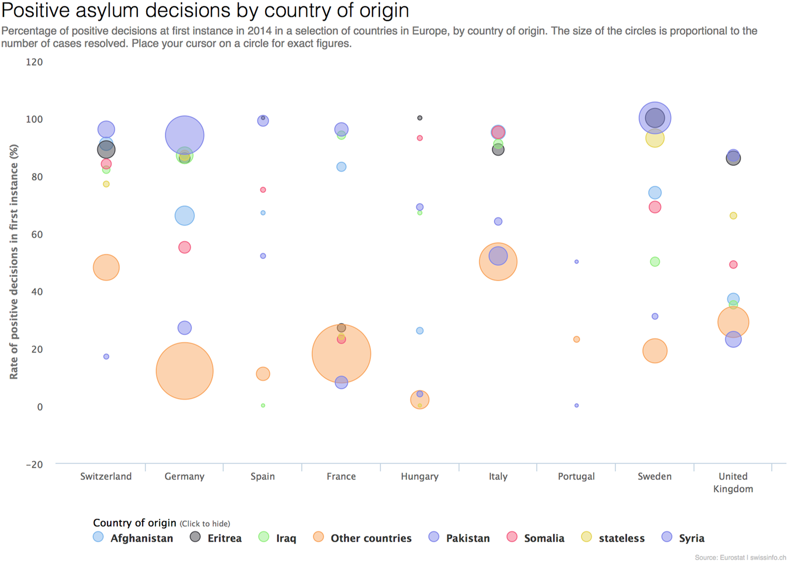
Think of the difference between cartographic imaginaries and the following chart, one in which the data is abstracted into circles of varying sizes (Figure 6).
The colours represent countries of origin, and their location, how likely they are to receive positive asylum decisions across various EU countries. What is remarkable about this chart is the manner in which metaphors of buoyancy operate implicitly to pull the data towards the top of the chart. Rather than dynamism, we have instead a metaphorics of effervescence, one which runs pointedly contra to the metaphors of migrant drownings.
What this indicates is that geographic imaginations frequently normalize the ideological force of migration data. What looks like clarification (mapping) is also obscuring. A large part of the data visualization of migration during the migrant crisis inolved new dynamic mapping technologies, such as those created by design labs such as Lucify and CREATE Lab. CREATE Labs’ maps are called “Explorables”, working to make complex data “more accessible.” They’ve created maps addressing global income inequality and fracking earthquakes. One researcher with CREATE argues that the interactivity allows viewers to become “intimate” with the data: “Instead of mere observers, they become participants in making meaning of data. Then, they can work to answer the questions we really should be asking: Why does our world view allow this sort of harm to exist? How can we work together to change the status quo for the better?”.
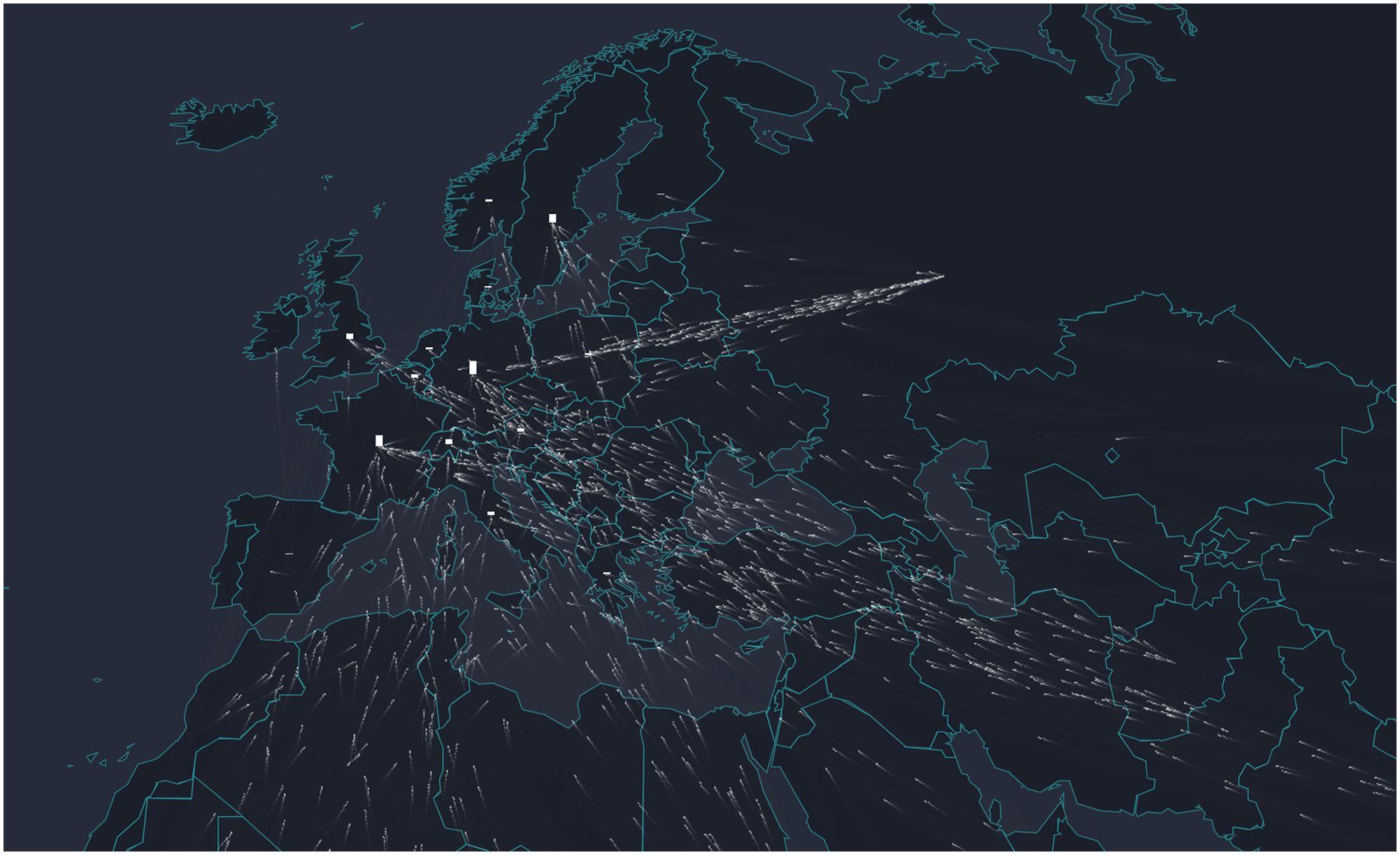
Lucify, a design lab that “helps organizations visualize, understand, and communicate important data and models” has also created a dynamic map of migrant movement entitled “The Flow Towards Europe.” In this data visualization, they animated UNHCR data to create a map of movement where little specks of light travel like swarms of insects towards increasing bar graphs on each country of Northern Europe (Figure 7).
Lucify states plainly that the routes and travel times in their data visualizations are not accurate, but that their animation sought instead to provide “an intuitive grasp of the scale of the problem.” The map provides the key anchor for their data visualization, which appears to make sense given that migration involves spatial movement. It is interesting to think, however, about how this geographical imaginary organizes the aesthetic and ideological force of “migrant data” in profoundly racialized and xenophobic terms. The trajectories of movement visualized emanate out of the center of national territories because data is collected on the basis of nation-state data. The animation abstracts migrant movement into direct lines, directly from departure to arrival locations, erasing movements between countries (and movement to and through non-European countries). The movement itself builds into bar graphs in Western nations, turning the movement itself into statistics, and thus into a biopolitical ‘problem of populations’ that has its origins in colonial and racist scientific schemas. These experiments participate the thaumatotropic movement between forensic and humanitarian lenses within the very dynamism of the data visualization itself.
Back to the world
If the visual regime is governed by the “marvelous turning” of the forensic-humanitarian thaumatrope—formula v. figure, data v. image—and if each instance and object of the crisis remediates and mediates an enlarged field of mediation, how can migrant justice activists and artists intervene in this visual field? I’d like to propose thinking the thaumatropic flipping of the humanitarian into the forensic alongside active processes of remediation to undo the rhetorics of crisis that dominate the mediation of migration). If the visual regime of the migrant crisis is governed by the marvellous optical trick of flipping between data and image, formula and figure—and if each instance and artifact of the crisis is from the ouset remediating and mediating a larger visual field—how do we jam this optical trick to expose its ideological operations?
The first step might be not to map migration abstractly. This kind of intervention, in my reading, is at play in UNITED for Intercultural Action’s “List of 33,305 documented deaths of refugees and migrants due to the restrictive policies of Fortress Europe”. On first glance, the list (which records data on refugee deaths related to Fortress Europe since 1993) appears to be a kind of database, the raw data that subtends the data visualization projects I’ve discussed thus far. Its form is peculiar, however, since it appears online as a PDF rather than a spreadsheet. The pages are numbered in a #/# format, which emphasizes the length of the document and thus materializes the scope of the tragedy in a bounded physical form. The data includes the date the body was found, the name and region of origin (if known) as well as the cause of death. This latter column occupies a full third of the page; the text skirts the conventions of storytelling with its meticulous details (“missing, after falling into the water when their rubber boat deflated between Libya and Italy”; “strangled with electric cable on building site in Qawra (Malta)”; “died of inhaling fumes from stove, at Moria camp, Lesbos” “died of cold after walking for 48 hours through the mountains of Turkish-Bulgarian border”). It constitutes a list that refuses to be a list, a database that resists its structure, a structure whose information cannot simply be sorted or synthesized because the cause of death remains obdurately singular.
The notion that one might remediate data and visual artifacts (and thus activate the turnstile of forensic and humanitarian visual regimes) to diagram the singularity of some experience rather than universal models poses a challenge to social scientific methods for understanding migration as a social phenomenon, one that occurs at the level of particular collective units (populations, nations, etc.) First off, the singularity of migrant movement troubles the specificity of reflexivity or of a politics of location (the manner in which both the subject and object of knowledge is located in gender, race, sexuality, ethnicity, class or nation), since standpoint is particularly what is eroded and lost by migrant movement. Singularity thus points to varying and uneven processes of locatedness (rather than location), a locatedness that is partial and situated but also distributed and layered 4 , intersected by a variety of forces, speeds and exposures that are social, technological, environmental, economic and ideological.
A second step might be to refuse the amplification that social media users produce in liking, sharing, and witnessing images of death and (and in) data, which produces a recursive logic of again and again and again. Instead, grappling with that data as a form of “crisis making” involves intervening in overlapping data regimes, in the surfeit of images, and exposing what they obscure as much as what they reveal. In this regard, Charles Heller and Lorenzo Pezzani’s Liquid Traces: The Left-to-Die Boat Case (2014) situates itself precisely in the overlapping data sets that reveal the Mediterranean’s economies of abandonment in an emblematic instance. The video seeks to trace the trajectory of a small rubber boat, which departed from the Libyan coast in March 2011 with 72 passengers on board. Despite several distress signals relaying the location of the boat and interactions with military vessels, the boat was left to drift for 14 days. Because the multiple state actors failed to respond, only nine of the passengers survived. Heller & Pezzani made use of survivor testimonies, data about wind direction and force, sea currents, and satellite imagery to trace the path of the boat into segments of the Mediterranean governed alternately by the Malta Search & Rescue operation or the Italian Search & Rescue operation. They used naval and aerial data to assist survivors in remembering details that could reconstruct the event and to identify the vessels and aircraft that encountered the rubber boat as it drifted at sea. 5
Wave currents, political assemblies in the streets, Frontex security policies all conjoin to articulate the Mediterranean as a space of acute abandonment. True to the method of “forensic architecture,” the project visualizes a host of overlapping mediatic and data-driven artefacts, remediating found footage, maps, networks, and historical events to expose human rights abuses, expulsions or violence covered over or denied by state, parastate, and individual actors. (Weizman and Herscher, 2011: 116). It operates in the gaps between incommensurable data worlds to find evidence of failures to respond to distress calls in the Mediterranean, for instance. Rather than the abstracted arrows governing data visualizations, the film’s narrative tension is generated by the very act of tracing the precise location of a single boat, using wave patterns, meteorological data, locations of distress calls and other technologies to triangulate the path the boat took. The trajectory is interpellated from the data (it has no indexical trace), and yet it strives for verifiability, for establishing the weight of the singularity of this experience, this boat.
The singularity of some experiences asks us to attend to the contingency of certain articulations (the kind of articulations that hang together by the rope connecting an overcrowded Zodiac boat whose engine has flooded and multinational coalition of social justice workers, medical volunteers in the middle of the sea; that hold together the cellphone making the distress call with the humanitarian and security dashboards that control and patrol international waters; the kind of articulations that float trajectories of desire, personal wagers, and imaginaries of arrival in a potent brew that might look something like political agency). It allows us to attend (and to give scientific meaning to) the fragility of emergent social and subjective forms.
The idea, then, is not to deny the vacillation of the “forensic/humanitarian” couplet in mediating migration. Instead, it involves actively observing how the movement between these poles of mediation trains publics to understand migration as a “crisis,” and thus to see human suffering (which often results from border controls, deportations and detentions) as, instead, a problem of insufficient regulation and control. It means understanding that images might form potent affective archives for calling for rights and responsibility, just as they might form databases for data mining, political cooptation, or national (and xenophobic) sentimentality. It means understanding that data collected by agencies such as FRONTEX, which form the basis of many data visualizations of migrant movement, are bound to institutions and legislative instruments of state surveillance, border control, and militarized responses to human movement. What we do with images, and what we do with data, can amplify the “crisis affect” surrounding migration, just as they can be a tool of intervention in the complicity of visual culture with nation-state ideologies, border regimes, and the militarized control of movement.
Footnotes
Author’s note
This paper revises and extends a previously published paper, “How the World is not a Map: The Political Aesthetics of Mapping Migrant Journeys.” The Large Glass. Vol. 29/30, 2020.
Acknowledgements
I am grateful to the editors for including my work and granting me permission to revisit my argument here.
Funding
The author(s) disclosed receipt of the following financial support for the research, authorship, and/or publication of this article: Support for this research was provided by the Social Sciences & Humanities Research Council of Canada (435-2018-572), as well as Iméra, Institut d'études avancées (IEA) d'Aix Marseille Université.
Declaration of conflicting interests
The authors declared no potential conflicts of interest with respect to the research, authorship, and/or publication of this article.
Data Availability Statement
Data sharing not applicable to this article as no datasets were generated or analyzed during the current study.