
Abstract
What visual features characterize online migration data visualizations, and what do they suggest for the politics of representing migration and informing public attitudes? Audiences increasingly encounter quantitative information through visualization, especially in digital environments. Yet visualizations have political dimensions that manifest themselves through “conventions,” or shared symbols and practices conveying meaning. Using content analysis, I identify patterns of representation in a sample of 277 migration data visualizations scraped from Google Images. I find evidence of several conventions including appeals to objectivity and traceability as well as perspectives and units of analysis centered on states—particularly higher income migrant destinations. Then, by locating my analysis within the growing field of digital migration studies, I argue these conventions potentially shape public attitudes and understandings about migrants, and contribute to broader migration politics involving categorization and quantification that have relevance both on- and off-line.
Keywords
Visual representations have arguably always been central to communicating information and ideas, having equal footing with, if not priority over, accompanying text (Bucchi and Saracino, 2016). Yet the contents and usages of visuals to express information are not self-evidently neutral or objective, as a longer history of scholarship across diverse fields including science and technology studies (STS), international studies, and cartography has shown (Haraway, 1988; Kinross, 1985; Wood, 2010). Images encode rules that help audiences make sense of them, while also normalizing the values and cultural contexts from which they emerged (Kress and Van Leeuwen, 2006). These encodings involve several intermediate steps of translating and transcribing information about an observed (three-dimensional) object in order to create its (two-dimensional) representation (Pauwels, 2020). Therefore, visuals are important objects of study because they provide windows onto political, social, and cultural processes that may have otherwise remained hidden from a primarily text-based analysis (Aiello and Parry, 2020).
As a type of image, data visualization—or the “visual representation and presentation of data to facilitate understanding” (Kirk, 2019: 15)—is particularly salient for the ways that quantitative information is transformed, shared, and used. Across different forms of communication and topics, the turn toward “telling stories with data” (Segel and Heer, 2010) has motivated resurgent interest in data visualization. Its public and policy relevance is especially high: more so than “raw” tables or spreadsheets, visualizations are important ways by which laypeople and experts alike encounter and engage with data (Engebretsen and Kennedy, 2020). From weather maps to dashboards, visualizations offer the promise of distilling key insights from ever-larger and complex datasets to support decision-making (Chen et al., 2014).
Yet just like images more generally, data visualizations convey meanings in ways that are not necessarily self-evident or straightforward. They emerge from particular contexts and tell “multitruthed” stories (Welles and Meirelles, 2015) by invoking conventions, or “a symbolic or social practice that is shared, readily understood and widely accepted by members of a cultural group” (Kennedy et al., 2016a: 717). Social semioticians have developed inventories of signs and symbols present in visualization conventions (Weber, 2019), while several studies have empirically identified how these conventions are deployed in political domains (e.g. Hill, 2017; Risam, 2019).
While the concept of visual conventions highlights the political significance of visual patterns in data visualization, it raises empirical questions about how prevalent they are among images that are available to audiences. The definition of a convention implies that they derive influence from the extent to which they actually appear in visual artifacts. Although surveys of visualization practices in academic settings exist (e.g. Healy and Moody, 2014), they neither consider visualizations that non-expert laypeople would likely encounter, nor link their analyses to the political dimensions highlighted by the concept of conventions. Some scholars in new media and communication studies have begun addressing this gap by identifying patterns within sets of infographics appearing in political settings (Amit-Danhi and Shifman, 2018).
Picking up this line of work, I focus on a particular issue—international migration—to address two questions: what visual conventions characterize online data visualizations about migration, and what do these patterns suggest for the politics of representing human mobility? Migration is particularly useful for examining visualization conventions. First, it is a polarizing issue within which competing sets of values are invoked, resulting in a tendency for data and evidence to serve legitimating roles (Boswell, 2009). This means that visualizations about migration may be more likely to display conventions doing ideological work. Second, if conventions require a degree of shared attention and interest to exist, migration is certainly a topic that is salient among visualizers and the public alike (Dennett, 2015). Third, data underpinning migration visualizations typify those used in other social scientific settings, for example, surveys, censuses, and administrative records (Ruppert, 2011).
To address these questions about conventions’ prevalence, I report results from a content analysis of 277 data visualizations about migration collected from Google Images. Drawing upon prior semiotic work to develop my coding scheme and interpret the results, I demonstrate the extent to which key patterns existed within this set of images: a limited number of chart types (mostly variations of bar and line graphs); the prevalence of white backgrounds; supporting annotation indicating the underlying data sources; symbols and plots using the nation-state as the primary unit of analysis, and particularly reporting statistics drawn from higher income migrant destination countries; and branding that, when present, typically referred to the media outlet that published the visualization.
As such, this article makes three contributions that are relevant for understanding how issues are represented through data visualization and why these (digital) representations matter politically. First, I extend existing theory surrounding visualization conventions by applying it to the domain of migration. Specifically, I argue that visualizations—being accessible to larger audiences across multiple media—can contribute to the stock of information that people draw upon as they think about and form opinions about migration. Therefore, visualization conventions potentially shape the “imagined immigration” (Blinder, 2015) that exists in individuals’ minds, making them important to study not only as images in their own rights but also as vectors by which messages can influence attitudes and preferences. Second, I contribute a systematic analysis of a relatively large number of migration visualizations that are available online. Having this evidence base is an important prerequisite for making claims about the impacts of representations on public perceptions, attitudes, or beliefs—causal claims that are implicit within the concept of conventions. Third, I locate my analysis within the growing field of “digital migration studies” (Leurs and Smets, 2018) to address how studying visualization conventions reveals insights into the place of “the migrant” in these digital outputs, and how visualizations speak to broader migration politics that take place on- and off-line.
Data visualization conventions and politics
Much like scientific imagery, visualization has attracted critiques of its usage to reinforce established power relations and viewpoints (Haraway, 1988; Latour, 1986; Manovich, 2011). A growing body of work specifically identifies how visualization “does political things” (Boehnert, 2016). Sometimes, this involves critically examining the sensory criteria that render some visualizations more valuable than others (Sack, 2011). Other approaches from political communication examine how visualizations arrange and present information in ways that support particular conclusions (Hullman and Diakopoulos, 2011; Pandey et al., 2014). Moreover, political aspects of visualization extend beyond the charts themselves to include messengers. Visualizations exist within networks of designers, researchers, data collectors, and intermediaries such as journalists. These actors bring their own individual and organizational priorities, cultural references, values, and practices to bear on the process of creating and communicating data—a form of “visual brokerage” (Allen, 2018)—even leaving their own branding marks on visualizations that signal ownership or approval. The resulting visualizations and their dissemination often contain tensions among competing interests even if they appear to be seamless and clean (Alcíbar, 2017; Welles and Meirelles, 2015). 1
Cleanliness of design and a comprehensive view (e.g. looking over an entire dataset) are two examples of data visualization conventions that convey shared meaning (Kennedy et al., 2016a)—in this case, a sense of scientific objectivity and truthfulness derived from being able to see “all” the data at once. Donna Haraway (1988), in her feminist critique of scientific knowledge production, called this the “god trick” of science communication—a “vision from everywhere and nowhere equally and fully” (p. 584). A major task taken up by later critical scholars of visual communication—and also by this article—has been to show how such conventions underpin and enable particular ideological and political stances (e.g. Amit-Danhi and Shifman, 2018). To systematize analyses of conventions, social semioticians have created inventories of semiotic resources present in visualizations and afforded by their designs (Aiello, 2020; Weber, 2019). Empirical studies of visualizations typically focus on identifying these features, whether explicitly through formal semiotic analyses or implicitly as part of broader rhetorical studies. Moreover, connecting the concept of conventions with audience reception, some researchers have investigated how individuals react to and make sense of visualizations (e.g. Engebretsen, 2020).
Here, I aim to extend the concept of conventions beyond its sociological roots by applying it to the domain of migration data visualizations to show its relevance for political behavior and attitude formation. As I have argued up to this point, the political dimensions of conventions manifest themselves both in the content and circulation of images. Moreover, as implied by the aforementioned qualitative reception studies as well as experimental efforts, conventions derive part of their importance from their causal effects on audiences. How might this work in the case of migration? Scott Blinder (2015), in developing his concept of “imagined immigration,” argues that as individuals respond to survey questions about what they think about immigrants, they rely on a prototypical immigrant held in their minds. 2 These imagined immigrants are the products of individuals’ prior knowledge and experiences—possibly derived from personal contact with immigrants or media coverage (Blinder and Allen, 2016).
Building on these ideas, I argue that visualizations also potentially contribute to the stock of information about migration that people draw upon as they engage in political behaviors such as forming attitudes. To be sure, scholars of political communication have examined how photographs of migrants and refugees impact what people think about these groups (e.g. Parrott et al., 2019). However, the novelty of my approach lies in theoretically linking the visual conventions identified by semioticians to the ways that data visualizations can shape how individuals understand and perceive concepts such as “immigrants,” “refugees,” and “migration.” If this is correct, then an important prerequisite for determining how visualizations exert their influence is to empirically identify what kinds of features are present in those visualizations. It is this step which I address in the remainder of the article.
Data and methods
The dataset for my analysis comprises 277 images collected from Google Images using the digital tool “Google Image Scraper” (Digital Methods Initiative, n.d.) in October 2019. To compile this dataset, I combined the individual search terms “immigration,” “migration,” and “refugee” with “graph,” “chart,” “statistics,” and “data” to produce 12 search strings. Using these latter four terms ensured that the results excluded photographs. A research assistant conducted these searches, deleting their browser history between each search, and retained the first 30 images returned by the tool for each query while removing duplicate results. This retrieved 300 images, of which 23 were not related to human migration and have been excluded in the empirical section. Comparing top results after simulating searches made in the United States, the United Kingdom, and Germany using a Virtual Private Network (VPN) did not reveal major differences.
Following good practice in digital migration studies (Sánchez-Querubín and Rogers, 2018) and content analysis using, online archival data sources (Barberá et al., 2021), here it is important to reflect on my search term choices. While I considered using the related terms “asylum” and “visualization,” Google Search Term Trends indicated these words were not nearly as popular in searches compared to the other terms. Also, “visualization” seemed too technical and unlikely to feature in ordinary usage compared to “chart” or “graph”: Kennedy et al. (2016b) observed how their layperson respondents sometimes did not recognize the term “visualization” until it was explained to them. Finally, I did not search for variations of “map” because I considered it to be a chart type that my coding scheme would capture. Including it as a search term would amount to selecting on an outcome of interest, that is, the prevalence of different chart types, and introduce bias (see Hewitt, 2006, for further discussion). Even so, maps as a genre of data visualization are worth their own investigation (e.g. Van Houtum and Lacy, 2020).
Next, I developed a coding scheme (reproduced in the Supplemental Appendix) that included features which prior studies and guidance from professional practice indicate are central to the ways that data are represented (Kirk, 2019; Smith, 2019). Most of these are self-explanatory, although some warrant clarification. For example, the feature “three dimensional” referred to the presence of any chart elements that simulated depth, such as shading bars to make them appear three-dimensional. “Symbols” referred to the presence of any pictures or images that did not convey data, such as thumbnail images of flags to correspond with countries or simplified human figures to indicate gender. Finally, the feature of “branding” referred to any logo or statement indicating the source of the visualization—which did not necessarily have to match the data source.
Then, after the research assistant and I applied this coding scheme to the initial set of 300 images, I randomly sampled 30 images (10% of the dataset) and compared the two sets of coding results. Table 1 reports intercoder reliability statistics that account for chance agreement (Klein, 2016). In this article, I only report on and discuss those dimensions whose point estimates were at least .80 on both measures, a threshold commonly interpreted as indicating very high levels of intercoder reliability (O’Connor and Joffe, 2020).
Intercoder reliability statistics.
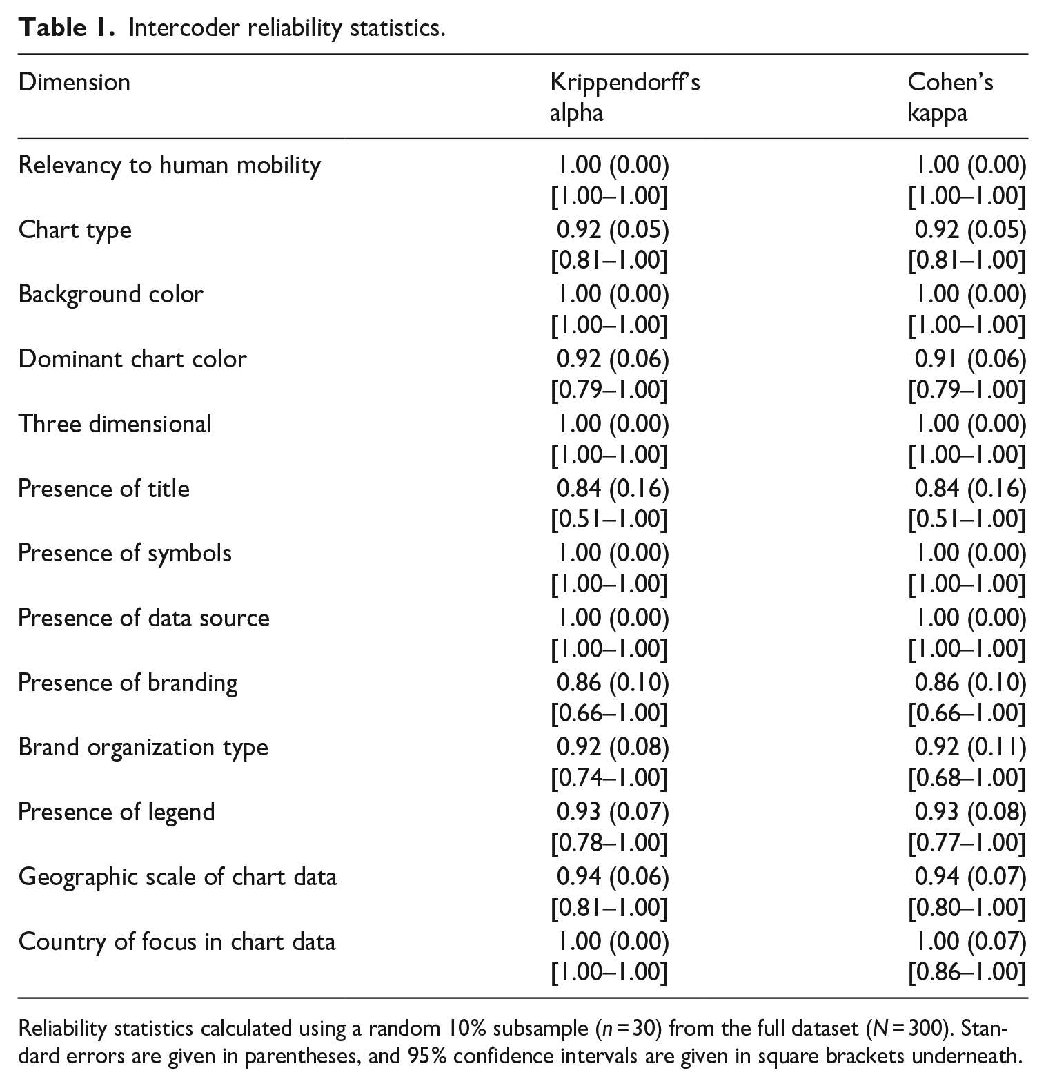
Reliability statistics calculated using a random 10% subsample (n = 30) from the full dataset (N = 300). Standard errors are given in parentheses, and 95% confidence intervals are given in square brackets underneath.
Using Google Images as a data source—and Google Image Scraper as a tool—comes with opportunities and limitations that impact on the scope of my analysis. On one hand, Google Images provides a way of quickly determining where and how images specifically are used online, as opposed to text that appears in general Google web searches. As such, the Image Scraper is an effective way of systematically querying this database while retaining metadata such as website URLs. On the other hand, this data source is itself a particular representation of the kinds of static (i.e. non-interactive) visualizations relating to migration circulating online: it is neither comprehensive in the sense of sampling from a known population, nor entirely transparent as to how items are ranked and presented to users. To be sure, although Google search results likely give a broad sense of the dominant or major aspects of a topic, this should not be confused with providing a neutral window onto data (Rogers, 2009). This has implications for the validity of digital research generally, as scholars have discussed in relation to doing research involving online settings, including Twitter (Driscoll and Walker, 2014) and TripAdvisor (Sánchez-Querubín and Rogers, 2018). Instead of treating data collected online as self-evident, researchers must recognize how digital platforms are part of the data infrastructure that increasingly characterize politics and political messaging (Bigo et al., 2019).
Given this background, I want to set out two scope conditions for my analysis: the results come from a snapshot of static visualizations available on Google Images at a certain point in time; and as a result, this snapshot is neither a comprehensive census of all migration visualizations available to all people, nor did it intend to be one. In this sense, I firmly acknowledge the partialities and biases likely present in my dataset. Rather, I argue this approach provides a way of identifying patterns in the kinds of visual information that users from particular locations (e.g. certain countries simulated by the use of VPNs) might reasonably encounter in typical search settings. 3 As such, my approach is closer to what Richard Rogers (2013) calls “search as research,” whereby the outcomes of interest (i.e. search results) are known to be generated in part by the digital infrastructures in which they are accessed.
Documenting conventions within migration data visualizations
Next, I report how the visual and textual aspects captured by my coding scheme were distributed across the visualization dataset by presenting a high-level view of these patterns. Given that I am interested in documenting the extent to which these conventions exist across many images in a topical domain, I have not chosen to present in-depth qualitative interpretations of specific visualizations. However, to give a flavor of the materials, I include several illustrative examples in the Supplemental Appendix.
Dominant chart types: a convention of limited variety
Practical guidance from visualization practice places great importance on the type of chart used to represent data (Kirk, 2019; Smith, 2019). Different kinds of charts convey different meanings, not least of all by directing attention to particular dimensions within the data. On one hand, this is a somewhat practical matter informed by specific constraints imposed by the visualization’s media location or the shape of the dataset itself. On the other hand, given that visualizations are usually underpinned by complex datasets (Dennett, 2015), deciding which aspects to visualize—and how—is key for shaping how the final output looks and how it is received (Allen, 2018). Figure 1 displays the most commonly used chart types observed in the dataset. Variations of bar charts (bar, stacked bar) comprise about 38% of the sample, while line charts make up 19%. These two chart types are the most frequent among the visualizations (57% of the total), especially compared to the next most frequent chart type (pie, 8%). Moreover, the prevalence of these chart types is underestimated because they also appeared in images containing multiple charts within one image (20% of the total).
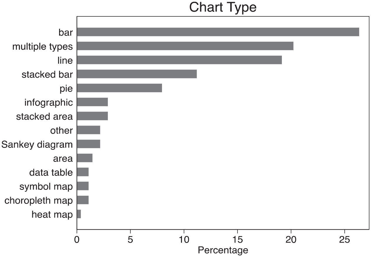
Distribution of main chart types in a sample of migration data visualizations.
What might explain this limited set of common chart varieties? Publicly available migration data tend to express either the gross size of a country’s migrant population, the proportion of the foreign-born population, or both in one chart with two axes. These data, typically being cross-sectional and collected at regular intervals through national statistical offices (Allen et al., 2018), lend themselves well to being expressed in bar and line charts which visualizers use to show changes over time and rank categories in a quantitative order (Smith, 2019). Yet this raises questions about what kinds of perspectives are missing or invisible in these charts that aim to present a comprehensive, “god-like” view (Kress and Van Leeuwen, 2006: 149; see also Haraway, 1988). A common critique of migration visualizations is that they often oversimplify or outrightly lack context about migrants’ intermediate journeys, instead focusing on starting and endpoints (Van Houtum and Lacy, 2020). My quantitative evidence confirms this tendency: the sampled images lack chart types, which could express some of this movement and wider context in even crude ways. For example, visualizations using maps of any type (choropleth, symbol, heat) comprised about 3% of the total dataset and rarely appeared in images coded as involving “multiple” or “other” types. Meanwhile, only about 2% featured Sankey diagrams, a char type which depicts change using curved bands to indicate how quantities vary between different categories or states of being, such as geographic locations or legal statuses.
Background and chart color choices: a convention of objectivity
Color is a key feature that enables users to “read” a chart more effectively by drawing attention to certain elements of the plotted data, and “feel” its overall character by generating emotional responses (Kennedy and Hill, 2018). Figure 2 displays the main colors identified in the backgrounds of each visualization as well as the dominant color present in the chart. What is particularly striking is the lack of background color in the overwhelming majority of the visualizations: nearly four out of five (79%) images in the dataset have a white background. (A small proportion, about 4%, either had their backgrounds removed or were rendered transparent due to how Google displayed the images.)
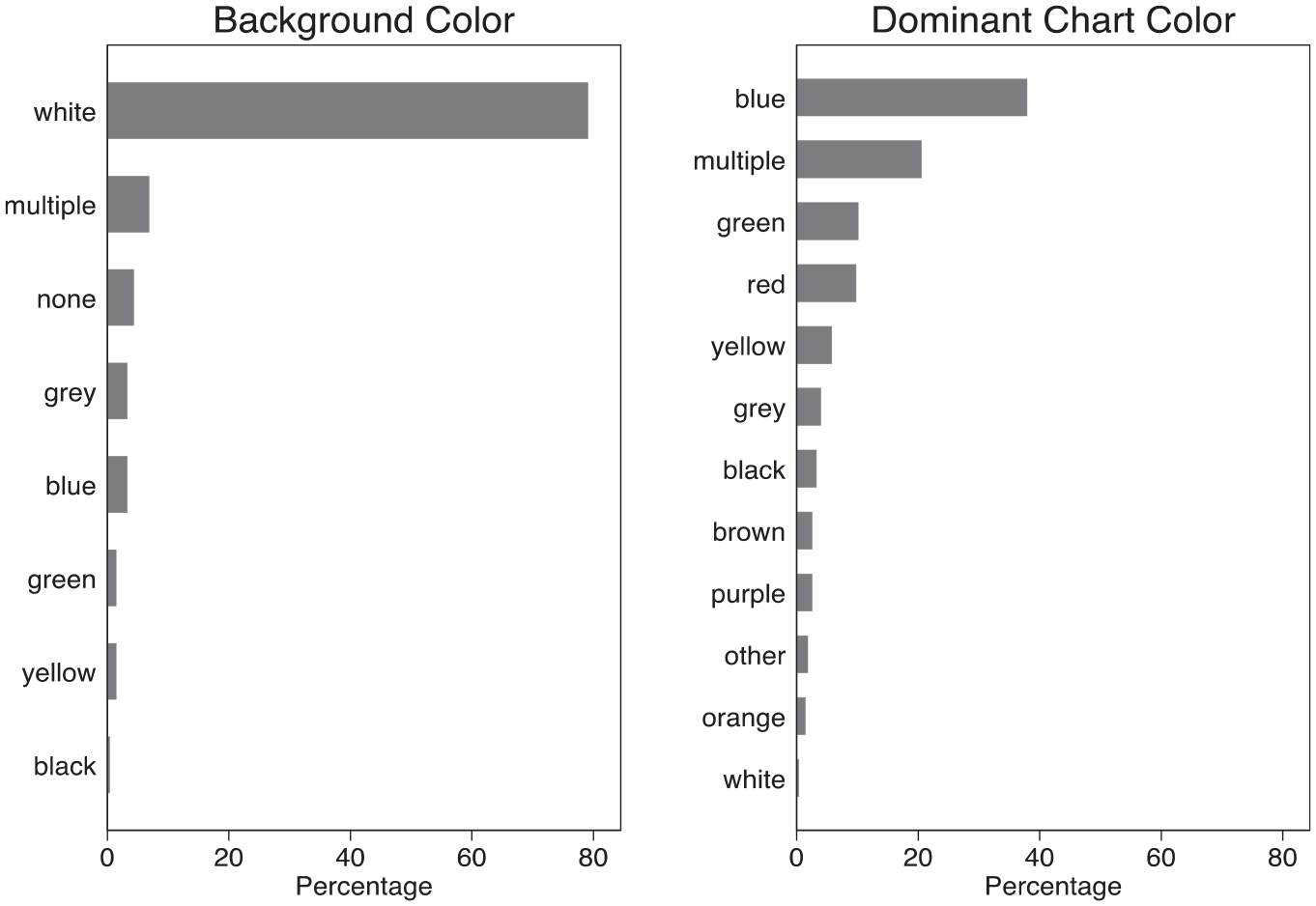
Background and dominant chart colors in a sample of migration data visualizations.
Visual reception studies and social semiotic analyses show how white backgrounds suggest “cleanliness” and objectivity in the context of data visualization (Aiello, 2020; Kennedy et al., 2016a). A preference for “clean” design to indicate clear messaging runs through existing guidance in scientific visualization practice (Kelleher and Wagener, 2011). 4 Yet whether originating in design training or the aesthetic preferences of individual visualizers, this is a non-neutral choice when it comes to the ways that these objects are received. By prioritizing some values such as (perceived) scientific objectivity over others, such as pleasure or amusement (Kennedy and Hill, 2016), visualizers potentially contribute to these representations’ perceived accuracy and trustworthiness. Moreover, this pattern fits with a reading of data visualization as supporting trends in migration politics and policymaking toward quantification and evidence-based decision-making (Boswell, 2019), a point to which I return in the concluding discussion.
By contrast, distilling a clear convention from the patterns of dominant chart colors is less straightforward: only a plurality (38%) mainly contains blue, although it is the only color appearing in more than 10% of the images. On one hand, this may be a feature specific to migration-related visualizations: in their study involving a visualization that showed trends of media coverage about immigration rendered in dark blue, Kennedy and Hill (2018) report how some of their study participants welcomed the color choice and viewed it as an effort to cool a “heated” topic (p. 843). Indeed, experiments and cultural histories show how Western participants associate blue with feelings of calmness and comfort (Pastoureau, 2001; Valdez and Mehrabian, 1994). On the other hand, without comparative analysis of other topics, singling out this interpretation is inadvisable: an apparent preference for blue coloration might not be migration-specific, but rather could arise from a combination of the default affordances of available software and the habits of visualizers—not all of whom may be data visualization specialists.
Titles, legends, data sources: a convention of traceability
In addition to the main chart, there are several elements of visualizations that add information to help viewers understand the visual message. These “visual supports” (Brett et al., 2020) include annotations that most designers would consider essential for visualizations that have public-facing uses: titles, legends, and an indication of the data source or where to access it. Figure 3 displays the proportion of the collected visualizations that contained each of these elements. Most (81%) had a title, and a majority (58%) had text pointing to the data on which the visualization was based. The presence of a legend, meanwhile, was less consistent, appearing in about 48% of the images.
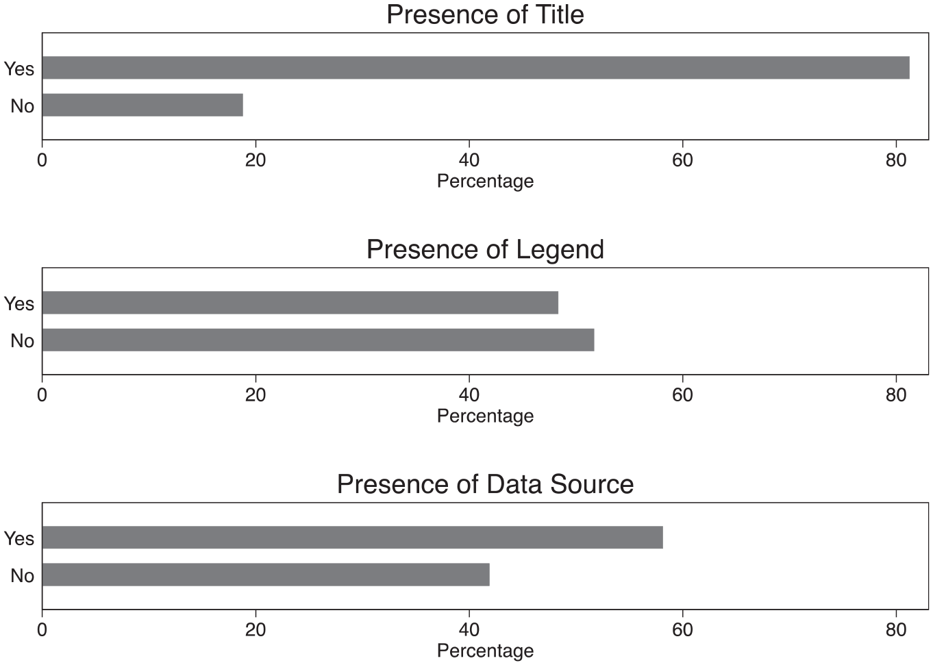
Presence of titles, legends, and data sources in a sample of migration data visualizations.
My results highlight a tendency for migration visualizations to display references to underlying datasets. Linked to the previous discussion about scientific objectivity, I argue this citation practice supports a further convention of traceability by signaling to viewers how they can see—and potentially access—the source data for themselves. This demonstrates norms of honesty and openness while appealing to reputable sources that possess subject expertise, characteristics indicative of credibility (Mackiewicz, 2010). Of course, in political and polarized domains such as migration, it is not always clear who or what constitutes a “credible” expert on whom citizens can and should rely as they make sense of issues and form opinions (Druckman, 2001). Moreover, data and evidence themselves can be used to legitimate preexisting agendas rather than inform technocratic decision-making (Boswell, 2009). Nevertheless, the fact that a clear majority of these images cite their data sources suggests a convention of traceability in the domain of migration.
Three-dimensional plots and symbols: a convention of state-centric priority
Edward Tufte (1983) introduced the concept of “chartjunk” to refer to visual elements that are not necessary for understanding the data, which should be at the center of a visualization. Related to the previous discussion of clean layouts and simple designs, this implies anything that decreases the “data-ink ratio” should be avoided. In my coding scheme, I included the presence of three-dimensional plots and iconographic symbols as two features that sometimes attract the attention (and annoyance) of visualizers as forms of chartjunk. Figure 4 displays the prevalence of these features in the image dataset. These features’ presence across the collected migration visualizations is very low: only about 5% of images have three-dimensional elements, while about 19% contain symbols that were not directly representing data.
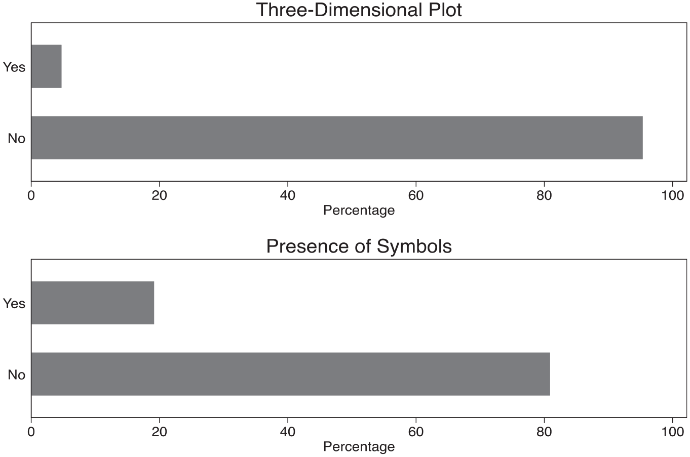
Presence of three-dimensional plots and symbols in a sample of migration data visualizations.
On the one hand, this pattern confirms how the specter of chartjunk has successfully led visualizers of migration data to avoid these features. On the other hand, where symbols do appear in the images, they almost exclusively focus on images that represent nation-states—particularly flags and simplified outlines of territorial boundaries. From a political perspective, this practice is problematic because it privileges how states “see” and are seen via underlying datasets (Squire, 2015). Linking to my earlier discussion of how visualizations contribute to the ways that people might “imagine” immigration, the dominance of national symbols in these images suggests a convention of prioritizing states’ views of migration over other scales that may actually be more relevant for mobility (e.g. cities, transborder regions) as well as other forms of migratory connections among places (e.g. networks).
Units of analysis and geographies: a convention of destination country interests
Closer investigation of the geographic scales and locations featured in these migration visualizations not only provides further evidence of a state-centric convention but also highlights how these images tend to prioritize the situations and interests of higher income and migrant-receiving countries. Figure 5 displays both the geographic scale represented by the data and the named focus of the visualization where one was present. 5 Two key points emerge from the analysis. First, national perspectives are indeed more common than other geographic scales, featured in 58% of the images with an identifiable scale. Second, about half (49%) of the visualizations with an identifiable focus specifically depict migration data about the United States, followed by about 15% referring to the United Kingdom. These trends remained even after comparing the results returned by searches while using a VPN.
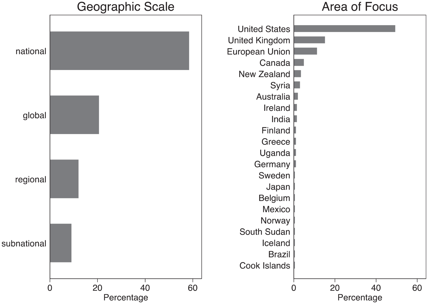
Distribution of geographic scales and areas of focus in a sample of migration data visualizations.
Beyond the skew toward national-level data, which confirms the findings relating to the types of symbols reported in the previous section, the breakdown by areas of focus reveals an important pattern that is relevant to the politics of migration: most of these visualizations refer to higher income, immigrant-receiving countries that are typically considered destinations for migrants and refugees. By contrast, the experiences of sending and transit countries, with the possible exception of Syria in my sample, are invisible despite the fact that many have actually experienced greater migratory flows (Abid et al., 2017). This likely reflects a mixture of three factors: the realities of migration data collection, which tends to be more developed and available in these kinds of countries (Laczko, 2015); the prominence of these countries’ agenda-setting power in global migration politics and policymaking that increasingly speaks of the importance of data (Pécoud, 2021); and, specific to online research, how platforms like Google potentially shape the results returned to users. Indeed, comparative empirical work reveals how Google search results in most developing countries actually point to US or European content rather than local content (Ballatore et al., 2017).
Branding: a convention of use by established institutions and media
The final set of characteristics I examine addresses the question of who uses data visualization on issues of migration. As communicative objects in their own rights, visualizations are located at—and arise out of—the interface of multiple actors that may include academics, designers, data collectors, and intermediary organizations (Allen, 2018). The clearest, though by no means the only, signal of these actors is a brand or similar mark that appears on the visualization. Figure 6 displays both the proportion of images that contained identifiable branding and the breakdown of those brands into broad categories.
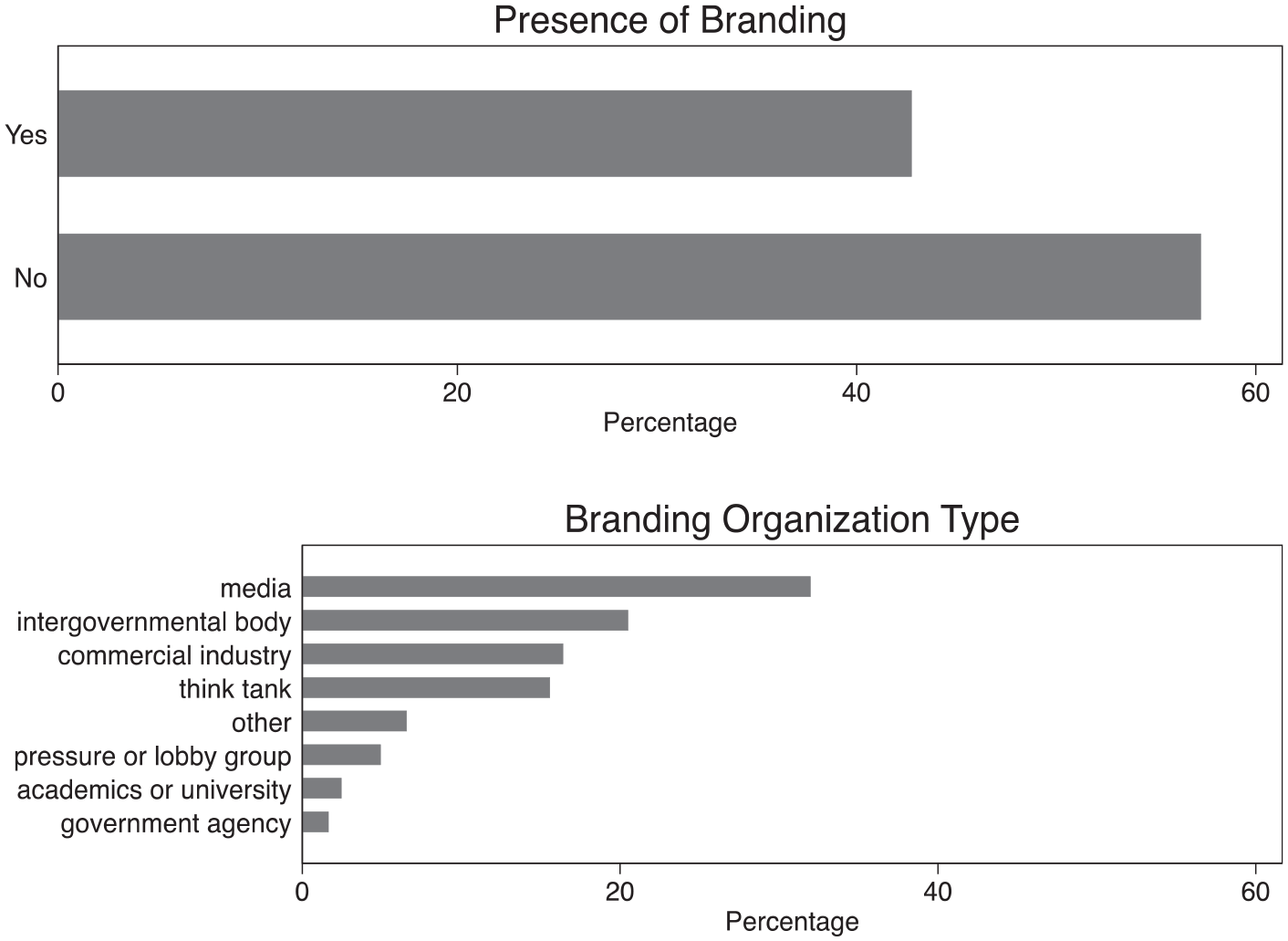
Presence and types of organizational branding in a sample of migration data visualizations.
About 43% of the visualizations displayed a brand, usually in a corner. Among these instances, about 32% involved a media organization, 20% an intergovernmental body, and 16% each for commercial industry and think tanks. This suggests some organizations are more strongly linked with visualization outputs: across the sampled images, these include journalistic media organizations and (to a lesser extent) bodies such as the UN High Commissioner for Refugees (UNHCR) which comprised most of the “intergovernmental” category. 6 While fully identifying why this is the case is beyond the scope of this article, observing this convention among migration data visualizations adds to understanding about who engages in visualization practice.
Discussion: the politics of making migrants and migration visible
My analysis has documented several patterns within these 277 visualizations about migration: limited chart type variety; appeals to objectivity and traceability; prioritization of states’ perspectives, particularly higher income destination countries; and use by established international organizations and media. In this section, I discuss their significance as indications of the kinds of information about migration that users encounter in digital spheres. Then, I consider how identifying these patterns—which are not necessarily exclusive to migration—adds to scholarly knowledge about data visualization as a genre within digital migration studies while opening up new avenues for further research both on- and off-line.
How visualization conventions potentially shape public understandings of migration
Documenting the presence of conventions contributes empirical knowledge about publicly available migration data visualizations, and ratifies findings identified by prior qualitative work (e.g. Kennedy et al., 2016a). Yet as argued earlier with reference to the notion of “imagined immigration” (Blinder, 2015), I leverage this evidence base to develop a further theoretical point: that data visualization conventions potentially shape how users perceive and understand the concepts of migrants and migration, which may have consequential impacts on attitudes, policy preferences, and political behavior. My evaluation of visual conventions, combined with existing work on migration attitudes, reveals at least three mechanisms by which this can happen: (1) presenting numerical and quantitative evidence about migration as being especially relevant and credible, (2) emphasizing migration as a primarily national phenomenon, and (3) providing a means of signaling the agenda or partisanship of messengers who commission or otherwise publish visualizations.
First, relevancy and credibility are well known to be key factors that shape how people engage with—and are impacted by—information (Druckman, 2001). When they invoke conventions of objectivity and traceability, data visualizations appear to make objective statements about migration and migrants. Yet the data underpinning these images are necessarily limited and partial, prioritizing quantitative measures such as stocks and flows rather than contextual features about migrants’ journeys and motivations (Van Houtum and Lacy, 2020). Of course, all images possess degrees of partiality: they must include some elements while excluding others from view. Rather, I want to draw critical attention to the kinds of information that visualizations tend to convey. Statistics focusing on quantities necessarily draw attention to aggregations, potentially feeding (mis)perceptions of large-scale movement and overestimations of foreign-born populations which cross-national evidence shows to be associated with negative immigration attitudes (Herda, 2010). More broadly, as seen in trends toward evidence-based migration policymaking (Boswell, 2009), preferences for numerical data potentially elide what is countable with what is knowable—and ultimately what is actionable by policymakers (Lo Presti, 2020). This sustains a widely held assumption that mere access to more information necessarily should lead to positive policy outcomes (Srinivasan et al., 2017).
Second, conventions of reporting migration in national terms—and with particular reference to mainly higher income destinations—overlook other locations and scales in which the impacts of migration are also felt. Discussing migration at the level of an entire country, while factually accurate, may misstate the actual degrees to which migrants are salient for individuals or communities whose experiences likely vary from a national picture (Katwala et al., 2014). This may change how people imagine the relative importance (or unimportance) of migration as a political issue. To be sure, migration scholars have productively challenged the empirical and methodological primacy of the nation-state by using more dynamic concepts like networks and mobilities (Gielis, 2009). Yet I argue more needs to be done to link these nuances of the experiences of migration with their representations through visualization. The success of this task will depend not only on expanding the varieties of migration data that are often collected at national levels (Van Reekum and Schinkel, 2017) but also on developing different ways of visualizing data more broadly—a point to which I return in the next section.
Third, the convention of incorporating branding onto visualization outputs presents a second-order mechanism for changing the ways that people imagine migration: not through the datasets themselves but rather through the perceived reputation of the messenger whose brand appears on the image. Much work in political communication shows how people tend to interpret new information alongside their prior partisan beliefs—a form of motivated reasoning (Kunda, 1990; Leeper and Mullinix, 2018). My results suggest that a plurality of sampled migration visualizations contained brands corresponding to established media outlets, think tanks, or partisan pressure groups. This presents two possible implications for migration attitude formation: that the branding serves as a heuristic which shapes how users engage with the visualization content, and that users’ perceptions of the messenger change as they associate it with quantitative outputs. Here, perceptions of intermediary messengers like media outlets and lobbying groups matter because they impact upon trust and partisanship—factors which are important antecedents for attitude formation and persuasion (Allen, 2018).
Visualization as a genre within digital migration studies
Studying migration data visualizations as communicative objects in their own rights paves the way for further work that empirically demonstrates their consequences for public understanding of this issue. This could productively happen via qualitative studies among users, quantitative experimental work, or a combination of both. Yet it is also important to highlight how the conventions I have identified speak to changes in the relationships between digital and social worlds more broadly. Here, the heterogeneous and growing field of “digital migration studies” (Leurs and Smets, 2018) provides a fertile area in which to plant my investigation of data visualization. Specifically, borrowing from two of Leurs’ and Smets’ provocations, I ask: where is the migrant in digital data visualization, and where is the political in digital data visualization?
As a matter of representation, my analysis suggests “the migrant” largely appears in aggregated forms. To an extent, this is neither unexpected nor a departure from analog (i.e. pre-digital) media: moves toward quantification and statistical reasoning throughout history have always involved aggregation (Desrosières, 1998), and studies into legacy media representations of migration show how “masses” of migrants predominate (Smith and Deacon, 2018). What is more, paraphrasing Haraway’s (1988) language, my results suggest migrants are simultaneously everywhere and nowhere: everywhere in the sense that migrants appear to occupy entire nation-states, and nowhere in the sense that charts tend to strip away contextual details about migrants’ varied origins and locations to focus on their quantitative stocks.
This leads me to consider where the political is located in digital migration visualizations. One well-documented source of politics in migration studies relates to categorization, in terms of both “who counts” as a migrant, and who gets to do that counting (Allen et al., 2018). By invoking received regimes of categories, often generated and used by states yet unrecognizable to migrants themselves who slip between gaps in official typologies (Crawley and Skleparis, 2018), visualizations potentially oversimplify the realities of migrants’ actual trajectories. What is more, as Bridget Anderson (2013) observes, the roots of these categories run through much longer histories of colonialism, vagrancy, and transportation that are not as readily associated with contemporary “migration” even as they have produced highly significant patterns of human mobility.
Another source of migration politics relates to the uses of numbers as tools of governance. Quantitative measures standardize and depoliticize issues as they present a “credible” and neutral view to legislators (Baele et al., 2018). Meanwhile, metrics and their visualization can function as “alignment devices” (Bandola-Gill et al., 2021) that gather policymakers’ attention around an issue in an attempt to build consensus towards collective action. Such depoliticizing and aligning through quantification is evident in contemporary migration governance: for example, the Global Compact for Safe, Orderly and Regular Migration—adopted in 2018 by the United Nations—prioritizes expanding the collection and standardization of different forms of data in order to support evidence-based migration policymaking (see Pècoud, 2021 for a critical assessment). Yet in polarized issue domains like migration that lack commonly shared standards and objective benchmarks, there is a risk of pre-determined agendas actually driving the production, selection, and eventual use (or non-use) of evidence (Boswell, 2009; 2019). Moreover, echoing Leurs’ and Smets’ plea to not lose sight of the contexts in which digital practices occur, these sources of migration politics (categorization and quantification) are not solely on-line concerns. Rather, conventions’ importance spills over into the ways that migration policymaking and attitudes develop and have consequences off-line, too.
Yet these outcomes are not necessarily inevitable: visualizers can productively break with conventions in order to challenge established thinking. This echoes Haraway’s (1988) original, and still prescient, feminist call for a “practice of objectivity that privileges contestation, deconstruction, passionate construction, webbed connections, and hope for transformation of systems of knowledge and ways of seeing” (pp. 584–85). To achieve this, some designers have explicitly highlighted and celebrated normative purposes of visualization that aim to make a difference, producing visualizations that emphasize narrativity and non-linearity (Risam, 2019) and challenge the ubiquity of national sources of migration data (Adams, 2018). Another way of “doing” visualization differently involves making design conventions explicit to users: Vermeulen et al. (2020) and Kennedy and Allen (2017) demonstrate this approach by placing modified versions of published data visualizations that intentionally disrupt established conventions alongside their original forms. These practices collectively offer the possibility of shifting how people imagine migrants and migration by generating alternative, even radical, representations that unsettle dominant approaches to mobility (e.g. Ponzanesi, 2019).
As researchers are increasingly encouraged (if not outrightly required) to engage with different kinds of publics, it is tempting to turn to data visualization for eye-catching outputs that reinforce heuristics of credibility. This is especially the case as the resource and time costs associated with producing visualizations to relatively high standards decrease, and public access to large-scale and diverse datasets grows. Yet visualization involves conventions that are not politically neutral, and are therefore potentially consequential for political behaviors and policymaking. Acknowledging this should be an important starting point for future visualization efforts.
Supplemental Material
sj-pdf-1-nms-10.1177_14614448211019300 – Supplemental material for The conventions and politics of migration data visualizations
Supplemental material, sj-pdf-1-nms-10.1177_14614448211019300 for The conventions and politics of migration data visualizations by William L Allen in New Media & Society
Footnotes
Acknowledgements
I would like to thank Benjamin Landis who provided excellent research assistance, and Evan Easton-Calabria who commented on an earlier draft. I am also grateful for the feedback provided by attendees and discussants at the conference “Digital Fortress Europe: Exploring Boundaries Between Media, Migration, and Technology” organized by the European Communication Research & Education Association (October 30–31, 2019; Brussels, Belgium); a seminar for the Digital Society Network at the University of Sheffield (November 20, 2019; Sheffield, UK); and the “Images-as-Data Workshop” hosted virtually by Trinity College Dublin (December 10–11, 2020).
Funding
The author(s) disclosed receipt of the following financial support for the research, authorship, and/or publication of this article: Funding for this research was provided by the Public Engagement with Research Leadership scheme at the University of Oxford.
Supplemental material
Supplemental material for this article is available online.
Notes
Author biography
References
Supplementary Material
Please find the following supplemental material available below.
For Open Access articles published under a Creative Commons License, all supplemental material carries the same license as the article it is associated with.
For non-Open Access articles published, all supplemental material carries a non-exclusive license, and permission requests for re-use of supplemental material or any part of supplemental material shall be sent directly to the copyright owner as specified in the copyright notice associated with the article.