
Abstract
The output of a differential scanning fluorimetry (DSF) assay is a series of melt curves, which need to be interpreted to get value from the assay. An application that translates raw thermal melt curve data into more easily assimilated knowledge is described. This program, called “Meltdown,” conducts four main activities—control checks, curve normalization, outlier rejection, and melt temperature (Tm) estimation—and performs optimally in the presence of triplicate (or higher) sample data. The final output is a report that summarizes the results of a DSF experiment. The goal of Meltdown is not to replace human analysis of the raw fluorescence data but to provide a meaningful and comprehensive interpretation of the data to make this useful experimental technique accessible to inexperienced users, as well as providing a starting point for detailed analyses by more experienced users.
Keywords
Introduction
Thermal shift analyses may be performed in many ways; one of the more popular techniques uses a real-time polymerase chain reaction (RT-PCR) machine, and this version (known as Thermofluor or more generally as differential scanning fluorimetry [DSF]) is becoming widely used in structural biology and biophysics, driven in part by its simplicity, low cost, and the wide availability of the hardware used in the assay. Initially, these miniaturized thermal analyses were used to investigate ligand binding to a protein target,1,2 but DSF has been adopted as a general method to assess relative protein stability.3–5
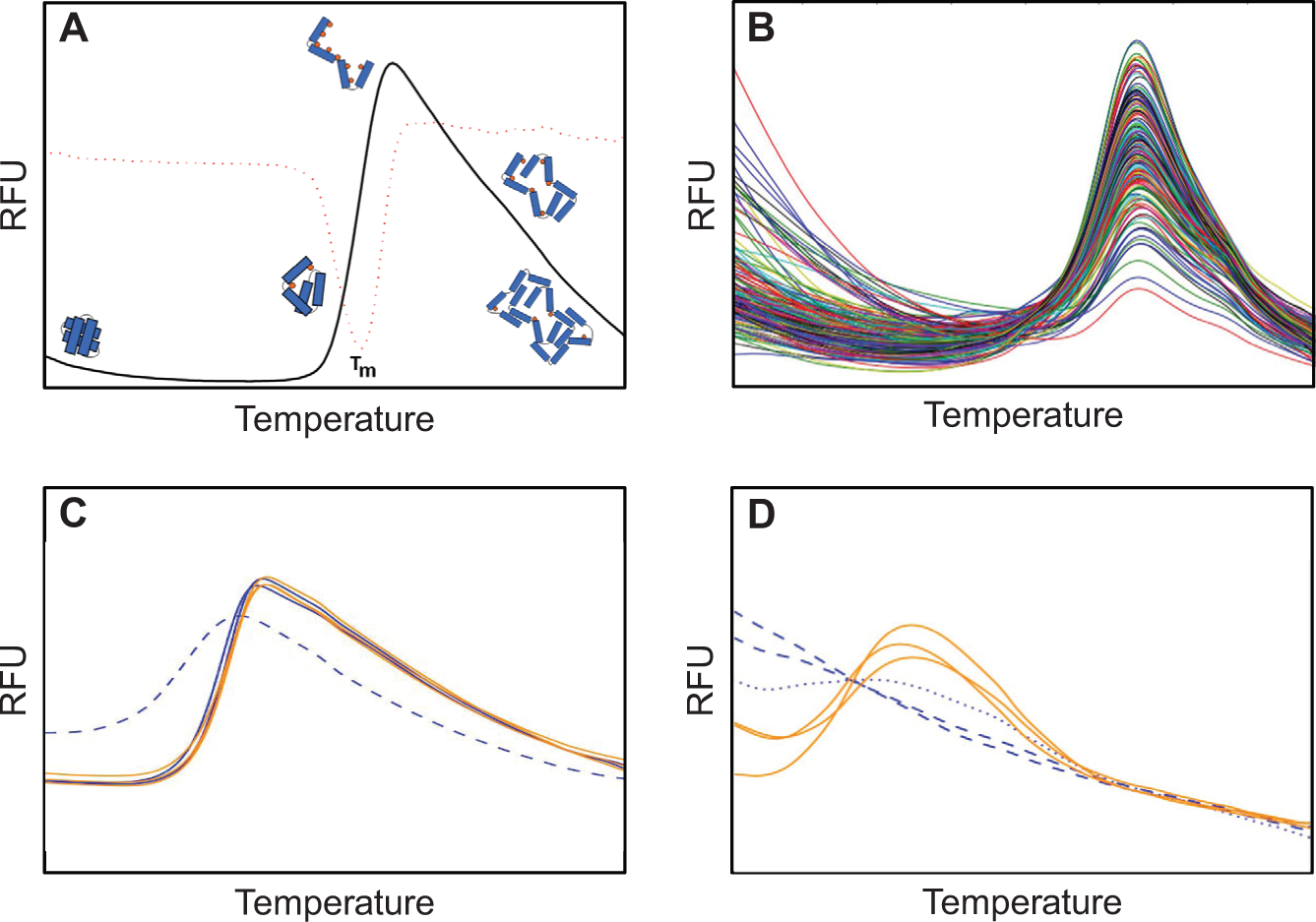
In the DSF experiment, an RT-PCR machine is used to measure the fluorescence of an array containing different protein/fluorescent dye mixtures as they are heated. A number of dyes can be used in a DSF experiment, but all have the property of preferring a hydrophobic to a hydrophilic environment; thus, these dyes bind to the hydrophobic core of an unfolding protein in aqueous solution. Furthermore, the fluorescence from these dyes is quenched in an aqueous environment. Many DSF experiments start at moderate temperature (around room temperature, or 20 °C) and measure the fluorescence response from this point up to high temperature: 80 °C or more. At the beginning of an ideal experiment, the protein is well folded, and there is little interaction between the dye and the protein; the dye is in the bulk solution, and its fluorescence is quenched in this aqueous environment. As the dye/protein mixture is heated, the protein unfolds, exposing its hydrophobic core to which dye binds. The dye bound to the hydrophobic environment of the unfolding protein fluoresces. As the protein continues to unfold, the fluorescence from bound dye increases. At some point, the unfolded protein chains aggregate, excluding dye in the process. The excluded dye is returned to the surrounding aqueous environment or is simply quenched at higher temperatures, and the fluorescence signal decreases. The temperature versus fluorescence plot from this ideal experiment has a flat pretransition region, a steep sigmoidal unfolding region, and an aggregation region ( Fig. 1A ). The value most often reported from a DSF experiment is the temperature of the midpoint of the sigmoidal transition region of the fluorescence curve, which is the temperature of hydrophobic exposure—usually reported as the melt temperature (Tm). Other attributes of the curves also contain information—the steepness of the sigmoidal transition, for example, or the flatness of the pretransition baseline.
(
The individual trials in a DSF experiment may be used to probe the stability of a protein under different conditions—in the presence of small molecules 6 or under different pH or salt conditions 7 ; a higher Tm is associated with increased stability. The raw fluorescence versus temperature plots obtained from RT-PCR machines need to be interpreted to extract the stability information, and there are tools to help in the interpretation of the raw curves. Earlier applications tended to be spreadsheet based and required a significant effort to use. 6 More recently developed tools such as DMAN, 8 MTSA, 9 and ThermoQ 10 overcome many of the difficulties with the spreadsheet analysis tools, but these are general applications for displaying curves and extracting specific parameters rather than offering an interpretation for the overall experiment. In general, the currently available tools aid the experienced user, rather than helping a less experienced user to interpret a DSF result. The knowledge that is required to interpret a bank of DSF experiments includes (a) an understanding that some curves are outliers or are otherwise unlikely to give sensible results, (b) recognizing when a curve might be an outlier, and (c) recognizing that some curve shapes do not provide any information or may provide ambiguous results. In earlier work, we showed that replication and the inclusion of suitable controls are essential for reasonable interpretation of a DSF experiment. 11 Building on that, we set out to build a robust, extensible analysis tool that would be easily accessible and would use any replication and some basic knowledge of the experiment to create a report to help pilot both less and more experienced users through a DSF experiment.
For structural biology, in particular crystallography, the production of protein and the production of crystals from the protein are limiting—as both steps are unreliable and expensive; DSF experiments may ameliorate some of the limitations of these steps.7,12 Because of the importance of the formulation of protein used in all biophysical analyses, we implemented a standard buffer screen 11 (Buffer Screen 9, BS9) as part of the suite of offerings through the Collaborative Crystallisation Centre (C3; http://crystal.csiro.au). BS9 is the ninth iteration of our in-house formulation screen, and it captures our experience that controls, replication, and consistent layout are all critical for reliable downstream interpretability. The Meltdown analysis tool was initially developed for the interpretation and display of BS9 results but has been extended and is appropriate for analyzing many DSF experiments, particularly ones where replication has been used.
Materials and Methods
Input into Meltdown
The machines that can generate the fluorescence readouts that are the basis for a Meltdown analysis tend to be plate-based devices and thus produce 96 or 384 fluorescence curves simultaneously; however, Meltdown has no inbuilt limitations to the number of curves that can be analyzed at once.
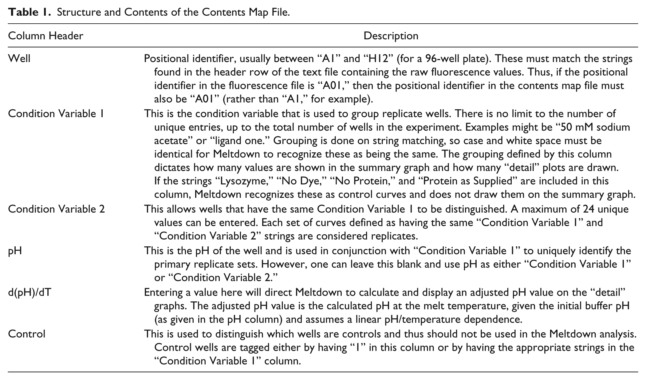
Meltdown requires two input files: a text file containing the raw fluorescence values and a text file containing the contents of each well (the “contents map” file). The contents map is used to group replicates within a DSF experiment and to provide information about how the results of the experiment should be presented. In C3, the export option of the BioRad CFX Manager analysis package (Version 3.1 or above) is used to obtain the raw data as a text file (i.e., tab-separated .txt file). Only one of the exported files is used in the analysis—the file that contains the fluorescence reading for each well at each temperature point (the BioRad CFX manager software calls this file “Runname - Melt Curve RFU Results_FRET.txt”). This file is arranged so that each row is a temperature point, and each column is a well (or a position in the experimental plate). Text files from other systems can be used but must follow the same arrangement of rows and columns. The first column gives the temperature at which the fluorescence was measured—this column must have exactly the string “Temperature” (no quotes) as its header. The first row gives the positional identifiers of the plate well (except the first column, which must contain the string “Temperature,” as described above). Meltdown has no intrinsic limits on either the number of wells that can be analyzed or the temperature step size or range. The contents map file is also a tab delimited file; an example is provided along with the Meltdown code. The order of the information in the contents map file is unimportant; however, the header information may not vary. The contents map file contains columns including a positional identifier and a number of other columns for content description. The contents map file also contains a column that allows a user to enter a buffer temperature dependence term, which is included in the Meltdown analysis if provided. Replicates are identified by having the same string in the first “Condition Variable” column of the contents map file. Standard controls “Lysozyme,” “No Dye,” “No Protein,” and “Protein as Supplied” are recognized by Meltdown, but other controls may also be defined in the contents map file. Table 1 gives a more extensive description of the contents map file structure.
Structure and Contents of the Contents Map File.
Meltdown Analysis
The Meltdown analysis of an experiment considers replicates of the experimental trials and applies analytical techniques to determine curve outliers and curves unsuitable for Tm calculation. The analysis is conducted as follows:
1. All curves are normalized such that the area under the melt curve integrates to unity, and the factor used in normalization is retained for later use.
2. Curves are identified as being above background by comparing the normalization constant of the curve with that of the “no-protein” curves, if available. Curves are considered to have a signal above background if their normalization factor is at least 15% greater than the average normalization factor found in the no-protein controls of the same run. Each curve is also checked for saturation—curves that have a flat top are identified by finding the temperature that gives the greatest fluorescence response; curves that have that same fluorescence value for 10 or more consecutive temperature steps are considered overloaded. Curves are only considered valid and used for further analysis if they fulfill both the requirement for being above background and are not overloaded.
3. Outliers among a replicate set are located through a graph-based analysis. The Aitchison distance 13 between each pair of the normalized replicates (i.e., the sum of differences squared of the natural logarithm) is used to generate a full connected graph where each node is a normalized replicate and each edge is weighted by the distance: if an edge distance is above an experimentally derived threshold, that edge in the graph is removed.
4. After processing all distances, a replicate is retained if it belongs to the largest connected component of the resulting graph. Nonretained curves are the discarded outliers. If this process returns two equally large connected components, the one with a smaller sum of distances is selected.
The threshold cutoff (point 3 above) was derived from the spread obtained when 168 lysozyme curves (the lysozyme-positive control curves from 56 different runs of BS9 performed in C3) were normalized and overlaid in the same manner ( Fig. 1B ).
After selection of valid curves and removing outliers ( Fig. 1C ), the remaining replicates are tested for monotonicity and used to estimate a melt temperature (Tm):
5. If the differences between each point of a moving window of five consecutive points in a melt curve are all negative, the replicate is considered monotonic and not further analyzed ( Fig. 1D ). This analysis is made more robust by softening the requirement for negative decrements by a “noise factor” derived from the normalization constant. Furthermore, within the series of consecutive points, a single point may show a positive difference; however, this invokes a penalty and requires that the string of consecutive points be longer to fulfill the requirement of monotonicity.
6. The negative first derivative of each remaining (i.e., valid, nonmonotonic, nonoutlier) melt curve is calculated and used to estimate if there are single or multiple transitions. If multiple minima are found, the melt curve is considered “complex,” which is the term we use for curves that do not adopt the canonical melt profile shown in Figure 1A .
7. The Tm of the selected curves is estimated in two ways—first by using a quadratic fit to the data around the global minimum of the first derivative curve (this value is used as the Tm in subsequent analyses) and second by finding the temperature associated with the midpoint in the fluorescence response between the high point and the low point of the melt curve. If the melt temperatures estimated by the two different methods differ by more than 5 °C, then the curve is considered “complex.” The low point of the graph is the lowest point found starting from the left-hand side of the graph, and the high point is the highest point of the melt curve after the low point.
8. Curves where the minimum of the inverse first derivative is within a small (empirically derived) distance from 0 are considered “shallow.”
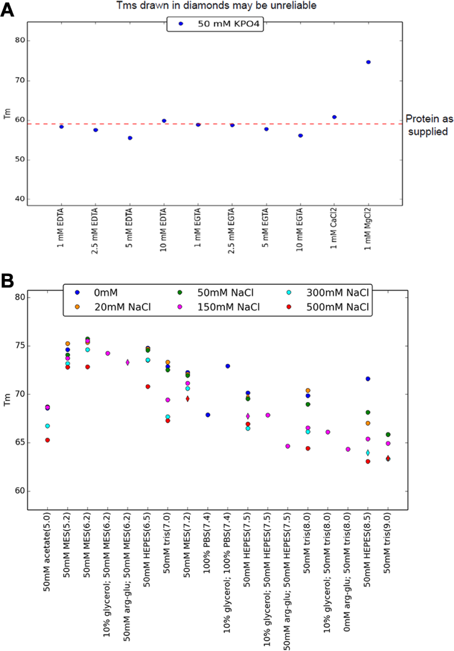
9. The Tm values of the individual melt curves within a replicate set are used to find an average Tm and an estimate of the variation in the Tm. If only one curve of a replicate set remains, no estimate of the variation is made. If a buffer pH temperature dependence value is given in the contents map file, then the estimated pH at the Tm is also provided.
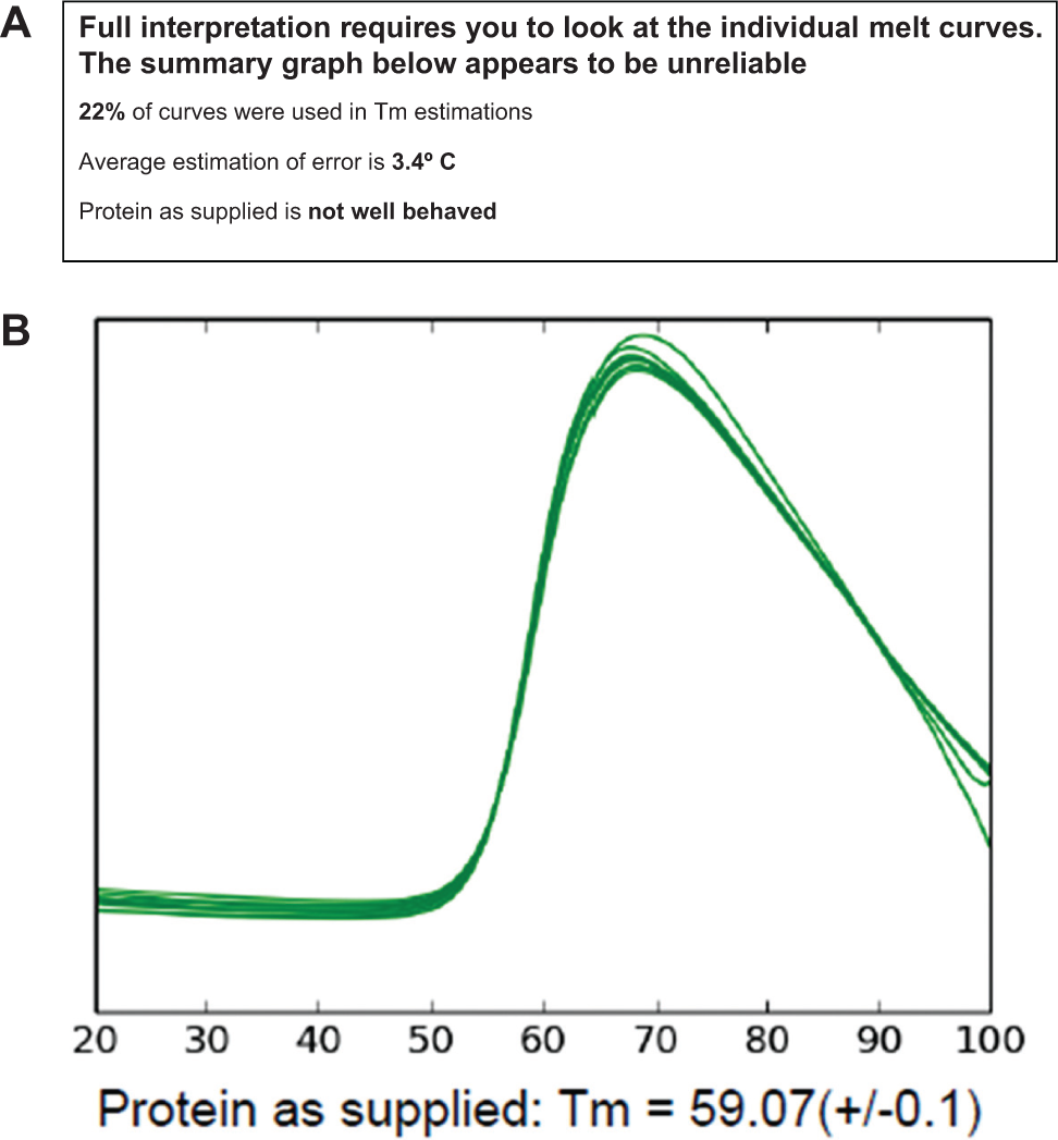
10. A report is generated that presents an overall summary graph of the Tm versus content (from the content map) and an estimate of the robustness of the overall analysis. This estimation considers the number of curves that could be used to generate a Tm as a percentage of the total number of experimental (noncontrol) melt curves, the average estimation of error in the Tm for all replicate sets, and the unfolding behavior of the protein in its original formulation if identified in the contents map file. Along with the summary graph, the superposed normalized curves from the “Protein as Supplied” wells are shown ( Fig. 2 ). The Tm values that are potentially less reliable—that is, derived from a complex curve, a shallow curve, and/or a single melt curve—are shown on the summary graph with a diamond-shaped symbol rather than the default solid circle symbol.
11. Any curves identified by Meltdown as belonging to controls—either through the “Control” tag in the contents map file or by one of the standard names for controls (“Lysozyme,” “No Dye,” “No Protein,” “Protein as Supplied”) are not displayed on the summary graph, but controls that fail—for example, don’t superpose well—are noted on the front page of the report.
12. The number of values along the x-axis of the summary graph is determined from the contents map file. In the simplest case, identical experimental replicate curves are grouped, and each group would be labeled separately on the summary graph ( Fig. 3 ). Each member of a group is identified by having the same string in the “Condition Variable 1” column and the same value in the pH column of the contents map file. A second layer of differentiation may be used. This is defined in the “Condition Variable 2” column; up to 24 unique secondary identifiers may be used. The order of the values along the x-axis is defined by the “pH” column of the contents map file, with the lowest values on the left and the highest values on the right of the graph.
13. The normalized melt curves for each of the groups are shown in separate detail plots. Curves distinguished by the secondary differentiator within a group are drawn in different colors. There is one detail plot for each of the x-axis strings in the summary graph ( Fig. 1C , D ).
(
(
All the calculations are performed using SciPy/Pandas, as implemented in the Anaconda Python distribution (Continuum Analytics, Austin, TX), and the final pdf report is generated using ReportLab (ReportLab, London, UK). All of the software used in Meltdown is freely available.
Results and Discussion
Normalization and Outliers
The absolute fluorescence response seen in a single-protein concentration DSF experiment is generally not quantifiable 14 ; with the exception of step 2 above, the Meltdown analysis assumes the curves in the DSF experiment contain only relative information and thus can be normalized to integrate to unity. The normalization process allows direct comparison of the replicate curves and is an essential prerequisite for outlier rejection.
The DSF experiments are generally robust, but some curves are outliers ( Fig. 1C ). The outliers are likely the result of mis-dispensing during experimental setup or could be an indication that a particular combination of protein/pH/salt/buffer is inappropriate for this analysis—for instance, the protein precipitates under the starting conditions. The threshold for outlier rejection in this study was set on the basis of the 168 individual lysozyme melt curves from 56 different BS9 experiments ( Fig. 1B ). These curves were normalized, and for each pairwise combination of lysozyme curves, the sum of squared differences between every point was calculated. The mean and standard deviation of these distances were determined. The threshold for outlier rejection in the experimental curves has been set to the mean distance between two curves in this lysozyme curve set (5 × 10⁻⁷ normalized RFU). If the Aitchison distance between two curves of a replicate set falls outside this threshold, the measurement is considered unreliable and the curve is tagged as an outlier and is not included in the subsequent analyses. Both Euclidian and Aitchison distance were tested (over 56 BS9 experiments) for outlier rejection, and the results were similar, but the Aitchison distance resulted in a set of outliers that was slightly larger—and a superset—of the set produced using a Euclidian distance. Although we have only included lysozyme data collected on a single RT-PCR machine in our basis set for the rejection threshold, we assume that the normalization of the curves makes the threshold value appropriate for curves collected from other machines as well.
The threshold for outlier selection is necessarily somewhat arbitrary, and by this criterion, rejected outliers made up 10.2% of the experimental curves in the 56 exemplar BS9 experiments.
Tm Estimation and Curve Shape
Melting temperature, although not the only measurable outcome of a DSF experiment, is the most widely reported. Although there are different approaches to obtaining Tm, 9 most who find the region of the fluorescence curve between the global maximum and minimum assume that this region displays a sigmoidal transition and either perform a least squares fit to the truncated region (e.g., MTSA) or take the maximum of the first derivative (e.g., DMAN). The two approaches generally give a slightly different Tm, although the variation is probably not important for comparative analyses.
Meltdown uses both of these approaches only to gauge the reliability of the Tm estimate. The Tm reported in the Meltdown report is derived from the minimum of the negative first derivative curve. In the case of more complex curves, this simple approach will return the global minimum of the derivative curve, but Meltdown tags these curves to let the user know that the assumption of a single sigmoidal transition is not valid ( Fig. 1D ). A second test for Tm reliability is the comparison of the Tm values calculated in the two different ways. The cutoff for the ΔTm (5 °C or greater) was derived empirically from inspection of some pathological examples.
Previous studies have indicated that real DSF curves do not necessarily adopt the canonical melt curve shape, and we note that some of the less orthodox curves—for example, those where the highest fluorescence response is seen at the start of the melt curve and the lowest response is at the end—are currently not robust in the Meltdown analyses. Earlier studies classified curves into three or more classes4,15 but performed the classification by eye. Although this approach is certainly useful, a programmatic or statistical method would allow automated and reproducible classification of ambiguous curves in high-throughput experiments. The interpretation of different curve classifications is not completely clear. Although a common interpretation for a monotonically decreasing curve with no obvious unfolding transition is that the protein is unfolded from the outset of the experiment, other work has suggested that curves with no clear unfolding transition may be the result of a protein having a limited hydrophobic core, which limits dye binding on thermal challenge. 15
pH and Temperature
Although it is recognized that the pKa of a buffering chemical can change with temperature, this does not seem to be taken into consideration in many of the studies done on the formulation of the protein solution for protein stability studies. As a way of bringing this to the attention of the user, we include field for temperature correction in the contents map. Although the absolute pH at which a transition occurs is probably of little consequence when using this method to select an appropriate formulation, it may be very important when DSF is used to measure ligand binding, as the charge of the binding site might change according to the pH of formulation used in the assay. The measurement of the variation in pH with temperature is complex, as the response of pH probes varies with both temperature and pH, and these effects have to be teased out from the fundamental changes in buffer pKa with temperature. A guide to the values that might be used for the temperature dependence of some different buffering chemicals is given in the supplementary information.
Meltdown Report
The Meltdown analyses are presented in a pdf (portable document format) report, which is arranged so that the “high information content” summaries come first. In the ideal DSF experiment—that is, one that includes all four types of control and contains replication—the front page of the Meltdown report includes what system gives the “best” (highest) Tm, a summary graph of the experimental replicates, and estimates of the reliability of the whole experiment ( Fig. 3 ). The summary graph presents the average Tm values from the experimental curves and includes a reference line that is the Tm determined for the protein baseline control “Protein as Supplied.” Robust Tm estimations are plotted as solid circles, and less reliable Tm estimations are plotted with diamond shapes. If any of the control replicates (lysozyme only, dye only, protein only) gave aberrant results, this is presented in the report on the front page. This allows a user to rapidly see if any of the tested formulations give a stability increase relative to the current formulation, providing an immediate indication of how much faith one should have in the results of the experiment.
The remaining pages of the report show individual detail plots, each showing a group of normalized curves. The groups are assigned by string matching in the “contents map” input file; the number of plots will depend on how many groups of replicates are defined in the contents map file. In the case of BS9, there are 14 groups defined by the “Condition Variable 1” column in the contents map file, and thus there are 14 individual detail plots. In the BS9 experiment, the “Condition Variable 2” column has either low (50 mM) or high (200 mM) salt, so there are two subsets of curves (distinguished by color) in each of the 14 detail plots. Meltdown groups melt curves into three sets: those for which no attempt is made to obtain Tm values, those for which Tm values may be unreliable, and those that give a robust Tm estimation. Invalid, monotonic, and outlier curves are found in the first set and are drawn in the detail plots as dashed lines. Complex and shallow curves may give unreliable Tm values; these are plotted as dotted lines. All remaining curves are considered robust and are drawn in solid lines ( Fig. 1C , D ). A number of different sample reports are provided (along with the raw data and matching contents map files) in the supplementary information.
There were two major considerations in designing the report format—the report must show a useful summary of the experiments, yet present the data in a manner that discourages facile overinterpretation of the data. To this end, the graph presenting an overview of the results is shown after a summary that shows two things: the replicate melt curves of the protein as supplied and a box that gives overall statistics. The statistics box starts with the caution that “Full interpretation requires you to look at the individual melt curves.” This is followed by a brief “reality check”—how many of the experimental melt curves were used to estimate a Tm value, the average estimation of error for the plate, and a summary of the “Protein as Supplied” curves. If any of these three checks fail to meet minimum standards, then a further cautionary statement is printed: “The summary graph below appears to be unreliable.” By implementing these cues, it is hoped that the investigator will then take the time to investigate the individual graphs that follow the summary and make a cautious decision as to whether any information can be inferred from the data.
In conclusion, we have written a Python program to help summarize and interpret DSF experiments, particularly those that are run with replication and controls. This program, Meltdown, requires a text file containing raw fluorescence data, along with a file describing of the contents of each well. The program locates the control curves and replicate experiments as well as finding and rejecting curves that are inappropriate for use in Tm estimation. A simple quadratic fit to the global minimum of the inverse first derivative curve is used to estimate Tm, and the results—the best experimental system (by Tm) and a summary overview—are presented as a pdf report. The code, instructions for installation and use, and some sample data are freely available via GitHub (https://github.com/C3-CSIRO/Meltdown).
Footnotes
Acknowledgements
We thank the users of the CSIRO C3 (crystal.csiro.au), particularly Alan Riboldi-Tunnicliffe of the Australian Synchrotron for providing proteins used in this analysis. We thank Tim Adams, Lesley Pearce, and Matt Wilding for providing some of the DSF data presented in this article.
Declaration of Conflicting Interests
The authors declared no potential conflicts of interest with respect to the research, authorship, and/or publication of this article.
Funding
The authors disclosed receipt of the following financial support for the research, authorship, and/or publication of this article: Marko Ristic and Nick Rosa were supported by the Victorian Life Sciences Computational Initiative, the Biomedical Research Victoria Undergraduate Research Opportunities Program (UROP), and CSIRO’s Transformational Biology program.
Supporting Information
Meltdown reports, raw fluorescence data, and content maps are provided for three different systems, along with the installation guide for Meltdown and a table of d(pH)/dT values.
References
Supplementary Material
Please find the following supplemental material available below.
For Open Access articles published under a Creative Commons License, all supplemental material carries the same license as the article it is associated with.
For non-Open Access articles published, all supplemental material carries a non-exclusive license, and permission requests for re-use of supplemental material or any part of supplemental material shall be sent directly to the copyright owner as specified in the copyright notice associated with the article.