
Abstract
When there are no witnesses, no substantive material evidence, no plausible motive, and, moreover, nothing beyond speculation to indicate that a crime has even occurred, then the prosecution of suspected serial killer nurses will be difficult. It will lean heavily on statistical arguments. There are two pillars to these arguments; the first is to show, on the basis of a believed inexplicable spike of deaths and life-threatening events, that the best explanation is that of criminal activity. While identifying a cluster is an awkward statistical question, it is not the one we address here. Our focus is on the second pillar of the argument, one that aims to show the accused as the most likely culprit in the light of roster chart evidence. The basis of this evidence comes from what is judged to be an unusually high correlation of the accused’s presence with the events when they took place. We show that such roster chart evidence is unreliable. A visual inspection of any chart will be misinterpreted, the reader coming to an erroneous conclusion. We consider a recent case and, via careful calculation, show that what was believed to be strong evidence of culpability is, in truth, anything but. The often heard statement “whenever something went wrong, the nurse was always there,” has no basis in fact.
Introduction and background
An inexplicable spike in the rate of adverse events
A cluster of events within the health care sector, a clinic or a hospital, for example, can trigger alarm bells. The events we have in mind are serious, life-threatening, and possibly death itself, so that the potential origins of the events capture our whole interest. An example might be that of a neonatal intensive care unit where deaths and collapses are to be expected to some degree. The problem then is not the nature of the events but the rates of these events, a concentration of events, a cluster on the time scale that will often be described as an “inexplicable spike,” that is to say something most unusual, something unanticipated, and that, at an initial glance, appears to defy explanation.
Such a spike will rightly produce concern. Observing more deaths or serious events, such as collapses, than we expect to see will necessarily raise questions. Year in year out, month in month out, we will see variability in any observed rate. This is to be expected. However, we might sense that the rate we are observing appears to push the boundaries defined by statistical variability a little too far; that is, it looks like an outlier. This is not an easy statistical problem. Far from it, although for the purposes of this communication, we will assume that whatever investigative techniques have been used, and to what extent they rely on statistical analyses, a conclusion has been reached. The conclusion is that, within the unit, there is unmistakable evidence of an outlier, an inexplicable spike that—it might be argued—points to deliberately inflicted harm.
Uncovering correlations via a roster chart
Once deliberate harm has been agreed upon, then only one important question remains. Who? Unlike finding someone face down in a back alley with a knife in their back, where the culprit has to be singled out from a very large number of potential suspects, for a case in a health care setting, there can only be a limited number of possible suspects. If we are able to identify several suspicious events, then one obvious way to proceed would be to look for some common denominator. Does one of the doctors or nurses stand out from the others in terms of their presence in the vicinity of suspicious events for many, if not all, of the suspicious events? Should that turn out to be the case, then we might argue that close attention needs to be paid to the activities of the particular person present at the time of the several events. The doctor or nurse in question may become a suspect after giving consideration to other relevant factors.
How do we study the correlation between the presence of a particular nurse and the occurrence of suspicious events? Any such study, in order to claim validity, would require the implementation of a carefully constructed experimental design. A considerable amount of training and experience in epidemiology and statistics would normally be required. An absence of this kind of knowledge can lead us very much astray, and several real examples exist. It is quite easy to simulate a chart, or several charts, based on a condition of independence between the columns of the chart (potential suspects) and the outcome. It is interesting to note that such simulations will often give an impression that certain clusters, hence certain correlations, are present in the data. Natural intuition can let us down, and more formal statistical approaches are needed.
We introduce binary variables,

A chart believed to show a strong statistical correlation between the presence of nurse 23 and suspicious events. The visual impression that ignores bias is very strong.
Selection, outcome, and confirmation bias
If our visual impressions from Figure 1 are all we have to go on, it could well surprise us to learn that the nurse working the most shifts is more likely to be present when a suspicious event occurs than is nurse 23. We show in this paper why that would be the case. At first glance, it is certainly counterintuitive and serves to illustrate how necessary are careful calculations. Let us keep in mind that, while impressions may stimulate our research, only a relatively unbiased evaluation of the relevant probabilities in different situations will enable us to make sober and reliable decisions. So why then is our intuition so far off when looking at Figure 1? Simply because the figure is not really what it purports to be. At a meeting of the Legal Section of the Royal Statistical Society in September 2024, it was described as a fake. The figure contains major biases that convey a very misleading impression. Ignoring these biases, we could easily conclude that, for nurse 23, the probability of being present at a suspicious event is of the order 100% (“any time something bad happens, the nurse is always there”). As we will see, a correct analysis estimates this probability to be an order of magnitude smaller than that.
Unbounded impact of hidden biases
Bias is a common theme in statistical theory. For a sample of observations, we can add up the sum of squares about the mean and divide the result by the sample size,
Outcome bias and how to spot it
Most of us, including skilled probabilists, will fall into the trap of outcome bias at one point or another. It has been given many labels—the Texas sharpshooter fallacy, the lottery blunder, among others. The problem arises from our calculating the probability of some event after the event has occurred, and is motivated by the event itself. The probability of winning the lottery is tiny, but what can we say about the probability relating to the person who won? We would all agree, it is not tiny; in fact, it is 100%, which is very different from the probability we would have assigned before the draw took place.
Now, just about all of us would get the above example. But different forms of the very same idea are not so easily detected. Take a DNA test, for instance. A suspect seen running away from the crime scene by several witnesses, and with known links to the victim, is found after detention to have left traces of his DNA on the victim himself. This is the kind of language used to describe such evidence. In truth, we do not know that the suspect’s DNA was found at the crime scene. What we do know is that the DNA, sampled at the crime scene, and analyzed for a very small number of genetic markers, found a very high degree of correspondence with those same genetic markers of the suspect. In order to quantify that degree of correspondence, we are told that there would be less than a one in a million chance of an individual, randomly chosen from the population, exhibiting so high a degree of matching. A smoking gun! Possibly, although (as an aside) a sharp defense lawyer may want to ask where precisely did that one in a million calculation came from. Let us leave that, though, and assume that we have our culprit. How about the following situation? No suspects were seen. There were no witnesses. No known links to the victim. A DNA sample was taken and run through a national database containing around 20 million profiles. A match, that is to say a profile with a fixed small number of genetic markers corresponding to those found at the crime scene, is identified. An arrest is made.
The above two situations may appear to be similar. They are, however, very different. The second one can be subject to a large outcome bias that requires involved calculations in order to quantify. More details are given in O’Quigley. 1 We can see that the one in one million probability is likely to be very far off, and it is not at all implausible that we are observing something far less unusual than we had believed. But let us return to our main concern, clusters of potentially suspect outcomes in the setting of a clinic or a hospital. It is not hard to see that many of the very investigations themselves are little more than the result of outcome bias combined with a total lack of understanding of how, why, and when such biases arise.
Selection bias and how to spot it
Any introductory epidemiology course will devote time to the topic selection bias. The topic might be viewed as the central concern of epidemiologists doing their best to ensure the validity of their findings. Selection bias occurs when the participants included in a study are not representative of the target population, leading to systematic differences between the study sample and the population of interest. This bias can distort the observed relationships between exposures and outcomes, compromising the validity of the study’s conclusions. Selection bias, while particularly problematic in epidemiology, is also a real concern in clinical research, where accurate, unbiased results are crucial for guiding public health decisions and medical practice. Selection bias can show itself in many forms, the most common being sampling bias.
Sampling bias arises when certain groups in the population are overrepresented or underrepresented in the study sample. For example, recruiting participants from a hospital setting may exclude healthier individuals who do not require hospitalization. Self-selection bias can occur when individuals who volunteer to participate differ systematically from those who do not. For instance, volunteers for a fitness study may be more health-conscious than the general population. In longitudinal studies, selection bias can emerge if participants who drop out differ to any extent from those who remain. For example, individuals with severe illnesses might be more likely to discontinue participation. Another form of selection bias comes under the heading, exclusion bias. This results from the inappropriate exclusion of certain participants during study design or data analysis. Excluding older adults from a clinical trial may limit our ability to generalize the results to that age group. The flip side of exclusion bias would be inclusion bias, whereby certain subsets or subgroups are overrepresented. This is very much the case in the focus of our study here, where the suspect nurse is included in the study to a degree well beyond what we might anticipate from a fair representation.
Selection bias arises both during the study design phase, when the inclusion and exclusion criteria can be overly restrictive, and at the recruitment stage, 2 when recruitment strategies may fail to reach a diverse and representative sample. Even when the sample is in some sense representative, we can run into difficulties at the data analysis stage, when certain subgroups are excluded post hoc, often unintentionally. This can lead to strongly biased results. In particular, selection bias may lead to inaccurate estimates of correlations between exposures and outcomes, either exaggerating or underestimating true effects. A well-known example would be smoking and lung cancer where a strong emphasis is put on older smokers, included in the study because they have already developed lung cancer. Without making careful adjustments, the degree of association can appear to be stronger than it truly is as a result of neglecting information on younger smokers who have yet to develop the disease if ever they do.
The most effective way to reduce or eliminate the risk of misleading inferences, consequent upon selective bias, is through a rigorous experimental design. 3 Whenever possible, this would involve randomization so that, at least in principle, all the individuals in the target population have an equal chance of being selected. A close and critical examination of recruitment methods can help identify groups that are under or overoverrepresented. While not perfect, we can often make up for lost ground at the design stage by careful statistical modeling alongside other adjustment techniques such as re-weighting and sensitivity analysis. In some cases, we may be able to reduce most if not all of the bias and, certainly, that is an important first step. No less important is to identify as many sources of selection bias as possible, some of which we can try to address and some of which may be beyond our reach, and to describe them and their potential implications as accurately as possible. This will allow any decision makers to gain realistic insights into the lack of precision of findings, inevitable sampling error, as well as systematic errors, and to make any conclusions with that in mind. Additionally, this kind of critique can be of help to future investigators as a means to building designs less prone to errors in inference linked to selection bias. 4
Confirmation bias and gut feelings
The chart shown in Figure 1 results from a sequence of iterations.5,6 At a meeting of the Royal Statistical Society Legal Section on 17 September 2024, the chart was described as essentially “worthless” since it would be near impossible to obtain without such a sequence of iterations. At the outset 6 Rose finds the chart to have contained several holes, that is to say, a suspicious event, but the accused was not present. This is the point at which concerns and gut feelings drive the construction of the chart. The accusers’ focus was entirely on nurse 23. They agreed with hospital management that they had no material evidence of any kind; there was nothing concrete pointing in the direction of nurse 23. They were adamant, though. They had gut feelings. Now, almost all of the cases being divided into suspicious and non-suspicious were anything but clear-cut. We know this from the accusers themselves who, not only came to conclusions very different from those of highly qualified neonatal pathologists, but, on many occasions, re-classified suspicious to non-suspicious and vice-versa.
The original chart, identified by Rose and Elston 6 and before the gaps were filled in on the basis of gut feelings—otherwise known as confirmation bias—is shown in Figure 2. This is not the precise chart since there were changes to events, some being added and some removed, as well as the set of nurses not being the same. Our purpose is simply to show the impact of not modifying the original chart. One of the strongest biases—failure to account for time on duty—remains and explains why the presence of nurse 23 continues to stand out in the chart. The nurse’s presence appears strong, although the visual impact of Figure 2 is so much weaker than the visual impact of Figure 1 that we can easily suppose that it would not have made anything like so great an impression on the jury.
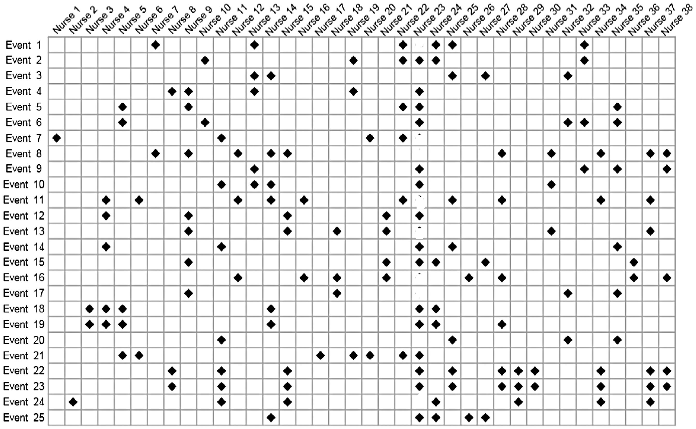
One single hole in the unbroken line of presence, and the case for the prosecution team suffers greatly. Why? For the simple reason that the prosecution themselves would be pointing to something suspicious that did not involve the suspect. Or, even worse for the prosecution, that the definition of what constitutes a suspicious event is so vague that it cannot be relied upon; this, in turn leads to the inevitable question—just what do you mean by a suspicious event. Close scrutiny here would also result in the prosecution’s case collapsing.
And here, the largest bias of all kicks in. The accusers are convinced; their concerns, their gut feelings, cannot be wrong. Confirmation bias takes hold, and a reexamination of the holes in the line of presence takes place. A case of death by asphyxiation, the most obvious of all triggers for judging an event to be suspicious, turns out to have taken place when the accused was not present. Closer examination and this case is reclassified as non-suspicious. The same procedure is applied to the other holes. This results in having rather fewer cases than we started out with, a much less impressive looking chart, but that also can be fixed by the simple device of expanding the number of cases under consideration, some of which—on the basis of gut feelings—may look suspicious. Inevitably, the confirmation bias, fueled by the strength of concerns and gut feelings, will manifest itself through a sequence of iterations that result in Figure 1.
Digging more deeply
In our view, the kinds of chart discussed here ought not to be admissible by a court. Most jurors will not fully understand why these charts can be so misleading. But misleading they are, and, as currently used, they fail completely to even begin to address the relevant question, the one that supposedly motivated the chart’s construction in the first place; that is, how to assess the probability of the suspect finding themselves in the close vicinity of the events making up a cluster of supposed crimes. And, no less important, after accounting for the differing lengths of time on duty, does this probability differ significantly from that for any other randomly selected nurse? At best, the chart is a distraction from this. Practical conclusions need to be based on a more careful analysis and not simply on the visual impressions that can be gained from a roster chart.
A more careful analysis begins with a more carefully formulated question. It has to be something more precise than—we have come up with a list of suspicious events, specifically 25 of them, and it turns out that nurse 23 is present for all 25; how likely is that? There is no way of tackling that question, especially since we are told nothing about how the list was cobbled together and the extent to which the repeated inclusion of nurse 23 was mostly due to the influence of selection and confirmation bias—in the investigator’s mind, being nurse 23 can be enough to view an event as suspicious.
The question needs to be more specific, and we suggest the following. Given that an event is deemed suspicious, then: (i) what are the chances that a randomly chosen nurse is present, and (ii) what are the chances that nurse 23 is present? This does not eliminate strong biases in the definition of a suspicious event, but does open up a way, via a simple model and some simple working assumptions, to address our main question without leaning so heavily on those empirical quantities that reflect little more than the bias itself. We can estimate, in close to a fully unbiased way, the probability of presence for a non-accused nurse at events, whether considered to be suspicious or non-suspicious. It is this knowledge that we rely upon, in conjunction with what can be said about relative risk, to infer the probability of the presence of nurse 23 indirectly when events have been deemed to be suspicious. The details are outlined in the following two sections.
Statistical methodology
First, some notation. For the
We define
Inference will be based on summary statistics that are not indexed by
For the set of non-suspected nurses;
This describes independence between presence on duty and the occurrence of an event during that shift, being labeled as suspicious. This has to be a fair working assumption for this group of nurses. The labeling itself is somewhat tenuous, and coming years after the shift was worked, it is hard to conceive of anything but the most minimal degree of association. Which is not to say that no possible association could be conjectured. It could be argued that the suspected nurse, being relatively senior, would have some small influence on the other nurses showing presence at those shifts. This could be explored, but we do not do so here. We need two further results:
Switching the order of conditioning, we write
This powerful result is the basis of case-control methodology and is shown in almost all introductory epidemiology texts. Our interest is in the relative risk and, since the odds are approximated by the relative risk, we can say that
Assuming proportional hazards, we can write,
The proposition follows as an immediate consequence of Theorem 1 in Xu and O’Quigley.
7
We can exploit the result to obtain an estimate of
A complete Bayesian analysis would consider the rival explanations for the observed events, together with all sources of information, that is, the observations themselves, any other relevant information we may have, and the plausibility of differing explanations. The analysis then produces posterior probabilities that can guide investigators in their search for the truth. The philosophical basis of Bayesian approaches is increasingly convincing to applied researchers, and we can anticipate these methods gaining in popularity in the legal setting. For now, we do not adopt such an approach and, in particular, the plausibility of different explanations plays no part in our analysis. That said, we can make use of Bayesian thinking—we might describe this as a partial Bayesian analysis—by exploiting all the information we have on relative risk. We return to this in the following section.
We now have all the tools we need. The goal of a statistical analysis is to provide us with support for making logical conclusions. Any analysis, including Bayesian analyses, will lean on assumptions, working conditions, and approximations. Bringing these under scrutiny will involve further study of two components. The first of these components is to consider how credible the assumptions are, while the second, the more important consideration, will focus on the impact of plausible departures from these assumptions and approximations. Fully scrutinizing all nooks and crannies of these would result in a 100-page document, and, since there are always several approaches to any statistical analysis, and we do not have 100 pages, the question to keep in mind is whether or not it is likely that any changes to the analytic approach would have more than a minor impact on the conclusions.
The first step of an analysis is to choose a sampling framework within which, in an abstract sense, we can view the observations as having been generated. The next step is to decide which outcomes are to be treated as observations on a random variable and which ones we take as fixed. Sample size is generally the outcome of a random variable, although, almost always, is treated as fixed. We take the sample size of 61 for the events studied here to be fixed. Depending on the different experimental contexts, we will sometimes view the number of suspicious events as fixed at 25 and sometimes not, allowing for variability. Different, equally reasonable, experimental constructs could be employed here. They will generally have no more than a small impact on our conclusions.
Statistical case against nurse 23
The concerns and gut feelings resulting in the chart shown in Figure 1 appear to show a strong correlation between the occurrence of suspicious events and the presence of nurse 23. A very superficial and incorrect analysis might conclude the probability of the nurse being present at all 25 suspicious events to be 100% or somewhere close. That number, though, is grossly inflated as a result of selection bias and confirmation bias, the avoidance of which results in a far more accurate estimate of this probability around 10%. There are simply no grounds for the statement, often repeated, that “whenever something goes wrong, the accused nurse is always there.” But let’s not discard the chart into the trash just yet. Within it, the information we need can be found. Some work is required.
Working constraints and conditions
Every statistical analysis leans to some degree on working assumptions or conditions; the more stringent the conditions, the less generally applicable the results. The conditions may describe restrictions on the nature of the observations, but may also indicate requirements concerning the anticipated properties of the methods we use under varying hypotheses. Since we aim for the greatest generality, we have two things in mind when looking at the working conditions: (1) to find broad physical support for the conditions and (2) to assess to what extent realistic departures from these conditions will impact any conclusions. Statisticians refer to this second concern as one that describes robustness. Here, we clearly identify our working conditions so that the critical reader, the statistical analyst in particular, can reproduce our findings with the help of the previous section, challenge them through different assumptions or carry out a study on how robust they are. The following condition helps to support our methodological approach. Furthermore, should the condition fail to hold, whereby inferences could change by a change in the labeling, then clearly that would be problematic.
Statistical inferences should be invariant to changes in the labeling of the events.
The 61 events studied are ordered from 1 to 61, but we will not always know precisely how the ordering has been accomplished. The ordering may correspond to a time ordering, the first event in time being given the label 1 and so on, but, in general, we will not know this. When we do, we may be able to further exploit the added information. For now, we assume that the ordering is somewhat artificial, and so we would like our results to remain unchanged following any permutation of the ordering. Simply put, this means that our attention is focused on the number of events and their concentration over the whole time frame under study, but not on the order in which they may have occurred.
Of no less importance, the constraint implies a lack of correlation between the placing of the “suspicious” events on the time scale, 0 to 61, and the “non-suspicious” events on this same scale. In particular, the way the data are generally presented, including our own presentation, implies that the first 25 events are all suspicious and the latter 36 events are non-suspicious. While the data are presented that way, our analysis does not assume such a structure and, indeed, the results would be unchanged following any permutation of event labels.
Distribution of presence for non-suspect nurses
Our purpose is to say as much as we can about The chart shown to the jury, but with all information on nurse 23 removed.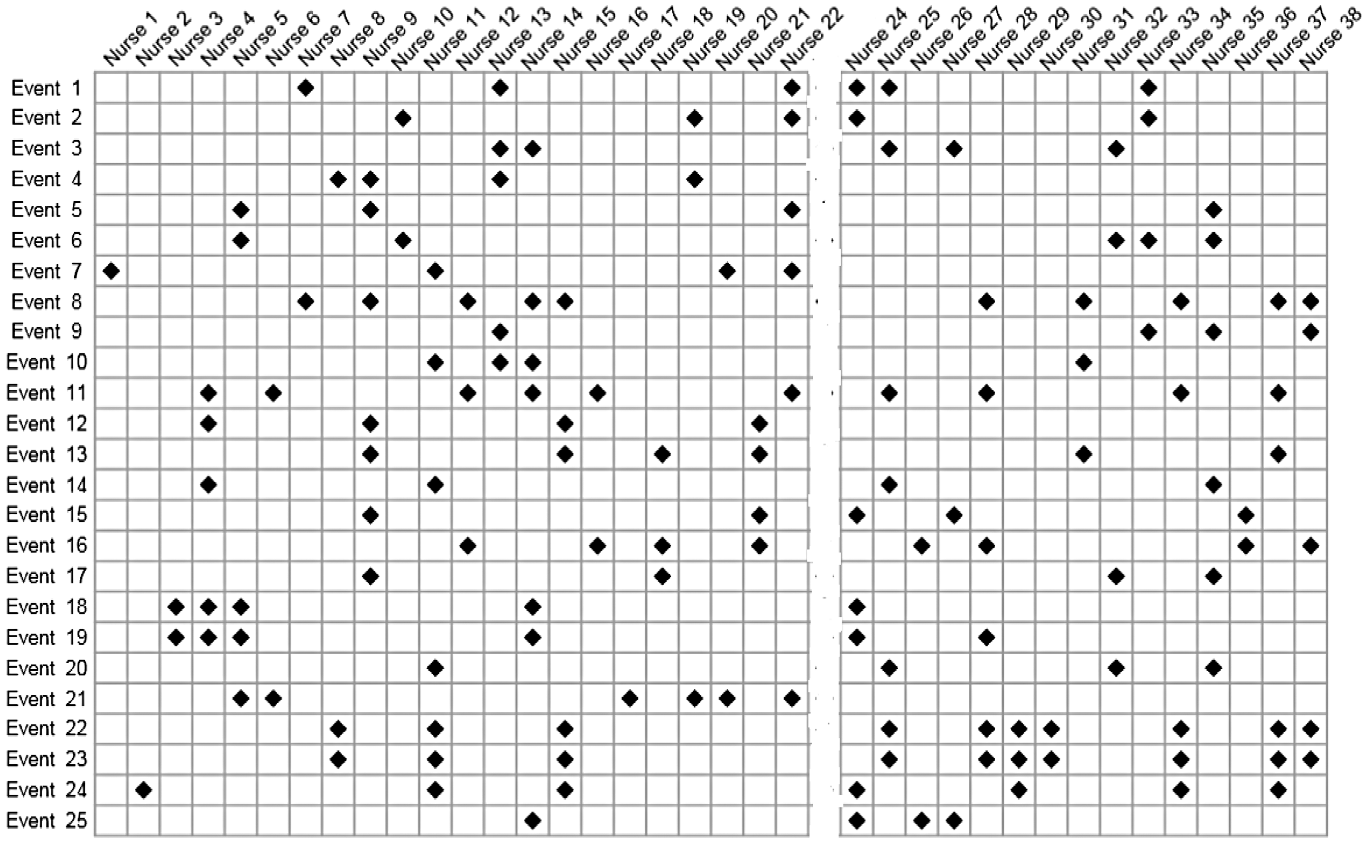
Following Little and Rubin, 8 all possible configurations of the 36 non-suspicious events are assigned probabilities using missing completely at random (MCAR).
For example, from Figure 1, for nurse 33, we see four events, and so we estimate as 4 out of 25 the probability of nurse 33 being present for an event. We do not know this nurse’s presence for those 36 non-suspicious events, but based on MCAR, we take the number to be binomially distributed with
For the non-suspected nurses, the time on duty, ranging from 0 to 61 of the studied events, is taken to follow a beta-binomial model. The beta distribution is the maximum likelihood fit to the observations obtained from Figure 1, excluding the data from nurse 23.
The figure shows Condition 3 to provide a good fit to the observations. Other models could be employed, but without appealing to some very involved structure that would be difficult to justify, it is hard to see how we could improve on Figure 4. Our next step is straightforward and amounts to sampling a probability of presence from this distribution and then deriving the distribution of presence under a binomial assumption and a sample size of 61.
A histogram showing the raw data for the presence of the unsuspected nurses. A beta-binomial distribution is fit to the data using maximum likelihood estimates.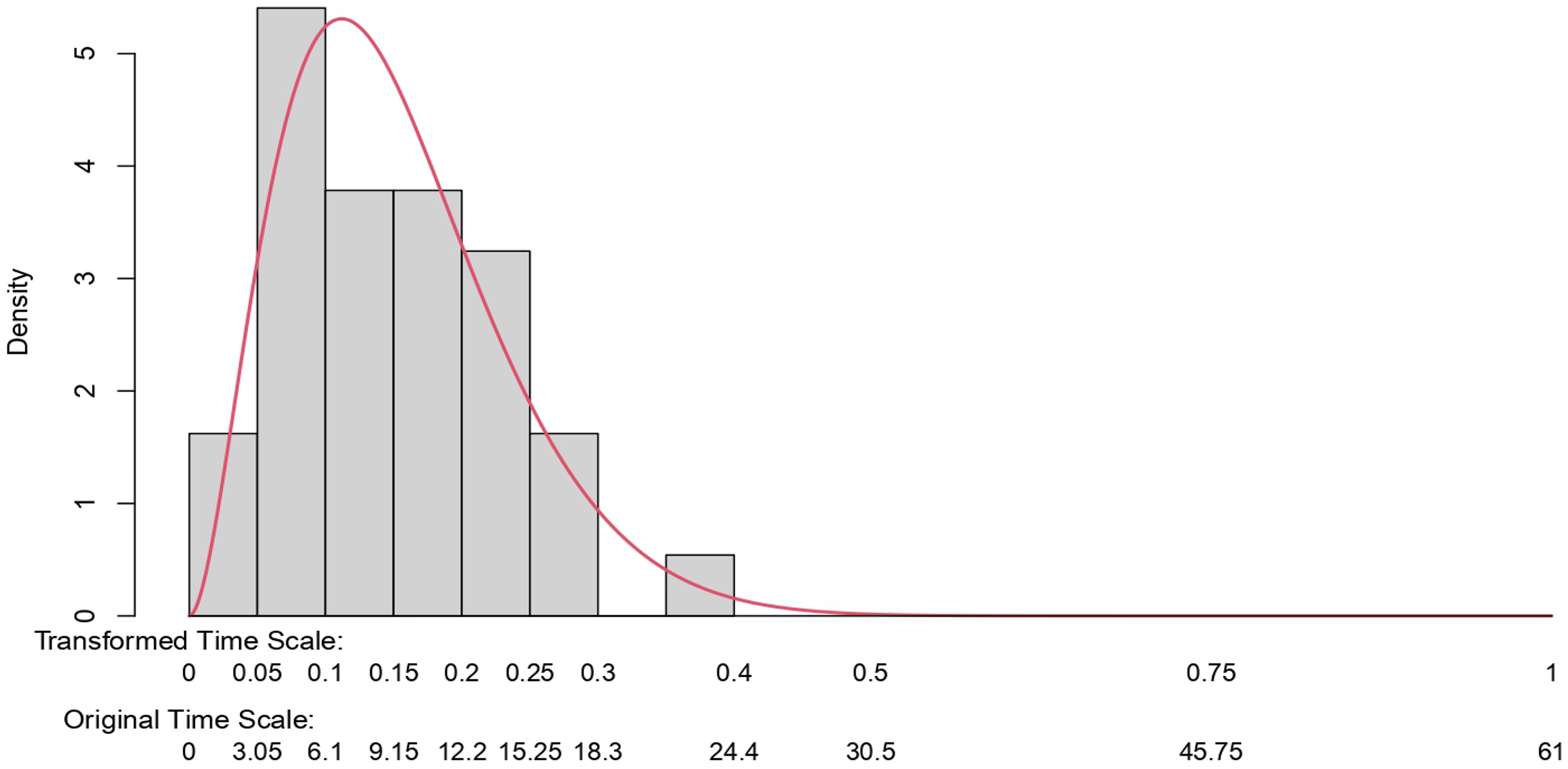
Note that we could obtain something similar to this figure more directly based on information from human resources at the hospital in question. This information could also be used to validate our results. Such information is typically difficult to obtain. However, it would be worth checking when available. The figure estimated on this basis provides an excellent summary of the data.
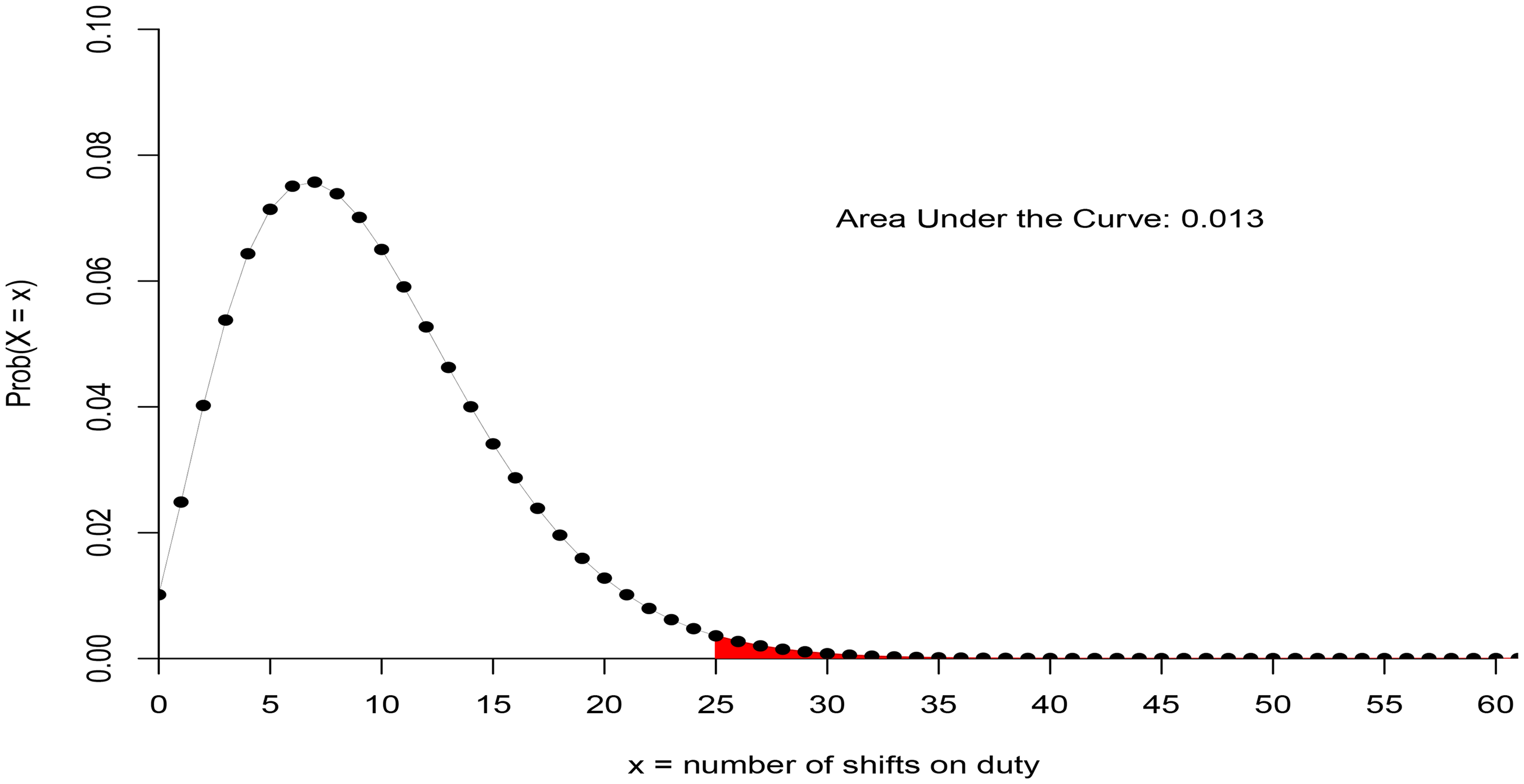
For the unsuspected nurses, the beta-binomial distribution shows the probability of covering 25 shifts or more out of 61, given that something suspicious occurs is 0.013.
Distribution of presence for suspected nurse
As a result of selection bias, the empirical estimate of presence for the suspected nurse—at 100%—has no value. We need something else, and we describe that here. We will exploit what we know about the distribution of presence for the non-suspected nurses, and we will then combine this information with an estimate of the relative risk.
We specify two further conditions:
The relative risk is taken to be constant in time, time here being the indices
Note that this condition will automatically hold under Condition 1, in which case, assuming Condition 4 to hold does not imply any loss in generality.
The two extremes for the unobserved times of presence for the suspected nurse for the set of non-suspicious events are taken to be either: (i) zero or (ii), distributed according to a binomial law with a rate equal to one-third more than the overall mean rate of all nurses, and with
These two conditions enable us to obtain a simple estimate of relative risk. The first of these is readily defended against challenge as a result of Condition 1. The second condition appears to be quite reasonable and quite conservative, given the context. By conservative, we mean being more prejudicial than warranted against nurse 23 since it is known that the nurse worked more than one-third over the average hours. In any event, if needed, we could proceed without the condition by putting a more Bayesian flavor on the approach. We know, for instance,
6
that there were 10 holes in the first version of the chart. These events were re-classified as non-suspicious, so we might infer that, for nurse 23, there was a presence for at least 10 non-suspicious events. This information could be combined with uncertainty over these counts, as well as any uncertainty on the entries to the table of suspicious events, in such a way as to obtain a prior distribution for
Knowledge of the relative risk
This provides us with one extreme for the range of plausible values for
For the lowest value, we might suppose nurse 23 to have been present for a percentage of the non-suspicious events that equates to the average time on duty of this nurse. We know this time to be greater than one-third above the average. These numbers result in a relative risk of the order 1.2. We might then proceed by building a distribution on the interval (1.20, 2.44). A natural candidate prior would be a beta model on the interval (0, 1) re-scaled to the interval (1.20, 2.44). The parameters of the beta model would reflect the prior weighting, favoring values closer to the lower or the upper ends of the interval. Given that the beta model provides for a conjugate prior, it is very simple to run a series of Bayesian analyses based on prior pseudo-data put together by the investigators.
We obtain our relative risk estimate of
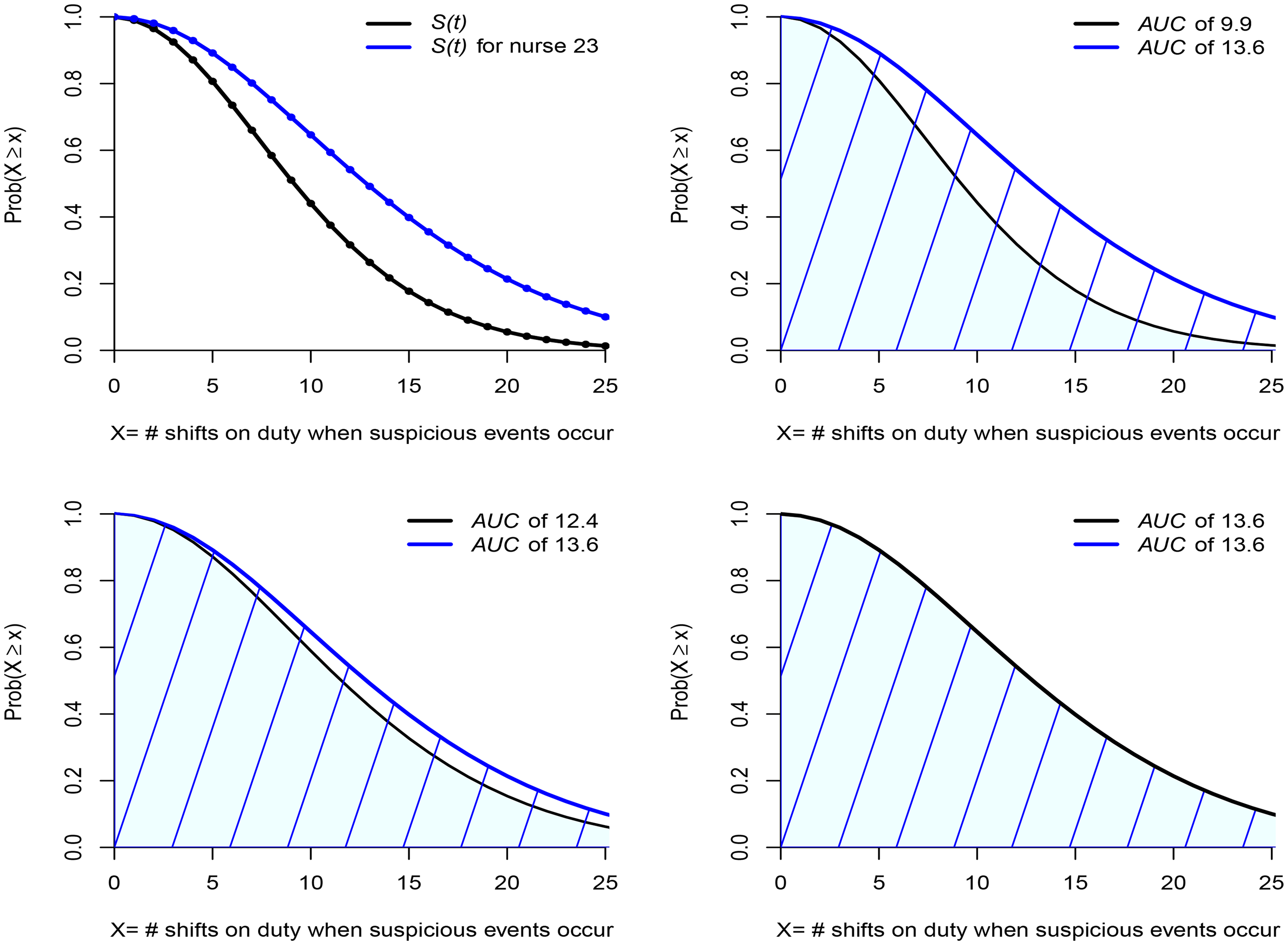
Top two figures show the distribution of times on shift for all nurses and, via a proportional hazards transform, the distribution for nurse 23. The bottom two figures show this distribution for those nurses working 20% and 33% more than the average, respectively.
When something suspicious happens; where is nurse 23?
Finding nurse 23 to be about eight times more likely to be present at 25 suspicious events than any other nurse, chosen randomly from the group of non-suspected nurses, might give us food for thought. While the probability of presence at all 25 events is small, even for nurse 23—an order of magnitude less than would be guessed by a glance at Figure 1—for the non-suspected nurses it is close to zero. That alone might strike us as evidence against nurse 23. Would that be true though?
The top right-hand figure in Figure 6 presents the area under the curve (AUC) and this equates to the mean number of shifts of presence at a suspicious event given that it cannot exceed 25: 9.9 for the non-suspected nurses and 13.6 for nurse 23. Even though we are very far from the wildly incorrect assessment of the nurse being always there when something suspicious takes place, there does appear to be evidence that the probability of presence for nurse 23 is greater than for a randomly chosen nurse. Suppose, however, that, instead of contrasting the experience of nurse 23 with that of all nurses, we consider only those nurses whose time on duty equals or exceeds by more than 20% the overall average. The result can be seen in the bottom left-hand figure of Figure 6. The blue line does not move. The black line moves a lot, and we can see that much of the difference has disappeared, the mean for the non-suspected group having increased to 12.4. Let’s take it one more step and consider only those nurses whose time on duty equals or exceeds by more than 33% the overall average. The result can be seen in the bottom right-hand figure of Figure 6. Again, the blue line does not move, and the black line has moved so much that the entire difference has disappeared, the means now being the same.
It turns out that nurse 23 is a member of this group just described since, on average, the nurse’s time on shift duty was more than 35% above the overall average. In other words, what was taken to be strongly incriminating evidence has simply evaporated. Can anything then be added to the believed 100% correlation of the presence of nurse 23 at suspicious events? Yes. A lot can be said. Using no more than the estimated relative risk and comparing nurse 23 with a randomly chosen nurse, we find a correlation
How robust are these findings? Could they be impacted in any significant way by small changes to the data or by working with estimated parameters for the beta law that differ from the maximum likelihood estimates, but remain plausible? We carried out a limited study on this and concluded on the reliability of the findings. Specifically, while modest changes in the parameters of the beta law will result in small changes to the areas under the curve at event 25 and beyond, the estimated relative risk is not impacted; the above arguments and the conclusion of the following section remain unaltered. Another study, once again a quite limited one, showed, if we were to avoid framing the relevant distributions within a parametric beta model and appeal instead to a re-sampling approach, that any changes would be small.
Summary of the statistical case against nurse 23
Ignoring selection bias, outcome bias, and confirmation bias and making an ill-considered deduction on the basis of the entries in Figure 1 would have us concluding that
Nurse 23’s presence at all 25 suspicious events, in terms of probability, while very far from the crude empirical estimate that ignores biases, is still about eight times what is found for the unsuspected nurses. However, if instead of contrasting nurse 23’s presence to the distribution of presence for a randomly chosen nurse selected from all nurses, we were to only consider those nurses working the most shift hours, we find that for this hard-working subgroup, the probability of presence when something suspicious takes place is estimated to be about the same as that for nurse 23. Knowing that the hours worked by nurse 23 put the nurse well within this hard-working subgroup, we can conclude that nothing unusual was observed. When something suspicious occurs, the probability of being in the vicinity of those events is the same for nurse 23 as for about five or six of the hardest-working nurses. If this kind of presence is the litmus test for guilt, then the statistical case against nurse 23 is non-existent. Non-existent in that there is simply no evidence pointing toward nurse 23 as the culprit, any more than to those other five or six potential suspects, all of whom showed a degree of presence at suspicious events no less than the presence of nurse 23.
Deeper and more thorough investigations would surely be needed in order to unmask, from among the five or six potential culprits, the one who is truly the author of those crimes. Unless that is, there is no culprit. Unless that is, there never was any crime.
Conclusion
The immediate conclusion is that the evidence against nurse 23 in the form of the now famous chart (Figure 1) is non-existent. This conclusion will not be impacted in any significant way as a result of measured challenges to the working assumptions and approximations of this paper. The chart—the only one seen by the jurors—despite giving an initially abrupt visual impression, does not demonstrate an unusually high correlation between events, labeled as suspicious, and the presence of nurse 23. The apparent correlation is entirely explicable by the combined influence of selection bias, confirmation bias, and the well-above-average time on duty of the nurse when compared with others. Entering those times on duty into the equation leads to the complete disappearance of the spurious correlation.
A number of take-home messages suggest themselves. We limit ourselves to just one: that the kind of chart shown in Figure 1 ought never be allowed as evidence in any court. Only one purpose could be construed for it: to mislead. And mislead it does! It misleads juries—we have ample evidence of that via several miscarriages of justice—and, well before the chart gets to reach the jury, it will mislead prosecutors and the police alike. Finding the visual impact of the chart thoroughly compelling, the prosecution and the police can easily be convinced that their case is solved; so much so that other, far more plausible, explanations for the apparent increase in deaths and collapses are wholly neglected. Our one take-home message would be simple. It would be unequivocal: keep the charts, those hopelessly biased and misleading charts out of the courtroom. No jury will ever glean anything of value from them.
Footnotes
Acknowledgements
I am grateful to the editor and the reviewers for several detailed and thoughtful comments. I believe that these comments have resulted in a sharper and more accurate presentation. I would like to thank Sean Devlin for writing the code needed to obtain all of the results, numerical and graphical. Sean also spared no effort in checking and re-checking the calculations and using different methods to validate the findings. Together with other colleagues, he provided significant input to put to the test those working statistical concepts upon which the writer is relying in order to claim the reliability of the results.
Funding
The author received no financial support for the research, authorship, and/or publication of this article.
Declaration of conflicting interests
The author declared no potential conflicts of interest with respect to the research, authorship, and/or publication of this article.