
Abstract
Meaningful information about an RDF resource can be obtained not only by looking at its properties, but by putting it in the broader context of similar resources. Classic navigation paradigms on the Web of Data that employ a follow-your-nose strategy fail to provide such context, and put strong emphasis on first-level properties, forcing users to drill down in the graph one step at a time. We introduce the concept of semantic paths: starting from a set of resources, we follow and analyse chains of triples and characterize the sets of values at their end. We investigate a navigation strategy based on aggregation, relying on path characteristics to determine the most readable representation. We implement this approach in S-Paths, a browsing tool for linked datasets that systematically identifies the best rated view on a given resource set, leaving users free to switch to another resource set, or to get a different perspective on the same set by selecting other semantic paths to visualize.
Keywords
Introduction
Linked Data browsers face a complex problem. They are expected to display any RDF data [19] so as to enable users to effectively explore an open web of datasets whose structure is inherently complex and whose content can be highly heterogeneous, featuring a wide variety of resources described by classes and properties from multiple ontologies.
Most linked data browsers employ a follow-your-nose strategy inherited from the classic Web browsing paradigm: they display one page per RDF resource, fetching its direct properties and allowing users to hop in the graph one step at a time by clicking on property values when those can be dereferenced (URI) [20,30]. This strategy scales well in terms of performance, enabling users to traverse an arbitrary number of linked datasets regardless of their size. The representation of resources is as meaningful as it can be in the absence of vocabulary-specific display instructions [25], i.e., spatial and temporal properties can be displayed in maps, calendars or timelines, while most other properties will be handled in a generic manner, typically as lists of property-value pairs. Automatically generating more meaningful representations of resources and their properties is challenging, and remains an open research problem. The challenge, however, does not only lie in the difficulty to find such meaningful representations. It also lies in identifying what properties provide meaningful descriptions of resources in the first place, and in putting those resources in the broader context of similar resources.
Properties that provide relevant descriptions of resources are not necessarily direct properties of those resources. They can be several hops away in the RDF graph, depending on the granularity of the model. For instance, considering the Nobel prize dataset,1
Our approach is rather to remain at the original resources of interest; to identify particular chains of statements, which we call semantic paths, that lead to meaningful descriptions of those resources; and to display the values at the end of those paths using an appropriate visualization. This not only addresses the above problem of original-resource context loss, but also enables displaying semantic paths for sets of resources all at once, thus easing their comparison. For instance, going back to the analogy used above, this enables comparing the spouse’s occupation for all the relatives of Peter’s children.
But considering all properties up to a given depth in the graph can yield a large number of candidate semantic paths, even for a single resource. And considering sets of resources can yield a large number of distinct values, even for a single semantic path. The amount and heterogeneity of information to display can thus rapidly become quite large. To address this issue, we rely on the automatic selection of which semantic paths to display by default, and on aggregation techniques to generate legible visual representations of the values at the end of those paths.
We argue that providing users with such default, possibly aggregated, views is an efficient strategy for browsing datasets, especially in situations where users are unfamiliar with them (dataset discovery). We implement this approach in S-Paths, a prototype Web-based system that can be plugged on SPARQL endpoints, which we evaluate with different persona (data publishers, data reusers, lay data consumers) to gather feedback about the effectiveness of the approach and general user experience with the tool.
A review of all linked data browsers and visualization tools is beyond the scope of this paper. We direct readers to recent surveys [6,10,11], and only discuss representative examples of the different approaches related to S-Paths.
Early visualization tools exposed the raw RDF graph represented as a node-link diagram [23], sometimes using stylesheets to customize the appearance of nodes and links [24]. The approach is generic, and the resulting representations can be useful to illustrate very small graphs and communicate to a relatively expert audience, but it quickly yields illegible “big fat graphs” [28]. In most cases, regardless of the graph drawing technique used to generate the visualization, the RDF graph is not the right level of abstraction for presentation purposes [10]. It is often quite verbose and the details of how the model structures the data are often of low interest to users browsing the Web of Data. Three systems that display the data primarily as node-link diagrams, but at a higher level of abstraction than the raw RDF graph, and for specific purposes, are LodLive [9], Visor [26] and RelFinder [15]. The first two limit visual clutter by using a dynamic graph and using aggregation, expanding nodes and links on demand; the latter focuses on showing paths connecting pairs of resources only, starting with the shortest ones. Visor also helps identify paths connecting elements several hops away in the graph structure, taking edge direction into account.
Linked data browsers break free from the node-link diagram to consider a wider range of visual representations. The first browsers, such as Brownsauce [30], produced generic (almost raw) representations of the data in HTML pages, exposing property-value pairs of the current resource of interest as text and clickable URIs. Clicking a URI would attempt to dereference it, and a new HTML page with the properties of the corresponding resource would be displayed. They dynamically generated HTML pages showing RDF triples in a generic manner, with some basic formatting to improve readability. Follow-up work, including LENA [20] and the Marbles engine [2], used presentation knowledge captured in vocabulary-specific Fresnel lenses and formats [25] to enhance the representation. Such languages, however, require that declarative presentation rules be available to the browsers for the different RDF vocabularies involved. Some of them also supported map-based or timeline-based visualizations for spatio-temporal properties, culminating in the Tabulator [3] which, despite being more than a decade old, remains one of the most ambitious projects in this area so far, also aiming at making the Web of Data writable [4]. However, since Tabulator only features a limited set of views (map, timeline, calendar), it frequently displays data using a generic, more triple-oriented, tree or tabular view on data which are neither spatial nor temporal.
While the above are primarily supporting exploration one resource at a time, other systems based on advanced query mechanisms, such as Visinav [13], or more specifically based on faceted browsing, such as /facet [17], provide support for particular types of set-based navigation [18,26]. But as observed by Marie and Gandon [21], the often large number of facets, combined with the irregularity and incompleteness of semi-structured data on the Web, tends to result in cluttered, unusable interfaces. The problem can be alleviated by enabling users to select facets on the fly [17], and help them determine their relevance [32]. But such approaches require users to make choices about facets. Another limitation of existing facet-based exploration systems lies in how they display results, i.e., as lists of items in most cases (presented as text or image thumbnails). These can sometimes be complemented with aggregated views in the form of maps or timelines, which are familiar, graspable views [22]. But even then, the types of visualizations available is limited. Set-oriented tasks, such as identifying correlations, observing distributions, comparing & contrasting groups of resources, remain difficult.
Answering questions such as these, and more generally gaining insights about collections of resources, requires generating multi-variate data visualizations (e.g., scatterplots [16]) of a set of properties associated with resources in the set. The Linked Data Visualization Model [8] defines a transformation workflow to dynamically associate one or more datasets with multiple visualizations. Implementations of this workflow typically support a range of data visualization techniques. The methodology defined in [7] focuses on statistical linked data as found in, e.g., RDF data cubes, making it possible to combine data from different linked sources and display them in visualization dashboards. Multiple other projects have been attempting at making it easier for users to generate data visualizations from linked data. Again, the reader is referred to recent surveys [10,11] for an exhaustive list. Of particular interest here are Visualbox [12] and LinkDaVis [31]. Visualbox enables its users to create different visualizations by writing SPARQL queries and populating predefined visualization templates with the queries’ results. The produced visualizations can then be embedded in classic Web pages. LinkDaVis provides users with a hierarchical representation of properties, from which users can choose the ones to visualize. It then performs a heuristic analysis of the data to suggest a ranked list of visualization configurations for these properties, based on different bindings to visual encoding channels. Once a particular visualization is selected, it can further be customized, as in other mixed-initiative approaches such as that adopted in Voyager [34], a tool for the creation of multi-variate data visualizations.
Such tools are very powerful, and enable the creation of a wide variety of visualizations from linked data: maps, timelines, and a range of statistical charts (scatterplot, line plot, density plot, etc.). However, they produce standalone visualizations, that can be used on the spot or exported and integrated elsewhere. They don’t support browsing over the Web of Data. Indeed, once created, these visualizations feature a very limited level of interactivity. They cannot be used directly to make sub-selections or continue navigation, which requires following links, fetching additional data, and displaying it.
S-Paths
S-Pathsis a mixed-initiative application [31,34] designed to support users in the exploration of linked datasets, providing them with visual representations of resource sets that help gain insights about those resources. Users can adopt different perspectives on the data: focus on a subset of interest, select different types of view, display other dimensions, pivot to a set of related resources. This section first describes how S-Paths defines semantic paths, views, and how it matches them. It then describes a prototype user interface based on this approach.
Semantic paths
We introduce the concept of semantic paths. We denote U the set URIs and L the set of literals, as is usually done in the literature to define RDF terms. Given an RDF graph G, and a set of resources E sharing a similarity criterion such that:
Given a set of resources, S-Paths considers all semantic paths to identify those that can be matched with its visualization templates. Each template declares the category of paths it is able to display, and the optimal and limit conditions for readability. S-Paths uses a set of heuristics to rank the views and displays the best ranked one by default. Considering paths representing chains of triples, and not only direct properties, gives more opportunities to find properties that are in a displayable range.
We define categories corresponding to different behaviors in terms of aggregation and display, and conceptually roughly equivalent to datatypes. Datetimes can be aggregated by years, decades, centuries...; geographical coordinates can be aggregated at different scales, as on multi-scale maps; images can be resized, displayed at different scales, and juxtaposed in grids or mosaics; numbers can be binned; text strings can only be aggregated by similar values, and can be displayed according to different layout strategies depending on their length; URIs can only be aggregated by similar values. These categories are very similar to the ones used by Atemezing and Troncy [1].
The main characteristics considered are summarized in Table 1. Depth captures the degree of indirectness of the property at the end of a path (i.e., the semantic path length, or number of hops to reach it from the original resource). Coverage indicates the percentage of entities actually described by the path. This notion of coverage is especially important in the context of semi-structured data, where no schema is enforced and some properties exist for only a subset of all considered resources.
Characteristics of semantic paths
Characteristics of semantic paths
Path analysis is performed when S-Paths gets set up with a new set of graphs, and the characteristics are stored in a Mongo database, which will be retrieved by the system when users navigate. The query to characterize the paths can be formalized as in Fig. 1. However, running such a query is very likely to time out, except with very small datasets. S-Paths splits it into multiple queries, following a divide-and-conquer strategy. The analysis function takes as input a set of paths, and the similarity criterion for the entities. For each path of maximum length in the set of paths, it queries all extensions by appending one property at the end. Then for each new path found, it queries separately for coverage and count, and datatype information, as shown in Fig. 2. Then the analysis function saves its results, and calls itself recursively until the maximum length of paths set in the configuration is reached. This allows to progress in the exploration step by step, and to resume where it stopped if the network or SPARQL endpoint breaks.

Conceptual query template to retrieve paths characteristics for all paths of depth n. S-Paths splits this query into multiple queries, following a divide-and-conquer strategy, as described in Fig. 2.
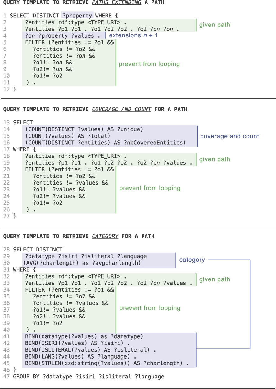
Query templates dividing the query in Fig. 1 into multiple queries. The first query is called iteratively for each path of depth n, to find all the paths of depth
S-Pathsprovides a set of views: map, image gallery, timeline, statistical charts, simple node-link diagrams, presented in Table 2. Each view specifies how many dimensions it can handle, and defines the requirements that semantic paths must meet to be considered for a given dimension, as well as the conditions under which they will be considered optimal. For example, Fig. 3 shows the definition of a 2D density plot view. It handles two dimensions: x- and y-axis. Paths associated with the x-axis (dimension 1) must be of category
Each view also receives a weight. Generic views, that are able to handle any data, can be lower rated, while very specific views able to give a more meaningful representation but only for specific types of data can be given higher priority. Petrelli et al. [22] refer to space, time and topology as examples of graspable dimensions that provide effective support to the exploration and sense-making of semantic data. Indeed, the aggregation mechanism is embedded in the map background and in our mind, which explains why they scale so well: when we look at a world map we automatically think in terms of continents, while when we look at a zoomed map we think in terms of countries or region. Our mind seems to be continuously looking for the most graspable dimension, which is probably why Bertin states that “Useful information comes with clusters” [5].
Default configuration of view templates as configured for the Nobel dataset
Default configuration of view templates as configured for the Nobel dataset

2D density plot view definition.
This also makes it possible to have various levels of overview, depending on the number of items in the selection when dealing with very large sets. The system should support, and default to, aggregate views on the data, enabling users to easily select subsets of higher interest to focus on, eventually displaying them in detail [29] when the set size becomes tractable.
Once semantic paths for a given resource set have been retrieved, the system evaluates the suitability of the different views to generate a default representation of this resource set. Figure 4 gives an overview of the process. S-Paths iterates through the entire collection of views, discards the ones that are not viable for the set of resources considered, configures the remaining ones with the top-ranked semantic paths as dimensions, and gives a score to each candidate view, eventually selecting the top-ranked one.
Some views define a maximum number of resources they can handle. When the number of resources to visualize exceeds that maximum number, this view is discarded. Otherwise, S-Paths computes the list of candidate paths for each of the view’s dimensions. If there is no path matching the constraints for one of the dimensions, the view is discarded. S-Paths assigns a score to each path, using a normalized weighted average of the following criteria:
path coverage: S-Paths favors paths that have a high level of support (cover a large number of resources);
adequation between the path and the view dimension: a path closer to the optimal settings for a dimension is scored higher. A dimension can specify optimal settings in terms of unique count (Fig. 3, lines 8–10 and 13–14), and in terms of average char length (avgcharlength) for paths leading to textual values. Also, the closer to the ranges defined as optimal for the dimension, the better the score. When a dimension supports several categories, it lists those categories in order of preference. This preference influences the score. For example, in Fig. 3,
path depth: S-Paths favors more direct properties (lower depth) over more indirect ones (higher depth);
custom path preferences: optionally, S-Paths can be told to favor some paths, by declaring them explicitly in a configuration file.

Process for generating a default view.

Query templates used to populate views.
After having iterated over the collection of views, S-Paths builds a list of optimally-configured views, retaining only the best-scoring paths for each view (Fig. 4, 3rd column). It then assigns a score to each view using another normalized weighted average of:
configuration quality: average of associated path scores; preference: each type of view has a score which indicates preferences for some types over others based on, e.g., their familiarity or concreteness. As this is subjective and application domain-dependent, these scores can be edited in a configuration file; number of dimensions: support for more dimensions to be displayed simultaneously implies more opportunities for visualizing different properties.
S-Pathsthen selects the top-scoring view according to this weighted average, and configures it with the top-ranked semantic paths (Fig. 4, 4th column). Lower-ranked paths that still match this view can be selected using the dimensions menus. The view menu lets users switch to any other view available for the resource set.
When users select a subset, the system retrieves paths for the entire set, and computes an approximation for the subset.
S-Paths’ query mechanism is independent from any view specifics. It switches between three possible query templates according to the type of view – aggregate view, multiple distinct entities, or single entity – as detailed in Fig. 5. In the case of aggregate views, binning operations are performed in the query for paths belonging to datetime, geo or number category, so as to ensure the number of results will not exceed the endpoint quota (lines 15–16). Queries which handle transitions between views are identical, combining dimensions from the previous and the new view.
When a subset is selected in an aggregate view, constraints to define the subset (lines 11–12 or 31–32) are added to the ones already gathered in previous views. When the selection happens in a multiple distinct entities view, previous constraints are replaced by the list of selected URIs. When users pivot to explore another set of resources, constraints defined in previous views are rewritten:
Configuration
S-Pathsrequires minimal configuration: the URIs of the SPARQL endpoint and of the named graphs to explore behind it. At start up the system looks for
User interaction
The system then provides them with different options as entry points into the data, which correspond to the different types of entities detected (classes of resources). By default, it selects the class of resources that has the richest description, and generates a default view that acts as a gateway to that set of resources.
Figure 6(a) shows the interface when starting to browse the earlier-mentioned Nobel prize dataset. It is composed of a set of widgets in the upper part, and a central panel showing a visualization of the resource set. S-Paths has selected the
S-Pathsdisplays summary information about the resource set and the visualized semantic paths just above the view itself, providing users with some context (see, e.g., Fig. 6(a)). Detailed information about the selected semantic paths and the RDF graphs they traverse is also available. Such provenance-related information is especially useful when dealing with heterogeneous datasets distributed over multiple linked graphs, but as it is rather expert-oriented, it gets displayed on demand only, by clicking an icon [ ] next to the summary.
From a presentation perspective, S-Paths seeks to display user-friendly labels for the resources and properties encountered along semantic paths. The corresponding URIs are systematically dereferenced, looking for labels and descriptions (
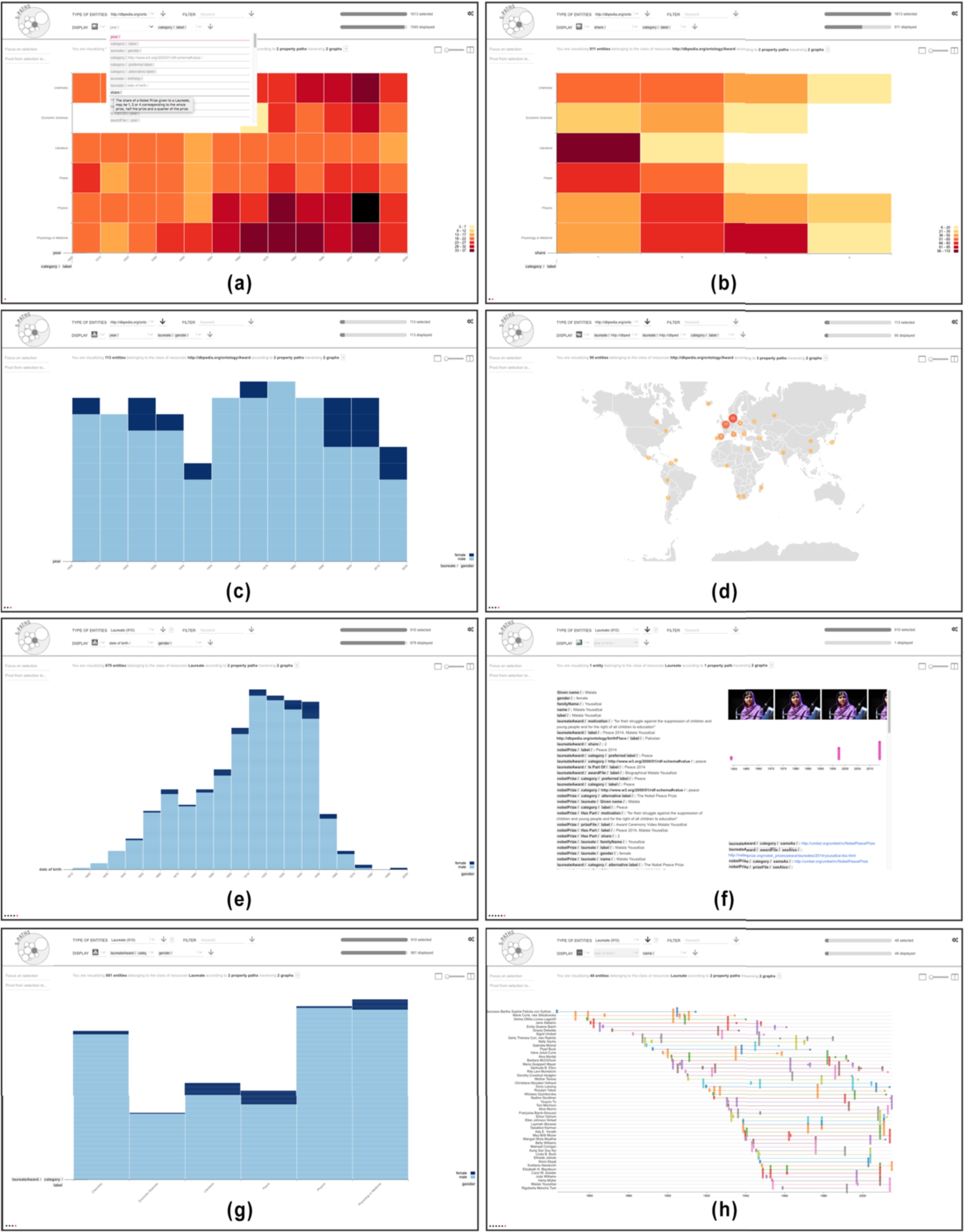
Key views illustrating the Nobel prize use case: (a) 2D density plot showing the count of awards per year (binned by decade) and category; (b) showing award shares instead of years; (c) histogram showing the repartition of awards by gender over the years; (d) map showing the birthplace of award laureates; now considering laureates as the resource set: (e) histogram showing laureates’ gender and birth year; (f) info card detailing all semantic paths for one laureate in the set; (g) histogram showing gender balance by award category; (h) timeline of events in the life of a subset of laureates.
Users can select another resource set in the top row of the UI. They can switch to any other class available in the  menu. Available classes of resources correspond to the sets of instances that share a particular class (
 in the form of keywords to be matched in values anywhere along the associated semantic paths. Users can use such a filter to restrict the initial
View configuration
The drop-down menus in the second row of the UI (dimensions menus) let users change which semantic paths get visualized in the view. They support auto-completion for quick selection in the list. The number of dimensions menus depends on how many dimensions the view expects. For instance, the default view generated by S-Paths for the
Users can also choose another type of visualization using the view menu  , which lists all visualizations compatible with the current resource set (chart, timeline, map, image gallery, etc.). Selecting a different visualization in this menu will generate a new view based on the top-ranked semantic paths for that view. For example, in Fig. 7(c), the user has selected the map view. S-Paths automatically populates this view with longer, three-step semantic paths:

(a) Default view on
The above view reconfiguration capabilities let users change what dimensions of resources in the current set are visualized, and how they are visualized. Users can also restrict what resources to visualize by making direct selections in the currently displayed view: clicking on individual items and aggregates, performing rubber-band selections of contiguous elements, selecting ranges by, e.g., clicking a particular bin on the horizontal axis of a histogram to select all items in that bar. They can also combine multiple, non-contiguous selections by holding a modifier key (
The two percentage bars in the top right corner of the interface give an indication of what proportion of the dataset is currently visualized. The upper bar indicates how many resources of the selected type match the  . The lower bar indicates how many resources of the selected type are actually represented in the main view. This latter set of resources depends on the successive user selections, and on the selected semantic paths, that might not exist for all resources in the current set.
Navigation and transitions between views
S-Pathssmoothly animates transitions between views when the two views have entities in common [14]. This provides some basic level of perceptual continuity that contributes to minimizing the cognitive cost of relating one view to the next, as illustrated in Fig. 8. Visual marks that represent aggregations of resources are partitioned according to a space-filling strategy. This preserves aggregations that still exist in the target view and might actually be part of a larger aggregate.

Animated transition from a sub-selection made in a 2D density plot showing counts for types of
The system also supports the juxtaposition of two consecutive views, as well as brushing and linking between those views: selecting elements in one view immediately highlights the corresponding elements in the other view (see Fig. 9), further helping users relate views. The same space-filling strategy as above is used to handle brushing & linking between aggregates.
S-Pathsalso keeps track of all past views and represents them as dots forming a basic navigation history displayed in the bottom left corner of the interface. Clicking on one of these dots reverts to the corresponding view, enabling users to easily backtrack.
Transitioning from one view to another requires an explicit user action in S-Paths. Users have to click button  to focus on a subset selection, or one of the
  buttons to apply other configuration changes. While an explicit user action is necessary to offer the multiple-selection model described above, configuration actions would preferably not require users to explicitly apply changes, in order to promote responsiveness and immediate feedback. But, as changes to the resource set and to the view settings can take several seconds (depending on the complexity of the underlying SPARQL queries, on the size of the resource set considered, and on the overall responsiveness of the queried endpoints), this is impossible in practice. Triple store query performance needs to improve by at least an order of magnitude before this can be seriously considered.
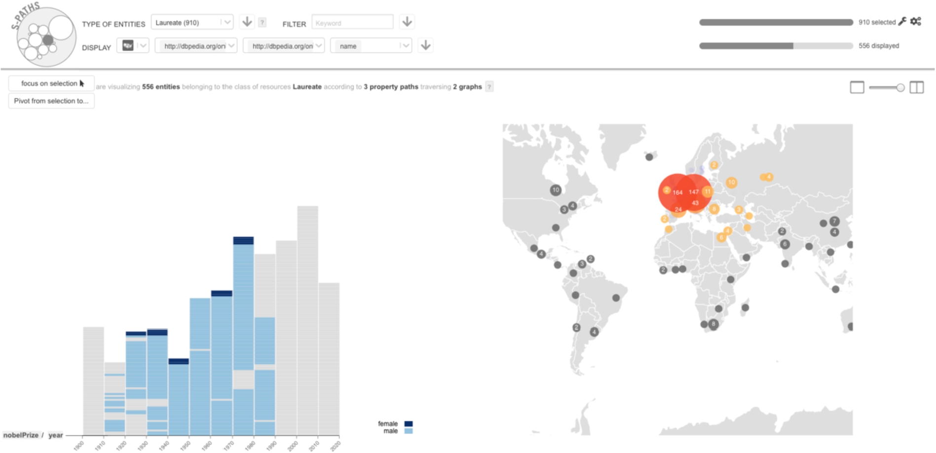
Brushing & linking between two views: items selected on the map are highlighted in the histogram.
Switching to another set of resources related to the current set is an essential operation in set-based navigation. The classic example of such a pivot operation can be found in Parallax [18] where focus switches from all presidents of the USA to the children of presidents affiliated with the Republican party. In S-Paths, clicking  lists all possibilities for pivoting from the current view. These include root pivots, and path pivots. Root pivots are other classes that entities in the current resource set itself may belong to (multiple
Implementation
S-Pathsis developed using NodeJS/Express. RDF data is stored in a Virtuoso instance, and queried using SPARQL. Semantic paths are encoded using the Fresnel FSL syntax [25]. The code analyzing them runs server side, storing their characteristics in MongoDB.
When populating a view, S-Paths only fetches the data actually displayed in the view, so as to improve scalability and support browsing large sets of resources. It queries the SPARQL endpoint using query patterns that retrieve only the distinct values at the end of the property paths.
The front-end is implemented as a Single Page Application developed with React and Redux, a React component being associated with each view. Views are implemented in a modular way, so as to ease the process of extending S-Paths with new types of views. New views have to implement a minimal interface to fit in the general framework: publish their constraints on allowed dimensions; broadcast subset selections made by users in the view; and broadcast graphical properties of the entities they display to enable interpolated graphics transitions, as well as brushing & linking between views. Beyond this, each view is free to handle the data in its own way: clustering and other aggregation methods, library used for graphics rendering (many views are implemented with Vega [27], others are plain HTML+CSS), etc.
S-Pathsis distributed as an open-source project.2
This section illustrates how S-Paths works using a simple scenario. We follow Alice, a lay user interested in the data made available by the Nobel Prize organization. We will see how S-Paths enables her to find interesting facts. The first screen displayed by S-Paths is a 2D density plot showing information about
Alice notices that five of the six categories start at the beginning of the 20th century, while the sixth, Economic Sciences, was only created in the 1960’s. From the colors in the cells, she sees that disciplines such as Physics and Medicine have more awards than, e.g., Literature. She wonders if she can find an explanation, which prompts her to try other dimensions than
Using the first dimension menu, Alice considers different options. Hovering the different property paths, she can read their description. She finds the
Alice would like to know more about
Alice wonders if the gender repartition is the same in all categories. Using the top menu, she considers the entire set of
Coming back to her original question about gender repartition, Alice goes back to the previous screen (Fig. 6(e)), which she reconfigures to display gender and category (Fig. 6(g)). She observes that gender unbalance is particularly pronounced in
Evaluation
In the early design phase of S-Paths, we conducted two workshops in order to inform our design choices. The first workshop involved nine Linked Data experts, and the second one seven lay users (data consumers) who were interested in exploring linked data. We asked them to sketch scenarios of what they would like to be able to do when exploring Linked Data, illustrating how an ideal tool would support them. Feedback from these workshops, combined with informal observations during the French National Library’s hackathon and other Linked Data community events in Paris allowed us to derive three persona that represent our target users: a Linked Data
At the end of S-Paths’ design process, we conducted a qualitative study to observe how S-Paths supports users in their exploration of a dataset. The study consisted of a series of nine individual sessions: 2
The exploratory tasks to be performed depended on the persona. Lay users were provided with a list of specific tasks4
Indicative tasks for lay users are in Appendix A.
Our hypothesis was that aggregating data along readable dimensions as S-Paths does would help users gather high-level knowledge about a dataset. In particular, S-Paths helps spot outliers (e.g., there is only one laureate born in the 1990’s and she is a woman), but also shows categories or trends (e.g., awards in literature are usually not shared). In the rest of this section, we report on our observations along four axes that White & Roth [33] identify as key aspects for the evaluation of an exploratory search system: learning and cognition, information novelty, engagement and enjoyment. We do not analyse task success and task time, the number of participants being too low to yield significant results.
In order to assess how much users learnt during their use of S-Paths,
Questions for lay users and reusers are in Appendix B.
As participants were thinking aloud, the operator noticed that it was not always clear to lay users which entity was represented in a view. However it did not seem to have much impact on their understanding. For example, they might not have known that the view in Fig. 6(a) was showing the number of Laureate Awards and what the definition of a Laureate Award was. However, it did not prevent them from learning that there were six categories for Nobel prizes, and that prizes have existed for over a century.
S-Pathsmakes it easy for users to get views that combine several paths, providing insights that would otherwise have required some analysis. Reusers and publishers were the most enthusiastic about getting such combined views that reveal distributions, trends or outliers in the data. One reuser mentioned that S-Paths automatically does what he typically does by means of multiple SPARQL queries or Python scripts to analyze dumps at the start of a hackathon: “When you engage in a hackathon, what you are looking for is irregularity in the data, and this tool finds them and points them out.”.
The two data publishers spontaneously identified specific cases where S-Paths may be very useful. The first data publisher is in charge of the ontology of Legilux,6
The second data publisher is the Bibliothèque nationale de France (BnF). Their data come from multiple catalogs, and are enriched with external data, making it particularly difficult to get an overview of their dataset. They liked the fact that S-Paths provides views that combine metadata with meta-metadata (e.g., a view of works that combines the work’s topic with the year when the work was added to the catalog). This helps understand the cataloguing policy and trends, and spot anomalies in the data. In particular, S-Paths could drive campaigns for cleaning and fixing data.
All participants were fully focused on their tasks. Twenty minutes seemed short to them. Lay users were able to use the tool without knowing about graph databases or what a path in a graph is. However, some of them expressed concerns about the interface’s responsiveness. For example, they would have expected previews on rollover for any selection before actually validating it. On the opposite, experts understood the underlying computation cost, and were tolerant regarding the non-instantaneous generation of views.
Limitations
User interaction
Our observational study revealed two aspects of the interface that might negatively impact user experience. The first issue is related to the number of entities that are actually shown in a view. The automatic aggregation and selection of paths might give the impression that the view displays the whole set of entities that has been selected from the previous view. Although S-Paths’ scoring strategy favors paths that have a high coverage, the semi-structured nature of data makes it very frequent to have irregularities in the data, and thus partial coverage only. While actual coverage is shown in the top-right corner of the interface, a participant mentioned that it should be made more salient. The second issue was raised by one of our lay users. While she liked the fact that S-Paths automatically selected views, she found it frustrating that the system did not remember the dimensions she had explicitly set when she was revisiting a given set of entities. One way of addressing this issue would be to take into account the navigation history in S-Paths’ scoring strategy.
Data processing
We did set up S-Paths with seven datasets of varying size and with different characteristics: Nobel,7
Data BnF,8http://api.bnf.fr/ (we ran our test on a 10 percent sample.)
First, both ELI and RISM datasets lack
Second, S-Paths encounters performance issues with the BnF dataset. The high level of abstraction of the model, which makes the relevant paths potentially very long, combined with the very large number of entities, significantly increased the cost of each SPARQL query. This problem could be addressed by implementing mechanisms for query optimization. Furthermore, the granularity of the model resulted in a very large number of paths, some of them having a very low coverage. To keep the matching algorithm reactive, we implemented an ad hoc solution that consisted of restricting the considered paths to the first fifty featuring the highest coverage at the start. A better solution would dynamically update the list of candidate paths whenever users focus on a new subset of resources, as a given path’s coverage can vary significantly from one subset to another. This would require implementing advanced graph exploration techniques to identify relevant paths without having to check them all after each new subselection.
Finally, in the John Peel Sessions dataset, S-Paths is unable to match paths with any view for several classes of resources. This is because values at the end of the paths consist of mostly-unique URIs or text values. In the current implementation, S-Paths does not provide aggregation mechanisms in such cases. Generic aggregation methods would make it possible to handle such situations. For example, text values could be grouped based on their first letters, while URIs could be grouped based on a common pattern. Such views would be rated low, but would act as fallbacks when no other view is available.
Discussion and future work
Follow-your-nose style navigation on the Web of Data can be roughly compared to how users browse pages on the classic Web: they follow hyperlinks. This works well in open worlds of linked documents or linked data, because following a link is basically a question of dereferencing what is on the other side of that link. The process just gets repeated again and again, exploring one path at a time. Things are not that simple when considering set-based navigation and semantic paths, as we do in S-Paths. We want to browse many resources simultaneously and look beyond the direct properties of those resources, following longer paths that lead to relevant information about them. This raises multiple practical questions. What sets of resources do we expose to bootstrap the exploration process? How deep down the paths do we go? Do we consider all possible paths? How many interlinked graphs do we traverse? Contrary to follow-your-nose navigation, considering (even theoretically) the open world in its entirety is not an option. Answering the previous questions necessarily entails delimiting perimeters in the data, that both the system and its users will be able to cope with.
S-Pathstakes named graphs as the unit to delimit such perimeters. At first, this might seem contradictory with the very notion of a Web of Data, the whole point being to break out of data silos by having direct links between resources in different graphs from different datasets, and enabling the easy traversal of those links. Our purpose, however, is not to re-introduce artificial silos. It is rather to have some means to group sets of resources meaningfully, and to identify coherent ensembles of semantic paths describing those resources. Small combinations of named graphs seem to be reasonable candidates to act as perimeters for such a purpose.
For now, S-Paths supports this approach by having the system connect to a single, local SPARQL endpoint that hosts one or more RDF graphs. For instance, the simple Nobel prize example used throughout the paper makes use of two linked graphs: the Nobel prize dataset itself, and an extract from DBpedia with the names and geo-coordinates of places, as well as pictures of people. While these two graphs are hosted behind the same SPARQL endpoint, we could imagine explore graphs in distant endpoints using the SPARQL
However, this would come with significant performance issues, and would not be sufficient to enable users to navigate seamlessly across numerous linked graphs. Right now, graphs to include in the perimeter have to be declared manually. As we do not want to have all graphs merged into one huge perimeter (which would defeat the whole point of defining a perimeter and would be practically impossible anyway), we need S-Paths to be capable of dynamically redefining its perimeter in a way that is transparent to users: seamlessly adding new datasets to it based on the semantic paths followed, discarding datasets that are no longer relevant.
This also requires determining the best way to dynamically update the semantic path characterizations that S-Paths relies upon to rank and configure views. These characterizations need to be updated whenever the data change. But S-Paths cannot easily know when data hosted at remote endpoints change. Theoretically, the system is able to perform this analysis on the fly, since users can start browsing as soon as S-Paths has retrieved the first few paths, which only takes a few seconds. But having S-Paths permanently scan graphs is neither reasonable nor scalable. The characterizations also need to be updated when the perimeter changes, i.e., when graphs are added or removed. Knowing that a full analysis requires from several minutes to several hours depending on the number, size and structure of the graphs considered, an interesting hybrid approach would be to have data providers publish characterizations alongside their graphs (these are relatively small and simple JSON files). S-Paths would then only need to analyze connections between graphs when the perimeter changes. Achieving this would turn S-Paths into a full-fledged linked data browser combining set-based and follow-your-nose style navigation into a single tool.
Further evaluation will be needed. A key finding is that S-Paths lets users memorize the outlines of a dataset. It would be interesting to compare it with other Linked Data browsers in this respect. Another axis could be to try to understand which aspect of S-Paths supports memorizing. This is an intricate question since it is a complex system, and we had to combine a number strategies to make browsing sets of entities even possible. Another promising result is that S-Paths can support users in finding ideas to reuse data. This is a crucial point for adoption of Linked Data, and as for memorizing, it would be worth investigating which aspects of the tool makes it possible.
Finally, we designed S-Paths to support the discovery of unknown datasets, but if we mean to turn it into an exploratory search browser, we also need to evaluate its performance when users know what they are looking for, and when they switch from open exploration to focused search, and the other way round.
Footnotes
Indicative tasks to perform for lay users
Identify the laureate of the peace Nobel prize in 1949. List all prizes’ categories. Find all the laureates born in Australia. How many of them are still alive? Find the first woman who got awarded. What was the motivation for her prize? What was the category and field of her prize? Find the category with the highest proportion of women. Find the number of fields in the Literature category. Then in Physics. Find which are the fields, within the Economic Science, in which female laureate have had prizes. When did it happen?