
Abstract
In a global and interconnected economy, decision makers often need to consider information from various domains. A tourism destination manager, for example, has to correlate tourist behavior with financial and environmental indicators to allocate funds for strategic long-term investments. Statistical data underpins a broad range of such cross-domain decision tasks. A variety of statistical datasets are available as Linked Open Data, often incorporated into visual analytics solutions to support decision making. What are the principles, architectures, workflows and implementation design patterns that should be followed for building such visual cross-domain decision support systems. This article introduces a methodology to integrate and visualize cross-domain statistical data sources by applying selected RDF Data Cube (QB) principles. A visual dashboard built according to this methodology is presented and evaluated in the context of two use cases in the tourism and telecommunications domains.
Introduction
Decision Support Systems (DSS) are typically customized for specific decisions in a given domain. In a global economy, external events such as financial crises or climate change – through observable consequences like bankruptcies or hurricanes – can render such domain-specific solutions obsolete. Building comprehensive monitoring systems into DSS tools is a potential solution, but one that can be prohibitively expensive and out-of-reach for smaller companies and research groups. One way to build DSS tools that leverage such cross-domain information is to analyze aggregated representations of events in the form of statistical data. Such an integration helps answer complex questions that require cross-domain data. Drawing on economic and sustainability indicators in conjunction with behavioral data from tourism research, for example, allows answering complex questions such as the following: Do financial crises affect tourist behavior? Do temperature increases in continental Europe change the annual distribution of arrivals? Can the failure of specific stocks – e.g., large tour operators or hotel stocks – predict a sector-wide crisis? Similar questions arise in other sectors as well. A telecommunications analysts, for example, might want to investigate longitudinal data to explain unusual peaks in the number of calls or text messages sent, or better understand how geopolitical trends (migration, aging population, etc.) influence call data patterns.
Statistical data sources from multiple domains are increasingly available as linked (open) data following the publication of the RDF Data Cube Vocabulary (QB).1
Visualization seems to be the de facto method for making sense of Linked Data (LD), and various approaches have been developed for navigating the data deluge [11], but less effort was dedicated to integrating visualizations into analytical platforms for answering complex questions, similar to the ones we have discussed earlier. Fox and Hendler [16] argue that integration and reusability are the most important aspects on which visualization designers need to focus for successfully controlling the current data deluge through visualizations. The success of tools like LOD, QB or D3 [4] has greatly simplified data publishing and visualization, but the problems described by Fox and Hendler still persist due to a combination of factors: i) the standards are often taken as guidelines and there is a lot of improvisation when publishing datasets; ii) integration of SLD is a complex field [56]; iii) projects are mostly focused on creating individual visualizations (line charts, bar charts, etc.) instead than frameworks for integrating multiple types of visualizations; iv) in the context of Big Data, scalability has to be taken into account when designing new systems right from the start.This article describes methods to address some of these gaps and integrate cross-domain statistical data into a visual dashboard following a multiple coordinated view approach. A first prototype considered specific project requirements in conjunction with recommendations from Dadzie and Rowe [11] and QB (concepts such as observations and slicing).
Principles and workflows for integrating and visualizing heterogeneous datasets were extracted and applied to two uses cases in the tourism and telecommunications domains.
These use cases are based on cross-domain datasets from multiple sources including Eurostat2
and the World Bank,3 and discuss specific types of tasks that the visual dashboard helps address. The article’s main contributions include:a set of workflows and visualization principles usable for visualizing datasets in the RDF Data Cube vocabulary (Section 4);
a collection of visualization scenarios that are useful for multiple use cases (Section 5);
visual dashboards developed following these principles and scenarios (Section 6 and Section 8).
The remainder of this article is structured as follows: Section 2 offers an introduction to the QB vocabulary and formulates the problem statement; Section 3 describes the current state of the art in statistical LD Visualization; Section 4 describes the principles, architecture and workflows we propose to visualize statistical LD using different visual metaphors; Section 5 describes use cases from the tourism and telecommunication domains and how they guided the development of visual tools; Section 6 describes the design, implementation, and usage of a tourism dashboard in line with the use case requirements, which is evaluated in Section 7. The telecommunications dashboard presented in Section 8 builds on recommendations derived from this evaluation. Section 9 summarizes the lessons we learned and outlines future research avenues.
Background – RDF Data Cube Vocabulary
The RDF Data Cube Vocabulary is a W3C Recommendation for publishing statistical data, supported by industry and academia as evidenced by the increasing number of datasets published using this vocabulary; e.g., the PlanetData datasets4
or the W3C use cases.5 A further advantage of QB is that it is based on a cube model that is compatible with the Statistical Data and Metadata Exchange (SDMX) standard and designed to be general so that it enables the publishing of different types of multidimensional datasets.The basic building blocks of the cube model (measures, dimensions and attributes, collectively referred to as components) have the following roles:
Measure components describe the things or phenomena that are observed or measured (e.g., height, weight, arrivals, bed nights, capacity, number of mobile phone calls).
Dimension components specify the variables that are important when defining an individual observation for a measurement (e.g., time and space).
Attributes help interpret the measured values by specifying the units of measurement, but also additional metadata such as the status of the observation (e.g., observed, estimated).
These basic building blocks are then combined into more complex structures such as
slices and datasets: Observations are the atomic data units that
represent a concrete measured value for a set of concrete dimension values.
Observations correspond to the values from statistical databases. Sometimes
observations can also contain multiple measurements related to the same
dimensions. Slices are groups of
observations with several dimensions fixed (e.g., the arrivals of German tourists in
Budapest between 2007 and 2013 has only one variable dimension:
time). Datasets are collections of
observations with the same dimensions and measures. Datasets that contain
observations grouped into slices across dimensions constitute a
cube. A Data Structure
Document (DSDs) describes a dataset and contains all the required
namespaces and components. Code lists
or dictionaries describe the list of entities that are repeated
through all datasets of a publisher (e.g., countries, units of measurements). They
can also be used to describe complex hierarchies (geopolitical, ISO classification,
etc.), and are often described using the SKOS vocabulary.
Global economies expose us to various instabilities of non-periodic flows similar to those described by Lorenz [34]. Most domains reflect aggregated patterns of human behavior (finance, telecommunications, tourism, culture, etc.), where small changes of amplitudes can lead to instabilities. To design a DSS for such dynamic domains, one needs to understand financial and cultural profiles (migration patterns, financial needs, etc.). Such problems are easier to investigate through the lens of statistics. In fact an immediate method to reduce the complexity derived from such phenomena is to use large collections of statistical data such as those provided by the World Bank or Eurostat, which are now increasingly available as LD. Such collections help understand macroscopic effects when investigating complex economic, environmental or social phenomena.
By splitting statistical data into cubes of up to three dimensions, the QB vocabulary offers a simple and flexible structure to represent such macroscopic effects. Performing ontology alignment between any QB datasets is a problem that is usually complicated by a number of factors – lack of DSDs, failure of SPARQL endpoints, errors in the data or DSD, deviations between QB guidelines and actual implementations, etc. Simply gathering a lot of data will not suffice to understand macro trends, however, and visual methods can help reduce data complexities during the decision-making process. Building a visual DSS is the first step towards a full-fledged DSS system, but the output of the visualizations (e.g., correlations, patterns) does not necessarily need to be translated into new knowledge (e.g., by creating new annotations or datasets with these correlations). Even without automatic interpretation of the results, this still complicates the problem, as most visualizations are built for simple use cases. What methodology needs to be followed to display multiple coordinated visualizations built from a single query? What are good methods to show both numeric results of analytic processes and the corresponding visualizations in a unified view?
Building visualizations is a time-consuming process, and the desired ability to reuse them poses a number of challenges. What are the best design patterns for implementing reusable visualizations? Do existing interaction patterns of existing visualizations need to be adapted for new datasets? These questions lead to the main research problem investigated in this article: What are the principles, architectures, workflows and implementation design patterns needed to build a visual DSS that exploits cross-domain information?
Related work
A survey of Semantic DSS [2] contains an overview of the systems and a set of interviews with various research and industry partners. It identifies two main challenges for future Semantic DSS: a) the lack of flexible integration of information (most systems do not integrate text, data and visualization well) and b) numerous issues related to the data analysis (cleaning, querying, aggregation, abstraction, etc.) and scalability. Semantic Web (and Linked Data, by extension) and DSS can be viewed as application areas of Artificial Intelligence (AI), and in many cases the result of research in such an applied field is a system. However, effective AI systems need to use a variety of technologies to deliver their best results. In Semantic Web, for example, there is an increased wave of hybridization with Natural Language Processing (NLP), Machine Learning (ML), and Information Retrieval (IR), even the most popular systems such as Watson subscribing to this trend [27,53]. Another possibility is to use Human-Computer Interaction (HCI) techniques such as visualization to navigate the data flow. The remainder of this section is focused on the visualization of Linked Data as a major means of sense-making.
Linked Data visualization
We can distinguish two large domains of LD visualization: ontology visualization (TBox visualizations) and instance data visualizations (ABox visualizations). Systems that offer both are also possible. In both cases, the main goal of the visualizations is to help understand the relations between the various ontology classes or instances. We also discuss several Linked Data Visualization Models.
All these models and workflows resonate well with Schneiderman’s Visual Information Seeking Mantra: Overview first, zoom and filter, then details-on-demand [48]. Shneiderman’s taxonomy actually goes beyond this mantra and contains additional tasks: relate, history and extract, as well as a list of the quantitative visualization types. A recent list of visualization types can be found in Heer’s visualization zoo [20], while an extension of the task types taxonomy for interactive dynamic analysis can be found in Heer and Shneiderman [21]. The updated taxonomy contains twelve types of tasks split into three groups. Data and view specification tasks (visualize, filter, sort, derive) for exploring large datasets tend to focus on the selection of visual encodings rather than the actual visualization. View manipulation tasks (select, navigate, coordinate, organize) are used for highlighting and coordinating interesting items and represent the core tasks described in the original Information Seeking Mantra. Since today’s visualizations are typically related to multiple datasets or articles, the last category of tasks is related to process and provenance tasks (record, annotate, share, guide).
An extensive treatment of the various reusable quantitative visualizations can be found in [54]. The book presents a grammar of graphics that allows building any 2D scientific visualization from a set of simple primitives such as points, lines, scales or shapes. Recent visualization libraries built on top of D3 such as ggD36
or Vega7 are following this philosophy. The next step in the evolution of LD visualization systems is to design pipelines and systems capable of exploiting the dataset structure and the underlining data structures. The next section is focused only on those systems able to visualize QB datasets.In statistical LD visualization, instances will typically belong to or be associated with QB datasets. If the SLDs have a more complex structure, the corresponding ontologies or DSDs might need to be visualized as well. There are three types of Statistical LD Visualizations systems:
tools and packages that offer basic LD visualizations (tables, charts, maps) of QB datasets, with or without aggregations;
dashboards or complex tools that integrate several visualizations typically using Multiple Coordinated Views (MCV);
LD platforms that might contain visualizations.
The Media Watch on Climate Change is a news and social media aggregator on climate change and related environmental issues, which serves as a public showcase of the presented MCV approach (www.ecoresearch.net/climate).
Even though not directly related to visualizations, the work of Kämpgen and Harth [28] focused on interrogating multiple QB datasets via the OLAP4LD framework, which can be used as a starting point for delivering data to complex dashboards.
In conclusion, many visualization workflows are geared towards creating simple charts, and little effort (with the exception of MCV dashboards) is dedicated to complex analytic solutions. Without combining datasets and synchronizing multiple visualizations with the integrated repository, it will remain a challenge to clearly present complex use cases like those described in Kämpgen and Harth’s work or at the beginning of this article. The next section presents a set of principles and a workflow to support the creation of complex visualisations from Statistical Linked Data.
Before describing the design of visualizations following QB principles, this section outlines the workflow of statistical LD visualizations, as well as the tasks and visual metaphors involved.
RDF Data Cube Visualization principles
The principles outlined in this section do not fundamentally change those presented by
Dadzie and Rowe [11], but extend them in the
context of visualizing statistical LD. The goal is to create a set of linked views for
analyzing the relations between slices from multiple datasets in order to identify
correlations and other patterns. The iterative process of defining these principles
started with the design guidelines for QB datasets, iteratively expanding and refining
them during dashboard development. The following list summarizes these principles for
visualizing statistical LD.
Architecture and workflow
Many state-of-the-art applications emphasize automation and reuse – creating, using and replacing visualizations as part of an iterative process. Such a lifecycle can be expressed as a series of visualization pipelines [13,26], which requires developers to follow certain workflows. When visualizing statistical LD, such workflows will necessarily include both LD tasks (selection of indicators, ontology alignment, etc.) and visualization tasks (data wrangling, interaction, etc.).

Generic, reusable workflow for visualizing Statistical Linked Data (QB, SDMX and other formats).
Building on best-practice examples reported in the literature, we propose a workflow for creating visualisations that follows the logical sequence of developing statistical LD applications. We have closely followed these steps when implementing the dashboards described in Sections 6 and 8.
Due to the increased specialization of certain layers (e.g., alignment or interaction) and the wide variety of choices when it comes to storage and indexing, by using the previous steps as a guideline, one can implement a variety of workflows.
The next section will introduce several use cases for statistical LD. It will outline the analysis of user requirements, show how to transform these requirements into visualization scenarios, and discuss how to implement these scenarios using the previously mentioned principles and steps.
The main strength of LD technology lies in the simplified integration of various data sources either by aligning identical entities (e.g., statistical indicators, people, organizations, locations), or by explicitly stating the relation between similar things (e.g., one statistical indicator being narrower than another).
The following use cases present independent visual analytics platforms for different domains, which integrate Statistical Linked Data with real-time content streams from news and social media channels.
Tourism domain
Tourism analytics is a complex field drawing on different statistical data sources (Eurostat, World Bank, etc.) and a wide range of indicators incorporated from these sources (bed nights, arrivals, capacities, etc.). The ETIHQ project [42] investigated such sources and their value for visual tools and real-world decision support scenarios. Typical users in such scenarios are tourism professional (e.g., DMO managers, travel consultants, researchers) interested in questions related to seasonality, country and city profiles during peak tourist season, points of interests, arrivals in tourism destinations, or number of occupied bed nights. Tourism professionals will be interested in nuanced answers to such questions in order to better understand why tourists choose a certain destination in a given time period.
Many existing tools do not support the creation of scenarios for visualizing linked models as part of a unified view, or to easily reuse visualizations by changing their input data. Answering complex questions, however, often requires combining heterogeneous indicators from multiple sources. One has to specify not only the possible combinations of dimensions and measures within a visualization, but also the temporal granularity of the datasets (e.g. monthly, weekly or daily data points), their provenance, or statistical tests that are needed to validate the underlying models. To combine this heterogeneous data into meaningful visualizations, visual tools need to use MCV or similar design patterns to synchronize multiple visualizations [45].
To specify requirements in line with the scope of the ETIHQ project, we have initially conducted structured interviews with colleagues from the Tourism and Service Management and Applied Statistics and Economics departments from MODUL University Vienna, and also conducted a practitioner’s survey [43]. The results of the evaluation of the interface described in Section 7 were instrumental for designing the telecommunications dashboard prototype, as outlined in the next section.
Telecommunications domain
The effective integration of structured and unstructured data from multiple sources, both open and proprietary, is of particular importance in the telecommunications industry. Pursuing such an integrated approach, the ASAP Project (see Section 8) collects and annotates the public dialog about regional and national events in the form of Web documents and social media content, and combines the resulting repository with Call Data Records (CDRs) related to voice, SMS and mobile traffic, aggregated and fully anonymized to preserve customer privacy in line with European privacy protection laws.17
A telecommunications analyst who wants to compare CDR data across cities, for example, can use the aggregated representations of online media coverage from the observed regions, and correlate peaks in the number of calls with co-occurring events such as music concerts, sports events and political campaigns. Statistical indicators from the respective cities can help analysts understand related geopolitical trends such as migration, an aging population, or a decreasing Gross Domestic Product (GDP).
Overview and examples of decision support scenarios depending on the number of combined data sources and indicators
To cope with the requirements of such scenarios, a state-of-the-art visualization engine and dashboard needs to include not just a set of appropriate visual methods, but also components that support: (i) the parallel processing of a wide variety of data types, including semantic data types like geographic location, sentiment, timestamp, etc.; (ii) the remix of data from a wide variety of data sources regardless of domain, type (structured or unstructured), or provenance; (iii) and the possibility to extract aggregated statistics of the most important entities, and means to select, sort and summarize the data accordingly.
To better structure use case descriptions, we have devised a theoretical framework (see Table 1) that takes into account the provenance of the indicators, and several possible scenario types (ST). These scenario types allow telling different stories, and mix the visualizations according to the hypothesis we want to check, but also with respect to data provenance.
The
The
The
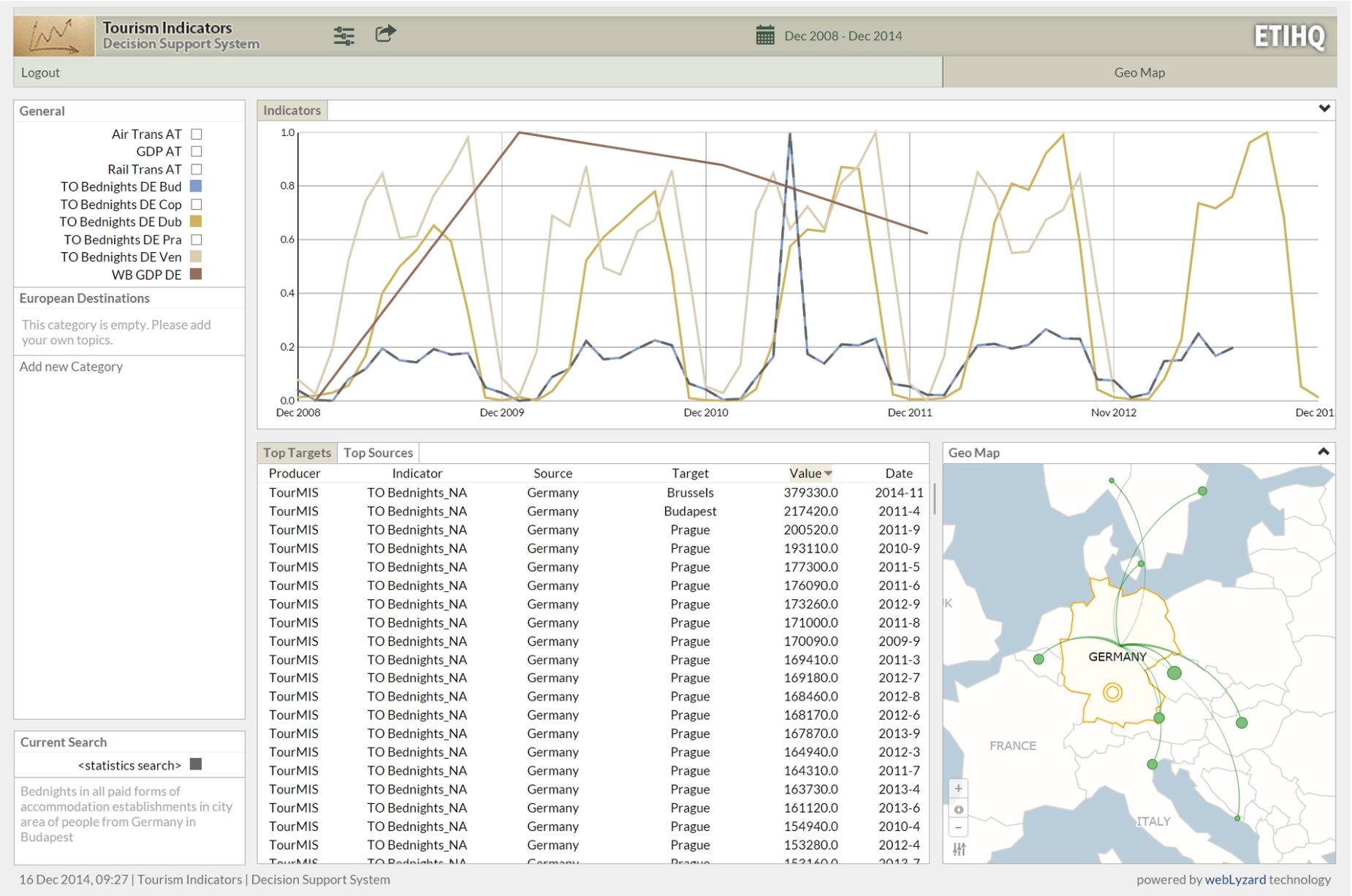
The ETIHQ Dashboard showing bed nights occupied by German tourists in various European destinations (Budapest, Dublin, Venice), plotted against the GDP growth of Germany.
The
From a tourism research perspective, cross-domain indicator comparisons are the most relevant cases. LD technologies support integrated visualizations that are difficult to obtain by means of traditional database systems. When implementing such scenarios it is important that the two indicators are linked based on the value of one of their dimensions, that is the same or compatible (e.g., if one has cities and the other country data, city data from that country can be added up). Additionally, indicator value ranges should be the same, or compatible in the sense that higher granularity data can be obtained from lower granularity data by additions (e.g., month vs. year, city vs. country).
The visual dashboard19
(Fig. 2) is a visual semantic DSS that uses multi-domain knowledge in tourism. The dashboard combines information from TourMIS, World Bank and EuroStat. Its design is based on the scenarios discussed in Section 5. It currently allows decision makers to select and concurrently visualize tourism, economic and sustainability indicators, though the number of indicators can be extended to any number of domains of interest for which statistical LD exists. While TourMIS provides European tourism indicators, we select economics and sustainability indicators from the other two sources. Data from TourMIS/ETIHQ rarely overlaps with Eurostat or World Bank data, therefore scenarios that compare same indicator from multiple sources (1:N Scenarios) are not present in this dashboard, which relies of two main components:An indexer package that represents the Linked Data components as an Elasticsearch index.
A set of reusable visualization components that are linked together to form a dashboard.
After discussing the design of the scenarios that were important for this dashboard, we will examine how each component implements the workflow from Section 4.2.
In order to implement the use cases described in Section 5, one needs access to several indicators from various data publishers. The tourism data we have used represents the dumps of an updated version of TourMISLOD [41] named ETIHQ which contains tourism data about arrivals, capacities, bed nights, points of interest and shopping items in QB format. For Eurostat and World Bank data we have used dumps of economics and sustainability indicators published in the 270 Linked Dataspaces repositories.20
Some details about the publishing process of these RDF dumps can be found in [8,9].Currently several issues need to be solved by anyone trying to build large scale RDF or Linked Data visualization engines: (i) SPARQL repositories still have serious availability and scalability issues and in order to federate data one will have to replicate all the needed datasets, vocabularies and Knowledge Bases locally; (ii) somewhat related to the previous issue, in order to be able to run queries against data from multiple sources one either has to perform data matching on the fly or convert those sources to a common format; (iii) the data matching is complicated by the fact that dataset designers do not strictly follow the rules from guidelines, therefore in the case of RDF Data Cubes, we frequently have missing code lists/dictionaries or DSDs, object properties that are labeled heterogeneously [56]; (iv) visualizations are usually realised with JavaScript libraries like D3, which require JSON-based formats in order to quickly process and visualize any type of data. These issues suggested indexing the data rather than to provide the users with on-the-fly integration and visualization of LD sources, as all operations should take less than a second if they are to be integrated into the portal.
As already noted, currently the QB standard is taken mostly as a recommendation, some implementations skipping code lists or data structure documents (especially if they only need to publish one dataset) or using their own heterogeneous naming conventions for object properties. As explained in [56], if location is named through geo, location, geolocation and many other names in several datasets, a matching system will have to take into account all these variations. Standardizing naming conventions for RDF Data Cubes would be one way to address some of these issues, but it would only work if the guidelines would be strictly enforced (e.g., via custom validation). Perhaps even more troublesome is the fact that some elements of the QB vocabulary like slices or observation groups are rarely used. While this perhaps makes sense for slices which can be created automatically later, behind the existence of an observation group there might be reasons that are not immediately obvious if not documented. For example, medical data from certain months or years can be published as an observation group because there was an epidemic in a set of countries. In such a scenario we face a loss of information if the observation group is missing.
While RDF Data Cubes do offer a simple way to merge lots of datasets together and create large data cubes with statistical indicators, this is true only if the data publishers follow the specifications point by point. The fact that some components such as code lists are optional and not necessarily well-understood leads to additional complexity. We have for example encountered several situations related to code lists: (i) they do not exist, which is not a problem since they are optional; (ii) they exist, work fine and respect the specifications; (iii) they exist, but they contain ambiguous names or URIs (which should not happen) – therefore requiring a pre-processing step since it cannot be anticipated what they will contain. In fact, some small changes to the specification of the optional components of the RDF Data Cubes and a better validation process for these components are needed before on-the-fly validation and visualization in a reasonable amount of time (sub second) can be achieved, especially if a system needs to be able to integrate any kind of SLD source. We insist on the sub second loading times to avoid suboptimal user experiences.
We have used several approaches for collecting the data for visualization. One approach was to use Federated SPARQL, but quite often it resulted in queryTimeouts. Another approach was to write SPARQL queries or bash scripts (a combination of cat and grep commands can return all the URIs that respect a certain pattern, for example) and run them against the dumps collected from the three services. As a final solution, we indexed the data using a search server (Elasticsearch) and creating an LD indexer API that gets the data from all the data sources. The indexing service we created provides all the functionality for the LD layers we envisioned (Selection of Indicators; Ontology and Data Alignment; Storage and Indexing). As long as the running time of SPARQL queries is several seconds, we will prefer the fastest method of indexing data and recomputing the queries each time instead of classic data cube methods like full or partial materialization of cuboids (slices in the current QB terminology). In fact even though full or partial materialization of cuboids is certainly useful, it is not always needed. A common use case where it is not really needed is creating a new index on top of the current indexes. Creating derived indicators, a central problem in Statistical Linked Data, requires complex computations, therefore in general it is better to use the full power of a programming language like Java and some of its DSLs instead of plain SPARQL. Since we do plan to include derived indicators in a future release, this was an additional reason to consider indexing.
After indexing the datasets, each observation corresponds to one document. The document structure for a QB observation only takes into account the essential information that needs to exist in a dataset so that it can be visualized: the observation value, the unit of measure, the geographic location (if it exists), and so on. This allows indexing a huge number of datasets from many publishers therefore enabling the creation of scalable visualization solutions.
Since the URIs from Eurostat and World Bank published in the 270 Linked Data Space21
are well-designed, for the discovery and selection of indicators all that is needed to find an indicator is to have an idea about the name or part of the name of the desired indicator. If the indicator name and URIs are known, then it is sufficient to directly provide the URIs for the new datasets. In the first phase, the indexer will harvest all triples from that location that match the selected criteria (for example, only the data for indicators that correspond to real geographic entities, and no entities that were invented for statistics (like Germany+France or EU-Germany); or only data for the last 10 years).A simple process of harvesting the triples that match certain criteria would have not offered enough information for a visualization. Some additional tasks that are performed are usually those related to ontology alignment. One such example of alignment is the geospatial alignment performed by the indexer: Geonames [55] and DBpedia [32] URIs are used instead of the names of the actual locations, as the real names of the location might suffer from various issues such as spelling mistakes, wrong encoding or even different name variants. Another example is the alignment of various units of measurements which was done using the DSDs (where they were available, else we took no units of measurements into consideration). We have not performed any alignment based on granularity of the temporal data (month, quarter, years), but instead used a convention: each observation corresponds to a data point in a graphic. The granularity information is added to each observation, and it can be used whenever it is needed (for complex aggregations at query time, for example).
When indexing the data, we kept all the information (including the links) from the actual RDF dumps so that any observation or slice can be recreated if needed. From the first set of indexed datasets we have extracted a QB-inspired JSON data format in order to ease the validation of further datasets. The required fields of this format are those expected to be found in any QB dataset (dataset, observation URI, observation value, date, etc.), while optional fields can accommodate dataset-specific information such as geographic location or the unit of measurement.
The added information such as granularity or added URI is only used for visualization purposes. It can be said that an indexer, in addition to the processing for the LD layers, also provides some of the functionality typically found on a transformation layer.
The first version of the indexer contained small functions that allowed indexing any type of dataset or code lists from a certain publisher (e.g., Eurostat, World Bank, TourMIS). This was possible due to the fact that each publisher follows the same style of dataset design for their datasets (e.g., if they do not use code lists, none of the datasets from that publisher will have references to code lists). Therefore by writing several lines of code we were able to automatically index hundreds of datasets from a single publisher. While this worked well, we still needed new data formats from time to time (date or time formats that were not included in the initial list, for example), as almost each dataset producer only loosely followed the W3C Recommendation when designing RDF Data Cubes and introduced small variations. Due to this fact, a custom API has been developed to provide third-party access (see Section 8).
The functionality for all these layers (selection of indicators, ontology alignment) is included into a single software package that was initially written in Python and later rewritten in Java for better performance.
All the visualization layers are grouped in the actual dashboard product. The visualizations were designed taking into account the requirements presented in the previous sections (see Section 5).
The reusable visualizations are written in JavaScript with jQuery and d3.js, following the conventions of the d3 reusable chart pattern.22
All visualizations are presented in a single-screen interface, synchronized using the multiple coordinated views design pattern.The two layers that host the interface components are the visualization and interaction layers. In reality they often cannot be separated, as often certain types of interaction are easier to implement directly into a specific visualization, as opposed to external modules. It also helps to present the workflow that needs to be followed when constructing particular dashboard visualizations.
The current dashboard is targeting analysts and decision makers. This can be inferred directly from the use cases presented in the previous section. A Destination Management Office (DMO) manager that wants to understand the influence of the financial crisis on the traveling behavior of German tourists, needs only to add some indicators to a chart, namely the variables he is interested in. Some of the functionalities of the dashboard were created with researchers in mind (e.g., data export).

Advanced search dialog for creating slices, accessible via the topic’s gear icon.

Tabular and geographic map views of Eurostat data.
A good method to start could be adding an indicator from TourMIS that shows the data slice representing the number of beds reserved by German tourists in Budapest. The definition of an indicator in the visual interface is a slice of data that covers the selected dates and in which the market and the destination are fixed. Pushing the gear icons button in the General pane (Fig. 2) will uncover the menu where we will select Add topic. A topic corresponds to an indicator, that is a slice of the data in the respective interval with market (source) and destination (target) as fixed dimensions. From the same menu we can sort the data from a chart alphabetically or by frequency.
It is recommended to create a meaningful naming convention for the topics/indicators, as shown in Fig. 2, because the display space for menus will always be limited. Generally, we recommend that the names consist of the abbreviation of the indicator’s data source (TO stands for TourMIS, ES for Eurostat and WB for World Bank), the name of the indicator (i.e., Bednights) and the dimension values that are chosen (in the shown example, these would be DE for Germany and Bud for Budapest). So, for this example indicator we provide the TO Bednights DE Pra name. While some users might not adopt this convention (indeed some of the users who participated in the evaluation described in the next section have not), it is nevertheless good to provide guidelines about this naming convention in the tutorials or user manuals.
Once named, a new indicator (or topic) is added on the right-hand panel of the portal, under the General heading. We then proceed to define the topic. By hovering over the new topic and clicking the gear icon on the right, the chart view in the top-middle pane of the interface will be replaced with a dialog field that allows defining the topic, as shown in Fig. 3. It enables selecting the data source (currently, World Bank, Eurostat, TourMIS), indicators (the indicators from the menu), markets and destinations (both can be cities or countries). A description of the selected indicator appears near the Save button. Once the relevant selections have been made, Save will close the dialog box.
The General pane, the Advanced Search dialog, and the date selection mechanisms, allow the users to create most of the operations from the data and view specification layers suggested by Heer and Shneiderman [21]. The General pane allows to filter the indicators and sort them via the advanced search menu, and triggers the visualizations. By looking at the charts we can also derive new knowledge, this being the main purpose of designing a visual DSS.
As soon as the Advanced Search dialog box is closed, the data related to this topic is retrieved and visualized in the charts view (entitled Indicators). The first time a topic’s data is visualized, the corresponding trend line is a dashed line. The current search can also be observed in the Current Search box, under the General menu.
The newly added topic also triggers various changes in the rest of the interface. The data displayed in the tables (middle pane) changes. This pane will create as many sub-panes as the number of dimensions for the visualized indicators. For the presented example, the TourMIS Bednights indicator has two dimensions, namely source and target, so two panes will be created corresponding to these dimensions (see the table in Fig. 2). The Targets table, keeps the source value fixed (Germany) and varies the values for the Target cities, thus displaying the number of German tourists going to all European destinations. The table can be sorted based on the value field, thus allowing to quickly identify the most/least popular destination for Germans – it appears for example that Venice is a very popular destination for German tourists. Similarly, the Source table keeps the target fixed to Budapest, for example, but varies the source markets, thus allowing detecting those tourist groups that go to Budapest the most/the least. World Bank and Eurostat indicators are from the economic and sustainability areas, and therefore have a single dimension, that of the country/city of interest. In this case (as shown in the left side of Fig. 4) a single table, called Targets, is created. The Targets table only contains data about the main markets for the indicator of interest.
A click on the pane name will trigger a change in the Geo Map (right pane of the interface), which displays the tabular data visually. The data for a particular market is summed up (from months to yearly data), and a visual representation of the connection between markets and destinations (arrows) is created (bigger arrows mean more tourists in the selected interval). The map from Fig. 2, shows various destinations that were top choices for German tourists. For the Eurostat data (Air Transport indicator), the right side of Fig. 4 (choropleth map), displays the markets using color coding (darker shades correspond to higher values), and the tooltips contain totals and averages of the selected indicator for the currently hovered country.
The previous steps allow exploring the behavior of German tourists in terms of their visitor volume to Budapest and also to other European cities. To understand whether this behavior correlates with the economic situation in Germany, we can continue by selecting an economic indicator as a new topic. A good economic indicator is GDP Growth from World Bank (displayed as a brown line in the Fig. 2). Figure 2 super-imposes German GDP (from World Bank) as well as Bednights occupied by German tourists in Dublin, Venice and Budapest, as these indicators have been selected for visualization in the General pane (the color on the right side of a topic corresponds to the graph color on the chart – e.g., light blue for German Bednights to Budapest). The values displayed in the chart are normalized so that it is easy to compare them.
The resulting chart shows that there is a certain seasonality of the German visits in Budapest. The peak for each year is October (Are Germans escaping from Oktoberfest?). By inspecting German arrivals to several locations such as Prague, Dublin, Venice and Budapest, it appears that German tourists seem to be influenced more by the seasonality of the business year (more visits during summer) than the crisis, as the patterns seem consistent from the end of 2008 to the end of 2014 and unaffected therefore by the slight GDP drop from 2009. Adding more destinations (Copenhagen, Dubrovnik, Venice) confirms our hypothesis of German tourist behavior being influenced by seasonality, as opposed to GDP fluctuation.
These interconnected tables and charts correspond to Heer and Shneiderman’s view manipulation logic [21]. We can select items from the tables and trigger new searches using them as parameters, or select various observations from the line chart and display additional information in tooltips. The geographic map allows users to see summaries of the various destinations visited by tourists from a certain country. Users can organize their workspace as they please, and are able to coordinate the views to explore the data in a meaningful way. Since everything happens on a single screen, navigation is reduced to several clicks in the various views.
It generally takes less than a minute to load two to five typical datasets via the API, and this results in an index with the size of around a hundred MB. An index of 1000 random datasets with data from Eurostat and the World Bank has 27,2 GB and 242 million documents (=data points). We do not index data about composite geographical entities, regardless of them being real (like European Union) or made up for that specific indicator (like DE+FR or EU-25 or Vienna+Salzburg), only data that contains real geographical coordinates or corresponds to actual geopolitical entities (countries, regions, cities) or points of interests (e.g., historical sites, parks, museums). Covering the full datasets would likely result in sizes that are up to 1.5 times bigger. Elasticsearch has no latency issues even when hosting indexes several times this size. The initial load of the portal takes about 1.5 to 5 seconds. Each subsequent query and the visualization of results is typically performed in less than a second, regardless of the index size. Future versions will also support the display of composite geographical entities.
Some datasets contain millions of points, as already mentioned, but those millions of points contain all possible slices. When visualizing datasets with the ETIHQ dashboard, we already visualize slices instead of entire datasets (as explained in Section 6.2), therefore restricting the data size to only several hundreds points at most. This is the main reason why the Advanced Search dialog is necessary before being able to visualize new slices. A slice for the GDP of Austria for the last 10 years only has 10 points at most (if all the data points are available). Even when visualizing several slices there will be less than 120 points. If some of these datasets do have monthly data (e.g., TourMIS) there will be at most 120 points for the last ten years for a single slice and less than a 1200 when visualizing 10 such slices (the maximum number of slices that can be visualized with this tool). However, for sources with monthly or daily data, the more the time interval is increased, the chances to end up with a visualization where data is already aggregated (daily data displayed as monthly totals, and monthly data displayed as yearly totals) also grow.
Dashboard evaluation
The tourism dashboard prototype showcases cross-domain data analytics functions that are feasible over datasets integrated through Linked Data. An exploratory evaluation of this prototype has been conducted and reported in [43] with the focus of understanding the usefulness of the tool for tourism practitioners. In this section we provide a summary of that evaluation and refer the interested readers to details in [43].
Evaluation design
Assignment of tasks to the two evaluator groups
(GrA, GrB); Y = dashboard use; N = other means, e.g. spreadsheet
applications
The tasks covered two exploration scenarios. Task 1 to 3 investigate the influence of the American economy on bed nights of American tourists in European countries. Similarly, tasks 4–6 cover an exploration of how Japanese economic indicators might influence arrivals of Japanese tourists to European cities. Both scenarios were investigated in the time period January 2005–December 2014.
Evaluation results have shown that the ETIHQ Dashboard provides considerable improvements over manual approaches to answering a range of complex questions. By comparing the outcomes of Activity 1 and 3, an average time improvement of 29.76% was obtained (average task execution times without the dashboard were 5.74 minutes and with the dashboard 3.93), while answer quality, in terms of precision, was clearly inferior when using manual approaches (under 71%) as opposed to using ETIHQ (over 63% and up to 100%). Based on Activity 2 it became clear that manual approaches to cross-domain analytics are currently the norm and participants provided ideas for new tasks to be supported with the Dashboard. Details on all these results are available in [43].
A third important aspect of the evaluation was the focus on the usability of the tool and the collection of future features, based on the results from Activity 4. We report these findings and extend them beyond [43].
Aggregated user
feedback on specific dashboard features
Aggregated user feedback on specific dashboard features
The second part of Activity 4 was dedicated to current and future features that users consider useful, collecting the users’ answers as free form text.
Participants also suggested to extend the system by including other data sources: news media, stock exchanges, flight connections, GDP indicators, exchange rates, and events (the latter not being a statistical dataset). Another requested upgrade were additional analytic functions (e.g., calculation of explicit correlations; regression analysis; more data summaries) to complement the current visual comparison, and to reduce the need to export data to other tools for detailed mathematical analysis. Other users suggested minor user interface changes such as different fonts or geographic base layers, and an interactive tutorial built directly into the tool.
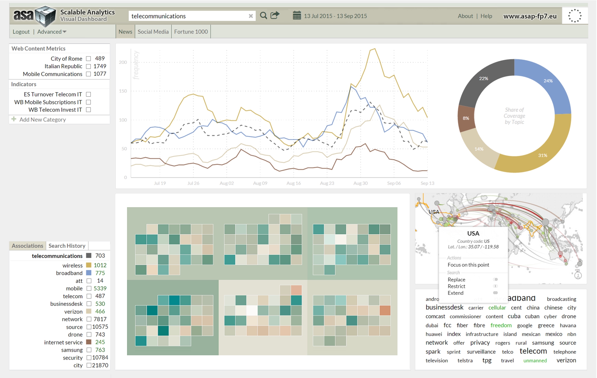
Prototype of the ASAP dashboard for the integrated analysis of unstructured Web content and structured telecommunications data.
The ASAP FP7 Research Project23
develops a dynamic execution framework for scalable data analytics based on structured and unstructured data from a range of sources, open as well as proprietary. This includes automatically annotated news and social media content, statistical indicators from linked data sources, and anonymized Call Data Records (CDRs). The conceptual development of the ASAP dashboard to analyze data across these sources benefited from the evaluation results summarized in the preceding section. The dashboard is implemented as part of the telecommunications use case (Section 5.2), paying particular attention to (i) on-the-fly data composition and visualization, (ii) the display of temporal data and interactive controls to quickly select desired time intervals, and (iii) the provision of APIs for uploading datasets and annotations, querying the knowledge repository, and embedding visualizations into third-party applications.Visual tools for representing Statistical Linked Data (LD) can support policy experts and decision makers in a wide range of domains such as telecommunications, travel and tourism, financial markets, health care services, or sustainable development. Facilitated by the adoption of LD technologies, applications that seamlessly integrate and visualize statistical LD from multiple sources have started to appear. The large-scale integration of statistical LD technologies at semantic and syntactic level is still at an early stage and calls for improved methods to align, link and visually explore datasets from heterogeneous sources.
This article describes innovations from two European research projects that advance the state of the art in terms of: (1) workflow and design principles to develop statistical LD visualizations for heterogeneous data from multiple sources, (2) use cases and scenarios for visualizing statistical data, (3) visual DSSs that support these scenarios across application domains, and (4) multiple coordinated view technology for LDPs that embeds data analysis and visualization processes in a flexible and reusable framework.
The presented workflows and principles can also be applied to other types of data: scientific data (often statistical in nature, but not always published using QB standards), personal data (e.g., curricula vitae or FOAF profiles), or historical data (e.g. comparing trends in different historical periods). At this stage, individual research communities develop their own guidelines, which eventually should be merged into a general set of principles for visualizing any kind of LD content.
For the use cases, we acquired statistical indicators from international organizations. One of the main benefits of using such LD sources is access to a large number of indicators (the Eurostat endpoint alone provides 6538 datasets) covering a wide range of topics (telecommunications, economy, ecology, travel and tourism, health, etc.). Publishers typically provide indicators in standard formats such as RDF Data Cube (QB) and Statistical Data and Metadata eXchange (SDMX). The datasets are interlinked, even though their alignment might represent a challenge due to heterogeneous property labels or deviations from the W3C recommendations.
QB datasets and related formats support structured queries that consider complex hierarchies exposed as code lists (e.g., geographical locations), which is not possible when using open data provided in Comma-Separated Values (CSV) format. A side-effect of using RDF Data Cube was the creation of a QB-inspired JSON data format for including data into the webLyzard visualization engine that can be reused for any type of statistical dataset. The required fields from this format are those that are generally used to describe datasets and observations with the QB vocabulary (dataset, observation URI, observation value, date, etc.), while optional fields can accommodate dataset-specific information such as geographic location or the unit of measurement.
The validity of the underlying datasets is of particular importance and a fruitful avenue for future research. This article is based on datasets published by trusted third parties, but large-scale LD analytics solutions require verification techniques and certification procedures to address the open nature of LD and ensure data quality including assessments of veracity and conformity with security standards. Data composition and visualization services will enable users to create new indicators on-the-fly, compare them with similar values from other indexes [17], and integrate them into complex analytical models – to automatically verify knowledge [49], for example, or to identify rumors spread via social media [3].
Future work will add decision support metrics extracted from news and social media coverage to these analytic models, resulting in novel solutions for the integrated management and analysis of statistical LD. This will not only unlock significant commercial opportunities, but also enable us to better understand (and act upon) systemic issues on a society-wide scale, for example when addressing environmental problems or pursuing sustainable development goals [45].
Footnotes
Acknowledgements
The research presented in this article has received funding from the European Union’s 7th Framework Programme for Research, Technology Development and Demonstration as part of the ASAP25
and ETIHQ