
Abstract
Bike-metro integration is regarded as an effective means of improving the access to metro systems. This study aims to assess the metro accessibility by biking at a finer spatiotemporal scale using a real bike trajectory dataset generated by cyclists. To achieve this goal, we propose a metro accessibility level (MAL) indicator that explicitly integrates metro crowdedness into the accessibility measurement. We then introduce a method to examine the possibility of avoiding metro crowdedness by using the bike as the access mode. The proposed indicator and method are applied to Shanghai, China as a case study. Results show that bike-metro integration increases the accessibility to metro systems in terms of larger population coverage and a higher accessibility level. Omitting the metro crowdedness leads to an overestimation of the accessibility to metro systems, and the overestimation for the morning peak is larger than that of the afternoon peak. Only 19% of the population in walking catchment areas of crowded stations can shift from crowded stations to non-crowded ones. These results provide a good reference for transportation planning, modeling, and policymaking to improve bike-metro integration.
Highlights
(1) We propose a metro accessibility level (MAL) indicator by explicitly integrating metro crowdedness into the accessibility measurement.
(2) We assess the metro accessibility by biking at a finer spatiotemporal scale using a real dockless bike trajectory dataset in Shanghai, China.
(3) Taking metro crowdedness into consideration can better estimate the accessibility to metro systems.
(4) There is a potential to promote the travel shift from crowded stations to non-crowded ones for metro passengers through bike-metro integration.
Introduction
The integration of bikes and public transportation (bike-and-ride) has been regarded as an effective way to solve the first/last mile problem of public transit (Boarnet et al., 2017; Lin et al., 2019). During the last decades, the widely launched station-based bike-sharing programs have facilitated this type of integration. The recent emerging dockless bike-sharing programs also greatly promote the use of bike-and-ride because of the convenience of locating, fetching, and parking shared bikes (Zhang et al., 2019). Bike-and-ride has many socioeconomic and environmental benefits associated with cycling itself, such as reducing traffic congestion and carbon emission and providing travel alternatives for passengers (Zhang and Mi, 2018). In addition, compared with walk-and-ride, it is usually regarded as a more convenient way to travel and a better way to expand the catchment areas of public transit stations, thus having the potential to increase the accessibility to public transit (Lin et al., 2019; Zuo et al., 2018).
As an important public transportation mode, metro systems have been constructed in many large cities worldwide to provide better transportation services and address urban issues, like traffic congestion and air pollution. They can be more attractive for passengers if the accessibility to metro systems can be improved (Du et al., 2022), for example, by providing convenient bike-sharing service and improving efficient bike-metro integration (Chen et al., 2019). Bike-metro integration acts as a more representative mode of bike-and-ride in comparison with bike-bus integration, because bus stops are usually densely distributed, attracting more access/egress trips by walking (Zhao and Li, 2017). Additionally, more parking places are usually affiliated with metro stations than bus stops. We herein focus on bike-metro integration.
In order to promote bike-and-ride, many empirical studies have examined how the accessibility to public transit is influenced by using biking as the access mode instead of walking. Most previous studies (e.g., Lee et al., 2016; Lin et al., 2019; Zuo et al., 2018) measured the accessibility change by examining how bike-and-ride could increase the areas/population covered by transit catchment areas. Such analysis is useful for capturing a general picture of the accessibility to public transit by biking. However, the covering-based analysis usually failed to provide a finer-scale measurement of the accessibility change. For instance, all locations inside the same catchment area are assumed to have the same level of accessibility. This assumption is inappropriate or insufficient if we want to investigate the accessibility at a finer scale, such as a building or an urban parcel because accessibility varies greatly for different places at this spatial scale.
To examine how bike-and-ride could change the accessibility to metro systems at a finer spatiotemporal scale, we herein introduce an accessibility indicator, namely the metro accessibility level (MAL). The MAL is developed based on the widely used public transit accessibility level (PTAL) indicator developed by Transport for London (2015), and with an adaptation by integrating metro crowdedness. Existing studies have indicated that transit crowdedness affects the travel from several aspects, including in-vehicle time, waiting time, and well-being (Li and Hensher, 2011; Tirachini et al., 2013). As a result, transit crowdedness can affect users’ modal choices (Tirachini et al., 2013) and route choices (Kim et al., 2015; Raveau et al., 2014). In terms of metro crowdedness, it might affect the accessibility to metro systems from three aspects. First, metro crowdedness could increase the train dwelling time and cause train delay depending on the number of boarding, alighting, and onboard passengers (Kim et al., 2015; Lin and Wilson, 1992). Second, metro crowdedness could lead to an additional waiting time when passengers cannot get on overcrowded trains (Raveau et al., 2014). Third, the comfort of metro travel could decrease if the train is crowded. For metropolitans (e.g., Shanghai and London) that suffer from a high level of transit crowdedness during peak hours, it is crucial to consider the impact of crowdedness on metro accessibility. On the other hand, bike-metro integration might have the potential to relieve the metro crowdedness because it has the potential to increase metro accessibility (Lin et al., 2019). For instance, non-crowded metro stations beyond walking distance might become accessible within an acceptable time if biking is used as the access mode instead of walking. As a result, from the perspective of users, using biking to substitute walking might help them avoid crowded metro stations without increasing the total access time. From the perspective of metro operators, the promotion of bike-metro integration might relieve the crowdedness of certain metro stations. Thus, in this paper, we try to identify the locations where users might use biking as the access mode to avoid crowded stations without increasing the total access time.
The rest of the paper is organized as follows. In the next section, we review the studies related to transit accessibility measurement. The next section proposes the MAL indicator and other methods. We then use the data from the city of Shanghai, China to showcase our study. We conclude our study in the final section.
Related studies
Transit accessibility has been a long-lasting topic in transportation research because of its importance in transportation planning, modeling, and policymaking. Generally, transit accessibility can be classified into two types, namely accessibility to transit and accessibility via transit to opportunities (Morris et al., 1979). This study focused on reviewing the literature related to accessibility to transit. For the accessibility via transit to opportunities studies, please refer to a good review paper written by Lei and Church (2010).
The covering analysis of transit catchment areas is an easily implemented and interpreted approach to assessing public transit accessibility. Generally, a large proportion of the area/population coverage of a transit system indicates good transit accessibility (Currie, 2010). As one of the major concerns of this type of approach, the assumed sizes of catchment areas usually cannot match real situations because of diverse urban forms, socioeconomic statuses, and transit types. To address this issue, several studies (El-Geneidy et al., 2010; Lin et al., 2019; Zuo et al., 2018) have tried to measure more accurate transit catchment areas by using real travel data with more details, such as origin-destination data and trajectory data. In addition, the covering analysis usually assumed that all locations inside the same catchment area have the same degree of accessibility to the transit system (García-Palomares et al., 2013), thus failing to capture the accessibility heterogeneity at a finer scale. The public transit accessibility level (PTAL), developed and used in London (Transport for London, 2015), is a more accurate and sophisticated accessibility indicator, for it is measured at individual location level, and considers more factors (e.g., waiting time). For a population location 1 inside a catchment area, the PTAL measures the location’s accessibility to public transit based on the walking time, waiting time, reliability, and available services. The PTAL has also shown its applicability outside London, such as in Manchester (the United Kingdom) (Transport for Greater Manchester, 2016), Melbourne (Australia) (Saghapour et al., 2016), and Surat (India) (Adhvaryu et al., 2019).
In another stream, some studies tried to adopt the two-step floating catchment area (2SFCA) method to measure transit accessibility (Luo and Wang, 2003). Langford et al. (2012) argued that the 2SFCA methods are capable of integrating the public transit supply and demand into a combined indicator and thus are suitable for measuring public transit accessibility. In their study, the supply of public transit was modeled by the service frequencies of transit routes, and the demand was measured as the summation of the population (weighted by distance decay) inside the transit catchment areas. Several recent studies have tried to use more detailed data to model dynamic transit supply and demand (Kyung et al., 2018; Xu et al., 2015). Xu et al. (2015) modeled the supply as a combination of transit service frequencies and vehicle sizes, and the demand for a traffic zone was measured by summing the travel demand to and from traffic zones. Kyung et al. (2018) measured the demand by excluding the population on the road area, and the supply as a combination of transit service frequencies, vehicle size, and occupy rates.
In terms of the transit accessibility measurement, one of the key added values introduced by the 2SFCA-based methods is that the balance between supply and demand is embedded in the supply-demand ratio; hence, the “crowdedness” is implicitly integrated into the accessibility measurement. Generally, a larger supply-demand ratio acts as an indicator of lower crowdedness. However, the supply-demand ratio might act as a “biased” indicator of crowdedness. For example, assuming a bus has 50 seats as its supply, we have two scenarios with different demand levels, i.e., Scenario 1 with 10 passengers and Scenario 2 with 20 passengers. As a result, the supply-demand ratio of Scenario 2 is two times that of Scenario 1, although there is no crowdedness for both scenarios. In addition, the waiting time has not been explicitly modeled in the 2SFCA-based methods, failing to reflect the accurate time needed for access to the transit system.
With regard to the measurement of transit accessibility by biking, the literature can be divided into three streams based on the type of bike under investigation. The first stream focuses on dock-based bike sharing. Cheng and Lin (2018) examined how the public bike-sharing system in Kaohsiung could increase the metro service area and found most service areas can be largely expanded by using biking as the egress mode. Yang et al. (2018) investigated how the public bicycle-sharing system could impact the urban public transport networks in Hangzhou and found the public bicycle-sharing systems can decrease the average trip time of passengers and increase the efficiency of the urban public transport network. In terms of dockless bike sharing, Lin et al. (2019) analyzed how the metro catchment areas can be expanded by dockless shared bikes using trajectory data. They found that the bike-metro integration increased the metro catchment coverage ratio in the central area of Shanghai (China) by 104%. Zhou et al. (2018) analyzed how dockless bike sharing impact the modal shift in metro commuting and found one-third of respondent shifted to dockless bikes mainly because of the advantage of shorter access time and the relief of bicycle theft problem. Shen et al. (2018) found that high land use mixtures, easy access to public transportation, more supportive cycling facilities, and free-ride promotions positively impact the usage of dockless bikes. The last stream mostly focuses on private bikes, La Paix Puello and Geurs (2016) examined the role of perceptions and attitudes in bike accessibility to the railway system by adding them to the generalized transportation access cost. The results showed the accessibility levels tend to be overestimated if the unobserved effect is omitted. Boarnet et al. (2017) found that bike-and-ride significantly reduces the gaps between access to low-wage jobs by car and by transit in San Diego (the United States). Zuo et al. (2018) investigated the transit coverage of non-motorized transport modes (i.e., walking and biking) by using GPS (Global Positioning System) data obtained in Cincinnati (the United States). They highlighted the advantages of bike-transit integration by comparing the area and population covered by bike and walk catchment areas. Pritchard et al. (2019) examined how job accessibility in São Paulo (Brazil) was changed by using biking as the access mode. The results showed that bike-and-ride has the potential to increase the job accessibility, especially in the areas already with good accessibility. However, they found the accessibility inequality issue cannot be improved by bike-and-ride in their case.
The existing literature on the finer-scale assessment of bike accessibility to metro systems is still limited. More importantly, the crowdedness of metro systems is not explicitly included in the existing accessibility measurement. To fill this gap, in this paper, the metro crowdedness is transferred into waiting time and then included in the proposed MAL indicator. To provide a finer spatiotemporal granularity of accessibility analysis, we differentiate the accessibility between morning and evening peaks and measure the accessibility at individual population grid, which is a similar concept to the population location used by Transport for London (2015). Additionally, we also use big trajectory data in Shanghai to measure the bike catchment areas and biking speeds around metro stations, thus obtaining a more realistic assessment of bike accessibility to the metro system.
Methodology
Metro accessibility level (MAL)
The MAL of a population location mainly consists of three components, i.e., access time (AT), scheduled waiting time (SWT), and waiting time caused by crowdedness (WTC). In what follows, we describe each component and explain how to combine them as a single indicator.
Access time (AT)
The access time from a population location i to a metro station k depends on the corresponding distance and speed. The distance between a population location and a metro station is measured based on Dijkstra’s algorithm by assuming users choose the shoest paths (denoted as Disik). If a station has multiple entrances, the distance is measured as the shortest distance between the entrances and the population location. For different metro stations, the catchment areas may vary because the willingness of walking/biking depends on the station features (e.g., location and service quality). In order to derive the bike catchment areas of metro stations, the 75th percentile distance of the access/egress trips of a metro station is regarded as its maximum acceptable biking distance (Lin et al., 2019; Wang et al., 2016). Similarly, the biking speeds heading to metro stations vary from station to station because the road condition around each metro station is different. Thereby, the average biking speed heading to a station k (denoted as AvgSk) is estimated as the average biking speed of its associated bike-and-ride trips. Then, the access time ATik is calculated by the following formula

Scheduled waiting time (SWT)
Based on the accessible metro stations of a population location, the corresponding accessible metro lines can be constructed. The scheduled waiting time for metro station k of metro line j is then decided by its service frequency
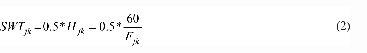
where Fjk and Hjk are the service frequency and headway for metro station k of metro line j, respectively. For instance, if the service frequency for metro station k of metro line j is 10 train/hour, the corresponding scheduled waiting time is 3 minutes. If the headways of the two directions of a metro line are different, the average headway of the two directions is used as the headway of the metro line. Note that the stations belonging to the same metro line may have different service frequencies, because metro operators may set different service frequencies for different parts of a metro line.
Waiting time caused by crowdedness (WTC)
As mentioned in the introduction, metro crowdedness can cause additional waiting time for passengers from two aspects: train delay and the ability to board. Due to the difficulty to obtain the train delay data, we herein focus on modeling the second aspect. Specifically, a passenger needs to wait for additional trains (e.g., waiting for the next train) when the train occupancy rate exceeds a certain threshold. Thereby, the additional waiting time caused by crowdedness can be calculated based on the following formula

where WTCjk is the average waiting time caused by crowdedness for metro station k of metro line j, ajk represents the average number of extra trains that a passenger needs to wait at station k of metro line j, Hjk is the headway for metro station k of metro line j, and RCjk is the crowdedness ratio, which can be calculated as the ratio between the number of times that the train is fully loaded and the train frequency at station k during a certain period. Assuming a passenger cannot get aboard the current train and need to wait for the next train, then the time he/she needs to wait equals to the train headway. Following such logic, if we would like to measure the additional waiting time in a larger time interval, the crowdedness ratio can be introduced to measure the average additional waiting time. For example, if the headway of a metro line is 6 minutes (i.e., 10 train/hour), 3 of the 10 trains are detected as being fully loaded at a station, and passengers usually need to wait for one additional train when they cannot get on board. Then, the corresponding
Total access time (TAT)
Based on the above three components, the total access time from location

The total access time from location i to metro line j is then measured as

where K represents all the stations of metro line j that can be accessed by location i. When two or more stations of metro line j (i.e., |K| > 1) are accessible, the TAT from location i to metro line j equals to the minimum TAT of its accessible stations.
Equivalent doorstep frequency (EDF)
The total access time from location i to metro line j can be transferred into equivalent doorstep frequency (EDF) as 30 minutes divided by the corresponding TAT, shown as follows
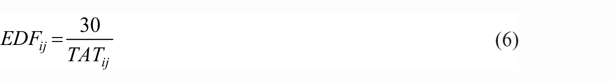
The EDF treats access time as a notional average waiting time as though the route was available at the “doorstep” of the selected metro station (Transport for Greater Manchester, 2016).
Metro accessibility level (MAL)
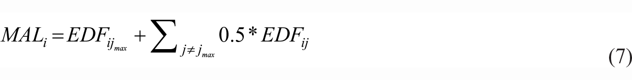
The metro accessibility level of a location i is calculated as a summation of all the accessible metro lines.
where,
Identifying possible shifts from crowded stations to non-crowded stations
It is possible to avoid crowded stations without increasing the total access time by using biking to substitute walking as the access mode. The general idea for examining such a possibility is to check if bike-metro integration could enable a population location to get access to any non-crowded station beyond the walking distance without increasing the total access time (Figure 1). The aim is to examine in which population locations such potential exists and how they distribute spatially. We first define the WTC of a metro station as the average WTC of its associated metro lines. Then, a metro station can be classified as a crowded or non-crowded one based on its WTC. To be specific, stations with a WTC above a certain threshold are defined as crowded. Then, a metro station can be classified as a crowded or non-crowded one. To find all the potential shifts from crowded stations to non-crowded stations of location i, the following steps are needed.
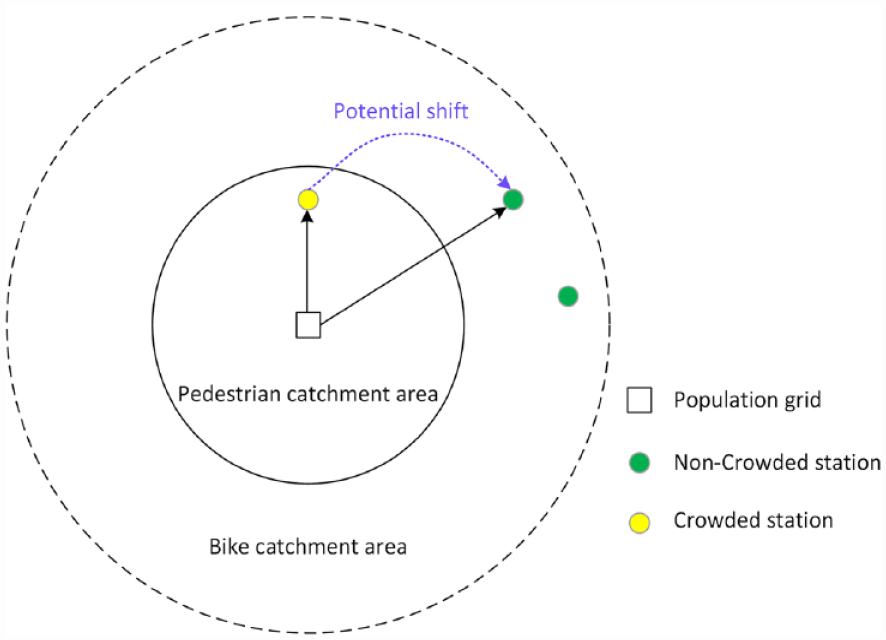
Illustration of the potential shift from crowded to non-crowded stations.
Case study
Study area and data preparation
Study area
With a population of 24.2 million as of 2018, Shanghai (Figure 2) is the most populous city in China (Shanghai Municipal Bureau of Statistics, 2019). It is also a global center for finance, innovation, and transportation. Shanghai Metro is a major public transportation mode in the city, ranking as the world’s largest rapid transit system with a total route length of 676 kilometers (as of December 2018 2 ). The average daily volume of Shanghai Metro is 10.16 million ridership in 2018 (Shanghai Municipal Bureau of Statistics, 2019). During the commuting peaks, the metro trains can be overcrowded because of the huge commuting demand and the separation of workplaces and residences (i.e., the job-housing imbalance). To tackle the metro crowdedness, many strategies, such as adding barriers (e.g., setting fences), and closing part of metro entrances and gates, have been adopted by the metro operators to reduce the passenger crowdedness. On the other hand, Shanghai is also one of the biggest dockless bike-sharing markets in the world, having more than 1.5 million dockless shared bikes in the market by the end of August 2017 (Xinmin Evening News, 2017). The dockless shared bikes have been widely used for solving the first/last mile problem of accessing/egressing the metro system in Shanghai.
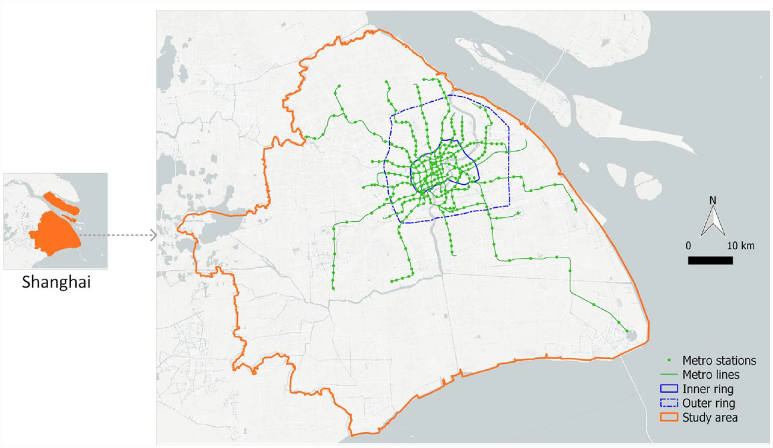
The map of Shanghai and the metro lines.
Data preparation
The population dataset originated from the 250 × 250 m Global Human Settlement (GHS) of 2015 provided by the Joint Research Centre of the European Commission (Schiavina et al., 2019). The road network of Shanghai was downloaded from OpenStreetMap (https://www.openstreetmap.org). Via the API (Application Programming Interface) provided by Gaode (https://www.amap.com), which is a leading map service provider in China, we obtained 1,223 metro entrances, in the form of POIs (Points of Interest) from 301 different stations and 14 metro lines (shown in Figure 2). Note that, to keep consistency with our dockless bike-sharing data, we have ignored the metro stations that opened later than October 1, 2017, and three metro stations located in Kunshan (a city near Shanghai) were ignored as well. The service frequencies of the 14 metro lines were collected from the official web of Shanghai Metro (http://service.shmetro.com).
The bike trajectory dataset was originated from one of the leading bike-sharing companies, Mobike. The dataset was generated by randomly selecting a certain number of anonymized users, who specified their registration locations as Shanghai. The dataset covered 15 days from September 16 to 30, 2017. After excluding the trips made outside Shanghai, 777,896 trips generated by 135,239 users were kept. To construct bike catchment areas of metro stations, we first determined bike-metro trips by extracting trips with origin/destination within a 50-m buffer distance around metro entrances. Trips with both origin and destination within the 50 m buffer of a metro station are excluded since it is unlikely to be bike-metro trips. Then, the traveling routes of bike-metro trips were mainly constructed using the FBF (forward-backward-forward) based map matching algorithm (Lin et al., 2019). At last, the acceptable biking distance for a metro station was measured as the 75th percentile distance of its bike-metro trips. Similarly, the average biking speeds around individual metro stations were measured. Technical details of the bike catchment area measurement can be found in the work conducted by Lin et al. (2019).
In terms of the metro crowdedness, Shanghai Metro developed a system, namely “Real-time info Display System of Shanghai Metro Passenger Flow” to show the system’s crowdedness (Figure 3). The system is based on the data collected by automated fare collection (AFC), automatic train supervision systems, and dynamic train weighing systems. There are three different statuses of a metro station (or a metro segment 3 ), namely “suspended”, “crowded”, and “clear”, indicated by the colors of red, yellow, and green, respectively. Generally, green means the transportation capacity is sufficient, the metro station and train can provide normal service. Yellow represents operational congestion, indicating that the transportation service capacity is insufficient, and the station/train is in crowded status. Red indicates the disruption of the operation, such as serious train delays and transit route closures (Shen et al., 2012).
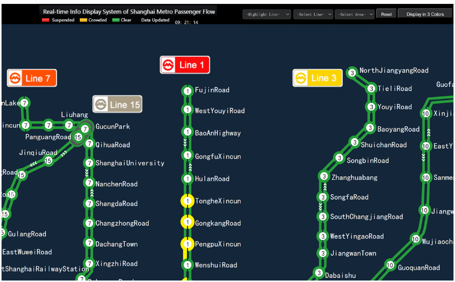
A screenshot of the “Real-time info Display System of Shanghai Metro Passenger Flow”.
We measured the crowdedness ratio of a metro station (see “Waiting time caused by crowdedness (WTC)”) by counting its number of yellow statuses within a certain period. A station is labeled as yellow (i.e., crowded) if it is under the status of limiting the passenger crowdedness (e.g., some entrances of a station need to be closed) or the density of passengers exceeds 2 people/m2. A metro segment is labeled as yellow if the number of passengers on the train exceeds 90% of the train’s capacity (including standee places) and the train delay is under 10 minutes (Shen et al., 2012). As a result, the crowdedness of a metro station has two forms, either the station alone is labeled as being crowded (termed Form 1) or the station and the segment originating from the station are both labeled as being crowded (termed as Form 2). Under the Form 2, it is reasonable to assume that passengers need to wait for additional trains because of the high occupancy rate and large amounts of passengers on the platforms. On the other hand, Form 1 means some strategies are adopted to slow down the speeds of arriving at the platform, indicating users need additional time to get on board than normal cases. In this study, we assumed crowdedness is observed if users need to wait for additional trains either Form 1 or Form 2. The crowdedness statuses of metro stations during September 17–19, 2019 (from Tuesday to Thursday) were collected with an interval of 2 minutes. Within an hour, the crowdedness ratio of a metro station can then be calculated based on the number of times it is labeled as being crowded among the corresponding 30 statuses. The α (Formula 3) was set to be 1 for all the stations by assuming the passengers need to wait for one more train when a station is detected as being crowded.
Accessibility analysis
MAL by walking and biking
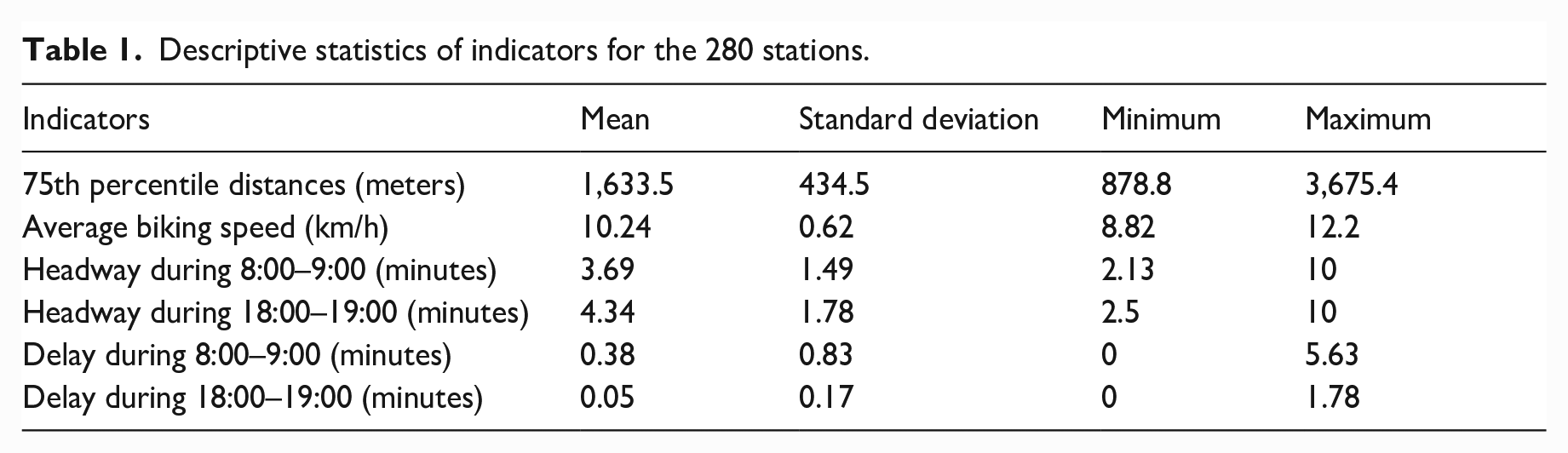
To avoid potential data biases caused by small sample sizes, metro stations with less than 40 bike-metro trips were ignored (Lin et al., 2019). Besides, all the stations within Shanghai’s central area were kept for better analyzing the accessibility in the city center. Finally, 280 stations were kept for the accessibility analysis. Since the train service frequencies and crowdedness of metro stations are different during the morning and afternoon peaks. Based on the metro peak hours defined by Shanghai Metro, we found two periods, i.e., 8:00–9:00 and 18:00–19:00, are within the peak hours for all the 14 metro lines considered in this study. We thus selected 8:00–9:00 (morning peak) and 18:00–19:00 (afternoon peak) to analyze the MALs of grids inside the bike catchment areas. The descriptive statistics of indicators of the 280 stations are shown in Table 1. Then, the accessibility of the population grids inside the bike catchment areas was calculated accordingly.
Descriptive statistics of indicators for the 280 stations.
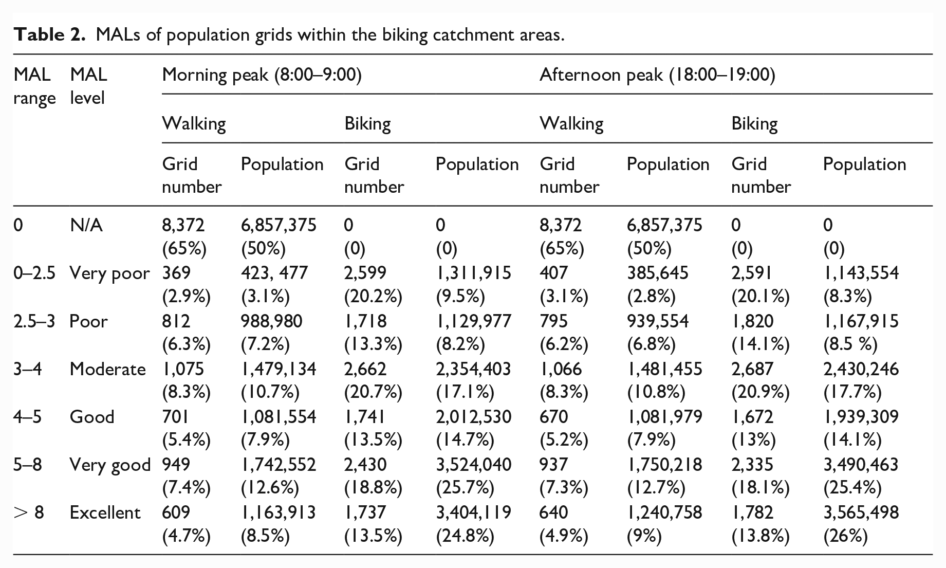
As a comparison, the MALs by walking for both periods were measured by assuming a walking speed of 4.8 km/h and an acceptable walking distance of 800 m (Guerra and Cervero, 2013). Via referring to Adhvaryu et al. (2019) and Saghapour et al. (2016), the quintiles of the MALs by walking during the morning peak were used to classify the MALs into six different levels: very poor, poor, moderate, good, very good, and excellent (Table 2). In comparison with the MALs by walking, two improvements made by bike-metro integration can be observed. First, the population and areas covered have been largely extended. The population covered by bike catchment areas was two times that covered by walking catchment areas. Given the average acceptable biking distance (1633.5 m in Table 1) is twice as long as the acceptable walking distance (800 m), such a result is not surprising. Second, the proportion of the population with a MAL above poor (the MAL value is larger than 3) has increased sharply, i.e., from 39.7% to 82.3% for the morning peak, and from 40.4% to 83.2% for the afternoon peak. A closer look at the spatial distributions of the MALs by walking and biking during the morning and afternoon peaks (Figure 4) also confirmed these two improvements. The MALs of the population grids inside the central area (i.e., the area inside Shanghai’s outer ring) showed a noticeable improvement.
MALs of population grids within the biking catchment areas.
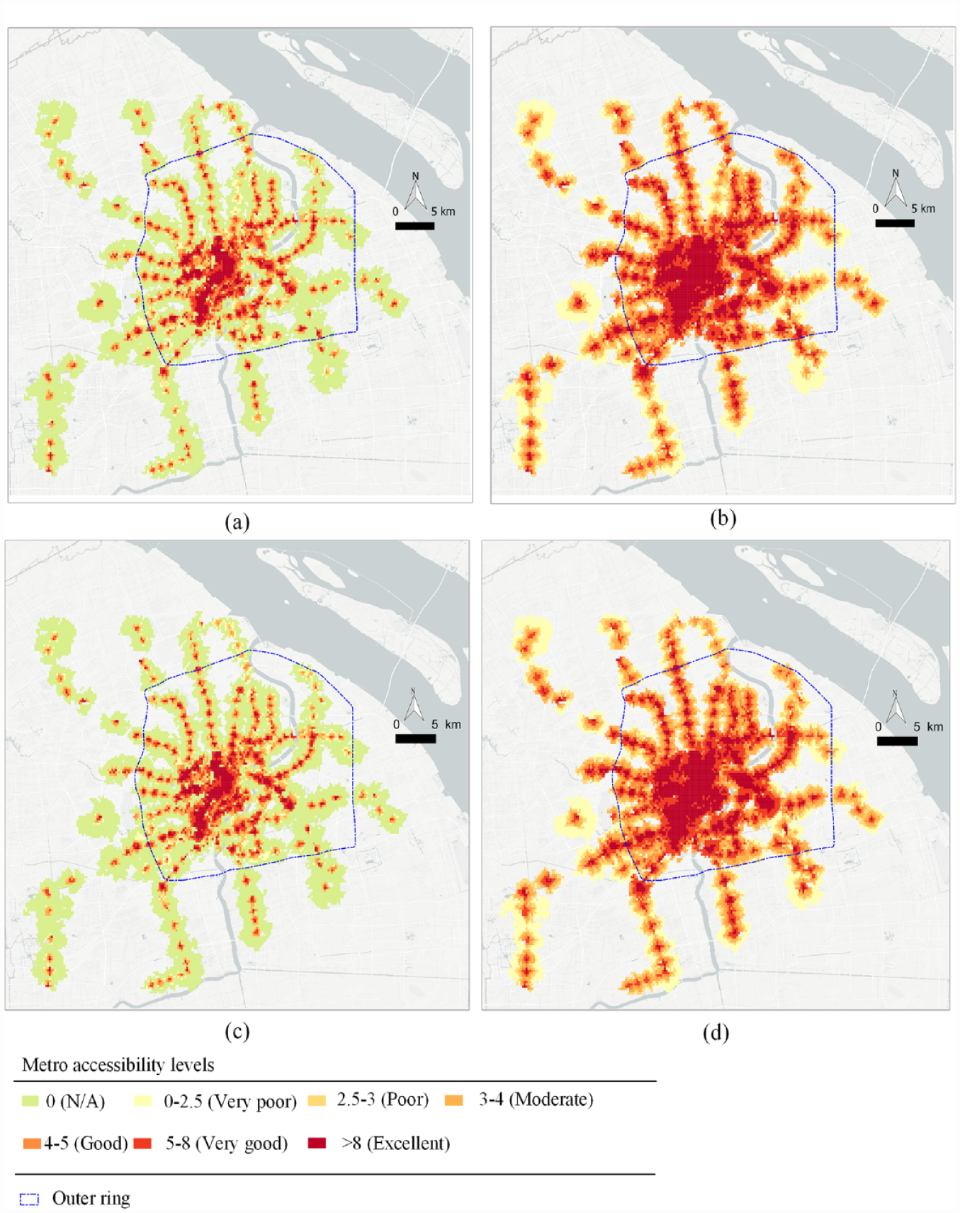
MALs of the population grids in the bike catchment areas during the morning and afternoon peaks. (a) MALs by walking in the morning peak. (b) MALs by biking in the morning peak. (c) MALs by walking in the afternoon peak. (d) MALs by biking in the afternoon peak.
Assessing the MALs by overlaying with population densities
By combining with the population density data, the MAL map can provide a clear picture on how metro accessibility is distributed with respect to different levels of population densities. For the assessment and potential improvement of the public transit accessibility, we need to pay specific attention to the areas with a high population density but poor metro accessibility. Figure 5 depicts the MAL distribution of Shanghai’s central area during the morning peak and its overlay with population densities. By using the overlaid distributions, seven areas with poor metro accessibility but high population densities can be easily identified (labeled by dotted lines). Area 1 is a typical residential area with several gated communities, such as Dong Jiao Hua Yuan and Si Ji Ya Yuan. Area 2 is also a residential area where the Nan Jiang Yuan is located and with some residential buildings under construction. Area 3 is a compound industrial area (e.g., Long Xin industrial park) and residential area (e.g., Hong Fu Xin Cun) located at the southwest corner of the central city. Area 4 is a typical industrial area where the Da Chang Nan Da industrial park and Shan Wai industrial park are located. The area around the Yin Gao Xi Lu and Jiang Wang Zhen metro stations is labeled as Area 5, which is a mix of commercial, residential, and educational areas. Area 6 mainly covers the Gong Qin National Forest Park and the University of Shanghai for Science and Technology, and the Huangpu River is also partly covered in this area. Area 7 is characterized by densely distributed residential areas, such as Long Ju Hua Yuan and Yi Shan Jia Yuan. Among the seven labeled areas, Areas 1, 2, 3, 4, and 6 are outside the bike catchment areas (i.e., MAL equals 0). Areas 5 and 7 have moderate MALs but very high population densities. By considering both the accessibility and population densities, we can identify the areas that need priorities to improve metro accessibility. For example, Area 1 would have the top priority of the metro accessibility improvement among the five areas outside the bike catchment areas, for it has the same MAL (i.e.,
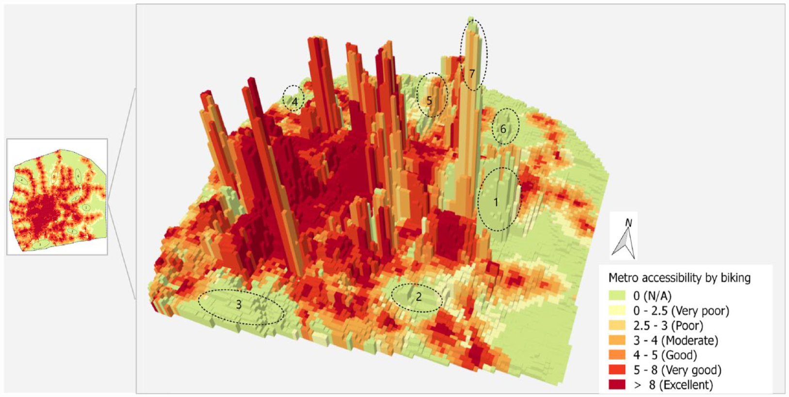
MALs by overlapping with population densities during the morning peak of Shanghai’s central area.
MAL decrease caused by crowdedness
As indicated by Table 2, the MALs for the morning and afternoon peaks are different. In general, the MALs during the afternoon peak are slightly higher than the MALs during the morning peak, with 16.8% and 17.7% of the population under the moderate level, respectively. This may be caused by the differences in metro service frequencies and the crowdedness between the morning and afternoon peaks. The result is also a little bit counterintuitive because the service frequencies during the morning peak are usually higher than that of the afternoon peak (the average headways for all the 280 stations during the morning and afternoon peaks are 3.69 minutes and 4.34 minutes, respectively, as shown in Table 1). The result may be explained by the differences in metro crowdedness during the morning and afternoon peaks, as the average WTCs for all the 280 stations during the morning and afternoon peaks were 0.38 minutes and 0.05 minutes, as shown Table 1. We thus assessed the crowdedness-caused accessibility differences by measuring the accessibility differences between the MALs with and without crowdedness. Specifically, the MALs without crowdedness were calculated by excluding the WTC from the TAT.
Figure 6 shows that metro crowdedness has a noticeably greater impact on the MALs during the morning peak than that during the afternoon peak, with 61.1% and 29.2% of the population’s MALs being affected by the crowdedness, respectively. This is because much fewer metro stations were detected as being crowded during the afternoon peak in comparison with the morning peak. Additionally, the spatial distributions of the affected areas during the morning and afternoon peaks are also different. Most of the affected areas during the afternoon peak are in the central area. In contrast, the affected areas during the morning peak are widely distributed in both the central area and suburban areas. This may be partly explained by the imbalanced distribution of jobs and residences in Shanghai. The major commute direction during the morning peak is originated from the suburban to the city center, whereas the opposite direction is for the afternoon peak. Furthermore, instead of directly going back home, people may have more travel or activity choices after work, which might also help reduce the crowdedness level of the metro system during the afternoon peak.
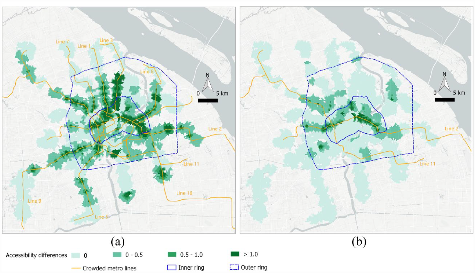
MAL differences caused by crowdedness. (a) The morning peak. (b) The afternoon peak.
Mapping grids with the possibility of avoiding crowdedness
Because of its heavy crowdedness, we used the morning peak to map the population grids with the possibility of avoiding crowdedness. The threshold for identifying crowded stations was set to be 0, i.e., the stations with a WTC larger than 0 were considered as crowded ones; otherwise as non-crowded ones. As a result, among the population inside the 800-m walking catchment areas, 64% of them are inside the walking catchment areas of crowded stations. The identified population grids with the possibility of avoiding crowdedness are depicted in Figure 7. Generally, this type of possibility is limited to a small proportion of the population. Specifically, only 19% of the population inside the walking catchment areas of the crowded stations was detected to have the possibility of avoiding crowdedness. As noted by red circles, several areas (i.e., Area 1–5) around crowded metro stations have no grids with a possibility to be shifted from crowded stations to non-crowded stations. For instance, Area 1 is an area around several crowded metro stations of Line 11, which are heavily affected by metro crowdedness. However, the stations near the crowded stations in this area are either crowded or non-crowded ones but too far away (i.e., beyond acceptable biking distances).
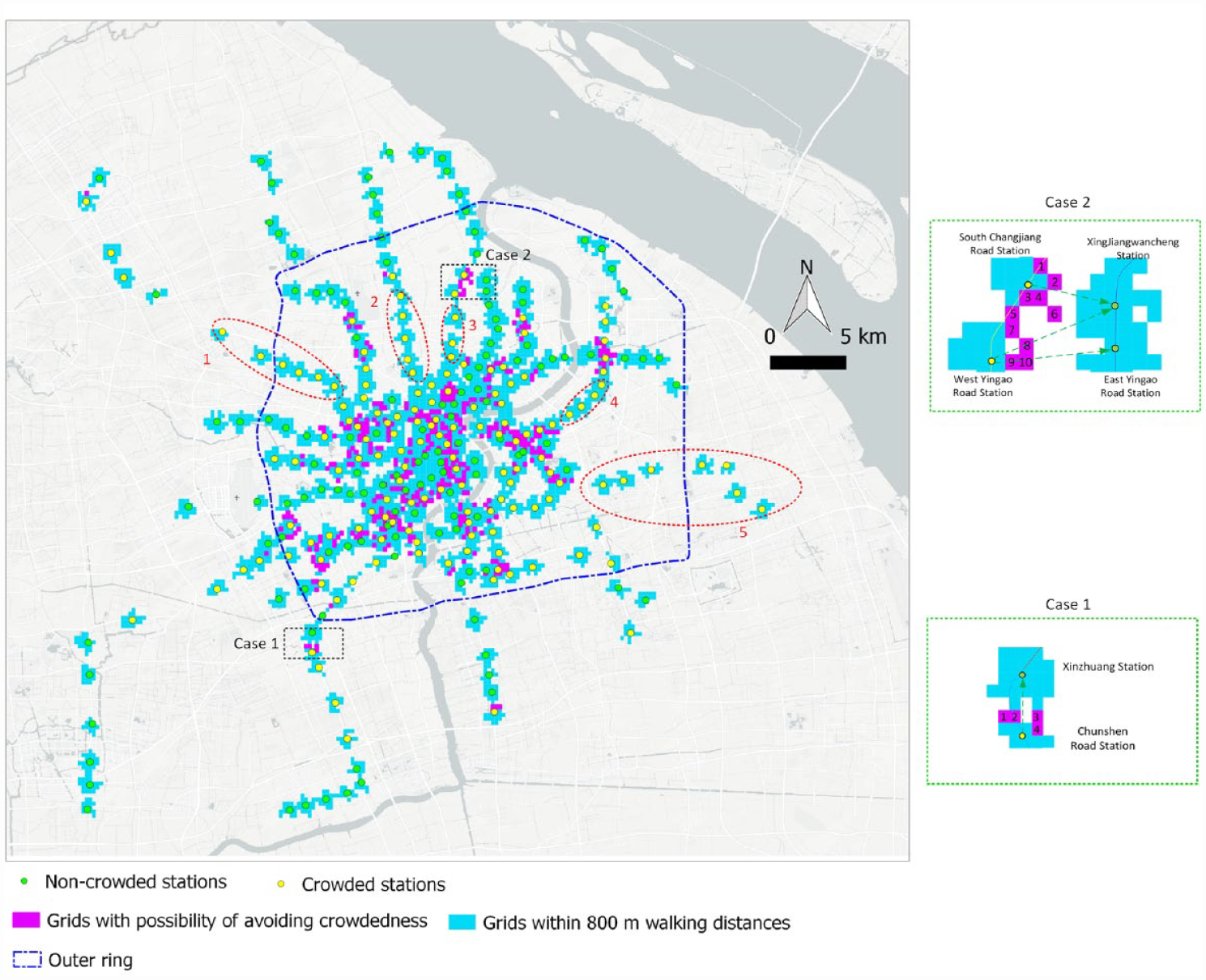
Spatial distributions of the grids with the possibility of avoiding crowdedness.
Among the population grids with the possibility of avoiding metro crowdedness, there exist two types of shifts: the shift between the stations from the same metro line and the shift between the stations from two different lines. We illustrated the first and second types by using Case 1 and 2 labeled by black rectangles in Figure 7, respectively. Table 3 shows bike-metro integration not only helps to avoid crowdedness but also greatly saves the total access times for some population grids (e.g., Grid 3 in Case 1). For Case 1, part of the users within the walking catchment areas of the crowded station Chunshen Road could shift to the non-crowded station Xinzhuang to avoid metro crowdedness. In this specific case, since most passengers boarding on the station Chunshen Road need to transfer at the station Xinzhuang, it is practical for them to bike directly to Xinzhuang station instead of walking to station Chunshen and then ride to station Xinzhuang. For Case 2, the shift of the departure stations occurs between the metro stations from two different lines, i.e., from Line 3 to Line 10. In such a situation, passengers may need to take further criteria, such as the transfer convenience, into consideration to decide whether to shift or not. Nevertheless, the quantitative analysis presented here can provide a good reference for passengers to select a better departure station. For instance, it might be attractive for users living in Grid 6 of Case 2 to shift from the station South Changjiang Road to Xinjiangwancheng given the total metro access time can be largely reduced from 18 minutes to 9.4 minutes.
The total access times of the population grids with the shift possibility for Cases 1 and 2.
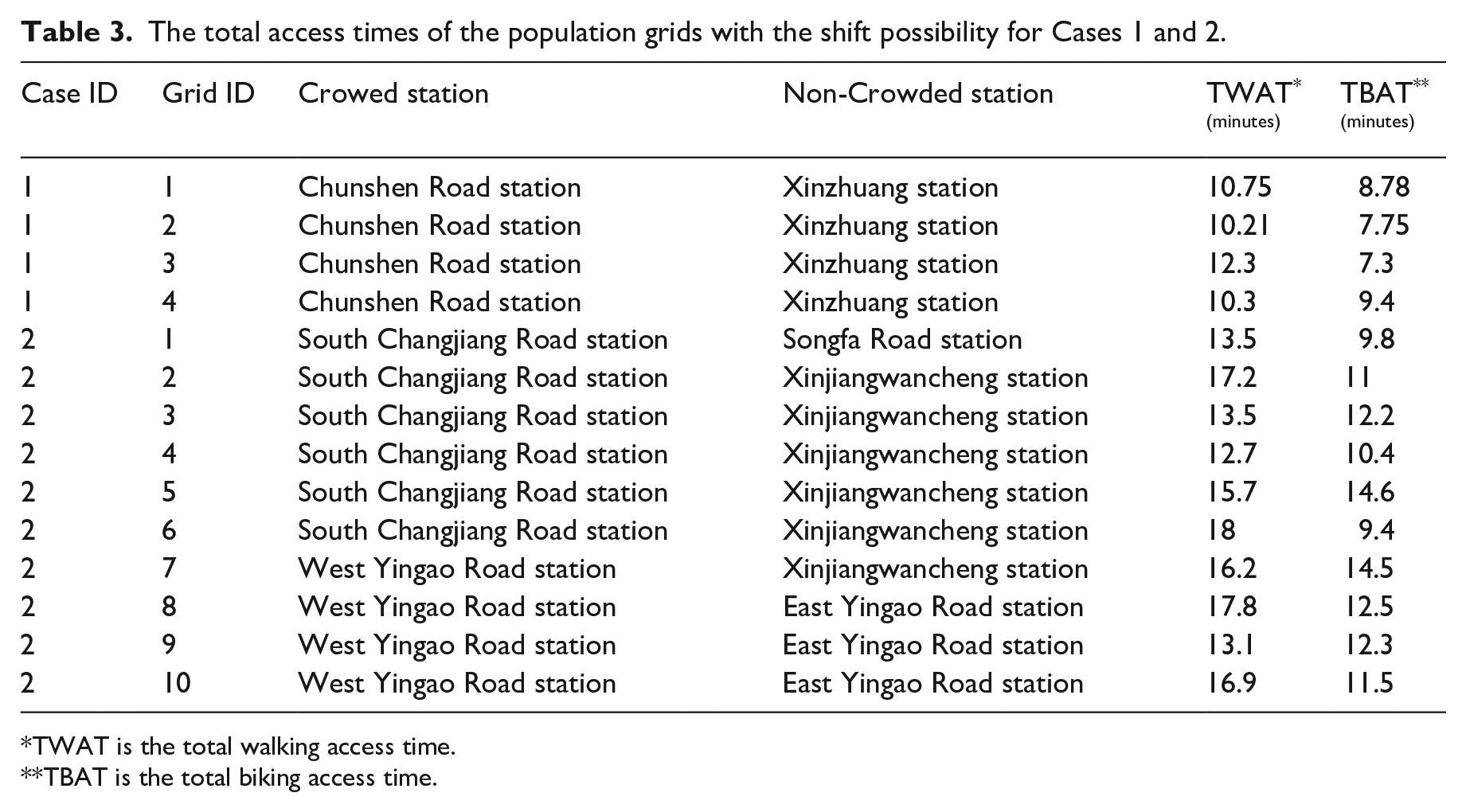
TWAT is the total walking access time.
TBAT is the total biking access time.
Discussion and conclusions
The paper proposed a crowdedness-integrated MAL indicator to measure the accessibility to metro systems by biking. We employed the MAL indicator to assess how bike-metro integration could change the metro accessibility using a big bike trajectory dataset generated by users in Shanghai, China. Results show that the accessibility to metro systems has been greatly improved by bike-metro integration in terms of population coverage and accessibility level. The population grids being covered and the population above the poor MAL level have both been doubled by using biking as the access mode. The areas that need the accessibility improvement can be identified by overlaying the MALs with the population densities. Compared with the afternoon peak, a larger proportion of the population’s MALs are affected by the crowdedness during the morning peak. The metro accessibility may be overestimated, especially for the morning peak in comparison with the afternoon peak, when the metro crowdedness is ignored. Additionally, bike-metro integration can act as a practical option for avoiding crowded stations for some citizens living in the central area of Shanghai. However, we find only a small proportion (19%) of the population has the possibility to shift from crowded stations to non-crowded ones.
Compared with the covering-based accessibility analysis, the MAL-based analysis can be conducted at a finer granularity, i.e., clear distinctions can be made to the MALs and population densities of individual population grids. As a result, the MAL-based analysis bears more subtle knowledge for micro-level transportation planning, modeling, and policymaking. For instance, specific areas that need metro accessibility improvement can be identified via referring to the generated gird-level MAL map. Some improvements have already been made by the metro operators towards Area 1 4 and Area 2 5 (in Figure 5) by opening new metro stations, indicating the potential usefulness of our analysis in practical applications. Nevertheless, other areas (i.e., Area 3–7 in Figure 5) may deserve more attention from public transport sectors. In addition to the costly metro station construction, measures, such as improving the frequencies of accessible trains (i.e., shortening the waiting time), and constructing attractive walking and biking environments, might help to improve the accessibility to metro systems in these areas.
As revealed by Figure 6, metro crowdedness significantly impacts the MALs. This highlights the importance of integrating crowdedness into the MAL measurement. Compared with the 2SFCA-based accessibility analysis conducted by Langford et al. (2012), crowdedness was explicitly modeled in the proposed MAL by transferring the crowdedness into additional waiting time. This study collected the crowdedness information from the official website of Shanghai Metro, but such crowdedness information could also be measured by using other well-established modeling approaches. For instance, assuming relevant data are available, it is feasible to measure the crowdedness of adjacent metro stations by using the train capacity information, operation schedules, and passenger flows (Jiao et al., 2017). In line with the 2SFCA-based study (Xu et al., 2015), the temporal differences of accessibility to metro systems were revealed. As a result, it is essential to make a distinctive measurement of accessibility to metro systems for different time periods, especially when metro crowdedness is integrated into the accessibility measurement.
The relatively small proportion of the population with the possibility of avoiding the metro crowdedness indicates bike-metro integration has the potential to act as a supplementary means of relieving the metro crowdedness. Note that there are two ways to reduce metro crowdedness by biking: using biking to substitute walking as the metro access mode or using biking to replace short-distance metro trips (Sun and Zacharias, 2017). This study emphasized the former approach, but in the future it will be interesting to investigate the possibility of the latter one.
Several improvements can be made to the current study. First, we only consider the integration between dockless shared bikes and the metro system due to the data limitation. It would be interesting to explore the role of station-based bike-sharing programs and personal bikes in promoting bike accessibility to the metro in the future. Second, due to data availability, the population grids used only have a spatial resolution of 250 × 250 m. A higher grid resolution (e.g., 100 × 100 m) is expected to better delineate the accessibility differences across areas. Third, the additional waiting time caused by crowdedness can be more accurately measured by improving the models based on users’ questionnaire surveys. Modeling and integrating the train delay into the MAL analysis also helps to improve the accessibility measurement. Fourth, the decrease in travel comfort in the train caused by crowdedness is not explicitly considered because of the difficulty of modeling the perceived factors. Lastly, this study only analyzed the potential shift between the crowded station and non-crowded stations based on the theoretical analysis of the total access time. It would be interesting to conduct an extra survey to validate how users actually conduct such maneuvers, and to explore how other factors (e.g., the total travel time) affect people’s selection of their departure metro stations.
Footnotes
Acknowledgements
We also thank the reviewers for their constructive remarks, which greatly help us improve the manuscript.
Declaration of conflicting interests
The author(s) declared no potential conflicts of interest with respect to the research, authorship, and/or publication of this article.
Funding
The author(s) disclosed receipt of the following financial support for the research, authorship, and/or publication of this article: This research is supported by the Fundamental Research Funds for the Central Universities (S20230013), Zhejiang University and Artificial Intelligence Key Technologies R & D Program of Hangzhou (2022AIZD0057) (Future City Being Construction and AI SuperBrain Key Technology Research for City Governance).