
Abstract
As data science gains traction, it often brings quantitative approaches and positivist epistemologies. While these can generate powerful insights, we argue for methodological hybridity in modern data science. We demonstrate the power of complementary qualitative approaches and flexible ontologies. Using an example of classifying segments™ on Strava, neither quantitative nor qualitative approaches alone were adequate to meaningfully classify segments, but together allowed accurate, useful, and intuitive categories to emerge. Drawing on this experience, we discuss qualitative data science and argue the ontological discussions within Critical GIS from the 1990s and 2000s are increasingly relevant and informative amidst our platial paradigms.
Introduction
Society is increasingly being shaped by algorithmic practices that inform people, governments, and organizations about various aspects of the world. Data-driven research is almost always a positivist practice, where the “truth” about the world is extracted from big datasets using complex algorithms and advanced statistics. We know, however, that data, algorithms, and GIScience are not value neutral; they are created subjectively by individuals that have their own epistemic lenses. We are living at a time where these two realities coexist: algorithms shaped by unknown epistemologies posit “objective” realities and futures. Recognizing the code/space or subjectivity of an algorithm and continuing to believe that it produces objective results is untenable (Kitchin and Dodge, 2011; Matzner, 2019). Yet, this is the current cultural practice.
The possibilities of objectivity and subjectivity are not new discussions in GIScience; however, the emergence of big data and algorithmic society offers an opportunity to reinvestigate places and spaces where they intersect. In 1987, Latour outlined a map of how science and society interact using a number of case studies (Latour, 1987: 198). This network of close interconnectivity between culture and what we call Science has been documented by scholars since the 1980s (Collins, 2001; Law and Mol, 2001; Pickering, 1995). In 2011, Kitchin & Dodge rearticulated similar themes by offering examples of how embodied code both produces and moderates our understanding of space. Recently, Shashank and Schuurman (2019) revealed how the quantitative “objectivity” of walkability indices are anything but free from the influence of the decisions made by the index creators and can lead to misrepresentation of neighborhood spaces. While these algorithms shape the desirability and value of a neighborhood, they are sensitive to the subjectivity of their creators. In this article, we once again call on these concepts by exploring how a social network that is centered on a “quantified-self” is best understood through qualitative measures, rather than a purely data-driven approach.
While we advocate for a qualitative approach, we recognize that qualitative GIS is a mixed methods practice, as suggested by Cope and Elwood (2009). They identify that although data and methods often perform quantitatively, qualitative conceptualizations and processes may exist alongside—and indeed profoundly influence—the “quantitative.” Although qualitative GIS remains nascent in GIScience at large (Martin and Schuurman, 2020), Kitchin (2013) argues that human geography must remain engaged with data science or risk finding itself in the same position that Lane (2016) claims humanities research is in, “left behind.” Increasingly, GIScience echoes the need to update its understanding and operationalizing of ontologies, such as Couclelis’ recent micro-ontologies (Couclelis, 2019).
In this article, we illustrate the close interwoven nature of the qualitative and quantitative in big data spatial science by undertaking an analysis of Strava 1 user-segments. 2 Strava is a social media site for endurance athletes (primarily runners, cyclists, and triathletes), allowing users to upload GPS files with annotated titles, photos, and richer narratives. The segments uploaded are truly spatial data with corresponding integrations with web maps. Each athlete can upload running, cycling, or swimming 3 activities they have completed that can then be viewed by their friends and “followers.” Like most social media sites, kudos (likes) can be offered. Individual users can identify commonly traveled “segments” upon which to measure their progress against other athletes or their own athletic development. The segments are sections of urban and wilderness running (or cycling or swimming) routes have been created to benchmark athletic performance. Users compete against one another, or themselves, to get the fastest time for a segment, usually under 2 km long.
This article is about how segments are classified into different athletic identities. The purpose of classifying these segments is to identify different types of spaces where users go so that analytical focus can be dedicated to analysis of co-located and complementary social media datasets. Our eventual goal is to ask questions similar to, “how does running environment change how runners think about and discuss their activities?” However, while the design of this study was originally to develop these classifications through a data-driven approach, we quickly recognized that the rate at which we produced new and increasingly complex rules for classification of the segments greatly outpaced our ability to effectively categorize them. Moreover, the classification systems ballooned as we attempted to incorporate multiple outliers. In other words, categorization of segments is not a simple quantification exercise but a deeply complex process of deciding what counts in any classification and providing allowances for a multitude of exceptions. While our intuition and experience using Strava made it easy to grasp what types of segment categories were needed, developing generalizable rules for classification was much more difficult. Of the thousands of Strava segments used in the study, we found exponentially increasing edge cases and boundary objects that existed simultaneously in either bespoke categories or multiple identities.
To introduce this problem, we begin with a review of ontological and qualitative research into GIScience, and a brief overview of some of the quantitative methods geographers have taken in analyzing Strava data. We then describe the range of quantitative approaches that were initially used to try to understand the segments, before moving on to describe the qualitative methods that ultimately proved most useful. Finally, the article concludes by discussing where this case study fits within broader discussions that surround ontology, qualitative GIS, and data science.
Literature review
Categories and classification
Categories are a way of sorting entities and processes so that we can better identify patterns and ultimately recognize correlation and (hopefully) causation. This is as much a social and political process as a scientific one (Bowker and Star, 2000). One of the chief problems with classification and resulting categories is that they become entrenched and, in the process, exclude important data points. They start out as arbitrary bins for grouping objects but become solidified simply by virtue of being part of everyday life. In other words, categories are not transparent—as socially developed and enforced—but rather solid, opaque notions (Schuurman, 2002). This tendency toward permanence of categories has repercussions for underrepresented groups, political decisions, as well as belief in science.
How are categories even formed? To many they seem preordained, and we fail to envisage how things could be any other way. But categories are rather arbitrary based on the worldview (epistemology) of the classifier. In the natural sciences, classification is often inductive, dependent on how the creator viewed the order of the natural world (Bryant, 2001). Carl Linneaus’ species/genus model could have been entirely different if DNA and genetics had been recognized in the 1700s. Where animals were previously organized based on morphology and movement patterns, they are now reclassified based on genetic attributes. Which is better or makes more sense? That fundamentally depends on your worldview (Longino, 2001). Smith and Mark (2001) describe how geographical objects are differently categorized depending on the level of training. If categories are that fragile, then one would think that geographers would pay more attention to their construction. In 1997, Pickles exclaimed that it is hard to understand why GIScientists have not paid more attention to the epistemologies of their subject and the ontologies of their objects (Pickles, 1997). As a human geographer, he could see that the worldviews of data providers and their subsequent classifications were contextual.
Lakoff, a sociologist rather than a geographer, wrote a landmark book in 1990 that laid to waste any concept that there could be a priori categories. Among the dysfunctional notions of categories, he outlined in detail that meaning is social not material, that there is no correct view of the world, and that few people share the same conceptual system (Lakoff, 1990). A number of science and technology studies scholars have presented a similar argument about scientific categories and practices (Collins, 2001; Law and Mol, 2001; Pickering, 1995). There is a lot at stake because if categories are not stable, decisions made upon them can be questioned. In the case of disabilities, finding oneself in the wrong category could lead to disability benefits being terminated or reduced (Crooks et al., 2008). Categories are political, social, and often difficult to defend.
Categories are populated through classification, or a process of binning objects into like groups. Both the categories and the process of classification can be arbitrary, though often given full credence. As a result, scientific and social policy decisions are suspect. This summary articulates the problems of categories and populating them; it is also the basis for the authors’ journey through Strava segments and the problems of organizing them.
Critical GIScience on classification
Many of the concepts and precepts that inform a critical view of categorization first emerged in critical GIS papers from 1995 to the present (e.g. Schuurman, 2000). In the late 1990s and early 2000s, the problems of categories and classification became pressing (Armstrong, 1992; Bowker, 1996; Cross et al., 2010). There was a growing recognition that ontologies—in the computing sense articulated by Gruber (1995) and others—were not true and inviolable categories but rather projections of specific epistemologies and ideologies onto the data themselves (Bryant, 2001; Raubal, 2001; Shrader-Frechette, 1999). Critical GIScience, still in its infancy, seized upon the issues related to epistemological and ontological representation as a means of expressing the simple message that “the map is not the territory” (Harley, 1996; Wood, 1992). This recognition was linked to debates in critical GIS about the powers of positivism and quantification to represent events and phenomena (Leszczynski, 2009).
Well into the 1970s, positivism ruled physical geography and GIScience. There was no debate that empiricism, tightly controlled and reported, was a reliable reporter of the singular truth of physical and social realities (Schuurman and Pratt, 2002). Human geographers, however, in the 1950s began to suggest that idiographic or qualitative information about both social and physical phenomena brought different realities to the fore and provided the opportunity to understand—and know—the world differently than reported through quantitative metrics and maps based on them (Harley, 1996; Kitchin, 2015; Wood, 1992). This insight led naturally to the realization that data, collected in different forms by different actors led to different categories and classification schemes. Environmental advocates arguing against a nuclear power plant created different categories and maps to fight the plant than government or corporate supporters. Likewise, data recorded on effects of clear-cut logging were differently construed and represented by the Sierra Club than the Ministry of Forests (Schuurman, 2009). More recently, Astaburuaga et al. (2022) demonstrated how governmental classifications and official discourses of nature are continually (re)presented in the voices of social media users.
Critical GIS and indeed mainstream GIScience scholars started to look at the formerly robust categories on maps (e.g. ontologies) with greater skepticism (Volta et al., 1993). Complex but sometimes elegant solutions were proposed such as concept lattices that could be formalized using mathematical principles (Kavouras et al., 2002). Simpler methods such as tight data dictionaries (Kuhn, 2002) and principles from semantic data interoperability were considered (Schuurman, 2002, 2006). Ironically, many of these attempts focused on making the “science” underlying ontologies tighter and more defensible—in theory. A notable exception was the contribution by Smith and Mark (2001), which noted that epistemology shapes categories as does familiarity with the concept as well as depth of knowledge concerning the phenomena. All of this combined effort, however, had a positive effect on GIScience in that ontologies were no longer unquestioned. Categories and classification were forever rendered somewhat arbitrary and certainly shaped by the worldview of their creators. Maps as the truth about the world were irrevocably dismissed, at least in human geography and critical GIS (Kitchin, 2015; Pavlovskaya, 2009a; Wilson, 2014).
Qualitative GIS and classification
Classifying objects into ontological bins in a post-positivist mindset is a qualitative, subjective art. Qualitative GIScience, introduced formally by Cope and Elwood in 2009, took early murmurings in computing science, philosophy, and critical GIScience very seriously. The body of work that has emerged over the next 10 years under the umbrella of qualitative GIS has implicitly and explicitly addressed the problems of categories and classification.
It is often the creation and curation of objects into thematic areas that allow experience and qualitative evidence to be assembled into explanatory narrative (Deleuze and Guattari, 1987). Qualitative GIS seeks to mix this epistemic lens with geographic technology or redefine GIS as an existing qualitative process. Pavlovskaya (2009b) reimagines the core functions of GIScience itself as a qualitative endeavor. To her, the process of overlay, the selection of symbolization, and the creative cartographic expression are all deeply qualitative. Regardless of GIS as qualitative, other scholars have created tools to adapt qualitative inquiry into existing spatial and qualitative software, such as Jung’s (2009) computer-automated qualitative GIS (CAQ-GIS), and Kwan and Ding’s (2008) adaptation of NVivo functionalities inside ArcGIS for their exploration of Muslim women’s experiences in post 9/11 America. Others built their own methods and software for qualitative exploration, especially as geolocated social media and big data analysis gained popularity.
While not named as qualitative GIS efforts, many examples of developing qualitative understanding of space exist from this period. Zook and Poorthuis (2014) used tweets and odds-ratios to plot the geography of beer in America, Crampton et al. (2013) plotted geographies of police scanner retweets, and Gerber (2014) used kernel density as a tool for examining crime-related tweets. These investigations used the tools familiar to GIScience to complete their investigations; however, others still looked to computer science and linguistics to provide insight, for example, the adaptation of topic modeling to qualitative GIS by Martin and Schuurman (2017) and sentiment analysis that produced a “geography of happiness” (Mitchell et al., 2013). The application of these methods was critiqued by Martin and Schuurman (2020) in an effort to demonstrate that although quantified methods can be used on qualitative data, the value of context in understanding the results they produce is often just as important as the results themselves. In each of these studies, the classification of social data into thematic bins of information was central to the analysis and discussion of results.
Qualitative data science is not bounded by a given disciplinary silo or conceptualization. Digital ethnographies (Pink et al., 2015), digital humanities (Lane, 2016), and the geohumanities (Crang, 2015) all offer useful frameworks to investigate qualitative information and make qualitative decisions. However, as this study is specifically and uniquely geospatial and qualitatively labels quantitative data, it is a perfect opportunity to make a contribution to qualitative GIS and to further expand its capacity. Strava segment data are not qualitative data; however, they are produced by users for subjective reasons. Users identify the locations they desire to create segments where they can challenge themselves and their friends. The location data (coordinate-based polylines) and the ranking data (time-based with power and heart rate data) are quantitative, but the choice of where to create the segments, the title of the segment, and the value of achieving a top spot in the leaderboard are qualitative choices.
Other areas of GIS have been interested in automatic classification, too (e.g. Hinton, 1996). Of particular interest is the field of mobility studies, as it shares a common ground of understanding of how humans and animals move through space (Demšar et al., 2021; Siła-Nowicka et al., 2016). While mobility studies have focused on many challenging problems, such as route segmentation (Lera et al., 2017), map-matching (Fang and Zimmermann, 2011), and walkability measures (Basu and Sevtsuk, 2022), it has also contributed to the problems of classification. Pritchard (2018) provides a detailed account of the methods available for surveilling bicycle route and looks at the ways in which understanding route preference might be determined, finding eventually that the best method to determine these was to conduct video interviews with cyclists. Magnana, Rivano, and Chiabaut, (2022) look at methods for clustering known cycling GPS traces, using a DBSCAN and LSTM approach. These clusters were used to build routes that better resembled the ways that cyclists choose to navigate, instead of the commonplace shortest path methods. In this study, they do not classify the route segments (why cyclists go the way they do), but rather demonstrate a novel approach to routing based on demonstrated choices. Sun et al. (2015) use a volunteered geographic information (VGI) dataset of geotagged Flickr 4 photos to route tourists based on the popularity of photos, in effect creating a classification of route for the highest tourism value. Although mobility studies present many useful methods for clustering, routing, and fitting GPS data, to our knowledge it has not found a solution to the problem we set out to solve in this article, that of creating a compact set of codes to classify the user segments of Strava data.
Quantitative inefficiency
The intended goal for the classification of segments was to develop a set of codes that could be attributed to each segment. Ideally, the set of codes would be generalized sufficiently to facilitate valuable groupings of like segments, but specific enough to demonstrate why the segment was created. We did not have an ideal number of segments we desired prior to beginning our quantitative process, but we intended it to be compact in order to make it useful. We did not limit ourselves to ensuring that each segment could only have one classification. We term our classification units “codes” intentionally. As we demonstrate in this section, a tagging approach (automatic and connoting “objective” labels) could suggest that the process we advocate is not reflexive, iterative, and involves care. In this sense, we feel that “codes” in the thematic sense is the most appropriate description of our classification.
Segments were retrieved using the Strava application programming interface (API). The API limits the number of segments that can be retrieved per request, and as such we systematically queried for segments across the study area. In total, 7856 segments were discovered. Once identified, we queried each segment for additional data, such as polylines, distance, elevation, and the average time it took for runners to complete the segment.
In order to classify segments, we began by quantitatively exploring the data. This exploratory data analysis centered on three general themes: user characteristics (e.g. segment choice & popularity), segment characteristics (e.g. distance & elevation), and topological characteristics (e.g. proximity to nearby features). What follows is an overview of our attempts to identify generalized quantitative boundaries upon which we could partition segments and the myriad ways this grew into a wicked problem.
User characteristics
Our first phase of data exploration centered on user characteristics. More specifically, we began analyzing the segment data by sorting them according to the number of stars (similar to “favouriting” on other platforms), the number of athletes attempting, and the number of total attempts. We also analyzed ratios of these, such as attempts per athlete. We chose to filter out the top 250 segments according to attempts made and the number of athletes making those attempts rather than examine all 8000. We also included segments with 10+ stars. This garnered a total of 385 segments. Sorting segments by the ratio of attempts per athlete produced the most distinctive results. Oval running tracks immediately became identifiable due to the high attempt counts, as each individual lap typically equated to one attempt. In fact, all the top 54 results of this sorting strategy were tracks (out of 58 tracks in the study area). However, there was no clear cut-off that would allow automatic classification of tracks, and even using elevation data (as tracks ideally have minimal elevation) to refine this was problematic due to relatively high variability (~13 m within normal range, with one outlier of 71.4 m).
Sorting by star count also produced intriguing, though less distinctive results (Figure 1). The most starred segments are relatively iconic within Metro Vancouver, including the Grouse Grind (388 stars), Stanley Park Seawall (118 stars), and 1st Peak (55 stars, commonly known as The Chief). Interestingly, many of the top starred segments are not as frequently attempted as other segments, such as The Chief and Abbotsford (Abby) Grind, both of which are relatively steep and difficult routes, known locally as grinds. These data support our local knowledge that these segments are respected due to their difficulty, but also not frequently attempted partially due to that difficulty and distance from the city center. While this first filter pass did lead to the clear identification of tracks and pointed us toward considering grinds, the overall results remained unsatisfying, as most segments still escaped classification using these methods alone.
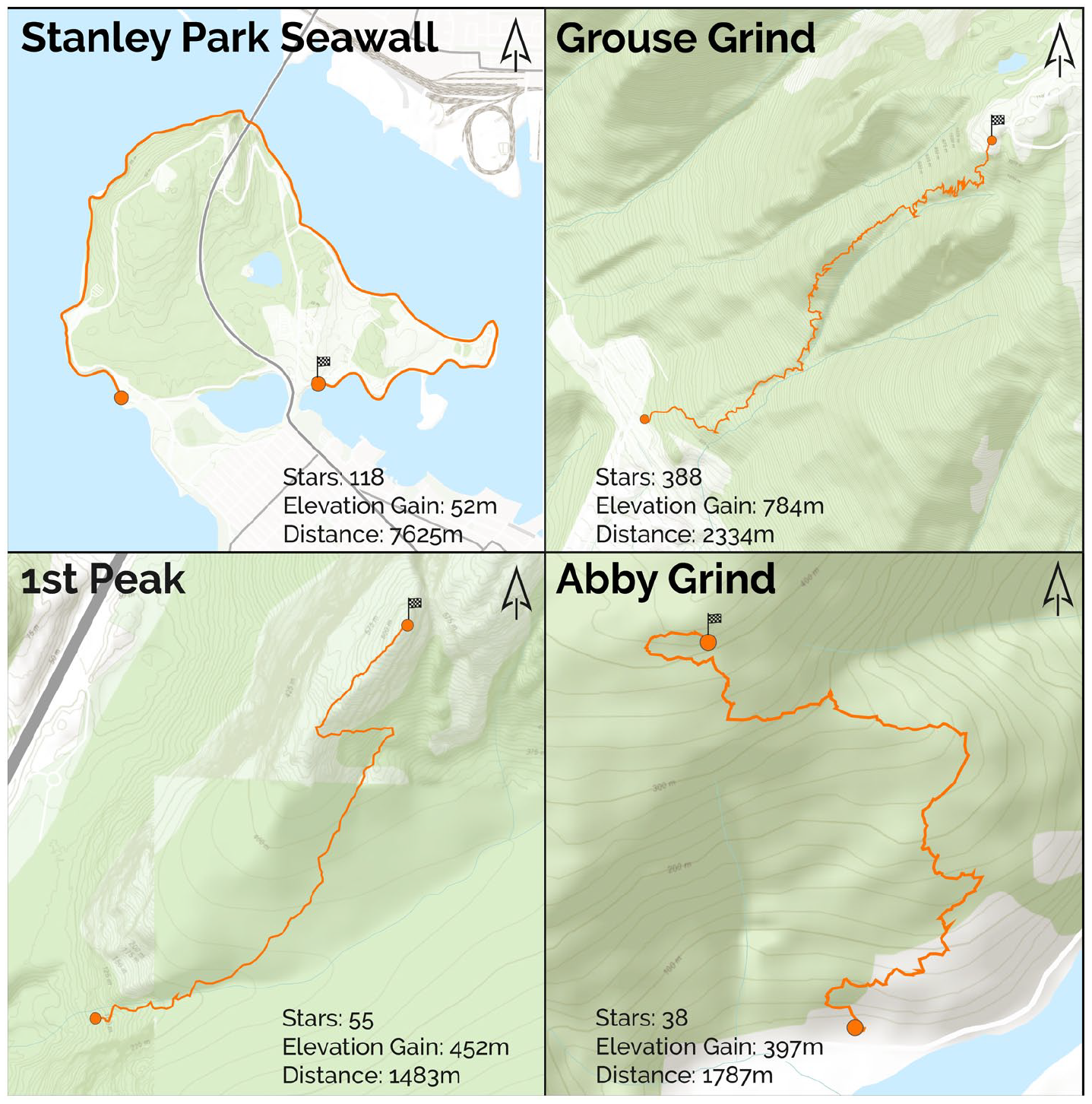
Maps depicting four frequently starred segments, each of which are well known as benchmarks of fitness for local athletes.
Segment characteristics
Our next phase of analysis focused on the characteristics of the segments, such as distance, elevation gain, and average and maximum grade. Our initial filtering of these metrics was similar to user characteristics as we sorted the full list of segments along each of our axes and investigated if any meaningful classification boundaries emerged.
Distance
The longest segments in our study area described segments where contiguity matters. Examples include race routes, often with a year attached such as “SeaWheeze 2012 Course” (21 km), or “2013 BMO Vancouver Half Marathon” (21 km). Lengthy scenic routes were also long segments, such as a 14-km segment around iconic Stanley Park, or wilderness routes such as “Elfin Lakes to Mamquam Lake, and back” (22 km). Frequently, the longest segments were both backcountry trails and race routes, such as “Mount Frosty 27k Race” or “50 km Tenderfoot Boogie.”
Conversely, shortest segments were frequently hills. For instance, “Jericho Stairs” is a 41-m segment with an 11% average grade, while “Teahouse Stairs” is an 80-m segment with 12.5% average grade. The average grade of the 50 shortest segments was 6%. Many of the other shortest segments included small sprints between city blocks, such as the 77-m “Esplanade to 1st” segment, or the 82-m “1st to 2nd” segment.
Elevation and grade
Elevation and grade delivered similar types of segments. The difference between the highest and lowest point on the segment (i.e. elevation difference) served as an easy way to classify segments toward or from mountain peaks. Indeed, almost all top 100 segments of the 8000-segment dataset with the greatest elevation differences were in challenging mountainous terrain. Accordingly, most of these also featured relatively low effort and athlete counts. To see how this manifested in more popular segments, we sorted the 385 segment sample described above (i.e. only popular segments) by elevation difference, which returned quite different results. These segments were still typically rugged and mountainous but were far more accessible from Vancouver, many just minutes away from urban areas. Moreover, elevation differences were much lower (though still relatively high) and as a result many segments emerged that were small portions of longer routes. For instance, the Grouse Grind is segmented into quarters, with duplicates of each. When sorted by average grade, very similar results were returned as when sorted by elevation, both with regard to the total segment dataset and the 385-segment sample. Finally, sorting by maximum grade returned many climbs, with 36 of the top 50 segments even having the word “climb” in their name. However, these varied significantly in terms of actual elevation difference and terrain.
While the previous phase pointed us toward considering grinds, this phase cemented our inclusion of grinds as a classification, something that we knew from personal experience, but were reticent to include as an object fearing our limited and partial perspective might be driving an otherwise nascent or overly personal category. Moreover, this phase also suggested possibly including races and sprints, as these were consistently presented within the results of our sorting.
Topological characteristics
The final range of characteristics we examined were topological. More specifically, we examined the proximity of segments to water, parks, and population.
Proximal population density
Our next hypothesis was that the population surrounding each segment could be a primary determinant of how popular that segment is, and therefore serves as one method of classification. Our assumption was simple: as more people live near a segment, it will be more popular. We created catchments around the start, middle, and end of each segment using 5000-m manhattan buffers to approximate a 30-minute run. We spatially joined each buffer to census blocks to determine the approximate number of people that lived within a 30-minute run from the segment. We then selected the most populous catchment from each segment as the “best-case scenario” to be used in our analysis. After mapping segments by the size of their population catchments and finding no discernible visual pattern, we decided to perform ordinary least squares (OLS) regression between effort counts and the catchment populations (r-squared = 0.028, p = 0.00) as well as athlete counts and catchment populations (r-squared = 0.015, p = 0.00). While this was a largely exploratory step, it failed to yield a correlation worth pursuing further.
Segment popularity by land-cover type
The last method of quantitative classification tested was land-cover type. Using open data from the Province of British Columbia, we performed a spatial join to determine the land-cover type of the midpoint of each segment. Land-cover types included broadleaf forest, coniferous forest, mixed forest, exposed land, cropland, developed land, water, snow/ice, shrubland, and wetland. The total number of segments per class is listed in Table 1. Again, we explored the top segments and found that, unsurprisingly, the top segments by effort and athlete counts were overwhelmingly in developed areas. This was moderated slightly when sorted by star counts as segments in forested cover types became more prominent, but developed land remained dominant.
Number of segments, efforts, athletes, and stars per segment by land-cover class (highest values are given in bold).
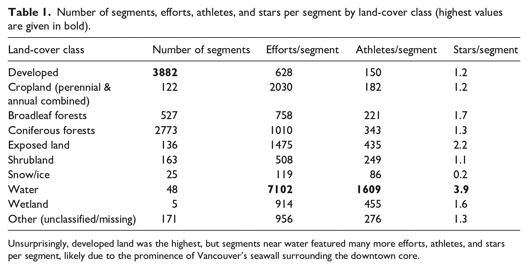
Unsurprisingly, developed land was the highest, but segments near water featured many more efforts, athletes, and stars per segment, likely due to the prominence of Vancouver’s seawall surrounding the downtown core.
We also calculated the number of segments and the number of efforts, athletes, and stars per segment for each land-cover class. Interestingly, segments within the water class (e.g. segments along seawalls or bridges) had several times higher effort, athlete, and star per segment rates than any other land-cover class. This was partly due to a handful of segments along Vancouver’s seawall that surrounds both Stanley Park and the downtown core. However, even after removing segments within the City of Vancouver (leaving 35 segments), the water class still had the highest efforts (2166), athletes (535), and stars (2.2) per segment rates. To reiterate, this calculation was done using only the land-cover type of the midpoint of each segment, which may be relatively crude but nevertheless produced a compelling result. Indeed, this made it clear that proximity to water is highly favored by runners and should be strongly considered for classifying segments.
Through our data-driven investigations, one thing became clear: the closer we came to setting rules for inclusion, the more evident that additional caveats were required. Although we had all lived in the city and distinctions between many segments were obvious, the ruleset for classification grew rapidly. We also explored using machine learning classifiers like k-means clustering and random forest on many of the above variables, but our results indicated that significant further investment would have to be made into those methods to yield useful results; meanwhile our intuitive investigations had already shown us they were fruitful. We arrived at a critical juncture when we realized that we were crafting rules to justify our subjective notions of the city. As much as we could codify the segments to “make sense,” ultimately we were re-creating our sense of place through codification—which is inherently subjective. To be clear, this is not to suggest that continuing with a quantitative approach would not be fruitful. Rather, given the preliminary quantitative analysis we had attempted, we felt that continuing on a quantitative path required significant work to meaningfully classify segments, and would not be generalizable to other studies using social media data. Instead, we decided to use a hybrid approach of both the initial quantitative investigation combined with a qualitative process that leveraged our combined local knowledge to classify segments, having familiarity with the areas and having attempted the segments ourselves. Although it may be possible to classify Vancouver’s segments quantitatively, energy-consuming (in terms of both labor and computation) models would need to be developed to achieve that which can be done trivially (in comparison) using a qualitative approach. Given this fact, and in accordance with a tradition of pragmatism in GIS (Schuurman and Pratt, 2002), we continued our classification task using an intuitive and qualitative approach.
Qualitative pragmatism
Our workflow for qualitatively labeling segments involved manually inspecting each segment’s characteristics (such as elevation gain) and combining it with Google StreetView (https://maps.google.com) imagery as well as our own local knowledge. This was done for the same 385-segments we used to analyze user characteristics. Based on this and group discussion, we devised a limited set of labels to describe the segments, with each segment having a primary and potentially secondary label. While we sought to accurately capture the essence of each segment with our labels, this was balanced with the need to keep the number of labels relatively small to ensure that later analysis remained feasible and, importantly, meaningful. However, while this still largely qualitative approach proved much more successful than the quantitative methods we had employed previously, issues still arose that complicated the labeling process. Three core issues forced us to adjust labels and re-evaluate segments multiple times: agreement as to how to construct the labels, agreement on application of labels to particular segments, and the mismatch between segment data from our earlier investigations and our local knowledge. It is important to note that although we present these as three distinct and somewhat sequential phases, there was significant overlap as we wove between each approach.
Agreement on label construction
Our qualitative approach was iterative and recursive as we worked toward constructing a set of labels that captured the variety of the 385 segments. This process was fluid and involved constant comparison to and adjustment of already-constructed labels amid an evolving set of goals and epistemological differences between authors. One of the first examples of our struggle to construct these labels regarded the labels “urban scenic” and “trail.” These were two of the initial labels developed, but proved problematic as they failed to capture why a runner would choose an “urban-scenic” versus “trail” segment. Instead, we decided that what mattered was whether people were trying to escape the urban buzz. This is both highly emotional and sonic in nature. Some trails are less than 100 m from busy roads, but, in our own experience as runners, feel like an escape from the city nonetheless, due in part to the dampening of noise that the forest provides, the sound of birds and rustling leaves, and the natural smells. On the contrary, some trails run through small urban parks that do not offer such escape. After debate, our solution was to use separate categories of “urban,” “scenic,” and “natural,” which we felt better captured these elements. To reiterate, the difference between these sorts of segments is not necessarily proximity or other easily measurable factors (as our previous quantitative efforts have partially revealed), but highly emotional and affective characteristics that lend themselves to a qualitative approach.
We also must acknowledge that there was a lack of internal consistency in the labels that we constructed. Indeed, while we originally worked to ensure internal consistency, it was not long before we saw the constraints that adherence to such a rule imposed. This led us to forgoing internal consistency in favor of descriptive power. In fact, we strongly believe that a formal, logical, and internally consistent set of labels would be unable to capture the platial aspects of the segments. For instance, while the labels “grind” and “track” do not neatly fit into a schema that includes “natural,” “urban,” they nevertheless capture the essential idiosyncrasies of their corresponding segments. Like the world we tried to capture, this process was inherently messy, but it was nevertheless fruitful.
Agreement on label application
With a starting set of labels in hand, the second challenge was applying them to segments. Again, epistemological differences quickly led to disagreement over what might seem like relatively simple and straightforward decisions. For instance, segments along one of Vancouver’s main bridges were difficult to categorize, as one of the authors viewed the bridge as a scenic place to run, complete with wide sidewalks, benches, trees, and a view of the city, while another author believed the bridge was urban infrastructure and not natural (Figure 2). In another instance, we struggled to decide whether a sidewalk through Stanley Park (a very large urban forest next to downtown Vancouver) should be labeled as natural or urban (Figure 3). While it was less than a kilometer away from the downtown core and heavily trafficked by vehicles, it was simultaneously surrounded by a canopy of old-growth cedars and vibrant green undergrowth of ferns, lichen, and saplings: an amalgam of exhaust fumes and natural beauty.

A Google StreetView image showing the Burrard Bridge. This space was debated between being a scenic route and merely concrete infrastructure.
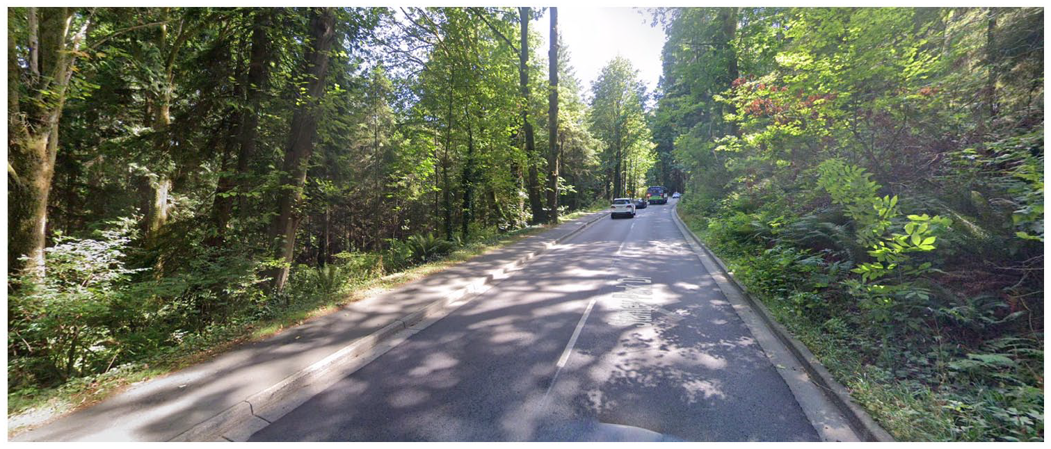
A Google StreetView image of Stanley Park, where busy roads complete with sidewalks cut through highly scenic natural forests, all just outside the downtown core.
A final example, labeling the Coquitlam Crunch (Figure 4), was similarly contentious. This segment is a relatively long and steep climb straight through the city of Coquitlam. While the segment is a mix of gravel and pavement, and crosses several urban streets, it is largely surrounded by grasses and natural vegetation, and offers some limited escape from the surrounding city. Like the segments that preceded it, this was difficult to classify between several possible tags: urban scenic, urban, natural, grind, and trail. As a direct result of these three examples, we decided to include both primary and secondary labels, but many segments had to subsequently be revisited and relabeled.
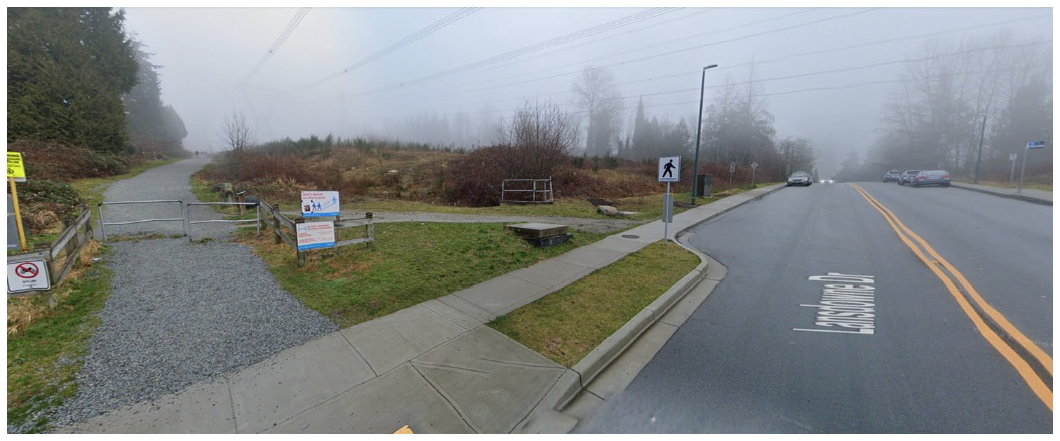
A Google StreetView image of the Coquitlam Crunch, a long climb that slices through the suburbs. The image shows one of the many suburban roads that intersect this trail.
Information/knowledge mismatch
The last area of disagreement was between our own local knowledge and the quantitative data. In this case our preconceived notions of various segments were fundamentally challenged, forcing us to rethink both the construction and application of our labels. This issue was commonly associated with “grinds,” where many trails that are not conventionally described as “grinds” nevertheless exhibited very similar distance and grade profiles. For instance, The Chief (1.5 km, 30% grade), an iconic hike in Squamish, is quite similar to the Grouse Grind (2.3 km, 34% grade) and Abby Grind (1.8 km, 22% grade), as is the Coquitlam Crunch (2.2 km, 11%). In fact, Grouse Grind (Figure 5) starts and finishes at the exact same location as the BCMC trail (Figure 6), and yet may not immediately stand out as a “grind” despite being nearly identical to Vancouver’s most famous grind. Due to this mismatch, we were forced to rethink how we categorize grinds, and in this case took the quantitative data into account to more consistently label such segments. While we had initially identified 16 grinds, this modification led to 9 more segments being classified as grinds.
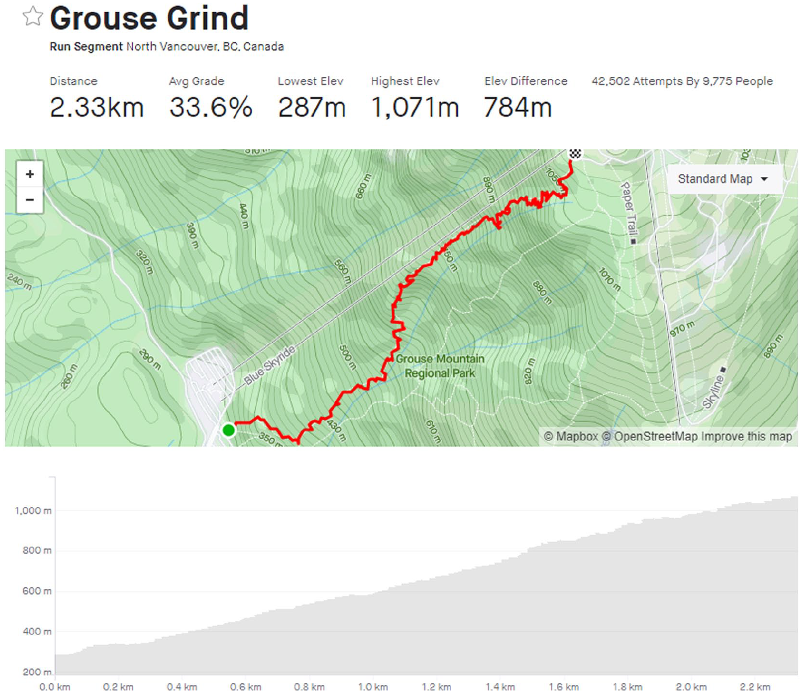
A screenshot of the Grouse Grind segment on Strava. With an average grade of 34%, this is one of the most popular trails in the city and considered a benchmark for fitness among athletes.
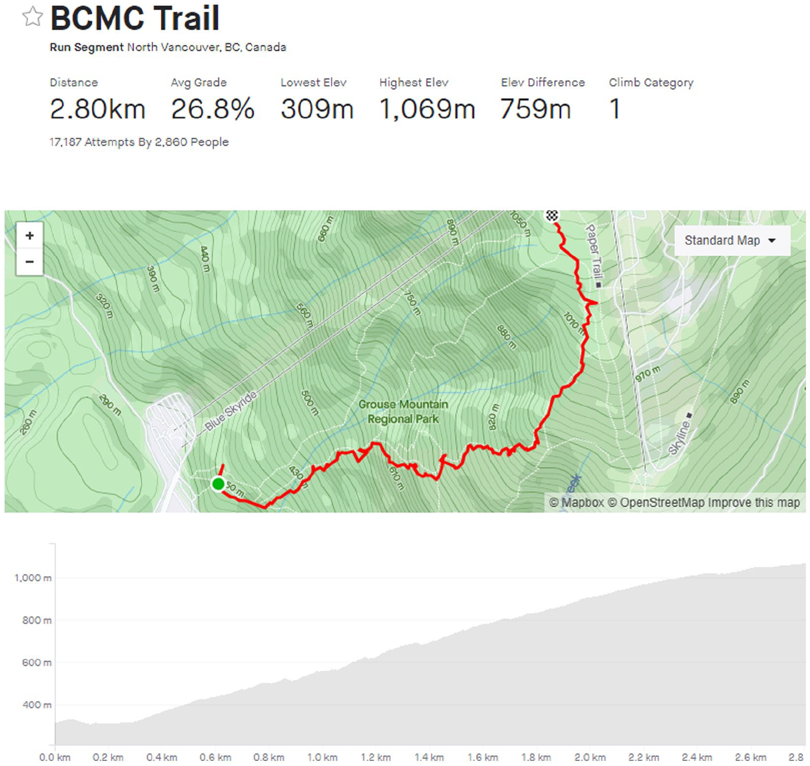
A screenshot of the BCMC Trail segment. It is adjacent and very similar to the Grouse Grind, but receives far less traffic and is not as commonly considered a “grind.”
A qualitative solution
Our final set of labels included urban, scenic, natural, grind, and track. While these labels may seem rather straightforward, they were the product of long discussions and much debate. And yet, despite many stumbling blocks, we were still able to classify segments in a far more meaningful and elegant way than through a singularly quantitative, data-driven approach. The result of this approach is a lack of generalizability, though we strongly suspect this would be shared by a quantitative approach. Instead, we embrace this locality by tailoring our labels specifically to Vancouver’s local running scene, which is distinct from other major cities such as New York City or Toronto. For instance, whereas Vancouver’s mountain-side geography encourages runners to focus on elevation-gain as much as distance (which manifests in the popularity of grinds), we expect that labels in Toronto would value speed, distance, and a different conceptualization of what “natural” would mean. For example, while Toronto has many excellent parks and ravines, it does not have the sense of limitless wilderness and adventure of the North Shore Mountains.
Discussion and conclusion
Classification is a pillar of modern data science and is, for the most part, automated. Algorithms abound that strain and sift rivers of data neatly into buckets within buckets. And yet, while these processes can feel tidy (if not sterile) thanks to toolkits that reduce complicated methods to a few lines of code, sometimes these buckets spill. Indeed, classification is hard and often deceptively so. Social scientists have warned for decades of the hurdles posed by rigid ontologies. Couclelis (1992) was already thinking about the issues of ontology in GIS, long before the onslaught of big data essentially brought their desired data into reality. To Couclelis the challenge was that by perceiving the world as raster (fields) and manipulating vectorized (objects) data, we lost critical information along the way. While the promise of big data allows us to peek into many windows of data, the consequences of ontologizing data into bins remains, as our exploration shows. Bowker and Star (2000) took “ontology” to task in their investigation of medical records, noting that the creation of fixed bins of disease types (for billing codes) entrapped what was treatable, and not. Ontological definition has power and doing so incorrectly can create a life-and-death difference. However, classification can also be highly intuitive. Facing the rigid constraints of fixed information ontologies, we instead embraced an intuitive, hybrid approach toward classification that enables ontological pluralism and epistemological fluidity. In this way we follow the guidance of Sui and DeLyser (2012), that hybridity between different qualitative and qualitative approaches provide a more balanced approach to problem-solving. This allowed us to combine our expert and local knowledge to create qualitative classifications that better capture the unique environmental and cultural context of Vancouver’s running scene.
We used a hybrid approach to better understand the tumult of data in the Strava dataset. We recognize the potential and power of processing data using qualitative means, and indeed these enabled us to identify ontologies that were otherwise obfuscated. These approaches, however, did not enable us to understand the data we were binning, and did not show us the edge cases—the curious parts of data exploration where important stories are taking place. For example, we want to know what makes a vertical climb so valuable to trail runners and what makes these climbs make them more, or less, valuable. By using a quantitative and qualitative approach, several more of these were visible when they would have otherwise not been identified (e.g. the Coquitlam Crunch segment). Valuing both automatic classification and qualitative elements allowed us to heed the call to action by Kitchin (2013), who suggested that qualitative geographers need to stand up and participate with data science, or be left behind. The risk of being left behind in this case would be to lose access to many of the most interesting stories in our data. Lane (2016) noted the real risk of being left behind in this sense as they lament how digital humanities were largely surpassed in technical ability by computer science. Kitchen and Lane’s advice is an echo of Haraway’s (1991) previous advice, that to understand and be fully represented by technology (the cyborg, in her terms), we must engage fully with it on its own terms. If we want a quantitative–qualitative GIS to understand not only what bins exist, but what are silenced through an algorithmic approach, we need to write these algorithms ourselves.
Throughout this process we were reminded of the many discussions that arose in the early 2000s about ontology but that were never fully integrated into GIScience (Couclelis, 1992; Schuurman, 2006; Schuurman and Leszczynski, 2006). While many factors could have inhibited this integration, perhaps the most likely is that they are so difficult to automate. The process of scientific discovery doesn’t lend itself well to automation. Although fantastic examples exist of how machine learning is sifting through piles of data to find new particles (e.g. see methods used to identify the Higgs-Boson (Adam-Bourdarios et al., 2015)), Latour (1987) demonstrates that the pathways to profound discoveries is neither linear nor predictable. However, the rise of social media, movement analytics, and nascent technologies like virtual and augmented reality and their accompanying spatial datasets may necessitate resolving these issues. Although we are in “the age of big data,” qualitative techniques and flexible ontologies are as relevant as ever.
Many may point to the potential for machine learning and artificial intelligence (AI) to more objectively and consistently classify Strava segments. However, it is important to remember the subjective and cultural reasons that motivate runners to choose particular routes, such as an “escape to nature,” its sonic characteristics, its perceived safety, its local status for runners, and so on. Given this immense amount of subjectivity, we do not believe that machine learning would be an ideal solution. This is not to suggest that it would strictly be infeasible, only that it would be difficult and come with caveats. As Narayanan (2019) notes, the tasks that AI tends to perform best at are perceptual tasks, such as recognizing the species of a flower, where there is a defined, verifiable answer (it is a chrysanthemum or it isn’t, there’s no in-between). But given that the factors motivating runners to select segments are varied and culturally mediated and that there is no verifiable ground-truth data against which to train a model, this is hardly a case where AI would excel.
While the problems of classification systems “hardening” into ontologies has been acknowledged in GIScience for 20 years or more (Couclelis, 1992; Schuurman, 2006; Schuurman and Leszczynski, 2006), the advent of ubiquitous and voluminous social media data has made a reexamination of these issues more critical. There is a temptation to organize social media data about our environment (like that Strava presents) using quantitative, automated approaches. We are claiming that Strava data classification is an ontology problem in that purely quantitative measures did not reflect considerable on-the-ground knowledge. This recurring problem in the context of social media data presents an opportunity for GIScientists to revisit the real and material effects of ontology creation and ask where we can intervene to avoid blind world building with machine learning and AI.
This is especially critical since ontologies reinforce perceptions and experiences of reality. Plus they have consequences for decision making. As social media becomes a more ubiquitous and reliable source of data for decision making about urban planning with respect to physical activity, as well as walkability and runnability (Shashank and Schuurman, 2019; Shashank et al., 2022), it becomes ever more important to question the automation of categorization of social media data.
Elwood et al. (2013) have suggested a new paradigm for GIS may be approaching, that of platial ontologies. Indeed, this seems to have been the case as platial GIS has gained traction and now has its own conference and proceedings (such as Dolma, 2021; McKenzie, 2021; Richardson and Stock, 2021; Slivinskaya and Westerholt, 2021). The platial approach suggests that some spatial phenomena cannot be defined in rigid terms. A spatial object may not be representable in a singular location, and an area of space may not have edges that easily define inclusion-and-exclusion. In essence, platial thinking encourages assembling ontologies with non-fixed definitions. Although messy, this approach is particularly valuable for studies such as the present case. In our own exploration, we have noted the many cases where spatial objects defy ontological definition. Our approach celebrates contradiction, multi-coding, iteration, and recursion or ideas and shifting understandings of our ontologies.
Footnotes
Declaration of conflicting interests
The author(s) declared no potential conflicts of interest with respect to the research, authorship, and/or publication of this article.
Funding
The author(s) disclosed receipt of the following financial support for the research, authorship, and/or publication of this article: Nadine Schuurman would like to acknowledge the support of SSHRC Grant Number 435 2018 0114.