
Abstract
In scientific communication, figures are typically rendered as static displays. This often prevents active exploration of the underlying data, for example, to gauge the influence of particular data points or of particular analytic choices. Yet modern data-visualization tools, from animated plots to interactive notebooks and reactive web applications, allow psychologists to share and present their findings in dynamic and transparent ways. In this tutorial, we present a number of recent developments to build interactivity and animations into scientific communication and publications using examples and illustrations in the R language (basic knowledge of R is assumed). In particular, we discuss when and how to build dynamic figures, with step-by-step reproducible code that can easily be extended to the reader’s own projects. We illustrate how interactivity and animations can facilitate insight and communication across a project life cycle—from initial exchanges and discussions in a team to peer review and final publication—and provide a number of recommendations to use dynamic visualizations effectively. We close with a reflection on how the scientific-publishing model is currently evolving and consider the challenges and opportunities this shift might bring for data visualization.
Keywords
Effective data visualization is one of the cornerstones of clear scientific communication (Friendly, 2008). Numerous guidelines have been written about what makes for good data visualization, from choosing the right type of graph (Doumont & Vandenbroeck, 2002) to using color wisely (Borland & Taylor, 2007) and adapting to one’s intended audience (Rougier et al., 2014). Other recommendations have emphasized transparency in displaying statistical results, for example, with a shift from the once-ubiquitous bar plots to more comprehensive graphs that include various distribution properties (Allen et al., 2012; Newman & Scholl, 2012; Weissgerber et al., 2015).
Recent increases in data complexity and software capabilities have paved the way for more sophisticated ways of presenting findings. This is especially visible in popular scientific communication, in which a specific mode of presentation—dynamic data visualizations—has flourished. With a blend of animated and interactive features, dynamic data visualizations can be found in the classroom (Fawcett, 2018; Moreau, 2015), the news media (e.g., The New York Times), information campaigns by nonprofit organizations (e.g., Our World in Data), and TED talks. Many readers 1 would have seen Hans Rosling’s most popular talk, The Best Stats You’ve Ever Seen (Rosling, 2006), in which he introduced multifaceted data in an easily digestible way using pointed animations to direct the audience’s attention and stress important information. The dynamic style of Rosling’s presentation has since gained traction, and many writers and speakers from academia to government and industry have embraced the trend. Clear, powerful visualizations have become especially important given the growing need to accurately inform populations about high-stake problems that require collective action, such as global warming or pandemics. 2
Despite these recent advances, dynamic data visualizations remain underused in the communication of findings among scientists, for a number of reasons. First, scientists have historically relied on print-only journals to disseminate their findings, and many of the current practices are based on obsolete standards—in the traditional publishing system, figures had to be static to be rendered in print. Second, dynamic visualizations can be challenging to describe accurately given that captions need to capture a vast number of frames or relationships between numerous potential variables, especially in rich data sets. In contrast, figures and graphs in peer-reviewed journals often present a snapshot of the findings, with the goal to portray the most important or most impressive findings. Finally, a number of recommendations have been made to improve plots and figures in scientific publications (Kelleher & Wagener, 2011), and these have often emphasized simplicity over seemingly more advanced, but perhaps less accessible, renderings (e.g., three-dimensional plots). Given these potential limitations, we first present the rationale for using dynamic visualizations in scientific projects.
The Case for Dynamic Visualizations
Effective data visualizations often rely on clarity and simplicity (Few, 2004; Kelleher & Wagener, 2011; Midway, 2020), yet scientific data have become increasingly complex over the last few decades (Cordero et al., 2016; Kamath, 2001). One key feature of effective dynamic data visualizations is their ability to pack rich information into relatively simple displays (Blok, 2005) via two components that can be found in most recent, eye-catching content: interactivity and animation.
Interactive content enables active exploration of data features, for example, by selecting a subset of observations, focusing on specific variables, or displaying particular values or statistics on data-point mouse-overs. Interactivity may help with collaborative data exploration (Isenberg et al., 2011); for example, a team member might have questions about the impact of particular analytic choices, such as the influence of an outlier on a model or statistic. Because new visualizations need to be created to explore each question, this type of conversation might typically result in back-and-forth communication over days or weeks and because of delays inherent to this process, in fewer research questions being explored altogether. Interactive visualizations provide an easy way to address queries in an immediate manner without the need for additional visualizations and thus can greatly streamline this process. In many cases, interactivity can also provide the means to transparently disclose the impact of analytical choices in statistical analysis (Ospina et al., 2014) and could serve as a valuable tool to teach statistical concepts to trainees (Xie, 2013).
In contrast to interactive plots, in which the user is actively exploring variables and relationships to better understand the data at hand and their inherent features, animations are built to be consumed passively. Animated content is content that is dynamic either across time—for example, showing the relationship between variables across hours, days, or years—or across iterations of another variable (e.g., participants, experimental conditions, algorithms). This type of visualization can be particularly useful when presenting variable change (Weiss et al., 2002), illustrating computational algorithms and their outcomes (Kerren & Stasko, 2002), or displaying the results of simulations (Moreau, 2015). The key component is that the variable that is being iterated over does not need to be displayed as another dimension with an additional axis (e.g., three-dimensional plot) or with another plot altogether for each value (i.e., faceting). Rather, the relationship is implicitly and effortlessly inferred from the natural flow of the animation, with the user being introduced to additional content in a passive manner (Rolfes et al., 2020).
In this tutorial, we show how to convert static plots into dynamic ones in the R language (R Core Team, 2020). 3 With various options and implementations, we first discuss how to build interactivity into scientific plots—a feature especially interesting at the exploration stage of a project, for example, to discover relationships among variables. We then focus on animations, or how to transition from static to live figures, a property particularly useful for the presentation of findings. Finally, we propose to combine interactive and animated features via Shiny apps that can be personalized depending on individual needs and preferences. Blending interactive and animated features facilitates the dissemination of findings in the scientific community in a transparent and user-friendly way.
Disclosures
All materials (data, scripts) of this tutorial can be found at osf.io/fwy8j. The OSF repository includes an RMarkdown file with all code that is used in this tutorial, the corresponding html file including all dynamic figures, code for two Shiny apps (one full, one simplified version), and two data sets. We designed this tutorial to be accessible to novices, but we do assume basic knowledge of R and ggplot2 (Wickham, 2016). For researchers who are not familiar with R and its ggplot2 visualization capabilities, see Nordmann et al. (2021). Familiarity with shiny (Chang et al., 2022) is helpful for the final section of this tutorial but not necessary.
R Packages Enabling Dynamic Content
In the last few years, several R packages have been created that can be used to make plots either interactive, animated, or both. In this tutorial, we use the following packages: ggiraph (Gohel & Skintzos, 2022), gganimate (Pedersen & Robinson, 2020), plotly (Sievert, 2020), and shiny (Chang et al., 2022). Note that although for each example used in this tutorial we picked one package to add dynamic content, in most cases, at least one of the other packages can be used to get a similar result. We provide a reproducible environment with the renv package (Ushey, 2021), which allows restoring the state of this project from the renv.lock file provided at osf.io/fwy8j. For a more extensive discussion of reproducible computational environments using R, see Wiebels and Moreau (2021).
ggiraph and gganimate are packages built on top of ggplot2. ggiraph enables interactive content by adding tool tips, hover effects, and JavaScript actions to static plots via adapted geoms, such as
Plotly is a computing company that provides visualization tools and products for a variety of programming languages, including R, Python, and Julia. The R package plotly can be used to create interactive and animated content and does so via its JavaScript graphing library, plotly.js. The plots can be created using either stand-alone code or the
Finally, shiny allows building interactive apps that can be deployed locally (Sharing Apps to Run Locally, 2014) or on the web (Deploying Shiny Apps to the Web, 2017), be embedded in RMarkdown documents, or used to build dashboards. shiny provides user interface functions that convert R code into the HTML, CSS, and JavaScript functions necessary for the web content and a style of programming called “reactive programming,” which keeps track of dependencies and automatically updates the code when any input changes. shiny can be used by itself to make content interactive, or it can be combined with other packages that enable dynamic visualization. For more information, see https://shiny.rstudio.com.
Preparations
To follow this tutorial, you will need to have R installed on your computer. If you do not have R installed and want to install it locally, follow the instructions at r-project.org. We recommend using RStudio (RStudio Team, 2020), an integrated development environment for the R language, which can be downloaded from rstudio.com.
Before starting the tutorial, download the data files (
Before creating any plots, you need to install and load the packages needed for this tutorial. A note for Mac users: XQuartz needs to be available on your computer for the ggiraph install to succeed (you can download the software from https://www.xquartz.org/). Install the packages that you do not have on your computer yet:
We use some tidyverse functions to manipulate the data sets and ggplot2 (which is part of the tidyverse) and ggridges to build the static plots. All other packages are used to create dynamic content. In case you encounter any issues with the installation of these packages, we provide a reproducible environment that contains all packages and their versions. To make use of this environment, download the
Once all packages have successfully installed, you can load them:

We also set up a custom theme for the plots so that we do not have to add these specifications to every single plot:

This code chunk specifies that we want to use the classic ggplot2 theme (for an overview of available themes, see Wickham et al., n.d.) and three colors we use to differentiate between the conditions/groups in our data sets.
Finally, we need to load the data:

Example 1: future-imagination data set
The future-imagination data set is a subset of a published study on phenomenological differences between imagining future events relative to remembering past events (Wiebels et al., 2020; details can be found at osf.io/xqm5n/). Twenty participants remembered personal past events and imagined possible future events. The time it took to bring these events to mind was measured using button-press response times, and participants recorded in how much detail they remembered/imagined these events. Each past and future event was brought to mind three times during the experiment to test how response times and detail ratings changed across time points.
Let us have a look at the data:

Using this data set, the plots we create throughout this tutorial address the following research questions:
Research Question 1: Does it take longer to imagine future events compared with remembering past events?
Research Question 2: Do future events become faster to imagine with repetition?
Research Question 3: Can we predict how long it takes people to imagine future events based on how fast they remember past events?
Example 2: intervention data set
The second data set is a simulated study comprising data from 40 participants—20 in each of two groups (intervention and control groups)—with measurements taken once a week for the duration of 20 weeks. The intervention took place from Week 5 to Week 16, so the data set includes a 4-week baseline and a 4-week postintervention phase. There are two outcome variables: performance on a task that is targeted by the intervention and alertness level on the days of testing.
Let us look at the structure of this data set:

Using this data set, we create plots that address the following research questions:
Research Question 4: How does performance on the task change over time?
Research Question 5: Does the intervention elicit differences in performance between the groups?
Research Question 6: Can people’s performance on the task be predicted from their alertness level?
All questions for this tutorial have been designed to illustrate the potential and the advantages of dynamic visualizations. In the remainder of this section, we provide static plots that could be used to explore these six questions. In the following sections, we then demonstrate how interactive or animated features can be added to create dynamic visualizations.
Static Plots
Example 1: future-imagination data set
Research Question 1: Does it take longer to imagine future events compared with remembering past events?
To address the first question, we construct a violin plot showing response times for remembering past and imagining future events. We also display box plots and individual data points within the violins.

We can see in the resulting Figure 1 that novel future events take longer to bring to mind than past events.

Violin plot displaying response times for remembering past events and imagining future events.
Research Question 2: Do future events become faster to imagine with repetition?
To address the second question, we construct a violin plot with boxes and individual data points again, this time only for the future events, but for each time point separately. We also connect the individual data points with lines to highlight each person’s change in response time across time points.

Figure 2 shows that future events are brought to mind faster when they are imagined a second/third time. This effect is very consistent across people, as indicated by the dashed lines.
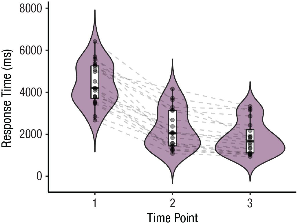
Violin plot displaying response times for imagining future events across time points.
Research Question 3: Can we predict how long it takes people to imagine future events based on how fast they remember past events?
For the last question on this data set, we construct a scatter plot with a trend line for each time point. The sizes of the points correspond to the mean detail rating made by each person for these events. Before we create this plot, we create a wider version of this data set to have separate columns for the response times in the future and past conditions, respectively. We also compute mean detail ratings.
Using this data set, let us create the scatter plot:
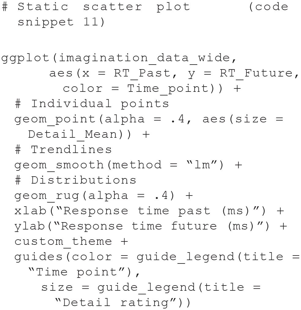
Figure 3 shows that past and future response times are positively correlated for all three time points.

Scatter plot displaying the correlation between past-event and future-event response times for each time point.
Example 2: intervention data set
Research Question 4: How does performance on the task change over time?
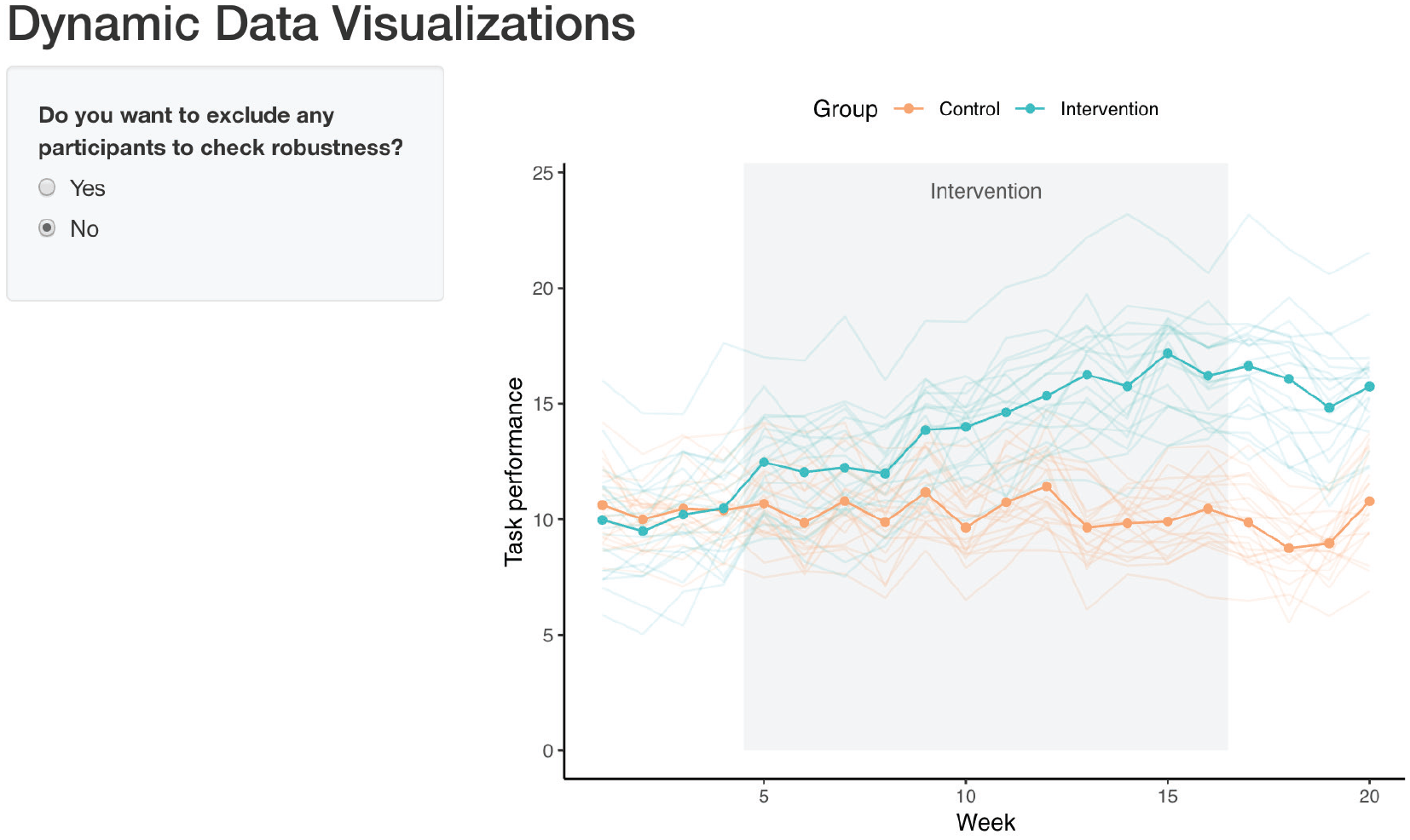
To address the first question for this data set, we construct a line graph. Two bold lines in Figure 4 indicate group-average performance to see whether task performance might differ between groups. In addition, we display each person’s individual performance.


Line graph displaying group-average and individual task performance over time.
Figure 4 shows that performance on the task remained relatively stable across the 20 weeks for the control group, whereas performance gradually improved from shortly after the onset until the end of the intervention for the intervention group.
These data and the divergence in task performance between groups across time can also be nicely visualized with a ridgeline plot (Fig. 5):


Ridgeline plot displaying task performance for each group over time.
If the focus is on individual performance and its change across time, we can also construct a heat map:

The resulting plot (see Fig. 6) visualizes each person’s performance on the task across the 50 weeks, expressed by the color of the tiles.

Heat map displaying individual performance over time.
Research Question 5: Does the intervention elicit differences in performance between the groups?
Another potential research question relates to observed group differences at specific time points of the intervention to examine the efficacy of the intervention. This aspect of the data is nicely visualized with a box plot. In our case, we are interested in group differences in Week 1 (start of the baseline), Week 5 (start of the intervention), Week 16 (end of the intervention), and Week 20 (end of the postintervention phase). We are also adding individual data points. Let us construct the box plot:

The resulting plot (see Fig. 7) suggests no differences at the first two time points, after which task performance appears to be higher for the intervention group than for the control group.

Static box plot displaying potential group differences at specific time points.
Research Question 6: Can people’s performance on the task be predicted from their alertness level?
Our last question is about the relationship between task performance and alertness level. An important aspect to visualize here is whether this relationship changes over the course of the intervention to check whether the intervention changes the relationship between the variables (e.g., whether task performance becomes less correlated with alertness level).
To that end, we construct a scatter plot correlating task performance with alertness level using different colors to indicate different group and weeks:

Positive correlations across all weeks for both the intervention and the control groups can easily be identified (see Fig. 8), but how these correlations change across weeks is less easily discernible.

Scatter plot displaying the correlation between task and underlying construct for the two groups across all weeks.
Although all of these plots convey useful information, adding dynamic content can extend functionality by either making the plots more suitable for data exploration or making the data more easily digestible for an audience during presentations. We illustrate these two aspects of dynamic plotting in the next sections.
Make It Pop: Interactive Plots
In this section, we demonstrate how to add interactive features to some of the plots above. Interactive plots are especially useful during the data-exploration phase, for example, to identify outliers by highlighting data of particular participants or to get a better overview of the data by visualizing descriptive statistics on the plots.
Example 1: future-imagination data set
Let us start with the violin plot we constructed for our first research question (see Fig. 1; code snippet 8). This plot is useful to inspect differences between conditions, but it is not as easy to identify data of specific individuals. We could assign different colors or shapes to the individual data points, but especially with large groups, this gets messy very quickly. A nice alternative is to make this plot interactive. Using the package ggiraph, we can highlight the data of single individuals by hovering over data points.
As mentioned earlier, ggiraph provides adapted geoms that will create the interactivity. To build an interactive version of the violin plot, we build the plot again, replacing ggplot2’s

The code is identical to the previous version, apart from the name of the geom and the aesthetics that specify details of the interactivity. Inside
Handing this object to the
In addition to passing the name of the saved plot, the
The result is a plot with which we can interact. Using this interactive version of the plot, we can inspect individuals’ data points along with the participant label (see Fig. 9), which might be more cumbersome to find out using the static version of the plot or inspecting the data themselves.

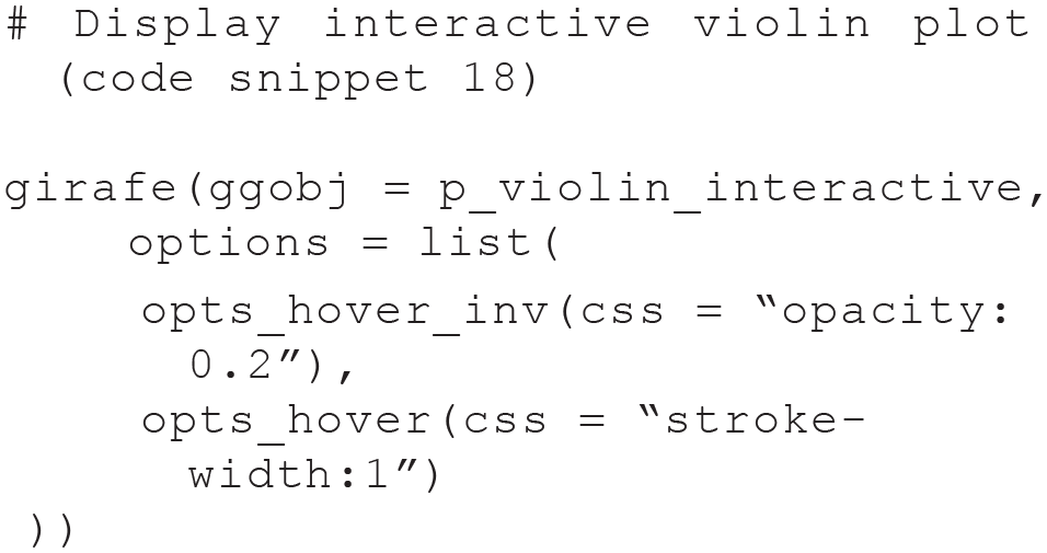
Screenshot of interactive violin plot. Plot created with the ggiraph package. The interactive version is available at osf.io/tj2xr.
Using the same strategy, we can also make the second violin plot (see Fig. 2; code snippet 9) interactive. This time, we use

As before,

In this interactive version of the plot (see Fig. 10), the lines connecting individuals’ data points are highlighted in addition to the points, a feature that might be especially useful with bigger data sets.

Screenshot of interactive violin plot with lines. Plot created with the ggiraph package. The interactive version is available at osf.io/tj2xr.
Finally, ggiraph and its geom_point_interactive() can also be used to easily make the scatter plot (see Fig. 3; code snippet 11) interactive:

This interactive version of the scatter plot (Fig. 11) allows us to highlight individuals’ data points across the three time points.

Screenshot of interactive scatter plot. Plot created with the ggiraph package. The interactive version is available at osf.io/tj2xr.
Example 2: intervention data set
Let us look at the plots for the second data set. The line graph we constructed for Research Question 4 (see Fig. 4; code snippet 12) is useful to inspect group trends, but making it interactive makes it very easy to spot individual trajectories or atypical patterns in the data. To build an interactive version of the line graph, we replace ggplot2’s

As with the other data set, handing this object to the
Using this interactive version of the plot (see Fig. 12), we can inspect individuals’ trajectories across time easily, get the participant labels, and identify potential outliers.
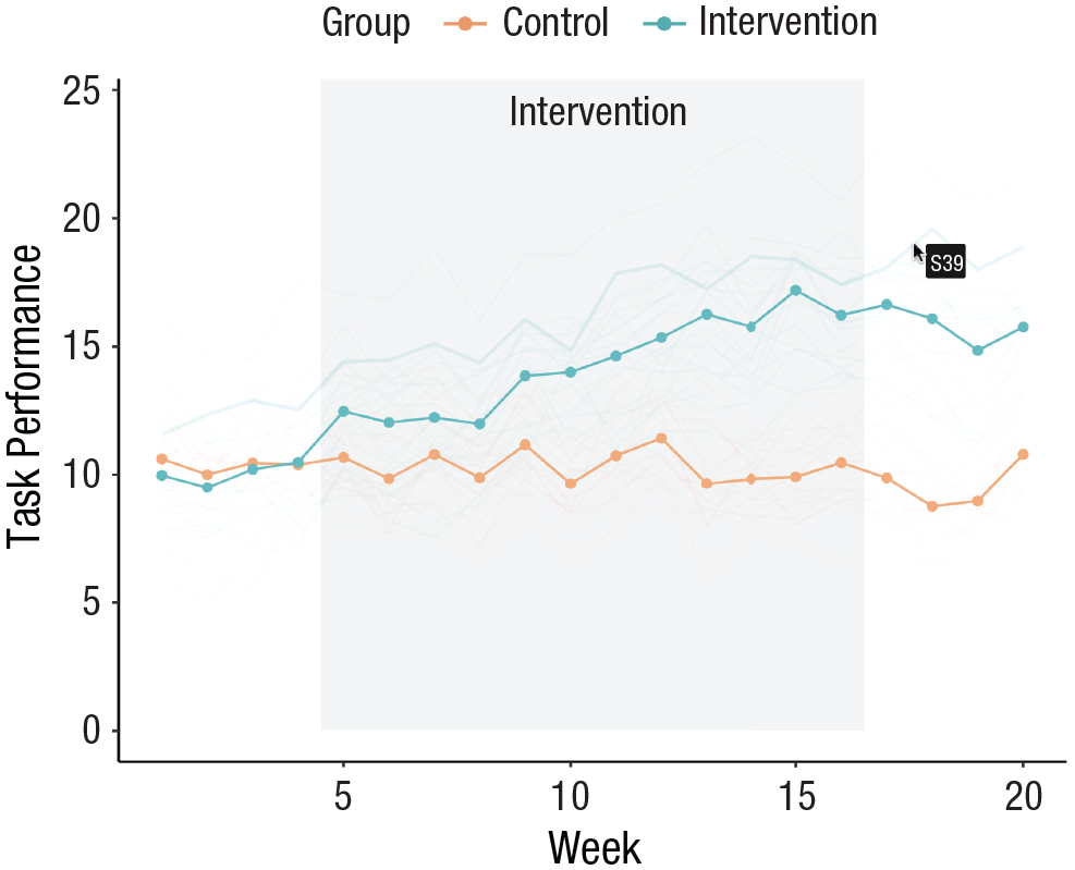
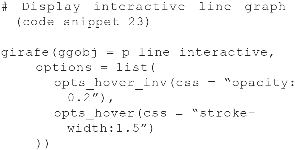
Screenshot of interactive line graph. Plot created with the ggiraph package. The interactive version is available at osf.io/tj2xr.
In a similar way, the heat map displaying individual performance (see Fig. 6; code snippet 14) can also be made interactive. As before, we use ggiraph and change only the geom layer:
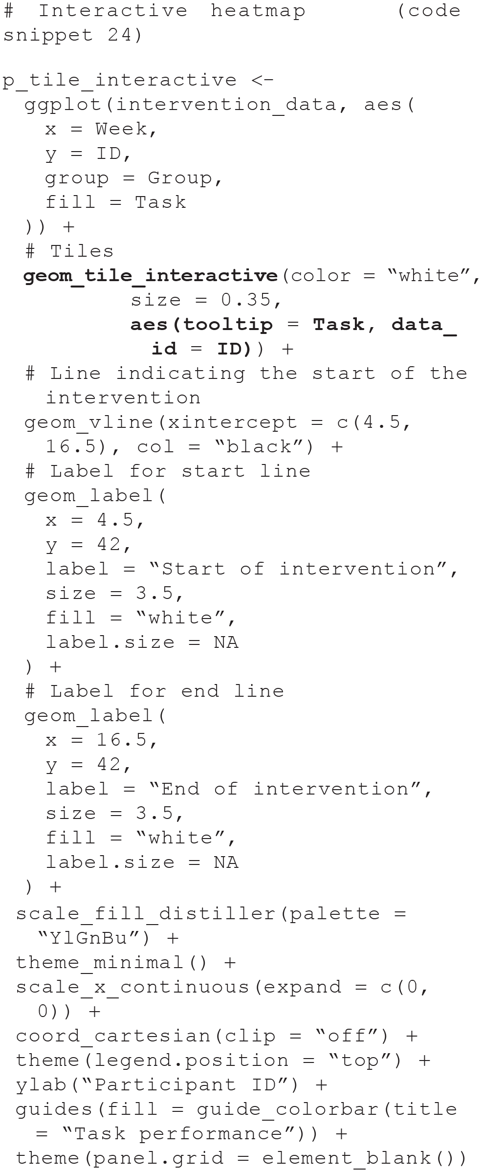
This time,

Apart from slightly adapting the hover options, the code is the same as for the line graph (see Fig. 13).

Screenshot of interactive heat map. Plots created with the ggiraph package. The interactive version is available at osf.io/tj2xr.
In the data-exploration phase, it might also be useful to add summary statistics to a plot so that specific values can be directly inspected without the need to generate them separately, for example, in the form of a table. This can be rendered easily with the plotly package. Plotly’s syntax is slightly different to the one used by ggplot2, but the plot is also created in layers. Let us use plotly to create an interactive version of the box plot from earlier (see Fig. 7; code snippet 15):

We use the
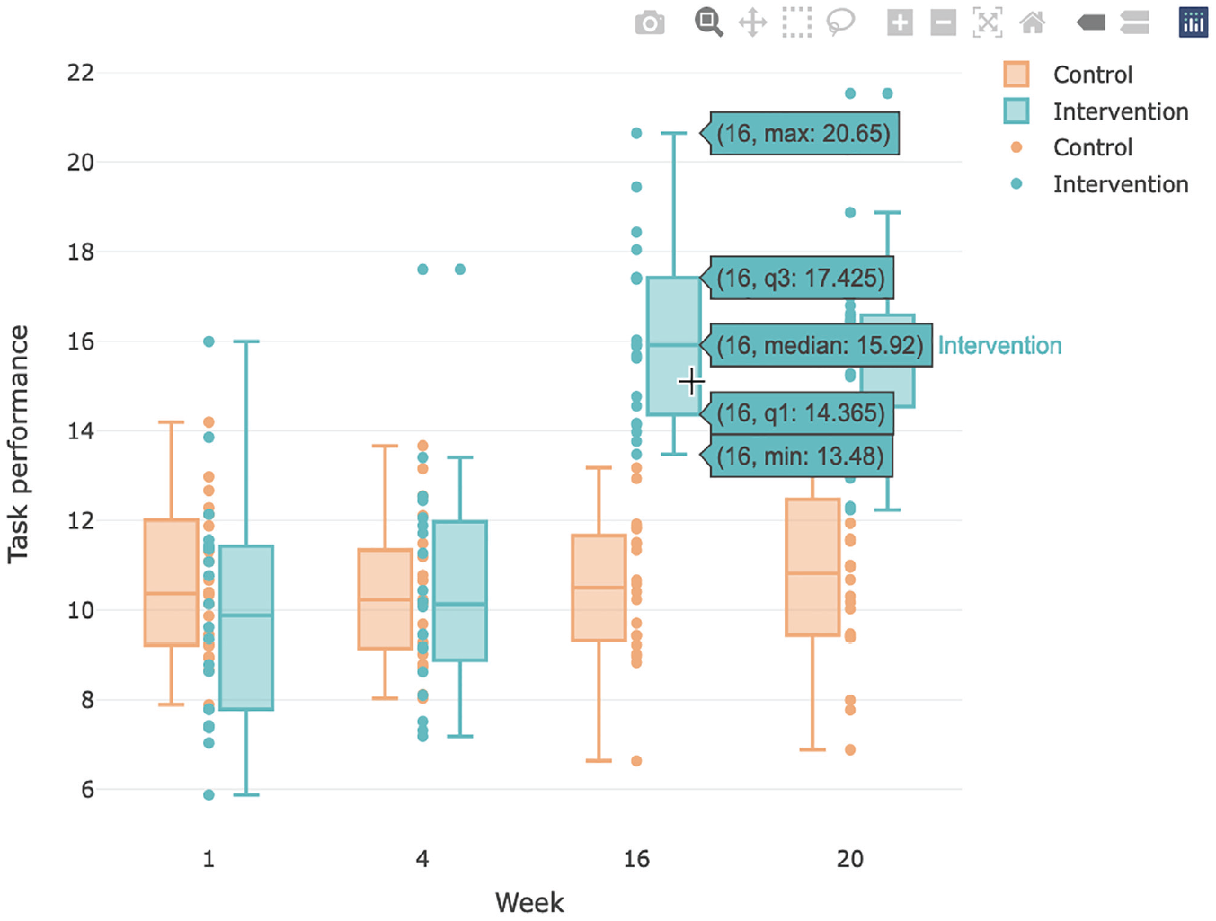
Screenshot of interactive box plot. Plot created with the plotly package. The interactive version can is available at osf.io/tj2xr.
Make It Smooth: Building Animations
Animations, which allow visualizing the evolution of data across a variable such as time, are particularly useful for the presentation of findings, for example, during talks. Several packages exist now that make turning plots into animations fairly straightforward.
Example 1: future-imagination data set
We start with the violin plot from earlier (see Fig. 2; code snippet 9) and adapt it so that the three violin plots are revealed sequentially. Using the gganimate package, the ggplot2 code can be reused, with minimal additional code that specifies the desired animation type. In this case, we add gganimate’s layer
There are two parts to creating animated plots with gganimate. First, we specify the plot and the animation type we want to use:
Using
The animated version of the plot can be displayed in Rstudio or in an html file by either printing the variable name or using gganimate’s

Using this function, we can specify additional arguments. Here, we added a pause of 40 frames at the end of the animation, before it starts from the beginning. The renderer can also be changed if a different file format is preferred. The renderer

Screenshots of selected frames of the animated violin plot. Plot created with the gganimate package. The corresponding animated version of the plot is available at osf.io/tj2xr.
Finally, the animation can be saved to file using:

The function
In a similar way, we can also use gganimate to animate the scatter plot from the first example (see Fig. 3; code snippet 11) to cycle through the time points. This time, we use gganimate’s

As before, let us view the animation using the

The animation is visualized in Figure 16.

Screenshots of selected frames of the animated scatter plot. Plot created with the gganimate package. The corresponding animated version of the plot is available at osf.io/tj2xr.
Example 2: intervention data set
For the intervention data set, we illustrate the same process using gganimate for the line graph, the ridgeline plot, and the scatter plot. We start with the line graph (see Fig. 4; code snippet 12) and adapt it so that the data are gradually revealed across the weeks of the intervention. This time, we use gganimate’s layer

Using

In addition to the pause of 40 frames at the end of the animation, we specified that six frames per second should be displayed (10 is the default). See the resulting animation in Figure 17.

Screenshots of selected frames of the animated line graph. Plot created with the gganimate package. The corresponding animated version of the plot is available at osf.io/tj2xr.
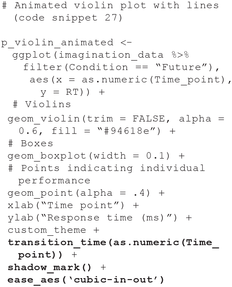
Instead of gradually revealing parts of the plot over time, we can animate the ridgeline plot (see Fig. 5; code snippet 13) so that the distributions dynamically shift across the weeks of the intervention. This animation style is similar to the animation of the scatter plot of the future-imagination data set used earlier (code snippet 30), so we use gganimate’s

In addition to the
After building the plot, let us use

This time, we also specified the optional arguments

Screenshots of selected frames of the animated ridgeplot. Plot created with the gganimate package. The corresponding animated version of the plot is available at osf.io/tj2xr.
Beyond making the presentation of plots more visually appealing or more easily digestible during presentations, animations also allow us to examine and present new aspects of our data, such as the evolution of the intervention-data scatter plot (see Fig. 8; code snippet 16) over time. Similar to the previous example, we can cycle through the weeks, constructing a separate correlation plot for each week. Given that we already animated a correlation plot and that we have used gganimate in several different examples now, we use plotly this time to showcase another way to create animations. With plotly, a version of the static plot first needs to be recreated, with the aesthetics argument

We can then use

Using the animated version of the scatter plot (see Fig. 19), it becomes more easily apparent that the correlation between task performance and alertness level decreased across the intervention for the intervention group but not to the same extent for the control group.

Screenshots of selected frames of the animated scatter plot. Plot created with the plotly package. The corresponding animated version of the plot is available at osf.io/tj2xr.
Make It Shine: Blending Interactive and Animated Features
Once a project is complete, data and materials are often shared alongside the article that describes the project and presents its findings. Packaging these up into a dashboard or web app for a project is a great way not only to share additional material and let others recreate plots and statistics from the article but also to allow for additional exploration and manipulation of the data, such as examining the effect of outliers or particular modeling choices on the results. The R package shiny makes building interactive dashboards and web apps straightforward, without the need for web development skills and deep knowledge of web technologies such as HTML or CSS.
Extensive and detailed shiny tutorials are provided elsewhere (see e.g., Shiny Learning Resources, n.d.; Wickham, 2021). Briefly, Shiny apps are written in a single R script called
To demonstrate some of Shiny’s features, we built a Shiny app that includes dynamic plots for each of the questions we addressed for the intervention-data-set example (Example 2), additionally allowing for one or several individuals to be excluded to check robustness (see Fig. 20). For simplicity purposes, we provide instructions for a simplified version of this app below, which displays just the interactive line graph created with ggiraph but still allows for the exclusion of individuals from the data set. Whenever we reuse code from earlier parts of the tutorial, we use a placeholder, indicating which code snippets should be inserted (e.g.,
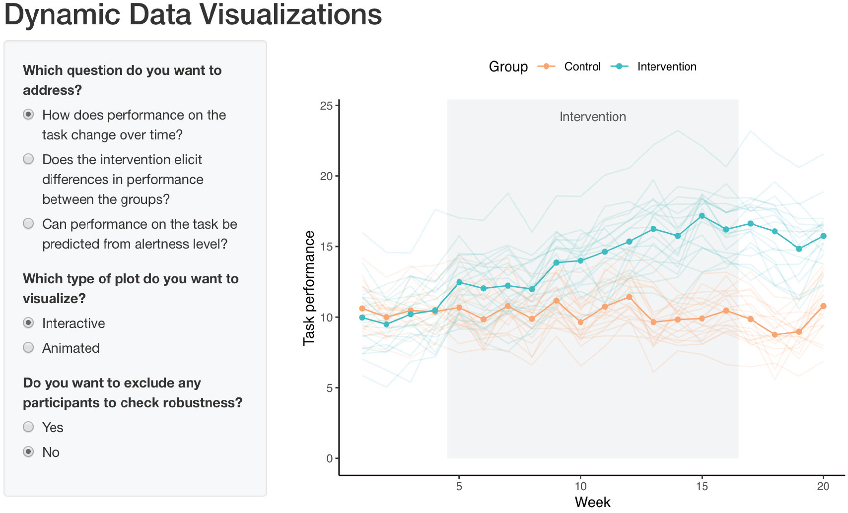
Screenshot of Shiny app with dynamic plots.
To start, create a new R script called
Everything needed for the preamble has already been covered in the tutorial, apart from the conversion of
In the
Next, we add the

Only two things are required in the server function for our app: removing data of excluded individuals (if the user selects this option) and the code for the plot. Note that, as in the previous code snippet, we had to replace the shiny function
Finally, we need to add code to the end of the script to build the app:

Running this script will display the app (see Fig. 21).
Screenshot of simplified version of Shiny app.
The reactive endpoint functions for the other packages we used throughout this tutorial have to be changed similarly to the ggiraph ones when used in Shiny apps. For interactive and animated graphs with plotly, these are changed to
Discussion
In this tutorial, we described how to turn static figures into interactive and animated content. We used the R statistical language throughout and based our examples on common types of plots and widely used packages. The first part of the tutorial focused on building interactive content, an aspect particularly important to early stages of a scientific project, such as data exploration. In the second part of the tutorial, we showed how to animate plots, a useful feature for data communication to scientific and general audiences. Finally, we integrated these two components into a single Shiny app that let us combine the flexibility of interactive graphs with the visual appeal and conciseness of animations. These richer modes of visualization can be ideal for sharing findings, with prespecified features that can help users explore key aspects of a study results. To conclude, we provide a number of practical recommendations to help researchers navigate use and implementation of dynamic content into a research project and close with a few remarks about prospective challenges and opportunities in the field of psychology.
Practical recommendations
Fancier is not always better; sometimes, traditional, static figures are the best way to convey information in a clear and efficient manner (Bétrancourt & Tversky, 2000; Lewalter, 2003). Because dynamic visualizations have a cost—inasmuch as they represent additional time, effort, and sometimes resources compared with more traditional visual displays—it may be difficult to gauge what content to turn into interactive or animated displays and when. Here, we provide five recommendations that we hope can help guide the reader through this process.
Recommendation 1: understand the specifics of your data
Given the variety of options now available to psychologists to present their research, understanding the type of data that is to be displayed is key. If the data structure is complex, multifaceted, or layered, interactivity can often be valuable because it provides a tool to explore different aspects sequentially or in combination with one another (Ward et al., 2011). Animations can be especially beneficial to represent phenomena that change over time or processes that are being iterated over (Robertson et al., 2008; Yu et al., 2010). In the case of low-dimensional data or if the added features lead to an unnecessary cognitive burden, the value of dynamic visualizations over that of static displays might be less evident (Steele & Iliinsky, 2010).
Recommendation 2: know your audience
Just like the data, the intended audience is also a crucial element in deciding to use dynamic displays (Kennedy, 2012). Peers might value interactivity to be able to verify assumptions, check alternative explanations, or explore complementary findings. Animations might be better suited to large, eclectic audiences who may not have the time or expertise necessary to invest in active exploration of the data. Students and trainees might benefit from either or both of these features, depending on their specific goals and needs.
Recommendation 3: adapt visualizations to the current needs of the project
The requirements of a research project often differ across its life cycle. Features that are key to data exploration may not match those needed to discuss results with a team of collaborators or to present findings to a larger audience. Flexibility and creativity in the display of visual content can facilitate insights, help convey information in a more effective way, and make a presentation more memorable.
Recommendation 4: complement journal publication with online materials
In case journal platforms lack the capabilities to display dynamic graphs, it is relatively straightforward to complement the publication of an article with online materials, for example, in the form of a repository that can enable more sophisticated display. Tools such as Binder (mybinder.org) or Stencila (stenci.la) can help turn a static repository (e.g., from GitHub; github.com) into a collection of interactive notebooks or executable documents. We also provide an example of a repository including dynamic content with this article, hosted on OSF (osf.io). Along with alternatives such as Dryad (datadryad.org), FigShare (figshare.com), or Zenodo (zenodo.org), OSF allows creating a persistent digital object identifier for each submission, making repositories and their content easily citable.
Recommendation 5: consider packaging research findings into a Shiny app
In many cases, articles can benefit from alternate modes of presentation for the reported findings, which allow active exploration of the results. For this, we recommend Shiny apps, which are extremely flexible and easy to implement in R. Exploring data with Shiny apps is especially relevant when results involve a large number of variables, analyses are complex, or contributions are methodological in nature, but the versatility of Shiny apps makes them useful for almost any research project. Having the possibility to interact with the data can enhance understanding, engagement, and ultimately the impact of a research project.
Concluding remarks
A vast literature indicates that when used appropriately, dynamic visualizations can promote understanding and retention of various scientific findings and concepts (e.g., Ryoo & Linn, 2012; Suits & Sanger, 2013; Yang et al., 2015). Not only can they facilitate conveying and streamlining information at the time of publication, but dynamic visualizations can also help communication among team members at earlier stages of a project and dissemination of findings via talks, conferences, and in the media after publication. Furthermore, when projects have the potential to be continuously updated—for example, in the case of longitudinal studies or meta-analyses (Braver et al., 2014)—figures that are based on dynamic code can get updated automatically as new data come in, thus ensuring the user has access to the latest, up-to-date information.
In many ways, current publishing models pose a number of challenges to the implementation of this type of content, and a number of journals and publishing platforms are currently working toward developing ways to enable more elaborate content (see e.g., Colomb & Brembs, 2014; Penfold, 2017). The move toward more sophisticated options for visual content is unquestionably the future of scientific publishing, with preregistrations, articles, code, and data hosted together to facilitate evaluation and active exploration of a research project. In the meantime, independent hosting platforms allow moving beyond the traditional format of presentation for scientific projects, and researchers should become familiar with the possibilities and capabilities they afford. We hope these developments will enable a more ubiquitous use of dynamic visualizations to help further the understanding of the complex, multifaceted relationships that govern brains and behaviors.
Footnotes
Transparency
Action Editor: David A. Sbarra
Editor: David A. Sbarra
Author Contributions