
Abstract
Ground murals have been increasingly applied as a tactical urban design strategy to improve place quality. However, limited research has explored how ground mural design may impact mental health. This study applied a 3 × 2 × 2 mixed design to explore how design features of sidewalk ground murals, specifically color (warm, cool, or achromatic) and pattern (rectilinear or curvilinear), influence mood states and perceived restorativeness of stressed or non-stressed individuals. Students (n = 112) were assigned into two groups, one with stress induction and the other without. They were asked to view images showing six design conditions and the uncolored condition. For each condition, mood states, including pleasure level, energetic arousal, and relaxation, were assessed using statements, along with perceived restorativeness as measured by the Perceived Restorativeness Scale—short version. The results reveal that presence of sidewalk murals improved mood states, including hedonic tone and energetic arousal, and perceived restorativeness compared to the uncolored sidewalk. Cool colors had the strongest effects in promoting a restorative experience, particularly for stressed subgroup. Warm colors significantly reduced relaxation across all participants and were perceived as less restorative for stressed individuals. Achromatic colors reduced energetic arousal and were perceived as the least restorative across all participants. Pattern features did not contribute to mood enhancement, but curvilinear patterns were perceived as more restorative than rectilinear patterns. This study provides empirical evidence to support urban public space design aiming to benefit mental health through ground murals with a more systematic color and pattern use.
Introduction
City inhabitants face higher mental health risks than rural residents due to the increasing urbanization and its associated social and environmental stressors (e.g., dense population, noise, and pollution) (Gruebner et al., 2017). These stressors are known to correlate with negative mood states (e.g., anxiety, depression, distress, and upset) (McKinzie et al., 2006; Singh et al., 2012). In response, neurourbanism—the application of neuroscience to investigate how built and social environments impact mental health—aims to identify pathways toward fostering healthy urban living (Adli et al., 2017). Previous studies have revealed the association between urban design qualities, such as street network configuration, green space distribution, and mental health outcomes (Dimitrov-Discher et al., 2022, 2023). Among many potential solutions to enhance city inhabitants’ mental health, tactical urban design interventions, such as introducing movable furniture, plants, and arts to enhance user engagement, have been advocated by practitioners and researchers for their ability to bring about meaningful changes to neighborhoods and cities in a fast, low-cost, and action-oriented way (Neale et al., 2022; Negami et al., 2018; Roe et al., 2019).
Ground murals, a prevalent tactical urbanism strategy, refer to artificial paintings with color and pattern details on the ground surface in urban public spaces such as squares, roadways, intersections, and sidewalks. They offer cost-effective and easily implementable advantages compared to other interventions (e.g., planting greenery and changing existing building features) (Bloomberg Philanthropies, 2022). They have been recommended to improve walkability and interestingness of places, fostering user engagement (O'Connor, 2021). For instance, two Superblock projects in Barcelona employed ground murals to make the neighborhood more welcoming for pedestrians and cyclists and provide more playful and livable places for local activities (Archdaily, 2020) (Figure S1 in the Supplementary material). During the COVID-19 Pandemic, ground murals also have been used to create vibrant outdoor spaces for safe and interesting outdoor experiences (Pradifta et al., 2021).
Ground murals contain two basic visual elements: color and pattern. It has been well-established that color and pattern have emotion induction effects (Elliot and Maier, 2014; Larson et al., 2012). In general, cool colors (e.g., green and blue) are associated with calmness, relaxation, and comfort, indicating low arousal and pleasure, while warm colors (e.g., red and orange) are related to stimulation, stress, and anxiety, signifying high arousal (Valdez and Mehrabian, 1994; Yildirim et al., 2011). Limited exploration has focused on the emotional associations of achromatic colors (e.g., white, black, and gray). Yildirim et al. (2011) reported that achromatic living rooms were perceived less positive in arousal, happiness, vividness, and restfulness than warm and cool colors but calmer than warm colors. However, color effects can vary based on individual differences. For example, Dijkstra et al. (2008) reported that the stress-reducing effects of green and the arousal-enhancing effects of orange were more prominent for individuals perceiving greater complexity in their environment compared to those less sensitive to environmental stimuli.
Many studies consistently reported a preference for patterns or objects with curvilinear features over rectilinear ones (e.g., Bar and Neta, 2006; Ruta et al., 2019). Curvilinear patterns are often associated with perception of pleasantness, calmness, relaxation, and approachability (Dazkir and Read, 2012; Naghibi Rad et al., 2019; Tawil et al., 2024; Vartanian et al., 2019). In contrast, perceptions of rectilinear patterns or objects vary. While rectangles are perceived as stable and pleasant in some studies (Naghibi Rad et al., 2019; Ruta et al., 2019), others found that triangles and down-pointing V-shapes are considered unpleasant and threatening (Bar and Neta, 2006; Larson et al., 2012). Although some findings were from studies on interior and architecture design (e.g., AL-Ayash et al., 2016; Yildirim et al., 2011), research on the association between the color and pattern design of objects in urban public spaces and psychological responses is limited.
Few studies have explored link between ground mural color and pattern design and psychological responses: Chen et al. (2023) investigated the impacts of colored urban sidewalks on tourists’ walking experience and interest, finding that both red and blue sidewalks increased enjoyment, excitement, and walking interest compared to uncolored sidewalks, with no difference between red and blue colors. Batistatou et al. (2022) reported that more complex mural design (i.e., more colors and pattern details) triggered a higher level of pleasant feelings and heart rate than a single line with white or RGB color on a campus roadway. Gu et al. (2021) found that RGB colored sidewalks were perceived as more restorative than an uncolored sidewalk. Green had a stronger effect of enhancing relaxation than red. While these studies provided foundational evidence of the impact of ground murals on users’ perception, they provided limited insights into how to design murals for positive psychological outcomes due to the limited design variables included in the research.
Creating restorative urban public spaces is considered crucial for promoting better mental health (Roe and McCay, 2021). Based on Stress Recovery Theory (SRT) (Ulrich et al., 1991; Ulrich, 1983) and Attention Restoration Theory (ART) (Kaplan and Kaplan, 1989; Kaplan, 1992), a restorative experience involves recovery from mental fatigue or stress and emotional states enhancement. While the association between restorative experiences and natural environments has been well established (Berman et al., 2008; Hartig et al., 1991), literature also revealed the restorative effects of exposure in urban environments with features enhancing place attractiveness and interestingness (Bornioli et al., 2018; Karmanov and Hamel, 2008). To measure perceived restorativeness (PR), ART identifies four environmental components: being away (mentally away from daily routine), fascination (being involuntarily attracted by the environment), extent (a sufficient large environment forming a “whole different world”) and compatibility (the actions required by the environment fit individual’s inclinations). Art galleries have been suggested as restorative environments as the fascinating collection allows visitors to imagine and immerse in a different world (Packer and Bond, 2010). As a form of urban artistic expression, ground murals hold the potential to shift a gray urban sidewalk into a fascinating walking place, enabling users to escape from their daily routines that contribute to mental fatigue and stress. Thus, there is a need to explore the utilization of ground murals in promoting a restorative experience, especially for vulnerable individuals prone to mental stress and in places susceptible to stressors, including traffic, noise, and other stress-inducing activities.
Gu et al. (2021) confirmed the effects of artificial ground colors on improving PR and varied effects of colors on mood states. However, the study was limited by its use of a single color for the design, which deviates from real-world scenarios where ground murals typically feature multiple colors and patterns. To address this, we expanded on Gu et al. (2021)’s work by introducing more detailed ground painting designs, incorporating color and pattern as design variables, to explore their impact on restorative experiences within the same sidewalk setting. This study aimed to explore (1) how presence of ground murals and (2) how colors and patterns of ground murals influence a restorative experience in a gray urban street setting, thus extending the scarce existing literature on street mural practices that has focused on promoting mental well-being. The study addressed participants overall and specially explored variations in individuals with different stress level. The hypotheses are as follows: H1: Presence of ground murals on a gray sidewalk affects mood states and PR compared to the same sidewalk without murals. H2: Color and pattern features of ground murals affect mood states and PR. H2a: Cool colors are associated with the strongest positive affective outcomes (i.e., pleasure level and relaxation) and higher PR. Warm colors, in contrast, reduce relaxation and elicit a higher level of arousal. Achromatic colors have a minor effect on improving hedonic tone and arousal, eliciting only more relaxation and PR than warm colors. H2b: Curvilinear patterns elicit stronger positive affective outcomes (i.e., pleasure level and relaxation) and PR than rectilinear patterns. H3: There is a difference between stressed and non-stressed individuals in mood change and PR in response to different design conditions.
Methods
Participants
Students (n = 114) from Technical University of Darmstadt and Darmstadt University of Applied Science participated in the study in July and August of 2022. Recruitment information was spread through posters in faculties and on social media. Due to a technical problem, two students failed to submit the data, resulting in a final sample size of 112. Among them, 70 were females and the average age was 25.12 (SD = 3.81). Each participant received 20 euros as a reward. The study was approved by the Ethics Commission at Technical University of Darmstadt. An informed consent was required before participation.
Visual stimuli
The street view, from Rheinstrasse, Darmstadt, Germany, is an inner-city arterial street with four lanes for cars, a tram and bus corridor, green buffers, and cycle and pedestrian infrastructure. The location was chosen to represent a typical walking environment along an inner-city arterial street in a medium-sized European city: having proximity to motorized traffic and a continuous design character of the building interface along the street. The street view photo was taken on an overcast winter day by our researcher. To eliminate potential positive effects of natural elements, the image was modified by excluding sidewalk greenery using Adobe Photoshop 2020 (Adobe Inc., San Jose, CA, USA), serving as both the uncolored condition and the base for applying ground mural designs (Figure S2 in the Supplementary material).
The ground mural design incorporated two variables: basic pattern composition elements (i.e., rectilinear and curvilinear lines) and colors (i.e., warm, cool, and achromatic). Straight lines were utilized for rectilinear design, while wavy lines were adopted for curvilinear design, as wavy lines can mitigate the emotional impact caused by the concave and convex directions of a single arc (Salgado-Montejo et al., 2017). The lines were arranged in parallel to divide the ground zone for filling with colors. The distance between adjacent lines varied. Warm colors contained red, pink, orange, and yellow, while cool colors contained different shades of blue and green. The selection of colors was based on references from existing ground mural practices. Achromatic colors included black, white, and gray. The specific RGB parameters of the chosen colors are presented in Table S1 of the Supplementary materials. In total, six stimuli groups (cool-rectilinear, cool-curvilinear, warm-rectilinear, warm-curvilinear, achromatic-rectilinear, and achromatic-curvilinear) were generated. Each stimuli group contained three scenarios, presenting various design possibilities by varying the pattern arrangement direction (horizontal, vertical, or diagonal) (Figure S2 in the Supplementary material). The graphic designs were initially created using AutoCAD 2018 (Autodesk Inc., San Rafael, CA, USA) and subsequently integrated with the street view using Adobe Photoshop 2020 (Adobe Inc., San Jose, CA, USA). The three scenarios within each stimuli group were edited into a 1-min slideshow video, with each scenario shown for 20 s.
Measurements
Subjective mood states were assessed using statements corresponding to three dimensions of mood: hedonic tone (“I feel happy”), energetic arousal (“I feel energetic”), and relaxation (“I feel calm”). The statement for each mood item was rated on a 9-point Likert scale (1 = “extremely disagree,” 2 = “very disagree,” 3 = “disagree,” 4 = “slightly disagree,” 5 = “neutral,” 6 = “slightly agree,” 7 = “agree,” 8 = “very agree,” and 9 = “extremely agree”). Subjective mood states were measured before and after presenting each stimuli group. Mood change scores were calculated by subtracting pre-scores from post-scores. Positive change scores thereby indicate an increase in mood, whereas negative change scores indicate a decrease.
Perceived restorativeness (PR) was measured by the Perceived Restorativeness Scale—short version (PRS) (Berto, 2005). Two statements corresponding to “fascination” and “being away,” which are two restorative environment properties in ART, were rated on a 9-point Likert scale (from 1 = “extremely disagree” to 9 = “extremely agree”). The statements were re-edited for the walking context (Fascination: “This place is fascinating, and it is hard to be bored”; Being away: “Spending time here gives me a break from my day-to-day routine”). The mean score of fascination and being away was calculated to present PR.
Stress task
In the stressed group, we used a 3-min mental arithmetic task to induce stress at the beginning of each experimental unit. Research has validated it as an efficient method to induce stress (Dickerson and Kemeny, 2004). Participants were asked to continuously subtract from a 3-digit number with a step of 6 or 7. The whole process was under the supervision of a researcher. Once a mistake was detected, the researcher would say “Wrong!” and the participant would restart the calculation from the given number. To induce time pressure, the researcher on occasions said “You are doing too slow. Be faster!” when the participant’s calculating speed was slow. In the non-stressed group, we used a 3-min task that demanded less cognitive resources: selecting the number that the researcher read out from 4 options.
Procedure
The experiment was conducted in the Department of Architecture at Technical University of Darmstadt. Two quiet lecture rooms with similar size, furniture layout, and orientation were used for the experiment. The rooms were lit by artificial lighting. Participants were equally assigned to the stressed group or non-stressed group. After signing the consent and a brief introduction, they were instructed to sit in front of a computer screen displaying a time counter and remain calm for 2 min. Then they completed seven experimental units. The order of the seven units was reverse counterbalanced. For each unit, participants were first asked to complete the stress task and then assess their mood states. Following this, they were asked to watch a 1 min video of one design condition, with an instruction shown at the beginning asking participants to imagine walking in the scenarios. Then they were asked to reassess their mood states and evaluate PR. After completing all units, participants were asked to provide personal information (Figure S3 in the Supplementary material).
Statistical analysis
Within-subjects
Paired samples t-tests with pre- and post-ratings were used to determine the significant mood changes. Cohen’s d values were reported to present effect sizes.
Eight one-way repeated measures ANOVAs (within-subject factor: (a) cool, warm, achromatic, and uncolored; (b) curvilinear, rectilinear, and uncolored) were employed to explore the difference between each design condition and the uncolored condition in mood changes (hedonic tone change, energetic arousal change, and relaxation change) and PR.
Two-way repeated measures ANOVAs were employed to explore the main effects for color (cool, warm, and achromatic) and pattern (curvilinear, rectilinear) on mood changes and PR. When the assumption of sphericity was violated, the degrees of freedom were corrected using the Greenhouse–Geisser adjustment. Partial eta square values (η 2 ) were reported to present effect sizes. Bonferroni correction was employed to account for post-hoc multiple comparisons.
Between-subjects
Independent t-tests were conducted with task group (stressed vs non-stressed) as the grouping variable to examine differences in pre-mood scores, mood change scores, and PR. When Levene’s test of homogeneity of variances was significant, corrections were made by reporting adjusted degrees of freedom. Cohen’s d values were reported to present effect sizes.
An alpha level of .05 was used for all statistical tests.
Results
Effects of ground mural presence on mood states and perceived restorativeness
Pre- and post-mood assessments, mood change score, and perceived restorativeness (PR) rating for each condition (M (SD)).
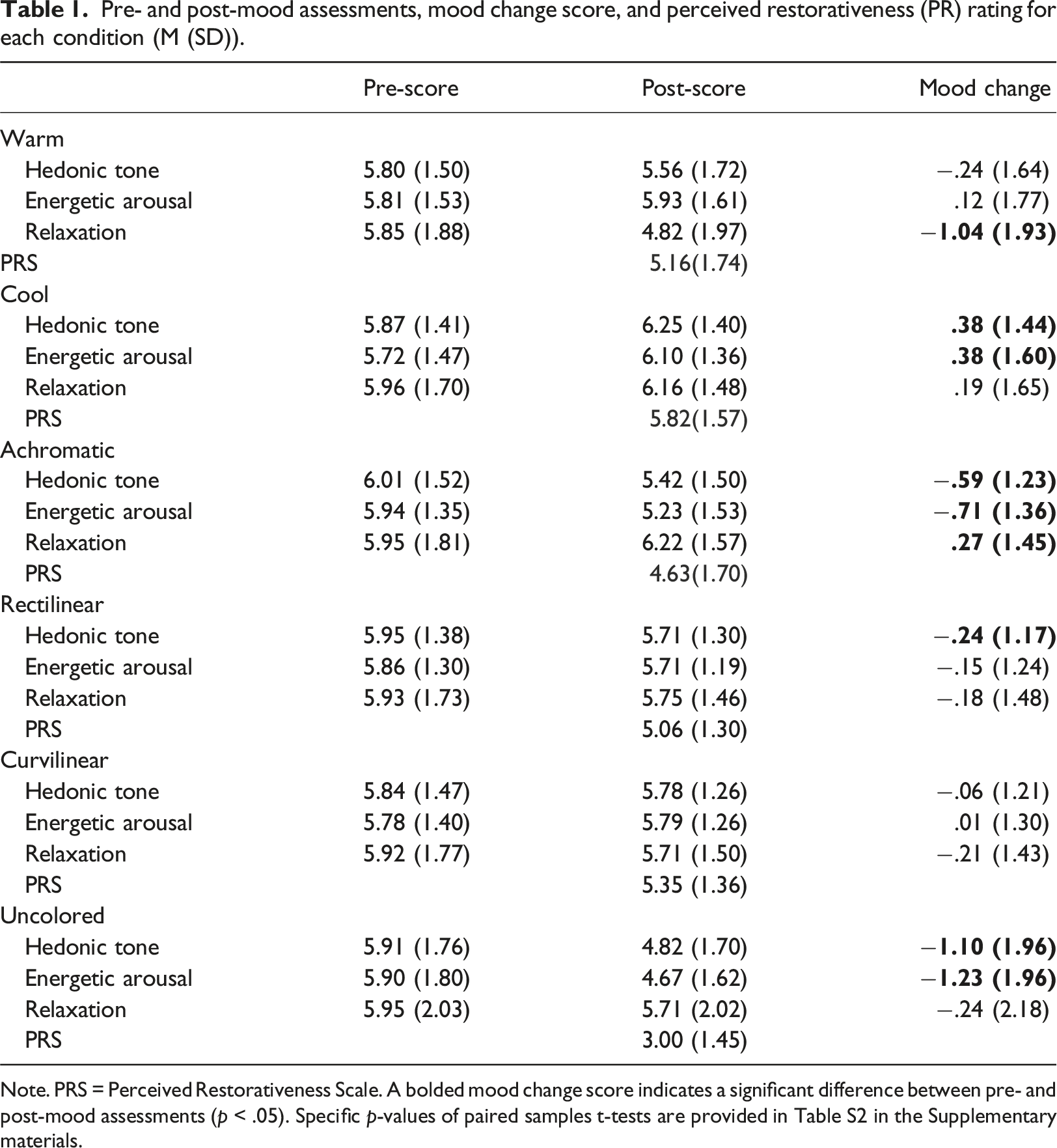
Note. PRS = Perceived Restorativeness Scale. A bolded mood change score indicates a significant difference between pre- and post-mood assessments (p < .05). Specific p-values of paired samples t-tests are provided in Table S2 in the Supplementary materials.
To investigate if presence of sidewalk ground murals affects mood states and PR (H1), we compared mood change scores and PR ratings between each color/pattern condition and the sidewalk without murals (uncolored condition). In line with H1, the findings revealed a significant influence of mural presence on mood states and PR. All design conditions yielded influences in pleasure level (hedonic tone), energetic arousal, relaxation, and PR compared to the uncolored sidewalk, except for pattern condition on relaxation change (Table S3 in the Supplementary materials). Bonferroni post-hoc tests indicated that compared to the uncolored condition, all design conditions (warm, cool, and achromatic colors, rectilinear, and curvilinear patterns) significantly enhanced hedonic tone change (p = .001, <0.001, = 0.039, <0.001, and <0.001), energetic arousal change (p < .001, <0.001, = 0.040, <0.001, and <0.001), and PR (all p < .001). Additionally, compared to the uncolored condition, warm colors reduced relaxation, whereas achromatic colors increased relaxation (p = .005 and .047) (Figure 1). No significant difference was observed in relaxation change between cool color, rectilinear, and curvilinear conditions, and the uncolored condition (p = .337, 1.000, and 1.000). Hedonic tone (A & E), energetic arousal (B & F), and relaxation (C & G) change, and perceived restorativeness (PR) (D & H) per design condition. Error bars represent standard error. A bar below zero indicates negative mood change, while a bar above zero indicates positive change. A higher PR score signifies a more positive result. A score of 5.00 denotes a neutral result. Different lowercase letters indicate statistical significance (p < .05).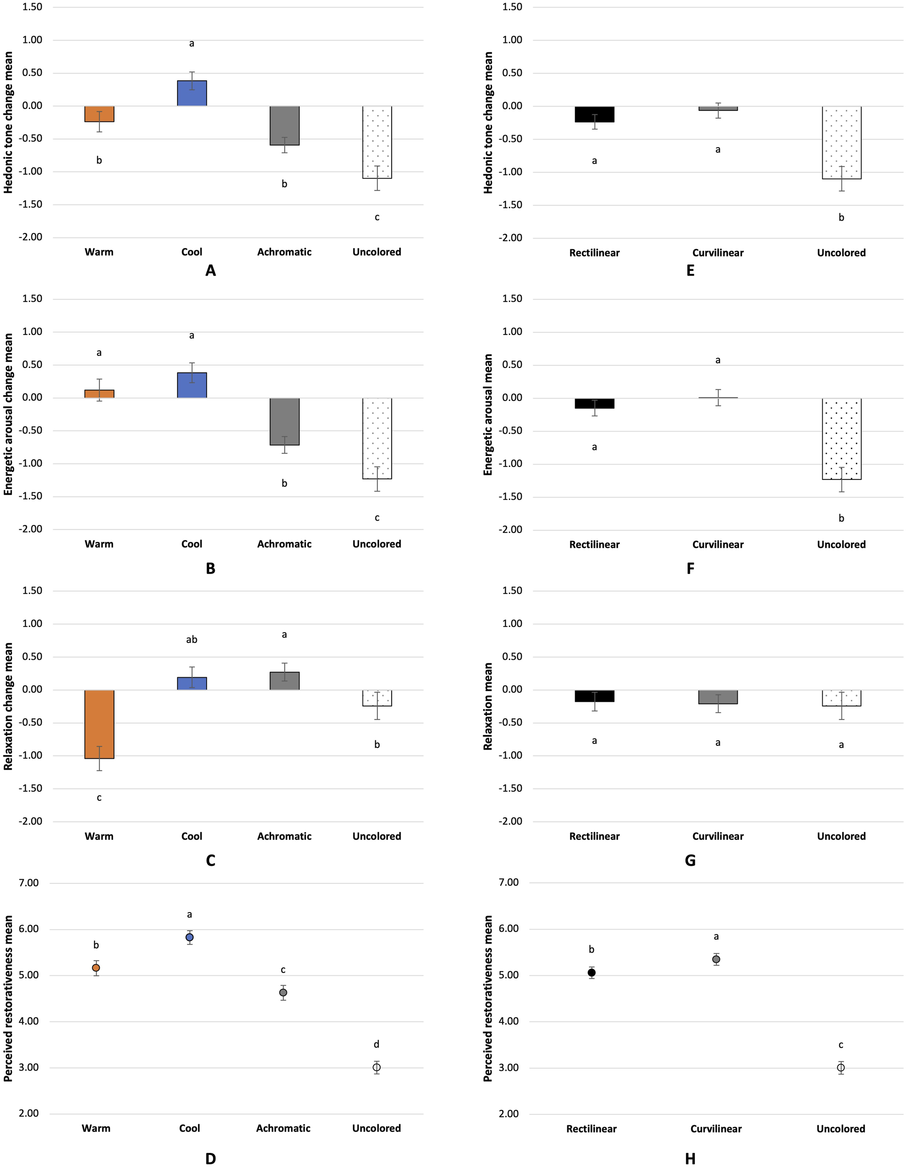
Effects of design condition on mood changes and perceived restorativeness
Results of two-way repeated measures ANOVAs.
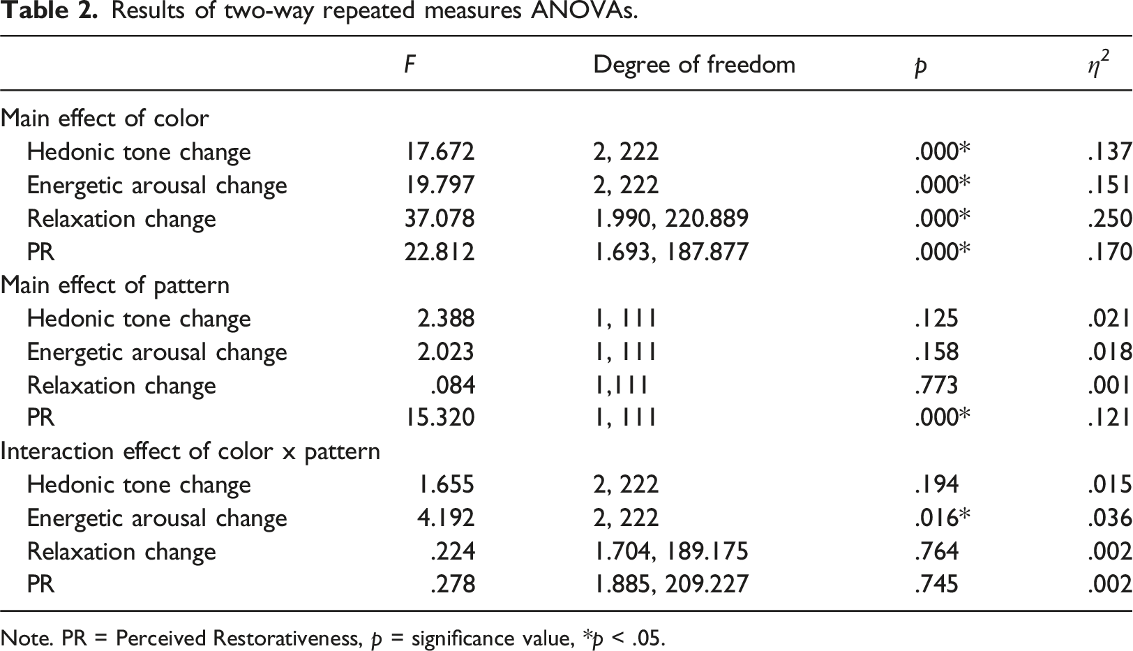
Note. PR = Perceived Restorativeness, p = significance value, *p < .05.
Color effects
In line with H2, the results suggested that ground mural colors affected mood states and PR. Two-way repeated measures ANOVAs yielded a significant main effect for color on hedonic tone change, energetic arousal change, relaxation change, and PR. Bonferroni post-hoc tests indicated that cool colors significantly improved pleasure level (hedonic tone) compared to warm (p = .001) and achromatic colors (p < .001), which reduced pleasure level. Cool colors were also perceived as more restorative than warm and achromatic colors (p < .001). Warm colors significantly decreased relaxation compared to cool and achromatic colors (p < .001). Achromatic colors led to a reduction in energetic arousal and were perceived as the least restorative compared to warm (both p < .001) and cool colors (p < .001 and = 0.040). However, no difference was found between cool and achromatic colors in improving relaxation (p = 1.000), and between warm and cool colors in enhancing energetic arousal (p = .431) (Figure 1(A – D)).
Pattern effects
Partially aligning H2 and H2b, the results suggested that ground mural pattern design did not affect mood states but did impact PR, with curvilinear patterns were perceived as more restorative than rectilinear patterns. Two-way repeated meaures ANOVAs revealed a significant main effect for pattern on PR, but no main effect for pattern on hedonic tone change, energetic arousal change, and relaxation change. Bonferroni post-hoc tests confirmed the significant difference between rectilinear and curvilinear patterns in PR (p < .001) (Figure 1(E – H)).
Difference between stressed and non-stressed groups
To explore the impact of stress on mural design perception (H3), we conducted a comparison between stressed and non-stressed groups regarding mood change and PR in response to each specific condition. Figure 2 provides a visual representation of this comparison, while detailed statistics from independent samples t-tests can be found in Table S4 in the Supplementary materials. Mood change score (A–C) and perceived restorativeness (PR) (D) per design condition in the stressed and non-stressed groups. Error bars represent standard error. A bar below zero indicates negative mood change, while a bar above zero indicates positive change. A higher PR score signifies a more positive result. A score of 5.00 denotes a neutral result. * after items on the horizontal axis indicates statistical significance between two individual groups (p < .05).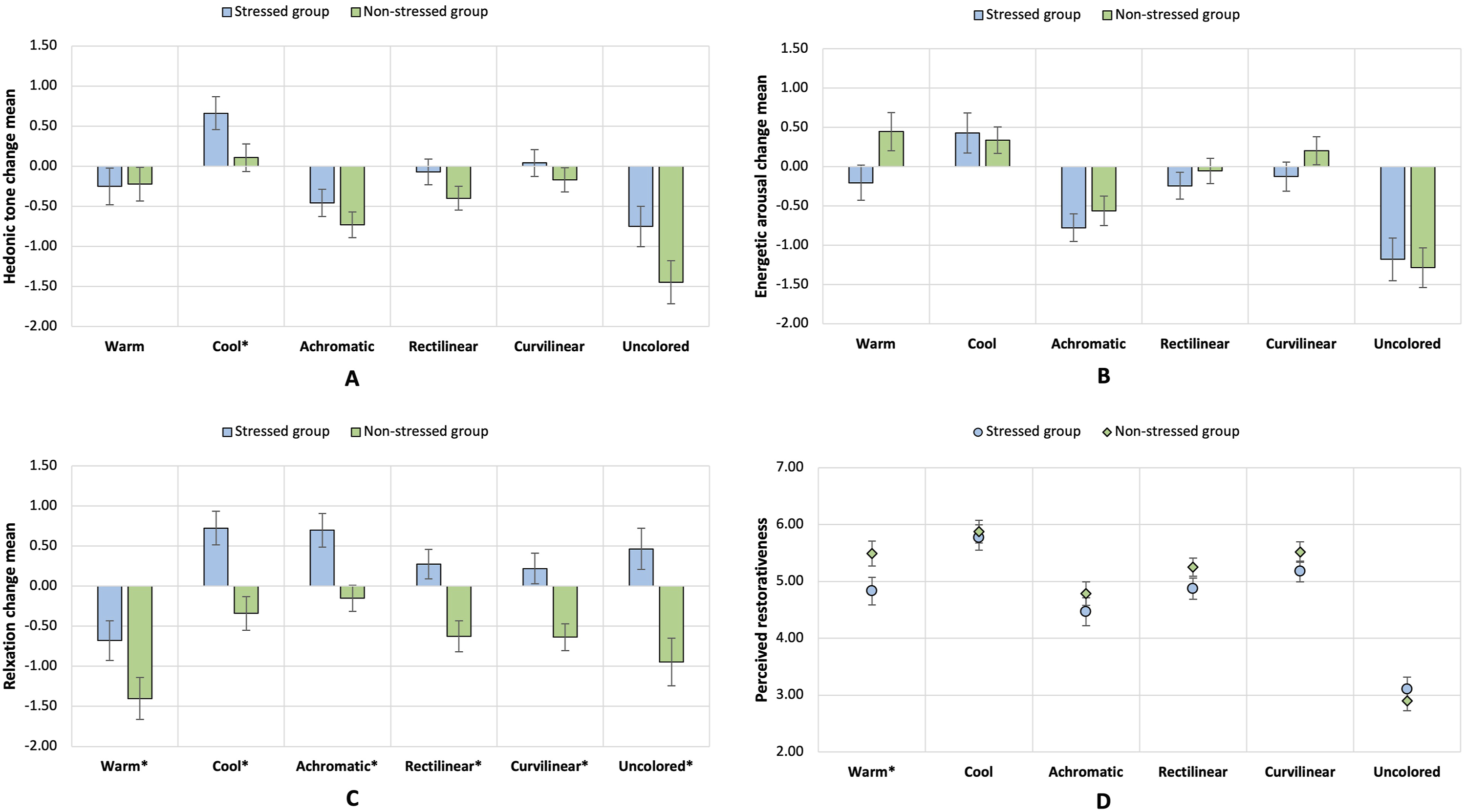
Difference in mood change and perceived restorativeness
Partially supporting H3, we found a significant difference existing between stressed and non-stressed individuals in relaxation change across all design conditions, as indicated by independent samples t-tests (Table S4 in the Supplementary materials). For warm colors, a negative change in relaxation was observed in both individual groups, but the change was less negative in stressed individuals than in non-stressed individuals (p = .047). In all other conditions, a positive change in relaxation was observed in the stressed group, whereas a negative change was shown in the non-stressed group (p < .05) (Figure 2(C)).
Group differences also existed in hedonic tone change and PR in specific conditions (Table S4 in the Supplementary materials). For cool colors, a more positive change in pleasure level (i.e., hedonic tone) was observed in the stressed group than the non-stressed group (p = .041) (Figure 2(A)). For warm colors, stressed individuals perceived warm colors as less restorative than non-stressed individuals (p = .044) (Figure 2(D)).
Stress induction efficiency
The results confirmed successful stress induction, as independent samples t-tests revealed significantly lower mean pre-scores for relaxation in the stressed group across all conditions compared to the non-stressed group (p < .05). Additionally, in most conditions, the stressed group exhibited lower mean pre-scores for hedonic tone than the non-stressed group (p < .05). The only non-significant difference between the groups was observed in the warm color condition (specific statistics provided in Table S5 in the Supplementary materials).
Discussion
This study explored how sidewalk ground mural design features (i.e., color and pattern) influence a restorative experience, including subjective mood enhancement and perceived restorativeness (PR). It also examined if stress influences design perception.
Compared to the uncolored condition, all design conditions significantly enhanced hedonic tone and energetic arousal, as well as PR. This supported H1 and indicated that except for artistic purposes, sidewalk ground murals can be a tactical strategy to improve gray place qualities related to mood enhancement and restorative effects. The findings also mirrored previous research where colored sidewalks were found to be associated with higher enjoyment and excitement level than uncolored sidewalks (Chen et al., 2023).
We also found that color schemes of sidewalk ground murals influenced mood states and PR, as hypothesized in H2. The results also confirmed the expected positive effects of cool colors in H2a. Cool colors significantly improved hedonic tone and PR compared to warm and achromatic colors. These findings augmented the predecessor study by Gu et al. (2021) by revealing a more positive effect of cool colors on increasing pleasure level than warm colors. Moreover, cool colors enhanced relaxation compared to warm colors. Those findings align with previous studies showing positive effects of cool colors in indoor spaces (e.g., AL-Ayash et al., 2016; Yildirim et al., 2011). Warm colors significantly reduced relaxation compared to cool and achromatic colors, aligning with H2a and the findings of Kutchma (2003), where a red room was perceived as more stressful than a green or white room. Achromatic colors reduced energetic arousal and were perceived as less restorative compared to warm and cool colors. In Batistatou et al. (2022), a lower arousal level was also observed in the ground painting condition with an achromatic (white) line than a color line. However, achromatic colors have a similar effect to cool colors in improving relaxation, consistent with H2a and the research by Yildirim et al. (2011), where achromatic living rooms were perceived as less positive in arousal, happiness, vividness, and restfulness than warm and cool colors but calmer than warm colors. The positive impact of achromatic design on relaxation is plausible, as seen in practices like Superkilen in Copenhagen, fostering a pleasant and relaxing space for cultural communication (Archdaily, 2012). Moreover, this finding suggests that for simply enhancing relaxation, both achromatic and cool colors can be recommended. However, our study found that cool colors are preferable for overall mood enhancement compared to achromatic colors.
In H2a, we expected warm colors to evoke a higher energetic arousal level than other colors. However, warm colors were observed to enhance energetic arousal compared to achromatic colors, with no significant difference from cool colors. This finding contrasts with prior studies reporting an association between warm colors and higher arousal level in indoor settings (Yildirim et al., 2011). However, a similar finding was also reported by Chen et al. (2023): red and blue-colored sidewalks both improved excitement with no significant difference between them. The outcomes of these two studies might indicate that individuals perceive colors differently in indoor and urban environments. Such color interventions in urban settings may stand out more prominently against the urban landscape daylight conditions, whereas in a colored room, as seen in the study by Yildirim et al. (2011), such contrast may not be as apparent owing to more controlled lighting conditions.
Regarding pattern features, we observed that curvilinear patterns were perceived as more restorative than rectilinear patterns (Figure 1(H)), partly supporting H2b. Prior studies indicated that curvilinear features were associated with positive emotions (Dazkir and Read, 2012). However, we found no significant difference between rectilinear and curvilinear patterns in any mood states. One possible explanation is how we presented the patterns. We used parallel color stripes in both rectilinear and curvilinear designs, meaning that for the rectilinear designs, we did not incorporate angular features (e.g., sharp angles) that have been associated with negative affective responses (e.g., threat) (Larson et al., 2012). Therefore, a wider range of pattern variations are recommended in future research.
Compared to the uncolored condition, we observed higher PR ratings in all color and pattern conditions (Figure 1(D) and (H)). However, these “higher ratings” ranged around the neutral point 5 (i.e., 4 to 6 and on a range of 1 to 9), indicating a tendency toward neutral rather than positive PR. To explain this, it should be noted that over 90% of the participants indicated familiarity with the selected street, characterized as an inner-city arterial street with high traffic volume and noise levels. A street with heavy traffic has been perceived as stressful by pedestrians (Knöll et al., 2018). Thus, participants might have related their real-life experiences with the street when evaluating the presented designs. However, our results still support the positive effects of ground murals, suggesting their potential to evoke restorative experiences in an unappealing gray walking environment.
The between-subjects analysis indicated that cool colors yielded significant differences between stressed and non-stressed participants in hedonic tone change and relaxation change, with more positive changes for stressed individuals. Concerning energetic arousal change and PR, cool colors equally produced positive outcomes for both individual groups (Figure 2). These findings again confirmed the positive effects of cool colors in promoting a restorative experience, especially for stressed individuals.
Additionally, for stressed individuals, only warm colors were associated with a negative relaxation change, while all other conditions showed positive changes (Figure 2(C)). Moreover, warm colors were perceived as less restorative by stressed individuals, consistent with the association between warm colors and negative perceptions found in previous research (Kutchma, 2003). These findings suggest that warm colors could be reduced on sidewalks for individuals susceptible to stress.
For non-stressed individuals, all conditions resulted in a negative relaxation change, with warm colors showing a greater reduction and other conditions causing a slight reduction in relaxation (Figure 2(C)). It is important to note again that viewing the streetscape in the study might reduce relaxation, as participants might related to their real-life experience while rating (as discussed earlier). The between-subjects findings revealed that stress level influenced environmental color perception, aligning with the study by Dijkstra et al. (2008) and suggesting that stress might influence cognitive abilities related to perceiving and interpreting stimuli (Yaribeygi et al., 2017). Therefore, emphasizing the importance of considering individual differences in future studies is crucial to identify the specific responses to environmental colors in target groups.
Limitations
First, to save time and reduce costs associated with stimulus generation, equipment setup, and experimental procedures, we opted to present visual stimuli using 2D images. However, the use of two-dimensional images might limit participants’ immersion and understanding of the wider surroundings. Despite a high correlation (r = 0.86) between evaluations from two-dimensional images and onsite assessment (Kjellgren and Buhrkall, 2010; Stamps III, 2010), future studies could employ visual reality (VR) to include more environmental information and allow participants to navigate in the environment. Second, hue is the only color feature, but effects for the other two color features (i.e., value and saturation) on psychological responses have also been reported (AL-Ayash et al., 2016; Kwallek et al., 1996). Additionally, we only explored one possibility in rectilinear or curvilinear design. However, more design options have been shown in existing ground mural projects. Thus, color and pattern features should be systematically categorized and incorporated in future research. Third, participants’ familiarity with the selected street view might confound the evaluation on mood states and PR, due to the environmental stressors like high traffic volume and noise. However, we were unable to measure the effect of the familiarity on the evaluations. Additionally, the results might only be applicable to the selected street typology, rather than streets with less traffic, as prior research has shown varied color needs and responses to colors in different settings (Torres et al., 2020).
Conclusion
This study systematically explored the effects of design features of ground murals on mood states and perceived restorativeness (PR) in a gray urban sidewalk. The results revealed that presence and design features of ground murals impacted a restorative sidewalk experience. The effects on mood states and PR were varied in colors and cool color design, especially for stressed participants, had the most positive effects. Pattern features did not yield mood enhancement, but curvilinear patterns were perceived as more restorative than rectilinear patterns.
This study is the first to report a positive impact of ground murals on mood and PR, expanding the understanding of their potential benefits. The differences between colors and the similarities between the two used patterns are a first step towards a taxonomy, which would allow the design ground murals in a more differentiated way and in response to users’ predominant needs and affordances for mental well-being. To encourage more active forms of travel (such as walking and running), colorful design could be employed in ground mural to evoke fascination which in turn could promote more exploratory behavior and result in a greater distance traveled. Ground murals in street segments in areas with potential environmental stressors can employ cool colors combined with curvilinear patterns to optimize restorative effects. Such stressors include highly connected street networks that are correlated with high traffic volume and noises, a primary land use such as business districts where mental fatigue is prevalent, and specific building types (e.g., hospital) where stress-inducing activities occur. More empirical research is needed to support future urban public space design aiming to benefit mental well-being through prudent ground mural design with colors and patterns.
Supplemental Material
Supplemental Material - Cool colors promote a restorative sidewalk experience: A study on effects of color and pattern design of ground murals on mood states and perceived restorativeness using 2D street view images
Supplemental Material for Cool colors promote a restorative sidewalk experience: A study on effects of color and pattern design of ground murals on mood states and perceived restorativeness using 2D street view images by Lanqing Gu, Annika Dimitrov-Discher, Martin Knöll, and Jenny Roe in Environment and Planning B: Urban Analytics and City Science.
Footnotes
Acknowledgements
We would like to thank Boyang Ji, Seyma Karagoz, and Arthur Kremser for their valuable assistance in conducting the experiment. Additionally, we extend our thanks to Nebojša Čamprag and Jessica Priem for providing photographs of Superblocks of Sant Antoni and Poblenou.
Declaration of conflicting interests
The author(s) declared no potential conflicts of interest with respect to the research, authorship, and/or publication of this article.
Funding
The author(s) disclosed receipt of the following financial support for the research, authorship, and/or publication of this article: This work was supported by the Deutsche Forschungsgemeinschaft (DFG) [Project number 437818133].
Data availability statement
The datasets are not publicly available due to the data protection terms specified in the research consent but are available from the corresponding author upon reasonable request.
Supplemental Material
Supplemental material for this article is available online.
References
Supplementary Material
Please find the following supplemental material available below.
For Open Access articles published under a Creative Commons License, all supplemental material carries the same license as the article it is associated with.
For non-Open Access articles published, all supplemental material carries a non-exclusive license, and permission requests for re-use of supplemental material or any part of supplemental material shall be sent directly to the copyright owner as specified in the copyright notice associated with the article.