
Abstract
Co-creation of urban data and informatics with community partners facilitates the development of insights and actions that are grounded in residents’ experiences and aimed at achieving social change. Despite rising interest in co-creation strategies, instructive guidance on implementation remains scarce. To address the shortage of instructive guidance, we provide a detailed account of how the resident, community, and institutional partners in the Healthy Neighborhoods Study co-created a dataset on neighborhood health, and a data dashboard that allows for all partners, as well as the public, to access and use the data to support neighborhood-level action and regional planning. We focus on the collaborative and iterative design process used to co-create a digital tool to access, analyze, interpret, and communicate community-generated data. While co-creation strategies require an upfront investment in relationship building and facilitating a more complex process, they carry significant benefits in producing truly representative datasets and data tools and services that advance data inclusion, laying the foundation for social change.
Introduction
The integration of data into planning practices is becoming commonplace, with cities utilizing indicators and projections, and publicizing data through dashboards. By 2023, 129 cities and counties in the United States have established open data sites, allowing public access to urban data. Various entities, including academic institutions, private firms, and non-profits, contribute data and tools to inform planning and engage the public in urban challenges. Notable examples include dashboards related to the COVID-19 pandemic (Dong et al., 2020; Praharaj et al., 2023; Praharaj and Wentz, 2022), housing justice efforts through data visualizations (Maharawal and McElroy, 2017), and projects like “Inside Airbnb” (2024) studing the impact of short-term rentals on local housing markets (Horn and Merante, 2017; Duso et al., 2020; studies reviewed by Gold, 2019; as examples). This reliance on data and dashboards assumes their effectiveness in representing cities, improving urban performance, and enhancing communication between residents and public services (Batty, 2013; Goldsmith and Crawford, 2014; Kourtit and Nijkamp, 2018; Krishnamurthy et al., 2017; Townsend, 2013).
Because data are so crucial to planning, decisions made about what data to collect, where and how to collect it, and how to analyze and share it reverberate through any stage of planning, investment and development, community organizing, or advocacy that uses a city’s urban planning data resources. To provide context on how the Health Neighborhood Study’s (HNS) approach to creating a data dashboard differed from standard approaches, and to situate the effort within relevant traditions of community-engaged scholarship, we briefly review literature on urban data dashboards, co-creation with communities, and Participatory Action Research.
Urban data dashboards
Kitchin and McArdle (2016) define urban data and city dashboards as platforms presenting key information about cities, which are updated and often interactive. They contend that the widespread adoption of urban dashboards not only addresses practical requirements for managing city services and catering to the needs of data-driven public administration but also responds to broader, subjective inquiries about a city’s present status and performance.
The study of urban dashboards exposes the contextual dependence of data, often inclined toward the interests of data producers rather than the subjects (Kitchin et al., 2015; Kitchin and McArdle, 2016; Mattern, 2015). Kitchin et al. (2015) assert that “Indicator, benchmarking, and dashboard initiatives inherently express a normative notion about what should be measured, for what reasons, and what they should tell us, and are full of values and judgments shaped by a range of views and contexts. There is a politics to indicator and benchmark selection, their communication and visualization, their deployment, and their use.”
Across diverse fields of investigations, researchers have shown that historically vulnerable populations are misrepresented in data. Health equity researchers have argued that the detailed data required to inform public decision-making on health interventions is nonexistent, scarce (Caiaffa et al., 2014), or aggregated in a way that masks inequalities (Friel et al., 2011; Schnake-Mahl et al., 2020). The literature on smart cities is abundant with critique of bias in big data that leads to discriminatory public service, such as in predictive policing that perpetuates racism (Browning and Arrigo, 2021; Richardson et al., 2019), and in allocation of goods to those better represented in the data that perpetuates socio-economic gaps (McCarthy, 2016; Pak et al., 2017). These examples demonstrate how the ability to collect, analyze, and interpret data matters for how public resources are allocated. Since these abilities are defined by inequalities in economic, social, political, and cultural capital (Cinnamon, 2020), there is a need for social action to increase the diversity of people who can use data to advance their planning goals. This includes diversity of roles people serve in different levels of community (e.g., planners, advocates, and service providers; grassroots, regional, and institutional) as well as diversity of people on the basis of demographics.
(Mattern, 2015) adds that by choosing how to represent the city, data dashboards do not only represent the city through a particular lens but also actively define it by influencing what is measured, tracked, and governed. Hence, data dashboards are criticized for portraying an incomplete image of a city, one that lacks the perspectives of those not invited to participate in its creation.
Co-creation with communities
One potential antidote to this problem is to co-create dashboards with communities that are portrayed by, and potentially affected by decision-making that occurs in response to, urban dashboards. Co-creation is a term used by many fields to refer to either a “theory of value,” focusing on how entities co-create value with users through collaboration, a set of practices that function as design methods, or both (Jones, 2019). This study sits at the intersection of urban planning and public health, two fields in which scholars have probed the meaning and importance of co-creation.
From the urban studies and planning perspective, Lund (2018) skillfully traces the concept’s roots in the literature on innovation, management, design, and planning theory before distilling the meaning of the term as one that refers to “innovation and value creation taking place as a collaborative process involving different types of actors.” Lund is careful to highlight that co-creation involves citizens acting as co-initiators, co-designers, and co-implementers, roles that require planners and public agency staff to relinquish control and their privileged position as experts, and instead lean more heavily into serving as process facilitators. While some planning agencies involve users in testing data tools, fewer examples exist of co-creation with community partners to ensure data and tools align with community priorities. Co-created data resources, focusing on community priorities and employing measures residents find appropriate, enable the integration of community perspectives into data-informed processes, resulting in tailored data products.
Coming from the field of public health, Vargas et al. (2022) define co-creation as “the collaborative approach of creative problem solving between diverse stakeholders at all project stages.” Their view includes stakeholders working together at key inflection points such as problem definition, and, similarly to Lund, that co-creation encompasses both co-design and co-production. The promise of co-creation, they argue, includes the promotion of “equity, citizenship, and social justice” in public health initiatives. Vargas et al. further posit that that Participatory Action Research (PAR) offers uniquely appropriate approaches for guiding the co-creation.
Participatory Action Research (PAR)
While PAR lacks a universally accepted, concise definition, there is general consensus among scholars and practitioners that its key elements include better understanding a problem by acting to address it, engaging people and communities most affected by a problem as capable peers in all stages of the research, enacting cycles of research-action-reflection, and challenging unjust systems and oppressive structures, among other tenants (Freire and Ramos, 1970; Borda, 2006; J. Greenwood and Levin, 2007; Kesby, 2007; Jacobs, 2018). The application of these elements mean that PAR initiatives focus heavily on the quality and integrity of collaborative processes, and judge their own successes based on whether they helped address problems and improve conditions targeted for research and action. The HNS uses a PAR approach in all of its work, adopting and adapting specific methodologies for co-creation of data resources to create the data dashboard.
Co-creation of data resources is a pathway toward data inclusion, defined by Bhargava et al. as the universal opportunity and ability of people to create, control, access, and use data (Bhargava et al., 2015). Data inclusion resonates with the history and purpose of Participatory Action Research (PAR), which posits that those most affected by a complex social problem should be involved in the study of it, with an orientation toward action (Baum et al., 2006). Practicing data inclusion means prioritizing residents’ critical needs and increasing resilience to help all stakeholders listen, learn, and adapt to change and uncertainty (Bhargava et al., 2015). It requires that practitioners use their power, positions, and resources to create more opportunities for underrepresented and misrepresented communities to fully and effectively participate (Costanza-Chock, 2020; D’Ignazio, 2017; Hayes, 2019; Ogbonnaya-Ogburu et al., 2020; Cooper et al., 2022).
Emerging frameworks such as design justice (Costanza-Chock, 2020) and creative data literacy (D’Ignazio, 2017), as well as methodologies such as Participatory Action Design Research (Bilandzic and Venable, 2011), Participatory Action Research In Software Methodology Augmentation (Young, 2021; Siew, 2013), and Design-Based Implementation Research (Kumar and Dell, 2018), underscore the necessity of co-creation strategies. These new visions advocate for more comprehensive, long-term community engagement through all phases of development of data projects inclusive of identifying the appropriate indicators, collecting and analyzing data, and communicating and sharing the findings via data dashboards. The common thread among these strategies is the recognition that partnerships with community members are crucial to understanding ongoing information needs and priorities. This is achieved through an iterative and collaborative process that translates insights into digital interfaces and data access workflows tailored to the specific needs of diverse community groups.
Amid the growing scholarly interest in the participatory design of data and its products, a fundamental research question emerges: How can data dashboard creators successfully implement a PAR approach to the design of urban data dashboards? In contrast to conventional methods of data dashboard design, participatory approaches necessitate increased investment and extended timeframes to cultivate relationships and collaboratively design research questions, strategies, and iterative learning processes (Cooper et al., 2022; Hayes, 2014). These projects also require researchers to prioritize community outcomes and long-term sustainability over novelty, and community ownership of the process and outcomes over short-term evaluations (Balestrini et al., 2015). Together, the uncertainties associated with managing a project of higher complexity with little instruction on the process pose barriers to the participatory design of urban data dashboards.
Methodology
To help researchers and practitioners practically apply PAR strategies, this paper describes the collaborative dashboard design process implemented by the Healthy Neighborhoods Study (HNS). The HNS is a longitudinal, multi-site, Participatory Action Research (PAR) project exploring the relationship between urban development and community health in nine rapidly changing neighborhoods in Massachusetts (Arcaya et al., 2018). The HNS integrates community collaboration into all aspects of research and has previously published the HNS process for conducting action research (Healthy Neighborhoods Study, 2020) and planning and facilitating collaborative instrument design and data analysis (Binet et al., 2019). This paper focuses on the use of established PAR methods for the collaborative design of a data dashboard for community-generated data. The final dashboard can be accessed through this link: https://hns.mit.edu/datadashboard/ and we provide the code in this GitHub Repository: https://github.com/HealthyNeighborhoodsStudy/DataPortal
Co-creation of neighborhood health data
The HNS is led by a consortium of academic researchers, public agencies, and community organizations and residents focused on advancing health equity, equitable development and housing justice, and/or environmental justice in nine communities across Eastern Massachusetts. Together, the HNS partners advance data inclusion by meeting the community demand for actionable data on how gentrifying development affects the health and well-being of people most vulnerable to neighborhood changes, to inform local and regional planning, investment, development, and organizing activities, including community mobilization, public testimony, needs assessment, resource allocation, local decision-making, and grant writing.
The HNS research process follows a collaborative five-step process: relationship building, collaborative research design, data collection training and implementation, data analysis, and action projects designed and implemented by the community partners (Arcaya et al., 2018). Research processes and data collection have been IRB approved by the Biomedical Research Alliance of New York (Protocol#: 18-006-520). Central to the research process are a group of approximately 35 residents from our nine research communities who are trained and employed as Resident Researchers and participate in each step of our PAR process. They work with research staff at partnering non-profit and academic institutions to generate research questions that matter most to the residents and their community partners, collect and analyze data, and work closely with their local community partner to use data and findings to advance an action agenda. The research process has included co-developing survey and interview tools to answer shared research questions. We hosted workshops and facilitated processes to pilot and revise the tools to ultimately include 12 survey domains on what matters about neighborhoods and how they change for health from the resident perspective.
By 2023, the HNS team successfully maintained ongoing collaboration between consortium partners across academic, community, and public sectors for 8 years. We have surveyed over 3000 people; analyzed data via collaborative workshops (Binet et al., 2019) and acted on findings through local projects. The team produced a new dataset alongside robust findings about neighborhood change and health in our sample across nine communities and advanced several action and advocacy projects using HNS findings and data (Arcaya et al., 2018; Binet et al., 2021, 2022).
After collecting complex urban data for several years, our team sought a methodology to share these data with consortium members and the public in the studied neighborhoods. The need for a data dashboard initially arose from the desire to enhance efficiency in accessing and interpreting data within the Consortium’s action processes. Earlier efforts to share data included extensive data reports and a data request process, which proved cumbersome and impractical for sharing comprehensive data. Therefore, we embarked on designing an interactive data dashboard. This shift, informed by community partners, aimed to create a publicly accessible dashboard providing insights into the relationship between place and health in the studied neighborhoods. The design challenges mirrored those faced by many municipalities, focusing on making data accessible to individuals with varying digital skills and neighborhood knowledge levels, while ensuring appropriate context for understanding the data and its creators.
Co-creation of neighborhood health data visualization
The HNS research staff planned and implemented a participatory process to develop the HNS data dashboard alongside resident researchers and community partners as part of the overall PAR framework developed by the HNS as previously described (Arcaya et al., 2018; Binet et al., 2019). In this study, relationships with impacted communities were already established as part of the HNS’s PAR process. Therefore, all members of the data dashboard planning team and design workshop participants were paid researchers working on our 5-step, Institutional Review Board approved research processes. It is essential to note, within the PAR framework, that community partners were compensated researchers, and the development and refinement process described herein does not constitute human subjects research. Below we discuss the reasons for choosing a participatory process, and we provide a step-by-step account of how it was designed, implemented, and evaluated.
The participatory approach to developing data tools and services aligns with the HNS mission to practice data inclusion by including those most impacted by social inequalities in the development of data tools about their own neighborhoods. The engagement process aimed to achieve multiple objectives: firstly, to uncover community priorities for dashboard use; secondly, to identify intuitive data analysis and visualization workflows for community members; and lastly, to ensure ownership of the process and outcomes by resident and community partners. This ownership was crucial for the final product to align with their needs in organizing campaigns, resident education, stakeholder activation, grant writing, and local decision-making. The HNS residents and community partners, being long-term community leaders, played a vital role in contributing to the design of data tools and services. Their extensive experience in using data for community activities, coupled with their understanding of how community members access data, made them valuable contributors to the development process. The engagement process, therefore, proved essential for creating a practical data tool aligned with community priorities and offering user-friendly access to data analysis and visualization.
The participatory process for designing the HNS data dashboard took place in the summer of 2020 and was completed within 3 months. A group of four HNS researchers from academic and non-profit partners planned a three-step process to collaboratively design the HNS data dashboard with the HNS residents and community partners (Figure 1). The purpose of step 1 was to create a multidisciplinary team to oversee the design process; identify the needs among the HNS research staff, resident researchers, and community partners; and evaluate software solutions to meet those needs. Insights from the first step informed the first iteration of the data dashboard. In step 2, the HNS research staff facilitated several workshops with the multidisciplinary team and with the wider HNS partners to co-create the dashboard in an iterative design process. The data dashboard tool was developed in between workshops in response to the feedback received. In step 3, the HNS research staff conducted an informal evaluation of the tool by collecting feedback from HNS residents and community partners on how the dashboard is being used. We note that our process incorporates a similar approach to the Participatory Action Design Research approach (Mark Bilandzic and Venable 2011). Due to the disruptions of the COVID-19 pandemic at the time of development, the entire process was conducted remotely using the Zoom meeting software to host group meetings as well as Google document sharing and Google Jamboard services to document feedback during meetings. Methodology diagram.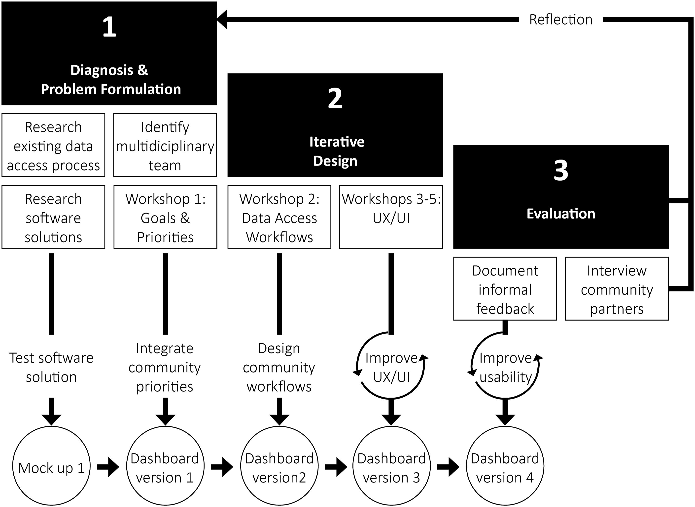
The HNS PAR approach to facilitation is intentional, and workshops were designed to share, combine, and use the knowledge of all partners, and maintain the power of community partners and Resident Researchers to guide decision-making. As such, all workshop participants were held to the same ground rules: (1) Be present, (2) speak from your own experience, (3) listen to understand and share to be understood, (4) no one knows everything, but together we know a lot, (5) move up, move up, (6) keep time together, and (7) embrace curiosity. Collectively we follow the same principles: accountability, action-oriented, resident leadership, shifting power, and reciprocity (The HNS Research team, 2020). Research staff’s facilitation style in these workshops drew from key lessons from Binet et al. (2019). Facilitators focused on building trust by emphasizing how participant’s contributions are integrated into the design, maintaining flexibility in facilitation materials and techniques, and ensuring transparency in the implications of the decisions we collectively chose to make about the dashboard.
Step 1: Diagnosing and problem formulation
In step 1.1, the HNS academic researchers conducted a comprehensive review of the existing manual data sharing process, analyzing recurring patterns of data requests and successful formats for data visualizations. Through interviews with long-term HNS staff, insights were gathered on frequently requested information, visualization methods, and the data analysis workflow employed by the staff to respond to community data requests. These findings provided foundational information for the initial mockup of the data dashboard.
In step 1.2, the HNS academic team explored various software solutions suitable for a lean organization, considering factors such as affordability, ease of maintenance, robust documentation, support, compatibility with basic data analysis functions, interactive visualizations, and flexibility in user interface design. The R studio environment, featuring the shiny and dashboard packages, met all technical requirements and was selected. Given the familiarity of academic researchers with the R environment, it required no additional training. After selecting the software solution, the HNS academic researchers leveraged insights from step 1.1 to develop the initial mockup of the data dashboard. A researcher with design background and proficiency in the R environment constructed this mockup using the shiny and dashboard packages. The first mockup served three primary purposes: (1) testing the software solution’s capabilities in handling baseline queries, (2) establishing a foundation for future iterations based on community feedback, and (3) ensuring privacy concerns were adequately addressed.
The initial mockup functioned as a simple query tool, resembling the previous manual reporting process. Users could obtain descriptive statistics for all dataset variables, with the ability to filter results based on pre-selected criteria, and the results were presented in tabular form. To address privacy concerns, the dataset underwent anonymization by removing personally identifiable information and recategorizing response categories with minimal responses. Additionally, the mockup incorporated safeguards such as suppressing data subset queries resulting in less than five aggregated surveys as an added measure of protection.
In step 1.3, the HNS research staff established a multidisciplinary team for creating the data dashboard. This team comprised two resident researchers and three community partners from the HNS. Resident researchers and community partners were selected to represent the data needs of their respective communities, bringing expertise in housing justice, environmental justice, health engagement, and community leadership. All five invited members agreed to participate, forming a diverse team with a range of skills and knowledge. The team consisted of HNS research staff with expertise in data management, statistics, and UX/UI, while the community leaders brought experiential knowledge of data use in their specific context, particularly in grant writing, stakeholder engagement, community organizing, and resident engagement. All team members had prior experience in utilizing HNS data for community engagement and action projects using the previous data sharing methods, such as data reports and requests.
In step 1.4, HNS research staff conducted a workshop for the multidisciplinary team identified in step 1.3. The workshop aimed to identify communication goals, users, audience, and data analysis and visualization needs for the development of the data dashboard. The tasks of the facilitation team had been divided into facilitator, note-taker, and Google Jamboard note-taker. Facilitators initiated the session by presenting the proposed agenda and inviting input from Resident Researchers and community partners for any additional items. They then introduced the purpose of co-creating a data dashboard, emphasizing its role in action planning and advocacy. Facilitators posed questions to gather participant feedback on goals, data needs, and intended users and audience, recording responses on a shared jamboard in real time for collaborative learning (Figure 2). At the end of this meeting and in preparation for the next workshop which focused on data analysis workflows, the facilitators introduced the concept of iterative design and shared with participants a link to the baseline mockup. Participants were given more than a week between workshops to review the mockup on their own and reflect on the helpfulness of this tool in providing data access. The community priorities identified in this session, including communication goals, users, audiences, and data analysis and visualization needs, were crucial in informing the first iteration of the data dashboard. Workshop 1 Jamboard.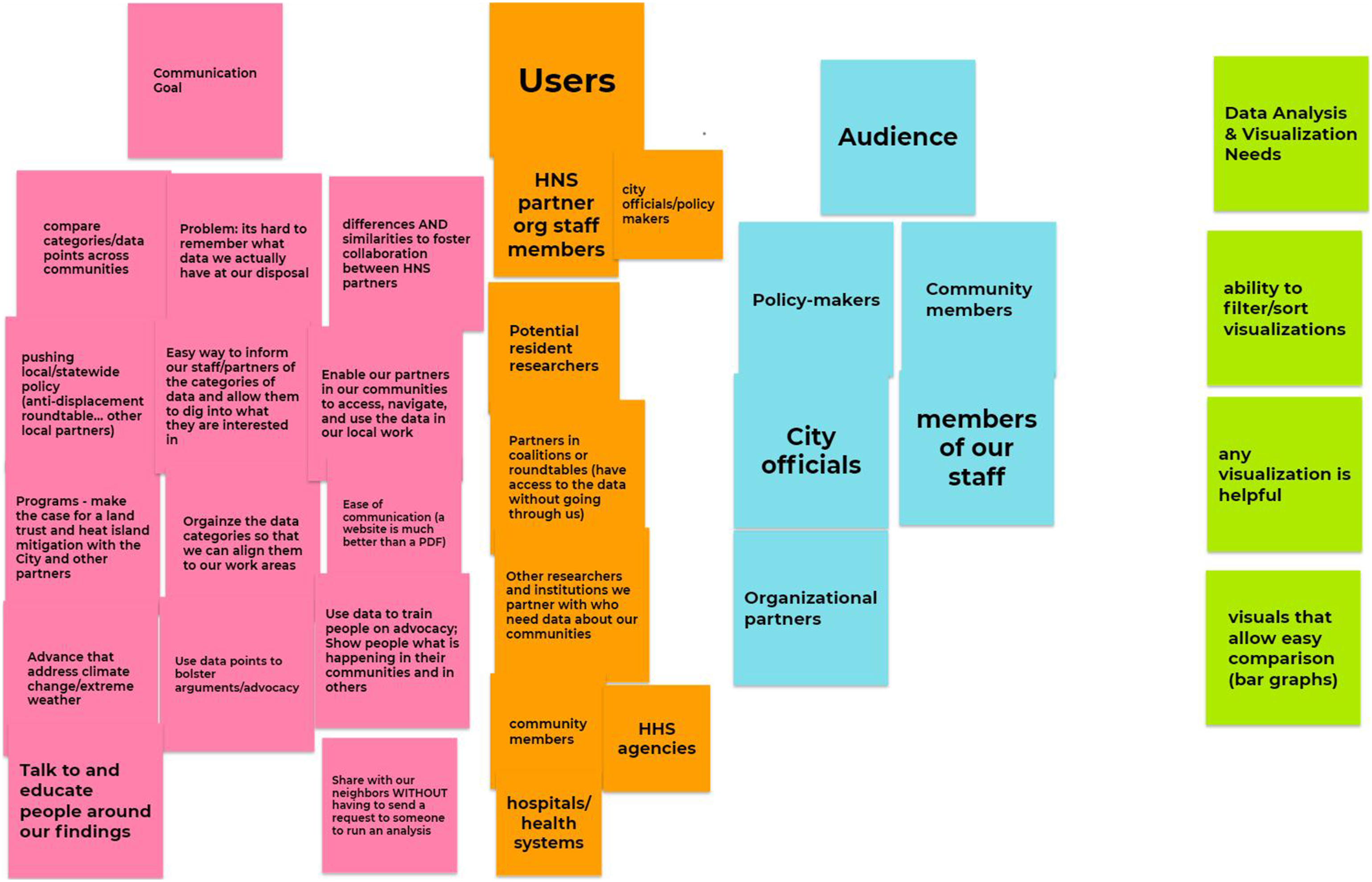
Step 2: Iterative design
In step 2.2, the HNS research staff organized a workshop for the multidisciplinary team to explore data access and analysis workflows and obtain initial feedback on the mockup. The facilitators initiated the session by screen-sharing and guiding participants through the first iteration of the dashboard, highlighting how feedback from Resident Researchers and community partners had been integrated. A demonstration of executing a univariate analysis prompted discussions on data analysis workflows, user experience, functionality, and interpretability. Participants were then invited to share their feedback on the dashboard, which facilitators meticulously documented and categorized on a shared Jamboard (Figure 3). The four categories included Initial Impressions/User Experience, Feedback/Questions, Recommendations, and Data Analysis and Visualization Needs. Insights gathered from this workshop played a pivotal role in shaping the second iteration of the data dashboard, incorporating identified data analysis workflows. Workshop 2 Jamboard.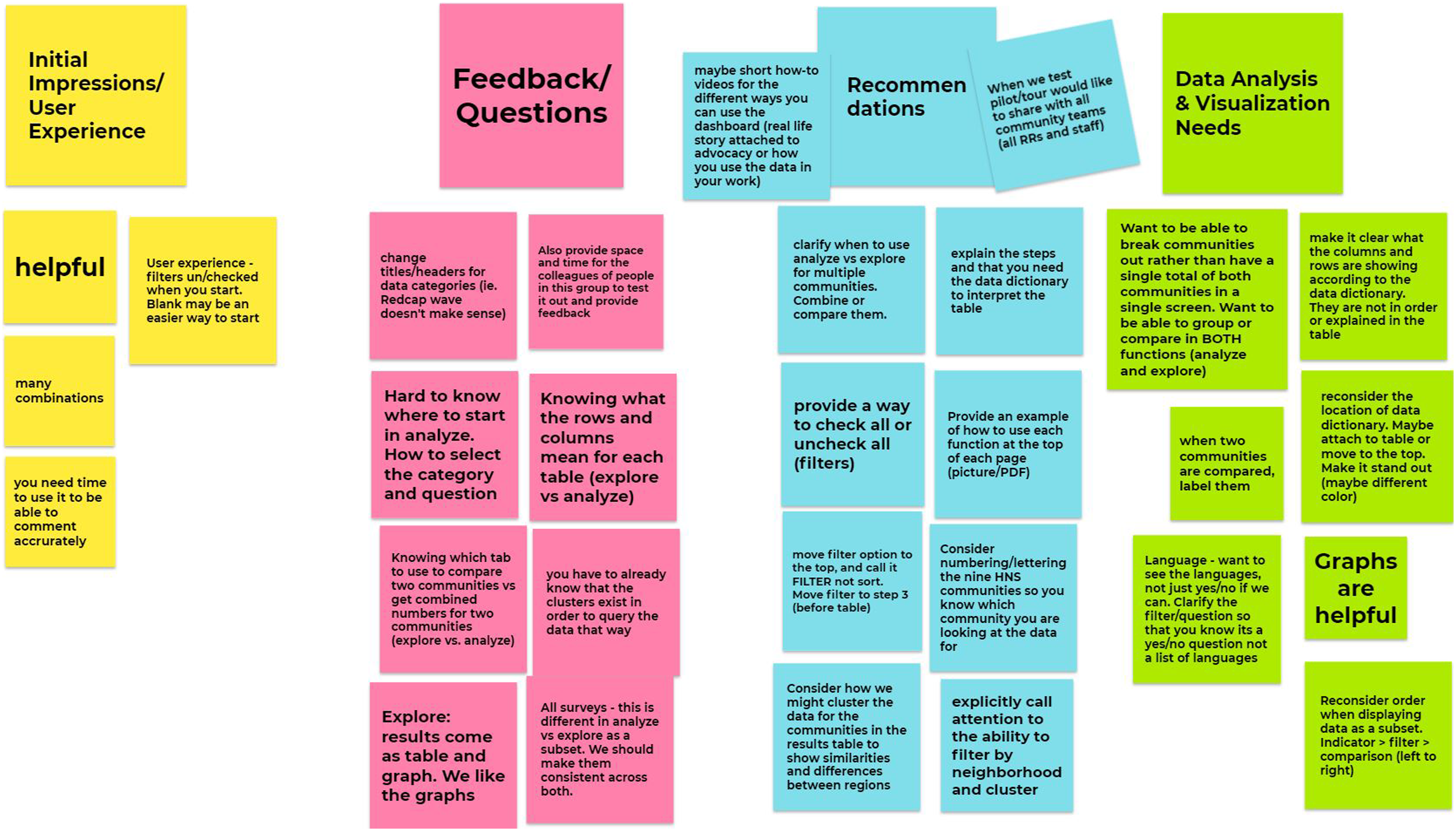
In step 2.3, HNS research staff conducted three workshops involving HNS partners, additional research staff, and resident researchers to introduce the tool to its intended audience and to gather feedback on the user experience and user interface. All workshops followed a standardized facilitation guide and included different groups of 8-12 Resident Researchers and community partners from the HNS network with varying technical experience. Each workshop comprised a 40-min agenda: the first 10 minutes introduced the data dashboard’s purpose and features, followed by 20 min of facilitated exploration in small groups within breakout rooms. Facilitators demonstrated dashboard usage for data analysis, addressing specific research questions related to participants’ geographic locations. Participants then independently navigated the dashboard to answer their own questions using data analysis pathways. The final 10 min were allocated for participants to provide feedback, reflecting on their experience, sharing difficulties encountered, and suggesting improvements for the dashboard. These workshops were instrumental in familiarizing the intended audience with the dashboard in a collaborative learning environment that encouraged experimentation and shared learning. Participants received technical training on conducting analyses using the data dashboard, with their questions and improvement suggestions recorded and incorporated into the third version of the tool. This approach facilitated the integration of diverse perspectives into dashboard creation while enhancing participants' proficiency in using the tool for generating their own data insights in the future.
Step 3: Evaluation
In step 3, HNS research staff documented the initial feedback received from community partners on the long-term usability of the tool using semi-structured interviews at two time points, as well as unstructured ad-hoc conversations with Resident Researchers and community partners as they sought support in using the data dashboard in their work. Semi-structured conversations were conducted with Resident Researchers and community partners—including those outside of the initial design team—immediately following the dashboard completion. HNS research staff also held semi-structured conversations with members of the design team 1 year following dashboard completion. We note that due to the unique structure of PAR in this study, both the HNS research staff and community partners are paid researchers and are members of the HNS research consortium and not research subjects. Hence this section reports on an internal evaluation process.
Initial conversations solicited information about how Resident Researchers and community partners might use the dashboard, features of particular interest, and support that might be needed to ensure the tool’s usefulness in our partners’ advocacy and organizing. Follow-up conversations with members of the design team discussed dashboard use in the past year, reflections on future utility of the dashboard, and continued support needed to ensure their success with using the tool.
Ad-hoc conversations focused on soliciting real-time information about intended use of the dashboard and usability of the dashboard as a resident and/or community partner used it alongside research staff while creating their own messaging and action campaigns. All feedback provided within the timeframe of the creation of the tool was incorporated into the final data dashboard version.
Results
Step 1: Diagnosing and problem formulation
Resident Researchers and community partners outlined key needs for the data dashboard: (1) Community Awareness: Gain insights into local issues to inform community programs addressing specific concerns; (2) Education and Outreach: Educate community members and organizational partners about research findings; (3) Recruitment: Recruit community members for organizational initiatives; (4) Collaboration: Understand how their community compares with others in the HNS, facilitating better coordination with community organizations; (5) Independent Data Access: Access data independently, reducing reliance on academic and non-profit research staff; and (6) Advocacy Support: Utilize data insights to strengthen advocacy efforts at local and state levels.
Resident researchers and community partners also identified a wide range of potential users and audiences for the dashboard who differ in technical skills and familiarity with the HNS. While resident researchers and community partners wanted the dashboard to primarily target technical and non-technical members of the HNS community, they also wanted it to be accessible to their target audiences, which included policy makers, policy designers in government agencies, and newspaper outlets.
A key insight from the first workshop was that resident researchers and community partners wanted to use the data dashboard as an information and communication tool, in addition to its functionality as a data access and analysis tool. To meet this need, we created a user interface that included an informational landing page and a fixed vertical navigation panel which directs to the data analysis tool as well as to more informational resources (Figure 4). The navigation panel directs users to four informational sections tailored to address diverse community priorities. The About section serves as the landing page, offering essential information about the study and instructions for dashboard use, promoting meaning-making, and detailing potential insights and limitations. The Survey Information section explains data structure and population sample in accessible language. Tutorials in the Tutorial section aid non-technical users in creating their analyses. The Resources section caters to broader communication goals, providing links to HNS publications, reports, the survey, anonymized dataset, and data dictionary. These resources empower other research teams to replicate findings or undertake more complex analyses. Diagram of the content navigation strategy.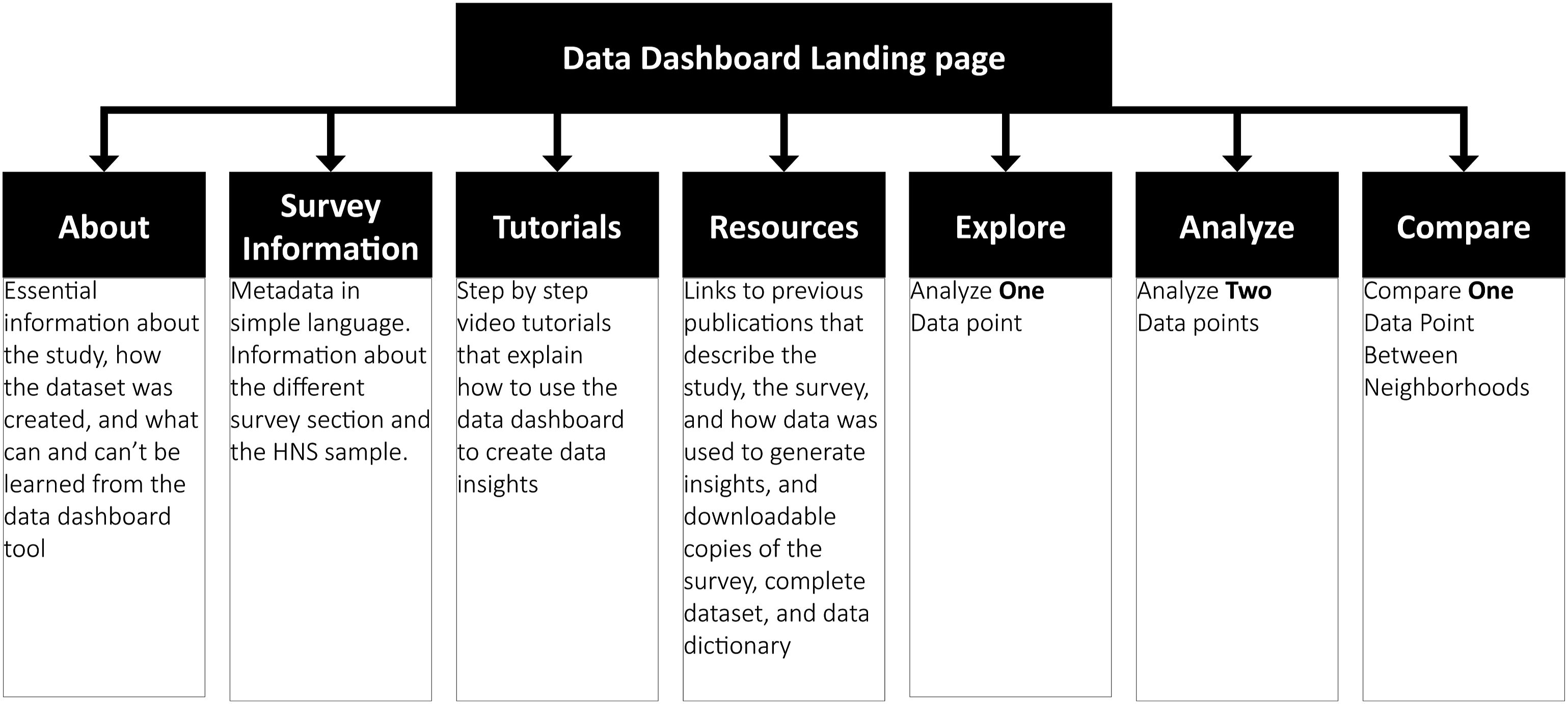
Step 2: Iterative design
The multidisciplinary team of the HNS residents and community partners and research staff identified three preferred data analysis workflows in workshop 2 (Figure 5): (1) The Explore workflow caters to users seeking descriptive statistics, offering flexibility in filtering options; (2) the Analyze workflow facilitates the examination of relationships between two data points through a cross table; and (3) the Compare workflow allows users to assess differences between neighborhoods in relation to a selected data point. While technically accessible from the same location, placing each workflow on different dashboard pages streamlined user interactions. All workflows share a consistent interface, enhancing usability. Users select a survey section, choose a data point, and obtain immediate results. The interface includes pop-up guidance and result descriptions to aid users in analysis and interpretation, refined through iterative feedback from workshop participants. A diagram of the three workflows.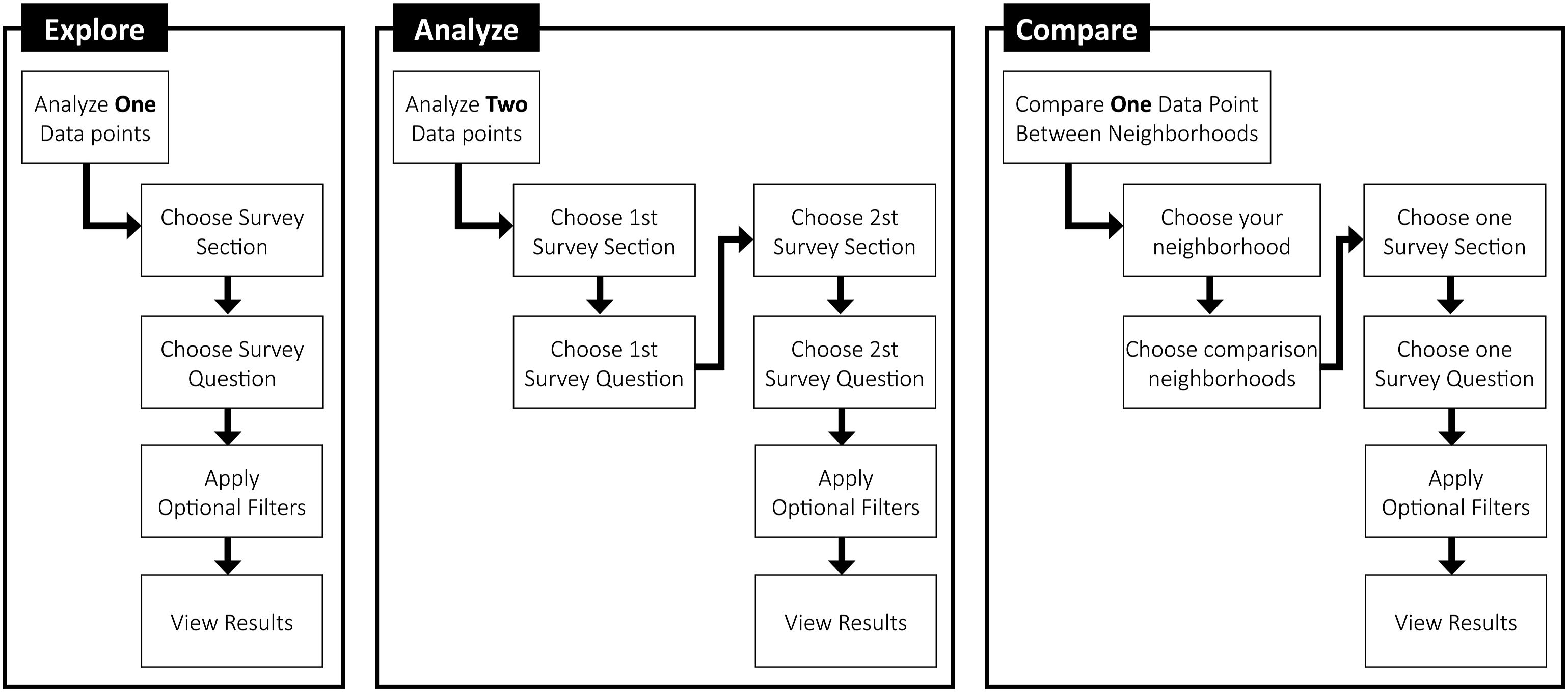
Key insights from workshops underscore critical aspects of user interface development. Firstly, participants expressed a preference for a concise description of the analysis purpose and steps at the top of the page, aiding comprehension of the workflow. Additional step-specific descriptions were desired to guide users through the process effectively. Secondly, participants found pop-up descriptions for survey questions beneficial, enhancing their understanding and aiding selection. Thirdly, users preferred optional access to data filters, avoiding unnecessary choices. Filters were incorporated into a closed tab, ensuring a user-friendly experience. Fourthly, participants emphasized the need for result descriptions clarifying the interpretation of output tables and visualizations. Lastly, users sought result sections that summarized chosen questions and filters for seamless download or printing. Collaborating with residents and community partners played a pivotal role in developing informative resources to support non-technical users in deriving insights from the data.
Step 3: Evaluation
Usage falls into three main categories: Understanding local trends, pulling data for community use, and general learning about the dashboard and its functions. Overall, our initial evaluation shows that the data dashboard has been used by the HNS consortium as well as by independent community organizers and educators.
HNS community partners and resident researchers have used the data dashboard in diverse ways, several examples are: (1) They shared the dashboard with non-HNS affiliated colleagues as potential source of needs assessment data and as a model for sharing community data; (2) they used the data dashboard to collaborate with a non-HNS affiliated academic researcher to develop a grant proposal for a project based in their HNS community; (3) they used that data dashboard for learning about the similarities and differences between neighboring communities for community organizing; and (4) they used the data dashboard to understand and share local data trends during a series of community workshops on power building against anti-displacement. And as a final example, (5) they used the data dashboard to generate insights that were incorporated into an op-ed and a news story. HNS researchers and other academic researchers have used the dashboard to inform grant writing, and educators used it to teach students about statistics relevant to their neighborhoods.
Discussion
This paper presents a timely illustration of employing Participatory Action Research (PAR) methodologies in crafting a data dashboard. Addressing the criticism that urban dashboards can perpetuate social inequalities (Kitchin et al., 2015; Mattern, 2015), we showcase an alternative approach to rebalance power dynamics in data collection, analysis, and representation of social phenomena. Drawing from principles in data inclusion, data literacy, and PAR (Bhargava et al., 2015; Bilandzic and Venable, 2011; D’Ignazio, 2017; Hayes, 2014), this dashboard differs from most other planning dashboards in the following ways: (1) the underlying data is co-created with community partners, meaning the topics and measures of those topics are already tailored to community use; (2) the interface was designed to support the most common and important ways that residents and community partners query, visualize, and used the data for action. The result is a context and place specific urban dashboard that tracks indicators that were chosen by the communities that the data describes and are used by community members to plan for desired change in their living environment.
We offer five lessons from our experience in facilitating and participating in the data dashboard design process that may be of use to other researchers seeking to engage community members in similar processes. We believe these lessons can be of value to researchers working in different domains of implementation such as urban planning, education, health, energy, Urban Informatics (UI), Community Informatics (CI), and Human Computer Interaction for Development (HCI4D).
First, the data dashboard design process required multidisciplinary expertise and a shared understanding and respect for both technical and experiential knowledge. The expertise needed included skills in facilitation, community organizing, data management, UX/UI design, and experiential expertise in how the intended users access and utilize data to inform their activities. We specifically highlight the importance of including the end users in the design process because, as Costanza-Chock argues, there is no substitute for the lived experience of race, class, gender identity, sexual orientation, disability, immigration status, language, age, and so on, which structure variance in user needs (Costanza-Chock, 2020). In the case of the HNS, resident and community partners know which data insights would be valuable for them when making the procedural and policy changes they desire, and which ways of accessing that information would be helpful.
Second, to be able to build on the collective expertise of all group members, there must be processes for trust building and collaborative decision-making. In addition to the PAR facilitation approach described earlier, we also emphasize two other aspects relating specifically to dashboard design. First, aligned with the PAR literature (Cooper et al., 2022), the technical members of the team set aside prior notions of how a dashboard should look or perform, and instead worked collaboratively with all team members toward the end goal of usability for the intended audiences. Second, aligned with the literature on data literacy (D’Ignazio, 2017), the technical members of the team continued to build trust by using an iterative design process, which incorporated recommendations from resident and community members into every iteration of the dashboard, demonstrating that their ideas and needs are valued and addressed. Using an iterative design process also enabled us to start design explorations with a simple baseline mockup, and to slowly add complexity in response to community demand.
Third, designing different access points into (Siew, 2013) data analysis addressed a wider diversity of user needs. While we acknowledge Human Computer Interaction researchers often use design personas to characterize the needs of different users (Cooper, 2007; Bilandzic and Venable 2011; Young, 2021), our team preferred to use the term workflow to acknowledge that the same user might be needing different workflows depending on the task at hand. This concept is aligned with the design justice framework, which aims to create inclusive designs that are fit for the task at hand and not for a pre-design standard type (Costanza-Chock, 2020). During our workshops, resident and community partners illustrated different pathways for accessing the HNS data. Some wanted to access a data point first and then filter it by a pre-selected criterion, others wanted to compare two data points, and others wanted to compare data points between locations. In response to insights from community members about how they would like to access the data, we created three entry points into data analysis that addressed the descriptions from resident and community partners about their workflows to accessing and analyzing data.
Fourth, in alignment with the framework of data literacy outlined by D’Ignazio (2017), integrating descriptions to facilitate the process of looking up data and interpreting the findings was essential in supporting meaning-making. Resident and community partners have previously used the HNS data insights to apply for grants, compare information between neighborhoods, and plan activities targeting specific subgroups of the population that they identified by querying the dataset. Prior to using the dashboard, the HNS partners would get this information directly from the HNS staff member who had accessed the data, conducted the analysis on behalf of the HNS partner, and communicated the finding to the HNS partner. When switching to an automated query system using the dashboard, it was essential to identify what resident and community partners would need in order to follow a data analysis workflow that addresses their research questions. Feedback received during workshops 2–5 was helpful in illustrating which descriptions were needed to make the process of looking up data easily navigable, intuitive, and useful in the sense that it was easy to understand the results. As our intended users included people with a diversity of technical skills, the purpose of providing descriptions was to assist users with no technical background in conducting data analysis.
Fifth, aligned with the literature on data literacy (D'Ignazio 2017), integrating informational resources about the dataset was helpful for both resident and community partners and others in understanding what can be learned from the dataset and what can’t be inferred from a localized survey dataset. Specifically, we provide essential information about the HNS in the landing page and direct to information about the survey and additional resources in following pages. Our resources section includes reference to all HNS reports and publications in order to provide a more detailed account of the HNS and survey tool and how community members have used it to generate insights. We also provided a copy of the HNS survey instrument, a spreadsheet of the dataset, and a data dictionary. Together these materials assist members of the HNS community or the general public in contextualizing their queries in the appropriate context of the dataset and HNS.
We also note four limitations to our account of the HNS participatory data dashboard design process. First, the development and facilitation of the HNS data dashboard workshops was a largely self-contained process, and while we did receive feedback from experienced HNS researchers, we did not have the opportunity to receive constructive criticism on the design of the workshops from colleagues outside of the HNS. Second, we have not yet developed a process to formally evaluate the long-term usability of the data dashboard to community partners. Third, since the data dashboard was developed during the COVID-19 disruptions, participation in the workshops required participants to have access to a computer and Internet service, and have the capacity to be engaged in a remote format. These limitations did not exclude participation in the case of the HNS project, but should be acknowledged in other contexts where there is a risk of exclusion due to unavailable equipment or capacity to participate in a remote engagement format. Fourth, we were able to complete the design process in 3 months because relationships with community partners were previously established. Practitioners and researchers seeking to apply a similar framework must include additional time to identify community partners and establish collaborative processes for decision-making. Lastly, we note that the purpose of the data dashboard is to provide access to HNS data and resources that assist with analysis and interpretation. It doesn’t replace a dialog about how to translate the findings into action which takes place at the HNS Collaborative Data Analysis workshops and in conversations between community organizers. Similarly, while data dashboards and data resources support informed participation in a data-driven society and specifically in decision-making processes, they cannot replace an engaged process for planning actions.
Conclusions
The manuscript describes a Participatory Action Research approach to co-create a community data dashboard with resident and community partners. We highlight key aspects of our approach that contribute to the knowledge of how Participatory Action Research can address data inequalities by practicing data inclusion. First, data service professionals seeking to create a product that will provide data and informational resources to misrepresented resident and community partners must include the end users in all steps of the design process. Second, researchers must design a participatory process that not only centers the voices of community partners, but also shifts the power dynamics so that community partners’ experiential knowledge guides the development of the data product to meet their needs. Community partners hold expert knowledge on how data has been used to benefit or harm their communities and they are best positioned to illustrate what types of data investigations or resources are most needed in their communities. Third, if the product is targeting non-technical users, then the multidisciplinary design team has to create a strategy to support new learners, which might include tutorials, instructional workshops, interactive assistance, and so on.
We hope that this approach and lessons learned provide urban governments with practical guidance on how to work with their residents to create data and data products that stem from resident needs, respond to data inequalities, and strive to improve urban measurement and services via a shared understanding of what needs to be measured and how. Our process relied on the expertise of resident and community partners in how members of their communities access and interpret data. Their creativity, ideas, and insights guided the development of a user experience and interface inclusive of data workflows, visualizations, and informational resources. Dashboard designers taking these steps support data inclusion by increasing the representation of misrepresented populations in the creation of data tools and resources, creating products oriented toward action, advancing data literacy among hard-to-reach audiences, and ultimately including those most affected by data inequalities in the production of knowledge in society.
Supplemental Material
Supplemental Material - Practicing data inclusion: Co-creation of an urban data dashboard
Supplemental Material for Practicing data inclusion: Co-creation of an urban data dashboard by Yael Nidam, Reann Gibson, Rebecca Houston-Read, Marcia Picard, Vedette Gavin in Environment and Planning B: Urban Analytics and City Science
Footnotes
Acknowledgments
We are grateful to all members of the Healthy Neighborhoods Research Consortium for their contributions to the Healthy Neighborhoods Study and to the Robert Wood Johnson Foundation for their generous support. Special recognition is reserved for Professor Mariana Arcaya for her exemplary leadership and invaluable guidance throughout the course of the HNS research. Her expertise and mentorship have been indispensable in shaping both the study and this manuscript. We would also like to thank Professor Andrew Binet and Andrew Seeder for their thoughtful critique and feedback on an earlier version of this paper. Their insights have greatly enhanced the clarity and depth of our work.
Declaration of Conflicting Interests
The author(s) declared no potential conflicts of interest with respect to the research, authorship, and/or publication of this article.
Funding
The author(s) disclosed receipt of the following financial support for the research, authorship, and/or publication of this article: This work was supported by the Robert Wood Johnson Foundation grant number 93875.
Data Availability Statement
The data used in this research paper is available on the website of the final dashboard, and can be accessed through this link: https://hns.mit.edu/datadashboard/. Additionally, we provide the code for creating this dashboard and analysis in this GitHub Repository: ![]() .
.
Supplemental Material
Supplemental material for this article is available online.
References
Supplementary Material
Please find the following supplemental material available below.
For Open Access articles published under a Creative Commons License, all supplemental material carries the same license as the article it is associated with.
For non-Open Access articles published, all supplemental material carries a non-exclusive license, and permission requests for re-use of supplemental material or any part of supplemental material shall be sent directly to the copyright owner as specified in the copyright notice associated with the article.