
Abstract
COVID-19 dashboards with geospatial data visualization have become ubiquitous. There is a growing sense of responsibility to report public health data pushing governments and community organizations to develop and share web-based dashboards. While a substantial body of literature exists on how these GIS technologies and urban analytics approaches support COVID-19 monitoring, their level of social embeddedness, quality and accessibility of user interface, and overall decision-making capabilities has not been rigorously assessed. In this paper, we survey 68 public web-based COVID-19 dashboards using a nominal group technique to find that most dashboards report a wealth of epidemiologic data at the state and county levels. However, these dashboards have limited emphasis on providing granular data (city and neighborhood level) broken down by population sub-groups. We found severe inadequacy in reporting social, behavioral, and economic indicators that shape the trajectory of the pandemic and vice versa. Our survey reveals that most COVID-19 dashboards ignore the provision of metadata, data download options, and narratives around visualizations explaining the data’s background, source, and purpose. Based on these lessons, we illustrate an empirical experiment of building a dashboard prototype—the COVID-19 Economic Resilience Dashboard in Arizona. Our dashboard project demonstrates a model that can inform decision-making (beyond plain information sharing) while being accessible by design. To achieve this, we provide localized data, drill-down options by geography and sub-population, visualization narratives, open access to the data source, and accessible features on the interface. We exhibited the value of linking pandemic-related information with socioeconomic data. Our findings suggest a pathway forward for researchers and governments to incorporate more action-oriented data and easy-to-use interfaces as they refine existing and develop new information systems and data analytics dashboards.
Introduction
The rise in geospatial data availability in cities has encouraged authorities to invest in ways to explore, operationalize, and visually communicate vast amounts of information. There has been a growing trend of public-facing dashboards as instruments that policymakers use to integrate and visualize multi-agency data to monitor and respond to emergency events and organizational performance issues (Lee et al., 2015; Mattern, 2015). Dashboards are software tools enabling information visualization and data storytelling through maps, graphs, diagrams, indicators, and other interactive widgets, consolidated and arranged on a single screen or a webpage (Few, 2006; Rojas et al., 2020). Dashboards are dynamic visualizations because they are programmed to update as new data are released (Batty, 2015), helping the users track and compare over time and space to support real-time decision-making. The COVID-19 pandemic triggered a deluge of data dashboards that visualize cases of infection and fatalities over time and space. These dashboards emphasize the importance of spatial thinking and the effectiveness of geospatial technologies in understanding Covid-19 (Dangermond et al., 2020; Praharaj et al., 2022). However, all these dashboards are not created equal—in their layout, structure, visual flair, content, and navigability, nor do all communities access the data equally (Fareed et al., 2021; Lan et al., 2021). For all the COVID-19 data, graphs, and maps available to the decision-makers, the global response has been chaotic, inconsistent, and in places disastrous, implying that the mass visualization of inputs does not necessarily lead to better outputs (Budd et al., 2020).
Stephen Few (2006) defines dashboards as a “visual display of the most important information needed to achieve one or more objectives.” Dashboard embodies the many ways of visualizing a variety of data that is representable, contextualizable, and intelligible to a non-expert target audience and can be used as a decision-support tool by governments, corporations, urban stakeholders, and communities (Batty, 2015; Kitchin, 2014; Mattern, 2015). A Scopus database search within article titles and abstracts reveals that 321 documents were published with the “COVID-19 dashboard” keyword as of 5th December 2021. The core focus of these projects has been on providing information to the public, enabling place comparisons, and monitoring public health scenarios. Ivanković et al. (2021), in an assessment of 158 COVID-19 dashboards, found that while these visualizations overwhelmingly reported public health indicators (e.g., cases, deaths, and hospitalizations), only a handful revealed the pandemic’s impact on the social and economic profile of communities. Lack of local and disaggregated data (by age, sex, socioeconomic status, and ethnic or racial groups) restricts dashboards’ utility for decision-making purposes and poses a risk of the public not being informed about these critical (and modifiable) differences. Furthermore, Pietz et al. (2020) state that less than 10% of dashboards explicitly stated the purpose and intended user, which raises questions about their efficacy. Previous research also shows the underuse of explanatory narratives in the widely used single-screen dashboards (Chiang, 2011) that are proven to clarify complex data for less-data-savvy users to use the information in their decision-making confidently. Overall, existing literature points to the need for dashboards to explore the connections between public health indicators and socioeconomic patterns to improve healthcare response mechanisms (Budd et al., 2020; Fareed et al., 2021; Lan et al., 2021; Pietz et al., 2020). Further research is necessary to examine the factors that make dashboards more fit for purpose and actionable in the context of COVID-19 and in general.
The flurry of covid-19 dashboards is somewhat a technological response to resilience challenges at a time when we are experiencing that existing social and policy mechanisms are insufficient to deal with new kinds of global change. However, dashboards that communicate only epidemic indicators while being disconnected from social and economic contexts are less likely to influence change in how our communities consume data to prepare for and respond to emerging shocks (Crepaz and Arikan, 2021; Dangermond, 2020). While they might still be useful tools for policymakers, their potential for wider public dissemination to induce behavioral change and situational awareness among communities is limited. This study adopts a novel approach to emphasize the role of social learning (Coe et al., 2001), engaging with socioeconomic aspects of the pandemic to organize and inform communities. Our hypothesis is that disasters may provide windows of opportunity to transform traditional response mechanisms and build new narratives that the enhancement of community-based knowledge networks through tools such as data dashboards will provide pathways to a stronger and more effective model of community resilience (Sharifi et al., 2021; van der Voorn and de Jong, 2021). Our research particularly focuses on providing a socially embedded data and visualization interface for augmenting the technological capacity of communities to comprehend rapidly evolving issues and address them in a timely and efficient manner.
This research advances the ongoing innovations in data analytics and urban science to shape community-focused decision-support systems (Kourtit and Nijkamp, 2018; Kitchin, 2014; Mattern, 2015; Pettit et al., 2017) to enable evidence-based and near-real-time decision-making. This work is grounded in the fact that building community resilience in response to emerging challenges requires a combination of timely data at the local scale (Haraguchi et al., 2022) and easy-to-use decision-support tools (Batty, 2015) that can inspire and organize local communities to initiate local action. Drawing on the lessons learned from the critical literature, we outline a community-driven approach to identify pressing resilience issues and deploy our dashboard tool on targeted areas for maximum community benefit. This approach addresses important gaps highlighted by Pettit et al. (2017) who suggested that dashboards often fail to engage with local issues as they provide high-level executive data and are often designed as a general instrument for conveying a range of discrete information without a clear delineation of expected users. Our research emphasizes a tool that focuses on a single aspect of economic resilience for tangible outcomes while outlining how digital data can be collected, processed, and disseminated through “public dashboards” during the event of a disaster to enable local communities to gain critical knowledge, decipher complex evolving issues, and prepare responses to the current and future crisis.
This article explores 68 publicly available COVID-19 dashboards to identify whether the data presented over these dashboards were socially embedded and actionable to a diverse target audience. The goal was to examine which design elements make some dashboards easier to navigate, more inclusive, and more actionable than others. Based on the lessons from the case study analysis, we developed a dashboard prototype: Economic Resilience Dashboard that brings together multi-agency data to capture the links between the COVID-19 pandemic and the local economic and social dynamics in Arizona, US. The dashboard prototype demonstrates a model that can inform decision-making (beyond basic information sharing) while being accessible and actionable by design. As Mattern (2015) argues, data generated from complex systems cannot be understood without epistemological clarity, and as most of the data on COVID-19 dashboards is sanitized and treated, we investigate the broader knowledge and policy implications of these technological framing of public health crisis (Crepaz and Arikan, 2021). This study’s findings culminate into a set of guidelines and recommendations for dashboard designers to implement robust data visualization tools that are fit for use—meeting the specific information needs of targeted stakeholders.
Critical assessment of the COVID-19 dashboards
We assessed a sample of 68 publicly available web-based COVID-19 dashboards across the States in the US, Canada, and several other countries designed to help people better understand the evolving scenarios of COVID-19. The principal criteria for the selection of the dashboard were the authoritativeness of the projects, the diversity of actors involved in their development, and openly available tools accessible to a wide range of users. The first set of dashboards selected for this assessment is developed and maintained by the US States. These projects provide authoritative information for a broad range of stakeholders, supporting both policy actions and general awareness among communities. The samples also include renowned non-profit sector-generated dashboards (New York Times dashboard (NYTD), COVID Act Now (CAN), and The Atlantic’s COVID Tracking Project) and academic-sponsored projects like the Johns Hopkins Dashboard. These projects are also open and authoritative nonpartisan solutions attracting a diverse audience. Globally, the survey focused on the WHO Coronavirus (COVID-19) Dashboard, and several other state-sponsored projects in Canada and European countries. The list of dashboards assessed is presented in Supplementary Table S1.
We find that 62 out of the 68 dashboards (91.18%) reported data at the county/district level, and all the assessed samples had state-level information. Just over 16% (11/68) of the dashboards showed city-level data, and none had numbers for the metropolitan statistical areas. Our analysis of COVID-19 dashboards further reveals that 9.24% (6/58) of the samples provided data going down to census tracts or postcode level, and none made pandemic statistics accessible for US public use microdata areas (PUMA). These trends highlight that dashboard makers primarily focus on providing macro-level aggregated data with minimal emphasis on granular data dissemination at the scale of local communities and neighborhoods. The findings are important as previous research (Fareed et al., 2021; Ivanković et al., 2021; Pietz et al., 2020) established that local data provision significantly improves public health decision-making abilities and dashboards’ actionability.
Characteristics of the assessed COVID-19 dashboards (N = 68).
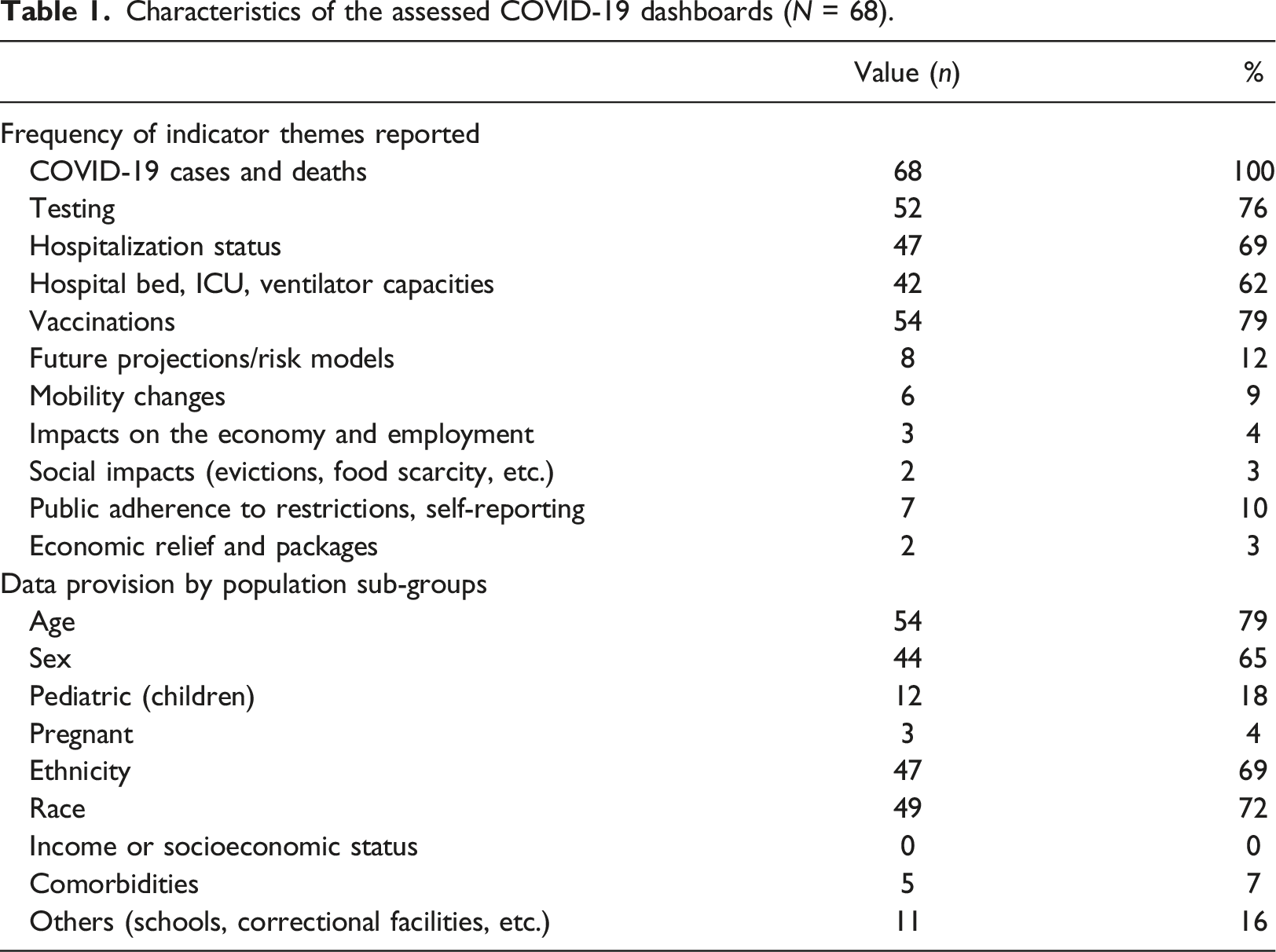
Table 1 summarizes the COVID-19 dashboard assessment of the provision of information by population sub-groups, indicating to what extent these tools offer disaggregation options. We found that the 68 dashboards offered eight types of breakdowns that allow users to investigate data by population sub-groups. Of these, the most common breakdowns included age (54/68, 79%), sex (44/68, 65%), ethnicity (47/68, 69%), and race (49/68, 72%). Although less frequently reported, other breakdowns included pediatric information (12/68, 18%) and schools and correctional facilities (11/68, 16%). Only 4% of dashboards (3/53) provide granular data on pregnant women and comorbidities with preexisting health conditions. None of the dashboards present data breakdowns by income or socioeconomic status. The analysis reveals that many COVID-19 dashboards, including those developed by Connecticut, Illinois, Iowa, Kansas, Alaska, and North Carolina, do not provide disaggregation options for viewing population sub-group level data. Kitchen (2014) argues that dashboard projects of this nature often translate into technological framing of a problem; rather, they should be designed as a humane solution that is cognizant of the context, people, and underlying unequal societies that these tools address.
We assessed the design and functionality of the dashboards (n = 68) and analyzed the data (Supplementary Figure S1) to indicate the commonly used visualization techniques and the features that characterize an effective dashboard. The analysis shows that over one-third (28/68) of dashboards had a single-screen view, where all the data visualization is fitted on a set view with no option for up-and-down navigation or scrolling. The more favorable option was a multiple granular view dashboard interface which allows users to navigate across pages and scroll up and down over the webpage. The second option provides more space to align data visualization and integrate textual narratives alongside visuals. 54% of the dashboards (37/68) used narratives to describe the visualizations. The data download option—an essential dashboard element found missing in over half the dashboards (33/68). Similarly, 60% of the samples (41/68) did not provide metadata that describes critical information, such as the purpose of the data, time and date of creation, data quality, source, and the process used to create and explore the data. Most dashboards (48/68, 71%) included some user interaction element. For example, the New York Times dashboard provides dynamic click-to-filter options, where clicking on any chart or map creates a quick filter that applies to all dashboard data, delivering new insights instantly. Another interesting finding was that a high share of dashboards (36/68, 53%) did not use a color palette that meets accessibility standards. Less than half of these tools (31/68, 46%) used icons and menus that allow users to navigate data seamlessly. These are some of the fundamental elements of inclusive and accessible dashboards (Batty, 2015; Few, 2006). We also learned that 85% (58/68) of the samples presented visualizations in distinct sections to guide users through the data, an increasingly popular storytelling feature (Elias et al., 2013; Knaflic, 2015) in dashboard design practice.
Methods and approach for the Economic Resilience Dashboard development
Building on the lessons learned from the COVID-19 dashboard assessments in the previous section, we categorize the dashboard design observations and development challenges. We further identify approaches to address the issues and challenges scientifically and technically.
The primary challenge with dashboard design we found is that higher-level aggregated data is less compelling and actionable. Broad data may provide interesting insights, but most agencies and groups interacting with such data lack the authority or responsibilities to act at that level. Our goal was hence to provide granular local data to assist local stakeholders in identifying key issues and solutions. As Pettit (2017) argues, integrating micro-level real-time data can assist executives and citizens in responding to disruptions in a timely and efficient manner. We collected economic data across spatial scales, the State, County, metro areas, and cities on several core indicators and sub-measures (Supplementary Table S2) that can quantify and visually capture the immediate economic loss and the policy-induced social processes during the pandemic. We also offer data segregation by population sub-groups (e.g., race, ethnicity, and education) that enlighten users about the unequal effects of the pandemic. Another design issue for at-a-glance dashboards is the lack of ability to explore time-series information (Praharaj and Wentz, 2022) and data segregation to drill into the history of data metrics (Kitchin, 2014). We address this limitation by providing time-series data at various frequencies for users to examine weekly, monthly, and annual trends.
Our dashboard evaluation indicated the issue of limited background information and interpretation of data available over the single-screen dashboards, working as a barrier for many users. We tackle this fundamental design challenge by adopting a multiple-view scrolling webpage dashboard allowing more space to describe the contextual information behind the data and lay visualizations in clearly defined sections that improve users’ understanding and navigability.
The previous section noted an acute lack of socially embedded data provided through the COVID-19 dashboards as they overwhelmingly focused on reporting public health data. This approach limits the authority’s ability to pinpoint disproportionately affected communities and establish connections between the pandemic and social vulnerability. Our dashboard emphasizes novel factors, including changes in earnings, delayed medical care, evictions and foreclosures, and food shortages that help communities visualize the interaction between economic changes and social stress.
We designed a four-layer dashboard technical architecture (Figure 1) seamlessly connected to produce the dashboard's visual analytics interface. The first, database layers act as an edge-level device, providing secure data feeds. We connected with the servers of data providers through APIs to retrieve published historical time-series data in JSON data-interchange format. Specific processing and parsing were applied on machine-readable datasets in the controller logic to extract the relevant variables within the dataset and to render it into the real-time visualizations of the dashboard. In the integration layer, each file was stored locally, new data was refreshed as it became available, and we simultaneously used ArcGIS Pro and Tableau Business Intelligence (BI) software for layer joining and blending to match features and geographies to ensure the consistency of datasets from different sources. The third layer provided the platform for creating various maps, charts, widgets, and navigation menus assembled into the dashboard. We published the dashboards to a server to generate JavaScript codes for deploying the dashboard visualizations to a web page https://resilience.asu.edu/economic-resilience-dashboard. The user interface (fourth layer) provides the output view to navigate different metrics visualizations. We have optimized the dashboard for the visualization to adjust on both computer/laptop and mobile devices, and the interface allows users to enter full-screen view mode for each section for deeper dives into the data. Technical architecture and workflow for the Economic Resilience Dashboard development.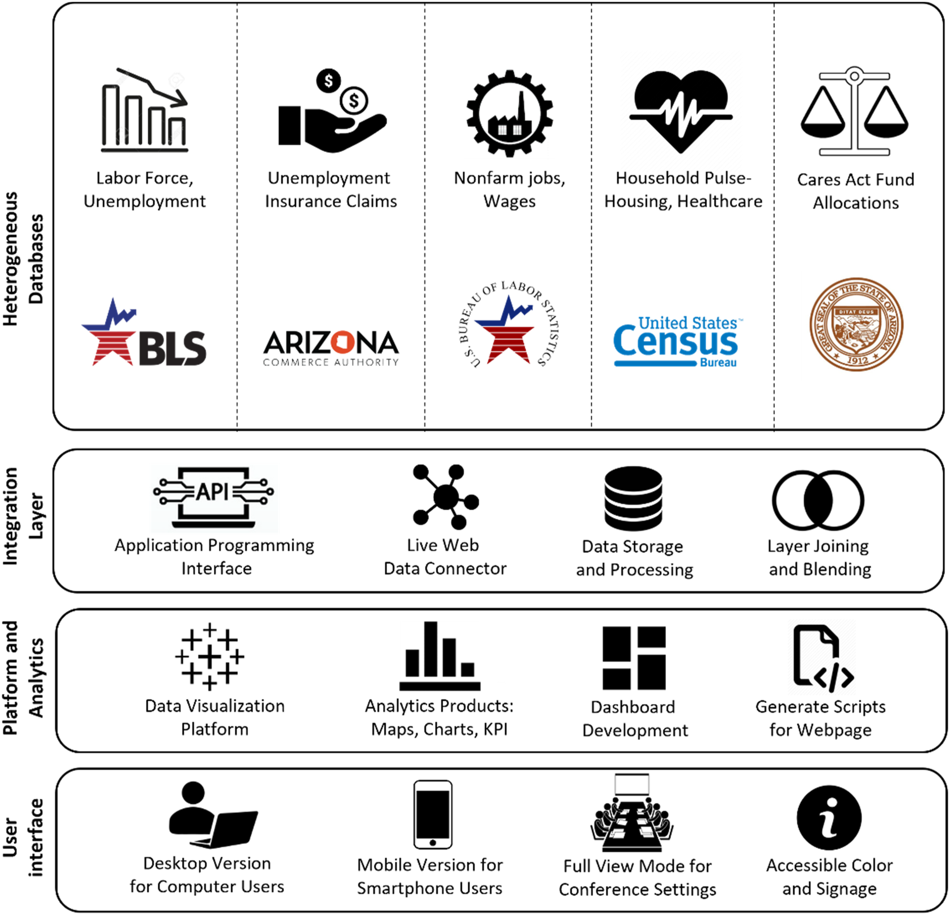
Results
Overview and analysis of the Economic Resilience Dashboard
We present an overview of the different modules, sections, and infographics of the Economic Resilience Dashboard tool in Figure 2. The dashboard tool supports communities, planners, non-profit responding organizations, and policymakers to explore and query data to formulate questions and examine responses. They can evaluate issues like the monthly change in the unemployment rate in a County, or which sector experienced the most job loss in the last quarter. The graphical user interface adheres to the Model-View-Controller (MVC)—a three-part design pattern, dependent and connected, that allows the controller to receive handler inputs. It manages and sends a query to the model, which contains the data and the rules for carrying out a specific task. The interface provides users with a set view highlighting the most important trends, and detailed information can be visualized through drill-down buttons, navigation panels, map-based selection and filtering, and timeline sliders placed in strategic locations across the interface. The dashboard tool gives users the capability to perform historical data analysis in over 15 counties, seven metropolitan statistical areas, and 91 towns in Arizona. The dashboard is hierarchically organized into five different modules (see Supplementary Figures S2–S5 in Supplementary Materials) to enable a connected dashboard environment to be navigated across indicators from summary-to-detail exploration within a single system. The interface ultimately addresses the characteristics of exploratory dashboards (Kitchin, 2014). A screenshot of the Economic Resilience Dashboard. Source: https://resilience.asu.edu/economic-resilience-dashboard.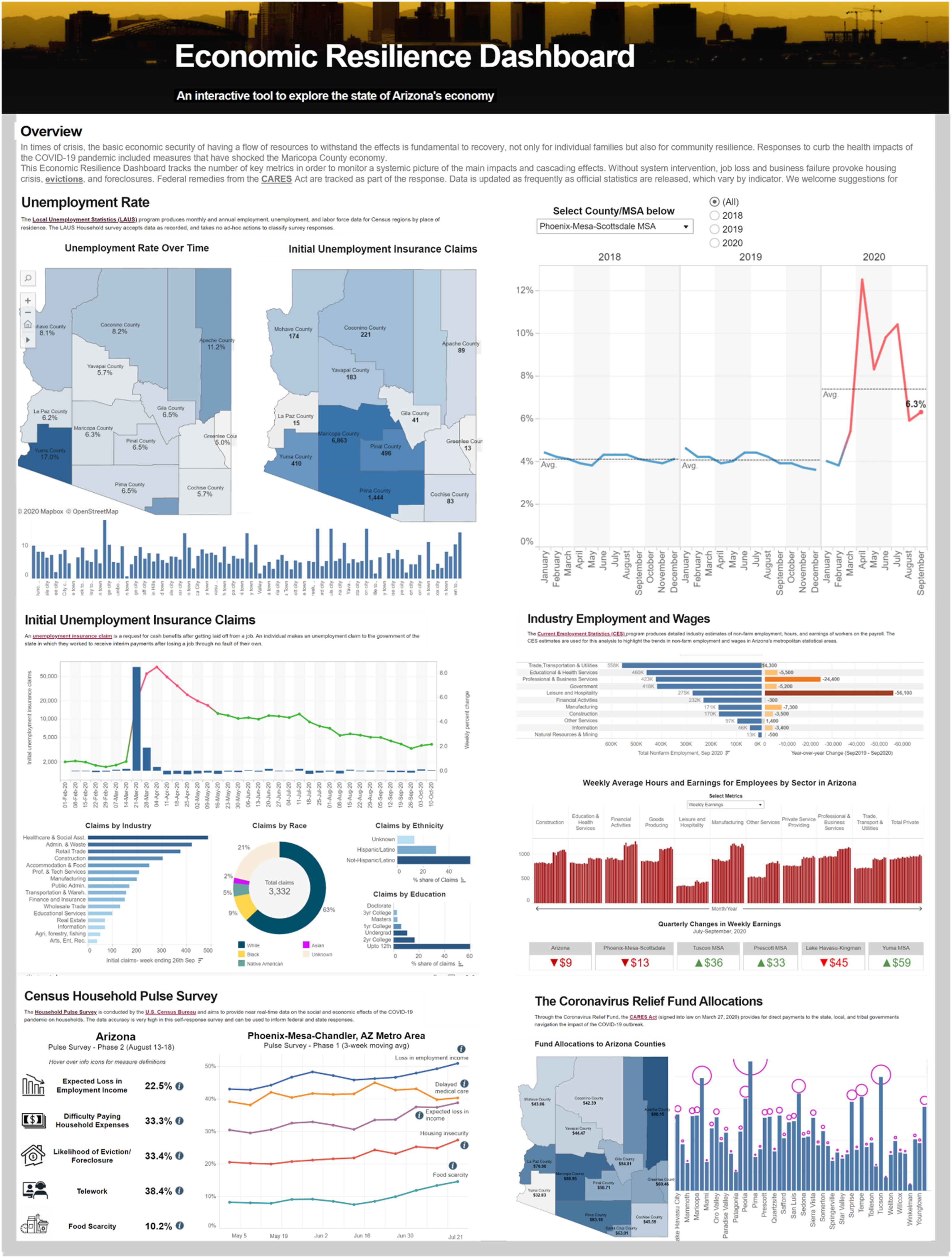
The analysis presented in the dashboard links the economic trends with demographic information (e.g., race, ethnicity, and education) to examine equity issues around the COVID-19 impact on communities. The tool integrates weekly data from the Census household pulse survey, including households’ perceptions of loss in employment income, difficulty in paying household expenses, housing insecurity and the likelihood of eviction, food scarcity, and delayed medical care. Such data help users understand correlations and interdependencies between COVID-19 and social dynamics. The best practice design approach to information dashboard design (Few, 2006) is used to integrate a range of charts, maps, and big number KPIs to communicate and visualize the data. Line charts in our dashboard analyze indicators with historical time-series information. Donut charts visually capture proportional data such as the share of unemployment insurance claims by different racial/ethnic groups. The butterfly charts capture two-dimensional data (sector-wise total nonfarm employment and annual change in jobs generated by these sectors) and bar charts visualize categorical and continuous datasets (e.g., unemployment rate by cities). The dashboard also has KPI text indicators to highlight key facts and outliers, such as which county shows positive changes in unemployment in the last month or quarterly changes in wages across regions.
The Economic Resilience Dashboard placed significant emphasis on map-based analysis to provide users with a spatial understanding of how the pandemic impacts different regions. We follow the approach of geospatial BI dashboards (Badard and Dubé, 2009; Presthus and Canales, 2015) to integrate spatial querying and filtering tools in our dashboard. The map area selection commands enable users to select different geographic units, dynamically changing the views over charts, graphs, and numbers. An introduction for the overall dashboard was provided first, followed by the background descriptions for each of the five sections to inform users about why we chose those indicator data, how they help us measure what we are trying to measure, and the sources of information. The dashboard provides links to the original data repositories to maintain transparency. The tool supports the download of maps, visualizations, and underlying datasets. Young and Kitchin (2020) found that an explanation of the history and epistemology of data and the provision of data and chart download play a crucial role in engaging users to create a participatory environment over dashboards.
The first section of the dashboard presents the visualization output for the unemployment rate and labor force data (see Supplementary Figure S5). It provides a snapshot of how a combination of maps, various types of charts, and indicator KPIs were used to illustrate the changing state of the Arizonan economy while flagging key issues. Standard navigation tools, including a time slider and dropdown menus, were deployed to show historical unemployment data since 2018 visualized over varying geographic scales ranging from the State and Counties to the level of metropolitan areas and individual cities in Arizona. These tools allow users to select and visualize data for a defined timeframe and geography. KPIs were used strategically to highlight which regions were the worst hit and the ones that showed remarkable resilience to the COVID-19 economic shock. Tooltips were used throughout the visualizations allowing users to view background and contextual information, definitions, and description of the data when hovering over dashboard elements. The line chart reveals the striking impact of the pandemic on the unemployment rate in most places, including in the most populated Phoenix-Mesa-Scottsdale metropolitan area, where the unemployment rate shot up to 13.5% in April 2020 from 4% in February of the same year. The data allows researchers to investigate further questions, such as the linkage of these unemployment trends with government policies, including vaccination, lockdown and reopening, social distancing orders, and the COVID-19 Economic Impact (Stimulus) Payments.
The second section shows data on weekly unemployment insurance claims highlighting which geographic regions, industry sectors, and socioeconomic groups received the most filings, and the changes observed every week (see Supplementary Figure S3). The maps and charts in this section and throughout the dashboard were built with color palettes that conform with accessibility standards (Healy, 2018) to engage with diverse users, including people with color blindness. Interactive features are embedded, which allow dynamic changes to multiple views and indicators when users select a county from the dropdown menu. The map highlights how the unemployment insurance claims in Maricopa County shot up from 1003 claims in February last week to over 48,000 in the first week of April 2020. The line chart establishes an apparent relationship between different waves of infections and related increases in claims by individuals due to job losses. A significant finding is that specific industries have emerged as most vulnerable to the COVID-19 effects. Workers from five industries—accommodations and food services, healthcare and social assistance, retail trade, administration, and manufacturing—received over 250,000 claims in Arizona during the initial COVID-19 outbreak (April to May 2020).
Section 3 of the Economic Resilience Dashboard tool highlights nonfarm employment trends, monthly changes in employment by industry, and weekly average hours and wages/earnings of workers on the payroll (see Supplementary Figure S4). A significant drop in nonfarm employment was found during COVID-19, with a loss of 244,300 jobs between February and April 2020. The butterfly chart showing the employment change by sector points out that the leisure and hospitality sectors lost an overwhelming 138,000 jobs during that period, followed by 34,000 job losses in trade, transportation, and utilities, and 28,000 jobs in education and health services. While jobs were lost across sectors as an effect of COVID-19, the bar chart analysis suggests a trend of increasing wages/earnings during the pandemic. The dashboard also provides BAN (Big Ass Number) indicators to draw attention to the regions showing the most significant gains and losses in employment and earnings. A BAN is a big number meant to attract attention from end-users and is popularly used in business analytics dashboards (Badard and Dubé, 2009). The dashboard interface shows BANs as bold, big, and colored in a way that makes users notice them.
The last two sections of the dashboard (see Supplementary Figure S5) explore the linkage and impact of the COVID-19 pandemic with the socioeconomic profile of communities. We visualize the weekly Census Household Pulse Survey data from the US Census Bureau (Schanzenbach and Pitts, 2020) to show the social and economic impacts of the COVID-19 pandemic on households. The dashboard visualization reveals severe issues; over half of the households surveyed in the Arizona and Phoenix metro area reported some form of loss in employment income by July 2021. Nearly 40% of the households faced a delay in accessing medical care in the State. Over a quarter of the households faced housing insecurity amidst the first wave of the pandemic. This analysis of the Census data also indicates how resilient our communities are and their ability to reconstruct and recover through the economic shocks, as our data suggest consistent improvements in the economic scenario since the relaxation of COVID-19 policies. The analytics on CARES Act fund allocations data, too, is a classic measure of the policy-induced dynamic ability of the economy to recuperate from disruptions through financial stimulus from the governments and donors. This dashboard section provides intuitive icons (Pettit et al., 2017) placed in strategic locations of the web interface for end-users to hover over the icons to view definitions and explanations of keywords (e.g., housing insecurity, food scarcity, and the likelihood of evictions).
Usability assessment of the dashboard
We performed a comprehensive evaluation experiment to understand how the dashboard meets the users’ needs and to determine future research and development priorities. We designed a set of usability metrics for assessing the dashboards based on established literature (Dowding and Merrill, 2018; Forsell and Johansson, 2010; Nielsen and Molich, 1990). User ratings on a five-point scale were obtained on these metrics through an online questionnaire survey (O’Brien and Cairns, 2015) with 30 survey participants. A detailed note on the participant backgrounds and recruitment process is outlined in Supplementary Material, Page 11. The first set of questions focused on assessing the suitability of indicators used in the dashboard and the overall clarity of understanding or ease of grasping the information presented in various sections of the tool. Lan et al. (2021) and Kitchin (2014) in their dashboard studies highlighted that user experience and engagement over visual dashboards are largely influenced by the nature of metrics provided and the clarity of information for a range of users. The second round of questions delved into the navigability and ease of data exploration (Letouzey, 2012) as well as the visual and aesthetic appeal of the various maps, charts, and widgets presented in the dashboard. Based on evidence from earlier studies by Pettit et al. (2017) and Fareed et al. (2021), we included questions to measure the users’ level of trust in the data sources used in the dashboard, the interactivity of different visualization elements, and whether the dashboard offers new knowledge and novel understandings to users. The last set of questions assessed the usefulness of the dashboard for decision-making for various user groups and based on the experience whether the users would recommend the tool within the wider community for extensive dissemination. We included these metrics based on previous studies (Batty, 2015; Kourtit and Nijkamp, 2018) that found dashboards that are actionable and useful for decision-making purposes are more likely to be used by the community.
Figure 3 provides the results from the dashboard usability survey, where experts provided one to five ratings on a set of questions. A low rating of one—two suggests negative sentiment, whereas a higher four—five rating indicates a significantly positive opinion. A rating of three would mean a somewhat neutral response. We find that overall, 88% of respondents rated 4 to 5 indicating very high suitability of the indicators presented over the dashboard and that the metrics/themes adequately capture the critical components of the evolving economic scenario in Arizona during and post-pandemic. In response to Question 2 on the clarity of understanding, just over 70% rated 4–5, signaling that the dashboard provides information that is easy to understand, and digest. A sizeable 23% of respondents assigned a rating of three, taking a neither-agree nor-disagree positioning on this question. 74% believed the dashboard is easy to navigate and over 80% positively opined on the visual and aesthetic appeal of the data representation. 76% of the experts reposed a high level of trust in the data used for dashboard analytics as well as 92% suggested that the dashboard offers new knowledge to advance resilience thinking. Nearly 87% of survey respondents found that the dashboard is highly interactive and engaging, and an equal share would recommend the tool to their colleagues and community. A modest 63% believed that the dashboard is useful for decision-making. However, one-third of the respondents did not strongly agree with the question (providing a 3-point rating) indicating that further work and research are required to make the dashboard actionable. The usability ratings are further analyzed by the job roles and sectors represented by the respondents in Supplementary Figures S6 and S7 (pages 11–12 in Supplementary Material). Overall usability ratings (N = 30) on the Economic Resilience Dashboard.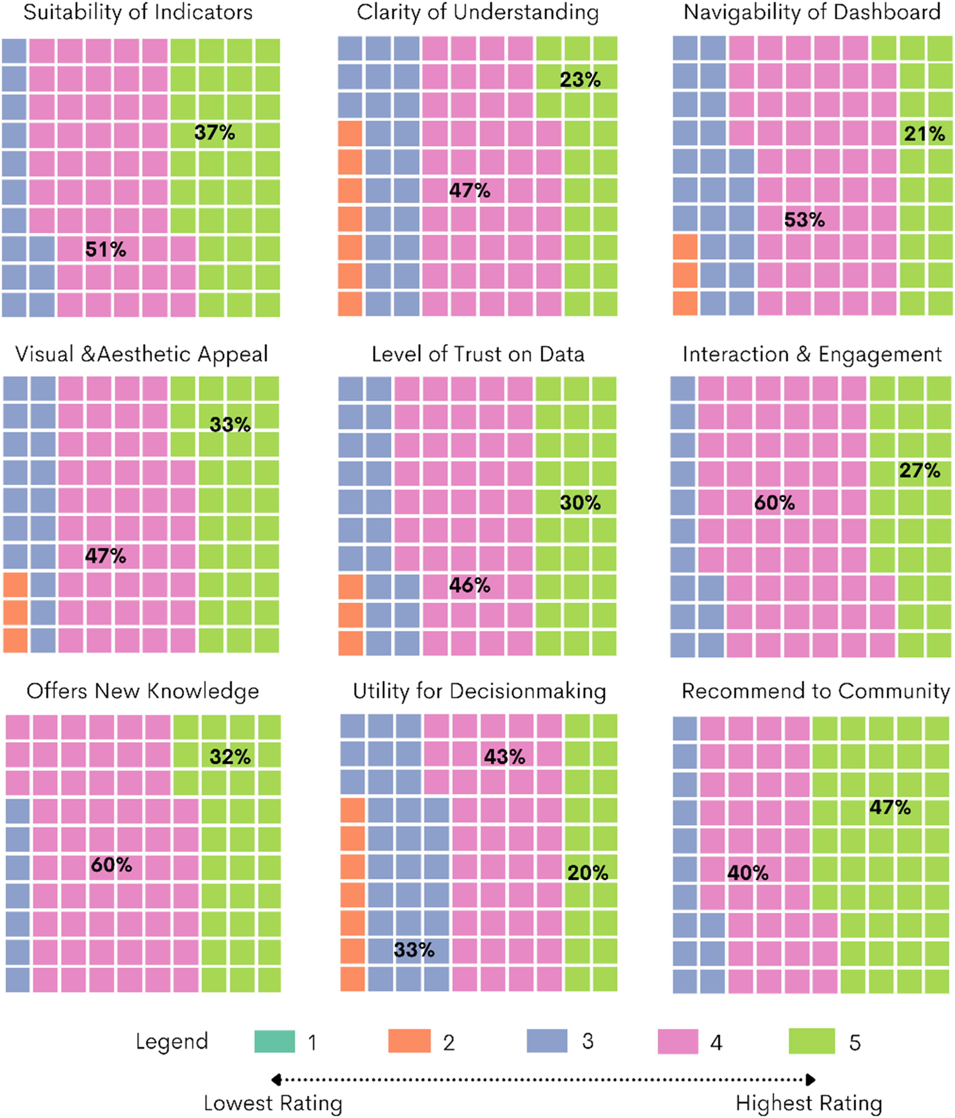
Discussion and findings
This paper has examined and consolidated how public data can be collected and visualized through information dashboards and novel interaction techniques. We assessed the state of the art of public web-based COVID-19 dashboards in the US and worldwide to identify standard features, indicators, data granularity, and the design and functionality of these tools that make them engaging and actionable. We developed the prototype of the Economic Resilience Dashboard in Arizona, drawing on the lessons learned from the global dashboard review. The findings indicate that the COVID-19 dashboards ultimately share a common aim: to serve as both a communication tool and a decision-support system to respond to the COVID-19 pandemic. However, we find the approach to dashboard development varies from case to case in terms of their indicator selection, the geographical scale of data, granular data provision by population sub-groups, and the functional elements on the interface. We learned the common features that these visualization tools display and the elements that distinguish effective, more actionable, and inclusive dashboards from others. The study highlights that while there is no single approach to dashboard design, several aspects are critical for the successful application of such technologies, explained in the following paragraphs.
Traditional information design textbooks define dashboards as a single-screen representation of various metrics (Few, 2006). While at-a-glance dashboards do offer users a span of control over a large amount of data, our analysis reveals that the COVID-19 dashboards are revolutionizing the design approach. We found that 57% of the dashboards were built using a multiple-view scrolling webpage format (e.g., New York Times and California State COVID-19 dashboards) against 43% of projects sticking to the traditional single-screen layout. At-a-glance dashboards show overall underuse of explanatory narratives (due to limited space on the interface), which are proven techniques for clarifying complex information for end-users, making them motivated and confident in using the data in their decision-making (Ivanković et al., 2021). A more extended viewing area on the multiple-view dashboards, such as the one provided in the Economic Resilience Dashboard, allows laying visualizations in distinct sections, building narratives around the maps, graphs, and charts to engage visitors, and attract them to spend longer on the site (Sarikaya et al., 2018). The custom-made multiple-view dashboard design approach is emerging much more robust than the standard single-screen layout in improving interpretation and storytelling, reducing cluttering of information and widgets, and leading to an overall improvement in delivery and communication.
Existing literature established that data communicated over dashboards are not always neutral and value-free, independent of external influence, and always treated and engineered before sharing (Batty, 2015; Kitchin, 2014; Mattern, 2015). This study found that while COVID-19 dashboards reveal a broad set of epidemiological data (e.g., cases, deaths, hospitalizations, and vaccinations), they also in several cases hide critical data on population sub-groups, including ethnicity, income status, and comorbidities. There is also a severe gap in reporting social, behavioral, and economic impacts and interdependencies with the COVID-19 pandemic. Our findings are consistent with previous research (Lan et al., 2021) that noted without estimating and sharing data about meaningful population sub-groups, communities are at risk of not being educated about these issues. We find that the provision of segregated local data and data breakdown options over public dashboards offers novel opportunities for exploring interrelations between epidemiological trends and social determinants (e.g., economy and unemployment, behavioral responses to government policies, and equitable recovery).
Inclusive design strategies determine the credibility and trustworthiness of dashboards. As Kitchin (2014) suggests, dashboards act as translators rather than mirrors, and it’s the designers who frame how data are visualized and thus what the user can see, what questions can be asked, and how the answers are displayed. We found that inclusive and convincing dashboards explicitly describe what data they choose, justify their selection, and provide a point of truth access to the data sources. Contextual information, metadata attached to visualizations, links to open data repositories, and options for downloading maps and charts over dashboards provide clarity and transparency while encouraging replicability and iterative improvements in outcomes. Our review suggests that more than half of the State dashboards in the US failed to recognize these elements, indicating the need for more transparency in public reporting of pandemic-related data. We demonstrate a range of inclusive design elements in the dashboard tool, including the use of an accessible color palette, info icons and signage, storytelling with clear sections, and data download menus, which improves community engagement, accessibility to a range of users, and serves to leverage the two-way communication potential of dashboards. Further research could explore the development of uniform standards to guide dashboard designers across States and Countries to produce inclusive and trustworthy data tools and bring uniformity to public health data reporting.
The scientific novelty of this work advances the COVID-19 dashboard literature beyond technological or epidemiologic framing of data dissemination (Fareed et al., 2021; Shankar et al., 2021; Solis et al., 2021; Wang et al., 2022) to discourses around socially embedded participatory visualizations (Beheshti, 2020; Hippala, 2020; Lock et al., 2020). From identifying the qualities of actionable dashboards through expert opinion surveys to defining the data metrics and assessing the usability of the tool through the engagement of local leadership, this research explored the boundaries of user community-focused dashboards to meet pressing resilience challenges. The success of our dashboard project is reflected in the fact that leaders cutting across job roles and sectors agreed that the tool provides novel understandings of the evolving economic and social scenario during and post-COVID-19. Furthermore, the high usability ratings on indicators presented over the dashboard and positive experience with the interactivity of visualization elements reinforce the value of engaging local stakeholders in defining the scope of dashboard tools and grounding the metrics selection process within current debates that impacts the communities directly. As Dangermond et al. (2020) suggest the proliferation and growth of GIS technologies provide researchers and policymakers with several options to design dashboard visualization; however, how far they succeed in engaging the wider community and supporting critical social problems will determine their use and uptake in the future. Findings from this study offer new clues for the research and development community who are designing public-facing dashboards to explore further how different user groups perceive visualization tools differently and the ways these data tools can be standardized and co-designed to meet the expectations and needs of a wide range of audiences.
Conclusion
This article contributes to a rapidly growing research domain around dashboards and geospatial data visualization technologies used to monitor, inform, and respond to the ongoing public health crisis. Indicators, data, and software tools are increasingly playing a vital role in the shaping and proliferation of government policies, including resilience planning and disaster response. The ability of our organizations and cities to collect, process, and utilize data to enforce a logic of control enacted through digital technologies shows immense potential to transform how we address and respond to emerging challenges and shocks. While many dashboard project implementations are coming to fruition, there is still considerable research and development potential yet to be explored and exploited. Our global analysis of the 68 COVID-19 dashboards shows the varying contexts, levels of focus, data sources and indicators, and design elements—a testament to the advancements in health informatics and a growing sense of public responsibility to report health and community data. While this research acknowledges that there is no one-size-fits-all model for dashboard design, we encourage authorities to consider the essential features of inclusive and actionable dashboards identified in this study.
This research highlights the existing gaps in COVID-19 dashboards in two dimensions. In terms of data provision, there is a lack of granular information at the local level, missing data by population sub-groups, and severe inadequacy in reporting social and economic indicators. From the perspective of user-interface design, we reveal the challenges of the single-screen dashboard layout adopted by many projects, limited focus on data download and metadata provision, and a general disregard for providing explanatory narratives to describe the background, source, and purpose of the data. Building on these gaps, we illustrate an empirical experiment of building a dashboard prototype—the COVID-19 Economic Resilience Dashboard. We demonstrated the fit-for-purpose dashboard model (Kitchin, 2014) that provides localized data, drill-down options, visualization narratives, open access to data, and accessible features on the interface to facilitate two-way information exchange. We emphasized and exhibited the value of linking pandemic-related information with socioeconomic data to illustrate how intervention policies affect the spread of COVID-19 and vice versa, a feature generally lacking in the existing COVID-19 dashboards (Fareed et al., 2021; Ivanković et al., 2021). The tools we have discussed and introduced here are synergetic to the broader agenda of “dashboard governance” (Few, 2006) where data sharing and visualization interface plays a vital role in everyday decision-making, acting as a potential channel of communication between decision-makers and community stakeholders. The application we provided can easily be replicated for other regions across the world as we consistently used standard technologies and open data. These findings together suggest a clear pathway forward for researchers and governments to incorporate more action-oriented data and easy-to-use interfaces as they refine existing and develop new information systems and data analytics dashboards. Such projects may generate an exciting collection of informed and engaged community development strategies on a systematic comparative basis.
Supplemental Material
Supplemental Material - Deploying geospatial visualization dashboards to combat the socioeconomic impacts of COVID-19
Supplementary Material for Deploying geospatial visualization dashboards to combat the socioeconomic impacts of COVID-19 by Sarbeswar Praharaj, Patricia Solis, and Elizabeth A Wentz in Environment and Planning B: Urban Analytics and City Science.
Footnotes
Declaration of conflicting interests
The author(s) declared no potential conflicts of interest with respect to the research, authorship, and/or publication of this article.
Funding
The author(s) disclosed receipt of the following financial support for the research, authorship, and/or publication of this article: This study is supported by Virginia G. Piper Charitable Trust.
Supplemental Material
Supplemental material for this article is available online.
References
Supplementary Material
Please find the following supplemental material available below.
For Open Access articles published under a Creative Commons License, all supplemental material carries the same license as the article it is associated with.
For non-Open Access articles published, all supplemental material carries a non-exclusive license, and permission requests for re-use of supplemental material or any part of supplemental material shall be sent directly to the copyright owner as specified in the copyright notice associated with the article.