
Abstract
Disparity in spatial accessibility is strongly associated with growing inequalities among urban communities. Since improving levels of accessibility for certain communities can provide them with upward social mobility and address social exclusion and inequalities in cities, it is important to understand the nature and distribution of spatial accessibility among urban communities. To support decision-makers in achieving inclusion and fairness in policy interventions in cities, we present an open and data-driven framework to understand the spatial nature of accessibility to infrastructure among the different demographics. We find that accessibility to a wide range of infrastructure in any city (54 cities) converges to a Zipf’s law, suggesting that inequalities also appear proportional to growth processes in these cities. Then, assessing spatial inequalities among the socioeconomically clustered urban profiles for 10 of those cities, we find urban communities are distinctly segregated along social and spatial lines. We find low accessibility scores for populations who have a larger share of minorities, earn less and have a relatively lower number of individuals with a university degree. These findings suggest that the reproducible framework we propose may be instrumental in understanding processes leading to spatial inequalities and in supporting cities to devise targeted measures for addressing inequalities for certain underprivileged communities.
Introduction
Cities are places of consumption that provide a variety of amenities and services to their citizens Jayne (2005). Cities with high-capital investments and technological dominance have become attractive for migrants who are highly skilled, well-educated and well-paid Huang and Wei (2011); Scott (2017). As authors of Ref. Nijman and Wei (2020) argue in a comprehensive review of urban inequalities, national and regional level policies around globalisation, migration and free-market investments have catapulted the urban economy, but the benefits have not accrued equitably across urban populations, and as cities grow, the benefits of living in them are increasingly unequally distributed Heinrich Mora et al. (2021). Akin to the notion that to survive a decline, cities must make attractive amenities accessible for increasingly rich workers Glaeser et al. (2001), and the responsibility (Sustainable Development Goal 10 - Reduced Inequalities suggests that there is a mutual understanding among world governments to tackle inequalities as a global challenge) United-Nations (2017) of equitably addressing urban inequalities also lies with municipal authorities Seskin and McCann (2012).
Over time, the dynamics of gentrification, the housing market, residential segregation and de jure practices like exclusionary zoning laws Higginbotham et al. (1990); Parekh and Gaztambide-Fernández (2017) have pushed low-income minority groups to live in deteriorated urban areas receiving a minor share of public investments Rothstein (2015, 2017). Such processes have resulted in the concentration of urban poverty and the creation of strong inequalities among urban communities Bayón and Saraví (2018); Hajnal (1995); Musterd et al. (2017); Sydes (2019); Walks and Bourne (2006). Through sociological investigations and observations, scholars have illustrated how urban inequalities are related to interlinked social factors across spatial and temporal scales Nijman and Wei (2020). In general, depending on their socioeconomic status McFarlane and Rutherford (2008), some communities benefit from access to a wide range of urban services such as mobility, health, education and community space, while others are segregated in neighbourhoods where they struggle to access resources within the city Delafontaine et al. (2011); Tao et al. (2014); Mayaud et al. (2019); Neutens (2015); Van Wee and Geurs (2011). People living in areas with a poor concentration of accessible services and amenities tend to snowball into low levels of education, poor physical and mental health, disproportionate job opportunities and social exclusion Gobillon and Selod (2007); Glaeser et al. (2009); Massey et al. (1987); Rothstein (2017), thus lacking upward mobility.
As authors of Ref. Klinenberg (2018) posit in their book that building better social infrastructure will result in more resilient and less unequal societies, it is an account of how urban infrastructure can facilitate shared spaces through which civic life can be rebuilt and improved for vastly underprivileged communities. Fortunately, globally, cities have implemented policies aimed at improving the quality of urban infrastructure, and at reducing inequalities in accessibility among urban communities Barcelona (2015); Bogota (2011); London (2019); Paris (2018); Singapore (2016). In the United States and Canada alone, more than 400 municipalities have implemented policies to encourage the development of ‘complete street’ Seskin and McCann (2012). Such policies aim to create socially inclusive communities with improved access to services, shops and recreation, healthy and active lifestyles, more walking and less driving, attractive public spaces and improved economic vitality Seskin and McCann (2012).
Even though nuanced variations of the definition of Accessibility exist Biazzo et al. (2019); Hewko et al. (2002); Levinson and King (2020), more generally it refers to the ease with which residents within a city can reach amenities or opportunities (destinations, social interactions and jobs) Hansen (1959). It is a general measure adopted by planners to understand how land-use and transport systems shape the quality of life of residents in a city and identify where equitable developments can improve the life of marginalised communities Levinson and King (2020). Studies that attempt to inform policy by quantitatively highlighting urban inequalities in cities usually measure variability in access for residents to specific spatial factors, such as access to transit, health or green space infrastructure, and by specific demographic attributes, such as income or ethnicity Jang et al. (2017); Mayaud et al. (2019); Xiao et al. (2017). These findings are especially useful for decision-makers to tailor policies toward their specific communities Seskin and McCann (2012). However, inequalities among communities are shaped differently depending on the diversity in distribution of resources and compounded by several other spatial and economic factors Moro et al. (2021), and adopting utilitarian (or case-specific) approaches may prevent in addressing the causes of inequalities in urban regions Farmer (2011). Therefore, systematically understanding the variability in spatial distribution of access and the associated demographic distribution is instrumental in designing targeted and equitable policies for addressing urban inequalities.
Using open data, we present a framework to understand and evaluate the differences in access to urban infrastructure afforded to various demographics within cities around the world. By taking into consideration more than 50 types of urban amenities, we quantify accessibility to different categories of basic services for 54 cities, globally. Despite the geo-political differences that exist across these cities, we find that accessibility in all cities is characterised by a log-normal distribution. We infer the existence of this law by comparing the distribution of accessibility to the spread of population density in those regions. By taking into consideration several categories of socioeconomic attributes, we characterise city-specific urban communities and assess inequalities in accessibility in 10 of those cities (due to data-availability). Our findings reveal the existence of structural inequalities for similar archetypes of urban communities across all North American cities within our data. This approach supports us in investigating the nature of inequalities in access and its relationship with different socioeconomic aspects of urban communities, thus providing evidence to derive tailored policies in addressing inequalities in an equitable manner.
Our goal is twofold: First, we investigate the nature of spatial factors that relate to accessibility in any given city, and in turn urban inequalities. Then, because of its flexible nature, the framework can be adapted to the local values of decision-makers with regards to accessibility, and provide support in identifying region-specific social groups suffering from inequalities in access within their regions.
Materials and methods
Data-driven framework
To understand the nature of inequalities that citizens face in accessibility to urban infrastructure, we introduce a data-driven framework that facilitates comparison of accessibility scores of groups of individuals that share similar demographic and socioeconomic attributes (e.g. age, ethnicity, income, employment and mobility) within and across cities worldwide (Figure 1). This framework is based on three types of data sets (see Section Data Description). First, we use census data from governmental agencies to identify which population groups are predominant within a certain area – these are called social groups (see Section Data Description for detailed information on census data). We use consensus clustering (see Section Clustering Method in SI) to identify social groups using variables of interest. In parallel, we perform a network analysis on the street networks and urban amenities data to quantify and map accessibility to urban infrastructure at the block level. Finally, we measure inequalities by comparing the distribution of accessibility across social groups that were identified through consensus clustering. In the spirit of contributing to open data and research PapersWithCode (2020), our framework is fully automated and documented as open code on GitHub. Framework for evaluating equity in accessibility to urban infrastructure.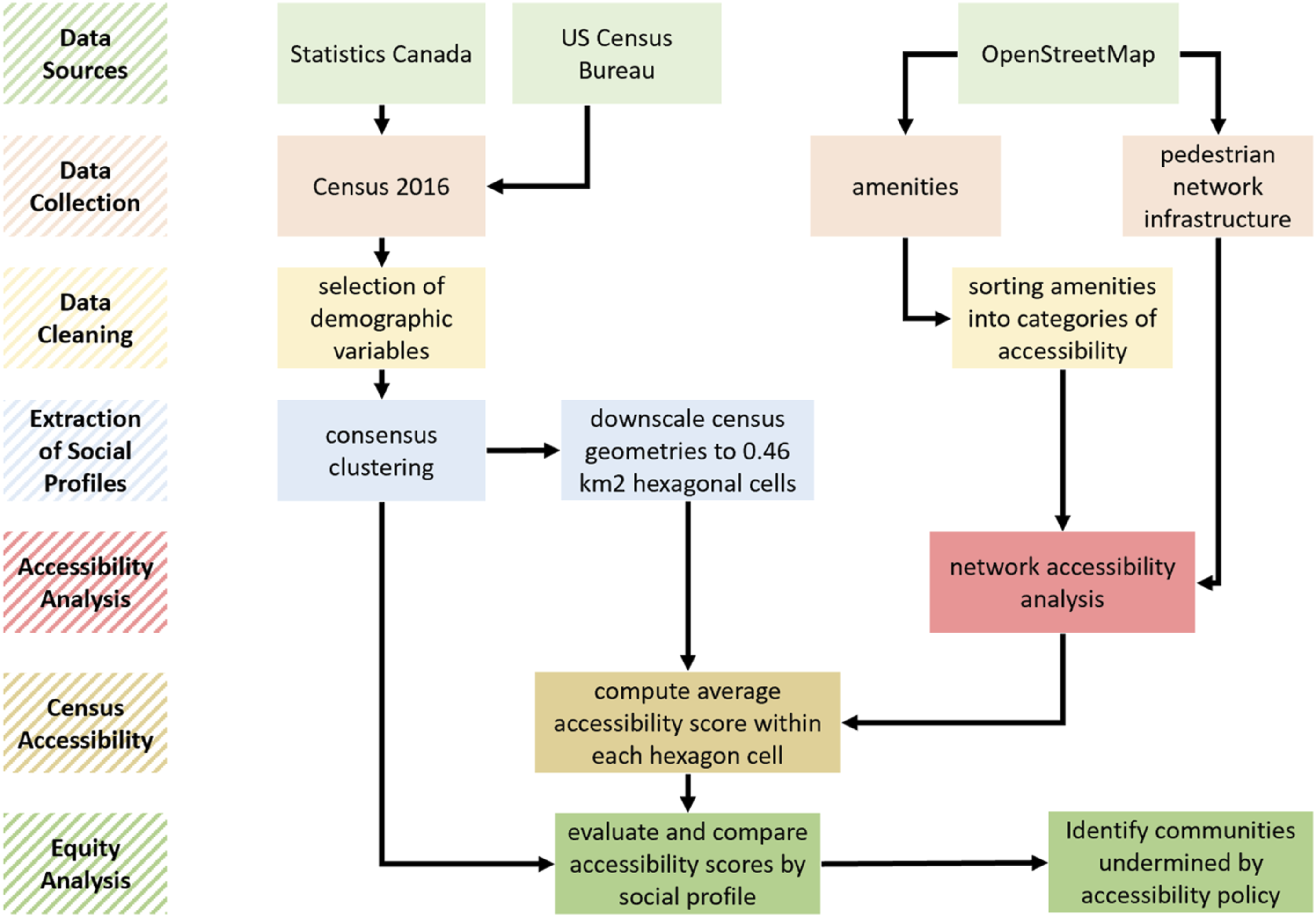
We apply this framework to 54 cities across six continents as reported in the Tables in the Supplementary Information (SI). We measure accessibility for all 54 cities and examine the variability in its distribution for the city population on a subset of those cities: New York City (NY), Chicago (IL), San Francisco (CA), Los Angeles (CA), Houston (TX), Seattle (WA), Miami (FL), Toronto (ON), Vancouver (BC) and Montreal (QC). Within this subset, the municipal authorities of each city have made strong policy efforts to provide equitable accessibility to urban services within their municipal jurisdiction Seskin and McCann (2012). In addition, open data programs run by the municipal governments of these cities provide aggregated demographic and socioeconomic variables for the complete population.
Data description
Census data
To characterise population demographics, we use 2016 demographic data from Statistics Canada StatCan (2018) at the Dissemination Area (DA) level, and 2017 demographic data estimates from the United States Census at the Census Block Group (CBG) US-Census-Bureau (2019) level. In order to capture a full spectrum of demographic attributes, we consider 46 census variables relating to ethnicity and minority status, income level, marital status, household composition, language abilities, education level and type, employment status, occupation type and commuting mode. Several scholars agree that many of these socioeconomic variables are related to factors explaining inequalities in cities Nijman and Wei (2020), although the evidence is scattered in the literature through case studies specific to cities or types of infrastructure.
Streets and amenities
To characterise street networks and urban amenities, we use OpenStreetMap (2020) to collect data on pedestrian infrastructure and geographically allocated places of interest (POI): hospitals, schools, supermarkets, restaurants, schools, etc. POIs are returned by the OpenStreetMap API as amenity names and their associated geographical location (i.e. longitude and latitude). Pedestrian infrastructure networks are returned by the OpenStreetMap API as networks of nodes and edges, where each node represents a street intersection and each edge represents a segment of road with walkable or bikable features. Next, we group POI types into a set of different categories (see SI for a complete list of amenities and their associated category). This source is inconsistent in terms of data completeness and quality. The street network can be incomplete in several rural and developing parts of the world. The number of amenities in OSM can be twice as high as the real number (for instance, the number of POIs categorised as schools for Helsinki is around 250, whereas the real (from the city’s administrative data base) is 100). In some cases, this happens because the name of buildings occurs twice or thrice, like school buildings A and B. Further, the cities we have selected have a reliable amount of data
Population grids
Data on population density for every city is retrieved from the European Commission’s 2015 Global Human Settlement Layer (GHSL) GHSL (2015). This data is retrieved in the form of a grid of 250m by 250m squares (0.0625 km2 spatial units exactly the same size as units used for accessibility analysis) and their associated population density values covering the entire world. Gridded population covers the whole world versus census data which is only available in case study cities (Canada and United States). Gridded population is an estimate developed using a computational method and a multitude of raw data sources as described in the GHSL methodology GHSL (2015).
Year mismatch in the collection of data sets
The data sets we have used in this analysis have been collected and catalogued across different years. The census data is from the year 2016 (Canada) and 2017 (United States). The mismatch is not relevant to us because we want to produce the latest estimates from both country-specific sets of cities. For comparison of cities’ accessibility, it would be beneficial to use the same year for census information, and also for the OpenStreetMap data set, but we were aiming to illustrate our results toward policymakers who we think should have the latest estimates for their city. Thus, the street networks were extracted in the year 2019 at the time we started the study. The GHSL grid data of population density is from 2015. This does not cause any problems for comparison as we do not expect population densities to change drastically within a couple of years. Further, we are not making any inferences about certain people but a group as a whole, and do not expect neighbourhoods to gentrify within a year in any city in the world.
Accessibility score
To compute accessibility, we use the amenity location point data (from here on called Points of Interest (POI)) and the pedestrian street network data collected from OpenStreetMap, where each node represents a street intersection (green circles in Figure 2) and each edge represents a pedestrian road segment (black lines). We classify each POI into one of seven categories of accessibility (categories are marked as red circles): Mobility, Active Living, Entertainment, Food Choices, Community Space, Education and Health and Well-being (Supplementary Note 1). Next, each POI, in each category, is assigned to the nearest edge on the pedestrian network. For each node on the network, we calculate the routing distance (weighted shortest path along the pedestrian network) to the nearest POI, essentially representing a distance weighted feature of a POI as in the classical definition of accessibility Hansen (1959). Each node on the network is then assigned a value representing the distance in metres to the nearest POI. This process is repeated for each category of POIs, resulting in each node being assigned seven accessibility values. Previous studies on quantifying accessibility in cities have focused on measuring the Euclidean distance to services Gastner and Newman (2006). However, the ease with which residents can access services in a city is limited by urban form and land-use and the routing distance is a better proxy for the accessibility Xu et al. (2020). (Figure 2) Diagram illustrating the calculation of Accessibility Scores using hexagons, intersections and amenity (POI) categories c.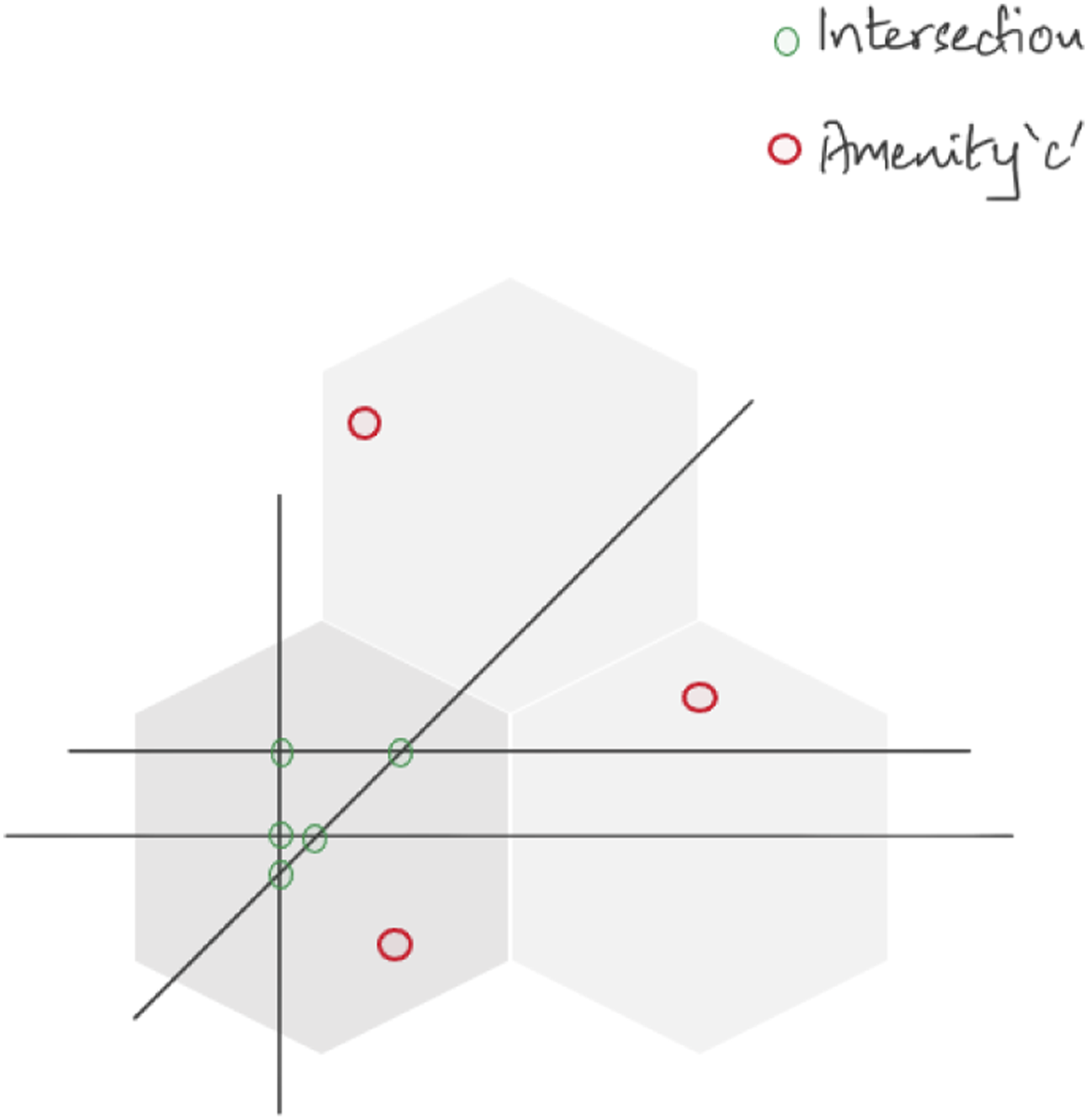
Note that POIs do not warrant equal importance for all people and contribute differently to addressing inequalities Klinenberg (2018). For example, improving access to a pharmacy or library might be more important to a social group than access to a public transport station. Maslow’s hierarchy of needs suggests, that in general, humans have three important needs in their living environment: Physiological, Safety and Security and Social needs Maslow (1954). This suggests that similar POIs can be classified into categories for ease of analysis and to reflect more broadly on the concept of accessibility and inequalities. So, to capture the essential aspects of urban accessibility, we classify each POI into one of seven categories of accessibility: Mobility, Active Living, Entertainment, Food Choices, Community Space, Education and Health and Well-being (Supplementary Note 1). We choose these categories to reflect on the needs of peoples (as specified by Maslow) and broader attributes of functional and livable urban spaces: transportation, public health, food security, cultural capital and social cohesion Kenworthy (2006); Leby and Hashim (2010). We (the 3 co-authors) carried out a subjective assignment of the POI to the seven categories. Then we deliberated on where we differed and found resolution within the context of needs and livable urban spaces.
Operationally, the methodology works as follows: With the use of Python’s open-source OSMnx library Boeing (2017), we filter OpenStreetMap according to different keys (‘public transport’, ‘leisure’ and ‘amenity’). We create a geospatial point data set, consisting of 50 types of urban amenities, of all the POIs considered in each city. In total, we collect 1, 678, 000 POIs across all 54 cities. SI reports the number of points collected for each city.
Next, we use OSMnx to download street networks for the pedestrian street infrastructure of each city. Using the street network data, we interpolate nodes within identical 0.0625 km2 spatial units in a grid matching those resulting from the analysis of social groups. By averaging distances from the nodes that fall within each spatial unit to nearest amenities of each category (that may or may not be in the same spatial unit), we compute the average walking distance within every spatial unit of a city to each of the seven categories of basic amenities. Finally, we weigh and aggregate average walking distances into a walking distance measure D using the following equation

Finally, we subtract

It is important to note that in our study, we are not interested in the number of amenities at a specific location, rather, the location of the nearest amenity is important. This is because of the nature of the accessibility score that we compute between individual locations and individual points of interest. Traditional measurements of accessibility Hansen (1959) directly quantify the opportunities at each location, which could either be the count of points of interest or other attributes about each point of interest, like attractiveness or availability. Even though we measure accessibility to a specific category (for example, pharmacies and health facilities), not all POIs from that specific category carry the same level of opportunity (i.e. some pharmacies might be better quality than others). This can be a limiting factor of the measurement we present here. However, due to the flexibility built in the framework, this measurement of accessibility can be swapped for any other measurement with relative ease to produce new insights into the multidimensional nature of accessibility.
Results
There is more to the scale-free nature of accessibility
To examine how accessible urban infrastructure is for residents in a city, we first define a measurement of accessibility A (see Section Methods for details) that quantifies the ease with which residents within a city can reach amenities Biazzo et al. (2019); Levinson and King (2020) (for example, Mobility, Active Living, Entertainment, Food Choices, Community Space, Education, or Health and Well-being) by walking or by using a form of active transportation (e.g. bicycle or roller-blades) Vale et al. (2016). Active accessibility measures play a central role in shaping accessibility policy worldwide Seskin and McCann (2012); Orozco et al. (2019) by demonstrating how well urban dwellers have access to basic services in the immediate proximity of their place of residence. We make the choice of defining accessibility as active for two reasons: First, there are many cities that do not have any reasonable forms of public transportation and presuppose participation in society through private modes of transportation like cars – using a more general definition of accessibility will only facilitate a comparison among limited car-dependent urban regions. Second, our work is responding to policy efforts in promoting more active accessibility in cities around the world United-Nations (2017).
Regardless of how each city has evolved, the accessibility score A ∈ [0, 1] for the spatial units (see SI for details) of any given city is either normally distributed (see Figure 3(a)) or a mixture of normal distributions (see SI for a detailed analysis of the distributions). As A is defined using a logarithm, a log-normal relationship governing the distribution of accessibility across the world could be explained following the economic and spatial integration of settlements into a larger urban area Cristelli et al. (2012): Access (as a resource that is developing with the growth of an urban region) may have evolved log-normally as a result of the overall effects of factors such as economic, technological or demographic changes Parr and Suzuki (1973) (also see Ref. Parr and Suzuki (1973) for justification of using a log-normal distribution). Although accessibility score A
i
of a given spatial unit i across a city is inversely proportional to the natural log of its rank in accessibility (see Figure 3(b)) following (A) Statistical distribution of accessibility for Chicago, Montreal, San Francisco, Los Angeles, New York City, Philadelphia, Vancouver, Miami, Seattle and Houston, showing log-normal behaviour. (B) The scale free relationship between a spatial unit’s accessibility A and the rank of its accessibility (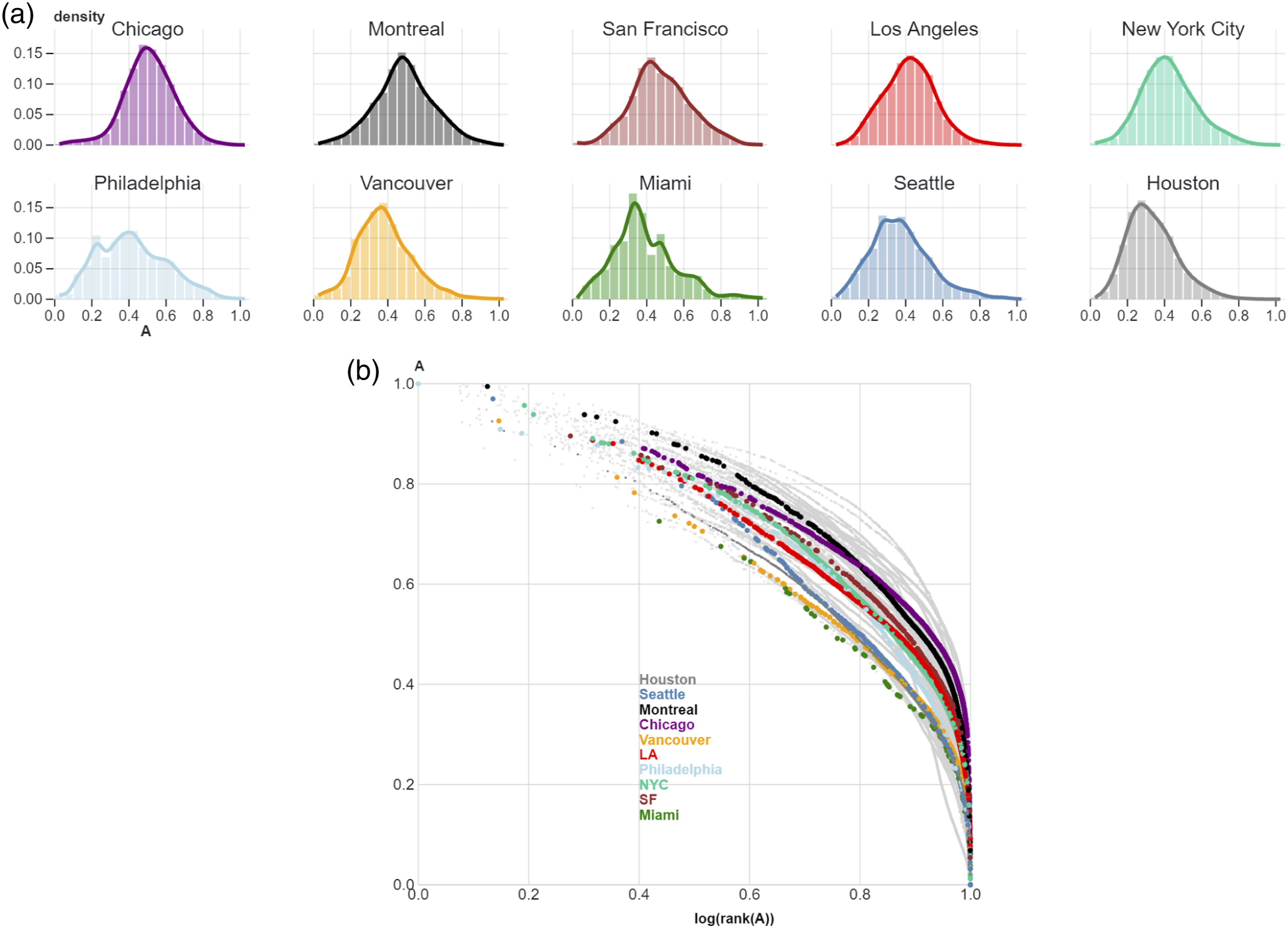
Since accessibility is only defined as a measure of infrastructural provision, decision-makers may argue that regions with lower populations may not necessitate the same investment of resources in providing better levels of accessibility compared to urban centres. To ground the discussion of accessibility in urban policy, we measure the cumulative size of population that has accessibility A lower than a in a city using a separate Global Human Settlement Layer (GHSL) data set of population residing in similar sized spatial units Freire et al. (2016); Schiavina et al. (2019) (see Section Methods for details about GHSL population grids). Figure 4(a) shows that, in many North American cities, while there is a large number of spatial units with high accessibility scores (for example, A > 0.3), there is a large proportion of the population with low accessibility scores (i.e. A < 0.3), evident from the difference in area between the density curves. In Houston and Seattle, for example, around 90% of the population resides in spatial units that have a score A of less than 0.3. In those cities, accessibility only benefits a few residents. Figure 4(b) presents this distribution for all 54 cities within our study. It shows that, in cities where curves are heavily shifted to the right and which start to resemble the sigmoid curve S(x), S(x) = 1/1 + e−k(x−0.5) where k = 10), there is a larger share of people that benefits from higher accessibility scores, and the share of people with lower accessibility scores is smaller. Cities like Zurich, for example, come close, but no city resembles the sigmoid function. In this context, S(x) can be used as a benchmark for accessibility within cities, a hypothetical scenario where 50% of the population has at least an accessibility score A of 0.5. See SI for more details on descriptive statistics of accessibility for all cities. (A) Cumulative density of accessibility and cumulative population proportion. On the y-axis, the dotted line represents the log of the cumulative density of accessibility, and the triangle symbol line represents the log of the cumulative density of population proportion. The x-axis represents the accessibility score A. (B) Cumulative population proportion versus accessibility score A for the 54 cities studied. S(x), where S(x) = 1/1 + e−k(x−0.5) where k = 10, can be used as a benchmark for accessibility within cities, where 50% of the population has at least an accessibility score A of 0.5. The dots and triangles represent equal sized 0.0625 km2 spatial units within and across all cities.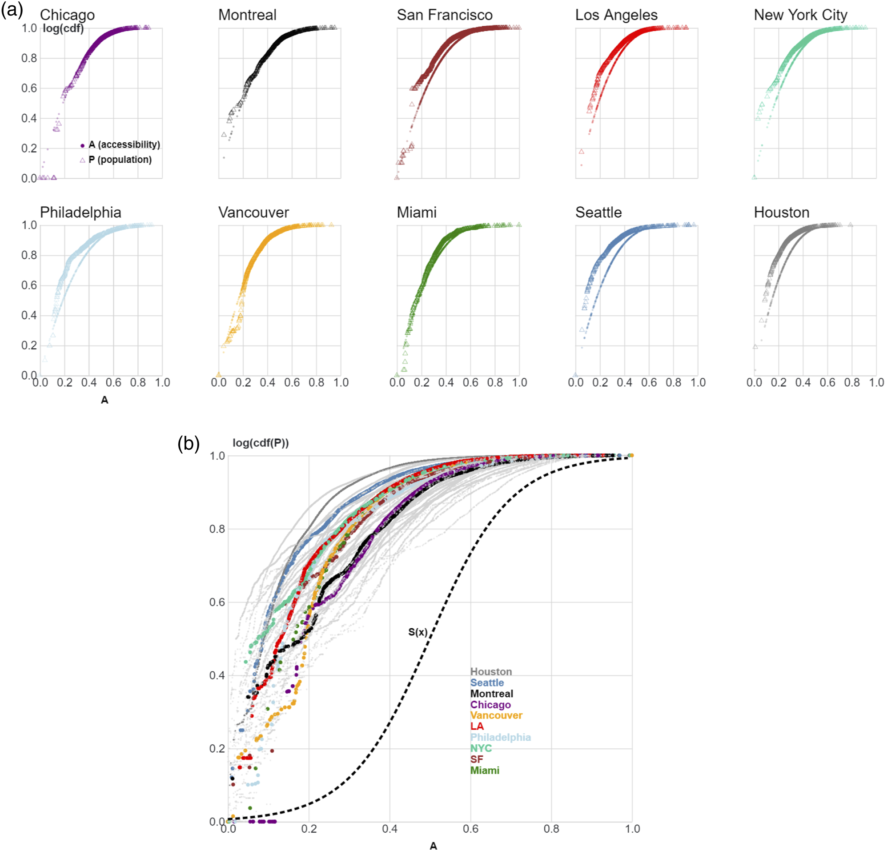
Through this analysis, we are not attempting to resolve the regionalisation debate Cristelli et al. (2012), wherein, depending on the number of spatial units taken into account, the distribution of A may transform. Our data represents administrative units of each city, which may differ from economically functional units, especially for smaller cities Dijkstra et al. (2019) (see Section Methods for data description). To partly address this concern, we use a cumulative function to account for sampling biases in low access regions Newman (2005) in illustrations in Figure 4.
To understand this relationship better – the cumulative density (spatial units) of accessibility (CDF(A)) and the cumulative population density of accessibility (CDF(p)) – we present a ranking and a quadrant grid in Figure 5. Figure 5(a) represents a ranking of cities using S(x) as a benchmark where 50% of the population has at least an accessibility score A of 0.5. Cities are ranked according to the normalised mean absolute error (MAE) between a city’s population curve and the benchmark function S(x). In Figure 5(b), we plot each city’s area under its (normalised) CDF(A) and CDF(p) against each other. Each of the four quadrants of this grid represents a unique scenario. Cities that fall in the top left quadrant (Q1) represent a scenario where a large number of spatial units have high accessibility scores, but the majority of the population is concentrated in spatial units of lower accessibility. In the particular case of Amsterdam in our data set, the city witnesses very high levels of tourism every year. Most spatial units in the city centre that have very high access also see a huge crowd of foreign visitors Gemeente-Amsterdam (2022). Other spatial units in the city that are more residential have lower levels of relative access within the city, but much better absolute levels of access when compared to other cities. This scenario is not observed in other cities where tourism is not so prevalent, hence the scarcity of points within this quadrant. Cities that fall in the top right quadrant (Q2) represent a scenario where a large number of spatial units have low accessibility scores and the majority of the population is concentrated in spatial units of low accessibility. This scenario is very common for the United States of America (USA) (for example, Los Angeles, Houston or Seattle) which is entrenched in policies steering away from public transportation, and a majority of the urban area is characterised by low-density suburban built environment English (2022). Cities that fall in quadrant Q3 provide highly accessible amenities to the most dense regions, with very limited pockets of less accessible urban areas, but may be undervaluing areas with low density. Quadrant Q4 illustrates cities where both low and high density spatial units have higher levels of access, but the cities may be more sprawled with some regions where access is low. A key observation in this figure is that cities that may appear similar to each other (for example, in their morphology, street network density, or griddedness of blocks) appear in different quadrants here. For example, New York City, although very similar to Chicago, is categorised more closely with Houston or Seattle. This can be explained by the fact that accessibility score comparison occurs within a city’s spatial units, and Figure 5(b) (although a comparison among cities) illustrates a sense of inequality within a city. While New York might resemble Chicago in its structure and absolute accessibility, within New York, a large part of the population resides in spatial units with lower accessibility compared to New York’s most accessible spaces. (A) Ranking of cities using S(x) as a benchmark where 50% of the population has at least an accessibility score A of 0.5. Cities are ranked according to the normalised mean absolute error (MAE) between a city’s population curve and the benchmark function S(x). (B) The four quadrants of accessibility versus population densities. Q1 represents a scenario where a large number of spatial units have high accessibility scores but the majority of the population is concentrated in spatial units of lower accessibility. Q2 represents a scenario where a large number of spatial units have low accessibility scores and the majority of the population is concentrated in spatial units of low accessibility. Cities in Q3 provide highly accessible amenities to the most dense regions, with very limited pockets of less accessible urban areas. Quadrant Q4 has cities where both low and high density spatial units have higher levels of access, but the cities may be more sprawled with some regions where access is low.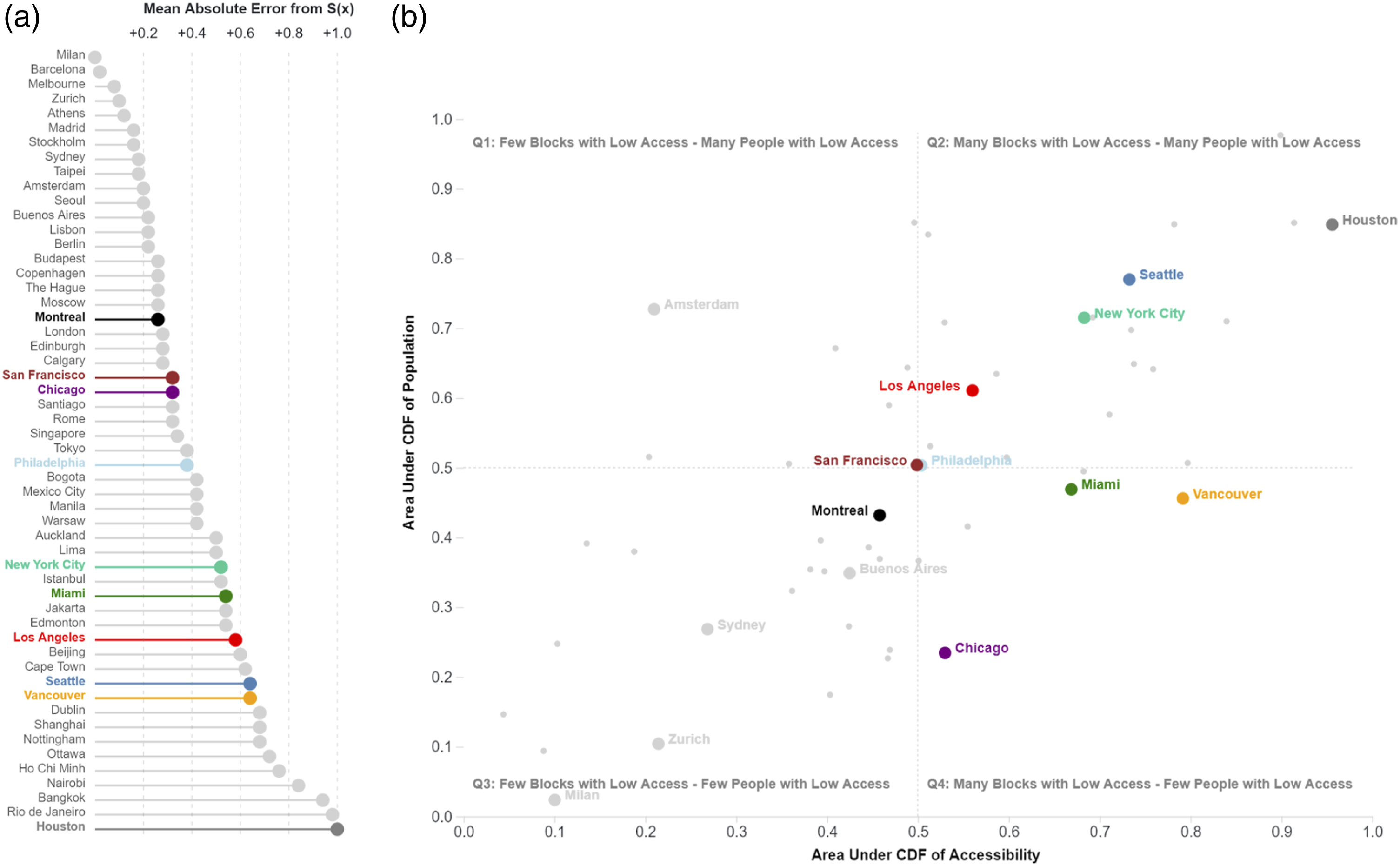
The variation in accessibility by urban profiles
Above, we presented results on the static distribution of accessibility in any given city without differentiating among the resident population. Cities in the third quadrant of Figure 5(b) have a high median accessibility, indicating that most of the population is also able to easily access urban infrastructure in their vicinity. In comparison, many cities fall in quadrant 2, where the accessibility distribution is characterised by shorter tails and wider humps (hence more inequalities prevalent among its residents – in Ref. Van Wee and Geurs (2011), authors discuss how a Gini index measure can be used to assess levels of accessibility using density based distributions of accessibility). While this analysis of accessibility as a resource is useful, it might prevent recognition of structural inequalities in the distribution of this resource. To provide appropriate support to decision-makers in addressing socioeconomic inequalities in cities, we examine the relationship of accessibility distributions with socioeconomic attributes of households within the spatial units of a city using Chicago, IL (USA), as an illustrative example.
We cluster households using socioeconomic attributes to form urban profiles where households within a profile are similar to each other than across profiles (see Section Methods for description of census data and SI for clustering methodology). We selected attributes that were largely available in the census data across Canada and USA: ethnicity and minority status, income level, marital status, household composition, language abilities, education level and type, employment status, occupation type and commuting mode. A complete list of demographic attributes is provided in the SI. By using consensus clustering Likas et al. (2003) on this set of attributes associated with Dissemination Areas (DA) (in Canada) and Census Block Groups (CBG) (in USA) (see Section Methods for modelling details), we identified a set of urban profiles for each city in our original subset (in the Methods section we explain the choice for the subset sample for further analysis). For instance, five urban profiles are identified for the city of Chicago: (1) Low-income mixed (LIMix) (2) Low-income minority (LIM) (3) Medium-income white (MIW) (4) High-income white (HIW) (5) Medium-income white suburban (MIW-Suburban)
We observe that the resulting clusters vary between 3 and 5 by city because of each city’s unique socioeconomic distribution. The difference in the number of profiles for various cities is also affected by the choice of the consensus function used to evaluate the performance of clustering (see SI for clustering performance metrics). For example, for Chicago, IL (USA), based on the k-modes consensus function, the most appropriate number of clusters is equal to 5. Importantly, for some cities, the difference in the metric values is hardly distinguishable. In such cases, we try to minimise the resulting number of clusters while preserving subjective cluster interpretability.
Next, to establish a relationship between the accessibility score A and urban profiles, we interpolate each city’s clustered DAs or CBGs onto equally sized spatial units. Although Chicago’s median accessibility of 0.51 makes it generally more accessible than other cities, investigating accessibility scores for each of Chicago’s urban profiles reveals more nuanced socioeconomic differences. On average, urban areas inhabited by the most disadvantaged group in Chicago are 27% less accessible than those inhabited by the least disadvantaged group. Figure 6(a) visually depicts the spatial differences in accessibility for each urban profile, largely indicating the disparity in accessibility between groups (2) LIM and (4) HIW, where a clear difference in contrast is visible between the areas where the two groups live. Figure 6(b) illustrates the distribution of accessibility across the urban profiles in Chicago. We observe that in Chicago, urban profile (5) MIW-Suburban, represents a small fraction (10.7%) of spatial units mostly located in suburban areas where low accessibility scores are likely reflective of personal lifestyle choices rather than discriminatory outcomes of public policy Mikelbank (2004). We also observe that the (2) LIM urban profile has the least median accessibility across the other groups (sans profile (5) MIW-Suburban). The prevalent socioeconomic features of this profile are characterised by the lowest levels of income, the highest percentage of individuals who identify as visible minorities, the lowest number of individuals with university education, and the highest rates of unemployment (Figure 6(c)). In contrast, the group with the highest median accessibility – (4) HIW – is in stark contrast with group (2) LIM, displaying diverging distributions for each socioeconomic attribute (Figure 6(c)). If we break down accessibility by category of amenities (Figure 6(d)), we observe that in Chicago, the highest degrees of inequality are found in access to infrastructure related to Food Choices, Entertainment, Active Living and Health and Well Being. These results highlight areas for intervention, where urban planners may focus equitable accessibility policies in the city of Chicago. The results of other cities of the subset are reported in the SI, and we can observe that in a majority of the subset of cities, low-income communities who also have a larger share of minorities, earn less and are less educated and typically have lower access to urban amenities compared to other communities in the region. (A) Spatial representation of the five clustered social groups for Chicago and the spatial distribution of accessibility for Chicago, where each spatial unit (an equal sized square of 0.0625 km2) has its own accessibility score. (B) The statistical distribution of accessibility for each of Chicago’s clustered social groups. (C) Statistical distribution of normalised key demographic attributes for each of Chicago’s clustered social groups. (D) A parallel coordinates chart illustrating each social group’s median accessibility scores dis-aggregated across amenity types.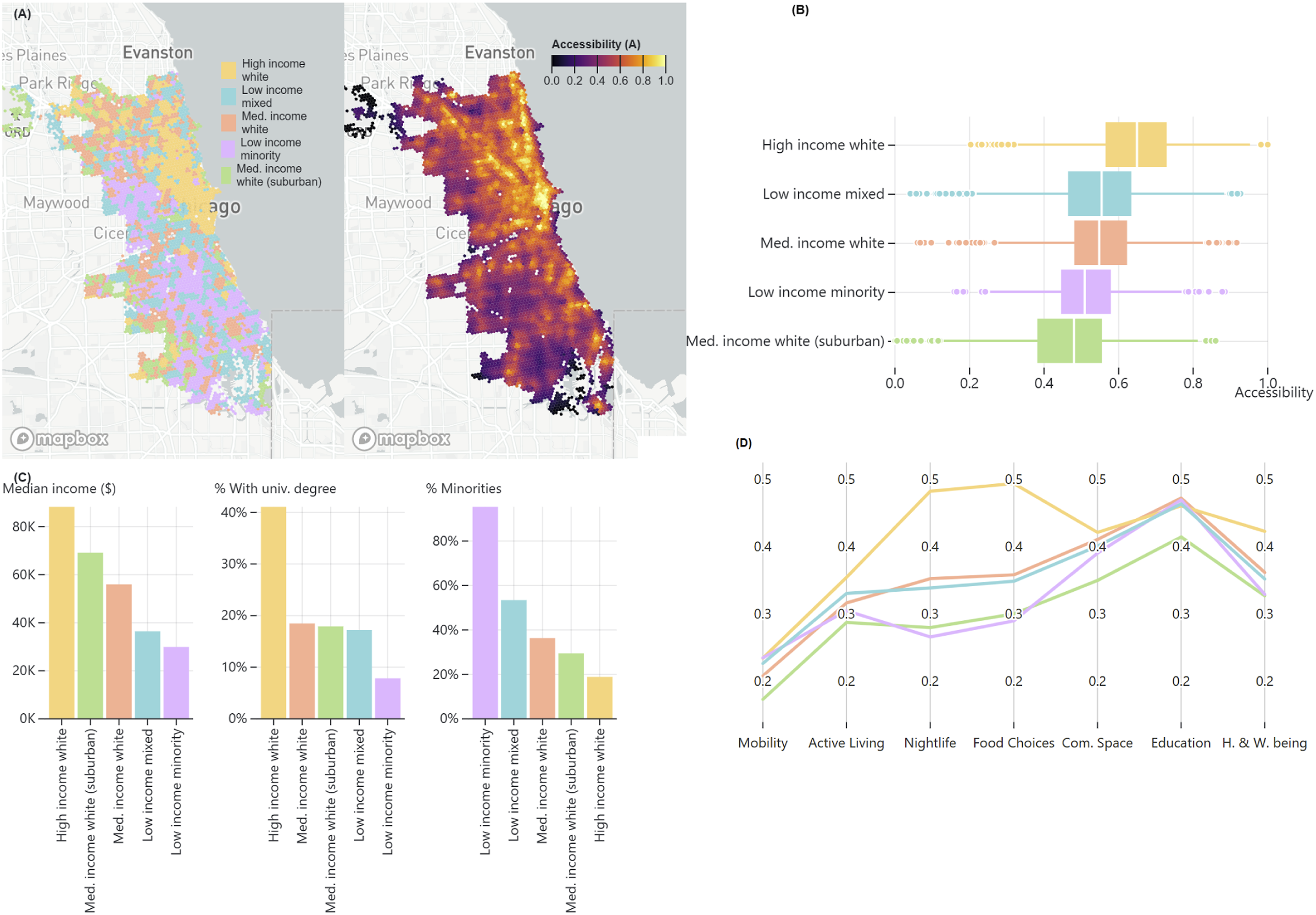
Accessibility is inequitably distributed across urban profiles
We rank each urban profile based on their relative attribute values of income, education, minority status and employment census variables. In each city, we choose the two groups at each extreme and classify them as either ‘most disadvantaged’ (lowest income, lowest levels of education, highest proportion of minorities, highest unemployment) or ‘least disadvantaged’ (highest income, highest levels of education, lowest proportion of minorities and lowest unemployment). In highly unlikely cases where the differences in socioeconomic variables are negligible between two groups, we combine them together and treat them as one. In each city, by comparing spatial units pertaining to either group with their associated accessibility scores, we calculate the probability density functions of each group’s respective accessibility. The assessment of equity is determined by computing the relative change between the two groups’ median accessibility as follows,

Figure 7 shows results from all 10 North American cities (subset of this work). We find that inequalities in access to urban infrastructure are present in the majority (6 out of 10) of cities we studied. The most disadvantaged groups are structurally under-served by urban infrastructure as compared to least disadvantaged groups. When accessibility is aggregated by category of amenities (Figure 7), there is a gap in access to food, culture and entertainment, active living and health infrastructure, which is all more accessible in spatial units where the least vulnerable populations reside. The subset analysis illustrates that in North American cities, public transit options (represented by the mobility infrastructure) are scarcely distributed: they are either very few Tomer et al. (2020) and difficult to access or have poorly evolved through complex processes of institutions, government and corporate practices that shape the choices of communities to be car-dependent English (2022). Median accessibility scores for most advantaged and least advantaged groups aggregated by city (A) and category (B) for 10 North American cities.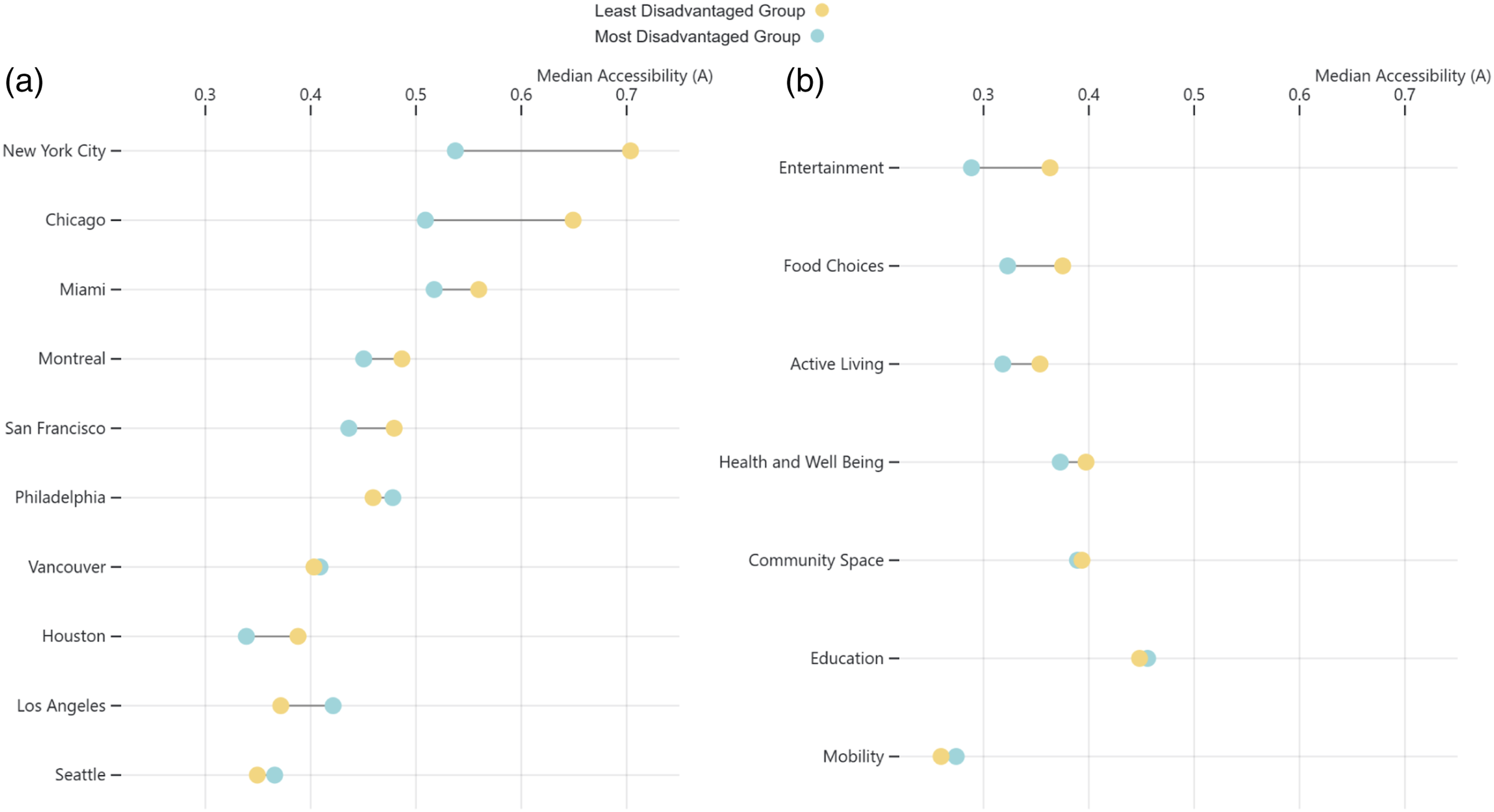
Discussion
Our goal in this paper was to investigate the spatial relationship of accessibility and urban inequalities. We found that the spatial distribution of accessibility to infrastructure follows a universal log-normal paradigm, indicating stratified urban communities (some with increasingly high access, and others with lower levels of access). In accordance with Zipf’s laws of cities Gabaix (1999), and considering the economic integration of urban regions Cristelli et al. (2012), some cities exhibit a widening inequality across social and spatial lines. Our findings suggest that the distribution of amenities in cities plays a significant role in how inequalities in access to urban infrastructure manifest. The most socioeconomically disadvantaged groups are structurally under-served by urban infrastructure as compared to least disadvantaged groups. When dis-aggregating accessibility over the types of urban amenities, there is an overall gap in access to food, culture and entertainment, active living and health infrastructure, which is all more accessible in spatial units where the least vulnerable profiles reside. The societal impacts of these general inequality patterns in access to infrastructure can be serious. For example, in a study of 11,599 Philadelphia households Mayer et al. (2014), the authors report that households who reported very difficult access to fruits and vegetables were more likely to also report food insecurity in their household. In this context, poor access to food options in communities that are already marginalised socioeconomically can contribute to perpetuate structural inequalities among urban communities. While these findings are not surprising and have been reported in multiple contexts and cases studies Moro et al. (2021); Nijman and Wei (2020); Pereira et al. (2019), a framework to assess equity is an important step to understand the global state of inequalities in accessibility from a spatial perspective. Through this research, we have unified previous social, empirical and theoretical work and identified the general social groups that suffer from inequitable accessibility to urban amenities.
Our research provides a holistic and reproducible framework for municipalities worldwide to redress inequalities in access to infrastructure. Because of its flexible nature, the framework can be adapted to incorporate the multiple values of stakeholders with regards to accessibility, and support in identifying spatial regions and social groups suffering from inequalities in access. Starting with global case studies of countries, regions or political contexts, a lot of scholarly work can be reproduced or extended and strengthened with our framework and access to open data. For example, in Ref. Pereira et al. (2019), authors concluded that white and high-income communities in Brazil have more access to jobs and education than black and poor communities, irrespective of transport options considered. Thus, by combining measures of active accessibility and dynamic measures of opportunities, such an approach can understand the big picture better, and identify pockets of poorly accessible neighbourhoods that also have lower access to job and other opportunities across an urban region. Similarly, combining our insights with work of scholars in Ref. Xu et al. (2020), policymakers could derive targeted and equitable measures for facilitating the distribution of amenities in neighbourhoods that are most in need of such resources. Although studying overall accessibility levels do not support particular communities in understanding their needs and contextual factors that perpetuate inequalities, our proposed approach can provide an empirical foundation to narrow down on opportunities for decision-makers to investigate further in remedying poor levels of access and inequalities. When moving to a local case study of access to particular infrastructure, this study can support scholars and policymakers in identifying situation specific factors for their neighbourhoods. This can be achieved by supplementing such a case study with other data sets that expand on in-depth socioeconomic conditions of social groups over time, and how active accessibility indicators have shaped in and around the region in conjunction.
Although this work supports in identifying general levels of accessibility for various urban communities, the results are bound to the definition of accessibility. The accessibility score we define is based on the importance attributed to each category encoded as a weight (same set of attributions for all spatial units and cities). If the weights are changed drastically, the distributions change quite considerably. Following the work of Maslow (1954), we agree that changing these weights drastically mean little to our understanding of the basic needs of peoples. In case where decision-makers pander to different politics where our needs change or must change considerably (and thus the weights), the associated distributions of accessibility will paint a different picture recognising the goals of policymakers as opposed to the present levels of access that are afforded to communities. As our framework design is modular and flexible, in that these weights can be changed, the associated distributions of accessibility can help in understanding local measures of access and contextualising them within the larger policy goals of the city itself. In this article, we propose a strict weighting setup based on a similar approach as illustrated in the section on Accessibility Score above. Building upon Maslow’s work Maslow (1954), we classify Mobility and Health and Well-being as the most important categories of accessibility. These are followed by Food Choices and Education. Finally, the remaining categories of Community Space, Active Living and Nightlife are placed in the third tier. To assign a weight to each of these categories, we reviewed the complete streets policy document Seskin and McCann (2012) and chose weights representative of service importance as reflected in over 400 studied reviewed by this policy analysis framework. Based on this evidence, we deliberated and assigned a weight of 0.2, 0.15 and 0.1, respectively, making a sum of 1 for the weights (see SI for exact weights matching categories). We propose two avenues for future work in this regard. In one, more practice-oriented work can be done to decipher the needs of communities through public participation methods. These can be translated to weights that are region specific and compared more broadly to city-wide levels of access. In two, a theoretical approach can be used carry out a sensitivity analysis (for instance, a Sobol Salteli sampling) on the weights to evaluate the robustness of the [different] definition of accessibility. The outcome of such an analysis; results of the changes in distributions of the accessibility density plots can support in multiple policy goals where negotiations might be necessary among decision-makers and stakeholders for further development.
Urban planning varies in practice across cities around the world. Diverse and competing values and regulatory policies around market instruments usually govern how accessibility to amenities is shaped Nijman and Wei (2020); Huang and Wei (2011). This is coupled with more bottom-up processes of change within neighbourhoods (effects of local economies, segregation and gentrification) that are shaped by the availability (or lack thereof) of good quality infrastructure. While all of the subset cities that we have studied have implemented policies targeted at improving equity in accessibility Seskin and McCann (2012), the presence of such a gap in accessibility indicates that de facto processes of urban change and de jure policies (whether discriminatory government actions of the past Higginbotham et al. (1990); Parekh and Gaztambide-Fernández (2017), or utilitarian policies and neoliberal market investments Farmer (2011)) still perpetuate social inequalities in today’s urban communities. Additionally, these results show that present accessibility policies must be more ambitious, so as to reduce the inequalities that exist in access to infrastructure to acceptable levels and improve the minimum access affordability for multiple urban communities.
Supplemental Material
Supplemental Material - Disadvantaged communities have lower access to urban infrastructure
Supplemental Material for Disadvantaged communities has lower access to urban infrastructure by Leonardo Nicoletti, Mikhail Sirenko and Trivik Verma in Environment and Planning B: Urban Analytics and City Science
Footnotes
Acknowledgements
We are grateful to the open-source community for making code and data accessible. This analysis depends on such efforts. We would also like to thank the reviewers at GISRUK 2022 conference for such constructive and detailed feedback for improving the readability, rigour and quality of this manuscript.
Declaration of conflicting interests
The author(s) declared no potential conflicts of interest with respect to the research, authorship, and/or publication of this article.
Funding
The author(s) received no financial support for the research, authorship, and/or publication of this article.
Supplemental Material
Supplemental material for this article is available online.
Leonardo Nicoletti is a Master’s graduate from the Engineering and Policy Analysis Program at Delft University of Technology. He is a Visualisation Engineer and Information Designer focussing on Data Journalism.
Mikhail Sirenko is a postdoc at the Resilience Lab at Delft University of Technology affiliated with the 4TU Resilience Engineering Centre on an EU Project called HeROS. His research interests are data science and visualisation and simulation models. Currently, he is working on urban resilience.
Trivik Verma is an Assistant Professor at Delft University of Technology. His research focusses on tackling challenges of urbanisation in an equitable and just manner. Specifically, he is using methods in spatial data science, complex network analyses and participatory mapping to develop computational tools for advancing the theories and practices of urban science.
References
Supplementary Material
Please find the following supplemental material available below.
For Open Access articles published under a Creative Commons License, all supplemental material carries the same license as the article it is associated with.
For non-Open Access articles published, all supplemental material carries a non-exclusive license, and permission requests for re-use of supplemental material or any part of supplemental material shall be sent directly to the copyright owner as specified in the copyright notice associated with the article.