
Abstract
Highlights
Most evidence about the effect of format on ability to evaluate differences in probabilities was weak or insufficient because of too few comparable studies.
Strong evidence showed that computations relevant to differences in probabilities are easier with rates per 10n than with 1 in X rates.
Adding graphics to probabilities helps readers compute differences between probabilities.
Keywords
Patients need numbers to make informed decisions on the basis of the probabilities of health and disease. One important communication challenge is how to express the difference between 2 probabilities, such as the effect of a risk factor or a therapy. The difference between 2 probabilities—the effect size3is key information that can help patients choose between therapies, determine whether to avoid risk factors or exposures, and make other decisions involving interpreting effect sizes. The difference between 2 probabilities can be formatted in multiple ways. Common approaches include a pair of individual probabilities (an increase from a 3% risk to a 4.5% risk), a relative difference between probabilities (a 50% relative increase, a relative risk of 1.5), an absolute difference between probabilities (a 1.5-percentage-point absolute increase), or a combination of several of these formats.
As described previously,1,2 our systematic literature review collected evidence on how to communicate health-related numbers across data types and across different data presentation formats. We organized the literature according to a conceptual model of communication in which a reader views a stimulus, performs cognitive tasks to make sense of it, and experiences cognitive, affective, perceptual, or behavioral responses that are measured with outcome measures.
This article presents the subset of evidence pertaining to probability data and difference cognitive tasks requiring audience members to evaluate differences between 2 or more probabilities. Difference cognitive tasks are important for understanding the effects of therapies or risk factors. Readers may perform difference-level tasks upon absolute probabilities (for example, a pair of absolute probabilities expressing the chance of disease before and after vaccination) or upon precalculated probability comparisons (e.g., an absolute probability difference, a relative risk, or relative risk reduction [RRR]). (Additional articles in this series, as elaborated in Table A, cover point tasks, in which readers seek information about individual probabilities, synthesis tasks, in which the reader integrates several probabilities such as the set of risks and benefits for a therapeutic option, synthesis-Bayesian tasks involving interpreting probability information to estimate Bayesian posterior probabilities, and time-trend tasks, in which readers examine stimuli to evaluate patterns over time.)
Current Articles’ Scope within the Making Numbers Meaningful Systematic Review

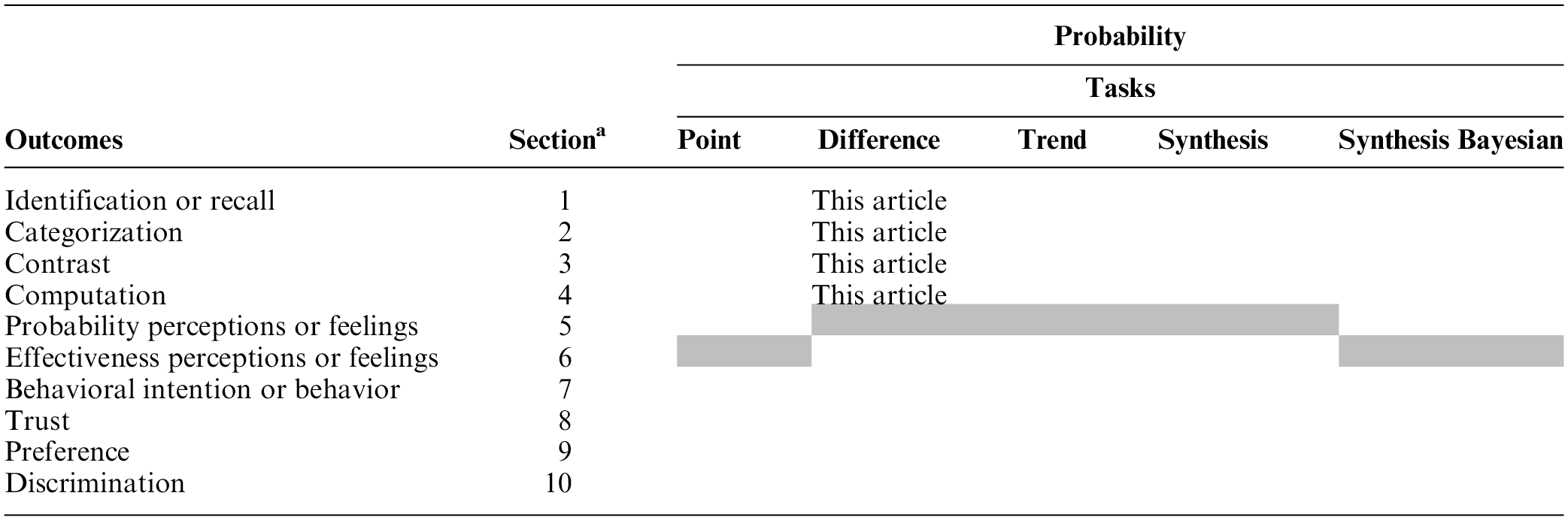
This standardized numbering system has been used for results subheadings in this article and across all Making Numbers Meaningful results articles to ensure that readers can find comparable information in all articles. Gray cells represent combinations that are not possible according to the definitions presented in Ancker et al. 1
To keep article length manageable, the difference task research has been divided into a pair of articles. The current article (part 1) presents evidence on 4 outcomes: 1) identifying a probability difference in the stimulus (termed identification) or recalling it (termed recall), 2) identifying the largest or smallest of a set of probability differences (termed contrast), 3) placing a probability difference into a meaningful category such as “elevated” or “below average” (termed categorization), and 4) performing computations on probability differences such as subtracting one probability from another or converting a percentage into a number out of 100 (termed computation). Although the first 2 of these (identification and recall) would appear to be different, we grouped them (as described below) because of a frequent lack of clarity in the research about which was being measured. (A companion article, part 2, presents evidence on the remaining outcomes.) Here, we include evidence on the effects of all data presentation formats—numbers, graphics, and verbal probabilities—on these outcomes.
Methods
Methods for the literature search, screening, risk-of-bias evaluation, data extraction, credibility evaluation of findings, and organization into evidence tables are reported in detail in our companion methods article. 2 In brief, a broad search was performed to find experimental or quasi-experimental (nonrandomized) research comparing 2 or more ways of presenting quantitative health-related data to patients or other lay audiences. The search was performed on MEDLINE, Embase, CINAHL, the Cochrane Library, PsycINFO, ERIC, and ACM Digital Library, and we conducted hand searches of tables of contents of Medical Decision Making, Patient Education and Counseling, Risk Analysis, and Journal of Health Communication. Substudies in the same article were extracted separately. All instruments used (search strategy, data extraction instrument, and study risk of bias rubric) are available at the Making Numbers Meaningful Project at the Open Science Framework site (https://osf.io/rvxf2/).
As described in detail elsewhere, 2 our literature review identified 316 articles, of which 32 (representing 35 unique studies) involved difference-level tasks with probability data that reported 1 or more of the 4 above outcomes.
We assigned each included study a study risk-of-bias (S-ROB) score according to a rubric developed for this project, which considered sample representativeness, randomization, protocol deviations, presence/absence of demographic and covariate information, missing data, and other potential biases. Within each included study, we extracted information about task, stimulus (data and data presentation format), and outcome. The outcomes were informed by behavioral and risk communication theory (behavior or behavioral intention, probability perceptions or feelings, recall) or empirically on the basis of what was frequently measured by the research included in our review (trust, preference for a format), particularly measures used to measure comprehension (identification, contrast, computation, categorization, discrimination).
Each unique combination of task, format comparison, and outcome from a single study was termed a finding. We grouped findings by task and outcome, rated their credibility, and synthesized them into guidance statements. Credibility for each finding was assessed on a scale from 1 to 10 by pairs of authors (N.C.B., J.SA., B.J.Z.-F.) using a holistic assessment of sample size, statistical methods, validity of stimulus design, comparison, outcome measures, and covariates (either criterion validity or face validity), plus the S-ROB for the study from which the finding came. Credibility of 7 or higher was considered high, 4.5 to 6.5 moderate, and 4 or lower low. Using the group of relevant findings, we then applied a standard rubric to grade the strength of evidence for each guidance statement according to finding credibility and consistency. Consistency was considered high if all findings were significant in the same direction or if a large majority were significant in one direction with a few lacking in significance, moderate if findings showed a small majority of significant effects in one direction with the remainder lacking significance, and low if the findings showed significant effects in different directions. Findings with high credibility (7 or higher on a scale of 1 to 10) and moderate credibility (4.5–6.5) are discussed below. Findings with lower credibility (4 or lower) are mentioned below, counted in Table B, and listed in our Findings tables, but they do not contribute to the evidence summaries or the statements in the evidence tables.
Section Headings for Each Subset of Outcome Evidence Included in This Article and the Number of Included Findings

1. No relevant findings for the following comparisons: numbers versus verbal probabilities (row D), uncertainty (row G), larger or smaller denominators (row H), longer or shorter time periods (row J).
2. No relevant findings for the following outcomes: categorization (section 3).
3. The standardized numbering system in Table B has been used for the subheadings of all Making Numbers Meaningful results articles. The numbers ensure that, for example, studies of the effects of gain-loss framing manipulations on computation are always placed in a subhead labeled subsection 4F (whether or not that article contains sections 1 through 3). Our goal is to ensure that readers can use this subhead system to locate similar sections across articles.
We have described our terminology in our previous articles, but for the current article, it is important to note several terms. For probabilities, we distinguished between 2 types of rates: those formatted as 1 in X (examples include “1 in 5” and “1 of every 25”) and those formatted as a rate per 10n (such as “12 in 100” or “2.5 per 1,000”). Also, we reserved the natural frequency label for a series of joint probabilities and conditional probabilities computed from the same pool of patients, in the context of Bayes’ theorem.3,4 This definition matches the original term definition, 4 and using the term only for this purpose helps clarify otherwise apparently contradictory findings. 3
Results
No articles measured categorization outcomes related to probability differences. We grouped studies examining identification and recall outcomes because it was often unclear whether study participants could see the relevant stimuli when answering these questions.
We therefore summarize the findings related to identification/recall, contrast, and computation outcomes below (Table B). The full spreadsheet of difference task findings is available in the “Probability Findings” folder in the Making Numbers Meaningful Project at OSF (https://osf.io/rvxf2/).
Each results subsection summarizes evidence on the following comparisons in order: comparisons among number formats, among graphics formats, between number and graphic formats, between different types of contextual elements, between different framings, and effect of animation or interactivity. Within subsections, evidence is arranged from strongest to weakest. No studies examining the communication of probability differences examined comparisons between number and verbal formats, effect of representations of uncertainty, effect of manipulations of denominators, or manipulations of time periods.
Effects of Different Formats for Probability Trends on Ability to Identify or Recall Information (Identification/Recall Outcome): Section 1
Researchers often assessed comprehension by asking questions about probability differences in the stimulus. However, published studies were frequently unclear about whether the stimulus was available or removed when the questions were presented and thus whether the outcome was assessing ability to identify the numbers or ability to recall them. Given this ambiguity, we combined these 2 outcomes in this section. However, for studies that had clear distinctions between identify and recall outcomes, we reflect the distinction in the summaries and guidance statements.
Comparisons between number formats on identification/recall of probability differences (subsection 1A)
RATES PER 10n VERSUS PERCENTAGES: In a high-credibility finding from a large study, Woloshin and Schwartz 5 found the ability to answer questions about probability differences was better when pairs of probabilities were presented as percentages in a drug facts box table than when as rates per 10n (either fixed denominator or variable denominator) or combinations of percentages and rates.
Evidence-Based Guidance for Effects of Numerical Formats on Identification/Recall of Probability Differences

ADDING RATE PER 10n TO DIFFERENCE: In a high-credibility finding, Sullivan et al. 6 found no difference in ability to answer questions about numbers when pairs of rates (percentages plus rates per 10n) were added to arithmetic differences in a table, although the presence of verbal labels in addition to the absolute difference complicates interpretation of this negative finding.
TABLES VERSUS TEXT: A high-credibility finding (Tait et al. 7 ) showed no significant differences in ability to answer questions about differences in numbers of people affected by a drug when pairs of rates per 10n were presented in table or text format. However, a moderate-credibility finding from a different study by the same author team (Tait et al. 8 ) found that ability to answer questions about differences was better with rates per 10n in a table versus rates per 10n in text. Mühlbauer et al. 9 found mixed findings when comparing text to table.
LIFE EXPECTANCY: In a moderate-credibility finding (Galesic and Garcia Retamero 10 ), short- and long-term recall of the effect of a risk factor was higher when information was presented in life expectancy terms than with a baseline percentage and absolute risk difference as a percentage.
INSTRUCTIONS: A moderate-credibility finding (Mühlbauer et al. 9 ) showed that identification of probability differences was improved when a drug facts box table format was accompanied by a “how to read this table” instructions.
An additional recall finding was not summarized due to a floor effect, specifically very poor recall at 1 mo across formats. 11
Comparisons between graphic formats on identification/recall of probability differences (subsection 1B)
ICON ARRAYS: A high-credibility finding from Zikmund-Fisher et al. 12 substudy 1 found no differences in the ability to answer questions about probability differences between combination-framed icon arrays showing incremental differences in survival and mortality outcomes versus gain-framed icon arrays only highlighting incremental survival outcomes.
Evidence-Based Guidance for Effects of Graphical Formats on Identification/Recall of Probability Differences

OTHER GRAPHICS VERSUS PIE CHART: A moderate-credibility finding (Hawley et al. 13 ) showed that certain graphical formats (icon array, bar chart, number line) appeared to help people answer questions about the number of people affected or probability differences better than pie charts did (with or without circular axis labels). However, this study mixed questions about individual probabilities and probability differences, making it impossible to assess a unique effect for differences.
A low-credibility finding from Schonlau and Peters 14 substudy 2 was not summarized due to methodological concerns, specifically the inability to make comparisons between graphical formats and determine statistically significant differences based on the results presented.
Comparisons between numerical and graphical formats, and combinations of numerical and graphical formats, on identification/recall of probability differences (subsection 1C)
VARIOUS GRAPHICS: A high-credibility finding (Tait et al. 7 ) found that icon arrays led to better ability to answer questions about numbers of people and differences in numbers of people affected by a drug than rates per 10n in table or text format. However, a moderate-credibility finding by the same author team (Tait et al. 8 ) found that performance was better with rates per 10n in a table versus icon arrays or rates per 10n in text. Another moderate-credibility finding (Hawley et al. 13 ) also found that a table of rates per 10n helped people answer questions about the number of people affected more effectively than a variety of graphical formats (pie charts were the worst). All of these studies mixed questions about individual probabilities versus probability differences, making it impossible to assess a unique effect for differences.
Evidence-Based Guidance for Contrasts between Numerical and Graphical Formats, and Combinations of Numerical and Graphical Formats, on Identification/Recall of Probability Differences

A low-credibility finding 14 was not summarized due to methodological concerns, specifically, the inability to identify statistically significant differences based on results presented.
Comparisons of elements added for context on identification/recall of probability differences (subsection 1E)
DIFFERENCE LABELS: A high-credibility finding (Sullivan et al. 6 ) found no difference in ability to answer questions about probability differences in a table resembling a drug facts box including pairs of absolute rates per 10n and/or absolute probability differences by whether the table did or did not include labels describing which drug had the higher rate of each outcome.
Evidence-Based Guidance for Effect of Adding Context on Identification/Recall of Probability Differences

Comparisons of frames (gain, loss, combination) on identification/recall of probability differences (subsection 1F)
COMBINATION FRAME VERSUS GAIN FRAME: A high-credibility finding (Zikmund-Fisher et al. 12 substudy 1) found no differences in ability to answer questions about probability differences between combination-framed icon arrays showing survival and mortality outcomes versus gain-framed icon arrays only highlighting survival outcomes.
Evidence-Based Guidance for Effect of Framing on Identification/Recall of Probability Differences

Comparisons of animation or interactivity on identification/recall of probability differences (subsection 1I)
STATIC VERSUS ANIMATED GRAPHICS: A moderate-credibility finding (Housten et al. 15 ) did not find any differences in the ability to answer questions about probabilities by format (static icon arrays, icon arrays animated to draw attention to subsets, or icon arrays with additional animation effects to emphasize randomness) but was limited by small sample size.
Evidence-Based Guidance for Effect of Animation or Interactivity on Identification/Recall of Probability Differences

Effects of Different Formats on Ability to Identify Largest or Smallest of a Set of Numbers (Contrast Outcome): Section 2
Responses to questions about identifying the largest or smallest in a list of differences or ranking the differences in order of size were considered contrast outcomes.
Comparisons between numerical formats on ability to contrast probability differences (subsection 2A)
PERCENTAGE PAIRS VERSUS RELATIVE RISK DIFFERENCE: One high-credibility finding (Perneger and Agoritsas 16 ) shows that ability to select the option (based on size of risk reduction) was better when the participant received the RRR as a raw singular number versus either positively or negatively framed pre/post percentage values or pre/post values plus the RRR.
Evidence-Based Guidance for Effects of Numerical Formats on Ability to Contrast Probability Differences
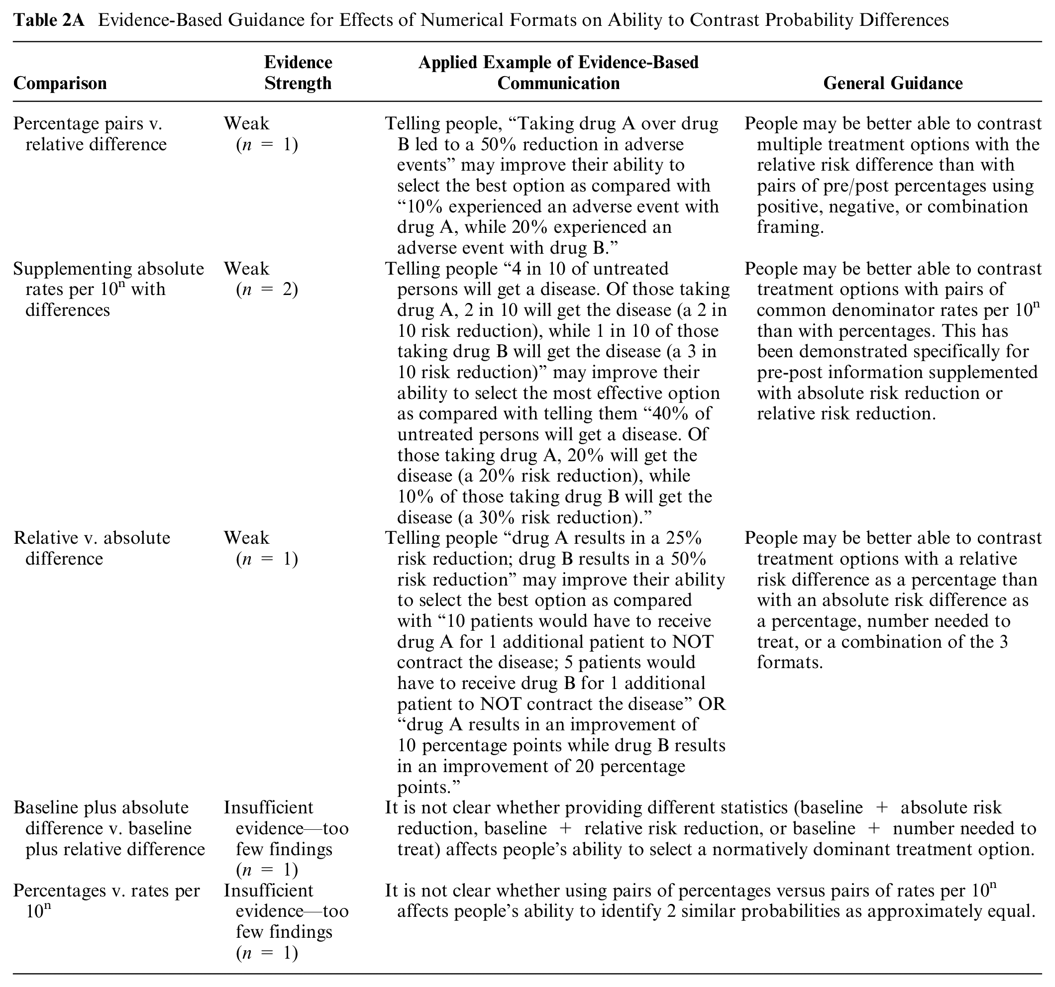
SUPPLEMENTING ABSOLUTE RATES PER 10n WITH DIFFERENCES: In a moderate-credibility finding from Covey 17 substudy 1, pairs of rates per 10n supplemented with absolute risk reduction (ARR) or RRR increased the ability to select the largest difference as compared with pairs of percentages also supplemented with ARR and RRR. There were no significant differences between supplementing with ARR or with RRR. Covey 17 substudy 2 produced the finding that rates per 10n supplemented with ARR information improved the ability to select the largest difference as compared with RRR as a percentage alone. For both of these studies, small samples of students reduce confidence in findings.
RELATIVE VERSUS ABSOLUTE DIFFERENCE: One high-credibility finding from Sheridan et al. 18 was that conveying RRR as a percentage led to an improved ability to select the largest difference as compared with conveying ARR as a percentage, number needed to treat (NNT), or a combination of all three.
BASELINE PLUS ABSOLUTE DIFFERENCE VERSUS BASELINE PLUS RELATIVE DIFFERENCE: One moderate-credibility finding, Lavallie et al., 19 found that conveying baseline probability and ARR as a common denominator rate per 10n was superior to baseline and RRR as common denominator rate per 10n or to baseline common denominator rate per 10n with NNT.
PERCENTAGES VERSUS RATES PER 10n: One moderate-credibility finding (Wolfe et al. 20 substudy 1) found that using pairs of percentages (versus pairs of common denominator rate per 10n) improved women’s ability to identify 2 similar probabilities as “approximately equal.”
A low-credibility finding 11 was not summarized because the single question assessing contrast outcomes from difference tasks was not reported separately from an aggregate knowledge measure.
Comparisons between graphical formats on ability to contrast probability differences (subsection 2B)
TYPES OF BAR CHARTS: One high-credibility finding (Okan et al. 21 substudy 1) determined that selecting the option with the largest effect in a vertical bar chart improved when showing absolute difference as positive bars (percentage point improvement) as opposed to negative bars (percentage point reduction).
Evidence-Based Guidance for Effects of Graphical Formats on Ability to Identify the Dominant Option

ICON ARRAYS VERSUS PIE CHARTS VERSUS BAR CHARTS: Tolbert et al., 22 in a high-credibility finding, found that pairs of icon arrays and pie charts improved participants’ ability to select the option with the largest effect over bar charts. However, the bar charts used in the study had more visual elements (3 bars), which may have made the interpretation task using the bar chart more cognitively complex. A moderate-credibility finding by Waters et al. 23 showed that in a description of the chance of benefit of a drug, the ability to recognize that the drug reduced the total probability of disease was similar with icon arrays and with bar charts.
GROUPED VERSUS RANDOM ICON ARRAYS: A moderate-credibility finding (Wright et al. 24 ) found that the ability to select the largest or smallest effects of smoking on disease outcomes shown in icon array graphics was similar whether the icon array was grouped or random.
BAR CHARTS ILLUSTRATING ABSOLUTE DIFFERENCES OR RISK RATIOS: A moderate-credibility finding (Harper et al. 25 ) found a higher ability to determine whether population-level disparities increased, decreased, or stayed the same when grouped bar charts showed risk ratios instead of absolute differences.
Comparisons between numerical and graphical formats, and combinations of numerical and graphical format, on ability to contrast probability differences (subsection 2C)
BAR CHART WITH OR WITHOUT A PERCENTAGE: A moderate-credibility finding (Wolfe et al. 20 substudy 2) found that adding a bar chart to a percentage did not improve women’s ability to identify 2 similar probabilities as “approximately equal.”
Evidence-Based Guidance for Contrasts between Numerical and Graphical Formats, and Combinations of Numerical and Graphical Formats, on Ability to Contrast Probability Differences

ICON ARRAYS VERSUS NUMBERS: A moderate-credibility finding by Waters et al. 23 showed that in a description of the chance of benefit of a drug, the ability to recognize that the drug reduced the total probability of disease was better with icon arrays than with percentages alone. 23
One finding by Silk and Parrott 26 not synthesized had lower credibility due to limited comparability of the information in the graphical and numerical arms.
Comparisons of elements added for context on ability to contrast probability differences (subsection 2E)
INSTRUCTIONS: A moderate-credibility finding (Wolfe et al. 20 substudy 2) found that adding “gist-evoking instructions” to percentages (with or without a bar chart) improved women’s ability to identify 2 similar probabilities as “approximately equal.” The “gist-evoking” instructions were labeled, “When is a difference really a difference?” and provided examples of small differences that were meaningful (a millimeter movement during a surgical procedures) and were not (a millimeter difference in 2 peoples’ heights).
Evidence-Based Guidance for Effect of Adding Context on Ability to Contrast Probability Differences

Comparisons of frames (gain, loss, combination) on ability to contrast probability differences (subsection 2F)
FRAMING PERCENTAGES: One high-credibility finding (Perneger and Agoritsas 16 ) found that ability to select the normatively dominant option was better when the difference comparisons were presented either as a pair of negatively framed percentages or a combination frame (percentage dying plus percentage surviving plus RRR) versus as a pair of positively framed percentages.
Evidence-Based Guidance for Effect of Framing on Ability to Contrast Probability Differences

Comparisons of animation or interactivity on ability to contrast probability differences (subsection 2I)
ANIMATED VERSUS STATIC ICON ARRAYS: One moderate-credibility finding (Housten et al. 15 ) found no effect of animation (of icon arrays specifically) in participants’ ability to detect the lowest or highest probability difference value. Interactivity was not assessed. The small sample reduces the confidence in the negative finding.
Evidence-Based Guidance for Effect of Animation or Interactivity on Ability to Contrast Probability Differences

Effects of Different Formats on Ability to Perform Computations on Probability Differences (Computation Outcome): Section 4
Although it is not generally desirable to make readers perform computations, and best practice in health literacy is to perform computations for the reader, 27 there are some situations in which the correct calculation cannot be performed for every reader. Researchers therefore sometimes assess participants’ ability to perform computations as a measure of comprehension. Although the ability to perform the computations is influenced by numeracy, it also provides information about the clarity and ease of use of the data presentation format.
Comparisons of numerical formats on ability to perform computations on probability differences (subsection 4A)
RATES PER 10n VERSUS OTHER NUMERIC FORMATS: Five findings contrasted rates per 10n and other number formats. In 4 high-credibility findings, rates of correct responses were higher when baseline probability or all numbers were given as rates per 10n rather than percentages or 1 in X (Cuite et al. 28 substudy 2, Bodemer et al. 29 substudy 1 and 2, Schwartz et al. 30 ). However, 1 moderate-credibility finding from a small study found no difference between rates per 10n and percentages (Koo et al. 31 ).
Evidence-Based Guidance for Effect of Numerical Format on Ability to Perform Computations on Probability Differences
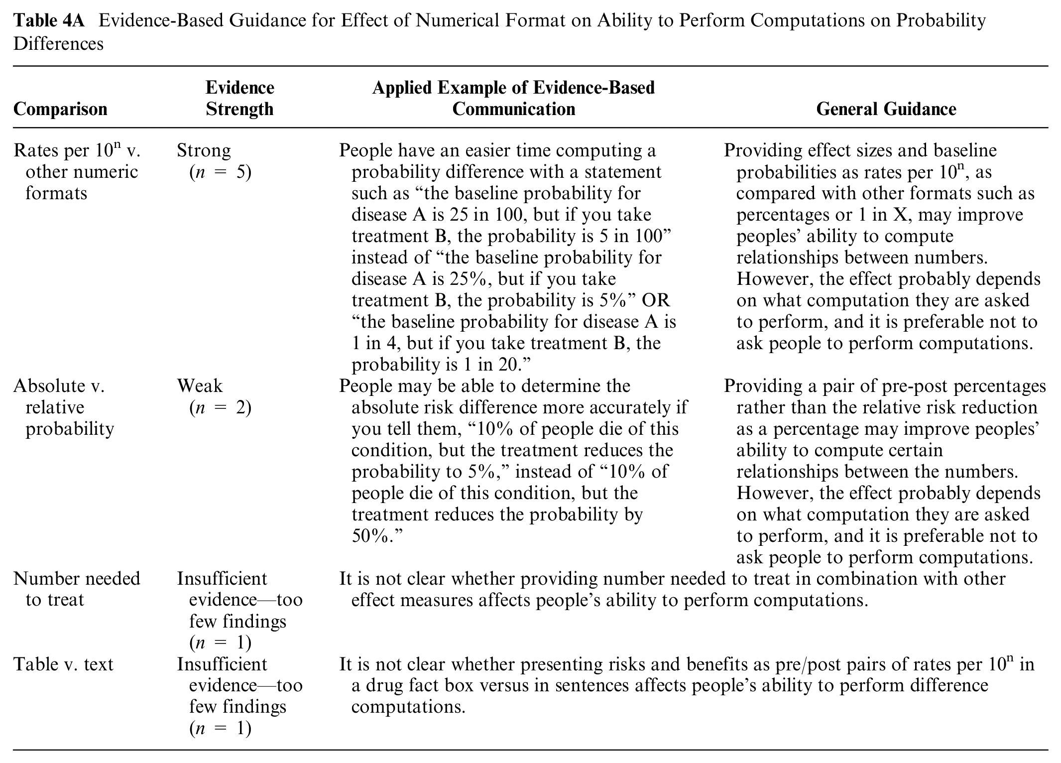
ABSOLUTE VERSUS RELATIVE PROBABILITY: Two moderate- to high-credibility findings showed that the accuracy of computing a probability difference was better with an absolute difference (pair of pre-post percentages) than RRR as percentage (Garcia Retamero et al., 32 Schwartz et al. 30 ).
NNT: Rates of correct answers were lower when NNT was provided alone or in combination with other metrics of effect size (Sheridan et al., 18 moderate credibility).
TABLE VERSUS TEXT: One moderate-credibility finding by Brick et al. 11 was that computation ability improved when the risks and benefits were presented as pairs of pre-post rates per 10n in a drug facts box rather than as pairs of rates per 10n in sentence text.
Comparisons between graphical formats on ability to perform computations on probability differences (subsection 4B)
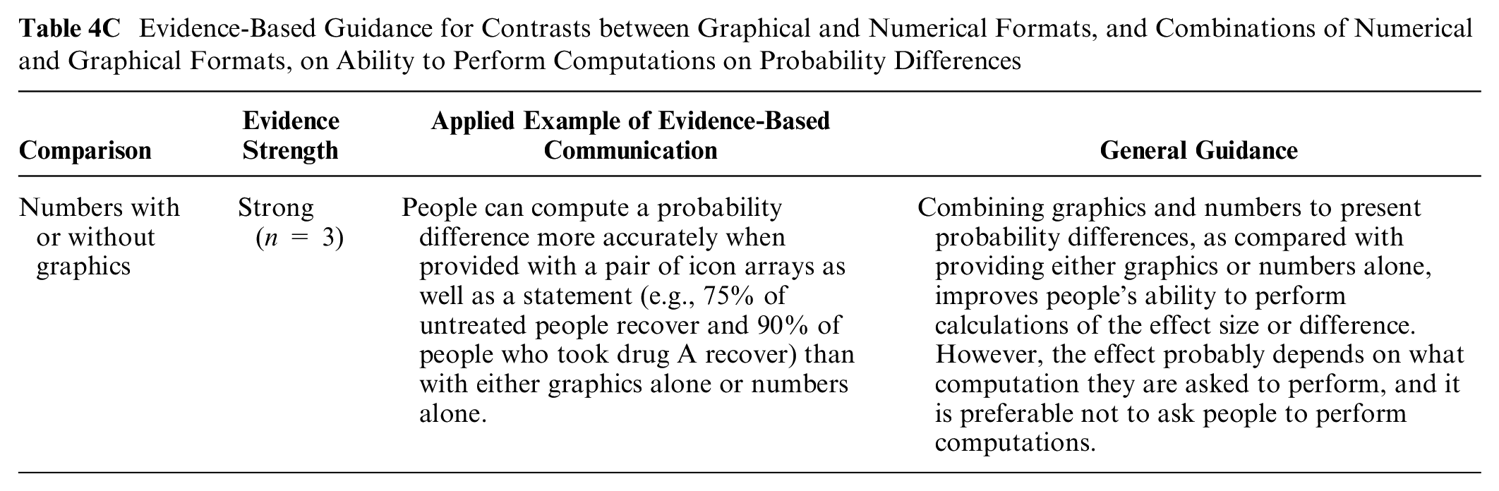
ICON ARRAYS VERUS BAR CHARTS: Two moderate-credibility findings (Garcia-Retamero et al., 33 Garcia-Retamero et al. 34 ) found the ability to perform computations to estimate differences was similar with pairs of part-to-whole icon arrays and pairs of part-to-whole bar charts.
Evidence-Based Guidance for Effect of Graphical Format on Ability to Perform Computations on Probability Differences

PART-TO-WHOLE VERSUS FOREGROUND-ONLY GRAPHICS: A high-credibility finding showed that the ability to perform computations to estimate differences was higher with pairs of part-to-whole graphics (icon arrays or bar charts) than foreground-only ones (Garcia-Retamero and Galesic 35 ).
A lower-credibility finding (Price et al. 36 ) compared different icon array fill patterns but was insufficiently powered.
Comparisons between numerical and graphical formats, and combinations of numerical and graphical formats, on ability to perform computations on probability differences (subsection 4C)
NUMBERS WITH OR WITHOUT GRAPHICS: Three moderate to high-credibility findings from different studies by the same author team suggest that the combination of graphics and numbers is generally superior to numbers alone in supporting computations. In one of these (high credibility), part-to-whole icon arrays or bar charts plus the arithmetic difference were superior to numbers alone as well as to several other graphics (Garcia-Retamero and Galesic 35 ). The remaining 2 (moderate- to high-credibility findings) (Garcia-Retamero et al., 34 Garcia-Retamero et al. 32 ) also found that icon arrays or bar charts performed better than numbers alone, but the effect may be strongest among or limited to those with high graph literacy.
Evidence-Based Guidance for Contrasts between Graphical and Numerical Formats, and Combinations of Numerical and Graphical Formats, on Ability to Perform Computations on Probability Differences
Comparisons of frames (gain, loss, or combination) on ability to perform computations on probability differences (subsection 4F)
SURVIVAL VERSUS MORTALITY CURVES: A moderate-credibility finding (Armstrong et al. 37 ) found a greater ability to calculate the difference between 2 groups at a point in time when the data were presented in survival curves instead of mortality curves.
Evidence-Based Guidance for Effect of Framing on Ability to Perform Computations on Probability Differences

Summary of Evidence
Both of the 2
Computations related to probability differences are easier with pairs of rates per 10n than with pairs of percentages or 1 in X rates (subsection 4A: compute outcome, numerical formats comparison).
Adding graphics (icon arrays and bar charts) to numeric communications about probability differences makes it easier to perform computations than providing either numbers alone or graphics alone (subsection 4C: compute outcome, numerical and graphical format comparison).
The available
People may do better answering questions about risk reductions with a pair of percentages than with a pair of rates per 10n (subsection 1A, identification/recall outcome, numerical format comparison).
People may be better able to contrast several options with relative risk differences than with pairs of absolute percentages (subsection 2A, contrast outcome, numerical format comparison).
Showing risk reduction as pairs of rates per 10n with the same denominator rather than pairs of percentages may help people identify larger versus smaller differences (subsection 2A, contrast outcome, numerical format comparison).
It may be easier to contrast treatment options with a relative risk difference than with either absolute risk differences, NNT, or a combination of these formats (subsection 2A, contrast outcome, numerical format comparison).
People’s ability to contrast effect sizes may be better with a bar chart of percentage point improvement than a bar chart of percentage point reduction (subsection 2B, contrast outcome, graphical format comparison).
People may be better able to contrast probability differences associated with multiple options with pairs of negatively framed percentages (with or without positively framed percentages) than with pairs of positively framed ones alone (subsection 2F, contrast outcome, numerical format comparison).
Using a) pre-post percentages instead of RRR (subsection 4A: numerical formats comparison) or b) graphics with numerators and denominators instead of only numerators (subsection 4B: graphical formats comparison) may help people perform certain computations relevant to probability differences (computation outcome).
Further
The ability to answer questions about probability differences may not be affected by a) adding pairs of absolute rates per 10n to the absolute difference (subsection 1A: identification/recall outcome, numerical format comparison), b) adding labels to numbers saying which is greater (subsection 1E: identification/recall outcome, context), or c) using combination-framed icon arrays showing incremental differences in multiple outcomes versus gain-framed icon arrays highlighting only incremental survival outcomes (subsection 1A: identification/recall outcome, graphic format comparison; gain-loss framing).
The ability to perform computations relevant to probability differences may not be affected by using icon arrays versus bar charts (subsection 4B, compute outcome, graphical format comparisons).
Discussion
This literature review synthesizes the evidence pertaining to the impact of data presentation formats on multiple outcomes (identify/recall, contrast, categorization, and computation) when performing difference cognitive tasks on probability information. The task of assessing the difference between 2 probabilities is a critical one for patients seeking to understand the size of a treatment benefit, the size of a potential harm from a risk factor, and other risk reduction or risk increase messages such as those included in US Preventive Services Task Force guidance 38 or decision aids. 39
Even when focusing on those questions for which research evidence exists (see Table B), it is notable that we classified most of the evidence from this synthesis as insufficient or weak, mostly due to limited numbers of relevant studies that could be directly compared. As a result, we provide only a few strong guidance statements and no moderate statements.
Although there are 2 pieces of strong evidence about how to help readers perform computations (by using rates per 10n rather than other numbers and by adding graphics to numbers), we note that information designers should be cautious about requiring readers to do their own computations. Many best practices for inclusive communication40,41 recommend against making readers perform computations because the cognitive effort and skill level required may be barriers to using the numbers. Instead, the designer of the information should perform the computation for the reader when possible. When computations are unavoidable, the evidence provided here may make them easier.
Weak evidence regarding probability difference communications was more common. Often, this was not because of an absence of high-credibility research but because only 1 high-credibility finding was identified for a particular format comparison, which did not meet our standard for moderate or strong evidence. Overall, these weak evidence statements reinforce the idea that a format beneficial for one outcome may not be ideal for another outcome. For example, showing RRRs (e.g., a 30% reduction) appear to help people contrast the effect sizes for several options, but pairs of pre-post percentages (e.g., a reduction from 40% to 10%) appear to be better for helping people perform computations around probability differences. This supports our general message that communicators should thoughtfully choose their goal for presenting information before deciding on the format.
Much of the evidence pertaining to the use of graphics to represent probability differences was weak and so specific that it may not be very helpful to professional communicators. For example, it appears that bar charts showing percentage increase are easier for contrast than bar charts of percentage reduction, but little other guidance is available about the design of bar charts. We note that there is more evidence available about the use of graphics to represent single probabilities (rather than probability differences), as summarized in our companion articles; the extent to which this evidence generalizes to representations of probabilities differences is not clear.
There were no findings related to the outcome of categorization of probability differences, although, in the context of tasks evaluating the difference between 2 or more values, this is not particularly surprising. Instead of asking participants to categorize differences, studies instead asked which difference was less or greater (contrast outcome), such as to help readers determine which options may be best.
Limitations for the Making Numbers Meaningful project include the possibility that studies were missed in the search, the use of a small group of experts to evaluate study risk of bias and finding credibility, and the granular data extraction that meant that we prioritized narrow comparisons of highly comparable studies (studies with the same task, format comparison, and outcome) rather than more global assessments. We did not perform analyses by audience characteristic (such as numeracy or culture) because so few comparable articles segmented their results by the same characteristics.
An additional limitation is our decision to distinguish between research findings related to point tasks from those related to difference tasks. Because of this decision, we excluded research questions such as, “Do people have an easier time performing computations with absolute risk of disease or with risk relative to the average person’s risk?” In our approach, performing a cognitive task such as a computation with a single probability (such as absolute disease risk) is different from doing so with relative differences. That means that such comparisons did not meet our inclusion criterion of having the same information presented in different formats (see the Methods section).
As shown in Table A, this review article covers part of the research evidence about difference tasks, that is, situations in which an audience examines a stimulus to seek information about probability differences. Other tasks are covered in other articles focusing on point tasks (in which people look for information about individual probabilities), time-trend tasks (involving assessing patterns of probability over time), and synthesis tasks (involving aggregating information about multiple probabilities together, such as a set of risks and benefits of a therapeutic option). As a result, each article in this series presents an inherently incomplete snapshot of the effect of format on important outcomes. Findings and evidence presented here should be considered in the context of the companion articles filling out the evidence on the effects of format on important outcomes in probability communication.
In conclusion, difference tasks—tasks involving assessing or making decisions about a probability difference—are critical to informed decision making about risk-reducing therapies or risk-increasing exposures. The evidence presented here pertains to 3 specific outcomes that might map to communicators’ goals when designing information. When trying to help patients to identify or remember probability differences, weak evidence supports the superiority of pairs of percentages than pairs of rates per 10n. When trying to help patients contrast probability differences to select the biggest (or smallest), weak evidence favors relative risk differences or pairs of rates per 10n with the same denominator rather than pairs of percentages, absolute risk differences, or NNT; negatively framed percentages rather than positively framed ones; and bar charts of percentage increase rather than bar charts of percentage decrease. Finally, several communication choices (rates per 10n rather than 1 in X or percentages; adding graphics to numbers) improve patients’ ability to perform computations when the information designer cannot find a way to avoid computations altogether. Communicators who wish to influence other outcomes, such as perceived effectiveness or behavioral intention, should refer to the companion article in this series (“How Difference Tasks Are Affected by Probability Format, Part 2: A Making Numbers Meaningful Systematic Review”). 42
Footnotes
Acknowledgements
We thank the Numeracy Expert Panel for contributions to conceptualizing the Making Numbers Meaningful project (Cynthia Baur, Sara Cjaza, Angela Fagerlin, Carolyn Petersen, Rima Rudd, Michael Wolf, and Steven Woloshin). We are grateful to Marianne Sharko, MD, MS, Andrew Z. Liu, MPH, and Lisa Grossman Liu, MD, PhD, for contributions to article screening and risk-of-bias assessment. We also thank Jordan Brutus for assisting with data management.
The authors declared no potential conflicts of interest with respect to the research, authorship, and/or publication of this article. The authors disclosed receipt of the following financial support for the research, authorship, and/or publication of this article: Financial support for this study was provided entirely by a grant from the National Library of Medicine (R01 LM012964, Ancker PI). The funding agreement ensured the authors’ independence in designing the study, interpreting the data, writing, and publishing the reports.