
Abstract
Highlights
Formatting a probability as 1 in X, using a foreground-only icon array, adding anecdotes to numbers, and gain-loss framing all affect probability perceptions and feelings.
The evidence on communicating numbers to influence perceptions is far stronger than the evidence on using it to change health behavior or behavioral intention.
Only weak evidence is available on patient preferences for verbal, graphical, and numerical probability formats.
As people make decisions about their health, they frequently require information about health probabilities such as the likelihood of disease or the chance of side effects. This information may be conveyed as numbers (e.g., percentages, rates per 10n, 1 in X, or other formats), graphics (such as icon arrays, bar charts, number lines, or others), and verbal descriptions of probabilities (such as “rare” or “unlikely”). We synthesized the evidence on how to communicate health-related numbers in medical and health domains through a large systematic review (Prospero registration number CRD42018086270).1,2 We applied a conceptual model of communication in which a stimulus (containing data presented in a data presentation format) is available to a reader, who performs a cognitive task upon it to extract meaning, resulting in a cognitive, affective, perceptual, or behavioral response captured with an outcome measure.1,2
This article focuses on research on communicating health probabilities, that is, the chances of health events occurring. Throughout, we use the term probability rather than risk because of the sometimes ambiguous meaning of risk (for example, in epidemiology, risk is the probability of an event, whereas in environmental science, risk is the hazard times its probability).
In the systematic review, we grouped the research literature by the task performed by the research participant while looking at the stimulus. The current article includes point tasks, in which readers examine a stimulus for information about single probabilities, such as the chance of cancer recurrence. Future articles (see Table A) will cover difference tasks, those in which readers seek information about the differences between probabilities, such as the effect of a risk factor upon chance of disease. Other future articles will cover synthesis tasks, in which the reader integrates several probabilities, such as the set of risks of a medication or a list of risks and benefits. As shown in Table A, a subset of synthesis task research involves interpreting probability information to estimate Bayesian posterior probabilities. Another article will cover time-trend tasks, in which readers examine stimuli to evaluate patterns over time.
Current Article’s Scope within the Making Numbers Meaningful Systematic Review


This standardized numbering system is used within the current article and across all Making Numbers Meaningful articles to allow the reader to find comparable information in different articles. Gray cells represent combinations that are not possible according to the definitions presented in Ancker et al. 1
To keep article length manageable, the point research has been divided into a pair of articles. The current article presents point task evidence on commonly assessed outcomes: 1) probability perceptions (perceived likelihood of an event; sometimes called risk perception) or probability feelings (self-reported emotional response to the message, including worry or concern; also sometimes called risk perception), 2) behavioral intentions (self-reported decision or plan to take some action) and health behaviors (self-reported or objectively assessed action), 3) trust in the information (self-reported credibility of the communication or the information), and 4) preference for or perception of the data presentation format (including perceived helpfulness of the format and how much the participant liked a format). Finally, we also include 5) discrimination, that is, the ability to make distinctions between probability levels on the basis of differences in the stimuli. This article includes the evidence on the effects of all different probability presentation formats—numerical, graphical, and verbal—on these outcomes. (The companion article 3 presents the parallel evidence for 5 additional outcomes.)
Methods
The systematic review and classification methods are reported in our companion methodology article. 1 In brief, we conducted a broad literature search through 2020 to find experimental (randomized) and quasi-experimental (nonrandomized) research comparing 2 or more formats for presenting quantitative health-related data to patients or other lay audiences. We searched MEDLINE, Embase, CINAHL, the Cochrane Library, PsycINFO, ERIC, and ACM Digital Library and conducted hand searches of the tables of contents of Medical Decision Making, Patient Education and Counseling, Risk Analysis, and Journal of Health Communication. The current article presents only research about probabilities.
We defined a data presentation format as a method of communicating a probability: the data presentation formats of interest were numbers, graphics, and verbal descriptions of probabilities. Numbers used to express single probabilities of health events included percentages, frequencies, counts, and age-based estimates such as “heart age” or “additional years of life.” We distinguished between 2 types of frequencies: 1 in X (examples include “1 in 5” and “1 of every 25”) and rate per 10n (such as “12 in 100” or “2.5 per 1,000”). Unlike some others, we use the term natural frequencies only for presentations of a series of probabilities and joint probabilities computed from the same pool of patients in the context of Bayes’ theorem.4,5 (This definition is congruent with the original formulation of the term, 5 and using the term only for this purpose helps clarify otherwise contradictory findings about these numbers. 4 ) Graphical formats for single probabilities included icon arrays, number lines and risk ladders, bar charts, pie charts, and flow charts as well as novel creations such as animated icon arrays and slide shows. Verbal formats for single-probability information included probability terms such as rare or likely. In addition, we assessed manipulations of or variations on the formats that appeared frequently in the literature (such as gain-loss framing, addition of or variation of contextual information [including order effects], addition of anecdotes, and manipulation of denominators for frequencies).
We identified 316 articles published through 2020 focused on health probability communication. Each included article is covered in 1 or more of our review articles (listed in the mapping file at the Making Numbers Meaningful Project at OSF; https://osf.io/rvxf2/). Of these, 161 articles (reporting 466 distinct findings) involved point tasks related to the 7 outcomes described above. The risk of bias of each study (S-ROB) was assessed according to a standard rubric developed for this project, which considered sample representativeness, randomization, protocol deviations, presence/absence of demographic and covariate information, missing data, and other potential biases. 1 From each study, we extracted information about task, stimulus (data and data presentation format), and outcome to produce multiple findings per article. We selected outcomes to track informed by behavioral and risk communication theory (behavior or behavioral intention, probability perceptions or feelings, recall) or empirically on the basis of what was frequently measured by the research included in our review (trust, preference for a format), particularly measures used to measure comprehension (identification, contrast, computation, categorization, discrimination).
Each finding was assessed by a panel of expert reviewers (J.S.A., B.J.Z.-F., with N.C.B. substituting in case of conflict of interest), who weighed sample size, statistical methods, effect size, face validity and comparability of the stimuli being compared, face validity or criterion validity of the outcome measures and covariates at the finding level, as well as the S-ROB for the study from which the finding came. Credibility was assigned holistically on a scale from 1 to 10 on the basis of the expert team’s evaluation of these factors. We grouped findings by task type and outcome type and developed evidence statements for each group. We used the finding’s risk of bias, the credibility of each finding, and the consistency of findings grouped together in a standard rubric to assess the strength of evidence for each guidance statement. Consistency was considered moderate if findings showed a mix of significant effects in one direction and lack of significant effects; consistency was considered low if the findings showed significant effects in different directions.
Findings with high credibility (7 or higher on a scale of 1 to 10) and moderate credibility (4.5–6.5) are discussed below. Findings with credibility of 4 or lower are mentioned in the text below, counted in Table B, and cited in the Findings files, but they do not contribute to the evidence summaries or the evidence tables.
Numbers of Findings by Outcome and Data Presentation Format Comparison

This standardized numbering system used in the rows and columns of this table has been used for results subheadings across all Making Numbers Meaningful (MNM) results articles. The standard numbers ensure that, for example, studies comparing graphical formats for their effects on behavior are always placed in a subhead labeled subsection 7B (whether or not there are sections labeled 1A though 6J or 7A in that particular article). Our goal is to ensure that readers can use this subhead system to more easily locate similar sections across articles. The full list of section headers is available in the Methodology Files folder at the MNN Project at https://osf.io/rvxf2/.
The Making Numbers Meaningful Project at OSF (https://osf.io/rvxf2/) contains all supplemental files, including a Methodology Files folder containing the search strategy, the data extraction instrument, and the S-ROB rubric).
Results
Each subsection below includes evidence on the following comparisons in order: comparisons among number formats, among graphics formats, between number and graphic formats, between number and verbal formats, between different types of contextual elements, effect of framing, effect of representations of uncertainty, effect of manipulations of denominators, effect of animation or interactivity, and manipulations of time period.
Within each subsection (listed in Table B), evidence is arranged from strongest to weakest. Each subsection concludes with a table of the evidence-based guidance, arranged in the same order; each paragraph in the subsection corresponds to a row of that subsection’s evidence table. The full spreadsheet of point task findings is available in the Probability Findings folder in the Making Numbers Meaningful Project at OSF (https://osf.io/rvxf2/).
Effects of Different Formats on Probability Perceptions and Feelings (Probability Perception and Probability Feelings Outcomes): Section 5
Researchers presenting the probability of an event to a patient sometimes measured perceptions on a quantitative or ordinal scale of size (e.g., how large the probability seems on a scale of 1 to 10) and sometimes on an affective scale (e.g., how concerned the patient feels about the event). We abstracted the first of these as “probability perceptions” and the second as “probability feelings.” Both are presented in this section.
Importantly, in this section, we do not cover research into the accuracy of the probability perception or feeling. The accuracy of identification of a probability (when the stimulus is visible) or recall of it (when the stimulus is not visible) is covered in our companion Part 1 article under section 1, the so-called “identification-recall” outcome.
Comparisons between numerical formats in effects on probability perceptions and feelings (subsection 5A)
1-IN-X VERSUS OTHER FORMATS: A total of 16 findings demonstrated a 1-in-X effect. Thirteen moderate and high-credibility findings showed that 1-in-X formats led to greater perceived probability and/or feelings than rate per 10n or percentage formats (Fair et al. [perceptions and feelings] 6 ; Chapman et al. 7 ; Sirota et al. 8 substudy 1 [perceptions and feelings] and 3; Pighin et al. 9 findings from substudies 1 [both perceived probability and feelings], 2, 3, and 6; Sirota et al. 10 ; Pighin et al. 11 ). Knapp et al. 12 showed the 1-in-X effect when compared to a “probability band,” which was a range of probabilities in 1-in-X format (e.g., a chance of “up to 1 in 100” or “1 in 10 to 1 in 100”). A moderate-quality finding 12 showed that the 1-in-X probability band format was associated with higher perceived probability than a rate per 10n value within that probability band (probability feeling not assessed). Two findings from the same Wu et al. 13 publication (substudies 2 and 3) produced moderate-credibility findings demonstrating the 1-in-X effect (compared to percentage) but only for some probability levels and some emotional priming conditions.
Evidence-Based Guidance for Effects of Numerical Formats on Probability Perceptions and Feelings

A total of 6 moderate- to high-credibility findings did not find a 1-in-X effect (Gurmankin et al, 14 Knapp et al., 15 Sirota et al. 8 substudies 2, 4, and 5 [perceptions and feelings]).
PERCENTAGE VERSUS RATE PER 10n: While 1 high-credibility finding (Hill and Brase 16 substudy 1) and 4 moderate-credibility findings (Peters et al., 17 Halpern et al., 18 Peters et al. 19 substudy 1, Hill and Brase 16 substudy 2) compared percentage with rate per 10n (such as 10 in 100), none showed a significant difference in perceived probability. One moderate-credibility finding 20 did find lower perceived probability with rates per 10n embedded in text versus percentages in a table format, but confounding of format and table limits the ability to draw conclusions from this finding. Probability feeling was not assessed in these findings.
ARITHMETIC DIFFERENCE: Five findings examined the impact of providing the arithmetic difference between probabilities (compared with providing pairs of probabilities alone) on perceived probability of individual probabilities. (Arithmetic difference between probabilities may be called absolute risk difference, absolute risk reduction, or absolute risk increase.) Zikmund-Fisher et al. 21 substudy 2 (high credibility) and Shepperd et al. 22 (moderate credibility) demonstrated lower worry or concern about a negative outcome when the arithmetic difference between those with and without the risk factor was presented versus pairs of rates per 10n alone. Similarly, both Zikmund-Fisher et al. 21 substudy 2 (high credibility) and Zikmund-Fisher et al. 23 (moderate credibility) showed lower perceived probability of the posttreatment probability in a similar comparison, and Berry et al. 24 (moderate credibility) showed lower perceived probability with harm when arithmetic difference was shown together with baseline probability than for the arithmetic difference alone. However, Sullivan et al. 25 (high credibility) showed no differences in perceived probability when medication side effect rates (percentage + rate per 10n) were supplemented by the arithmetic difference between medication and no medication, and Shepperd et al. 22 (moderate credibility) similarly showed no differences in perceived probability of cancer when arithmetic difference was added to rate per 10n.
TEXT VERSUS TABLE: A high-credibility finding and a moderate-credibility finding from the same author group demonstrated no differences in either perceived probability26,27 or emotional concern 26 when medication side effects were presented as rate per 10n in text versus in table format. However, in 2 high-credibility findings, Schwartz et al. 28 substudy 1 and 2 showed higher perceived probability when percentages were embedded in dense text than presented with rate per 10n rates and arithmetic difference in drug facts box table, although the multiple differences between arms limits ability to attribute the effect to the table format.
MORE VERSUS FEWER DIGITS TO THE RIGHT OF THE DECIMAL POINT: One high-credibility finding from a study of the number of significant digits showed that an increase in the number of significant digits led to higher perceived probability. 29 However, there was not a linear relationship between increasing perceived probability and increasing number of digits.
HEART AGE VERSUS PROBABILITY: In 2 high-credibility findings, Bonner et al. 30 showed both higher perceived probability and stronger probability feelings when a personalized estimate of cardiovascular risk was shown as “heart age” plus the difference from actual age versus as pair of percentages plus arithmetic difference between them. However, 2 moderate-credibility findings comparing percentages with heart age showed no difference in perceived probability or probability feeling. 31 Translating these findings into practice may be challenging in the absence of a single universally accepted “Heart Age” calculator.
ORDER EFFECTS: In a high-credibility finding, Ubel et al. 32 demonstrated higher perceived probability and higher concern about side effect chances when benefits were presented before risks.
VERBALIZING NUMBERS: In a moderate-credibility finding, Miron-Shatz et al. 33 showed that writing 1-in-X statistics as “1:X” resulted in higher perceived probability than when the same ratio was written out as “one in every X.”
TIME INTERVAL: One moderate-credibility finding 34 demonstrated that adding a large time interval (1 case per 3,500 y) to a 1-in-X chance reduced perceived threat, but a smaller time interval had no effect. Perceived probability was not assessed.
NOT SUMMARIZED: Two lower-credibility findings are not summarized due to insufficient information in the stimulus 35 and lack of statistical power and hypothesis testing. 36
Comparisons between graphical formats in effects on probability perceptions and feelings (subsection 5B)
PART-WHOLE VERSUS FOREGROUND-ONLY GRAPHICS: Studies comparing foreground-only/numerator-only graphics versus part-to-whole graphics produced 10 findings. Five high-credibility findings demonstrated higher perceived probability with numerator-only bars37,38 or icon arrays (Okan et al. 39 substudies 1 and 2, Stone et al. 40 substudy 2) than with part-to-whole displays. Stone et al. 37 showed the same pattern in probability feelings (fear). Five additional findings, all moderate credibility, showed no differences in perceptions or feelings. These included 2 moderate-credibility findings 22 showing no differences in either perceived probability or probability feelings in a small sample. In addition, 1 moderate-credibility finding compared a denominator-only icon array with a part-to-whole icon array (using very large numbers of typed dots rather than icons), finding no difference in perceived probability (Weinstein et al. 41 substudy 1). A moderate-to-high-credibility finding (Stone et al. 40 substudy 2) found no differences in probability feelings between denominator-only and part-to-whole icon arrays.
Evidence-Based Guidance for Effects of Graphical Formats on Probability Perceptions and Feelings
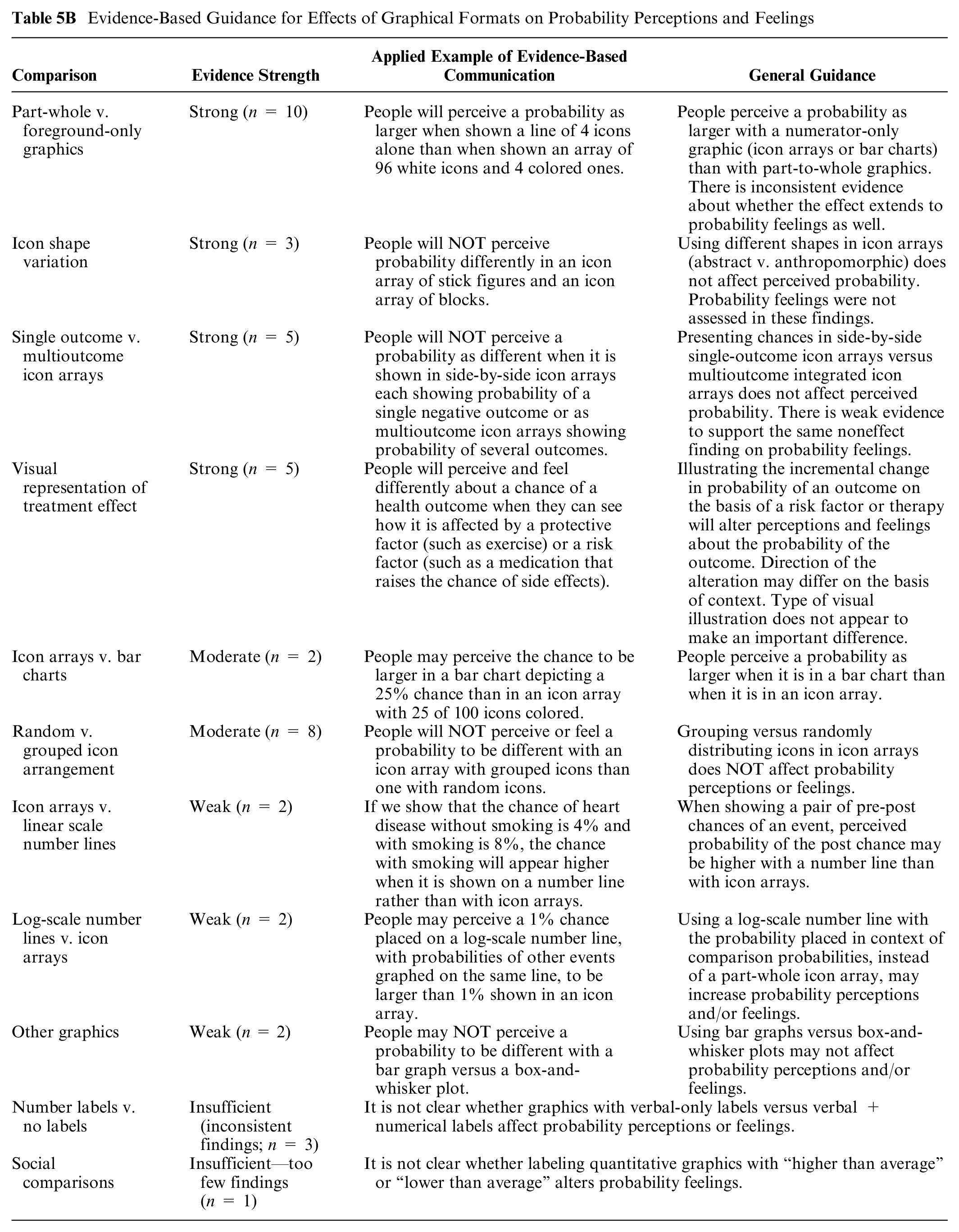
ICON SHAPE VARIATION: Three moderate-to-high-credibility findings compared icon shapes (e.g., abstract versus anthropomorphic), finding no difference in perceived probability, although probability feelings were not assessed.42–44
SINGLE-OUTCOME VERSUS MULTIOUTCOME ICON ARRAYS: Several studies examined the problem of simultaneously conveying the chances of several mutually exclusive outcomes of an event. These studies compared 1 stimulus that contained several icon arrays, each portraying the chance of a single outcome, with a second stimulus containing 1 icon array portraying the chances of the different outcomes integrated into the same array. A high-credibility finding (Zikmund-Fisher et al. 21 substudy 2) and 1 moderate-credibility finding (McDowell et al. 45 substudy 2) all showed no difference in perceived probability between side-by-side icon arrays versus multioutcome integrated icon arrays. Zikmund-Fisher et al., 21 substudies 1 and 2 (both high credibility), also showed no differences in probability feeling (worry). However, a moderate-credibility finding 23 showed lower perceived probability of side effects with multioutcome icon arrays that showed baseline probability plus arithmetic difference versus side-by-side icon arrays.
ICON ARRAYS VERSUS BAR CHARTS: One high-credibility finding 46 and one moderate-credibility finding 42 compared icon arrays to bar charts, both finding lower perceived probability of disease with icon arrays than with bar charts. Probability feelings were not assessed.
ICON ARRAYS VERSUS LINEAR SCALE NUMBER LINES: Both Adarkwah et al. 47 (high credibility) and Adarkwah et al. 48 (moderate credibility) demonstrated that perceived chance of disease was higher with pre/post numbers (percentages or rate per 10n) placed on a number line than with an integrated icon array.
ICON ARRANGEMENT: Eight findings included a comparison of random versus grouped icons in icon arrays. One moderate-credibility finding demonstrated that perceived probability was higher with the random array, 42 but 4 moderate-credibility findings demonstrated no effect on perceived probability.49–52 In addition, 3 moderate-credibility findings showed no difference in probability feeling.49,50,52
VISUAL REPRESENTATION OF TREATMENT EFFECT: In communicating the effect of medication on chance of side effects with rates per 10n and icon arrays, 2 high-credibility findings from Zikmund-Fisher et al. 21 was that, in stimuli that illustrated the incremental risk, worry was not affected by whether the increment was illustrated with side-by-side icon arrays or a single icon array showing the increment. One of these showed the same pattern for perceived probability. 21 However, in a moderate-credibility finding, Janssen et al. 53 showed that in communicating “your chance” of several chronic diseases on a vertical risk ladder, perceived probability of the disease was slightly higher when the ladder also portrayed the (lower) postexercise probabilities showing how much exercise could reduce risk. Worry was not affected. 53
LOG-SCALE NUMBER LINES VERSUS ICON ARRAYS: Two moderate-credibility findings (Siegrist et al. 54 substudy 1) showed that a log-scale number line that included probabilities of comparison events resulted in higher perceived probability and emotion than a part-whole icon array, although it is not clear how much the effect was a result of graphics versus the additional comparison probabilities.
OTHER GRAPHICS: Two moderate-credibility findings 55 compared several different graphics including bar graphs and box-and-whisker plots with no significant effect on probability perceptions or feelings.
NUMBER LABELS VERSUS NO LABELS: In a moderate-credibility finding, Janssen et al. 53 showed no differences in perceived probability when personal probability shown on a risk ladder was accompanied by verbal labels only or verbal labels plus rate per 10n. Probability feelings were also not affected. 53 However, in a moderate-credibility finding, Okan et al. 38 showed that in communicating effect of drug therapy, adding rate per 10n data labels to bar charts slightly reduced perceived probability (however, the measure of perceived probability was conflated with a measure of perceived effectiveness, somewhat reducing ability to draw conclusions about either alone). 38
SOCIAL COMPARISONS: In a moderate-credibility finding by Emmons et al., 56 worry about colorectal cancer did not differ significantly when risk ladders labeled with social comparisons (e.g., “higher than average”) were added to either static or interactive risk ladders that used scales of rates per 10n to communicate absolute probabilities.
NOT SUMMARIZED: Findings from lower-credibility studies were not summarized due to lack of power, 57 stimulus complexity (Damman et al. 58 for both perceptions and feelings), and lack of clarity regarding stimuli and outcome measures (Weinstein et al. 41 substudy 2).
Comparisons between numerical and graphical formats, and combinations of numerical and graphical formats, in effects on probability perceptions and feelings (subsection 5C)
ICON ARRAYS VERSUS NUMBERS: Five high-to-moderate-credibility findings demonstrated that grouped icon arrays were associated with lower perceived probability than rate per 10n or percentages (Siegrist et al. 54 substudy 1, Keller and Siegrist, 59 Galesic et al. 60 substudy 2, Navar et al., 46 Tait et al. 26 ). Both the first and the last of these (both high-credibility) demonstrated the same effect for concern about side effects. However, 2 high-credibility findings showed no difference between icon arrays and percentages, 52 for either perceived probability or probability feelings, and 3 moderate-credibility findings also showed no difference in perceived probability between icon arrays and frequency numbers (Weinstein et al. 41 substudy 1, Tait et al., 27 Colome et al. 61 ). The Weinstein et al. finding used sheets with large numbers of dots, rather than a traditional icon array.
Evidence-Based Guidance for Contrasts between Numerical and Graphical Formats, and Combinations of Numerical and Graphical Formats, on Probability Perceptions and Feelings

ADDING AN ICON ARRAY TO A RATE PER 10n: Two high-credibility findings (Fraenkel et al. 62 for perceptions and feelings) and 7 moderate-credibility findings (Cameron et al., 63 McDowell et al. 45 substudy 2, Shepperd et al. 22 with 1 finding for feelings and another for perceptions, Zikmund-Fisher et al., 23 Cozmuta et al. 64 for feelings and another finding for perceptions) examined the effect of adding a part-to-whole icon array to rate per 10n numbers, consistently finding no differences in either perceived probability (6 findings) or concern (3 findings). However, when communicating effect of medication on chance of side effects with rates per 10n with or without icon arrays, a moderate-credibility finding from Zikmund-Fisher et al. 21 was that worry about 1 out of the 4 side effects was reduced when the pre and post risk was explicitly stated in side-by-side icon arrays labeled with numbers versus numbers only.
FOREGROUND-ONLY ICON ARRAYS VERSUS NUMBERS: One high-credibility finding and 1 moderate-credibility finding demonstrated higher perceived probability with foreground-only icon arrays than with rate per 10n (Stone et al., 40 subsubstudies 1 and 2). Similarly, in a moderate-credibility finding, Stone et al., 65 substudy 2, showed higher probability estimates with foreground-only icon arrays than with rate per 10n, but concern was not affected. However, a high-credibility finding (Stone et al. 40 substudy 2) demonstrated no differences in probability feelings between rate per 10n and foreground-only or part-to-whole icon arrays, and a moderate-credibility finding 22 showed no differences in either probability perceptions or feelings about cancer between rate per 10n and foreground-only icon arrays.
LOG-SCALE NUMBER LINES VERSUS NUMBERS: Five findings examined a horizontal number line with a log-scale axis, all of which showed comparison probabilities or population probability as well as the target probability (“Paling” graphic). Four findings (Siegrist et al. 54 substudies 1 and 2) showed that probability perceptions (1 high and 1 moderate credibility) and feelings (both high credibility) were higher with the log-scale number line than with 1 in X, and 1 moderate-credibility finding 59 showed the same for perceived probability only.
ADDING AN ICON ARRAY TO 1 in X: Two moderate-credibility findings33,66 demonstrated that estimated probability with 1 in X was reduced by adding an icon array, but only under certain conditions. In a related finding, a high-credibility finding (Pighin et al. 9 substudy 7) showed that supplementing frequency numbers with an icon array reduced the difference in perceived probability between 1 in X and rate per 10n.
LINEAR-SCALE NUMBER LINE VERSUS NUMBERS: Two high-credibility findings showed no difference between percentages and number lines (Han et al. 67 substudy 1) for probability perceptions or feelings.
BAR CHARTS VERSUS NUMBERS: A high-credibility finding 46 did not find differences in perceived probability between a pair of percentages versus a bar chart. Similarly, a moderate-to-lower-credibility finding 20 showed no differences between percentages in a table and percentages plus a bar chart, although small sample and other factors limit confidence in this negative finding. However, 1 moderate-credibility finding demonstrated that the stacked bar chart was associated with lower perceived probability than rate per 10n or more complex graphics. 55 The authors also assessed probability feelings but did not detect any differences.
PIE CHARTS VERSUS NUMBERS: One moderate-credibility finding compared pie charts versus percentages (both with uncertainty), finding no difference in perceived probability. 68 This combination has not been assessed for probability feeling.
NOT SUMMARIZED: Some lower-credibility findings from relevant findings are not synthesized due to confounding with contextual manipulations (Damman et al., 58 perceptions and feelings findings), modest sample and multiple differences between formats (Lee and Mehta, 69 perceptions and feelings findings), lack of power, 57 unclear statistical testing, 70 or combination of the communication with a counseling intervention (Henneman et al., 71 perceptions and feelings findings).
Comparisons between numerical and verbal probabilities in effects on probability perceptions and feelings (subsection 5D)
VERBAL VERSUS NUMERIC PROBABILITY: Twelve high-credibility findings examined the mapping between verbal probabilities and numbers endorsed by the European Commission (EC). 72 Overall, these findings demonstrated that probability perceptions and feelings with verbal descriptors were higher than with the corresponding EC probability numbers, whether in percentage, 1 in X, or rate per 10n formats. Three of the findings detected this pattern in perceived probability only (Berry et al. 73 substudy 2, Berry and Hochhauser, 74 Peters et al. 75 ), 1 in probability feelings only (Young and Oppenheimer 76 substudy 3), and 8 in both (Knapp et al. 77 substudy 1, Knapp et al., 12 Berry et al., 78 Berry et al. 73 substudy 1).
Evidence-Based Guidance for Contrasts between Numerical and Verbal Probability Formats on Probability Perceptions and Feelings

However, 1 high-credibility finding that did not focus on the EC terms 79 demonstrated that perceived probability was lower with verbal probability than with percentage plus rate per 100 or 1,000. Similarly, a moderate-credibility finding 80 showed that verbal descriptions evoked higher risk perceptions for low probabilities but lower risk perceptions for higher probabilities. Also, 2 moderate-credibility findings 81 showed that perceived probability (but not probability feelings) was higher with raw numbers of people affected than with verbal probabilities, and 2 moderate-credibility findings82,83 showed no difference between verbal probabilities and rates per 100/1,000 or percentages.
VERBAL PLUS NUMERIC PROBABILITY: Several findings assessed the effect of combining verbal probabilities and numeric probabilities but did not find any consistent results. Knapp et al. 84 (high credibility) showed that perceived probability was increased by adding verbal probability to 1 in X, but this change did not affect probability feelings (moderate credibility). A moderate-credibility finding 85 suggests that when genetic test results are labeled “screen negative,” adding verbal or numeric probabilities does not affect probability feelings such as anxiety and worry.
NOT SUMMARIZED: A lower-credibility finding was limited by insufficient power (Young et al. 76 substudy 2). A finding from Timmermans and Oudhoff 70 was not summarized due to floor effects, and a finding from de Wit et al. 86 was not summarized due to small sample size limiting confidence in the exact ranking of the different interventions studied.
Comparisons of elements added for context on probability perceptions and feelings (subsection 5E)
ANECDOTES: Several studies examined the effect of anecdotes, or short text narratives about individuals who experienced an event. Three moderate-to high-credibility findings all showed that anecdotes about adverse events increased perceived probability of the adverse event (Gutierrez and Cohn, 87 Betsch et al. 88 substudies 1 and 2; concern not assessed). However, in a more complicated moderate-credibility finding, Sheridan et al. 82 showed perceived probability of disease did not vary when anecdotes were provided in addition to X-in-N numbers.
Evidence-Based Guidance for Effect of Adding Contextual Information on Probability Perceptions and Feelings

CHANCE OF COMPARISON EVENTS: Six findings (2 high credibility, 4 moderate credibility) examined the effect of adding comparison chances of other events. Ubel et al. 32 showed that adding comparison events did not affect perceived probability but did eliminate risk versus benefit order effects on probability feelings. Similarly, Schapira et al. 42 showed that perceived probability of breast cancer did not differ when probabilities of other cancers were provided. Siegrist et al. 54 substudy 2 (assessing only perceived probability) showed no difference between showing comparison probabilities as 1 in X or depicted on a log scale number line. A similar finding by the same author (Siegrist et al. 54 substudy 1) assessed both perceived probability and probability feelings but combined the presence of comparison probabilities with the log scale number line format, reducing ability to draw conclusions about the role of either alone.
RISK-REDUCING ACTIONS: A high-credibility finding 63 showed perceived probability of disease was lower when numerical probabilities were accompanied by text describing the “risk-action link” to risk-reducing actions.
EXPLANATION OF UNCERTAINTY: Three moderate-credibility findings examined different ways of verbally explaining uncertainty, with none finding an effect on perceived probability52,89 or probability feeling. 52
INTERPRETIVE LABELS: In a high-credibility finding, Zikmund-Fisher et al. 90 showed that adding qualitative interpretive labels “normal” or “positive” to test results had an amplifying effect that either raised or lowered both probability perceptions and feelings.
DESCRIPTIVE LABELS: In a high-credibility finding, Sullivan et al. 25 demonstrated that perceived probability was not affected by whether a table of probabilities was accompanied by labels describing which option had the higher probability for each outcome.
DENOMINATOR SALIENCE: A high-credibility finding (Stone et al. 40 substudy 1) showed no difference in perception of probabilities when a foreground-only icon array accompanied by numerical denominator had denominator salience increased by making the denominator bold and red. A moderate-credibility finding 91 demonstrated a similar noneffect of highlighting either the number of events or the time period.
POPULATION AVERAGE: Of the 15 findings studying the effect of adding or showing a population average, 7 demonstrated an effect on probability perceptions or feelings. Three high-credibility findings (Fair et al. 6 [probability perceptions and feelings], Weinstein et al. 92 ) showed that showing or explaining that the person was higher than the population average increased probability perceptions and/or feelings. One moderate-credibility finding 93 found that showing that the person had higher probability than the lowest-probability group also increased perceived probability. Two moderate-credibility findings (Han et al. 67 substudy 1) demonstrated increased probability feeling but not probability perceptions with the addition of population averages. Lastly, Janssen et al. 53 (moderate credibility) showed that in communicating “your chance” of several diseases with a vertical risk ladder, perceived probability was lower when accompanied by verbal social comparison labels such as “much higher than average.” However, 7 moderate-quality findings showed no effect of showing the population average on perceived probability (Hess et al. 94 finding 1, Gibson et al., 55 Harris and Smith 95 ) or negative emotion.53,55,93,95 In a separate moderate-credibility finding (Raghubir, 96 finding 1) shifting the reference group so that counts of deaths represented a larger fraction of a smaller denominator lead to higher perceived probability.
CONCEPTUAL ILLUSTRATION OF TRADEOFFS: A moderate-credibility finding 64 demonstrated no differences in probability feelings when probability information was accompanied by balance beam graphics conceptually illustrating the risk-benefit tradeoff.
SOCIAL NORM MANIPULATION: A moderate-credibility finding 97 demonstrated higher perceived probability of cancer when screening was described as the default social norm.
NOT SUMMARIZED: Several lower-credibility findings are not synthesized due to questions of generalizability (Dillard et al. 98 substudy 2), lack of power,57,86 and confounding with graphical manipulations.58,59
Effects of gain-loss framing on probability perceptions and feelings (subsection 5F)
GAIN VERSUS LOSS FRAMING OF NEGATIVE EVENTS—PERCEPTIONS: Eight high- and moderate-credibility findings looked at the impact on perceived probability of framing of negative events (such as mortality or chance of side effects), with 4 (including 2 high credibility) finding that perceived probability of the negative event was higher when loss-framed (Peters et al., 17 Garcia-Retamero and Galesic, 99 Chapman et al. 7 substudy 2, Halpern et al. 18 ) and 4 (including 1 high-credibility) finding no effect (Williams et al., 100 Chapman et al. 7 substudy 4, Farrell et al., 101 Kalluru et al. 102 ). Two additional findings showed no similar effect on probability feelings.101,103
Evidence-Based Guidance for Effects of Gain-Loss Framing on Probability Perceptions and Feelings

GAIN VERSUS LOSS FRAMING OF POSITIVE EVENTS—PERCEPTIONS: Eleven high- and moderate-credibility findings examined the effect of framing positive events (such as effectiveness of a vaccine), all finding that gain-framing increased the perceived probability of that event (Peng et al. 104 substudy 1; Peng et al. 105 substudy 1; Kreiner and Gamliel 106 ; Bigman et al. 107 ; Zamarian et al. 108 ; Gamliel et al. 109 ; Biswas and Pechmann 110 findings 1, 3, 4, 5; Levin et al. 111 ).
GAIN VERSUS LOSS FRAMING OF BOTH POSITIVE AND NEGATIVE EVENTS—PERCEPTIONS: One examined the effect of framing both the harms and the benefits of an intervention, finding no effect on perceived probability of disease. 82
Comparisons of methods of representing uncertainty on probability perceptions and feelings (subsection 5G)
EXPLANATION OF UNCERTAINTY: Three moderate-credibility findings examined different ways of supplementing numbers with an explanation of uncertainty in words, none finding an effect on perceived probability52,89 or probability feelings. 52
Evidence-Based Guidance for Stating or Illustrating Numerical Uncertainty on Probability Perceptions and Feelings

POINT ESTIMATES VERSUS UNCERTAINTY NUMBERS: Twelve moderate-to-high-credibility findings compared point estimates (as numbers or graphs) to uncertainty displayed as range of numbers, range of points on a graph, or distribution graphs. Of these, 5 showed increased perceived probability (Johnson and Slovic 112 substudies 2 and 4, Gibson et al. 55 ) or probability feeling (Han et al. 67 substudy 1 and Johnson and Slovic 112 substudy 2) when uncertainty was shown. Others showed no difference for perceived probability (Kuhn et al., 89 Han et al. 67 substudy 1 and 2, Lipkus et al., 68 Sladakovic et al. 113 ) or probability feeling (Johnson and Slovic 112 substudy 4, Gibson et al., 55 Han et al. 67 substudy 2). We noted inconsistencies in findings among the 2 outcomes measures in Han et al. 67 finding 1 and Johnson and Slovic 112 finding 4, which creates additional questions regarding the strength of this evidence.
NARROW VERSUS WIDE CONFIDENCE INTERVAL: A moderate-credibility finding 114 compared narrow versus wide confidence interval to a point estimate. Perceived probability was higher only with the wide confidence interval. Probability feelings were not assessed.
VERBAL UNCERTAINTY: One moderate-credibility finding (Knapp et al. 84 substudy 1) showed no difference in perceived probability or probability feelings by whether side effects “will occur” or “may occur.” However, in this finding, the number was a probability band (“up to 1 in 10”) which may have given the impression of uncertainty as well.
Comparisons of larger and smaller denominators on probability perceptions and feelings (subsection 5H)
DENOMINATOR MANIPULATIONS: Of 5 moderate- to high-quality findings comparing several rates with different numerators/denominators, 1 finding 30 showed a difference in perceived probability, while the remaining 4 did not (Pighin et al. 9 substudies 4 and 5, Raghubir 96 substudy 2, Zikmund-Fisher et al. 23 ). A high-credibility finding by Zikmund-Fisher et al. 21 had mixed findings, suggested that icon arrays with larger denominators increased worry for 2 rare side effects but not for 2 more common ones. Conversely, a classic pair of moderate-to-high-quality findings (Yamagishi 115 substudies 1 and 2) suggests that probability feeling is influenced more by an increasing numerator than by changes to the denominator (“denominator neglect”). However, another moderate-credibility finding (Galesic et al. 60 substudy 2) demonstrated no differences in perceived seriousness of a probability with changing denominators, although small sample size may have limited ability to pick up an effect.
Evidence-Based Guidance for Manipulating Denominators on Probability Perceptions and Feelings

Comparisons of animation or interactivity on probability perceptions and feelings (subsection 5I)
We defined “interaction” as an action such as clicking on or manipulating a graphic, inputting information into a form, drawing, or responding to a question; the opposite of interacting with a visual was passively viewing it. We defined “animation” as a visual that moved or changed, as opposed to a static visual.
Evidence-Based Guidance for Effects of Animation or Interactivity on Probability Perceptions and Feelings

INTERACTION WITH GRAPHICS: Three trials of different sorts of interactive graphics showed no impact on probability perceptions and feelings (Han et al. [high credibility], 52 Fraenkel et al., 62 and Ancker et al. 116 [moderate credibility]). A moderate-credibility finding from Emmons et al. 56 also showed no effect on concern about cancer when interactivity (ability to toggle risk factors to change risk level) was added to vertical risk ladders.
PERSONALIZATION AND INTERACTIVITY: A high-credibility finding, Witteman et al. 117 showed that adding a personalized avatar to an animated icon array slightly increased probability feelings.
ABILITY TO PERSONALIZE PROBABILITY ASSESSMENT: One high-credibility finding 118 showed no impact on perceived probability depending on whether or not the participant could interact with the risk assessment instrument.
INTERACTION WITH INFORMATION OUTPUT: Four moderate-credibility findings of cognitive activities, assessing both probability perceptions and feelings, had mixed results: drawing a bar chart reduced perceived probability, but calculating the answer to a question about the probability did not (Natter and Berry 119 substudies 1 and 2).
ANIMATED SLIDE SHOW: In addition to the interactive graphic described above, Fraenkel et al. 62 (moderate credibility) also compared a static icon array with an animated but noninteractive slide show of people affected/not affected by the condition, finding no effect on perceived probability or concern.
NOT SUMMARIZED: A lower-credibility finding from Weinstein et al. 41 substudy 2 is not summarized due to lack of clarity about stimuli and outcomes.
Comparisons of shorter versus longer time periods on probability perceptions and feelings (subsection 5J)
LONGER VERSUS SHORTER TIME PERIODS: One high-credibility finding 46 showed much higher perceived probability with chances presented as lifetime probability rather than 10 y. However, the fact that the lifetime probability number was higher than the 10-y probability number may have accounted for the finding.
Evidence-Based Guidance for Varying the Time Period on Probability Perceptions and Feelings

Effects of Different Formats on Health Behaviors and Behavioral Intentions (Health Behavior/Behavioral Intention Outcome): Section 7
Findings of health behavior outcomes were relatively few, limiting our ability to draw strong conclusions about the effects of data presentation formats on health behaviors. Instead, we present health behavior findings grouped with behavioral intention findings. Most behaviors and behavioral intentions were assessed by self-report. As mentioned in the Methods section, face and criterion validity of measures contributed to the credibility assessments.
Comparisons between probability formats in effects on health behavior and behavioral intention (subsection 7A)
1 IN X: Three findings compared 1 in X to other formats. Two high-credibility findings6,10 demonstrated that behavioral intention was more strongly affected by 1 in X than by rate per 10n or percentages. One moderate-credibility finding (Sirota et al. 8 substudy 5) demonstrated no difference between 1 in X and other formats.
Evidence-Based Guidance for Effects of Probability Formats on Health Behavior and Behavioral Intention

HEART AGE: Two findings compared “heart age” to percentage probability; 1 (high credibility, Lopez-Gonzalez 120 ) finding a stronger effect from heart age and 1 (moderate credibility, Soureti et al. 31 ) finding no difference. Applying this finding to practice may be challenging in the absence of a universally accepted Heart Age calculator.
ROUND NUMBERS: The effect of round versus nonround numbers was assessed in several substudies by Wadhwa and Zhang. 121 Both “round” numbers and unrounded numbers were presented to same number of significant digits (e.g., 3.00 and 3.14). Round numbers had a stronger effect on self-reported behavior in 2 moderate-credibility findings but not in a third that assessed effect on behavioral intention.
RATE PER 10n: One moderate-credibility finding 122 demonstrated no differences in behavior between percentage and rate per 10n. Another moderate-credibility finding 123 showed that intention to take a drug was influenced more strongly by rate per 10n plus verbal probability than by rate per 10n alone, percentages alone, or percentages plus verbal probability.
ADDING TIME INTERVAL: A moderate-credibility 34 finding showed that adding a very long time interval (“1 case every 3,500 y”) to explain a 1-in-X probability reduced behavioral intention (but adding a shorter time interval had no effect).
NOT SUMMARIZED: Findings were from 2 very small studies that may have been underpowered.124,125 Three additional findings by Wadhwa and Zhang 121 were not summarized because the small sample size reduced confidence in findings of no difference.
Comparisons between graphical formats in effects on health behavior and behavioral intention (subsection 7B)
ICON ARRAYS VERSUS OTHER GRAPHICS: A high-credibility finding (Weinstein et al. 41 substudy 1) showed no impact on intentions by whether the graphic added to a frequency number (either 1 in X or rate per 10n) was a denominator-only icon array or part-to-whole/numerator-denominator icon array. A high-credibility finding 62 demonstrated no behavioral intention differences by graphic format (static icon array, interactive “spinner” graphic, and sequence of slide images of people who experienced the different outcomes). Another moderate-credibility finding 58 showed no consistent differences between an icon array and a vertical bar chart as part of an infographic. (The effect of the animated graphics in Fraenkel are discussed in the animation/interactivity section below.)
Evidence-Based Guidance for Effects of Graphical Formats on Health Behavior and Behavioral Intention

RANDOM VERSUS GROUPED ICON ARRAY: A large high-credibility finding 117 compared several sorts of static and animated icon arrays, showing that intention to change behavior was higher when the array had grouped icons rather than randomly arranged ones.
NOT SUMMARIZED: A lower credibility finding 126 was not summarized due to moderate sample size and additional experimenter activities in one of the graphics conditions.
Comparisons between numerical and graphical formats, and combinations of numerical and graphical formats, in effects on health behavior and behavioral intention (subsection 7C)
NUMBERS VERSUS GRAPHICS: Six findings in which numbers could be directly compared with graphics had inconsistent results. One high-credibility and 3 moderate-credibility findings showed no difference between numerical and graphical formats (Weinstein et al. 41 substudy 1, Gibson et al., 55 Henneman et al., 71 Damman et al. 58 ). However, 1 moderate-credibility finding 122 demonstrated that self-reported condom use was higher when the probability of disease was presented as a part-to-whole icon array than when it was presented as a number (either percentage or rate per 10n). A high-credibility finding 62 demonstrated that in communicating probabilities of all the different outcomes of surgery, intention to get the surgery was higher with formats that included visuals than with rate per 10n alone.
Evidence-Based Guidance for Comparisons of Numerical and Graphical Formats, and Combinations of Numerical and Graphical Formats, on Health Behavior and Behavioral Intention

NOT SUMMARIZED: A lower-credibility finding 126 was not summarized due to moderate sample size and additional experimenter activities in a graphics condition.
Comparisons between numerical and verbal probabilities in effects on health behavior and behavioral intention (subsection 7D)
NUMBERS VERSUS VERBAL PROBABILITIES: In comparing the effect of verbal and numerical probabilities on behavioral intention, 8 of 10 findings showed that verbal probabilities had stronger impact. Studies showing an impact were 3 high-credibility findings (Berry et al. 127 substudy 2, Berry et al., 78 Barry et al. 73 substudy 1) and 5 moderate-credibility findings (Young and Oppenheimer substudy 3, 128 Young and Oppenheimer 76 substudy 3, Sinayev et al., 123 Peters et al., 75 Berry and Hochhauser 74 ). However, 2 findings showed no difference (a high-credibility finding by Dahlstrom et al., 81 a moderate-credibility finding by de Wit et al. 86 ). However, several of these findings assessed the mapping between probabilities and specific verbal probability terms established by the EC to describe relatively small chances of drug side effects; for these, it is unclear whether other verbal terms, higher-probability events, or other verbal-numeric mappings would produce different results.
Evidence-Based Guidance for Comparisons of Numerical and Verbal Probabilities on Health Behavior and Behavioral Intention

NOT SUMMARIZED: Three low-credibility findings (Young and Oppenheimer 128 substudy 2, Young and Oppenheimer 76 substudy 2, Cheung et al. 125 ) were not summarized due to small sample sizes.
Comparisons of elements added for context on health behavior and behavioral intention (subsection 7E)
Four different types of contextual information were studied: anecdotes, population average, comparison events, years of life lost.
Evidence-Based Guidance for Context on Health Behavior and Behavioral Intention
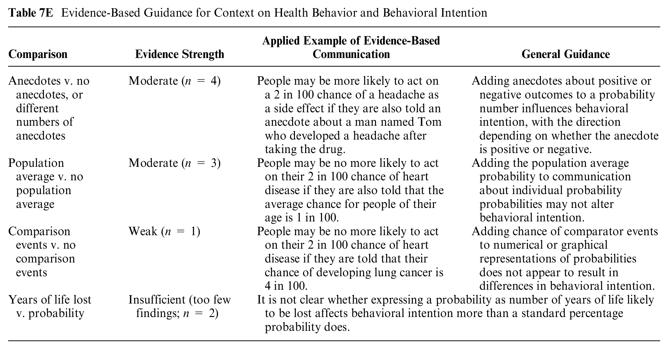
ANECDOTES: Three moderate-credibility findings examine the effect of adding narrative anecdotes to numerical information. Two showed that behavioral intention was strongly affected by the anecdotes (Betsch et al., 88 substudies 1 and 2) and one finding 87 did not. The one that did not focused on intention to try recreational drugs, which may have been too strongly influenced by preexisting attitudes toward drug use. A low-to-moderate-credibility finding 86 demonstrated no difference between anecdotes (alone or with verbal probability) and percentage with verbal probability.
POPULATION AVERAGE: Three moderate-credibility findings examined the effect of adding a population average or typical probability for context, and none showed that this addition affected behavioral intention.6,93,95
COMPARISON EVENTS: In a moderate-credibility finding examining the effect of adding a different probability for comparison (e.g., chance of other cancers, chance of injury and construction accident), Gibson et al. 55 did not find an effect.
YEARS OF LIFE LOST: One high-credibility finding 120 showed that showing heart age + numbers of years lost + additional explanation had a larger impact on behavioral intention than percentage probability. It is not clear whether the effect is due to the heart age, the explanation, or the number of years lost. A moderate-credibility finding 58 compared heart age plus years of life lost to standard probability percentage, but the contextual element (years of life lost) was added only in the heart age condition, making it unclear whether the effect was due to the heart age or the years of life lost.
NOT SUMMARIZED: A small study may have been underpowered to detect a difference but was generally consistent with the summaries above for population average and comparison events. 129
Comparisons of frames (gain, loss, or comparison) on health behavior and behavioral intention (subsection 7F)
GAIN VERSUS LOSS FRAMING OF CHANCE OF BENEFIT—BEHAVIORAL INTENTION: Two moderate- and high-credibility findings from Levin et al. 111 and Garcia-Retamero and Cokely 122 showed that gain framing the chance of benefit increased likelihood of choosing an option (behavioral intention). However, Bigman et al. 107 demonstrated no effect of framing success rates of a vaccine on intention to take the vaccine (but the same study did find a significant effect on perceived probability).
Evidence-Based Guidance for Framing on Health Behavior and Behavioral Intention

GAIN VERSUS LOSS FRAMING OF CHANCE OF BENEFIT—BEHAVIOR: An additional finding from one of these studies also showed a similar framing effect of the benefit on self-reported behavior. 122
GAIN VERSUS LOSS FRAMING OF CHANCE OF HARM—BEHAVIORAL INTENTION: Moderate- and high-credibility findings from Gurm and Litaker 130 Donovan and Jalleh, 131 Taylor et al., 132 and Wilson and Kaplan 133 substudy 2 showed that loss framing the chance of harm from an option reduces intention to select the option.
NOT SUMMARIZED: A lower-credibility finding 134 is not summarized due to small sample size.
Comparisons of methods of representing uncertainty on health behavior and behavioral intention (subsection 7G)
One moderate-credibility finding 55 did not find differences in behavioral intention between graphics that demonstrated uncertainty and graphics that did not show uncertainty.
Evidence-Based Guidance for Uncertainty on Health Behavior and Behavioral Intention

Comparisons of animation or interactivity on health behavior and behavioral intention (subsection 7I)
INTERACTIVITY: Four moderate- to high-credibility findings examined the effect of adding some form of interactivity, all showing no effect on behavioral intention (Harle et al., 118 Natter and Berry 119 substudies 1 and 2, Witteman et al. 117 ). However, the interactive features were extremely heterogeneous, reducing ability to compare and draw conclusions. The interactivity included answering questions for a personalized risk screening, 118 drawing a bar chart or computing an equivalent probability (Natter and Berry 119 substudies 1 and 2), and personalizing an avatar with a color. 117
Evidence-Based Guidance on Effect of Animation or Interactivity on Health Behavior and Behavioral Intention

ANIMATION: The Witteman finding 117 additionally examined several forms of animation applied to icon array graphics including whether a personal avatar was displayed and whether the avatar moved, with no effect on behavioral intention. No other findings looked at behavioral impact of other animated graphics.
Within the health behavior and behavioral intention outcome, no relevant findings examined effect of manipulating denominators of probabilities or effect of varying the time period.
Effects of Different Formats on Trust in the Message (Trust Outcome): Section 8
Many researchers assessed trust in the information, credibility of the information, or related constructs. We summarize findings on the effects of different formats on trust.
Comparisons between numerical probability formats in effects on trust (subsection 8A)
SIGNIFICANT DIGITS: In a high-credibility finding, Witteman et al. 29 showed that trustworthiness was highest when a percentage had 0 or 1 digits to the right of the decimal and decreased with more digits.
Evidence-Based Guidance on Effect of Numerical Probability Formats on Trust

PERCENTAGES VERSUS OTHER FORMATS: In high-credibility findings, Soureti et al. 31 showed no trust difference between percentage probability and heart age, and Gurmankin et al. 14 showed no difference in trust in information presented as percentage or as 1 in X.
Comparisons between graphical formats in effects on trust (subsection 8B)
Only 2 findings, both moderate credibility, examined effects of different graphic types on trust. Both assessed icon arrays.
Evidence-Based Guidance on Effect of Graphical Formats on Trust

ICON ARRAY DESIGN FEATURES: Schapira et al. 42 showed that “perceived truth” of an icon array with probability of breast cancer was higher for randomly arranged icons than for grouped ones and for icon arrays with smaller number of icons. For both of these, an interaction with numeracy meant that the finding occurred only among those low in numeracy.
Brewer et al. 135 showed that trust in the information was lower for an icon array paired with rate per 10n and verbal probability than for the original Oncotype Dx report and for several custom-designed alternative graphics.
Comparisons between numerical and graphical formats, and combinations of numerical and graphical formats, in effects on trust (subsection 8C)
Only 3 moderate-credibility findings have compared numbers versus graphics in effect on trust. Both Lipkus et al. 68 and Han et al. 67 substudy 1 showed no trust differences between information in numbers or in graphics. Brewer et al. 135 showed trust to be lower when cancer recurrence probability was presented as an icon array plus rate per 10n and verbal probability than with several other types of combined graphics such as the Oncotype Dx report or a number line.
Evidence-Based Guidance on Comparisons between Numerical and Graphical Formats or Combinations of Numerical and Graphical Formats on Credibility

Comparisons of elements added for context on trust (subsection 8E)
One moderate-credibility finding (Han et al. 67 substudy 1) compared graphic depictions of probability with and without a reference (population average) value, finding no difference in trust. A second moderate-credibility finding 135 compared graphics with and without interpretive categories. However, so many factors were altered in the comparison that differences cannot be attributable to this factor.
Evidence-Based Guidance on Effect of Contextual Information on Trust

Comparisons of frames (gain, loss, combination) on trust (subsection 8F)
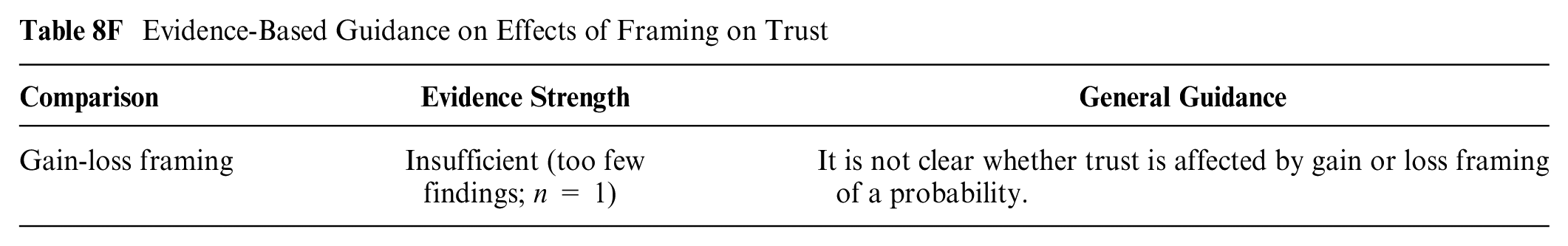
One moderate-credibility finding, Webster et al., 103 showed that frame did not affect credibility, but small sample size and confounding of numerical frame with verbal label reduce confidence in negative finding.
Evidence-Based Guidance on Effects of Framing on Trust
Comparisons of methods of representing uncertainty on trust (subsection 8G)
The effect of showing uncertainty on perceived credibility or trust has been studied in 5 moderate-credibility findings. Longman et al. 114 showed credibility was lower when estimates were accompanied by confidence intervals but only when the confidence intervals were wide, not narrow.
Evidence-Based Guidance on Effect of Uncertainty on Trust

Both Han et al. 67 substudy 1 and Lipkus et al. 68 showed that adding confidence intervals did not affect credibility, but the Han finding altered multiple factors between stimuli, making it difficult to attribute differences to the confidence intervals. Han et al. 67 substudy 2 showed no differences in perceived credibility on the basis of how the uncertainty was shown (numerically or graphically).
Brewer et al. 135 showed that several information formats that did not include confidence intervals were perceived as less trustworthy than the original Oncotype report that included a confidence interval. However, the effect was confounded by a number of different format differences between the versions.
Within the trust outcome, no relevant findings examined the effects of manipulating probability denominators, animation or interactivity, or varying the time period. No findings met our criteria for comparisons of verbal and numerical probabilities.
Preferences about Formats (Preference Outcome): Section 9
It was common for researchers to assess how much participants liked or preferred certain formats, using measures such as ranking or choosing preferred formats. All relationships between formats and preferences are summarized in this section.
Preferences for different numerical probability formats (subsection 9A)
PERCENTAGES: Both a high-credibility finding 136 and a moderate-credibility finding 137 suggested percentage was preferred to 1 in X, but another high-credibility finding from Nagle et al. 138 showed the opposite. A high-credibility finding 15 showed percentage combined with 1 in X was preferred to either alone.
Evidence-Based Guidance on Preferences for Numerical Probability Formats

NUMBERS PLUS VERBAL: Two findings lend support to combinations of verbal interpretation or verbal probability and numerical information. A high-credibility finding 139 suggested people had more comfort with numbers combined with a verbal interpretation (“some chance of”) than with the verbal description alone. A moderate-credibility finding 140 also showed that self-reported understanding was higher with percentage plus verbal probability rather than with rate per 10n or percentage alone. However, Steiner et al. 141 (a moderate-credibility finding) showed that verbal labels alone were considered easier to understand than percentages or percentages plus verbal labels. (This evidence is summarized further in the numbers versus verbal category, so we have not added it to the evidence table below.)
NOT SUMMARIZED: Relevant findings produced several lower-credibility findings not included in the synthesis due to small sample size and/or lack of hypothesis testing (Lobb et al., 142 Hamilton et al., 57 Cheung et al., 125 Knapp et al., 35 Hovick et al. 143 substudy 1, Strathie et al. 36 ) or insufficient information provided to participants. 144
Preferences for different graphical probability formats (subsection 9B)
Evidence about preference for different types of graphics is limited by the fact that the findings in this category have assessed very different types of graphics.
Evidence-Based Guidance on Preferences for Graphical Probability Formats
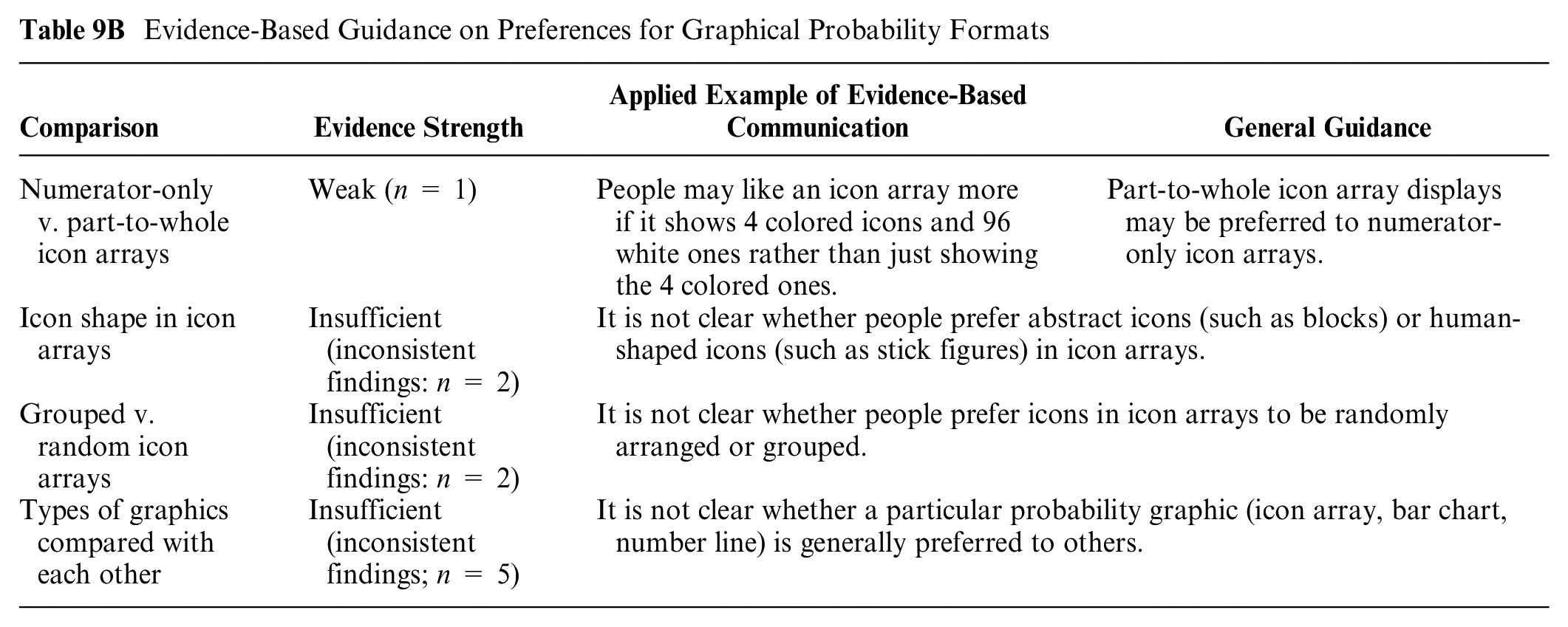
NUMERATOR-ONLY VERSUS PART-TO-WHOLE ICON ARRAYS: In a high-credibility finding, Okan et al. 39 substudy 1 showed part-to-whole icon arrays preferred over numerator-only icon arrays.
ICON SHAPE: Two moderate-credibility findings on icon shape were inconsistent: Kreuzmair et al. 43 showed no preference difference between block icons and human figure icons, but Schapira et al. 42 showed a preference for human figure ones.
GROUPED VERSUS RANDOM ICON ARRAYS: Ancker et al. 116 (moderate credibility) showed no preference difference between randomly arranged and grouped icons, but Schapira et al. 42 (moderate credibility) showed a preference for grouped over random ones.
TYPES OF GRAPHICS: Four moderate-credibility findings compared icon arrays to other graphics formats. Ghosh et al. 145 showed no overall preference difference between icon arrays and bar charts, but Edmonds et al. 146 showed that a bar chart was preferred to an icon array. Etnel et al. 147 reported that pie charts were preferred to icon arrays and/or bar charts. Brewer et al. 135 showed that an icon array was one of the multiple formats rated as more understandable than the Oncotype Dx graphic display.
Three studies examined number lines. A moderate-credibility finding 146 showed a preference for bar charts over number lines. Another moderate-credibility finding 135 showed that a number line was one of the formats rated more understandable than the Oncotype Dx report. A high-credibility finding 148 of a number line/risk ladder showed that the number lines that included categories shown in rate per 10n were rated as more understandable and actionable than number lines with verbal labels alone.
NOT SUMMARIZED: Lower-credibility findings not synthesized here due to small sample size and/or lack of statistical testing (Clarke et al., 149 Hamilton et al., 57 Hovick et al. 143 substudy 1, Housseini et al. 150 substudy 1); complicated, multidimensional stimuli 58 ; additional experimenter activities conflated with the display itself 126 ; and contradictory findings between 2 measures of satisfaction. 56
Preferences for numerical versus graphical formats (subsection 9C)
Two studies examined icon arrays versus numbers. Siegrist et al. 54 substudy 1 showed that icon arrays were preferred to other graphics and number formats including 1 in X, rate per 10n, and log scale number line. However, Gett et al. 151 showed that a pie chart + percentage was preferred to an icon array.
Evidence-Based Guidance on Preferences for Numerical versus Graphical Formats

Siegrist et al. 54 substudy 2 (a high-credibility finding) showed no preference difference between 1 in X and a log-scale horizontal number line (“Paling”).
A moderate-credibility finding, Brewer et al., 140 showed numbers (with or without verbal probability) were preferred to pie charts.
A moderate-credibility finding, Brewer et al., 135 showed that several alternate formats were all preferred to the original Oncotype Dx report.
A high-credibility finding, Kiely et al., 152 showed a preference for a histogram graphic that showed best case, worst case, and typical cases over a numerical description of median survival, but it is unclear how much the graphic design contributed to this preference.
NOT SUMMARIZED: Some lower-credibility findings are not summarized due to small sample size and/or lack of statistical testing (Hamilton et al., 57 Hovick et al. 143 substudy 1, Hagerty et al., 153 Henneman et al., 137 Hill et al. 154 ); complicated, multidimensional stimuli 58 ; or additional experimenter activities conflated with the display itself. 126
Preferences for numerical versus verbal probability formats (subsection 9D)
Thirteen moderate-to-high-credibility findings have elicited preferences for or satisfaction with numbers versus verbal probabilities.
Evidence-Based Guidance on Preferences for Numerical versus Verbal Probability Formats

NUMERICAL VERUS VERBAL PROBABILITY: Eight of these (4 high-credibility, 4 moderate) showed a preference for either numbers or numbers plus verbal labels over verbal probabilities alone. A caveat is that they used different sorts of numbers and verbal labels (Berry et al. 127 substudy 2, Berry et al., 78 Knapp et al., 12 Carey et al., 155 Connolly et al., 148 Freeman and Bass, 156 Nagle et al., 138 Berry et al. 74 ). Nagle et al. 138 also showed certain number formats (1 in X) preferred to verbal probabilities but not to other number formats (percentage alone or percentage + verbal combinations).
However, 3 moderate-credibility findings showed no difference in preference between numbers and verbal terms (Knapp et al., 77 Knapp et al. 84 substudy 2, Damman et al. 58 ). In addition, 1 high-credibility finding 136 and 1 moderate 141 showed a preference for verbal probabilities over numbers or numbers + verbal. (The latter finding was in a context in which multiple forms of birth control were being displayed simultaneously.)
NOT SUMMARIZED: Lower-credibility findings are not included in the synthesis due to small sample size and/or lack of statistical testing (Knapp et al., 144 Lobb et al., 142 Hallowell et al., 157 Bloch et al., 158 Cheung et al., 125 Hovick et al. 143 substudy 1) or lack of clarity about outcome measures. 159
Preferences for elements added for context (subsection 9E)
Evidence for preferences about contextual elements is limited by the fact that the few findings in this category evaluated different sorts of context.
Evidence-Based Guidance on Preferences for Added Contextual Information

ELEMENTS FOR CONTEXT: Three moderate-to-high-credibility findings examined preferences for providing probabilities of other events as context/comparison for the probability of interest. In a high-credibility finding, Keller and Siegrist 59 showed no difference in preference between presenting chance of adverse outcomes associated with radon alone or pairing it with the equivalent probabilities from smoking. In a moderate-credibility finding, Siegrist et al. 54 substudy 1 showed no preference difference between a log-scale number line that provided chance of comparison events and other numerical and graphical formats that did not provide comparison event chances. In a moderate-credibility finding, Freeman and Bass 156 showed that single probabilities alone (numerical or verbal only) were preferred to expressing the probability as a verbal comparison probability (“as likely as being struck by lightning”).
In a moderate-credibility finding, Henneman et al. 137 showed a preference for a combination of lifetime and 10-y probability versus either time interval separately.
In a moderate-credibility finding, Harris and Smith 95 showed no difference in perceived understandability by whether a personal probability was accompanied by the population average or by whether the personal probability was higher or lower than the average.
NOT SUMMARIZED: Three lower-credibility findings are not included here due small sample size (Gett et al., 151 Hovick et al. 143 substudy 1) or complicated, multidimensional stimuli. 58
Preferences for frames (gain, loss, or combination) (subsection 9F)
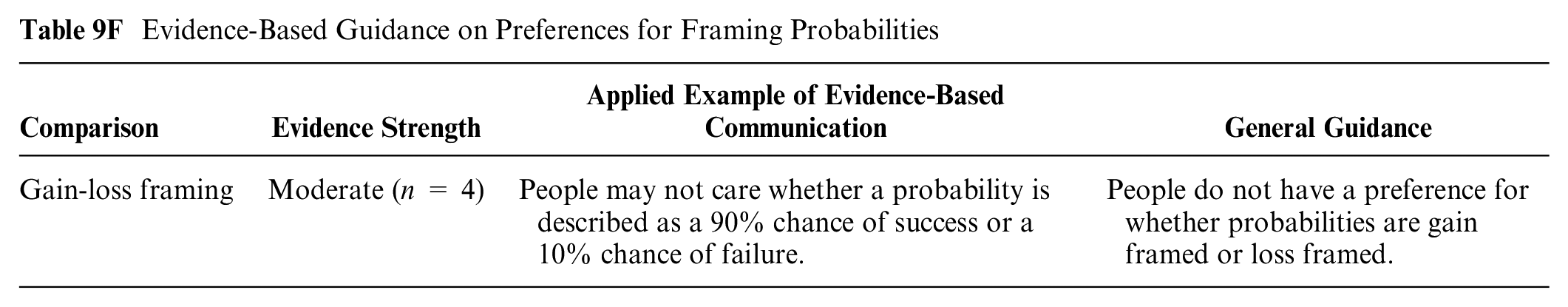
GAIN VERSUS LOSS FRAMING: Four moderate- to high-credibility findings suggest that whether a probability is gain framed or loss framed does not strongly affect preference for the information or related constructs such as satisfaction and perceived usefulness (Biswas and Pechmann 110 finding 1, Garcia-Retamero and Cokely, 160 Garcia-Retamero and Cokely, 122 Webster et al. 103 ). Most of these findings are small, somewhat reducing the confidence in negative findings.
Evidence-Based Guidance on Preferences for Framing Probabilities
NOT SUMMARIZED: Two lower-credibility findings are not summarized here due to small sample size.132,161
Preferences for methods of representing uncertainty (subsection 9G)
DISPLAYING VERSUS NOT DISPLAYING UNCERTAINTY: A moderate-credibility finding 135 showed that a number of different formats without uncertainty were preferred to the Oncotype Dx report, which includes confidence intervals.
Evidence-Based Guidance on Preferences about Uncertainty

NUMERICAL VERSUS VERBAL UNCERTAINTY: A second moderate-credibility finding 148 showed that in showing probability of harm from eating fish on a vertical number line/risk ladder graphic, participants preferred a version in which the scale was shown in units of rate per 10n plus uncertainty to a verbal only scale.
NOT SUMMARIZED: Two additional lower-credibility findings are not summarized here due to small sample size.134,158
Preferences for animation or interactivity (subsection 9I)
INTERACTIVITY OR ANIMATION: The 3 available moderate-credibility findings have examined very different sorts of animation/interactivity. Natter and Berry 119 substudy 2 showed that undergraduates were more satisfied with information when they had to answer a reflective/computational question about it than when they did not. Natter and Berry 119 substudy 1 showed there were no differences in satisfaction when undergrads were given a bar chart or invited to draw one on the basis of information provided. Ancker et al. 116 showed no preference differences between interactive and static icon array graphics.
Evidence-Based Guidance on Preferences about Animation and Interactivity

Preferences for shorter versus longer time periods (subsection 9J)
SHORTER VERSUS LONGER TIME PERIODS: A moderate-credibility finding 137 showed a preference for presenting both lifetime probability and 10-y probability rather than either alone, but the general preference for more over less information reduces confidence in this finding.
Evidence-Based Guidance on Preferences about Time Period

Within the preference outcome, no relevant findings examined the effect of manipulating probability denominators.
Ability to Distinguish between Quantities (Discrimination Outcome): Section 10
Metrics that assessed differences in responses to different levels of probability on the basis of differences in the stimulus were termed discrimination outcomes. An assessment of whether respondents estimated 2 probabilities to be the same or different on the basis of presence or absence of a graphic, or design of the graphic, was considered a discrimination outcome.
Comparisons between graphical formats in effects on discrimination (subsection 10B)
ICON ARRAYS VERSUS RISK LADDERS: A moderate-credibility finding 162 in a contingent valuation context showed greater discrimination between probability levels when numbers (1 in X and rate per 10n) were accompanied by a large icon array than with either of 2 risk ladder formats.
Evidence-Based Guidance on Effects of Graphical Formats on Discrimination

NOT SUMMARIZED: A lower-credibility finding from Schonlau and Peters 163 finding 2 was not synthesized due to poor-quality stimuli and lack of clarity in reporting.
Comparisons between numerical and graphical formats in effects on discrimination (subsection 10C)
NUMBERS VERSUS GRAPHICS: Two findings, 1 high credibility and 1 moderate, find no difference in direct comparison of numbers versus graphics for helping readers discriminate between probability levels.59,164 A moderate-credibility finding 162 showed greater sensitivity to probability differences when numbers (1 in X and rate per 10n) were accompanied by a large denominator icon array but showed no effect of 2 types of risk ladders.
Evidence-Based Guidance on Effects of Numerical and Graphical Formats on Discrimination

NOT SUMMARIZED: A lower-credibility finding from Schonlau and Peters 163 finding 2 is not synthesized due to poor-quality stimuli and lack of clarity in reporting.
Comparisons between numerical and verbal probabilities in effects on discrimination (subsection 10D)
A high-credibility finding 80 showed that discrimination between different probabilities was higher when probabilities were explained with verbal probabilities plus rate per 10n than with verbal probabilities alone.
Evidence-Based Guidance on Effects of Numerical and Verbal Probabilities on Discrimination

Comparisons of elements added for context on discrimination (subsection 10E)
INTERPRETIVE LABELS: A high-credibility finding (Pighin et al. 165 study 2) showed that adding verbal interpretive labels to a number assisted in discrimination between probability levels. A moderate-credibility finding 166 showed that ability to discriminate between levels was not affected by slight differences in the labeling of the interpretive probability categories.
Evidence-Based Guidance on Effects of Contextual Information on Discrimination

CHANCE OF COMPARISON EVENTS: Keller et al. 167 showed that showing a chance of comparison events increased discrimination among less numerate but not more numerate readers. Also, a moderate-credibility finding 162 showed no effect of adding risk ladders (containing comparison risk information) on sensitivity to probability variations, although the conflation of context with graphic type undermines confidence in this negative finding.
POPULATION AVERAGE: Two findings examined the effect of showing a population average value for comparison. In a high-credibility finding, Hess et al. 94 finding 1 showed that adding a second icon array with the population average did not improve discrimination and may have reduced it among low-numeracy respondents. A moderate-credibility finding by Keller and Siegrist 59 showed that a horizontal log-scale number line with population probability shown for comparison improved discrimination among high-numeracy respondents only but not low-numeracy ones; conflation of graphic type and the population value reduces confidence in finding.
Comparisons of animation or interactivity on discrimination (subsection 10I)
Only 1 moderate-credibility finding (Hess et al. 94 substudy 3) examined the effect of interactivity on ability to discriminate between probabilities, finding that encouraging participants to count icons in an icon array did not make a difference.
Evidence-Based Guidance on Effects of Interactivity on Discrimination

Within the discrimination outcome, no relevant findings examined the impact of different numerical probability formats, framing manipulations, expressing uncertainty, manipulating the denominator, or changing the time period.
Summary of Evidence
Evidence is
with 1 in X than with rate per 10n or percentage (subsection 5A: numerical formats comparison),
with 1 in X alone than with 1 in X plus a part-to-whole icon array (subsection 5C: numerical and graphical format comparison),
with foreground-only (numerator-only) icon arrays than with part-to-whole (numerator-denominator) icon arrays (subsection 5B: graphical format comparison),
with foreground-only (numerator-only) icon arrays than with rates per 10n (subsection 5C: numerical and graphical format comparison),
with a bar chart than with a part-to-whole icon array (subsection 5C: numerical and graphical format comparison),
with rate per 10n or percentage than with part-to-whole icon arrays (subsection 5C: numerical and graphical format comparison),
With log-scale number lines (that displays risks of comparison events) than with 1 in X (subsection 5C: numerical and graphical format comparison),
with verbal probabilities (such as “rare”) than with the corresponding probability numbers designated by the EC (subsection 5C: numerical and graphical format comparison),
with numbers supplemented by anecdotes about people who have experienced the event than with numbers alone (subsection 5E: contextual information comparison), and
when negative events are loss framed or positive events are gain framed (subsection 5F: framing comparison).
There is also
Furthermore, evidence is
replacing a percentage with a rate per 10n (subsection 5A: numerical formats comparison),
replacing human-shaped icons in an icon array with abstract icons (subsection 5C: graphical formats comparison),
replacing a series of side-by-side icon arrays with a single integrated multioutcome icon array (subsection 5B: graphical formats comparison),
grouping versus randomly distributing icons in icon arrays (subsection 5B: graphical formats comparison),
supplementing a rate per 10n with a part-to-whole icon array (subsection 5C: numerical and graphical format comparison),
supplementing a rate per 10n with a foreground-only (numerator-only) icon array (subsection 5C: numerical and graphical format comparison),
supplementing a probability of an event with the chances of comparison events (subsection 5E: contextual information comparison), and
replacing a static graphic with an interactive one (subsection 5I: animation or interactivity comparison).
Specifically, we found only
using numbers instead of verbal probability terms to describe negative outcomes such as side effects (subsection 7D: numerical versus verbal probabilities comparison),
presenting probabilities as 1 in X versus other number formats (subsection 7A: numerical formats comparison),
adding anecdotes showing an outcome—the effect direction depends on whether the outcome described is positive or negative (subsection 7E: contextual information comparison),
presenting positive outcomes such as efficacy using gain framing (subsection 7F: framing comparison), and
presenting negative outcomes using gain framing (e.g., chance of avoiding a side effect) (subsection 7F: framing comparison).
In addition, evidence is
There is
Few studies examined discrimination outcomes, and as a result, all findings were either weak or insufficient.
Discussion
The outcomes discussed in this article (see Table A) focus on the interpretation of probability information and subsequent perceptions and actions. They include both cognitive and emotional interpretations of probability magnitudes (probability perceptions, probability feelings) and measures of the degree that people adjust their perceptions to variations in those magnitudes (discrimination), which is a particularly important measure of the degree that a probability presentation format enables people to derive accurate and meaningful information from the probability data. They also include the behavioral intentions or actual behaviors after exposure to probability information. We also report evidence related to both preference and trust outcomes, which conceptually moderate peoples’ attention to information and the degree that they are influenced by that information.168–170 Put another way, these outcomes measure what people think, feel, or do about probabilities, whether or not they can remember, categorize, contrast, or perform computations with them. (See our companion article for the evidence regarding these additional outcomes.)
Probability perceptions and feelings are the most frequently studied outcomes in probability communication, and evidence points to a large number of ways that data presentation formats can influence these outcomes. For the most part, perceptions and feelings had similar strength of evidence, but in a few cases, evidence was weaker for feelings. Broadly speaking, these findings are a reminder of the persuasive power inherent in the selection of format for probability communications. The effects identified here are effective tools for intentionally increasing or decreasing reactions to probability information if persuasion is desired and appropriate. Yet, it is worth remembering that no “gold standard” level of probability perceptions and/or feelings exists, and thus it is always up to the communication designer to assess whether using a particular format will support or inhibit their communication goal. (Importantly, the accuracy of probability perceptions is not covered in this article. Whether participants accurately identified a probability while viewing a stimulus, or recalled it after the stimulus was removed, is considered an identification-recall outcome and is covered in the companion Part 1 article in this series.)
Although probability perceptions and feelings are precursors to behavior in well-established health behavior models such as the health belief model 172 and the extended parallel process model,172,173 the evidence about behavior and behavioral intention is far weaker in our review. We did not find evidence against a link between perceptions and behaviors but rather found that both behaviors and intentions were less frequently studied than perceptions and feelings, and the findings that are available for the distal outcome are mixed.
Similarly, we found that preferences for communication formats are frequently studied, but the resulting findings are extremely mixed. Other evidence is limited by the fact that the data presentation formats studied, especially the graphics, had important structural differences. Overall, we conclude that preferences may not be reliably or stably linked to data presentation format. In fact, it appears that preferences may be influenced by factors such as format familiarity and the differing meanings that readers need to derive from the communication. We found that trust in the communication also has similarly weak and mixed evidence.
Limitations of this set of reviews includes the possibility of missed and omitted studies, the use of a small expert group to evaluate risk of bias and credibility, and the highly granular data extraction process that slowed work and may make it less replicable. Types of studies varied so that the numbers of high-credibility articles within any category was small, and this limited the strength of the evidence that could be derived from this literature. We did not subset the studies by participant or population characteristics such as education, culture, or numeracy because of the small numbers of comparable articles for each relevant characteristic and because of significant heterogeneity in how these characteristics were measured. These potential confounding factors could contribute to the heterogeneity of findings when studies are grouped and may also limit generalizability of the findings to diverse settings and populations.
Another key limitation is that this article examines only the research evidence related to peoples’ ability to perform what we have termed point tasks, that is, situations in which the audience is asked to focus on single probabilities (presented either alone or in larger sets). It does not touch upon the evidence for communicating probability differences (difference tasks), which include, for example, evaluations of the effectiveness of health interventions or the magnitude of differences in risk across populations. Nor does this article consider situations in which the audience is asked to consider time trends (trend tasks) or multiple types of probability information simultaneously (synthesis tasks), such as evaluations of or choices about treatment options that affect people’s chances of experiencing multiple complication risks and/or benefits.
In summary, many factors appear to modify probability perceptions and feelings in the context of point tasks, while other factors appear to have few or no effects. In addition, the link between interpretation of probability information and health behaviors, despite being supported by theory, is not strongly reflected in the evidence about communicating probabilities. Also, the large amount of research into patient preferences for numerical, graphical, and verbal formats has yielded relatively little evidence that would suggest stable and predictable preferences, other than a general preference for numbers alone or combined with words rather than words alone. While these findings do provide clear evidence that the choice of formats used to present probabilities will influence people’s perceptions of individual probabilities under certain circumstances, we remind readers that the findings presented here represent only one part of the larger evidence base needed to guide practice. We encourage future efforts to use our findings to clearly define the ways that different methods of communicating probabilities have both strengths and weaknesses when used to achieve various communication goals.
Footnotes
Acknowledgements
We thank the Numeracy Expert Panel for contributions to conceptualizing the MNM project (Cynthia Baur, Sara Cjaza, Angela Fagerlin, Carolyn Petersen, Rima Rudd, Michael Wolf, and Steven Woloshin). We are grateful to Marianne Sharko, MD, MS, Andrew Z. Liu, MPH, and Lisa Grossman Liu, MD, PhD, for contributions to article screening and risk of bias assessment. We also thank Jordan Brutus for assisting with data management.
The authors declared no potential conflicts of interest with respect to the research, authorship, and/or publication of this article. The authors disclosed receipt of the following financial support for the research, authorship, and/or publication of this article: Financial support for this study was provided entirely by a grant from the National Library of Medicine (R01 LM012964, Ancker PI). The funding agreement ensured the authors’ independence in designing the study, interpreting the data, writing, and publishing the reports.
Availability of Research Resources
All research resources are available at the Making Numbers Meaningful Project at OSF (![]() ). This project includes a Methodology Files folder (containing the search strategy, the data extraction instrument, and the study risk of bias [S-ROB] rubric), the list of each included article mapped to the Making Numbers Meaningful review article that covers it, and a Probability Findings folder displaying the extracted findings for each of the Making Numbers Meaningful review articles.
). This project includes a Methodology Files folder (containing the search strategy, the data extraction instrument, and the study risk of bias [S-ROB] rubric), the list of each included article mapped to the Making Numbers Meaningful review article that covers it, and a Probability Findings folder displaying the extracted findings for each of the Making Numbers Meaningful review articles.