
Abstract
Highlights
Many researchers have studied the effects of data presentation formats of single probabilities on different outcomes.
However, few findings are comparable enough to allow for strong evidence-based conclusions about the impact on identification, recall, contrast, categorization, and computation outcomes.
Numbers, graphics, and verbal descriptions of probabilities convey critical information for informed decision making in health. As described elsewhere, we undertook a large systematic literature review (Prospero registration No. CRD42018086270) to develop evidence-based guidance on how to communicate numbers in medical and health domains across different data types.1,2 We organized this literature according to a conceptual model of communication in which a reader performs a cognitive task upon some stimulus that contains data in some data presentation format, prompting a cognitive, affective, perceptual, or behavioral response that is measured with an outcome measure. We restricted our review to stimuli containing quantitative health-related data in 1 or more data presentation formats, including numbers, graphics, and verbal descriptions. We define and enumerate types of tasks, outcomes, data, and data presentation formats in our companion methodology and taxonomy articles.1,2
Although the literature review included several types of numbers, the current article focuses only on literature about probability numbers (Table A). We grouped the research literature according to the task performed by the reader or research participant as they examine the stimulus. Point tasks (the focus of the current article) are tasks in which people examine the stimulus for information about single probabilities, such as the chance of disease or the likelihood of side effects. Future articles (Table A) will cover difference tasks, those in which readers seek information specifically about the differences between probabilities (e.g., the effect of a therapy upon probability of recurrence). Other future articles will cover synthesis tasks, in which the reader integrates several probabilities, such as the set of risks of a medication or a list of risks and benefits. As shown in Table A, a subset of synthesis task research involves interpreting probability information to estimate Bayesian posterior probabilities. Finally, we will present evidence on time-trend tasks, in which readers examine stimuli to evaluate patterns over time.
Current Article’s Scope within the Making Numbers Meaningful Systematic Review a


Gray cells represent combinations that are not possible according to the definitions presented in Ancker et al. 1
This standardized numbering system has been used for results subheadings in this article and across all Making Numbers Meaningful results articles to ensure that readers can find comparable information in all articles.
This article presents the subset of point task evidence pertaining to 5 commonly assessed outcomes: 1) identifying a number in the stimulus (termed “identification”); 2) remembering a number (“recall”); 3) selecting the largest or smallest of a set of probabilities (“contrast”); 4) recognizing which category, such as “elevated” or “within normal range,” a probability falls into, when category boundaries are provided (“categorization”); and 5) performing a computation such as converting a percentage into a number out of 100 or calculating the complement of a probability (“computation”). However, as described in more detail below, the articles in this review frequently did not report enough detail to allow us to distinguish between identification and recall, and thus we group these outcomes in the current article. We include evidence on the effects of all probability presentation formats—numerical, graphical, and verbal—on these outcomes. (Our companion point task results article, titled “Part 2,” presents the evidence on 7 additional important outcomes: probability perceptions, probability feelings, behavioral intentions, behavior, trust in information, preference for a data presentation format, and discrimination.)
Methods
As described in more detail in our companion methodology article, 2 we searched for experimental (randomized) and quasi-experimental (nonrandomized) research comparing 2 or more formats for presenting quantitative health-related data to patients or other lay audiences. The search was performed on MEDLINE, Embase, CINAHL, the Cochrane Library, PsycINFO, ERIC, and ACM Digital Library, and we conducted hand searches of the tables of contents of Medical Decision Making, Patient Education and Counseling, Risk Analysis, and Journal of Health Communication.
The literature review identified 316 eligible articles on communicating probabilities. Of these, 99 articles involved point tasks involving the 5 outcomes reported here. These 99 articles produced 215 distinct findings. Methods for the literature search, screening, risk-of-bias evaluation, data extraction, credibility evaluation of findings, and organization into evidence tables are reported in detail in the methods article. In brief, a broad search was performed to find research comparing 2 or more ways of presenting quantitative health-related data to patients or other lay audiences. Within each included study, we extracted information about task, stimulus (data and data presentation format), and outcome. Overall, we selected outcomes to track informed by behavioral and risk communication theory (behavior or behavioral intention, probability perceptions or feelings, recall) or empirically on the basis of what was frequently measured by the research included in our review (trust, preference for a format), particularly measures used to measure comprehension (identification, contrast, computation, categorization, discrimination).
Data presentation formats included a) numbers, b) graphics, and c) verbal descriptions of probabilities. a) Numeric formats used for single probabilities (covered in the current article) included percentages, frequencies, proportions, and individual numbers (such as numbers of individuals affected). Among frequencies, we distinguished between 2 types of rates: those formatted as 1 in X (examples include “1 in 5” and “1 of every 25”) and those formatted as a rate per 10n (such as “12 in 100” or “2.5 per 1,000”). Unlike some other authors, we reserved the term “natural frequencies” for presentations of a series of probabilities and joint probabilities computed from the same pool of patients in the context of Bayes’ theorem.3,4 (This definition is congruent with the original formulation of the term, 4 and using the term only for this purpose helps disambiguate otherwise contradictory evidence about the impacts of types of frequencies on comprehension outcomes. 3 ) b) Graphical formats for single probabilities included icon arrays, number lines and risk ladders, bar charts, pie charts, and flow charts as well as novel creations such as animated icon arrays and slide shows. c) Verbal formats for single probability information included probability terms such as “rare” or “likely.” In addition, we collected information on common manipulations of or variations on the formats (gain-loss framing, addition of or variation of contextual information including order effects, addition of anecdotes, and manipulation of the denominators of frequencies).
We assigned each included study a study risk of bias (S-ROB) score according to a rubric developed for this project, which considered sample representativeness, randomization, protocol deviations, presence/absence of demographic and covariate information, missing data, and other potential biases. A single study could produce many findings, defined as combinations of task, format comparison, and outcome. For example, a single study could produce one finding on the effects of graphics versus numbers on perceived probability when the reader assessed a single probability and another finding on the effects of graphics versus numbers on recall of that probability. Each finding was rated for credibility by 2 expert reviewers (primarily J.S.A. and B.J.Z.-F., with N.C.B. substituting in cases of conflict of interest), who weighed sample size, statistical methods, face validity and comparability of the stimuli being compared, and the face validity or criterion validity of the outcome measures and covariates at the finding level, together with the S-ROB for the study from which the finding came. Credibility was assigned holistically on a scale from 1 to 10 on the basis of the expert team’s evaluation of these factors, rather than according to a quantitative rubric. The credibility of different findings from the same study often varied. For example, a study might produce a high-credibility finding for its primary outcome but a lower-credibility finding for a secondary outcome not subjected to hypothesis testing.
Findings were grouped by task and outcome and synthesized into guidance statements. We then applied a standard rubric to grade the strength of evidence for each guidance statement according to finding risk of bias, finding credibility, and consistency of findings.
Consistency was considered high if all findings were significant in the same direction or if a large majority were significant in one direction with a few lacking in significance, moderate if findings showed a small majority of significant effects in one direction with the remainder lacking significance, and low if the findings showed significant effects in different directions. Findings with high credibility (7 or higher on a scale of 1 to 10) and moderate credibility (4.5–6.5) are discussed below. Findings with lower credibility (4 or lower) are mentioned below, counted in Table B, and listed in our Findings tables, but they do not contribute to the evidence summaries or the statements in the evidence tables.
Section Headings for Each Subset of Outcome Evidence Included in This Article and the Number of Included Findings
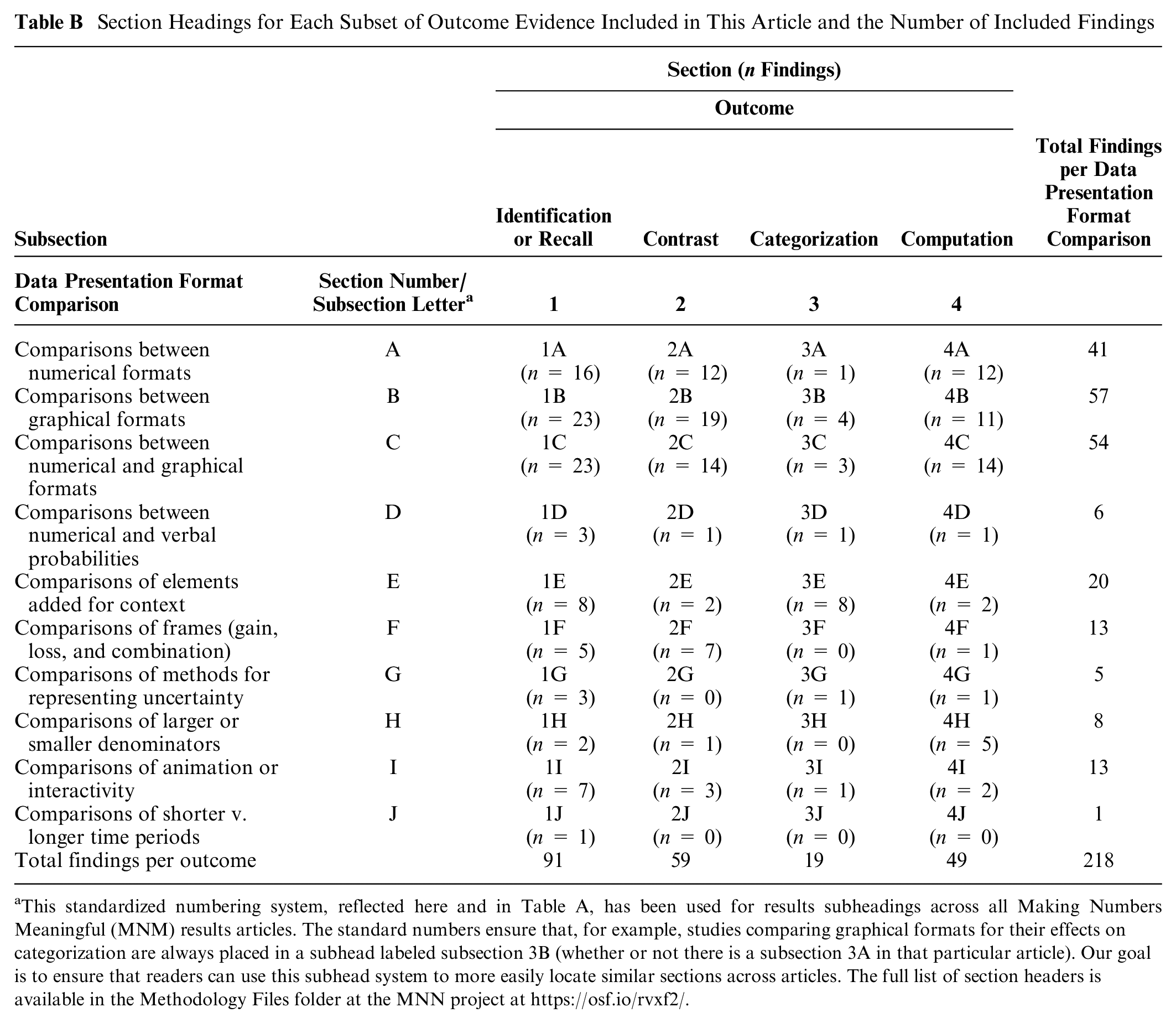
This standardized numbering system, reflected here and in Table A, has been used for results subheadings across all Making Numbers Meaningful (MNM) results articles. The standard numbers ensure that, for example, studies comparing graphical formats for their effects on categorization are always placed in a subhead labeled subsection 3B (whether or not there is a subsection 3A in that particular article). Our goal is to ensure that readers can use this subhead system to more easily locate similar sections across articles. The full list of section headers is available in the Methodology Files folder at the MNN project at https://osf.io/rvxf2/.
The freely available Making Numbers Meaningful project at OSF (https://osf.io/rvxf2/) contains methodology files (search strategy, S-ROB instrument, and data extraction instrument), a mapping file listing each included study and which Making Numbers Meaningful results article will cover it, and a Probability Findings folder containing each finding listed in this article.
Results
Each results section summarizes evidence on the following comparisons in order: comparisons among number formats, among graphics formats, between number and graphic formats, between number and verbal formats, between different types of elements added for context, effect of gain-loss framing, effect of representations of uncertainty, effect of manipulations of denominators, effect of animation or interactivity, and manipulations of time period. Table B shows the section headings and numbers of findings in each.
Within each subsection, evidence is arranged from strongest to weakest. Each subsection concludes with a table of the evidence-based guidance, arranged in the same order.
The full spreadsheet of point task findings cited in the current article is available at the free Making Numbers Meaningful Project at OSF (https://osf.io/rvxf2/) in the Probability Findings folder.
Effects of Different Formats on the Ability to Identify or Recall Information (Identification/Recall Outcome): Section 1
Many researchers administered questions about specific numbers appearing in the stimulus. If the stimulus was present, we classified the outcome as “identification,” but if the stimulus had been removed, the outcome was considered “recall.” As we have previously reported, 2 some articles were unclear about whether participants could refer to the stimulus when asked to “report” information or answer “knowledge questions.” We therefore combined the identification and recall outcomes in this article. When individual findings did clarify the outcome, we reflect that in the summaries below.
Comparisons between numerical formats in effects on identification/recall of probabilities (subsection 1A)
ADDITIONAL DIGITS: A high-credibility finding 5 from a large study by Witteman et al. showed that adding more digits to the right of a decimal reduced recall of the percentage probability of cancer; recall was highest with integers and decreased with each additional digit to the right of the decimal up to 3 digits.
Evidence-Based Guidance for Effects of Numerical Formats on Identification/Recall of Probabilities

HEART AGE: A few studies used risk calculators that express the chance of cardiovascular disease as estimated “heart age” in years rather than as percentage chance of an event, such that an individual with a high risk of cardiovascular disease would show a “heart age” older than their chronological age. A high-credibility finding by Bonner et al. 6 showed better 2-wk recall of “heart age” plus the difference in years between heart age and actual age than of paired percentages plus arithmetic difference between them.
PERCENTAGES, 1 IN X, RATE PER 10n, PROBABILITY BANDS: In a high-credibility finding, Woloshin and Schwartz 7 demonstrated higher ability to identify percentages in a drug facts box table than a rate per 10n (e.g., number per 1,000) or combinations of percentages and rate per 10n. However, Henneman et al., 8 in a moderate-credibility finding, demonstrated no difference in recall between different formats (percentages v. rates). Similarly, in a moderate-credibility finding, Garcia-Retamero and Galesic 9 demonstrated no difference in recall between pairs of rates per 10n and pairs of 1-in-X. Two moderate-credibility findings had opposite findings: Ruiz et al. 10 demonstrated that verbatim recall was slightly better with a pair of rates per 10n than with a pair of percentages, but Sinayev et al. 11 demonstrated the reverse pattern of improved identification or recall with percentages than with rate per 10n. Furthermore, a third moderate-credibility finding 12 demonstrated that the ability to identify information was better with rates than with a 1-sided probability band (e.g., “up to a 1 in 10 chance”).
TABLE VERSUS TEXT: In a moderate-credibility finding, Tait et al. 13 demonstrated better ability to answer questions about numbers of people and differences in rates with rate per 10n in a table format rather than the same numbers in text, but another finding by the same author group 14 demonstrated no difference in a similar comparison. In a moderate-credibility finding, Brick et al. 15 found ability to identify specific risks or benefits was higher with a drug fact box table format than with percentages in text.
TABLE DESIGN: In a moderate-credibility finding, Mühlbauer et al. 16 demonstrated that ability to identify numbers in a drug fact box was lower when “how to read this table” instructions were added or the numbers were provided in sentences. However, a similar high-credibility finding 17 demonstrated no difference in identification/recall when arithmetic difference was added to numbers, although the presence of verbal labels in addition to the absolute difference complicates interpretation of this negative finding.
VERBALIZED NUMBERS: A moderate-credibility finding 18 suggests that recall was lower when the rate per 10n was verbalized as “N out of every 1,000 people,” with no other recall differences across formats. However, a high-credibility finding 19 demonstrated higher recall when 1-in-X pairs were phrased as “one out of every X” than as 1-in-X icon arrays or 1:X numbers.
An additional relevant finding was not summarized due to small sample size and ceiling effects. 20 A recall finding was not summarized here because floor effects (i.e., low overall recall) reduced the credibility of a finding of no difference between formats. 15
Comparisons between graphical formats in effects on identification/recall of probabilities (subsection 1B)
Although a number of findings have compared graphics, our ability to draw conclusions is limited by the fact that there are few findings for each specific type of graphic.
Evidence-Based Guidance for Effects of Graphical Formats on Identification/Recall of Probabilities
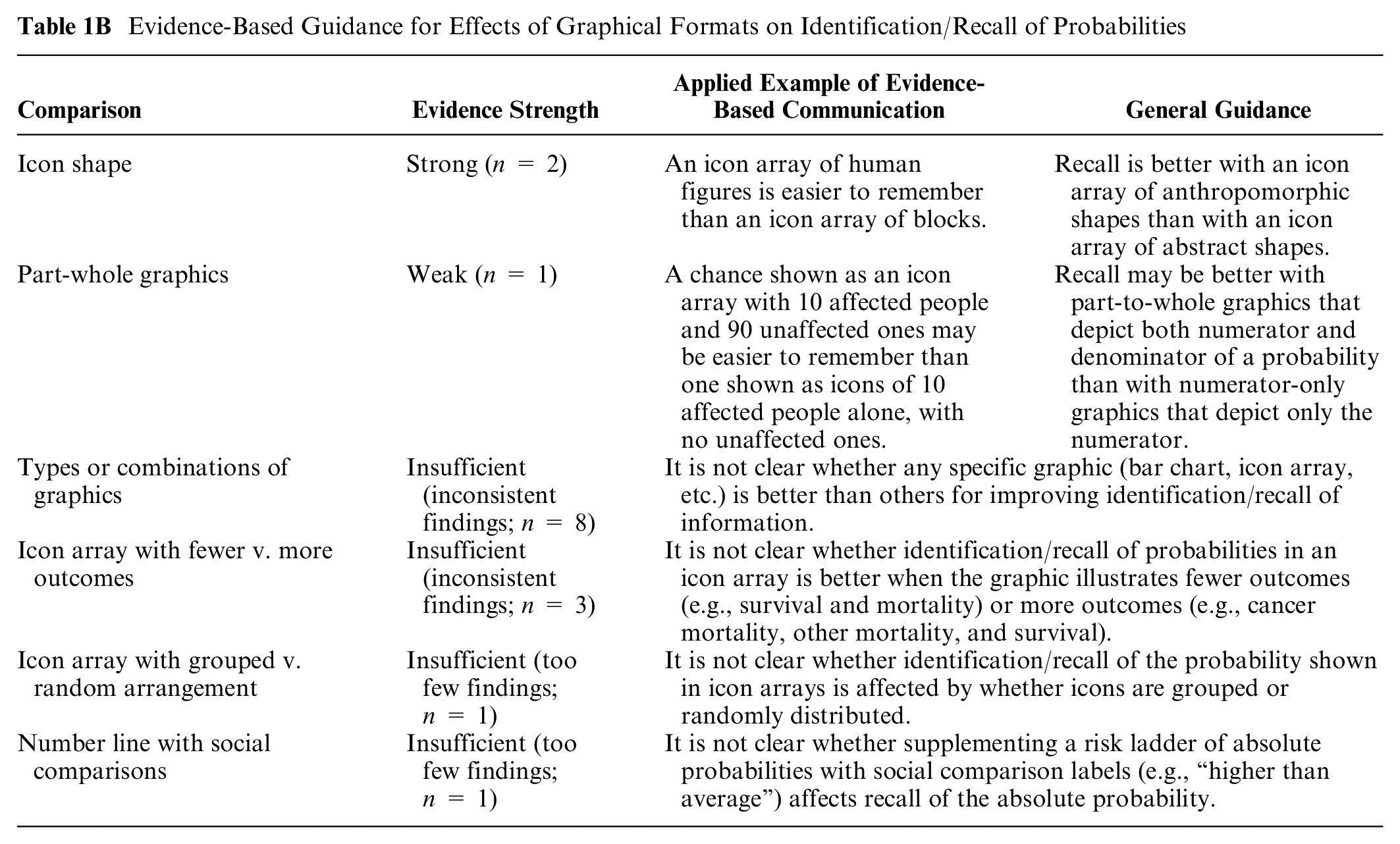
ICON SHAPE: Two consistent high-credibility findings from Kreuzmair et al., 21 and Zikmund-Fisher et al. 22 suggest that with icon arrays, recall is higher with stick figure icons than with abstract icons.
PART-WHOLE GRAPHICS: A high-credibility finding from Okan et al. 23 showed higher recall with a part-to-whole icon array than with a numerator-only icon array.
TYPES OR COMBINATION OF GRAPHICS: In a high-credibility finding, van Weert et al. 24 demonstrated slightly better identification/recall of information for bar charts versus other graphical formats (“clock” pie charts, icon arrays, number lines, unlabeled pie charts). However, another high-credibility finding from Zikmund-Fisher et al. 25 showed better identification/recall with icon arrays than horizontal bar charts. Similarly, another high-credibility-finding from Fraenkel et al. 26 demonstrated better identification/recall with an icon array (labeled with rate per 10n) than with an interactive spinner graphic or an animated slide show. A moderate-credibility finding from Masson et al. 27 also showed somewhat better recall with icon arrays versus bar charts and more so versus number lines, but confidence in this finding is limited due to differences across the graphics. Furthermore, a moderate-credibility finding with a stimulus that showed probabilities changing over time by Hamstra et al. 28 demonstrated no difference in recall between multiple graphical formats (line graph, sets of pie charts, set of bar charts, sets of icon arrays). In moderate-credibility findings from Ghosh et al., 29 adding an icon array to a bar chart did not improve recall, and one finding from Martin et al. 30 showed recall was similar between icon arrays and a speedometer graphic. Similarly, a moderate-credibility finding by Hawley et al. 31 demonstrated no major differences between several graphic types (bar charts, icon arrays, pie charts).
ICON ARRAY WITH FEWER VERSUS MORE OUTCOMES: A moderate-credibility finding from Zikmund-Fisher et al. 32 showed better identification/recall of information with icon arrays that visually highlighted survival outcomes rather than arrays that highlighted both survival and mortality outcomes, but in a follow-up finding in the same publication, the authors did not find a significant difference in recall. Similarly, 2 moderate-credibility findings published in the same article by McDowell et al. 33 showed no differences in identification/recall between separate icon arrays and integrated multioutcome icon arrays.
ICON ARRAY WITH GROUPED VERSUS RANDOM ARRANGEMENT: In a moderate-credibility finding, Ancker et al. 34 showed estimates of the probability were more accurate when icons were grouped versus randomly distributed in an icon array.
NUMBER LINE WITH SOCIAL COMPARISONS: In a moderate-credibility finding by Emmons et al., 35 recall of personal probability of colorectal cancer as an approximate rate per 10n was not significantly different when a risk ladder (static or interactive) with a scale of rates per 10n was supplemented by a second risk ladder that showed social comparison labels (e.g., “higher than average”).
Several findings are not summarized due to a lack of hypothesis testing or other limitations (specifically,36–40 a finding from Feldman-Stewart et al. substudy 4, 40 a finding from Rakow et al. substudy 2 41 ).
Comparisons between numerical and graphical formats, and effect of combinations of numerical and graphical formats, on identification/recall of probabilities (subsection 1C)
ADDING NUMERATOR-ONLY ICON ARRAYS TO NUMBERS: Two moderate-credibility findings in the same article by Stone et al. 42 showed that adding numerator-only icon arrays to rates reduced the ability to answer questions about the probability.
Evidence-Based Guidance for Contrasts between Numerical and Graphical Formats, and Combinations of Numerical and Graphical Formats, on Identification/Recall of Probabilities

ADDING PART-TO-WHOLE ICON ARRAYS TO NUMBERS: In a high-credibility finding, Fraenkel et al. 26 showed that the ability to answer questions about probabilities was improved when a part-to-whole icon array was added to a rate, and Reder and Thygesen 43 also demonstrated improvement in the ability to answer questions about probability information with the combination. However, a high-credibility finding by Fagerlin et al. 44 and a moderate-credibility finding by Henneman et al. 8 each suggested that adding part-to-whole icon arrays to rates made no difference. Finally, a moderate-credibility finding 10 demonstrated lower recall when part-to-whole icon arrays were added to rates than when rates or percentages were shown alone.
NUMBERS VERSUS GRAPHICS: Eleven findings had different comparisons and different findings. A high-credibility finding 17 demonstrated better ability to answer questions about probabilities for verbalized “1 out of every X” numbers than for 1-in-X icon arrays. Gibson et al. 45 (moderate) showed that ability to answer questions was higher for bar charts than for rates, and Martin et al. 30 (moderate) demonstrated better recall with icon arrays or a speedometer graphic than with percentage alone. Lipkus et al. 46 (moderate) found no differences between pie charts and percentages in terms of ability to answer questions about probabilities, but Schonlau and Peters 47 (moderate) demonstrated worse ability to identify information with pie chart formats than with percentages in a table. In 2 findings published in 2 substudies in the same article, McDowell et al. 33 found neither identification nor recall differences between tables of rates and either integrated or separated icon arrays. Tait et al. 14 (high-credibility) found a better ability to answer questions about probabilities with part-to-whole icon arrays than with rates either in table or text format, but a moderate-credibility finding from a similarly designed study by the same group 13 demonstrated better performance with rate per 10n in tables than with icon arrays. Hawley et al. 31 found a higher ability to answer questions about number of people affected with rates in tables than with icon arrays, pie charts, or bar charts, but this format had lower performance for identifying differences between numbers. A high-credibility finding from a similarly designed study 24 by van Weert also demonstrated the highest ability to answer questions with a table of rate per 10n compared with bar charts (next best), icon arrays, pie charts, and number lines.
Several findings37,38,48–50 are not summarized because of a lack of hypothesis testing or other limitations.
Comparisons between numerical and verbal probabilities in effects on identification/recall of probabilities (subsection 1D)
As described in our methods article, 2 we included research on verbal descriptions only when they were verbal probabilities (such as “likely,” “rare,” and “common”). In this section, we summarize research that directly contrasted verbal descriptions with numerical probabilities. (A previous article included a larger set of verbal probability articles, including both the ones that contrasted verbal probability with another format and those that assessed the effect of verbal probability alone with no comparison stimulus. 51 )
Evidence-Based Guidance for Contrasts between Numerical and Verbal Probability Formats on Identification/Recall of Probabilities

ADDING VERBAL PROBABILITY TO NUMBERS: One moderate-credibility finding (by Sinayev et al. 11 ) demonstrated that the ability to answer questions about a probability number or recall of it was improved when a verbal probability was added to percentages or rates.
VERBAL PROBABILITY COMPARED TO NUMBERS: A moderate-credibility finding 52 demonstrated no difference in 4-mo recall by whether the chance had been presented with 1 in X or verbal probability.
One finding is not summarized due to small sample size and other limitations. 20
Comparisons of elements added for context on identification/recall of probabilities (subsection 1E)
We included research on 4 types of information frequently added to provide context to quantitative probability information.
Evidence-Based Guidance for Effect of Adding Context on Identification/Recall of Probabilities

ADDING THE POPULATION AVERAGE: Two moderate-credibility findings45,53 examined the effect of adding information about the population average to a message about personal chance of an outcome, with neither finding an effect on abilities to answer questions about probabilities.
ADDING DIFFERENCE LABELS: A high-credibility finding 19 demonstrated no difference in ability to answer questions about differences between probabilities when a drug facts box-like table including absolute rates and/or absolute probability differences did or did not include labels describing which drug had the higher frequency of each outcome.
ADDING ANECDOTES: Three moderate-credibility findings and 1 high-credibility finding have examined effects of anecdotes, that is, short narratives about people (such as people who experienced a side effect or a benefit from a therapy). These did not have consistent results. Betsch et al. published 2 substudies in 1 paper, 54 with one finding that a larger proportion of adverse event anecdotes improved recall of the adverse event probability and the other finding showing no such effect. Gibson et al. 55 demonstrated that when the proportion of adverse effect anecdotes was not consistent with the actual proportion of adverse effects, it impaired ability to answer questions about the probability, but Fagerlin et al. 44 demonstrated no effect of anecdotes (either statistically proportionate or nonproportionate) on ability to answer questions about probabilities.
ADDING LIFETIME CHANCE: One moderate-credibility finding 8 compared lifetime probability alone with lifetime probability plus 10-y probability, finding no effect on recall.
Comparisons of frames (gain, loss, combination) on identification/recall of probabilities (subsection 1F)
A high-credibility finding 56 demonstrated greater ability to answer questions about individual time points with mortality curves than with survival curves. However, another moderate-credibility finding 57 demonstrated the reverse pattern.
Evidence-Based Guidance for Effect of Gain-Loss Framing on Identification/Recall of Probabilities

In a moderate-credibility finding, Zikmund-Fisher et al. 32 demonstrated better recall or ability to identify information when outcomes of breast chemotherapy or hormonal therapy were presented in positively framed icon arrays showing only survival information (with other outcomes unlabeled) than in combination-framed icon arrays showing both survival and mortality statistics. However, a second moderate-credibility replication finding in the same article 32 did not find a significant difference in recall.
A final relevant finding 58 was not synthesized due to limitations.
Comparisons of methods for representing uncertainty on identification/recall of probabilities (subsection 1G)
We focused on numeric uncertainty representations such as the range or the confidence interval.
Evidence-Based Guidance for Representing Uncertainty on Identification/Recall of Probabilities

In a high-credibility finding, 59 the ability to answer questions about the probabilities of benefit or harm was significantly better when people received a percentage point estimate than when people received a range and were asked to report the maximum value of the range. Similarly, in one finding, 45 ability to answer questions was better with a combined graphic that did not show uncertainty than with several that did show uncertainty, but a number of differences between the graphics makes it somewhat difficult to attribute the difference to the uncertainty representation. A finding from a smaller study 46 demonstrated no effect of uncertainty (represented as pie charts) on recall.
Comparisons of larger or smaller denominators on identification/recall of probabilities (subsection 1H)
A moderate-credibility finding 42 suggests that recall of several rates is improved when they all have the same denominator. In a moderate-to-lower-credibility finding, Garcia-Retamero and Galesic 9 demonstrated higher recall of both rates and 1-in-X numbers when denominators were small (100 or 1,000) rather than large (5,000 or 10,000). However, this effect was mostly due to lack of recall of the denominator, and the small sample size limits confidence in this finding.
Evidence-Based Guidance for Effect of Manipulating Denominators on Identification/Recall of Probabilities

Comparisons of animation or interactivity on identification/recall of probabilities (subsection 1I)
Animation was defined as the use of movement in graphics or illustrations, including moving slide shows, cartoons, or graphics such as icon arrays. Interactivity was defined as any function that allowed the user to manipulate or input information.
Evidence-Based Guidance for Effect of Animation or Interactivity on Identification/Recall of Probabilities

TYPE OF ANIMATION: A high-credibility finding 60 demonstrated no differences in recall with several different types of animation and interactivity applied to icon arrays. Animation features included whether a personal avatar was displayed and whether the avatar moved; interactivity included whether the user could personalize the avatar.
ANIMATION VERSUS STATIC: In a high-credibility finding, Fraenkel et al. 26 demonstrated recall was better with a rate per 10n combined with a static icon array than with an animated (but not interactive) slide show showing a long series of people affected and unaffected. In a moderate-credibility finding, Housten et al. 61 demonstrated no differences in “verbatim” or “gist” knowledge scores between static icon arrays and 2 types of animated icon arrays emphasizing either subgroups or randomness, but several factors limit confidence in this finding.
INTERACTIVITY: Three studies used very different types of interactive graphics. In a high-credibility finding, Fraenkel et al. 26 demonstrated recall was better when rates were combined with a static icon array than with an interactive “spinner” graphic that the participant could spin. It is not clear whether the difference was due to the specific design of the spinner or influenced by the relative unfamiliarity of the spinner. However, a moderate-credibility finding 50 demonstrated no recall difference between information in a static bar chart and an interactive one in which the respondent was asked to adjust the height. Emmons (moderate credibility) found that recall of personal probability of colorectal cancer as an approximate rate per 10n was not significantly different between static risk ladders and interactive ones with the ability to toggle risk factors to see their effects on one’s personal probability of cancer. 35
Another finding 39 from a study comparing animated and static number lines and icon arrays lacked hypothesis testing and is not summarized.
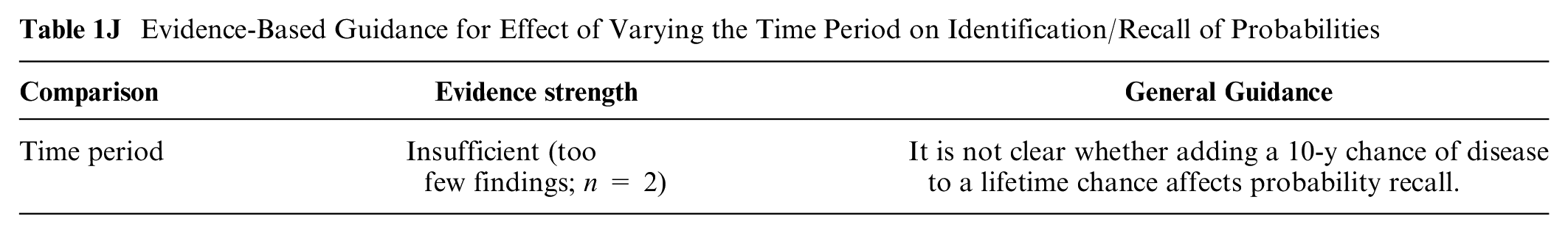
Comparisons of shorter versus longer time periods on identification/recall of probabilities (subsection 1J)
In one moderate-credibility finding from a small study, 8 there were no recall differences by whether lifetime chance was given alone or combined with the 10-y chance.
Evidence-Based Guidance for Effect of Varying the Time Period on Identification/Recall of Probabilities
Effects of Different Formats on Ability to Identify Largest or Smallest of a Set of Numbers (Contrast Outcome): Section 2
Asking participants to select the largest or smallest in a list of numbers or rank the numbers in order of size was classified as a contrast outcome.
Within the contrast outcome, there were no relevant findings on the effects of stating or illustrating numerical uncertainty (category 2G in Table B) or effects of varying the time period (category 2J).
Comparisons between numerical formats in effects on ability to contrast probabilities (subsection 2A)
RATES PER 10n VERSUS 1 IN X: Two high-credibility findings62,63 demonstrated that people’s ability to identify which probability was larger was better with pair of rates with the same denominator than with pair of 1-in-X frequencies. However, in another high-credibility finding, Cuite et al. 64 demonstrated no difference in ability to identify which probability was higher between 1-in-X and rates per hundred or thousand, and that 1-in-X was better than percentages for this task. Similarly, in a moderate-to-high-credibility finding, Pighin et al. 65 demonstrated no difference in overall ability to compare probabilities by whether the probabilities were in 1-in-X or rate per 10n format.
Evidence-Based Guidance for Effects of Numerical Formats on Ability to Contrast Probabilities

CONSISTENT FORMATS: In a moderate-to-high-credibility finding, Nagle et al. 66 demonstrated that the ability to compare probabilities and choose the higher/lower was best when both were in the same format.
ORDER OF RISKS AND BENEFITS: In a moderate-to-high-credibility finding, Ubel et al. 67 demonstrated people were better at identifying the larger or smaller chance when information was presented benefit-then-harm than when presented harm-then-benefit.
TABLES: In a moderate-credibility finding, Tait et al. 13 demonstrated ability to identify which group was more affected by chances or benefits or drug was better when the rate per 10n was embedded in a table versus in text. However, a high-credibility finding by the same author group 14 demonstrated no difference in this ability, and other formatting factors may have contributed to the identified effects. A moderate-credibility finding 10 demonstrated no difference in ability to identify the higher risk by format of the number (rate per thousand or percentage), but the small sample size reduces confidence in the negative finding. Brick et al. 15 showed better performance on a composite comprehension measure with a fact box than with numbers in a paragraph. However, because only 5 of 12 comprehension measure questions involved contrast outcomes, the contrast outcome finding is classified as only moderate credibility.
NUMBERS AS LIST VERSUS NUMBERS AS FLOW CHART: In a moderate-credibility finding, Dolan et al. 68 demonstrated no difference in ability to identify larger chances between a list of rates per thousand or the same numbers formatted as a number-based flow chart (or several graphical formats).
RATIO VERSUS CASE COUNT VERSUS RATE PER 10n: In a moderate-credibility finding, Waller et al. 69 demonstrated no difference in ability to answer whether screening mammograms increase the likelihood of diagnosis when information about overdiagnosis was presented in 3 numerical formats (an odds ratio, a case count, or a rate per 10n), but concerns about question wording and stimulus design somewhat limit confidence in this negative finding.
Comparisons between graphical formats in effects on ability to contrast probabilities (subsection 2B)
GROUPED VERSUS RANDOM ICON ARRAYS: A high-credibility finding 70 demonstrated better ability to identify biggest/smallest/equal probabilities with grouped icon arrays (static or animated) versus random icon arrays (static or animated). Similarly, in 2 moderate-credibility findings, Feldman-Stewart et al. 40 substudy 3 and Feldman-Stewart et al. 71 showed that ability to identify biggest/smallest was better with grouped icon arrays versus random icon arrays. In the same finding, Feldman-Stewart et al. 71 also showed that adding axes to graphics improved performance for grouped icon arrays but worsened performance for random icon arrays. However, another moderate-credibility finding 72 demonstrated that ability to identify the largest/smallest probabilities (measured using an outcome that combined single risks and effects) was not associated with whether an icon array was grouped or random.
Evidence-Based Guidance for Effects of Graphical Formats on Ability to Contrast Probabilities
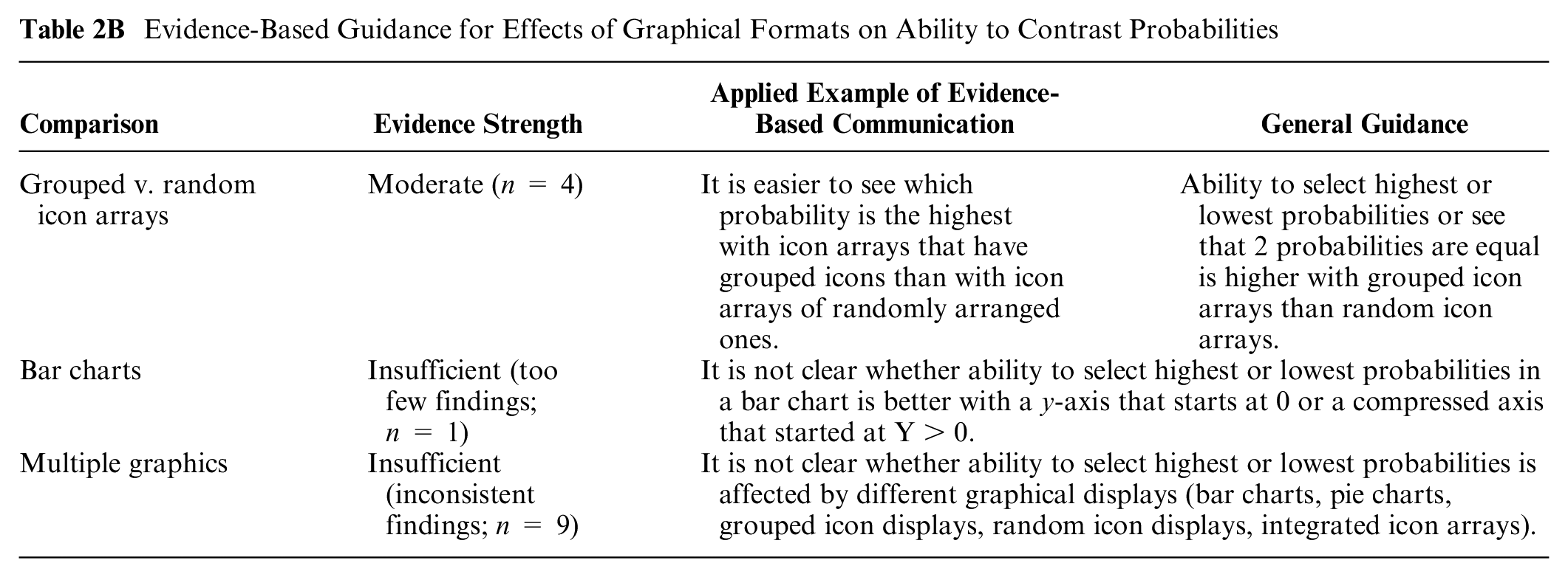
BAR CHARTS: In a moderate-credibility finding, Okan et al. 73 (substudy 16) showed that ability to identify largest/smallest in a bar chart was facilitated by a standard y-axis starting at zero and impaired by a y-axis that started at 400.
MULTIPLE GRAPHICS: A variety of findings have compared ability to identify larger or smaller probabilities across graphics types, with varying results. Aside from the evidence suggesting that grouped icon arrays are superior to randomly arranged ones (discussed above), there is insufficient similarity and coherence among the available studies to determine whether icon arrays, bar charts, number lines, or other types of graphics are better for improving people’s ability to contrast quantities.
In 2 moderate-credibility findings, Feldman-Stewart et al. 40 and Feldman-Stewart et al. 71 showed that ability to identify biggest/smallest was best with vertical bar charts and grouped icon arrays and worst with pie charts and random icon arrays. In this latter study, Feldman-Stewart et al. 71 also showed that adding axes to graphics improved performance for grouped icon arrays and both horizontal and vertical bar charts but worsened performance for random icon arrays and pie charts. In a somewhat similar finding, Dowen et al. 74 (moderate-credibility) demonstrated that ability to identify the best/worst option was better with vertical or horizontal bar charts (grouped to show proportions dead/alive at several time points) than with pairs of pie charts or survival curves. In moderate-credibility findings from 2 substudies published in the same article, McDowell et al. 33 demonstrated improved ability to identify options with higher probabilities with sets of individual icon arrays versus an integrated icon array. However, a variety of findings have demonstrated no differences between graphical formats in identifying larger or smaller probabilities: neither a moderate-to-high-credibility finding 31 nor a very similar moderate-credibility finding 24 demonstrated any differences in this ability between rate per 10n in tables, bar charts (horizontal or vertical), pie charts, or icon arrays (vertical or horizontal). Dolan et al. 68 also demonstrated no differences between a horizontal number line with log-scale axis, a vertical bar chart, and a 25 × 20 icon array. Similarly, a moderate-credibility finding 75 demonstrated no difference between icon arrays and sequential experience format in people’s ability to compare cancer detections versus false alarms.
Two lower-credibility findings (Timmermans et al., 76 Okan et al. 73 substudy 7) were not synthesized due to small sample size. Two low-credibility findings published in the same article 41 were also not synthesized due to confounding in the manipulation, while another low-credibility finding 37 had both a small sample size and an aggregate measure that combined multiple types of outcomes, decreasing confidence in a contrast effect.
Comparisons between numerical and graphical formats, and combinations of numerical and graphical format, in effects on ability to contrast probabilities (subsection 2C)
NUMERATOR-ONLY ICON ARRAYS ADDED TO NUMBERS: In 2 moderate-credibility findings from substudies published in the same article, Stone et al. 42 showed that adding a foreground-only icon array graphic to rate per 10n did not affect people’s ability to select the most common disease.
Evidence-Based Guidance for Contrasts between Numerical and Graphical Formats, and Combinations of Numerical and Graphical Formats, on Ability to Contrast Probabilities

PART-TO-WHOLE ICON ARRAYS: In a high-credibility finding, Tait et al. 14 demonstrated ability to identify more affected groups was better with icon arrays than with rate per 10n in table or text format, while a moderate-credibility finding of similar design 13 demonstrated icon arrays or the rate per 10n in table format led to improvements over rate per 10n in text. Similarly, a moderate-to-high-credibility finding 75 demonstrated that adding icon arrays (or an animated graphic, discussed elsewhere) to rates improved ability to identify more common events. In moderate-credibility findings from substudies published in the same article, McDowell et al. 33 demonstrated improved ability to identify options with higher probabilities with sets of individual icon arrays versus an integrated icon array or rate per 10n in a tabular facts-box format. However, both a moderate-to-high-credibility finding 31 and a moderate-credibility finding 24 demonstrated no differences in this ability between rate per 10n in tables, bar charts (horizontal or vertical), pie charts, or icon arrays (vertical or horizontal). Similarly, in a moderate-credibility finding, Dolan et al. 68 demonstrated no differences in ability to identify higher disease probabilities between a list of rate per 10n, a number-based flow chart, a number line, a vertical bar chart, or a 20 × 25 icon array. A low-to-moderate-credibility finding 37 also demonstrated no differences between percentages combined with rate per 10n, vertical stacked bar charts, pairs of icon arrays, or sets of pie charts. A moderate-credibility finding 10 demonstrated no difference in ability to identify the higher probability by format of the number (icon arrays with rate per 10n versus the rates alone or percentages alone), but the small sample size reduces the confidence in the negative finding.
Two lower-credibility findings47,76 were not synthesized due to limitations for this outcome.
Comparisons between numerical and verbal probabilities in effects to contrast probabilities (subsection 2D)
One lower-credibility finding had a small sample size and confounded manipulations. 77
Comparisons of elements added for context on ability to contrast probabilities (subsection 2E)
CHANCE OF COMPARISON EVENTS: In a moderate-to-high-credibility finding, Ubel et al. 67 demonstrated that adding information about chance of other cancers eliminated order effects, so ability to identify the larger/smaller harm was not affected by whether information was presented benefit-then-harm or harm-then-benefit.
Evidence-Based Guidance for Effect of Adding Context on Ability to Contrast Probabilities

INTERPRETIVE LABELS: One moderate-credibility finding 78 suggests that classifying items into verbally described categories helps readers more than providing numbers does. However, this finding was limited by the fact that the numbers provided were complex, reducing confidence in this finding.
Comparisons of frames (gain, loss, or combination) on ability to contrast probabilities (subsection 2F)
SURVIVAL AND MORTALITY CURVES: Both a high-credibility finding 56 and a moderate-credibility finding 57 demonstrated that ability to select a medication with better survival at specific time points was better with survival curves (gain framing) versus mortality curves (loss framing).
Evidence-Based Guidance for Effect of Framing on Ability to Contrast Probabilities
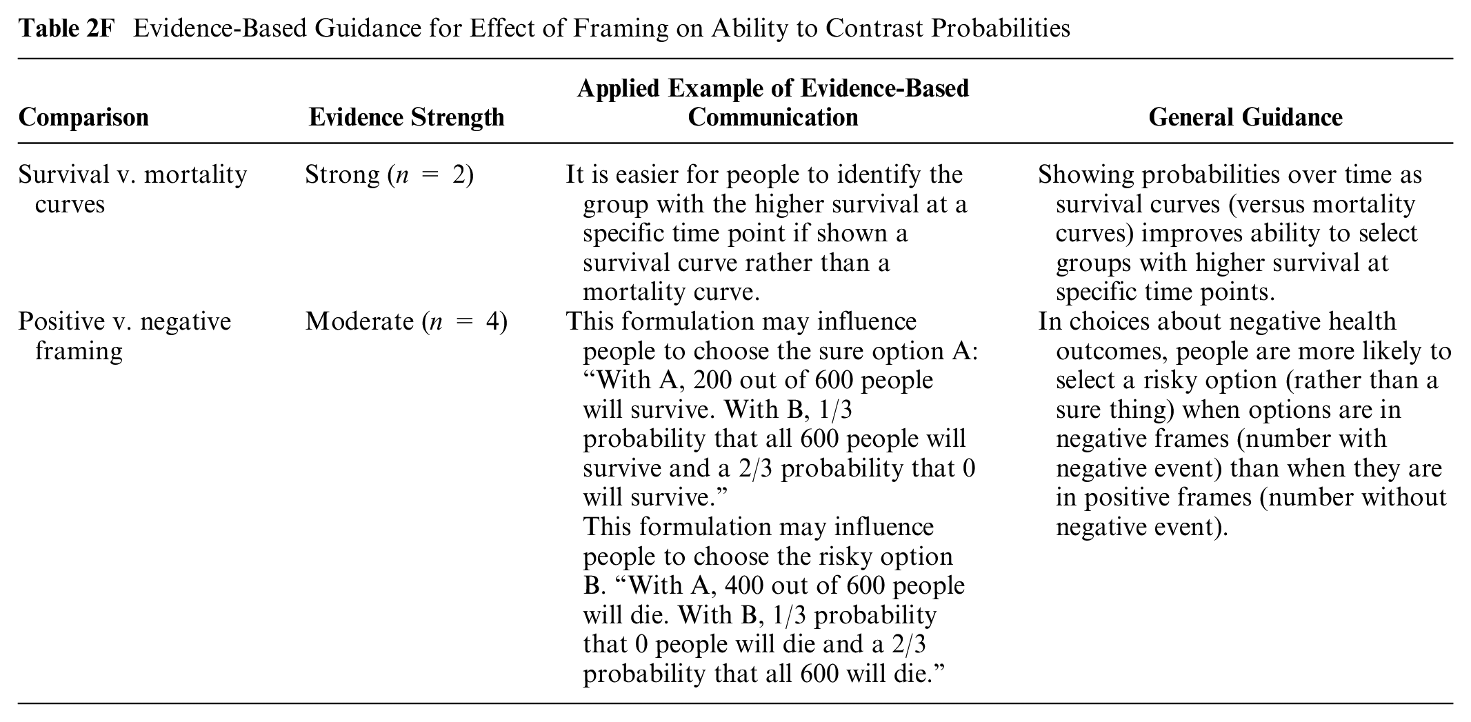
POSITIVE VERSUS NEGATIVE FRAMING: Four high- and moderate-credibility findings examined effect of framing on risky choice problems, which is a preference-based choice more than a selection of a normatively bigger or smaller option. Peters and Levin 79 and Damnjanovic and Gvozdenovic 80 demonstrated a tendency to pick risky options (v. sure-thing options) in a health domain involving negative outcomes when options were presented in negative frame (e.g., 10 out 100 die) versus positive frame (e.g., 90 out of 100 saved). Two low-to-moderate-credibility findings published in the same article 81 also examined framing in a more complicated design, with inconsistent findings.
An additional finding is not summarized due to confounding of the data formats and the question format. 73
Comparisons of larger or smaller denominators on ability to contrast probabilities (subsection 2H)
CONSISTENT DENOMINATORS: Stone et al. 42 in a moderate-credibility finding demonstrated that ability to rank events from least to most common was highest when all were shown as rates with the same denominator. When denominators were different, ability to rank them was poor (note that adding an icon array did not help).
Evidence-Based Guidance for Effect of Manipulating Denominators of Probabilities on Ability to Contrast Probabilities

Comparisons of animation or interactivity on ability to contrast probabilities (subsection 2I)
INTERACTIVITY: A high-credibility finding 82 demonstrated that ability to choose the therapy with the lowest probability was better with static icon arrays combined with rate per 10n than with an interactive graphic that invited respondents to illustrate the probability expressed in the rate.
Evidence-Based Guidance for Effect of Animation or Interactivity on Ability to Contrast Probabilities
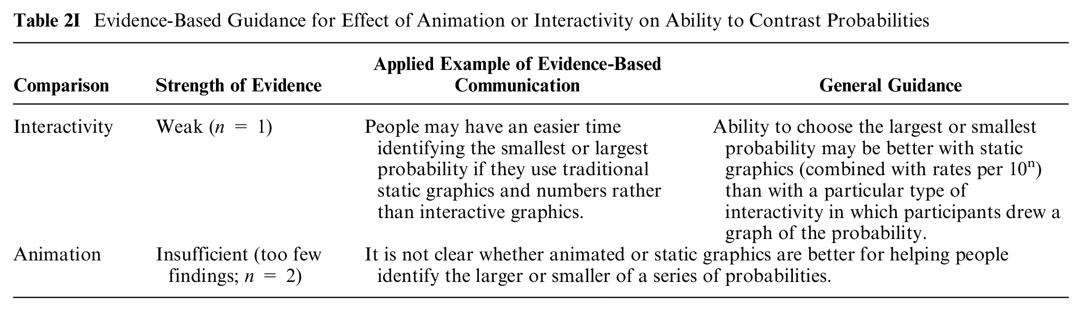
ANIMATION: A high-credibility finding 70 demonstrated no improvements (and some decreases) in ability to identify larger or equal probabilities with a variety of types of animated icon arrays versus static icon arrays. Similarly, a moderate-credibility finding 61 demonstrated no difference in ability to identify higher or lower values (combined with higher/lower effects of screening) between static icon arrays and 2 different types of animated icon arrays; the small sample reduces confidence.
Effects of Different Formats on Ability to Classify a Number into Categories (Categorization Outcome): Section 3
Research in risk communication sometimes involves questions about whether the participant can recognize which category they fall into. For example, patients receiving a personalized chance of cancer recurrence may need to understand whether cancer experts consider this recurrence probability to be high, moderate, or low. Similarly, a patient may be able to make more informed decisions about lifestyle if they recognize that their chance of developing diabetes is above average. A question asking participants to assess which category a probability belongs to, when categories are provided, is called a categorization outcome.
Within the categorization outcome, there were no relevant findings for gain-loss framing (category 3F), denominator manipulation (3H), animation and interactivity (3I), or time period variation (3J).
Comparisons between numerical formats in effects on categorization of probabilities (subsection 3A)
In a study comparing table versus text formats with a 12-item composite comprehension measure, 1 item pertained to contrast outcomes. However, no hypothesis testing was performed specific to this outcome, so this low-credibility finding is not synthesized. 15
Comparisons between graphical formats in effects on categorization of probabilities (subsection 3B)
GRAPHIC TYPE: In a moderate-credibility finding, Masson et al. 27 demonstrated no difference in people’s ability to place their personal probability into provided categories between percentages combined with icon arrays, percentages combined with a bar chart, or a number line with verbal probability.
Evidence-Based Guidance for Effect of Graphical Format on Ability to Classify a Number into a Category

Three lower-credibility findings35,83,84 are not synthesized due to limitations.
Comparisons between numerical and graphical formats, and combinations of numerical and graphical formats, in effects on ability to classify a number into a category (subsection 3C)
NUMBERS VERSUS GRAPHICS: Two moderate-credibility findings contrasted numbers versus graphics for helping people to correctly classify a probability. Timmermans and Oudhoff 85 demonstrated that a verbal comparative probability (higher/lower than average) was as effective as numbers combined with an icon array showing a person’s chance of disease as higher or lower than average. Brewer et al. 86 demonstrated that women were more accurate at classifying their probability of a health event into categories when it was displayed on a horizontal number line that superimposed the risk onto a labeled category than with various numbers or graphics that included the category information only in a text label. A low-credibility finding 84 is not synthesized.
Evidence-Based Guidance for Contrasts between Numerical and Graphical Formats, and Combinations of Numerical and Graphical Formats, on Categorization of Probabilities

Comparisons between numerical and verbal probabilities in effects on categorization of probabilities (subsection 3D)
1-IN-X FORMAT VERSUS VERBAL PROBABILITY: One moderate-credibility finding 52 suggests that women were more likely to correctly recognize they were in the “low-risk” category rather than the “no-risk” category with a 1-in-X rather than a verbal probability alone.
Evidence-Based Guidance for Contrasts between Numerical and Verbal Probabilities on Categorization of Probabilities

Comparisons of elements added for context on categorization of probabilities (subsection 3E)
Three types of context features were added to probability information: interpretive labels about the categories, a population or average probability, and the chances of other events (“comparison risks”).
Evidence-Based Guidance for Effect of Adding Context on Categorization of Probabilities

INTERPRETIVE LABELS: Three findings examined the effect of interpretive labels on people’s ability to correctly classify their probability of disease, generally finding that the labels helped. In a high-credibility finding, Marteau et al. 87 demonstrated that when a test result was labeled “abnormal,” there was no added effect of providing absolute or relative probability numbers. In a high-credibility finding, Johnson 88 demonstrated that, with air quality indicators, there was no difference between a label of “unhealthful” and “unhealthful for sensitive groups.” In a moderate-credibility finding of the Oncotype DX report, Brewer et al. 86 demonstrated that several graphics that showed cancer recurrence probability in graphics with interpretive labels outperformed the original Oncotype report, but multiple differences between the different graphics make it difficult to attribute the performance to the interpretive labels.
ADDING A POPULATION VALUE: Two findings examined the effect of adding a population value to a risk message. A moderate-credibility finding from Lipkus et al. 89 showed that women were better able to classify their own probability as higher or lower than others’ when they were shown the typical probability. In a moderate-credibility finding, Timmermans and Oudhoff 85 showed that displaying the population probability improved accuracy of perception of personal probability (by increasing perceived risk); the format of the comparison to the average did not matter.
COMPARISON RISKS: In a moderate-credibility finding, Lipkus et al. 90 showed that displaying probabilities of different cancers for comparison did not affect ability to classify their own probability as higher or lower than others’.
Comparisons of methods of representing uncertainty on categorization of probabilities (subsection 3G)
In 1 moderate-credibility finding 86 comparing several formats as alternatives to the Oncotype Dx report, the presence/absence of confidence intervals in various formats did not appear to affect ability to classify probability.
Evidence-Based Guidance for Effect of Stating or Illustrating Numerical Uncertainty on Categorization of Probabilities

Comparisons of animation or interactivity on categorization of probabilities (subsection 3I)
A relevant finding was considered lower credibility because of the small sample size and lack of hypothesis testing specific to this comparison. 35
Effects of Different Formats on Ability to Perform Computations (Computation Outcome): Section 4
It is widely accepted that it is poor communication practice to require patients to perform computations and that communicators should instead do calculations for their readers. 91 Nevertheless, there are situations in which the appropriate calculation cannot be performed for every reader who might need it, or in which readers might want to compute additional metrics that are not provided. For these reasons, researchers sometimes assess participants’ ability to perform computations on information provided in the stimulus. Performance on computations is likely to depend in part on numeracy and in part on the difficulty of the computation. Computation questions in the research we reviewed ranged from relatively simple (subtracting a percentage from another percentage to compute an absolute risk reduction) to somewhat more difficult and multistep (converting a percentage into a rate per 1,000, thus expecting participants to understand they should first convert the percentage into a proportion and then multiply it by 1,000) to moderately complex (computing a relative increase or decrease). These issues of numeracy and heterogeneity of types of computations assessed make it impossible to attribute performance entirely to the stimulus. Nevertheless, performance on computations does provide some information about the clarity and ease of use of the data presentation format.
In the computation outcome, there were no relevant findings about time period variation (category 4J in Table B).
Comparisons between numerical formats in effects on ability to perform computations on probabilities (subsection 4A)
NUMERICAL FORMATS: Two high-credibility findings (Cuite et al. 64 substudy 3 and Garcia-Retamero and Galesic, 92 respectively) and a moderate-credibility finding (Cuite et al., 64 substudy 5) demonstrated that computations with probabilities were more accurate with percentages than with rate per 10n or 1 in X. However, a high-credibility finding 65 and moderate-credibility findings by Knapp et al. 93 and Ruiz et al. 10 demonstrated no effect of number format (percentage, 1 in X, rate per 10n, or combinations of these) on ability to perform computations with probability numbers. Two moderate-credibility findings12,94 demonstrated greater accuracy with rate per 10n than with the rate-based probability band established by the European Commission (EC; e.g., “up to 1 in 10”). By contrast, a moderate-credibility finding (Hill and Brase 95 substudy 3) demonstrated better calculations of cumulative probability with common-denominator rates than with probabilities. Two additional moderate-credibility findings (Hill and Brase 95 substudies 1 and 2) demonstrated no effect of number format (percentage, 1 in X, rate per 10n, or combinations) on ability to perform computations with probability numbers.
Evidence-Based Guidance for Effects of Numerical Format on Ability to Perform Computations on Probabilities

A lower-credibility finding 96 is not summarized.
Comparisons between graphical formats in effects on ability to perform computations on probabilities (subsection 4B)
ICON ARRAYS: A moderate-credibility finding demonstrated an advantage when icon arrays were presented in combination with numbers (data labels) compared with icon arrays alone. 97 However, a second moderate-credibility finding suggested that supplementing numbers with a bar chart or data table was preferable to supplementing them with an icon array. 98
Evidence-Based Guidance for Effect of Graphical Format on Ability to Perform Computations on Probabilities

A high-credibility finding by Okan et al. 23 did not find a difference in ability to perform computations between part-to-whole and numerator-only icon arrays.
SURVIVAL CURVES: Two low-to-moderate-credibility findings examining types of survival curves published in 1 article by Rakow et al. 41 demonstrated no differences by what sort of survival curve was used to display the probability.
MULTIPLE GRAPHICS: Three other moderate-credibility findings that contrasted multiple graphics (icon arrays both random and grouped, bar charts both horizontal and vertical, pie charts, flowcharts, number lines) either demonstrated no differences 99 or produced different rankings.40,68 Another low-to-moderate-credibility finding in the Feldman-Stewart et al. 40 article was underpowered to determine differences between graph types.
Comparisons between numerical and graphical formats, and combinations of numerical and graphical formats, in effects on ability to perform computations on probabilities (subsection 4C)
COMBINING NUMBERS AND GRAPHICS: Five moderate- to high-credibility findings suggest that the combination of graphics and numbers is generally superior to either alone, in contrast to 3 moderate-to-lower-credibility findings that did not show this effect. Specifically, a finding by Garcia-Retamero and Galesic 101 and 2 findings from substudies in the same article by Garcia-Retamero et al. 102 demonstrated that computations using rates per 100 or 1,000 numbers were more accurate when sizes of the treated and untreated groups were the same or when the numbers were supplemented with icon arrays. Another finding by Garcia-Retamero and Dhami 103 also showed that the combination of numbers and icon arrays was better than numbers alone. Similarly, a moderate-credibility finding 104 demonstrated that supplementing percentages with a bar chart helped facilitate computations. However, both a moderate-credibility finding 10 and 2 additional moderate findings (in the same Dragicevic and Jansen 104 article) demonstrated no evidence that supplementing numbers with graphics helps computations.
Evidence-Based Guidance for Contrasts between Graphical and Numerical Formats, and Combinations of Numerical and Graphical Formats, on Ability to Perform Computations on Probabilities

NUMBERS VERSUS GRAPHICS: In a moderate-credibility finding, Feldman-Stewart et al. 40 demonstrated that vertical bar charts were superior to numbers in terms of facilitating computations, but grouped icon arrays were about equal to numbers, and horizontal bar charts, random icon arrays, and pie charts were all worse. A low-to-moderate-credibility finding from a different substudy by the same author 40 had similar results, and another low-to-moderate-credibility finding 45 demonstrated computational ability was best when numbers were supplemented by bar charts than when they were shown alone or supplemented with a histogram.
Lower-credibility findings from 3 substudies published in 2 articles were not summarized.47,100
Comparisons between numerical and verbal probabilities in effects on ability to perform computations on probabilities (subsection 4D)
ADDING INTERPRETIVE LABELS: In communicating chance of a series of side effects, adding a verbal label to a rate per 10n did not improve ability to compute the chance of having any side effect. 12
Evidence-Based Guidance for Contrasts between Numerical and Verbal Probabilities, or Combinations of Numerical and Verbal Probabilities, on Ability to Perform Computations on Probabilities

Comparisons of elements added for context on ability to perform computations on probabilities (subsection 4E)
ANECDOTES: In a moderate-credibility finding, Gibson et al. 55 demonstrated that ability to convert from proportion to percentages was better when accompanying anecdotes reinforced the proportions stated in the scenario.
Evidence-Based Guidance for Effect of Adding Context on Ability to Perform Computations on Probabilities

A low-credibility finding from a relevant study is not summarized. 45
Comparisons of frames (gain, loss, combination) on ability to perform computations on probabilities (subsection 4F)
GAIN- VS LOSS-FRAMING: A single moderate-credibility finding 105 studied whether gain versus loss framing affects computations, finding no effect.
Evidence-Based Guidance for Effect of Gain-Loss Framing on Ability to Perform Computations on Probabilities

Comparisons of methods of representing uncertainty on ability to perform computations on probabilities (subsection 4G)
One finding is not synthesized here due to limitations in this comparison. 45
Comparisons of larger or smaller denominators on ability to perform computations on probabilities (subsection 4H)
CONSISTENT VERSUS DIFFERENT DENOMINATORS: Presenting people with frequency information with different denominators impairs people’s ability to compute relationships between probabilities, according to 4 moderate-to-high-credibility findings that showed that computations were more accurate when sizes of treated and untreated groups were the same (Garcia-Retamero and Galesic, 101 Garcia-Retamero et al. findings from studies 1 102 and 2 102 , Okan et al. 105 ).
Evidence-Based Guidance for Effect of Manipulating Denominators of Probabilities on Ability to Perform Computations on Probabilities
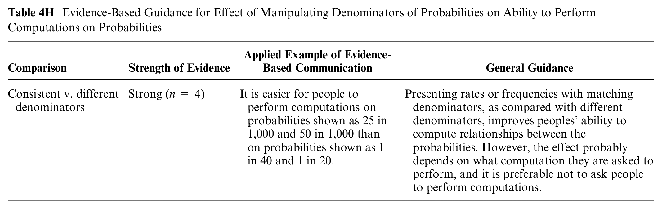
A lower-credibility finding 103 is not summarized.
Comparisons of animation or interactivity on ability to perform computations on probabilities (subsection 4I)
Two moderate-credibility findings were inconsistent. Okan et al. 97 demonstrated that accuracy in computation was higher when icon arrays were animated and had reflective questions added. However, Housten et al. 61 demonstrated no difference in ability to perform computations between static and animated icon arrays.
Evidence-Based Guidance for Effect of Animation or Interactivity on Ability to Perform Computations

Summary of Evidence
We categorized the majority of evidence from this synthesis as insufficient, with only small numbers of strong, moderate, and weak guidance statements.
There is
icon arrays with human figures are more memorable than icon arrays with blocks (subsection 1B: recall outcome, graphics v. graphics comparison);
it is easier to identify points of highest survival with a survival curve than with a mortality curve (subsection 1B: identification outcome, graphics v. graphics comparison);
adding an average population-level probability to a message about individual probability may not affect the memorability of the probability (subsection 1E: recall outcome, context comparison);
computations are easier when bar charts are combined with data labels than with either numbers or graphics alone (subsection 4C: computation outcome, numbers v. graphics comparison);
computations with frequencies are more accurate when denominators match (subsection 4A: computation outcome, numbers v. numbers comparison); and
gain-loss framing has substantial effects on risky choices, with selection of a risky outcome being more common when options are presented in negative frames (subsection 2F: contrast outcome, framing comparison).
reducing significant digits may improve people’s ability to identify numbers (subsection 1A: identification/recall outcome, numbers v. numbers comparison);
interpretive labels for numbers may improve people’s ability to categorize (subsection 3E: categorization outcome, context comparison);
“heart age” communications may improve identification/recall (subsection 1A: identification/recall outcome, numbers v. numbers comparison);
table formats may improve ability to identify numbers (subsection 1A: identification/recall outcome, numbers v. numbers comparison);
numerator-denominator icon arrays may improve both recall and contrast ability over numerator-only ones (subsections 1B/1C and 2C: recall and contrast outcomes, graphics v. graphics and numbers v. graphics comparisons);
adding labels may improve ability to identify the option with a higher rate (subsection 2E: contrast outcome, context comparison);
rates per 100 may improve ability to identify or remember numbers as compared with numerator-only icon arrays (subsection 1C: identification/recall outcome, numbers v. graphics comparison);
using point estimates rather than ranges may improve identification/recall (subsection 1G: identification/recall outcome, uncertainty comparison);
matching formats and denominators of probabilities and presenting benefit probabilities before harm probabilities may each improve ability to find highest or lowest values (subsection 2A: contrast outcome, numbers v. numbers comparison);
adding probabilities of other harms for context may also improve ability to find high/low values (subsection 2E: contrast outcome, context comparison); and
showing the population probability may help people understand what category their probability falls into (subsection 3E: categorization outcome, context comparison).
Weak evidence also suggested a lack of benefit of different types of animation (subsections 2I: contrast outcome, animation comparison). However, notably, despite the ubiquity of online and computer-mediated health communication, animation and interactivity have not been well-studied to date.
Discussion
This article synthesizes the evidence pertaining to the impact of data presentation formats on 5 outcomes (identification, recall, contrast, categorization, computation) involving performing point tasks on stimuli containing probabilities.
The granular nature of this evidence showcases nuances in the conclusions that can be drawn. For example, evidence is strong that survival curves are better than mortality curves for helping people identify the point at which survival is the highest (the contrast outcome), and yet there is insufficient evidence to determine whether they are also better for helping people identify the exact probability at 1 point of time (the identification outcome).
The outcomes discussed here are sometimes lumped together in both the research and practice literatures as comprehension or sometimes broken down as verbatim versus gist comprehension. Indeed, improving what is alternately described as audience comprehension, understanding, or knowledge of probability information is perhaps the most commonly stated objective for probability communications. Yet, as this review shows, it is precisely the imprecision of such terms that has led to confusion about what is and is not known about the effectiveness of different probability data presentation formats. Indeed, it matters whether the people receiving probability information need to simply recognize what is in front of them (identification), remember it later (recall), or perform numerical operations on it (computation). It matters whether they need to compare a number to other data points (contrast) or to a set of thresholds that define classes or categories (categorization). Part of the reason that we were able to draw so few strong conclusions from our review is that those studies that do exist often compared similar formats using distinctly different measures.
As a result, as yet unanswered with the current evidence are broad questions such as, “Is there a specific number format or graphic that is superior to other formats for all of these outcomes?” “In general, does adding a graphic to a number improve multiple outcomes?” and “Is recall of the probability of an event better with numbers alone or verbal probabilities alone?” While resolution of these questions must await further research, the heterogeneity of findings across the outcomes studied in this article suggest that that there may be very few formats that improve all outcomes. Instead, our evidence is consistent with the idea that the right question will usually be “which format or graphic is superior for the specific outcome that is most important in this particular context?”
Limitations include the possibility of overlooked studies, the use of a small expert group to evaluate risk of bias and credibility, and the highly granular data extraction that focused on narrow comparisons rather global assessment of research. The literature was heterogeneous, ranging from large to very small sample sizes, including strong and weak study designs, and different types of participants with some including patients, other members of the general public, and others primarily undergraduates or other educated samples. Overall, the number of highly credible comparable articles within any category was small, limiting the strength of the evidence that could be derived from this literature. We did not analyze articles by participant or population characteristics (such as education, culture, or numeracy) because of the relatively small numbers of comparable papers for each relevant characteristic. Such potential confounders might contribute to the heterogeneity of findings when studies are grouped and may also limit generalizability to different settings and populations.
As illustrated previously in Table A, this review addresses the research evidence only regarding point cognitive tasks, that is, situations in which the audience for probability communications is asked to focus on single data points (presented either singly or in larger sets). It does not touch upon the evidence for communicating probability differences (difference tasks), time trends (trend tasks), or situations in which the audience is asked to consider multiple types of probability information simultaneously (synthesis tasks). It also considers only a narrow slice of 5 specific outcomes, while a companion article presents the set of evidence pertaining to the effect of data presentation formats on 7 additional outcomes involving point tasks (probability perceptions, probability feelings, behavioral intentions, behavior, trust in information, preference for a data presentation format, and discrimination). 106 As such, it represents a fundamentally incomplete picture of the implications of using particular data presentation formats for communicating probabilities. We urge readers to consider this article as but 1 segment of the larger compendium of findings from this project. To the extent that the research evidence presented here provides guidance to the practice of probability communication, the findings shown here must be integrated with and balanced against the findings regarding both the other cognitive tasks that users may need to perform and the larger set of outcomes that such communications create.
Footnotes
Acknowledgements
We thank the Numeracy Expert Panel for contributions to conceptualizing the MNM project (Cynthia Baur, Sara Cjaza, Angela Fagerlin, Carolyn Petersen, Rima Rudd, Michael Wolf, and Steven Woloshin). We are grateful to Marianne Sharko, MD, MS, Andrew Z. Liu, MPH, and Lisa Grossman Liu, MD, PhD, for contributions to article screening and risk-of-bias assessment. We also thank Jordan Brutus for assisting with data management.
The authors declared no potential conflicts of interest with respect to the research, authorship, and/or publication of this article. The authors disclosed receipt of the following financial support for the research, authorship, and/or publication of this article: Financial support for this study was provided entirely by a grant from the National Library of Medicine (R01 LM012964, Ancker PI). The funding agreement ensured the authors’ independence in designing the study, interpreting the data, writing, and publishing the reports.
Availability of Research Resources
All research resources are available at the Making Numbers Meaningful Project at OSF (![]() ). This project includes a Methodology Files folder (containing the search strategy, the data extraction instrument, and the study risk of bias [S-ROB] rubric), the list of each included article mapped to the Making Numbers Meaningful review article that covers it, and a Probability Findings folder displaying the extracted findings for each of the Making Numbers Meaningful review articles.
). This project includes a Methodology Files folder (containing the search strategy, the data extraction instrument, and the study risk of bias [S-ROB] rubric), the list of each included article mapped to the Making Numbers Meaningful review article that covers it, and a Probability Findings folder displaying the extracted findings for each of the Making Numbers Meaningful review articles.