
Abstract
Highlights
The Making Numbers Meaningful project conducted a comprehensive systematic review of experimental and quasi-experimental research that compared 2 or more formats for presenting quantitative health information to patients or other lay audiences. The current article focuses on probability information.
Based on a conceptual taxonomy, we reviewed studies based on the cognitive tasks required of participants, assessing 14 distinct possible outcomes.
Our review identified 316 articles involving probability communications that generated 1,119 distinct research findings, each of which was reviewed by multiple experts for credibility.
The overall pattern of findings highlights which probability communication questions have been well researched and which have not. For example, there has been far more research on communicating single probabilities than on communicating more complex information such as trends over time, and there has been a large amount of research on the effect of communication approaches on behavioral intentions but relatively little on behaviors.
1. Introduction
Much of the information patients need for decision making and disease self-management contains quantitative concepts, such as the chance of getting a disease and the harms and benefits of therapeutic options. Quantitative concepts can be challenging to understand and apply, especially for those with low numeracy or health numeracy. Because low numeracy is so prevalent, with nearly 30% of United States adults having difficulty working with fractions and decimals, 1 it is reasonable to assume that it is common in any patient or public audience.
To address challenges in communicating numbers, a rich and diverse research literature is demonstrating that comprehension can be affected by the data presentation format, the way in which a quantitative concept is conveyed. For example, for conveying probabilities, data presentation formats include numbers (e.g., 10%, 1 in 10, 10 in 100, and 0.10), graphics (such as icon arrays, bar charts, and number lines), and verbal descriptions of probability (such as “common” or “rare”).
The Making Numbers Meaningful seeks to comprehensively review and synthesize the evidence on the impact of data presentation formats on perceptual, affective, cognitive, or behavioral outcomes using numbers, words, or graphics, across all domains of health and medical decisions. As described elsewhere, 2 this was necessary for several reasons. First, although review articles, expert panel summaries, and guidance instruments are available to provide guidance in specific domains or for specific purposes, no single project has integrated evidence across all types of data, data presentation formats, and clinical domains. Second, as part of this project, we have developed a standard conceptual model and terminologies that will help readers and researchers make sense of diverse research literature that uses different terminologies and approaches. 2 Third, the project is also producing a freely available interactive guide to help disseminate this newly generated evidence to professional communicators and others outside the research world.
Although the broader Making Numbers Meaningful project encompasses research on the communication of both probabilities and quantities (such as laboratory results, nutrition data, or quality-of-life metrics), the current article details the methods used for the systematic review and evidence synthesis for probability communication only. We consider a separate methods article to be necessary because the methods are detailed and because the project is producing several closely related results articles that share the same methods. In this methodology article, we describe the literature search and review methods, our novel classification and data extraction approaches, and the evidence synthesis methods we applied systematically to all articles reporting methods for communicating probabilities. We also summarize the outcomes and data presentation format comparisons to provide a snapshot of the relative volume and scarcity of research examining different types of health probability communication questions.
2. Foundational Work
Our guiding conceptual model for this research represents quantitative communication (including communication of probabilities) as the presentation of a stimulus to a respondent, who performs cognitive tasks while making sense of the stimulus, resulting in perceptual, affective, cognitive, or behavioral responses that can be measured with outcome measures such as questionnaire instruments or observations (Figure 1). We are interested in the effect of data presentation format on these outcomes, and therefore, we consider only stimuli that consist of quantitative data such as probabilities represented in 1 or several data presentation formats.

In this conceptual model, people perform cognitive tasks to make sense of stimuli, resulting in perceptual, affective, cognitive, and behavioral responses that can be measured with outcome measures. Types of data structures, data presentation formats, tasks, and outcomes are described in section 2 of this article.
Applying this model to the literature was challenging because, as described in Ancker et al., 2 vocabularies used in the research literature were ambiguous and redundant. Therefore, we created 4 taxonomies to classify the literature in line with this model, ensuring that we were using standard terminologies and comparing similar studies with each other. The first taxonomy is the list of possible data structures (such as absolute probabilities versus probability comparisons and probabilities measured at 1 time/time interval versus probabilities measured multiple times over time). The second is the taxonomy of data presentation formats (including number formats such as percentages and frequencies, different data graphics, and verbal descriptions of probabilities). These 2 taxonomies are used to describe the stimuli in the studies. These taxonomies ensure that, for example, “pictograph” and “icon array” are recognized as synonyms for the same graphic format, and that “1 in X” (for example, 1 in 20) and “rate per 100” (for example, 5 in 100) are recognized as 2 different frequency formats. 2
Our next taxonomy is list of cognitive tasks conducted by a reader to make sense of a stimulus and extract information from it. For example, to answer a question about perceived risk from some graphic, the reader may examine a single point on the graphic; we label this task a “point task.” However, to assess the effectiveness of a treatment, the reader may need to perform the more complex cognitive task of evaluating the difference between 2 points on the graphic; we call this a “difference task.” The task taxonomy enumerates the cognitive actions performed on the stimulus as the reader seeks the answer to some informational question, allowing us to distinguish between simple and more complex tasks.
We also developed a taxonomy of outcomes, that is, measures of the construct that the research was designed to affect. Outcomes include recall, health behavior, probability perceptions (when responses to a probability are measured on a quantitative scale such as one ranging from very small to very large), and probability feelings (when responses to a probability are measured on an affective scale capturing, for example, worry or concern). 2 This taxonomy allows a classification that demonstrates how a single data presentation format can be good for one purpose and bad for another. For example, this classification allows us to demonstrate that formatting a probability as 1-in-X (e.g., 1 in 10) rather than a rate per 10n (e.g., 100 in 1,000) tends to increase readers’ perception of the size of the probability. 3 It also allows us to capture the fact that presenting several probabilities in 1-in-X format makes it more difficult for readers to identify the larger of 2 quantities. 4 Tasks and outcomes are closely linked; some outcomes are measured after the reader examines a small part of a stimulus, whereas other outcomes are linked to tasks that involve consideration of several portions of the stimulus or the entire stimulus holistically.
More details about these taxonomies are presented below as part of the systematic review.
3. Systematic Review
Guided by these taxonomies, we conducted a systematic literature review of the research on communicating health-related probabilities and amounts to nonexpert audiences.
3.1 Literature Search and Screening
We conducted a systematic literature search following the Preferred Reporting Items for Systematic Reviews and Meta-Analyses (PRISMA) statement (PROSPERO registration #CRD42018086270). Professional librarians constructed a search strategy including selected vocabulary (the search strategy is available in the Methodology Files folder at MNM Project at OSF: https://osf.io/rvxf2/) and applied it to MEDLINE, Embase, CINAHL (EBSCO), the Cochrane Library (Wiley), PsycINFO (EBSCO), ERIC (ProQuest), and the ACM Digital Library, from inception to September 10, 2020. In addition, we hand-searched the tables of contents for the 4 most common journals occurring in the initial results (Medical Decision Making, Patient Education and Counseling, Risk Analysis, and Journal of Health Communication), starting in 2008 because this appeared to be a year when the numbers of relevant citations increased. Inclusion criteria were 1) original research articles that 2) presented quantitative health information, 3) compared 2 or more data presentation formats for this information, 4) included adult patients or lay-people as participants, and 5) quantitatively measured or more outcomes related to perceptual, affective, cognitive, or behavioral outcomes. Verbal information was eligible for inclusion only if it was a verbal description of a probability (such as “rare,”“common,” or “unlikely”) or a magnitude (“large”). Because of our focus on the effect of data presentation format, we excluded research that assessed the effects of presenting different sorts of information to the viewer; we therefore excluded studies that compared arms with different reference classes and those that compared information and no-information arms (such as pre-post assessments of knowledge with a decision aid). As a result, we can draw conclusions about the effects of data presentation format but cannot draw broader conclusions about the effects of providing information or the effects of providing different information.
Literature search results were imported into the Covidence web app (Covidence.org, Melbourne, Australia). A pool of 6 reviewers screened titles and abstracts using Covidence, with 2 independent reviews for each title and abstract. This process resulted in a set of articles for full-text review, each of which was also reviewed by 2 independent reviewers. At both stages, disagreements were resolved by consensus. No language restrictions were imposed; we had 4 publications professionally translated before full-text review. (However, we excluded studies [n = 1] of verbal probability terms when the stimulus terms were not in English. This was because we were not confident that terms would be reliably translated to the same verbal probability term in English or that perceptual, affective, cognitive, and behavioral responses to a word in another language would be the same as the responses to the translated term.) For all included articles, we also retrieved and screened reference lists and citing articles from Scopus.
3.2 Data Extraction
We constructed a custom online data extraction instrument (Qualtrics.com, Seattle, WA) with branching logic to apply our taxonomy concepts to different types of research (the data extraction instrument is available in the Methodology Files folder at MNM Project at OSF: https://osf.io/rvxf2/). Three researchers (J.S.A., N.C.B., M.M.S.) independently conducted data extraction; each extraction record was reviewed for accuracy twice, first by a second member of the team during data extraction and second by J.S.A. and B.J.Z.-F. during the construction of the evidence table. When a single publication described 2 or more studies, each of these studies was assessed for eligibility and (if included) underwent its own data extraction. This was necessary because studies in a single publication often had different samples, data presentation formats, and outcome measures.
As described below, the data extraction allowed for classification of the stimulus (containing the data and the data presentation formats), the task required to extract the relevant information from the stimulus, and the outcome measures.
3.2.1 Participants, settings, study characteristics
For each study, we extracted sample size, a description of the sample (e.g., Internet panel, patients recruited from a cancer clinic), and whether or not education, literacy, and numeracy were measured as covariates. Any statistically significant interactions between data presentation format and education, literacy, or numeracy were noted in free text (Appendix 2).
3.2.2 Structure of data in the stimulus
Data were classified as probability (e.g., chance of getting a disease or chance of side effects) or quantity (e.g., laboratory results or environmental contaminants). The current methods article describes only the probability class of research and introduces a series of results articles on probability communication. (Quantity articles will be published separately.)
As shown in Table 1 and Ancker et al., 2 stimuli could include variables assessed at 1 time or time interval (such as the 10-y chance of a cardiovascular event), variables assessed multiple times over time (such survival curves or time trends), or sets of option attributes intentionally presented together to provide standardized information about choice options (such as the chance of benefit and the chance of harm for several therapeutic options). In addition, the data in the stimulus could be absolute probabilities (such as the chance of an event for an individual or population) or calculated probability comparisons (such as absolute risk differences, relative risk differences, relative risks, odds ratios, or numbers needed to treat or harm).
Taxonomy of Data Structures for Stimuli in Studies
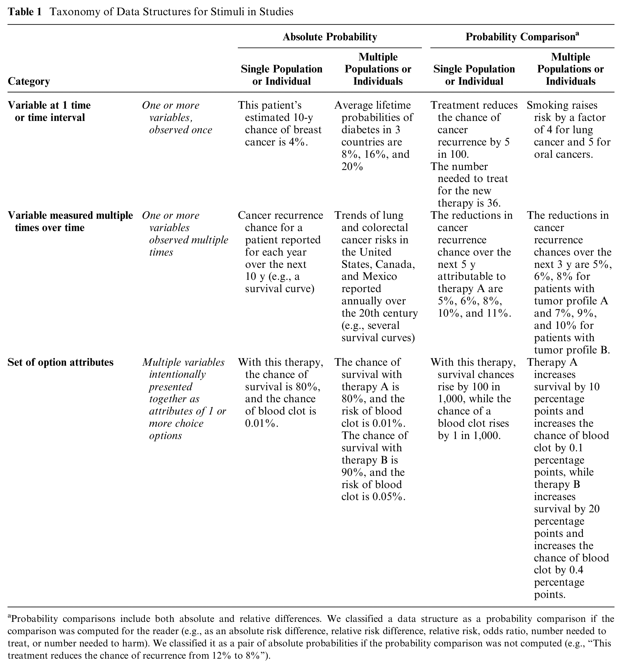
Probability comparisons include both absolute and relative differences. We classified a data structure as a probability comparison if the comparison was computed for the reader (e.g., as an absolute risk difference, relative risk difference, relative risk, odds ratio, number needed to treat, or number needed to harm). We classified it as a pair of absolute probabilities if the probability comparison was not computed (e.g., “This treatment reduces the chance of recurrence from 12% to 8%”).
3.2.3 Data presentation format in the stimulus
For each study, we classified the data presentation formats used in the stimuli as numerals, graphics, or words. Each stimulus could contain 1 or more data presentation formats.
We also captured an enumerated list of modifications and manipulations commonly applied to data presentation formats.
3.2.4 Data presentation format comparisons
As specified in the inclusion criteria, all studies involved 1 or more head-to-head comparison of different data presentation format groups. For example, a factorial design might contrast viewer perceptions of risk from 3 stimuli: a list of numbers, an icon array, and a bar chart. In this case, comparisons could be made between the numerical format and the 2 graphical ones or between the 2 types of graphics. On the basis of the study design, we placed each study record into 1 or more of these data presentation format comparison groups:
Numbers versus numbers
Graphics versus graphics
Numbers versus graphics
Numbers versus verbal probabilities
Context manipulations
Framing manipulations
Uncertainty manipulations
Denominator or unit manipulation
Animation and interactivity interventions
Time period manipulations
Within these larger comparison groups, we used the more specific information about the type of number, type of graphic, and so forth described in section 3.2.3 above for subgroups in the evidence synthesis.
3.2.5 Tasks
As described above, a reader conducts a cognitive task to make sense of a stimulus (its data structure and data presentation format) and extract information. Broadly, sometimes a participant focuses on only a small part of a stimulus, whereas other times the participant may consider several portions of the stimulus or the entire stimulus holistically.
For example, consider a bar chart representing the chance of disease with and without a vaccine (an absolute probability data structure). A viewer interested in learning about the chance of disease without the vaccine would perform the cognitive task of locating and examining the disease chance without vaccination. As this involves only a single element of the stimulus, we term this a point task.
Alternately, the viewer could use the same bar chart to estimate how effective the vaccine is by performing the cognitive task of contrasting the disease chances with and without vaccination and evaluating the difference between them. As this task involves examining the difference between numbers, we term this a difference task (Table 2).
Task Definition and Examples

3.2.6: Outcome measures
As described in Ancker et al., 2 we classified the constructs measured in the study in an information-processing framework. Because “gist understanding” was operationalized in different ways by different researchers, we avoided the term and instead identified the specific outcome in the study that was used to assess understanding (e.g., identifying which of 2 treatments had lower risk or assessing whether a value was in the above-average category or the below-average category).
For each outcome, we recorded the effects of each of the data presentation format, with nonsignificant differences considered ties. We also wrote a free-text summary of the effect sizes (Table 3).
Outcome Measures

Articles were frequently unclear about whether the participants answered the questions while viewing the stimulus or after the stimulus was removed. As a result, we were forced to combine identification and recall outcomes in the evidence tables and results publications.
Studies of actual health behaviors were so rare that we combined them with the behavioral intention studies in the evidence tables and results publications.
The outcome question presented to the participant would influence which cognitive task the participant needed to perform. For example, as described above, a question asking for a probability perception about a single absolute probability would prompt the participant to pay attention to one probability and perform a point task, whereas a question about how effective a treatment appeared (an effectiveness perception outcome) would prompt the participant to evaluate the size of the treatment effect via a difference task. We linked outcomes to tasks as follows:
People asked to report probability perceptions or probability feelings conduct point tasks to assess absolute probabilities.
People asked to report effectiveness perceptions and effectiveness feelings conduct a difference task to assess either probability comparisons (such as relative risk or absolute risk difference) or the relationship between 2 absolute probabilities (such as a pair of before- and after-treatment probabilities).
People asked questions about behavioral intention will perform a point task if given information about a single absolute probability. However, if given either a probability comparison data structure (e.g., a set of relative risks) or an absolute probability data structure with variables from several populations, they conduct a difference task of comparing the probabilities.
People asked questions about preference for or trust in the information will conduct a point task if they have access to an absolute probability data structure with a single probability. However, with either a probability comparison data structure or an absolute probability data structure with variables from several populations, they conduct a difference task of comparing the probabilities.
The identification-recall, contrast, categorization, discrimination, and computation outcomes could involve either point tasks or difference tasks, based on which information needed to be extracted from the stimulus. For example, finding the larger of 2 absolute quantities is a contrast outcome requiring a point task of looking at 2 absolute probabilities, but finding the larger of 2 absolute difference statistics is a contrast outcome requiring a difference task of looking at 2 probability comparisons. As another example, if a participant was given a stimulus presenting an absolute probability data structure and asked to compute some outcome, the task would be a point task if individual rates were needed for the calculation or a difference task if the inputs were probability comparisons (e.g., relative risk reduction statistics).
3.2.7 Findings
Our data extraction procedure resulted in multiple findings for each study. Each finding was defined uniquely by a task, an outcome, and a data presentation format comparison. For example, imagine a study contrasting icon arrays, bar charts, and 1-in-X numbers to illustrate the chances of colon cancer with and without regular screening, with measurements of the effect of the stimulus on the perceived risk of colorectal cancer and the perceived effectiveness of screening. Data extraction would produce 4 findings from this study (Table 4).
Four Findings from a Hypothetical Study Comparing Numbers and Graphics

Findings would then be placed in the evidence table defined by the unique combination of task and outcome, with subtables for each data presentation format comparison. Thus, findings 1 and 2 in Table 4 would go into the point task × probability perception table (and its subtables for graphics v. graphics and numbers v. graphics), and findings 3 and 4 would be allocated to the difference task × effectiveness perception table (and its subtables for graphics v. graphics and numbers v. graphics).
3.3 Risk-of-Bias Assessment
We adapted risk-of-bias criteria from the AHRQ Methods Guide for Effectiveness and Comparative Effectiveness Reviews 5 and the Cochrane Handbook for Systematic Reviews of Interventions. 6 For each study, pairs of reviewers independently evaluated and scored sample selection (with the highest scoring for educationally diverse or ecologically valid samples), randomization, protocol deviations, whether demographics and other covariates were reported, missing data, and presence of other potential biases (Appendix 3). Scoring conflicts were resolved in consensus meetings. This process allowed us to classify each study as having low, moderate, or high risk of bias. The study risk of bias (S-ROB) rubric is available in the Methodology Files section of the MNM Project at OSF (https://osf.io/rvxf2/).
3.4 Evidence Synthesis
3.4.1 Grouping findings into evidence tables
This set of data extraction tasks resulted in multiple findings for each article as portrayed in Figure 2.

After articles were identified for inclusion, data extraction was performed on each study within the article as described above, producing multiple findings per article. Data extraction steps, assessment/evaluation steps, and classification steps were performed at different stages of the analysis.
To synthesize the evidence, we grouped the findings into evidence tables united by task and outcome, containing subtables for each data presentation format comparison. In other words, each unique combination of task and outcome was a unique table, containing several subtables for different data presentation format comparisons.
This produced, for example, a point task| probability perception evidence table, with a graphics versus graphics subtable that assembles all findings about the effects of different graphics upon the estimated probability of single absolute probabilities, a numbers versus graphics subtable that assembles findings about comparisons between number formats and graphic formats, and a numbers versus numbers subtable that contains only comparisons between different number formats. Similarly, the point task|behavioral intention table assembles findings from studies about formats for single absolute probabilities in their effect upon behavior and behavioral intentions, with subtables for numbers v. numbers, numbers v. graphics, graphics v. graphics, numbers v. verbal probabilities, and so on.
3.4.2 Credibility assessment of findings
Because the ROB assessment at the study level was not granular enough to be applied to each of up to several dozen distinct findings from that study, we implemented a systematic evaluation process based on the judgments of 2 expert reviewers with more than 35 y of combined experience conducting research on communicating numbers in health (authors J.S.A. and B.J.Z.-F.). A third reviewer (N.C.B.) substituted for one of the other two in cases of coauthorship or other conflict of interest.
For each finding in each evidence table, the experts independently summarized the takeaway and assigned a credibility score based on the risk of bias, the sample size, potential for confounding, and the face validity of the comparisons. Face validity judgments assessed whether the experimental stimuli were comparable to each other and embodied the factors claimed to have been tested. Credibility ratings could be reduced by lack of hypothesis testing for a specific comparison, noncomparable study arms (such as one stimulus containing more extensive information about a risk than its comparator), or mismatches between measurements and stimuli (e.g., stimuli that did not give enough information to allow respondents to answer the questions asked). Typically, a finding would receive a high credibility score if it had low risk of bias, more than 100 participants per arm, stimuli with high face validity, and statistically significant results by credible hypothesis-testing approaches. A finding might receive a low credibility score if a failure to find statistically significant differences could be due to inadequate sample size, if there was confounding of several data presentation format manipulations that reduced confidence that the effect could be attributed to any one of them, or if a particular comparison of interest was a secondary outcome that was not subjected to hypothesis testing.
After independent ratings, the experts reviewed each other’s takeaways to come up with a consensus takeaway, with differences resolved by discussion. This process also resulted in regular methodological discussions to ensure consistent consideration of different factors in credibility judgments. The reviewers sometimes changed their credibility scores after the discussion but continued to assign individual credibility scores, which were averaged for the final score on each finding.
Because of this process, a single study often produced findings with different credibility scores. For example, in a well-designed and adequately powered study, the finding from the primary comparison might receive a high credibility score, but the finding for a secondary comparison not subjected to hypothesis testing might receive a low credibility score. For each finding, average credibility scores across reviewers from 0 to 4 were labeled low credibility, 4.5 to 6.5 moderate, and 7 to 10 high credibility. Low-credibility findings were reported but did not contribute to the evidence synthesis.
3.4.3 Evidence synthesis, consistency, and strength within evidence tables
For each evidence table, we created evidence syntheses that summarized the relevant findings. For each synthesis, we assessed consistency of the evidence (adapted from the GRADE criteria) as high (all the studies in a group point toward the same direction or show no effect), moderate (most show an effect in the same direction or no effect), or low (effects in different directions). Consistency was not applicable to categories that included only 1 finding.
The experts then used the credibility scores and the evidence consistency to rate the strength of evidence for the evidence synthesis.
3.4.4 Guidance statements within evidence tables
Each evidence synthesis was additionally translated into simpler guidance statements and examples for use in our interactive evidence guide for professional communicators. For example, a guidance statement on the effect of using 1-in-X number formats on perceived probability reads, “Strong evidence: People will perceive a probability as larger if it is stated as 1-in-X rather than a rate per 10n or a percent” (Figure 3).

Sample evidence subtable, synthesis, and guidance statements. The evidence subtable (top) lists findings in which numbers were compared with verbal probabilities for point tasks when identify/recall outcomes were measured. Findings were synthesized in text form (middle) and used to generate guidance (bottom) according to the procedures outlined in this article.
Results
As shown in Figure 4, we screened more than 35,000 unique articles to identify eligible research. We completed the full data extraction process described above for eligible articles reporting research about communicating probabilities (n = 314), quantities (n = 36), and both probabilities and quantities (n = 2). The current article focuses on probability communication research from the 316 probability articles.3,4,7–320

More than 35,000 articles were screened to identify 314 articles about communicating probabilities, 36 about quantities, 2 about both, 21 about medication instructions, and an additional 18 about verbal probabilities (PRISMA diagram). Articles that met the inclusion criteria only for publications a and b above are not discussed in the current article, which focuses on the 314 probability articles and the 2 articles that studied both probabilities and quantities. (a) Published in 2021 as Andreadis et al., Journal of General Internal Medicine 2021;36(12):3820–9. (b) Published in 2022 as Sharko et al., Patient Education and Counseling 2022;105(7):1888–903.
Data extraction from the 316 articles about probability communication produced 1,119 findings relevant to probabilities, which we organized into 37 unique evidence tables by task-outcome combination as shown in Table 5, with each evidence table containing subtables for each data presentation format comparison (summarized in Table 6A–E). Some evidence tables are very large, reflecting deep research in that domain. For example, within the point task×perceived probability evidence table, we identified 193 unique findings (summarized in Table 6A, fifth row): 40 study records for numbers versus numbers comparisons, 30 for graphics versus graphics, 34 for numbers versus graphics, 15 for numbers versus verbal probabilities, 19 for framing, 30 for context, 12 for uncertainty, 5 for denominator manipulation, 7 for animation and interactivity, and 1 for time period. By contrast, certain other evidence tables are much smaller or even nonexistent.
Numbers of Probability Findings by Task and Outcome, across All Data Types and Data Presentation Formats
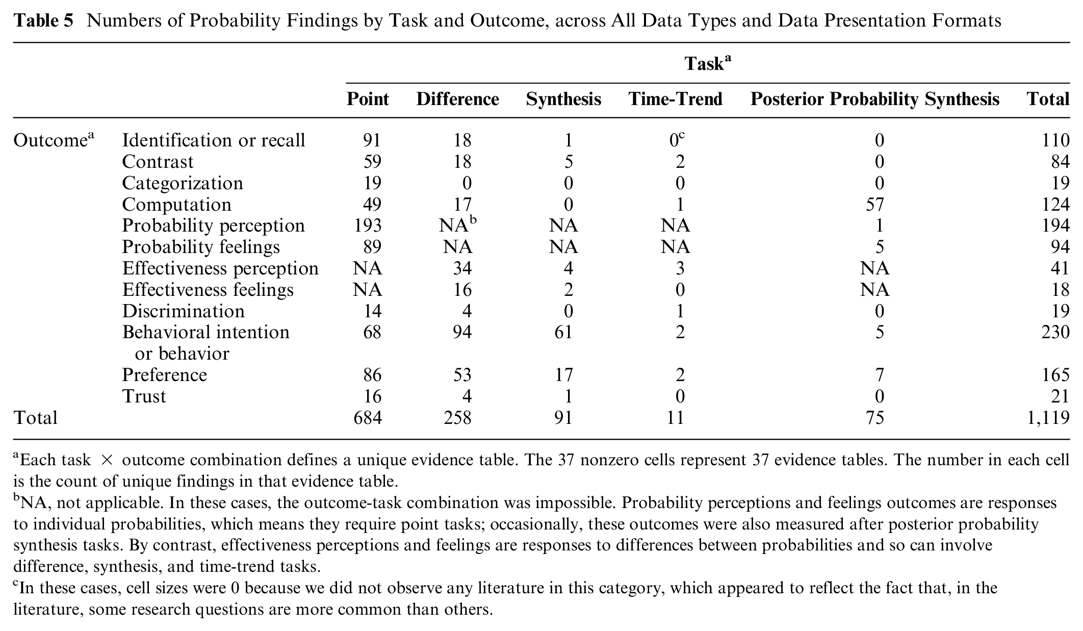
Each task × outcome combination defines a unique evidence table. The 37 nonzero cells represent 37 evidence tables. The number in each cell is the count of unique findings in that evidence table.
NA, not applicable. In these cases, the outcome-task combination was impossible. Probability perceptions and feelings outcomes are responses to individual probabilities, which means they require point tasks; occasionally, these outcomes were also measured after posterior probability synthesis tasks. By contrast, effectiveness perceptions and feelings are responses to differences between probabilities and so can involve difference, synthesis, and time-trend tasks.
In these cases, cell sizes were 0 because we did not observe any literature in this category, which appeared to reflect the fact that, in the literature, some research questions are more common than others.
Point Tasks Only: Numbers of Findings by Outcome and Data Presentation Format Comparison

Each row counts findings within a single evidence subtable.
Difference Tasks Only: Numbers of Findings by Outcome and Data Presentation Format Comparison

Each row counts findings within a single evidence subtable.
Synthesis Tasks Only: Numbers of Findings by Outcome and Data Presentation Format Comparison

Each row counts findings within a single evidence subtable.
Time-Trend Tasks Only: Numbers of Findings by Outcome and Data Presentation Format Comparison

Each row counts findings within a single evidence subtable.
Synthesis Bayesian Tasks Only: Numbers of Findings by Outcome and Data Presentation Format Comparison

Each row counts findings within a single evidence subtable.
Overall, as shown in Tables 5 and 6A through E, there were substantial numbers of findings in most point tasks. Evidence related to difference tasks focused on effectiveness perceptions, behavioral intentions, and preference for formats, while evidence related to synthesis tasks was almost entirely about behavioral intentions and preferences. The evidence regarding posterior-probability synthesis tasks focused on computation outcomes, while the literature regarding time-trend tasks was quite sparse.
Discussion
The Making Numbers Meaningful project identifies, organizes, and synthesizes evidence on how to present numbers to patients. The challenges of this evidence synthesis have led us to develop novel methods for classifying the evidence, and understanding these methods is essential to understanding the evidence reports from the project.
In brief, we applied standard systematic literature search methods to identify articles comparing the effects of different data presentation formats on quantitatively assessed, comprehension-related outcomes in adult, lay audiences. The resulting articles were classified along several dimensions: the stimulus (data and data presentation format), the outcomes assessed by the experimenters, and the cognitive tasks performed by respondents to make sense of the stimuli and respond to the outcome questions. The data extraction and classification approach described in this article allowed us to create evidence tables that grouped studies that were comparable along these dimensions. This approach ensures that comparable articles are compared with each other and not with articles studying other phenomena. Our evidence synthesis and quality rating approach, based in AHRQ and GRADE and expert assessment, then allowed us to develop evidence syntheses that were weighted toward higher-credibility studies. Overall, this systematic process allows us to develop guidance with strength-of-evidence estimates about the effects of specific data presentation formats upon communication outcomes.
In synthesizing this evidence, we encountered a number of challenges. The lack of standard vocabulary caused difficulties classifying the literature, which we addressed in some cases with a more granular classification vocabulary. Most notably, the terms “gist understanding” and “comprehension” were operationalized differently in each study according to the aspect of the message considered the most important by the researchers. For example, depending on the purpose of a study, researchers might consider a respondent’s “gist comprehension” to be good if they successfully identified a number in a stimulus, selected the most effective of several therapies, recognized that their situation carried “low risk” rather than “no risk,” or correctly translated a percentage into a rate per 100. Given the wide variety of operationalizations of “comprehension,” we avoided that term and instead classified the narrower outcome assessed; in the previous sentence, the first outcome was classified as “identification,” the second as “contrast,” the third as “categorization,” and the fourth as “computation.” It may be helpful for future researchers to provide additional specification to the term “gist comprehension” to help readers better understand what gist message or messages were considered the most important.
Conversely, we sometimes decided to group outcomes because of a lack of clarity in methods reporting. In particular, studies were frequently unclear about whether the participants could view the stimulus while answering outcome questions (in which case the outcome measured would be “identification”) or not (in which case the outcome measured would be “recall”). We thus decided to collapse these in our evidence tables. We also grouped studies assessing behavior with those assessing behavioral intention because the former were so rare.
Methodological and reporting limitations in the studies also affected this work. We noted cases in which researchers failed to illustrate or describe the stimuli, making it challenging to know what aspect of the stimulus was responsible for the effects reported. In other cases, comparison arms differed on several dimensions at once, making it difficult to attribute effects to any individual manipulation.
The Making Numbers Meaningful project highlights the uneven nature of the literature on risk communication in health and medicine. For well-studied (even overstudied) questions, the evidence is strong and consistent, so our work suggests that it is time to move away from additional experiments and toward dissemination and implementation. For other questions, our work shows that research is sparse. We hope that health and risk communications researchers can use our work as a guide to identify the most fruitful areas for further inquiry.
This project has a number of limitations. Given the ambiguities of the research vocabulary, we optimized the literature search for sensitivity rather than specificity and were forced to manually screen a very large number of candidate articles to remove false positives. Reviewer error could have led us to mistakenly exclude relevant studies, although we tried to address this with 2 independent reviewers screening each article. The detailed data extraction needed to create the individual-level findings required more manual work than is typically needed for a systematic review, which both made it difficult to work quickly and created challenges to replicating the work. The credibility assessment for the findings, while intended to help ensure that higher-quality studies contributed more to the evidence, involved 2 experts applying experienced judgment. The use of only 2 primary reviewers may have led to greater consistency or, alternately, potential biases. Expert reviewers were needed to assess this highly heterogenous literature. For example, stimuli such as bar graphs could vary by axis design, bar clustering or stacking, colors, shape, data labels, and use of additional or explanatory text; reviewers needed to decide issues such as whether 2 such stimuli were similar enough to be grouped together and whether differences between stimuli could have confounded comparisons. Such judgments, although necessary, were also a potential source of bias. We addressed this concern by first conducting independent initial evaluations (to allow differences in perspective to arise) followed by consensus discussions (to require reviewers to justify decisions). Our hope is that by making the data transparently available, we can enable future work that might incorporate a larger community of expert perspectives as a further check on any potential bias.
The use of our novel taxonomies is a potential limitation. Although intended to standardize comparisons and ensure that like was compared with like, the taxonomies are not externally validated. One controversial aspect is that they avoid some terms commonly accepted in the literature such as “gist comprehension.” We focused on numbers communicated to patients and the public for health-related decisions, so findings may not apply to communication of numbers in other domains and also omit lessons learned about communicating other types of numbers that may nonetheless apply to communicating health-related probabilities and/or quantities. We excluded studies of health professionals and medical students, although there is an additional interesting body of research about numerical communication with these expert audiences. We also excluded formative studies such as purely qualitative focus group feedback on the development of decision aids as well as studies that compared numerical information against no-information and no-numbers controls, despite the important contributions that these studies have made. Also, our highly granular classification approach prioritizes comparing very similar studies for generating evidence specific to individual types of data, data formats, tasks, and outcomes, rather than general conclusions that might be more broadly applicable to multiple communication problems.
Finally, our focus on the effects of data presentation formats led us to exclude potentially interesting comparisons as out of scope, such as before-and-after assessments of knowledge after using a decision aid or manipulations of proportions involving changing the reference class for the computation (such as describing mortality as the percentage dead of those with cancer v. the percentage of all women). As a result, we can draw conclusions only about the effects of the data presentation format used to convey quantitative information and not about the effects of providing quantitative information in general.
Conclusion
A comprehensive effort to synthesize the evidence about the effects of data presentation formats on comprehension-related outcomes required conducting a large systematic review, developing innovative taxonomies for classifying the literature, and organizing multiple evidence tables to generate evidence-based guidance that is specific to individual communication problems. Because results are too extensive for a single article, this methods article is accompanied by a set of results articles, each presenting a bounded set of findings for specific problems in the communication of numbers in health.
We anticipate that this project will make several contributions to the future of research into health numbers communication. Research will be more easily translated into evidence if researchers adopt standard terms for the constructs they measure. More comprehensive reporting of methods (such as whether the stimulus was visible when a participant answered questions) will also help achieve this goal. The current project can also help direct future research away from relatively well-studied questions toward more novel questions needed to fill in gaps in the current evidence. Overall, these innovations should facilitate more productive health and risk communication research, strengthening the evidence base for improving health numbers communication in practice.
Supplemental Material
sj-docx-1-mpp-10.1177_23814683241255334 – Supplemental material for Scope, Methods, and Overview Findings for the Making Numbers Meaningful Evidence Review of Communicating Probabilities in Health: A Systematic Review
Supplemental material, sj-docx-1-mpp-10.1177_23814683241255334 for Scope, Methods, and Overview Findings for the Making Numbers Meaningful Evidence Review of Communicating Probabilities in Health: A Systematic Review by Jessica S. Ancker, Natalie C. Benda, Mohit M. Sharma, Stephen B. Johnson, Michelle Demetres, Diana Delgado and Brian J. Zikmund-Fisher in MDM Policy & Practice
Supplemental Material
sj-docx-2-mpp-10.1177_23814683241255334 – Supplemental material for Scope, Methods, and Overview Findings for the Making Numbers Meaningful Evidence Review of Communicating Probabilities in Health: A Systematic Review
Supplemental material, sj-docx-2-mpp-10.1177_23814683241255334 for Scope, Methods, and Overview Findings for the Making Numbers Meaningful Evidence Review of Communicating Probabilities in Health: A Systematic Review by Jessica S. Ancker, Natalie C. Benda, Mohit M. Sharma, Stephen B. Johnson, Michelle Demetres, Diana Delgado and Brian J. Zikmund-Fisher in MDM Policy & Practice
Supplemental Material
sj-docx-3-mpp-10.1177_23814683241255334 – Supplemental material for Scope, Methods, and Overview Findings for the Making Numbers Meaningful Evidence Review of Communicating Probabilities in Health: A Systematic Review
Supplemental material, sj-docx-3-mpp-10.1177_23814683241255334 for Scope, Methods, and Overview Findings for the Making Numbers Meaningful Evidence Review of Communicating Probabilities in Health: A Systematic Review by Jessica S. Ancker, Natalie C. Benda, Mohit M. Sharma, Stephen B. Johnson, Michelle Demetres, Diana Delgado and Brian J. Zikmund-Fisher in MDM Policy & Practice
Footnotes
Acknowledgements
We thank the Numeracy Expert Panel for contributions to conceptualizing the MNM project (Cynthia Baur, Sara Cjaza, Angela Fagerlin, Carolyn Petersen, Rima Rudd, Michael Wolf, and Steven Woloshin). We are grateful to Marianne Sharko, MD, MS, Andrew Z. Liu, MPH, and Lisa Grossman Liu, MD, PhD, for contributions to article screening and risk-of-bias assessment. We also thank Jordan Brutus for assisting with data management. Abstracted data, methods, and materials are available to other researchers upon request to Jessica S. Ancker.
The authors declared no potential conflicts of interest with respect to the research, authorship, and/or publication of this article. The authors disclosed receipt of the following financial support for the research, authorship, and/or publication of this article: Financial support for this study was provided entirely by a grant from the National Library of Medicine (R01 LM012964, Ancker PI). The funding agreement ensured the authors’ independence in designing the study, interpreting the data, writing, and publishing the reports.
Availability of Research Resources
All research resources are available at the Making Numbers Meaningful Project at OSF (![]() ). This project includes a Methodology Files folder (containing the search strategy, the data extraction instrument, and the study risk of bias [S-ROB] rubric), the list of each included article mapped to the Making Numbers Meaningful review article that covers it, and a Probability Findings folder displaying the extracted findings for each of the Making Numbers Meaningful review articles.
). This project includes a Methodology Files folder (containing the search strategy, the data extraction instrument, and the study risk of bias [S-ROB] rubric), the list of each included article mapped to the Making Numbers Meaningful review article that covers it, and a Probability Findings folder displaying the extracted findings for each of the Making Numbers Meaningful review articles.
References
Supplementary Material
Please find the following supplemental material available below.
For Open Access articles published under a Creative Commons License, all supplemental material carries the same license as the article it is associated with.
For non-Open Access articles published, all supplemental material carries a non-exclusive license, and permission requests for re-use of supplemental material or any part of supplemental material shall be sent directly to the copyright owner as specified in the copyright notice associated with the article.