
Abstract
In this study, we used a paper–pencil questionnaire to investigate whether teachers, administrators, and parents differed in their preferences and accuracy when interpreting visual data displays for decision making. For the data analysis, we used nonparametric tests due to violations of distributional assumptions for using parametric tests. We found no significant differences between the three groups on graph preference, but within two groups, we found statistically significant differences in preference. We also found statistically significant differences in accuracy between parents and administrators for two graphs—grouped columns and stacked columns. Implications for researchers and education stakeholders, and recommendations for further research are provided.
Keywords
Introduction
Visual data displays have been a topic of research and opinion across multiple academic disciplines (e.g., statistics, cartography, and human factors engineering). In education, visual data displays have typically focused on curricular content for teaching graph design (Friel, Curcio, & Bright, 2001; McClure, 1998; Shah & Hoeffner, 2002, p. 341), graphicacy (ability to read graphs; Friel & Bright, 1996; Wainer, 1980), and presentation of large-scale results (e.g., reading and math scores from National Assessment of Educational Progress [NAEP]) to different educational audiences (Hambleton & Slater, 1994, 1996; Wainer, 1997a). The refereed literature is limited regarding visual data to engage teachers, administrators, and parents in discussions resulting in programmatic change and improved student outcomes. Thus, the purpose of this study was to contribute new empirical research knowledge about educational decision making with visual data and graphical interpretation and the effects of user preference and accuracy.
We drew from visual data and graphical interpretation in general, along with data-based or data-informed decision making in education to frame the theoretical background and orientation used for this study.
Visual Data and Graphical Interpretation
When determining how data should be displayed visually, Henry (1997) suggested consideration should be given to the (a) format, (b) audience’s experience with data display, (c) task to be performed with the information, and (d) data complexity, or how much data are displayed. Schmid (1983) emphasized consideration should be given to the design’s (a) accuracy in the representation of data, (b) simplicity, (c) clarity so as the message is conveyed in a meaningful and comprehensible way, (d) appearance to attract and hold a reader’s attention, and (d) well-designed structure conforming to specific principles. Empirical research on these suggested elements is limited.
Beginning with Henry’s (1997) suggestions, format refers to how data are displayed: narrative description or data table and other visual forms, such as column or bar graphs, boxplots, or 2- and 3-D pie charts. Few experimental studies have compared different graphic formats. In three separate experiments comparing participants’ performance on readability, making decisions, interpreting accurately, and conveying messages using tables, lines, and graphs, Dickson, DeSanctis, and McBride (1986) found tables were easier to read than graphs and found no statistical difference in accuracy or decision making. They also found decisions were made easier with graphs, but there was no meaningful difference in accuracy between lines and tables. Participants performed better using graphs when there was a substantial amount of information, and they were asked to make simple interpretations. Researchers concluded, “ . . . effectiveness of the data display format is largely a function of the characteristics of the task . . .” (Dickson et al., 1986, p. 40).
Researchers, mostly in the field of business, have emphasized the need to link task with the type of graphic presentation (Benbasat, Dexter, & Todd, 1986; Dickson et al., 1986; Henry, 1997; Jarvenpaa & Dickson, 1988; Smart & Arnold, 1947). Studies in the context of business finance typically examined whether decision making or decision quality was improved by the use of a graph. Task completion in these studies, although not explicitly stated, required participants to have content specific knowledge (e.g., how to maximize total profit, find one optional solution, and read financial statements). When developing visual data displays, the “ . . . central issue should be to identify specific contexts in which certain kinds of graphics may be most useful to decision makers” (DeSanctis, 1984, p. 484).
Researchers examining individual differences from a variety of perspectives have investigated the role of the audience related to data presentation. These perspectives include mental representations (Dibble & Shaklee, 1992; Shah & Carpenter, 1995; Shah & Hoeffner, 2002), gender differences (Hood & Togo, 1993), perceptual differences (Carpenter & Shah, 1998), and cognitive theory (Cleveland & McGill, 1984). Furthermore, authors (Freedman & Shah, 2002; Shah & Hoeffner, 2002) have recognized the role prior knowledge plays in an audience’s understanding of data displayed visually. Jarvenpaa and Dickson (1988) cautioned that audiences inexperienced with a graphic display would need sufficient practice with unfamiliar displays to adjust to the graphical presentation display and that the adjustment period would be necessary before benefits from the usage of a graph could be obtained. van Someren, Boshuizen, de Jong, and Reimann (1998) promoted the idea that “ . . . different domains and disciplines all have their own terminology and their concepts” (p. 1) and therefore, understanding one form of a representation (i.e., diagram, model) does not guarantee one’s understanding of another form of representation.
In considering how complex a dataset can be for information displayed graphically, Wainer (1997c) agreed with Tufte’s rule of thumb: “ . . . three numbers or fewer use a sentence; four to twenty numbers use a table; more than twenty numbers use a graph” (p. 129). Carswell and Ramzy (1997) measured how effectively tables, bar graphs, and line graphs communicated information in simple time series using datasets with 4, 7, or 13 values. They found format influenced participant interpretations, and line graphs were more sensitive to the complexity of the data for men than women. Spence and Lewandowsky (1991) compared tables and graphs with datasets containing four to seven variables, manipulating task complexity by varying the number of numerical integrations required to yield a correct response. They found the advantage of graphs over tables increased with task complexity more than with the number of data values.
As to which graphic displays enabled users to extract information more accurately, only four studies reported statistically significant differences in participants’ accuracy for using graphs or charts. Cleveland and McGill (1984) found participants were more accurate judging position than length or angle. DeSanctis and Jarvenpaa (1989) found participants were more accurate in a forecasting task when using a graph than a table, or combination table/chart. Dibble and Shaklee (1992) found participants scored higher on a causal inference task when bar charts were used rather than a data table. They also found participants scored higher using pie charts than bar graphs when data were presented as percentages rather than as frequencies. Shah and Carpenter (1995) compared eight different patterns of line graphs, but examined accuracy only to the extent viewers were able to reproduce from memory the original and alternate perspectives of the data. They found participants were more accurate in drawing the original perspective. Hutchinson, Alba, and Eisenstein (2010) found graphical displays may contribute to accurate perceptions of data, but they also “might make some aspects of the data more salient than others, leading to overemphasis and neglect of different decision variables” (p. 630).
Henry (1993) and Carswell, Bates, Pregliasco, Lonon, and Urban (1998) reported participants’ preferences for data display, but did not investigate why a particular display was preferred. Henry (1993) asked whether participants liked a table or a multivariate graph (STAR chart) and found they liked a table over the START chart. Henry (1993) and Dickson et al. (1986) speculated that preference might be due to familiarity with one display over a less familiar, more novel display. In their study to measure preference, Carswell et al. (1998) posed eight questions to participants regarding their typical reaction to graphs, and then classified participants with a score of 10 or more as having a high graph preference and participants with a score of 6 or less as having a low graph preference. They grouped participants by their high- or low-preference score for analyses and found the low-preference group made more errors when asked to recall complex data structures. The high-preference group used more references to “global” content that “required inspection or integration of all data points in the display” (p. 9) when describing what they learned from a graph/table. Furthermore, they found the high-preference group was statistically significantly faster in classification of trends than the low-preference group.
Data-Based/Informed Decision Making in Education
The growing prominence of data-based/informed decision making, or “using data to support instructional planning . . .” (Rudy & Conrad, 2004, p. 39), combined with accountability and assessment in public schools, has made data the 21st-century watchword in education. The use of data for decision making became codified in federal law in 2001. With passage of the No Child Left Behind (NCLB) Act (P.L. 107-110), education policy focused on student academic achievement that linked school accountability to student performance on statewide assessments.
Prior to NCLB, results of the NAEP assessment were routinely reported to a variety of educational audiences. These assessment results were reported to provide information to policy makers, educators, and the public about students’ achievement and monitor achievement changes over time (Hambleton & Slater, 1996). Education is a field in which the audience needs and characteristics have been considered in the use of data to inform decisions. Hambleton and Slater (1996) acknowledged educational audiences of NAEP results were “not well prepared to handle the wealth of data that a complex NAEP assessment provides” (p. 2). The need to train teachers and administrators in data interpretation, as well as to use data to inform and improve programming are recurring themes in the education literature (Kerr, Marsh, Ikemoto, Darilek, & Barney, 2006; Wayman, 2005; Young, 2006).
Hambleton and Slater (1996) found that educators and education policy makers wanted an explanation of the graphs used to display NAEP results to understand them. Participants reported they could not have figured out the graphs on their own or that they did not have time to figure out what the graphs represented. Hambleton and Slater suggested a “threat to the validity of inferences about NAEP results [was] due to the misunderstanding of the NAEP reports themselves by intended NAEP audiences” (p. 2). They attributed misunderstandings to three possible factors: (a) brief, confusing text, (b) complex tables and displays that are difficult to read, and (c) characteristics of the tables and figures.
Recently, the employment and further education experiences (i.e., the postschool outcomes [PSO]) of students who received special education services have received national attention due to requirements of the Individuals with Disabilities Education Improvement Act (IDEA; P. L. 108-446). Since 2004, state departments of education have been required to report the postschool outcomes for students with disabilities in an annual performance report (APR) on the state’s performance plan (SPP). Students’ PSO are measured in one of 17 indicators in the SPP/APR. SPP/APR data are reported to two primary audiences. First, these data are reported to the Office of Special Education Programs (OSEP). OSEP reports the findings to the Secretary of Education, who in turn “determines if the State meets the requirements and purposes of Part B of the [IDEA] Act” (34 C. F. R. §300.603(b)(1)i))). Second, the SPP/APR is made public as a means of informing the public, specifically parents, about the education for children with disabilities (Sopko & Reder, 2007). These reporting requirements make the SPP/APR tools for accountability. Targets for improvement, set by the state departments of education (Alverson & Yamamoto, 2014), and corresponding improvement activities for each federal indicator also make the SPP/APR a mechanism for improvement.
To initiate changes leading to programmatic improvements for children with disabilities, educators need accessible and usable data. Carnine (1997) defined accessibility as “the ease and quickness with which practitioners can obtain research findings and extract the necessary information related to a certain goal,” and usability as “the likelihood that the research will be used by those who have the responsibility for making decisions” (p. 363). Johnson (2000) found that educators embraced using data that were relevant to their classrooms situations, a similar theme noted by Wayman (2005) and Kerr et al. (2006). Johnson (2000) also found that educators preferred to view graphs rather than data tables when examining PSO data. In interviews with education administrators and teachers from five school districts reviewing PSO data of students with disabilities, Johnson (2000) found educational audiences wanted data presented visually and through an oral presentation. These audiences acknowledged they would not have spent time reviewing data presented in graphs if someone had not guided the process.
Education professionals are expected to make decisions based on quantifiable data. To that end, a variety of student related data have been collected and stored for years by state education agencies (SESs), school districts, and other education entities (see Wayman, 2005). Yet schools are often considered data-rich but information poor (Stringfield, Wayman, & Yakimowski, 2005; Wayman, 2005). That is, despite collecting large quantities of data, most education agencies have not utilized data to inform policy making or decision making. Some researchers posit that the availability of user-friendly technologies will increase access to and use of data for decision making (Earl & Katz, 2006; Wayman, 2005; Wayman & Stringfield, 2006). Others, including Henry (1997), Schmid (1954) and Wainer (1984, 1997b), have focused on the role of visual data display in making complex information easy to access. Thus, the purpose of this study is to examine the role of visual data display in the decision making by education stakeholders. Specifically, we investigated the following two research questions:
Method
To answer the two research questions, we used a nonexperimental design using a paper–pencil questionnaire. Given the exploratory nature of study and the sparse research base, this was the most appropriate research design (see Shadish, Cook, & Campbell, 2002).
Data Collection
Participants
We identified and recruited study participants from three groups of education stakeholders: (a) teachers, (b) local and state administrators, and (c) parents. Recruiting began by identifying a point of contact at key locations (e.g., assistants to administrators at school districts, transition specialists at state departments of education, executive director of parent center) who could facilitate recruiting strategically within each location. For example, conference coordinators placed a flyer in the conference materials for attendees and names/addresses of potential participants were collected throughout the conferences; administrative assistants placed flyers in school mailbox at the district office. In general, recruiting strategies consisted of (a) distributing a flyer at state conferences, graduate classes, a local school district, and a national listserv for special education administrators; (b) speaking at classes, administrator meetings, and on national community of practice calls; and (c) meeting with representatives from parent training centers to describe the project and requesting they distribute the flyer at parent meetings. Names and addresses of potential participants were collected. We followed Dillman’s (2000) tailored design method for questionnaire implementation. We mailed prenotice letters 7 to 10 days prior to mailing the questionnaire. Then, 10 days after mailing the questionnaire, we mailed a follow-up thank you/reminder postcard. The questionnaire was mailed along with a letter describing the project and a postage-paid, return envelope.
Teachers
The teacher sampling frame consisted of regular and special education middle school and high school teachers. We recruited potential respondents from (a) a state transition conference, (b) a national special education conference, (c) a local high school, and (d) graduate classes for a special education teacher-training program.
Administrators
The administrators’ sampling frame consisted of (a) SEA and (b) local education agency (LEA) administrators. SEA administrators included individuals responsible for reporting the state’s Indicator Part B 14 postschool outcomes (i.e., state transition specialists, the director of special education, and the state education data manager) from across the nation. LEA administrators included individuals with an administrator license or who was responsible for supervising or providing support services to teachers. Participants for these two groups were recruited through (a) contact list of state transition specialists maintained by a national technical assistance center, (b) state and national conferences, and (c) a graduate class for administrator licensure program.
Parents
The parents’ sampling frame consisted of natural, stepparents, or guardians of children with disabilities who were members of a parent advocacy group in a northwestern state. State administrators for two advocacy organizations distributed information about the study and questionnaire to parents in the associations. Parents were recruited from (a) a state conference for parents with exceptional children, (b) state parent meetings, and (c) regional parent trainings.
Questionnaire Variables
There was one categorical independent variable, audience, with three groups (teachers, administrators, and parents). The three dependent variables were an accuracy score for each type of graph. We calculated the accuracy scores by summing the number of questions each respondent answered correctly for each graph type.
Questionnaire
We developed a 38-item questionnaire and pilot tested the questionnaire with university researchers and nonresearchers individuals (e.g., high school paraprofessional, carpenter) to check the wording and structure of the questions, navigational cues, and continuity in data display (Groves et al., 2004). Based on their feedback, we revised the questionnaire to improve clarity and consistency. The final questionnaire contained three sections: (a) preferences, (b) graphs and questions, and (c) demographics.
Preferences
The first section of the questionnaire consisted of 11 questions designed to elicit participant preferences for how data are displayed in graphical form. The first eight questions were adapted from Carswell et al.’s (1998) Graphic Preference Questionnaire; response categories were dichotomous, with no coded as 0 and yes coded as 1. The last three questions assessed respondents’ (a) familiarity, (b) perceived accuracy, and (c) preference for six graphs. Each question contained the same six graphs—stacked horizontal bar, stacked column, grouped column, horizontal grouped bars, pie chart, and line graph (see Figure 1a-1f).
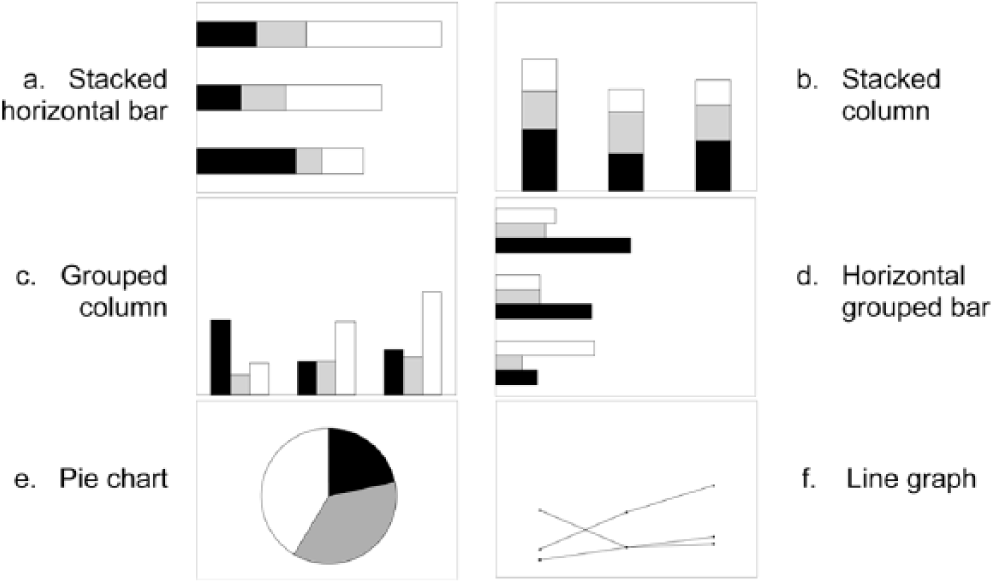
Graph types for preferences and accuracy.
Each graph displayed a different amount of data, and we did not label the axes or values. Respondents were asked to indicate their familiarity with each graph on a 3-point scale—not familiar (1), somewhat familiar (2), and very familiar (3). Similarly, respondents were asked to indicate how accurately they perceived themselves to be when reading graphs—less accurate (1), somewhat accurate (2), and most accurate (3) for each graph. Respondents ranked their preference from most preferred (1) to their least preferred (6).
Graphs and questions
The second section of the questionnaire consisted of three types of graphs—grouped columns, stacked columns, and line graphs (see Figure 1). We relied on graph design literature to guide the structure of the graphs. Many authors emphasize the importance of design principles when crafting a graph (Henry, 1997; Kosslyn, 1989; Schmid, 1954; Tufte, 2001; Wainer, 1984, 1992, 1997c). Each graph was displayed on the upper one half of a standard 8.5 × 11-inch sheet of white paper and contained a title and labeled axes using Arial 12-point font. We printed the specifiers—bars, lines, and symbols (Kosslyn, 1989)—in black, 50% black (i.e., gray), and white. Graphs contained either 9 or 15 data points. The data we used in the graphs were fictitious, but consistent with the type of PSO data states were expected to collect and use in their SPP/APR reporting. The intended purpose for viewing the graphs was to extract information by reading a specific datum point or making comparisons across a data segment. Under each graph were two multiple-choice questions, each with four response categories. Questions were randomized to reduce ordering effects.
Demographics
The final section of the questionnaire contained seven background and demographic questions for teachers and administrators, plus two additional questions for parents. Questions included, gender, highest education level, number of years in their current position (or as a member of a parent advocacy group), number of classes that addressed research related topics (e.g., statistics, data analysis, or data interpretation), and approximate number of hours of training they had related to using data to make decisions.
Data Analysis
We ran descriptive statistics and exploratory analysis to identify and correct data entry errors before proceeding. To verify the accuracy of data entry, we randomly selected 15 (10%) questionnaires and double-checked data entry for each question. We examined data for individual item missing data and unit-missing data in which data were missing in their entirety for each questionnaire section. We excluded three questionnaires due to missing data.
We ran descriptive statistics on the demographic questions and frequency counts for the first 11 questions on preferences, familiarity, and perceived accuracy. After reversing the scale on four questions to assign the highest value (coded as 1) to the favored graph response, we conducted a reliability analysis using Cronbach’s alpha and conducted separate reliability analyses for multi-part questions. To determine whether respondents had a “high or low” preference for graphs, we calculated an overall preference score. Scores of 9 or higher constituted a high preference, and scores of 8 or less constituted a low preference. Finally, for the questions related to accuracy, we dichotomized answers by assigning 0 to incorrect responses and 1 to correct responses.
Next, we examined descriptive statistics to assess the distributional assumptions for ANOVA. We examined normality, homogeneity of variance, and independence. We found that the data were negatively skewed. Examining homogeneity, however, revealed the variances exceeded a 4:1 ratio of largest to smallest. We then examined Levene’s statistic and found it to be statistically significant. Heterogeneity of variance and unequal group sizes make ANOVA less robust to these distributional violations (Howell, 2002). Failing to meet these assumptions necessitated the use of nonparametric statistical tests as an alternative (see Conover, 1999; Hollander & Wolfe, 1973). We considered using corrected parametric estimations (e.g., Brown, Welch/Forsythe test), but given the exploratory nature of the study and purposeful sample, we decided to use a more conservative test. We also considered data transformation, but decided against it to avoid confusing interpretation of results (see Tabachnick & Fidell, 2007). An advantage of nonparametric tests is they do not have the same restrictive underlying distributional assumptions as parametric tests, such as a priori defined shape (Kerlinger & Lee, 2000). The disadvantage is the reduction of statistical power to reject a false null hypothesis (Howell, 2002), that is, to detect true differences when they are present.
Results
We begin by reporting the participants’ response rates and describe the participants. Next, we report the results of the data analysis for the two research questions.
Response Rates and Description of Respondents
In total, we distributed 293 questionnaires—60 to teachers, 141 to education administrators, and 92 to parents. Respondents returned 163 questionnaires for an overall return rate of 56%. Of these, three contained missing data and 15 were received too late for inclusion in the analysis. Thus, 145 questionnaires were completed and returned for a 49% final return rate.
Respondents in the three audiences were similar in their demographic characteristics and experiences with data. Table 1 summarizes the audiences on key demographic characteristics. Given the similarity between the teachers and administrators, we collapsed their demographic data. Overall, the majority of respondents were highly educated and female. Nearly half of the teachers and administrators had a master’s degree, and 81% of parents had a bachelor’s degree. Parents had been members of the advocacy group longer than teachers or administrators had been in their current positions. Parents reported having had more research classes and training hours (Mdn = 100 hr) in the use of data than either teachers or administrators (Mdn = 11hr). Experience with data is the only area in which the three groups were greatly different.
Demographics of Respondents by Audience.

Teachers
Teachers comprised 21% (n = 31) of respondents, 74% (n = 23) of whom were female. Teachers had been in their current position for an average of 5.5 years (SD = 4.9). The majority (61%) held a master’s degree or higher. Of the respondents, 55% (n = 17) reported using graphs to make program decisions once a term or more. Of the college classes required for their current position, 71% (n = 22) of teachers reported having between one and 12 classes focused on research topics (M = 2.73, SD = 2.64). Of the 12 teachers who received training other than college classes in using data for decision making, the number of training hours ranged from 3 to 50 hr (Mdn = 11 hr).
Administrators
Administrators comprised 63% (n = 91) of respondents, 74% (n = 67) of whom were female. Administrators had been in their current position for an average of 6.0 years (SD = 6.0). A majority of administrators (81%) had a master’s degree or higher (n = 74). Of the respondents, 55% (n = 50) reported using graphs to make program decisions monthly or more frequently. With regard to the college classes required for their current position, 79% (n = 72) of administrators reported having between one and seven classes focused on research topics (M = 2.75, SD = 1.62). Of the 49% (n = 45) of administrators who received training other than college classes in using data for decision-making, the number of training hours ranged from 2 to 120 hr (Mdn = 10 hr).
Parents
Parents comprised 16% (n = 23) of respondents, 91% (n = 21) of whom answered the demographic questions; 78% (n = 18) of respondents were female. Parents reported being members of an advocacy group for an average of 8.9 years (SD = 7.3). A majority (81%) of parents had a bachelor’s degree or higher (n = 17). The average age of their oldest child with a disability was 14 years (SD = 6.1). Of the 20 parents who reported using graphs to make program decisions, 25% (n = 5) did so once a year, 50% (n = 10) indicated they used data one 1 to 2 times a year, and 25% (n = 5) indicated they never used graphs to make program decisions. Of the 17 parents with a bachelor’s degree or higher, 8 (47%) reported having between one and 25 classes focused on research (M = 8.63, SD = 9.04). Only eight of 21 (38%) parents reported having received training beyond college classes on using data to make decisions. The number of training hours reported ranged from 50 to 1000 hr (Mdn = 100 hr).
Research Question 1: Preference
This research question asked, “Do teachers, education administrators, and parents have preferences for data displayed graphically, and if so what are they?” We asked respondents to rank their preference for each of the six types of graphs by marking their most preferred (first) to least preferred (sixth) choice. We analyzed preference differences between groups using the Kruskal–Wallis test (Conover, 1999), a nonparametric statistical test similar to one-way ANOVA (see Kerlinger & Lee, 2000). Results were nonsignificant at the p < .05 level for all six graphs.
We also used the Friedman test (Conover, 1999), another nonparametric statistical test, to examine the within-subjects differences on the six graphs. The omnibus Friedman test yielded a statistically significant difference at the .05 level, χ2(5, N = 138) = 55.29, p < .001, with an effect size of .08 as measured by Kendall’s Coefficient of Concordance. There was a significant difference in the preferences of teachers, χ2(5, N = 29) = 21.72, p = .001, and administrators, χ2(5, N = 87) = 33.12, p < .001. The test was not significant for the parents’ preferences for graphs.
Based on the significant results of the Friedman tests for teachers and administrators, we conducted post hoc pairwise comparisons to further analyze which graphs teachers and administrators preferred. We corrected for alpha slippage using Bonferroni correction (.05 / 15 = .003) (Tabachnick & Fidell, 2007). Only teachers’ preference for grouped columns over horizontal stacked bars, z = −3.072, p = .002, was statistically significant. We also applied the adjusted alpha to a pairwise comparison for administrators’ preferences, which were significant for (a) group columns over horizontal stacked bars, z = −3.072, p = .002; (b) pie graph over horizontal stacked bars, z = −3.312, p = .001; (c) stacked columns over grouped columns, z = −3.826, p < .001; and (d) pie graph over stacked columns, z = −3.453, p = .001.
High/low preference for graphs
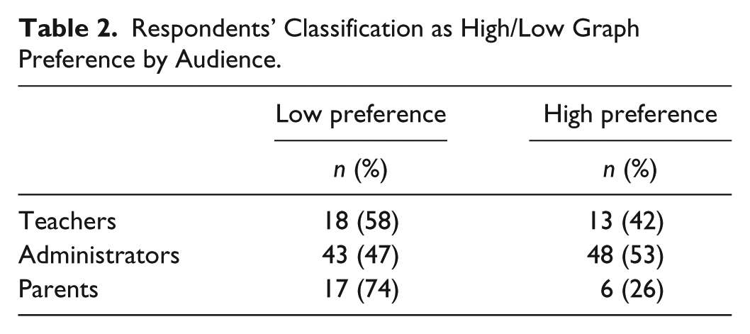
We computed reliability estimates using Cronbach’s alpha (Glass & Hopkins, 1996), followed by results for (a) high/low preference for graphs adapted from Carswell et al. (1998) questionnaire, (b) familiarity, (c) perceived accuracy, and (d) order of preference for six types of graphs. We adapted Carswell et al.’s (1998) questionnaire to determine whether respondents expressed a high or low preference for graphs. A combined score of 9 or more constituted a high preference for graphs, and a combined score of 8 or less constituted a low preference for graphs. Cronbach’s alpha was .64 on Questions 1 to 7; a reliability estimate was not reported in Carswell et al. (1998) study. The number and percent of respondents classified as high/low graph preference by audience are presented in Table 2. We evaluated whether the proportions of people with high preferences were equal in the three groups, χ2(2, N = 145) = 5.54, p = .06, Cramer’s V = .19, which was not significantly different.
Respondents’ Classification as High/Low Graph Preference by Audience.
Familiarity
To determine respondents’ familiarity with each type of graph, respondents were asked to mark each graph as (a) not familiar, (b) somewhat familiar, or (c) very familiar. Cronbach’s alpha was .70.
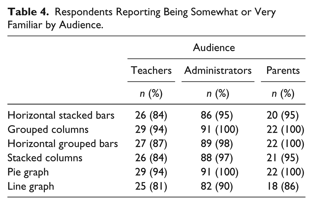
Visually inspecting the boxplots representing respondents’ familiarity with each graph revealed negatively skewed responses, as the mean was not in the center of the distribution (see Tabachnick & Fidell, 2007), resulting from a high number respondents who reported being either somewhat or very familiar with each graph. To ascertain the extent of skewness, we examined the mean, degree of skewness, and standard error for each graph. Skewness is considered significant when the degree of skewness is approximately 3 times the standard error (see Glass & Hopkins, 1996). As seen in Table 3, the degree of skewness was statistically significant in each graph. Furthermore, all graphs contained at least one cell with expected cell counts less than 5; therefore, we could not conduct a chi-square test. The number of respondents in each audience who reported being somewhat or very familiar with each graph is shown in Table 4. The inter-item correlations for the familiarity variables ranged from .133 to .642 (Table 5).
Descriptive Statistics for Graph Familiarity.
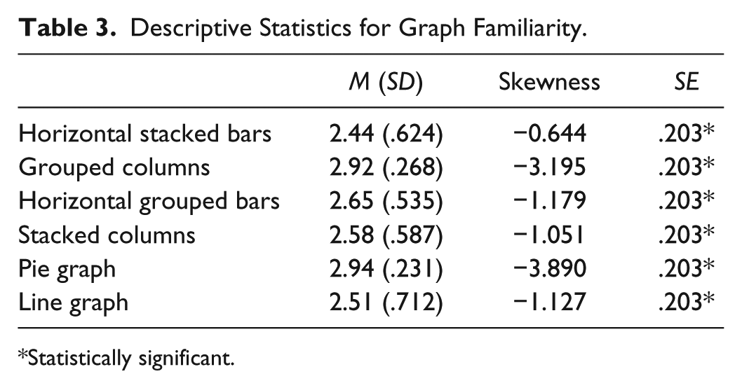
Statistically significant.
Respondents Reporting Being Somewhat or Very Familiar by Audience.
Inter-Item Correlation Matrix for Familiarity Variables.
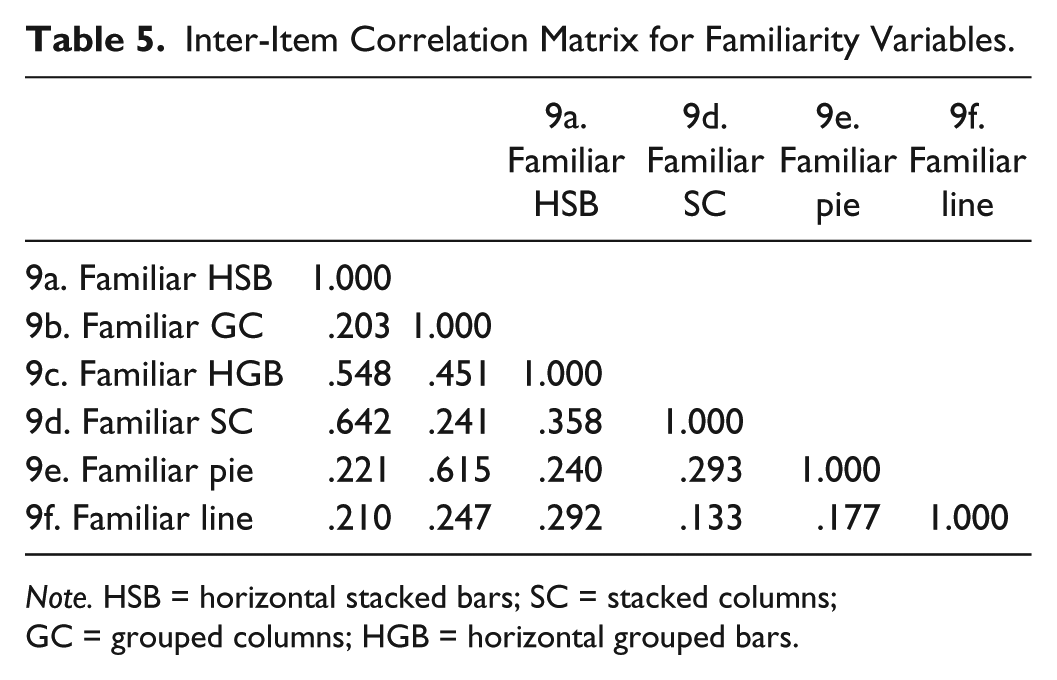
Note. HSB = horizontal stacked bars; SC = stacked columns; GC = grouped columns; HGB = horizontal grouped bars.
Perceived accuracy
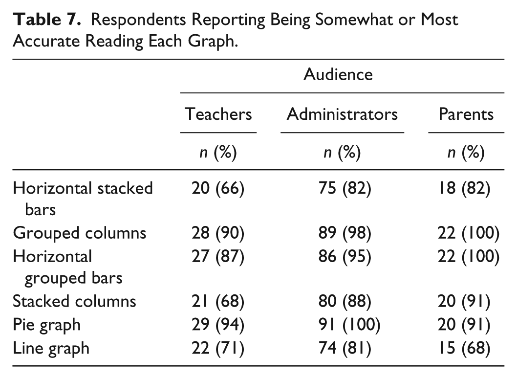
Respondents indicated how accurately they thought they could read the graphs by marking (a) less accurate, (b) somewhat accurate, or (c) very accurate for each. Cronbach’s alpha was .61. Boxplots of perceived accuracy were negatively skewed. We verified the extent of skewness by examining the mean, degree of skewness, and standard error for each graph. The degree of skewness was significant on half of the graphs (Table 6). At least one cell contained expected cell counts less than 5 in all graphs; therefore, we could not conduct a chi-square test. The number of respondents, by group, who perceived themselves to be somewhat or most accurate reading the graphs is shown in Table 7. The inter-item correlations for the perceived accuracy variables ranged from −.034 to .771 (Table 8).
Descriptive Statistics for Perceived Accuracy on Graphs.
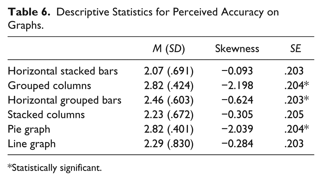
Statistically significant.
Respondents Reporting Being Somewhat or Most Accurate Reading Each Graph.
Inter-Item Correlation Matrix for Perceived Accuracy Variables.

Note. HSB = horizontal stacked bars; GC = grouped columns; HGB = horizontal grouped bars; SC = stacked columns.
Research Question 2: Accuracy
This research question asked, “Do teachers, education administrators, and parents differ in their accuracy when extracting information from different graphic displays?” We computed an internal consistency estimate of reliability using Cronbach’s alpha, which was .582. A visual inspection of the means showed relatively small differences in the number of questions answered correctly among the groups for each graph (Table 9). The biggest differences were observed between administrators and parents on grouped columns and stacked columns. To test whether groups differed significantly in their accuracy when extracting information from a graph, we conducted a Kruskal–Wallis test (Conover, 1999). The omnibus result was statistically significant at p < .05 for (a) stacked columns, χ2(2, N = 143) = 8.210, p = .016, and (b) grouped columns, χ2(2, N = 143) = 7.695, p = .021. The omnibus test was not significant for the line graph variable.
Mean Accuracy Scores for Audiences by Graph Type.

To evaluate pairwise differences among the three groups, we conducted post hoc pairwise comparisons using Mann–Whitney U tests (Conover, 1999), another nonparametric statistical test. We again used Bonferroni (.05 / 6 = .008) to correct for alpha slippage. Between teachers and administrators, there were no significant differences in the accuracy scores on stacked columns, grouped columns, and line graphs. Between teachers and parents, there were no significant differences in the accuracy score on any graphs. Between administrators and parents, there were significant differences in accuracy for (a) stacked columns, z = −2.801 p = .005, and (b) grouped columns, z = −2.70, p = .007. They did not significantly differ in accuracy for line graphs. The inter-item correlations for the 20 questions related to accuracy of extracting information from the graphs ranged from −.002 to .455 (Table 10).
Inter-Item Correlation Matrix for Accuracy When Extracting Information.

Note. Numeral refers to question number. SC = stacked columns; GC = grouped columns; L = line.
Discussion
Data-based or data-informed decision making in education is paramount at all levels—from individual students to federal policy—to evaluate existing systems and improve outcomes. At each level, various stakeholders with different experiences are expected to engage in meaningful conversations that require understanding and interpretation of a variety of data. In this study, we sought to determine which graphic displays stakeholders preferred and which displays resulted in a more accurate interpretation with three educational stakeholder groups—teachers, administrators, and parents—when using data to inform decisions.
Preference
We found parents did not have statistically significant preferences for any of the graphs used in this study. Teachers and administrators’ preferences were statistically significant for grouped columns over horizontal stacked bars. Furthermore, administrators had statistically significant preferences for other two-way comparisons. Specifically, administrators preferred (a) pie graphs over either bars or columns, and (b) stacked columns over grouped columns.
The differences in audiences’ preference for some graphs underscore Hambleton and Slater’s (1996) assertion that
special attention will need to be given to the use of figures and tables, which can covey substantial amounts of data clearly if they are properly designed. “Properly designed” means that they are clear to the audiences for whom they are intended. (Hambleton & Slater, 1996, p. 19, emphasis original)
If stakeholders, including parents, are going to engage in meaningful conversations about data and use data to make decisions, these results indicate a need to consider the audiences’ preferences for how data are displayed, at least when the audiences consist of teachers and administrators. Alverson and Yamamoto (2014) found that educational stakeholders expressed preferences for grouped columns rather than stacked columns or stacked bars, or grouped bar graphs, with one important difference. Administrators stated a preference for a more complex graph (i.e., stacked columns) rather than simpler graphs (i.e., grouped bars) when it meant having one piece of paper rather than multiple pages.
Determining how to present data based on the amount of data being presented has been a problem recognized by several researchers (Hambleton & Slater, 1996; Henry, 1993; Wainer, 1997b). When considering how much data to display, consideration of preference alone is insufficient; data complexity must also be considered. That said, the results in this study indicate that parents, teachers, and education administrators each have a particular preference for graphical displays of data under certain conditions. This suggests that for these education stakeholder groups, their preference for particular graphical displays of data may play a role in how they use such information for decision making.
Accuracy
An essential finding from this study was the similarity of the audiences. Beginning with respondent demographic characteristics, similarities included (a) majority female, (b) highly educated, and (c) had been in their current positions roughly the same amount of time. The only differences were in their reported number of classes focused on research and number of training hours related to using data. In these areas, parents reported having more classes in research and more hours of training related to data use than did either the teachers or administrators. Administrators, although not different from teachers in their accuracy when extracting information from each type of graph, were statistically more accurate than parents. Administrators answered more questions accurately when extracting information from the stacked column and the grouped column graphs than did parents. The differences in the administrators’ and parents’ accuracy scores suggest a need to consider audience early, as the literature suggests (e.g., Shah & Carpenter, 1995) when determining the type of visual data to use. This effect, at least in this particular study, seems to have negated parents’ potential advantage of having had more classes focused on research and received more training hours in using data than administrators to more accurately extract information. It may also suggest that the training needs to be current and ongoing for parents, who may not work with different types of graphs on a regular basis the way teachers and administrators probably do. Although there is less empirical research about accuracy than about preference for particular graphical displays of data in the research literature, the results of our analysis nevertheless suggest that accuracy also plays a role in the decision making among these education stakeholder groups. That is, given how consequential accuracy in graphical interpretation and application of visual data could be in real-world decision making for administrators (e.g., programmatic and policy reviews and implementation), it is not surprising that they were more accurate—their professional experience was perhaps a strong factor.
Limitations
Although the results of our study contribute new empirical knowledge to a sparse literature base, there are two limitations we must note. One limitation was measurement error. The relatively low reliability estimates obtained on the various sections of the questionnaire is concerning, although they can be attributed primarily to the relatively few questions in the different sections. In recognizing how these reliability estimates are computed (e.g., Spearman-Brown), it is expected that an increase in the number of questions would increase reliability estimates (Pedhazur & Schmelkin, 1991). Nevertheless, the inter-item correlations indicate that additional research should further examine the underlying construct validity of the questions.
A second limitation of the study is the sample. Although the sample was purposeful, the relatively small numbers of teachers, administrators, and parents who responded were not representative of all teachers, administrators, and parents. There is no causal inference drawn from this study, and generalizability beyond this study is limited. Greater control over the distribution of the questionnaire to teachers and parents might have resulted in higher response rates and increased statistical power to detect true group differences. More respondents also could have resulted in near-equal cell sizes, thereby reducing one of the problems associated with heterogeneity of variance assumption (Howell, 2002).
Implications for Stakeholders
For researchers, the use of nonparametric statistical analyses may be a challenging one, not only because of the issue of power reduction and the need to examine assumptions before using any parametric statistical tests but also because most published studies do not use or discuss the use of nonparametric statistical analyses. Nevertheless, many resources, including advanced nonparametric analyses using Bayesian statistics, are available and should be used. Simply accepting as article of faith that a parametric test is “robust” is simply not defensible (see Conover, 1999; Hollander & Wolfe, 1973). Statistical analyses of data are nowadays ubiquitous, and results of studies are often used to make important—often financial/resource—decisions about education programs and policies (i.e., emphasis on data-based decision making). Thus, the underlying research must be free of fundamental and fatal errors in design, data collection, and analyses. Otherwise, it risks being useless at best, or harmful at worst.
For education professionals, including teachers and administrators, using data to improve educational outcomes requires stakeholders to understand data and be comfortable discussing, and interpreting the information. To aid conversations between these audiences based on data, the following suggestions are offered when developing graphs: (a) know the audience, (b) define the task, (c) simplify data complexity, and (d) provide learning opportunities.
Know the audience
Knowing the intended audience, designers of graphs can tailor the information to better meet the audience’s preferences, knowledge, and experience and facilitate the audience’s comfort with data. Beyond helping audiences to be comfortable discussing and interpreting information, the importance of knowing the audiences is especially relevant in light of the differences between administrators’ and parents’ accuracy when extracting information from graphs. Administrators were more accurate extracting information from the stacked and grouped column graphs than were parents in this study.
Administrators who create graphs need to be cognizant of the preferences and characteristics of graphs that contribute to audience’s comfort, and ease associated with graphs, as well as their accuracy when extracting information. For example, experienced state-level administrators preferred the stacked columns, yet this preference was in the minority for most participants, especially parents. Designs that rely solely on this display may effectively exclude some audiences from participating in conversations based on the data and create, rather than eliminate, barriers to using data for decision making.
Define the task
SEA personnel play an important role in making data accessible to stakeholders and usable for decision making. Within this system are state-level personnel, typically data managers, those whose primary responsibility is working with large-scale datasets. State data managers are in a unique position to contribute to the decision-making process. As such, they should be actively involved in defining the task that can be accomplished, based on the given data, as well as defining the type of display that will promote accomplishing the task.
Given the confusion expressed by some participants regarding what the stacked column graph represented, the type of tasks audiences are expected to perform when using data for decision making is an important consideration.
Simplify data complexity
Determining how to present data based on the amount of data to present has been a problem recognized by several researchers (Hambleton & Slater, 1996; Henry, 1993; Wainer, 1997b). The amount of data, or data complexity, displayed in a graph contributes to the reader’s understanding and comfort with the graph (Alverson & Yamamoto, 2014). Both administrators and teachers preferred having more complex graphs (i.e., more greater amount of data) displayed on a single page, than parents.
Provide learning opportunities
There may be a universal assumption that educators and administrators, are or should be familiar with all types of graphs, but this assumption may be an unfair. van Someren et al. (1998) posit that representational knowledge is domain specific; that knowledge in one domain does not necessarily transfer to other domains. From a practical stand point, this means, although teachers and administrators may have had classes in their respective training programs focused on research topics, and presumably some discussion of reading and creating graphs, they may need time to develop and practice the skills necessary to engage in the inquiry and analysis processes involved with using data to drive programmatic changes. Several researchers (Ingram, Louis, & Schroeder, 2004; Kerr et al., 2006) have advocated for professional development training specifically designed to develop these skills. For example, learning opportunities can be provided to audiences by spending 10 min of a stakeholder meeting defining statistical terms and walking through an example of the data displays used in the day’s meeting.
Knowing the characteristics of an intended audience provides an opportunity to tailor information to better meet the audience’s preferences, knowledge, and experience. Being mindful of differences in preferences, familiarity, and accuracy with graphs across teachers, administrators, and parents can facilitate data-driven conversations across these audiences.
Recommendations for Further Research
A clear area for further research is to replicate, and potentially validate, the current study by addressing the identified methodological limitations. Specifically, the questionnaire needs to be validated further to ensure it measures graph reading skills (i.e., construct validity) and that the questions include a range of complexity. Greater control over the distribution of the questionnaire would facilitate comparison of respondents to nonrespondents and a more thorough description of the sample and population. Conducting a power analysis would also aid in the recruitment of larger samples and allow the use of more powerful statistical tests.
A second line of inquiry for further research would continue to focus on the preferences and accuracy of the three educational audiences, with one change. Authentic graphs from states’ public reports should replace theoretical graphs. Holding the data display and complexity within well-defined parameters may have reduced sources of variability. Furthermore, it is possible the questions posed in this study did not accurately reflect the type of questions stakeholders must answer, and decisions to be made, when using postschool outcomes data, further limiting the source of variability. A study using authentic state data and actual decisions to be made would greatly advance the field relative to which displays facilitate data-informed conversations among educational stakeholders and the decisions they make.
A third line of inquiry for further research would be to investigate how much preference and accuracy affect education stakeholder decision making. In other words, which variables are more salient across the stakeholder groups? Is one variable more salient for one group than for another? For example, if the assumption is, education administrators more frequently use or are exposed to visual data and graphical interpretation than teachers or parents, is accuracy significantly more salient than preference for them? If so, by how much and what does that mean in terms of data-based and data-informed decision making in education?
Conclusion
A reference to data should be a fundamental element in the conversations of stakeholders invested in students’ educational outcomes. Conversations among stakeholders about data have the potential to generate change at all levels; however, significant change in the system can only occur when stakeholders are comfortable talking about and using data. Stakeholders, including teachers and administrators at all levels, represent diversity in their knowledge, training, and experience using data to inform decisions. They also share a common goal: to improve educational programs and outcomes. Understanding how audiences differ in their preferences and accuracy are starting points for identifying what helps stakeholders be comfortable interpreting and using data in graphical forms, which is a prerequisite to having data-informed conversations and decisions.
Footnotes
Declaration of Conflicting Interests
The author(s) declared no potential conflicts of interest with respect to the research, authorship, and/or publication of this article.
Funding
The author(s) received no financial support for the research and/or authorship of this article.