
Abstract
Images have become a key vehicle for communicating climate change, especially in a visually oriented social media ecosystem. However, few studies have examined the ways in which climate change is visually communicated on those platforms. This study addresses that gap by examining more than 2 million images appearing alongside tweets containing #climatechange, identifying the types of images different stakeholders share and the amount of engagement those images elicit. It highlights differences in the image types that are published frequently (e.g., textual visualizations), the image types that users prefer to engage with (e.g., protest images), and the impact of bots and a cyclical communication pattern keyed to focusing events. These findings are then evaluated through a conceptual framework of media logics, which helps highlight some of the distinctions between (news) media logic and social media logic—and their emerging hybridization—within the context of climate change communication.
Keywords
Introduction
Climate change is today recognized as one of the biggest threats to human life, and its trajectory can be influenced to some extent by human action (or inaction) (IPCC, 2022). Global leaders, in response to alarms about catastrophic impacts on the Earth’s environment, have made pledges to accelerate decarbonization efforts. Such pledges are meaningless without a coordinated collective response, which is especially challenging to organize because climate change “feels” abstract to many people, does not develop in a linear fashion, requires international cooperation, and has become highly politicized (Boykoff et al., 2022; Chapman et al., 2016; IPCC, 2022). Given these challenges, it is unsurprising that effectively communicating the issue of climate change—and getting people to care about it—remains a vexing challenge for different stakeholders, especially those who seek to align public understanding of climate change with the scientific consensus (Brossard & Scheufele, 2022).
A key vehicle for communicating information about climate change is visual media. Images have become central to today’s information environment as evidenced by the popularity of visuals on social media, which have become both important sources of news and general information as well as sites for meaning-making (Highfield & Leaver, 2016; Pearce et al., 2020). Images also offer a potential break from the typical critique of climate change science as being overly technical and complex—and therefore alienating—by offering the opportunity to simplify ideas into easily consumed objects that immediately draw upon and reinforce multiple associations (Pearce et al., 2019; Schäfer, 2020). In light of this, it is unsurprising that climate change stakeholders have turned to images to make an abstract and complex phenomenon more concrete (Wozniak, 2020).
While there has been some research on the use of climate change images by professional journalists and through professional media vehicles like newspapers, online news sites, and broadcast news programs (see the reviews by Agin & Karlsson, 2021; Anderson, 2009; Pearce et al., 2019; Schäfer, 2012; Schäfer & Schlichting, 2014), there is far less research with regard to the use of images on social media platforms (cf. Hopke & Hestres, 2018; Pearce et al., 2019,2; Schäfer, 2020). This is an important oversight because social media have become a major—if not the primary—news source for large segments of people around the world (Newman et al., 2022).
One platform where images play a prominent role is Twitter, which is used by various climate change stakeholders to influence public understanding. Although it originated as a text-oriented microblogging platform, Twitter has evolved to become a major distributor of images in part because of its sociotechnical design. While Twitter’s userbase only accounts for a small sliver of the world population, it is nevertheless influential among journalists, policymakers, academics, and so-called political junkies (Freelon, 2019). However, relatively little is known about how climate change images are used on Twitter (cf. Pearce et al., 2019, p. 2; Schäfer, 2020). Instead, extrapolations are sometimes made from the larger body of literature on traditional mass media, and especially professional news media, which are governed by different value systems, processes, and sociotechnical structures (Thimm et al., 2018; Tsuriel et al., 2021; Van Dijck & Poell, 2013).
This study aims to address this shortcoming in the literature by adopting a computational approach to examine more than 2 million images included in climate change-related tweets over 10 years, from the time Twitter launched its image-hosting feature until the middle of 2021. In doing so, we offer an empirical contribution by identifying the kinds of stakeholders that are using Twitter to communicate images related to climate change, the types of images those stakeholders share, and the amount of engagement (e.g., likes, retweets) that those images elicit. We also offer a theoretical contribution by discussing the distinctions between (news) media logic and social media logic—and their emerging hybridization—within the context of climate change communication. Finally, we introduce a large-scale computational methodological approach and operationalize it through an unsupervised machine learning.
Literature Review
Media and Logics
To understand how images related to climate change might be communicated on Twitter—and how such communication might differ from traditional news media, which is the context most often examined in the literature—it is helpful to draw upon the conceptual lens of media logic. Media logic refers to “[t]he assumptions and processes for constructing messages within a particular medium,” with the communicator’s behavior being structured by the “rules or ‘codes’ for defining, selecting, organizing, presenting, and recognizing information as one thing rather than another” (Altheide, 2004, p. 294). Hjarvard (2008, p. 113) refines the concept by underscoring the importance of the “technological modus operandi” employed by media actors, which in turn recognizes the structuring role of technology in shaping those “codes.” Media logic can therefore be understood as a subset of the broader conceptual framework of institutional logics (Hjarvard, 2018), and one that focuses on how media vehicles are instrumentalized for communication, and in particular, to convey information about specific issues.
A media logic lens is useful for two reasons. First, it draws attention to the fact that communicators must abide, to a certain extent, by a particular “rhythm, grammar, and format” to be seen as legitimate media actors producing legitimate media messages, while recognizing a certain degree of fluidity for those things (Altheide, 2004, p. 294). Second, it recognizes that technological affordances play a major role in how, and the extent to which, the communicators can abide by those codes (Altheide, 2016).
The concept of media logic is rooted in the distinct context of professional news media and has tended to focus on one-way mass media (Asp, 2014; Van Dijck & Poell, 2013). Indeed, Altheide and Snow’s original formulation of the concept in 1979 arose from an evaluation of commercial television (a highly visual medium) and the efforts of media producers to efficiently (profitably) coordinate political coverage. Consequently, the formal and informal codes associated with media logic are shaped by the professional values and the media vehicles typically utilized by professional news organizations, even as they are inextricably linked to external logics (e.g., political and market logics). In other words, the logic is constrained and enabled—at least in places like the United States—by shared understandings of newsworthiness criteria, performances of neutrality, and the advancement of civic-minded ideals to demarcate professional boundaries, as well as by temporal and spatial restrictions such as the expected length of a newspaper article or segment on a television broadcast (Asp, 2014) and political and economic considerations (Altheide, 2004).
The rise of social media over the past two decades has required a rethinking of that concept. Van Dijck and Poell (2013) have argued that the mass (and news) media-centric conceptualization of media logic needs to be expanded into a sister concept of social media logic, which remixes traditional media logic across four dimensions. First, programmability recognizes a distinction between the scheduled editorial approach adopted by traditional media and the more unpredictable two-way crowdsourced nature of social media. Second, popularity points to social media’s emphasis on quantifying and rewarding “likeable” phenomena and the feedback loop generated by its technical design. Third, connectivity similarly highlights social media’s emphasis on “spreadable” content and the use of different repertoires to forge subcommunities. Finally, datafication involves the quantification of phenomena in ways that are both visible and invisible, as with prominently displaying the number of likes received by an image while invisibly personalizing one’s information feed based on multiple quantified inputs (Van Dijck & Poell, 2013).
In short, social media logic amplifies existing aspects of media logic and adds new ones. For example, while shareability has been recognized as an element of the newsworthiness criteria used by journalists (Harcup & O’Neill, 2017), it acts as a central component linking the four key dimensions identified by Van Dijck and Poell (2013). Moreover, social media logic permits the embrace of new communication strategies as it is not bound by the same senses of professionalism as its traditional counterpart (Tsuriel et al., 2021). Indeed, different stakeholders, from major companies to individuals users, have taken to using the meme visual format (among other amateurish visual artifacts) to communicate a mixture of messages, a practice that is both accepted and frequently used in social media exchanges (Murru & Vicari, 2021). As news media have expanded their presence on social media platforms, a contested, hybridized logic has begun to emerge (Tsuriel et al., 2021).
Climate Change Visuals in News and Social Media
Most studies of climate change have focused on traditional news media, such as newspapers and television newscasts (and their online versions), in the Global North (see the reviews by Agin & Karlsson, 2021; Schäfer & Schlichting, 2014). Three findings from that literature merit particular attention here.
First, there is a recurring observation that professional news media attention to climate change is cued by particular focusing events that draw attention for a time, but that such attention wanes shortly thereafter until the next focusing event (Djerf-Pierre, 2012; O’Neill, 2020; Schäfer & Schlichting, 2014). In other words, the pattern of climate change coverage frequently follows what Downs (1972) termed the “issue-attention cycle” (see Brossard et al., 2004), leading to the critique that climate change coverage is cyclical rather than sustained. Scholars have argued that this is due in part to the politics tied to the issue and the media logic that governs professional journalism in the West (Tschötschel et al., 2020). Boykoff and colleagues’ (Boykoff et al., 2022) global longitudinal study tracking climate change coverage in traditional news media since 2004 shows that while climate change coverage has generally increased, there are still temporal peaks in coverage that confirm that there have been several climate change issue-attention cycles since 2004.
Second, professional journalistic norms that value neutrality have been found to hamper climate change coverage by giving disproportionate voice to climate change skeptics and deniers, especially in the United States, thereby creating a distorted image of the causes and effects of climate change (Tschötschel et al., 2020). As social media has displaced some of the gatekeeping power previously held by professional news media (Wallace, 2018), frustrated stakeholders—both among climate skeptics/deniers and advocates/believers—have actively sought to communicate directly with their audiences by bolstering their social media presence (Pearce et al., 2019; Schäfer, 2012, p. 2). Moreover, scholars have found that bots are being increasingly instrumentalized on social media to shape discussions around issues like climate change (Chen et al., 2021).
Third, the literature on the use of images to communicate climate change-related messages is underdeveloped in relation to the broader literature on its written counterpart. Nevertheless, the work on visual communication about climate change has produced important findings. Reviews of existing literature on the visual coverage of climate change (e.g., O’Neill & Smith, 2014; Schäfer, 2020) show that two types of images are especially common in news coverage: those depicting the consequences of climate change (e.g., extreme weather events, desertification, impacts on biodiversity, the iconic polar bear on the too-small ice floe) and those showing prominent people (e.g., politicians and celebrities). Studies also find the following types to be present, though less common: infographics (e.g., temperature curves, visualizations of the greenhouse effect), causes of climate change (e.g., power plants, traffic), nature (e.g., unsoiled habitats), solutions and opportunities for action (e.g., energy-saving lamps, alternative energy production), and protests. With regard to the pattern of coverage, the UNFCCC World Climate Conferences (COP) and the IPCC Assessment Reports have been identified as international events that trigger global media coverage of climate change (Schäfer, 2020). For example, O’Neill (2020) observed in their analysis of the use of images in five US and UK newspapers between 2001 and 2009 that events like the release of the IPCC’s fourth assessment report and COP15 drove notable increases in the coverage. They also observed changes in the kinds of images that were featured, with the latter part of the decade featuring a notable increase in climate cartoons, protest imagery, and visual synecdoches that were subverted and parodied within right-wing, climate-skeptic newspapers (O’Neill, 2020). Finally, the literature offers only some insight into the potentially distinct visual communication strategies used by different sets of stakeholders (e.g., journalists, nongovernmental organizations, political actors, scientists). Interviews conducted during COP18 and COP19 by Wozniak et al. (2017) found that communicators from non-governmental organizations believed that images of protests and “PR stunts” were particularly effective, while communicators from government delegations believed that images of political actors were particularly effective. This finding contrasts with those of some prior scholarship. Images of politicians have previously been found to be ineffective and to elicit the least positive responses from audiences, and protest images, while effective among those who express concerns about the climate, tend to generate negative responses from skeptics (Chapman et al., 2016; Corner et al., 2015; Leviston et al., 2014; Metag et al., 2016; Wang et al., 2018). In other words, it remains unclear if the image types that stakeholders think are effective really help in making the topic of climate change more accessible to the audience.
The aforementioned distinctions between media logic and social media logic raise questions about the extent to which these findings might apply to social media, and Twitter in particular. As such, the lack of a robust body of literature on the visual communication of climate change on social media hampers our understanding of the phenomenon. While there has been an increase in scholarship on how the issue of climate change is communicated on and through social media (see the reviews by Pearce et al., 2019; Schäfer, 2012), those studies have focused largely on written communication. One exception in this area is the work of León et al. (2022) who analyzed 380 images that were included in top-ranked tweets about climate change over a 1-year period. A key finding in relation to the present study is that the majority of images focused on people and that the majority of identifiable people were indeed politicians and celebrities. Thus, in this regard, the results were consistent with those of traditional media. Notably, however, their study design makes it impossible to ascertain whether such communication followed the cyclical nature observed in traditional media, whether such images were typically tied to focusing events, or what kinds of stakeholders were communicating those images.
Images and Engagement on Social Media
The power of images lies in the holistic, associative, and quick way through which they are perceived as well as in their superiority over verbal material in attracting attention (Messaris & Abraham, 2001). This makes them particularly effective at articulating ideological messages (Brantner et al., 2011). In particular, the analogical quality of images makes them generally perceived to be closer to reality, and they are therefore less questioned than verbal content (Brantner et al., 2011). Messaris and Abraham (2001) further suggest that people are better able to index and later recall pictorial information because of that analogical quality.
It is therefore unsurprising that visual depictions of climate change have repeatedly been found to impact not only individuals’ perceptions of the importance of the issue but also their attitudes toward it (Chapman et al., 2016; Metag et al., 2016; O’Neill & Nicholson-Cole, 2009; O’Neill et al., 2013). These effects can be moderated by individual factors, such as image preferences or subjective interpretation of images, as well as content-specific factors, including the nature of the content (i.e., type and subject of the image), the amount of exposure to the content (i.e., how often it surfaces), and the context around the exposure (i.e., associated signals surrounding the image) (Metag, 2020). In other words, repeated exposure to particular kinds of images and indicators of community support for them can be presumed to increase the potential impact of the image on perceptions of and attitudes toward the issue depicted in said images (or some component of that issue). It is therefore worthwhile to examine what kinds of images tend to be engaged with the most, as social media infrastructure both uses and communicates engagement-related signals in ways that structure the user experience on the platform (Van Dijck & Poell, 2013).
Engagement on Twitter manifests primarily through the use of four different affordances. Users can “like” a tweet, which generally indicates their support of a tweet (Bucher & Helmond, 2018). They can “retweet” the tweet, thereby highlighting the message’s “informational value” (Hwong et al., 2017, p. 481) and helping it spread. Notably, both of these forms of engagement can be executed with a simple click. However, users can also “quote tweet” (retweet with added comment) and they may “reply” (respond) to a tweet. The function of these latter forms is harder to discern because the act alone says nothing about the direction of user engagement (i.e., if it is supportive or dismissive). Nevertheless, the use of such affordances signals discursive engagement (Hwong et al., 2017) and can be factored into both human and algorithmic evaluations over the value of the tweet and its accompanying image (Van Dijck & Poell, 2013). In other words, the utilization of these affordances creates conditions for establishing the likelihood of exposure, and the context around the exposure, to a particular image, as well as to repeated exposure to similar images or to images disseminated by similar stakeholders. Indeed, studies show that tweets containing embedded images tend to generate higher levels of engagement than text-only tweets (Rogers, 2014). However, it remains unclear if certain image types elicit greater engagement on social media than others when it comes to the issue of climate change.
Research Questions
The conceptual framework of media logics and the issue attention cycle help draw attention to an important set of questions pertaining to what images are disseminated about climate change on social media, when those images are disseminated, who disseminates those images, and how those images are engaged with via technical affordances. However, there is limited empirical evidence for how these questions play out at the intersection of the issue of climate change, the context of social media, and the practice of visual communication. As such, we pose the following research questions:
RQ1. What types of images are most common in climate change-related tweets?
RQ2. Do climate change-related tweets featuring images follow a cyclical pattern that is tied to focusing events?
RQ3. What kinds of stakeholders are most active in distributing climate change-related tweets containing images, and what types of images do they use?
RQ4. What types of images tend to elicit the greatest engagement?
Methods
Data Collection
To address those research questions, we collected all original tweets (excluding re-tweets) that used the hashtag #climatechange and contained an image. We then downloaded all of those images based on the image URL. While there exist many hashtags related to climate change on Twitter, we focused on #climatechange to study the topic from a very general perspective, instead of targeting specific themes (e.g., by using #biodiversity), events (e.g., by using #COP21), or communities (e.g., by using #globalwarming, a hashtag rather prominent across right-wing communities) (Cann et al., 2021; Thorsen & Astrupgaard, 2021). For data collection, we used the Twitter Academic API (Pfeffer et al., 2022), which allowed us to access all historic tweets available on the platform at the time of data collection (meaning all tweets sent, which have not been removed by Twitter due to content violations or by the users themselves). Data collection took place in July 2021 and included all images posted from the time Twitter introduced its image-sharing service in August 2011 to June 2021. This produced a dataset containing 2,516,251 images.
Variables
Image Type
To categorize such a large amount of image data, we used a semiautomated, iterative approach to label images. First, we established a set of categories that we expected to be prevalent based on prior work (Dahl, 2017; DiFrancesco & Young, 2011; O’Neill et al., 2013) and that we estimated would be visually distinct. For this reason, we used only some of the categories employed in studies of traditional news media and augmented them with categories that are likely to be found on social media. For example, we found that textual content, such as screenshots of tweets, was quite common on Twitter, so we included the category “text/quote.” We chose to adopt an iterative approach that allowed us to add new categories as we came across substantively distinct images.
Next, we employed image clustering to form groups of visually similar images. We used the VGG16 convolutional neural network 1 to extract 4,096 features per image. These features are specific characteristics of an image. As they are created by the neural network, we do not know exactly what each feature comprises but machines can make decisions about whether two images look similar to each other based on the features they contain.
We then performed k-means clustering, a technique that takes a set of unlabeled data points (e.g., the features in the images) and calculates the similarity between data points based on their vector representation in a multidimensional space. The technique then divides the data into k subsets, called clusters, whereby similar data points are grouped into the same cluster. The number of clusters (k) must be defined in advance by the researcher. To choose an appropriate number of clusters, we had to deal with two competing interests. First, we wanted to categorize highly similar images into a single group (e.g., images showing the same object and scenery). This interest favors creating the largest number of clusters to take into account small and subtle differences between images. Second, the number of clusters had to be small enough to allow manual inspection and labeling of each cluster. This interest favors creating a small number of clusters to make the project feasible. We therefore settled on a k value of 5,000, which appeared to show a sufficient amount of differentiation while making manual cluster inspection feasible.
After clustering visually similar images, we manually assigned each cluster into a substantive category (e.g., “animals”). We randomly selected a set of 100 images per cluster, which was used to represent that cluster. If the cluster size contained fewer than 100 images, we evaluated all images in the cluster. In some instances, all images were substantively similar but did not fit a preexisting category and did not appear frequently enough to warrant a new category; these were coded as “miscellaneous.” In other instances, the image set contained substantively distinct images and the cluster was labeled as “no categorization possible.” A trained assistant manually inspected all sets and assigned a label to each cluster.
At the conclusion of this process, we aggregated those categories into a smaller set of eight conceptually distinct parent categories to facilitate the presentation of the results (see Figure 1). Sample images for each category are available in Figure 2. In the end, 12% of images could not be categorized, yielding a final dataset of 2,070,123 images spread across 2,207,543 tweets.
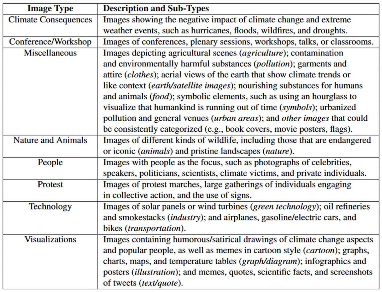
Description of image types and subtypes.

Example images of the categories text/quote, graph/diagram, illustration, cartoon (row 1), people, conf./workshop, protest (row 2), animals, nature, climate consequences (row 3), transportation, industry, green technology, urban (row 4), symbol, earth/satellite, food (row 5), pollution, clothes, agriculture, other (row 6) (from left to right).
To validate our findings, we manually inspected 1,000 randomly selected images. Nine hundred twenty images were categorized correctly by the system, leading to an accuracy of 92% (Krippendorff’s alpha = .90). The 80 images, which were classified incorrectly by the system, showed a great visual similarity to each of the assigned categories, for example, a picture of a diagram consisting of multiple colored sketches was coded as “graph/diagram” by our human inspection and classified as “cartoon” by the system (as the features were similar to that of the cartoon), and an image which depicted two persons holding a sign that demanded funding for a climate project was coded with the “people” category by human inspection and was classified as “protest” by the system.
Stakeholder Type
To get an understanding of the most active distributors of images, we extracted all accounts that published more than 100 images associated with the hashtag #climatechange. This gave us a subset of 2,047 accounts, which we classified into different groups based on their Twitter profile description, their most recent tweets, and any readily accessible online information (e.g., their website). This classification was performed by two coders. To establish intercoder reliability, those coders double-coded 200 accounts (10% of the sample). A Krippendorff’s alpha test for categorical variables yielded a coefficient of .81, which exceeds the recommended minimum coefficient of .8 (see Riffe et al., 2019, p. 129).
Drawing on prior work and our observations, we developed a typology made up of the following stakeholder types: advocacy actors (e.g., nongovernmental organizations, fundraisers, charitable organizations, interest groups, and individual activists), bots (i.e., accounts showing automated behavior, such as publishing the same tweet multiple times in a short time), business actors (e.g., companies and brands, or individuals who primarily promoted their business activity or network), journalistic actors (e.g., news outlets and their journalists), political actors (e.g., political or governmental institutions and projects, as well as politicians and members of their campaigns), scientific actors (e.g., research institutions and projects, as well as individual researchers and climate experts), and private persons (e.g., individuals who used their accounts mostly for personal reasons or to provide personal opinions). An other category was also included to account for individuals who did not clearly fit into one of the above categories.
Forty-nine of the accounts could not be classified because they were no longer on Twitter at the time of data collection or had exclusively non-English descriptions and tweets; these accounts were excluded from the analysis.
Engagement
We also collected information about four different engagement affordances—“likes,” “retweets,” “quote tweets,” and “replies”—for each tweet in our dataset. These data were obtained directly from the Twitter API and represent the counts for that affordance and tweet at the time of the data collection.
Results
Salience of Image Types
The first research question asked about the types of images that were most common in climate change-related tweets.
As shown in Figure 3, just over half of the images were categorized as visualizations, with over two-thirds of such images falling into a subcategory that included memes, inspirational quotes, and screenshots of quoted tweets. The second most common category was people (15% of the images), which contained photographs of politicians and celebrities, among others. The third most common category with just under one-tenth of the images was nature and animals (9%). These images included both endangered animals as well as pristine environments. While the images are arguably distinct, they nevertheless cumulatively represent what could be lost due to climate change. The fourth most common category was conference/workshop (7%). The less-common categories were miscellaneous (5%), technologies (4%), protest (4%), and climate consequences (4%).
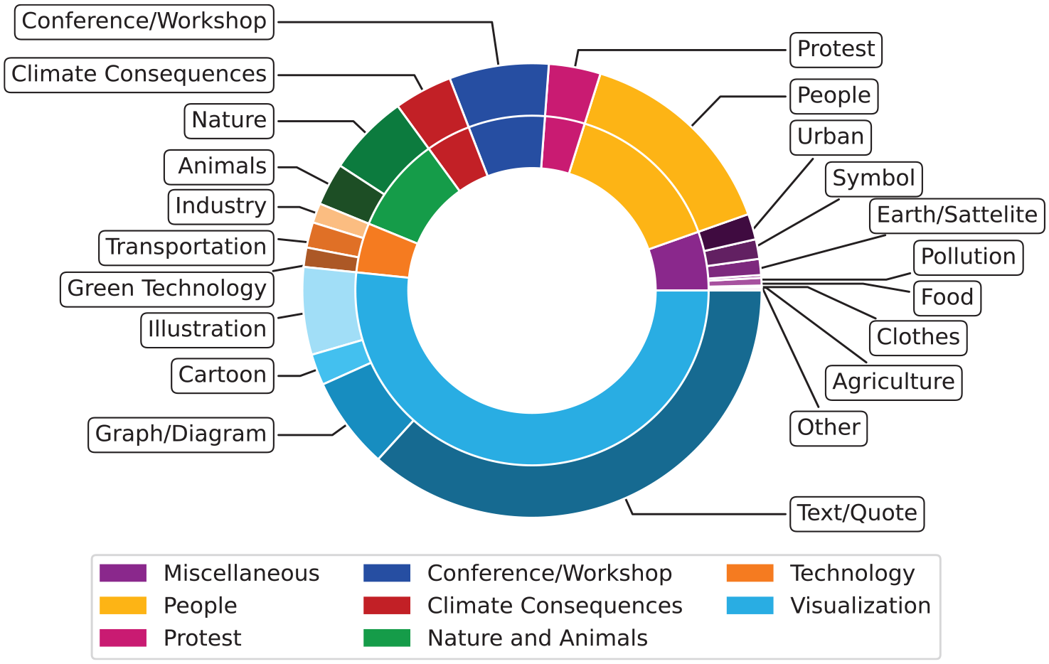
Distribution of images by type of image.
Pattern of Communication and Focusing Events
The second research question asked whether climate change-related tweets featuring images followed a cyclical pattern that was tied to focusing events.
There is some evidence of a cyclical pattern (see Figure 4). In particular, there are repeated spikes in both the volume and proportion of #climatechange tweets with images, often in the latter part of each year. These peaks appeared to be linked to focusing events. For example, instances of the United Nations Climate Change Conference (COP) frequently coincided with increases in the distribution of #climatechange images. Other major policy and media events also seemed to draw attention, such as Fridays for Future and the global school strikes that followed. Notably, there is a pronounced dropoff in the volume and proportion of images starting in the beginning of 2020, which suggests that climate change may have been displaced as a key issue on Twitter as the United States began a messy transition of power and the COVID-19 pandemic took hold. The volume began to increase toward the end of 2020, but the proportion of #climatechange tweets, in relation to all English tweets, remained low in comparison to pre-COVID times.
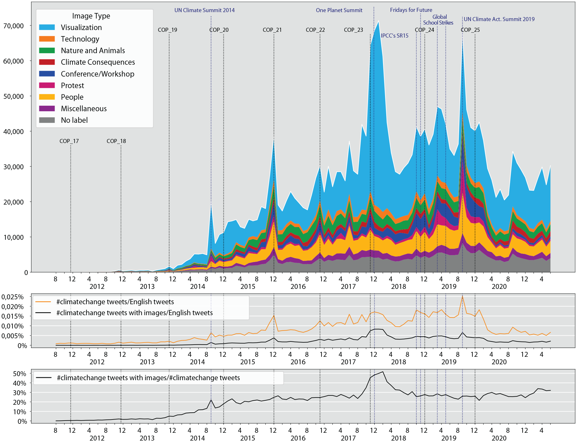
Amount of images associated with tweets containing the hashtag #climatechange on a monthly basis between August 2011 and June 2021 (upper chart). Proportion of the total #climatechange tweets (orange) and the #climatechange tweets with images (black) in relation to all English tweets (middle chart). Proportion of #climatechange tweets with images in relation to all #climatechange tweets (lower chart).
The results also show that images have become an important vehicle for climate change communication. The proportion of #climatechange tweets containing an image, in relation to all #climatechange tweets, rose with the introduction of the image feature in 2011 and became relatively stable around 30% since 2015. A notable exception to this are the months around the One Planet summit, during which roughly 50% of #climatechange tweets were published with an image.
The use of image types remained, proportionally, fairly stable over time. The most notable exception to this was visualization images. That image type gained some relative salience in the middle of 2014 and spiked in late 2017. It returned to more normal levels by early 2018 and remained the most common image type in the years that followed.
Active Stakeholders and Strategies
The third research question asked about the kinds of stakeholders that were most active in distributing climate change-related tweets containing images and about the types of images they use.
To address this question, we analyzed a subsample of 1,998 accounts (see the “Methods” section for more details) that collectively distributed more than 1 million of the labeled images. As shown in Figure 5, the most active set of stakeholders were private individuals (20%), followed by advocacy actors (19%), business actors (17%), journalistic actors (12%), scientific actors (12%), political actors (10%), bots (5%), and other actors (5%). However, the picture looks rather different in terms of the share of images that were distributed. Even though bots only comprised 5% of the accounts, they were responsible for 41% of the images in the subsample. They were followed by advocacy actors (14% of the images), business actors (11%), private individuals (9%), journalistic actors (9%), scientific actors (7%), other actors (6%), and political actors (4%).

Number of accounts (n = 1,998), number of images (n = 1,026,636), and distribution of image types by the kind of stakeholder among users who shared more than 100 images using the hashtag #climatechange.
Figure 5 also shows some interesting differences in the types of images produced by each kind of stakeholder in the subsample. A Pearson chi-square test indicated that there was a significant relationship between stakeholder type and image category, χ2 (49, N = 1,026,636) = 304,302, p < .001. Notably, bot accounts overwhelmingly distributed visualization images (88% of their images), especially images that incorporated text and quotes in the form of screenshotted tweets, inspirational quotes, and memes (78%). Thus, bots were clearly instrumentalized to promote some coordinated messaging but, interestingly, used images of tweets in place of the quote tweet affordance during a significant portion of the time. While scientific actors also favored visualizations overall (55% of their images), they differed by being the most likely to distribute images of graphs and diagrams (18%). In contrast, journalistic actors were the least likely to use visualizations (27%).
Political actors were relatively more likely to distribute people images (27%) as well as conference/workshop images (16%). Journalistic actors (5%) and advocacy actors (4%) were the stakeholders most likely to distribute protest images; no other stakeholder had a share in excess of 3%.
Image Type and Engagement
The fourth research question asked about the types of images that tended to elicit the greatest engagement.
The average (mean) image in our data received 5.5 likes, 3.2 retweets, 0.2 quotes, and 0.3 replies. However, the distribution of these forms of engagement was not equal across categories. As shown in Figure 6, protest images generated the most user engagement by far (Mlikes = 10.8,
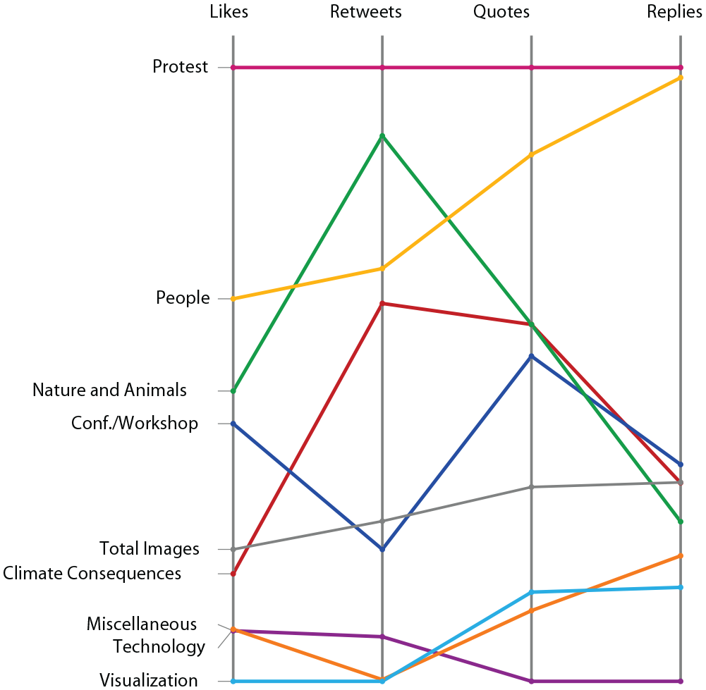
The mean number of likes, retweets, quote tweets, and replies per image for eight different types of images, normalized by the minimum and maximum mean values of all image types.
Discussion
Climate Change Communication
Climate change is one of the most important issues of our time (IPCC, 2022), and visual depictions of the issue matter greatly for how individuals come to perceive the issue’s importance and the attitudes and affect they develop toward it (Chapman et al., 2016; Metag et al., 2016; O’Neill & Nicholson-Cole, 2009; O’Neill et al., 2013). It is therefore crucial that we better understand how the issue is communicated visually within the spaces where people gather and interact, such as on social media.
To that end, this study elicited four key empirical findings in relation to prior work. First, the most common type of image—by a large margin—was the visualization, and typically one that included some combination of some text (e.g., quote) with an image. This stands in stark contrast to prior work, which has identified images of climate change consequences and prominent individuals as being most common in traditional news media (see O’Neill & Smith, 2014; Schäfer, 2020). Second, the temporal flow in the volume of images being distributed followed a fairly cyclical pattern situated around focusing events like the COP summits. This finding is in line with prior work that examined traditional news media (O’Neill, 2020; Schäfer, 2020). Third, bots accounted for a significant share of the images communicated on Twitter, with journalistic actors and scientific actors lagging noticeably behind. While this study does not speak to individual actors’ influence, it does offer further evidence that the most interested stakeholders (e.g., advocacy actors and business actors) continue to invest in a platform that affords them the opportunity to communicate directly with an audience (Pearce et al., 2019; Schäfer, 2012, p. 2). Our findings are also in line with those of Wozniak et al. (2017), who showed that governmental communicators prefer images of political actors for promoting climate change awareness. Fourth, protest images were consistently the ones engaged with the most, which is also in line with the expectations of the nongovernmental organizations (Wozniak et al., 2017). This is notable given that prior work (Chapman et al., 2016; Corner et al., 2015; Leviston et al., 2014; Metag et al., 2016; Wang et al., 2018) has raised questions about the effectiveness of such images, particularly among climate change skeptics.
These empirical findings contribute to a broader theoretical discussion regarding the logic employed in communicating the issue of climate change through images on social media. Foremost, they further illustrate that the use of social media—and Twitter in particular—involves a logic that is distinct from traditional media in some dimensions (Hjarvard, 2018; Van Dijck & Poell, 2013 see also Asp, 2014). This is no doubt due in part to the platform’s technical affordances (Altheide, 2016), which promote and facilitate distribution via single-click actions and integrated hosting, which in turn reinforces the core element of shareability that characterizes social media logic. However, it is also likely due in part to the fact that social media allow a wider range of stakeholders to be media producers, which fosters a co-production of the “rhythm, grammar, and format” (Altheide, 2004, p. 294) that is considered acceptable in that networked space. Of particular note is the fact that the most common image type in this study (visualizations featuring image-text combinations) is one not seen in prior work (León et al., 2022; O’Neill & Smith, 2014; Schäfer, 2020). Traditional news media have long used pull-out quotes, which is somewhat akin to the apparent practice found here of distributing screenshots of others’ tweets. However, the common practice of juxtaposing synecdoches with inspirational quotes and utilizing memes to ridicule individuals or offer social commentary suggests a grammar and format that is quite distinct (see Figure 2).
In addition, although the genuinely digital and online multimodal “text/quote” genre did not elicit the same engagement as regular photos, stakeholders may nevertheless favor using these aesthetically unprofessional or amateurish text images for two reasons. First, they are easier to generate and remix to convey the stakeholder’s perspective, especially when compared to professional photojournalistic styles. Second, they may be used to signal the stakeholder’s familiarity with the distinct aesthetic vernacular that social media logic is imbued with. Visual cross-platform analysis that takes specific affordances and vernaculars into account (Pearce et al., 2020) could show if this image type represents an aesthetic and logic that is specific to Twitter, or perhaps social media more broadly.
However, this study also points to continuities between the two logics, at least as they manifest through the issue of climate change. For example, the rhythm in the distribution of images appears to mirror that of traditional media, as it shows an at least partially cyclical pattern which connects to focusing events. This is in line with decades-old theorizing about the coverage of persistent issues (Downs, 1972) and the longitudinal analysis of Boykoff et al. (2022). Furthermore, many of those focusing events appeared to be preplanned political events often orchestrated to draw media attention (e.g., climate conferences and planned demonstrations), which not only reinforces a linkage between the two logics in terms of what drives communication but also highlights the continued interlinkage with political logic (Altheide, 2004). Similarly, we see the performance of journalistic actors perhaps most closely aligning with prior scholarship on the visual communication of climate change, such as by being among the actor types most likely to distribute images of people and protests. These observations cumulatively lend themselves supporting a broader contention that the continued intertwining of news media and social media is producing a more hybridized logic (Tsuriel et al., 2021).
This theoretical contribution also helps us better understand the present state of climate change communication on Twitter, especially on the visual front, and what its future might look like. The high levels of engagement around protest imagery in particular highlight both promise and risk. While such images resonate well with people who are already climate-aware, they can reinforce cynicism and an “us versus them” feeling in others (Chapman et al., 2016; Corner et al., 2015; Wang et al., 2018). In other words, while such images do generate engagement, that engagement may be detrimental to fostering the collective response that is necessary for tackling climate change (Leviston et al., 2014; Metag et al., 2016). In a similar vein, the use of bots to promote visualized forms of text can pose a significant threat to effective climate change communication on two fronts. First, bots can be instrumentalized—as they qualitatively appear to already be—to promote polarizing messages conveyed through social media-friendly aesthetics (e.g., semiamateur media). Second, even if the intent of such bots is not to persuade, they may nevertheless contribute noise that drowns out contributions made by scientific actors and journalists, among others, or simply creates what appears to be an informational overload. Put differently, we must reckon with the growing volumes of climate change communication being generated by nonhuman actants that leverage both the logics and forms associated with Twitter and other social media platforms (Chen et al., 2021).
In considering this study’s findings and theoretical contributions, it is important to remain mindful of the fact that it examines a single hashtag. While #climatechange is highly useful in coordinating discussion around the topic (as evidenced by the volume of tweets), it does not encompass all related communication. Indeed, as Twitter’s search and surfacing affordances have improved over the years, hashtags have perhaps become less important. This may be especially true for accounts that have large followings, as well as those that view the use of hashtags as tacky, unprofessional, or a potential branding liability. In other words, our findings are likely most reflective of actors who aimed for wider reach and may be less representative of actors who aimed to reach just their followers. We find some corroborating evidence of this in the fact that not a single fossil fuel company tweeted more than 100 images using the #climatechange. It is likely that such actors, and others, are looking to participate in (and influence) deliberations, but not through this key hashtag. It would thus be helpful for future work to further segment the coordinating affordances—and, perhaps, the key nodes—implicated in these discussions. Nevertheless, the present study does shed light on a substantial and important part of the discussion.
Methodological Challenges
This study was based on a methodological design that is novel among studies of climate change communication. The unsupervised machine learning approach is highly useful in multiple regards. In particular, it allows for the systematic evaluation of a large volume of data—something that is becoming ever more necessary given the sheer amount of digital communication produced on a daily basis—and allows for segmentation based on microfeatures that humans might miss. This is doubly true for longitudinal work that requires larger samples to be representative. However, more data or the use of complicated algorithms is not necessarily better. We see evidence of this in the limitations of this study. For example, our approach is unable to differentiate between visually similar but substantively distinct images, such as one that pairs an image of a field of solar panels with a supportive quote and one that pairs it with a critical quote. The approach we have used to automatically label images was based on purely visual characteristics and is therefore different from the manual analysis of images that is able to consider the semantic meaning of images. For example, it would be interesting to investigate whether the images that have been shown to be particularly effective, namely those of people that are negatively affected by climate change (Wang et al., 2018), elicit more user engagement. However, as Figure 7 illustrates, trying to automatically differentiate between images of climate victims and other people, such as politicians, is an extremely difficult task. In the future, the researcher could train classifiers to detect very specific subcategories and combine these to build larger semantic categories.

Example of algorithmic limitations: Even though the image in the middle belongs semantically to the same category as the left image (climate victims), it is visually more similar to the image on the right (politician).
Similarly, our ability to pair our findings to those from prior work is limited by differences in how categories are operationalized (and which categories can be formulated). To that end, we believe that future work in this area would benefit from hybrid approaches to content analysis (Brantner & Pfeffer, 2018; Zamith & Lewis, 2015), namely by using an approach like ours to capture a more complete range of distinct types of images and randomly sample from them to perform a closer analysis that allows for more nuance and considers the peculiarities of images. Such analyses could build upon the more interpretative traditions of visual communication scholarship to capture latent meanings through contextualization (Wozniak et al., 2015).
Moreover, similar to studies on multimodality in news media, future work could investigate how different modalities are combined in meaning-making within climate change communication. Our computational approach could thus be combined with the pairing of qualitative iconographic-iconological analysis and quantitative content analysis of both image and text—an approach that has already been successfully implemented in analyses of multimodal tweets (Brantner et al., 2020).
Finally, we have applied a single-label classification approach to be able to differentiate between images based on their most prevalent theme. This restricted us though in assessing the full meaning of an image when images contained more than one category. Future work could use multilabel classification to account for images that show several categories, such as protesters in front of an industry scene.
Footnotes
Author Notes
We confirm that all authors have agreed to the submission and that the article is not currently being considered for publication by any other print or electronic journal.
Declaration of Conflicting Interests
The author(s) declared no potential conflicts of interest with respect to the research, authorship, and/or publication of this article.
Funding
The author(s) received no financial support for the research, authorship, and/or publication of this article.