
Abstract
This study examines how climate change is visually framed on Twitter/X and how these frames influence users’ emotional responses and engagement across languages. Using automated image analysis of over three million images posted between 2019 and 2022, we identify nine dominant visual frames. “Public Engagement: Politics & Events” was most prevalent, interactive visuals such as memes generated the highest engagement but predominantly negative response in user comments. By contrast, we find more positive responses for solution-focused frames, but lower levels of engagement. These results underscore the value of automated image analysis in uncovering culturally nuanced patterns in visual climate communication.
Introduction
The image of Greta Thunberg addressing world leaders at the United Nations in 2019 became a global symbol of youth climate activism, inspiring millions to join the movement for climate action (Wahlström & Uba, 2023). In 2024, visuals of an unprecedented heat wave across southern Europe, where temperatures soared beyond 40°C, were widely shared on social media, highlighting the immediate human and ecological risks posed by escalating temperatures (Euronews, 2024). During the same year, satellite imagery captured severe coral bleaching at the Great Barrier Reef, underlining the long-term consequences of warming ocean waters (NASA Earth Observatory, 2024). Together, these images, shared by activists, residents, and media, demonstrate the power of visuals to convey the urgency of climate change and can evoke emotional responses. Such visuals may help to make climate change feel personally relevant and immediate, with subsequent impacts on peoples’ values, actions and behaviors (Keller et al., 2022).
Traditionally, scientific institutions and news media produced and disseminated climate visuals, playing a key role in shaping public understanding of climate change (O’Neill & Smith, 2014). However, existing studies of climate media imagery are limited given that legacy media images are typically curated by professional journalists and institutions, restricting the diversity of visual perspectives. By contrast, with the rise of social media, climate messaging has become more decentralized, allowing diverse actors to share climate imagery that reaches millions with unprecedented immediacy and emotional impact (Li & Xie, 2020). Although research has examined the role of climate visuals in legacy media organizations (e.g., O’Neill, 2020; Wang et al., 2018), relatively little attention has been paid to how these images affect engagement on social media, particularly in different cultural contexts, where climate change imagery (e.g., protest photos, memes, infographics, and even “recycled” legacy media images) gain new meanings. Recent studies shows that image and video content now account for most posts on major platforms (Reuters Institute for the Study of Journalism, 2025), and images that involve climate impacts, people, and infographics are among the most widely shared visual types (Mooseder et al., 2023; Qian et al., 2024). The overarching question of this study is therefore: How is climate change visually framed on social media, and what impact do these frames have on user engagement across different languages?
Empirically, this study analyzes more than 3 million climate-related tweets shared on Twitter/X from 2019 to 2022 along with their replies and user engagement metrics. Using automated image classification, we identify which visual frames (e.g., depicting activism, natural disasters, or solutions) drive user engagement, and how these climate visuals resonate across different audiences, using language as a proxy for cultural context. Based on framing theory, this study offers new insights into the emotional and engagement dynamic of visual climate change communication in social media like Twitter/X.
Visual Climate Change Communication on Social Media
Climate change communication has evolved significantly with the rise of social media. While legacy media remain influential (Wang et al., 2018), platforms like Twitter/X, Instagram, and TikTok now serve as central channels for climate discourse (Schäfer, 2020), enabling scientists, policymakers, and the public to produce and share climate-related content, reaching even broader audiences (Pearce et al., 2019; Reuters Institute for the Study of Journalism, 2025). Visual formats (e.g., images, GIFs, and videos) are influential communication tools, as they convey complex information, simplify the message, and amplify user engagement (Hall, 1973; León et al., 2022). Memes and selfies are prevalent in social media content, eliciting varied emotional and cognitive responses (Andreallo, 2022). While images about climate impacts may evoke fear or defeatism (O’Neill & Nicholson-Cole, 2009), visuals of renewable energy or community action can inspire hope and efficacy (Corner et al., 2015; Metag et al., 2016; O’Neill et al., 2013).
Despite this growing interest, most research has focused on text-based representations or visual content in Western, English-speaking countries (Hopke & Hestres, 2018; O’Neill, 2013), often relying on small-scale or qualitative approaches. Large-scale, cross-cultural studies of visual climate discourse on social media remain limited (for exceptions, see: Doerr & Langa, 2024; Mooseder et al., 2023; Qian et al., 2024). Among the social media platforms studied, Twitter/X has been studied most extensively, given its active role for climate change stakeholders and activists (Hoffmann & Neumayer, 2024; Hopke & Hestres, 2018; Pearce et al., 2019).
Visual Framing as a Theoretical Lens
Visual framing provides a useful theoretical lens for understanding how climate change visuals are constructed and communicated. Framing theory, as defined by Entman (1993), involves selecting elements of perceived reality and emphasizing them in a way that promotes a particular problem definition, causal interpretation, moral evaluation, and/or treatment recommendation. While traditionally been applied to texts, framing as a theoretical approach is also applicable to images (O’Neill et al., 2015; Rebich-Hespanha et al., 2015; Rodriguez & Dimitrova, 2011).
Framing can shape public perceptions about climate change by highlighting certain climate issues over others (Rodriguez & Dimitrova, 2011; Schäfer et al., 2017). According to Barthes (1977), every image comprises two levels of interpretation, distinguishing between the denotative level, which depicts the literal, objective description of what is shown in an image, and the connotative level, which refers to the cultural and symbolic meanings associated, given the cultural background, personal experiences, and emotions of the viewers. Rodriguez and Dimitrova (2011) expanded these levels into a four-level model for visual framing analysis, adding a stylistic–semiotic level, which consider how formal features (e.g., composition, camera angle, and color shape), and the ideological level, which interpret how images convey and reinforce societal values, power relations, and worldviews.
However, the empirical application of framing to climate visuals remains fragmented. Studies of legacy media have found common frames in climate media content include nature, disaster and risk, technology and society (Rebich-Hespanha et al., 2015). Also, social media studies have rather categorized image types (León et al., 2022; Mooseder et al., 2023). One exception is O’Neill et al. (2015), who examined Intergovernmental Panel on Climate Change (IPCC) coverage in legacy and social media, and found frames such as “settled science” common, a frame later observed as prominent on Twitter (Pearce et al., 2019). Yet, these studies vary widely in how they define and operationalize “visual frames.” In addition, most studies of climate media content which use framing employ qualitative thematic coding of small samples, making cross-cultural and longitudinal comparisons challenging.
Given the lack of conceptual clarity, of what constitutes a “visual frame” in the context of climate change communication, we define a visual frame as a recurring configuration of visual elements, which can be depicted type of settings, symbols, objects, and style, that selectively emphasizes certain interpretations of climate change over others. Frames are conceptually distinct from themes, which describe specific topical content within an image (e.g., polar bears, solar panels, protest crowds, image types) that may contribute to, but do not alone define, what we understand by visual frame.
Exploring how visual frames operate on social media platforms like Twitter/X can reveal insights into the dynamics of online discourse and the spread of visual climate-related content. Thus, our first research question is: How is climate change visually framed on Twitter/X (RQ1)?
In addition, recognizing that cultural contexts shape different perceptions regarding climate change as well as its communication, comparative studies indicate that while countries with similar socio-political contexts tend to produce comparable climate images (e.g., United States, United Kingdom, and Australia; O’Neill, 2020), cultural variations exist, as some regions prioritize policymakers and protests visuals, while others highlight environmental consequences or technological solutions. Countries like India and Brazil prominently emphasize visuals of nature and wildlife at risk, nations such as Germany, Russia, and Japan focus heavily on images depicting industry and pollution (Ben-David et al., 2025). Anglo-Saxon countries frequently use visuals related to clean energy solutions, and countries like Argentina highlight civic actions and public demonstrations (protests) in their visual framing of climate change (Ben-David et al., 2025). Thus, exploring the role of cultural variation, we ask: How do visual climate change frames differ across different languages (RQ2)?
Emotional Resonance and User Engagement With Climate Change Visuals
Building on the previous discussion of visual framing, we examine how frames intersect with users’ emotional responses on Twitter/X. Emotions refers to the degree of affective reactions evoked from exposure to climate images (Lee & Hong, 2016). A single frame can invoke different emotional responses (e.g., the Wildlife and Nature frame could evoke negative emotions triggered by concern over the threat of endangered species or positive emotions, triggered by affection for beautiful landscapes or charismatic species). We therefore treat visual framing and emotional response as analytically separate constructs, allowing us to examine how different frames are associated with varying emotional responses and engagement patterns.
Hughes (2024) argues that climate change visuals do not simply evoke individual emotions but contribute to collective meaning-making, helping to reconfigure shared visions of climate scenarios. Previous research demonstrates the ability of images to support environmental policy (Leiserowitz, 2006), strengthen acceptance of anthropogenic climate change (Feldman et al., 2012), but also to invoke climate skepticism (Capstick & Pidgeon, 2014). Their effects depend on both framing and emotional responses, which influences how users interpret and engage with social media content (Johann et al., 2023; León et al., 2022; O’Neill & Nicholson-Cole, 2009). For activists and communicators, aligning visual representations with personal values and collective goals can be an effective strategy for public engagement (Molder et al., 2021).
While iconic images frequently featured in legacy media (e.g., depicting polar bears or flooding) often focus on global-scale impacts, they may inadvertently create a sense of distance, reducing audience identification and self-efficacy (Manzo, 2010; Nicholson-Cole, 2009; Wang et al., 2018). Similarly, scientific visuals (e.g., graphs, maps, or infographics) can invoke a sense of salience via their perceived authority and objectivity (Leviston et al., 2014). Conversely, imagery featuring people or human elements can strengthen audience identification (Chapman et al., 2016). However, portrayals of politicians, celebrities, or activists can polarize viewers, eliciting either support and solidarity or opposition and resistance (O’Neill et al., 2013; Wang et al., 2018).
Despite a growing interest in how people engage with climate change content online, few studies have analyzed users’ emotional responses to climate change imagery at scale (see Bravo et al., 2025). Automated sentiment analysis offers a promising method for exploring how emotional reactions shape user engagement (Bednarek, 2016). Analyzing user replies can provide a deeper understanding of the emotional responses that drive user engagement with climate visuals. Such emotional engagement is essential in climate communication, as it bridges the gap between passive awareness and active involvement by creating a personal connection to the topic (Capstick & Pidgeon, 2014). However, visuals that lack emotional response and relatability can further contribute to a sense of distance from the issue (Leviston et al., 2014; O’Neill et al., 2013). In contrast, images focusing on climate impacts tend to evoke stronger negative emotions, while solution-oriented images often elicit positive emotions (Leviston et al., 2014; San Cornelio et al., 2024; Wang et al., 2018). By making climate change feel more immediate, such visuals can minimize the “psychological distance” that often accompanies global or abstract climate issues, though their effectiveness also critically depends on the types of emotions they evoke (Günay et al., 2025). While positive emotions like hope or efficacy can promote engagement, negative emotions like fear or helplessness might diminish it (Corner et al., 2015; Nicholson-Cole, 2009; Wang et al., 2018). Thus, we ask: How do emotions expressed in user comments vary across visual climate change frames on Twitter/X (RQ3)?
Emotions also function as powerful drivers of engagement, particularly on social media platforms where emotionally charged content tends to attract more attention (Lehman et al., 2019; Wang et al., 2018). For example, visual frames associated with activism and politics may drive likes and shares, while environmental consequences or images of wildlife can generate more user responses such as likes, retweets and comments (León et al., 2022; Luebke et al., 2025). Also, visuals featuring public activism, have been shown to generate strong audience reactions, as they provide a sense of immediacy and relevance, bridging the psychological distance often associated with climate issues (Chapman et al., 2016; Mooseder et al., 2023; Powell et al., 2015). Consequently, activism visuals may not only attract more attention but also drive higher engagement levels in the form of shares, likes, and supportive comments (Hart et al., 2024; Luebke et al., 2025).
While engagement metrics (on Twitter/X they include likes, retweets, quotes, and replies) offer valuable insight into how users interact with climate visuals, research to date has not comprehensively explored how specific visual frames influence these different forms of engagement (León et al., 2022). Therefore, to investigate the relationship between visual framing and user engagement, we propose the following research question: How do visual climate change frames impact the levels of engagement, in terms of likes, retweets, quotes, and replies on Twitter/X (RQ4)?
Data Sample & Methods
Data Collection and Sampling
The data for this study were collected from Twitter/X, covering the period from January 2019 to December 2022. Data were retrieved using the Twitter Academic API v2 before its discontinuation in May 2023, via the “AcademicTwitteR” package in R (Barrie et al., 2021), and the Python library “Tweepy” (Harmon & Roesslein, 2022). This timeframe was selected to capture key climate discourse moments, including the global climate protests led by Fridays for Future in September 2019 and the Extinction Rebellion protests, representing major climate protests; global summits such as COP25 in Madrid (December 2019), COP26 in Glasgow (November 2021), and COP27 in Sharm El Sheikh (November 2022); and extreme weather events for example the Australian bushfires of 2019–2020, and the record-breaking European heatwaves of 2022.
A keyword-based search filtered tweets containing the terms “climate change” and #climatechange, along with their equivalents in multiple languages (Spanish, German, French, Arabic, Chinese, Russian). Non-English translations were sourced using DeepL and verified by native speakers, except for Russian, which was machine-translated. We then filtered tweets with an embedded image and extracted all replies to these tweets. We also collected metadata metrics (e.g., number of likes, retweets, replies, quote tweets). The final dataset includes 3,133,962 tweets from 852,283 users, and 3,795,245 replies. Most tweets in the sample were collected using English keywords (n = 2,344,387; 74.8%), followed by Spanish (n = 580,142; 18.5%), German (n = 83,520; 2.7%), French (n = 82,911; 2.6%), Arabic (n = 30,284; 1%), Russian (n = 6,693; 0.2%), and Chinese (n = 6,025; 0.2%). To see the pre-processing steps applied to this dataset, and the image distribution by language see Supplemental Material.
Visual Framing Classification
To explore how climate change is visually framed on Twitter/X (RQ1), we define a visual frame as a recurring configuration of visual elements (e.g., settings, symbols, objects, and style) that selectively emphasizes interpretations of climate change (see “Visual Framing as a Theoretical Lens” section). To operationalize this, we used a two-step procedure: (1) the automatic detection of thematic labels (e.g., specific visual elements such as “melting ice,” “wildlife,” or “renewable energy”), and (2) the clustering of images based on these labels and their visual embeddings to identify broader visual patterns, which we then interpreted as distinct frames.
First, we developed a codebook (Supplemental Material 01—Coding Scheme) based on previous studies of climate change imagery (Guenther et al., 2024; O’Neill et al., 2015; Pearce et al., 2019; Rebich-Hespanha et al., 2015). This codebook specified thematic labels, defined as the presence or absence of identifiable visual elements (e.g., animals, protest scenes, industrial pollution). Each image could receive multiple labels, as different elements may co-occur (see Supplemental Appendix 1).
Images were then automatically classified with the CLIP zero-shot model (Radford et al., 2021), which detects thematic labels based on visual–textual similarity. To enhance classification accuracy and minimize false negatives, we implemented five distinct probability thresholds. Each threshold was empirically tested and validated against a manually annotated reference sample of 1,000 images, following validation practices from previous studies (Radford et al., 2021). We then selected the threshold achieving the highest accuracy per category for subsequent analyses (details in Supplementary Material 02—Model Metrics). Recognizing the model’s limitations in interpreting abstract or subtle visual features, we supplemented the automated classification with manual analyses, detailed in the supplementary material, to validate classifier performance.
Next, we employed k-means clustering on the CLIP embeddings to group images with similar visual and thematic properties. The optimal number of clusters (k = 10) was determined using the elbow criterion by analyzing the sum of squared Euclidean distances for solutions ranging from two to 50 clusters (Li, 2013). Clusters exhibiting similar visual and thematic characteristics, such as common image content, visual composition, or related textual descriptions, were then manually aggregated and aligned with recurring interpretive visual frames. We performed this by assigning each image to a frame if its cluster displayed a coherent configuration of thematic labels and visual features corresponding to that frame. Because frames represent holistic patterns rather than isolated elements, each image was assigned to one predominant frame, even if it contained multiple thematic labels.
Finally, we identified nine predominant visual frames that succinctly summarize patterns and trends observed in climate change visuals on Twitter/X (see Table 1). This also allows us to explore how the salience of visual frames varies across linguistic regions, using the language of our search queries (English, Spanish, German, French, Arabic, Russian, and Chinese) as a proxy for cultural contexts, and to examine how these frames shift over time, providing the empirical basis for addressing RQ1 and RQ2.
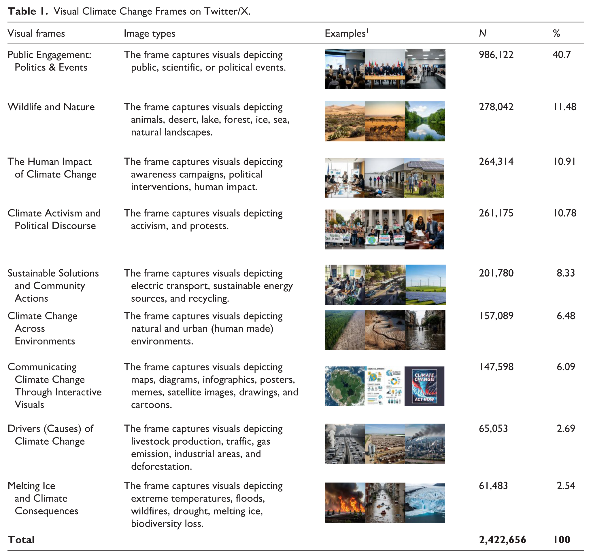
Visual Climate Change Frames on Twitter/X.
Engagement With Visual Climate Change Frames and the Role of Emotional Responses
To examine how users interact with different visuals on Twitter/X, we implemented a series of regression analyses to model the effect of various visual climate change frames on sentiment expressed in user comments (RQ3) and user engagement levels (RQ4). We use sentiment analysis to measure emotions in user replies to tweets with climate change images. Given the dataset’s language diversity, we identified non-English replies (n=1,468,303) using the cld2 (Ooms, 2022) and cld3 (Ooms, 2023) R packages and translated them to English with the Google Translate API. These were merged with English replies (n=2,326,942). Before sentiment analysis, we pre-processed this dataset by removing URLs, usernames, hashtags, and so on; standardizing contractions, slang, and abbreviations; removing special characters/punctuation; and converting to lowercase. This resulted in a final subset of 363,930 tweets with replies.
The sentiment analysis was implemented in Python using the TweetNLP library, specifically leveraging the Twitter-roBERTa-base model, a pre-trained transformer-based model fine-tuned for sentiment classification on Twitter data. This model, trained on approximately 124 million tweets, captures the nuances of informal, short-text language, and the contextual sentiment typical of social media conversations (Barbieri et al., 2020). The sentiment was classified into the three categories positive, neutral, and negative where each reply was classified based on the highest probability score. To aggregate these responses more precisely at the tweet level, we calculated a continuous emotional response score for each post by assigning replies to numerical values (+1 for positive, –1 for negative, and 0 for neutral) and then computing the difference between positive and negative replies divided by the total number of replies per tweet. This score thus reflects both the direction and intensity of emotional responses in a more nuanced approach.
To examine how users interact with different climate visuals on Twitter/X, we implemented two sets of regression analyses. For RQ3 (emotions expressed in user comments), we implemented a beta binomial regression model via the python module statsmodels (Seabold & Perktold, 2010), where the dependent variable is a normalized emotional response score per tweet. The normalized score reflects the emotional response in the range (1, 0), while the closer to 0 more negative response, the closer to 1 more positive response. Our main independent variable is the visual climate change frame, identified via automated visual classification (see “Visual Framing Classification” section). We selected “Public Engagement: Politics & Events” as the reference category given its prominence within the dataset, providing a robust baseline for evaluating the impact of other visual frames on emotional response. We also controlled for temporal variation as a categorical variable in emotion by coding the year the tweet was posted. Thus, we included the years between 2019 and 2022, with 2019 as the reference category.
For RQ4 (user engagement), we examined how visual climate frames influence likes, retweets, quotes, and replies, which are numeric count variables from the tweet metadata Given the overdispersed nature of the data, we used Negative Binomial regression models, implemented via the MASS package in R (Venables & Ripley, 2002). The model coefficients represent the log-transformed expected count of user engagement. A positive coefficient indicates that the corresponding visual frame is associated with higher expected engagement relative to the reference category (“Public Engagement: Politics & Events”), while a negative coefficient indicates lower expected engagement. To facilitate clearer interpretation, coefficients were also exponentiated to produce incidence rate ratios (IRRs), quantifying the percentage increase or decrease in engagement associated with each visual frame.
As geolocation data on Twitter/X is often unreliable (Kumar et al., 2017), we use language as a proxy for cultural regions (c.f., Hopke & Hestres, 2018). Importantly, this refers to the language of the keywords matched by our search queries during data collection, not necessarily the language used in the tweet content itself. On this basis, we operationalize the language by constructing a categorical variable representing the seven languages included in our dataset: English, Spanish, German, French, Arabic, Chinese, and Russian. In the regression models, English was used as the reference category. These baselines provided a consistent foundation for interpreting the effects of other levels. The coefficients from the model represent the log-transformed expected count of user engagement, where higher values indicate a greater expected level of engagement.
Finally, to modeling frames and emotional response separately, we also estimated interaction effects to examine how emotions expressed in user comments condition the effect of visual frames on engagement. By doing so, we directly assess the intersection of RQ3 and RQ4, moving beyond separate analyses of emotional response and engagement to explore their combined dynamics. To do this, we extended the negative binomial regression models to include the normalized emotional response score and its interaction with each visual frame.
Results
Framing Climate Change on Twitter/X
To explore the dominant climate visual narratives on Twitter/X, we analyzed how climate change is visually framed (RQ1). To this end, we analyzed over 3 million climate-related images shared on Twitter/X between 2019 and 2022 and identified nine different visual frames (see Table 1), with varying prominence across time (see Figure 1).
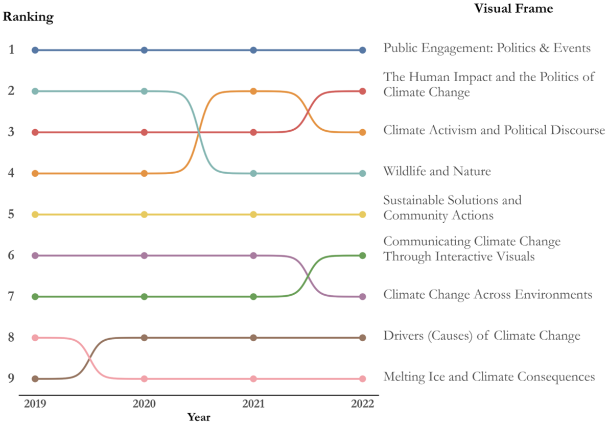
Longitudinal Distribution of Visual Climate Frames on Twitter/X, 2019 – 2022.
The most salient frame is “Public Engagement: Politics & Events,” representing 40.7% of all analyzed images and consistently holding the top rank across years. This frame predominantly features images of public events, awareness campaigns, political interventions, activism, and protests, underscoring the societal urgency and political relevance of climate. The second and third positions fluctuated between “Human Impact of Climate Change” (10.9%) and “Climate Activism and Political Discourse” (10.8%), reflecting variation in attention to either human-centered consequences or political mobilization. “Wildlife and Nature” (11.5%) maintained a relatively stable fourth position, though with a gradual decline toward 2022. The salience of images featuring the “Sustainable Solutions and Community Actions” frame increased steadily from 7.5% in 2019 to 9.5% in 2022, holding a mid-ranking (5th) that signals modest but persistent visibility of solution-oriented content. Less salient, frames emphasize scientific causes (“Drivers of Climate Change,” 2.7%) and environmental consequences of climate change (“Melting Ice and Climate Consequences,” 2.5%).
Together, these rankings highlight that while political and activist frames dominate, solution and ecological narratives remain secondary, and science-focused frames struggle to gain traction in the visual communication of climate change on Twitter/X. To explore the distribution across frames and time, see Supplemental Appendix 2.
Comparing tweets sampled based on climate change–related keywords in different languages, Figure 2 shows that while “Public Engagement: Politics & Events” dominates in most languages, its prominence differs significantly, for example from 50% in Spanish and 47.3% in French, to lower shares in Arabic (32.7%) and German (31.4%), where “Climate Activism and Political Discourse” is also salient. Russian diverges most, with “Wildlife and Nature” emerging as the leading visual frame (19.2%), suggesting a stronger emphasis on biodiversity and ecological preservation. Across languages, “Human Impact of Climate Change” and “Climate Activism and Political Discourse” consistently rank among the top three frames, while scientific (“Drivers of Climate Change”) and consequence-oriented (“Melting Ice”) visual frames remain marginal, rarely exceeding 5%. To explore the dynamics across time, see Supplemental Appendix 3.
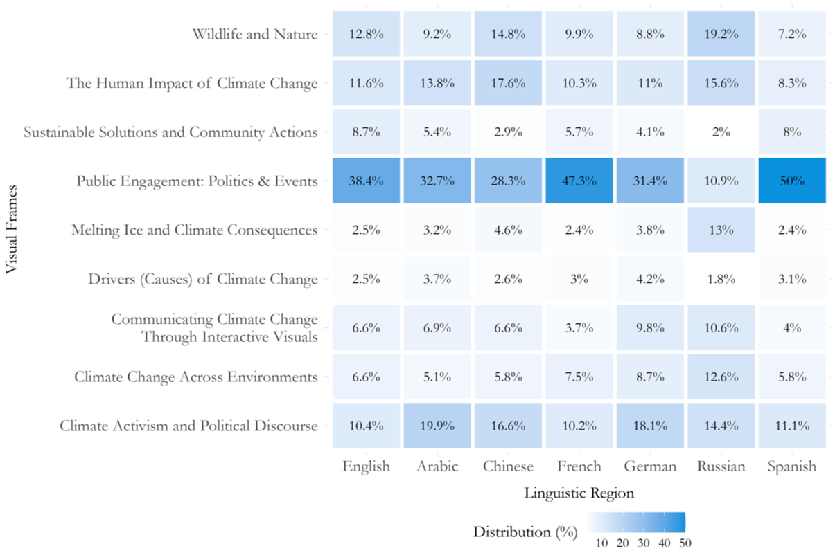
Distribution of Visual Climate Frames by Language.
Effects of Visual Frames on Emotional Response in User Comments
To assess how different visual climate change frames influence emotional response in user comments (RQ3), we modeled normalized emotional response scores using beta regression (see Supplemental Appendix 4 for details). Our results show significant differences across visual frames and time (see Figure 3), highlighting the role of visual framing on the variations in how emotional response expressed in user comments on Twitter/X.
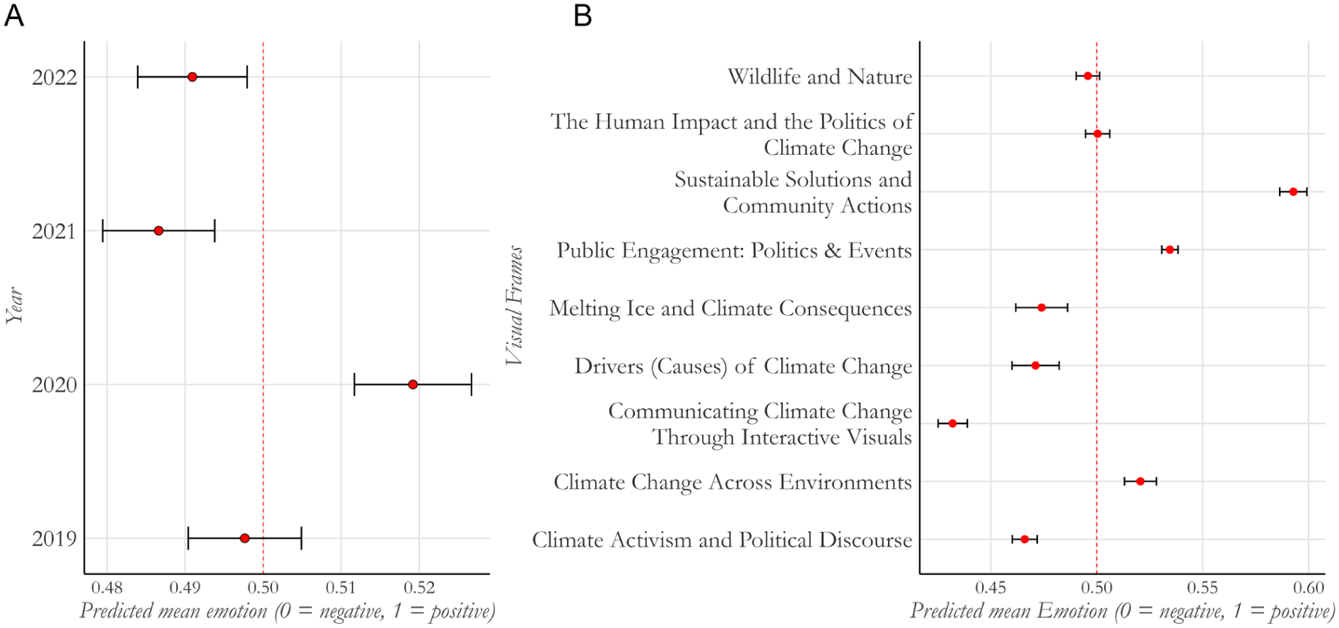
Overall Effects of Year and Visual Frames on Emotional Response. (A) Predicted Emotional Response by Year With 95% CI. (B) Predicted Emotional Response by Frame With 95% CI.
Across years, predicted emotional response was overall close to neutral, with only small and non-significant fluctuations. The exception was 2020, where responses were significantly more positive than in the other years (Figure 3A). Emotional response differed more notably across frames (Figure 3B): The emotional response of user comments on images featuring the visual frame “Sustainable Solutions and Community Actions” was significantly more positive than those associated with most other frames. The emotional response linked to the frames “Communicating Climate Change Through Interactive Visuals,” featuring that complex, data-rich imagery (e.g., visuals depicting maps, diagrams, infographics, posters, memes, satellite images, drawings, and cartoons) and “Climate Activism and Political Discourse,” in contrast, was the most of negative. Frames with a focus on politics (e.g., “The Human Impact and the Politics of Climate Change,” and “Public Engagement: Politics & Events”) and “Wildlife and Nature” show more neutral replies. These findings suggest that images focused on abstract causes or distant ecological impacts may not resonate emotionally with users, potentially due to their lack of direct human connection or psychological distance. In the case of “Human Impact of Climate Change” frame these results may reflect emotional fatigue, or the polarizing nature of visuals depicting disaster impacts or politicized human stories.
Regression estimates (see Supplemental Appendix 5) confirm these patterns, with “Communicating Climate Change Through Interactive Visuals” showing the strongest negative effect (β = –0.412, p < .001) and “Sustainable Solutions and Community Actions” the only frame associated with a significantly more positive response (β = 0.237, p < .001), suggesting that solution-oriented visuals (e.g., images showing renewable energy or community-led projects), or positive political change are more likely to evoke positive emotional reactions, potentially due to their association with hope, efficacy, and collective action. Thus, while some frames may provoke concern, anxiety, or disengagement, visuals offering tangible solutions are associated with more positive responses, which may reflect perceptions of positive and potentially more motivating for action.
These patterns remained consistent from 2019 to 2022, suggesting that the emotional response of climate frames on Twitter/X is stable over time. Overall, while many frames were associated with more negative replies, solution-oriented content consistently corresponded with more positive emotional response in climate-related discussions on Twitter/X.
Engagement and Visual Climate Change Frames
To evaluate the relationship between visual frames and user engagement (RQ4), we estimate their effects on four types of engagement: likes, retweets, quotes, and replies. Our findings (see Figure 4) show that four frames consistently showed higher levels of engagement relative to the baseline (“Public Engagement: Politics & Events”): “Communicating Climate Change Through Interactive Visuals,” “Climate Activism and Political Discourse,” “The Human Impact of Climate Change,” and “Wildlife and Nature.” Among these, “Communicating Climate Change Through Interactive Visuals” had the strongest effect across all engagement metrics. Specifically, this frame was associated with engagement rates that were 57% higher for likes (p < .01), 52% higher for retweets (p < .01), 44% higher for replies (p < .01), and 37% higher for quotes (p < .01). These percentage changes are derived from the incidence rate ratios (IRRs) obtained by exponentiating the regression coefficients from the negative binomial model. These effects are expressed relative to the reference category “Public Engagement: Politics & Events,” which functions as the baseline in our regression model (see Supplemental Appendix 6 for details).
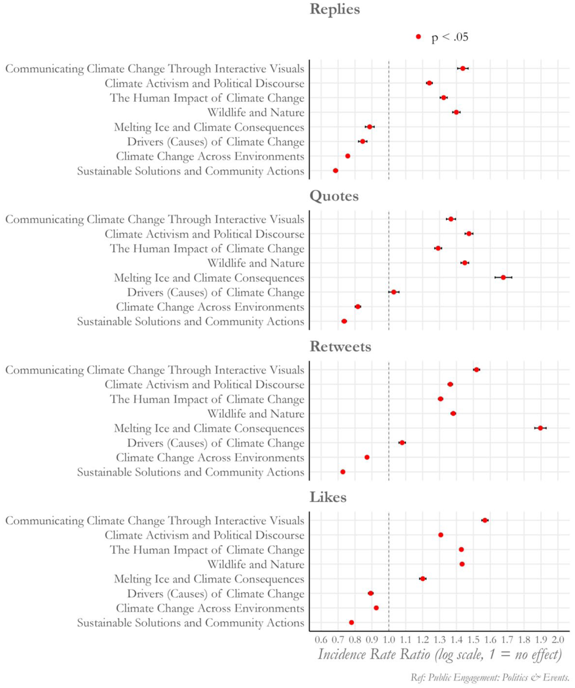
Effects of Visual Frames on Engagement Metrics (IRRs).
By contrast, “Sustainable Solutions and Community Actions” and “Climate Change Across Environments,” were consistently associated with lower engagement (IRRs < 1 across all engagement metrics), suggesting that although these images promote behavioral change, they may lack the emotional intensity or urgency that drives immediate user interaction.
Other frames showed more mixed effects. For example, “Melting Ice and Climate Consequences” was associated with substantially more retweets (+90%, p < .01), quotes (+68%, p < .01), and likes (+20%, p < .01), while replies were 11% lower (p < .01). This suggests that dramatic visual representation of climate impacts is more often associated with user sharing and amplification rather than conversation or commentary. Similarly, the “Drivers (Causes) of Climate Change” frame was linked to fewer replies (–15%, p < .05) and likes (–11%, p < .01), but a more retweet (+8%, p < .01) and quotes (+3%, p < .1). These patterns may indicate that cause-oriented content may not generate immediate or affective responses, but it has some potential to amplify (through retweets) and, to a lesser extent, reflective commentary (through quotes). To complement the regression results, we also conducted a variance mean analysis to examine absolute levels of engagement predicted for each of the nine frames. This analysis confirms the IRR patterns and provides additional insight into the magnitude of engagement (see Supplemental Appendix 7 for details).
Examining how engagement varies by language, we find that Chinese-language content was associated with the highest engagement levels across all metrics, with particularly strong effects for replies (β = 1.900, p < .01) and likes (β = 0.946, p < .01). By contrast, Russian-language content showed the lowest engagement levels, especially for quotes (β = –1.580, p < .01) and retweets (β = –1.310, p < .01), showing pronounced cross-linguistic variation in the reception of climate visuals. In addition, temporal analysis shows variation in engagement over time. Compared with 2019, engagement levels decreased in 2020 but rose again in subsequent years, reaching a peak in 2022, particularly for replies, and quotes. This trend may reflect renewed public attention and concern about climate issues.
Finally, Figure 5 presents the interaction effects between visual frames and emotional response on engagement, revealing a more nuanced picture (see Figure 5). Specifically, when emotional response is combined with particular visual frames, engagement sometimes increases. Frames such as “Climate Activism and Political Discourse” and “Communicating Climate Change Through Interactive Visuals,” were associated with significantly higher engagement when the replies were mostly negative, particularly for replies and retweets. This might indicate that polarization or critical audience responses amplify engagement around activism-related and data-interactive visuals.
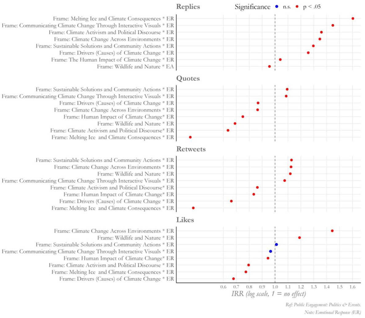
Interaction effects of Visual Frames and Emotions on Engagement Metrics.
Similarly, “Melting Ice and Climate Consequences” and “Drivers (Causes) of Climate Change” showed higher engagement when responses were more negative. By contrast, frames emphasizing “Sustainable Solutions and Community Actions” and “Climate Change Across Environments” were associated with higher engagement levels when replies were more positive (with significantly higher IRRs for retweets), suggesting that hopeful or supportive replies may encourage participation in these narratives. However, for likes, the positive trend for “Sustainable Solutions and Community Actions” was not statistically significant. “Wildlife and Nature” also demonstrated higher engagement under more positive responses, particularly in likes.
Our results provide evidence how visual climate change frames play a role for public engagement. Emotionally charged, interactive, and politically themed visuals are associated with higher user engagement. In contrast, solution-oriented or scientific content was linked to lower engagement, potentially because such images evoke weaker emotional responses. Engagement also differs by language and evolves over time, emphasizing the importance of contextually and temporally adaptive communication strategies.
Discussion
This study offered a comprehensive analysis of how climate change has been visually framed on Twitter/X and how these frames are associated with emotional responses in user comments and patterns of engagement (replies, quotes, retweets, and likes). Our findings provide several key insights into the evolving dynamics of visual climate change communication on social media.
First, our results show that climate change imagery on Twitter/X is structured around nine recurring frames, with “Public Engagement: Politics & Events” consistently being most salient across years and languages. This is in line with prior research showing the dominance of participatory imagery in climate discourse (Chapman et al., 2016; Hoffmann & Neumayer, 2024; León et al., 2022). In contrast, frames emphasizing scientific explanations (e.g., “Drivers of Climate Change” or “Melting Ice and Climate Consequences”) are less prevalent and, in most cases, associated with more negative emotional response in user comments. However, we also observe a modest upward trend for “Sustainable Solutions and Community Actions,” suggesting an emerging, though still limited, shift toward efficacy- and action-oriented visual content.
Using the language (Arabic, Chinese, English, French, German, Spanish, and Russian) as a proxy for identifying different cultural regions, our comparisons of images in Tweets indicated that climate visuals are not homogeneous. For example, while Russian-language content favored biodiversity-focused visuals (“Wildlife and Nature”), French, and Spanish content prioritized political activism frames. These differences suggest that climate change visuals on Twitter/X are not only frame-dependent but also shaped by broader cultural, political, and media ecosystems (Metag et al., 2016). At the same time, it is also important to note that Twitter/X is not equally popular across regions (Kemp, 2025). A common feature of climate change visuals across language regions is that solution-oriented and scientific frames were underrepresented.
In addition, emotional response in user comments and user engagement vary considerably. Frames like “Communicating Climate Change Through Interactive Visuals” combined high engagement with predominantly negative user replies, while “Wildlife and Nature” was also linked to high engagement but tended to attract more positive responses, particularly in the form of likes. These findings underscore the importance of pairing emotionally salient visuals with clear and empowering narratives to avoid disengagement or emotional fatigue (Corner et al., 2015; Höijer, 2010). In contrast, the “Climate Activism and Political Discourse” frame was not only associated with the high engagement levels across multiple metrics, but also with predominantly negative emotional response in user replies across languages, reinforcing the idea that activism imagery plays a central role in climate storytelling (Doerr & Langa, 2024). However, this negativity can potentially also lead to polarization (Gan et al., 2024; Meyer et al., 2025). Our interaction models (Figure 5) reveal that the relationship between visual frames and engagement varies with the emotional tone of replies, with emotional response strengthening or weakening user engagement depending on the frame. Together, these results show that the relationship between emotional response and engagement is not linear but contingent on frame.
Finally, our findings show a marked increase in both engagement and emotional responses over time. This trend may reflect a broader shift in public consciousness around climate change, likely influenced by recurring extreme weather events (McGarry & Treré, 2024; O’Neill et al., 2023), youth-led activism (Gan et al., 2024), and the increasing normalization of climate discourse in social media platforms (Schäfer, 2024). It also reaffirms the need for time-sensitive, flexible communication strategies that respond to evolving public moods and external socio-political events.
While previous work has primarily focused on textual framing or small-sample qualitative studies, our findings demonstrate how visual frames are evident at scale, revealing associations not only with emotional tone and user engagement across diverse contexts. By identifying variation in emotional response in user comments and user engagement patterns for different visual frames, this study extends framing theory beyond problem definition and issue salience, showing how visual elements interact with platform affordances and cultural variables in structuring climate discourse. In doing so, it bridges the gap between media effects research and computational social science, highlighting the analytical potential of integrating machine learning approaches with framing analysis to uncover dynamic patterns in public engagement with climate change.
Conclusion
This study provides new empirical evidence on how climate change is visually framed on Twitter/X and how these frames are associated with variation in emotional response and user engagement across cultural contexts. Our findings emphasize that climate visuals are not neutral communicative tools, they are embedded in broader political, cultural, and emotional contexts that are associated with how audiences interpret and respond to them. Climate change visuals on social media (particularly on Twitter/X) are culturally situated, emotionally charged, and engagement-dependent: negative content tends to be associated with more engagement among users, whereas solution-oriented visual content is linked to more positive and supportive responses, even if overall engagement levels are lower.
While this study offers insights from a computational analysis of a large-scale dataset, several limitations should be acknowledged. First, the use of language as a proxy for cultural region, while practical, may not align with users’ actual location or cultural identity. Users tweeting in English, for instance, may reside in non-English-speaking regions or belong to multilingual communities. However, this approach is consistent with prior cross-cultural social media research (Hopke & Hestres, 2018). Future work could address this limitation by incorporating more refined geolocation techniques and hybrid classification approaches that combine visual, textual, and contextual cues.
Second, although the CLIP model we used for zero-shot image classification provides high performance on large datasets, it may struggle with abstract, symbolic, or culturally nuanced content. To mitigate these issues, we conducted validation procedures and manually reviewed a sample of classified images. Future studies could, for example, use fine-tuned models on climate change imagery. Given that CLIP is primarily trained on English-language and Western-centric datasets (Radford et al., 2021), there may also be classification inaccuracies or cultural misinterpretations when analyzing images from non-Western contexts. Thus, to address these limitations, future research should pursue mixed-method approaches combining computational analysis with qualitative visual analysis to enhance accuracy and interpretive depth from the results.
Third, while the engagement metrics used in this study (retweets, replies, likes, and quotes) offer insights into user engagement with content, they do not necessarily signal support or agreement. For instance, quote tweets often express critique, and retweets can be used ironically or to signal disagreement (Zade et al., 2023; Guerra et al., 2017). Future research could expand on the nuances of these types of engagement.
Finally, this study also raises new questions. Future research could explore multimodal dynamics (i.e., how text and visuals interact), investigate platform-specific visual framing beyond Twitter/X by including other social media platforms such as Instagram and TikTok, and assess the long-term behavioral impacts of emotionally charged climate imagery. Although Twitter/X has historically been a predominant platform for public discourse in climate change, its current relevance in the study of climate change visuals may be deteriorating. However, assessing this change remains challenging due to increasingly restricted data access. Moreover, advancing methodological approaches, for example, the combination of computational modeling with qualitative visual analysis, could further enrich our understanding of how climate change is framed, and perceived in an increasingly image-saturated media landscape.
Supplemental Material
sj-docx-1-scx-10.1177_10755470251401900 – Supplemental material for Global Dynamics of Climate Change Imagery: Emotional and Engagement Effects Across Visual Frames on Twitter/X
Supplemental material, sj-docx-1-scx-10.1177_10755470251401900 for Global Dynamics of Climate Change Imagery: Emotional and Engagement Effects Across Visual Frames on Twitter/X by Isaac Bravo, Katharina Prasse, Stefanie Walter, Saffron O’Neill and Margret Keuper in Science Communication
Supplemental Material
sj-docx-2-scx-10.1177_10755470251401900 – Supplemental material for Global Dynamics of Climate Change Imagery: Emotional and Engagement Effects Across Visual Frames on Twitter/X
Supplemental material, sj-docx-2-scx-10.1177_10755470251401900 for Global Dynamics of Climate Change Imagery: Emotional and Engagement Effects Across Visual Frames on Twitter/X by Isaac Bravo, Katharina Prasse, Stefanie Walter, Saffron O’Neill and Margret Keuper in Science Communication
Supplemental Material
sj-docx-3-scx-10.1177_10755470251401900 – Supplemental material for Global Dynamics of Climate Change Imagery: Emotional and Engagement Effects Across Visual Frames on Twitter/X
Supplemental material, sj-docx-3-scx-10.1177_10755470251401900 for Global Dynamics of Climate Change Imagery: Emotional and Engagement Effects Across Visual Frames on Twitter/X by Isaac Bravo, Katharina Prasse, Stefanie Walter, Saffron O’Neill and Margret Keuper in Science Communication
Footnotes
Acknowledgements
We would like to thank the two anonymous reviewers and the editor for their constructive feedback, which helped improve the paper. We also express our gratitude to our colleagues in the Emmy Noether Research Group “The Media Portrayal of Majority and Minority Groups” at the Technical University of Munich, and at the Centre for Climate Communication & Data Science (C3DS) at the University of Exeter.
Ethical Considerations
This research did not require ethical approval by an institutional review board at the University where the research was conducted.
Funding
The authors disclosed receipt of the following financial support for the research, authorship, and/or publication of this article: This work is part of the ClimateVisions project (grant no. 16DKWN027A), funded by the Federal Ministry for Research, Technology and Aeronautics and by the European Union -NextGenerationEU program.
Declaration of Conflicting Interests
The authors declared no potential conflicts of interest with respect to the research, authorship, and/or publication of this article.
Data Availability Statement
Notes
Author Biographies
References
Supplementary Material
Please find the following supplemental material available below.
For Open Access articles published under a Creative Commons License, all supplemental material carries the same license as the article it is associated with.
For non-Open Access articles published, all supplemental material carries a non-exclusive license, and permission requests for re-use of supplemental material or any part of supplemental material shall be sent directly to the copyright owner as specified in the copyright notice associated with the article.