
Abstract
Seeing is believing, so goes the cliché. In our extremely online world, the particular nexus between visual information and political belief has become one of the thorniest challenges to truth. We live in an extremely visual world in which we navigate social media, search engines, platforms, interfaces, icons, memes, and smartphones. Despite the fact that we navigate visual information at an astounding rate, we have not nationally developed literacies to debunk bad information. I argue that we are witnessing a confluence between extremely online, crowd-sourced conspiracies, whose adherents possess a high capacity for online information gathering, and visualization, meant to communicate data about our world effectively and accurately through optical means which has been co-opted for information warfare. Deploying such informatics further legitimates bizarre, unhinged theories about political reality. QAnon, the extremely online conspiracy theory that has cast its shadow over the Internet, relies exclusively on information visualization to communicate its message and is symptomatic of our inability to combat misinformation that mimics the methods of data analysis and information literacy. I argue that QAnon’s success—indeed, its very existence—relies on (at least) two principal factors: (1) QAnon relies, intentionally or no, on a slippage between data and information that obscures the interventions by Q and Q’s anons in leveraging information warfare, and (2) QAnon supports such a slippage with complex and interactive visualizations of bad information, thereby accelerating apophenia, the tendency to see linkages between random events and data points.
We live in a world where there is more and more information, and less and less meaning.
You can have data without information, but you cannot have information without data.
Seeing is believing, so goes the cliché. In our extremely online world, the particular nexus between visual information and political belief has become one of the thorniest challenges to fact. Humans navigate much of the meaning that informs their lives within an extremely visual digital world: social media, search engines, platforms, interfaces, icons, memes, and smartphones. At the same time, our lives are increasingly circumscribed by these online environments, especially in terms of understanding the sociopolitical realities of life in the United States. Despite the fact that Americans are navigating data at an astounding rate, we have still not developed national initiatives to promote media or information literacies to debunk bad information derived from that data. Fallout from the 2016 and 2020 presidential elections forcefully illustrates how susceptible Americans are to “fake news”: bad information meant to inflame existing political prejudices through misleading or false reports, which spread virally despite the fact-checking capacities of the Internet (Meyer, 2018).
As a result of this exposure to massive amounts of data, Americans have become increasingly accustomed to interpretations of that data provided via visualizations and dashboards, and we often equate visuality with authority a priori. 1 When combined with the sheer amount of data now available online, visualizations produce a sense of authenticity and have become prominent (with some strange aesthetics) in the world of online conspiracy theorizing. In this article, I argue we are witnessing a unique and especially problematic deployment of information visualization and information dissemination by believers in the extremely online, crowd-sourced conspiracy known as QAnon. 2 In my account, QAnon’s success—indeed, its very existence—relies on (at least) two principal factors: (1) QAnon relies, intentionally or no, on a slippage between data and information that obscures the interventions by Q and Q’s anons in leveraging information warfare, and (2) QAnon supports such a slippage with complex and interactive visualizations of bad information, thereby accelerating apophenia, the tendency to see linkages between random events or data points. The latter explains why visualization is especially prominent among QAnon communities, and this adoption of information visualization has proven especially problematic when encountered by online users who may naïvely believe such visualizations are accurate representations of some data “out there” in the world without a framework to critique or deconstruct such data interpretations (Klein & D’Ignazio, 2020). Whereas the possibility of naïve readers being unduly influenced by the rhetoric of information visualization is nothing new (Cairo, 2009; Foley, 2020), the scale of viral online development, spread, and recruitment using such visual data reflects an unsettling new trend in global communications. These visualizations do not accurately reflect actual data, but instead an informational framework always already put into place by QAnon, and this slippage is used for full effect in advancing the movement.
The QAnon movement comprised a group of anonymous online posters who organized a crowd-sourced conspiracy theory believing they were coordinating with President Trump to expose and punish a cadre of globalist, Satanic pedophiles (M. Miller, 2021). In the QAnon eschatology, a “Great Awakening” was imminent in which President Trump, with the help of a mysterious intelligence operative known as Q, would unseal indictments of these globalists thereby destroying the conspiracy (Cassin & Wendling, 2018; Sommer, 2019). To aid this operation, Q posted cryptic clues on imageboards, such as 4chan, 8chan, and 8kun, for adherents to decode and share across the mainstream Internet through anonymized Twitter accounts, YouTube videos, and Reddit threads. “Breadcrumbs” were baked into coherent—albeit often inaccurate or conflicting—narratives by Q believers, using social media and streaming platforms to disseminate their interpretations. Such a functional role for adherents produces a psychological feedback mechanism whereby anons could weave themselves into an overarching sociopolitical, religious, global conflict. Despite the fact that Trump lost the 2020 election and Q stopped posting in December 2020, new permutations of the conspiracy have already appeared (Greenspan & Orrechio-Egresitz, 2021).
The nexus between information visualization and conspiracy theorizing is nothing new. Indeed, one of the ways American culture has always imagined the conspiracy theorist in books and films is as a lone wolf building elaborate “mind maps,” connecting shadowy figures and events through (often literal) strands of thread to underscore the central premise that everything is connected. Such depictions have become a central feature of the conspiracy theory genre itself. Consider the scene in the film Conspiracy Theory (Donner et al., 1997) in which Julia Roberts’ character discovers the secret basement room where Mel Gibson’s paranoid conspiracy theorist has mapped out events and news reports related to the mysterious murder of her father by a shadowy intelligence agency. Or consider the now viral gif of Charlie Day spinning out a highly complex map of events in an episode of It’s Always Sunny in Philadelphia (n.d., Figure 1). Mapping events in a visual form is inherent to our cultural understanding of the conspiracy theory as a genre, and the visual is usually meant to explain the intricacies in such a way that regular people can interpret the data and become believers.

Charlie Day gif (n.d.), It’s Always Sunny in Philadelphia.
Conspiracy theories rely on a unique slippage between the concept of data and information. Although the two concepts are often used interchangeably, the difference is instructive for understanding how QAnon legitimizes and spreads its theories. As the Oxford English Dictionary makes clear, the difference between data and information is one of interpretation and context. Information is defined as “that which is obtained by the processing of data” (Oxford English Dictionary, n.d.). In attempting to define the differences between data, information, and knowledge, Zin (2007) found that many information scientists view the difference between data and information as one of sensory stimuli or sets of signs representing such stimuli (data) versus the meaning made of such stimuli or a set of signs representing empirical knowledge (information) (p. 487).
3
Ko (2021) nicely summarizes the canonical work of Charles Meadow and Weijing Yuan (1997) to define the distinction between data and information: Data are a set of “symbols,” broadly construed to include any form of perceptible difference in the world . . . Information, in Meadow and Yuan’s definition, is realization of the informational potential of data: it is the process of receiving, perceiving, and translating data into knowledge.
4
(n.p.)
Marsh (2012) agrees, arguing that the distinction is one of progression: data lead to information which leads to knowledge which can produce a response or action (p. 4). For our purposes, it is this last step which is most dangerous as it produces unpredictable and often violent behavior among anons. 5
QAnon relies on a slippage between disparate data—sets of signs collected by the adherents through online research—and those same data interpreted as information provided by Q in the drops and by other anons on social media and elsewhere, which are then deployed through authoritative visualizations to recruit and guide newcomers into the movement. 6 Whereas discrete data may represent actual empirical realities, such as John Podesta’s connections to the Clintons or the mysterious events surrounding Jeffrey Epstein’s death, they are contextualized into a pre-existing informational framework of global conspiracy. And because the data collected by anons are derived from Internet searching and collaborative research, the likelihood of apophenia increases exponentially simply given the immense scale of possible data sources. As Haken and Portugali (2015) point out, there is a paradoxical relationship between having more data while receiving less accurate information which is borne out by QAnon. As researchers follow breadcrumbs down rabbit holes all over the web, they are able to weave incredible logical leaps into coherent narratives, into information. 7 “Everything has meaning,” exhorts Q (Q post 1676 [2018b]). And because these data are visualized into seemingly coherent visualizations, the actual randomness of the data is hidden. Information visualization has thus become a keystone for 21st-century, extremely online conspiracies with astounding technico-aesthetic development and political impact beyond the isolated musings of an individual.
By researching the breadcrumbs and building the map, anons weave themselves into the conspiracy theory, becoming “digital soldiers” and keyboard warriors in a battle with the Deep State for the soul of America. This highly dangerous and potentially incendiary situation exploded with dramatic impact during the Capitol riot on 6 January 2021 in which Q flags were in abundance (Howley, 2021). Because so much of QAnon relies on crowd-sourced content, the contours of the conspiracy expand with incredible speed and scope, with new interpretations and conspiracies linking together everything from beliefs in ancient astronauts to fears about mind control to psychic warfare, and everything in between. QAnon is a uniquely modern phenomenon because it leverages information technology to help construct and disseminate the theory, which also accelerated its spread and made it terribly difficult to combat. Trump’s defeat in the 2020 election slowed the conspiracy somewhat as Q has stopped posting, but anons now advance new paranoid strands to be woven into new theories (Bjork-James, 2021; Vaughn, 2021). While the failure of Trump to expose the cabal may discourage some potential followers, the theory has shown a remarkable capacity to adapt to current events, and it remains to be seen whether QAnon will evolve into something else or reappear under a new name (Figure 2). Certainly, the underlying structures that made QAnon possible will continue to produce new cancerous growths online and should be better understood by media scholars.

Prominent QAnon Twitter accounts react to news of Electoral College certification of election for Joseph Biden (Major Patriot, 2020; QTah [@QTah17], 2020).
Most information on QAnon has been reported in mainstream journalism, which has done a good job of detailing and exposing the theory to public view. But such reporting can only raise the alarm among “normies” and has been unable to impact adherents. 8 In large part, this is due to the fact that QAnon maintains built-in defense mechanisms in which the mainstream press is working to protect the Deep State. “We are the news now,” became the rallying cry of many anons in response to reporting on Trump or Q. 9 Such reflexivity and flexibility, combined with increasing mainstreaming of Q, have produced an environment in which distrust of authority has morphed into distrust of fact—or more precisely the development of what Trump White House advisor Kellyanne Conway labeled “alternative facts” (Blake, 2020). Q’s posts are filled with messages exhorting anons not to trust mainstream media sources believed to be co-opted by the cabal and instead conduct their own research and build the map. As Q reiterates throughout the drops, “The graphic is key” (Q Post 189 [2017a]). In another post, Q exhorts the faithful: “Your ability to spread information across the digital battlefield and bypass their control is what they fear . . . Keep charging, Midnight Riders!” (Q post 4855 [2020b]). Such a unique confluence of social media organizing, anonymous media platforms, and militant opposition to academia and mainstream news I have described elsewhere as the “Information Dark Age” (Hannah, 2021).
Media scholars have begun to contextualize QAnon within the broader history and culture of our media ecosystems, but academic responses have been fairly limited so far; however I anticipate growing interest in future research projects as QAnon’s impact on media and politics becomes clear. Zuckerman (2019) analyzes QAnon as an example of what he calls the “emergence of the unreal,” or the notion that reality as such has become a subjective orientation rather than an objective reality due to our contemporary media environments. de Zeeuw et al. (2020) trace the global spread of QAnon across platforms, arguing that the theory has become increasingly normalized as it spread onto the mainstream web through sites such as Twitter and YouTube, although such mainstream platforms have begun banning accounts affiliated with QAnon (Conger, 2020; Holmes, 2020). Cosentino (2020) positions QAnon within the global spread of far-right conspiracy theories and toxic ideologies through a specific set of myths, symbols, and codes. Such scholarly interventions help frame and contextualize the rise and spread of QAnon within broader subaltern ideologies espoused and cultivated online by White supremacists and open fascists. I build on such scholarship to analyze the particular aesthetic and tactical role of information visualization within the QAnon community to understand better how data are modeled and disseminated. I collect some of the more complex information visualizations deployed in the QAnon community from both the mainstream and dark web, focusing on the maps, graphics, and clocks that have been developed to convey the derived information created by Q. QAnon represents a new visual epistemology unique to the information age, which will be pervasive in the future conspiracies seeded and nurtured on the Internet.
Information Visualizations, Data Conspiracies
QAnon’s success in building its own visual epistemology occurred through crowdsourcing. The digital soldiers who make up the QArmy hailed from all over the world, from many different backgrounds with varying technical competencies in visualization and web design. Over the past 4 years, QAnon evolved from a few basic comment threads on 4chan/pol to a phenomenon that, at its height, pervaded most social media platforms, a process theorized by de Zeeuw et al. (2020) as “normiefication” or the normalizing of fringe, born-digital content. QAnon communities popped up on mainstream sites such as Facebook, Twitter, TikTok, Reddit, and YouTube, but much of the organizing and mobilizing around the information war was done on the dark web, in the unpoliced enclaves of 8chan and 8kun, before spilling over into the mainstream Internet. Whereas Facebook, Twitter, and TikTok have banned QAnon content for violating terms of service, 8kun provides a fairly stable hub for launching troll attacks, organizing operations, archiving threads, curating content such as memes and tweets, and researching Q posts (Allyn, 2020; Statt, 2020). 10 And while we have seen a downturn of QAnon activism after the 2020 electoral defeat of Donald Trump, the dynamics by which such conspiracies mobilized and communicated their theories will continue to reappear as visual information across the Internet. 11
Such technical skill in developing visualizations was especially prominent in visual displays of data from social media. If we conceptualize the various threads, posts, references, and clues woven into a form of data, then anons have been engaged in a surprising amount of data collection and visualization, translating a labyrinth of speculation into a coherent visual narrative. Certainly, memes have also been an important aspect of online engagement using visual means, and QAnon has organized vast repositories of memes on 8kun, but I focus especially on QAnon’s more complex and sophisticated use of maps, clocks, and graphics. Whereas memes are common on social media, these more complex visualizations lend authority and credence for new anons just beginning to explore QAnon, who may have been impressed by the mapping itself. Furthermore, these visualizations are unique to QAnon. For a phenomenon guided by the principle that “everything has meaning” and “everyone is connected” visual representation provides coordinates for navigating an information labyrinth (Q post 318 [2017b]; Q post 354 [2017c]). In a conspiracy theory with such a staggering degree of apophenia, patterns appear in such maps almost without interpretive effort. As one commenter describes it, QAnon is like a game that plays the gamer because it suggests a master narrative that can be deciphered, yet it perpetually defers resolution and epiphany through new strands (Rabbit, n.d.). Visualization of such threads accelerates apophenia, lending a certain authority to the contours of the larger theory while also providing a roadmap for newbies. 12
Visualization plays a crucial role in communicating information quickly, accurately, and succinctly. Scholars note the increasing importance of displays of visual data in the information age. For example, Börner et al. (2019) articulate the dramatic historical evolution underway in the increase of visual displays of information: “In the information age, the ability to read and construct data visualizations becomes as important as the ability to read and write text.” In their account, data visualization has produced a sea change in communication technologies equivalent to the printing press, the development of mathematics, and the birth of photography and film. As visualization has become more publicly visible, academic studies have focused on the “why” and “how” of effective data visualization with an eye toward crafting better visualizations for specific audiences. In such accounts, the emphasis is on crafting effective and attractive data visualizations for specific audiences (Camm et al., 2017) or on academic applications for specific areas of research (Anouncia et al., 2020; Chen et al., 2008; Wilke, 2019). Much academic work on data visualization has also focused on “big data” applications in an era where so many massive datasets are available and where new methods have been developed (J. Miller, 2017), and new work focuses on linkages between machine learning and data visualization (Hemanth et al., 2019). With the rise of digital humanities, data visualization has also become a critical approach to studies in cultural artifacts, such as literary texts or historical materials (Drucker, 2011; Schäfer & van Es, 2017).
Despite all the buzz about data visualization, we have still not fully grappled with what all these visual data mean in our contemporary moment nor discussed the ways information visualization has been applied by social actors in a variety of sociopolitical contexts. Unlike data visualization that takes an input of collected data, information visualization contains added contextualization and interpretation that may masquerade as objective evidence. 13 It is well and good to assert, as Camm et al. (2017) do, that the “goal of a table or chart should be to display data in a manner that conveys the desired message to the intended audience,” but what if that audience comprises believers in Q with a priori informational objectives? In many ways, this is exactly the structuring principle of QAnon already. As Zuckerman (2019) shows, such a domain may in fact be unmoored from empirical reality yet still maintain an internal coherence as a kind of reality, and this paradox is essential to understand why QAnon resisted efforts to debunk and delegitimize it. This corresponds to what Moscovici (2008) has diagnosed as social representation within global society: “we are witnessing the emergence of very heterogeneous political, philosophical, religious, and artistic practices” (p. 5). Despite the fact beliefs in Q are observably untrue, they become true through the niche community’s advocacy and fervency. Framing information visualization literacy within the context of audience or data domain does little to help us analyze such information-rich yet delusional domains such as QAnon.
Visualizing the World of QAnon
The epistemological coordinates of QAnon have been extensively plotted by anons through complex and attractive maps, clocks, and charts. Such visual displays do have an impact on mainstream perceptions of the conspiracy theory because they rely on aesthetico-informational graphics which audiences have been trained to perceive emotionally as authoritative yet have not been trained to critique intellectually. In other words, the danger of such visualizations is not that they are actually effective but rather that they mimic effective visualization, accessing emotional response among those untrained in the manipulation of data. As Alberto Cairo (2020) argues, emotional registers can be activated through visualization: Our emotional engagement with information visualizations is also closely connected to their aesthetic aspects. The forms, colours, and arrangements of information visualizations trigger our senses in particular ways. In turn, the interplay between the semiotic, meaning-making aspects of information visualizations, and the emotions they evoke is closely related to their ability to elicit social engagement.
QAnon visualizations produce an emotional effect through the combination of information (posts, actors, and breadcrumbs) and aesthetic elements designed to attract participation (maps, clocks, and memes). If our senses are triggered by such aesthetico-informational effects, as Cairo contends, what are they stimulated to do? In the case of QAnon, and other online conspiracies, such visualizations are designed to elicit strong feelings of anger and outrage to support information gathering among anons and “red pill” newcomers. 14 In addition, QAnon visualizations are attractive and slick, adding to their attraction for newcomers. In this instance, the interplay between meaning and emotion elicits social engagement online around exposing the conspiracy of the Deep State, and Trump’s defeat in the 2020 election has only exacerbated that social engagement.
Essential for a reading of QAnon’s visualizations is the notion that all signs are socially constructed and embedded within a broader discourse, but this is especially problematic given that the broader discourse is still internal to QAnon itself. Q maps depict massive, expanding vistas of purported connections, and clocks provide arcane, mysterious functions for context, a particular discourse. Van Leeuwen (2005) defines discourses as “socially constructed knowledges of some aspect of reality” (p. 94). However, these maps and clocks are not merely illustrative of “some aspect of reality” but of what philosopher Jean Baudrillard (1983) describes as “hyperreality,” the “generation by models of a real without origin or reality” (p. 2). Whereas Q’s maps and clocks may seem to provide visual evidence of an existing, hidden, political reality, that reality is actually completely unreal in itself, completely untethered to an existing precedent. Visualizations suggest connections that seem plausible (corruption in politics, familiar conspiracies, and belief in the paranormal) while introducing radically new information (the Democratic Party comprises Satan worshippers harvesting adrenochrome from children) designed to push adherents into deeper and deeper swamps of paranoia, anger, fear, and unreality. The discourse of information visualization provides an authoritative gloss to cover over the outlandish nature of these new discourses. 15
If QAnon’s conceptual framework corresponds to Baudrillard’s description of hyperreality, how might the discourse of such visualizations function? What are the informational structures of the maps and clocks used by anons to promulgate the theory? Baudrillard describes hyperreality as a semiotic system “marked by a liquidation of all referentials”: It is rather a question of substituting signs of the real for the real itself, that is, an operation to deter every real process by its operational double, a metastable, programmatic, perfect descriptive machine which provides all the signs of the real and short-circuits all its vicissitudes. (p. 4)
Sign systems such as maps and clocks, threads and posts, concepts and ideologies link together a belief system that gestures toward religious belief—indeed, the eschatology of QAnon is modeled almost exactly on Christian eschatology, which may explain why evangelicals are attracted to it—but exists apart from any actual transcendental referent (Rogers, 2021). Anons receive the “scripture” from the mysterious Q through the Q drops (breadcrumbs), but unlike pre-modern religious declarations in which the religious sign corresponds directly to an external referent (God), Q’s system of signs (the drops or breadcrumbs) only proliferate other Q sign systems through interpretation: the bread baked by the anons. The movement’s sign systems have been substituted for reality itself (Andrews, 2020) while positing a reality that has remained hidden due to the interference of powerful political operatives. Thus, the belief in a Great Awakening refers to a moment when the Q sign system will become readable to everyone.
QAnon’s information visualizations operate along two axes: spatial and temporal. Both axes are deployed as evidence that the visualizations point to something external to QAnon itself, some reality that has been obscured by powerful governments and bad actors. “Freedom of information [truth] = END,” Q posts in one drop, underscoring the belief that visualized data lead to objective truth (rather than Q’s particular ideology) (Q post 4910 [2020c]). Spatial data thus refer not to physical geography, but rather Internet space. Because posts and threads related to Q research are spread diffusely across platforms and media, such a spatial description is more than metaphorical, pointing instead to the various web locations housing content, which must be woven together by anons. As Weinberger (2002) argues regarding the web, “space isn’t a mere metaphor. The rhetoric and semantics of the Web are those of space. More important, our experience of the Web is fundamentally spatial.” The sheer volume of content is meant to demonstrate the exhaustive scope of QAnon despite the fact that all of the content is linked tangentially and superficially rather than explicitly. In other words, the sheer volume of data across platforms belies the randomness of the data.
But the spatiality of QAnon also refers to the topology of the Deep State and of the conspiracy theory within the broader context of mythico-historical events deemed important for understanding the background for current struggles. Q’s spatial coordinates are visually mapped in various modes and for different aims. Many maps are designed to connect the dots among various threads and Q’s posts. Such maps orient anons around the coordinates of the vast social media ecosystem. Curated on archived sites on 8kun, such maps serve as important representations of a massive amount of disparate information spread across the web. Unlike some of the other QAnon visualizations, these maps layer textual information (in threads, tweets, etc.) in such a way as to suggest an interpretation. As anons “bake the bread,” they combine various commentaries into an overarching meta-text, an intertextual map linking the various threads and comments together (Figure 3). Repositories storing low-resolution versions of these maps are available on 8kun, and Q often refers to the maps in posts (Q post 3016 [2019b]). Other maps are employed to visualize the ways in which the Democrats are engaged in the global conspiracy. For example, this map, entitled “How the Left Engineered a Fake Russia-Trump Connection” applies a basic form of network visualization to connect visually the various players perceived to be involved in a cover-up (Figure 4). Such visualizations perform certain communicative functions as roadmaps for anons to conduct research into the overarching conspiracy.

Repository of Q Maps and graphics on 8kun (n.d.).

More broadly, however, QAnon maps contextualized the entire conspiracy within the context of other conspiracies about the Deep State, the intelligence community, and geopolitics alongside a smorgasbord of other belief systems about cryptozoology, psychic phenomena, UFOs, and ancient aliens. Both maps served to anchor QAnon within much broader and older phenomena. Dylan Louis Monroe heads a project known as the “Deep State Mapping Project” (DSMP) whose aims are to categorize and visualize the linkages among various Deep State actors within a spatial framework (Monroe, n.d.). Often known as the “Q Web” (Figure 5), this map represents the global geopolitics and historical actors of the Deep State. Importantly, this map is far more historical and political than its successor, the “Great Awakening Map” (GAM), with important actors and events outlined, grouped, and color-coded to demonstrate the larger picture emerging (Parinya, n.d.). The map is divided into several sectors meant to provide evidence of the existence of a global cabal, and the events are loosely connected through a spatio-chronological set of linkages beginning with the seemingly incongruous instruction in the top left “Start here.” As described in the “Q Key,” the “Q-web is a chronological timeline of our Hidden History, highlighting declassified government projects & operations, the true global power structure, elitist occultism, and generally things you won’t read about in standard history books.” Positioning readers as smarter than “normies” who believe the “standard history books” is an essential part of the conspiracy theory system and makes QAnon very hard to debunk.

The Q Web or Deep State Mapping Project (Monroe, n.d.).
Sectors of the map have been color-coded to guide interpretation and include such symbolic zones as antiquity, pre-modern, ETs, fascism, MK Ultra, depopulation, false flags, geo-warfare, and the Trump era in which QAnon represents the logical eschatological endpoint. In each of these sectors, Monroe has organized prominent events as part of his vision of the Deep State. For example, false flags in the orange zone include the 1993 and 2001 attacks on the World Trade Center, anthrax attacks on media and the US Senate, a “pre-prepared” Patriot Act, and the Oklahoma City bombing in 1995. Such events are interpreted as a means to distract American citizens from the true aims of the Deep State. More disturbingly, most of the major mass shootings in the past decades, including the Pulse nightclub shooting, Parkland, Aurora, Sandy Hook, and Columbine, are linked in the purple zone to federal assaults on the Waco, Texas Branch Davidians and on Ruby Ridge as exemplars of MK Ultra programs—the Central Intelligence Agency’s (CIA) alleged mind control experiments—suggesting that mind control played a key role in those tragedies. Essential for the functioning of the Q Web is a fundamental belief that patterns exist beneath seemingly disconnected events, and that the map will showcase such linkages to illustrate the larger conspiracy at play in American life.
Even more expansive, the GAM, designed by Champ Parinya, contextualizes Q within a much longer timeframe and within a more paranormal milieu (Figure 6). If the Q Web focuses on government projects and cover-ups explicitly, the GAM places QAnon in conversation with more controversial theories about ancient aliens, extraterrestrial encounters, psychic phenomena, cryptozoology, and ancient religions. Even the term “Great Awakening,” which refers to the widespread exposure of the global cabal by Trump, has religious, supernatural, and paranormal overtones (Aghbali, 2020; Burke, 2020; Kristian, 2020). This map overlaps with the Deep State Map in certain areas, especially around the intelligence community, but the GAM serves as a sort of master key for all conspiracies. By visualizing the mythologies and historical events in such a way, the map establishes a shared mythos for the QAnon conspiracy and invites adherents from other theories to join.

The Great Awakening Map (Parinya, n.d.).
But QAnon also operates along a temporal axis, as Q’s posts are connected across time. Essential to the perceived verisimilitude of QAnon is the belief that subsequent data will prove the truth of the drops, as evidence in Q’s own exhortations to anons: “Future proves past” (Q post 721 [2018a]; Q post 3929 [2020a]). 16 In other words, Q’s posts are interpreted vis-à-vis events occurring both at the same time and in the future. Because Q is supposed to be an intelligence operative hinting obliquely at coming events deemed classified, the interpretation of unfolding events through past Q posts is crucial. Q’s information drops are meant to be interpreted alongside other key events and moments, and anons use a device known as a “Q Clock” to connect the dots (How to read the Q clock, 2019) (Figure 7). Q Clocks are devices for deciphering the Q drops vis-à-vis other Q drops and social media posts across time. Because Q reiterates a process of mirroring in posts, the Q Clock focuses on mirrored vectors between dates and posts. For example, a user selects a key date on the clock, which the user wants to study. After locating the data, the user draws a straight line to the center of the clock and then another straight line to the edge of the clock as a “mirror.” Key dates are circled in blue, providing a chronology of key Q posts to be interpreted alongside the original date (How to read the Q clock, 2019) (Figure 8). This line connects together posts in a constellation, linked together as part of the underlying structure of Q.
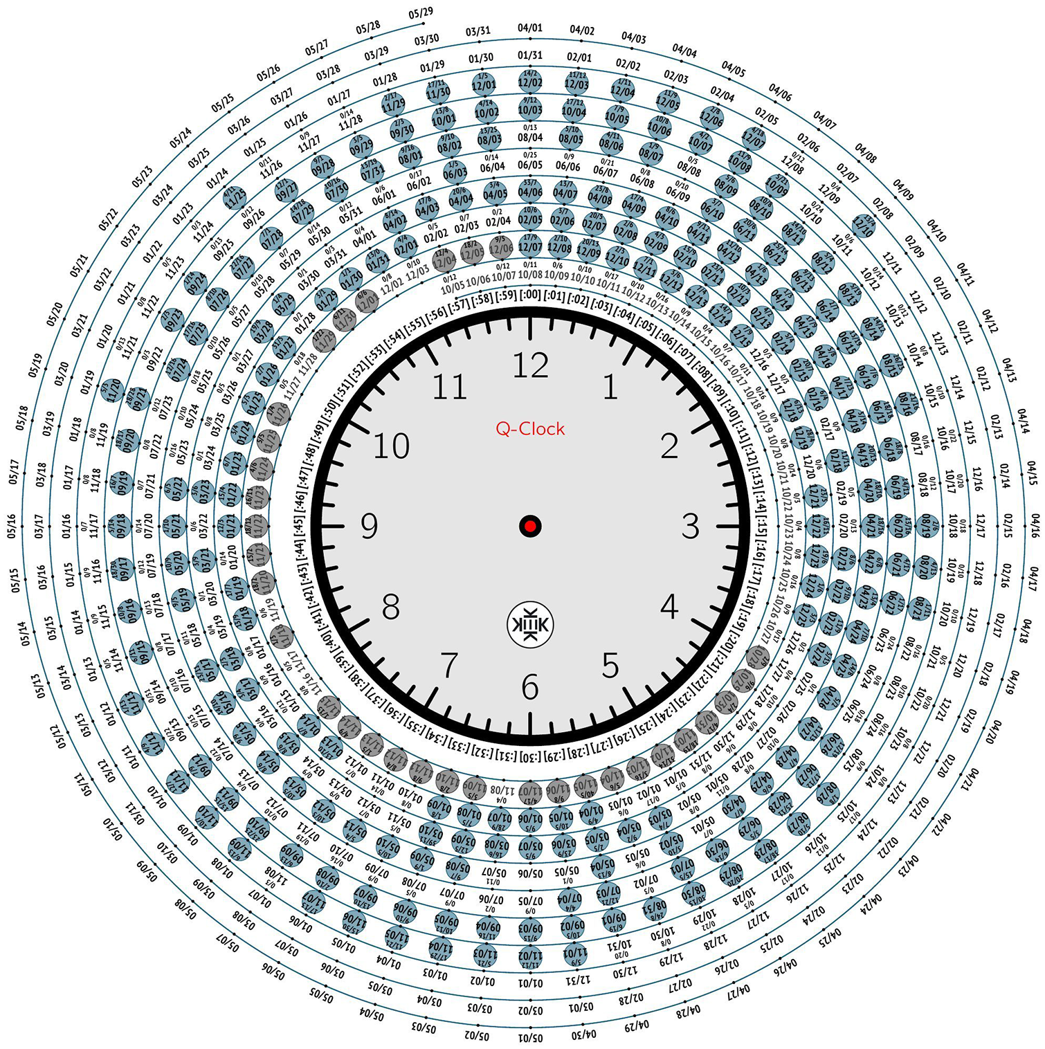
Q Clock (blank) (How to read the Q clock, 2019).
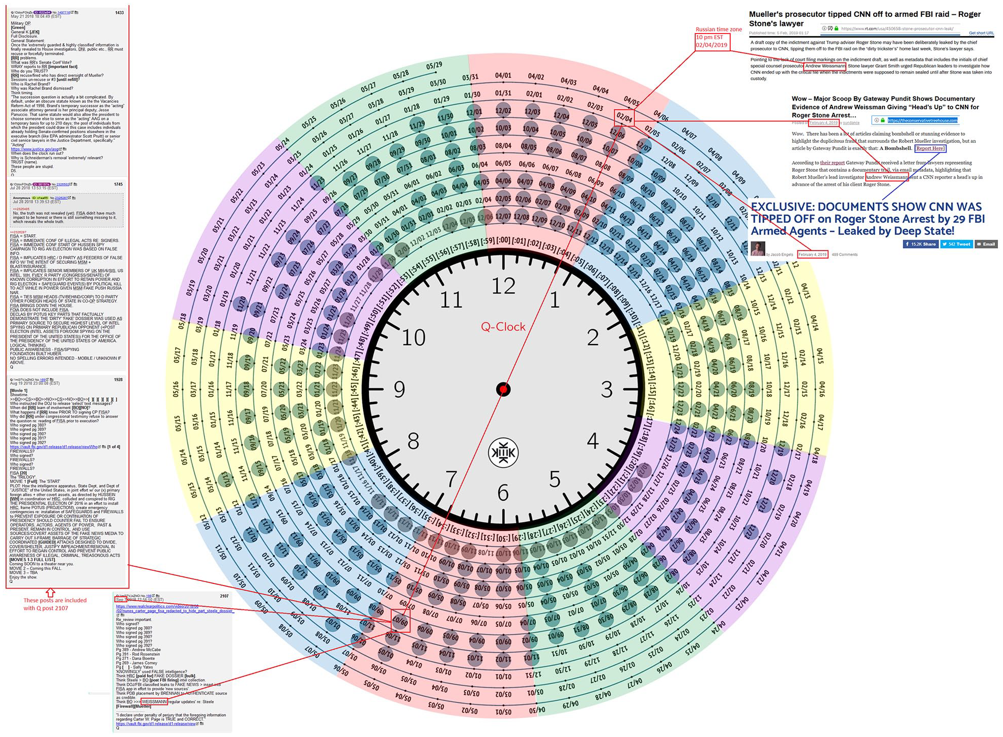
Q Clock (in use) (How to read the Q clock, 2019).
Such temporal mapping is meant to help anons navigate the increasingly complicated world of Q’s posts and position them on the timeline of current events leading inexorably to the Storm and the Great Awakening. By triangulating Q posts about a topic using the clock, anons gain insight into the longue durée of Q’s cryptic missives and navigate the epistemological coordinates and logic of multiple posts over time. Because the authenticity of QAnon rests on Q’s “proofs”—events predicted to unfold—as evidence that the Storm is coming, and because such evidence is designed to be unearthed rather than given, such devices as the Q Clock represent a powerful, crowd-sourced, interactive form of information visualization. 17
The sheer complexity and scale of such maps, clocks, and graphics are meant to signify the scope of the conspiracy and provide evidence of the linkages and connections for newcomers. Because these visual artifacts are so expansive and detailed, they suggest a certain potentiality for those sympathetic to the ideas. Conspiracy theories rely on such informational structures to combat the skepticism of opponents, and the capacity of social media to share and build such theories has only accelerated the growth of vast, complicated visualizations masquerading as authoritative truths. More importantly, the existence and consumption of these visualizations lend authority to the data collected and curated by anons. The maps and clocks provide an interpretation of the random data such that they become information, but such information is a structural illusion of totality. The actual data which are structured into these visualizations are disconnected from one another except within the symbolic structure of QAnon while suggesting a larger truth waiting to be discovered. In the information age, in which everything is connected, such “truths” are not hard to find.
Conclusion
In many ways, QAnon is the logical output of our information age, predicated on the same technological determinism and belief in patterns underlying the whole. Just like big data, QAnon is organized according to the principle that enough information will reveal the patterns, the connections between everything. As one recovering anon articulated, conspiracy theories
provide a sort of moral framework, they provide meaning, community, belonging, ego boosting, and answers to sometimes good questions. They are a sort of Mega Belief that rests on multiple separate pillars thus no one single pillar falling is enough to topple it. (Ex-QAnon, 2021)
Conspiracy theories have existed since we have had societies, but QAnon represents something new, a fusion between the paranoid search for hidden patterns and the capacity for massive data gathering and information visualization. And while such visualizations may not be effective at accurately representing “real-world” data, they are highly effective at lending credence to the theory, of “substituting signs of the real for the real itself” in Baudrillardian terms (p. 4). The representation of data through maps and clocks provides the stamp of authenticity to the very theory that produced them, forming a “conspiracy of data” designed to promulgate a reality that seems real through its very process of signifying its existence while exposing Americans to bad information. The capacity for building such visualizations has also enabled anons to disseminate the theory more quickly with a broader audience and, although QAnon seems unlikely to survive Trump’s defeat in the 2020 elections, there is no doubt that the underlying conditions of possibility will produce new, ever more dangerous movements.
Even as we understand the contours of QAnon’s application of information visualization and informatics, we have little recourse to combat it effectively at scale. Efforts to expand media/information literacy so that the general public gains the critical-thinking skills necessary to debunk conspiracy theories like QAnon seem to have little effect on the need to believe, the faith in something larger than one’s self in a time of great uncertainty. As Cairo (2020) points out, The expansion of information visualization in society therefore requires a new kind of literacy if it is to enable citizens to act in informed and critical ways. It also requires the assessment of information visualization’s role in democracy, and the reassessment of democratic theory in light of developments in information visualization. (p. 25)
Cairo’s diagnosis that we need new kinds of literacy to keep pace with our information age is particularly striking as we navigate increasingly dangerous crises such as the COVID-19 pandemic (and future pandemics), global climate change, the rise of militant white supremacy, and the increasingly bizarre and hostile world of the Internet. But what will such literacies look like? To be effective, will such training become part of our national civic experience? And how can we extend such literacy beyond the halls of academia? These are questions that need to be answered as we contemplate future occurrences of online cults like QAnon.
One thing is certain. QAnon is an instantiation of a particular infrastructure, a particular media ecosystem, in which individuals remain anonymous and post anything they want, and this environment is not going away. While QAnon may or may not survive Trump’s loss in 2020—and I predict it will survive or mutate in some capacity—new versions of it will certainly appear because such movements give people a sense of belonging and purpose. In an age where people are becoming increasingly desperate due to the failures of neoliberal capitalism and the American state, joining a secret group of online warriors who can see the big picture, help expose the corruption, and drain the swamp is very attractive to many. Efforts to control or police online speech seem misguided when the problem is so much vaster than that, a cultural malaise brought about by the collapse of existing norms and authority. And this will only get worse in the aftermath of the pandemic, which has revealed the limits of State intervention. We must evolve our capacity to delineate data and information, debunk bad information, understand the difference between news and memes, recognize irony and satire, and critique information visualizations. Humans are shockingly bad at the Internet as though we learned to run before we could walk. And this will only produce new, ever more dangerous QAnons.
Footnotes
Declaration of Conflicting Interests
The author declared no potential conflicts of interest with respect to the research, authorship, and/or publication of this article.
Funding
The author disclosed receipt of the following financial support for the research, authorship, and/or publication of this article: Publication of this article was funded in part by Purdue University Libraries Open Access Publishing Fund.