
Abstract
Background
Governments across the World Health Organization (WHO) European Region have prioritised dashboards for reporting COVID-19 data. The ubiquitous use of dashboards for public reporting is a novel phenomenon.
Objective
This study explores the development of COVID-19 dashboards during the first year of the pandemic and identifies common barriers, enablers and lessons from the experiences of teams responsible for their development.
Methods
We applied multiple methods to identify and recruit COVID-19 dashboard teams, using a purposive, quota sampling approach. Semi-structured group interviews were conducted from April to June 2021. Using elaborative coding and thematic analysis, we derived descriptive and explanatory themes from the interview data. A validation workshop was held with study participants in June 2021.
Results
Eighty informants participated, representing 33 national COVID-19 dashboard teams across the WHO European Region. Most dashboards were launched swiftly during the first months of the pandemic, February to May 2020. The urgency, intense workload, limited human resources, data and privacy constraints and public scrutiny were common challenges in the initial development stage. Themes related to barriers or enablers were identified, pertaining to the pre-pandemic context, pandemic itself, people and processes and software, data and users. Lessons emerged around the themes of simplicity, trust, partnership, software and data and change.
Conclusions
COVID-19 dashboards were developed in a learning-by-doing approach. The experiences of teams reveal that initial underpreparedness was offset by high-level political endorsement, the professionalism of teams, accelerated data improvements and immediate support with commercial software solutions. To leverage the full potential of dashboards for health data reporting, investments are needed at the team, national and pan-European levels.
Keywords
Introduction
Governments, as the stewards of healthcare systems, have the chief responsibility for protecting and promoting the health and well-being of the population. 1 The stewardship role includes collecting and reporting relevant information and supporting its use as performance intelligence by all health system actors, including the general public.2,3 This task has taken on new pertinence in the context of a public health emergency such as the COVID-19 pandemic.4–7 Governments worldwide have prioritised tools for delivering pandemic-related information, most often through the development of public web-based dashboards.8,9
Dashboards can be characterised as dynamic, visual displays of key performance indicators, arranged on a single screen for viewing at a glance.10–12 The ubiquitous use of dashboards as public reporting tools during a pandemic is a novel development13,14, but the use case for dashboards in a pandemic is clear. Contrary to static reporting, through their dynamic nature, they iterate content and its display daily, evolving with the stages of the pandemic. 15 By design, dashboards can manage large datasets and this, together with their near real-time reporting capabilities, makes them highly responsive to the information urgency in a pandemic. 8 And, when paired with geographic information system (GIS) and interactive drill-downs, dashboards are critical for local monitoring, reporting and decision making. 12
In the health sector, dashboards have traditionally been used for internal purposes, assisting managers in strategic and operational decision making, particularly in hospitals 16 and supporting clinicians in clinical care and quality improvement. 11 There are also notable examples of public web-based dashboards for international health system benchmarking.17–22 In contrast to COVID-19 dashboards, these have traditionally not been updated in near real-time. Previous studies have explored optimising the design of dashboards in healthcare, 10 their effects on quality in clinical practice 11 and their development and implementation cycles.15,23 In the context of the COVID-19 pandemic, scientific accounts have documented the technical development of dashboards9,24–28 and their applications in clinical practice.29,30 From a healthcare performance intelligence perspective, our research group HealthPros 31 has conducted international comparative research on COVID-19 dashboards, exploring features common to highly actionable dashboards 32 and their evolution over time.33,34
In this context, there are two critical gaps in the available scientific evidence. First, describing the processes of developing COVID-19 dashboards over the course of the pandemic's first year has predominately focussed on individual, anecdotal country accounts (e.g.35–38). While these provide some insight into the process, scientific methods to describe their development remains needed, offering critical historical intelligence for the future. Several systematic approaches to capture pandemic experiences have already been published, offering important insights from the perspective of healthcare providers,39–41 patients42,43 and the general public.44–46 Second, the anecdotal evidence and our previous COVID-19 dashboard research signal a gap in cross-country collaboration in the development process. This is despite the presence of several international actors (e.g. World Health Organization (WHO), European Centre for Disease Control and Eurostat) that have led initiatives for multi-country COVID-19 surveillance. The absence of established cross-country exchanges suggests there is untapped potential for the sharing of experiences and learning between countries.
Objective and research questions
To support governments during the current pandemic, and to better prepare for future health threats as well as for other potential uses of dashboards, our research group set out to conduct a multi-country study on the process of developing COVID-19 dashboards across Europe and Central Asia. To do so, we partnered with the WHO Regional Office for Europe, a key convening actor in the region and counterpart of our targeted health system stewards. With this aim, our study was guided by two research questions: (1) How can the development process of COVID-19 dashboards during the first year of the pandemic be described from the perspective of the teams responsible for development? (2) What common barriers, enablers and lessons can be derived from their experiences?
Methods
Design
The study adheres to the Consolidated Criteria for Reporting Qualitative Research. 47 To retrospectively examine the development process, we undertook a series of semi-structured group interviews with COVID-19 dashboard developer teams across the WHO European Region. We employed multiple methods to identify and recruit dashboard teams, using a purposive, quota sampling approach. Group interviews in the local language of teams, to the extent possible, provided rich, collective team reflections on experiences with the process. 48 To address our research questions, we adapted an approach previously developed by the study team to describe and assess the actionability of COVID-19 dashboards. 32 We also drew on the findings of prior COVID-19 dashboard research to help determine the characteristics and features to explore 32 (Table 1).
Overview of characteristics and features explored.

The study team included researchers from HealthPros and WHO European experts on health data. The multinational nature of the study team ensured broad and complementary expertise on contexts, research, policy and subject matter. Team members conducting interviews (four women and six men) had previously researched COVID-19 dashboards.32,49 They were trained in health services research and had prior research and professional experience in countries of the WHO European Region. Interviewers were collectively proficient in 13 languages used in the WHO European Region.
The research protocol was developed in accordance with the ethical requirements of our primary research base, the Amsterdam University Medical Centre affiliated with the University of Amsterdam. Participants provided written consent during the recruitment stage and verbally restated their consent at the start of their interview. Confidentiality was assured by assigning each participating dashboard team a random code (e.g. D1) and removing identifying information from verbatim quotes used throughout the paper.
Sample of dashboards and informant recruitment
We defined our target sample of COVID-19 dashboards using five criteria: (1) reporting of key performance indicators related to the pandemic; (2) use of some form of visualisation; (3) public availability in a web-based format; (4) reporting at national level within the WHO European Region; and (5) development by a governmental organisation or appointed authority. To maximise the generalisability of our findings, we set out to recruit a geographically representative sample of COVID-19 dashboards from the region's 53 Member States. We applied the country subgroups from the WHO's European Health for All database 50 and set a target of 50% representation within each: European Union (EU) members before May 2004 (EU15) (n = 15); EU members after May 2004 (EU13) (n = 13); Commonwealth of Independent States (CIS) members (n = 12); and other European Region countries not included in those groups (n = 13).
To identify COVID-19 dashboards, we consulted the affiliated country data sources of the international COVID-19 Situation Dashboard of the WHO European Region 51 as well as the sample from our previous COVID-19 dashboard work. 32 Additionally, we manually web-searched national and governmental COVID-19 webpages. Our target informants were referred to as dashboard teams, specified as members of core teams directly involved in developing and managing national COVID-19 dashboards, ideally right from their inception.
Following the identification of appropriate dashboards, we used multiple methods to recruit dashboard teams for interviews. In cases where contact details were listed, teams were reached directly via email and/or through social media (Twitter, Facebook and LinkedIn). Alternatively, where no direct contact was publicly available, we applied a snowball approach, soliciting the advice of existing networks on health information systems across Europe, including country focal points of the European Health Information Initiative (EHII) 52 and the Population Health Information Research Infrastructure (PHIRI) project, 53 as well as other experts known to the study team. To further the recruitment process, the WHO together with the study team, organised and hosted a public webinar in March 2021, convening EHII and PHIRI focal points, at which the study protocol was presented. Approximately 45 participants attended and, when appropriate, bilateral contacts were made by the study team. For countries in which these methods did not result in direct contact with dashboard teams, support from WHO Country Offices was obtained to contact their respective ministries of health, informing them of the study and soliciting participation. During correspondence with all prospective informants, an overview of the study was provided in English or Russian (online Supplemental material). When possible, correspondence took place in the local language.
Data collection
A detailed interview guide was developed by the first authors (EB and DI) and reviewed by the study team. Once finalised, a training session for interviewers was organised to calibrate the interview process. Interviews consistently explored two main themes: (1) the dashboard's development and (2) reflections on the process over the course of the first year of the pandemic (Table 1). A brief version of the interview guide was prepared in English and Russian and provided to informants in advance of the interview (online Supplemental material). A structured pre-interview process was developed for interviewers to familiarise themselves with the corresponding dashboard. For this, we adapted our descriptive COVID-19 dashboard assessment tool 32 and approach to scoring a dashboard's actionability.
Between April and June 2021, 60-minute semi-structured group interviews were conducted with participating dashboard teams, either virtually or in person. Dashboard teams were assigned to interviewers based on their language and context expertise. Interviews were conducted in pairs (a lead interviewer and a second team member), where language competencies were allowed and provided that the lead interviewer was not the first author (online Supplemental material for the distribution of interviewers and languages used). With the agreement of informants, interviews were recorded, transcribed verbatim and, when necessary, translated to English. Transcripts were made available to informants upon request Interview data were stored by the first authors. Fortnightly meetings were organised for interviewers to exchange impressions on the process and to update themes.
Data analysis
The first authors analysed the translated interview transcripts to identify descriptive and explanatory themes using elaborative coding 54 and thematic analysis 55 in an Excel tool developed in the approach set out by Meyer and Avery. 56 The analysis process included familiarisation with the data, development and piloting of a coding framework, independent coding, peer review, mapping and interpretation of results. The coding framework was aligned with the research questions and was developed based on the characteristics and features (Table 1) of the semi-structured interviews (level 1). Additional themes (level 2) were generated through open (unrestricted) coding. The first authors independently coded three test transcripts each, then collaboratively reconciled and revised their coding. The approach was reviewed and discussed during the piloting phase with two other study team members (NK and DK) and an external qualitative researcher. The transcripts were divided between the first authors for independent coding.
Once coding had been peer-reviewed by the second coder, and reconciled by the first, a consolidated dataset for analysis was developed. For analysis of the dataset, the characteristics/features explored were divided equally between the first authors for re-reading, mapping and interpretation. In this process, we iteratively noted recurrent themes, as well as outliers. For reporting on the results by the research question, verbatim quotes were extracted from the transcripts. To ensure the validity of the findings, we employed different techniques, including researcher reflexivity, debriefing with all interviewers and reviews by the full study team. Additionally, validation of the findings with informants was organised through a virtual workshop, again hosted by the WHO and attended by 55 study participants in June 2021.
Results
Sample of participating COVID-19 dashboards
Five WHO European Region Member States (5/53, 9%) did not have an applicable dashboard at the time of sampling. Three COVID-19 dashboards from non-members, yet representing territories within the WHO European Region, were identified through our sampling and included during the recruitment stage (Figure 1).

Geographic representation of participating COVID-19 dashboard teams.
In total, 33 dashboard teams participated in the study; see online Supplemental material for direct links to each dashboard. The dashboards represented 31 out of 53 WHO European Region Member States, and 65% (33/48) of total Member States with eligible dashboards (Figure 1). Seventeen Member States (17/48, 35%) were unreachable, unavailable or uninterested in participating. We met our target for representation in all but one regional subgroup, the CIS countries, where a quarter of Member States did not have an applicable dashboard (3/12, 25%). Overall, participation rates of eligible dashboards by subgroups ranged from 83% (10/12) of EU13 countries to 73% (11/15) of EU15 countries, to 57% (8/14) of other countries or territories and to 44% (4/9) of CIS countries.
Interviews engaged a total of 80 informants (45 men and 35 women). On average, two informants per dashboard were interviewed (range: 1–8), with three or more informants contributing to 42% (14/33) of dashboard teams. Two dashboard teams provided written responses and two others required a second interview to finalise data collection. One informant was directly involved in the development of two dashboards. Interviews were conducted in eleven languages (online Supplemental material).
Description of the development process
Responsible organisations, teams and launch: The development of dashboards was initiated predominately by high-level officials, namely a country's health minister, prime minister or president. Units of government or ministries of health (16/33, 48%) or national public health institutes (12/33, 36%) were mostly appointed to lead their development (see online Supplemental material for a listing by country/territory). In a few cases, governments appointed other organisations (5/33, 15%), such as NGOs, private companies or academic institutions, to develop the national dashboard, typically due to resource constraints. An awareness of the Johns Hopkins COVID-19 dashboard 57 and other national COVID-19 dashboards was often cited in connection with the initial request.
The launch dates of participating dashboards were in three main time periods (listed in online Supplemental material): February to May 2020, the first months of the pandemic (24/33, 73%); late 2020, in parallel to the pandemic's second wave across Europe (6/33, 18%); and early 2021, in connection with vaccination campaigns (3/33, 9%). Dashboards launched after the first months of the pandemic shared similar challenges, often data constraints or issues in identifying a responsible organisation. The unprecedented speed and workload involved in launching dashboards was a recurrent theme across teams. Many could vividly recount the initial days, recalling the level of uncertainty that characterised the process. As one informant remarked, ‘We were flying the plane as we were building it’ (D31).
While some teams had prior experience with developing dashboards for internal use, most had never worked on dashboards intended for public reporting. Where possible, internal teams of data management units were re-purposed or new internal teams formed. Often, non-COVID-19 activities were paused. For a quarter of dashboards (8/33, 25%), external teams were contracted to develop the dashboard. In two instances these teams worked on a volunteer basis. Most teams started small, typically with one or two persons, though growing with time to about three to five core persons, and in some contexts, to more than twenty. The importance of multidisciplinary teams was emphasised, involving epidemiologists, public health specialists, information technology professionals, data analysts, policy experts and administrative staff. As teams expanded, additional expertise engaged included business intelligence and analytics experts, GIS specialists, user experience researchers and communication professionals. Support received from private front-end dashboard software suppliers was described as a critical addition to teams, especially in the early stages following the launch.
Aims, users and content: The dashboards were depicted as a vehicle for informing, but also as a tool for partnering with the public to ‘achieve greater participation of people in fighting the pandemic’ (D9). Specific aims and target users were often implied rather than explicitly defined, with many citing the ‘chaotic’ (D2) period that characterised the initial phase as a cause for this. Above all, the dashboards targeted the general public, though no dashboard team described having direct or formal contact with the public in the early development stage. Time constraints were consistently cited as the cause for this: ‘We would normally have done some user engagement to understand user needs, but the pace and expectation and demand to get the information out was so high’ (D31). Other target users included national, regional and municipal officials, health professionals and the media.
In the early stages following a dashboard's launch, the monitoring of user analytics was not pursued, for one common reason: ‘there wasn’t time for deep analysis of user behaviour’ (D1). The intensity of the dashboards’ use was described as an effect of high expectations and ‘insatiable demands [for data]’ (D8), new requests, and questions. While internal feedback mechanisms to dashboard teams were well established, with dedicated pandemic crisis management teams or committees meeting daily, a structured process to manage feedback from the general public was largely absent. Communication teams were described as playing an important role in triaging such comments, predominantly received via email and social media. However, the core dashboard team was typically tasked with providing technical replies – a demanding task was given the magnitude and the work pace.
Most dashboards (27/33, 82%) reported two or more types of content, most often data on spread and death, on health systems or on vaccination (online Supplemental material). More than half (21/33, 64%) had added vaccination data by late 2020 or early 2021, either as new tabs or as separate dashboards. The latter were typically attributable to one of three reasons or a combination: (1) a different organisation was mandated to coordinate and report on vaccinations; (2) existing or new data collection infrastructure for vaccinations differed from the epidemiological system; and (3) a different software solution was used. Beyond the addition of vaccination data, major changes were usually avoided, due either to lack of time or to concerns about reactions from a public accustomed to the dashboard and trusting the original version.
Data sources and breakdowns: ‘In the beginning, there were Excel spreadsheets’ (D24). Many recounted similar intense manual data processing, especially countries or territories with more decentralised, less digitised information systems. The availability, completeness and quality of data ultimately played an important role in determining what indicators could be reported, especially in the initial stages. Many described the trade-off between speed and quality, facing intense demands to publish data in near real-time. This challenge intensified as the volume of data points increased with time. As one informant recounted, ‘Our data are usually ready for deployment 15 to 25 minutes before 4:00 p.m., which is the time at which we usually deploy the data. So we have that much time to curate 40 million records’ (D10). Choosing to report open data was a political decision, typically made with a view to ensuring full transparency. More than half of the dashboards reported open data (21/33, 64%), meaning full datasets could be directly downloaded from the webpage (online Supplemental material). Some went so far as to completely democratise their reporting: ‘The prime minister of [country] sees the data at the same time as the guy down the road’ (D10).
Data protection rules influenced a number of dashboard features, including what indicators were reported, data sources used and the geographic and population breakdowns applied. Clearances about what could be published reportedly caused delays, as one dashboard team noted in reference to vaccination data: ‘We have had it ready for months, but right now the lawyers are debating, writing back and forth with the ministry’ (D16). Fear of exposing personal health data was a repeated issue, with different interpretations of the lowest level of granularity when reporting cases locally, such as groups ‘larger than 20’ (D16), ‘smaller than 10’ (D2) or ‘no less than 5’ (D19).
Many reported that there was great interest in breaking down data to local or municipal levels. This became increasingly relevant with the progression of the pandemic, as infection control measures were being introduced subnationally. Possibilities to report data more locally also improved with time, as data collection processes became increasingly automated and of better quality. Persisting challenges included protecting the privacy and ensuring that declining numbers were not universally interpreted by the public as low levels of risk. Resolving issues of incomplete denominators was also faced by some teams, which described outdated census data and challenges in recording migrants, undocumented persons and seasonal workers. Beyond geographic breakdowns, disaggregations by age and gender were common, but the use of ethnicity- and race-related data and socioeconomic status breakdowns were generally not pursued. In some cases that was due to a lack of data, but more often it was a political decision. Specifically, some informants reported uncertainty about its relevance for decision making in the general public and fears of provoking discrimination.
Data display, interpretation and visualisation: Dashboard teams relied on front-end dashboard display solutions either developed in-house (14/33, 42%) or commercially available (19/33, 58%). Most started with commercial solutions (21/33, 64%), typically ArcGIS™ by Esri (11/33, 33%), which had a ‘COVID dashboard module’ by early March 2020 (online Supplemental material). Selecting a commercial solution was determined by a range of considerations: a team members’ previous experience with the software, which eased the learning curve; available free of charge (often for a limited period), meaning that public procurement processes could be avoided; proactive outreach and support by vendors; comparison with solutions used by other countries; and technical considerations, such as the degree of automation. Despite the speed-to-launch advantages of commercial solutions, they often posed limitations in terms of available templates and customisation. Most notably, the software selected was described as limiting the range and types of visualisations and multilanguage capabilities. Additionally, most commercial solutions were cloud-based, which was described by some as suboptimal, predominately due to data security concerns. For such reasons, four dashboard teams (12%) switched software over time.
Many described the task of visualising data in a clear, understandable way as a challenge. Incorporating policy measures in order to explain data trends was seen by some as beyond their function of reporting facts. Providing detailed explanations and interpretations of the data were rather left to the media or to what were described as ‘data enthusiasts’ (D24) among the public. The dashboard was often part of a larger COVID-19 data and reporting ecosystem. Supplementary reporting efforts, mostly through static weekly situation reports, typically included additional indicators and more sophisticated analytics. These reports accommodated more text than the dashboard, making detailed explanations of data possible.
The dashboard teams described the importance placed on preparing simple, easy-to-understand and interactive visualisations. In the early stages, visualisations were often not prioritised, as one developer described: ‘I can imagine maybe hundreds of other ways to visualise data describing the COVID-19 situation. Unfortunately, because of lack of time, we decided to implement only the simple versions’ (D1). Maps were consistently used to present local information, though privacy considerations also influenced visualisations, with some describing the challenge of avoiding the suggestion that specific addresses were sites of cases and outbreaks.
Future plans: In discussions of what is next for COVID-19 dashboards, four non-mutually exclusive scenarios were identified: (1) continuing to update existing dashboards, though less frequently over time; (2) further developing content (e.g. on vaccines and wastewater studies), data management (e.g. automation, quality and open data), design (e.g. visuals and organisation) and user elements (e.g. low literacy levels and user behaviour studies); (3) exploring non-COVID-19 uses of dashboards for monitoring other communicable diseases (e.g. influenza) and registry data (e.g. cancers); and (4) preparedness planning, including investing in centralised data warehouses, in-house dashboard teams, coordinating across European countries and exploring alternative server and software options.
Barriers and enablers
Six main themes and fifteen subthemes were identified as recurrent barriers for some dashboard teams, yet enablers for others. These are briefly described and listed in Table 2a and b.
Summary of themes and illustrative quotes describing barriers.

Summary of themes and illustrative quotes describing enablers.
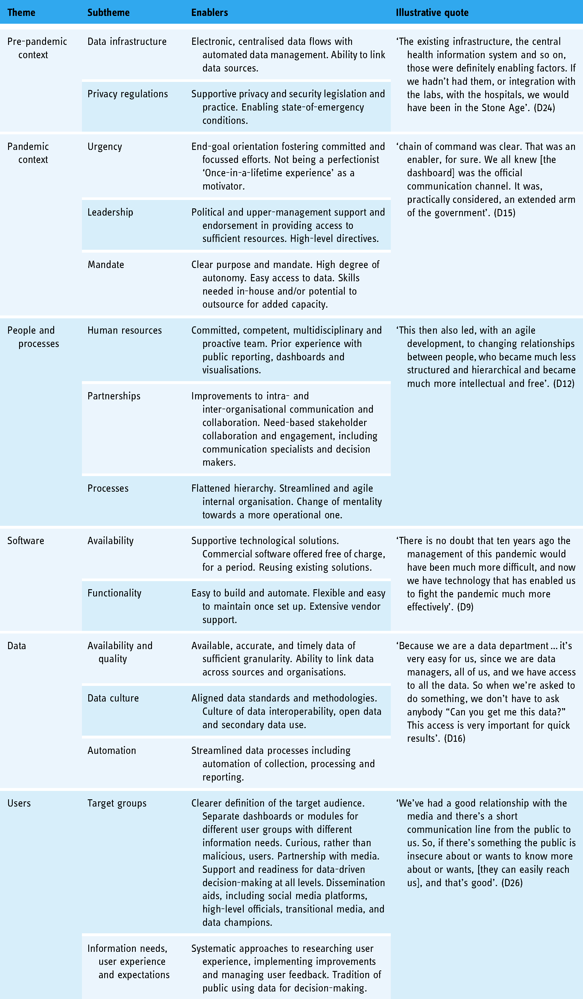
Pre-pandemic context: The existing data infrastructure was a major challenge facing some dashboard teams, exposing the limitations of traditional data collection and processing for near real-time dashboard reporting. In contrast, teams working in settings with more advanced data systems and a culture of data use and reuse credited this as a contributor to their success. Similarly, some described the challenge resulting from highly decentralised data structures and processes, which contributed to a lack of clarity around data ownership and custodianship. The limited level of preparedness for handling privacy regulations was a key barrier for some, whereas prior experience with interpreting privacy and security legislation in the context of public reporting was an enabler for others.
Pandemic context: For most teams, a chronic lack of time caused by the pandemic's urgency and the demand for publishing near real-time data meant that other needs such as analysing user behaviour, managing feedback, improving visualisations and engaging across stakeholders became secondary. However, some teams did cite the constant urgency of the pandemic as an incentive for streamlined processes and end-goal orientation, which in turn fostered committed teams and focussed efforts. The political context, including changes in leadership positions and the content demands of high-level decision makers, was highlighted as a barrier for some. An additional barrier was for some a lack of a common understanding of the purposes and audiences of dashboards and their position in the COVID-19 data ecosystem. Contrary to that experience, some teams credited high-level political endorsements for the development of national COVID-19 dashboards as a key enabler, providing ample resources and direction, yet autonomy, to the teams developing them.
People and processes: Seven-day work weeks, an immense workload and shortages of competent specialists hindered the development of dashboards in the experience of some teams. So did bureaucratic processes, including those involving partnering with stakeholders, accessing and linking data and public procurement. Others, however, considered assets such as having experienced data dashboard and business analytics teams in place, working across departments and organisations and engaging new team members with necessary competencies to be enabling factors. Flattening hierarchical structures and streamlining processes to facilitate decision making were also seen as playing supporting roles.
Software: Front-end dashboard software solutions occasionally impaired the development of dashboards, according to some teams, due to their limited visualisation potential, lack of multilanguage functionality and other customisation options, or prohibitive pricing. For others, the reuse of existing, in-house-developed data analytics and dashboard tools (where available) provided more flexibility. If in-house options were not available, some teams described commercial software as an aid to accelerating the launch of dashboards. Some software vendors waived initial fees and provided direct support at the outset, and this was cited as a key enabling factor.
Data: Publishing reliable, accurate, consistent and timely data proved challenging for many dashboard teams. Agreeing on data standards, including daily cut-off times, and the absence of granular data needed for reporting close to home and broken down by different population subgroups, were described as key hindrances. Conversely, the availability of interoperable data, coordination across data custodians, existing data and methodology standards and cultures of secondary data use and open data publishing were cited by others as benefits.
Users: Managing users was described by some teams as a critical challenge, who recounted intense scrutiny over the content of dashboards, issues of user misinterpretation of data and negative reactions to mistakes or modifications. Some teams also detailed high expectations from users (e.g. for real-time reporting), challenges in explaining methodologies (e.g. to lay audiences) and a lack of systematised processes to handle user feedback. For others, having clearly defined target audiences, knowing their information needs, engaging with media outlets, systematically improving user experience and handling feedback was a way of partnering with users, and hence an overall advantage to the process. Transparency on methods, and acknowledging mistakes that inevitably happen at this volume and speed of work, were perceived as enablers.
Lessons learned
When informants were asked to consider, with the benefit of hindsight, what dashboard teams would have done differently or what advice they would offer others to best prepare for public reporting in the context of a crisis, five recurrent themes were identified. One theme was the importance of simplicity – reporting only essential information, prioritising content that can be easily interpreted and supported by explanations. The second was the importance of trust. Teams described the inevitability of errors, given the urgency and volume of data, and the importance of disclosing errors as they happen. Using open data and prioritising data security and privacy were also important lessons for building user trust Third, the necessity of working in partnerships was emphasised – working in agile and collaborative ways with system leaders as well as across in-house units, with other stakeholders and with the target audience. A fourth theme was the importance of software and data. While this was intuitive and recognised at the outset, teams were continuously confronted with the parameters set by the software chosen and were reminded of the importance of automating processes and investing in quality data. The last theme was about confronting the truly dynamic nature of dashboards, finding ways to learn from others in order to improve, adapt to the stages of the pandemic and embed dashboards within other reporting modalities. Recurrent themes, lessons learned and representative quotes are summarised in Table 3.
Summary of lessons learned, recurrent themes and representative quotes.

Discussion
In this study, we retrospectively explored the development of COVID-19 dashboards over the first year of the pandemic across the WHO European Region. It is a geographically vast region, comprised of countries and territories with widely differing population sizes, health information systems at varying stages of development,59,60 and diverse data and administrative cultures and traditions, 4 among other key differences. Nonetheless, we encountered more similarities than differences in the development stories related to the 33 national COVID-19 dashboard teams we met with. The factors that hindered or facilitated the development process, and the resulting lessons learned, also shared many commonalities.
COVID-19 dashboards were developed across the region, albeit with little cross-national cooperation
The overall speed with which governments requested the development of public-facing COVID-19 reporting reflects the WHO European Region's tradition of prioritising good governance. 61 Even so, the ubiquitous use of dashboards for delivering COVID-19 data was driven more so by an international ripple effect than by the activation of pre-existing emergency response plans. The wide uptake of dashboards appears to have been triggered by early adopters (e.g. 9 ) and sustained by a proactive commercial software vendor market. In that light, the observation by Bouckaert et al. 4 that ‘coping with the crisis has been first and foremost an issue of the national states, whereas the European voice has been weak’ likewise holds true for COVID-19 public reporting tools, including dashboards. To foster more pan-European collaboration, the convening role of international actors needs to be leveraged. That could advance a common approach to public reporting using dashboards and an exchange of lessons across contexts.
Data behind dashboards is crucial, but so are visual presentations and data interpretation
Dashboards feed on relevant, quality data. In the literature, data sources are cited as an essential aspect of dashboard development.15,62,63 Initially, national health information systems struggled to provide accurate, timely data for COVID-19 dashboards – a key challenge also reported by other observers.14,64,65 Our findings signal the need for continued investment in national-level health data sources that are integrated and interoperable, and in digital infrastructure that spans systems of secondary, primary and social care. 14 Preparedness to tackle data privacy and security issues, including practical applications of the General Data Protection Regulation (GDPR) in EU contexts, needs further prioritisation, with the guiding aim of reporting data in ‘proportionate, ethical and privacy-preserving’ ways. 14 Cross-national efforts like the European Health Data Space 66 may advance the development of common data standards, indicator sets and methodologies, thus enhancing both national and pan-European reporting.
While dashboards are an important communication tool, they are, like other digital technologies, 14 not a silver bullet. Previous research has emphasised that the features of dashboards must fit their intended purposes. 15 The actionability of data for end users depends on how clearly and understandably the information is communicated.67–69 We observed differences in the extent to which teams were exploring, discussing and defining their dashboards’ purposes. Some saw the purpose as solely presenting data (raw numbers) for the public to interpret on its own; others endeavoured to provide explanations using narratives or visual methods. As reported in other studies, the ways in which information is presented may affect not only the subjective perception but also the objective comprehension of the information.11,70,71 Systematic approaches to exploring user needs and use patterns are necessary if dashboards are to bridge the gap between mere managerial tools and full-fledged public reporting devices.
Dashboards seem to be ‘here to stay’ for monitoring and reporting
The interviewed teams agreed that dashboards – as well as other near real-time, web-based, interactive and visual reporting tools – are the likely future of public reporting. COVID-19 dashboards have served to demonstrate how much can be achieved with limited resources and in high urgency. They also serve to flag imminent areas for improvement and to spot new challenges like potentially harmful misinformation. 72 Running dashboards in the longer term will likely include further expanding their policy, public health and clinical use into areas such as resilience and recovery plans, 73 late complications of COVID-1974–76 and its influence on specific populations and patient groups, such as people living with HIV 77 or diabetes,78–80 but also non-COVID-19 monitoring, like on cancer, seasonal flu and patient safety. More research is needed into the implementation and management costs of the long-term and extended use of dashboards. Past studies have warned that such costs could be prohibitive.15,16 These were managed (or avoided) during the pandemic through the mobilisation of emergency resources. Ultimately, the continued and expanded use of dashboards will require more intentional resource planning and investment.
Strengths and limitations
Working in partnership with the WHO gave us unique access to the targeted teams from COVID-19 dashboards associated with the national government. The diverse composition of our research team enabled the use of an extensive range of languages during data collection, thus aiding both informant recruitment and the richness of exchanges during the actual interviews. The study captured COVID-19 dashboards at a critical point in their development: teams were actively improving and making adjustments to their dashboards at the time of the interviews. Hence, teams were still deeply immersed in their dashboard work and had little difficulty recalling the processes that took place over the previous year.
We acknowledge several potential limitations. First, the size and composition of core dashboard teams varied across countries or territories, causing some variability per dashboard in the profiles and numbers of informants and, ultimately, in the nature of their experiences. Second, although group interviews stimulated joint reflections across teams and thus enriched data collection, such an approach could have also induced group pressure resulting in socially desirable responses. Third, the findings are a snapshot of the initial year of the COVID-19 pandemic and may not reflect the later stages of the pandemic. Lastly, the study encompassed national, government-associated COVID-19 dashboards in the WHO European Region, and findings may not be generalisable to the experiences of subnational dashboards or of other types of developers, such as academia, independent initiatives, media outlets or industry. They may also not apply to other regions globally, and in particular to low-income countries.
Conclusion
The study revealed more similarities than differences among the 33 participating COVID-19 dashboard teams from across the WHO European Region. The learning-by-doing approach described by the teams reflects the novelty of the use of dashboards as tools for public reporting during a pandemic. The experiences of the dashboard teams show that initial underpreparedness was compensated for by high-level political endorsement, the teams’ own professionalism, accelerated data improvements and commercial software solutions. Recurrent barriers and enablers deriving from the pre-pandemic and pandemic contexts, from people and processes and from software, data and users should inform future investments, both in dashboard teams and at the national and pan-European levels. Many lessons have been learned in relation to the themes of simplicity, trust, partnership, software and data and change. These highlight areas where the action is needed to ensure a data-informed approach to health data stewardship using dashboards.
Supplemental Material
sj-docx-1-dhj-10.1177_20552076221121154 - Supplemental material for The experiences of 33 national COVID-19 dashboard teams during the first year of the pandemic in the World Health Organization European Region: A qualitative study
Supplemental material, sj-docx-1-dhj-10.1177_20552076221121154 for The experiences of 33 national COVID-19 dashboard teams during the first year of the pandemic in the World Health Organization European Region: A qualitative study by Erica Barbazza, Damir Ivanković, Karapet Davtyan, Mircha Poldrugovac, Zhamin Yelgezekova, Claire Willmington, Bernardo Meza-Torres, Véronique L.L.C. Bos, Óscar Brito Fernandes, Alexandru Rotar, Sabina Nuti, Milena Vainieri, Fabrizio Carinci, Natasha Azzopardi-Muscat, Oliver Groene, David Novillo-Ortiz, Niek Klazinga and Dionne Kringos in Digital Health
Footnotes
Acknowledgements
The authors would like to thank Jeanine Suurmond for methodological advice, Michael Dallas for language editing and all the interviewees who generously shared their time to participate in the study: Assel Abakova; Anna Artsruni; Georgi Asatryan; Jonas Bačelis; Simon Bak; Senad Begić; Tania Boa; Lovro Bucić; Stefan Buttigieg; Alan Cahill; Fabrizio Carinci; Gianfranco Costabile; Phillip Couser; Igor Crnčić; Olgeta Dhono; Michaela Diercke; Mykola Dobysh; Marjolein Don; Anna Fumačová; Aram Ghulijanyan; Clare Griffiths; Veaceslav Gutu; Pouria Hadjibagheri; Luc Hagenaars; Scott Heald; Jonas Kähler; Kristjan Kolde; Martin Komenda; Kristina Kovačikova; Tanja Kustec; Terje Lasn; Sonia Leite; Renata Lenhardcziková; Pedro Licínio Pinto Leite; Jana Lepiksone; Mathias Leroy; Avet Manukyan; Elena Martinez; Graham McGowan; Emma McNair; Lorraine McNerney; Matej Mišik; Susana Monge; Teemu Möttönen; Maja Mrzel; Gints Muraševs; Hugo Agius Muscat; Martina Nagyová; Valentin Neevel; Aleksandar Obradović; André Peralta-Santos; Natalia Plugaru; Ane Radović; Anders Rasmussen; Raul Ritea; Leonardo Rocchi; Josep Romagosa; Giulio Siccardi; Fernando Simon; Margita Štāle; Alexandra Ștefănescu; Kristian Sufliarsky; Patrick Suter; Maríanna Þórðardóttir; Nataša Terzić; Vitaliy Trenkenshu; Alexander Ullrich; Zuzana Vallová; Jeroen van Leuken; Jana Vanagė; Giordano Veltro; Olivia Vereha; Solange Vogt; Liina Voutilainen; Martina Vrbiková; Marjana Vrh; Pauline White; Piotr Wlodarczyk; Kıvanç Yilmaz; and Tatiana Zvonnikova.
Declaration of conflicting interests
The authors declared no potential conflicts of interest with respect to the research, authorship, and/or publication of this article. DNO, KD and NAM are staff members of the WHO. The authors alone are responsible for the views expressed in this article, and these do not necessarily represent the decisions, policy or views of the WHO.
Contributorship
EB and DI contributed equally as co-first authors. EB, DI, KD, OG, DNO, NK and DK designed the study. All authors contributed to the tool development, sampling and/or recruitment of dashboards. EB, DI, OBF, MP, CW, BMT, VB, ZY, OG and NK conducted interviews and transcribed and translated interview data. EB, DI, NK and DK analysed interview data. EB and DI prepared the manuscript. All authors reviewed drafts of the manuscript and approved the final version.
Ethical approval
Ethical requirements of the primary research affiliation to the Amsterdam University Medical Centres, University of Amsterdam, the Netherlands, have been met, as stipulated in the Dutch ‘Medical Research Act with People’ (Wet medisch-wetenschappelijk onderzoek met mensen (WMO)) (Dutch), in BWBR0009408, W.a.S. Ministry of Health, Editor. 1998: Hague, Netherlands. Accordingly, as no human data were retained, voluntary informed consent was deemed appropriate.
Funding
The authors disclosed receipt of the following financial support for the research, authorship, and/or publication of this article: This work was carried out by the Marie Skłodowska-Curie Innovative Training Network (HealthPros – Healthcare Performance Intelligence Professionals), which has received funding from the European Union's Horizon 2020 research and innovation programme under grant agreement No. 765141.
Guarantor
EB and DI.
Supplemental material
Supplemental material for this article is available online.
References
Supplementary Material
Please find the following supplemental material available below.
For Open Access articles published under a Creative Commons License, all supplemental material carries the same license as the article it is associated with.
For non-Open Access articles published, all supplemental material carries a non-exclusive license, and permission requests for re-use of supplemental material or any part of supplemental material shall be sent directly to the copyright owner as specified in the copyright notice associated with the article.